Embed Size (px)
Citation preview
Edward R. Tufte
Envisioning Information
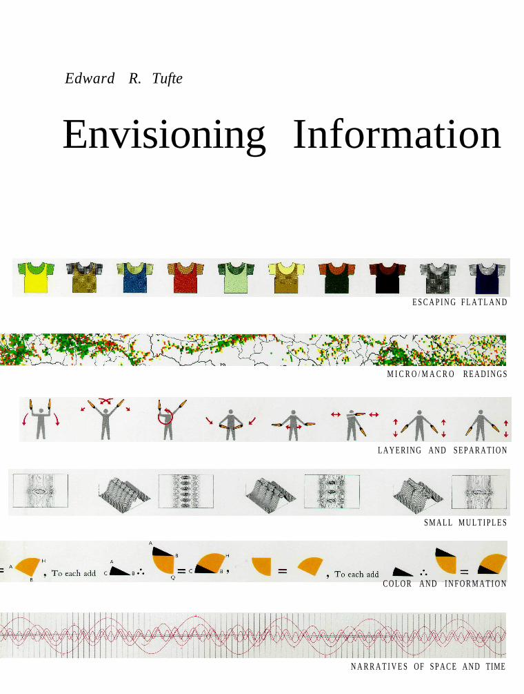
E S C A P I N G F L A T L A N D
M I C R O / M A C R O R E A D I N G S
L A Y E R I N G A N D S E P A R A T I O N
S M A L L M U L T I P L E S
C O L O R A N D I N F O R M A T I O N
N A R R A T I V E S OF S P A C E A N D TIME
Edward Tufte is a professor at Yale University,
where he teaches courses in statistical evidence
and information design. His books include
Visual Explanations: Images and Quantities,
Evidence and Narrative, Envisioning Information,
The Visual Display of Quantitative Information,
Political Control of the Economy, Data Analysis
for Politics and Policy, and Size and Democracy
(with Robert A. Dahl).
He is a fellow of the American Statistical
Association, the American Academy of Arts
and Sciences, the Guggenheim Foundation,
and the Center for Advanced Study in the
Behavioral Sciences. He has received honorary
doctorates from The Cooper Union and
Connecticut College, the Phi Beta Kappa Award
in Science, and the Joseph Rigo Award for
contributions to software documentation from
the Association for Computing Machinery.
Envisioning Information has received 14 awards
for content and design, including the Phi Beta
Kappa Award in Science and "Best Graphic
Design of the Year" from International Design.
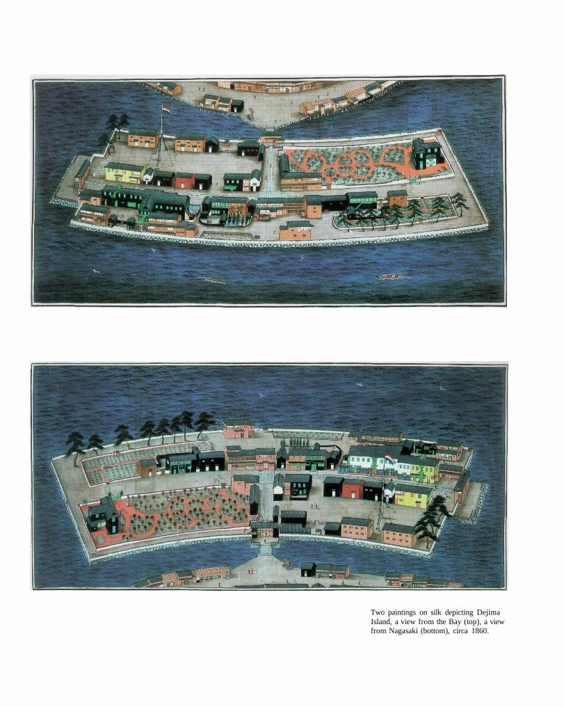
Two paintings on silk depicting DejimaIsland, a view from the Bay (top), a viewfrom Nagasaki (bottom), circa 1860.

Edward R. Tufte
Envisioning Information
Graphics Press • Cheshire, Connecticut

Copyright © 1990 by Edward Rolf TuftePublished BY GRAPHICS PRESSPOST OFFICE Box 430, CHESHIRE, CONNECTICUT 06410
All rights to illustrations and text reserved by Edward Rolf Tufte. This work may not be copied, reproduced, or translated in whole or inpart without written permission of the publisher, except for brief excerpts in connection with reviews or scholarly analysis. Use "with any formof information storage and retrieval, electronic adaptation or whatever, computer software, or by similar or dissimilar methods now knownor developed in the future is also strictly forbidden without written permission of the publisher. A number of illustrations are reproduced bypermission; those copyright-holders are credited on page 126.
Printed in the United States of America Sixth printing, February 1998
Contents
E S C A P I N G F l A T L A N D 1 2
M I C R O / MACRO R E A D I N G S 37
L A Y E R I N G A N D S E P A R A T I O N 5 3
S M A L L M U L T I P L E S 67
C O L O R A N D I N F O R M A T I O N 8 1
N A R R A T I V E S OF S P A C E A N D TIME 97
E P I L O G U E 1 2 1

for my teacher, Inge Druckrey
for my parents, Edward E. Tufte and Virginia James Tufte
and for Moshe, Tanya, Charlie, Natasha, Babar, and Frida
Introduction
THE world is complex, dynamic, multidimensional; the paper is static,flat. How are we to represent the rich visual world of experience andmeasurement on mere flatland?
This book celebrates escapes from flatland, rendering several hundredsuperb displays of complex data. Revealed here are design strategies forenhancing the dimensionality and density of portrayals of information-techniques exemplified in maps, the manuscripts of Galileo, timetables,notation describing dance movements, aerial photographs, the VietnamVeterans Memorial, electrocardiograms, drawings of Calder and Klee,computer visualizations, and a textbook of Euclid's geometry.
Our investigation yields general principles that have specific visualconsequences, governing the design, editing, analysis, and critique ofdata representations. These principles help to identify and to explaindesign excellence - why some displays are better than others.
Charts, diagrams, graphs, tables, guides, instructions, directories, andmaps comprise an enormous accumulation of material. Once describedby Philip Morrison as "cognitive art," it embodies tens of trillions ofimages created and multiplied the world over every year. Despite thebeauty and utility of the best work, design of information has engagedlittle critical or aesthetic notice: there is no Museum of Cognitive Art.This book could serve as a partial catalog for such a collection. Like myprevious study, The Visual Display of Quantitative Information, whichderives theoretical counsel from the classics of statistical graphics, thisbook arrays exemplary designs - this time over a broader spectrum, forall types of information.
To envision information - and what bright and splendid visions canresult - is to work at the intersection of image, word, number, art.The instruments are those of writing and typography, of managinglarge data sets and statistical analysis, of line and layout and color.And the standards of quality are those derived from visual principlesthat tell us how to put the right mark in the right place.
10
Finally, in reading the words and drawings, note that:
Many of the illustrations have been edited and redrawn (as indicatedin the citations) in order to repair battered originals, to make new colorseparations, and to improve the design. Primary sources - the themes formy variations - are always noted.
The illustrations repay careful study. They are treasures, complex andwitty, rich with meaning. The text, I do hope, is of similar character,with every word meant to count; all in all, the reader should proceedmost slowly through these bountiful and condensed pages.
The principles of information design are universal - like mathematics -and are not tied to unique features of a particular language or culture.Consequently, our examples are widely distributed in space and time:illustrations come from 17 countries and 7 centuries, and, for that matter,3 planets and 1 star.
Acknowledgments
I am most thankful for access to these libraries: in London, The BritishLibrary, and British Patent Office Library. In Paris, Bibliothèque Na-tionale, and Bibliothèque de l'Ecole Nationale des Ponts et Chaussées.In Tokyo, Arisugawa Memorial Park Library, and Japanese NationalRailroad Library. In the United States, the Library of Congress, NewYork Public Library at Lincoln Center, and, at Yale University, theArt and Architecture Library, Astronomy Library, Beinecke RareBook and Manuscript Library, Center for British Art, Historical Med-ical Library, Social Science Library, Sterling Memorial Library, andespecially Interlibrary Loan.
Original film separations for several maps and drawings were gener-ously provided by Samuel Antupit of Harry N. Abrams, Inc.; GaryGraham, IBM Corporation; David Monahan, Marine Cartography,Canadian Hydrographic Service; M. Roggli, Bundesamt für Landes-topographie, Wabern, Switzerland; Paul A. Tukey, Bell Communi-cations Research; Wild Leitz, Ltd., Heerbrugg, Switzerland; and theStatistics Bureau, Prime Minister's Office, Japan.
At Yale University, I am blessed with students who often listensympathetically and then go on to make their own independentcontributions. Three drawings here are adapted from student work.
In this complex project, many have provided advice and assistance.I remember gratefully:
For finding (and selling) rare books and maps, Teresa Bridgeman,Jonathan Hill, Gordon Hollis, George N. Johnson, Jr., and Richard Lan.
For their patient guidance in exploring Japanese information design,Akiko Hashimoto, Fumihiko Saito, and the essential Nagayo Sawa.
For suggesting and contributing examples, Scott Adams, RobertCameron, Inge Druckrey, Elisabeth Fairman, Gretchen Garner,Owen Gingerich, Howard I. Gralla, David H. Hathaway, NicholasJohnson, Herbert A. Klein, Paul Levy, Pamela Pfeffer, Denise ScottBrown, Ani Stern, Vane Sutton-Vane, R. Gay Walker, Colin Ware,Jon Wertheimer, Berthold Wolpe.
For reviewing the manuscript, Rudolf Arnheim, Samuel Edgerton, Jr.,Joanna Hitchcock, Virginia J. Tufte, and Kim Veltman; and for helpfuladvice, Robert K. Merton.
For elegant book design and counsel for many years, Howard Gralla;for typesetting in Monotype Bembo, Michael and Winifred Bixler;for advice on an intricate printing job, Don Dehoff, William Glick, andRobert Hennessey; for vigilant production review, Carolyn Williams.
For managing Graphics Press with special care, Elaine Lau and KathyOrlando; and for managing the rest, Cynthia Bill.
For superb and reflective research support, Scott Adams andMark Hansen.
For fine craft in artwork, and redrawing and adapting many ofthe examples, Nora Hillman Goeler.
For her ideas and inspiration, Inge Druckrey.
January 1990Cheshire, Connecticut
11
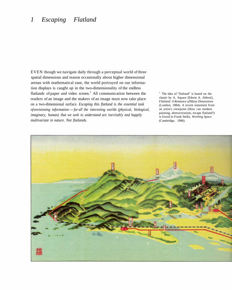
1 Escaping Flatland
EVEN though we navigate daily through a perceptual world of threespatial dimensions and reason occasionally about higher dimensionalarenas with mathematical ease, the world portrayed on our informa-tion displays is caught up in the two-dimensionality of the endlessflatlands of paper and video screen.1 All communication between thereaders of an image and the makers of an image must now take placeon a two-dimensional surface. Escaping this flatland is the essential taskof envisioning information — for all the interesting worlds (physical, biological,imaginary, human) that we seek to understand are inevitably and happilymultivariate in nature. Not flatlands.
1 The idea of "flatland" is based on theclassic by A. Square [Edwin A. Abbott],Flatland: A Romance of Many Dimensions(London, 1884). A recent statement froman artist's viewpoint (How can modernpainting, abstractionism, escape flatland?)is found in Frank Stella, Working Space(Cambridge, 1986).
THIS chapter outlines a variety of design strategies that sharpenthe information resolution, the resolving power, of paper and videoscreen. In particular, these methods work to increase (1) the numberof dimensions that can be represented on plane surfaces and (2) thedata density (amount of information per unit area).
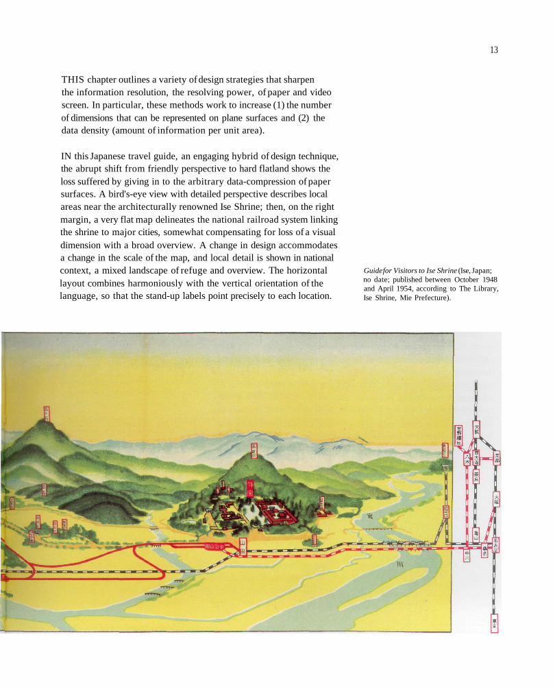
IN this Japanese travel guide, an engaging hybrid of design technique,the abrupt shift from friendly perspective to hard flatland shows theloss suffered by giving in to the arbitrary data-compression of papersurfaces. A bird's-eye view with detailed perspective describes localareas near the architecturally renowned Ise Shrine; then, on the rightmargin, a very flat map delineates the national railroad system linkingthe shrine to major cities, somewhat compensating for loss of a visualdimension with a broad overview. A change in design accommodatesa change in the scale of the map, and local detail is shown in nationalcontext, a mixed landscape of refuge and overview. The horizontallayout combines harmoniously with the vertical orientation of thelanguage, so that the stand-up labels point precisely to each location.
Guide for Visitors to Ise Shrine (Ise, Japan;no date; published between October 1948and April 1954, according to The Library,Ise Shrine, Mie Prefecture).
13
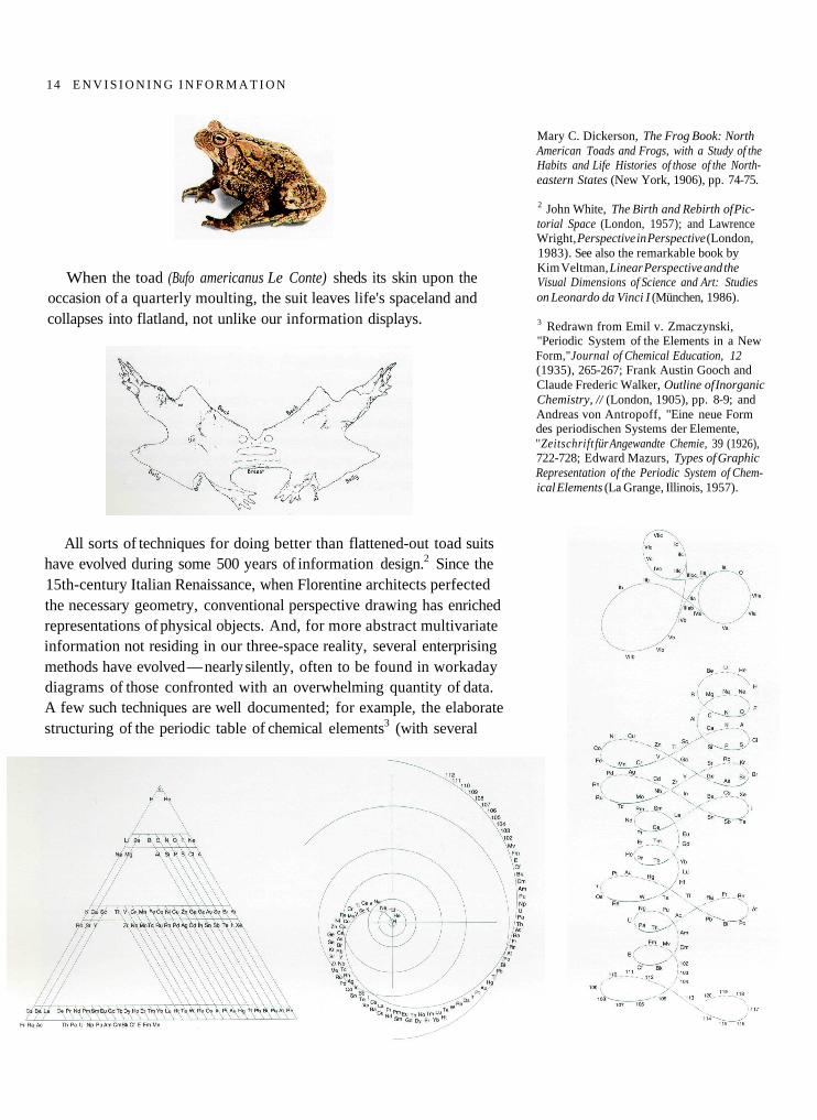
When the toad (Bufo americanus Le Conte) sheds its skin upon theoccasion of a quarterly moulting, the suit leaves life's spaceland andcollapses into flatland, not unlike our information displays.
All sorts of techniques for doing better than flattened-out toad suitshave evolved during some 500 years of information design.2 Since the15th-century Italian Renaissance, when Florentine architects perfectedthe necessary geometry, conventional perspective drawing has enrichedrepresentations of physical objects. And, for more abstract multivariateinformation not residing in our three-space reality, several enterprisingmethods have evolved — nearly silently, often to be found in workadaydiagrams of those confronted with an overwhelming quantity of data.A few such techniques are well documented; for example, the elaboratestructuring of the periodic table of chemical elements3 (with several
Mary C. Dickerson, The Frog Book: NorthAmerican Toads and Frogs, with a Study of theHabits and Life Histories of those of the North-eastern States (New York, 1906), pp. 74-75.
2 John White, The Birth and Rebirth of Pic-torial Space (London, 1957); and LawrenceWright, Perspective in Perspective (London,1983). See also the remarkable book byKim Veltman, Linear Perspective and theVisual Dimensions of Science and Art: Studieson Leonardo da Vinci I (München, 1986).
3 Redrawn from Emil v. Zmaczynski,"Periodic System of the Elements in a NewForm,"Journal of Chemical Education, 12(1935), 265-267; Frank Austin Gooch andClaude Frederic Walker, Outline of InorganicChemistry, // (London, 1905), pp. 8-9; andAndreas von Antropoff, "Eine neue Formdes periodischen Systems der Elemente,''Zeitschrift für Angewandte Chemie, 39 (1926),722-728; Edward Mazurs, Types of GraphicRepresentation of the Periodic System of Chem-ical Elements (La Grange, Illinois, 1957).
14 E N V I S I O N I N G I N F O R M A T I O N
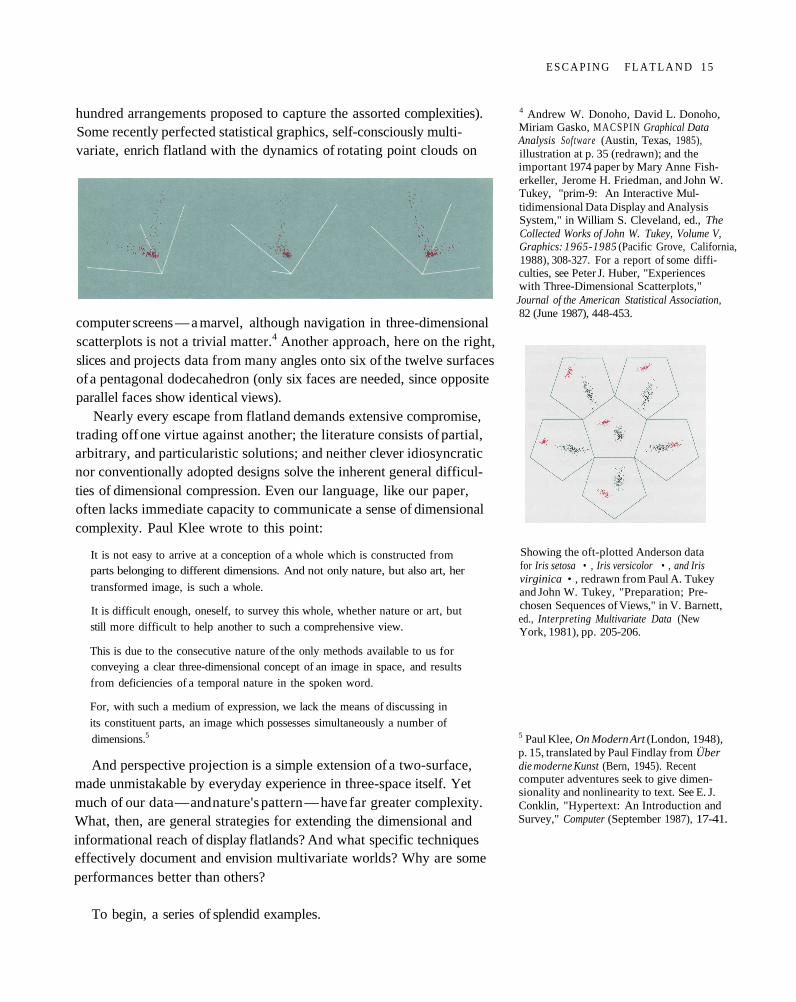
hundred arrangements proposed to capture the assorted complexities).Some recently perfected statistical graphics, self-consciously multi-variate, enrich flatland with the dynamics of rotating point clouds on
computer screens — a marvel, although navigation in three-dimensionalscatterplots is not a trivial matter.4 Another approach, here on the right,slices and projects data from many angles onto six of the twelve surfacesof a pentagonal dodecahedron (only six faces are needed, since oppositeparallel faces show identical views).
Nearly every escape from flatland demands extensive compromise,trading off one virtue against another; the literature consists of partial,arbitrary, and particularistic solutions; and neither clever idiosyncraticnor conventionally adopted designs solve the inherent general difficul-ties of dimensional compression. Even our language, like our paper,often lacks immediate capacity to communicate a sense of dimensionalcomplexity. Paul Klee wrote to this point:
It is not easy to arrive at a conception of a whole which is constructed fromparts belonging to different dimensions. And not only nature, but also art, her
transformed image, is such a whole.
It is difficult enough, oneself, to survey this whole, whether nature or art, butstill more difficult to help another to such a comprehensive view.
This is due to the consecutive nature of the only methods available to us forconveying a clear three-dimensional concept of an image in space, and results
from deficiencies of a temporal nature in the spoken word.
For, with such a medium of expression, we lack the means of discussing in
its constituent parts, an image which possesses simultaneously a number of
dimensions.5
And perspective projection is a simple extension of a two-surface,made unmistakable by everyday experience in three-space itself. Yetmuch of our data — and nature's pattern — have far greater complexity.What, then, are general strategies for extending the dimensional andinformational reach of display flatlands? And what specific techniqueseffectively document and envision multivariate worlds? Why are someperformances better than others?
To begin, a series of splendid examples.
4 Andrew W. Donoho, David L. Donoho,Miriam Gasko, MACSPIN Graphical DataAnalysis Software (Austin, Texas, 1985),illustration at p. 35 (redrawn); and theimportant 1974 paper by Mary Anne Fish-erkeller, Jerome H. Friedman, and John W.Tukey, "prim-9: An Interactive Mul-tidimensional Data Display and AnalysisSystem," in William S. Cleveland, ed., TheCollected Works of John W. Tukey, Volume V,Graphics: 1965-1985 (Pacific Grove, California,1988), 308-327. For a report of some diffi-culties, see Peter J. Huber, "Experienceswith Three-Dimensional Scatterplots,"Journal of the American Statistical Association,82 (June 1987), 448-453.
Showing the oft-plotted Anderson datafor Iris setosa • , Iris versicolor • , and Irisvirginica • , redrawn from Paul A. Tukeyand John W. Tukey, "Preparation; Pre-chosen Sequences of Views," in V. Barnett,ed., Interpreting Multivariate Data (NewYork, 1981), pp. 205-206.
5 Paul Klee, On Modern Art (London, 1948),p. 15, translated by Paul Findlay from Überdie moderne Kunst (Bern, 1945). Recentcomputer adventures seek to give dimen-sionality and nonlinearity to text. See E. J.Conklin, "Hypertext: An Introduction andSurvey," Computer (September 1987), 17-41.
E S C A P I N G F L A T L A N D 1 5
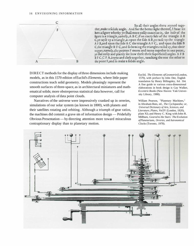
DIRECT methods for the display of three dimensions include makingmodels, as in this 1570 edition of Euclid's Elements, where little paperconstructions teach solid geometry. Models pleasingly represent thesmooth surfaces of three-space, as in architectural miniatures and math-ematical solids; more obstreperous statistical data however, call forcomputer analysis of data point clouds.
Narratives of the universe were impressively cranked up in orreries,simulations of our solar system (as known in 1800), with planets andtheir satellites rotating and orbiting. Although a triumph of gear ratios,the machines did commit a grave sin of information design — PridefullyObvious Presentation — by directing attention more toward miraculouscontraptionary display than to planetary motion.
Euclid, The Elements of Geometrie (London,1570), with preface by John Dee, Englishtranslation by Henry Billingsley, fol. 314.A fine guide to various extra-dimensionalelaborations in book design is Gay Walker,Eccentric Books (New Haven: Yale Univer-sity Library, 1988).
William Pearson, "Planetary Machines,"in Abraham Rees, ed., The Cyclopaedia; or,Universal Dictionary of Arts, Sciences, andLiterature, Plates, Vol.IV (London, 1820),plate XI; and Henry C. King with John R.Millburn, Geared to the Stars: The Evolutionof Planetariums, Orreries, and AstronomicalClocks (Toronto, 1978).
16 E N V I S I O N I N G I N F O R M A T I O N
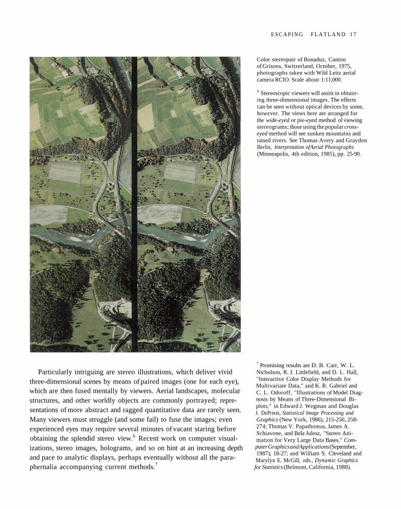
Particularly intriguing are stereo illustrations, which deliver vividthree-dimensional scenes by means of paired images (one for each eye),which are then fused mentally by viewers. Aerial landscapes, molecularstructures, and other worldly objects are commonly portrayed; repre-sentations of more abstract and ragged quantitative data are rarely seen.Many viewers must struggle (and some fail) to fuse the images; evenexperienced eyes may require several minutes of vacant staring beforeobtaining the splendid stereo view.6 Recent work on computer visual-izations, stereo images, holograms, and so on hint at an increasing depthand pace to analytic displays, perhaps eventually without all the para-phernalia accompanying current methods.7
Color stereopair of Bonaduz, Cantonof Grisons, Switzerland, October, 1975,photographs taken with Wild Leitz aerialcamera RCIO. Scale about 1:11,000.
6 Stereoscopic viewers will assist in obtain-ing three-dimensional images. The effectscan be seen without optical devices by some,however. The views here are arranged forthe wide-eyed or pie-eyed method of viewingstereograms; those using the popular cross-eyed method will see sunken mountains andraised rivers. See Thomas Avery and GraydonBerlin, Interpretation of Aerial Photographs(Minneapolis, 4th edition, 1985), pp. 25-90.
7 Promising results are D. B. Carr, W. L.Nicholson, R. J. Littlefield, and D. L. Hall,"Interactive Color Display Methods forMultivariate Data," and K. R. Gabriel andC. L. Odoroff, "Illustrations of Model Diag-nosis by Means of Three-Dimensional Bi-plots," in Edward J. Wegman and DouglasJ. DePriest, Statistical Image Processing andGraphics (New York, 1986), 215-250, 258-274; Thomas V. Papathomas, James A.Schiavone, and Bela Julesz, "Stereo Ani-mation for Very Large Data Bases," Com-puter Graphics and Applications (September,1987), 18-27; and William S. Cleveland andMarylyn E. McGill, eds., Dynamic Graphicsfor Statistics (Belmont, California, 1988).
E S C A P I N G F L A T L A N D 1 7
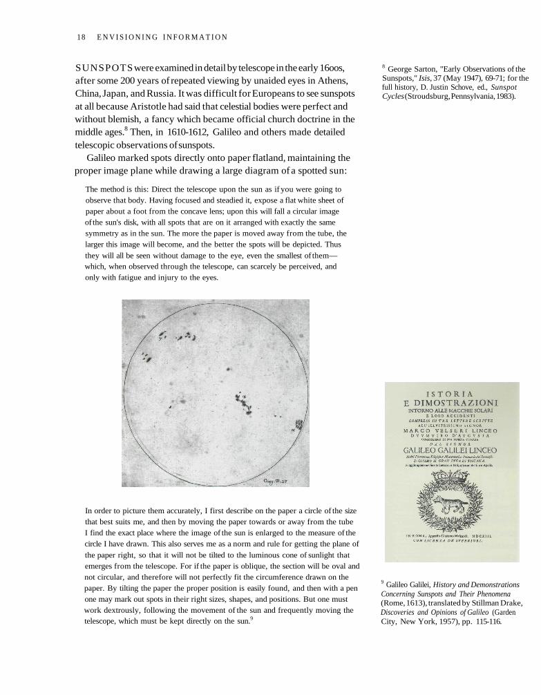
SUNSPOTS were examined in detail by telescope in the early 16oos,after some 200 years of repeated viewing by unaided eyes in Athens,China, Japan, and Russia. It was difficult for Europeans to see sunspotsat all because Aristotle had said that celestial bodies were perfect andwithout blemish, a fancy which became official church doctrine in themiddle ages.8 Then, in 1610-1612, Galileo and others made detailedtelescopic observations of sunspots.
Galileo marked spots directly onto paper flatland, maintaining theproper image plane while drawing a large diagram of a spotted sun:
The method is this: Direct the telescope upon the sun as if you were going toobserve that body. Having focused and steadied it, expose a flat white sheet ofpaper about a foot from the concave lens; upon this will fall a circular imageof the sun's disk, with all spots that are on it arranged with exactly the samesymmetry as in the sun. The more the paper is moved away from the tube, thelarger this image will become, and the better the spots will be depicted. Thus
they will all be seen without damage to the eye, even the smallest of them—which, when observed through the telescope, can scarcely be perceived, andonly with fatigue and injury to the eyes.
In order to picture them accurately, I first describe on the paper a circle of the sizethat best suits me, and then by moving the paper towards or away from the tubeI find the exact place where the image of the sun is enlarged to the measure of thecircle I have drawn. This also serves me as a norm and rule for getting the plane of
the paper right, so that it will not be tilted to the luminous cone of sunlight thatemerges from the telescope. For if the paper is oblique, the section will be oval andnot circular, and therefore will not perfectly fit the circumference drawn on thepaper. By tilting the paper the proper position is easily found, and then with a penone may mark out spots in their right sizes, shapes, and positions. But one mustwork dextrously, following the movement of the sun and frequently moving thetelescope, which must be kept directly on the sun.9
8 George Sarton, "Early Observations of theSunspots," Isis, 37 (May 1947), 69-71; for thefull history, D. Justin Schove, ed., SunspotCycles (Stroudsburg, Pennsylvania, 1983).
9 Galileo Galilei, History and DemonstrationsConcerning Sunspots and Their Phenomena(Rome, 1613), translated by Stillman Drake,Discoveries and Opinions of Galileo (GardenCity, New York, 1957), pp. 115-116.
18 E N V I S I O N I N G I N F O R M A T I O N
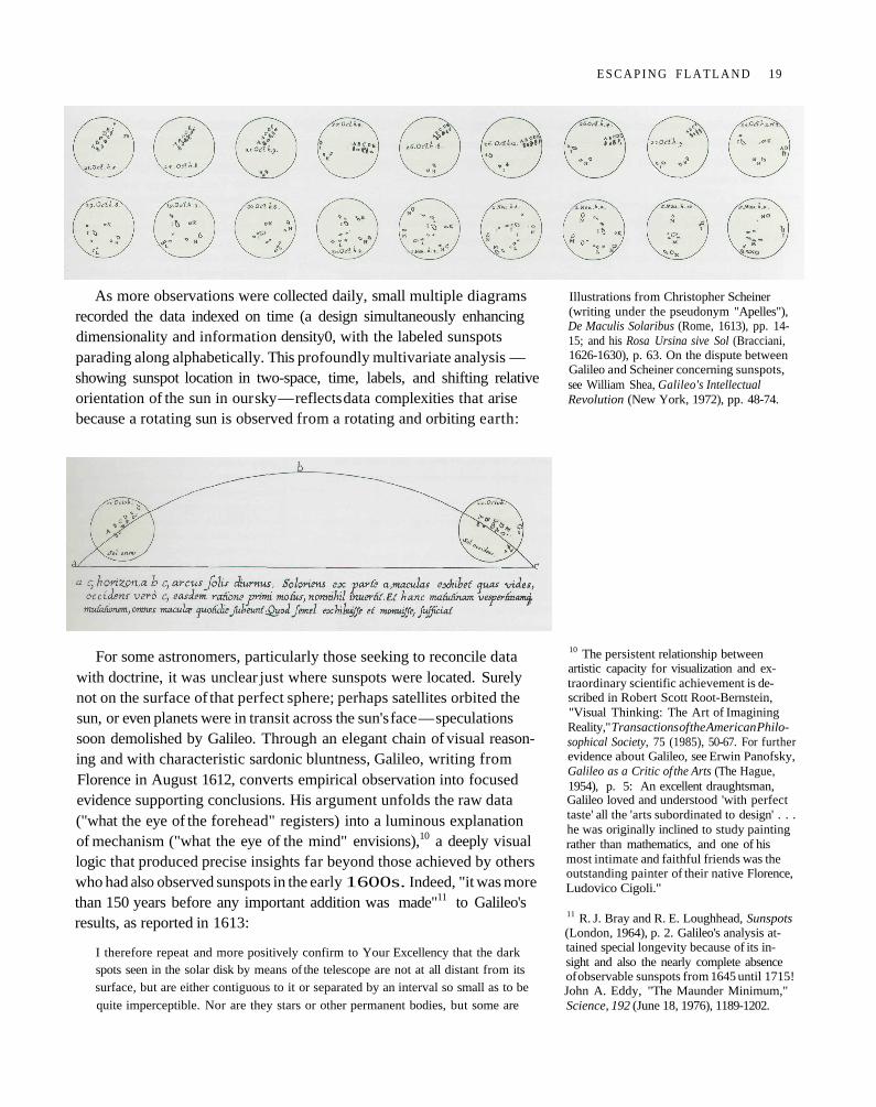
As more observations were collected daily, small multiple diagramsrecorded the data indexed on time (a design simultaneously enhancingdimensionality and information density0, with the labeled sunspotsparading along alphabetically. This profoundly multivariate analysis —showing sunspot location in two-space, time, labels, and shifting relativeorientation of the sun in our sky — reflects data complexities that arisebecause a rotating sun is observed from a rotating and orbiting earth:
For some astronomers, particularly those seeking to reconcile datawith doctrine, it was unclear just where sunspots were located. Surelynot on the surface of that perfect sphere; perhaps satellites orbited thesun, or even planets were in transit across the sun's face — speculationssoon demolished by Galileo. Through an elegant chain of visual reason-ing and with characteristic sardonic bluntness, Galileo, writing fromFlorence in August 1612, converts empirical observation into focusedevidence supporting conclusions. His argument unfolds the raw data("what the eye of the forehead" registers) into a luminous explanationof mechanism ("what the eye of the mind" envisions),10 a deeply visuallogic that produced precise insights far beyond those achieved by otherswho had also observed sunspots in the early 1600s. Indeed, "it was morethan 150 years before any important addition was made"11 to Galileo'sresults, as reported in 1613:
I therefore repeat and more positively confirm to Your Excellency that the darkspots seen in the solar disk by means of the telescope are not at all distant from itssurface, but are either contiguous to it or separated by an interval so small as to be
quite imperceptible. Nor are they stars or other permanent bodies, but some are
Illustrations from Christopher Scheiner(writing under the pseudonym "Apelles"),De Maculis Solaribus (Rome, 1613), pp. 14-15; and his Rosa Ursina sive Sol (Bracciani,1626-1630), p. 63. On the dispute betweenGalileo and Scheiner concerning sunspots,see William Shea, Galileo's IntellectualRevolution (New York, 1972), pp. 48-74.
10 The persistent relationship betweenartistic capacity for visualization and ex-traordinary scientific achievement is de-scribed in Robert Scott Root-Bernstein,"Visual Thinking: The Art of ImaginingReality," Transactions of the American Philo-sophical Society, 75 (1985), 50-67. For furtherevidence about Galileo, see Erwin Panofsky,Galileo as a Critic of the Arts (The Hague,1954), p. 5: An excellent draughtsman,Galileo loved and understood 'with perfecttaste' all the 'arts subordinated to design' . . .he was originally inclined to study paintingrather than mathematics, and one of hismost intimate and faithful friends was theoutstanding painter of their native Florence,Ludovico Cigoli."
11 R. J. Bray and R. E. Loughhead, Sunspots(London, 1964), p. 2. Galileo's analysis at-tained special longevity because of its in-sight and also the nearly complete absenceof observable sunspots from 1645 until 1715!John A. Eddy, "The Maunder Minimum,"Science, 192 (June 18, 1976), 1189-1202.
E S C A P I N G F L A T L A N D 19
always being produced and others dissolved. They vary in duration from one or
two days to thirty or forty. For the most part they are of most irregular shape, and
their shapes continually change, some quickly and violently, others more slowly
and moderately.
They also vary in darkness, appearing sometimes to condense and sometimes to
spread out and rarefy. In addition to changing shape, some of them divide into
three or four, and often several unite into one; this happens less at the edge of the
sun's disk than in its central parts. Besides all these disordered movements they
have in common a general uniform motion across the face of the sun in parallel
lines. From special characteristics of this motion one may learn that the sun is
absolutely spherical, that it rotates from west to east around its own center, carries
the spots along with it in parallel circles, and completes an entire revolution in
about one lunar month. Also worth noting is the fact that the spots always fall
in one zone of the solar body, lying between the two circles which bound the
declinations of the planets - that is, they fall within 28° or 29° of the sun's equator.
The different densities and degrees of darkness of the spots, their changes of shape,
and their collecting and separating are evident directly to our sight, without any
need of reasoning, as a glance at the diagrams which I am enclosing will show. But
that the spots are contiguous to the sun and are carried around by its rotation can
only be deduced and concluded by reasoning from certain particular events which
our observations yield.
First, to see twenty or thirty spots at a time move with one common movement is
a strong reason for believing that each does not go wandering about by itself, in the
manner of the planets going around the sun. . . . To begin with, the spots at their
first appearance and final disappearance near the edges of the sun generally seem to
have very little breadth, but to have the same length that they show in the central
parts of the sun's disk. Those who understand what is meant by foreshortening on
a spherical surface will see this to be a manifest argument that the sun is a globe,
that the spots are close to its surface, and that as they are carried on that surface
toward the center they will always grow in breadth while preserving the same
length. . . . this maximum thinning, it is clear, takes place at the point of greatest
foreshortening....
I have since been much impressed by the courtesy of nature, which thousands of
years ago arranged a means by which we might come to notice these spots, and
through them to discover things of greater consequence. For without any instru-
ments, from any little hole through which sunlight passes, there emerges an image
of the sun with its spots, and at a distance this becomes stamped upon any surface
opposite the hole. It is true that these spots are not nearly as sharp as those seen
through the telescope, but the majority of them may nevertheless be seen. If in
church some day Your Excellency sees the light of the sun falling upon the pave-
ment at a distance from some broken window pane, you may catch this light upon
a flat white sheet of paper, and there you will perceive the spots. I might add that
nature has been so kind that for our instruction she has sometimes marked the sun
with a spot so large and dark as to be seen merely by the naked eye, though the
false and inveterate idea that the heavenly bodies are devoid of all mutation or al-
teration has made people believe that such a spot was the planet Mercury coming
between us and the sun, to the disgrace of past astronomers.12
12 Galileo Galilei, History and DemonstrationsConcerning Sunspots and Their Phenomena(Rome, 1613), translated by Stillman Drake,Discoveries and Opinions of Galileo (GardenCity, New York, 1957), pp. 106-107, 116-117. Galileo had been through all this oncebefore when he first saw craters on themoon, another supposedly perfect celestialsphere. One of Galileo's opponents, "whoadmitted the surface of the moon lookedrugged, maintained that it was actuallyquite smooth and spherical as Aristotle hadsaid, reconciling the two ideas by sayingthat the moon was covered with a smoothtransparent material through which moun-tains and craters inside it could be discerned.Galileo, sarcastically applauding the ingenu-ity of this contribution, offered to accept itgladly — provided that his opponent woulddo him the equal courtesy of allowing himthen to assert that the moon was even morerugged than he had thought before, its sur-face being covered with mountains andcraters of this invisible substance ten timesas high as any he had seen. At Pisa theleading philosopher had refused even to lookthrough the telescope; when he died a fewmonths afterward, Galileo expressed thehope that since he had neglected to look atthe new celestial objects while on earth, hewould now see them on his way to hea-ven." Stillman Drake, "Introduction: Sec-ond Part," Discoveries and Opinions of Galileo(Garden City, New York, 1957), p. 73.
2 0 E N V I S I O N I N G I N F O R M A T I O N
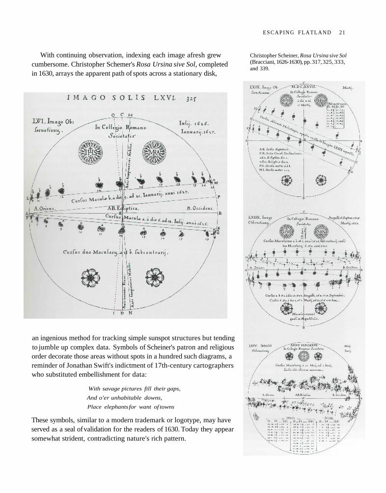
With continuing observation, indexing each image afresh grewcumbersome. Christopher Schemer's Rosa Ursina sive Sol, completedin 1630, arrays the apparent path of spots across a stationary disk,
an ingenious method for tracking simple sunspot structures but tendingto jumble up complex data. Symbols of Scheiner's patron and religiousorder decorate those areas without spots in a hundred such diagrams, areminder of Jonathan Swift's indictment of 17th-century cartographerswho substituted embellishment for data:
With savage pictures fill their gaps,
And o'er unhabitable downs,
Place elephants for want of towns
These symbols, similar to a modern trademark or logotype, may haveserved as a seal of validation for the readers of 1630. Today they appearsomewhat strident, contradicting nature's rich pattern.
Christopher Scheiner, Rosa Ursina sive Sol(Bracciani, 1626-1630), pp. 317, 325, 333,and 339.
E S C A P I N G F L A T L A N D 21
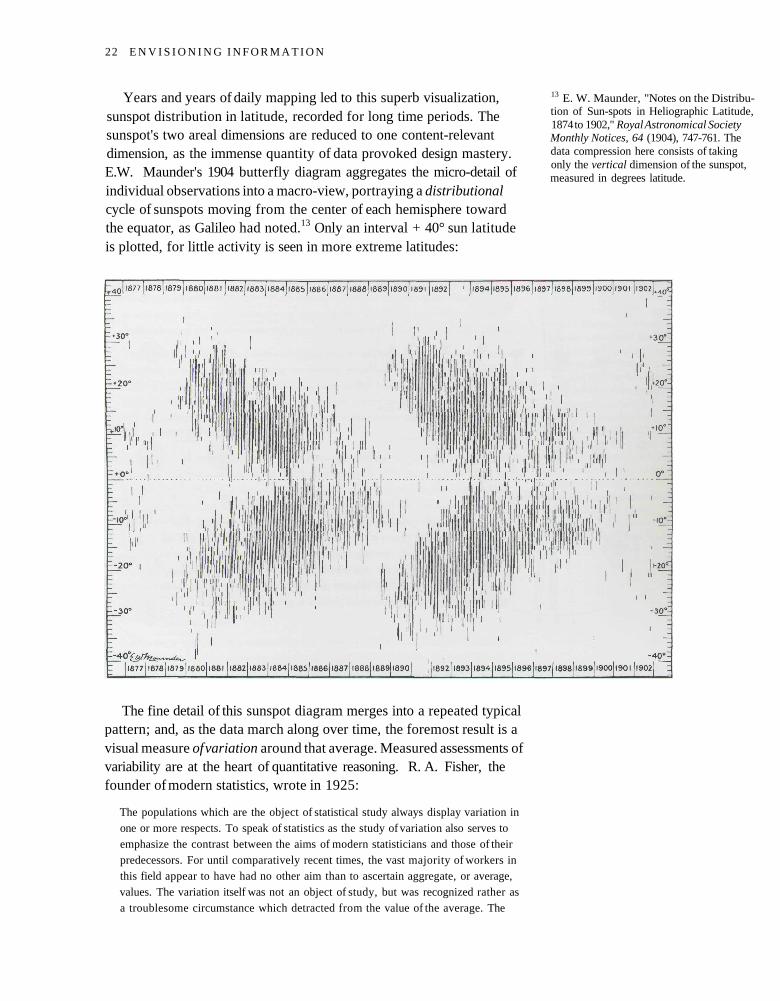
Years and years of daily mapping led to this superb visualization,sunspot distribution in latitude, recorded for long time periods. Thesunspot's two areal dimensions are reduced to one content-relevantdimension, as the immense quantity of data provoked design mastery.E.W. Maunder's 1904 butterfly diagram aggregates the micro-detail ofindividual observations into a macro-view, portraying a distributionalcycle of sunspots moving from the center of each hemisphere towardthe equator, as Galileo had noted.13 Only an interval + 40° sun latitudeis plotted, for little activity is seen in more extreme latitudes:
The fine detail of this sunspot diagram merges into a repeated typicalpattern; and, as the data march along over time, the foremost result is avisual measure of variation around that average. Measured assessments ofvariability are at the heart of quantitative reasoning. R. A. Fisher, thefounder of modern statistics, wrote in 1925:
The populations which are the object of statistical study always display variation inone or more respects. To speak of statistics as the study of variation also serves toemphasize the contrast between the aims of modern statisticians and those of theirpredecessors. For until comparatively recent times, the vast majority of workers inthis field appear to have had no other aim than to ascertain aggregate, or average,values. The variation itself was not an object of study, but was recognized rather asa troublesome circumstance which detracted from the value of the average. The
13 E. W. Maunder, "Notes on the Distribu-tion of Sun-spots in Heliographic Latitude,1874 to 1902," Royal Astronomical SocietyMonthly Notices, 64 (1904), 747-761. Thedata compression here consists of takingonly the vertical dimension of the sunspot,measured in degrees latitude.
22 E N V I S I O N I N G I N F O R M A T I O N
error curve of the mean of a normal sample has been familiar for a century, but that
of the standard deviation was the object of researches up to 1915. Yet, from the modern
point of view, the study of the causes of variation of any variable phenomenon, from
the yield of wheat to the intellect of [people], should be begun by the examination
and measurement of the variation which presents itself.14
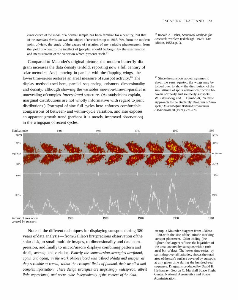
Compared to Maunder's original picture, the modern butterfly dia-gram increases the data density tenfold, reporting now a full century ofsolar memoirs. And, moving in parallel with the flapping wings, thelower time-series restores an areal measure of sunspot activity.15 Thedisplay method used here, parallel sequencing, enhances dimensionalityand density, although showing the variables one-at-a-time-in-parallel isunrevealing of complex interrelated structure. (As statisticians explain,marginal distributions are not wholly informative with regard to jointdistributions.) Portrayal of nine full cycles here enforces comfortablecomparisons of between- and within-cycle variation, and also exposesan apparent growth trend (perhaps it is merely improved observation)in the wingspan of recent cycles.
Note all the different techniques for displaying sunspots during 380years of data analysis — from Galileo's first precious observation of thesolar disk, to small multiple images, to dimensionality and data com-pression, and finally to micro/macro displays combining pattern anddetail, average and variation. Exactly the same design strategies are found,again and again, in the work of those faced with a flood of data and images, asthey scramble to reveal, within the cramped limits of flatland, their detailed andcomplex information. These design strategies are surprisingly widespread, albeitlittle appreciated, and occur quite independently of the content of the data.
14 Ronald A. Fisher, Statistical Methods forResearch Workers (Edinburgh, 1925; 13thedition, 1958), p. 3.
15 Since the sunspots appear symmetricabout the sun's equator, the wings may befolded over to show the distribution of thesun latitude of spots without distinction be-tween northerly and southerly sunspots.W. Gleissberg and T. Damboldt, "A NewApproach to the Butterfly Diagram of Sun-spots," Journal of the British AstronomicalAssociation, 81 (1971), 271-276.
At top, a Maunder diagram from 1880 to1980, with the sine of the latitude markingsunspot placement. Color coding (thelighter, the larger) reflects the logarithm ofthe area covered by sunspots within eachareal bin of data. The lower time-series, bysumming over all latitudes, shows the totalarea of the sun's surface covered by sunspotsat any given time during the hundred-yearsequence. Diagrams produced by David H.Hathaway, George C. Marshall Space FlightCenter, National Aeronautics and SpaceAdministration.
Sun Latitude 1900 1920 1940 1960 1980
90oN
30°N
equator
30°S
1.0%
0.1%
90°N
30oN
equator
30°S
1.0%
0.1%
Percent of area of sun 1900 1920 1940 1960 1980covered by sunspots
E S C A P I N G F L A T L A N D 23
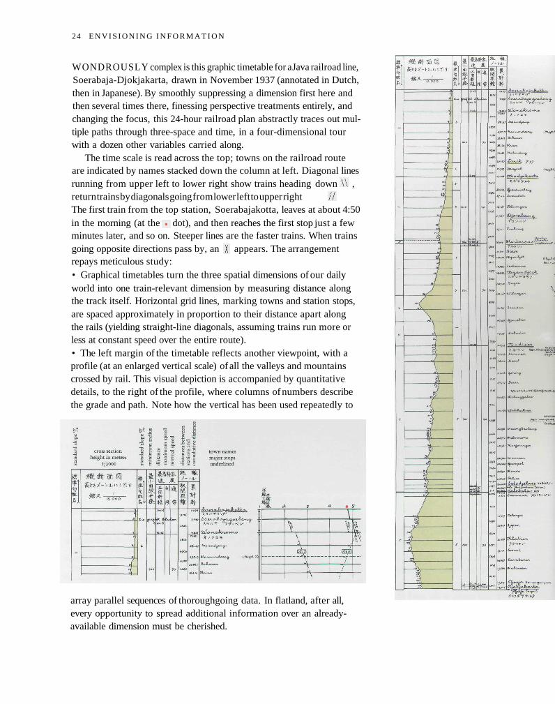
WONDROUSLY complex is this graphic timetable for a Java railroad line,Soerabaja-Djokjakarta, drawn in November 1937 (annotated in Dutch,then in Japanese). By smoothly suppressing a dimension first here andthen several times there, finessing perspective treatments entirely, andchanging the focus, this 24-hour railroad plan abstractly traces out mul-tiple paths through three-space and time, in a four-dimensional tourwith a dozen other variables carried along.
The time scale is read across the top; towns on the railroad routeare indicated by names stacked down the column at left. Diagonal linesrunning from upper left to lower right show trains heading down ,return trains by diagonals going from lower left to upper rightThe first train from the top station, Soerabajakotta, leaves at about 4:50in the morning (at the dot), and then reaches the first stop just a fewminutes later, and so on. Steeper lines are the faster trains. When trainsgoing opposite directions pass by, an appears. The arrangementrepays meticulous study:• Graphical timetables turn the three spatial dimensions of our dailyworld into one train-relevant dimension by measuring distance alongthe track itself. Horizontal grid lines, marking towns and station stops,are spaced approximately in proportion to their distance apart alongthe rails (yielding straight-line diagonals, assuming trains run more orless at constant speed over the entire route).• The left margin of the timetable reflects another viewpoint, with aprofile (at an enlarged vertical scale) of all the valleys and mountainscrossed by rail. This visual depiction is accompanied by quantitativedetails, to the right of the profile, where columns of numbers describethe grade and path. Note how the vertical has been used repeatedly to
array parallel sequences of thoroughgoing data. In flatland, after all,every opportunity to spread additional information over an already-available dimension must be cherished.
24 E N V I S I O N I N G I N F O R M A T I O N
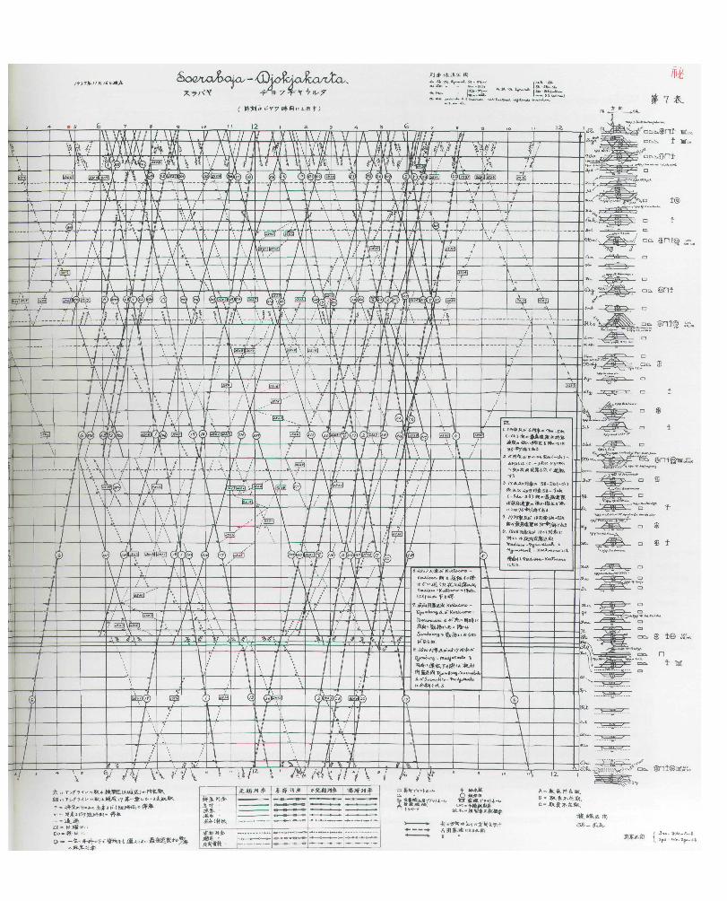
• Within each station, still another view — for what is important hereis activity on the flat ground. Aerial views of the intricate networks ofstation switching tracks are shown, encoded with symbols, icons, anddingbats describing the local facilities:
• The train diagonals cleverly multiple-function,16 as those marksrecord six variables all at once: the location of a train between towns,time of that position, direction, train type, relative speed (comparingslopes of diagonals), and yearly pattern of operation. A two-dimensionalmatrix organizes lines by type and seasonality, encoding the diagonalpath of the train through the space-time field:
This 16-variable schedule served as an internal planning documentfor the Java Railroad; it was then obtained by agents working for Japanpreparing for their military invasion of Java during 1942." In the upperright-hand corner, this railroad timetable is classified "secret" ( ).The spy graphical timetable portrays detailed operations of an intricateand irregular system and, at a more distant view, the overall structureand pattern of the railroad — a dual micro and macro reading. It is verymuch like an excellent map, but with many dimensions breaking freeof direct analogy to conventional cartographic flatland.
16 The idea of double-functioning elementsappears in architectural criticism; RobertVenturi, Complexity and Contradiction inArchitecture (New York, 2nd edition, 1977),ch. 5. Venturi in turn cites Wylie Sypher,Four Stages of Renaissance Style (GardenCity, New York, 1955). For statisticalgraphics, see "Multifunctioning GraphicalElements," in Edward R. Tufte, The VisualDisplay of Quantitative Information (Cheshire,Connecticut, 1983), pp. 139-159.
17 Indonesia ni okeru nihon gunsei no genkyu[A Study of Japanese Occupation in Indonesia],Okuma Social Science Center at WasedaUniversity (Tokyo, 1959).
cargo unloading platform
livestock loading platform
cargo unloading facilities
water supply pump tower
directional change platform
car repair platform
standby engines
relief car
closed areas
regular seasonal irregular special
super express
express
passenger
mixed
special
cargo
preferential
night cargo
26 E N V I S I O N I N G I N F O R M A T I O N
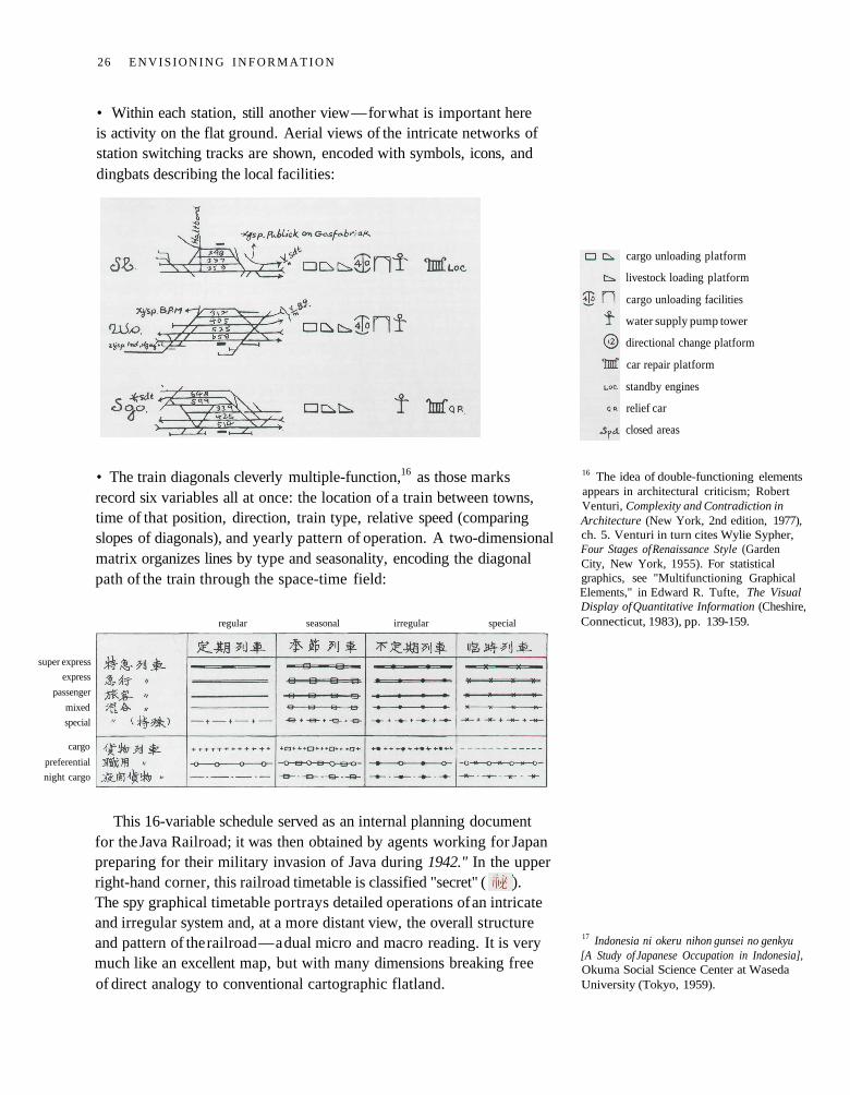
LIKE the tour-guides for the Ise Shrine and sunspots, movements areagain depicted on a perspective map, but now in four dimensions - theflatland of floor, coded gestures in dance notation of body motion, andtime sequence. (Symbolically encoded because "any serious system ofmovement notation avoids words because they are a strong deterrent tointernational communication.''18). The floor plan is linked to the airymusic (two dimensions there, time and tone) by numbers, with varyingsteps for varying sounds. The numbers double-function, simultaneouslysequencing steps and relating movement to music. Note the enlargeddance-floor notation for the partner on our right, since he takes a frontroute in switching sides. Often the redundancy of bilateral symmetryconsumes space better devoted to fresh information; but here the inte-grated complexity of dual movements, as the dancers' paths weave andintermingle, requires symmetric repetition. The two, pulled apart bytheir mirrored pairing, become visually integrated through their nearlytouching hands, mutual postures, overlapping paths of movement, andconvergence of perspective lines radiating from the flatland floor to avanishing point exactly midway between their outstretched hands.A subtle, graceful, profoundly simple design, with a straightforwardcomplexity, a forerunner of modern dance and movement notation.
Kellom Tomlinson, The Art of Dancing,Explained by Reading and Figures (London,1735), book I, plate XII.
18 Ann Hutchinson Guest, Dance Notation:The Process of Recording Movement on Paper(London, 1984), p. 14. This book also makesa surprising demonstration that abstract,symbolic methods of movement notationare preferable to film and stick figure por-trayals, at least from a dancer's viewpoint.
Margaret Morris, The Notation of Movement(London, 1928), pp. 103-104.
E S C A P I N G F L A T L A N D 27
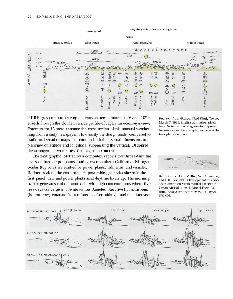
cirrocumulusmigratory anticyclone covering Japan
cirrus
stratocumulus altostratus stratocumulus nimbostratus
HERE gray contours tracing out constant temperatures at 0° and -10° cstretch through the clouds in a side profile of Japan, an ocean-eye view.Forecasts for 15 areas annotate the cross-section of this unusual weathermap from a daily newspaper. How easily the design reads, compared totraditional weather maps that commit both their visual dimensions to aplanview of latitude and longitude, suppressing the vertical. Of coursethe arrangement works best for long, thin countries.
The next graphic, plotted by a computer, reports four times daily thelevels of three air pollutants fuming over southern California. Nitrogenoxides (top row) are emitted by power plants, refineries, and vehicles.Refineries along the coast produce post-midnight peaks shown in thefirst panel; cars and power plants send daytime levels up. The morningtraffic generates carbon monoxide, with high concentrations where fivefreeways converge in downtown Los Angeles. Reactive hydrocarbons(bottom row) emanate from refineries after midnight and then increase
Redrawn from Akahata [Red Flag], Tokyo,March 7, 1985. English translation addedhere. Note the changing weather reportedfor some cities, for example, Sapporo at thefar right of the map.
Redrawn. See G. J. McRae, W. R. Goodin,and J. H. Seinfeld, "Development of a Sec-ond-Generation Mathematical Model forUrban Air Pollution. I. Model Formula-tion," Atmospheric Environment, 16 (1982),679-696.
28 E N V I S I O N I N G I N F O R M A T I O N
with daily traffic. The twelve time-space-pollutant maps add up smogobservations on a spatial grid of 2,400 squares (each five kilometers on aside), for a total of 28,800 readings, except for those masked by peaks —a high density arrangement of data, abounding with variables and withobservations on those variables.
This air pollution display is a small multiple, with the same designstructure repeated for all the images. An economy of perception results;once viewers decode and comprehend the design for one slice of data,they have familiar access to data in all the other slices. As our eye movesfrom one image to the next, this constancy of design allows viewers tofocus on changes in information rather than changes in graphical com-position. A steady canvas makes for a clearer picture. Note how paper'stwo dimensions are put to work here, twice over. Each small map re-ports on the two-space location of a third quantity; those maps becomeentries themselves in another matrix arraying time of day by type ofpollution, for a grand total of five variables.
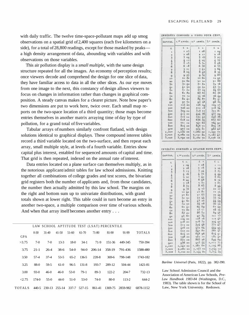
Tabular arrays of numbers similarly confront flatland, with designsolutions identical to graphical displays. These compound interest tablesrecord a third variable located on the two-surface, and then repeat eacharray, small multiple style, at levels of a fourth variable. Entries showcapital plus interest, entabled for sequenced amounts of capital and time.That grid is then repeated, indexed on the annual rate of interest.
Data entries located on a plane surface can themselves multiply, as inthe notorious applicant/admit tables for law school admissions. Knittingtogether all combinations of college grades and test scores, the bivariategrid registers both the number of applicants and, from those candidates,the number then actually admitted by this law school. The margins onthe right and bottom sum up to univariate distributions, with grandtotals shown at lower right. This table could in turn become an entry inanother two-space, a multiple comparison over time of various schools.And when that array itself becomes another entry . . .
LAW S C H O O L A P T I T U D E TEST ( L S A T ) P E R C E N T I L E
0-30 31-40 41-50 51-60 61-70 71-80 81-90 91-99 TOTALSGPA
>3.75 7-0 7-0 13-3 18-0 34-1 71-9 151-36 449-345 750-394
3.75 21-1 26-4 38-6 54-0 94-0 206-14 358-19 791-436 1588-480
3.50 57-4 37-4 53-5 65-2 136-5 228-8 369-6 798-148 1743-182
3.25 88-0 59-5 61-0 96-5 131-8 193-7 289-12 504-44 1421-81
3.00 93-0 46-0 46-0 53-0 79-1 89-3 122-2 204-7 732-13
<2.75 174-0 55-0 44-0 51-0 53-0 74-0 80-0 113-2 644-2
TOTALS 440-5 230-13 255-14 337-7 527-15 861-41 1369-75 2859-982 6878-1152
Barême Universel (Paris, 1822), pp. 382-390.
Law School Admission Council and theAssociation of American Law Schools, Pre-Law Handbook 1983-84 (Washington, D.C.,1983). The table shown is for the School ofLaw, New York University. Redrawn.
E S C A P I N G F L A T L A N D 29
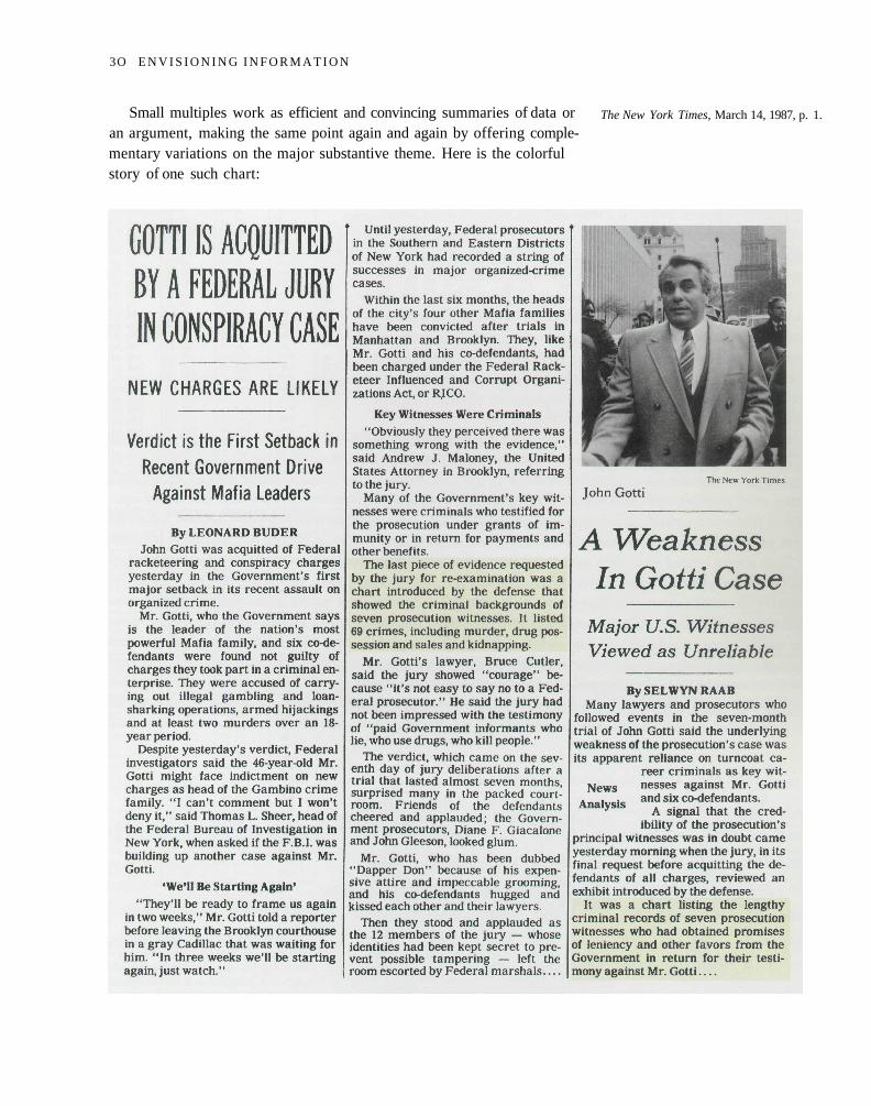
Small multiples work as efficient and convincing summaries of data oran argument, making the same point again and again by offering comple-mentary variations on the major substantive theme. Here is the colorfulstory of one such chart:
The New York Times, March 14, 1987, p. 1.
3O E N V I S I O N I N G I N F O R M A T I O N
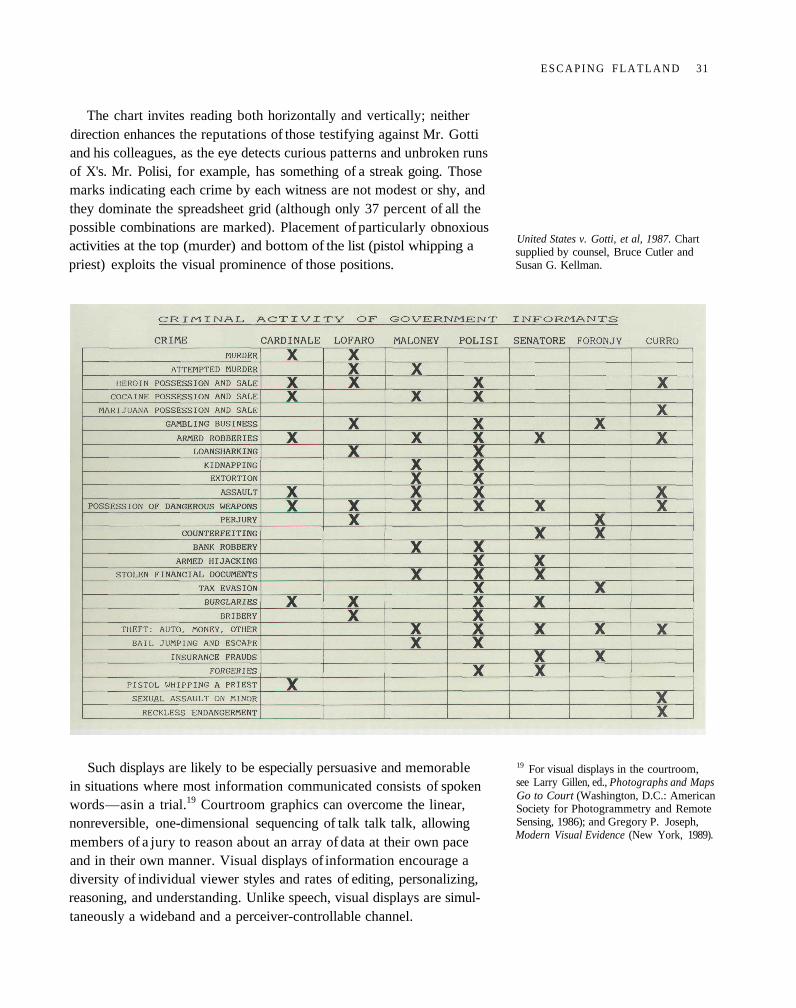
The chart invites reading both horizontally and vertically; neitherdirection enhances the reputations of those testifying against Mr. Gottiand his colleagues, as the eye detects curious patterns and unbroken runsof X's. Mr. Polisi, for example, has something of a streak going. Thosemarks indicating each crime by each witness are not modest or shy, andthey dominate the spreadsheet grid (although only 37 percent of all thepossible combinations are marked). Placement of particularly obnoxiousactivities at the top (murder) and bottom of the list (pistol whipping apriest) exploits the visual prominence of those positions.
Such displays are likely to be especially persuasive and memorablein situations where most information communicated consists of spokenwords — as in a trial.19 Courtroom graphics can overcome the linear,nonreversible, one-dimensional sequencing of talk talk talk, allowingmembers of a jury to reason about an array of data at their own paceand in their own manner. Visual displays of information encourage adiversity of individual viewer styles and rates of editing, personalizing,reasoning, and understanding. Unlike speech, visual displays are simul-taneously a wideband and a perceiver-controllable channel.
United States v. Gotti, et al, 1987. Chartsupplied by counsel, Bruce Cutler andSusan G. Kellman.
19 For visual displays in the courtroom,see Larry Gillen, ed., Photographs and MapsGo to Court (Washington, D.C.: AmericanSociety for Photogrammetry and RemoteSensing, 1986); and Gregory P. Joseph,Modern Visual Evidence (New York, 1989).
E S C A P I N G F L A T L A N D 31
sunny day
starry night
cloudy
rain
snow
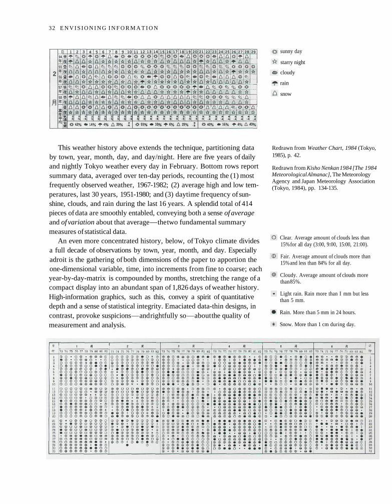
This weather history above extends the technique, partitioning databy town, year, month, day, and day/night. Here are five years of dailyand nightly Tokyo weather every day in February. Bottom rows reportsummary data, averaged over ten-day periods, recounting the (1) mostfrequently observed weather, 1967-1982; (2) average high and low tem-peratures, last 30 years, 1951-1980; and (3) daytime frequency of sun-shine, clouds, and rain during the last 16 years. A splendid total of 414pieces of data are smoothly entabled, conveying both a sense of averageand of variation about that average — the two fundamental summarymeasures of statistical data.
An even more concentrated history, below, of Tokyo climate dividesa full decade of observations by town, year, month, and day. Especiallyadroit is the gathering of both dimensions of the paper to apportion theone-dimensional variable, time, into increments from fine to coarse; eachyear-by-day-matrix is compounded by months, stretching the range of acompact display into an abundant span of 1,826 days of weather history.High-information graphics, such as this, convey a spirit of quantitativedepth and a sense of statistical integrity. Emaciated data-thin designs, incontrast, provoke suspicions — and rightfully so — about the quality ofmeasurement and analysis.
Redrawn from Weather Chart, 1984 (Tokyo,1985), p. 42.
Redrawn from Kisho Nenkan 1984 [The 1984Meteorological Almanac], The MeteorologyAgency and Japan Meteorology Association(Tokyo, 1984), pp. 134-135.
Clear. Average amount of clouds less than15% for all day (3:00, 9:00, 15:00, 21:00).
Fair. Average amount of clouds more than15% and less than 84% for all day.
Cloudy. Average amount of clouds morethan 85%.
Light rain. Rain more than I mm but lessthan 5 mm.
Rain. More than 5 mm in 24 hours.
Snow. More than 1 cm during day.
32 E N V I S I O N I N G I N F O R M A T I O N
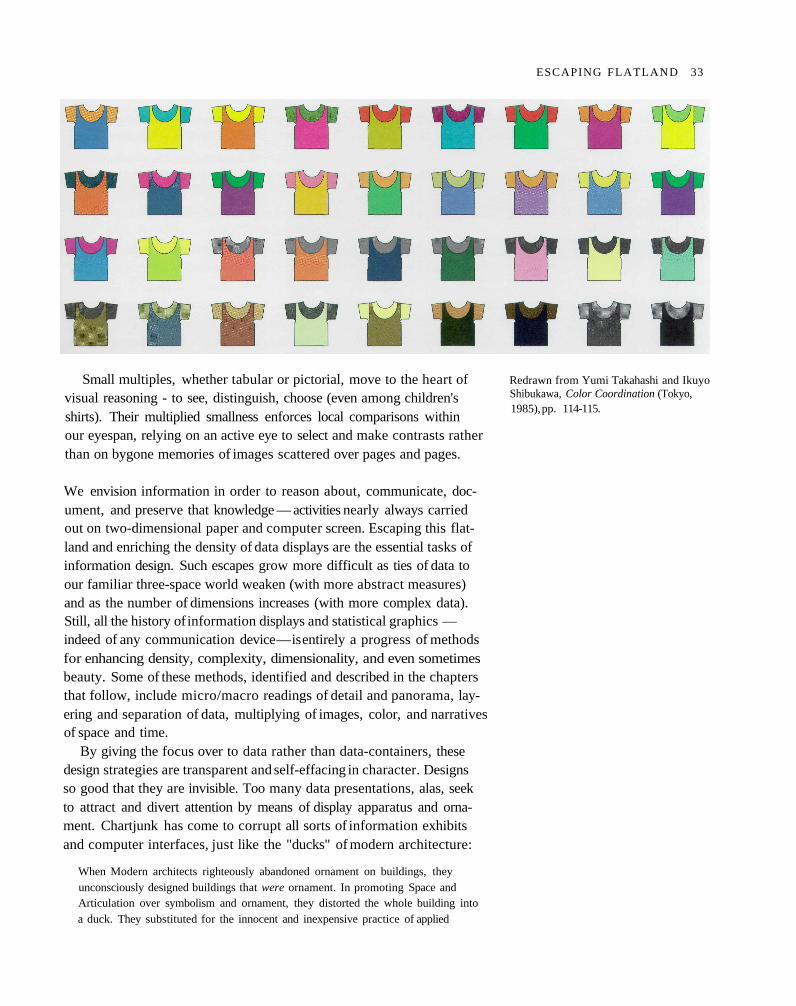
Small multiples, whether tabular or pictorial, move to the heart ofvisual reasoning - to see, distinguish, choose (even among children'sshirts). Their multiplied smallness enforces local comparisons withinour eyespan, relying on an active eye to select and make contrasts ratherthan on bygone memories of images scattered over pages and pages.
We envision information in order to reason about, communicate, doc-ument, and preserve that knowledge — activities nearly always carriedout on two-dimensional paper and computer screen. Escaping this flat-land and enriching the density of data displays are the essential tasks ofinformation design. Such escapes grow more difficult as ties of data toour familiar three-space world weaken (with more abstract measures)and as the number of dimensions increases (with more complex data).Still, all the history of information displays and statistical graphics —indeed of any communication device — is entirely a progress of methodsfor enhancing density, complexity, dimensionality, and even sometimesbeauty. Some of these methods, identified and described in the chaptersthat follow, include micro/macro readings of detail and panorama, lay-ering and separation of data, multiplying of images, color, and narrativesof space and time.
By giving the focus over to data rather than data-containers, thesedesign strategies are transparent and self-effacing in character. Designsso good that they are invisible. Too many data presentations, alas, seekto attract and divert attention by means of display apparatus and orna-ment. Chartjunk has come to corrupt all sorts of information exhibitsand computer interfaces, just like the "ducks" of modern architecture:
When Modern architects righteously abandoned ornament on buildings, theyunconsciously designed buildings that were ornament. In promoting Space andArticulation over symbolism and ornament, they distorted the whole building intoa duck. They substituted for the innocent and inexpensive practice of applied
Redrawn from Yumi Takahashi and IkuyoShibukawa, Color Coordination (Tokyo,1985), pp. 114-115.
ESCAPING FLATLAND 33
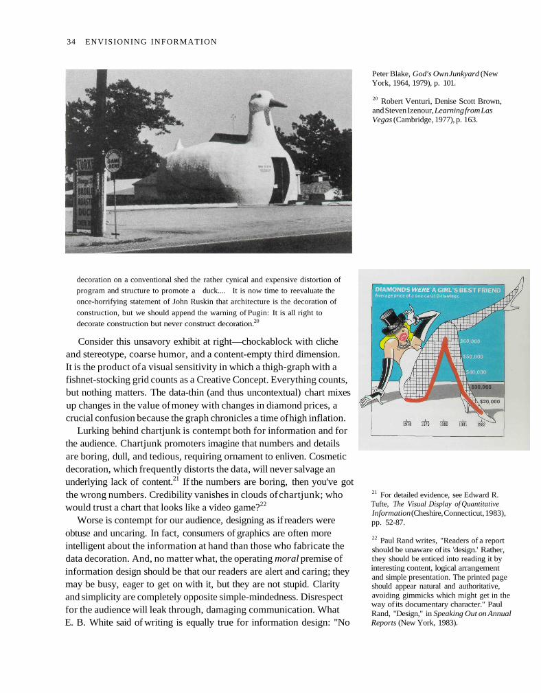
decoration on a conventional shed the rather cynical and expensive distortion ofprogram and structure to promote a duck.... It is now time to reevaluate theonce-horrifying statement of John Ruskin that architecture is the decoration of
construction, but we should append the warning of Pugin: It is all right todecorate construction but never construct decoration.20
Consider this unsavory exhibit at right—chockablock with clicheand stereotype, coarse humor, and a content-empty third dimension.It is the product of a visual sensitivity in which a thigh-graph with afishnet-stocking grid counts as a Creative Concept. Everything counts,but nothing matters. The data-thin (and thus uncontextual) chart mixesup changes in the value of money with changes in diamond prices, acrucial confusion because the graph chronicles a time of high inflation.
Lurking behind chartjunk is contempt both for information and forthe audience. Chartjunk promoters imagine that numbers and detailsare boring, dull, and tedious, requiring ornament to enliven. Cosmeticdecoration, which frequently distorts the data, will never salvage anunderlying lack of content.21 If the numbers are boring, then you've gotthe wrong numbers. Credibility vanishes in clouds of chartjunk; whowould trust a chart that looks like a video game?22
Worse is contempt for our audience, designing as if readers wereobtuse and uncaring. In fact, consumers of graphics are often moreintelligent about the information at hand than those who fabricate thedata decoration. And, no matter what, the operating moral premise ofinformation design should be that our readers are alert and caring; theymay be busy, eager to get on with it, but they are not stupid. Clarityand simplicity are completely opposite simple-mindedness. Disrespectfor the audience will leak through, damaging communication. WhatE. B. White said of writing is equally true for information design: "No
Peter Blake, God's Own Junkyard (NewYork, 1964, 1979), p. 101.
20 Robert Venturi, Denise Scott Brown,and Steven Izenour, Learning from LasVegas (Cambridge, 1977), p. 163.
21 For detailed evidence, see Edward R.Tufte, The Visual Display of QuantitativeInformation (Cheshire, Connecticut, 1983),pp. 52-87.
22 Paul Rand writes, "Readers of a reportshould be unaware of its 'design.' Rather,they should be enticed into reading it byinteresting content, logical arrangementand simple presentation. The printed pageshould appear natural and authoritative,avoiding gimmicks which might get in theway of its documentary character." PaulRand, "Design," in Speaking Out on AnnualReports (New York, 1983).
34 ENVISIONING INFORMATION
one can write decently who is distrustful of the reader's intelligence, orwhose attitude is patronizing."23
Standards of excellence for information design are set by high qualitymaps, with diverse bountiful detail, several layers of close reading com-bined with an overview, and rigorous data from engineering surveys.In contrast, the usual chartjunk performances look more like postersthan maps. Posters are meant for viewing from a distance, with theirstrong images, large type, and thin data densities. Thus poster designprovides very little counsel for making diagrams that are read moreintensely. Display of closely-read data surely requires the skilled craftof good graphic and poster design: typography, object representation,layout, color, production techniques, and visual principles that informcriticism and revision. Too often those skills are accompanied by theideology of chartjunk and data posterization; excellence in presentinginformation requires mastering the craft and spurning the ideology. 24
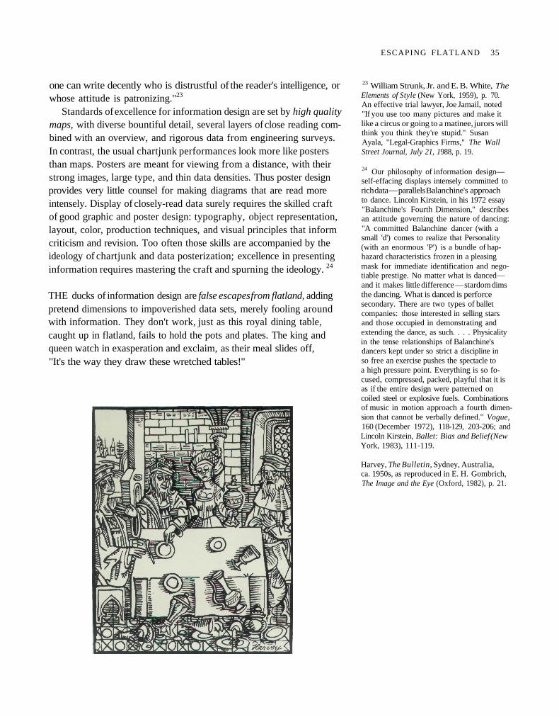
THE ducks of information design are false escapes from flatland, addingpretend dimensions to impoverished data sets, merely fooling aroundwith information. They don't work, just as this royal dining table,caught up in flatland, fails to hold the pots and plates. The king andqueen watch in exasperation and exclaim, as their meal slides off,"It's the way they draw these wretched tables!"
23 William Strunk, Jr. and E. B. White, TheElements of Style (New York, 1959), p. 70.An effective trial lawyer, Joe Jamail, noted"If you use too many pictures and make itlike a circus or going to a matinee, jurors willthink you think they're stupid." SusanAyala, "Legal-Graphics Firms," The WallStreet Journal, July 21, 1988, p. 19.
24 Our philosophy of information design—self-effacing displays intensely committed torich data — parallels Balanchine's approachto dance. Lincoln Kirstein, in his 1972 essay"Balanchine's Fourth Dimension," describesan attitude governing the nature of dancing:"A committed Balanchine dancer (with asmall 'd') comes to realize that Personality(with an enormous 'P') is a bundle of hap-hazard characteristics frozen in a pleasingmask for immediate identification and nego-tiable prestige. No matter what is danced—and it makes little difference — stardom dimsthe dancing. What is danced is perforcesecondary. There are two types of balletcompanies: those interested in selling starsand those occupied in demonstrating andextending the dance, as such. . . . Physicalityin the tense relationships of Balanchine'sdancers kept under so strict a discipline inso free an exercise pushes the spectacle toa high pressure point. Everything is so fo-cused, compressed, packed, playful that it isas if the entire design were patterned oncoiled steel or explosive fuels. Combinationsof music in motion approach a fourth dimen-sion that cannot be verbally defined." Vogue,160 (December 1972), 118-129, 203-206; andLincoln Kirstein, Ballet: Bias and Belief (NewYork, 1983), 111-119.
Harvey, The Bulletin, Sydney, Australia,ca. 1950s, as reproduced in E. H. Gombrich,The Image and the Eye (Oxford, 1982), p. 21.
ESCAPING FLATLAND 35
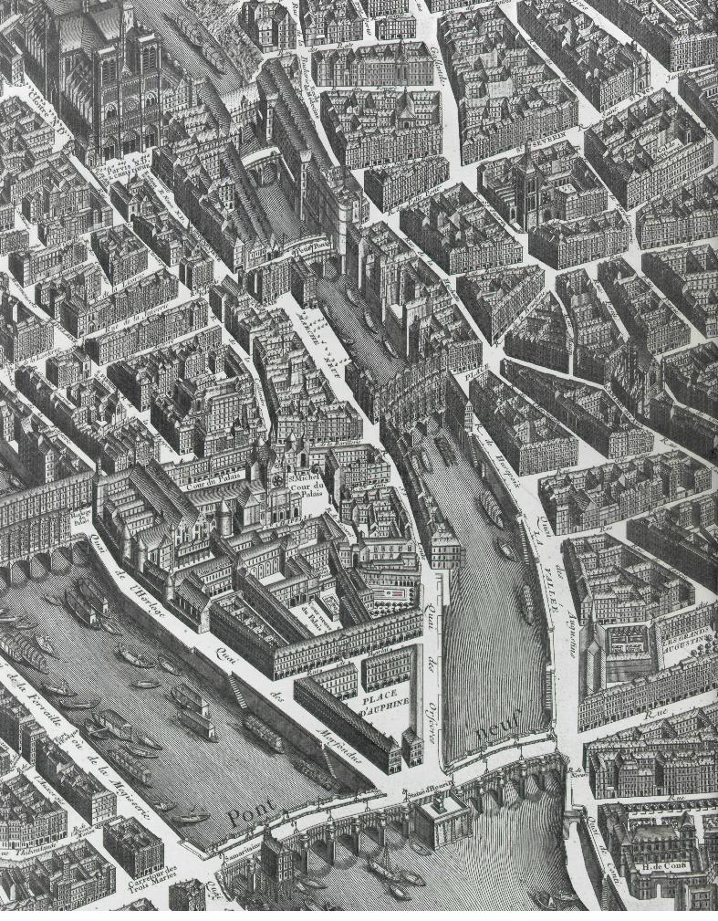
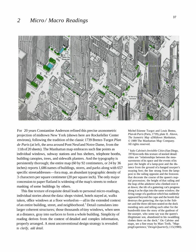
2 Micro / Macro Readings
For 20 years Constantine Anderson refined this precise axonometricprojection of midtown New York (shown here are Rockefeller Centerenvirons), following the tradition of the classic 1739 Bretez-Turgot Plande Paris (at left, the area around Pont Neuf and Notre Dame, from the11th of 20 sheets). The Manhattan map embraces such fine points asindividual windows, subway stations and bus shelters, telephone booths,building canopies, trees, and sidewalk planters. And the typography ispersistently thorough; the entire map (60 by 92 centimeters, or 24 by 36inches) reports 1,686 names of buildings, stores, and parks along with 657specific street addresses — for a map, an abundant typographic density of3 characters per square centimeter (20 per square inch). The only majorconcession to paper flatland is widening of the map's streets to reducemasking of some buildings by others.
This fine texture of exquisite detail leads to personal micro-readings,individual stories about the data: shops visited, hotels stayed at, walkstaken, office windows at a floor worked on — all in the extended contextof an entire building, street, and neighborhood.1 Detail cumulates intolarger coherent structures; those thousands of tiny windows, when seenat a distance, gray into surfaces to form a whole building. Simplicity ofreading derives from the context of detailed and complex information,properly arranged. A most unconventional design strategy is revealed:to clarify, add detail.
Michel Etienne Turgot and Louis Bretez,Plan de Paris (Paris, 1739), plate II. Above,The Isometric Map of Midtown Manhattan,© 1989 The Manhattan Map Company.All rights reserved.
1 Italo Calvino's Invisible Cities (San Diego,1974) records this texture of storied detail:cities are "relationships between the mea-surements of its space and the events of itspast: the height of a lamp-post and the dis-tance from the ground of a hanged usurper'sswaying feet; the line strung from the lamp-post to the railing opposite and the festoonsthat decorate the course of the queen's nup-tial procession; the height of that railing andthe leap of the adulterer who climbed over itat dawn; the tilt of a guttering cat's progressalong it as he slips into the same window; thefiring range of a gunboat which has suddenlyappeared beyond the cape and the bomb thatdestroys the guttering; the rips in the fish-net and the three old men seated on the dockmending nets and telling each other for thehundredth time the story of the gunboat ofthe usurper, who some say was the queen'sillegitimate son, abandoned in his swaddlingclothes there on the dock." On Calvino andmaps, see a fine essay by Marc Treib, "Map-ping Experience," Design Quarterly, 115 (1980).
37
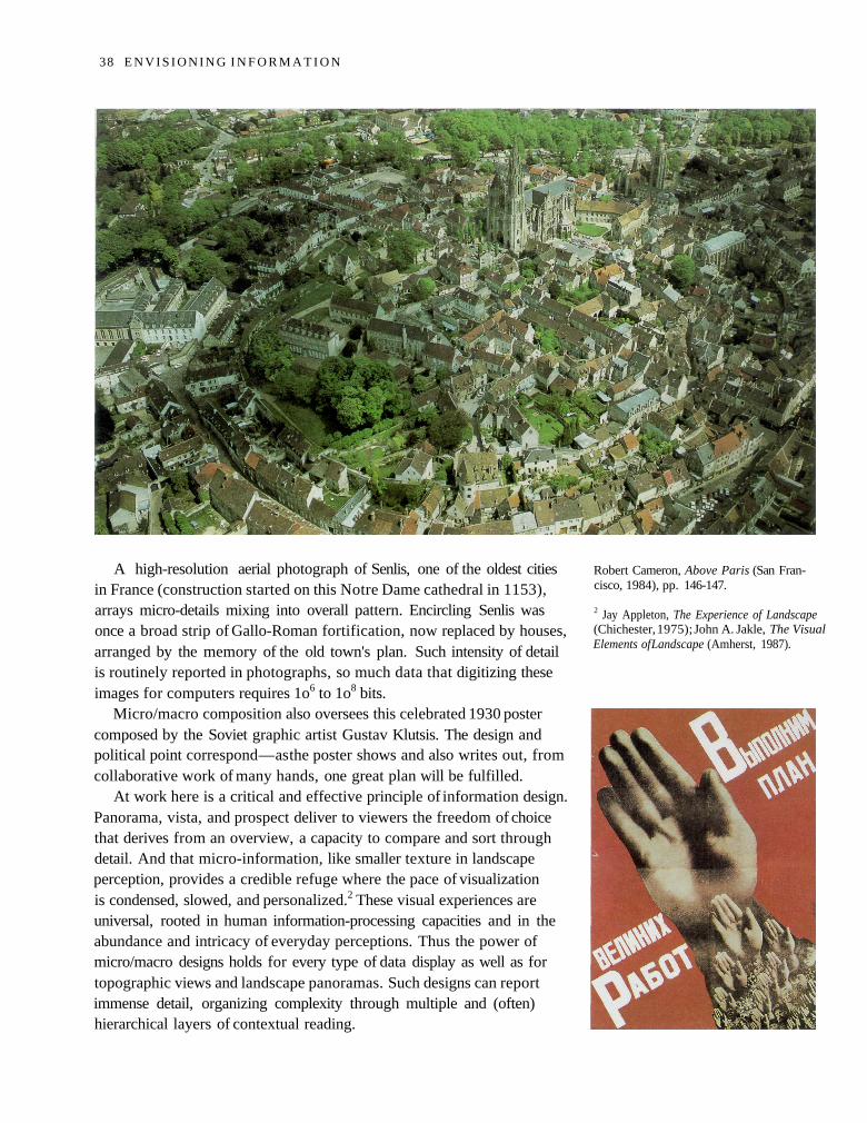
A high-resolution aerial photograph of Senlis, one of the oldest citiesin France (construction started on this Notre Dame cathedral in 1153),arrays micro-details mixing into overall pattern. Encircling Senlis wasonce a broad strip of Gallo-Roman fortification, now replaced by houses,arranged by the memory of the old town's plan. Such intensity of detailis routinely reported in photographs, so much data that digitizing theseimages for computers requires 1o6 to 1o8 bits.
Micro/macro composition also oversees this celebrated 1930 postercomposed by the Soviet graphic artist Gustav Klutsis. The design andpolitical point correspond — as the poster shows and also writes out, fromcollaborative work of many hands, one great plan will be fulfilled.
At work here is a critical and effective principle of information design.Panorama, vista, and prospect deliver to viewers the freedom of choicethat derives from an overview, a capacity to compare and sort throughdetail. And that micro-information, like smaller texture in landscapeperception, provides a credible refuge where the pace of visualizationis condensed, slowed, and personalized.2 These visual experiences areuniversal, rooted in human information-processing capacities and in theabundance and intricacy of everyday perceptions. Thus the power ofmicro/macro designs holds for every type of data display as well as fortopographic views and landscape panoramas. Such designs can reportimmense detail, organizing complexity through multiple and (often)hierarchical layers of contextual reading.
Robert Cameron, Above Paris (San Fran-cisco, 1984), pp. 146-147.
2 Jay Appleton, The Experience of Landscape(Chichester, 1975); John A. Jakle, The VisualElements of Landscape (Amherst, 1987).
38 E N V I S I O N I N G I N F O R M A T I O N
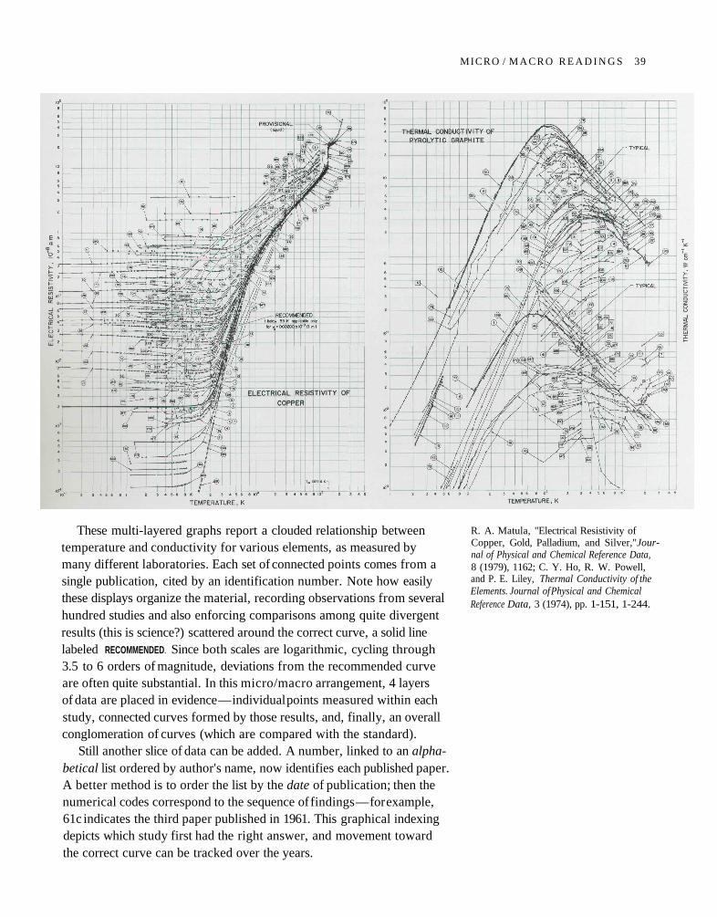
These multi-layered graphs report a clouded relationship betweentemperature and conductivity for various elements, as measured bymany different laboratories. Each set of connected points comes from asingle publication, cited by an identification number. Note how easilythese displays organize the material, recording observations from severalhundred studies and also enforcing comparisons among quite divergentresults (this is science?) scattered around the correct curve, a solid linelabeled RECOMMENDED. Since both scales are logarithmic, cycling through3.5 to 6 orders of magnitude, deviations from the recommended curveare often quite substantial. In this micro/macro arrangement, 4 layersof data are placed in evidence — individual points measured within eachstudy, connected curves formed by those results, and, finally, an overallconglomeration of curves (which are compared with the standard).
Still another slice of data can be added. A number, linked to an alpha-betical list ordered by author's name, now identifies each published paper.A better method is to order the list by the date of publication; then thenumerical codes correspond to the sequence of findings — for example,61c indicates the third paper published in 1961. This graphical indexingdepicts which study first had the right answer, and movement towardthe correct curve can be tracked over the years.
R. A. Matula, "Electrical Resistivity ofCopper, Gold, Palladium, and Silver,"Jour-nal of Physical and Chemical Reference Data,8 (1979), 1162; C. Y. Ho, R. W. Powell,and P. E. Liley, Thermal Conductivity of theElements. Journal of Physical and ChemicalReference Data, 3 (1974), pp. 1-151, 1-244.
MICRO / M A C R O R E A D I N G S 39
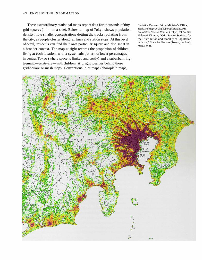
These extraordinary statistical maps report data for thousands of tinygrid squares (1 km on a side). Below, a map of Tokyo shows populationdensity; note smaller concentrations dotting the tracks radiating fromthe city, as people cluster along rail lines and station stops. At this levelof detail, residents can find their own particular square and also see it ina broader context. The map at right records the proportion of childrenliving at each location, with a systematic pattern of lower percentagesin central Tokyo (where space is limited and costly) and a suburban ringteeming — relatively — with children. A bright idea lies behind thesegrid-square or mesh maps. Conventional blot maps (choropleth maps,
Statistics Bureau, Prime Minister's Office,Statistical Maps on Grid Square Basis: The 1980Population Census Results (Tokyo, 1985). SeeHidenori Kimura, "Grid Square Statistics forthe Distribution and Mobility of Populationin Japan," Statistics Bureau (Tokyo, no date),manuscript.
4O E N V I S I O N I N G I N F O R M A T I O N
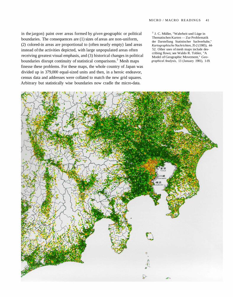
in the jargon) paint over areas formed by given geographic or politicalboundaries. The consequences are (1) sizes of areas are non-uniform,(2) colored-in areas are proportional to (often nearly empty) land areasinstead of the activities depicted, with large unpopulated areas oftenreceiving greatest visual emphasis, and (3) historical changes in politicalboundaries disrupt continuity of statistical comparisons.3 Mesh mapsfinesse these problems. For these maps, the whole country of Japan wasdivided up in 379,000 equal-sized units and then, in a heroic endeavor,census data and addresses were collated to match the new grid squares.Arbitrary but statistically wise boundaries now cradle the micro-data.
3 J. C. Müller, "Wahrheit und Lüge inThematischen Karten — Zur Problematikder Darstellung Statistischer Sachverhalte,"Kartographische Nachrichten, 35-2 (1985), 44-52. Other uses of mesh maps include des-cribing flows; see Waldo R. Tobler, "AModel of Geographic Movement," Geo-graphical Analysis, 13 (January 1981), 1-19.
MICRO / MACRO R E A D I N G S 41
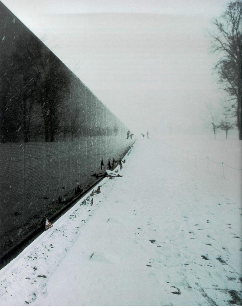
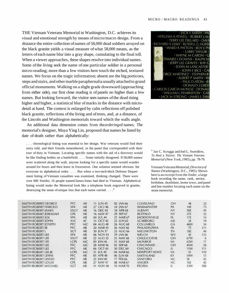
THE Vietnam Veterans Memorial in Washington, D.C. achieves itsvisual and emotional strength by means of micro/macro design. From adistance the entire collection of names of 58,000 dead soldiers arrayed onthe black granite yields a visual measure of what 58,000 means, as theletters of each name blur into a gray shape, cumulating to the final toll.When a viewer approaches, these shapes resolve into individual names.Some of the living seek the name of one particular soldier in a personalmicro-reading; more than a few visitors here touch the etched, texturednames. We focus on the tragic information; absent are the big porticoes,steps and stairs, and other marble paraphernalia usually attached to grandofficial monuments. Walking on a slight grade downward (approachingfrom either side), our first close reading is of panels no higher than a fewnames. But looking forward, the visitor sees names of the dead risinghigher and higher, a statistical blur of marks in the distance with micro-detail at hand. The context is enlarged by calm reflections off polishedblack granite, reflections of the living and of trees, and, at a distance, ofthe Lincoln and Washington memorials toward which the walls angle.
An additional data dimension comes from the ordering of names. Thememorial's designer, Maya Ying Lin, proposed that names be listed bydate of death rather than alphabetically:
. . . chronological listing was essential to her design. War veterans would find theirstory told, and their friends remembered, in the panel that corresponded with theirtour of duty in Vietnam. Locating specific names with the aid of a directory wouldbe like finding bodies on a battlefield. . . . Some initially disagreed. If 58,000 names
were scattered along the wall, anyone looking for a specific name would wanderaround for hours and then leave in frustration. One solution seemed obvious: listeveryone in alphabetical order. . . . But when a two-inch-thick Defense Depart-ment listing of Vietnam casualties was examined, thinking changed. There wereover 600 Smiths; 16 people named James Jones had died in Vietnam. Alphabeticallisting would make the Memorial look like a telephone book engraved in granite,destroying the sense of unique loss that each name carried. . . .4
4 Jan C. Scruggs and Joel L. Swerdlow,To Heal a Nation: The Vietnam VeteransMemorial (New York, 1985), pp. 78-79.
Vietnam Veterans Memorial, Directory ofNames (Washington, D.C., 1985). Shownhere is an excerpt from the finder, a largebook recording the name, rank, service,birthdate, deathdate, home town, and paneland line number locating each name on thestone memorial.
MICRO / MACRO R E A D I N G S 43
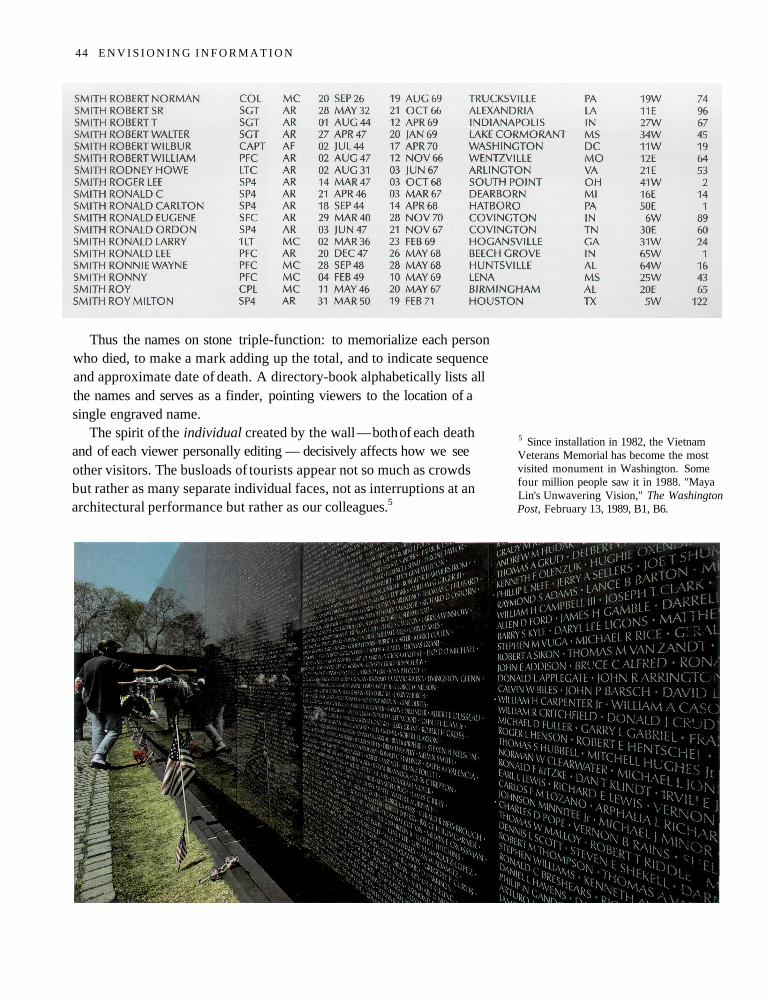
Thus the names on stone triple-function: to memorialize each personwho died, to make a mark adding up the total, and to indicate sequenceand approximate date of death. A directory-book alphabetically lists allthe names and serves as a finder, pointing viewers to the location of asingle engraved name.
The spirit of the individual created by the wall — both of each deathand of each viewer personally editing — decisively affects how we seeother visitors. The busloads of tourists appear not so much as crowdsbut rather as many separate individual faces, not as interruptions at anarchitectural performance but rather as our colleagues.5
5 Since installation in 1982, the VietnamVeterans Memorial has become the mostvisited monument in Washington. Somefour million people saw it in 1988. "MayaLin's Unwavering Vision," The WashingtonPost, February 13, 1989, B1, B6.
44 E N V I S I O N I N G I N F O R M A T I O N
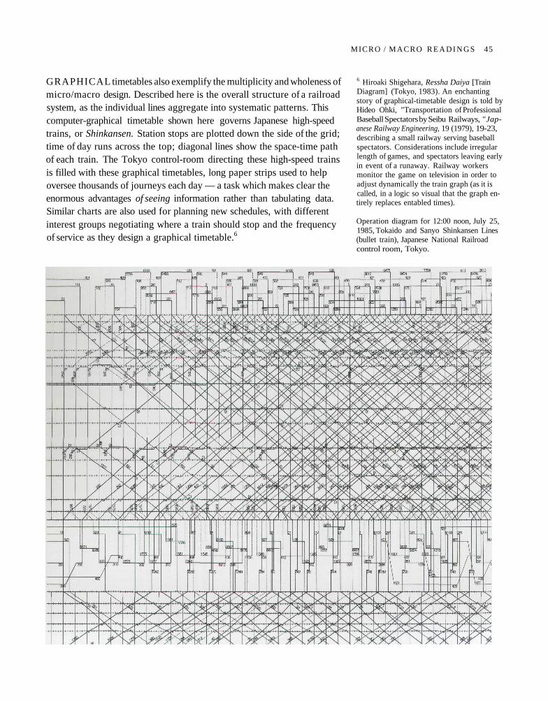
GRAPHICAL timetables also exemplify the multiplicity and wholeness ofmicro/macro design. Described here is the overall structure of a railroadsystem, as the individual lines aggregate into systematic patterns. Thiscomputer-graphical timetable shown here governs Japanese high-speedtrains, or Shinkansen. Station stops are plotted down the side of the grid;time of day runs across the top; diagonal lines show the space-time pathof each train. The Tokyo control-room directing these high-speed trainsis filled with these graphical timetables, long paper strips used to helpoversee thousands of journeys each day — a task which makes clear theenormous advantages of seeing information rather than tabulating data.Similar charts are also used for planning new schedules, with differentinterest groups negotiating where a train should stop and the frequencyof service as they design a graphical timetable.6
6 Hiroaki Shigehara, Ressha Daiya [TrainDiagram] (Tokyo, 1983). An enchantingstory of graphical-timetable design is told byHideo Ohki, "Transportation of ProfessionalBaseball Spectators by Seibu Railways, "Jap-anese Railway Engineering, 19 (1979), 19-23,describing a small railway serving baseballspectators. Considerations include irregularlength of games, and spectators leaving earlyin event of a runaway. Railway workersmonitor the game on television in order toadjust dynamically the train graph (as it iscalled, in a logic so visual that the graph en-tirely replaces entabled times).
Operation diagram for 12:00 noon, July 25,1985, Tokaido and Sanyo Shinkansen Lines(bullet train), Japanese National Railroadcontrol room, Tokyo.
MICRO / M A C R O R E A D I N G S 45
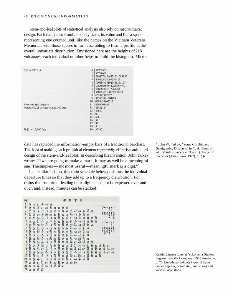
Stem-and-leaf plots of statistical analysis also rely on micro/macrodesign. Each data point simultaneously states its value and fills a spacerepresenting one counted unit, like the names on the Vietnam VeteransMemorial, with those spaces in turn assembling to form a profile of theoverall univariate distribution. Envisioned here are the heights of 218volcanoes; each individual number helps to build the histogram. Micro-
data has replaced the information-empty bars of a traditional barchart.This idea of making each graphical element repeatedly effective animateddesign of the stem-and-leaf plot. In describing his invention, John Tukeywrote: "If we are going to make a mark, it may as well be a meaningfulone. The simplest — and most useful — meaningful mark is a digit."7
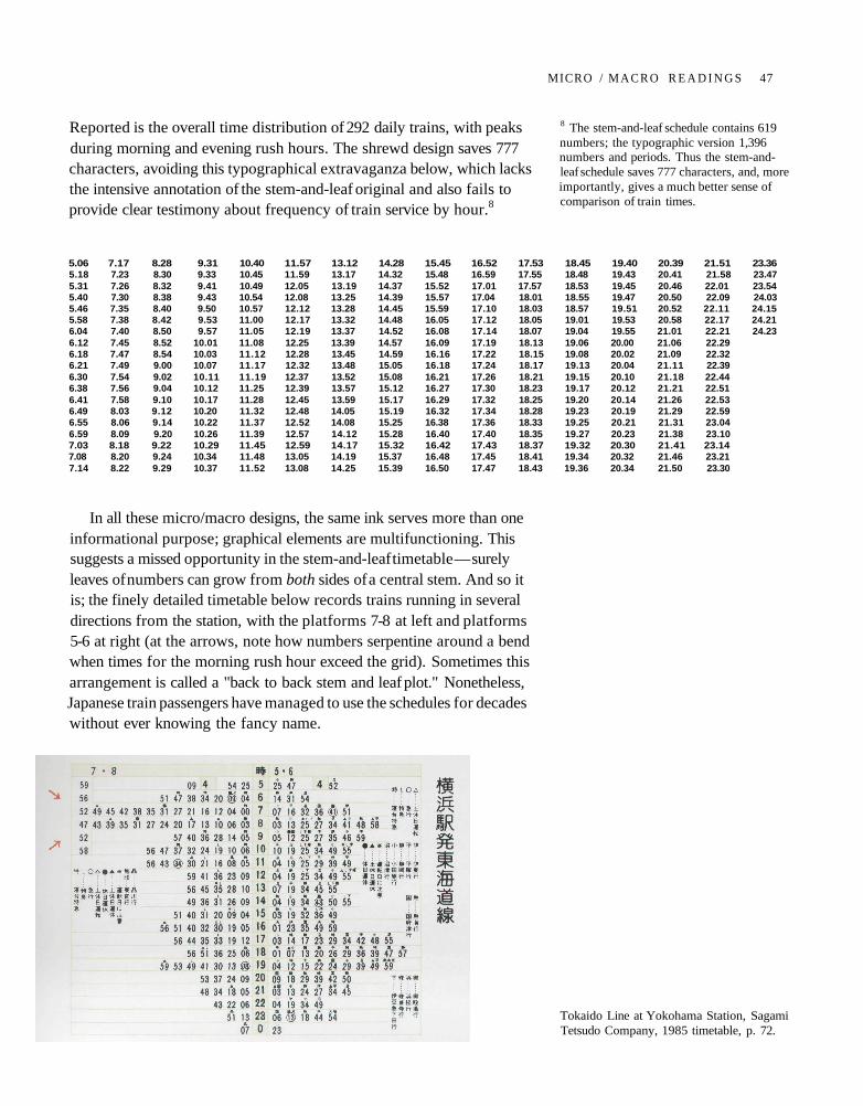
In a similar fashion, this train schedule below positions the individualdeparture times so that they add up to a frequency distribution. Fortrains that run often, leading hour-digits need not be repeated over andover, and, instead, minutes can be stacked:
7 John W. Tukey, "Some Graphic andSemigraphic Displays," in T. A. Bancroft,ed., Statistical Papers in Honor of George W.Snedecor (Ames, Iowa, 1972), p. 296.
Keihin Express Line at Yokohama Station,Sagami Tetsudo Company, 1985 timetable,p. 76. Encodings indicate types of trains(super express, commuter, and so on) andvarious local stops.
46 E N V I S I O N I N G I N F O R M A T I O N
Reported is the overall time distribution of 292 daily trains, with peaksduring morning and evening rush hours. The shrewd design saves 777characters, avoiding this typographical extravaganza below, which lacksthe intensive annotation of the stem-and-leaf original and also fails toprovide clear testimony about frequency of train service by hour.8
In all these micro/macro designs, the same ink serves more than oneinformational purpose; graphical elements are multifunctioning. Thissuggests a missed opportunity in the stem-and-leaf timetable — surelyleaves of numbers can grow from both sides of a central stem. And so itis; the finely detailed timetable below records trains running in severaldirections from the station, with the platforms 7-8 at left and platforms5-6 at right (at the arrows, note how numbers serpentine around a bendwhen times for the morning rush hour exceed the grid). Sometimes thisarrangement is called a "back to back stem and leaf plot." Nonetheless,Japanese train passengers have managed to use the schedules for decadeswithout ever knowing the fancy name.
5.06 7.17 8.28 9.31 10.40 11.57 13.12 14.28 15.45 16.52 17.53 18.45 19.40 20.39 21.51 23.365.18 7.23 8.30 9.33 10.45 11.59 13.17 14.32 15.48 16.59 17.55 18.48 19.43 20.41 21.58 23.475.31 7.26 8.32 9.41 10.49 12.05 13.19 14.37 15.52 17.01 17.57 18.53 19.45 20.46 22.01 23.545.40 7.30 8.38 9.43 10.54 12.08 13.25 14.39 15.57 17.04 18.01 18.55 19.47 20.50 22.09 24.035.46 7.35 8.40 9.50 10.57 12.12 13.28 14.45 15.59 17.10 18.03 18.57 19.51 20.52 22.11 24.155.58 7.38 8.42 9.53 11.00 12.17 13.32 14.48 16.05 17.12 18.05 19.01 19.53 20.58 22.17 24.216.04 7.40 8.50 9.57 11.05 12.19 13.37 14.52 16.08 17.14 18.07 19.04 19.55 21.01 22.21 24.236.12 7.45 8.52 10.01 11.08 12.25 13.39 14.57 16.09 17.19 18.13 19.06 20.00 21.06 22.296.18 7.47 8.54 10.03 11.12 12.28 13.45 14.59 16.16 17.22 18.15 19.08 20.02 21.09 22.326.21 7.49 9.00 10.07 11.17 12.32 13.48 15.05 16.18 17.24 18.17 19.13 20.04 21.11 22.396.30 7.54 9.02 10.11 11.19 12.37 13.52 15.08 16.21 17.26 18.21 19.15 20.10 21.18 22.446.38 7.56 9.04 10.12 11.25 12.39 13.57 15.12 16.27 17.30 18.23 19.17 20.12 21.21 22.516.41 7.58 9.10 10.17 11.28 12.45 13.59 15.17 16.29 17.32 18.25 19.20 20.14 21.26 22.536.49 8.03 9.12 10.20 11.32 12.48 14.05 15.19 16.32 17.34 18.28 19.23 20.19 21.29 22.596.55 8.06 9.14 10.22 11.37 12.52 14.08 15.25 16.38 17.36 18.33 19.25 20.21 21.31 23.046.59 8.09 9.20 10.26 11.39 12.57 14.12 15.28 16.40 17.40 18.35 19.27 20.23 21.38 23.107.03 8.18 9.22 10.29 11.45 12.59 14.17 15.32 16.42 17.43 18.37 19.32 20.30 21.41 23.147.08 8.20 9.24 10.34 11.48 13.05 14.19 15.37 16.48 17.45 18.41 19.34 20.32 21.46 23.217.14 8.22 9.29 10.37 11.52 13.08 14.25 15.39 16.50 17.47 18.43 19.36 20.34 21.50 23.30
8 The stem-and-leaf schedule contains 619numbers; the typographic version 1,396numbers and periods. Thus the stem-and-leaf schedule saves 777 characters, and, moreimportantly, gives a much better sense ofcomparison of train times.
Tokaido Line at Yokohama Station, SagamiTetsudo Company, 1985 timetable, p. 72.
MICRO / M A C R O R E A D I N G S 47
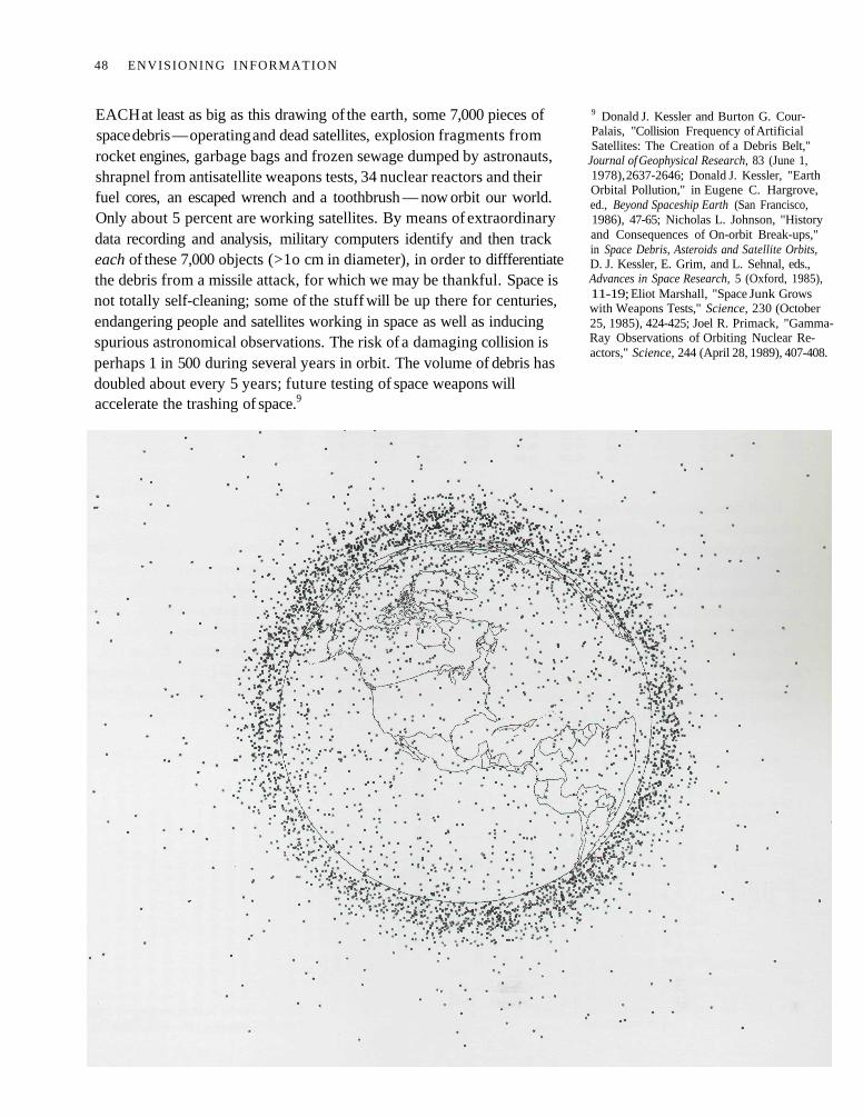
EACH at least as big as this drawing of the earth, some 7,000 pieces ofspace debris — operating and dead satellites, explosion fragments fromrocket engines, garbage bags and frozen sewage dumped by astronauts,shrapnel from antisatellite weapons tests, 34 nuclear reactors and theirfuel cores, an escaped wrench and a toothbrush — now orbit our world.Only about 5 percent are working satellites. By means of extraordinarydata recording and analysis, military computers identify and then trackeach of these 7,000 objects (>1o cm in diameter), in order to diffferentiatethe debris from a missile attack, for which we may be thankful. Space isnot totally self-cleaning; some of the stuff will be up there for centuries,endangering people and satellites working in space as well as inducingspurious astronomical observations. The risk of a damaging collision isperhaps 1 in 500 during several years in orbit. The volume of debris hasdoubled about every 5 years; future testing of space weapons willaccelerate the trashing of space.9
9 Donald J. Kessler and Burton G. Cour-Palais, "Collision Frequency of ArtificialSatellites: The Creation of a Debris Belt,"
Journal of Geophysical Research, 83 (June 1,1978), 2637-2646; Donald J. Kessler, "EarthOrbital Pollution," in Eugene C. Hargrove,ed., Beyond Spaceship Earth (San Francisco,1986), 47-65; Nicholas L. Johnson, "Historyand Consequences of On-orbit Break-ups,"in Space Debris, Asteroids and Satellite Orbits,D. J. Kessler, E. Grim, and L. Sehnal, eds.,Advances in Space Research, 5 (Oxford, 1985),11-19; Eliot Marshall, "Space Junk Growswith Weapons Tests," Science, 230 (October25, 1985), 424-425; Joel R. Primack, "Gamma-Ray Observations of Orbiting Nuclear Re-actors," Science, 244 (April 28, 1989), 407-408.
48 ENVISIONING INFORMATION
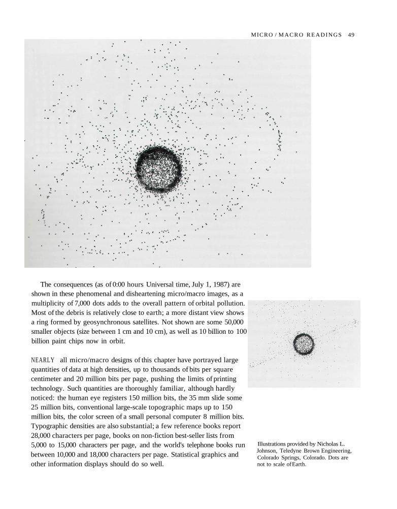
The consequences (as of 0:00 hours Universal time, July 1, 1987) areshown in these phenomenal and disheartening micro/macro images, as amultiplicity of 7,000 dots adds to the overall pattern of orbital pollution.Most of the debris is relatively close to earth; a more distant view showsa ring formed by geosynchronous satellites. Not shown are some 50,000smaller objects (size between 1 cm and 10 cm), as well as 10 billion to 100billion paint chips now in orbit.
NEARLY all micro/macro designs of this chapter have portrayed largequantities of data at high densities, up to thousands of bits per squarecentimeter and 20 million bits per page, pushing the limits of printingtechnology. Such quantities are thoroughly familiar, although hardlynoticed: the human eye registers 150 million bits, the 35 mm slide some25 million bits, conventional large-scale topographic maps up to 150million bits, the color screen of a small personal computer 8 million bits.Typographic densities are also substantial; a few reference books report28,000 characters per page, books on non-fiction best-seller lists from5,000 to 15,000 characters per page, and the world's telephone books runbetween 10,000 and 18,000 characters per page. Statistical graphics andother information displays should do so well.
Illustrations provided by Nicholas L.Johnson, Teledyne Brown Engineering,Colorado Springs, Colorado. Dots arenot to scale of Earth.
MICRO / M A C R O R E A D I N G S 49
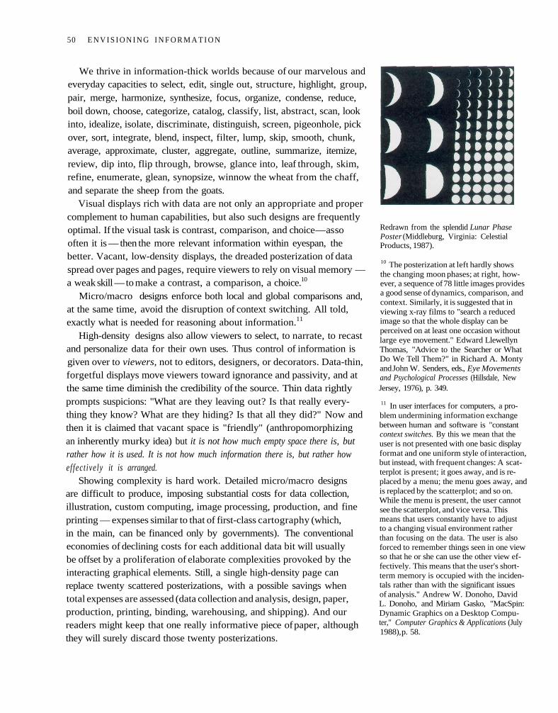
We thrive in information-thick worlds because of our marvelous andeveryday capacities to select, edit, single out, structure, highlight, group,pair, merge, harmonize, synthesize, focus, organize, condense, reduce,boil down, choose, categorize, catalog, classify, list, abstract, scan, lookinto, idealize, isolate, discriminate, distinguish, screen, pigeonhole, pickover, sort, integrate, blend, inspect, filter, lump, skip, smooth, chunk,average, approximate, cluster, aggregate, outline, summarize, itemize,review, dip into, flip through, browse, glance into, leaf through, skim,refine, enumerate, glean, synopsize, winnow the wheat from the chaff,and separate the sheep from the goats.
Visual displays rich with data are not only an appropriate and propercomplement to human capabilities, but also such designs are frequentlyoptimal. If the visual task is contrast, comparison, and choice — as sooften it is — then the more relevant information within eyespan, thebetter. Vacant, low-density displays, the dreaded posterization of dataspread over pages and pages, require viewers to rely on visual memory —a weak skill — to make a contrast, a comparison, a choice.10
Micro/macro designs enforce both local and global comparisons and,at the same time, avoid the disruption of context switching. All told,exactly what is needed for reasoning about information.11
High-density designs also allow viewers to select, to narrate, to recastand personalize data for their own uses. Thus control of information isgiven over to viewers, not to editors, designers, or decorators. Data-thin,forgetful displays move viewers toward ignorance and passivity, and atthe same time diminish the credibility of the source. Thin data rightlyprompts suspicions: "What are they leaving out? Is that really every-thing they know? What are they hiding? Is that all they did?" Now andthen it is claimed that vacant space is "friendly" (anthropomorphizingan inherently murky idea) but it is not how much empty space there is, butrather how it is used. It is not how much information there is, but rather howeffectively it is arranged.
Showing complexity is hard work. Detailed micro/macro designsare difficult to produce, imposing substantial costs for data collection,illustration, custom computing, image processing, production, and fineprinting — expenses similar to that of first-class cartography (which,in the main, can be financed only by governments). The conventionaleconomies of declining costs for each additional data bit will usuallybe offset by a proliferation of elaborate complexities provoked by theinteracting graphical elements. Still, a single high-density page canreplace twenty scattered posterizations, with a possible savings whentotal expenses are assessed (data collection and analysis, design, paper,production, printing, binding, warehousing, and shipping). And ourreaders might keep that one really informative piece of paper, althoughthey will surely discard those twenty posterizations.
Redrawn from the splendid Lunar PhasePoster (Middleburg, Virginia: CelestialProducts, 1987).
10 The posterization at left hardly showsthe changing moon phases; at right, how-ever, a sequence of 78 little images providesa good sense of dynamics, comparison, andcontext. Similarly, it is suggested that inviewing x-ray films to "search a reducedimage so that the whole display can beperceived on at least one occasion withoutlarge eye movement." Edward LlewellynThomas, "Advice to the Searcher or WhatDo We Tell Them?" in Richard A. Montyand John W. Senders, eds., Eye Movementsand Psychological Processes (Hillsdale, NewJersey, 1976), p. 349.
11 In user interfaces for computers, a pro-blem undermining information exchangebetween human and software is "constantcontext switches. By this we mean that theuser is not presented with one basic displayformat and one uniform style of interaction,but instead, with frequent changes: A scat-terplot is present; it goes away, and is re-placed by a menu; the menu goes away, andis replaced by the scatterplot; and so on.While the menu is present, the user cannotsee the scatterplot, and vice versa. Thismeans that users constantly have to adjustto a changing visual environment ratherthan focusing on the data. The user is alsoforced to remember things seen in one viewso that he or she can use the other view ef-fectively. This means that the user's short-term memory is occupied with the inciden-tals rather than with the significant issuesof analysis." Andrew W. Donoho, DavidL. Donoho, and Miriam Gasko, "MacSpin:Dynamic Graphics on a Desktop Compu-ter," Computer Graphics & Applications (July1988), p. 58.
50 E N V I S I O N I N G I N F O R M A T I O N
What about confusing clutter? Information overload? Doesn't datahave to be "boiled down" and "simplified"? These common questionsmiss the point, for the quantity of detail is an issue completely separatefrom the difficulty of reading. Clutter and confusion are failures of design,not attributes of information. Often the less complex and less subtle theline, the more ambiguous and less interesting is the reading. Strippingthe detail out of data is a style based on personal preference and fashion,considerations utterly indifferent to substantive content. What JosefAlbers wrote about typography is true for information design:
The concept that "the simpler the form of a letter the simpler its reading" was anobsession of beginning constructivism. It became something like a dogma, and isstill followed by "modernistic" typographers.
This notion has proved to be wrong, because in reading we do not read letters butwords, words as a whole, as a "word picture." Ophthalmology has disclosed thatthe more the letters are differentiated from each other, the easier is the reading.
Without going into comparisons and the details, it should be realized that wordsconsisting of only capital letters present the most difficult reading — because of theirequal height, equal volume, and, with most, their equal width. When comparingserif letters with sans-serif, the latter provide an uneasy reading. The fashionablepreference for sans-serif in text shows neither historical nor practical competence.12
So much for the conventional, facile, and false equation: simplenessof data and design = clarity of reading. Simpleness is another aestheticpreference, not an information display strategy, not a guide to clarity.What we seek instead is a rich texture of data, a comparative context,an understanding of complexity revealed with an economy of means.
Robert Venturi opens his Complexity and Contradiction in Architecturewith a broad extension of Albers' point:
I like complexity and contradiction in architecture.... I speak of a complex andcontradictory architecture based on the richness and ambiguity of modern experi-ence, including that experience which is inherent in art. Everywhere, except inarchitecture, complexity and contradiction have been acknowledged, from Gödel'sproof of inconsistency in mathematics to T. S. Eliot's analysis of "difficult" poetry
and Joseph Albers' definition of the paradoxical quality of painting.... Architectscan no longer afford to be intimidated by the puritanically moral language of ortho-dox Modern architecture .... an architecture of complexity and contradiction hasa special obligation toward the whole: its truth must be in its totality or its implica-tions of totality. It must embody the difficult unity of inclusion rather than the easyunity of exclusion. . . . Where simplicity cannot work, simpleness results. Blatantsimplification means bland architecture. Less is a bore.13
But, finally, the deepest reason for displays that portray complexityand intricacy is that the worlds we seek to understand are complex andintricate. "God is in the details," said Mies van der Rohe, capturingthe essential quality of micro/macro performances.
12 Josef Albers, Interaction of Color (NewHaven, 1963; revised edition, 1975), p. 4.
13 Robert Venturi, Complexity and Contra-diction in Architecture (New York, 1966),pp. 16-17.
MICRO / M A C R O R E A D I N G S 51
3 Layering and Separation
CONFUSION and clutter are failures of design, not attributes of informa-tion. And so the point is to find design strategies that reveal detail andcomplexity — rather than to fault the data for an excess of complication.Or, worse, to fault viewers for a lack of understanding. Among the mostpowerful devices for reducing noise and enriching the content of displaysis the technique of layering and separation, visually stratifying variousaspects of the data.
Effective layering of information is often difficult; for every excellentperformance, a hundred clunky spectacles arise. An omnipresent, yetsubtle, design issue is involved: the various elements collected togetheron flatland interact, creating non-information patterns and texture sim-ply through their combined presence. Josef Albers described this visualeffect as 1 + 1 = 3 or more, when two elements show themselves alongwith assorted incidental by-products of their partnership — occasionallya basis for pleasing aesthetic effects but always a continuing danger todata exhibits.1 Such patterns become dynamically obtrusive when ourdisplays leave the relative constancy of paper and move to the changingvideo flatland of computer terminals. There, all sorts of unplanned andlushly cluttered interacting combinations turn up, with changing layersof information arrayed in miscellaneous windows surrounded by a frameof system commands and other computer administrative debris.
AT left a second color annotates the brush strokes of the calligrapher,Uboku Nishitani. By creating a distinct layer, the red commentarymaintains detail, coherence, and serenity, in a crisp precision side-by-side with a gestural and expressive black line in this marriage of colorand information. The saturated quality of the red partially offsets itslighter value and finer line (appropriate to meticulous annotation).Alone, each color makes a strong statement; together, a stronger one.
1 Josef Albers, "One Plus One Equals Threeor More: Factual Facts and Actual Facts," inAlbers, Search Versus Re-Search (Hartford,1969), pp. 17-18.
Uboku Nishitani, Koyagire Daiishu [TheFirst Seed of Koyagiri], volume 17 of ShodoGiho Koza [Techniques in Calligraphy](Tokyo, 1972), p. 56. Redrawn.
53
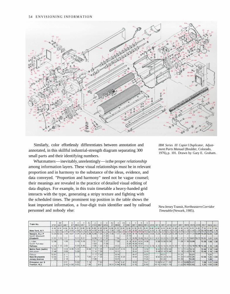
Similarly, color effortlessly differentiates between annotation andannotated, in this skillful industrial-strength diagram separating 300small parts and their identifying numbers.
What matters — inevitably, unrelentingly — is the proper relationshipamong information layers. These visual relationships must be in relevantproportion and in harmony to the substance of the ideas, evidence, anddata conveyed. "Proportion and harmony" need not be vague counsel;their meanings are revealed in the practice of detailed visual editing ofdata displays. For example, in this train timetable a heavy-handed gridinteracts with the type, generating a stripy texture and fighting withthe scheduled times. The prominent top position in the table shows theleast important information, a four-digit train identifier used by railroadpersonnel and nobody else:
IBM Series III Copier I Duplicator, Adjust-ment Parts Manual (Boulder, Colorado,1976), p. 101. Drawn by Gary E. Graham.
New Jersey Transit, Northeastern CorridorTimetable (Newark, 1985).
54 E N V I S I O N I N G I N F O R M A T I O N
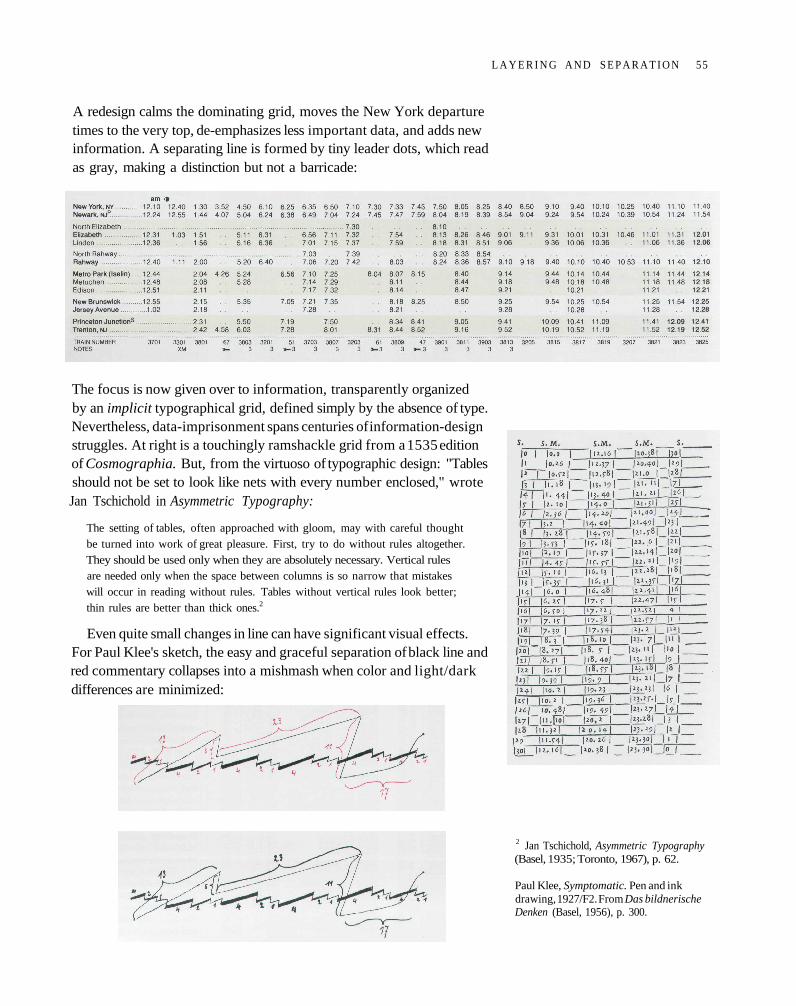
A redesign calms the dominating grid, moves the New York departuretimes to the very top, de-emphasizes less important data, and adds newinformation. A separating line is formed by tiny leader dots, which readas gray, making a distinction but not a barricade:
The focus is now given over to information, transparently organizedby an implicit typographical grid, defined simply by the absence of type.Nevertheless, data-imprisonment spans centuries of information-designstruggles. At right is a touchingly ramshackle grid from a 1535 editionof Cosmographia. But, from the virtuoso of typographic design: "Tablesshould not be set to look like nets with every number enclosed," wroteJan Tschichold in Asymmetric Typography:
The setting of tables, often approached with gloom, may with careful thoughtbe turned into work of great pleasure. First, try to do without rules altogether.They should be used only when they are absolutely necessary. Vertical rulesare needed only when the space between columns is so narrow that mistakeswill occur in reading without rules. Tables without vertical rules look better;thin rules are better than thick ones.2
Even quite small changes in line can have significant visual effects.For Paul Klee's sketch, the easy and graceful separation of black line andred commentary collapses into a mishmash when color and light/darkdifferences are minimized:
2 Jan Tschichold, Asymmetric Typography(Basel, 1935; Toronto, 1967), p. 62.
Paul Klee, Symptomatic. Pen and inkdrawing, 1927/F2. From Das bildnerischeDenken (Basel, 1956), p. 300.
L A Y E R I N G A N D S E P A R A T I O N 55
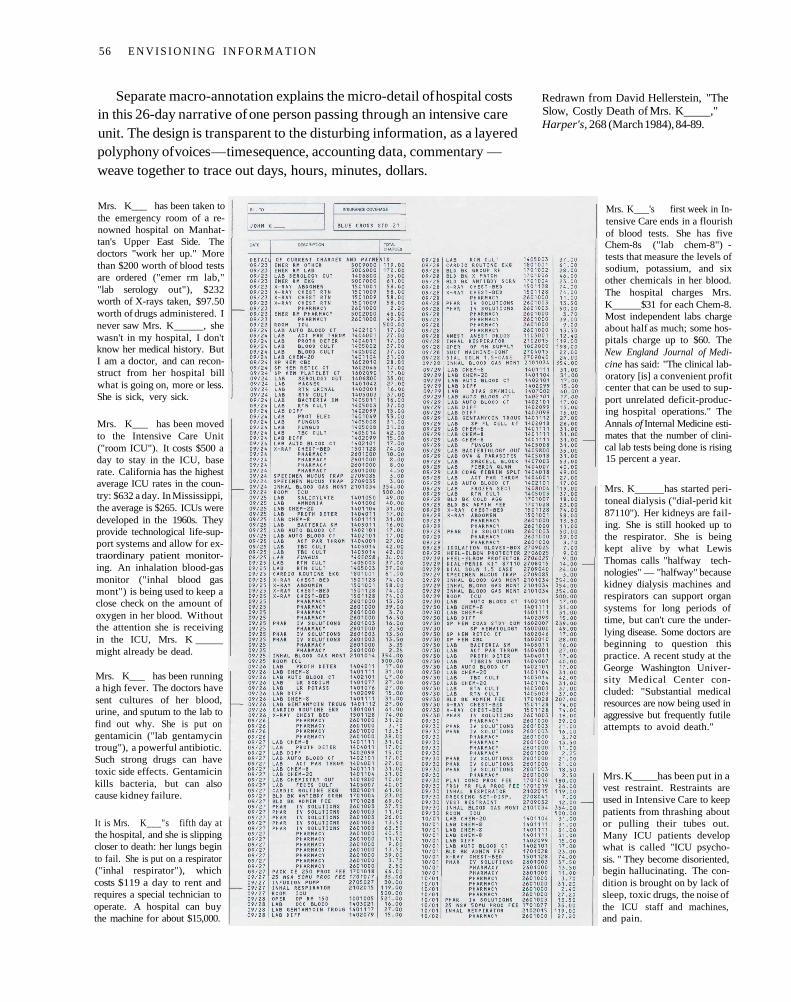
Separate macro-annotation explains the micro-detail of hospital costsin this 26-day narrative of one person passing through an intensive careunit. The design is transparent to the disturbing information, as a layeredpolyphony of voices — time sequence, accounting data, commentary —weave together to trace out days, hours, minutes, dollars.
Redrawn from David Hellerstein, "TheSlow, Costly Death of Mrs. K ,"Harper's, 268 (March 1984), 84-89.
Mrs. K___ has been taken tothe emergency room of a re-nowned hospital on Manhat-tan's Upper East Side. Thedoctors "work her up." Morethan $200 worth of blood testsare ordered ("emer rm lab,""lab serology out"), $232worth of X-rays taken, $97.50worth of drugs administered. Inever saw Mrs. K , shewasn't in my hospital, I don'tknow her medical history. ButI am a doctor, and can recon-struct from her hospital billwhat is going on, more or less.She is sick, very sick.
Mrs. K___ has been movedto the Intensive Care Unit("room ICU"). It costs $500 aday to stay in the ICU, baserate. California has the highestaverage ICU rates in the coun-try: $632 a day. In Mississippi,the average is $265. ICUs weredeveloped in the 1960s. Theyprovide technological life-sup-port systems and allow for ex-traordinary patient monitor-ing. An inhalation blood-gasmonitor ("inhal blood gasmont") is being used to keep aclose check on the amount ofoxygen in her blood. Withoutthe attention she is receivingin the ICU, Mrs. Kmight already be dead.
Mrs. K___ has been runninga high fever. The doctors havesent cultures of her blood,urine, and sputum to the lab tofind out why. She is put ongentamicin ("lab gentamycintroug"), a powerful antibiotic.Such strong drugs can havetoxic side effects. Gentamicinkills bacteria, but can alsocause kidney failure.
It is Mrs. K___"s fifth day atthe hospital, and she is slippingcloser to death: her lungs beginto fail. She is put on a respirator("inhal respirator"), whichcosts $119 a day to rent andrequires a special technician tooperate. A hospital can buythe machine for about $15,000.
Mrs. K 's first week in In-tensive Care ends in a flourishof blood tests. She has fiveChem-8s ("lab chem-8") -tests that measure the levels ofsodium, potassium, and sixother chemicals in her blood.The hospital charges Mrs.K $31 for each Chem-8.Most independent labs chargeabout half as much; some hos-pitals charge up to $60. TheNew England Journal of Medi-cine has said: "The clinical lab-oratory [is] a convenient profitcenter that can be used to sup-port unrelated deficit-produc-ing hospital operations." TheAnnals of Internal Medicine esti-mates that the number of clini-cal lab tests being done is rising15 percent a year.
Mrs. K has started peri-toneal dialysis ("dial-perid kit87110"). Her kidneys are fail-ing. She is still hooked up tothe respirator. She is beingkept alive by what LewisThomas calls "halfway tech-nologies" — "halfway" becausekidney dialysis machines andrespirators can support organsystems for long periods oftime, but can't cure the under-lying disease. Some doctors arebeginning to question thispractice. A recent study at theGeorge Washington Univer-sity Medical Center con-cluded: "Substantial medicalresources are now being used inaggressive but frequently futileattempts to avoid death."
Mrs. K has been put in avest restraint. Restraints areused in Intensive Care to keeppatients from thrashing aboutor pulling their tubes out.Many ICU patients developwhat is called "ICU psycho-sis. " They become disoriented,begin hallucinating. The con-dition is brought on by lack ofsleep, toxic drugs, the noise ofthe ICU staff and machines,and pain.
56 E N V I S I O N I N G I N F O R M A T I O N
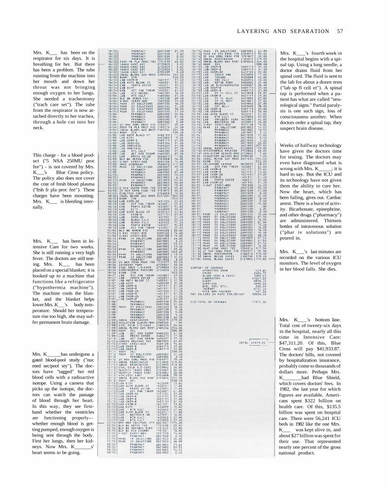
Mrs. K___ has been on therespirator for six days. It isbreathing for her. But therehas been a problem. The tuberunning from the machine intoher mouth and down herthroat was not bringingenough oxygen to her lungs.She needed a tracheotomy("trach care set"). The tubefrom the respirator is now at-tached directly to her trachea,through a hole cut into herneck.
This charge - for a blood prod-uct ("5 NSA 250MU procfee") - is not covered by Mrs.K___'s Blue Cross policy.The policy also does not coverthe cost of fresh blood plasma("frsh fr pla proc fee"). Thesecharges have been mounting.Mrs. K___ is bleeding inter-nally.
Mrs. K___ has been in In-tensive Care for two weeks.She is still running a very highfever. The doctors are still test-ing. Mrs. K___ has beenplaced on a special blanket; it ishooked up to a machine thatfunctions like a refrigerator("hypothermia machine").The machine cools the blan-ket, and the blanket helpslower Mrs. K 's body tem-perature. Should her tempera-ture rise too high, she may suf-fer permanent brain damage.
Mrs. K has undergone agated blood-pool study ("nucmed sec/pool sty"). The doc-tors have "tagged" her redblood cells with a radioactiveisotope. Using a camera thatpicks up the isotope, the doc-tors can watch the passageof blood through her heart.In this way, they see first-hand whether the ventriclesare functioning properly—whether enough blood is get-ting pumped, enough oxygen isbeing sent through the body.First her lungs, then her kid-neys. Now Mrs. K s'heart seems to be going.
Mrs. K___'s fourth week inthe hospital begins with a spi-nal tap. Using a long needle, adoctor drains fluid from herspinal cord. The fluid is sent tothe lab for about a dozen tests("lab sp fl cell et"). A spinaltap is performed when a pa-tient has what are called "neu-rological signs." Partial paraly-sis is one such sign, loss ofconsciousness another. Whendoctors order a spinal tap, theysuspect brain disease.
Weeks of halfway technologyhave given the doctors timefor testing. The doctors mayeven have diagnosed what iswrong with Mrs. K ; it ishard to say. But the ICU andits technology have not giventhem the ability to cure her.Now the heart, which hasbeen failing, gives out. Cardiacarrest. There is a burst of activ-ity. Bicarbonate, epinephrine,and other drugs ("pharmacy")are administered. Thirteenbottles of intravenous solution("phar iv solutions") arepoured in.
Mrs. K___'s last minutes arerecorded on the various ICUmonitors. The level of oxygenin her blood falls. She dies.
Mrs. K___'s bottom line.Total cost of twenty-six daysin the hospital, nearly all thistime in Intensive Care:$47,311.20. Of this, BlueCross will pay $41,933.87.The doctors' bills, not coveredby hospitalization insurance,probably come to thousands ofdollars more. Perhaps Mrs.K had Blue Shield,which covers doctors' fees. In1982, the last year for whichfigures are available, Ameri-cans spent $322 billion onhealth care. Of this, $135.5billion was spent on hospitalcare. There were 56,241 ICUbeds in 1982 like the one Mrs.K___ was kept alive in, andabout $27 billion was spent fortheir use. That representednearly one percent of the grossnational product.
LAYERING AND SEPARATION 57
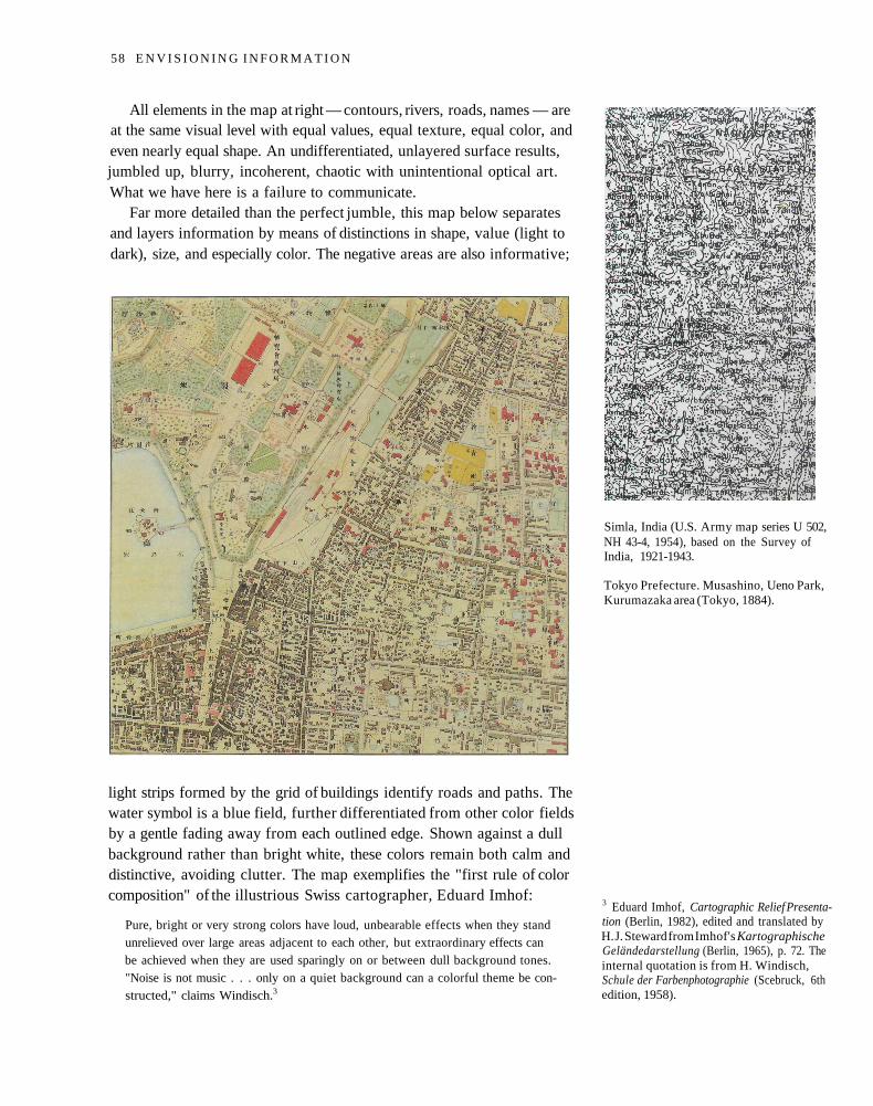
All elements in the map at right — contours, rivers, roads, names — areat the same visual level with equal values, equal texture, equal color, andeven nearly equal shape. An undifferentiated, unlayered surface results,jumbled up, blurry, incoherent, chaotic with unintentional optical art.What we have here is a failure to communicate.
Far more detailed than the perfect jumble, this map below separatesand layers information by means of distinctions in shape, value (light todark), size, and especially color. The negative areas are also informative;
light strips formed by the grid of buildings identify roads and paths. Thewater symbol is a blue field, further differentiated from other color fieldsby a gentle fading away from each outlined edge. Shown against a dullbackground rather than bright white, these colors remain both calm anddistinctive, avoiding clutter. The map exemplifies the "first rule of colorcomposition" of the illustrious Swiss cartographer, Eduard Imhof:
Pure, bright or very strong colors have loud, unbearable effects when they standunrelieved over large areas adjacent to each other, but extraordinary effects canbe achieved when they are used sparingly on or between dull background tones."Noise is not music . . . only on a quiet background can a colorful theme be con-structed," claims Windisch.3
Simla, India (U.S. Army map series U 502,NH 43-4, 1954), based on the Survey ofIndia, 1921-1943.
Tokyo Prefecture. Musashino, Ueno Park,Kurumazaka area (Tokyo, 1884).
3 Eduard Imhof, Cartographic Relief Presenta-tion (Berlin, 1982), edited and translated byH. J. Steward from Imhof's KartographischeGeländedarstellung (Berlin, 1965), p. 72. Theinternal quotation is from H. Windisch,Schule der Farbenphotographie (Scebruck, 6thedition, 1958).
58 E N V I S I O N I N G I N F O R M A T I O N
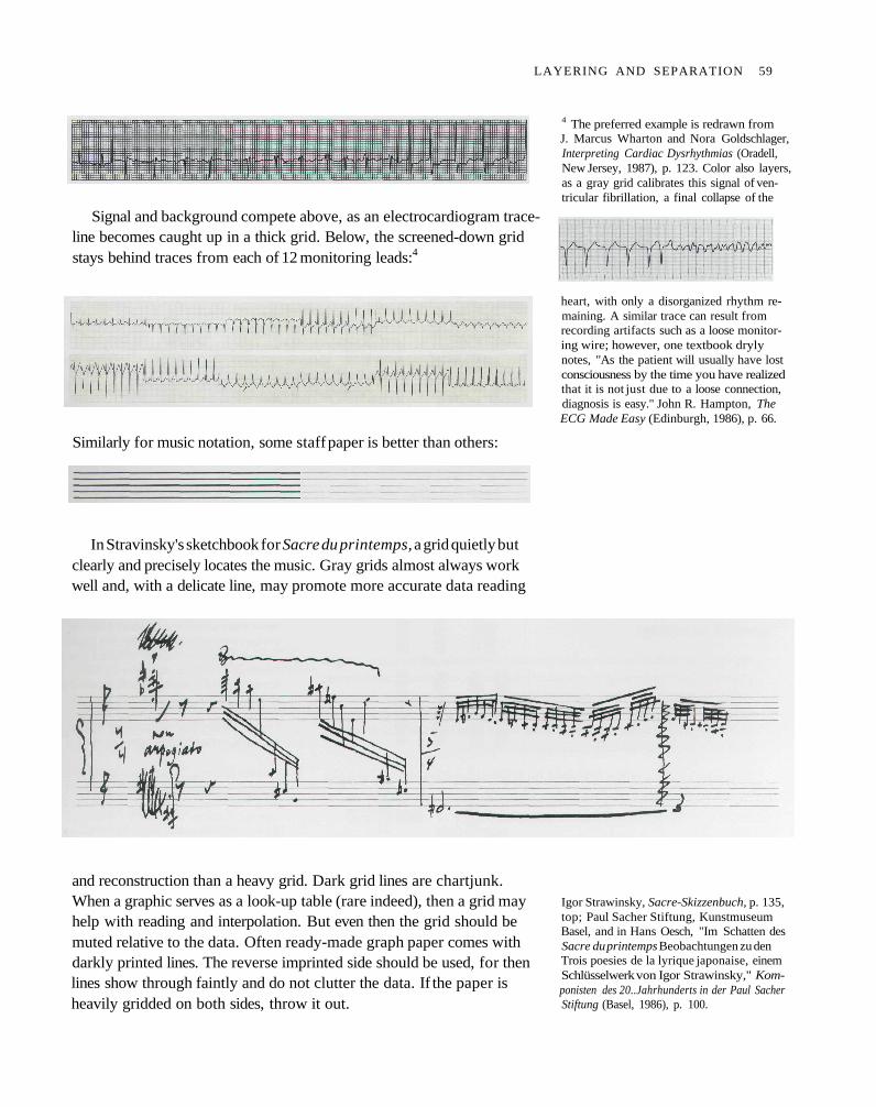
Signal and background compete above, as an electrocardiogram trace-line becomes caught up in a thick grid. Below, the screened-down gridstays behind traces from each of 12 monitoring leads:4
Similarly for music notation, some staff paper is better than others:
In Stravinsky's sketchbook for Sacre du printemps, a grid quietly butclearly and precisely locates the music. Gray grids almost always workwell and, with a delicate line, may promote more accurate data reading
and reconstruction than a heavy grid. Dark grid lines are chartjunk.When a graphic serves as a look-up table (rare indeed), then a grid mayhelp with reading and interpolation. But even then the grid should bemuted relative to the data. Often ready-made graph paper comes withdarkly printed lines. The reverse imprinted side should be used, for thenlines show through faintly and do not clutter the data. If the paper isheavily gridded on both sides, throw it out.
4 The preferred example is redrawn fromJ. Marcus Wharton and Nora Goldschlager,Interpreting Cardiac Dysrhythmias (Oradell,New Jersey, 1987), p. 123. Color also layers,as a gray grid calibrates this signal of ven-tricular fibrillation, a final collapse of the
heart, with only a disorganized rhythm re-maining. A similar trace can result fromrecording artifacts such as a loose monitor-ing wire; however, one textbook drylynotes, "As the patient will usually have lostconsciousness by the time you have realizedthat it is not just due to a loose connection,diagnosis is easy." John R. Hampton, TheECG Made Easy (Edinburgh, 1986), p. 66.
Igor Strawinsky, Sacre-Skizzenbuch, p. 135,top; Paul Sacher Stiftung, KunstmuseumBasel, and in Hans Oesch, "Im Schatten desSacre du printemps Beobachtungen zu denTrois poesies de la lyrique japonaise, einemSchlüsselwerk von Igor Strawinsky," Kom-ponisten des 20..Jahrhunderts in der Paul SacherStiftung (Basel, 1986), p. 100.
LAYERING AND SEPARATION 59
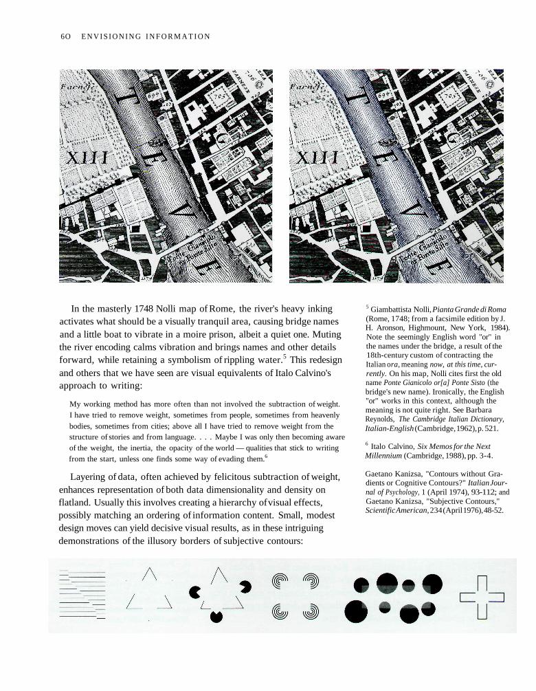
In the masterly 1748 Nolli map of Rome, the river's heavy inkingactivates what should be a visually tranquil area, causing bridge namesand a little boat to vibrate in a moire prison, albeit a quiet one. Mutingthe river encoding calms vibration and brings names and other detailsforward, while retaining a symbolism of rippling water.5 This redesignand others that we have seen are visual equivalents of Italo Calvino'sapproach to writing:
My working method has more often than not involved the subtraction of weight.I have tried to remove weight, sometimes from people, sometimes from heavenly
bodies, sometimes from cities; above all I have tried to remove weight from thestructure of stories and from language. . . . Maybe I was only then becoming awareof the weight, the inertia, the opacity of the world — qualities that stick to writingfrom the start, unless one finds some way of evading them.6
Layering of data, often achieved by felicitous subtraction of weight,enhances representation of both data dimensionality and density onflatland. Usually this involves creating a hierarchy of visual effects,possibly matching an ordering of information content. Small, modestdesign moves can yield decisive visual results, as in these intriguingdemonstrations of the illusory borders of subjective contours:
5 Giambattista Nolli, Pianta Grande di Roma(Rome, 1748; from a facsimile edition by J.H. Aronson, Highmount, New York, 1984).Note the seemingly English word "or" inthe names under the bridge, a result of the18th-century custom of contracting theItalian ora, meaning now, at this time, cur-rently. On his map, Nolli cites first the oldname Ponte Gianicolo or[a] Ponte Sisto (thebridge's new name). Ironically, the English"or" works in this context, although themeaning is not quite right. See BarbaraReynolds, The Cambridge Italian Dictionary,Italian-English (Cambridge, 1962), p. 521.
6 Italo Calvino, Six Memos for the NextMillennium (Cambridge, 1988), pp. 3-4.
Gaetano Kanizsa, "Contours without Gra-dients or Cognitive Contours?" Italian Jour-nal of Psychology, 1 (April 1974), 93-112; andGaetano Kanizsa, "Subjective Contours,"Scientific American, 234 (April 1976), 48-52.
6O E N V I S I O N I N G I N F O R M A T I O N
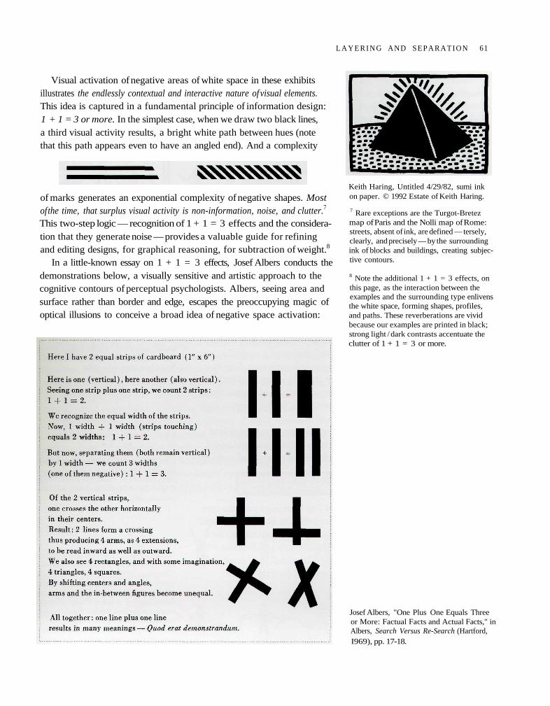
Visual activation of negative areas of white space in these exhibitsillustrates the endlessly contextual and interactive nature of visual elements.This idea is captured in a fundamental principle of information design:1 + 1 = 3 or more. In the simplest case, when we draw two black lines,a third visual activity results, a bright white path between hues (notethat this path appears even to have an angled end). And a complexity
of marks generates an exponential complexity of negative shapes. Mostof the time, that surplus visual activity is non-information, noise, and clutter.7
This two-step logic — recognition of 1 + 1 = 3 effects and the considera-tion that they generate noise — provides a valuable guide for refiningand editing designs, for graphical reasoning, for subtraction of weight.8
In a little-known essay on 1 + 1 = 3 effects, Josef Albers conducts thedemonstrations below, a visually sensitive and artistic approach to thecognitive contours of perceptual psychologists. Albers, seeing area andsurface rather than border and edge, escapes the preoccupying magic ofoptical illusions to conceive a broad idea of negative space activation:
Keith Haring, Untitled 4/29/82, sumi inkon paper. © 1992 Estate of Keith Haring.
7 Rare exceptions are the Turgot-Bretezmap of Paris and the Nolli map of Rome:streets, absent of ink, are defined — tersely,clearly, and precisely — by the surroundingink of blocks and buildings, creating subjec-tive contours.
8 Note the additional 1 + 1 = 3 effects, onthis page, as the interaction between theexamples and the surrounding type enlivensthe white space, forming shapes, profiles,and paths. These reverberations are vividbecause our examples are printed in black;strong light / dark contrasts accentuate theclutter of 1 + 1 = 3 or more.
Josef Albers, "One Plus One Equals Threeor More: Factual Facts and Actual Facts," inAlbers, Search Versus Re-Search (Hartford,I969), pp. 17-18.
L A Y E R I N G AND SEPARATION 61
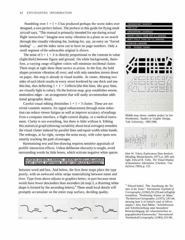
Stumbling over 1 + 1 = 3 has produced perhaps the worst index everdesigned, a rare perfect failure. The preface to this guide for flying smallaircraft says, "This manual is primarily intended for use during actualflight instruction." Imagine now noisy vibration in a plane as we searchthrough this visually vibrating list, looking for, say, an entry on "forcedlanding" ... and the index turns out to have no page numbers. Only asmall segment of the unbearable original is shown.
The noise of 1 + 1 = 3 is directly proportional to the contrast in value(light/dark) between figure and ground. On white backgrounds, there-fore, a varying range of lighter colors will minimize incidental clutter.Three maps at right show these tactics in action. In the first, the boldshapes promote vibration all over; and with only nameless streets downon paper, this map is already in visual trouble. At center, thinning twosides of each block results in every street bordered by one thick and onethin line, thus deflecting 1 + 1 = 3 effects (the thin lines, like gray lines,are visually light in value). On the bottom map, gray establishes serene,motionless edges - an arrangement that will easily accommodate addi-tional geographic detail.
Careful visual editing diminishes 1 + 1 = 3 clutter. These are nottrivial cosmetic matters, for signal enhancement through noise reduc-tion can reduce viewer fatigue as well as improve accuracy of readingsfrom a computer interface, a flight-control display, or a medical instru-ment. Clarity is not everything, but there is little without it. Editingthis statistical graph (showing variability about local averages) remediesthe visual clutter induced by parallel lines and equal-width white bands.The redesign, at far right, sweeps the noise away, with color spots nowsmartly tracking the path of averages.
Harmonizing text and line-drawing requires sensitive appraisals ofprolific interaction effects. Unless deliberate obscurity is sought, avoidsurrounding words by little boxes, which activate negative white spaces
between word and box. And below, the first three maps place the typepoorly, with an awkward white stripe materializing between name andriver. Type from above adjusts to graphics better, in part because mostwords have fewer descenders than ascenders (in map 3, a diverting whiteshape is formed by the ascending letters).9 These small local details willpromptly accumulate on the entire map surface, deciding quality.
Middle map above, student project by JonWertheimer, Studies in Graphic Design,Yale University, 1985-1986.
John W. Tukey, Exploratory Data Analysis(Reading, Massachusetts, 1977), p. 269; and,right, Edward R. Tufte, The Visual Displayof Quantitative Information (Cheshire, Con-necticut, 1983), p. 125.
9 Eduard Imhof, "Die Anordnung der Na-men in der Karte," International Yearbook ofCartography, 2 (1962), 93-129; and, in Englishtranslation, "Positioning Names on Maps,"The American Cartographer, 2 (1975), 128-144;showing here 4 of Imhof's total of 106 ex-amples ! Also, Paul Bühler, "Schriftformenund Schrifterstellung unter besondererBerücksichtigung der schweizerischen to-pographischen Kartenwerke," InternationalYearbook of Cartography, 1 (1961), 153-181.
62 E N V I S I O N I N G I N F O R M A T I O N
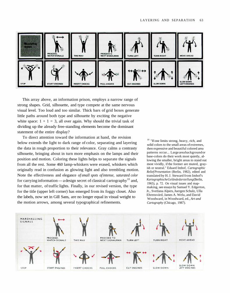
This array above, an information prison, employs a narrow range ofstrong shapes. Grid, silhouette, and type compete at the same nervousvisual level. Too loud and too similar. Thick bars of grid boxes generatelittle paths around both type and silhouette by exciting the negativewhite space: 1 + 1 = 3, all over again. Why should the trivial task ofdividing up the already free-standing elements become the dominantstatement of the entire display?
To direct attention toward the information at hand, the revisionbelow extends the light to dark range of color, separating and layeringthe data in rough proportion to their relevance. Gray calms a contrastysilhouette, bringing about in turn more emphasis on the lamps and theirposition and motion. Coloring these lights helps to separate the signalsfrom all the rest. Some 460 lamp-whiskers were erased, whiskers whichoriginally read in confusion as glowing light and also trembling motion.Note the effectiveness and elegance of small spots of intense, saturated colorfor carrying information — a design secret of classical cartography10 and,for that matter, of traffic lights. Finally, in our revised version, the typefor the title (upper left corner) has emerged from its foggy closet. Alsothe labels, now set in Gill Sans, are no longer equal in visual weight tothe motion arrows, among several typographical refinements.
10 "If one limits strong, heavy, rich, andsolid colors to the small areas of extremes,then expressive and beautiful colored areapatterns occur... Large area background orbase-colors do their work most quietly, al-lowing the smaller, bright areas to stand outmost vividly, if the former are muted, gray-ish or neutral." Eduard Imhof, CartographicRelief Presentation (Berlin, 1982), edited andtranslated by H. J. Steward from Imhof'sKartographische Geländedarstellung (Berlin,1965), p. 72. On visual issues and map-making, see essays by Samuel Y. Edgerton,Jr., Svetlana Alpers, Juergen Schulz, UllaEhrensvärd, James A. Welu, and DavidWoodward, in Woodward, ed., Art andCartography (Chicago, 1987).
L A Y E R I N G AND S E P A R A T I O N 63
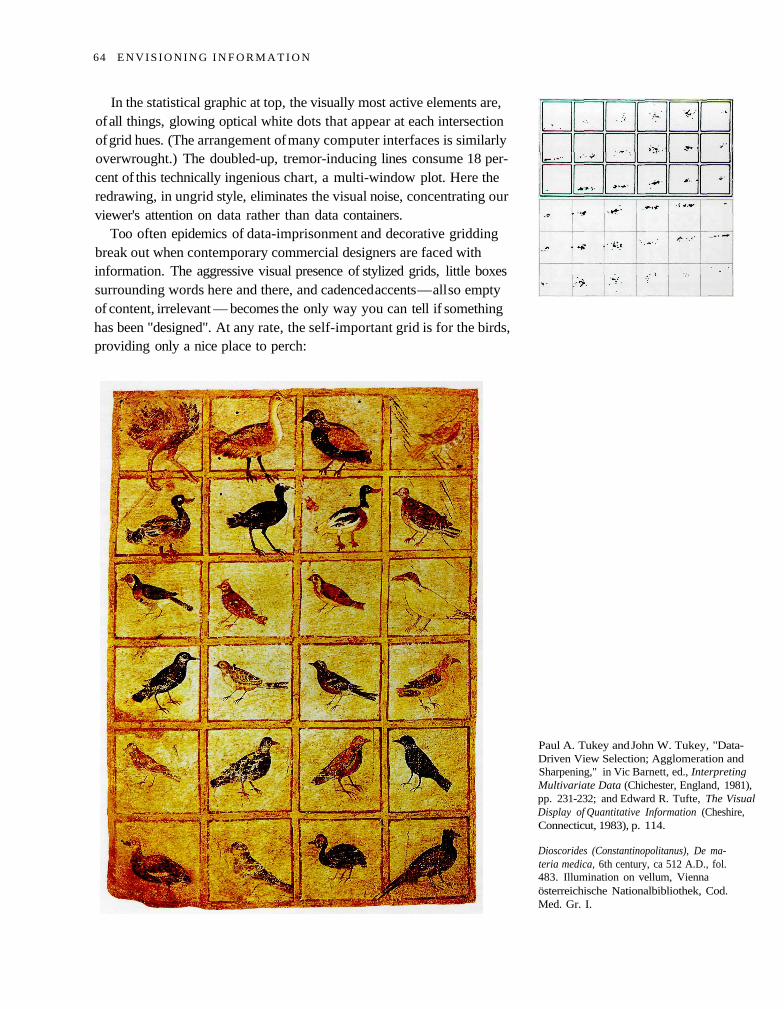
In the statistical graphic at top, the visually most active elements are,of all things, glowing optical white dots that appear at each intersectionof grid hues. (The arrangement of many computer interfaces is similarlyoverwrought.) The doubled-up, tremor-inducing lines consume 18 per-cent of this technically ingenious chart, a multi-window plot. Here theredrawing, in ungrid style, eliminates the visual noise, concentrating ourviewer's attention on data rather than data containers.
Too often epidemics of data-imprisonment and decorative griddingbreak out when contemporary commercial designers are faced withinformation. The aggressive visual presence of stylized grids, little boxessurrounding words here and there, and cadenced accents — all so emptyof content, irrelevant — becomes the only way you can tell if somethinghas been "designed". At any rate, the self-important grid is for the birds,providing only a nice place to perch:
Paul A. Tukey and John W. Tukey, "Data-Driven View Selection; Agglomeration andSharpening," in Vic Barnett, ed., InterpretingMultivariate Data (Chichester, England, 1981),pp. 231-232; and Edward R. Tufte, The VisualDisplay of Quantitative Information (Cheshire,Connecticut, 1983), p. 114.
Dioscorides (Constantinopolitanus), De ma-teria medica, 6th century, ca 512 A.D., fol.483. Illumination on vellum, Viennaösterreichische Nationalbibliothek, Cod.Med. Gr. I.
64 E N V I S I O N I N G I N F O R M A T I O N
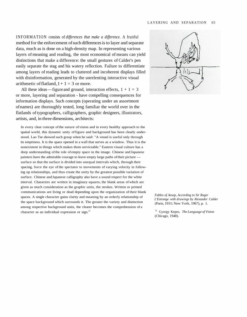
INFORMATION consists of differences that make a difference. A fruitfulmethod for the enforcement of such differences is to layer and separatedata, much as is done on a high-density map. In representing variouslayers of meaning and reading, the most economical of means can yielddistinctions that make a difference: the small gestures of Calder's peneasily separate the stag and his watery reflection. Failure to differentiateamong layers of reading leads to cluttered and incoherent displays filledwith disinformation, generated by the unrelenting interactive visualarithmetic of flatland, 1 + 1 = 3 or more.
All these ideas — figure and ground, interaction effects, 1 + 1 = 3or more, layering and separation - have compelling consequences forinformation displays. Such concepts (operating under an assortmentof names) are thoroughly tested, long familiar the world over in theflatlands of typographers, calligraphers, graphic designers, illustrators,artists, and, in three dimensions, architects:
In every clear concept of the nature of vision and in every healthy approach to the
spatial world, this dynamic unity of figure and background has been clearly under-
stood. Lao Tse showed such grasp when he said: "A vessel is useful only through
its emptiness. It is the space opened in a wall that serves as a window. Thus it is the
nonexistent in things which makes them serviceable." Eastern visual culture has a
deep understanding of the role of empty space in the image. Chinese and Japanese
painters have the admirable courage to leave empty large paths of their picture —
surface so that the surface is divided into unequal intervals which, through their
spacing, force the eye of the spectator to movements of varying velocity in follow-
ing up relationships, and thus create the unity by the greatest possible variation of
surface. Chinese and Japanese calligraphy also have a sound respect for the white
interval. Characters are written in imaginary squares, the blank areas of which are
given as much consideration as the graphic units, the strokes. Written or printed
communications are living or dead depending upon the organization of their blank
spaces. A single character gains clarity and meaning by an orderly relationship of
the space background which surrounds it. The greater the variety and distinction
among respective background units, the clearer becomes the comprehension of a
character as an individual expression or sign.11
Fables of Aesop, According to Sir RogerL'Estrange with drawings by Alexander Calder(Paris, 1931; New York, 1967), p. 1.
11 Gyorgy Kepes, The Language of Vision(Chicago, 1948).
L A Y E R I N G A N D S E P A R A T I O N 65
Jacob Leupold, Theatrum Arithtnetico-Geo-metricum (Leipzig, 1727), section 4, tab. I.
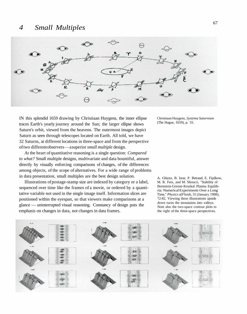
4 Small Multiples
IN this splendid 1659 drawing by Christiaan Huygens, the inner ellipsetraces Earth's yearly journey around the Sun; the larger ellipse showsSaturn's orbit, viewed from the heavens. The outermost images depictSaturn as seen through telescopes located on Earth. All told, we have32 Saturns, at different locations in three-space and from the perspectiveof two different observers — a superior small multiple design.
At the heart of quantitative reasoning is a single question: Comparedto what? Small multiple designs, multivariate and data bountiful, answerdirectly by visually enforcing comparisons of changes, of the differencesamong objects, of the scope of alternatives. For a wide range of problemsin data presentation, small multiples are the best design solution.
Illustrations of postage-stamp size are indexed by category or a label,sequenced over time like the frames of a movie, or ordered by a quanti-tative variable not used in the single image itself. Information slices arepositioned within the eyespan, so that viewers make comparisons at aglance — uninterrupted visual reasoning. Constancy of design puts theemphasis on changes in data, not changes in data frames.
Christiaan Huygens, Systema Saturnium(The Hague, 1659), p. 55.
A. Ghizzo, B. Izrar, P. Betrand, E. Fijalkow,M. R. Feix, and M. Shoucri, "Stability ofBernstein-Greene-Kruskal Plasma Equilib-ria: Numerical Experiments Over a LongTime," Physics of Fluids, 31 (January 1988),72-82. Viewing these illustrations upsidedown turns the mountains into valleys.Note also the two-space contour plots tothe right of the three-space perspectives.
67
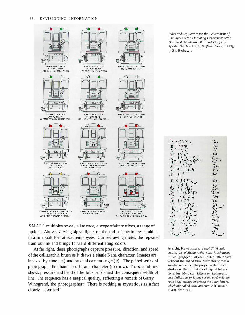
SMALL multiples reveal, all at once, a scope of alternatives, a range ofoptions. Above, varying signal lights on the ends of a train are entabledin a rulebook for railroad employees. Our redrawing mutes the repeatedtrain outline and brings forward differentiating colors.
At far right, these photographs capture pressure, direction, and speedof the calligraphic brush as it draws a single Kana character. Images areindexed by time ( ) and by dual camera angle ( ). The paired series ofphotographs link hand, brush, and character (top row). The second rowshows pressure and bend of the brush-tip - and the consequent width ofline. The sequence has a magical quality, reflecting a remark of GarryWinogrand, the photographer: "There is nothing as mysterious as a factclearly described."
Rules and Regulations for the Government ofEmployees of the Operating Department of theHudson & Manhattan Railroad Company,Effective October 1st, 1g23 (New York, 1923),p. 21. Redrawn.
At right, Kayu Hirata, Tsugi Shiki Shi,volume 25 of Shodo Giho Koza [Techniquesin Calligraphy] (Tokyo, 1974), p. 30. Above,without the aid of film, Mercator shows asimilar sequence, the proper ordering ofstrokes in the formation of capital letters.Gerardus Mercator, Literarum Latinarum,quas Italicas cursoriasque vocant, scribendarumratio [The method of writing the Latin letters,which are called italic and cursive] (Louvain,1540), chapter 6.
68 E N V I S I O N I N G I N F O R M A T I O N
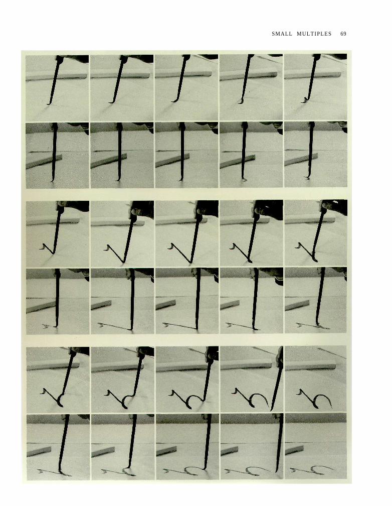
SMALL MULTIPLES 69
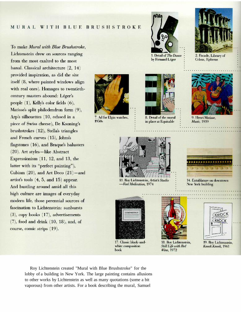
Roy Lichtenstein created "Mural with Blue Brushstroke" for thelobby of a building in New York. The large painting contains allusionsto other works by Lichtenstein as well as many quotations (some a bitvaporous) from other artists. For a book describing the mural, Samuel
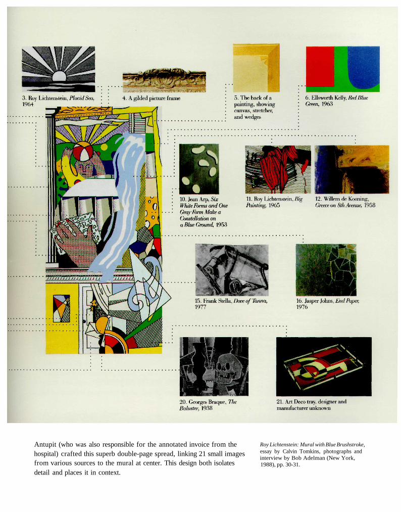
Antupit (who was also responsible for the annotated invoice from thehospital) crafted this superb double-page spread, linking 21 small imagesfrom various sources to the mural at center. This design both isolatesdetail and places it in context.
Roy Lichtenstein: Mural with Blue Brushstroke,essay by Calvin Tomkins, photographs andinterview by Bob Adelman (New York,1988), pp. 30-31.
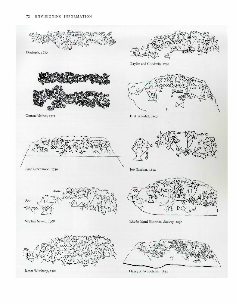
72 E N V I S I O N I N G I N F O R M A T I O N
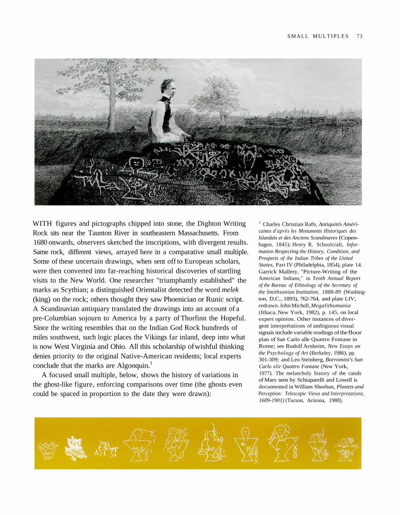
WITH figures and pictographs chipped into stone, the Dighton WritingRock sits near the Taunton River in southeastern Massachusetts. From1680 onwards, observers sketched the inscriptions, with divergent results.Same rock, different views, arrayed here in a comparative small multiple.Some of these uncertain drawings, when sent off to European scholars,were then converted into far-reaching historical discoveries of startlingvisits to the New World. One researcher "triumphantly established" themarks as Scythian; a distinguished Orientalist detected the word melek(king) on the rock; others thought they saw Phoenician or Runic script.A Scandinavian antiquary translated the drawings into an account of apre-Columbian sojourn to America by a party of Thorfinn the Hopeful.Since the writing resembles that on the Indian God Rock hundreds ofmiles southwest, such logic places the Vikings far inland, deep into whatis now West Virginia and Ohio. All this scholarship of wishful thinkingdenies priority to the original Native-American residents; local expertsconclude that the marks are Algonquin.1
A focused small multiple, below, shows the history of variations inthe ghost-like figure, enforcing comparisons over time (the ghosts evencould be spaced in proportion to the date they were drawn):
1 Charles Christian Rafn, Antiquités Améri-caines d'après les Monuments Historiques desIslandais et des Anciens Scandinaves (Copen-hagen, 1845); Henry R. Schoolcraft, Infor-mation Respecting the History, Condition, andProspects of the Indian Tribes of the UnitedStates, Part IV (Philadelphia, 1854), plate 14.Garrick Mallery, "Picture-Writing of theAmerican Indians," in Tenth Annual Reportof the Bureau of Ethnology of the Secretary ofthe Smithsonian Institution, 1888-89 (Washing-ton, D.C., 1893), 762-764, and plate LIV;redrawn. John Michell, Megalithomania(Ithaca, New York, 1982), p. 145, on localexpert opinion. Other instances of diver-gent interprétations of ambiguous visualsignais include variable readings of the floorplan of San Carlo alle Quattro Fontane inRome; see Rudolf Arnheim, New Essays onthe Psychology of Art (Berkeley, 1986), pp.301-309; and Leo Steinberg, Borromini's SanCarlo alle Quattro Fontane (New York,1977). The melancholy history of the canalsof Mars seen by Schiaparelli and Lowell isdocumented in William Sheehan, Planets andPerception: Telescopic Views and Interpretations,1609-1901) (Tucson, Arizona, 1988).
S M A L L M U L T I P L E S 73
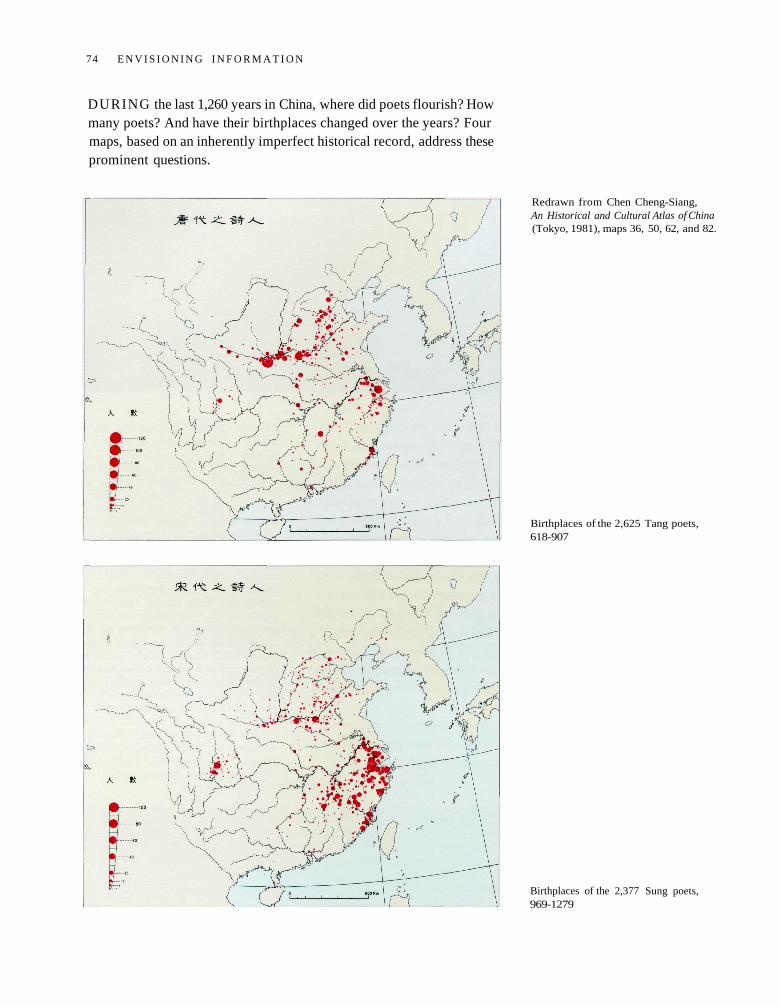
DURING the last 1,260 years in China, where did poets flourish? Howmany poets? And have their birthplaces changed over the years? Fourmaps, based on an inherently imperfect historical record, address theseprominent questions.
Redrawn from Chen Cheng-Siang,An Historical and Cultural Atlas of China(Tokyo, 1981), maps 36, 50, 62, and 82.
Birthplaces of the 2,625 Tang poets,618-907
Birthplaces of the 2,377 Sung poets,969-1279
74 E N V I S I O N I N G I N F O R M A T I O N
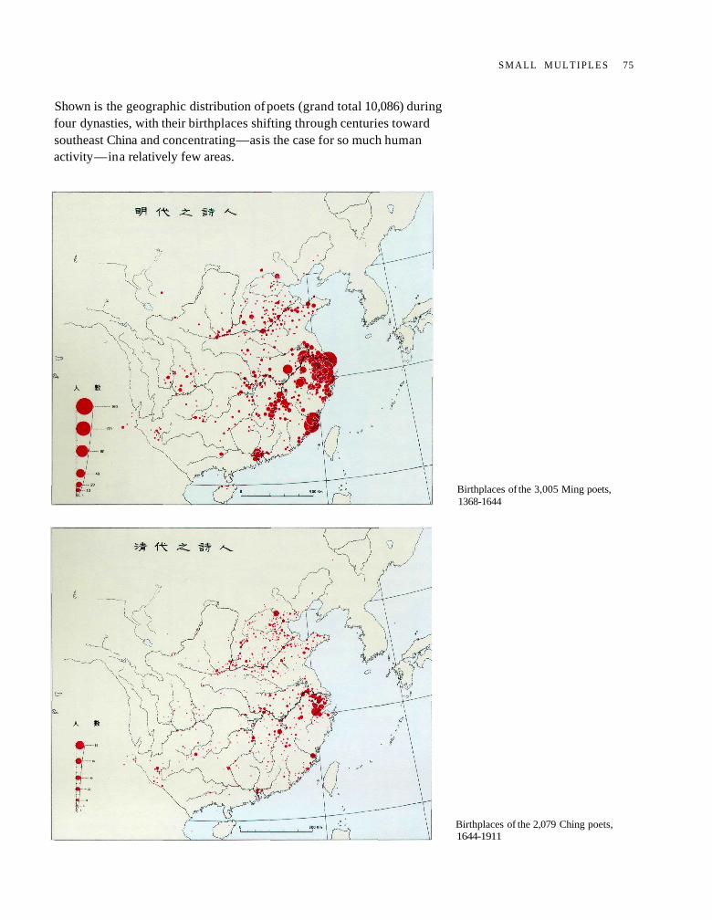
Shown is the geographic distribution of poets (grand total 10,086) duringfour dynasties, with their birthplaces shifting through centuries towardsoutheast China and concentrating — as is the case for so much humanactivity — in a relatively few areas.
Birthplaces of the 3,005 Ming poets,1368-1644
Birthplaces of the 2,079 Ching poets,1644-1911
S M A L L M U L T I P L E S 75
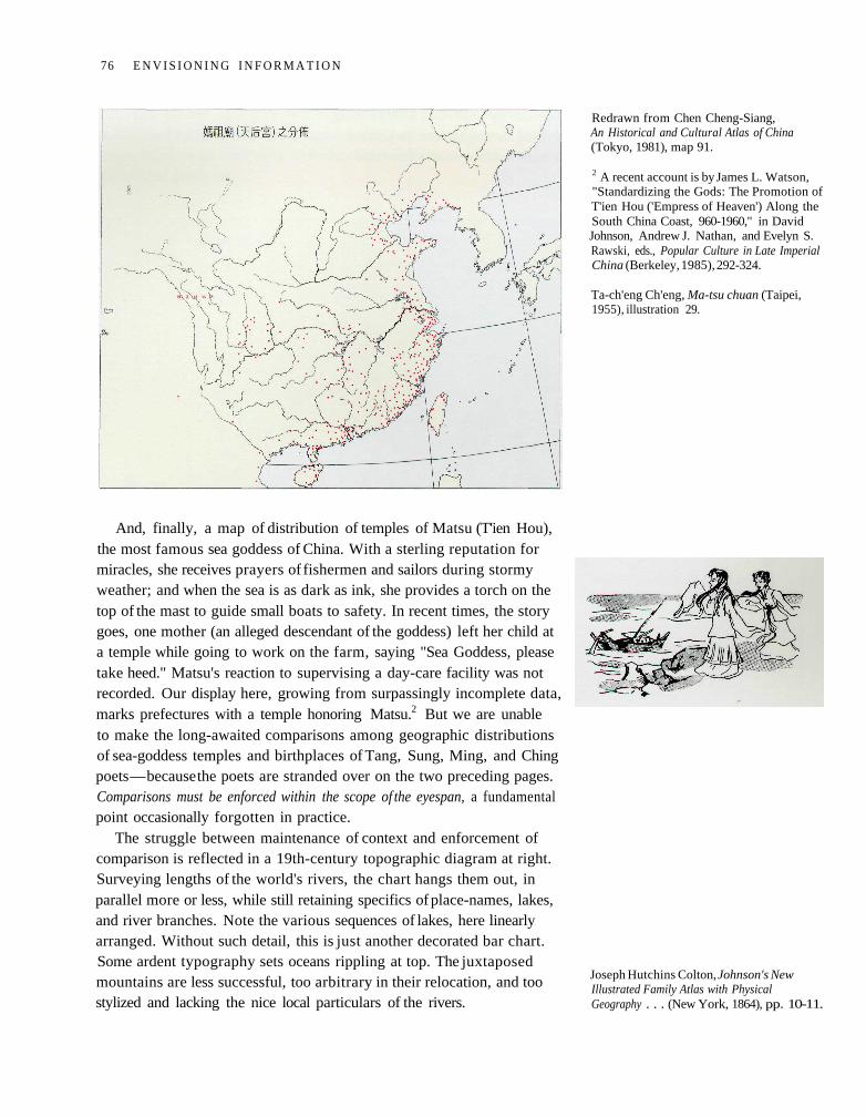
And, finally, a map of distribution of temples of Matsu (T'ien Hou),the most famous sea goddess of China. With a sterling reputation formiracles, she receives prayers of fishermen and sailors during stormyweather; and when the sea is as dark as ink, she provides a torch on thetop of the mast to guide small boats to safety. In recent times, the storygoes, one mother (an alleged descendant of the goddess) left her child ata temple while going to work on the farm, saying "Sea Goddess, pleasetake heed." Matsu's reaction to supervising a day-care facility was notrecorded. Our display here, growing from surpassingly incomplete data,marks prefectures with a temple honoring Matsu.2 But we are unableto make the long-awaited comparisons among geographic distributionsof sea-goddess temples and birthplaces of Tang, Sung, Ming, and Chingpoets — because the poets are stranded over on the two preceding pages.Comparisons must be enforced within the scope of the eyespan, a fundamentalpoint occasionally forgotten in practice.
The struggle between maintenance of context and enforcement ofcomparison is reflected in a 19th-century topographic diagram at right.Surveying lengths of the world's rivers, the chart hangs them out, inparallel more or less, while still retaining specifics of place-names, lakes,and river branches. Note the various sequences of lakes, here linearlyarranged. Without such detail, this is just another decorated bar chart.Some ardent typography sets oceans rippling at top. The juxtaposedmountains are less successful, too arbitrary in their relocation, and toostylized and lacking the nice local particulars of the rivers.
Redrawn from Chen Cheng-Siang,An Historical and Cultural Atlas of China(Tokyo, 1981), map 91.
2 A recent account is by James L. Watson,"Standardizing the Gods: The Promotion ofT'ien Hou ('Empress of Heaven') Along theSouth China Coast, 960-1960," in DavidJohnson, Andrew J. Nathan, and Evelyn S.Rawski, eds., Popular Culture in Late ImperialChina (Berkeley, 1985), 292-324.
Ta-ch'eng Ch'eng, Ma-tsu chuan (Taipei,1955), illustration 29.
Joseph Hutchins Colton, Johnson's NewIllustrated Family Atlas with PhysicalGeography . . . (New York, 1864), pp. 10-11.
76 E N V I S I O N I N G I N F O R M A T I O N
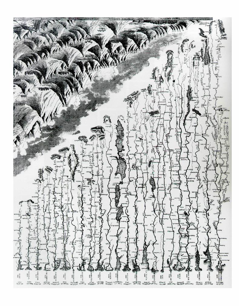
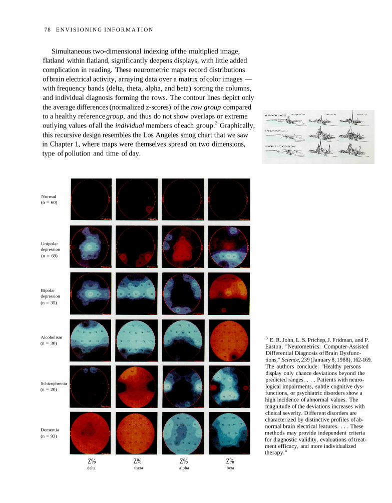
Simultaneous two-dimensional indexing of the multiplied image,flatland within flatland, significantly deepens displays, with little addedcomplication in reading. These neurometric maps record distributionsof brain electrical activity, arraying data over a matrix of color images —with frequency bands (delta, theta, alpha, and beta) sorting the columns,and individual diagnosis forming the rows. The contour lines depict onlythe average differences (normalized z-scores) of the row group comparedto a healthy reference group, and thus do not show overlaps or extremeoutlying values of all the individual members of each group.3 Graphically,this recursive design resembles the Los Angeles smog chart that we sawin Chapter 1, where maps were themselves spread on two dimensions,type of pollution and time of day.
Normal(n = 60)
Unipolardepression
(n = 69)
Bipolardepression
(n = 35)
Alcoholism(n = 30)
Schizophrenia(n = 20)
Dementia
(n = 93)
Z% Z% Z% Z%delta theta alpha beta
3 E. R. John, L. S. Prichep, J. Fridman, and P.Easton, "Neurometrics: Computer-AssistedDifferential Diagnosis of Brain Dysfunc-tions," Science, 239 (January 8, 1988), 162-169.The authors conclude: "Healthy personsdisplay only chance deviations beyond thepredicted ranges. . . . Patients with neuro-logical impairments, subtle cognitive dys-functions, or psychiatric disorders show ahigh incidence of abnormal values. Themagnitude of the deviations increases withclinical severity. Different disorders arecharacterized by distinctive profiles of ab-normal brain electrical features. . . . Thesemethods may provide independent criteriafor diagnostic validity, evaluations of treat-ment efficacy, and more individualizedtherapy."
78 E N V I S I O N I N G I N F O R M A T I O N
In our neurometric example at left, the dark colors surrounding eachimage generate disruptive white stripes. Locations can be signaled bynearly silent methods, as above, where an implicit grid pairs each insectwith its fly-fishing simulation. And the limited but focused color here ismore effective than strong rainbow colors, for reasons now to be revealed.
John Jackson, The Practical Fly-Fisher; MoreParticularly for Grayling or Umber (London,1854), plate VIII, at 26-27, insects and fliesfor July and August.
S M A L L M U L T I P L E S 79
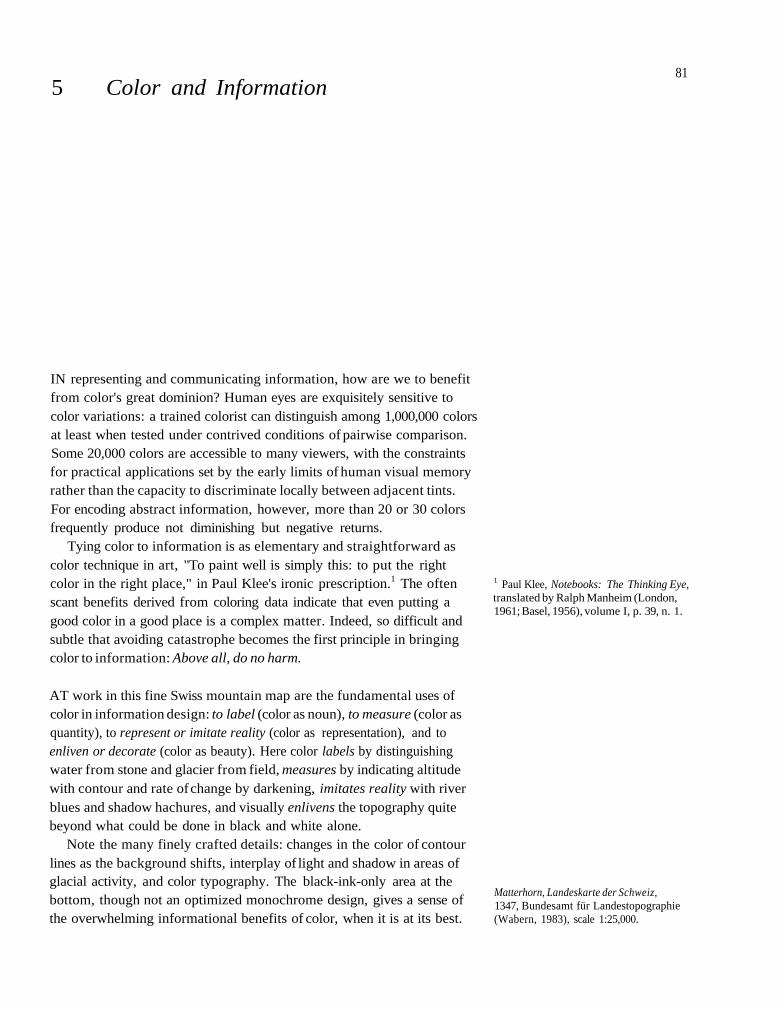
5 Color and Information
IN representing and communicating information, how are we to benefitfrom color's great dominion? Human eyes are exquisitely sensitive tocolor variations: a trained colorist can distinguish among 1,000,000 colorsat least when tested under contrived conditions of pairwise comparison.Some 20,000 colors are accessible to many viewers, with the constraintsfor practical applications set by the early limits of human visual memoryrather than the capacity to discriminate locally between adjacent tints.For encoding abstract information, however, more than 20 or 30 colorsfrequently produce not diminishing but negative returns.
Tying color to information is as elementary and straightforward ascolor technique in art, "To paint well is simply this: to put the rightcolor in the right place," in Paul Klee's ironic prescription.1 The oftenscant benefits derived from coloring data indicate that even putting agood color in a good place is a complex matter. Indeed, so difficult andsubtle that avoiding catastrophe becomes the first principle in bringingcolor to information: Above all, do no harm.
AT work in this fine Swiss mountain map are the fundamental uses ofcolor in information design: to label (color as noun), to measure (color asquantity), to represent or imitate reality (color as representation), and toenliven or decorate (color as beauty). Here color labels by distinguishingwater from stone and glacier from field, measures by indicating altitudewith contour and rate of change by darkening, imitates reality with riverblues and shadow hachures, and visually enlivens the topography quitebeyond what could be done in black and white alone.
Note the many finely crafted details: changes in the color of contourlines as the background shifts, interplay of light and shadow in areas ofglacial activity, and color typography. The black-ink-only area at thebottom, though not an optimized monochrome design, gives a sense ofthe overwhelming informational benefits of color, when it is at its best.
1 Paul Klee, Notebooks: The Thinking Eye,translated by Ralph Manheim (London,1961; Basel, 1956), volume I, p. 39, n. 1.
Matterhorn, Landeskarte der Schweiz,1347, Bundesamt für Landestopographie(Wabern, 1983), scale 1:25,000.
81
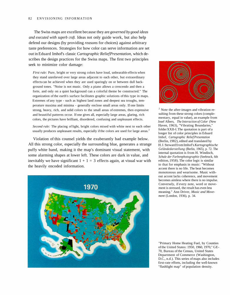
The Swiss maps are excellent because they are governed by good ideasand executed with superb craft. Ideas not only guide work, but also helpdefend our designs (by providing reasons for choices) against arbitrarytaste preferences. Strategies for how color can serve information are setout in Eduard Imhof's classic Cartographic Relief Presentation, which de-scribes the design practices for the Swiss maps. The first two principlesseek to minimize color damage:
First rule: Pure, bright or very strong colors have loud, unbearable effects whenthey stand unrelieved over large areas adjacent to each other, but extraordinaryeffects can be achieved when they are used sparingly on or between dull back-ground tones. "Noise is not music. Only a piano allows a crescendo and then aforte, and only on a quiet background can a colorful theme be constructed." Theorganization of the earth's surface facilitates graphic solutions of this type in maps.Extremes of any type - such as highest land zones and deepest sea troughs, tem-
perature maxima and minima - generally enclose small areas only. If one limitsstrong, heavy, rich, and solid colors to the small areas of extremes, then expressiveand beautiful patterns occur. If one gives all, especially large areas, glaring, richcolors, the pictures have brilliant, disordered, confusing and unpleasant effects.
Second rule: The placing of light, bright colors mixed with white next to each otherusually produces unpleasant results, especially if the colors are used for large areas.2
Violation of this counsel yields the exuberantly bad example below.All this strong color, especially the surrounding blue, generates a strangepuffy white band, making it the map's dominant visual statement, withsome alarming shapes at lower left. These colors are dark in value, andinevitably we have significant 1 + 1 = 3 effects again, at visual war withthe heavily encoded information.
2 Note the after-images and vibration re-sulting from these strong colors (comple-mentary, equal in value), an example fromJosef Albers, The Interaction of Color (NewHaven, 1963), "Vibrating Boundaries,"folder XXII-I. The quotation is part of alonger list of color principles in EduardImhof, Cartographic Relief Presentation(Berlin, 1982), edited and translated byH. J. Steward from Imhof's KartographischeGeländedarstellung (Berlin, 1965), p. 72. Theinternal quotation is from H. Windisch,Schule der Farbenphotographie (Seebruck, 6thedition, 1958). The color logic is similarto that for emphasis in music: "Withoutaccent there is no life. The beat becomesmonotonous and wearisome. Music with-out accent lacks coherence, and movementbecomes aimless where there is no impulse.Conversely, if every note, word or move-ment is stressed, the result has even lessmeaning." Ann Driver, Music and Move-ment (London, 1936), p. 34.
"Primary Home Heating Fuel, by Countiesof the United States: 1950, 1960, 1970," GE-70, Bureau of the Census, United StatesDepartment of Commerce (Washington,D.C., n.d.). This series of maps also includesfirst-rate efforts, including the well-known"flashlight map" of population density.
82 E N V I S I O N I N G I N F O R M A T I O N
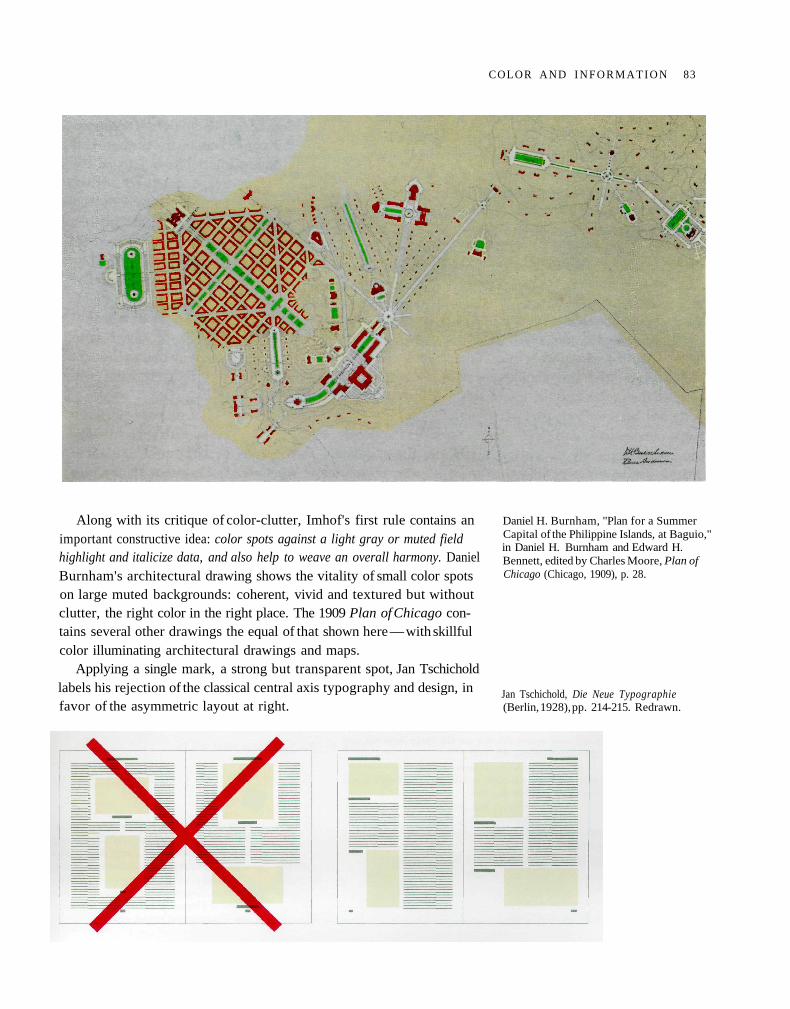
Along with its critique of color-clutter, Imhof's first rule contains animportant constructive idea: color spots against a light gray or muted fieldhighlight and italicize data, and also help to weave an overall harmony. DanielBurnham's architectural drawing shows the vitality of small color spotson large muted backgrounds: coherent, vivid and textured but withoutclutter, the right color in the right place. The 1909 Plan of Chicago con-tains several other drawings the equal of that shown here — with skillfulcolor illuminating architectural drawings and maps.
Applying a single mark, a strong but transparent spot, Jan Tschicholdlabels his rejection of the classical central axis typography and design, infavor of the asymmetric layout at right.
Daniel H. Burnham, "Plan for a SummerCapital of the Philippine Islands, at Baguio,"in Daniel H. Burnham and Edward H.Bennett, edited by Charles Moore, Plan ofChicago (Chicago, 1909), p. 28.
Jan Tschichold, Die Neue Typographie(Berlin, 1928), pp. 214-215. Redrawn.
COLOR AND I N F O R M A T I O N 83
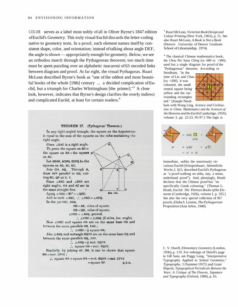
COLOR serves as a label most nobly of all in Oliver Byrne's 1847 editionof Euclid's Geometry. This truly visual Euclid discards the letter-codingnative to geometry texts. In a proof, each element names itself by con-sistent shape, color, and orientation; instead of talking about angle DEF,the angle is shown — appropriately enough for geometry. Below, we seean orthodox march through the Pythagorean theorem; too much timemust be spent puzzling over an alphabetic macaroni of 63 encoded linksbetween diagram and proof. At far right, the visual Pythagoras. RuariMcLean described Byrne's book as "one of the oddest and most beauti-ful books of the whole [19th] century ... a decided complication of Eu-clid, but a triumph for Charles Whittingham [the printer]."3 A closelook, however, indicates that Byrne's design clarifies the overly indirectand complicated Euclid, at least for certain readers.4
3 Ruari McLean, Victorian Book Design andColour Printing (New York, 1963), p. 51. Seealso Ruari McLean, A Book is Not a Book(Denver: University of Denver GraduateSchool of Librarianship, 1974).
4 The classical Chinese mathematics book,the Chou Pei Suan Ching (ca -600 to +300),used but a single diagram for proof of the"Pythagorean" theorem. According toNeedham, "in thetime of Liu and Chao[ca +200], it wascoloured, the smallcentral square beingyellow and the sur-rounding rectanglesred." [Joseph Need-ham with Wang Ling, Science and Civilisa-tion in China: Mathematics and the Sciences ofthe Heavens and the Earth (Cambridge, 1959),volume 3, pp. 22-23, 95-97.] The logic is
immediate, unlike the notoriously cir-cuitous Euclid (Schopenhauer, SämmtlicheWerke, I. §15, described Euclid's Pythagorasas "a proof walking on stilts, nay, a mean,underhand proof"). And, pleasingly, Heathdeclares that the Chinese proof has "nospecifically Greek colouring." [Thomas L.Heath, Euclid: The Thirteen Books of the Ele-ments (Cambridge, 1926), volume I, p. 355.]See also the very special collection of 367proofs, Elisha S. Loomis, The PythagoreanProposition (Ann Arbor, 1940).
C. V. Durell, Elementary Geometry (London,1936), p. 119. For redesign of Durell's pagein Gill Sans, see Peggy Lang, "InterpretativeTypography Applied to School Geometry,"Typography, 3 (Summer 1937); and GrantShipcott, Typographical Periodicals Between theWars: A Critique of The Fleuron, Signatureand Typography (Oxford, 1980), p. 65.
84 E N V I S I O N I N G I N F O R M A T I O N
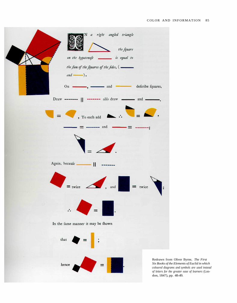
Redrawn from Oliver Byrne, The FirstSix Books of the Elements of Euclid in whichcoloured diagrams and symbols are used insteadof letters for the greater ease of learners (Lon-don, 1847), pp. 48-49.
COLOR AND I N F O R M A T I O N 85
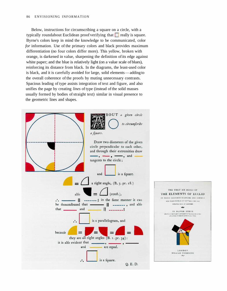
Below, instructions for circumscribing a square on a circle, with atypically roundabout Euclidean proof verifying that really is square.Byrne's colors keep in mind the knowledge to be communicated, colorfor information. Use of the primary colors and black provides maximumdifferentiation (no four colors differ more). This yellow, broken withorange, is darkened in value, sharpening the definition of its edge againstwhite paper; and the blue is relatively light (on a value scale of blues),reinforcing its distance from black. In the diagrams, the least-used coloris black, and it is carefully avoided for large, solid elements — adding tothe overall coherence of the proofs by muting unnecessary contrasts.Spacious leading of type assists integration of text and figure, and alsounifies the page by creating lines of type (instead of the solid massesusually formed by bodies of straight text) similar in visual presence tothe geometric lines and shapes.
86 E N V I S I O N I N G I N F O R M A T I O N
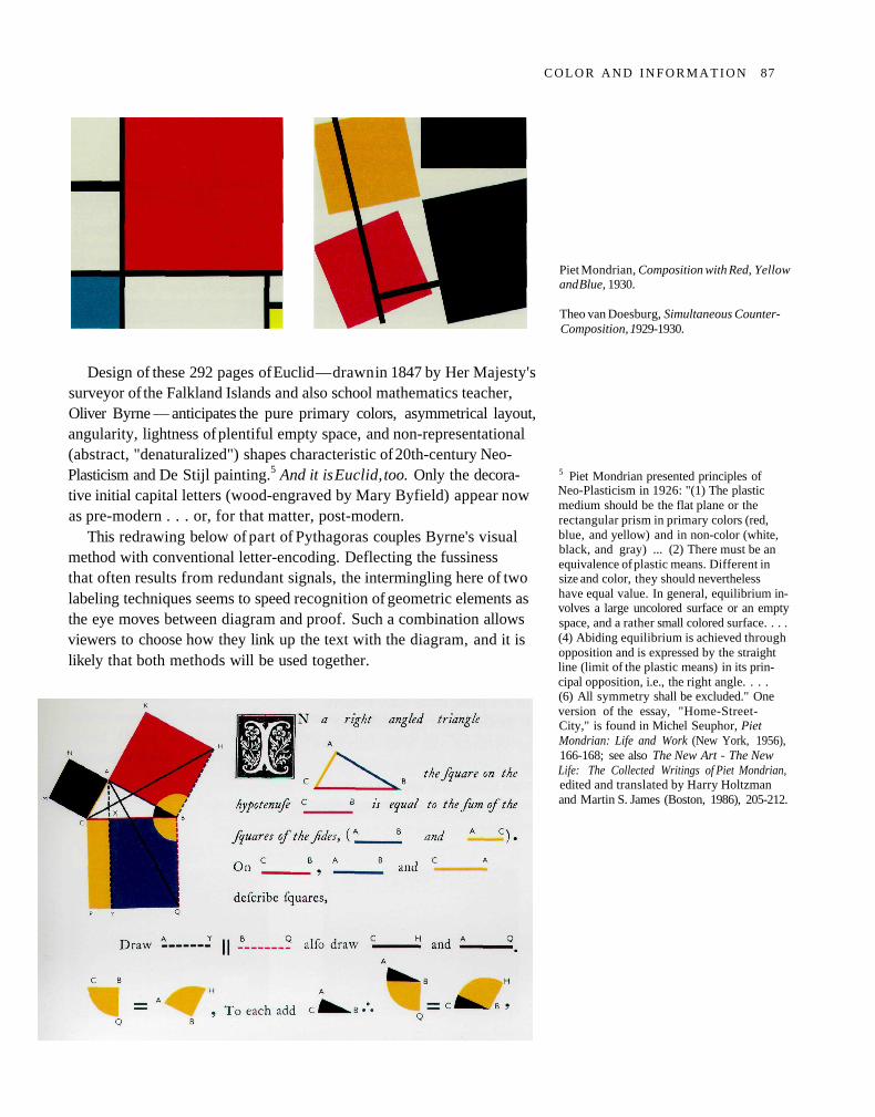
Design of these 292 pages of Euclid — drawn in 1847 by Her Majesty'ssurveyor of the Falkland Islands and also school mathematics teacher,Oliver Byrne — anticipates the pure primary colors, asymmetrical layout,angularity, lightness of plentiful empty space, and non-representational(abstract, "denaturalized") shapes characteristic of 20th-century Neo-Plasticism and De Stijl painting.5 And it is Euclid, too. Only the decora-tive initial capital letters (wood-engraved by Mary Byfield) appear nowas pre-modern . . . or, for that matter, post-modern.
This redrawing below of part of Pythagoras couples Byrne's visualmethod with conventional letter-encoding. Deflecting the fussinessthat often results from redundant signals, the intermingling here of twolabeling techniques seems to speed recognition of geometric elements asthe eye moves between diagram and proof. Such a combination allowsviewers to choose how they link up the text with the diagram, and it islikely that both methods will be used together.
Piet Mondrian, Composition with Red, Yellowand Blue, 1930.
Theo van Doesburg, Simultaneous Counter-Composition, 1929-1930.
5 Piet Mondrian presented principles ofNeo-Plasticism in 1926: "(1) The plasticmedium should be the flat plane or therectangular prism in primary colors (red,blue, and yellow) and in non-color (white,black, and gray) ... (2) There must be anequivalence of plastic means. Different insize and color, they should neverthelesshave equal value. In general, equilibrium in-volves a large uncolored surface or an emptyspace, and a rather small colored surface. . . .(4) Abiding equilibrium is achieved throughopposition and is expressed by the straightline (limit of the plastic means) in its prin-cipal opposition, i.e., the right angle. . . .(6) All symmetry shall be excluded." Oneversion of the essay, "Home-Street-City," is found in Michel Seuphor, PietMondrian: Life and Work (New York, 1956),166-168; see also The New Art - The NewLife: The Collected Writings of Piet Mondrian,edited and translated by Harry Holtzmanand Martin S. James (Boston, 1986), 205-212.
C O L O R A N D I N F O R M A T I O N 87

IN all 50 or so systems of color organization, every color is located inthree space: described by hue, saturation, and value in Munsell and otherspatial-perceptual classifications; by red, green, and blue components invarious additive methods for video displays; and by cyan, magenta, andyellow components in subtractive methods for printing inks. A varietyof color systems, but always three dimensions.
Can color's inherently multidimensional quality be used to expressmultidimensional information? And can viewers understand, or learnto understand, such displays? A good place to start on a video displayterminal is to spread data-points over flatland for two dimensions andthen light up each point by red, green, and blue (RGB) components,
in proportion to values taken by three additional variables. At right, afive-by-five scatterplot matrix shows all X-Y pairs. Note color clustersof data, assemblies of three-dimensional similarity (on RGB variables)spread on the X-Y plane, an obvious improvement over black-only dots.
Color's multidimensionality can also enliven and inform what usersmust face at computer terminals, although some color applied to displayscreens has made what should be a straight-forward tool into somethingthat looks like a grim parody of a video game:
Colin Ware and John C. Beatty, "UsingColor as a Tool in Discrete Data Analysis,"Computer Science Department, Universityof Waterloo, report 05-85-21 (August1985); and "Using Color Dimensions toDisplay Data Dimensions," Human Factors,30 (1988), 127-142. Success is reported forlocating simple clusters of data. For seriousdata analysis the method depends on howwell viewers can visualize a particular coloras a three-dimensional location.
88 E N V I S I O N I N G I N F O R M A T I O N
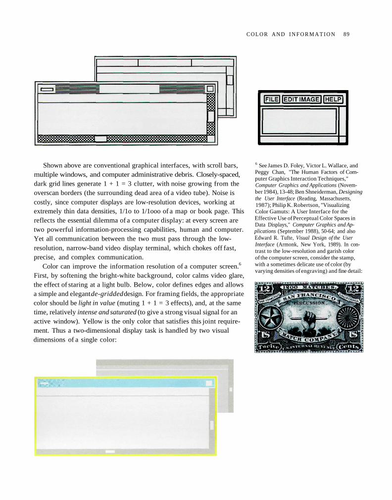
Shown above are conventional graphical interfaces, with scroll bars,multiple windows, and computer administrative debris. Closely-spaced,dark grid lines generate 1 + 1 = 3 clutter, with noise growing from theoverscan borders (the surrounding dead area of a video tube). Noise iscostly, since computer displays are low-resolution devices, working atextremely thin data densities, 1/1o to 1/1ooo of a map or book page. Thisreflects the essential dilemma of a computer display: at every screen aretwo powerful information-processing capabilities, human and computer.Yet all communication between the two must pass through the low-resolution, narrow-band video display terminal, which chokes off fast,precise, and complex communication.
Color can improve the information resolution of a computer screen.6
First, by softening the bright-white background, color calms video glare,the effect of staring at a light bulb. Below, color defines edges and allowsa simple and elegant de-gridded design. For framing fields, the appropriatecolor should be light in value (muting 1 + 1 = 3 effects), and, at the sametime, relatively intense and saturated (to give a strong visual signal for anactive window). Yellow is the only color that satisfies this joint require-ment. Thus a two-dimensional display task is handled by two visualdimensions of a single color:
6 See James D. Foley, Victor L. Wallace, andPeggy Chan, "The Human Factors of Com-puter Graphics Interaction Techniques,"Computer Graphics and Applications (Novem-ber 1984), 13-48; Ben Shneiderman, Designingthe User Interface (Reading, Massachusetts,1987); Philip K. Robertson, "VisualizingColor Gamuts: A User Interface for theEffective Use of Perceptual Color Spaces inData Displays," Computer Graphics and Ap-plications (September 1988), 50-64; and alsoEdward R. Tufte, Visual Design of the UserInterface (Armonk, New York, 1989). In con-trast to the low-resolution and garish colorof the computer screen, consider the stamp,with a sometimes delicate use of color (byvarying densities of engraving) and fine detail:
C O L O R A N D I N F O R M A T I O N 89
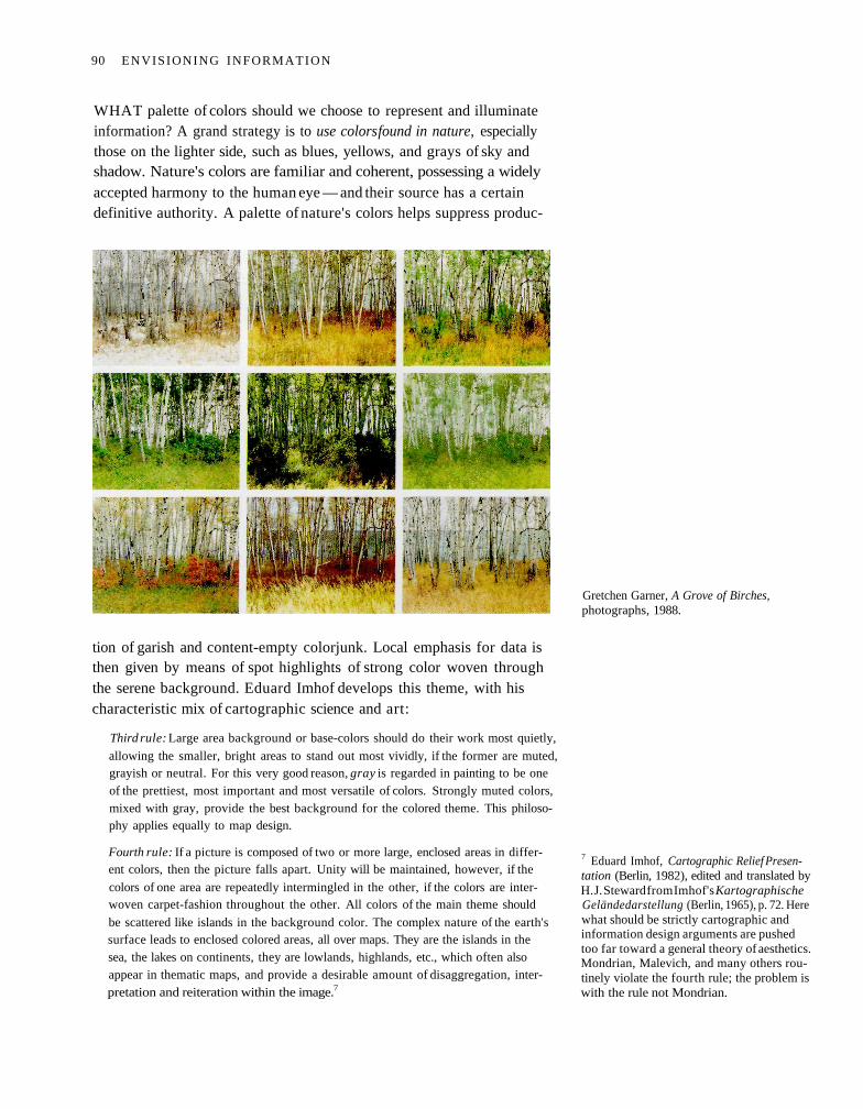
WHAT palette of colors should we choose to represent and illuminateinformation? A grand strategy is to use colors found in nature, especiallythose on the lighter side, such as blues, yellows, and grays of sky andshadow. Nature's colors are familiar and coherent, possessing a widelyaccepted harmony to the human eye — and their source has a certaindefinitive authority. A palette of nature's colors helps suppress produc-
tion of garish and content-empty colorjunk. Local emphasis for data isthen given by means of spot highlights of strong color woven throughthe serene background. Eduard Imhof develops this theme, with hischaracteristic mix of cartographic science and art:
Third rule: Large area background or base-colors should do their work most quietly,
allowing the smaller, bright areas to stand out most vividly, if the former are muted,grayish or neutral. For this very good reason, gray is regarded in painting to be oneof the prettiest, most important and most versatile of colors. Strongly muted colors,mixed with gray, provide the best background for the colored theme. This philoso-phy applies equally to map design.
Fourth rule: If a picture is composed of two or more large, enclosed areas in differ-ent colors, then the picture falls apart. Unity will be maintained, however, if the
colors of one area are repeatedly intermingled in the other, if the colors are inter-woven carpet-fashion throughout the other. All colors of the main theme should
be scattered like islands in the background color. The complex nature of the earth'ssurface leads to enclosed colored areas, all over maps. They are the islands in thesea, the lakes on continents, they are lowlands, highlands, etc., which often alsoappear in thematic maps, and provide a desirable amount of disaggregation, inter-pretation and reiteration within the image.7
Gretchen Garner, A Grove of Birches,photographs, 1988.
7 Eduard Imhof, Cartographic Relief Presen-tation (Berlin, 1982), edited and translated byH. J. Steward from Imhof's KartographischeGeländedarstellung (Berlin, 1965), p. 72. Herewhat should be strictly cartographic andinformation design arguments are pushedtoo far toward a general theory of aesthetics.Mondrian, Malevich, and many others rou-tinely violate the fourth rule; the problem iswith the rule not Mondrian.
90 ENVISIONING INFORMATION

Of course color brings to information more than just codes namingvisual nouns — color is a natural quantifier, with a perceptually continu-ous (in value and saturation) span of incredible fineness of distinction, ata precision comparable to most measurement. For data then as for art:"And what tremendous possibilities for the variation of meaning are of-fered by the combination of colors... What variations from the smallestshading to the glowing symphony of color. What perspectives in thedimension of meaning!" wrote Paul Klee.8 In practice everything is notthis wonderful, given the frequently uneasy translations from number tocorresponding color and thence to human readings and interpretations.
The General Bathymetric Chart of the Oceans records ocean depth(bathymetric tints) and land height (hypsometric tints) in 21 steps -with "the deeper or higher, the darker" serving as the visual metaphorfor coloring. Shown are the great ocean trenches of the western Pacificand Japan Sea. Numbered contours outline color fields, improving accu-racy of reading. Nearly transparent gray tracks, on a visual plane apartfrom the bathymetric tints, trace paths of sounding lines (outside thoseareas of extremely detailed surveys, such as ports and along coast lines).Every color mark on this map signals four variables: latitude, longitude,sea or land, and depth or altitude measured in meters.
8 Paul Klee, On Modern Art (London, 1948),translated by Paul Findlay from Über diemoderne Kunst (Bern, 1945), pp. 39-41.
General Bathymetric Chan of the Oceans,International Hydrographic Organization(Ottawa, Canada, 5th edition, 1984), 5.06.
C O L O R AND I N F O R M A T I O N 91
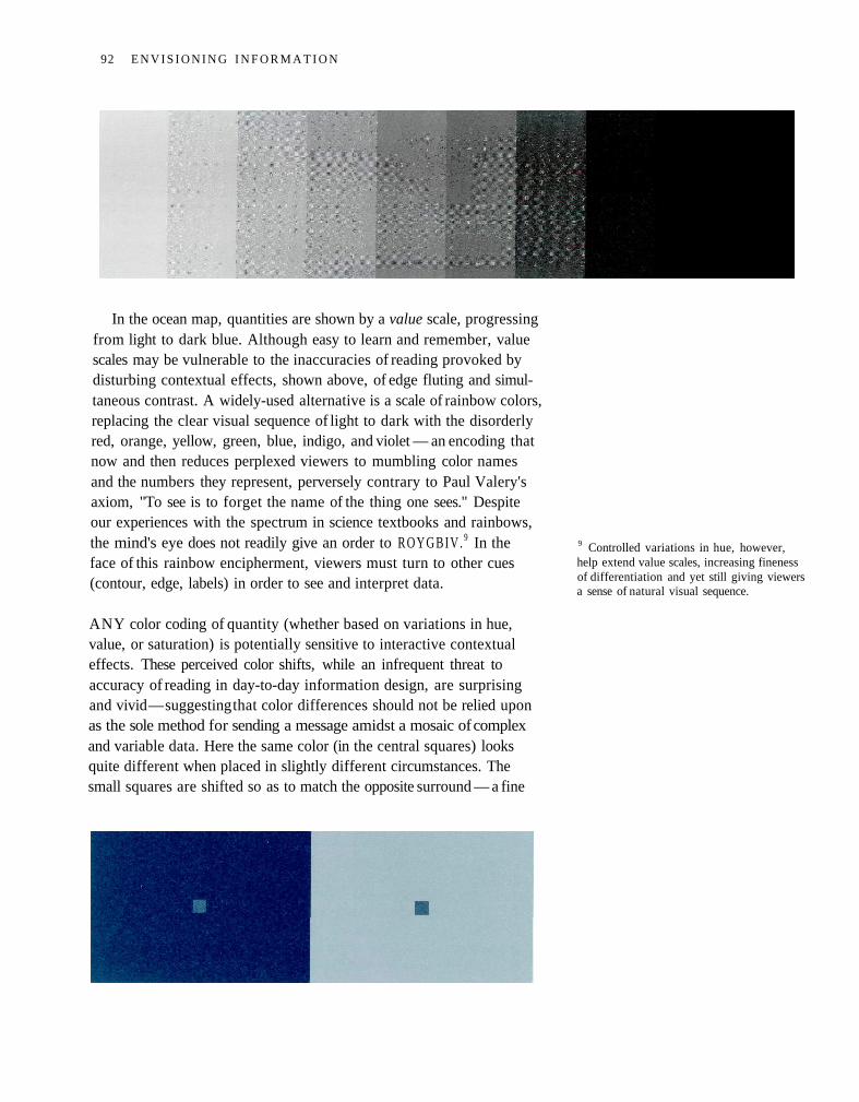
In the ocean map, quantities are shown by a value scale, progressingfrom light to dark blue. Although easy to learn and remember, valuescales may be vulnerable to the inaccuracies of reading provoked bydisturbing contextual effects, shown above, of edge fluting and simul-taneous contrast. A widely-used alternative is a scale of rainbow colors,replacing the clear visual sequence of light to dark with the disorderlyred, orange, yellow, green, blue, indigo, and violet — an encoding thatnow and then reduces perplexed viewers to mumbling color namesand the numbers they represent, perversely contrary to Paul Valery'saxiom, "To see is to forget the name of the thing one sees." Despiteour experiences with the spectrum in science textbooks and rainbows,the mind's eye does not readily give an order to ROYGBIV. 9 In theface of this rainbow encipherment, viewers must turn to other cues(contour, edge, labels) in order to see and interpret data.
ANY color coding of quantity (whether based on variations in hue,value, or saturation) is potentially sensitive to interactive contextualeffects. These perceived color shifts, while an infrequent threat toaccuracy of reading in day-to-day information design, are surprisingand vivid — suggesting that color differences should not be relied uponas the sole method for sending a message amidst a mosaic of complexand variable data. Here the same color (in the central squares) looksquite different when placed in slightly different circumstances. Thesmall squares are shifted so as to match the opposite surround — a fine
9 Controlled variations in hue, however,help extend value scales, increasing finenessof differentiation and yet still giving viewersa sense of natural visual sequence.
92 E N V I S I O N I N G I N F O R M A T I O N
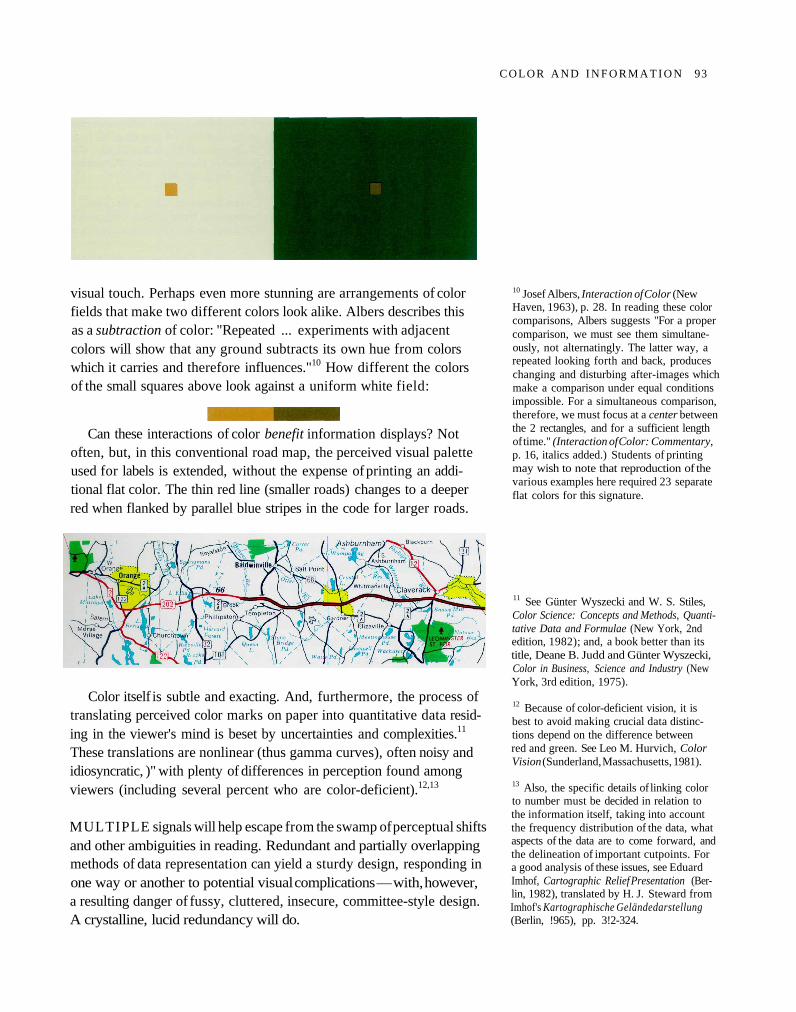
COLOR A N D I N F O R M A T I O N 93
visual touch. Perhaps even more stunning are arrangements of colorfields that make two different colors look alike. Albers describes thisas a subtraction of color: "Repeated ... experiments with adjacentcolors will show that any ground subtracts its own hue from colorswhich it carries and therefore influences."10 How different the colorsof the small squares above look against a uniform white field:
Can these interactions of color benefit information displays? Notoften, but, in this conventional road map, the perceived visual paletteused for labels is extended, without the expense of printing an addi-tional flat color. The thin red line (smaller roads) changes to a deeperred when flanked by parallel blue stripes in the code for larger roads.
Color itself is subtle and exacting. And, furthermore, the process oftranslating perceived color marks on paper into quantitative data resid-ing in the viewer's mind is beset by uncertainties and complexities.11
These translations are nonlinear (thus gamma curves), often noisy andidiosyncratic, )" with plenty of differences in perception found amongviewers (including several percent who are color-deficient).12,13
MULTIPLE signals will help escape from the swamp of perceptual shiftsand other ambiguities in reading. Redundant and partially overlappingmethods of data representation can yield a sturdy design, responding inone way or another to potential visual complications — with, however,a resulting danger of fussy, cluttered, insecure, committee-style design.A crystalline, lucid redundancy will do.
10 Josef Albers, Interaction of Color (NewHaven, 1963), p. 28. In reading these colorcomparisons, Albers suggests "For a propercomparison, we must see them simultane-ously, not alternatingly. The latter way, arepeated looking forth and back, produceschanging and disturbing after-images whichmake a comparison under equal conditionsimpossible. For a simultaneous comparison,therefore, we must focus at a center betweenthe 2 rectangles, and for a sufficient lengthof time." (Interaction of Color: Commentary,p. 16, italics added.) Students of printingmay wish to note that reproduction of thevarious examples here required 23 separateflat colors for this signature.
11 See Günter Wyszecki and W. S. Stiles,Color Science: Concepts and Methods, Quanti-tative Data and Formulae (New York, 2ndedition, 1982); and, a book better than itstitle, Deane B. Judd and Günter Wyszecki,Color in Business, Science and Industry (NewYork, 3rd edition, 1975).
12 Because of color-deficient vision, it isbest to avoid making crucial data distinc-tions depend on the difference betweenred and green. See Leo M. Hurvich, ColorVision (Sunderland, Massachusetts, 1981).
13 Also, the specific details of linking colorto number must be decided in relation tothe information itself, taking into accountthe frequency distribution of the data, whataspects of the data are to come forward, andthe delineation of important cutpoints. Fora good analysis of these issues, see EduardImhof, Cartographic Relief Presentation (Ber-lin, 1982), translated by H. J. Steward fromImhof's Kartographische Geländedarstellung(Berlin, !965), pp. 3!2-324.
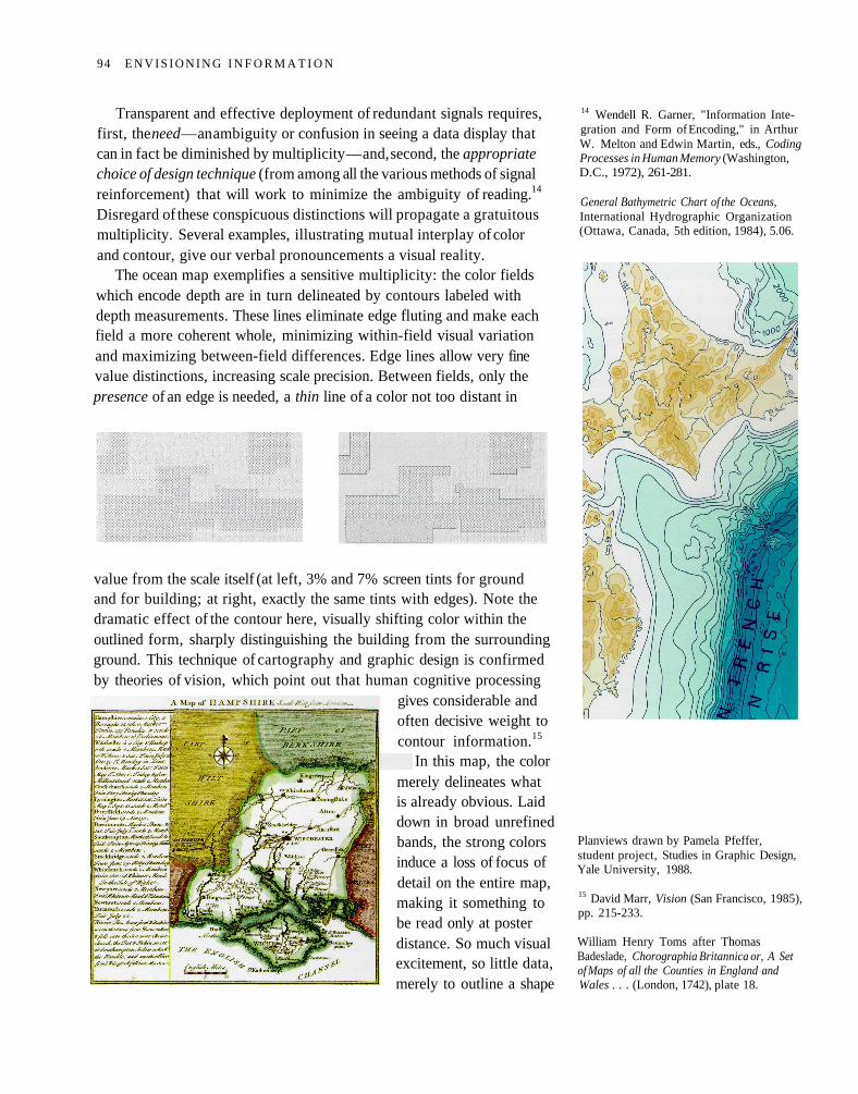
Transparent and effective deployment of redundant signals requires,first, the need — an ambiguity or confusion in seeing a data display thatcan in fact be diminished by multiplicity — and, second, the appropriatechoice of design technique (from among all the various methods of signalreinforcement) that will work to minimize the ambiguity of reading.14
Disregard of these conspicuous distinctions will propagate a gratuitousmultiplicity. Several examples, illustrating mutual interplay of colorand contour, give our verbal pronouncements a visual reality.
The ocean map exemplifies a sensitive multiplicity: the color fieldswhich encode depth are in turn delineated by contours labeled withdepth measurements. These lines eliminate edge fluting and make eachfield a more coherent whole, minimizing within-field visual variationand maximizing between-field differences. Edge lines allow very finevalue distinctions, increasing scale precision. Between fields, only thepresence of an edge is needed, a thin line of a color not too distant in
value from the scale itself (at left, 3% and 7% screen tints for groundand for building; at right, exactly the same tints with edges). Note thedramatic effect of the contour here, visually shifting color within theoutlined form, sharply distinguishing the building from the surroundingground. This technique of cartography and graphic design is confirmedby theories of vision, which point out that human cognitive processing
gives considerable andoften decisive weight tocontour information.15
In this map, the colormerely delineates whatis already obvious. Laiddown in broad unrefinedbands, the strong colorsinduce a loss of focus ofdetail on the entire map,making it something tobe read only at posterdistance. So much visualexcitement, so little data,merely to outline a shape
14 Wendell R. Garner, "Information Inte-gration and Form of Encoding," in ArthurW. Melton and Edwin Martin, eds., CodingProcesses in Human Memory (Washington,D.C., 1972), 261-281.
General Bathymetric Chart of the Oceans,International Hydrographic Organization(Ottawa, Canada, 5th edition, 1984), 5.06.
Planviews drawn by Pamela Pfeffer,student project, Studies in Graphic Design,Yale University, 1988.
15 David Marr, Vision (San Francisco, 1985),pp. 215-233.
William Henry Toms after ThomasBadeslade, Chorographia Britannica or, A Setof Maps of all the Counties in England andWales . . . (London, 1742), plate 18.
94 E N V I S I O N I N G I N F O R M A T I O N
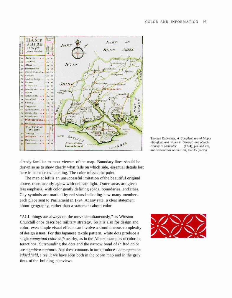
already familiar to most viewers of the map. Boundary lines should bedrawn so as to show clearly what falls on which side, essential details losthere in color cross-hatching. The color misses the point.
The map at left is an unsuccessful imitation of the beautiful originalabove, translucently aglow with delicate light. Outer areas are givenless emphasis, with color gently defining roads, boundaries, and cities.City symbols are marked by red stars indicating how many memberseach place sent to Parliament in 1724. At any rate, a clear statementabout geography, rather than a statement about color.
"ALL things are always on the move simultaneously," as WinstonChurchill once described military strategy. So it is also for design andcolor; even simple visual effects can involve a simultaneous complexityof design issues. For this Japanese textile pattern, white dots produce aslight contextual color shift nearby, as in the Albers examples of color in-teractions. Surrounding the dots and the narrow band of shifted colorare cognitive contours. And these contours in turn produce a homogeneousedged field, a result we have seen both in the ocean map and in the graytints of the building planviews.
Thomas Badeslade, A Compleat sett of Mappsof England and Wales in General, and of eachCounty in particular . . . (1724), pen and ink,and watercolor on vellum, leaf 35 (recto).
C O L O R A N D I N F O R M A T I O N 95
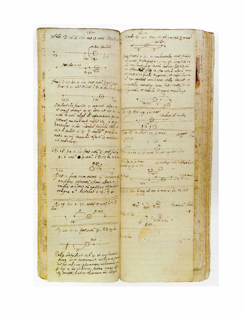
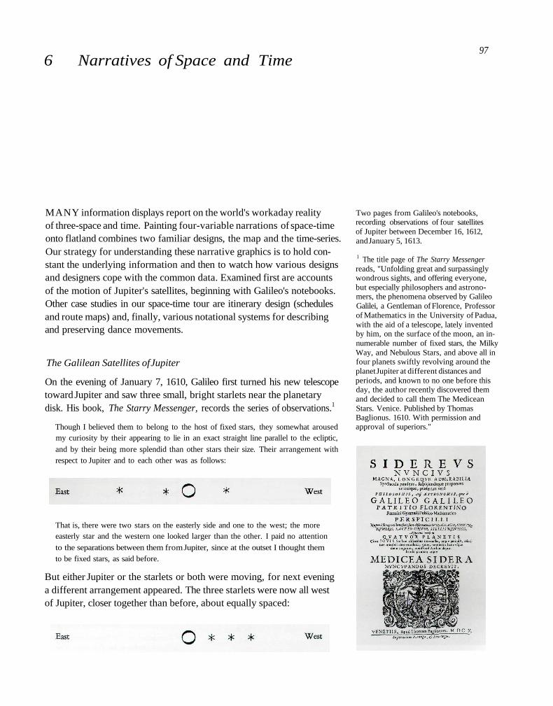
6 Narratives of Space and Time
MANY information displays report on the world's workaday realityof three-space and time. Painting four-variable narrations of space-timeonto flatland combines two familiar designs, the map and the time-series.Our strategy for understanding these narrative graphics is to hold con-stant the underlying information and then to watch how various designsand designers cope with the common data. Examined first are accountsof the motion of Jupiter's satellites, beginning with Galileo's notebooks.Other case studies in our space-time tour are itinerary design (schedulesand route maps) and, finally, various notational systems for describingand preserving dance movements.
The Galilean Satellites of Jupiter
On the evening of January 7, 1610, Galileo first turned his new telescopetoward Jupiter and saw three small, bright starlets near the planetarydisk. His book, The Starry Messenger, records the series of observations.1
Though I believed them to belong to the host of fixed stars, they somewhat arousedmy curiosity by their appearing to lie in an exact straight line parallel to the ecliptic,
and by their being more splendid than other stars their size. Their arrangement withrespect to Jupiter and to each other was as follows:
That is, there were two stars on the easterly side and one to the west; the moreeasterly star and the western one looked larger than the other. I paid no attention
to the separations between them from Jupiter, since at the outset I thought themto be fixed stars, as said before.
But either Jupiter or the starlets or both were moving, for next eveninga different arrangement appeared. The three starlets were now all westof Jupiter, closer together than before, about equally spaced:
Two pages from Galileo's notebooks,recording observations of four satellitesof Jupiter between December 16, 1612,and January 5, 1613.
1 The title page of The Starry Messengerreads, "Unfolding great and surpassinglywondrous sights, and offering everyone,but especially philosophers and astrono-mers, the phenomena observed by GalileoGalilei, a Gentleman of Florence, Professorof Mathematics in the University of Padua,with the aid of a telescope, lately inventedby him, on the surface of the moon, an in-numerable number of fixed stars, the MilkyWay, and Nebulous Stars, and above all infour planets swiftly revolving around theplanet Jupiter at different distances andperiods, and known to no one before thisday, the author recently discovered themand decided to call them The MediceanStars. Venice. Published by ThomasBaglionus. 1610. With permission andapproval of superiors."
97
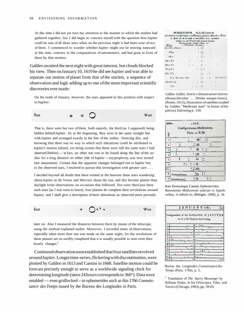
At this time I did not yet turn my attention to the manner in which the starlets had
gathered together, but I did begin to concern myself with the question how Jupiter
could be east of all these stars when on the previous night it had been west of twoof them. I commenced to wonder whether Jupiter might not be moving eastward
at this time, contrary to the computations of astronomers, and had gone in front of
them by that motion.
Galileo awaited the next night with great interest, but clouds blockedhis view. Then on January 10, 1610 he did see Jupiter and was able toseparate out motion of planet from that of the starlets, a sequence ofobservation and logic adding up to one of the most important scientificdiscoveries ever made:
On the tenth of January, however, the stars appeared in this position with respect
to Jupiter:
That is, there were but two of them, both easterly, the third (as I supposed) being
hidden behind Jupiter. As at the beginning, they were in the same straight line
with Jupiter and arranged exactly in the line of the zodiac. Noticing this, and
knowing that there was no way in which such alterations could be attributed to
Jupiter's motion [alone], yet being certain that these were still the same stars I had
observed [before] — in fact, no other star was to be found along the line of the zo-
diac for a long distance on either side of Jupiter — my perplexity was now turned
into amazement. Certain that the apparent changes belonged not to Jupiter butto the observed stars, I resolved to pursue this investigation with greater care . . .
I decided beyond all doubt that there existed in the heavens three stars wandering
about Jupiter as do Venus and Mercury about the sun, and this became plainer thandaylight from observations on occasions that followed. Nor were there just three
such stars [as I was soon to learn]; four planets do complete their revolutions around
Jupiter, and I shall give a description of their alterations as observed more precisely
later on. Also I measured the distances between them by means of the telescope,
using the method explained earlier. Moreover, I recorded times of observations,
especially when more than one was made on the same night; for the revolutions ofthese planets are so swiftly completed that it is usually possible to note even their
hourly changes.2
Continued observation soon established that four satellites revolvedaround Jupiter. Longer time-series, flickering with discontinuities, wereplotted by Galileo in 1613 and Cassini in 1668. Satellite motion could beforecast precisely enough to serve as a worldwide signaling clock fordetermining longitude (since 24 hours corresponds to 360°). Data wereentabled — even gridlocked—in ephemerides such as this 1766 Connais-sance des Temps issued by the Bureau des Longitudes in Paris.
Galileo Galilei, Istoria e dimostrazioni intornoalle macchie solan ... [Welser sunspot letters],(Rome, 1613), illustration of satellites (calledby Galileo "Medicean stars" in honor of hispatron) following p. 150.
Jean Domenique Cassini, EphemeridesBononienses Mediceorum syderum ex hypoth-esibus, et tabulis Io, (Bologne, 1668), p. 34.
Bureau des Longitudes, Connaissance desTemps (Paris, 1766), p. 5.
2 Translation of The Starry Messenger byStillman Drake, in his Telescopes, Tides, andTactics (Chicago, 1983), pp. 59-63.
98 E N V I S I O N I N G I N F O R M A T I O N
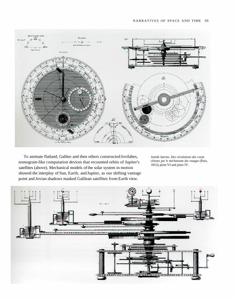
To animate flatland, Galileo and then others constructed Jovilabes,nomogram-like computation devices that recounted orbits of Jupiter'ssatellites (above). Mechanical models of the solar system in motionshowed the interplay of Sun, Earth, and Jupiter, as our shifting vantagepoint and Jovian shadows masked Galilean satellites from Earth view.
Antide Janvier, Des révolutions des corpscélestes par le méchanisme des rouages (Paris,1812), plate VI and plate IV.
N A R R A T I V E S OF SPACE A N D TIME 99
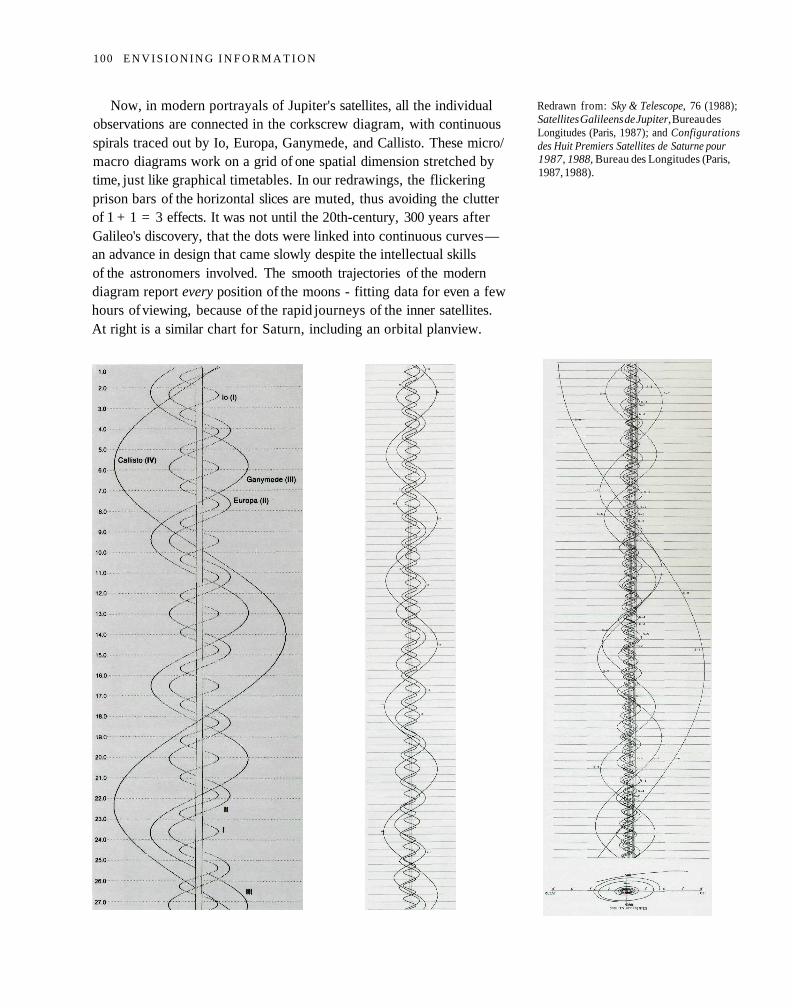
Now, in modern portrayals of Jupiter's satellites, all the individualobservations are connected in the corkscrew diagram, with continuousspirals traced out by Io, Europa, Ganymede, and Callisto. These micro/macro diagrams work on a grid of one spatial dimension stretched bytime, just like graphical timetables. In our redrawings, the flickeringprison bars of the horizontal slices are muted, thus avoiding the clutterof 1 + 1 = 3 effects. It was not until the 20th-century, 300 years afterGalileo's discovery, that the dots were linked into continuous curves —an advance in design that came slowly despite the intellectual skillsof the astronomers involved. The smooth trajectories of the moderndiagram report every position of the moons - fitting data for even a fewhours of viewing, because of the rapid journeys of the inner satellites.At right is a similar chart for Saturn, including an orbital planview.
Redrawn from: Sky & Telescope, 76 (1988);Satellites Galileens de Jupiter, Bureau desLongitudes (Paris, 1987); and Configurationsdes Huit Premiers Satellites de Saturne pour1987, 1988, Bureau des Longitudes (Paris,1987, 1988).
100 E N V I S I O N I N G I N F O R M A T I O N
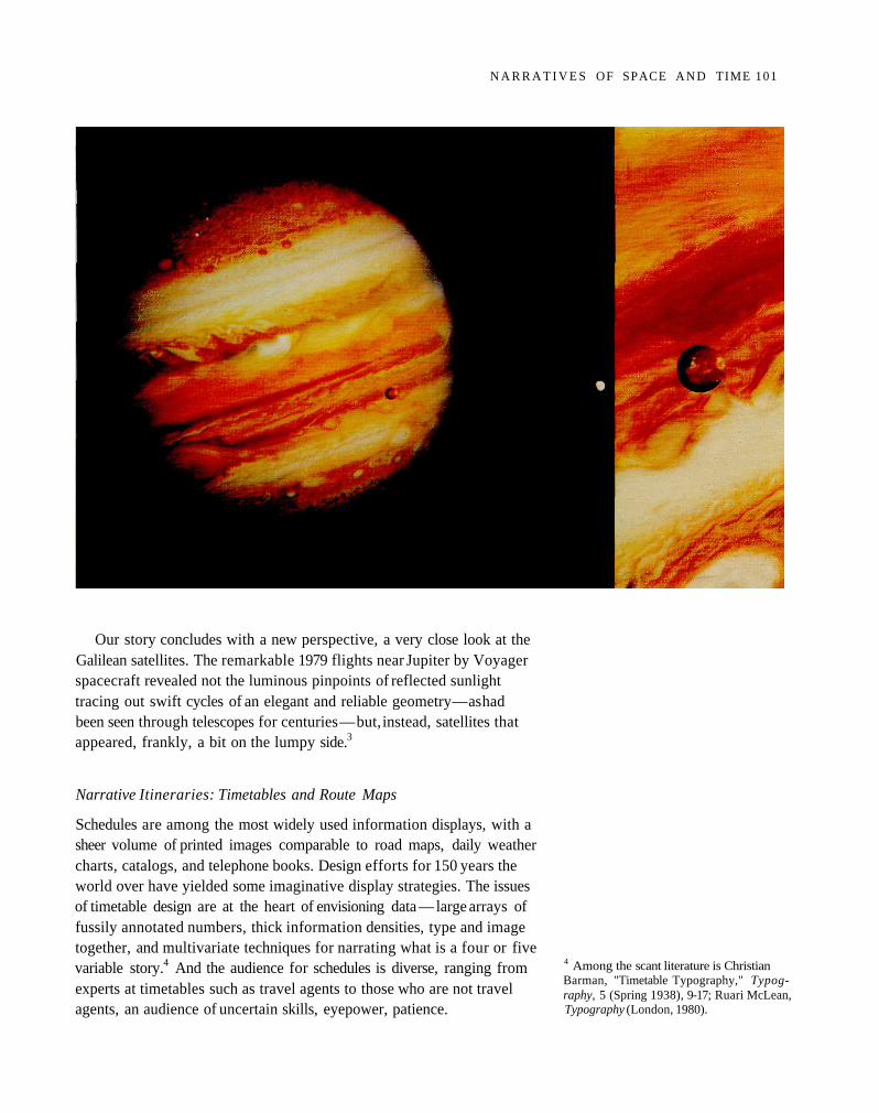
Our story concludes with a new perspective, a very close look at theGalilean satellites. The remarkable 1979 flights near Jupiter by Voyagerspacecraft revealed not the luminous pinpoints of reflected sunlighttracing out swift cycles of an elegant and reliable geometry — as hadbeen seen through telescopes for centuries — but, instead, satellites thatappeared, frankly, a bit on the lumpy side.3
Narrative Itineraries: Timetables and Route Maps
Schedules are among the most widely used information displays, with asheer volume of printed images comparable to road maps, daily weathercharts, catalogs, and telephone books. Design efforts for 150 years theworld over have yielded some imaginative display strategies. The issuesof timetable design are at the heart of envisioning data — large arrays offussily annotated numbers, thick information densities, type and imagetogether, and multivariate techniques for narrating what is a four or fivevariable story.4 And the audience for schedules is diverse, ranging fromexperts at timetables such as travel agents to those who are not travelagents, an audience of uncertain skills, eyepower, patience.
4 Among the scant literature is ChristianBarman, "Timetable Typography," Typog-raphy, 5 (Spring 1938), 9-17; Ruari McLean,Typography (London, 1980).
N A R R A T I V E S OF SPACE A N D TIME 101
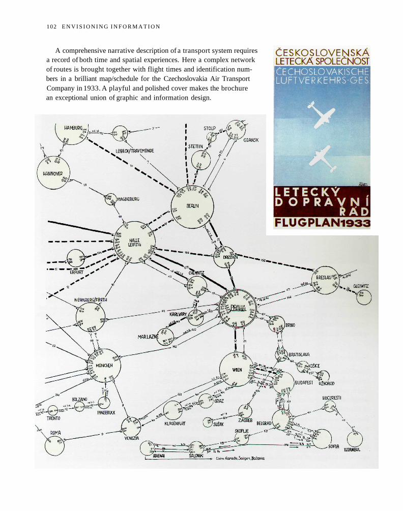
A comprehensive narrative description of a transport system requiresa record of both time and spatial experiences. Here a complex networkof routes is brought together with flight times and identification num-bers in a brilliant map/schedule for the Czechoslovakia Air TransportCompany in 1933. A playful and polished cover makes the brochurean exceptional union of graphic and information design.
102 E N V I S I O N I N G I N F O R M A T I O N
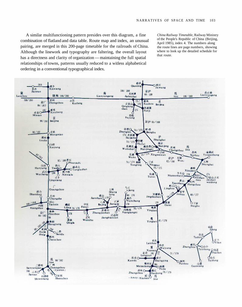
A similar multifunctioning pattern presides over this diagram, a finecombination of flatland and data table. Route map and index, an unusualpairing, are merged in this 200-page timetable for the railroads of China.Although the linework and typography are faltering, the overall layouthas a directness and clarity of organization — maintaining the full spatialrelationships of towns, patterns usually reduced to a witless alphabeticalordering in a conventional typographical index.
China Railway Timetable, Railway Ministryof the People's Republic of China (Beijing,April 1985), index 4. The numbers alongthe route lines are page numbers, showingwhere to look up the detailed schedule forthat route.
N A R R A T I V E S OF S P A C E AND TIME 103
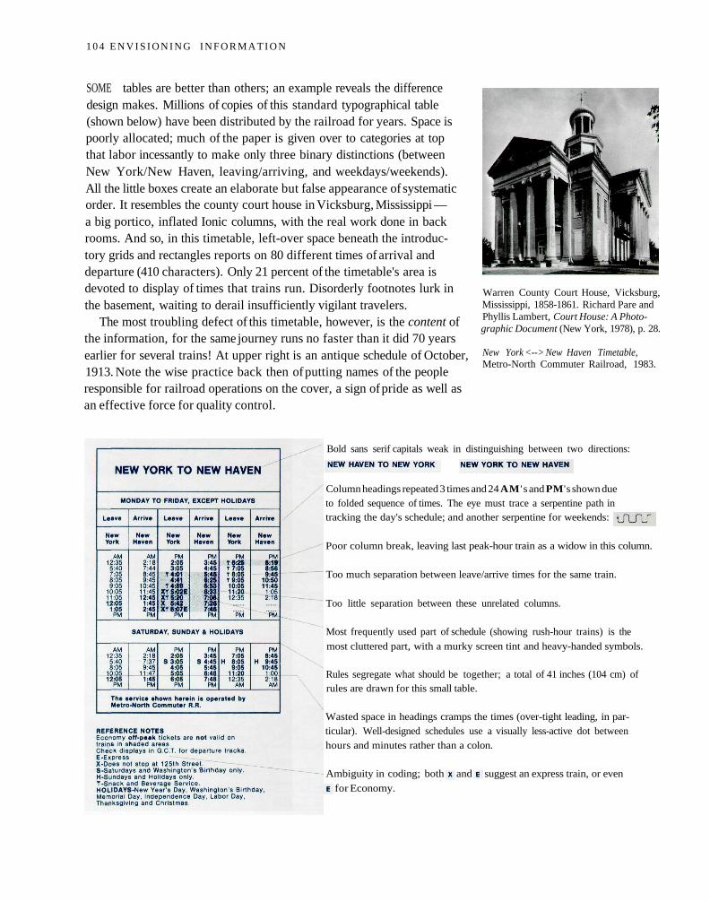
SOME tables are better than others; an example reveals the differencedesign makes. Millions of copies of this standard typographical table(shown below) have been distributed by the railroad for years. Space ispoorly allocated; much of the paper is given over to categories at topthat labor incessantly to make only three binary distinctions (betweenNew York/New Haven, leaving/arriving, and weekdays/weekends).All the little boxes create an elaborate but false appearance of systematicorder. It resembles the county court house in Vicksburg, Mississippi —a big portico, inflated Ionic columns, with the real work done in backrooms. And so, in this timetable, left-over space beneath the introduc-tory grids and rectangles reports on 80 different times of arrival anddeparture (410 characters). Only 21 percent of the timetable's area isdevoted to display of times that trains run. Disorderly footnotes lurk inthe basement, waiting to derail insufficiently vigilant travelers.
The most troubling defect of this timetable, however, is the content ofthe information, for the same journey runs no faster than it did 70 yearsearlier for several trains! At upper right is an antique schedule of October,1913. Note the wise practice back then of putting names of the peopleresponsible for railroad operations on the cover, a sign of pride as well asan effective force for quality control.
Warren County Court House, Vicksburg,Mississippi, 1858-1861. Richard Pare andPhyllis Lambert, Court House: A Photo-graphic Document (New York, 1978), p. 28.
New York <--> New Haven Timetable,Metro-North Commuter Railroad, 1983.
Bold sans serif capitals weak in distinguishing between two directions:
Column headings repeated 3 times and 24 AM ' s and PM's shown dueto folded sequence of times. The eye must trace a serpentine path intracking the day's schedule; and another serpentine for weekends:
Poor column break, leaving last peak-hour train as a widow in this column.
Too much separation between leave/arrive times for the same train.
Too little separation between these unrelated columns.
Most frequently used part of schedule (showing rush-hour trains) is the
most cluttered part, with a murky screen tint and heavy-handed symbols.
Rules segregate what should be together; a total of 41 inches (104 cm) ofrules are drawn for this small table.
Wasted space in headings cramps the times (over-tight leading, in par-ticular). Well-designed schedules use a visually less-active dot betweenhours and minutes rather than a colon.
Ambiguity in coding; both and suggest an express train, or even
for Economy.
1 0 4 E N V I S I O N I N G I N F O R M A T I O N
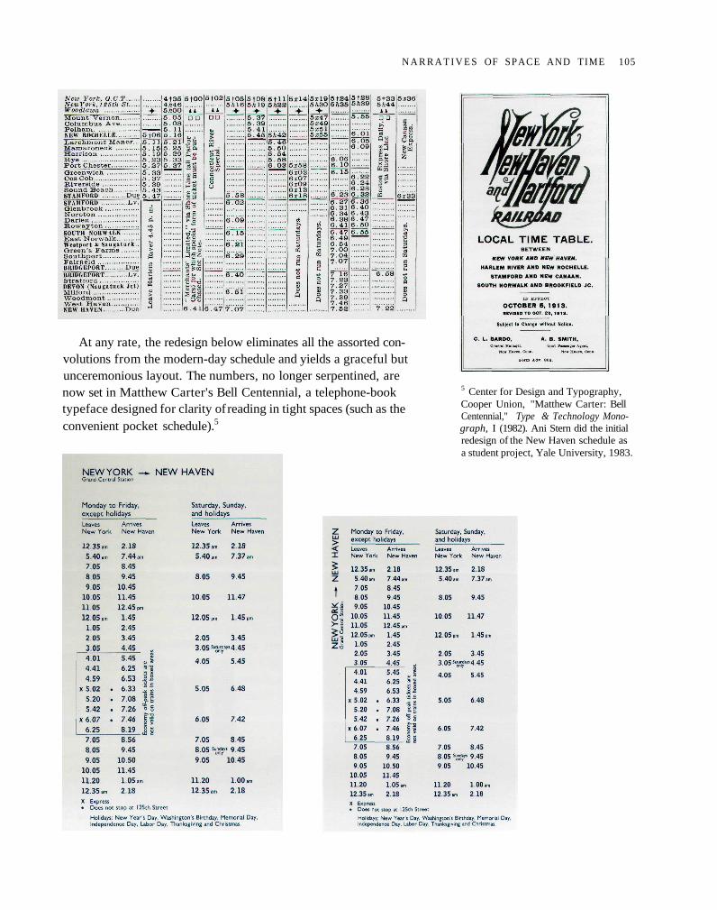
At any rate, the redesign below eliminates all the assorted con-volutions from the modern-day schedule and yields a graceful butunceremonious layout. The numbers, no longer serpentined, arenow set in Matthew Carter's Bell Centennial, a telephone-booktypeface designed for clarity of reading in tight spaces (such as theconvenient pocket schedule).5
5 Center for Design and Typography,Cooper Union, "Matthew Carter: BellCentennial," Type & Technology Mono-graph, I (1982). Ani Stern did the initialredesign of the New Haven schedule asa student project, Yale University, 1983.
N A R R A T I V E S OF SPACE AND TIME 105
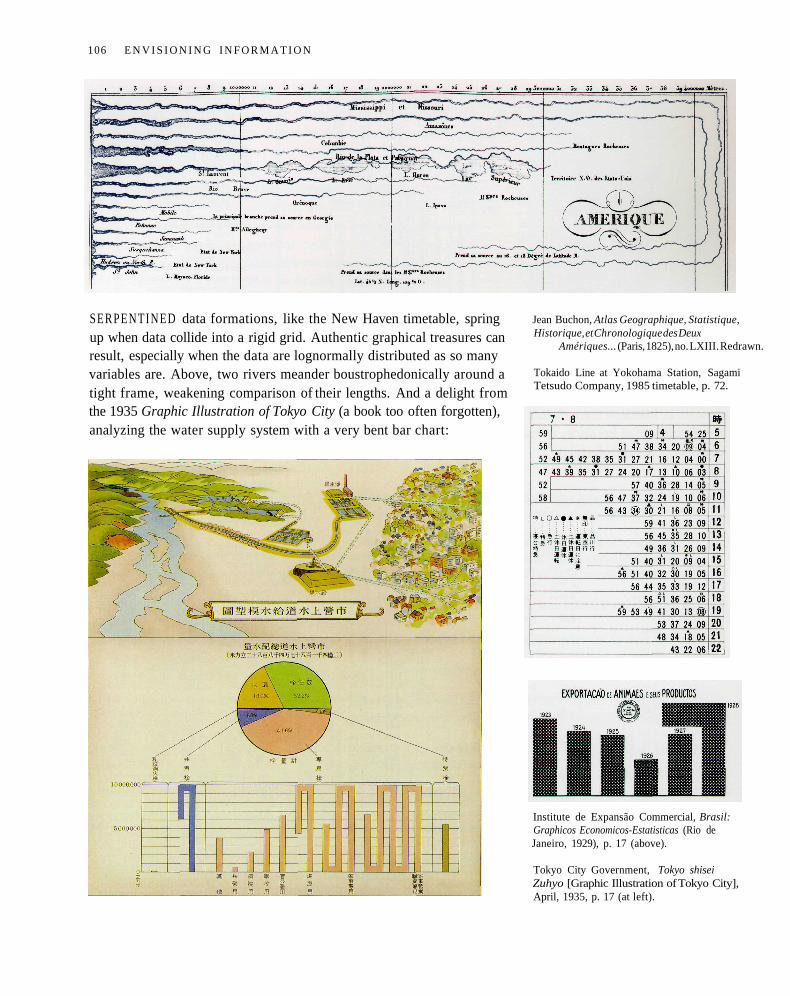
SERPENTINED data formations, like the New Haven timetable, springup when data collide into a rigid grid. Authentic graphical treasures canresult, especially when the data are lognormally distributed as so manyvariables are. Above, two rivers meander boustrophedonically around atight frame, weakening comparison of their lengths. And a delight fromthe 1935 Graphic Illustration of Tokyo City (a book too often forgotten),analyzing the water supply system with a very bent bar chart:
Jean Buchon, Atlas Geographique, Statistique,Historique, et Chronologique des Deux
Amériques... (Paris, 1825), no. LXIII. Redrawn.
Tokaido Line at Yokohama Station, SagamiTetsudo Company, 1985 timetable, p. 72.
Institute de Expansão Commercial, Brasil:Graphicos Economicos-Estatisticas (Rio deJaneiro, 1929), p. 17 (above).
Tokyo City Government, Tokyo shiseiZuhyo [Graphic Illustration of Tokyo City],April, 1935, p. 17 (at left).
106 E N V I S I O N I N G I N F O R M A T I O N
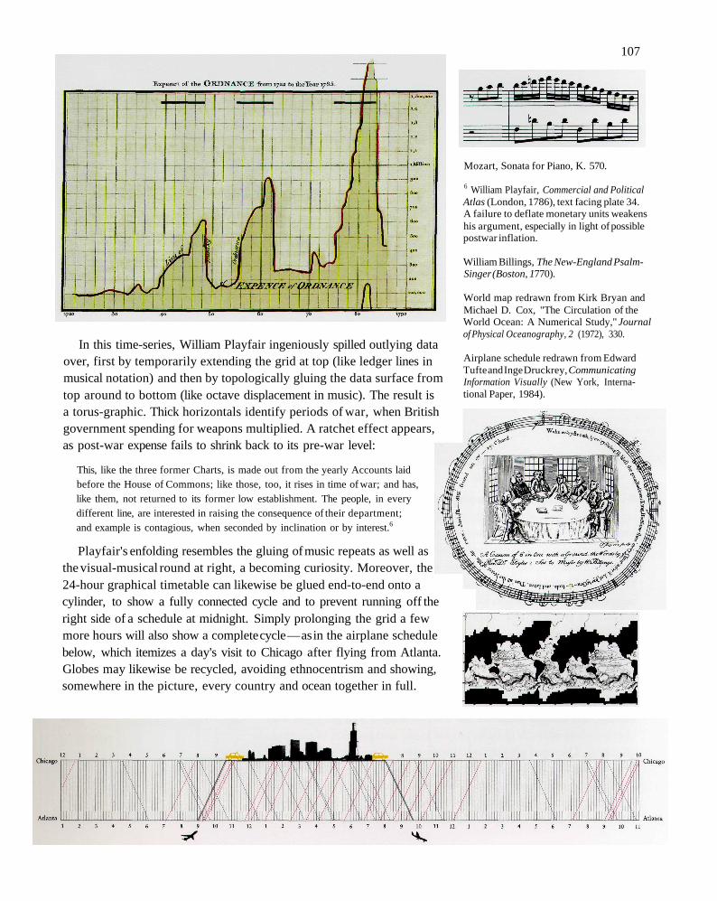
In this time-series, William Playfair ingeniously spilled outlying dataover, first by temporarily extending the grid at top (like ledger lines inmusical notation) and then by topologically gluing the data surface fromtop around to bottom (like octave displacement in music). The result isa torus-graphic. Thick horizontals identify periods of war, when Britishgovernment spending for weapons multiplied. A ratchet effect appears,as post-war expense fails to shrink back to its pre-war level:
This, like the three former Charts, is made out from the yearly Accounts laidbefore the House of Commons; like those, too, it rises in time of war; and has,like them, not returned to its former low establishment. The people, in everydifferent line, are interested in raising the consequence of their department;and example is contagious, when seconded by inclination or by interest.6
Playfair's enfolding resembles the gluing of music repeats as well asthe visual-musical round at right, a becoming curiosity. Moreover, the24-hour graphical timetable can likewise be glued end-to-end onto acylinder, to show a fully connected cycle and to prevent running off theright side of a schedule at midnight. Simply prolonging the grid a fewmore hours will also show a complete cycle — as in the airplane schedulebelow, which itemizes a day's visit to Chicago after flying from Atlanta.Globes may likewise be recycled, avoiding ethnocentrism and showing,somewhere in the picture, every country and ocean together in full.
Mozart, Sonata for Piano, K. 570.
6 William Playfair, Commercial and PoliticalAtlas (London, 1786), text facing plate 34.A failure to deflate monetary units weakenshis argument, especially in light of possiblepostwar inflation.
William Billings, The New-England Psalm-Singer (Boston, 1770).
World map redrawn from Kirk Bryan andMichael D. Cox, "The Circulation of theWorld Ocean: A Numerical Study," Journalof Physical Oceanography, 2 (1972), 330.
Airplane schedule redrawn from EdwardTufte and Inge Druckrey, CommunicatingInformation Visually (New York, Interna-tional Paper, 1984).
107
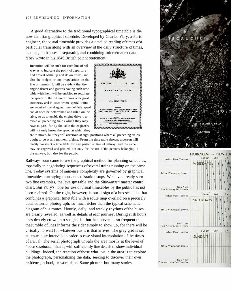
A good alternative to the traditional typographical timetable is thenow-familiar graphical schedule. Developed by Charles Ybry, a Parisengineer, the visual timetable provides a detailed reading of times of aparticular train along with an overview of the daily structure of times,stations, and routes — separating and combining micro/macro data.Ybry wrote in his 1846 British patent statement:
Invention will be such for each line of rail-
way as to indicate the point of departure
and arrival of the up and down trains, and
also the bridges or any irregularities on the
line or tunnels. It will be evident that the
engine driver and guards having such time
table with them will be enabled to regulate
the speeds of the different trains with great
exactness, and in cases where special trains
are required the diagonal lines of their speed
can at once be determined and ruled on the
table, so as to enable the engine drivers toavoid all preceding trains which they may
have to pass; for by the table the engineers
will not only know the speed at which theyare to move, but they will ascertain at sight positions where all preceding trains
ought to be at any moment of time. From the time table shown, a person will
readily construct a time table for any particular line of railway, and the same
may be engraved and printed, not only for the use of the persons belonging tothe railway, but also for the public.
Railways soon came to use the graphical method for planning schedules,especially in negotiating sequences of several trains running on the sameline. Today systems of immense complexity are governed by graphicaltimetables portraying thousands of station stops. We have already seentwo fine examples, the Java spy table and the Shinkansen master controlchart. But Ybry's hope for use of visual timetables by the public has notbeen realized. On the right, however, is our design of a bus schedule thatcombines a graphical timetable with a route map overlaid on a preciselydetailed aerial photograph, so much richer than the typical schematicdiagram of bus routes. Hourly, daily, and weekly rhythms of the busesare clearly revealed, as well as details of each journey. During rush hours,lines densely crowd into spaghetti — but then service is so frequent thatthe jumble of lines informs the rider simply to show up, for there will bevirtually no wait for whatever bus it is that arrives. The gray grid is setat ten-minute intervals in order to ease visual interpolation of the timesof arrival. The aerial photograph unveils the area mostly at the level ofhouse resolution, that is, with sufficiently fine details to show individualbuildings. Indeed, the reaction of those who live in the area is to explorethe photograph, personalizing the data, seeking to discover their ownresidence, school, or workplace. Same picture, but many stories.
1 0 8 E N V I S I O N I N G I N F O R M A T I O N
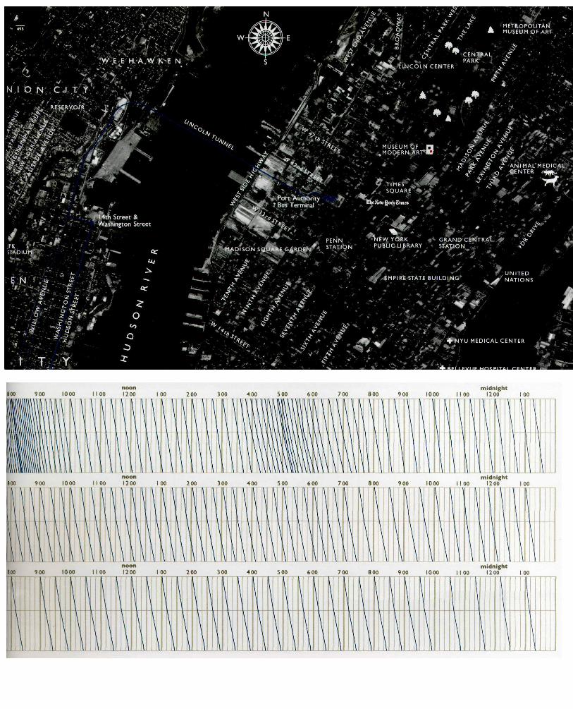
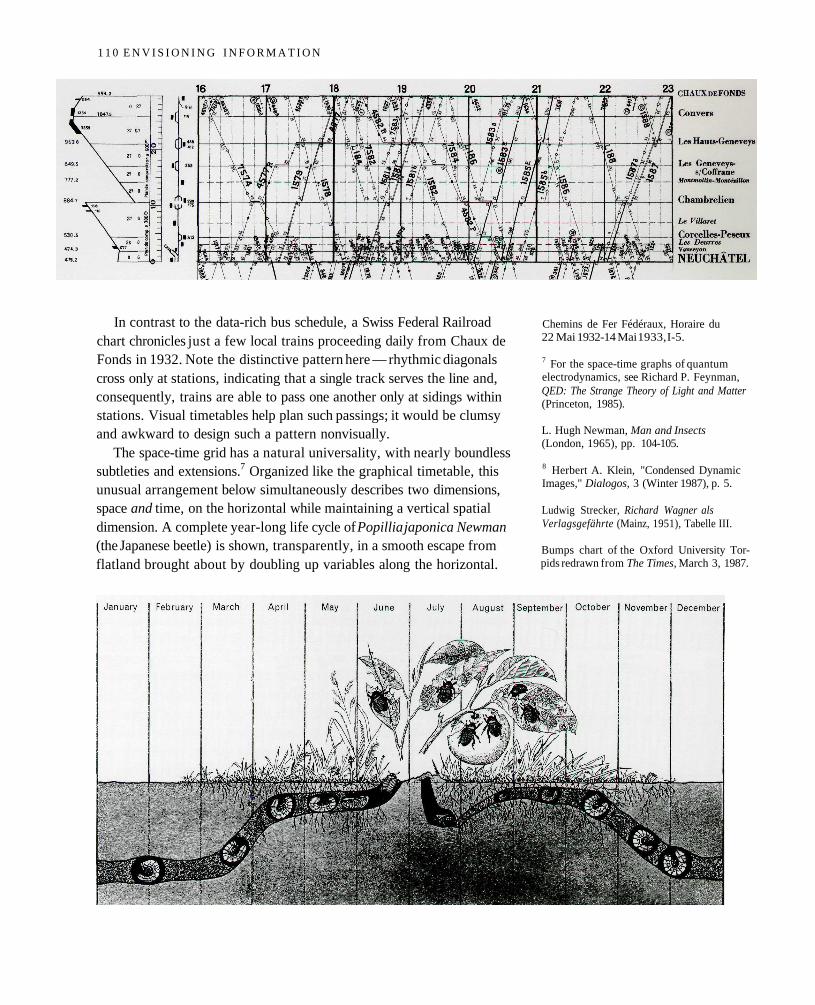
In contrast to the data-rich bus schedule, a Swiss Federal Railroadchart chronicles just a few local trains proceeding daily from Chaux deFonds in 1932. Note the distinctive pattern here — rhythmic diagonalscross only at stations, indicating that a single track serves the line and,consequently, trains are able to pass one another only at sidings withinstations. Visual timetables help plan such passings; it would be clumsyand awkward to design such a pattern nonvisually.
The space-time grid has a natural universality, with nearly boundlesssubtleties and extensions.7 Organized like the graphical timetable, thisunusual arrangement below simultaneously describes two dimensions,space and time, on the horizontal while maintaining a vertical spatialdimension. A complete year-long life cycle of Popillia japonica Newman(the Japanese beetle) is shown, transparently, in a smooth escape fromflatland brought about by doubling up variables along the horizontal.
Chemins de Fer Fédéraux, Horaire du22 Mai 1932-14 Mai 1933, I-5.
7 For the space-time graphs of quantumelectrodynamics, see Richard P. Feynman,QED: The Strange Theory of Light and Matter(Princeton, 1985).
L. Hugh Newman, Man and Insects(London, 1965), pp. 104-105.
8 Herbert A. Klein, "Condensed DynamicImages," Dialogos, 3 (Winter 1987), p. 5.
Ludwig Strecker, Richard Wagner alsVerlagsgefährte (Mainz, 1951), Tabelle III.
Bumps chart of the Oxford University Tor-pids redrawn from The Times, March 3, 1987.
1 1 0 E N V I S I O N I N G I N F O R M A T I O N
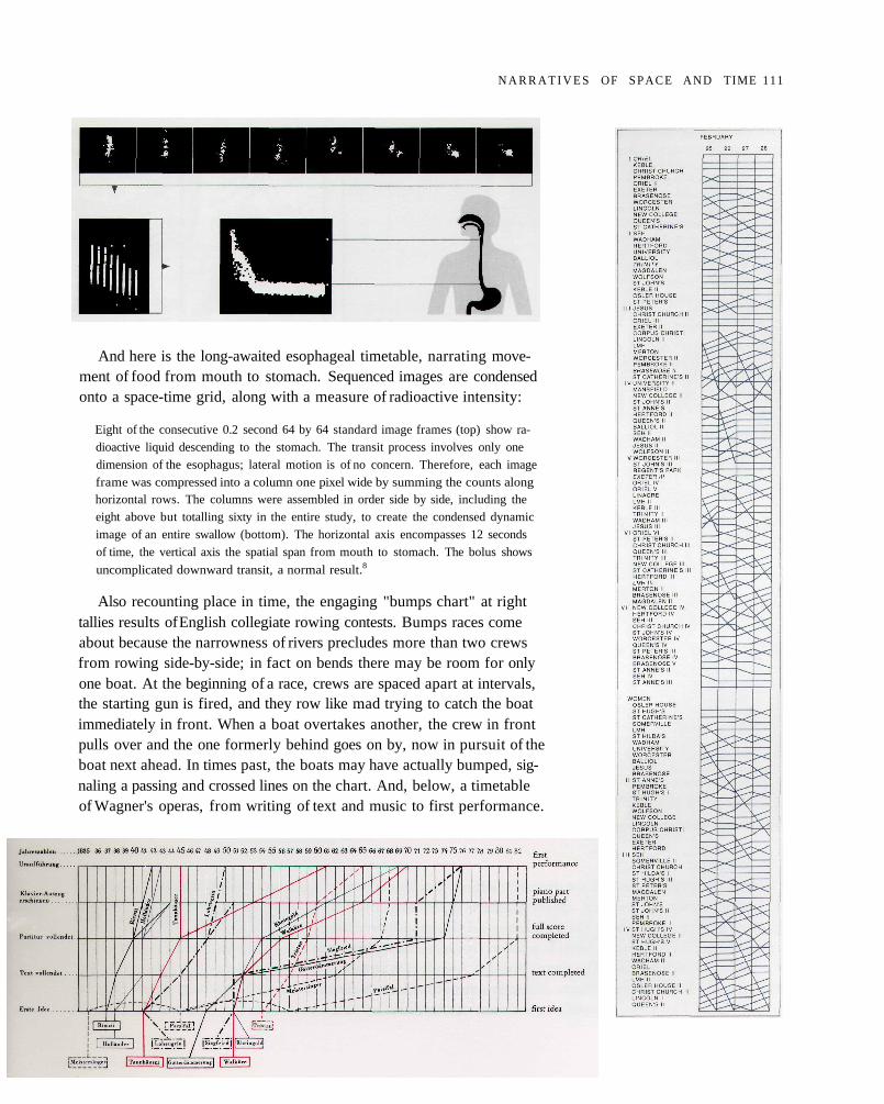
And here is the long-awaited esophageal timetable, narrating move-ment of food from mouth to stomach. Sequenced images are condensedonto a space-time grid, along with a measure of radioactive intensity:
Eight of the consecutive 0.2 second 64 by 64 standard image frames (top) show ra-
dioactive liquid descending to the stomach. The transit process involves only one
dimension of the esophagus; lateral motion is of no concern. Therefore, each image
frame was compressed into a column one pixel wide by summing the counts alonghorizontal rows. The columns were assembled in order side by side, including the
eight above but totalling sixty in the entire study, to create the condensed dynamic
image of an entire swallow (bottom). The horizontal axis encompasses 12 seconds
of time, the vertical axis the spatial span from mouth to stomach. The bolus shows
uncomplicated downward transit, a normal result.8
Also recounting place in time, the engaging "bumps chart" at righttallies results of English collegiate rowing contests. Bumps races comeabout because the narrowness of rivers precludes more than two crewsfrom rowing side-by-side; in fact on bends there may be room for onlyone boat. At the beginning of a race, crews are spaced apart at intervals,the starting gun is fired, and they row like mad trying to catch the boatimmediately in front. When a boat overtakes another, the crew in frontpulls over and the one formerly behind goes on by, now in pursuit of theboat next ahead. In times past, the boats may have actually bumped, sig-naling a passing and crossed lines on the chart. And, below, a timetableof Wagner's operas, from writing of text and music to first performance.
N A R R A T I V E S OF SPACE AND TIME 111
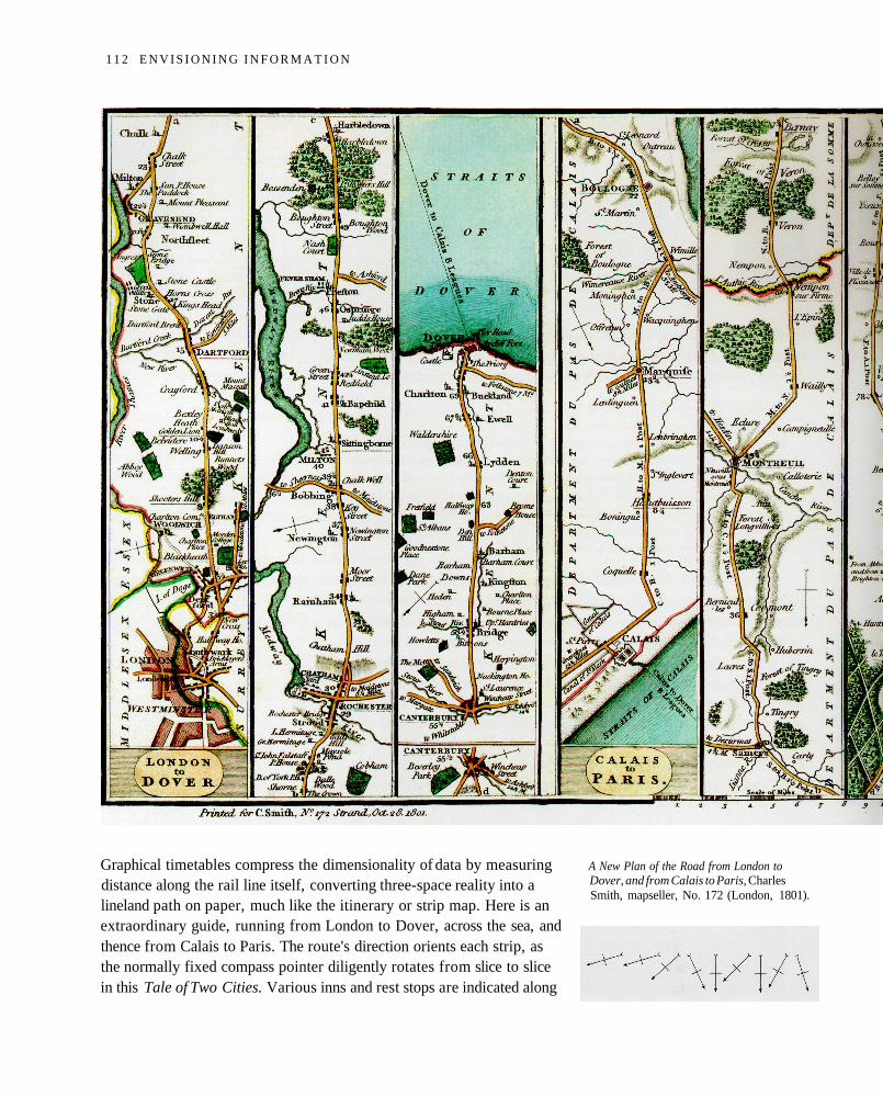
Graphical timetables compress the dimensionality of data by measuringdistance along the rail line itself, converting three-space reality into alineland path on paper, much like the itinerary or strip map. Here is anextraordinary guide, running from London to Dover, across the sea, andthence from Calais to Paris. The route's direction orients each strip, asthe normally fixed compass pointer diligently rotates from slice to slicein this Tale of Two Cities. Various inns and rest stops are indicated along
A New Plan of the Road from London toDover, and from Calais to Paris, CharlesSmith, mapseller, No. 172 (London, 1801).
1 1 2 E N V I S I O N I N G I N F O R M A T I O N
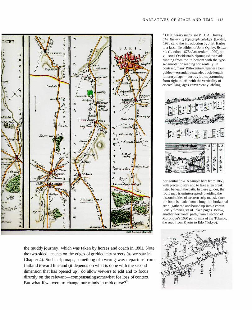
the muddy journey, which was taken by horses and coach in 1801. Notethe two-sided accents on the edges of gridded city streets (as we saw inChapter 4). Such strip maps, something of a wrong-way departure fromflatland toward lineland (it depends on what is done with the seconddimension that has opened up), do allow viewers to edit and to focusdirectly on the relevant — compensating somewhat for loss of context.But what if we were to change our minds in midcourse?9
9 On itinerary maps, see P. D. A. Harvey,The History of Topographical Maps (London,1980); and the introduction by J. B. Harleyto a facsimile edition of John Ogilby, Britan-nia (London, 1675; Amsterdam, 1970), pp.v—xxxi. Occidental strip maps show roadsrunning from top to bottom with the type-set annotation reading horizontally. Incontrast, many 19th-century Japanese tourguides — essentially extended book-lengthitinerary maps — portray journeys runningfrom right to left, with the verticality oforiental languages conveniently labeling
horizontal flow. A sample here from 1868,with places to stay and to take a tea breaklisted beneath the path. In these guides, theroute map is uninterrupted (avoiding thediscontinuities of western strip maps), sincethe book is made from a long thin horizontalstrip, gathered and bound up into a contin-uously flowing set of linked pages. Below,another horizontal path, from a section ofMoronobu's 1690 panorama of the Tokaido,the road from Kyoto to Edo (Tokyo):
N A R R A T I V E S OF SPACE AND TIME 113
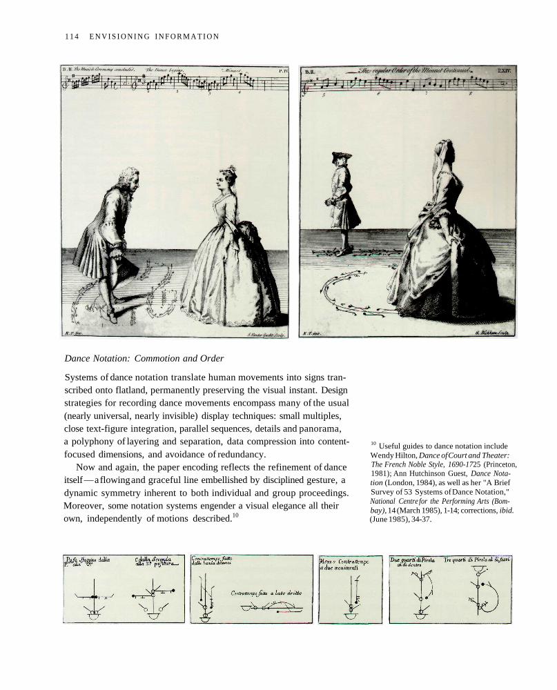
Dance Notation: Commotion and Order
Systems of dance notation translate human movements into signs tran-scribed onto flatland, permanently preserving the visual instant. Designstrategies for recording dance movements encompass many of the usual(nearly universal, nearly invisible) display techniques: small multiples,close text-figure integration, parallel sequences, details and panorama,a polyphony of layering and separation, data compression into content-focused dimensions, and avoidance of redundancy.
Now and again, the paper encoding reflects the refinement of danceitself — a flowing and graceful line embellished by disciplined gesture, adynamic symmetry inherent to both individual and group proceedings.Moreover, some notation systems engender a visual elegance all theirown, independently of motions described.10
10 Useful guides to dance notation includeWendy Hilton, Dance of Court and Theater:The French Noble Style, 1690-1725 (Princeton,1981); Ann Hutchinson Guest, Dance Nota-tion (London, 1984), as well as her "A BriefSurvey of 53 Systems of Dance Notation,"National Centre for the Performing Arts (Bom-bay), 14 (March 1985), 1-14; corrections, ibid.(June 1985), 34-37.
1 1 4 E N V I S I O N I N G I N F O R M A T I O N
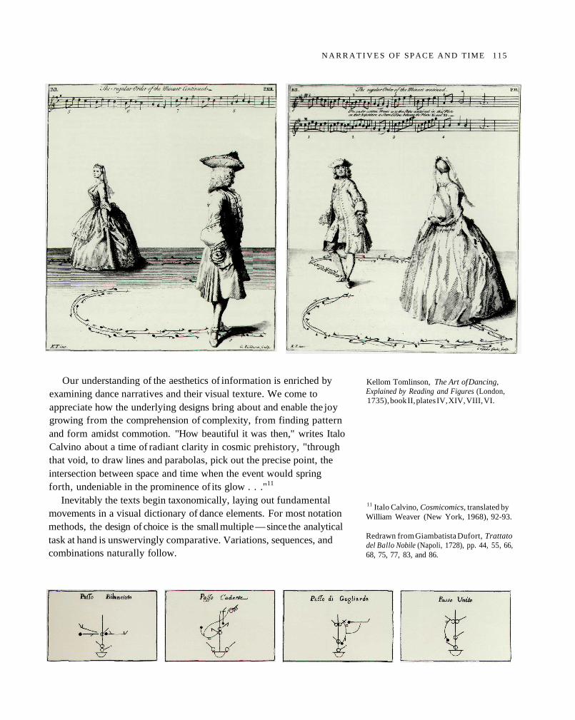
Our understanding of the aesthetics of information is enriched byexamining dance narratives and their visual texture. We come toappreciate how the underlying designs bring about and enable the joygrowing from the comprehension of complexity, from finding patternand form amidst commotion. "How beautiful it was then," writes ItaloCalvino about a time of radiant clarity in cosmic prehistory, "throughthat void, to draw lines and parabolas, pick out the precise point, theintersection between space and time when the event would springforth, undeniable in the prominence of its glow . . ."11
Inevitably the texts begin taxonomically, laying out fundamentalmovements in a visual dictionary of dance elements. For most notationmethods, the design of choice is the small multiple — since the analyticaltask at hand is unswervingly comparative. Variations, sequences, andcombinations naturally follow.
Kellom Tomlinson, The Art of Dancing,Explained by Reading and Figures (London,1735), book II, plates IV, XIV, VIII, VI.
11 Italo Calvino, Cosmicomics, translated byWilliam Weaver (New York, 1968), 92-93.
Redrawn from Giambatista Dufort, Trattatodel Ballo Nobile (Napoli, 1728), pp. 44, 55, 66,68, 75, 77, 83, and 86.
N A R R A T I V E S OF SPACE A N D TIME 115
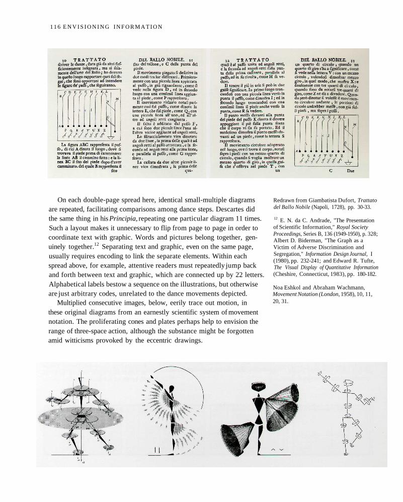
On each double-page spread here, identical small-multiple diagramsare repeated, facilitating comparisons among dance steps. Descartes didthe same thing in his Principia, repeating one particular diagram 11 times.Such a layout makes it unnecessary to flip from page to page in order tocoordinate text with graphic. Words and pictures belong together, gen-uinely together.12 Separating text and graphic, even on the same page,usually requires encoding to link the separate elements. Within eachspread above, for example, attentive readers must repeatedly jump backand forth between text and graphic, which are connected up by 22 letters.Alphabetical labels bestow a sequence on the illustrations, but otherwiseare just arbitrary codes, unrelated to the dance movements depicted.
Multiplied consecutive images, below, eerily trace out motion, inthese original diagrams from an earnestly scientific system of movementnotation. The proliferating cones and plates perhaps help to envision therange of three-space action, although the substance might be forgottenamid witticisms provoked by the eccentric drawings.
Redrawn from Giambatista Dufort, Trattatodel Ballo Nobile (Napoli, 1728), pp. 30-33.
12 E. N. da C. Andrade, "The Presentationof Scientific Information," Royal SocietyProceedings, Series B, 136 (1949-1950), p. 328;Albert D. Biderman, "The Graph as aVictim of Adverse Discrimination andSegregation," Information Design Journal, I(1980), pp. 232-241; and Edward R. Tufte,The Visual Display of Quantitative Information(Cheshire, Connecticut, 1983), pp. 180-182.
Noa Eshkol and Abraham Wachmann,Movement Notation (London, 1958), 10, 11,20, 31.
1 1 6 E N V I S I O N I N G I N F O R M A T I O N
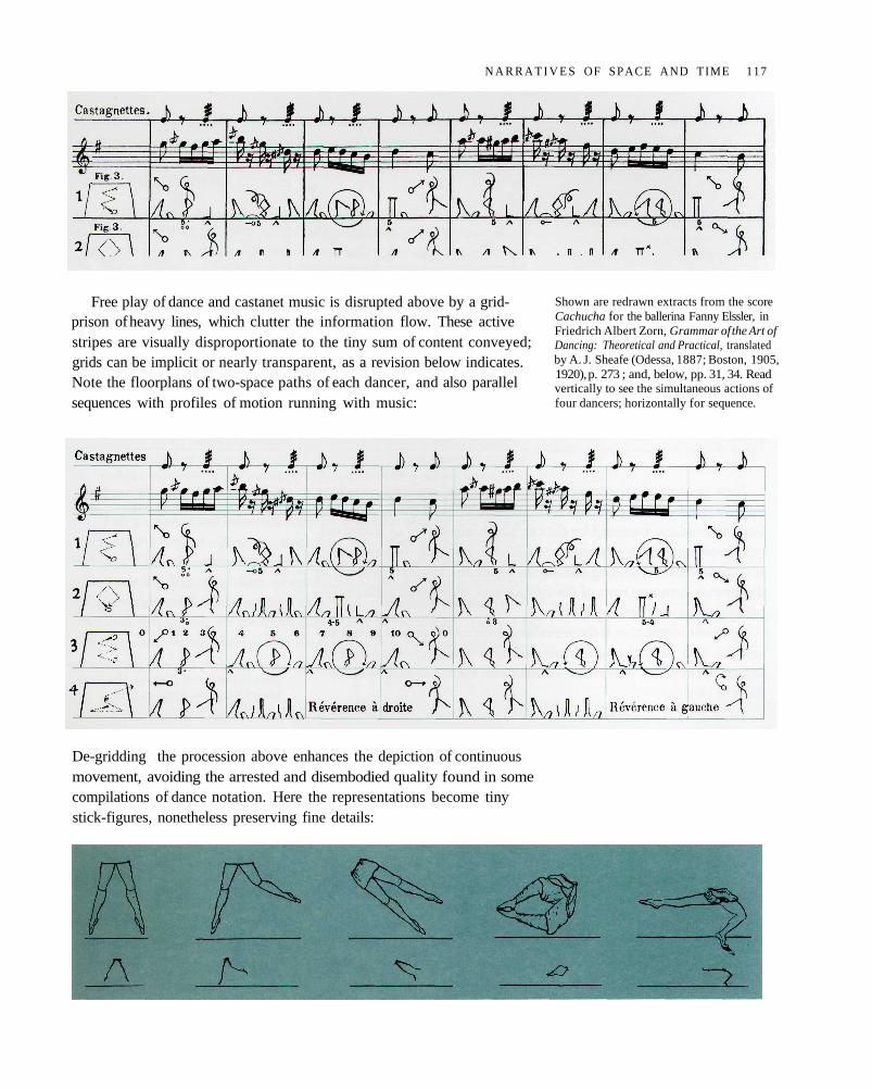
Free play of dance and castanet music is disrupted above by a grid-prison of heavy lines, which clutter the information flow. These activestripes are visually disproportionate to the tiny sum of content conveyed;grids can be implicit or nearly transparent, as a revision below indicates.Note the floorplans of two-space paths of each dancer, and also parallelsequences with profiles of motion running with music:
De-gridding the procession above enhances the depiction of continuousmovement, avoiding the arrested and disembodied quality found in somecompilations of dance notation. Here the representations become tinystick-figures, nonetheless preserving fine details:
Shown are redrawn extracts from the scoreCachucha for the ballerina Fanny Elssler, inFriedrich Albert Zorn, Grammar of the Art ofDancing: Theoretical and Practical, translatedby A. J. Sheafe (Odessa, 1887; Boston, 1905,1920), p. 273 ; and, below, pp. 31, 34. Readvertically to see the simultaneous actions offour dancers; horizontally for sequence.
N A R R A T I V E S OF SPACE AND TIME 117
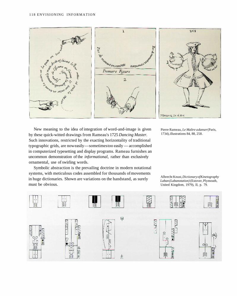
New meaning to the idea of integration of word-and-image is givenby these quick-witted drawings from Rameau's 1725 Dancing Master.Such innovations, restricted by the exacting horizontality of traditionaltypographic grids, are now easily — sometimes too easily — accomplishedin computerized typesetting and display programs. Rameau furnishes anuncommon demonstration of the informational, rather than exclusivelyornamental, use of swirling words.
Symbolic abstraction is the prevailing doctrine in modern notationalsystems, with meticulous codes assembled for thousands of movementsin huge dictionaries. Shown are variations on the handstand, as surelymust be obvious.
Pierre Rameau, Le Maître a danser (Paris,1734), illustrations 84, 88, 258.
Albrecht Knust, Dictionary of KinetographyLaban (Labanotation) (Estover, Plymouth,United Kingdom, 1979), II, p. 79.
1 1 8 E N V I S I O N I N G I N F O R M A T I O N
The microscopic and abstracted encodings of contemporary dancenotation — so fussy and clumsy and contrary to the wholeness of thesubstance — provoked the choreographic eye of Lincoln Kirstein of theNew York City Ballet:
A desire to avoid oblivion is the natural possession of any artist. It is intensified inthe dancer, who is far more under the threat of time than others. The invention ofsystems to preserve dance-steps have, since the early eighteenth century, shared astartling similarity. All these books contain interesting prefatory remarks on thestructure of dancing. The graphs presented vary in fullness from the mere bird's-eye scratch-track of Feuillet, to the more musical and inclusive stenochoreographyof Saint-Léon and Stepanov, but all are logically conceived and invitingly rendered,each equipped with provocative diagrams calculated to fascinate the speculativeprocesses of a chess champion. And from a practical point of view, for work in de-termining the essential nature of old dances with any objective authority, they areall equally worthless. The systems, each of which may hold some slight improve-ment over its predecessor, are so difficult to decipher, even to initial mastery of theiralphabet, that when students approach the problem of putting the letters together,or finally fitting the phrases to music, they feel triumphant if they can deciphereven a single short solo enchaînement. An analysis of style is not attempted, and theproblem of combining solo variations with a corps de ballet to provide a chart of anentire ballet movement reduces the complexity of the problem to the apoplectic.13
This profound and informed frustration reflects the essential dilemmaof narrative designs — how to reduce the magnificent four-dimensionalreality of time and three-space into little marks on paper flatlands. Per-haps one day high-resolution computer visualizations, which combineslightly abstracted representations along with a dynamic and animatedflatland, will lighten the laborious complexity of encodings — and yet stillcapture some worthwhile part of the subtlety of the human itinerary.
13 Lincoln Kirstein, Ballet Alphabet (NewYork, 1939), pp. 49-52, entry on "Notation(Stenochoreography or Dance-Script)."Kirstein describes Kellom Tomlinson's 1735Art of Dancing (which we have seen hereand in Chapter I) as "splendid . . . the finestrepresentations of the Minuet to be foundare rendered more complete by a series ofcareful portrait engravings of dancers mov-ing on the floor-track of a choreographicshort-hand."
N A R R A T I V E S OF SPACE A N D TIME 119
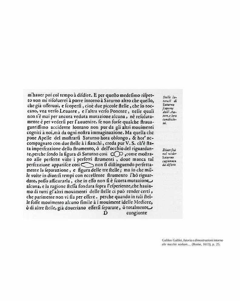
Galileo Galilei, Istoria e dimostrazioni intornoalle macchie solan... (Rome, 1613), p. 25.

Epilogue
IN 1613, when Galileo published the first telescopic observations ofSaturn, word and drawing were as one. The stunning images, neverseen before, were just another sentence element.
Saturn, a drawing, a word, a noun.
The wonderful becomes familiar and the familiar wonderful.
121
Index

Abbott, Edwin A. 12Above all, do no harm 81abstract encoding 27Adelman, Bob 71aerial photograph 109Aesop's fables 65Akahata [Red Flag] 28Albers color demonstrations 92-93Albers, Josef 51, 53, 61, 82, 93Algonquin writing 73alphabetical encoding 39Anderson, Constantine 37Anderson, Edgar 15Andrade, E. N. da C. 116Antropoff, Andreas von 14Antupit, Samuel 56-57, 70-71Apelles 19Appleton, Jay 38applicant / admit table 29Aristotle 18, 20Arnheim, Rudolf 73Athens 18Audouze, Jean 23Avery, Thomas 17Ayala, Susan 35
back-to-back stem-and-leaf plot 47Badeslade, Thomas 94-95Bancroft, T. A. 46Barême Universe 29Barman, Christian 101Barnett, Vic 15, 64baseball timetable 45bathymetric chart 91, 94Beatty, John C. 88Bell Centennial 105bent barchart 106Berlin, Graydon 17Betrand, P. 67Biderman, Albert D. 116Billings, William 107bird's-eye view 13, 36-38birds 64Blake, Peter 34Bonaduz, Grisons, Switzerland 17brain electrical activity 78Bray, R.J . 19Bretez, Louis 37, 61Britain 94, 95, 112-113Brown, Denise Scott 34Bryan, Kirk 107Buchon, Jean 106Bufo americanus Le Conte 14bumps chart 110-111Bundesamt für Landestopographie 81
Bureau des Longitudes 98, 100Burnham, Daniel H. 83butterfly diagram of sunspots 22-23Bühler, Paul 62Byfield, Mary 87Byrne, Oliver 84-87
Cachucha 117Calder, Alexander 65calligraphy 52-53, 65, 68-69Callisto 100Calvino, Italo 37, 60, 115Cameron, Robert 38Carr, D. B. 17Carter, Matthew 105Cassini, Jean Domenique 98Ch'eng, Ta-ch'eng 76Chan, Peggy 89chartjunk 34chemical elements 14, 39Chemins de Fer Fédéraux 110Cheng-Siang, Chen 74, 76children's shirts 33China 18, 74-76China Railway 103Chinese poets 74-76Chinese proof of Pythagorean
theorem 84choropleth maps 40-41Chou Pei Suan Chin 84Churchill, Winston 95Cigoli, Ludovico 19clarity and detail 37clarity of reading 51Cleveland, William S. 15, 17clutter 51, 53, 62cognitive contours 60color and information 52-54, 58-59,
63, 80-95color encoding 78-79color spots 63, 83color, multidimensional 88color, subtractive effects 93color-deficient perception 93Colton, Joseph Hutchins 76computer screens and interfaces 12, 15,
50, 53, 62, 88-89computer visualizations 15, 17, 119Conklin, E.J. 15context switches 50contours 28, 91, 94contours, cognitive 60corkscrew diagram 100Cosmographia 55Cour-Palais, Burton G. 48
courtroom graphics 31, 35Cox, Michael D. 107credibility 32, 34, 50Cunn, Samuel 16Cutler, Bruce 31Czechoslovakia Air Transport 102
dance notation 27, 114-119De Stijl 87de-grid design 89density of information 23, 37, 49-51DePriest, Douglas J. 17Descartes, Principia 116detail and clarity 37, 51Dickerson, Mary C. 14Dighton Writing Rock 72-73Dioscorides 64Doesburg, Theo van 87Donoho, Andrew W. 15, 50Donoho, David L. 15, 50double-functioning elements 26-27Drake, Stillman 18, 20Dreyfuss, Henry 63Driver, Ann 82Druckrey, Inge 107-109ducks 33-34Dufort, Giambatista 115-116Durell, C. V. 84
Easton, P. 78Eddy, John A. 19Edo 113electrocardiogram 59Eliot, T. S. 51Elssler, Fanny 117empty space 50Eshkol, Noa 116esophageal timetable 111Euclid 16, 84-87Europa 100
Feix, M. R. 67Feynman, Richard P. 110Fijalkow, E. 67Fisher, Ronald A. 23Fisherkeller, Mary Anne 15flatland 12-35Florentine architects 14fly-fishing 79fold-out Euclid 16Foley, James D. 89Fridman, J. 78Friedman, Jerome H. 15
I N D E X 1 2 3

Gabriel, K. R. 17Galileo 18-20, 22, 96-100, 120-121gamma curves 93Ganymede 100Garner, Gretchen 90Garner, Wendell R. 94Gasko, Miriam 15, 50Ghizzo, A. 67Gill Sans 63Gillen, Larry 31globes 107Goldschlager, Nora 59Gombrich, E. H. 35Gooch, Frank Austin 14Goodin, W. R. 28Gotti, John 30-31Graham, Gary E. 54graph paper 59graphic design 3 5graphical timetables 24-26, 45, 107-110Greenwood, Isaac 72grid lines 64grid-square maps 40-41grove of birches 90Grim, E. 48Guest, Ann Hutchinson 27, 114
Hall, D. L. 17Hampshire 94, 95Hampton, John R. 59handstands, notation for 118Haring, Keith 61Harley, J. B. 113Harvey 35Harvey, P. D. A. 113Heath, Thomas L. 84Hellerstein, David 56Hilton, Wendy 114Hirata, Kayu 68histogram 46Ho, C. Y. 39Hoboken to New York map and time-
table 109holograms 17hospital costs 56-57Huber, Peter J. 15hue 88, 92Hurvich, Leo M. 93Huygens, Christiaan 67hypertext 15
Imhof, Eduard 58, 62, 64, 82, 90, 93index design 62, 103India 58information density 23, 37, 49-51
information resolution 13, 89interaction effects 61-65interface, computer 12, 15, 50, 53, 62,
88-89International Hydrographic Organ-
ization 91, 94Io 100Iris setosa 15Iris versicolor 15Iris virginica 15Ise Shrine 13Israel, Guy 23Izenour, Steven 34Izrar, B. 67
Jackson, John 79Jakle, John A. 38Jamail, Joe 35Janvier, Antide 99Japan 12-13, 18, 26, 28, 40-41, 45,
58, 113Japanese beetle noJapanese tour guides 12-13, 113Java 24-26John, E. R. 78Johnson, David 76Johnson, Nicholas L. 48-49jovilabes 99Judd, Deane B. 93Julesz, Bela 17Jupiter 96-100jury graphics 31
Kana character 68Kanizsa, Gaetano 60Keil, John 16Kellman, Susan G. 31Kepes, Gyorgy 65Kessler, Donald J. 48Kimura, Hidenori 40King, Henry C. 16Kirstein, Lincoln 35, 119Klee, Paul 15, 55, 81, 91Klein, Herbert A. 110Klutsis, Gustav 38Knust, Albrecht 118Kyoto 113
Labanotation 118Lambert, Phyllis 104Lang, Peggy 84language, vertical 13, 113Lao Tse 65
layering and separation 52-65L'Estrange, Sir Roger 65Leupold, Jacob 66Lichtenstein, Roy 70-71Liley, P. E. 39Lin, Maya Ying 43-44Ling, Wang 84Littlefield, R. J. 17logarithmic scale 39logotype 21London to Dover strip map 112-113Loomis, Elisha S, 84Los Angeles 28-29, 78Loughhead, R. E. 19Lowell, Percival 73
MacSpin 15, 50Malevich, Kazimir 90Mallery, Garrick 73Manhattan 37Marr, David 17, 94Marshall, Eliot 48Martin, Edwin 94Matsu, sea goddess 76Matterhorn 81Matula, R. A. 39Maunder diagram 22Maunder, E. W. 22Mazurs, Edward 14McGill, Marylyn E. 17McLean, Ruari 84, 101McRae, G. J. 28Melton, Arthur W. 94Mercator, Gerardus 68mesh maps 40-41Metro-North Commuter Railroad 104Michell, John 73micro/macro design 36-51, 56-57Millburn, John R. 16models, three dimensional 16, 99Mondrian, Piet 87, 90Monty, Richard A. 50moon phases 50Moore, Charles 83Moronobu 113Morris, Margaret 27movement notation 27Mozart, Wolfgang Amadeus 107multi-layering 39multi-window plot 64multiple-functioning elements 26,
44, 47multivariate statistical graphics 15music notation 59, 117musical accents 82
124 E N V I S I O N I N G I N F O R M A T I O N

musical round 107Müller, J. C. 41
Nathan, Andrew J. 76nature's colors 90Needham, Joseph 84negative space 61-65Nenka, Kisho 32Neo-Plasticism 87neurometric imaging 78New Haven Railroad 104-105New Jersey Transit 54New York, New York 37New York Times 30New York to Hoboken map and time-
table 109New York to New Haven timetable
104-105Newman, L. Hugh 110Nicholson, W. L. 17Nishitani, Uboku 53Nolli map 60Nolli, Giambattista 60-61nomograms 99Notre Dame, 36-37, 38
ocean chart 91Odoroff, C. L. 17Oesch, Hans 59Ogilby, John 113Ohki, Hideo 45one plus one equals three 53, 61-65, 82orreries 16, 99
Panofsky, Erwin 19Papathomas, Thomas V. 17Pare, Richard 104Paris 36-37parts manual 54Pearson, William 16periodic table 14-15perspective 14Pfeffer, Pamela 94Plan of Chicago 83planetary machines 16, 99Playfair, William 107pocket schedule 105Pont Neuf 36-37Popillia japonica Newman 110population distribution 40-41postage-stamp designs 67posterization 35, 50Powell, R. W. 39
Prichep, L. S. 78Pridefully Obvious Presentation 16Primack, Joel R. 48Pythagorean theorem 84-85, 87
Rafn, Charles Christian 73rainbow encoding 82Rameau, Pierre 118Rand, Paul 34ratchet effect 107Rawski, Evelyn S. 76redundancy 93-94Rees, Abraham 16Reynolds, Barbara 60RGB coding 88rivers 60, 76-77, 106road map 93Robertson, Philip K. 89Rockefeller Center 36-37Rome 60Root-Bernstein, Robert Scott 19Rosa Ursina sive Sol 21rotating point clouds 15R O Y G B I V coding 82Russia 18
Sacre du printemps 59Sagami Tetsudo Company 46-47, 106sans-serif type 51Sapporo 28Sarton, George 18saturation 88, 92Saturn 67, 100Scheiner, Christopher 19, 21Schiaparelli, Giovanni 73Schiavone, James A. 17Schoolcraft, Henry R. 72-73Schopenhauer, A. 84Schove, D. Justin 18Scruggs, Jan C. 43sea goddess 76Sehnal, L. 48Seibu Railways 45Seinfeld, J. H. 28Senders, John W. 50Senlis 38serpentined data 106-107Seuphor, Michel 87Shea, William 19Sheehan, William 73Shibukawa, Ikuyo 33Shigehara, Hiroaki 45Shinkansen 45Shipcott, Grant 84
Shneiderman, Ben 89Shoucri, M. 67signals, aircraft 63Simla, India 58simultaneous contrast 92-93Sky and Telescope 100small multiples 28-33, 64, 66-79,
114-117Smith, Charles 112Smith, Robert 43-44smog map 28-29, 78Soerabaja-Djokjakarta 24Soerabajakotta 24solar system 16, 99space junk 48space-time grids 110-111spy graphical timetable 24-26Square, A. 12The Starry Messenger 97-98Steinberg, Leo 73Stella, Frank 12stem-and-leaf plot 46stem-and-leaf schedule 47stereogram 17Stern, Ani 105Stiles, W. S. 93Strawinsky, Igor 59Strecker, Ludwig 110strip map 112-113Strunk, William Jr. 35subtraction of weight 60sunspots 18-23, 98surgeon general's warning 62Swerdlow, Joel L. 43Swift, Jonathan 21Swiss Federal Railroad 110Sypher, Wylie 26
T'ien Hou 76tables, design of 35, 55, 56-57, 101-113Takahashi, Yumi 33A Tale of Two Cities 112Taunton River 73tee-shirts 3 3text / figure integration 116, 118Thomas, Edward Llewellyn 50Thorfinn the Hopeful 73The Times [London] 110timetables 46-47, 54-55, 101-113Tobler, Waldo R. 41Tokyo 32, 40-41, 58, 106, 113Tomkins, Calvin 71Tomlinson, Kellom 27, 115, 119Toms, William Henry 94train lights 68
I N D E X 1 2 5
Treib, Marc 37Tschichold, Jan 55, 83Tufte, Edward R. 26, 34, 62, 64, 89,
107, 116Tukey, John W. 15, 46, 62, 64Tukey, Paul A. 15, 64Turgot, Michel Etienne 37, 61
typography 35, 63, 76typography for maps 62
United States v. Gotti, et al., 1987 31
Valery, Paul 92value scale 53, 58, 60-64, 82, 86-94variation 22-23Veltman, Kim 14
Venturi, Robert 26, 34, 51video games 34Vietnam Veterans Memorial 42-44Voyager spacecraft 101
Wachmann, Abraham 116Wagner, Richard 110-111Walker, Claude Frederic 14Walker, Gay 16Wallace, Victor L. 89Ware, Colin 88Warren County Court House 104Washington, D.C. 43Watson, James L. 76weather charts 28, 32Wegman, Edward J. 17Wertheimer, Jon 62
Wharton, J. Marcus 59White, E. B. 35White, John 14Windisch, H 58, 82windows on computer screens 89Winogrand, Garry 68Wright, Lawrence 14Wyszecki, Günter 93
x-ray films, searching 50
Ybry, Charles 108
Zmaczynski, Emil v. 14Zorn, Friedrich Albert 117
The following illustrations are reprinted by permission:
CHAPTER 1. Pentagonal dodecahedron, Paul A. Tukey, Bell Commu-nications Research. Color stereogram, Wild Leitz, Ltd., photographswith Wild Leitz aerial camera RCIO. New York Times story on JohnGotti, copyright © 1987 by The New York Times Company,reprinted by permission. Picture of John Gotti, William E. Sauro/NYT Pictures. Thigh graph © 1982 Time, Inc.
C H A P T E R 2. Portion of Manhattan map, The Isometric Map of Mid-town Manhattan, © 1989 The Manhattan Map Company, Inc., allrights reserved. Senlis photograph © Robert W. Cameron. VietnamVeterans Memorial in snow, page 42, photograph by James P. Blair© 1985 National Geographic Society. Vietnam Veterans Memorialnews clipping, page 43, © Michael J. Pettypool/UNIPHOTO. VietnamVeterans Memorial, page 44, © Henley & Savage/UNIPHOTO. LunarPhase Poster, © 1988 by Celestial Products, Inc., Middleburg, Virginia.
C H A P T E R 3. Klee drawing from Paul Klee, Das bildnerische Denken(Schwabe & Co., Verlag, Basel, 1956). Hospital bill, copyright © 1984by Harper's Magazine. All rights reserved. Reprinted from the March1984 issue by special permission. Nolli map of Rome, from the facsim-ile of the Nolli Pianta Grande di Roma, published by J. H. Aronson,Highmount, New York, 1984. Josef Albers, excerpt from Search VersusRe-Search, reproduced by permission of Trinity College Press. Birds,Vienna österreichische Nationalbibliothek.
C H A P T E R 4. Film of calligraphy, © Nigensha Publishing Co. Ltd.,Tokyo. Illustrations for Roy Lichtenstein, Mural with Blue Brushstroke:(picture reproduction rights reserved by VAGA, SPADEM, ARS, andADAGP, where relevant): 1. Gallerie Louise Leiris, Paris, photo © 1986Bob Adelman, copyright 1989 A R S N Y / S P A D E M ; 2. Photo by GeneMarkowski; 4. Photo © 1986 Bob Adelman; 5. Photo © 1986 BobAdelman; 6. La Jolla Collection of Contemporary Art, gift of Carolynand Jack M. Farris © 1963, Ellsworth Kelly; 8. Photo © 1986 BobAdelman; 9. Albright-Knox Art Gallery, Buffalo, New York, Roomof Contemporary Art Fund, 1940, copyright 1989 Succession H.
Matisse / A R S N Y ; 10. Hirschhorn Museum and Sculpture Garden,Smithsonian Institution, gift of Joseph H. Hirshhorn, 1966, copyright1989 A R S N Y / A D A G P ; 11. Kunstsammlung Nordrhein-Westfalen,Düsseldorf; 12. Private collection; 13. Private collection, photo cour-tesy Leo Castelli Gallery, New York; 14. Photo © 1986 Bob Adelman;15. Private collection, photo by Eric Pollitzer, copyright 1989 FrankStella/ARS NY; 16. Collection of Philip Johnson; 18. The SeibuMuseum of Art, Tokyo; 19. Collection of Ileana and Michael Sonna-bend, New York; 20. Private collection, copyright 1989 A R S NY/A D A G P ; 21. Collection of Charles M. Senseman. Items 3, 8, 11, 13, 18,and 19, and Mural with Blue Brushstroke, © Roy Lichtenstein. Reprintedfrom the book Roy Lichtenstein: Mural with Blue Brushstroke, essay byCalvin Tomkins, photographs and interview by Bob Adelman.Published in 1987 by Harry N. Abrams, Inc., New York. Design andcompilation © Harry N. Abrams, Inc.
C H A P T E R 5. Swiss map, reproduced with the permission grantedJuly 10, 1989 by the Federal Office of Topography. Josef Albers,Interaction of Color, plate XXIII-I, "Vibrating Boundaries," © 1963,Yale University Press. Birch grove photographs © 1988, GretchenGarner. Ocean map, permission granted by Canadian HydrographicService. Stamps from Christie's New York, London, and Zurichcatalogs. William Henry Toms, Hampshire map; Thomas Badeslade,Hampshire map, Paul Mellon Collection, Yale Center for British Art.
C H A P T E R 6. Pages from Galileo's notebooks, Biblioteca nazionalecentrale, Florence. Satellites of Jupiter, diagram reproduced by permis-sion of Sky & Telescope. Jupiter photographs, from NASA, Washing-ton, D.C. Warren County Court House, Jim Dow, photographer,Seagram County Court House Archives, © Library of Congress.Tomlinson drawing IV by permission of the Library of Congress.Tomlinson drawing VI by permission of the Houghton Library,Harvard University. Tomlinson drawings XIII and XIV reproduced bypermission of Performing Arts Research Library, New York PublicLibrary at Lincoln Center. London to Paris map, Paul Mellon Collec-tion, Yale Center for British Art.
126 E N V I S I O N I N G I N F O R M A T I O N

A R T W O R K BY N O R A H I L L M A N GOELER
CAROLYN WILLIAMS, EXECUTIVE EDITOR, GRAPHICS PRESS
H O W A R D I . G R A L L A , C O N S U L T A N T FOR D E S I G N , T Y P O G R A P H Y , A N D P R O D U C T I O N
C O M P O S E D I N M O N O T Y P E B E M B O B Y M I C H A E L A N D W I N I F R E D B I X L E R
P H O T O G R A P H Y B Y R I C H A R D B E N S O N , R I C H A R D CASPOLE, R O B E R T H E N N E S S E Y , A N D GUS K A Y A F A S
P R I N T E D B Y HULL P R I N T I N G O N M O N A D N O C K D U L C E T TEXT
B I N D I N G B Y A C M E B O O K B I N D I N G C O M P A N Y
D E S I G N E D A N D P U B L I S H E D B Y E D W A R D TUFTE
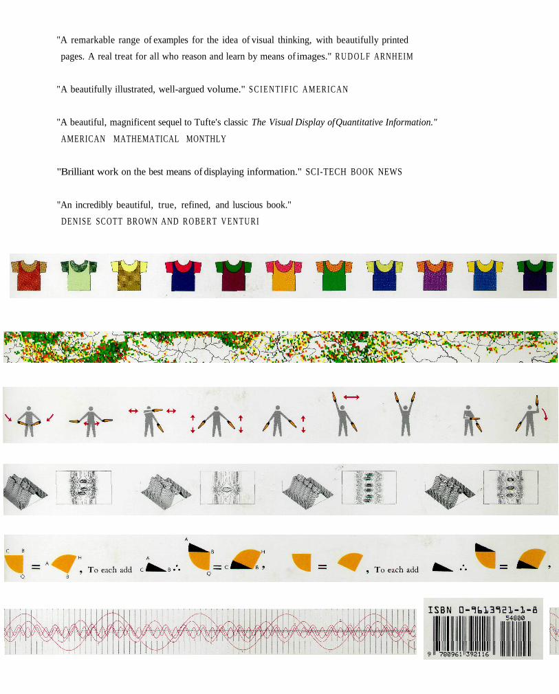
"A remarkable range of examples for the idea of visual thinking, with beautifully printed
pages. A real treat for all who reason and learn by means of images." R U D O L F ARNHEIM
"A beautifully illustrated, well-argued volume." S C I E N T I F I C AMERICAN
"A beautiful, magnificent sequel to Tufte's classic The Visual Display of Quantitative Information."
AMERICAN MATHEMATICAL MONTHLY
"Brilliant work on the best means of displaying information." SCI-TECH BOOK NEWS
"An incredibly beautiful, true, refined, and luscious book."
DENISE SCOTT BROWN AND R O B E R T VENTURI