Embed Size (px)
Citation preview
CYNTHIA DINAN-MITCHELL
DECORATION PRINTMAKING AND INVITING SPACES
Meacutemoire preacutesenteacute agrave la Faculteacute des eacutetudes supeacuterieures de lUniversiteacute Laval dans le cadre du programme de maicirctrise en arts visuels
pour lobtention du grade de Maicirctre es Arts ( MA)
ECOLE DES ARTS VISUELS FACULTEacute DAMEacuteNAGEMENT ARCHITECTURE ET ARTS VISUELS
UNIVERSITEacute LAVAL QUEacuteBEC
2007
copy Cynthia Dinan-Mitchell 2007
Reacutesumeacute (English)
Defenders of traditional printmaking techniques (lithography copper etching silkscreening) argue that the medium should be protected in respects to new infographie technologies because it is one of the last artistic domains that preserve technical craft (know-how) and tradition (master printers) Its critics meanwhile see it as a rather inferior branch of the visual arts They contend that printmaking is not capable of offering prompt and original responses to evolution in the worlds of art and culture I believe that as artists we have to develop intellectual and creative challenges in the meacutetier of printmaking rather than relying on technical demonstrations validated by handiwork For example my work utilizes printmaking for its infinitely flexible technical potential to serve my artistic preoccupations It allows me to appropriate existing visual material in view of imitating ornate wallpaper that is then placed in an artistic context Through a multidisciplinary approach to the meacutetier I transform the gallery into a mise-en-scegravene of a comfortable and intimate domestic setting Ultimately my practice in print seeks to parody and question the fine line between art installations interior decoration and storefront window displays The following essay illustrates certain strategies I employ in my artistic production It is based on inquiries and discoveries that have feed my research in creation during my masters in visual arts
n
Reacutesumeacute (franccedilais)
Certains deacutefenseurs de lestampe traditionnelle (lithographie eaux fortes seacuterigraphie gravure) affirment que ce meacutedium agrave linstar des nouvelles techniques informatiseacutees devrait ecirctre proteacutegeacute et revaloriseacute parce quil est lun des derniers domaines artistiques qui preacuteserve le meacutetier (maicirctre imprimeur) et la tradition (savoir-faire ancestral) Ces critiques par contre considegraverent lestampe comme un art infeacuterieur Ils deacuteclarent que ce meacutedium nest pas capable doffrir des reacuteponses promptes et originales agrave leacutevolution du monde de lart et de la culture Pour ma part je crois que les artistes travaillant dans le domaine de lestampe doivent deacutevelopper des deacutefis intellectuels et artistiques qui reacutepondent agrave une recherche personnelle et non agrave une deacutemonstration artistique uniquement valideacutee par la prouesse technique et le savoir-faire de lartiste Par exemple dans cette recherche-creacuteation jutilise la seacuterigraphie pour son potentiel creacuteatif infiniment flexible et graphique et ce afin de reacutepondre aux besoins de ma deacutemarche artistique Par exemple agrave laide de lestampe je mapproprie du mateacuteriel visuel existant afin dimiter du papier peint ornemental que je preacutesente ensuite dans un contexte artistique dinstallation Par cette approche multidisciplinaire de lestampe je transforme dans une mise en scegravene lespace de la galerie en un inteacuterieur domestique confortable Ma pratique cherche agrave parodier et questionner la mince ligne seacuteparant linstallation dart et les installations dordre deacutecoratives et domestiques (vitrine de magasin deacutecoration inteacuterieure kiosque de preacutesentation etc) Dans le texte qui suit jillustre certaines strateacutegies que jai utiliseacutees ainsi que les recherches et les deacutecouvertes qui ont alimenteacute et transformeacute ma production artistique lors de ma maicirctrise en arts visuels
III
Table of Contents
Introduction 1
Chapter I Decorative Installation 3 1 -1 Printmaking and Sampling 4 1 -2 Image Selection 5 1-3 Pop Art 8
Chapter II Little Room Installation 11 2-1 Ambiance 12 2-2Color 13 2-2 Lighting 14 2-3 Pattern 15 2-4 Framing (delimitations) 16 2-5 Reneacutee Greens Installation 16
Chapter III Yellow Decorative Installation 20 3-1 The Home 22 3-2 Deacutecors 24 3-3 Making ones self at home 24
Chapter IV Red Installation 28 4-1 The Art of the Home 30 4-2 High Art Versus Low Art 31
Chapter V Vitamin C Installation 34 5-1 Inside Versus Outside 37
Conclusion 44
Bibliography 46
IV
Table of Images
Decorative Installation 3
French Dog 6
Little Room Installation (2) 11
Mise-en Scegravene Commemorative Toile Reneacutee Greene 17
Mise-en Scegravene Commemorative Toile Reneacutee Greene (detail) 18
Yellow Decorative Installation 20
Art Press 26
Red Installation (2) 28
Loss Bridget Riley 29
Red Installation (as a still life painting) 33
Vitamin C 34
Orange Pekoe Tea (2) Internet and my own 36
Vitamin C (detail) 37
Vitamin C (view from outside) 38
Vitamin C (detail with a viewer in front of the wall of prints) 41
Vitamin C (detail of prints mirror and a viewer) 42
Introduction
I have developed a comprehensive diligent and playful studio practice that
embraces printmaking sewing installation interior decoration and stage design
as an objective to display private settings within public venues I initiate
exchanges where unexpected objects and discordant images come together for a
union and an attempt for a systemization of a quizzical domestic setting My
installations are intimate and connected to daily life in criticism to the traditional
public gallery viewing My handicraft and artistic reflections allow me to realize
a vision of comfort welcoming and even homey environments for art I thus
transgress the conventions of the white cube so as to relax and interact with the
art
The following is an accompanying text in support of a thesis exhibition for a
masters in visual arts The structure of my memoir is divided in five chapters to
formally and analytically research works that I constructed in the course of the
past two school years The presentation and description of my art pieces are
proposed chronologically to demonstrate the evolution of my production starting
with the first chapter that deals with a work titled Decorative Installation By
means of the depiction of this work I bring up my background in printmaking that
is founded on image appropriation and pop art This installation was my initial
attempt to move beyond the borders of the traditional dimensions of printmaking
paper In the second chapter I introduce Little room Installation and though its
analysis I breakdown my strategic operating methods For the third chapter I
tackle concepts that I see surface from my new studio practice that relate to the
home and interior decoration which are especially perceptible in Yellow
Decorative Installation Within the fourth chapter by the account of Red
Installation I reflect on my work in relation to the cultural hierarchy of the arts
In other words I elaborate on the notion of high art and how it is placed in
opposition to low art (which includes the home) The last and final chapter deals
with theory related to strategies of pastiche and the private versus the public
duality by the study of my final exhibition titled Vitamin C presented at th Engramme Gallery Queacutebec City (January 12 to February 18 )
Chapter I
Decorative Installation Silk-screening on rag paper (each sheet 30^ x 45) on a lampshade on canvas to make cushions and to upholster a sofa Dimensions 25 feet wide by 14 feet high and 7 feet deep 2005
Decorative Installation was the first artistic work that I produced during the
masters program The installation was constructed from thirty-two large light
pink silkscreen prints a small couch a lamp and cushions Each serigraph had a
recurrent ornamental motif that framed an assortment of images The themes
revolved around old encyclopedic illustrations For example they extended from
a skull a heart a tire a lady passing a vacuum a busted hot air balloon a German
barmaid birds a squirrel the scientific representation of a human head and
identified parts of the skeleton dragon flies a tin of shoe polish to a souflet The
primary goal of this installation was to unify a wide variety of appropriated
images within one piece of art By using printmaking to imitate an antique
tapestry and ultimately a type of intimate representation of a room (or a storefront
window display) I was able to create a context in which the disparate sampled
images could mingle within a same space The prints covered the entire back and
a portion of the right wall of the exhibition site in an attempt to draw up
boundaries for the installation that resembled a domestic setting At the junction
of these two walls 1 placed a sofa that I upholstered with hand printed fabric
(with the same pattern as the prints) I also used a discarded print to make a
lampshade that lit the installation autonomously from the gallery And lastly I
reproduced and embroidered a skull and squirrel image on canvas to make
decorative cushions that I placed next to the sofa
Technically this first installation was an attempt to conciliate my background in
printmaking with my background in crafts Accordingly Decorative
Installation is a combination of uprooted images from diverse sources and times
integrated within a fabricated environment that is reminiscent of craft show
stands
1-1 Printmaking and Sampling
My practice in printmaking is axed on a method akin to the work of techno
sampling By means of technological procedures in the medium of printmaking
I like the techno musician dig up existing material to create something new
More importantly a sampler is someone who decides to instigate citations and
appropriations in hisher production rather than generating new images Like a
sampler I combine heterogeneous and incongruous elements to express a singular
and personal opinion of the world
Appropriating ready-made images and objects raises several artistic questions on
what in fact is an artist by definition The artists clicheacuted hand is no longer the
creator It is a far cry from Platos theory insisting the loyal representation of
apparent objects (mimetic) through draftsmanship or of the genius at the
I completed a bachelors at Concordia University in Studio Arts with a concentration in Printmaking (intaglio lithography and silk-screening) After university I have actively participated in the printmaking community I joined a printmaking collective named Graff in Montreal and Engramme in Quebec City ^ Parallel to my work in printmaking I started my own company in crafts as a means to create my own employment I create handmade designer bags by combining silk-screening on fabric and sowing to make one of a kind utilitarian objects
pursuit of newness Instead the artist is a collector and organizer of available
images I am an artist retriever and recycler My selection is my expression and
my composition becomes a skill (even a craft) In my opinion sampling should
not be seen as an inferior branch of the visual arts and the assemblage should be
considered as a whole image and not its technical process The facility to take
existing samples is not determinedness of the final product The sampler has to
validate his or her competence in the seamless crossover between information
Artist samplers remake or remodel history by digging up the neglected and
conceptualize the genre itself
1-2 Image selection
I spend an enormous amount of time hunting for visual material in old bookstores
on the Internet in newspapers etc From theses sources I intuitively select
images Combined to the tradition or technique of silkscreening I specifically
embrace the use of technological procedures to transfer my image information
from paper to digital To be capable to take existing images I go through
calculating steps First of all I habitually scan the favored image in view of
computer manipulation (redraw certain parts elongate deteriorate divide colors
etc) I then reduce the resolution to 72 dots per inch to match the silkscreen mesh
on which I photo-chemically expose the images By experience I have felt that
manipulating images digitally can cause them to become weightless and distant
from its original source It is as if a lag is fashioned between the original design
and what I make from it More accurately the images are transformed into
something dimly dissimilar from their original allure These run offs become to
some extent my own creations Hence the amalgamation of techniques in the
creative process spawns a sort of push and pull from the actual image
French Dog Silkscreen on rag paper Dimensions 22 x 30 inches 2006
My chosen imagery revolves around old prints dated objects and machines
animals geometric forms and occasionally to the human figure For the most
part my selected images share characteristics of times past Seeing that some of
my imagery is taken from old textbooks and encyclopaedias they inevitably
reference a visual method of distributing information I am also delighted by the
fact that generally images fifty years and older are left to the public domain
therefore normally no longer subject to copyright laws
When working with samples I am conscious that my art is centered on my ability
to select and organize numerous elements together Like the techno musician
who uses different tracks to make a tune I too aim to create a cohesive whole by
creating andor suggesting links between images It is in the assemblage of
^ For example this print is an accumulation of images found in different sources The dog and the old circular illustrations in the back ground were found in an encyclopaedia the four orbs were part of an old advertisement the green flower design is taken from a wall paper motif I redrew from a home decoration magazine and the blue spiral motif was a doodle of mine that I enlarged
disparate elements of the installation that the images take on new meaning To
explore this technique my image selection tactics gyrate around two main
components
- First I work on the aesthetic considerations how I want to visually occupy a
form I observe the contrast in the graphic qualities of the different subject matter
And so my work is predominantly formal I relegate great attention to the visual
merits of old illustrations (often old copper etching) and photographs For
example older scientific illustrations have beautiful line features that are
completely unlike drawing or half tone reproductions I believe that the graphic
qualities typical to different reproductive techniques are emphasises when they
are placed side by side I could even argue that I use these images like
ornamentation or decorative illusions When poking around different
information I do not sort the data based on cultural value If I borrow an image
from a childs book I consider it equally precious as an image taken from a
medical encyclopedia or a glossy art catalogue I reckon that I often view the
images more for their composition than their content
-Second once the first selection process is completed it is at that moment that I
take the time to refer to the societal connotations of the appropriated images
Images are signs that can be exchanged and recycled for meaning By reworking
these images individually or in relation to others I aim to create new visual
associations and ultimately redefine their meanings independently of their original
source By disconnecting images from their starting places the images become a
slice or amputations of a collective visual history Moreover by juxtaposing a
particular image next to something completely absurd I bring about ambiguous
mental associations that are playful quirky and open to the viewers analysis On
this account I seek to create visual and interpretative tensions to set off re-
significations
Jean Baudrillard The Evil Demon of Images and the Precession of Simulacra (Sydney The Power Institute of Fine Arts 1987) 196
1-3 Pop Art On a number of points I can state that I borrow ideas from the pop art
movement A British art critic named Lawrence Alloway to describe the
emergence of a whole culture that was blatantly at odds with the [] old-
fashioned English establishment vernacular and conservative taste coined the
term pop art in the 1950s In some ways American art was directly antagonistic
towards Britains Victorian and Imperialist past Pop art refers to a populist art
(and to some extent anti-art) movement apparently naive colourful and largely
humorous that delved in the notions of commerciality and the kitsch but also
questioned the role of the artist inventor Similarly I use colour and humour as
strategies (for example) to seduce viewers to consider my prints I want to attract
people into my three dimensional image montages Moreover the sheer
technique of printmaking shares ideas with pop art on the grounds of
appropriation commerciality and repetition On the one hand printmaking is an
authentic and original work of art and on the other it is a manifold of objects of
mass distribution and consumption
When I speak about printmaking in my montages I want to clarify that I do not
use the discipline as a purist of this medium Contrary to the dogmatic
conventions established by the Code dEacutethique de lEstampe Originale I do not
follow the strict rules of printmaking This resource book was written by Nicole
Malenfant and Richard Ste-Marie who clearly states the dos and do nots of
editioning work which includes signing numbering titling technique etc to
preserve the integrity of the traditional print and more importantly its
commerciality I on the other hand use print for its creative potential because
silkscreening is exceptionally versatile I can repeatedly print images on all types
of surfaces Unlike the recommended identification protocol I prefer to present
my prints as part of an ensemble rather than each as individuals because they exist
not as sole pieces but through their rapport to the assembly of elements in an
Jonathan Harris Art History The Key Concepts (New Yorlc Routledge Key Guides 2006) 238
installation Hence my prints are not tided signed and numbered I feel that the
latter set of laws often restrain the process and in turn the creative and artistic
potential of the medium More emphasis is placed on the technique and the
fidelity of the reproduction rather than the artistic expression and liberty
Based on the same logic of sampling images in printmaking I also sample
objects The sofa and lamp in Decorative Installation are examples of items
taken out of a context (taken from the art studios du Roulement agrave billes)
reworked and then integrated in a new environment The bits and pieces are
selected for their formal and intellectual associations to fit in my installations
They participate in imitating the setting of a room and are presented as artifacts
retired from the everyday The objects and images I use are not rare we are
familiar with them They function through their relation to other items
Accordingly we come to the realization that these substances are peripheral to
that something else- in my case the home As much as trivialities clutter our
homes they can also singularize and identify Nonetheless the removal of matter
from the context of the everyday and positioned within the setting of the gallery
enhances the effect of their use their connotations and their design
I have come to believe that my reason for recycling images and objects is
anchored in the convenience and not as a personal mission to give new life to old
material As an artist and artisan the economy of production is often a
preoccupation Thus as a means to lighten the expenses of invention I will ask
my family members or friends about objects that I can borrow in the purpose of
making art This close network of people makes it possible for a relational
dimension However I cannot qualify my practice as relational aesthetics^ simply
based on the exchange aspect of my work since the art itself does not necessarily
demonstrate the relation Instead this resourcefulness avoids the trouble of the
accumulation of too much artistic material Amusingly this leads me to embark
on personal stories of the objects since they are integral to other peoples lives I
Nicolas Bourriaud Relational Aesthetics (Dijon Presses du reacuteel 2002)
take objects from a private setting to a public venue that is in turn transformed
into a representation of an intimate space None of my installations are made
exclusively from scratch Most of my images and objects are borrowed
My work as an artist is based on my ability to initiate exchanges of images and
objects to create design and organize domestic setting My image work
references illustration natural history art popular culture and the history of
printmaking For instance I can in the case of Decorative Installation
appropriate existing black and white encyclopaedic illustrations to slyly recast and
transform them in tones of light pink Or I can silkscreen different images to
artisticallycraftily transform everyday objects in view of integrating them within
a montage Hence fourth my artistic process borrows strategies from the rhetoric
of the handmade and the rhetoric of the machine-made to ultimately blur the
borderline between the two in view of creating intimate spaces
10
Chapter II
Little Room Installation Silk-screening on rag paper (each sheet 22 x 30 inches) on the wall the cement floor and fabric to make decorative cushions Ready-made objects dresser drawer lamp natural flowers and pot Dimensions 10 feet wide by 14 feet high and 10 feet deep 2005
Little Room installation was the second and a very important work during the
course of the past two years Contrary to my first installation that was done more
intuitively in this work I spent a lot of time simply assessing the enlarged scale
of printmaking through the construction of the deacutecor The potential of this
infinitely flexible medium is illustrated and revealed in this installation Even if
the work was not completely resolved it permitted me to find the key concepts of
my artistic production In other words this installation functioned as a
passageway to come to the realisation of four very important tactics that facilitates
the creation of an intimate space within a public venue Hence Little Room
Installation was a sketch in which I could discern what strategies can help create
the representation of a home setting 1 enumerated the use of a dominant color
the repetition of a motif an autonomous lighting system and lastly the framing
of the installation as formal and physical devices that help to unify a montage
11
Amusingly the plans that create ambiance in a staged domestic setting is of
course directly linked to the work of interior decorators
Essentially this installation like my other works combines recycled images and
objects Somewhat nostalgic somewhat ironic and somewhat humorous I
fabricated an ambient interior decor within the gallery setting by borrowing many
concepts from the home Through the artistic process of detaching trivial objects
from the domestic sphere that are familiar to everyone (for example a chair a
table a lamp wallpaper patterns etc) and reorganizing them in a gallery context
I arrange links between meanings and perspectives based on our culture in view
of triggering associations and emotions By constructing an immersive
environment I managed to create a feeling of a dwelling I believe that by using
every day objects related to living quarters our relationship to the gallery is
transformed and to some extent questioned One can feel a dilemma when in
front of my art pieces for we are perplexed on whether does it qualify as art Is it
a store montage Is it a comforting home representation Is it a show room Is it a
stage Etc
2-1 Ambiance
I have stated that my constructions resemble ambient home decors but what
exactly is ambiance To explain and support this concept I will reference Jean
Baudrillards view of the home and its objects Primarily his opinion is that the
ambiance of a room is an overall presence generated from the given environment
It is founded on our relation to the symbolic presence of an organization of tactic
elements^ A room may go beyond the simple architectural structure of its walls
to project through the mingling of its different objects a type of refuge a
protective and nurturing environment such as cocoons or nests The form is a
cultural demarcation between what is exterior versus what is interior Our home
^ Jean Baudrillard Le Systegraveme des Objets (Paris Denoeumll-Gonthier 1968)29
12
acts as containers for things most precious to us our families our memories and g
our mementos
An ambiance of a room or deacutecor is based on how different home objects can
associate and communicate More precisely how singular objects can create a
coherent ensemble By an unlimited combination of different elements the owner
can succeed in resolving a problem the solution being the mobilization of a
given space to create an attractive atmosphere that reflects hisher tastes
(historically associated to the womans domain) The ambiance of a space
becomes personalized and custom made to fit the possessors image In the
modernist spirit decorating was perceived as a form of self-expression an
exercise in cultivation and expression of ones particular artistic individuality^
Worded differently decoration helps to create a presence within the specific
space Based on an essay on the philosophy of interior decoration decorators
strive to attain Stimmung which is a word used to describes the impression of
intimacy that is evoked in a room and the furniture^
2-2 Color
Traditionally color has always had great importance in the signification of the
interior and a way to delimit spaces Color is metaphorically charged based on
cultural indexes^ For example usually the color red symbolically stands for
passion in our western culture Thus when decorating the selection of colors
symbolically suggests a lot about the homeowners In the past the bourgeois
would usually avoid the use of bright colors and opt for tints or shades to
exemplify moral refinement From a puritan point of view one does not indulge
in vulgar color extravagances for it is politically incorrect to reveal all of ones
Emma Morgan Warm and Fuzzy Craft Culture wwwcraftcultureorp viewed 060520 Reed Christopher Not At Home The Suppression of Domesticity in Modern Art and Architecture
(London Thames and Hudson 1996) 28 Rybczynski Le Confort Cinq Siegravecles dHabitation (Montreacuteal Du Roseau 1989) ii
Baudrillard Le Systegraveme des Objets 43 ^ Ibid 43 Ibid 43
13
personality Inversely lively color in home decoration is viewed as a sign of
emancipation
Bright colors are simulacra of nature for the reason that it is reminiscent of the
beautiful colors of flowers It brings the idea of nature into the home and can
produce ambiances It can also give rhythm to a room based on formal color
plays of the different objects A common practice in home decoration is to repeat
a color the chairs are painted the same color as a wall and the cabinet doors or
the curtains match the color of the lampshade etc A dominant color can facilitate
the creation of ambiance because it creates unity It is a way to give the
discursive furnishing system coherence It is a way to coalesce all the objects and
to some extent a means to forget their individual function
It is at this point in my artistic production that I affirmed and recognized the
choice of a dominant color in my decorative montages In Little Room
Installation I had in mind the use of light pink as a dominant color to create a
unity between the different elements the prints the cushions the lamp the
flowers etc However since the walls of the exhibition site were still very
noticeable in the montage it was hard to create the illusion of a different
ambiance and space The white walls in the installation were too much of a
reminder of the gallery venue Hence it looked more like an assembly of items
within a space rather than the illusion of a different environment Furthermore
the color looked pale and thus the ambiance in the space looked a little washed
out
2-3 Lighting
Much like color lighting is also used to uniform a room because it participates in
creating coherence between the different objects and images placed under the
same intensity of light The illumination can help in the comprehension of the
representation can define the limits of the environment and can be a means to
ibid 45
14
stage the deacutecor^ The intensity of the lighting can also program the dramatization
of the scene
Symbolic of the origin of life light is also a sign of privileged intimacy It places
a singular value on things The use of lighting in my installation was at first
instinctively used for the purpose of creating intimacy In this piece I
intentionally wanted the illumination of the art piece to be self-sufficient and
independent of the presentation conventions of the exhibition site In other words
I did not want the installation to be lit by the traditional lighting systems of
galleries but to have the warmth and life come from within the art By proposing
an independent setting within the exhibition I want to explore the notion of the
private space (real or artificial) transported into a public venue
2-4 Pattern
In Little Room Installation I repeatedly printed the same pattern on the cement
floor the bottom of a wall and as backgrounds on each of the nine paper prints to
unconsciously create a rhythm and a connection between the discursive elements
(parallel to the strategies of color) A pattern seeks the commonalities between
its elements whereas order distinguishes the differences and compartmentalizes
these^ The motif was also distinctively chosen as a reference to William
Morris The reason why I wanted to reference this personality is because he was a
founding voice and entrepreneur of the decorative arts movement in the late
eighteen hundreds in view of the fact that the decorative arts made [] the look 1 7
of daily life their central concern Morris fought to intentionally blur the
frontiers between what is art crafts decoration and utilitarian objects and
rejecting machine-made ornaments For Morris a noble artist a
handicraftsman was someone who could create good design by working with
hisher heart hands and intellect Indicative of my own background in both the Jeacuterocircme Bourque No Mans Land (Queacutebec Meacutemoire de Maicirctrise Universiteacute Laval 2006) 14
Julie Boivin The Aesthetics of Frivolity Reinvesting in Balloons Cake Icing Bovys and Trinkets (Montreal Thesis in Art History of Concordia University 2005) 49 Christopher Reed Not At Home The Suppression of Domesticity in Modern Art and Architecture (London Thames and Hudson 1996) 12
15
arts and crafts I too want to suggest conciliation between the disciplines Even
today this remains an on going debate in the arts Hence the printed motif
manifested the dimensions of the installation but it also implied a link to patterns
done during the decorative arts movement
2-5 Framing (delimitations)
Closely linked to the notion of context the factor of delimiting an installation
(creating boundaries) also helps to create an intimate and contrained setting
Clearly the deacutecor is created through its delimitations In this case the printing on
the floor acted as the boundaries of the work (There are numerous ways to
fashion delimitations that are explored in my next installations)
I have noticed that my installations can parody when framed correctly the artistic
practice of still life paintings These three-dimensional montages when looked at
from a certain and often-imposed point of view are reminiscent to traditional
types of display arrangements for paintings (drapery the rich presence of light
natural flowers food furniture etc) The delimitation strategies can also stress
the absurdity of a decorative installation within a gallery setting and for this
reason the notion of being out of context
2-6 Reneacutee Greens Installation
Soon after these first two montages I took the time to research other artists who
shared an interest for creating ambient decors within the gallery It was at this
moment that I came across the work of Reneacutee Green I was taken aback by the
similarities in her work and mine especially in the case of my first piece
Decorative Installation Reneacutee Green is an Afro-American artist born in 1959
who now lives and works in New York and Vienna Her [] installations are
complex examinations of overlapping themes that are usually related to the
exhibition site Using an anthropological approach toward her subjects she
researches historical and cultural topics and then offers viewers the results of her
16
studies in videos installations texts and sound elements
struck me was
Reneacutee Green Installation in Gallery in Taxispalais Mise-en Scegravene Commemorative Toile Silkscreening on fabric and paper vintage furniture 1996-2004
The work that most
In this installation Reneacutee Green constructed a mise-en-scegravene of a false seigniorial
interior enclosed within the gallery With the help of an appropriated toile pattern
the artist created an ambiance by repeatedly silkscreening on wallpaper curtains
and on fabric with which she upholstered vintage furniture- sofas and chairs The
whole installation is organized with the same motif in shades of red and cream
color with a few highlights of dark mahogany wood Through the
overwhelmingly resolved deacutecor she manages to seduce the spectator into her art
piece The organizations of her movable elements emit a luxurious feeling of
httpwwwthe-ailistsorgArtistView viewed 110506
17
comfort and affluence I could imagine this room belonging to a bleached blond
countess It borders cultured sophistication but with a hint of kitsch and sarcasm
However once invited into this countesses dwelling we realize that to acquire
such wealth history has often proven to be unpleasant Consequently contained
by the opulent decorative motif of the toile Reneacutee Green integrated racist-social
role images The repeated pattern on the ensemble of her installation does not
[] depict a bucolic idyllic scene as one would expect from a seigniorial interior
of 1800 To be seen are rather bizarre as well as brutal historical scenes from the
Haitian slave revolt of 1804^
19 wwwgalerieimtaxispalaisatausstellungenmobilienmobilien rundgang02htm viewed 052506
18
The highly political content of Reneacutee Greens work is camouflaged in a domestic
deacutecor that is not noticeable at first It is only once you invest a little time viewing
the work that the images reveal themselves Essentially she still refers to many of
the montage strategies that I have mentioned earlier that relate to notions of
interior decoration Her curtains delimit the space of the installations and the
dominant colors and patterns unify the montage However it is entirely under the
influence of post-colonial bitterness I was left destabilized by the atrocious
images (images of hangings murders and societal as well as religious domination
over slaves) and a little guilty because of a sense of shared responsibility for the
past but also helpless in the present moment
Little room installation proved to be a turning point in my art practice This
work helped to engender an assurance in my intuitive choices In due course it
fashioned working methods that has directed my printmaking and craft practice to
construct new environments within the gallery The traditional twenty-two by
thirty inch rag paper is no longer the delimitations of my silkscreening practice
rather with their accumulated help I adventured in a new dimension
19
Chapter III Yellow Decorative Installation Silk-screening on fabric to make curtains cushions tapestry and paintings ready-made objects sofas light tables fake flowers and fake art magazine Dimensions 16 feet wide by 14 feet high and 9 feet deep 2006
Yellow Decorative Installation was exhibited at Becot Gallery^deg in a two-person
show (with a class colleague named Catherine Sheedy) It was set up in an alcove
within the gallery that measured approximately 210 meters in height 270 meters
in depth and 420 feet in width where I produced the impression of a living room
show room stage Inspired at first by the availability and unique look of my own
vintage furniture I combined an assemblage of everyday yellow and cyan objects
that I borrowed from friends and family to create a welcoming space To do so I
screenprinted over thirty meters of fabric to upholster a pouf tapestry the walls
deg Beacutecot Gallery 344 Sainte-Heacutelegravene Queacutebec Qc Title of the exhibition Working Space Dates 3-21 of May 2006
20
sewed into decorative cushions and 420 meter high curtains The printed motif
was a doodle of mine simply taken from my drawings practice that I enlarged and
repeated to design a pattern In this case different from my last two installations
rather than relying on the appropriation of exterior visual sources I wanted to
sample my own creative work Thus it is entirely fabricated from personal
references The installation was lit from within or at least gave the impression that
it did (with minimal help from the gallery lights in the recess) Considering the
strange protuberance of the niche extending out of the right side of the gallery the
piece looked altogether extraneous and even self-sufficient to the exhibition site
itself hence the space was almost custom fit to accommodate my artistic
preoccupations The dominant colors unified the singular elements and the mood
lighting generated an impression of intimacy Lastly a faux carpet lay on the
cement floor literally cut in half and positioned equidistant to the curtains to
further emphasize the delimitations of the alcove This was purposefully placed to
persuade the frontier (boundary not to cross) of the installation Despite the
allusion and the illusion of a home no one was home There were no objects
related to a person in particular The narration was open for anyone to concoct
The fourteen feet tall hand printed curtains opened up like an Italian stage My
reconstitution of a room was a mise-en-scegravene released to the spectator
The quirky pattern and the out-dated saturated yellow furniture produced a strong
contrast to the white rectilinear gallery For the most part the installation was
very humorous It was bright homey inviting warm and in my opinion very
happy I wanted people to smile as they acknowledged what they were seeing
Even though the installation was seriously constructed and thought over I did not
want to make it look stern Rather my aim was to make people feel at home
Compared to the usual cold sterile and sanitized gallery ambience I wanted my
art to be the complete opposite I wanted the installation to look alluring and
comfortable comparable to a stereotypical view of a living room
21
3-1 The Home
Yellow Decorative Installation used objects and its organization related to
todays conception of the home In an article describing Reneacutee Greens
installation entitled Commemorative Toile Mise-en-Scegravene (seen in chapter II
page 16) the author stated that the piece was built through the use of movables
According to the commentary movables are [] portable and transportable
objects usually associated with interior furnishings which are laden with a history
that extends beyond their everyday form^ In my case I used my own bright
yellow couches from home particularly for their strong formal qualities for the
reference to the every day and accordingly their narrative potential To some
extent I found that the installation resembled a whimsical second living room^
These rooms are not used day to day rather they are kept impeccable as a space to
entertain and impress invited guests Compared to a room used to watch
television this room is often preserved much like a deacutecor forged out of an
accumulation of staged furniture and trinkets Interesting coffee table books are
strategically placed only for show where even the spines of the book never show
signs of use Or some even cover the fine couches or lampshades with plastic to
safeguard the upholstery Inversely real living rooms compared to the second one
is often more rudimentary and actually occupied
After the completion of this installation I took the time to examine what the work
reminded me of Home and comfort were two key words that surfaced from this
montage Exceptionally I had the occasion to compare this work with theory
centered in the discipline of ethnology It was at this time that I read a remarkable
book written by Witold Rybczynski based on the construction of comfort in the
home Interestingly comfort in the home is a relatively new term It is the fruit
of human construction like any type of machine that helps to facilitate life
wwwlikeyoucom viewed 210506 I use the term second living room to reference my personal experiences from childhood As
children we were forbidden to play in the fancy set up of the second living room because it was preserved for guests We were encouraged rather to play in the television room that consisted of an inferior deacutecor standard but could be freely inhabited ^^Rybczvnski Le Confort Cinq Siegravecles dHabitation 61
22
Since time spent at home today is synonymous to time off and relaxation after a
long day of work the home and its objects reflect this conception
Witold Rybczynski referred to the designer Ralph Lauren to illustrate the
interlaced notions of the home comfort and home installations Much like the
work of William Morris who was interested in the construction of objects related
to daily life Ralph Lauren highlights the concept of the home by creating
perfectly orchestrated deacutecors that promote social experiences (especially family
gatherings) around furniture Each of his conceptualized show rooms has a strict
purpose that corresponds to diverse family functions sending an overall
impression of comfort For example on the companys web site
(rlhomepolocom) we are offered three short films illustrating ensembles
representative of what living in Pacific Heights a Villa America or a Venice
beach loft might entail Every film is cunningly composed with music and visual
effects to suggest that fashion is a function of our life style The objects
advanced are made important through the rapport they have with a lifestyle based
on shared interests between culture and customs All in all his montages are a
very nostalgic take on upper class etiquette of luxurious homes Inversely the
homes presented in Ralph Laurens world are integral reconstitutions of a deacutecor
and are not habited (somewhat like a piece of art) They look deserted
Everything is placed in a morally ordered fashion His videos and deacutecors are but
backdrops destined to promote his linens glasses cutlery vases etc (similarly to
my stands in craft show) He sells us a vision of what a home should resemble
His themes are selected to evoke familiar and comfortable ensembles symbols of
a certain class of stability and of tradition^^ Of course there is definite care in
omitting any distracting objects of modern troubles
^Rlhomepolocom viewed070606 Rybczynski Le Confort Cinq Siegravecles dHabitation 18 - Ibid 24
23
3-2 Deacutecors
Like Ralph Laurens deacutecors Yellow Decorative installation is also only for
show It is very similar to store montages especially those in fabric stores that
craft artificial contexts for products Deacutecors promote interests shared between
culture and material objects for day-to-day life but remain off limits to be enjoyed
at the present moment In my case through the artistic process of detaching the
objects from their original contexts and previous functions to integrated them in a
piece of art they become ambassadors for a certain imaginative mise-en-scegravene
In architectural treatise manuals on decoration descriptions of theatrical settings and novels readers-viewers were encouraged to project themselves imaginatively into whatever space was described or represented The idea was that one didnt merely see space one could experience it through a visceral response to the imagined effects of light and shade proportions perspective and scale^
In other words my yellow montage is open to the spectators imagination Much
like my two-dimensional printmaking work in sampling can suggest visual
associations and interpretations installations are an assembly of different objects
also open to reading People can thus enter decors through their imagination and
if they are inclined can also physically enter the created space They in that case
experiment their presence within the environment
3-3 Making Ones self at Home
What if someone visiting a gallery or a storefront window makes himselfherself
at ease within the deacutecor I have come to believe that in my Yellow Decorative
Installation I was not prepared to actually witness people stretching their legs on
the hand made ottoman and adjusting the hand printed cushion to accommodate
their backs I felt a little stunned by the fact that a few persons took the deacutecor
literally The montage was inviting so it was only natural for them to accept the
invitation Should I have distanced the deacutecor with a ribbon or fence Worded
differently what type of conventions could offer clues as to what is the good
distance one should take vis-agrave-vis a piece of art Are these created montages
Christopher Reed Not At Home The Suppression of Domesticity in Modern Art and Architecture 69
24
made from real objects not intended for use During the opening night in
particular this installation performed like a world-theater box People that had
entered the yellow mise-en-scegravene gave the impression of acting out on a stage
The montage was now about the representation of the body within the domestic
space This work was then [] contending not with one interior but with two
the body itself and the container that surrounds it Victim to the comfortable
illusion the space emanated a few persons used the installation like a veritable
room Hence this installation led me to question what is the ideal distance one
should have towards art Does the impression of comfort override the notion of
art What type of formula should be established between the artwork and the
spectator Basically I realize that our relationship to the gallery is unsettled by
the fact that every day recognizable objects are used yet to be honest 1 was a
little put back by this intriguing response on the part of the public
Within the installation I also incorporated a modified Art press magazine (Art
Press being an important contemporary French art source) (see following page)
that mimicked the books placed in second living rooms to impress the guests This
periodical was strategically placed in the installation on a sofa with the
photograph of the actual magazine on the sofa for the cover illustration (mise-en-
abicircme) To be on the first page is an astounding accomplishment for any artist
Thus this infographie montage was an auto-referential cycle that specifically
endorsed the deacutecor as art Other than the sheer eccentricity of the set up
(outlandish color and motif) if people still had doubts about weather this montage
was a genuine art installation the magazine was a conceptual allusion towards the
art world conventions and accreditations Even if the magazine itself was a fraud
28 Ibid 67
25
artpr( PIERRE HUYGHE OTTO PIENE BERNARD DUFOUR BIENNALE DE BERLIN LOS ANGELES Agrave BEAUBOURG GALERIE WON LAMBERT 40 ANNIVERSAIRE CYNTHIA DINAN-MITCHELL OLIVIER MICHEL GALERIE BEacuteCOT
i^^sH
^ ^ ^ u i ^ M bull 3 I
^^^^^
i
mdash
^
mm
A ms -
iMto
k ^ icircraquo BIUNQUAL (FRENCH^NOLISH) j ^ O W T raquo gt laquoWC^
rBtL2006 - bull iiiiiuiiii
I believe that I bring furniture into the gallery space not so much based on the
same preoccupations as Marcel Duchamp Id argue that it operates differently to
those celebrated in the early nineteen hundreds where objects such as the urinal
once placed in a gallery by an artist transformed the item into arf The gallery
being somewhat an affirmation to what qualifies objects as important art Yet I
am not preoccupied by the debate on what qualifies as art or not Rather it
appears to me that I enjoy watching the confusion and the ambiguity that happens
to objects when placed in the gallery context precisely because they occupy the
luminal hybrid or not quite zone between intentional art objects and real things
in the world Intriguingly their relationship to the body to the family to the
domestic and the commercial ensures an on-going series of tensions recognitions
and complex responses These objects are used for their power of suggestion
They attract our attention because of the familiarity and comforting allure but they
also destabilize our role as spectators within the gallery context
Tanya Harrod The Future is Handmade the crafts in the New Millennium httpwwwcraftcultureorg Viewed 120506 Jean Baudrillard Le Svstegraveme des Objets 12
26
What I find stimulating in this piece is the duality between what is real and what
is art In my experience of Yellow Decorative Installation I could see that
people felt perplexed when viewing the room while standing in the gallery They
were not exactly sure what could be qualified as artistic work Other than the
printing on fabric some visitors did not consider the montage as a work of art
Hitherto there was an elusive tension between whether or not it is acceptable to
cross the boundary of the curtains and to step on the carpet Deacutecors in stores and
window displays provoke the same feeling We know that the objects are real but
we do not want to disrupt the order of the placed items We are only invited in to
look but not to touch I was left with a perplexing conclusion The creation of
ambiance and comfort in the art sends out an ambiguous message What do I
consider the limit of the real versus the art
27
Chapter IV
Red installation Framed prints silk-screening on wallpaper handmade tablecloth and fabric used to upholster chairs (Lunch all hand made by the artist) Ready-made objects table settings lamp red duct tape little decorations etc Dimensions 6 feet wide 14 feet high and 5 feet deep 2006
bullbull-bullbullbullbulldiams 5 laquo ^
Only a month after my last work (yellow) I produced this Red Installation
Since I was left with many questions about the distance the spectator should
consider towards a comfortable art montage I purposefully attempted to promote
another impression of invitation This installation was specifically fabricated in
view of it being entered (but with invitation only) On the first hand I
constructed the art piece to invite two persons (professors) and myself for
afternoon tea On the second hand I invited fellow artists and friends to view the
work Even though everything was hand printed color combined and set up as
an art piece it was meant to be manipulated for its utility
28
The installation again was constructed through the recycling of a variety of red
objects Firstly I chose this color because I had a large quantity of fire engine red
velvet in my inventory of fabrics (for craft making) And of course it is easier to
cook appetising food in this color Therefrom I printed the velvet with a motif
that I sampled and reworked from a Bridget Rilley painting titled Loss 1964
This line work is calculated to create optical illusions It made me think of retro
design work from the nineteen sixties coinciding with the look of the appropriated
chrome furniture
0 1 1 M n raquo M i l l bull bull bull bull e t 11 Hill M l bull bull bull laquo ^
bull ^ raquo I VAAMraquo-laquo- C gt I M i i M l f I t bull bull bull
bull bull I H11M diams V l f bull diams bull bull
bull bull bull f t raquo m i l bull bull bull bull
To be consistent with the dominant color I repainted and upholstered three chairs
that my proprietor was about to discard Also I borrowed red table settings a
lamp a stuffed cardinal and fake flowers from my mother in law Lastly I
obtained a tin lamp from a friends studio tables from school golden frames and
an old blown glass vase from my grandmother Along with these second-hand
objects I bought a roll of old wallpaper from a second hand store to silkscreen on
and fresh cut flowers from a flower shop
The wallpaper and the table were relatively the same width and they both had the
corresponding printed motif The similarity of their rectilinear dimensions served
to box the installation Furthermore I placed red duct tape on the floor to
purposefully enforce the delimitations of the art piece There was also an X on
the gallery floor directly in front of the installation to impose a concrete distance
and an angle by which to view the framed piece At this given viewpoint one can
httpnadavharelorgilBridget Riley viewed 121206
29
observe the installation as a clean red rectangle This in fact was worked out by
calculating the technical inversion of the visual effect caused by the perspective
In other words the tape is anamorphous And of course red tape has a
psychological of do not go beyond this point
4-1 The Art of the Home
The installation smelled and looked sweet My goal was to welcome my guests
and have a pleasant teatime while submerged in an artistic context For the
occasion I made chocolate covered strawberries cup cakes fancy cookies a plate
of cut fruit and vanilla tea All this preparation evoked a resemblance to the
work of Martha Stewart^^ whom has had great influence on our societys vdue
towards gracious living housekeeping and entertaining Her creative recipes
arts and crafts are very cultured She and her corporate team could make any
great chef interior decorator wedding planner gardener businessman etc blush
in comparison She has promoted homemaking as a very interesting and
challenging career where in comparison historically domestic figures were seen
as the opposite of heroic For instance valiancy [] has been the standard of
modern art a heroic odyssey on the high seas of consciousness with no time to
spare for the mundane details of home life and housekeeping Or Charles
Baudelaires famous defence of Impressionism in his essay The Painter of
Modern Life This essay cast the modern painter as a flacircneur a man of the
crowd who curses the hours he must spend indoors when he could be recording
the landscapes of the great city Consequently women for the most part were
excluded form the masculine realms of creativity and adventurousness Rather
they were associated with the domestic sphere assigned to the role of the
consumer often as decorators of their own homes and for the wealthy as patrons
of the arts
^ httpwwwmarthastewartcom viewed 121106 Christopher Reed Not At Home The Suppression of Domesticity in Modern Art and Architecture 15
^^Ibid 12
30
4-2 High Art versus Low art
My artistic goal when referencing the domestic is not to denunciate the gender
injustices rather I want to illustrate to some extent how [] the home has been
positioned as the antipode to high art hi other words how there is a separation
between the everyday experience and high culture Some authorities such as art
critics and historians used the term high art to classify what they consider the
most significant and precious creations produced by artists Low art implies an
opposite or at least a sharply contrasting alternative category this space has been
filled by a number of derogatory terms including the diametrically opposed low
art mass culture and popular culture The result of these theories is culturally
and socially specific modern conventions of western art For example
Museums have gained the power to define high art and art in the home was
consigned to other classifications- decorative crafts entertainment kitsch etc-
and accorded much lower status^ Big paintings for example have been
exaggerated in size not to fit in the domestic setting since [] homes could not T O
rival the grandeur of museums However it is apparent that these judgments
function principally at the level of the rhetoric and ideology For my part I amuse
myself with these established judgments I believe that by creating the simulation
of a domestic space within the gallery I criticize the doctrines Furthermore
crafts decoration etc have stupendous creative possibilities in art making On
that account I consider my installations just as valuable as a painting drawing
sculpture etc Yet I am conscious that I still refer to the specific and highly
limited meaning of the gallery since I first and foremost situate my art within the
context Coincidentally I rely on its appraisal that this is art
To further indicated to the notions of high art and low art within the installation I
allude to printed wallpaper versus framed prints Both were done with the same
35 Christopher Reed Not At Home The Suppression of Domesticity in Modern Art and Architecture 7
Jonathan Harris Art History The Key Concepts 140
Christopher Reed Not At Home The Suppression of Domesticity in Modern Art and Architecture 33
Ibib 46
31
printmaking technique but one was given a higher standing by placing it behind
glass and in a golden frame for protection The framed prints were moreover and
contrary to my previous acknowledgment of printmaking in my previous
installations were signed and numbered in respects to the traditional ethics of the
Code dEacutethique de lEstampe Originale I positioned the framed prints on top of
printed wallpaper to create a critique about the judgements we have towards art
categorisation In other words what is the art the installation the prints the
food the performance etc Thus while immersed in the artistic setting we could
visibly notice a cue to a voluntary hierarchy of artistic classifications Ironically
the motif of the printed wallpaper and fabric (considered of lesser value) as I
have mentioned earlier is an innuendo to Bridget Rilley who is today^^ acclaimed
in the world of high art
During the teatime the lights from the exhibition venue were turned off and the
lights within the installation entirely created the atmosphere for the piece Hence
the performance installation or relational art was self-sufficient from the
exhibition venue The two lights also created the boundaries of the installation
Once seated in the piece the rest of the gallery was no longer visible We were
isolated by the chiaroscuro (high contrast between complete darkness and warm
lighting) My installation looked like and reminded me of a three dimensional
representation of the still life genre that is
[] concerned with the pictorial representation of ordinary objects within daily life Scenes included the depiction of both natural things-plants and flowers for instance [] and a wide range of humanly made artefacts such as jewellery cups plates cutlery and furniture (eg Ambrosius Boschaert the Eloders Bouquet in a Niche (c 1600)^
I stress the today because Bridget Rileys work had been de-evaluated for several years after the fact that her optical work was shown and used by fashion and decoration magazines 40
This is the second time that I appropriate patterns in my work The first time was in Little Room Installation as a reference to William Morris and his link to the arts and crafts movement (page 15) On this event today it is used to allude to high arts 41
Jonathan Harris Art History The Key Concepts 301
32
Initially Red installation was a work done to regain control over the
delimitations of my montages The suggested presentation conventions were
more obvious than in my last work The red tape psychologically made people
stand back from the mise-en-scegravene This restricted area was a boundary that
people felt uncomfortable in crossing for it indicated that the objects inside it
were not rheant to be disturbed Only a selected few who were invited could relax
and interact with the deacutecor Thus this installation was experienced in two
fashions from a distance looking in versus up close and personal for a private
moment
33
Chapter V Vitamin C 36 silkscreen prints on rag paper curtains painted sofa and stool lamp and handmade lampshade hand printed candy wrappers handmade carpet Dimensions dimensions of Engramme gallery 2006
The idea behind the theme of Vitamin C installation was basically to
counterbalance the harsh winter days I learned that my exhibition dates were
planned during the dead of winter from mid January to mid February Hence
with this in mind and considering the architectural properties of Engramme
gallery^ (the large windows that face a busy street) I wanted to play on the
notion of a warm inviting and colorful space in contrast to the cold grey winter
days Furthermore I wanted my installation to be experienced in two fashions
First I wanted to make people live the interior of the installation through an
Engramme Gallery is situated at 510 cocircte dAbraham in the artistic cooperative Meacuteduse in Quebec city
34
intimate relation with numerous serigraphs (thirty six to be exact) in a warm and
cozy representation of a domestic setting Second I wanted the installation to be
also experienced from the exterior as a distant attraction much like how we view a
storefront window display where the inside light filled atmosphere can be seen
from the street Moreover we can as well experience the montage through its
relation to the time of day The short days of January and February can promote a
supple impression of the piece - by day and by night The daytime view of the
installation is very bright and energetic All the spotlights that were available in
the gallery directly light up the prints plus the two lamps from the mise-en-scegravene
participate to make the entire piece vibrant The nighttime montage is altogether
different for the gallery spotlights are dimmed at eighty per cent making it softer
for the eyes Lastly the domestic orange lamps create a mellow ambiance
suggesting a comfortable and intimate setting Still the montage radiates through
the windows of the gallery both during the day and at night
Contrary to my previous four installations I did not delimit the dimensions of the
installation within the venue instead I wanted to transform the entire set up of the
gallery into an immersive piece of art The architecture such as the windows and
walls of the gallery becomes integral to the boundaries of the installation This
was especially done because the parameter of the gallery is rather small In spite
of the narrow interior its visibility from the exterior is exceptional People can
see my Vitamin C installation from cocircte dAbraham from the top of the cliff
from the corner of St-Vallier Street and De la Couronne Street
To contrast the dull outside I specifically chose the color orange as the dominant
color for the art piece and in turn as the unifying theme for the printed material
That is I used images that reference our cultural associations to the color orange
Technically they are images that I found through typing the word orange in the
Internet search engine Google image From the results I selected based on
graphic qualities some images over others to rework and transform them into
35
something personal For example I found the image on the left as a logo for
orange pekoe tea that I transformed into the image on the right
- Image found on the Internet 2- Image reworked to fit in the installation
The images are thus visual and intellectual associations of the colour orange
based on our education Vitamin C for example is constantly associated to the
color orange other than that I found images of William of Orange the flag of
the Order of Orange Agent Orange Clock work Orange etc Amusingly the
title of the exhibition Vitamin C as well becomes a quirky allusion to the
contemporary art book collection Phaidon that published Vitamin P (for
painting) and Vitamin D (for drawing) In this instance Vitamin C stands for the
color reference but it can also be Vitamin C (for Cynthia)
Much like in Decorative Installation (chapter I) to frame and unify the array of
appropriated images I repeated an ornamental motif This pattern was also
sampled and reworked from another source (Dover illustration book on floral
design) Each image is placed in the center of the ornate design The unequal
quality of the printing reminds me of cheap place mats found in diners (that might
^ Web site CEYLAN-Broken-Orange-Pekoe-lKg-de-The-en-Vrac-Boite Viewed 121006 ^ Image created from the original logo I iiave added colors and altered others the shadow of the original logo was omitted the exterior box was deleted and replaced by an ornamental motif and the text was repositioned These Prints were done during a residency in New Brunswick at the printmaking collective Imago For two consecutive weeks I was given an artist fee and access to the studio including all the equipment This was the perfect opportunity to dive into an extensive printing project such as this one Dates October 5 to the 22 2006 In turn I gave conferences on my work to the local art community and to the printmaking students from Moncton University
36
say Bon Appeacutetit or Welcome) Or they also resemble advertisement labels one
might find on a soapbox In turn these silkscreens are successively pinned to the
wall to mimic wallpaper To furthermore emphasise the imitation of wallpaper
the last vertical row of prints at the end of the gallery is torn in half As a
consequence this effect reinforces the lower standing that wallpaper has versus
original prints
To this image montage I further added recycled and refurbished furniture to
create a humorous energizing warm and comfortable oasis The use of a sofa
two little tables two florescent orange lamps candies with silkscreened wrappers
and ottoman was to reference a living room or reading room It was also a strategy
to give off a feeling of a cozy lieu or a place where one can contentedly sit down
to view the numerous ornate prints One can also question whether the seat serves
the same purpose as the neutral benches in museums that is used to rest and gaze
at art work Essentially the composition of this piece has many affinities to my
37
first installation that was light pink and white (paragraph I) Similarly there is
only one place to sit The ambiance is rather solitary even if in this case there is
an extravagant and excessive use of color However in this montage the access
is refused because of a tiny ribbon that limits the access to the sofa The ribbon
also marks a distance between what is now art and what was a sofa
5-1 Inside versus outside duality
The strategies to use the specificities of the site embark on a discourse about an
inside versus outside duality There is an emphasis on the theme of the private
versus the public from the individual to the collective and from the everyday to
the public The gallery walls and windows become what is a geometric expression
and applied through the reinforcements of barriers that become limits^ These
limits are lived through our imagination The tangible intimate inside becomes
the contradiction to the immeasurable and impersonal outside
46 Gaston Bachelard La Poeacutetique de lEspace (Paris Presses Universitaires de France 1967) 194
38
From the outside there is a promise of the interior or an essence that seems to
entice the aesthetic observer- the everyday motorist and or pedestrian on hisher
path The glowing light can also correspond to the allusion that someone is home
that there is life within the installation Who however remains unknown
Interestingly the people who experience the private inside of the installation
become participants for the public looking in from the outside They are evoked
in the fearful and exhilarating intensity of the stage Hence the people inside are
on display and the people outside become the audience or the voyeurs The
enormous orange curtain at the front of the gallery is strategically placed to
cocoon the space but it also enforces the idea of entering a theatre When we go
beyond this point the spectator is implicated in the dramatic deacutecor This obstacle
is a line that one has to cross to actively participate in the art
Seen from the exterior the objects loose all sense of utility and simply become
formal blocks of orange matter Inside the utility is also questionable for the
gallery conventions create an impeding distance between the objects
convenience The material becomes a condition of the conceptualization of
abstract high art the installation Basically it is the gallery setting of the artist run
center Engramme that assists to qualify the montage as art Yet there is a blurring
of the boundaries around fine art and strategies of pastiche That is I deliberately
copy and ultimately parody objects from the everyday My work imitates a
different period combined with a mixture of styles to un-anchor the objects from
their sense to fit in a new context but they still remain very familiar to us
Accordingly the objects oscillate between pure color and independent form
versus recognizable function This is somewhat similar to the relation that we
have with storefront window displays
A simulated home and theatrical mise-en-scegravene constructed within the neutral
venue offers a feeling of comfort in the installation Vitamin C The ambiance of
a domestic setting is suggested and the delimitations offer a type of shelter A
tantalizing illusion of a fulsome oasis is noticed from the exterior and can be
39
experienced once inside The general public is welcomed to enter the installation
but contrary to Yellow Decorative Installation the distance that one should have
towards the display I believe is clearer The surreal and obsessive nature of the
decor rebukes anyone from sitting on the bright orange sofa and prevents anyone
to rest his or her feet on the pouf The unusual glamour of the sofa creates a
psychological distance from use even if it is a hundred percent real and resistant
Not to take any chances I also added a tiny orange ribbon on the chair to
delicately dissuades anyone from making himselfherself too comfortable thus
rendering the utility of the deacutecor off limits In this case the art overrides the real
The surreal and humorous impression is enough to deter a spectator from making
himselfherself at home In other words the impression of comfort is visually
perceived in Vitamin C like in my other installations but it cannot be consumed
because of a fear of destroying the art and perchance the disagreeable feeling of
the plastic upholstery The accord between the art and the spectators is
understood that is there are visible conventions that distance the invasion into
my artwork even if the work provokes the feeling that it should be consumed
Essentially my intuitive choice of title for my first work Decorative Installation
is tantamount to the strategies that I employ to play with the ambiance of the
gallery In other words I dress up the gallery space through the use of decoration
Decoration is a little like wrapping paper- it hides something else contained
behind it It is a luscious implement that can seduce a gap between what is known
and what is unknown
Decorative objects can be of an entertaining value as they enhance and detract our attention they can also enliven and thus entertain This combination of decoration and entertainment calls our attention to the difficulty of establishing the function and potential usefulness of these objects without considering them within an adequate context^
In Vitamin C for example I use printmaking to imitate decorative wallpaper that
camouflages the gallery into a domestic setting I even view the installation much
Julie Boivin The Aesthetics of Frivolity Reinvesting in Balloons Cake Icing Bows and Trinkets 42
40
like an inside-out present The wallpaper reminds me of wrapping paper It wraps
the architectural delimitations of the white cube exactly like we wrap a present in
a box The unifying pattern serves both to enhance and detract our attention from
the gallery context rendering the inside of the gallery present like Paradoxically I
also elevate these non-idealistic attractive objects by placing them in a higher
aesthetic context much like the pop art movement Essentially the organisation
of elements is an attempt for a three dimensional space while the total outcome is
a solitary set up where one can have a frontal experience with the print work
This spatial take over of the gallery is based on a desire to integrate the public
within the work
41
The inside of the gallery is aesthetic and successful The amalgamations of
decorative objects engage in a binary discourse between a secure and homey
environment versus an aggressive color and a few rather violent images (Agent
Orange Clockwork Orange the Orange order etc) The visual reference to the
extremely violent cult film Clockwork Orange or Agent Orange the poisonous
chemical sprayed over Vietnam during the war in Vietnam that still generate side
affects today were selected based on how I researched the graphic material with
Google However I now realize that reading the ensemble can be destabilising
One can notice that half way between delicate prints and the color-coded set are
ambiguous illustrations The recycling and representation of figurative elements
remain essentially formal without much question to the relation to a home deacutecor
but rather to a larger reference to the pigment The wall of prints acts like an open
puzzle where the visitors are invited to take part in The interpretations are free
to be made
My final show is populist It is colourful kitsch somewhat naive and could even
be interpreted as a promotion for mass distribution I took popular imagery from
publicity and old documents to result in a pastiche environment that borrows
concepts from low art stage design and window dressing Nevertheless I can get
Erik Fortin Vitamine C interpreacutetaion libre (Lencart 10)
42
away with it because of its location The artist-run center certifies the artistic
intention behind my work The gallery becomes a showroom and window display
for my art practice
43
Conclusion
My artistic work is essentially based on my ability to create and design intimate
spaces that resemble domestic settings through the retrieving and recycling of
images and objects To do so I use printmaking techniques to fabricate mise-en-
scegravenes that allude to domestic spaces My printmaking practice has gone astray to
the traditional interpretation of the medium in effort to conciliate print to my back
ground in craft making The infinitely flexible potential of these disciplines are
taken advantage of to transform the gallery just like wrapping paper can enhance
a plain box The sterile and neutral ambiance of the exhibition venue is altered
through the decoration and resemblance to the home
My artistic goal is centered on the creation of links between daily life and public
viewing The systemization of comfortable and intimate settings invites the
spectators to penetrate the gallery and the installation and criticises the traditional
public viewing There remains however a tension between how one should
experience and interact with the art The confusion lay in the vague distinction
between intentional art objects such as the handmade and framed prints versus
recognizable objects of the everyday
I see an infinite number of possibilities in this playful studio practice just as I find
endless inspirations from both a diligent research in the visual arts and through
the appropriation of concepts related to the every day
My thesis show Vitamin C is particular in the sense that the fluctuating
reference towards objects of an interior setting versus objects in a stage design or
from a the storefront window display are interlaced The spectators entering the
installation become active participant on stage for the spectators that view the
piece from the outside Moreover in this exhibition the art installation is seen
from so far and it is so omnipresent in the street that one could argue that I bring
44
art to the people in their daily routine rather than them come to my art Hence
Vitamin C installation is insistent perverse and somewhat banal for one it is a
store window display two it is a comforting home representation three it is a
stage four it is art
45
Bibliography
Bachelard Gaston La Poeacutetique de lEspace Paris Presses Universitaires de France 1967
Baudrillard Jean Le Systegraveme des Objets Paris Denoeumll-Gonthier 1968
Baudrillard Jean The Evil Demon of Images and the Precession of Simulacra Sydney The Power Institute of Fine Arts 1987
Boivin Julie The Aesthetics of Frivolitv Reinvesting in Balloons Cake Icing Bows and Trinkets Montreal Thesis in Art History of Concordia University 2005
Boulton Stroud Marion New Materials as New Media The fabric Workshop and Museum Cambridge The Mit Press 2002
Bourriaud Nicolas Relational Aesthetics Dijon Presses du reacuteel 2002
Bourque Jeacuterocircme No Mans land Queacutebec Meacutemoire de Maicirctrise de lUniversiteacute Laval 2006
Dover Old-fashioned Floral Designs CD-Rom and Book Dover Publications New York 1999
Filiod Jean Paul Le Deacutesordre Domestique France LHarmattan 2003
Haris Jonathan Art History The Kev Concepts New York Routledge Key Guides 2006
La Chambre Blanche Largus Pratique De LArt et Pratique Du Don Art and Giving Queacutebec Cameacuteleacuteon Designer Inc 2006
Malenfant Nicole amp Ste-Marie Richard Code dEacutetique de lEstampe Originale Montreal Conseil queacutebeacutecois de Lestampe 1949
Reed Christopher ed Not At Home The Suppression of Domesticity in Modern Art and Architecture London Thames and Hudson 1996
46
Rogers David William Morris at Home London Ebury Press 1996
Rybczynski Witold Le Confort Cinq Siegravecles dHabitation Montreal Du Roseau 1989
Wilde Oscar Essays and lectures by Oscar Wild Art and the Handicraftsman London Methuen and Co 1908
Periodical
Laumonier Alexandre Courtesy of Art Press out of series number 19 France 1998
Fortin Erik Vitamine C interpreacutetation libre Lencart 10 vol 3 No 4 Queacutebec 2007
Internet Sites
wwwCEYLAN-Broken-Orange-Pekoe-1 Kg-de-The-en-Vrac-Boite viewed 121006 wwwcraftcultureorg viewed 120506
Tanya Harrod The Future is Handmade the crafts in the New Millennium Emma Morgan Warm and Fuzzy An exploration of felt and feeling
wwwmarthastewartcom viewed 121106 wwwnadavharelorgilBridget_Riley viewed 121206 wwwlikeyoucom viewed 210506 wwwRlhomepolocom viewed070606 wwwthe-artistsorgArtist viewed 110506
Image
Mise-en Scegravene Commemorative Toile 1996 wwwgalerieimtaxispalaisatausstellungenmobilienmobilien rundgang02htiTi viewed 052506
47
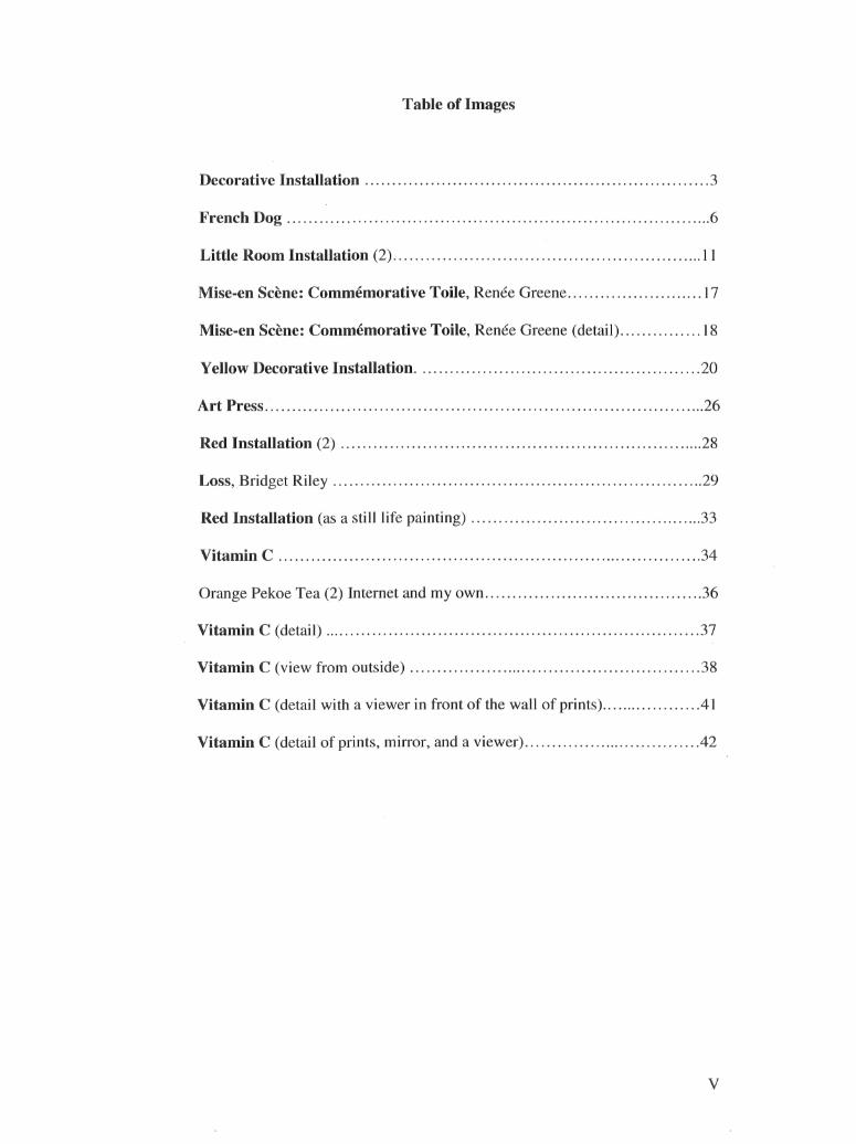
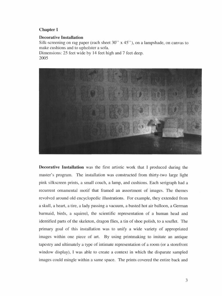
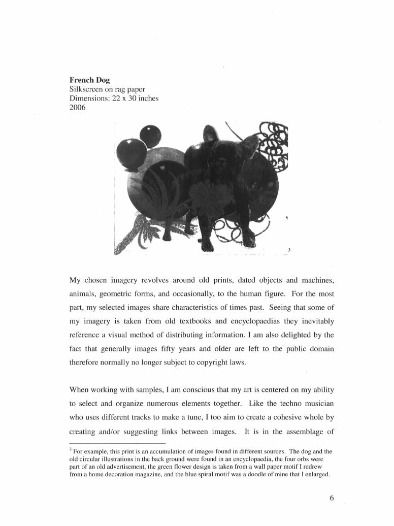
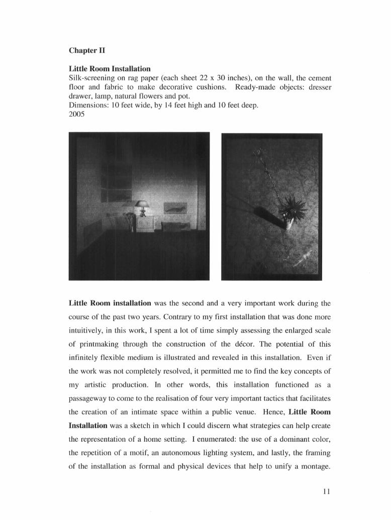
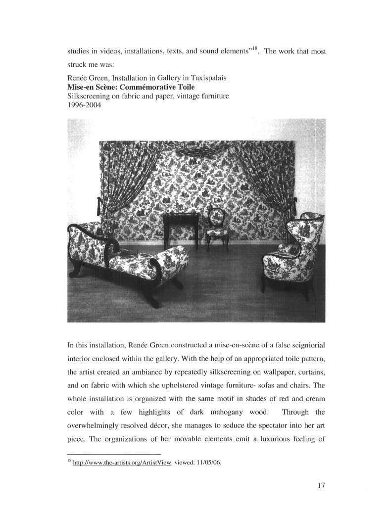
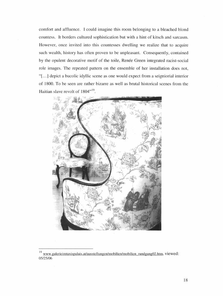
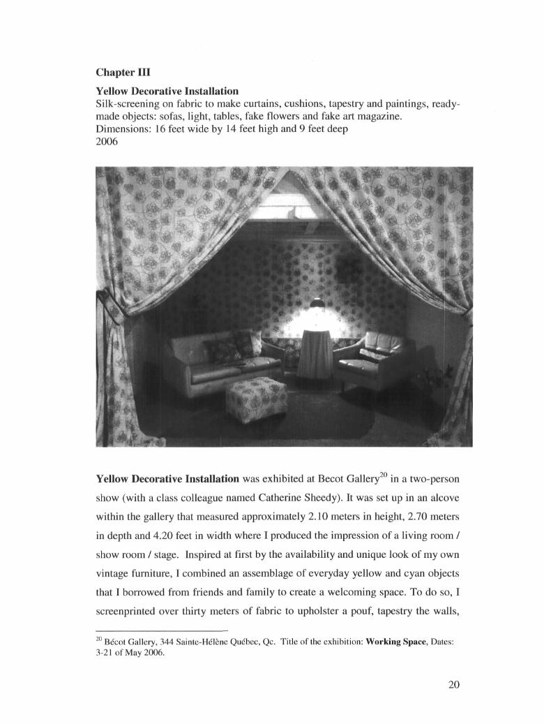
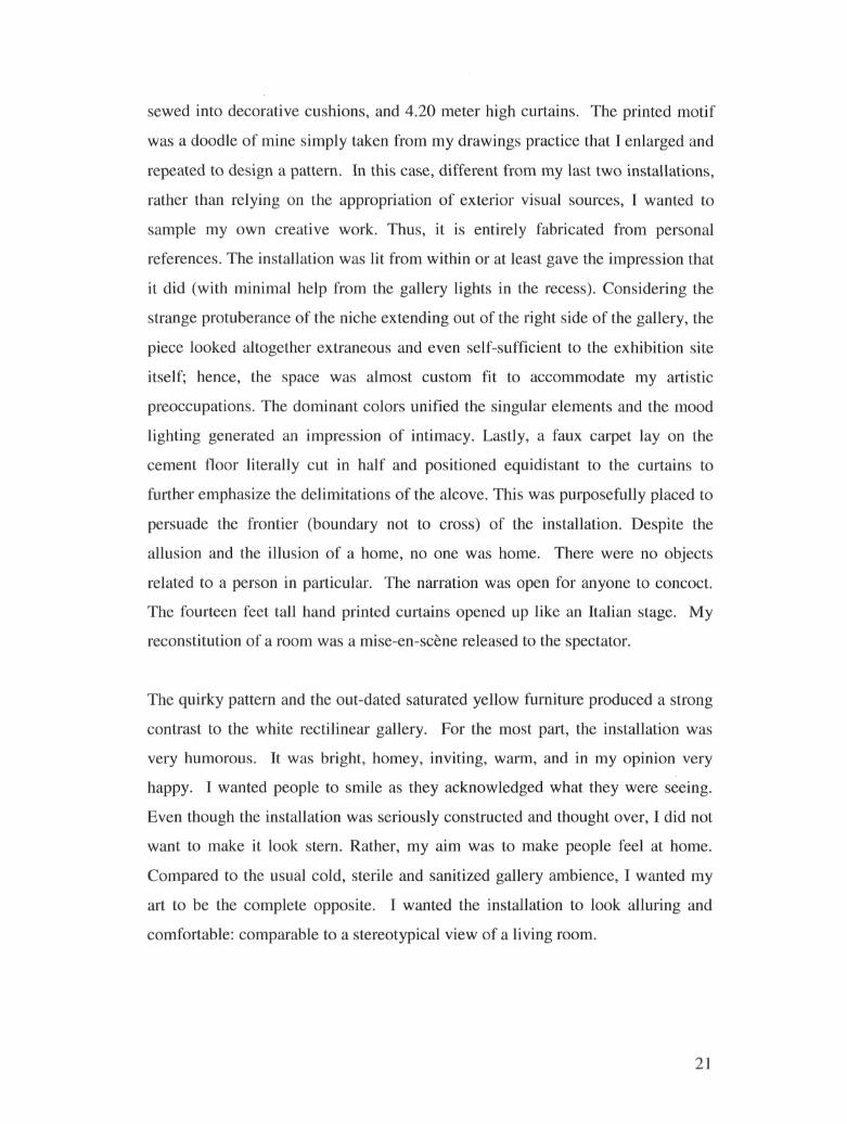
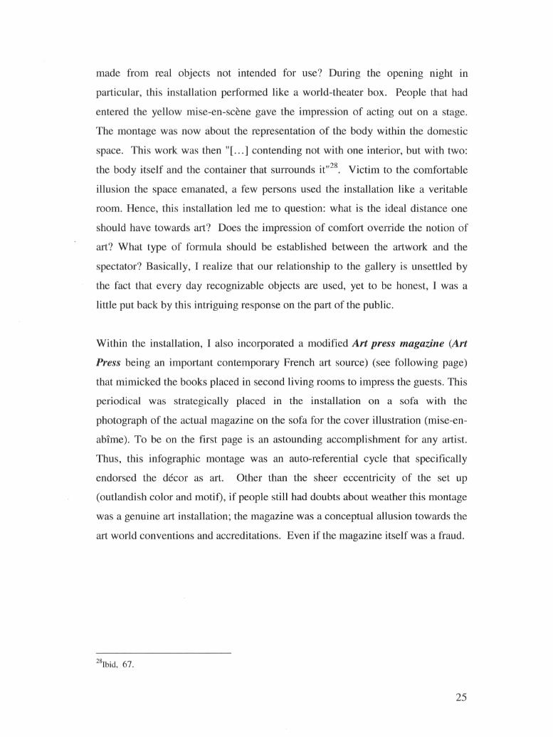
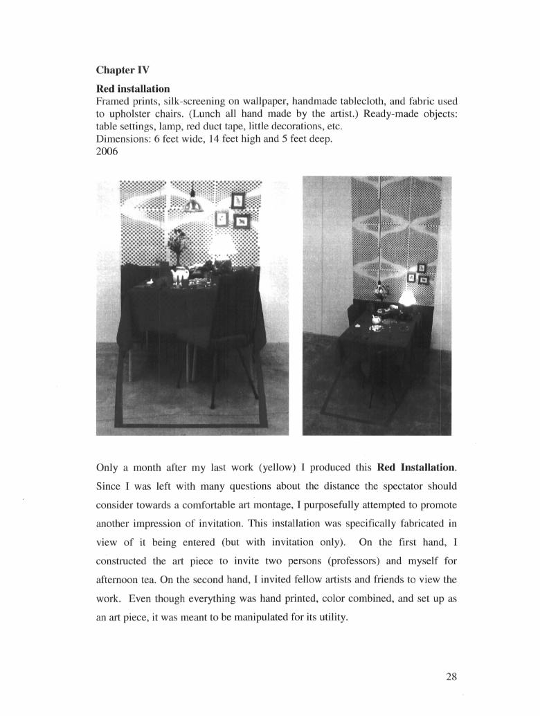
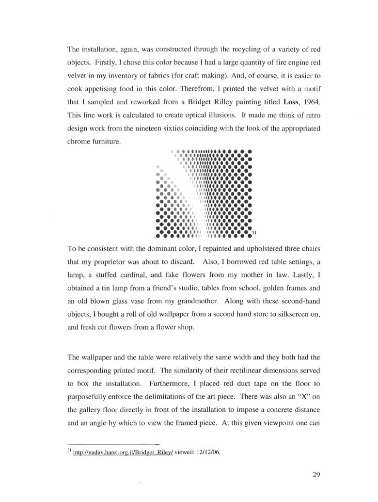
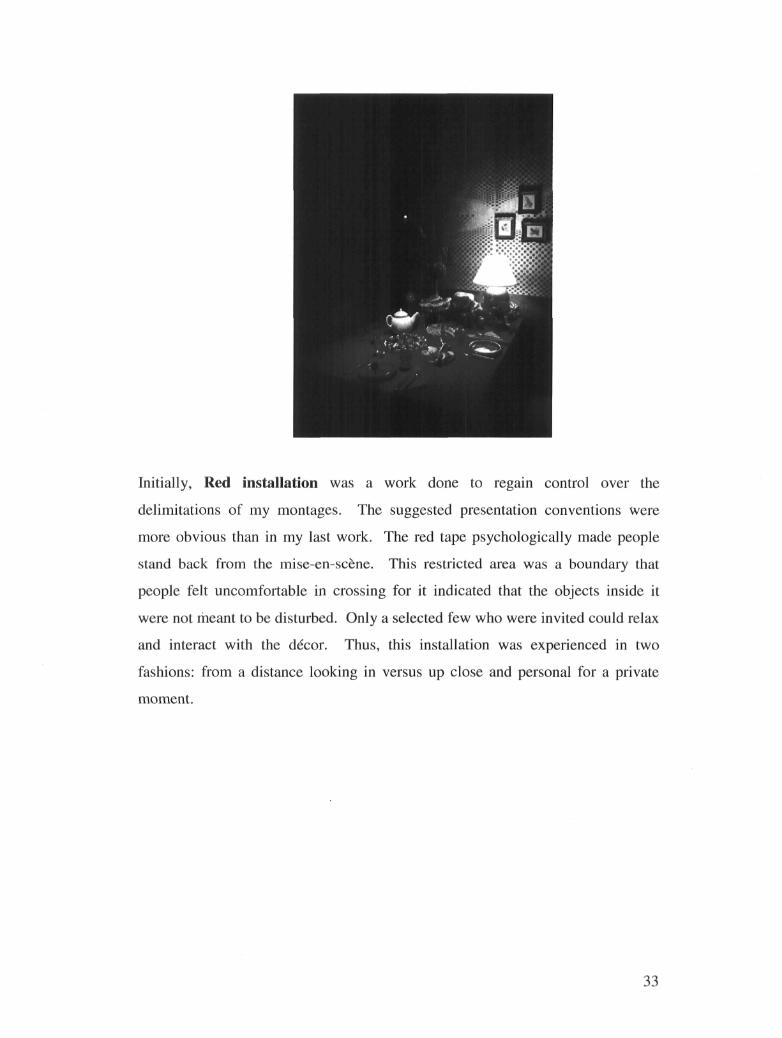
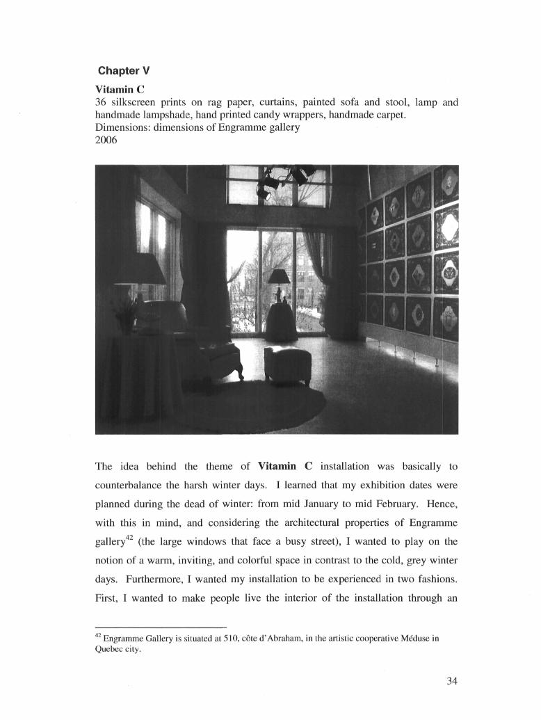
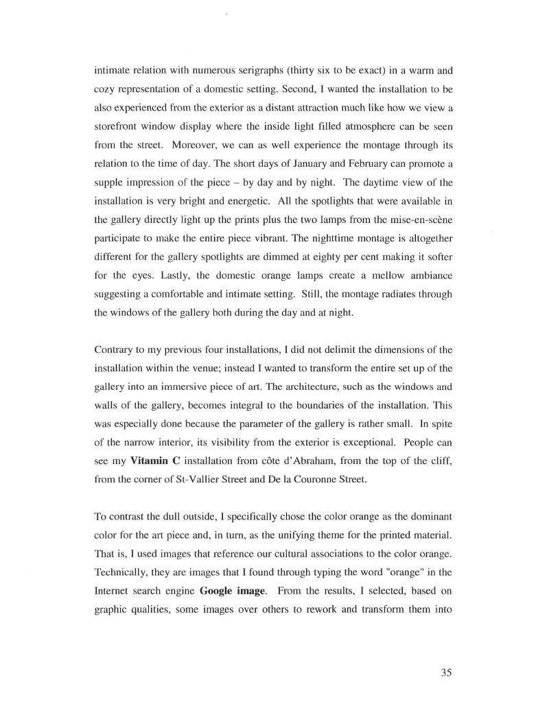
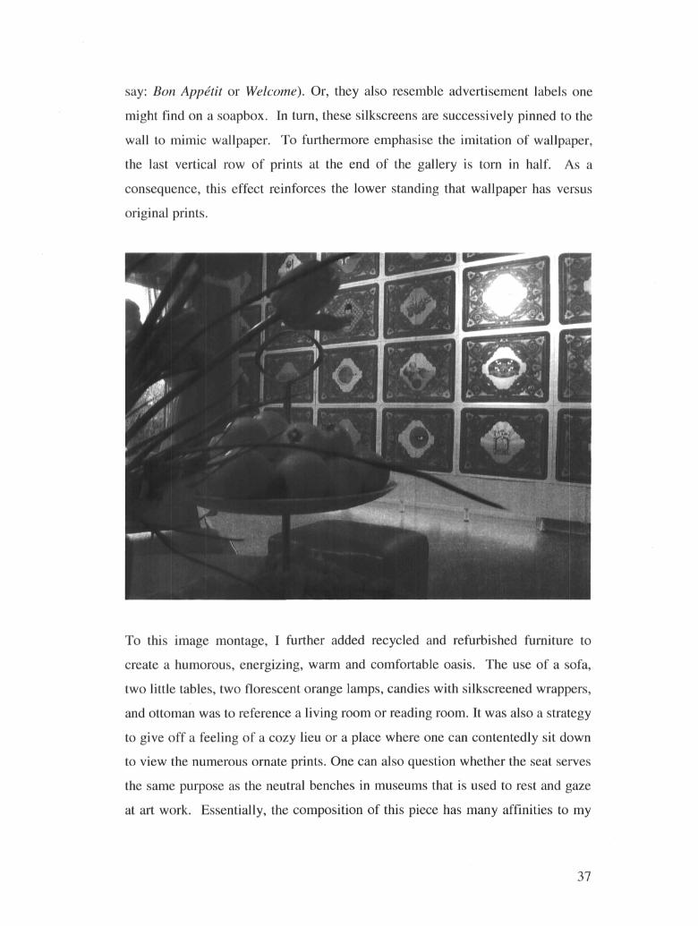
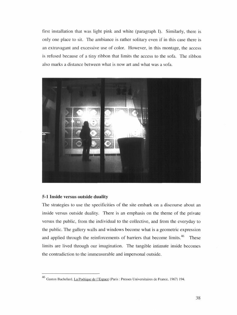
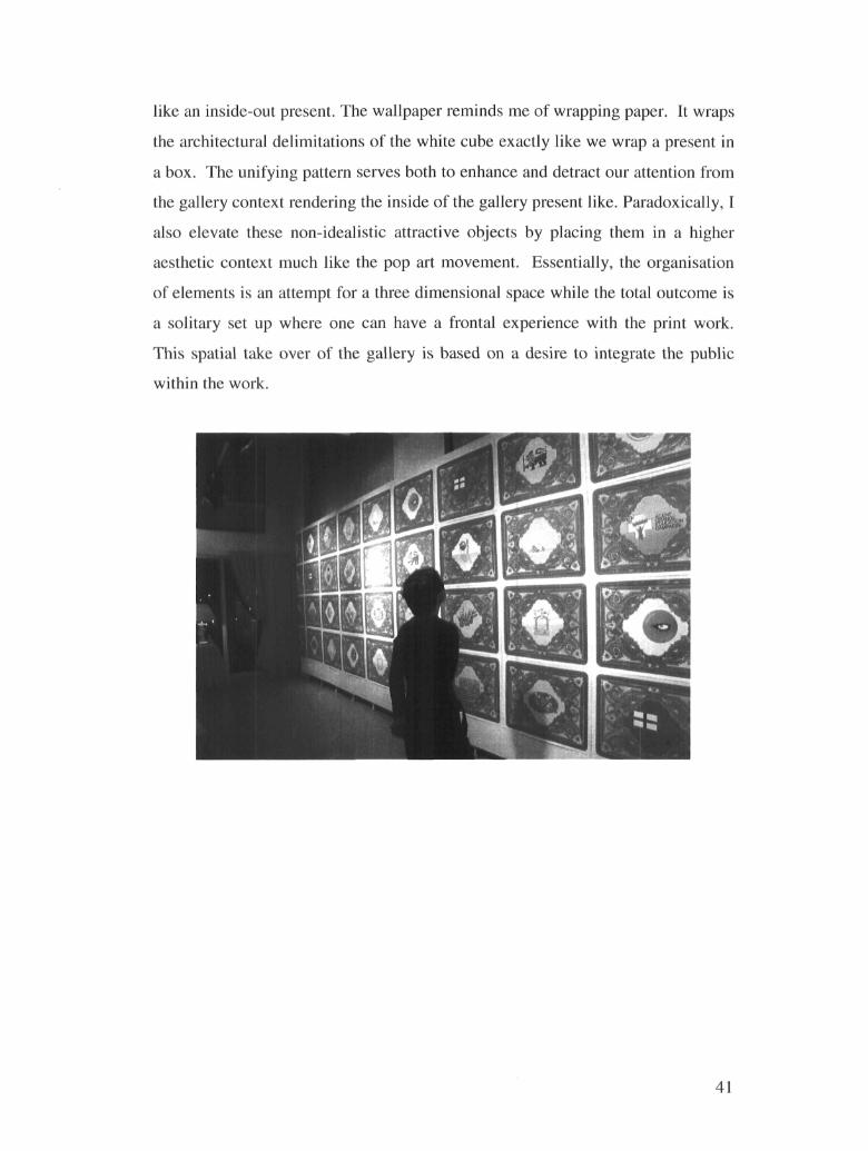
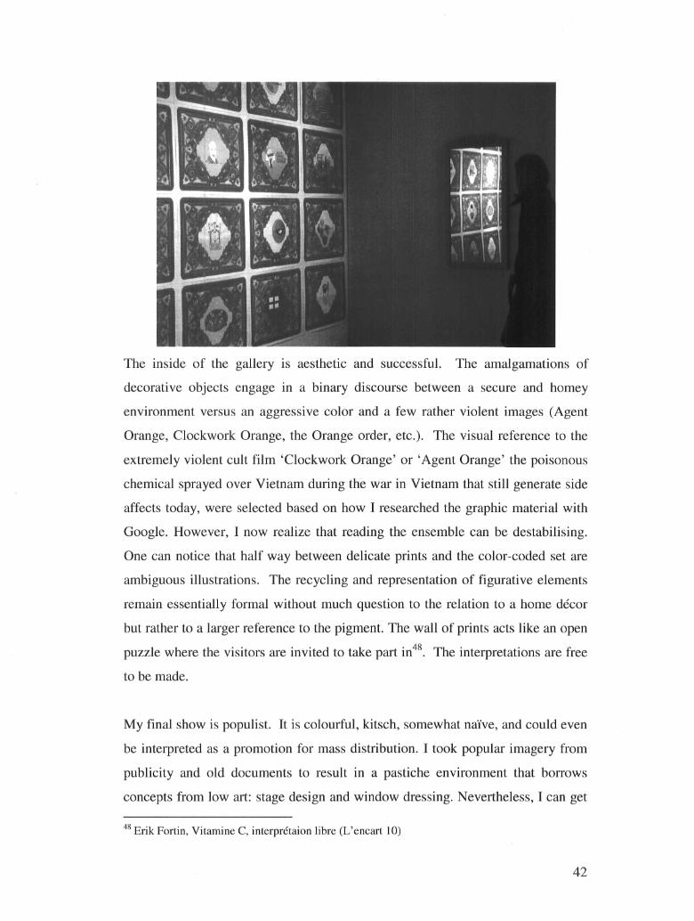


