Embed Size (px)
Citation preview
COLOURS
AND
EMOTIONS
IN
ADVERTISING How to catch the eye and capture the heart
BY
Parisa Irankhah 1584447
GRADUATION ASSIGNMENT SUBMITTED IN PARTIAL FULFILLMENT OF THE REQUIREMENTS FOR THE DEGREE OF BACHELOR OF
COMMUNICATIONSYSTEMS OF THE INSTITUTE OF COMMUNICATION AT THE UTRECHT UNIVERSITY OF APPLIED SCIENCES
UTRECHT, 10 – 06 – 2014
2
Management Summary Since the dawn of advertising in the Netherlands there have been much changes.
Advertising has become an essential tool for any type of organization (Rakker, 2009).
Nowadays, grasping the attention of an audience is becoming more and more difficult
(Libbenga, 2013). Mark Jetten (2014) said “We barely get any time or money to do
research.” Therefore, I have decided to save them time by writing this thesis. I have
analysed new and old theories and literature, and created a comprehensive report on
colour and emotion in advertising. This thesis should help advertising agencies influence
their target audience in a more effective manner through visual aspects. In the current
times, the favourite methods that are used to appeal to audience’s emotions are: the Social
Proof method, the Scarcity Effect, and the Fear Appeal method (Ford, 2013).
According to LeDoux (2002) it has been widely accepted by many that emotions have an
essential part in driving people’s decisions, whether it is a decision on purchasing items, or
watching television. The audience will be more willing to engage and share once they feel a
strong emotional appeal, preferably positive, towards an advertisement, which will also
increase their appeal to a certain brand (Henning, 2013). Therefore, advertisers increasingly
aim to evoke emotional responses rather that presenting factual statements (DeJesus,
2007). In order to evoke emotion, however, one first needs to grab the attention of the
audience. Therefore, colour is the first step. Each colour that the audience sees directly
affects their hormones, which in their turn control the audience’s emotions and responses.
(Wright, 2008b) A study from Millward Brown (2012) has shown that colour influences the
human memory performance by increasing the attention level. In an example case
(Appendix E), a company used the colour red for an important button on their website,
which maximize the clicks. In Appendix E there is also an example of a use of emotions in
order to increase sales by beauty brand Dove (Millward Brown, 2009).
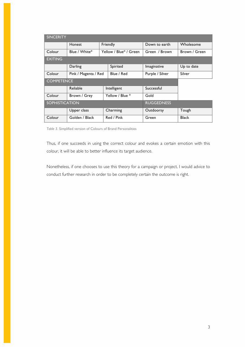
Below you can find the simplified version of the theory that I have created, which is meant
to guide Dutch advertising agencies in choosing the most effective colour for their
campaign or project. This theory has been confirmed by literature as well as own research
through a questionnaire amongst 108 people who are part of the target audience
3
SINCERITY
Honest Friendly Down to earth Wholesome
Colour Blue / White* Yellow / Blue* / Green Green / Brown Brown / Green
EXITING
Darling Spirited Imaginative Up to date
Colour Pink / Magenta / Red Blue / Red Purple / Silver Silver
COMPETENCE
Reliable Intelligent Successful
Colour Brown / Grey Yellow / Blue * Gold
SOPHISTICATION RUGGEDNESS
Upper class Charming Outdoorsy Tough
Colour Golden / Black Red / Pink Green Black
Table 3. Simplified version of Colours of Brand Personalities
Thus, if one succeeds in using the correct colour and evokes a certain emotion with this
colour, it will be able to better influence its target audience.
Nonetheless, if one chooses to use this theory for a campaign or project, I would advice to
conduct further research in order to be completely certain the outcome is right.
4
Abstract
To round of the four years of studying International Communication and Media, students
are obliged to do a graduation assignment. This assignment will be executed in form of a
report, or thesis as you may call it. This report is meant to demonstrate the skills and
knowledge one has gained during the course of four years.
In order to do this I have made use of a literature research as well as an own research.
However, first the policy, research, and sub questions have been defined. The literature has
been predominantly gathered from online sources. Much of the literature can be found in
the theoretical framework, where I discuss relevant theories and information that are
interrelated. Then, in the methodology section the desk and field research methods used
are discussed. The field research generally confirmed my own theory named Colours of
Brand Personalities. In the end I am able to conclude that if one succeeds in using the
correct colour and evokes a certain emotion with this colour, it will be able to better
influence its target audience. Nonetheless, further research is advised.
Preface and Acknowledgements
After all the research I have done, I feel much wiser now compared to when I started
writing this thesis. It has been a long road to arrive at this point. The journey has been
tough, yet instructive. I would like to thank my parents for their support and motivation, as
well as my tutor, Evelyn Bekooij-Westerhoudt, for her excellent guidance.
5
InDEX
List of figures 8 List of tables 8 1 . Introduction 9
1.1 PROBLEM SITUATION 9
1.2 PROBLEM DEFINITION 10
1.3 RESTRICTIONS TO THE RESEARCH 10
1.4 OBJECTIVES 12
1.5 RESEARCH QUESTIONS 12 Policy question 12 Research question 12 Sub question 13
2. The world of Dutch advertising 13
2.1 THE MARKET 13
2.2 PRINT AND ONLINE ADVERTISING 14
2.3 THE AUDIENCE 14
3. Theoretical framework and Literature review 15
3.1 BACKGROUND INFORMATION THEORIES 15
4. EMOTIONS AND THEIR EFFECTS IN ADVERTISING 17
4.1 WHAT IS EMOTION? 17
4.2 EMOTIONS IN ADVERTISING 18
5. COLOURS AND THEIR EFFECTS IN ADVERTISING 23
5.1 COLOUR ANALYSIS 24 Blue 24 Yellow 24 Brown 24 Magenta 24 Green 25 Pink 25 Red 25
6
Silver 25 Grey 25 Gold 26 Purple 26 Black 26
6. COLOURS OF BRAND Personalities 27
6.1 MAIN SOURCES 28
6.2 BRAND PERSONALITIES 30
6.3 THE THEORY 31
7. Methodology 37
7.1 RESEARCH DESIGN 37
7.2 DESK RESEARCH 37 Offline Literature 37 Online literature 37
7.3 FIELD RESEARCH 38
7.4 SAMPLING 39 Initial coding 41 Focused coding 41 Theoretical sampling 42 Memos 42
7.5 ANALYSIS 43
7.6 COLOURS OF BRAND PERSONALITIES 43
8. Results 44
8.1 FIELD RESEARCH 44
9. Conclusions 49
9.1 HOW ARE COLOURS AND EMOTIONS CURRENTLY USED BY ADVERTISERS? 49
9.2 HOW DOES THE AUDIENCE EXPERIENCE THE CURRENT ADVERTISEMENTS? 50
9.3 HOW CAN EMOTIONS AND COLOUR WORK TOGETHER TO MORE EFFECTIVELY
INFLUENCE THE TARGET AUDIENCE? 51
10 . Discussion 52
7
1 1 . Recommendations 53
12 . Reference List 55 13 . Appendix 61
APPENDIX A 61 Print and online advertising 61
APPENDIX B 62 The target audience 62
APPENDIX C 63 The survey layout and justifications 63
APPENDIX D 68 Survey results 68
APPENDIX E 78 Example cases 78
8
List of figures Figure 1. Communication model by Shannon Weaver. Adapted from Communication Theory, 2011, Retrieved from: http://communicationtheory.org/shannon-and-weaver-model-of-communication/ Figure 2. The Emotional Continuum. Adapted from How To Capture The Heart?, by Poels &
Dewitte, 2006, Katolieke Universiteit Leuven
Figure 3. A spectrum of affective phenomena in terms of the time course of each. Adapted
from Understanding Emotions, by Jenkins & Oatley, 1995
Figure 4. Brand Personalities Scale. Adapted from Dimensions of Brand Personalities, by
Aaker, 1997.
Figure 5.1. Morninglight. Adapted from Colour Affects System, by Wright, 2008e. Figure 5.2. Dreamlight. Adapted from Colour Affects System, by Wright, 2008e. Figure 5.3. Firelight. Adapted from Colour Affects System, by Wright, 2008e. Figure 5.4. Starlight. Adapted from Colour Affects System, by Wright, 2008e. Figure 6. Five levels for effectively measuring online advertising. Adapted from Measuring the
effectiveness of online advertising by PWC, 2010.
Figure 7. Applied coding process according to Charmaz (1983)
Figure 8.1. Age of the respondents
Figure 8.2. Gender of the respondents
Figure 8.3. Occupation of the respondents
Figure 8.4.1 Medium preference of the respondents -Online
Figure 8.4.2 Medium preference of the respondents - Print
Figure 8.5. The colour imagined when winning a lottery
Figure 8.6.1. Advertisement preference – Ad 1
Figure 8.6.2. Advertisement preference – Ad 2
Figure 8.7. Advertisement appeal preferences
Figure 8.8. Colour scheme for ruggedness
Figure 8.9. Colour scheme for Sincerity
List of tables
Table 1. Colours of Brand Personalities
Table 2. Colours of Brand Personality – Literature versus Survey results
Table 3. Simplified version of Colours of Brand Personalities
9
1 . Introduction Advertising has become an essential tool for any type of organization. However, many
people do not realize how deep advertising actually goes. (Libbenga, 2013) To ‘advertise’
has been defined by the Oxford Dictionaries (2014) as: Describe or draw attention to (a
product, service, or event) in a public medium in order to promote sales or attendance. This
definition is indeed what most people have in mind when they refer to advertising.
Nonetheless, this definition is solely a broad outline of what advertising really is.
Advertising nowadays goes much deeper. It considers many aspects and aims to influence
the audience as much as possible (Chapman & Nuttall, 2011). In this report I focus on two
aspects of advertising: colours and emotions. Emotions are critical to all human thought,
thus are critical to advertising as well (Du Plessis, 2005). Emotions can stimulate the
memory, determine the attention one pays to an ad, and much more (Du Plessis, 2005).
Colours in advertising are a crucial point as well. It is claimed to be the most important
visual experience to humans (Adawiah & Mustafar, 2013). However, not just any colour will
work as well. In the words of the Color Marketing Group, “Colour sells… and the right
colours sell better” (as cited in Lambert, 2004, p. 77). This basically means that one needs
to choose the colour it wants to use in its advertisements very carefully in order to sell
better. Both colours and emotions will be discussed further detail in the following chapters.
1 . 1 PROBLEM SITUATION Much has changed since the beginning of advertising in the Netherlands. Nowadays,
grasping the attention of an audience is becoming more and more difficult (Libbenga,
2013). Advertisers are challenged to keep coming up with the most innovative ads and
keep on developing their techniques. However, most advertisers already have much to do
and little time. Mark Jetten (2014) (who is the co-founder of advertising agency Nieuwe
Koffie) said, “We barely get any time or money to do research.” This could cause them to
miss out on great findings that could make a change.
Another factor that could cause them to miss out on these findings is that employees are
often not are not stimulated to go after new things in general. Braaksma, de Jong, & Stam
(2005) found that only 16% of the creative media sector had a new product or service
introduced to them in the past 3 years, and only 18% had a new way of delivering to its
10
clients. This indicates that the people in charge of the agencies could be one of the main
causes for this issue. For that reason, I would say this thesis is not necessarily solving a
problem, but rather pointing out an opportunity.
In the modern world we live in, there is a great deal of experiments and researches taking
place each day (Science Daily, 2013). Some of these results can, or should, have an impact
on the way advertisers create and execute campaigns. Therefore, I will look at the way
advertisers currently use specific aspects of advertising psychology, and how that could be
improved with new insights.
The research will result in recommendations to advertising agencies in the Netherlands on
how to more effectively influence the target audience in the future.
1 .2 PROBLEM DEFIN IT ION To define the problem (or in this case the opportunity) as clear as possible, I will state the
following. There are many new findings from psychological researches that could improve
the current styles of online- and print advertising. This in its turn can help advertising
agencies influence their target audience in a more effective manner. In this case, I will focus
on the psychological findings that will help Dutch advertising agencies more effectively
influence their audience, which is Dutch males and females between the age of 18 and 25.
1 .3 RESTRICTIONS TO THE RESEARCH Since my topic could be perceived as quite broad, I have chosen to determine several
exclusion factors. In the thesis I will briefly discuss the general psychology of colour and
emotions. However, other psychological factors will not be discussed as this would be
irrelevant to this study, and would not add value.
I have chosen to focus on the Netherlands for this thesis because despite its size, it is filled
with great advertising agencies that have a lot of potential (Adformatie, 2012).
Furthermore, I will focus on print and online advertising only. Print advertising will include
magazines, billboards and banners. This means that newspapers, newsletters, books,
brochures and press releases are excluded. The online advertising will include display
advertising, and social network advertising, and excludes SEM, newsletters, affiliate
marketing, in-game advertising, and direct marketing. More restrictions to both print and
11
online advertising will be to the nature of the advertisements. In this thesis I will be
focussing solely on graphical and still images. This is due to the fact that my focus in on the
‘visual aspects’ of each ad. Therefore, an online ad containing words only, for example, will
not be relevant to this report.
Another topic that might need further clarification is the word ‘visual aspects’, which will be
used in the coming section to state the policy question. With visual aspects I mean colours,
as well as emotions. This is because in my opinion, the emotions that will be used through
online and print advertisements will be projected as visuals. The sad face of a child, for
example, brings up a certain emotion in people. Yet, it is the image that carries that
emotion. Therefore, I will refer to colours and emotions as visuals aspects.
To clarify my research even more, I would like to point out the distinction between
advertising agencies, marketing agencies, and graphic bureaus. In this report I will be
focusing on advertising agencies, which are agencies that specialise in translating a brand’s
story into an advertising campaign (Desmyttere, 2008).
Marketing agencies on the other hand, specialise more in providing marketing advice, which
not restricted to advertising. It will cover the marketing strategy, digital media, costumer
services, and more. Graphic bureaus are solely focussed on providing graphics designs and
consider many aspects such as choice of material, colours, logos, and etcetera.
(Desmyttere, 2008)
Another subject worth mentioning is ‘emotion’. It is safe to say that emotion is difficult to
describe. As Fehr and Russell (1984) said, “Everybody knows what an emotion is, until
asked to give a definition”(p. 464). The precise definition I will use to describe emotion in
this thesis is:
An emotion is a feeling, or mental state, that derives from a certain circumstance, mood,
action, or interaction with another person
Further explanation concerning the definition can be found in chapter 4. For this thesis, I
will focus on emotions that are evoked through advertising. This means that human
emotions towards each other are excluded. The focus will be the emotions one feels
towards a brand or organisation, for example.
Similar to most other theories, my theory has some limitations and pitfalls. Since I have had
limited time and resources, the outcomes of my research, which the theory is based on, will
12
require further research before it can be used with complete certainty. Another factor to
consider is that I have based my brand personalities on one scale. There are obviously
many different manners to define brand personalities. However, it is impossible to consider
them all. I have chosen the one of which I think fits my theory and research best. The
explanation and justification of the chosen brand personalities scale will be discussed in
chapter 6.
1 .4 OBJECTIVES The objective of this thesis is to provide Dutch advertising agencies with a new view. I hope
to enlighten them and help to more effectively influence their audience of Dutch males and
females between the age of 18 and 29 through visuals aspects. I wish to provide them with
an advice that is considered valuable and eye-opening, and perhaps cause a change in the
advertising world. Ideally, my theory would be adapted in the process of creating an
advertisement.
S The goals Is to provide Dutch advertising agencies with an advice that is considered
valuable and enlightening.
M This can be measured by sending out this report to several Dutch advertising
agencies, and asking for their feedback.
A It is attainable to do so because I have all the resources and knowledge, which I
have gained during my course and through research, to attain this goal.
R The goal is also relevant to my studies, media and communications, because it
researches a part of the media industry.
T By the 10th of June, this report should be finalized.
1 .5 RESEARCH QUESTIONS Policy question
How can Dutch advertising agencies more effectively influence the audience of Dutch
males and females between the age of 18 and 29 through visuals aspects?
Research question
What effect do colours and emotions that are used in print and online advertisings have on
Dutch males and females between the age of 18 and 29?
13
Sub questions
1. How are colours and emotions currently used by Dutch advertisers?
2. How does the audience experience the current advertisements?
3. How can emotions and colour work together to more effectively influence the target
audience?
2. The world of Dutch advertising 2. 1 THE MARKET Much has changed in the Netherlands since the beginning of mass advertising in the end of
the 19th century. The first advertising agency named Nijgh & Van Ditmar was based in
Rotterdam (Emmelot, 2014). From there on things have moved rapidly for advertisers.
Advertising has become to brands if they want to keep up with their competition even the
slightest bit. Despite all of the protesting from people throughout the years, advertising
remained part of our daily life (Rakker, 2009).
Nowadays there are multiple organizations that control advertising in the Netherlands,
including the main one named Reclame Code Comissie. This organisation strives to stimulate
advertisers to create responsible ads in order to retain peoples’ trust. It also handles all
complaints that are advertisement related (Stichting Reclame Code, 2009).
Some believe that advertising agencies will not exist in the future because of the lack of
trust, new technologies, and the downfall of television as we know it (Wybenga, 2013).
However, I do not believe so. As Elke de Vilder (2014) said, “De toekomst van reclame is
dus wél reclame”, which roughly translates to: The future of advertising is advertising. With
this statement de Vilder means to say that even in the future, advertising will exist.
Especially with the knowledge that advertising agencies are gaining while specializing more
and more (Vilder, 2014), I believe that advertising agencies will still be necessary in the
future.
14
2.2 PRINT AND ONLINE ADVERTISING
I have chosen these two media for several reasons. First of all, these two methods will be
very appropriate for this specific target audience since they encounter them both
frequently. These two media are an interesting combination due to their differences and
similarities. Print advertising has existed for a long time, while online advertising is quite
recent (since 1994) (Arandilla, 2011). Although they are quite different in use, they are still
the same in nature: both types of advertisement will consist of a still graphic image that
somehow contains a persuasive message (Barett, 2007). The many similarities and
differences of these media, combined with the audiences’ exposure to them, were the main
reasons for my choice of media. A more elaborate explanation for my choice of medium
can be found in Appendix A.
2.3 THE AUDIENCE The Netherlands currently counts 16.850.058 inhabitants, of which 2.292.448 people are
between 18 and 29. (Centraal Bureau voor Statistiek, 2013) This means that over 10% of
the population falls within this category. I will be focussing on those who are currently
enrolled in a HBO study. This brings us to a set of 440.203 people (Centraal Bureau voor
Statistieken, 2013). Also, I have chosen to focus on the percentage of this group that
makes use of the Internet daily.
The typical male or female that is part of our target group will be enrolled in an HBO of
some kind. The majority of them will have a busy social live as well, besides studying. This
means that they will spend a considerable amount of time on the go. Please find a more
elaborate discussion on the target audience in Appendix B.
15
3. Theoretical framework and Literature review
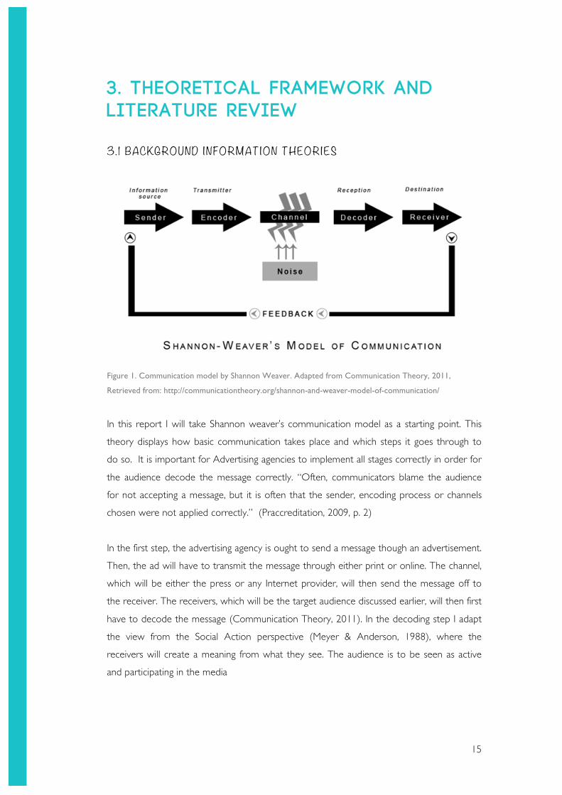
3.1 BACKGROUND INFORMATION THEORIES
Figure 1. Communication model by Shannon Weaver. Adapted from Communication Theory, 2011,
Retrieved from: http://communicationtheory.org/shannon-and-weaver-model-of-communication/
In this report I will take Shannon weaver’s communication model as a starting point. This
theory displays how basic communication takes place and which steps it goes through to
do so. It is important for Advertising agencies to implement all stages correctly in order for
the audience decode the message correctly. “Often, communicators blame the audience
for not accepting a message, but it is often that the sender, encoding process or channels
chosen were not applied correctly.” (Praccreditation, 2009, p. 2)
In the first step, the advertising agency is ought to send a message though an advertisement.
Then, the ad will have to transmit the message through either print or online. The channel,
which will be either the press or any Internet provider, will then send the message off to
the receiver. The receivers, which will be the target audience discussed earlier, will then first
have to decode the message (Communication Theory, 2011). In the decoding step I adapt
the view from the Social Action perspective (Meyer & Anderson, 1988), where the
receivers will create a meaning from what they see. The audience is to be seen as active
and participating in the media
16
Some people might disagree with this theory because audiences cannot always be active. It
might be dependent on where they are, what they are doing, who they are with, etcetera
(Schoening, 1995). However, it has been proven by neuroscientific researches that people
are always mentally active when viewing an ad, even if it is only unconsciously (Moorman,
2010). They perceive an ad, and the brain will respond somehow.
In the next step, where the audience is to receive the message, I shall consider the Two
Step Flow theory (University of Twente, 2014). The receivers will be seen as certain
opinion leaders, who receive the media message, and then spread the message to their
circle. So according to this theory, not all people who are influenced by the message will
get to see the actual advertisement. The drawback to this theory is that the people, who
get informed by an opinion leader, do not see the ad for themselves. This means that they
will not experience the visuals of the ad, which is the part that concerns this report. On the
other hand, if they look up the ad afterwards, this will no longer apply.
After the message has been decoded and received by the audience, the audience will
respond by giving some kind of feedback. This may occur as sales, brand awareness, or any
other type of measurable response.
Some might argue that this theory is too simplistic, which I do agree with. Therefore, this
model will be used as background information solely, in order to be familiar with the
communication process in broad lines. This model can be used to understand the process
an ad has to go through (very basically) to get a message across (University of Twente,
2014).

17
4. EMOTIONS AND THEIR EFFECTS IN ADVERTISING 4.1 WHAT IS EMOTION? Emotion might mean something different to someone who is an artist, than to someone
who is a shop owner. It is therefore important to create a clear definition of what is meant
by ‘emotion in this report. Below you can find several definitions that are stated by experts
and dictionaries:
“Advertising does not first get attention, and then create an emotion. Advertising creates an
emotion, which results in attention” (Jenkins and Oatley, 1995, p. 84).
“A strong feeling deriving from one’s circumstances, mood, or relationships with others”
(Oxford Dictionaries, 2014)
“A mental state that arises spontaneously rather than through conscious effort and is often
accompanied by physiological changes; a feeling” (The Free Dictionary, 2009)
The theories and quotes from Oatley and Jenkins are from 1995. As you know, much has
changed in the world since then. Therefore, they could be perceives as out-dated.
However, the basics often stay the same, and are simply built upon. This has been done in,
for example, a report on emotions by Sage (2011) concerning Basic Emotions in Social
Relationships, Reasoning, and Psychological Illnesses. Based on a combination of these
different definitions I have created a comprehensive statement that will define ‘emotion’ in
this thesis.
An emotion is a feeling, or mental state, that derives from a certain circumstance, mood, action,
or interaction with another person.
According to Poels & Dewitte (2006), there is a distinction to be made between
‘automatic’ emotions, and emotions that result from a cognitive process. A positive arousal
that gets men’s attention when viewing an ad involving women would be considered an
automatic response. Whereas hope that arises from a diet pill commercial, is generated by
a cognitive process. Figure 2 Displays the distinction between these types of emotions
based on the amount of cognitive processing they require. On the far left end of the
continuum you can find the emotions that occur automatically, labelled ‘lower-order
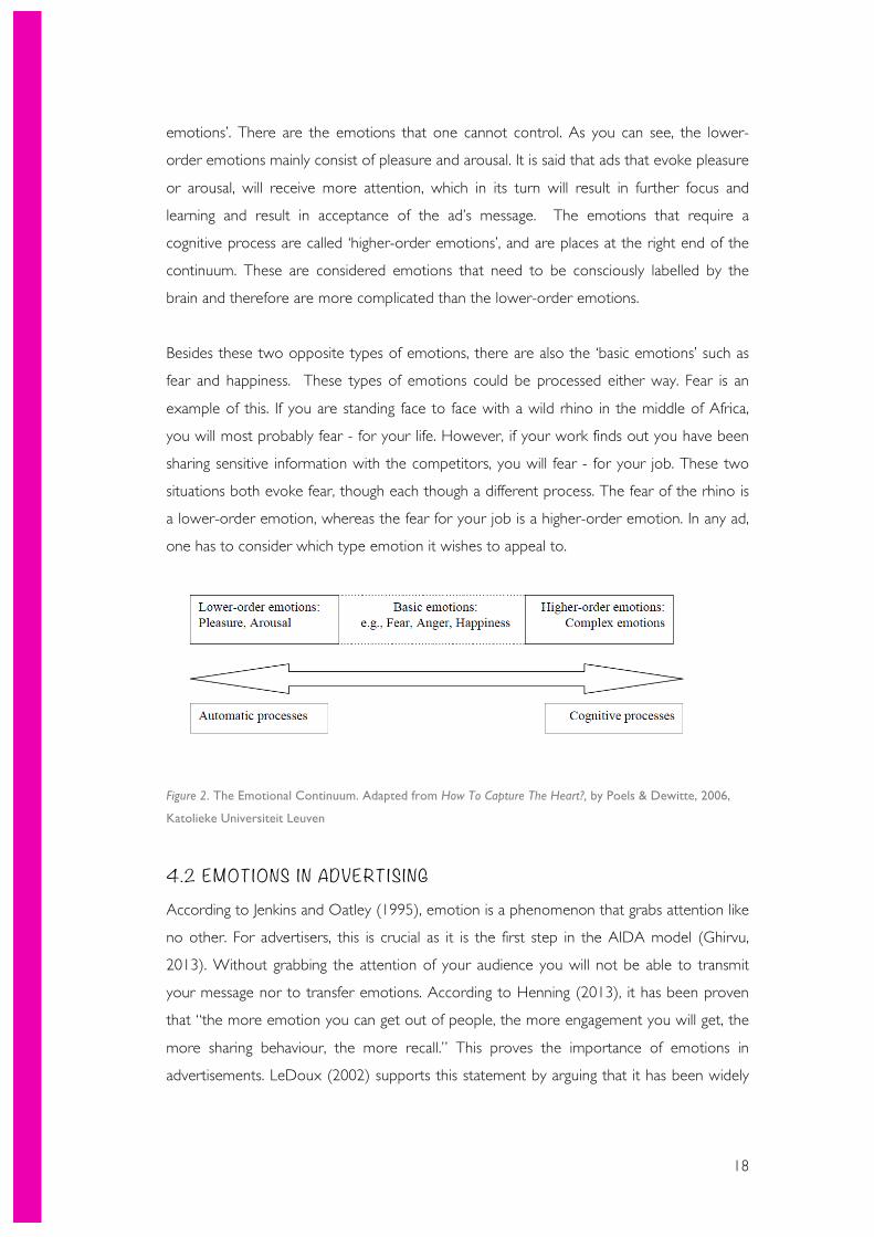
18
emotions’. There are the emotions that one cannot control. As you can see, the lower-
order emotions mainly consist of pleasure and arousal. It is said that ads that evoke pleasure
or arousal, will receive more attention, which in its turn will result in further focus and
learning and result in acceptance of the ad’s message. The emotions that require a
cognitive process are called ‘higher-order emotions’, and are places at the right end of the
continuum. These are considered emotions that need to be consciously labelled by the
brain and therefore are more complicated than the lower-order emotions.
Besides these two opposite types of emotions, there are also the ‘basic emotions’ such as
fear and happiness. These types of emotions could be processed either way. Fear is an
example of this. If you are standing face to face with a wild rhino in the middle of Africa,
you will most probably fear - for your life. However, if your work finds out you have been
sharing sensitive information with the competitors, you will fear - for your job. These two
situations both evoke fear, though each though a different process. The fear of the rhino is
a lower-order emotion, whereas the fear for your job is a higher-order emotion. In any ad,
one has to consider which type emotion it wishes to appeal to.
Figure 2. The Emotional Continuum. Adapted from How To Capture The Heart?, by Poels & Dewitte, 2006,
Katolieke Universiteit Leuven
4.2 EMOTIONS IN ADVERTISING According to Jenkins and Oatley (1995), emotion is a phenomenon that grabs attention like
no other. For advertisers, this is crucial as it is the first step in the AIDA model (Ghirvu,
2013). Without grabbing the attention of your audience you will not be able to transmit
your message nor to transfer emotions. According to Henning (2013), it has been proven
that “the more emotion you can get out of people, the more engagement you will get, the
more sharing behaviour, the more recall.” This proves the importance of emotions in
advertisements. LeDoux (2002) supports this statement by arguing that it has been widely
19
accepted by many that emotions have an essential part in driving people’s decisions,
whether it is a decision on purchasing items, or watching television.
According to Madeline Ford (2013), Psychology Writer of TipTap Lab, it has been proven
that advertisers currently use a few specific methods, in order to appeal to certain emotions
of the audience. The favourite methods that are most used are the Social Proof, The
Scarcity Effect, and the Fear Appeal method.
With the social proof method one can expect lines such as The favourite of millions of
costumers. With this method they strive to appeal to the instinctive social tendency of
human beings by creating the idea of a specific company being the favourite of many
others.
Then, with the scarcity effect method one will see lines such as Limited stock. Hereby
advertisers aim to appeal to the competitive side of people. This method has proven to be
very effective in times of crisis. Lastly, with the fear appeal method one should think of
lines like Smoking kills 2000 people each year. This type of advertising is mostly used to
create some type of behavioural change.
This last method is quite interesting since many researches, such as Du Plessis’ book (2005)
and a study by J. T. Enns (2014), claimed that positive emotional stimulates have more
effect than negative ones. A Millward Brown (2010) research also suggests that positive
emotional responses to ads are heavily related to rises in brand appeal.
Although these papers make a distinction between solely three favourite emotional appeals
in advertising, there is a long list of types of appeals that are currently used (Ambekar,
2009).
It occurs more and more often that advertisers aim to focus on evoking emotional
responses rather that presenting factual statements. They strive to create an ad that people
can relate to, and feel positive about in some way (DeJesus, 2007). Positive feelings, in their
turn are more likely to be subject of people’s conscious thoughts. This phenomenon has
been tested through own research. In an online questionnaire amongst 108 people within
the target group, the vast majority of the respondents preferred the ad that appealed to
people’s emotional side rather than the ad that focused on factual statements. Another
research by j. S. Armstrong (2010) claims that trust, guilt and self-expression are the
emotions that are most effective in advertising.
20
Another source, a book named The Advertised Mind by Eric du Plessis (2005), discusses
many psychological aspects of advertising. The author used to be an advertiser himself and
is well known in the field. I have taken several sections of this book into account, which will
be discussed below.
This book contains a large list of resources and references, which can be perceived as both
good and bad. It could be good as it could mean that he did much research to reach his
conclusions. However, it could also mean that he has not been as efficient as possible with
his choice of sources. His book has been referenced by many highly regarded brands such
as Millward Brown and 5MetaCom.
One important section of the book to consider is the foreword. There he explains the
basic principles of advertising. One of the headings states: “there is no ‘one size fits all’
media strategy that can meet different advertising needs“ (Du Plessis, 2005, p.17). This
statement fits well within this research and I have therefore taken it into consideration by
making use of many different emotions and colours in my own theory named Colours of
Brand Personalities.
Another interesting subject that has been discussed in this book is the primitive and
instinctive reaction of our brains. According to Du Plessis (2005), a human’s conscious
thoughts are controlled and shaped by emotions. However, first one needs to grab the
attention of the audience in order to start the process of the emotions. “ Since emotion
plays a key role in the directing of our attention, the task of the advertisement is to evoke
emotion in us” (Du Plessis, 2005, p29). This simply means that once you catch a person’s
attention, you need to make sure to evoke emotion in order to maintain this attention.
Two very strong emotions are pleasure and pain. In his book he talks extensively about
Darwin III, who had carried out an experiment with newborn babies to test the relation of
emotions and colours. He used blue to reflect pleasure, and red to reflect pain. At the end
of the research the children would experience pleasure when encountering blue objects,
and pain with red objects. Thus, they started to see blue as ‘good’ and red as ‘bad. This
demonstrates the basic connection of colour and emotions in the human brain.
Lastly, he discusses what emotion actually means in advertising. It is safe to say that it is not
easy to define. Although, everyone does know what it is.
21
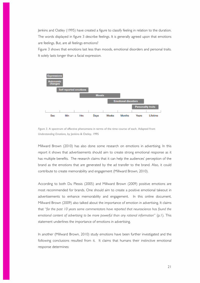
Jenkins and Oatley (1995) have created a figure to classify feeling in relation to the duration.
The words displayed in figure 3 describe feelings. It is generally agreed upon that emotions
are feelings. But, are all feelings emotions?
Figure 3 shows that emotions last less than moods, emotional disorders and personal traits.
It solely lasts longer than a facial expression.
Figure 3. A spectrum of affective phenomena in terms of the time course of each. Adapted from
Understanding Emotions, by Jenkins & Oatley, 1995
Millward Brown (2010) has also done some research on emotions in advertising. In this
report it shows that advertisements should aim to create strong emotional response as it
has multiple benefits. The research claims that it can help the audiences’ perception of the
brand as the emotions that are generated by the ad transfer to the brand. Also, it could
contribute to create memorability and engagement (Millward Brown, 2010).
According to both Du Plessis (2005) and Millward Brown (2009) positive emotions are
most recommended for brands. One should aim to create a positive emotional takeout in
advertisements to enhance memorability and engagement. In this online document,
Millward Brown (2009) also talked about the importance of emotion in advertising. It claims
that “for the past 10 years some commentators have reported that neuroscience has found the
emotional content of advertising to be more powerful than any rational information” (p.1). This
statement underlines the importance of emotions in advertising.
In another (Millward Brown, 2010) study emotions have been further investigated and the
following conclusions resulted from it. It claims that humans their instinctive emotional
response determines:
22
- The amount of attention one will pay to, for example, an advertisement.
- The conscious response that will follow
- How deep the memory will be rooted
In his book The Feeling of What Happens, the cognitive scientist Antonio Damasio (1999)
writes, “Consciousness must be present if feelings are to influence the subject having them
beyond the immediate here and now” (p.37).
In other words, just because one attends to something once, it does not mean that it will
be remembered at a later date. But when facts, ideas, and impressions are emotionally
charged a lasting memory is more likely to be created. The stronger the emotional charge,
the more likely we are to consciously reflect on the experience at the time it occurs, and
the more memorable the event will be (Millward Brown, 2009).
4.3 Recap Thus, in this chapter the definition of emotion is discussed, which is an emotion is a feeling,
or mental state, that derives from a certain circumstance, mood, action, or interaction with
another person. Then, I have discussed the emotional continuum, which makes a distinction
between low-order, high-order, and basic emotions. Afterwards it is discussed how
emotions can lead to recall and are essential when making decisions. The favourite and
most used methods to appeal to audiences’ emotions are the Social Proof, The Scarcity
Effect, and the Fear Appeal method. I continued by discussing the advertised mind by Eric
Du Plessis. In this book he states that there is no one size fits all with media. Also,
measurement of emotion and the primitive and instinctive reaction of our brains have been
discussed. It states that advertisements should aim to evoke emotion in us, and that two
very strong emotions to do that with are pleasure and pain. Then, the difference between a
spectrum of affective phenomena have been displayed through figure 3. Finally, I have
discussed a study from Millward brown (2009) that agreed with Du Plessis (2005) on
positive emotions. Furthermore, the connection between emotions and memory is
discussed.
23
5. COLOURS AND THEIR EFFECTS IN ADVERTISING
In order to understand what effect colours have, one first needs to understand what
colours basically are. According to Newton colour is simply the light from the sun, or any
other white light, that each has its own refrangibility. With refrangibility is meant the
characteristic angle of refraction in a prism. Homogeneal light would always bend at its
characteristic angle in a prism, but the differently refrangible rays that make up white light are
separated out into the rainbow by refracting to different degrees in the prism (Newtons
Colour Theory).
But how does something as simple as a colour affect us? Well, the answer is more
straightforward than expected. When light hits the eye, the wavelengths influence our
perception. “In the retina, they are converted into electrical impulses that pass to the
hypothalamus, the part of the brain governing our hormones and our endocrine system”
(Wright, 2008b). This means that every colour humans see directly affects our hormones,
which in their turn control our emotions and responses. A study from (Millward Brown,
2012)has shown that colour influences the human memory performance by increasing the
attention level.
Angela Wright (2008) has done much research on this topic. According to her, colour even
has a physical effect on us. In one of the experiments, blind people were assigned to
identify colours, and they all succeeded to do it with ease. The physical effect became
stronger as the wavelength got shorter.
Valdez and Mehrabian (1994) have gone even deeper into the world of colour. They have
studied many of aspects of colour; hue, saturation, brightness and value. In their research,
they looked at the emotional responses of people on these aspects. It has become a
voluminous research including many details. To sum it all up, they have found simplistic
patterns in which brightness and saturation have a considerably larger effect on emotions
compared to hue. One should choose the colours with an appropriately high brightness
and saturation in order to create emotional responses.
24
5. 1 COLOUR ANALYSIS In this section I will analyse 12 colours. I will investigate their meaning in colour psychology,
and analyse the effects of the usage of this colour. I have done this by using 5 main sources,
which will be further discussed in chapter 6.1. These colours have been chosen according
to their relation with the previously described emotion. Certain colours, which did not
match any of the emotions according to the utilized sources, are excluded.
Blue
Blue is generally seen as soothing (Wright, 2008c). This colour has been describes as
spirited, which can be assigned to emotions such as calm, happy and serene. Blue can also
be associated with honesty and sincerity. However, it is advised not to overuse this colour
as that may cause an impression of laziness. (1Earth1Design, 2007)(Wright, 2008c).
Examples of companies that have used this colour are Facebook, Twitter, and Tiffany & Co.
(Stranger, 2012).
Yellow
The colour yellow, which is seen as the colour of sunlight and happiness, is in general a
positive colour (1Earth1Design, 2007) (Scott-Kemmis, 2009)Therefore, it is associated with
friendliness (Stranger, 2012). Yellow is also associated with intelligence, happiness and
confidence (Scott-Kemmis, 2009). This colour is actually used by colour therapist to treat
several diseases such as arthritis, eczema and constipation. (1Earth1Design, 2007) An
example of a company using this colour in their communications is IKEA.
Brown
This earthly colour is often assigned to emotions such as wholesome, warm and natural
(Wright, 2008c). Brown-like colours are often considered cosy colours. It is advised not to
use too much brown to avoid the impression of a lack of vitality (1Earth1Design, 2007).
The logo of M&Ms uses brown as well. This is seemingly done in order to represent the
natural ingredients of the M&M’s and represent the wholesomeness of the brand (Stranger,
2012).
Magenta
Magenta is a colour with many faces. It can be experienced as harmonious and balanced, as
well as cheerful and darling. Its different traits make it appropriate for certain uses, such as
25
managing change (Scott-Kemmis, 2009). T mobile is an example of a company that uses
this colour well in their communications. (Stranger, 2012)
Green
Nature might be the first thing that pops into mind when thinking of the colour green.
According to Woollaston (2014), the colour green stands for ‘harmony of nature’.
However, this colour may also be experienced friendly and wholesome (Wright, 2008c)
(Scott-Kemmis, 2009). An example of a well-known brand that uses this colour is
Starbucks. It strives to be seen as wholesome and natural(Stranger, 2012).
Pink
This colour is often associated with sweet, feminine or darling emotions (Stranger, 2012).
According to many sources it is a colour that visualizes softness. Overuse of this colour,
however, might cause an overly girly and young image (1Earth1Design, 2007). An example
of a company that represents darling and female emotions with this colour is the Breast
Cancer Research Foundation.
Red
Passion might be the first thing you think of when thinking of the colour red (Wright,
2008c). This colour is frequently used in logos to represent an exciting or charming
character (Stranger, 2012). Caution is required with the colour red though. Too much use
of this colour can cause an image of anger and aggression (Wright, 2008c). RedBull is a
good example of a company that uses red to present a spirited nature.
Silver
Firstly, it is important to state that grey is considered as a different colour than grey. Silver,
unlike grey, has a metallic glow over it. This is one of the reasons that it communicates a
timely image. Emotions that are often associated to this colour are balanced and sleek. It is
a good colour to represent a new and exciting company (Scott-Kemmis, 2009).
Grey
Although grey is considered a neutral colour, it tends to represent reliability and a business-
like image (Scott-Kemmis, 2009). It emotionally relates to neutral and mature (Scott-
Kemmis, 2009). Therefore, it is often used in various business applications. Caution is
necessary when using this colour though. Overuse might cause a dull image (1Earth1Design,
2007).
26
Gold
Gold is a colour that is often associated with the material ‘gold’. This causes it to create a
high-class or wealthy emotional affiliation (Wright, 2008c). It is also often identified with
success and luxury (Scott-Kemmis, 2009). However, be careful not to use this colour too
much or it might look pretentious. UPS has combined golden with brown in their logo to
represent prestige and reliability (Woollaston, 2014).
Purple
Creative, imaginative and luxurious are the keywords when it comes to purple. Purple is
considered luxurious due to the value of creating this colour back in the days. It used to be
a very difficult process to create purple dye (Schultz, 2013). This image has lingered and
nowadays this colour is still considered luxurious. Also, this colour is pretty unusual. It is
therefore that it is associated with creativity (Scott-Kemmis, 2009).
Black
According to Karen Haller (2012) as cited in Stranger (2012), “Black, when used correctly
can communicate glamour, sophistication, exclusivity”. Besides these aspects, black can also
emotionally stand for strong and independent (Scott-Kemmis, 2009). IBM for example, has
chosen a black logo in order to communicate the character of the company (IBM, 2007).
Many brands have been very smart with colours when they chose their logo colour. An
example of that is McDonald’s. They have chosen the colours red and yellow. As you have
read in the previous section, yellow could stand for happiness and friendliness, and red for
excitement. Yellow is also an appropriate colour to attract attention, as it can be seen very
well in the daylight and at night (Haller, 2011). It has been discussed by Karen Haller
(2011) that the combination of those two colours results in a sense of speed, which is very
applicable to this ‘fast food’ restaurant. All of this combined, creates the perfect logo for
McDonald’s (Haller, 2011).
However, it often occurs that people do not make the exact same links to colours as
others. This has to do with the fact that each individual’s perception of a colour is
influenced by their memory, experiences, intelligence and cultural background (Feisner,
2006). Miller (2001) (as cited in Hemani & Punekar , 2009) has made a distinction of three
factors that together influence people’s perception of colours.
27
• An Innate Background
Hereby it is stated that humans are automatically programmed to react to colours for
survival (Mahnke, 1996). This theory has been developed through anthropological and
behavioural research.
• A Personal Background
Each individual’s personal experiences and choices influence their perception of colours.
“People are comfortable when colours remind them of similar things.” (Hemani & Punekar ,
2009). For example, the light blue colour of the sky gives people a relaxed feeling.
• A Cultural background. ���
The culture one grows up in also influences their perception of colours. Each culture
develops an own meaning of each colour, which each individual within the culture
correlates with (Zammitto, 2005).
6. COLOURS OF BRAND Personalities
I have decided to create my own theory to represent the best colour to use for an online
or print advertising campaign targeted towards Dutch males and females between the age
of 18 and 29. This theory will consist of 4 steps that one has to take in order to discover
the best choice of colour. First, one has to choose a brand personality. This is an important
step in the process since the emotions to represent might vary per campaign, but the brand
personality will remain the same. Therefore, it is advised to think about this step carefully.
After choosing the brand personality and the emotion to display, one can determine the
colour to use. Study has found a certain connection between the use of colours and
customers’ perceptions of a brand’s personality (Aaker, 1997).
The whole of this theory has its roots in Angela Wright’s Colour Affects System theory.
The steps that are taken are based upon these steps in a broad sense. Her theory states:
• First, identify the brand's characteristics, values, aspirations
• Decide on the most appropriate colour group to communicate the brand
personality, and the desired messages, most powerfully.
• Thereafter, make sure that every hue, shade, tone or tint used in any brand
communication is drawn from that colour group.
28
However, her theory is based on solely 4 personality types, whereas I have chosen to
extend this list (Wright, 2008b). This is due to a quote by Du Plessis (2005) that has been
made earlier, saying that there is no one-size-fits-all in advertising. In the explanation of the
theory by Angela Wright, it states that these are basic personality types. I wish to be more
precise and go more in depth than basic. Therefore I have chosen to use the brand
personalities scale by Aaker (1997). This scale will be further discussed in chapter 6.2. In
the end, the aim of this theory is to help advertising agencies in the Netherlands choose the
most effective colours for the brands they represent.
6. 1 MAIN SOURCES This theory I have created is based on several reliable sources. Below I will state the main
sources I have used to justify my colour choices.
1) To find out more about brand personalities I have read the POV paper on why brand
personality matters by Millward Brown (2012). They have explained what brand
personality actually is and how it can be used internationally. Millward Brown is an
organisation that focuses on helping brands to grow. “Our team includes some of the most
talented market researchers, consultants, storytellers and neuroscience experts in the industry.
(Millward Brown, 2014)” They have realized more than 2000 neuroscience projects by
talented and specialized people from the field. The reports of Millward Brown have been
used in various respected books and reports, e.g. the advertised mind by Eric Du Plessis
(2005). Some might question its reliability due to the fact that there is not much
information on the writers of each article. However, it has been referenced in many
professional papers, and the company promises to have the most talented experts in the
industry. This paper on brand personalities does contain information on its methodology.
However, major parts of the paper are based on Geert Hofstede’s cultural dimensions,
which is being used in over 800 scientific articles worldwide (Hofstede, 2008).
2) One of the sources I have used to justify various colours is the website of One Earth
One Design. Sandy Campbell is the owner of this company and has over 18 years of
experience in the field of interior design. She has won multiple awards, and has published
many books and journals. Nowadays, she has decided to focus on giving workshops. On
her website there is a section for ‘Colour Theory’. In this section she discusses the mental,
physical, and emotional effects the colours can have on people. This source could be
29
thought of as ‘biased’ as it is based on the knowledge of solely one person. Unfortunately,
there is no information provided on the research that has been conducted in order to
come to this colour theory.
3) Another website has been utilized for justification of the colours is empower-yourself-with-
color-psychology. This website has been created by Judy Scott-Kemmis, who has been
observing the impact of colour for over 25 years (Scott-Kemmis, 2009). She has created
several lists of colours, categorized by usage. An elaborate explanation on each colour’s
best use and effects is provided. Her experience and expertise in the field play a big role in
the reliability of the theories. However, the methodology is not mentioned here.
4) This source is an article in the Business Insider, written by the well-known Melissa
Stanger. She has written this article based on Karen Haller’s colour theories. On her
website there are several case studies and theories about colour psychology. Karen Haller’s
is a very well known international business colour and branding expert (Stranger, 2012).
“For me, working with colour is a magical process. It is about taking the personality of an
individual or a business, and drawing out the colours that represent their true identity” Haller
(2011) says on her website. Not only does she have a website and a company, she is also
the co-writer of the book “Colour design: Theories and Applications”, which is one of the
leading industry books (Grand Designs Life, 2010). Melissa Stranger has gathered all
information on each colour and summarized the meanings and effects in her article. The
articles are all based on several sources, combined with her knowledge. However, there is
no clear methodology available for Karen Haller’s colour theory. An interesting fact about
Karen Haller is that she has been trained by Angela Wright (Haller, 2011).
5) Angela Wright has worked on colour psychology since the 1970’s. She has released
several books, created a colour theory, and currently gives courses. Angela wright is
considered an expert in her field. Each of the colours on her website have been analysed
by her personally and there has been explained what each of them means, what effects
they have and what emotions they evokes. Angela Wright, alike the other writers, had
loads of experience. Her research, which was sponsored by Colour & Imaging Institute,
took place from August 2003 until March 2004. Her research has been carries out across
five European countries (Wright, 2008a). 143 Males and 125 females from 6 different
cultures participated in her experiments. “All observers were asked to perform the
experiment twice, and thus the number of observations was twice the number of
observers. “ Wright (2008d) explains. Some might doubt her theory, as there was relatively
30
small numbers of participants. However, considering her expertise, this number must have
been sufficient to create a solid theory. Also, her theory has been scientifically proven and is
in use for over 30 years now (Haller, 2011).
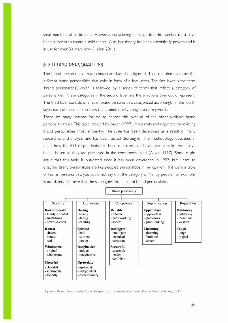
6.2 BRAND PERSONALITIES The brand personalities I have chosen are based on figure 4. This scale demonstrates the
different brand personalities that exist in form of a few layers. The first layer is the term
‘brand personalities’, which is followed by a series of terms that reflect a category of
personalities. These categories in the second layer are the emotions they could represent.
The third layer consists of a list of brand personalities, categorized accordingly. In the fourth
layer, each of these personalities is explained briefly using several keywords.
There are many reasons for me to choose this over all of the other available brand
personality scales. This table, created by Aaker (1997), represents and organizes the existing
brand personalities most efficiently. The scale has been developed as a result of many
researches and analysis, and has been tested thoroughly. The methodology describes in
detail how the 631 respondents had been recruited, and how these specific terms have
been chosen as they are perceived in the consumer’s mind (Aaker, 1997). Some might
argue that this table is out-dated since it has been developed in 1997, but I care to
disagree. Brand personalities are like people’s personalities in my opinion. If it were a table
of human personalities, you could not say that the category of friendly people, for example,
is out-dated. I believe that the same goes for a table of brand personalities.
Figure 4. Brand Personalities Scale. Adapted from Dimensions of Brand Personalities, by Aaker, 1997.
31
6.3 THE THEORY Step 1: Determine the brand personality according to the desired brand attitude
This is a very crucial step in determining the correct colours for any brand, project or
campaign (Wright, 2008c). It is essential for a brand to know what personality it strives to
reflect to the public. One should ask itself questions like: how do I wish to interact with the
audiences? How do I want my audiences to see the client? And, which traits fit the brand
the best? Once you have answer to these questions, you can continue to choose the most
appropriate brand personality. Without the correct brand personality, the result of this
theory might not be effective (Millward Brown, 2012).
Step 2: Choose the most appropriate emotion
After completing the first step, it is now time to choose one of the emotions that are in the
category of your brand personality. Similar to human personalities, each brand personality
consists of several emotions to express their personality. Therefore, in the second section
of the table it is important to choose an emotion that one strives to present to the public.
This emotion should be chosen according to the campaign that the colours will be used for.
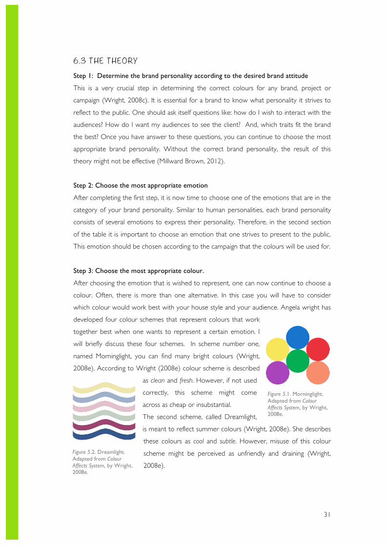
Step 3: Choose the most appropriate colour.
After choosing the emotion that is wished to represent, one can now continue to choose a
colour. Often, there is more than one alternative. In this case you will have to consider
which colour would work best with your house style and your audience. Angela wright has
developed four colour schemes that represent colours that work
together best when one wants to represent a certain emotion. I
will briefly discuss these four schemes. In scheme number one,
named Morninglight, you can find many bright colours (Wright,
2008e). According to Wright (2008e) colour scheme is described
as clean and fresh. However, if not used
correctly, this scheme might come
across as cheap or insubstantial.
The second scheme, called Dreamlight,
is meant to reflect summer colours (Wright, 2008e). She describes
these colours as cool and subtle. However, misuse of this colour
scheme might be perceived as unfriendly and draining (Wright,
2008e).
Figure 5.1. Morninglight. Adapted from Colour Affects System, by Wright, 2008e.
Figure 5.2. Dreamlight. Adapted from Colour Affects System, by Wright, 2008e.
32
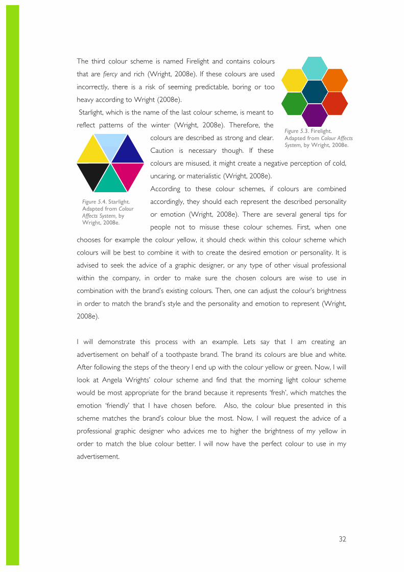
The third colour scheme is named Firelight and contains colours
that are fiercy and rich (Wright, 2008e). If these colours are used
incorrectly, there is a risk of seeming predictable, boring or too
heavy according to Wright (2008e).
Starlight, which is the name of the last colour scheme, is meant to
reflect patterns of the winter (Wright, 2008e). Therefore, the
colours are described as strong and clear.
Caution is necessary though. If these
colours are misused, it might create a negative perception of cold,
uncaring, or materialistic (Wright, 2008e).
According to these colour schemes, if colours are combined
accordingly, they should each represent the described personality
or emotion (Wright, 2008e). There are several general tips for
people not to misuse these colour schemes. First, when one
chooses for example the colour yellow, it should check within this colour scheme which
colours will be best to combine it with to create the desired emotion or personality. It is
advised to seek the advice of a graphic designer, or any type of other visual professional
within the company, in order to make sure the chosen colours are wise to use in
combination with the brand’s existing colours. Then, one can adjust the colour’s brightness
in order to match the brand’s style and the personality and emotion to represent (Wright,
2008e).
I will demonstrate this process with an example. Lets say that I am creating an
advertisement on behalf of a toothpaste brand. The brand its colours are blue and white.
After following the steps of the theory I end up with the colour yellow or green. Now, I will
look at Angela Wrights’ colour scheme and find that the morning light colour scheme
would be most appropriate for the brand because it represents ‘fresh’, which matches the
emotion ‘friendly’ that I have chosen before. Also, the colour blue presented in this
scheme matches the brand’s colour blue the most. Now, I will request the advice of a
professional graphic designer who advices me to higher the brightness of my yellow in
order to match the blue colour better. I will now have the perfect colour to use in my
advertisement.
Figure 5.4. Starlight. Adapted from Colour Affects System, by Wright, 2008e.
Figure 5.3. Firelight. Adapted from Colour Affects System, by Wright, 2008e.
33
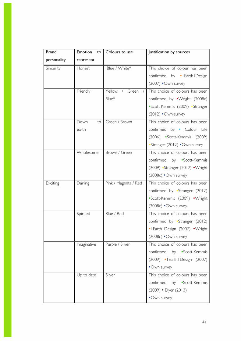
Brand
personality
Emotion to
represent
Colours to use Justification by sources
Sincerity Honest Blue / White* This choice of colour has been
confirmed by �1Earth1Design
(2007) �Own survey
Friendly Yellow / Green /
Blue*
This choice of colours has been
confirmed by �Wright (2008c)
�Scott-Kemmis (2009) �Stranger
(2012) �Own survey
Down to
earth
Green / Brown
This choice of colours has been
confirmed by � Colour Life
(2006) �Scott-Kemmis (2009)
�Stranger (2012) �Own survey
Wholesome Brown / Green
This choice of colours has been
confirmed by �Scott-Kemmis
(2009) �Stranger (2012) �Wright
(2008c) �Own survey
Exciting Darling Pink / Magenta / Red
This choice of colours has been
confirmed by �Stranger (2012)
�Scott-Kemmis (2009) �Wright
(2008c) �Own survey
Spirited Blue / Red
This choice of colours has been
confirmed by �Stranger (2012)
�1Earth1Design (2007) �Wright
(2008c) �Own survey
Imaginative Purple / Silver
This choice of colours has been
confirmed by �Scott-Kemmis
(2009) �1Earth1Design (2007)
�Own survey
Up to date Silver This choice of colours has been
confirmed by �Scott-Kemmis
(2009) � Dyer (2013)
�Own survey
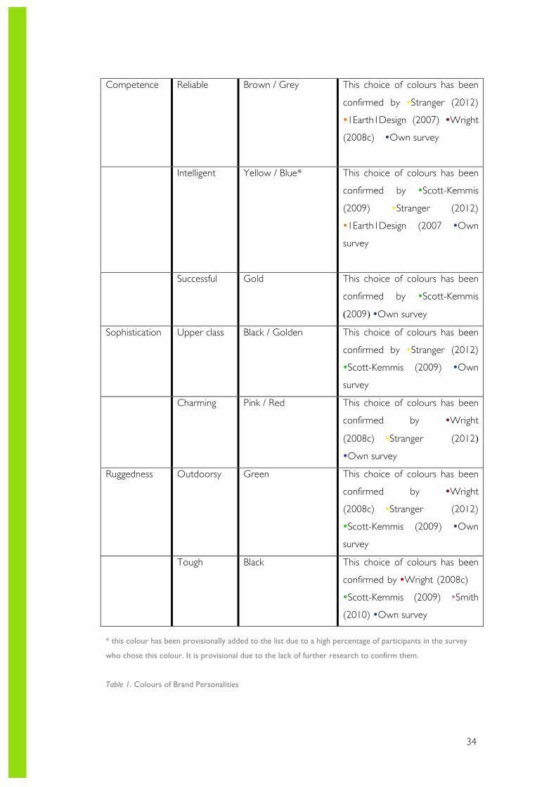
34
Competence Reliable Brown / Grey
This choice of colours has been
confirmed by �Stranger (2012)
�1Earth1Design (2007) �Wright
(2008c) �Own survey
Intelligent Yellow / Blue*
This choice of colours has been
confirmed by �Scott-Kemmis
(2009) �Stranger (2012)
�1Earth1Design (2007 �Own
survey
Successful Gold
This choice of colours has been
confirmed by �Scott-Kemmis
(2009) �Own survey
Sophistication Upper class Black / Golden
This choice of colours has been
confirmed by �Stranger (2012)
�Scott-Kemmis (2009) �Own
survey
Charming Pink / Red
This choice of colours has been
confirmed by �Wright
(2008c) �Stranger (2012)
�Own survey
Ruggedness Outdoorsy Green This choice of colours has been
confirmed by �Wright
(2008c) �Stranger (2012)
�Scott-Kemmis (2009) �Own
survey
Tough Black
This choice of colours has been
confirmed by �Wright (2008c)
�Scott-Kemmis (2009) �Smith
(2010) �Own survey
* this colour has been provisionally added to the list due to a high percentage of participants in the survey
who chose this colour. It is provisional due to the lack of further research to confirm them.
Table 1. Colours of Brand Personalities
35
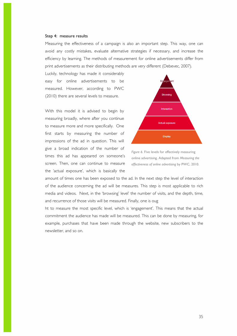
Step 4: measure results
Measuring the effectiveness of a campaign is also an important step. This way, one can
avoid any costly mistakes, evaluate alternative strategies if necessary, and increase the
efficiency by learning. The methods of measurement for online advertisements differ from
print advertisements as their distributing methods are very different (Debevec, 2007).
Luckily, technology has made it considerably
easy for online advertisements to be
measured. However, according to PWC
(2010) there are several levels to measure.
With this model it is advised to begin by
measuring broadly, where after you continue
to measure more and more specifically. One
first starts by measuring the number of
impressions of the ad in question. This will
give a broad indication of the number of
times this ad has appeared on someone’s
screen. Then, one can continue to measure
the ‘actual exposure’, which is basically the
amount of times one has been exposed to the ad. In the next step the level of interaction
of the audience concerning the ad will be measures. This step is most applicable to rich
media and videos. Next, in the ‘browsing’ level’ the number of visits, and the depth, time,
and recurrence of those visits will be measured. Finally, one is oug
ht to measure the most specific level, which is ‘engagement’. This means that the actual
commitment the audience has made will be measured. This can be done by measuring, for
example, purchases that have been made through the website, new subscribers to the
newsletter, and so on.
Figure 6. Five levels for effectively measuring
online advertising. Adapted from Measuring the
effectiveness of online advertising by PWC, 2010.
36
When it comes to print advertising things tend to get slightly more complicated. There is
no simple way, nor ‘best’ way to measure the effectiveness of your advertising (Roggio,
2009). However, according to the same source there are 4 main methods that have proven
to work.
1. Using ad-specific website domains
Hereby one creates a sub-domain specific to their ad. For example,
subdomain.measureresults.com. This is a very simple, yet effective method. It is also possible
to do this for measuring the effectiveness of different forms of print media. For example, by
putting different subdomain links on magazines than on the billboards.
2. Coupon codes
Hereby one presents a coupon code on its printed advertisements. This method has
proven to be very effective for companies that make sales online. One could use lines such
as ‘get 10% off when entering this code’. This way, when a purchase has been made using
this code, it can be seen as a result of the print ad campaign. Similar to the previous
method, different codes can be used on different ads.
3. Ask your consumers
As straightforward as it might seem, this is seen as an effective method to gain knowledge
on where your costumers know you from. This can be done through several methods. The
easiest one being to ask them through the respective website. When a new visitor views
the website, there is an option to display a pop up screen asking the visitor where he or
she knows you from. The most effective way to do this is by having multiple-choice
answers. This way it will be quick and easy for the visitor, and they will be more likely to
respond.
4. Monitor your sales
This method might be the oldest method of measuring the effect of print advertisements.
Hereby, one basically monitors the sales to control if it undergoes any changes. There is
some criticism on this method due to its uncertainty. It cannot be said with a 100%
certainty that the rise in sales has been from the advertisements. Perhaps another factor
was the cause in the rise, or fall, of the sales.
These methods for measurement are recommended to use for print campaigns. One may
also choose to combine some of these methods, in order to maximise the measurements
(Roggio, 2009).
37
7. Methodology Different types of research have been conducted in order to answer my research
questions. In this section I will elaborate on the types of research that have been conducted
and the methods that have been adapted. I have divided the types of research I have
conducted into two sections: desk research and field research. In each of these sections I
will discuss the research methods in depth.
7. 1 RESEARCH DESIGN For my thesis I have chosen to implement the Deductive Research Approach. This means
that I have started with more general information, which have then been narrowed down
to more specific (Ratnananthan, 2011). I have chosen for this approach because I had the
idea that there was a large amount of information available on tis topic, and there were
many angles to take. Based on this approach, the primary investigation methods have been
the theoretical framework and literature review, combined with a questionnaire.
7.2 DESK RESEARCH Similar to many other dissertations, I have started my research from behind a desk. Meaning
that I have gathered information from existing sources (such as researches, reports, articles,
etcetera) and critically reviewed these. This process has helped me to gain more in depth
knowledge concerning my topic and designate a clear angle.
Offline Literature
Although much of my research has been conducted through online sources, I have found
several books and reports to be helpful to my research. The books that I have chosen to
read gave me more in depth information and helped me understand my topic better. The
book ‘The Advertised Mind’ is a good example of this.
Online literature
As mentioned before in the theoretical framework, there are many online reports that I
have consulted in order to understand my topic better, and to support my statements. I
have made use of several online directories. Below I have stated the different types of
online sources I have mainly used.
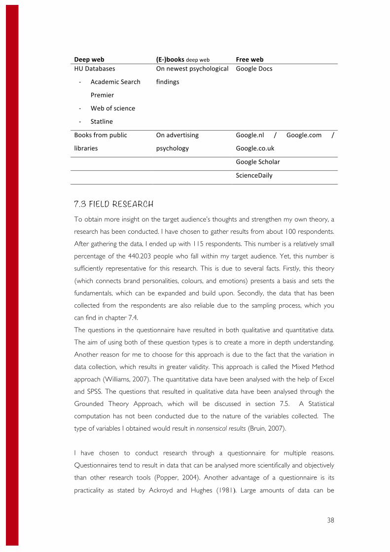
38
Deep web (E-‐)books deep web Free web HU Databases
-‐ Academic Search
Premier
-‐ Web of science
-‐ Statline
On newest psychological
findings
Google Docs
Books from public
libraries
On advertising
psychology
Google.nl / Google.com /
Google.co.uk
Google Scholar
ScienceDaily
7.3 F IELD RESEARCH To obtain more insight on the target audience’s thoughts and strengthen my own theory, a
research has been conducted. I have chosen to gather results from about 100 respondents.
After gathering the data, I ended up with 115 respondents. This number is a relatively small
percentage of the 440.203 people who fall within my target audience. Yet, this number is
sufficiently representative for this research. This is due to several facts. Firstly, this theory
(which connects brand personalities, colours, and emotions) presents a basis and sets the
fundamentals, which can be expanded and build upon. Secondly, the data that has been
collected from the respondents are also reliable due to the sampling process, which you
can find in chapter 7.4.
The questions in the questionnaire have resulted in both qualitative and quantitative data.
The aim of using both of these question types is to create a more in depth understanding.
Another reason for me to choose for this approach is due to the fact that the variation in
data collection, which results in greater validity. This approach is called the Mixed Method
approach (Williams, 2007). The quantitative data have been analysed with the help of Excel
and SPSS. The questions that resulted in qualitative data have been analysed through the
Grounded Theory Approach, which will be discussed in section 7.5. A Statistical
computation has not been conducted due to the nature of the variables collected. The
type of variables I obtained would result in nonsensical results (Bruin, 2007).
I have chosen to conduct research through a questionnaire for multiple reasons.
Questionnaires tend to result in data that can be analysed more scientifically and objectively
than other research tools (Popper, 2004). Another advantage of a questionnaire is its
practicality as stated by Ackroyd and Hughes (1981). Large amounts of data can be
39
collected in a time- and cost efficient manner. Also, this data can be processes thoroughly
by many different types of analysing software. However, there are some disadvantages of
this method as well. I will not be able to see how truthful the respondents have been while
filling in my questionnaire (Popper, 2004). It often occurs in face-to-face interviews that one
can tell from the interviewee’s behaviour whether they are speaking the truth or not, which
one can then act on (Popper, 2004). However, Hansen and Machin (2013) argue that an
online survey is more likely to result in a realistic and natural setting. They believe that
interviews often create an artificial and controlled situation.
Also, it is argued that one will not be certain to how much effort the respondents have put
in to the questionnaire (Ackroyd & Hughes, 1981). However, when looking at the collected
data, one can estimate this from the length and language of their answers to the qualitative
data.With this questionnaire I aimed to find out what colours people associate to which
emotions. I have done this through several questions. Furthermore, people’s general
preference of colours and brand personalities have also been an interesting point to analyse
for this report. The justification and validation of each question can be found in Appendix
C.
7.4 SAMPLING To recruit participants for my questionnaire, I have made use of purposeful sampling, also
called purposive sampling (Changing Minds, 2003). With this method one has a certain
purpose in mind. Selection of participants is based on their knowledge or usefulness
(Pearson Education, 2010). Typically, people who do not fit the profile are rejected
(Changing Minds, 2003). The reason for me to choose this method is its manner of picking
the audience. I had the specific purpose in mind of reaching Dutch males and females
between 18 and 29 years, who are studying and are active on the Internet, and confirming
their point of view on Colours of Brand Personalities. Therefore, I have solely collected the
opinions and perspectives of people who fall within my target group. In order to reach this
target audience I created an online survey through Thesistool.com.
The survey has been created online since it is time efficient and my target audience is active
on the Internet. I have carefully approached the potential participants through online
resources. First, I chose to approach people of which I knew fell within my target group
through social media, such as Facebook and LinkedIn. Then, I continued to post a general
message on my social media profiles, addressing people with the specific characteristics I
40
was searching for. Several contacts then shared this message, causing people within their
network who met the requirements to fill in the questionnaire. This brings us to the
disadvantages of this method. The results of this survey majorly consist of answers from
people within my network, and my friends their network. With this method biases often
occur due to its non-probability quality (Changing Minds, 2003). However, Charmaz (1983)
argues that researchers should always sample the group that will provide the most relevant
material. Through the purposeful sampling method, this goal has been achieved.
The data collection resulted in 115 responses, of which 3 were collected from participants
over 29 years old. Following the rules of the purposeful sampling method, I have excluded
those 3 participants. Another exclusion phase was mandatory for the 5 people who were
not studying. One of these non-studying participants fell outside of the targeted age group
as well, which caused me to end up with 108 valid participants.
7.5 ANALYSIS "If someone wanted to know whether one drug is more effective than another, then a double
blind clinical trial would be more appropriate than grounded theory study. However, if someone
wanted to know what it was like to be a participant in a drug study [..], then he or she might
sensibly engage in a grounded theory project or some other type of qualitative study" (Strauss
and Corbin, 1998, p. 40).
To analyse the results that I have gathered I have used the Grounded Theory Approach,
shortened as GTA. This approach has caught the eye of many scientists (in assorted fields)
from the start. The basis of the GTA has been describes as a combination of inductive and
deductive techniques (King & Horrocks, 2010). I have chosen to adapt Charmaz’ (2006)
approach of the GTA due to its ‘Constructivism’. With this approach the development of a
(substantive) theory is central. Hence, it is appropriate for this research as I aim to test and
further develop my own theory. While developing her theory she has attempted to remain
faithful to the original logic and form of the GTA (Charmaz, 1983).
This approach focuses on studying and interoperating of social, emotional and action
processes. The GTA is often criticized for its time-consuming character. Since it is a very in-
depth coding process, it tends to take much time and effort. However, it will result in a very
detailed analysis, which helps to discover patterns and construct theories (Myers, 2008).
I will now continue by discussing the steps that I have followed in order to analyse the
qualitative data.
41
Initial coding
This is the first in the two-phase coding process describes by Charmaz (1983). Hereby,
researchers should first look for what general discoveries they can make. Afterwards, they
inspect the leads, ideas or issues within the data. In this step it is important to look at the
data from various viewing points. After I had collected my data, I started going through the
results. “At first, the data may appear to be a mass of confusing, unrelated accounts. But by
studying and coding them the researcher begins to create order” Charmaz (1983, p. 111)
claims in her book. This was very true in my case. After looking through the results, I
started seeing patterns and similarities. I started the initial coding by creating words and/or
phrases that matched the answers. Then, I assigned each answer to one of these categories.
Hereby I remained true to the rule that states that one is allowed to use not more than
three words (Strauss & Corbin, 1994).
Focused coding
In this second phase of coding, researchers should be more selective and conceptual
(Charmaz, 1983). In this step the researchers take a small quantity of codes that they have
assigned in the previous phase, and apply them amongst the entire data. This phase is
considered selective due to the previous step, where the researchers have already
investigated all results in order to come up with a set of practical categories. The word
conceptual is assigned to this phase as well, which is a result of its ability to turn large sets
of summaries into analytic data by sorting them (Charmaz, 1983). I have executed this step
by taking the 9 categories that were developed in the previous step, and slimming these
down to only 5 codes. I have selected these 5 codes according to their relevance and
occurrence. I chose to apply these codes numerically, as you can see in figure 7. This is due
to its convenience of use in analytical software, such as SPSS.
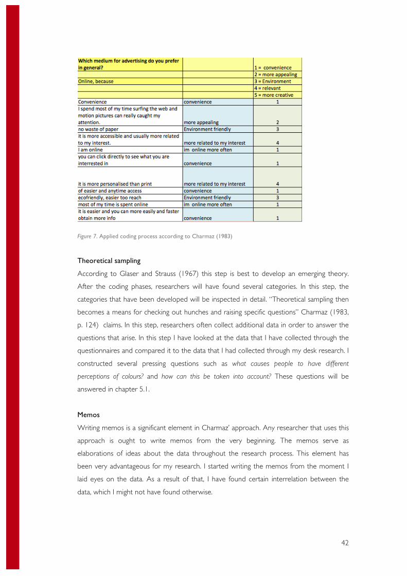
42
Figure 7. Applied coding process according to Charmaz (1983)
Theoretical sampling
According to Glaser and Strauss (1967) this step is best to develop an emerging theory.
After the coding phases, researchers will have found several categories. In this step, the
categories that have been developed will be inspected in detail. “Theoretical sampling then
becomes a means for checking out hunches and raising specific questions” Charmaz (1983,
p. 124) claims. In this step, researchers often collect additional data in order to answer the
questions that arise. In this step I have looked at the data that I have collected through the
questionnaires and compared it to the data that I had collected through my desk research. I
constructed several pressing questions such as what causes people to have different
perceptions of colours? and how can this be taken into account? These questions will be
answered in chapter 5.1.
Memos
Writing memos is a significant element in Charmaz’ approach. Any researcher that uses this
approach is ought to write memos from the very beginning. The memos serve as
elaborations of ideas about the data throughout the research process. This element has
been very advantageous for my research. I started writing the memos from the moment I
laid eyes on the data. As a result of that, I have found certain interrelation between the
data, which I might not have found otherwise.
43
7.6 COLOURS OF BRAND PERSONALITIES I have chosen to create an own theory for multiple reasons. First I had viewed Angela
Wright’s Colour Affects System theory, which I was impressed by. I found her theory very
relevant and thought out. This caused me to think whether I could improve on her theory
and adapt it more to my thesis topic. This gave me the idea to come up with 4 steps, based
on her theory, that use the aspects of colours and emotions in order to create a successful
advertising campaign. First, I started off by stating step one: determining the brand
personality according to your desired brand attitude. For this section I have chosen to use
the Brand Personalities scale by J. Aaker (1997). Reasons for choosing this particular scale
have been given in chapter 6.2. I realize that my research is not directly about brand
personalities. However, this is of absolute importance in order to determine which colours
and emotions is correct to use for a certain advertisement. The most basic goal of
advertising is to reflect a certain personality of the brand one way or another (Du Plessis,
2005).
In the following steps one chooses the preferred emotion to represent. The emotion to
represent will result in a colour in the next step, which evokes this certain emotion
according to the literature and own research. With this table a clear link between emotions
and colours can be illustrated. Each chosen colour has been thoroughly researched and
confirmed to stimulate the assigned emotion. In the last step one is to measure the results.
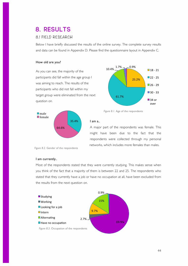
44
8. Results 8. 1 F IELD RESEARCH Below I have briefly discussed the results of the online survey. The complete survey results
and data can be found in Appendix D. Please find the questionnaire layout in Appendix C.
How old are you?
As you can see, the majority of the
participants did fall within the age group I
was aiming to reach. The results of the
participants who did not fall within my
target group were eliminated from the next
question on.
I am a..
A major part of the respondents was female. This
might have been due to the fact that the
respondents were collected through my personal
networks, which includes more females than males.
I am currently..
Most of the respondents stated that they were currently studying. This makes sense when
you think of the fact that a majority of them is between 22 and 25. The respondents who
stated that they currently have a job or have no occupation at all, have been excluded from
the results from the next question on.
25.2%
61.7%
10.4% 1.7% 0.9%
18 -‐ 21
22 -‐ 25
26 -‐ 29
30 -‐ 33
34 or over
35.4%
64.6%
male female
69.9% 2.7%
9.7%
15%
0.9% Studying
Working
Looking for a job
Intern
AlternaSng
Have no occupaSon
Figure 8.1. Age of the respondents
Figure 8.2. Gender of the respondents
Figure 8.3. Occupation of the respondents
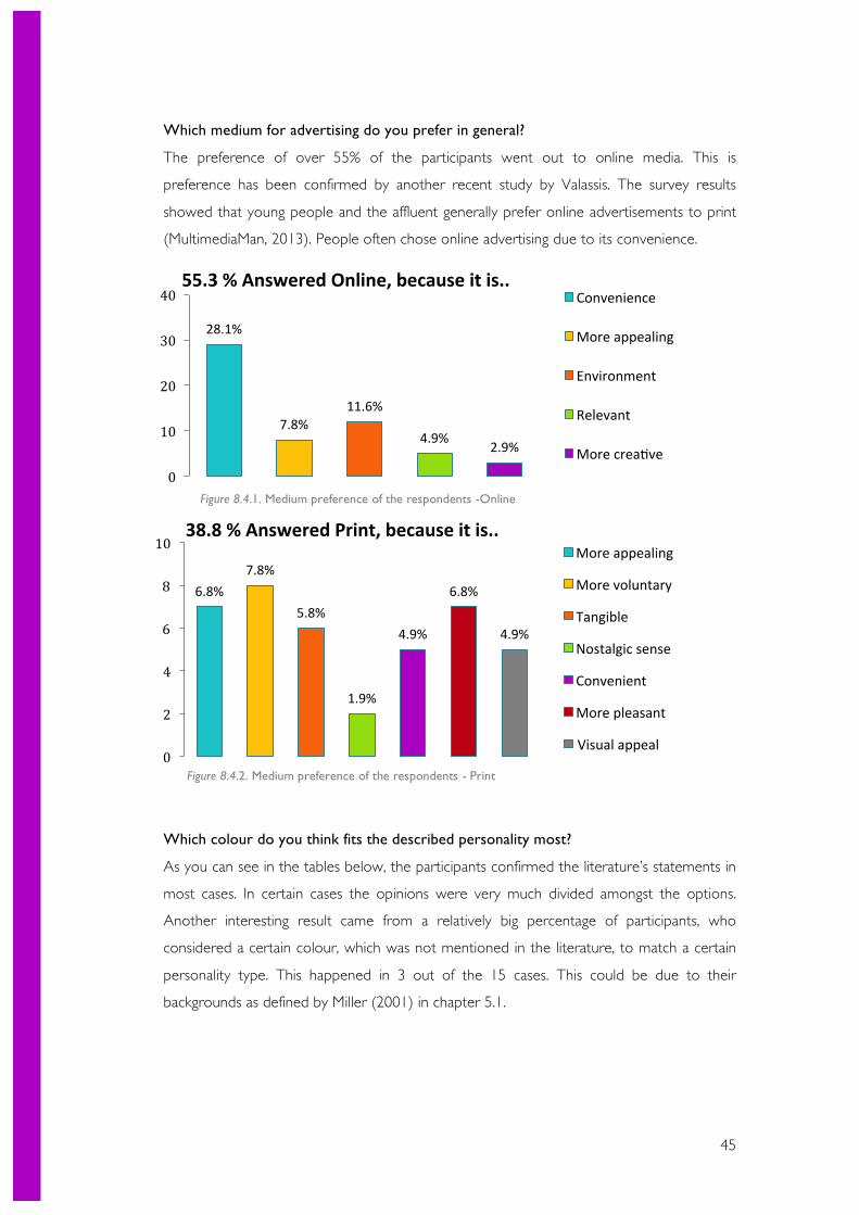
45
Which medium for advertising do you prefer in general?
The preference of over 55% of the participants went out to online media. This is
preference has been confirmed by another recent study by Valassis. The survey results
showed that young people and the affluent generally prefer online advertisements to print
(MultimediaMan, 2013). People often chose online advertising due to its convenience.
Which colour do you think fits the described personality most?
As you can see in the tables below, the participants confirmed the literature’s statements in
most cases. In certain cases the opinions were very much divided amongst the options.
Another interesting result came from a relatively big percentage of participants, who
considered a certain colour, which was not mentioned in the literature, to match a certain
personality type. This happened in 3 out of the 15 cases. This could be due to their
backgrounds as defined by Miller (2001) in chapter 5.1.
6.8% 7.8%
5.8%
1.9%
4.9%
6.8%
4.9%
0
2
4
6
8
10 38.8 % Answered Print, because it is..
More appealing
More voluntary
Tangible
Nostalgic sense
Convenient
More pleasant
Visual appeal
28.1%
7.8% 11.6%
4.9% 2.9%
0
10
20
30
40 55.3 % Answered Online, because it is..
Convenience
More appealing
Environment
Relevant
More creaSve
Figure 8.4.1. Medium preference of the respondents -Online
Figure 8.4.2. Medium preference of the respondents - Print
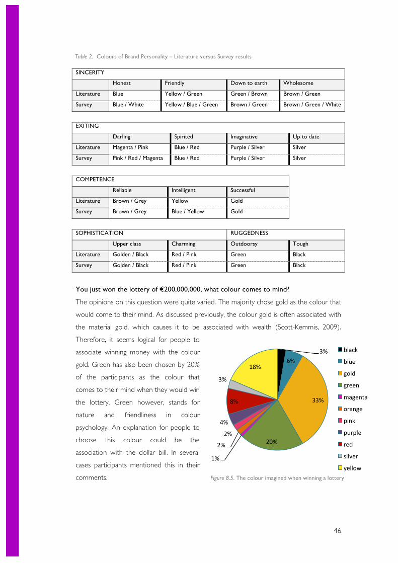
46
SINCERITY
Honest Friendly Down to earth Wholesome
Literature Blue Yellow / Green Green / Brown Brown / Green
Survey Blue / White Yellow / Blue / Green Brown / Green Brown / Green / White
EXITING
Darling Spirited Imaginative Up to date
Literature Magenta / Pink Blue / Red Purple / Silver Silver
Survey Pink / Red / Magenta Blue / Red Purple / Silver Silver
COMPETENCE
Reliable Intelligent Successful
Literature Brown / Grey Yellow Gold
Survey Brown / Grey Blue / Yellow Gold
SOPHISTICATION RUGGEDNESS
Upper class Charming Outdoorsy Tough
Literature Golden / Black Red / Pink Green Black
Survey Golden / Black Red / Pink Green Black
You just won the lottery of €200,000,000, what colour comes to mind?
The opinions on this question were quite varied. The majority chose gold as the colour that
would come to their mind. As discussed previously, the colour gold is often associated with
the material gold, which causes it to be associated with wealth (Scott-Kemmis, 2009).
Therefore, it seems logical for people to
associate winning money with the colour
gold. Green has also been chosen by 20%
of the participants as the colour that
comes to their mind when they would win
the lottery. Green however, stands for
nature and friendliness in colour
psychology. An explanation for people to
choose this colour could be the
association with the dollar bill. In several
cases participants mentioned this in their
comments.
3% 6%
33%
20%
1%
2%
2%
4%
8%
3%
18%
black
blue
gold
green
magenta
orange
pink
purple
red
silver
yellow
Table 2. Colours of Brand Personality – Literature versus Survey results
Figure 8.5. The colour imagined when winning a lottery
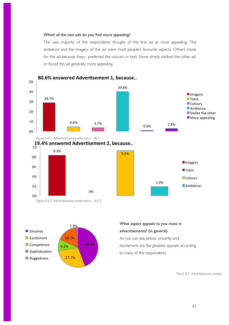
47
Which of the two ads do you find more appealing?
The vast majority of the respondents thought of the first ad as most appealing. The
ambience and the imagery of this ad were most people’s favourite aspects. Others chose
for this ad because theyv preferred the colours or text. Some simply disliked the other ad,
or found this ad generally more appealing.
What aspect appeals to you most in
advertisements? (in general)
As you can see below, sincerity and
excitement are the greatest appeals according
to many of the respondents.
28.7%
4.6% 3.7%
39.8%
0.9% 2.8%
00
10
20
30
40
50 80.6% answered AdverDsement 1, because..
Imagery Tekst Colours Ambience Dislike the other More appealing
8.3%
0%
9.3%
1.9%
00
02
04
06
08
10 19.4% answered AdverDsement 2, because..
Imagery
Tekst
Colours
Ambience
44.4%
27.7%
9.3%
16.7%
1.9% Sincerity
Excitement
Competence
SophisScaSon
Ruggedness
Figure 8.6.1. Advertisement preference – Ad 1
Figure 8.6.2. Advertisement preference – Ad 2
Figure 8.7. Advertisement appeal
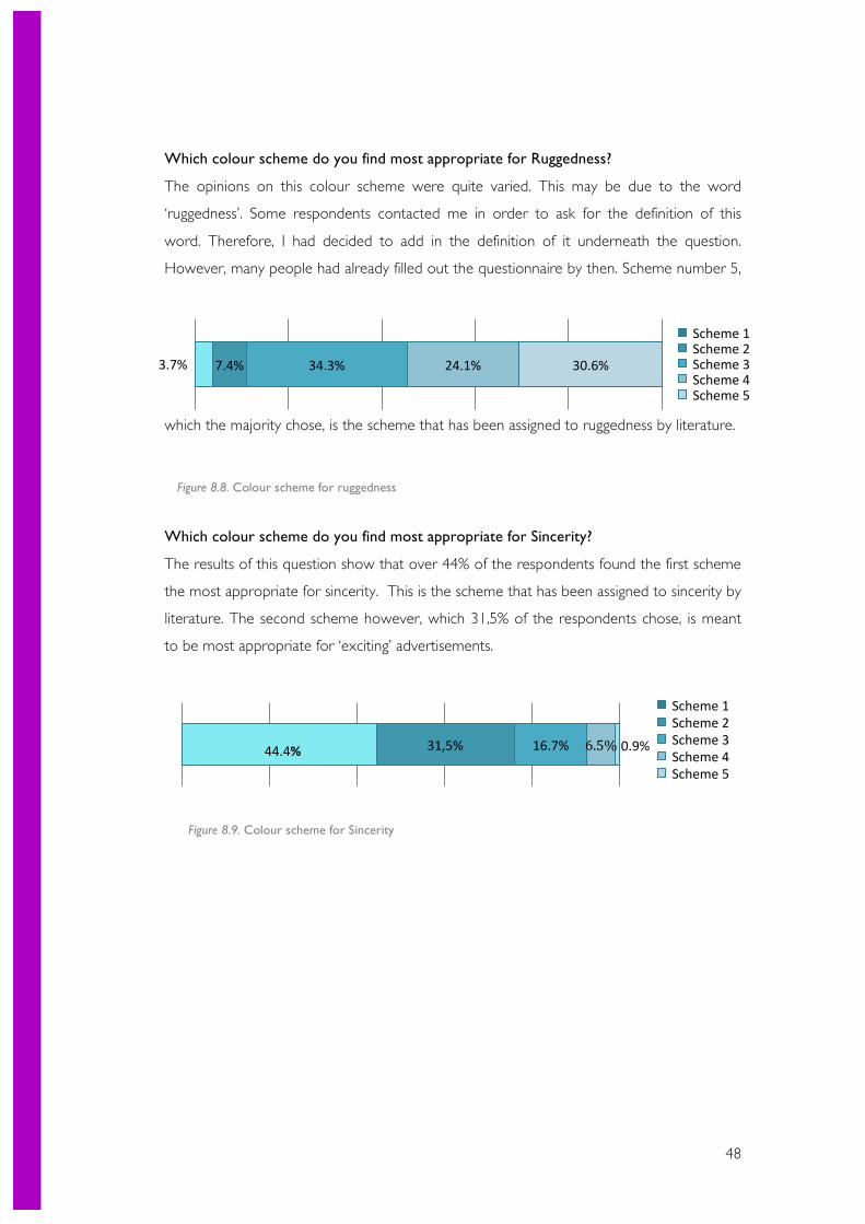
48
Which colour scheme do you find most appropriate for Ruggedness?
The opinions on this colour scheme were quite varied. This may be due to the word
‘ruggedness’. Some respondents contacted me in order to ask for the definition of this
word. Therefore, I had decided to add in the definition of it underneath the question.
However, many people had already filled out the questionnaire by then. Scheme number 5,
which the majority chose, is the scheme that has been assigned to ruggedness by literature.
Which colour scheme do you find most appropriate for Sincerity?
The results of this question show that over 44% of the respondents found the first scheme
the most appropriate for sincerity. This is the scheme that has been assigned to sincerity by
literature. The second scheme however, which 31,5% of the respondents chose, is meant
to be most appropriate for ‘exciting’ advertisements.
31,5% 16.7% 6.5% 0.9% 44.4%
Scheme 1 Scheme 2 Scheme 3 Scheme 4 Scheme 5
3.7% 7.4% 34.3% 24.1% 30.6%
Scheme 1 Scheme 2 Scheme 3 Scheme 4 Scheme 5
Figure 8.8. Colour scheme for ruggedness
Figure 8.9. Colour scheme for Sincerity
49
9. Conclusions
In this section I will discuss the answers to each one of my sub-questions in detail.
9. 1 HOW ARE COLOURS AND EMOTIONS CURRENTLY USED BY ADVERTISERS? If you look around you in the Netherlands, you can see that Dutch advertising is moving
forward towards bigger and better advertising each day (Adformatie, 2012). They make
distinctive use of colours and emotions in their advertisements as well. As discussed earlier,
advertisers use many different appeals in their advertisements. When considering emotional
appeals, there is a large list of specific methods that they use to appeal to their audience.
The favourite methods being: the Social Proof method, the Scarcity Effect, and the Fear
Appeal method (Ford, 2013).
It happens more and more nowadays that advertisers aim to evoke emotional responses
rather that presenting factual statements (DeJesus, 2007). They strive to create an ad that
people can relate to, and feel positive about in some way. Positive feelings in their turn are
more likely to be subject of people’s conscious thoughts (Enns, 2014). This phenomenon
has been confirmed by own research, where the vast majority of the respondents preferred
the ad that appealed to people’s emotional side rather than the ad that focused on factual
statements.
To demonstrate the current use of colours and emotions by Dutch advertisers I will consult
Appendix E for examples. In general the conclusion can be drawn that many companies
aim to use colours in order to maximize their influence as well as their profits (Haller,
2011). In an example case (Appendix E), a company used the colour red for an important
button on their website in order to maximize the clicks. The red colour proved to work
better than a red or white button. As my colour analysis in chapter 5.1. has concluded, the
colour red stands for an exciting brand personality with a spirited emotion, which could
have stimulated the visitors of GSM.nl to click on the button more often.
Another example proves a similar point. McDonald’s made use of colours in a smart way
by using them in order to reflect their purpose and attract attention. Since their company is
outrageously successful, one might conclude that the colours have been a supporting pillar
in their success (Haller, 2011).
In Appendix E there is an example of a use of emotions in order to increase sales. The
beauty brand Dove had switched from factual ads to ads that evoke strong emotions in
50
people, which turned out as a great success (Millward Brown, 2009). In chapter 5.1. you
can find an extensive description on the emotions and meanings that each of the 12
colours represent. Also, in chapter 6.3 it is discussed how certain emotions could be
represented by certain colours (Millward Brown, 2009).
9.2 HOW DOES THE AUDIENCE EXPERIENCE THE CURRENT
ADVERTISEMENTS? Through literature research I have discovered that the target audience is immensely
influenced by both colours and emotions in advertising. According to LeDoux (2002) it has
been widely accepted by many that emotions have an essential part in driving people’s
decisions, whether it is a decision on purchasing items, or watching television. He stated
that “emotion feeds into, shapes and controls our conscious thought” (p. 29). The audience
will be more willing to engage and share once they feel a strong emotional appeal,
preferably positive, towards an advertisement, which will also increase their appeal to a
certain brand (Henning, 2013). Millward Brown (2010) has stated that strong emotions
particularly can help the audiences’ perception of the brand as the emotions that are
generated by the ad transfer to the brand. Also, it could contribute to create memorability
and engagement.
The most commonly experienced emotions according to Ford (2013) are:
-‐ The need of belonging to a social group
-‐ A feel of competitiveness
-‐ Fear
As mentioned before, the task of advertisement is to evoke emotion in people Du Plessis
(2005). However, first one needs to grab the attention of the audience in order to start the
process of the emotions. This is done by colours. Each colour that the audience sees
directly affects their hormones, which in their turn control the audience’s emotions and
responses. (Wright, 2008b) A study from Millward Brown (2012) has shown that colour
influences the human memory performance by increasing the attention level.
I would like to bring to attention the fact that both print and online are excellent methods
of reaching this target group. Nonetheless, the survey has shown that a slightly higher
percentage of this group appreciates online advertising the most as you can see in Figure
8.4. The reason for a great deal of the respondents to choose online was due to its
convenience.
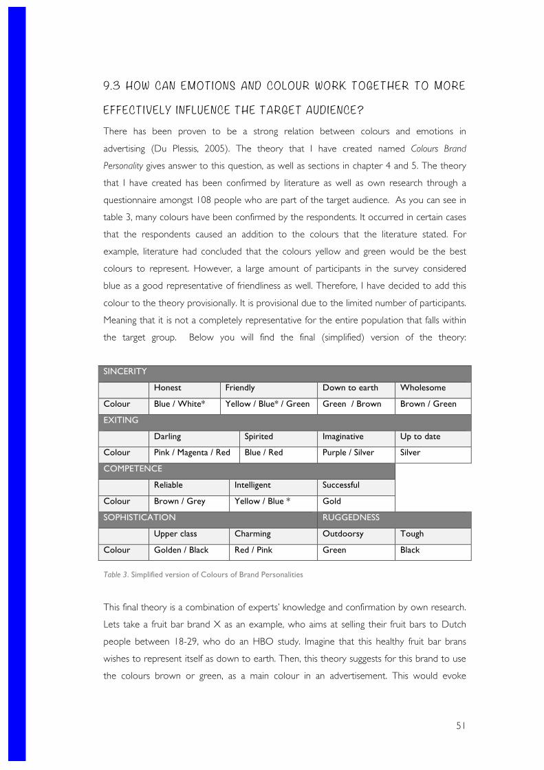
51
9.3 HOW CAN EMOTIONS AND COLOUR WORK TOGETHER TO MORE
EFFECTIVELY INFLUENCE THE TARGET AUDIENCE? There has been proven to be a strong relation between colours and emotions in
advertising (Du Plessis, 2005). The theory that I have created named Colours Brand
Personality gives answer to this question, as well as sections in chapter 4 and 5. The theory
that I have created has been confirmed by literature as well as own research through a
questionnaire amongst 108 people who are part of the target audience. As you can see in
table 3, many colours have been confirmed by the respondents. It occurred in certain cases
that the respondents caused an addition to the colours that the literature stated. For
example, literature had concluded that the colours yellow and green would be the best
colours to represent. However, a large amount of participants in the survey considered
blue as a good representative of friendliness as well. Therefore, I have decided to add this
colour to the theory provisionally. It is provisional due to the limited number of participants.
Meaning that it is not a completely representative for the entire population that falls within
the target group. Below you will find the final (simplified) version of the theory:
SINCERITY
Honest Friendly Down to earth Wholesome
Colour Blue / White* Yellow / Blue* / Green Green / Brown Brown / Green
EXITING
Darling Spirited Imaginative Up to date
Colour Pink / Magenta / Red Blue / Red Purple / Silver Silver
COMPETENCE
Reliable Intelligent Successful
Colour Brown / Grey Yellow / Blue * Gold
SOPHISTICATION RUGGEDNESS
Upper class Charming Outdoorsy Tough
Colour Golden / Black Red / Pink Green Black
Table 3. Simplified version of Colours of Brand Personalities
This final theory is a combination of experts’ knowledge and confirmation by own research.
Lets take a fruit bar brand X as an example, who aims at selling their fruit bars to Dutch
people between 18-29, who do an HBO study. Imagine that this healthy fruit bar brans
wishes to represent itself as down to earth. Then, this theory suggests for this brand to use
the colours brown or green, as a main colour in an advertisement. This would evoke
52
certain emotions in the audience that would cause them to consider Fruit bar brand X as
down to earth and create a brand image of sincerity.
The general associations of emotions with colours have been discussed in detail in chapter
6. Therefore, I will go through them briefly in this section. The colour blue is generally seen
as soothing and mostly associated with sincerity (Wright, 2008c). Yellow on the other hand
often reminds people of sunlight and happiness, and is therefore often associated with
friendliness (1Earth1Design, 2007) (Scott-Kemmis, 2009). (However, this colour can also be
associated with intelligence (Scott-Kemmis, 2009). Brown is to be associated with nature.
Yet, it has other associations as well, such as reliable and wholesome (Wright, 2008c).
Another colour that is often linked to nature is Green. This colour is connected in the mind
to a down to earth nature and friendliness (Wright, 2008c) (Scott-Kemmis, 2009).
Magenta is a colour that can be seen as harmonious and cheerful (Scott-Kemmis, 2009).
Although the colour pink is not too different from it, this colour is perceived as sweet and
soft (Stranger, 2012). Red on the other hand is quite a strong colour. It often represents an
exciting or charming character (Stranger, 2012). Silver, which communicates a timely image,
is much different than grey (Scott-Kemmis, 2009). The colour grey is associated with
reliability and business-like characters (1Earth1Design, 2007). Gold, similar to the colour,
often represents a high-class image (Scott-Kemmis, 2009). Purple, which used to be the old
day’s gold, nowadays represents a creative image (Scott-Kemmis, 2009). Lastly, the colour
black stands for strength and exclusivity (Scott-Kemmis, 2009).
10 . Discussion In this section I will critically evaluate this paper. The main topics to discuss are the
developed theory ‘Colours of Brand Personalities’ and the online questionnaire. To start off
with, I would like to state that the theory of brand personalities is to be seen as a
foundation for further research. The literature that it has been based on is stating the basics
and general associations to colours worldwide. Therefore, despite the high reliability of the
sources, one cannot be completely certain of its effect on the discussed target audience,
which is Dutch. The online survey has confirmed the literature concerning many colour
associations. However, this survey has been held amongst a small percentage of the total
target group. Also, in certain cases the questionnaire results would show a wide variation of
opinions. This has to do with people’s different perception of colours due to their
backgrounds, as discussed before (Miller, 2001).
53
Another point to view critically is the step of the Colours of Brand Personalities theory in
which one chooses the colour it will use in their advertisement. It mentions that this colour
might be used with a higher or lower brightness due to optimization of its ability to
combine well with other colours. However, doing this might cause the colour to change its
associations. Also, the theory solely discusses the change in brightness, and not in hue.
Valdez and Mehrabian’s (1994) stated that hue and brightness both create strong emotional
responses. However, to change the hue of a colour would bring more uncertainty of the
colour with it. Therefore, it has been chosen not to consider this aspect.
Additionally, the division of positive and negative associations of a colour point has not
been taken into consideration in the colour theory of this report is. Some sources, such as
Angela Wright, have chosen to divide the colour association into positive and negative.
However, in this thesis I have focused on the general associations of each colour, and have
therefor not dealt with this distinction.
The colour that is chosen in the end might be also assigned to another personality or
emotion. This, again, is due to the general association with each colour. The choice must
therefore be combined cleverly in order to make sure it presents the correct personality
and emotion.
1 1 . Recommendations
In the beginning of this thesis I have set the following policy question: How can Dutch
advertising agencies more effectively influence the audience of Dutch males and females
between the age of 18 and 25 through visuals aspects?
Based on the literature search and own research that I have conducted, I am now able to
answer this question carefully. In order for Dutch advertising agencies to more effectively
influence their target audience through visual aspects they will need to follow the steps of
the Colours of Brand Personalities theory. This theory considers that to influence the
audience, one first needs to catch their attention. This can be done by using the right
colour. Each colour that the audience sees directly affects their hormones, which in their
turn control the audience’s emotions and responses (Wright, 2008b.) A study from
Millward Brown (2012) has shown that colour influences the human memory performance
54
by increasing the attention level. The stronger the emotional charge, the more likely
humans are to consciously reflect on the experience at the time it occurs, and the more
memorable the event will be (Millward Brown, 2009)
Thus, if one succeeds in catching the attention of the audience using the correct colour
and evokes a certain emotion with this colour, it will be able to better influence its
target audience.
According to the steps of Colours of Brand Personalities this is best done by:
Step 1 Determining the brand personality according to the desired brand attitude
Choose the brand personality that fits the client best.
Step 2 Choosing the most appropriate emotion
Choose one of the emotions that are in the category of your brand personality
Step 3 Choosing the most appropriate colour
Find the colour that is the best fit to the brand personality and emotion. If more than one choice
is available, choose the most appropriate colour.
Step 4 Measuring results
The methods of measurement for online advertisements differ from print advertisements as their
distributing methods are very different (Debevec, 2007). For online advertisements measure the
results according to the 5 levels determined by PWC (2010). For print advertising one can
measure them through the 4 main methods as explained by Roggio (2009).
The final edition of this theory has been confirmed by both literature, and 108 participants
of a test in the form of a questionnaire. Nonetheless, if you are choosing to use this theory
for your campaign or project, I would advice you to conduct further research in order to
be completely certain the outcome is right for you. Based on the points that were brought
to attention in the discussion, and ideas that I have developed throughout the thesis, I
would suggest the following subjects for further research:
-‐ A research on factors that cause people to have different associations with colours.
-‐ A more extensive survey, followed by a focus group, in order to confirm people’s
general associations with each colour.
-‐ Consult a graphic designer, or any type of other visual professional in order to
confirm your colour and combination choices.
55
12 . Reference List 1Earth1Design. (2007). Colour Theory. Retrieved 2014 from 1Earth1Design:
http://www.1earth1design.com/design/information/color-theory
Aaker, J. L. (1997, August). Dimensions of Brand Personality. American Marketing
Association.
Ackroyd, S., & Hughes, J. A. (1981). Data Collection in Context .
Adawiah , M. D., & Mustafar, M. F. (2013). The Influence of Colour on Memory
Performance. A Review . The Malaysian Journals of Medial Sciences.
Adformatie. (2012). Top 500 Adverteerders.
Ambekar, A. (2009, January 9). Different Types of Advertising Appeals. From Info Jug:
http://www.infojug.com/advertising-articles/types-of-advertising-appeals.html
Arandilla, R. (2011). Rise and Fall of Online Advertising. Retrieved 2014 from 1st
Webdesigner: http://www.1stwebdesigner.com/design/online-advertising-history/
Armstrong, J. S. (2010). persuasive advertising. evidence-based principles . Palgrave Macmilan.
Barett, J. T. (2007). What Is the Difference Between Internet Advertising & Print Advertising?
Retrieved 2014 from Chron: http://smallbusiness.chron.com/difference-between-internet-
advertising-print-advertising-27710.html
Battey, K. (2014). Survey Questions and Answer Types. Retrieved 2014 from QuestionPro:
http://www.questionpro.com/a/showArticle.do?articleID=survey-questions
Braaksma, R. M., de Jong, J. P., & Stam, E. (2005, September). Creatieve bedrijvigheid in
Nederland . Structuur, ontwikkeling en innovatie . Zoetemeer: EIM bv.
Bruin, J. (2007, November 24). What statistical analysis should I use?
Centraal Bureau voor Statistiek. (2013). Bevolking; geslacht, leeftijd, burgerlijke staat en regio,
1 januari.
Centraal Bureau voor Statistieken. (2013, April 3). Hoger beroepsonderwijs, studievoortgang.
Retrieved 2014 from Statline CBS:
http://statline.cbs.nl/StatWeb/publication/?DM=SLNL&PA=71200NED&D1=38-
45&D2=0&D3=0&D4=0&D5=a&D6=0&D7=10-
16&HDR=G1,G2,G3,G5,T&STB=G4,G6&VW=T
Changing Minds. (2003). Purposive sampling .
Chapman, J. L., & Nuttall, N. (2011). Journalism Today. A Themed History . John Wiley &
Sons.
Charmaz, K. (1983). The Grounded Theory Model. an Explication and Interpertation .
Ciotti, G. (2013, August 6). The Psychology of Color in Marketing and Branding. Retrieved
2014 from https://www.helpscout.net/blog/psychology-of-color/
56
Colour Life. (2006). Colour Theory. Retrieved 2014 from Colour Life:
http://www.colorlifesystem.com/ColorLife/webapp/en/Resources/Html/Color%20theory/Ind
ex.htm
Communication Theory. (2011). Shannon and Weaver Model of Communication. Retrieved
2014 from Communication Theory: http://communicationtheory.org/shannon-and-weaver-
model-of-communication/
Damasio, A. (1999). The Feeling Of What Happens. London: Vintage Press.
Debevec, K. (2007). From MEASURING ADVERTISING EFFECTIVENESS:
http://people.umass.edu/debevec/mktg422/Measuring%20Advertising%20Effectiveness%202.
DeJesus, N. (2007). How to make your advertising appeal to consumers . Retrieved 2014
from Ads of the World:
http://adsoftheworld.com/blog/ndejesus/2007/apr/10/how_to_make_your_advertising_appe
al_to_consumers
Desmyttere, P. (2008). Wat is het verschil tussen een marketingbureau, een reclamebureau
en een grafisch bureau?
Du Plessis, E. (2005). The advertised mind. London: Millward Brown.
Dyer, P. (2013, April 22). The Role of Color in Marketing. Retrieved 2014 from
http://socialmediatoday.com/pamdyer/1401166/role-color-marketing-infographics
Emmelot, L. (2014, February 14). Geschiedenis van reclame in Nederland. Retrieved 2014
from Is Geschiedenis: http://www.isgeschiedenis.nl/nieuws/geschiedenis-van-reclame-
nederland/
Enns, J. t. (2014, May 5). Emotional Valence and Arousal Interact in the Control of
Attention.
Fehr, B., & Russel, J. A. (1984). Concept of Emotion . Viewed From a Prototype Perspective .
Journal of Experimental Psychology.
Feisner, E. A. (2006). Colour Studies. New York: Fairchild Publications.
Ford, M. (2013, August 7). Psych4Marketers: Emotions and Advertising. Retrieved 2014 from
Tip Tap Lab: http://blog.tiptaplab.com/Psych4Marketers-Emotions-and-Advertising
Ghirvu, A. I. (2013). The Aida Model For Advergamers. The USV Annals of Economics and
Public Administration.
Glaser, B., & Strauss, A. (1967). The discovery of grounded theory. Strategies for qualitative
research . Chicago: Aldine Publishing Company.
Gordy. (2012). Color Psychology Questions. Retrieved 2014 from
http://www.quibblo.com/quiz/gjlWPfc/Color-Psychology-Questions
57
Grand Designs Life. (2010, May 9). Karen Haller. Retrieved 2014 from
http://www.granddesignslive.com/speakers/50-interiors-theatre-speakers/400-karen-haller
Grootscholten, N. (2013, December 5). Jongeren als doelgroep.
Haller, K. (2011, March 20). branding – why red & yellow is used by the fast food industry.
Retrieved 2014 from Karen Haller: http://karenhaller.co.uk/blog/branding-why-red-yellow-is-
used-by-the-fast-food-industry/
Hansen, A., & Machin, D. (2013). Media and Communication Research Methods.
Hampshire: Palgrave Macmilan.
Hemani, S., & Punekar , R. M. (2009). Visual Design - Colour Theory.
Henning, J. (2013). Do Emotions in Advertising Drive Sales? From Research Access :
http://researchaccess.com/2013/09/emotions-in-advertising/
Hofstede, G. (2008). Dimensions of national Cultures. From
http://www.geerthofstede.nl/dimensions-of-national-cultures
Hypodermic Needle Theory. (2011). From Utwente:
http://www.utwente.nl/cw/theorieenoverzicht/Theory%20clusters/Mass%20Media/Hypoder
mic_Needle_Theory/
IBM. (2007). IBM Logo. Retrieved 2014 from IBM: http://www-
03.ibm.com/ibm/history/exhibits/logo/logo_1.html
Jenkins and Oatley. (1995). Understanding Emotions. Wiley-Blackwell.
Johnson-Laird , P. N., & Oatley, K. (2011). Emotion Review. Basic Emotions in Social
Relationships, Reasoning, and Psychological Illnesses . Sage.
King, N., & Horrocks, C. (2010). Interviews in qualitative research. SAGE.
Lambert, J. (2004, September 13). Colour Schemers. Canadian Business .
LeDoux, J. E. (2002). Synaptic Self. Penguin Books.
Libbenga, J. (2013, november 8). Digitaal dwingt reclamebranche tot nieuwe richtingen. From
Emerce: http://www.emerce.nl/nieuws/digitaal-dwingt-reclamebranche-tot-nieuwe-richtingen
Mahnke, F. H. (1996). Colour, environment and Human Response. An
Interdisciplinary Understanding of Colour and its Use as a Beneficial Element in the Design of
the Architectural Environment . New York: Van Nostrand Reinhold.
Meyer, T. P., & Anderson, J. A. (1988). Mediated Communication: A Social Action Perspective.
Books on Demand.
Miller, H. (2001). Experience of Colour.
Millward Brown. (2010). Emotion in Advertising: Pervasive, Yet Misunderstood .
Millward Brown. (2014). About. Retrieved 2014 from Millward Brown:
https://www.millwardbrown.com/About/Default.aspx
Millward Brown. (2009). Should My Advertising Stimulate an Emotional Response?
58
Millward Brown. (2012). Why Brand Personality Matters.
Moorman, M. (2010, December). Unconscious Advertising Effects. Part 4. Advertising and
Integrated Communication .
MultimediaMan. (2013, October 14). Surveys show preference for print media. Retrieved
2014 from http://multimediaman.wordpress.com/2013/10/14/surveys-show-preference-for-
print-media/
Myers, M. (2008). Grounded Theory.
Newtons Colour Theory. (n.d.). From
home.mtholyoke.edu/acad/intdept/i42/Newtoncolortheoryanswer.PDF
Oxford Dictionaries. (2014). Definition of advertise in English.
Pearson. (2014). A lifetime of learning. Retrieved 2014 from http://www.pearsoned.co.uk
Pearson Education. (2010). Subjects, Participants, and Sampling .
Percy, L., & Elliott, R. (2009). Strategic Advertising Management. Oxford: Oxford University
Press.
Poels, K., & Dewitte, S. (2006). How To Capture The Heart? Katolieke Universiteit Leuven.
Popper, K. (2004). The Logic of Scientific Discovery.
Praccreditation. (2009). From Praccreditation:
http://www.praccreditation.org/secure/documents/APRSG_Comm_Models.pdf
PWC. (2010). Measuring the effectiveness of online advertising. Paris.
Rakker. (2009, February 11). Alles over reclame. Retrieved 1014 from InfoNu: http://mens-
en-samenleving.infonu.nl/communicatie/31691-alles-over-reclame.html
Ratnananthan, A. (2011, September). Master's Research Dissertation: eReadiness of
Consumers for eCommerce Adoption. From A Case Study in Sri Lanka.
Rider, R. (2009). Color Psychology and Graphic Design Applications .
Roggio, A. (2009). Four Ways to Measure Print Advertising Effectiveness. Retrieved 2014 from
http://www.practicalecommerce.com/articles/1076-Ecommerce-Know-How-Four-Ways-to-
Measure-Print-Advertising-Effectiveness
Rooks, K. (2010). 4 Emotions to Include in Your Advertising to Induce Buyers to Buy. From
Yahoo Voices: http://voices.yahoo.com/4-emotions-include-advertising-induce-
6403984.html?cat=3
rosenbaum elliott, r., & Percy, L. (2009). Strategic advertising management. Oxford: Oxford
university press.
Salma, W., & Birajdar, A. (2013). How to Analyse a Case Study. Retrieved 2014 from
http://www.wikihow.com/Analyse-a-Case-Study
Schoening, G. T. (1995). The Electronic Journal of Communication. Retrieved 2014 from
CIOS: http://www.cios.org/EJCPUBLIC/005/1/00512.HTML
59
Schultz, C. (2013, October 10). In Acient Rome, Purple Dye Was Made From Snails. Retrieved
2014 from http://www.smithsonianmag.com/smart-news/in-ancient-rome-purple-dye-was-
made-from-snails-1239931/?no-ist
Science Daily. (2013). From Psychology News:
http://www.sciencedaily.com/news/mind_brain/psychology/
Scott-Kemmis, J. (2009). Colour Meanings in Business. From Empower Yourself WIth Colour
Psycholog: http://www.empower-yourself-with-color-psychology.com/color-meanings-in-
business.html
Smith, K. (2010). All About the Color BLACK. Retrieved 2014 from
http://www.sensationalcolor.com/color-meaning/color-meaning-symbolism-psychology/all-
about-the-color-black-4382#.U5DER5E5FjZ
Stichting Reclame Code. (2009). Wie zijn wij? Retrieved 2014 from Stichting Reclame Code:
https://www.reclamecode.nl/consument/default.asp?paginaID=141&hID=102
Stranger, M. (2012, December 29). How Brands Use The Psychology Of Color To
Manipulate You.
Strauss, A., & Corbin, J. (1994). Grounded Theory Methodology. SAGE.
The Free Dictionary. (2009). Emotion. Retrieved 2014 from The Free Dictionary:
http://www.thefreedictionary.com/emotion
Trochim, W. M. (2006). Types Of Questions. Retrieved 2014 from
http://www.socialresearchmethods.net/kb/questype.php
Tyler, S. (2011, April). Questionnaire for advertisement. From
http://www.slideshare.net/SusanTyler/questionnaire-for-advertisement
University of Twente. (2014). Two Step Flow Theory. Retrieved 2014 from University of
Twente:
http://www.utwente.nl/cw/theorieenoverzicht/theory%20clusters/mass%20media/two_step_
flow_theory-1/
Valdez, P., & Mehrabian, J. (1994). Effects of Color on Emotions. Journal of Experimental
Psychology.
van Deursen, A., & van Dijk , j. (2012, November 15). Trendrapport internetgebruik 2012.
Een Nederlands en Europees perspectief .
Vilder, E. d. (2014, May 07). De toekomst van reclame is geen reclame, maar wat met
reclame? Retrieved 2014 from Freddie: http://freddie.be/blog/de-toekomst-van-reclame-
geen-reclame-maar-wat-met-reclame/
Visual Website Optimizer. (2010, August 17). The attack of red buttons. Retrieved 2014
from how GSM.nl reduced bounce rate by doing a simple change:
60
http://visualwebsiteoptimizer.com/split-testing-blog/the-attack-of-red-buttons-how-gsm-nl-
reduced-bounce-rate-by-doing-a-simple-change/
Williams, C. (2007, March). Research Methods.
Woollaston, V. (2014, March 19). Retrieved 2014 from Dailymail:
http://www.dailymail.co.uk/sciencetech/article-2584462/Does-McDonalds-make-feel-joyful-
Infographic-reveals-psychology-colour-used-advertising.html
Wright, A. (2008a). Biography. From http://www.colour-affects.co.uk/biography
Wright, A. (2008b). Colour psychology - how it works. Retrieved April 2, 2014 from Angela
Wright's Colour Affects: http://www.colour-affects.co.uk/how-it-works
Wright, A. (2008c). Psychological Properties of Colour. From Colour Affects:
http://www.colour-affects.co.uk/psychological-properties-of-colours
Wright, A. (2008d). Research. Retrieved 2014 from Colour Affects: http://www.colour-
affects.co.uk/research
Wright, A. (2008e). The Colour Affect System. Retrieved 2014 from http://www.colour-
affects.co.uk/the-colour-affects-system
Wybenga, E. (2013, December 11). 5 Redenen Waarom Reclamebureaus Niet Meer Bestaan
in 2053. Retrieved 1014 from Marketing Online: http://www.marketingonline.nl/blog/5-
redenen-waarom-reclamebureaus-niet-meer-bestaan-2053
Zammitto, V. (2005). The Expressions of Colours. Retrieved 2014 from SFU:
http://summit.sfu.ca/item/274
61
13 . Appendix APPENDIX A Print and online advertising
I have chosen these two media for several reasons. First of all, I believe that these two
methods will be very appropriate for the target audience. Since most of the youth in the
Netherlands receives a free public transport card until the age of 22, a majority of them will
make use of public transport. This is when they will encounter various forms of print
advertising. Also, this age group spends a lot of time on the Internet daily. Therefore,
online advertisements will be seen by them as well.
Online advertising in particular is highly adaptable nowadays. In my internship at Mindshare
Worldwide I have learned many ways in which one can automatically adapt online
advertisements to specific people. This could be a major advantage for advertisers if used
correctly.
Another reason for me to choose these two media is because of its interesting
combination. Print advertising has existed for a long time, while online advertising is quite
recent. This gives a compelling twist to the outcome of this report in my opinion. Although
they are quite different in use, they are still the same in nature. Both types of advertisement
will consist of a still graphic image that somehow contains a persuasive message. The many
similarities and differences of these media, combined with the audiences’ exposure to them,
were the main reasons for my choice of media.
62
APPENDIX B The target audience
The Netherlands currently counts 16.850.058 inhabitants, of which 2.292.448 people are
between 18 and 29. (Centraal Bureau voor Statistiek, 2013) This means that over 10% of
the population falls within this category. That could be one of the reasons that many big
companies try to target young people in the Netherlands these days. In order to further
focus the group that I will be targeting, I have set two other restrictive factors. I will be
focussing on those who are currently enrolled in a HBO study. This brings us to a set of
440.203 people (Centraal Bureau voor Statistieken, 2013). Also, I have chosen to focus on
the percentage of this group that makes use of the Internet daily.
Numbers from van Deursen & van Dijk (2012) show that 100% of the Dutch people
between 12 and 75 years old have access to the Internet, and almost 90% use the Internet
daily. However, these numbered were measured in 2012. It has been estimated that this
number will continue to rise, which means that there is a good chance that the number is
higher today. The group that I will be focussing on in this report consists of people who are
used to having Internet access anywhere and anytime they wish.
Youngsters in this age group tend to be quite unpredictable and easily influenced
(Grootscholten, 2013). The many companies that target young people around this age lead
to the fact that many advertising agencies will have to target them for their ads they create
as well. This is one of the reasons I have chosen to aim this research at advertisements for
18-29 year olds in the Netherlands.
The typical male or female that is part of our target group will be in university of some kind.
The majority of them will have a busy social live as well, besides studying. This means that
they will spend a considerable amount of time on the go. Most of them will be using public
transport. This is also due to the free public transport card that has been discussed before.
This is when they encounter various forms of print advertising.
63
APPENDIX C The survey layout and justifications
These questions are there to find out whether the respondent falls within my target
audience or not and learn more about the respondents.
64
Wit this question I aim to learn about the general preferences for the medium of
advertising. This information is used to draw conclusions and give recommendations in the
end.
I have purposely not used, for example, a blue
button for the colour ‘blue’ because it has been
proven that everyone has his or her own vision of
each colour. (Ciotti, 2013) Also, when the colour is
chosen in step 3 of my theory, the brand will be able
to adapt the brightness of the colour. The results of
this question will show me whether the data of my
own theory is correct. With this question I have used
the verbal self report method (Poels & Dewitte,
2006). This question is based on a level of
measurement format (Trochim, 2006).
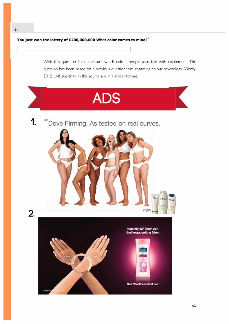
65
With this question I can measure which colour people associate with excitement. This
question has been based on a previous questionnaire regarding colour psychology (Gordy,
2012). All questions in this source are in a similar format.
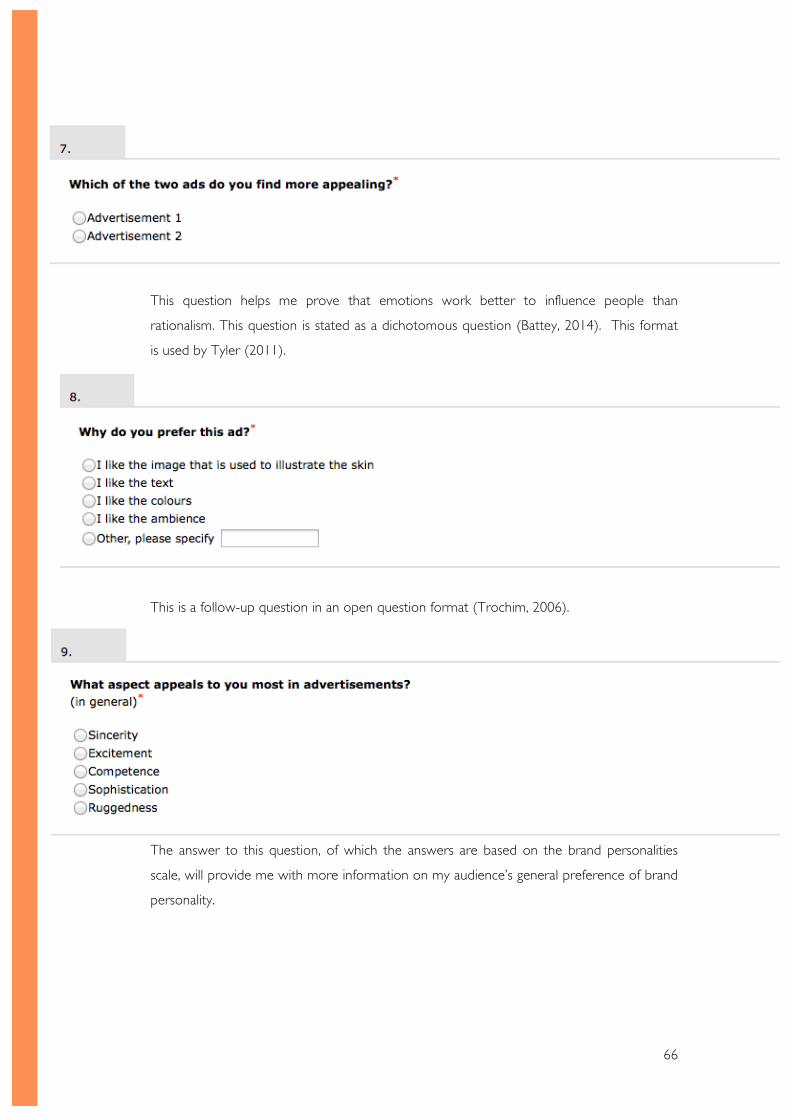
66
This question helps me prove that emotions work better to influence people than
rationalism. This question is stated as a dichotomous question (Battey, 2014). This format
is used by Tyler (2011).
This is a follow-up question in an open question format (Trochim, 2006).
The answer to this question, of which the answers are based on the brand personalities
scale, will provide me with more information on my audience’s general preference of brand
personality.
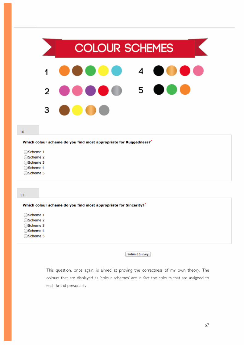
67
This question, once again, is aimed at proving the correctness of my own theory. The
colours that are displayed as ‘colour schemes’ are in fact the colours that are assigned to
each brand personality.
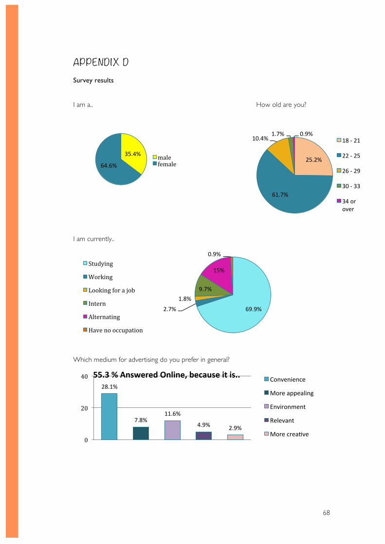
68
APPENDIX D Survey results
I am a.. How old are you?
I am currently..
Which medium for advertising do you prefer in general?
69.9% 2.7%
1.8% 9.7%
15%
0.9% Studying
Working
Looking for a job
Intern
Alternating
Have no occupation
28.1%
7.8% 11.6%
4.9% 2.9%
0
20
40 55.3 % Answered Online, because it is.. Convenience
More appealing
Environment
Relevant
More creaSve
35.4%
64.6% male female
25.2%
61.7%
10.4% 1.7% 0.9%
18 -‐ 21
22 -‐ 25
26 -‐ 29
30 -‐ 33
34 or over
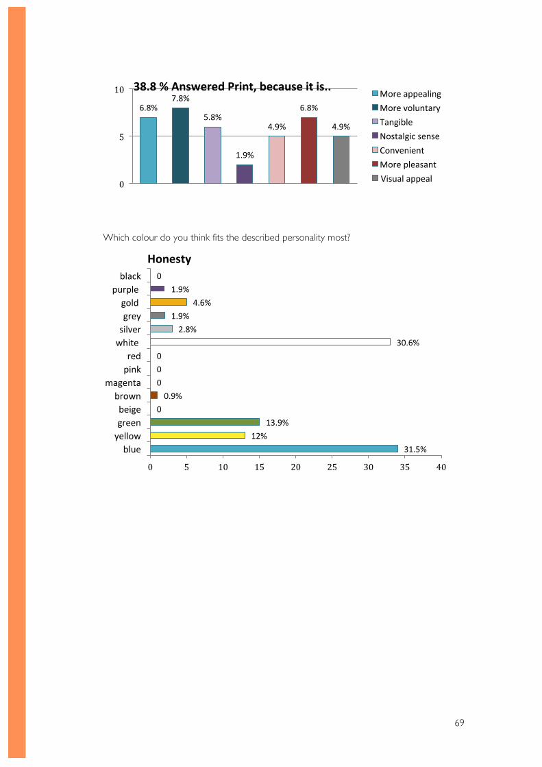
69
Which colour do you think fits the described personality most?
6.8% 7.8%
5.8%
1.9%
4.9%
6.8%
4.9%
0
5
10 38.8 % Answered Print, because it is.. More appealing More voluntary Tangible Nostalgic sense Convenient More pleasant Visual appeal
31.5% 12%
13.9% 0 0.9%
0 0 0
30.6% 2.8%
1.9% 4.6%
1.9% 0
0 5 10 15 20 25 30 35 40
blue yellow green beige brown
magenta pink red
white silver grey gold
purple black
Honesty
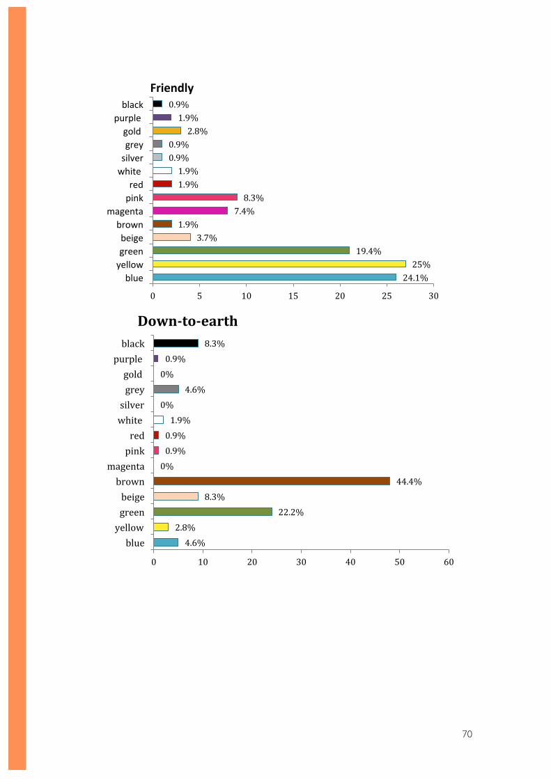
70
24.1% 25%
19.4% 3.7%
1.9% 7.4% 8.3%
1.9% 1.9%
0.9% 0.9%
2.8% 1.9%
0.9%
0 5 10 15 20 25 30
blue yellow green beige brown
magenta pink red
white silver grey gold
purple black
Friendly
4.6% 2.8%
22.2% 8.3%
44.4% 0% 0.9% 0.9% 1.9%
0% 4.6%
0% 0.9%
8.3%
0 10 20 30 40 50 60
blue yellow green beige brown
magenta pink red
white silver grey gold
purple black
Down-‐to-‐earth
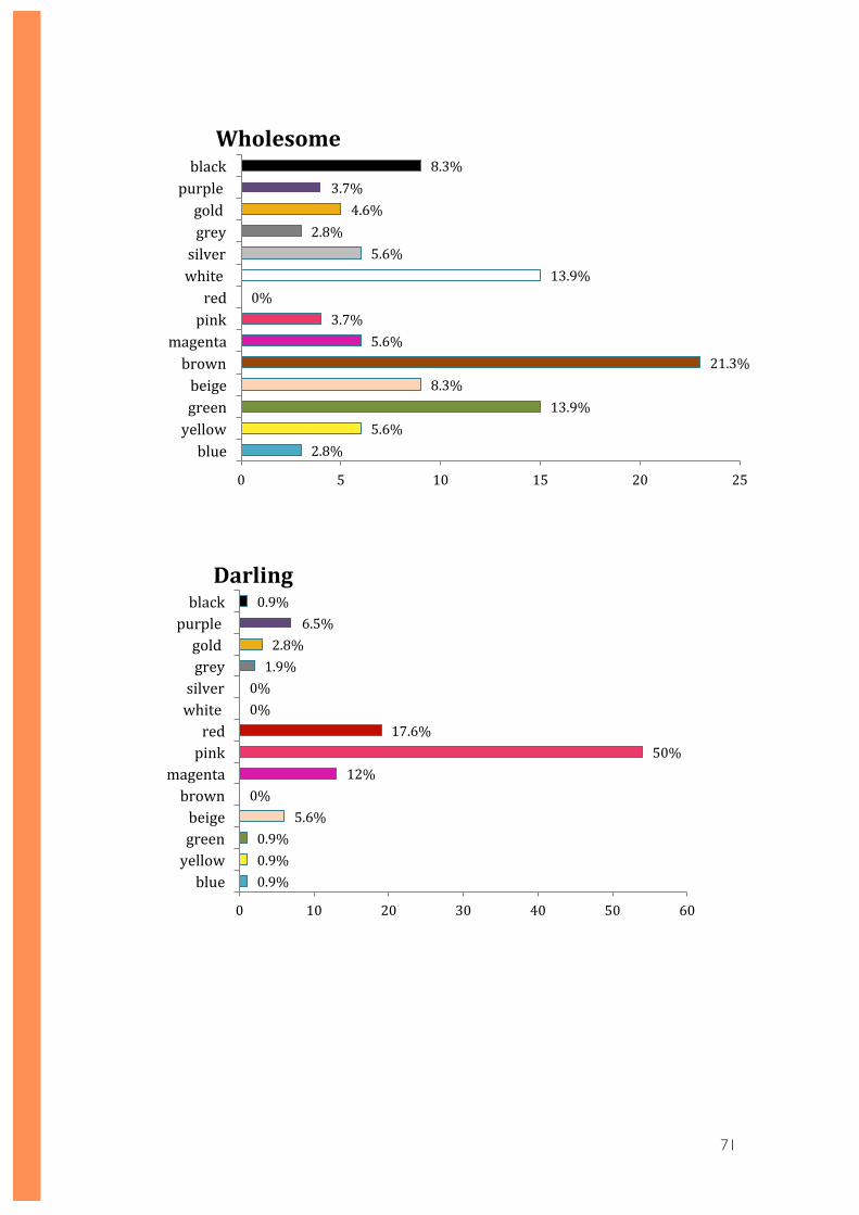
71
2.8% 5.6%
13.9% 8.3%
21.3% 5.6%
3.7% 0%
13.9% 5.6%
2.8% 4.6%
3.7% 8.3%
0 5 10 15 20 25
blue yellow green beige brown
magenta pink red
white silver grey gold
purple black Wholesome
0.9% 0.9% 0.9%
5.6% 0%
12% 50%
17.6% 0% 0% 1.9% 2.8%
6.5% 0.9%
0 10 20 30 40 50 60
blue yellow green beige brown
magenta pink red
white silver grey gold
purple black Darling
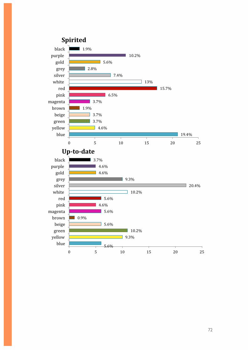
72
19.4% 4.6%
3.7% 3.7%
1.9% 3.7%
6.5% 15.7%
13% 7.4%
2.8% 5.6%
10.2% 1.9%
0 5 10 15 20 25
blue yellow green beige brown
magenta pink red
white silver grey gold
purple black
Spirited
5.6%
9.3% 10.2%
5.6% 0.9%
5.6% 4.6% 5.6%
10.2% 20.4%
9.3% 4.6% 4.6%
3.7%
0 5 10 15 20 25
blue yellow green beige brown
magenta pink red
white silver grey gold
purple black
Up-‐to-‐date
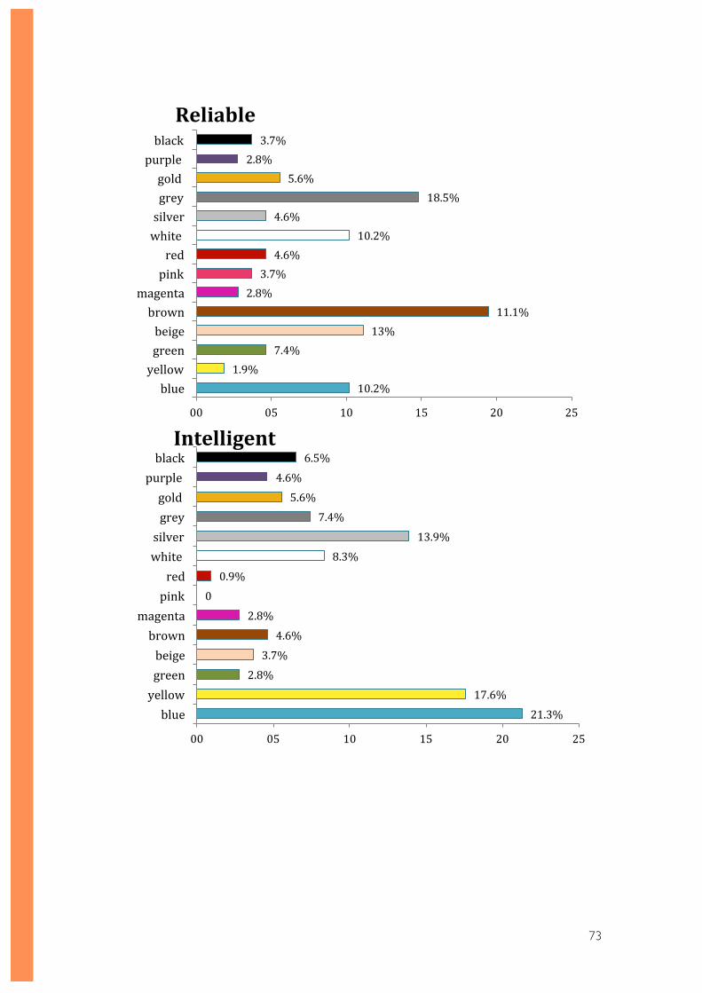
73
10.2% 1.9%
7.4% 13%
11.1% 2.8% 3.7% 4.6%
10.2% 4.6%
18.5% 5.6%
2.8% 3.7%
00 05 10 15 20 25
blue yellow green beige brown
magenta pink red
white silver grey gold
purple black
Reliable
21.3%
17.6%
2.8%
3.7%
4.6%
2.8%
0
0.9%
8.3%
13.9%
7.4%
5.6%
4.6%
6.5%
00 05 10 15 20 25
blue yellow green beige brown
magenta pink red
white silver grey gold
purple black Intelligent
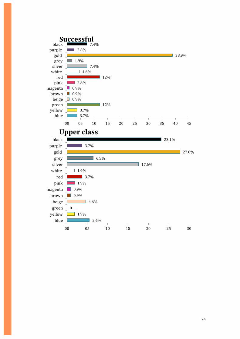
74
3.7% 3.7%
12% 0.9% 0.9% 0.9% 2.8%
12% 4.6%
7.4% 1.9%
38.9% 2.8%
7.4%
00 05 10 15 20 25 30 35 40 45
blue yellow green beige brown
magenta pink red
white silver grey gold
purple black Successful
5.6% 1.9%
0 4.6%
0.9% 0.9% 1.9%
3.7% 1.9%
17.6% 6.5%
27.8% 3.7%
23.1%
00 05 10 15 20 25 30
blue yellow green beige brown
magenta pink red
white silver grey gold
purple black Upper class
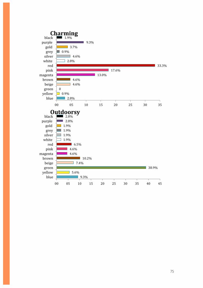
75
2.8% 0.9%
0 4.6% 4.6%
13.0% 17.6%
33.3% 2.8%
4.6% 0.9%
3.7% 9.3%
1.9%
00 05 10 15 20 25 30 35
blue yellow green beige brown
magenta pink red
white silver grey gold
purple black Charming
9.3% 5.6%
38.9% 7.4%
10.2% 4.6% 4.6% 6.5%
1.9% 1.9% 1.9% 1.9% 2.8% 2.8%
00 05 10 15 20 25 30 35 40 45
blue yellow green beige brown
magenta pink red
white silver grey gold
purple black Outdoorsy
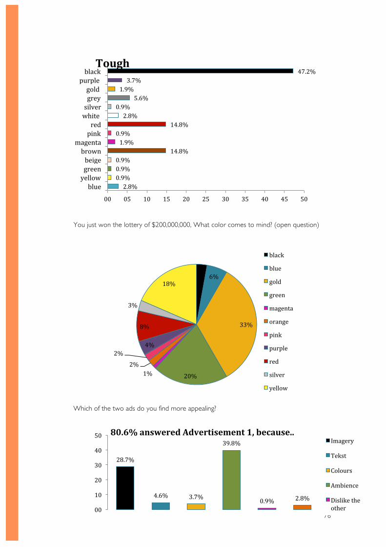
76
You just won the lottery of $200,000,000, What color comes to mind? (open question)
Which of the two ads do you find more appealing?
2.8% 0.9% 0.9% 0.9%
14.8% 1.9% 0.9%
14.8% 2.8%
0.9% 5.6%
1.9% 3.7%
47.2%
00 05 10 15 20 25 30 35 40 45 50
blue yellow green beige brown
magenta pink red
white silver grey gold
purple black Tough
3%
6%
33%
20% 1% 2%
2% 4%
8%
3%
18%
black
blue
gold
green
magenta
orange
pink
purple
red
silver
yellow
28.7%
4.6% 3.7%
39.8%
0.9% 2.8%
00
10
20
30
40
50 80.6% answered Advertisement 1, because.. Imagery
Tekst
Colours
Ambience
Dislike the other
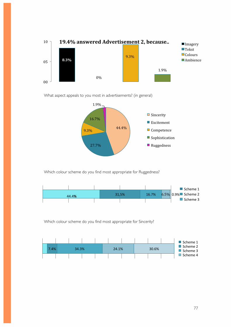
77
What aspect appeals to you most in advertisements? (in general)
Which colour scheme do you find most appropriate for Ruggedness?
Which colour scheme do you find most appropriate for Sincerity?
44.4%
27.7%
9.3%
16.7%
1.9%
Sincerity
Excitement
Competence
Sophistication
Ruggedness
8.3%
0%
9.3%
1.9%
00
05
10 19.4% answered Advertisement 2, because.. Imagery Tekst Colours Ambience
7.4% 34.3% 24.1% 30.6%
Scheme 1 Scheme 2 Scheme 3 Scheme 4
31,5% 16.7% 6.5% 0.9% 44.4%
Scheme 1 Scheme 2 Scheme 3
78
APPENDIX E Example cases
During my search for information and theories I came across several reports and websites
that had used real life examples. This is when I decided to analyse a selection of them in
order to gain more knowledge on of the effects of colours and emotions. I aimed to collect
more information on how certain colours and emotions are used in the field. The first case
will be analysing an example of how emotions are used, whereas the second case concerns
the colours that have been used.
Case 1: Dove real beauty
The key issue in this case study is the issue of a positive change. It is about the Dove
‘Campaign for Real Beauty’. Before this campaign, Dove used to focus a lot on factual
statements. Their advertisement style was mostly testimonial and not as appealing to its
target audience. Then, Dove decided to take remarkable measures. They started the new
campaign. The new campaign, as opposed to their previous ones, contains much more
emotional appeal. The Campaign for Real Beauty aimed to build the brand at an emotional
level by conveying a more democratic, celebratory and iconic vision of beauty (Millward
Brown, 2009).
This measure has had great effect on their sales. Women loved their new campaign that
idealizes realistic bodies and empowers woman. Dove has evolved from a passive and
factual brand into a distinctive and loved brand.
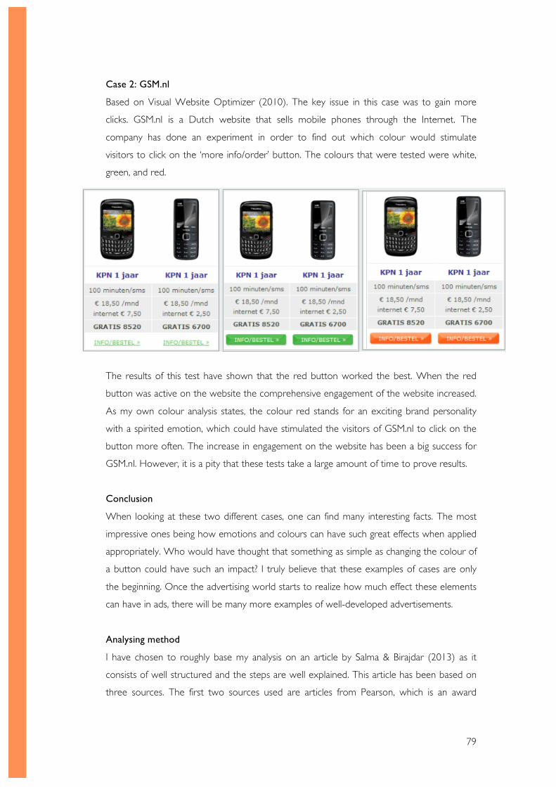
79
Case 2: GSM.nl
Based on Visual Website Optimizer (2010). The key issue in this case was to gain more
clicks. GSM.nl is a Dutch website that sells mobile phones through the Internet. The
company has done an experiment in order to find out which colour would stimulate
visitors to click on the ‘more info/order’ button. The colours that were tested were white,
green, and red.
The results of this test have shown that the red button worked the best. When the red
button was active on the website the comprehensive engagement of the website increased.
As my own colour analysis states, the colour red stands for an exciting brand personality
with a spirited emotion, which could have stimulated the visitors of GSM.nl to click on the
button more often. The increase in engagement on the website has been a big success for
GSM.nl. However, it is a pity that these tests take a large amount of time to prove results.
Conclusion
When looking at these two different cases, one can find many interesting facts. The most
impressive ones being how emotions and colours can have such great effects when applied
appropriately. Who would have thought that something as simple as changing the colour of
a button could have such an impact? I truly believe that these examples of cases are only
the beginning. Once the advertising world starts to realize how much effect these elements
can have in ads, there will be many more examples of well-developed advertisements.
Analysing method
I have chosen to roughly base my analysis on an article by Salma & Birajdar (2013) as it
consists of well structured and the steps are well explained. This article has been based on
three sources. The first two sources used are articles from Pearson, which is an award
80
winning and leading education services company. (Pearson, 2014)Another article used as a
reference comes from Cengage Learning, which is another high quality learning materials
provider. Although this method of analysis is meant for analysing case studies, it has been a
helpful guideline for analysing these example cases. I have treated these examples as a
‘mini-case study’ or a simplified version a case study. This means that I first read through
several real life cases, and picked the ones that were most relevant to my topic. While
doing so, I have identified the key issues in the cases. Then, I started to state their topic and
create a general overview of the situation described. I have chosen to continue with step 4,
where I investigated the organizations’ response to the previously found issue. In step 5 I
have reviewed the successful aspects of this response as well as the failures. In the final step
of this analysis I have written a conclusion.
81
Creative without
strategy is called
�art�� Creative with
strategy is called
�advertising��
� - Jef I . Richards
“
Parisa Irankhah 1584447


