Embed Size (px)
Citation preview
UNIVERSITY OF CALIFORNIA, IRVINE
An Investigation of Black Mobility from Los Angeles County to the Inland Empire,
1940-2000
MASTERS THESIS
submitted in partial satisfaction of the requirements
for the degree of
MASTERS OF ARTS
in Social Ecology
concentration in Demographic and Social Analysis
by
Angila LiShen Romious
Thesis Committee:
Professor Kenneth S. Chew, Chair
Professor Susan K. Brown
Professor John M. Whiteley
2009
ii
The thesis of Angila LiShen Romious is approved:
_________________________________
_________________________________
_________________________________
Committee Chair
University of California, Irvine
2009
iii
DEDICATION
To
my parents (Rebecca A. Stewart, Julius Romious and Courtney Burrell) &
life-long friends (Kamisha, Dianne, Saran, Felicia and Denise)
in recognition of their worth, endless love and support
an affirmation of faith
Faith is a mental attitude that is so convinced of its own idea –
which so completely accepts it – that any contradiction is
unthinkable and impossible. – ERNEST HOLMES
and an affirmation of hope
Any anxious thought as to the means to be employed in the accomplishment
Of our purposes is quite unnecessary. If the end is already secured,
then it follows that all the steps leading to it are secured also. – THOMAS HOWARD
iv
TABLE OF CONTENTS
Page
LIST OF FIGURES vii
LIST OF TABLES x
ACKNOWLEDGEMENTS xi
ABSTRACT OF THE THESIS xii
SECTION 1: INTRODUCTION 1
SECTION 2: THEORETICAL FRAMEWORK 5
2.1 Migration, Mobility and The Theoretical Model of Push/Pull 6
2.1.1 Place Stratification 10
2.1.2 Spatial Assimilation 13
2.2 Research Objectives 15
SECTION 3: METHODS 16
3.1 Study Area 16
3.2 Data Sources 19
3.2.1 Demographic Data 19
3.2.2 Qualitative Data 20
3.3 Operational Measures of Residential Mobility 21
3.3.1 Population Patterns 21
3.3.2 Changes in Households: Housing Units and Tenure 21
3.3.3 Changes in Households: Family Life Cycle and
Socioeconomics 22
3.3.4 Dissimilarity Index 22
3.3.5 Push/Pull Factor 23
3.3.6 Data Considerations 24
3.4 Analytical Procedures 24
3.4.1 Analysis of Population Patterns 25
3.4.2 Analysis of Changes in Households: Housing Units
and Tenure 26
3.4.3 Analysis of Changes in Households: Family Life
Cycle and Socioeconomics 26
3.4.4 Analysis of Dissimilarity Index 27
3.4.5 Analysis of Push/Pull Factor 27
SECTION 4: RESULTS 28
4.1 Population Patterns: Growth and Trends 28
4.1.1 State Growth 28

v
4.1.2 County Growth 33
4.1.3 City Growth 34
4.1.4 City Trends: Succession Cities 44
4.1.5 City Trends: Suburban Category Transition 45
4.2 Changes in Households: Housing Units, Householder, and
Tenure 46
4.3 Changes in Households: Family Life Cycle and
Socioeconomics 52
4.3.1 Population Age Structure 52
Chino 52
Colton 55
Corona 59
Fontana 62
Grand Terrace 65
Norco 67
Ontario 70
Rancho Cucamonga 73
Rialto 75
Riverside 77
San Bernardino 80
4.3.2 Socioeconomic Comparison: Origin and
Destination Cities 83
4.4 Dissimilarity Index 92
4.5 Drivers of Black Mobility 94
4.5.1 Origin Push 94
4.5.2 Destination Pull 97
SECTION 5: DISCUSSION AND CONCLUSIONS 101
5.1 Research Questions Revisited 101
5.2 Effects of Black Residential Mobility 105
5.3 Study Limitations 106
5.4 Future Research 107
5.5 Conclusions 108
REFERENCES: 110
APPENDIX A: Population Density Counties: 1940-2000 118
APPENDIX B: Crime Rates for California and Counties: 1970-2000 119
APPENDIX C: White Population Growth for Inland Empire Cities and
Los Angeles, 1940 – 2000 121
APPENDIX D: White Population Growth for Rialto, CA, 1950 – 2000 121
APPENDIX E: White Population Growth for Perris, CA, 1950 – 2000 122
vi
APPENDIX F: White Population Growth for Fontana, CA, 1970 – 2000 122
APPENDIX G: White Population Growth for Rancho Cucamonga, CA,
1980 – 2000 123
APPENDIX H: White Population Growth for Moreno Valley, CA,
1980 – 2000 123
vii
LIST OF FIGURES
Page
Figure 1 Theoretical Model of Push/Pull Factor 7
Figure 2 Map of California Counties 17
Figure 3 Map of Inland Empire 18
Figure 4 Black Population Growth for Inland Empire and LA Cities 43
Figure 5 Occupancy Status of Housing Units: 1980, 1990, 2000 48
Figure 6 Age and Sex Population Pyramid: Chino, 1970 53
Figure 7 Age and Sex Population Pyramid: Chino, 1980 54
Figure 8 Age and Sex Population Pyramid: Chino, 1990 54
Figure 9 Age and Sex Population Pyramid: Chino, 2000 55
Figure 10 Age and Sex Population Pyramid: Colton, 1970 57
Figure 11 Age and Sex Population Pyramid: Colton, 1980 57
Figure 12 Age and Sex Population Pyramid: Colton, 1990 58
Figure 13 Age and Sex Population Pyramid: Colton, 2000 58
Figure 14 Age and Sex Population Pyramid: Corona, 1970 60
Figure 15 Age and Sex Population Pyramid: Corona, 1980 61
Figure 16 Age and Sex Population Pyramid: Corona, 1990 61
Figure 17 Age and Sex Population Pyramid: Corona, 2000 62
Figure 18 Age and Sex Population Pyramid: Fontana, 1970 63
Figure 19 Age and Sex Population Pyramid: Fontana, 1980 64
Figure 20 Age and Sex Population Pyramid: Fontana, 1990 64
Figure 21 Age and Sex Population Pyramid: Fontana, 2000 65
viii
Figure 22 Age and Sex Population Pyramid: Grand Terrace, 1980 66
Figure 23 Age and Sex Population Pyramid: Grand Terrace, 1990 66
Figure 24 Age and Sex Population Pyramid: Grand Terrace, 2000 67
Figure 25 Age and Sex Population Pyramid: Norco, 1970 68
Figure 26 Age and Sex Population Pyramid: Norco, 1980 68
Figure 27 Age and Sex Population Pyramid: Norco, 1990 69
Figure 28 Age and Sex Population Pyramid: Norco, 2000 69
Figure 29 Age and Sex Population Pyramid: Ontario, 1940 70
Figure 30 Age and Sex Population Pyramid: Ontario, 1970 71
Figure 31 Age and Sex Population Pyramid: Ontario, 1980 71
Figure 32 Age and Sex Population Pyramid: Ontario, 1990 72
Figure 33 Age and Sex Population Pyramid: Ontario, 2000 72
Figure 34 Age and Sex Population Pyramid: Rancho Cucamonga, 1980 73
Figure 35 Age and Sex Population Pyramid: Rancho Cucamonga, 1990 74
Figure 36 Age and Sex Population Pyramid: Rancho Cucamonga, 2000 74
Figure 37 Age and Sex Population Pyramid: Rialto, 1970 75
Figure 38 Age and Sex Population Pyramid: Rialto, 1980 76
Figure 39 Age and Sex Population Pyramid: Rialto, 1990 76
Figure 40 Age and Sex Population Pyramid: Rialto, 2000 77
Figure 41 Age and Sex Population Pyramid: Riverside, 1940 78
Figure 42 Age and Sex Population Pyramid: Riverside, 1970 78
Figure 43 Age and Sex Population Pyramid: Riverside, 1980 79
Figure 44 Age and Sex Population Pyramid: Riverside, 1990 79
ix
Figure 45 Age and Sex Population Pyramid: Riverside, 2000 80
Figure 46 Age and Sex Population Pyramid: San Bernardino, 1940 81
Figure 47 Age and Sex Population Pyramid: San Bernardino, 1970 81
Figure 48 Age and Sex Population Pyramid: San Bernardino, 1980 82
Figure 49 Age and Sex Population Pyramid: San Bernardino, 1990 82
Figure 50 Age and Sex Population Pyramid: San Bernardino, 2000 83
Figure 51 Dissimilarity Index for Selected Cities 93
x
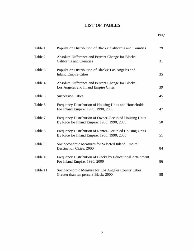
LIST OF TABLES
Page
Table 1 Population Distribution of Blacks: California and Counties 29
Table 2 Absolute Difference and Percent Change for Blacks:
California and Counties 31
Table 3 Population Distribution of Blacks: Los Angeles and
Inland Empire Cities 35
Table 4 Absolute Difference and Percent Change for Blacks:
Los Angeles and Inland Empire Cities 39
Table 5 Succession Cities 45
Table 6 Frequency Distribution of Housing Units and Households
For Inland Empire: 1980, 1990, 2000 47
Table 7 Frequency Distribution of Owner-Occupied Housing Units
By Race for Inland Empire: 1980, 1990, 2000 50
Table 8 Frequency Distribution of Renter-Occupied Housing Units
By Race for Inland Empire: 1980, 1990, 2000 51
Table 9 Socioeconomic Measures for Selected Inland Empire
Destination Cities: 2000 84
Table 10 Frequency Distribution of Blacks by Educational Attainment
For Inland Empire: 1990, 2000 86
Table 11 Socioeconomic Measure for Los Angeles County Cities
Greater than ten percent Black: 2000 88

xi
ACKNOWLEDGEMENTS
I would like to express my deepest appreciation to my committee chair, Professor
Kenneth Chew, for continuously pushing me to excel. Thank you for inspiring me and
guiding me through this journey, and for sharing your enthusiasm for scholarly research.
I would like to especially thank my committee members, Professor Susan K. Brown and
Professor John M. Whiteley. Your contribution towards my development as a researcher
has been invaluable.
I would like to thank my mother Rebecca A. Stewart-Wilson for her unconditional love
and support. You are a living example of tapping in to your potential and releasing
success. Thank you for opening my eyes to new experiences, allowing me to find my
way, and always encouraging me in my academic endeavors. You deserve this degree
just as much as I do and have earned it right along with me.
I love you and thank God for you!
In addition, I would like to thank my intelligently beautiful and extraordinary friends for
their undying support, late night talks, breakfast pow-wows and continuous
encouragement: Kamisha Davis-Johnson, Ph.D.; Dianne Stewart-Hamlin, Esq.; Saran
Tucker, Ph.D; Mrs. Felicia Vann and C.Denise Pollard, M.A.
Financial support was provided by the University of California, Irvine summer research
fellowship granted by The School of Social Ecology and by the Southern California
Edison Award granted by Southern California Edison
xii
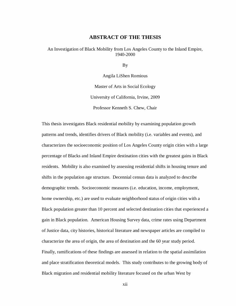
ABSTRACT OF THE THESIS
An Investigation of Black Mobility from Los Angeles County to the Inland Empire,
1940-2000
By
Angila LiShen Romious
Master of Arts in Social Ecology
University of California, Irvine, 2009
Professor Kenneth S. Chew, Chair
This thesis investigates Black residential mobility by examining population growth
patterns and trends, identifies drivers of Black mobility (i.e. variables and events), and
characterizes the socioeconomic position of Los Angeles County origin cities with a large
percentage of Blacks and Inland Empire destination cities with the greatest gains in Black
residents. Mobility is also examined by assessing residential shifts in housing tenure and
shifts in the population age structure. Decennial census data is analyzed to describe
demographic trends. Socioeconomic measures (i.e. education, income, employment,
home ownership, etc.) are used to evaluate neighborhood status of origin cities with a
Black population greater than 10 percent and selected destination cities that experienced a
gain in Black population. American Housing Survey data, crime rates using Department
of Justice data, city histories, historical literature and newspaper articles are compiled to
characterize the area of origin, the area of destination and the 60 year study period.
Finally, ramifications of these findings are assessed in relation to the spatial assimilation
and place stratification theoretical models. This study contributes to the growing body of
Black migration and residential mobility literature focused on the urban West by
xiii
providing an analysis of the shifting demographics within Southern California. This
research has implications for how Blacks in the West are studied.
1
“How do these dramatic changes in residential areas come about? In part, industry and
commerce in their expansion encroach upon land use for residences. But, in larger part,
the changes are mass movements of families- the end results of countless thousands of
residence shifts made by urban Americans every year. Compounded in the mass, the
residence shifts of urban households produce most of the change and flux of urban
population structures.”
--Peter Rossi (1955)
This research documents the transformation of Black residential mobility from
Los Angeles County into San Bernardino and Riverside Counties from 1940 to 2000.
Riverside and San Bernardino Counties are collectively known as the “Inland Empire.”
Black residential mobility is investigated by examining population growth patterns and
trends, by identifying the variables and events that drive Black mobility, and by
characterizing the socioeconomic position of Los Angeles County origin cities with a
large percentage of Blacks and Inland Empire destination cities with the greatest gains in
Black residents. Black mobility is also examined by assessing residential shifts in
housing tenure and shifts in the population age structure. The implications of these
findings are assessed for the spatial assimilation and place stratification theoretical
models of residential mobility. This research will contribute to the growing body of
Black migration and residential mobility literature focused on the urban West by
providing an analysis of the shifting demographics within Southern California.
Approximately 235,495 Blacks moved to the Inland Empire from 1940 to 2000.
During this period the total population of Blacks in Los Angeles County steadily declined
as the total population increased in suburban Orange County from 2% to 8%, in San
Bernardino County from 2% to 5%, and from 2% to 5% in Riverside County. San
Bernardino had the greatest growth and Riverside had the second greatest growth. The
Black population in San Bernardino County increased by eight percentage points
2
(145,573). Riverside County increased by four percentage points (89,922). In contrast,
Orange County‟s Black population increased by only one percentage point (39,866). The
phenomenon that occurred in Southern California can, at “least be considered [the] most
significant demographic development in California‟s Blacks history” (Sides, 2003).
The Southern California suburbanization phenomenon is an example of an
emerging urban migration pattern that strongly indicates minorities have come to
dominate suburban growth from metropolitan centers (Frey and Geverdt, 1998). Frey
(2003) studied 1990-2000 suburban diversity patterns of the nation‟s 102 largest
metropolitan areas and found that minorities make up more than 27 percent of the
suburban population and that Blacks show the greatest increase in suburban residence
migration compared to Asians and Hispanics. At that time the Los Angeles metropolitan
area was found to have the highest minority suburban population and the most
pronounced population gain. The Riverside-San Bernardino PMSA (Primary
Metropolitan Statistical Area) was ranked number two, has the greatest percentage gain
(15.8%) in suburban minority shares, and had a dissimilarity index of two. The index of
dissimilarity measures the even distribution or segregation of an area.
In other words, two percent of either Blacks or Whites would have to move
locations in the PMSA to achieve an even distribution of race across the PMSA. A value
of 60 or more denotes a high level of segregation, 100 indicates complete segregation and
zero indicates a heterogeneous neighborhood. Nationally, Blacks are more highly
segregated from Whites than are Hispanics or Asians (Charles, 2003; Frey and Farley,
1996). However, at the PMSA geographic level the index differs. Currently, the number
two ranking and minority share gains of 15.8% coupled with the information of a low
3
dissimilarity index, indicates Blacks that reside in the Riverside-San Bernardino PMSA
are highly suburbanized and well integrated within the area.
Frey‟s (2003) findings are unique because they imply change in suburban
diversity patterns, and the findings challenge previous notions about “race and space.”
These new suburban diversity patterns counter traditional social ideology of residential
pattern structuring (i.e. place stratification), the theory that Blacks predominate central
cities resulting in “White flight” to the suburbs (Frey and Geverdt, 1998; Frey 2003).
The Black population in the city of Los Angeles grew a staggering 1,096 percent
(63,744 to 763,000) between 1940 and 1970 (Sides 2003). Black population growth was
also strong in Newark (661%), Detroit (407%) and Chicago (342%) during the same time
period. Historically, Blacks concentrated in these central cities as a result of racial
discrimination, which physically restricted Blacks‟ from escaping high crime ghetto
areas. Place stratification theory describes how discrimination contributed to residential
segregation; and how residential patterns of minority groups are shaped. The United
States Census, 2000, indicates that the Black population in the north and east portion of
the U.S. remain concentrated in central cities, Detroit has 81%; Newark with 52% and
Philadelphia, 43%. This is compared to the west in Los Angeles at 11%. Increased
migration into Los Angeles in the 1940s gave rise to a trend of movement out of South
Central Los Angeles and into the suburbs that began in the 1950s and accelerated in the
1960s (Sides 2003).
Mobility of Blacks from Los Angeles County to suburban San Bernardino County
and Riverside County has been fairly constant since the middle of the 1960s. Between
1975 and 1980 more than 5,000 Blacks migrated. The number of Blacks migrating into
4
San Bernardino and Riverside counties doubled from 1980 to 1990 (DeGraff, 2001).
From a regional standpoint, such movement is distinct as suggested by Residential
Mobility theoretical models that explain minority group residential relocation patterns.
The following questions are investigated: 1) What are the population patterns of
Blacks, with respect to Whites, Hispanics, Asians, and Others? 2) What time period had
the greatest growth? 3) How has housing changed over time in terms of units and tenure?
4) How has the population age structure changed in cities with the greatest gain in Black
residents? 5) How do origin and destination cities, that are greater than 10 percent Black,
compare in terms of socioeconomic measures?; 6) How racially diverse are the
destination cities that are greater than 10 percent Black? 7) What push/pull factors
precede or contribute to the mobility of Blacks out of Los Angeles County and into 14
Inland Empire Cities: Banning, Chino, Colton, Corona, Fontana, Grand Terrace, Moreno
Valley, Norco, Ontario, Perris, Rancho Cucamonga, Rialto, Riverside, and San
Bernardino?
5
2. Theoretical Framework
Residential Mobility specifically refers to patterns of residential relocation and
redistribution (Rossi, 1955). Three theoretical models describe the relocation process:
Place Stratification, Spatial Assimilation and Homophily. Place Stratification theorizes
boundaries of residential movement are limited due to racial discrimination, which leads
to physical and socioeconomic separation. Spatial Assimilation posits that minority
movement out of ethnic enclaves and into surrounding areas occupied by the dominant
host group reflects an increase in the minority groups‟ socioeconomic status. Homophily
focuses on the personal preference process underlying choice to reside near those who
share racial or ethnic traits, and to avoid others who are racially or ethnically dissimilar.
Suburbanization is a prime example of a residential relocation pattern. In this
case, the Greater Los Angeles Basin which includes Los Angeles County and its cities is
considered the central city and the Inland Empire is equivalent to the suburban outskirts.
Reference to Homophily as a theory of redistribution has been somewhat abandoned by
theorists due to recent patterns of minority suburbanization (Frey, 2003). Frey‟s findings
indicate metropolitan suburban growth is dominated by minorities in more than half of
the nation‟s largest metropolitan areas (2003). Furthermore, Hwang and Murdock (1998)
argue “theoretical explanations of residential patterns based solely on racial or ethnic
preferences are inadequate. Status motivations are just as important as homophily or
perhaps more so in affecting the residential decisions of upwardly mobile minorities.”
This position is supported by the substantial rise in racial and ethnic diversity in suburban
areas (Frey, 2003). Suburbanization implies higher status attainment (Hwang and
6
Murdock, 1998) and has been characterized as Spatial Assimilation when applied to
minority groups (Massey and Mullan, 1984). Place Stratification and Spatial
Assimilation are the residential mobility theoretical models used as a framework in this
investigation.
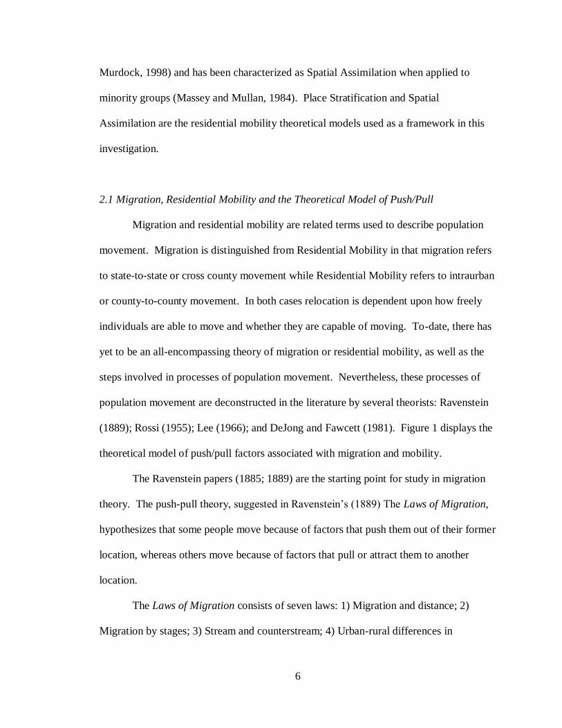
2.1 Migration, Residential Mobility and the Theoretical Model of Push/Pull
Migration and residential mobility are related terms used to describe population
movement. Migration is distinguished from Residential Mobility in that migration refers
to state-to-state or cross county movement while Residential Mobility refers to intraurban
or county-to-county movement. In both cases relocation is dependent upon how freely
individuals are able to move and whether they are capable of moving. To-date, there has
yet to be an all-encompassing theory of migration or residential mobility, as well as the
steps involved in processes of population movement. Nevertheless, these processes of
population movement are deconstructed in the literature by several theorists: Ravenstein
(1889); Rossi (1955); Lee (1966); and DeJong and Fawcett (1981). Figure 1 displays the
theoretical model of push/pull factors associated with migration and mobility.
The Ravenstein papers (1885; 1889) are the starting point for study in migration
theory. The push-pull theory, suggested in Ravenstein‟s (1889) The Laws of Migration,
hypothesizes that some people move because of factors that push them out of their former
location, whereas others move because of factors that pull or attract them to another
location.
The Laws of Migration consists of seven laws: 1) Migration and distance; 2)
Migration by stages; 3) Stream and counterstream; 4) Urban-rural differences in
8
propensity to migrate; 5) Predominance of females among short-distance migrants; 6)
Technology and migration; and 7) Dominance of the economic motive (Ravenstein,
1885; 1889).
Of the seven Laws of Migration proposed by Ravenstein, Laws 1, 2 and 6, denote
an underlining element that designates commerce or industry as a preferred pull that
attracts migrants to new locations. The law of migration and distance (1885) suggests
those who move long distances prefer centers of commerce and industry. Migration by
stages (1885) adds to this notion of attraction by identifying waves of population shifts to
these great centers. The law of technology and migration (1889) suggests that as one
increases the other also increases.
The decision to migrate is often based on economic factors and is accompanied by
the expectation of an enhanced life through better job opportunities. In the dominance of
economic motive law by Ravenstein (1889), uncongenial social surroundings are listed as
one of the factors contributing to migration currents. Within this final law, and based on
an analysis of migration in England, Ravenstein states that ultimately the dominant
driving force behind migration is the desire to “better oneself in material respects”
(1889). In other words, pull factors are more important than push factors: the desire to
get ahead is more powerful and most responsible for voluntary migration than the desire
to escape an unpleasant situation.
Residential Mobility is a two-stage conceptualization of the moving process: the
decision to move and the choice of where to move (Rosenbaum and Friedman, 2006).
Rossi (1955) suggests that the decision to move develops over a period of time
proceeding from a desire to move, to the expectation of moving, to actually moving. Lee
9
(1966) supplements this analysis with intervening obstacles between the desire to move
and the decision to actually do so. DeJong and Fawcett (1981) conceptualize the
migration process with a three step model: 1) propensity to migrate; 2) motivation to
migrate; 3) decision to migrate.
Lee (1966) describes the process of migration relative to factors associated with
both the area of origin and destination, including intervening obstacles and personal
factors. Inherent in each phase of the migration process are complexities. In the area of
origin and in the area of destination are factors that migrants are attracted to, repulsed by,
or indifferent to. For example, a sense of familiarity is achieved when a person has lived
in an area over a long term. Alternatively, a sense of uncertainty exists regarding the
advantages or disadvantages of the area of destination that are unconfirmed until a person
actually lives there.
It is also argued by Lee (1966) that a set of intervening obstacles weighs heavily
on the decision to migrate from one end to the other end of the spectrum. These include
factors associated with the place of origin to factors associated with the destination.
These intervening obstacles include distance and physical barriers. They also include the
stage of the life cycle (i.e. young, single, married, divorced, college graduate, elderly,
etc.) and the level of perceived surmountability of the intervening obstacles. Finally,
personal factors influence the migration process. These factors range from personal
sensitivities, intelligence, and personalities that resist change to whether or not they have
personal contacts with family who preceded their move at the destination.
Place stratification refers to neighborhood/place-level inequalities (e.g. class, race,
economics, etc.) and physical boundaries that separate people and stem from racial
10
discrimination. Place stratification is a theoretical model of residential mobility that fits
within Lee‟s (1966) proposition of intervening obstacles. Place stratification is examined
in this study because proponents argue that it is the dominant model of traditional
residential pattern structuring where Blacks concentrate in central cities and Whites
suburbanize. Given recent minority patterns of high suburbanization, it is important
conceptually to consider how this model fits Blacks migration to the Inland Empire.
2.1.1 Place stratification.
Place stratification is a sociological theory that identifies the dominance of racial
discrimination in shaping the residential patterns of minority groups. Both Place
stratification and spatial assimilation theories help to elucidate residential patterns across
racial and ethnic groups. Spatial assimilation theory argues socioeconomic differences
dominate in residential patterns while place stratification theory emphasizes the role of
racial and/or ethnic discrimination and prejudice.
Place stratification theory conceptualizes the primary role that prejudice and
discrimination play in the restriction of residential options that subsequently lead to
segregation among races. Evidence of Blacks in Los Angeles County historically being
restricted into ethnic enclaves up and down Broadway via discriminatory mortgage and
loan practices have been documented (Wiese 2004; DeGraff 2001).
Place stratification describes the physical restriction of housing options, not only
to the degree to which various groups reside in segregated neighborhoods, but also in the
negative social and cultural impacts they have on the Black experience regardless of
socioeconomic status. These disadvantages have been documented in terms of schooling,
employment, exposure to higher crime, increased rates of single parenthood, concentrated
11
poverty, and health/cognition outcomes (Charles, Dinwiddie, and Massey, 2004; Cutler
and Glaeser 1997; Massey 2004; Massey, Condran and Denton, 1987; Massey and
Denton 1993; Santiago and Wilder 1991). Additional findings show that Blacks living in
segregated neighborhoods tend to also live in less desirable neighborhoods that have
higher rates of poverty and crime (Massey, Condran and Denton, 1987).
Despite the increase in socioeconomic status, middle-class Blacks are more likely
to live in lower status neighborhoods than similar middle-class Whites, a pattern that
suggests that race is important in shaping their residential location (Alba, Logan and
Stults 2000). Similar findings indicate that middle class Blacks tend to live in
neighborhoods with significantly lower median incomes, higher poverty rates and a
higher incidence of other related problems than do middle-class Whites (Adelman 2004;
Adelman, Hui-shien, Tolnay and Crowder 2001; Alba et al. 2000; Erbe 1975; Pattillo-
McCoy 1999, 2000). Moreover, Blacks were found to live in neighborhoods that are 15-
20 percent less affluent than similar groups (Charles, 2003). These findings reveal how
neighborhood conditions influence an individual‟s life opportunities. Neighborhood
resources such as high-quality schools or high crime rates vary greatly and may
positively or negatively impact a resident‟s upward mobility. Thus, the implications of
these findings support the idea that place stratification along with neighborhood
conditions influence the life opportunities of Blacks (e.g. educational and occupational
opportunities).
More recent reports assessing all United States metropolitan areas between 1990
and 2000 continue to find evidence of place stratification relative to Blacks, regardless of
12
socioeconomic status levels (Iceland and Wilkes 2006). Blacks were more segregated
from Whites than were Hispanics and Asians.
Controversy abounds regarding which theory best explains the formation of
residential settlement patterns. Some studies appear to support place stratification while
others have alternative explanations. Allport (1954), Bogardus (1959), and Clark (1991)
hypothesize that segregated residential patterns are a result of people‟s desire for in-group
attraction and out-group avoidance. Homophily suggests people are attracted to those
who share racial or ethnic traits and repelled by those who are racially or ethnically
dissimilar.
How is it with the restrictions imposed by place stratification that Blacks moving
to the Inland Empire ended up highly suburbanized? Place stratification theory
contributes to the understanding of this phenomenon within this case study. Residential
patterns of the highly suburbanized Black population in the Inland Empire do not appear
to be aligned with traditional notions surrounding the differential distribution of groups
across space. Thus, place stratification may no longer be a factor in shaping historical
residential patterns of minority groups in Southern California.
Place stratification emphasizes that a group‟s residential pattern and integration
into society depend on the group‟s position in the larger social hierarchy (Charles 2003;
White and Glick 1999). Furthermore, Park (1925) and White (1987) hold that differences
in residential patterns across racial and ethnic groups reflect social distance between
different races. Given these two perspectives, it is implied that within the Black race, a
person‟s position in the social hierarchy may be exemplified by creating social distance
(i.e. to suburbanize) relative to other Blacks and/or other minority groups. Yet Massey
13
(1996) and Wilson (1996) have argued that class plays a more important role in shaping
residential patterns. With Blacks likely to prefer living in integrated neighborhoods
(Bobo and Zubrinsky 1996; Farley 1977; Farley and Frey 1994; Farley, Fielding and
Krysan 1997; Zubrinsky and Bobo 1996), whether they are capable of doing so or not, it
may come as no surprise that as one increases in socioeconomic status, and therefore
class, one‟s desire to migrate to an area that reflects their current status is inevitable. This
is one focus of the examination in this case study of the would-be Inland Empire
population.
2.1.2 Spatial assimilation.
Spatial assimilation is “the movement of minority groups out of established racial
or ethnic neighborhoods into a larger urban environment inhabited primarily by
„nonethnic‟ native Whites” (Massey and Mullan, 1984:837). The traditional theory of
spatial assimilation posits that minority movement out of ethnic enclaves and into
surrounding areas occupied by the dominant host group reflects an increase in the
minority group‟s socioeconomic status. In this study, it might be argued that the Inland
Empire‟s Blacks aimed to move among similarly classed individuals regardless of race.
Thus, spatial assimilation as a reflection of social distance may be a more adequate
explanation of the push/pull phenomenon.
Spatial assimilation predicts that segregation results, in-part, from socioeconomic
differences across groups. It does not directly address residential segregation between
minority groups. Park et al. (1925) argue that, “the overarching view of spatial
assimilation theory is that spatial distance is reflective of social distance.” Massey and
Mullan (1984) underscore the spatial component in the larger assimilation process by
14
concluding that a group‟s socioeconomic position in society cannot be understood apart
from its spatial location. Thus, the emphasis on space in current research indicates the
importance of locations where migrant groups ultimately settle and reside. Ideally a
group‟s residential pattern should be dictated by their ability to relocate out of an
undesirable area to a more desirable area. The ability to be socially mobile translates
desire to move into actual movement.
Many variables must be recognized when determining one‟s residential location:
cost and quality of housing, health and sanitary conditions, exposure to crime and
violence, quality of services and access to economic opportunity (Massey and Mullan
1984). Thus, residential location plays an important role in the levels of stratification
exhibited in the data because it has a direct impact on (or has direct consequences for) an
individual‟s life opportunities. This in turn determines the degree of racial segregation
the individual experiences as a result of his or her residential location.
Massey and Mullan (1984) underscore the influence of spatial mobility on social
mobility. Because social and economic resources vary geographically, patterns of spatial
assimilation have a clear impact on the opportunities for socioeconomic advancement.
Barriers to spatial mobility are barriers to social mobility, “thus in urban society
socioeconomic advancement tends to be accompanied by spatial movement aimed at
bettering personal or familial circumstances” (Massey and Mullan, 1984).
15
2.4 Research Objectives and Overview of Methodology
A comprehensive analysis of Black residential relocation and redistribution
patterns from Los Angeles County to the Inland Empire has yet to be accomplished. This
Residential Mobility investigation chronicles Black population growth trends, housing
and householder shifts in ownership, socioeconomic measures, residential segregation,
and push/pull factors that implicitly account for shifting demographic patterns. Taken
together, these findings will provide a broad-spectrum depiction of Black Residential
Mobility into Southern California‟s Inland Empire.
This case-study uses two methods of research. This mixed methods research uses
primarily quantitative population data supplemented with qualitative data from city
histories, historical references and newspaper articles to account for local events
preceding and/or paralleling any population change. This research design allows for
development of a local portrait of the study area in terms of size, the overall growth, and
composition of the local population. Three general areas of data were collected to obtain
a local portrait and for spatial assimilation analysis: housing, population and economic
characteristics.
16
3. Methods
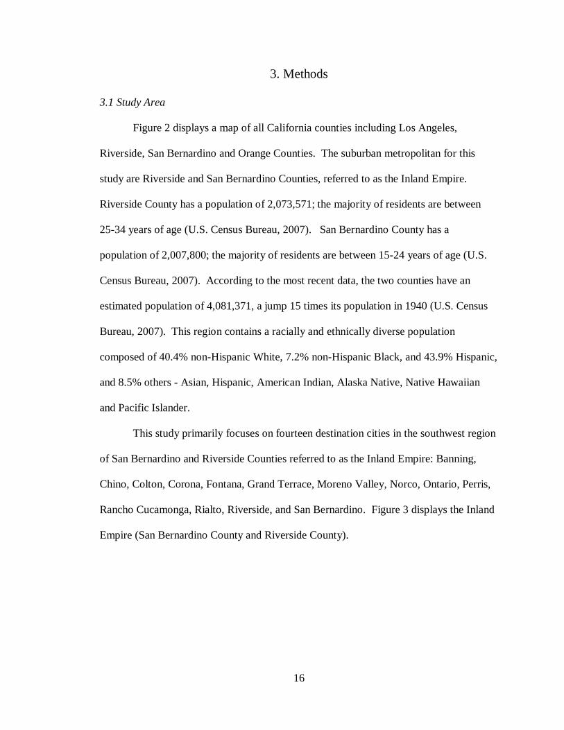
3.1 Study Area
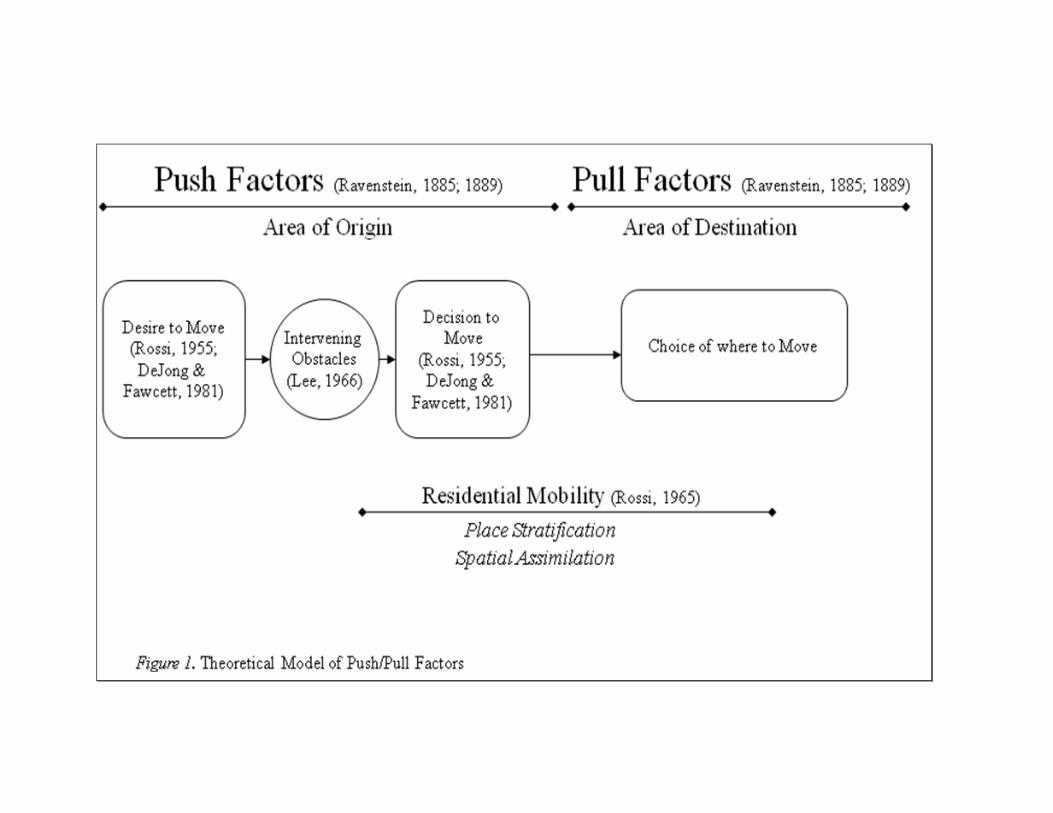
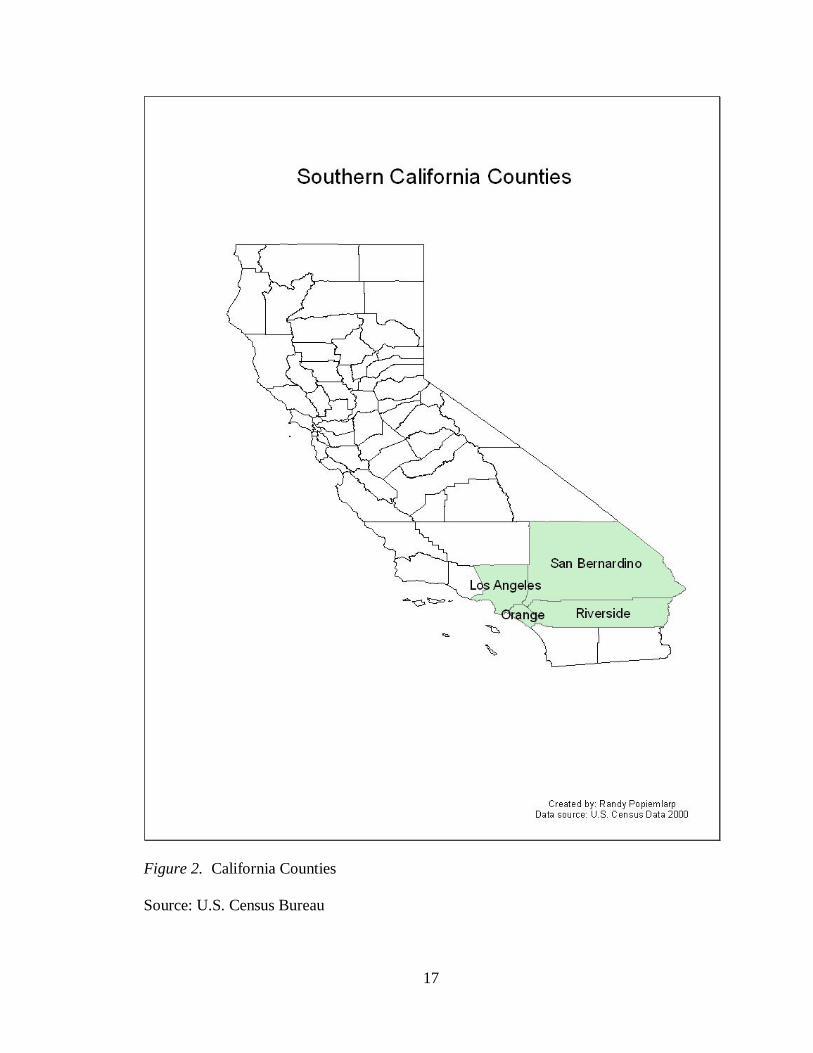
Figure 2 displays a map of all California counties including Los Angeles,
Riverside, San Bernardino and Orange Counties. The suburban metropolitan for this
study are Riverside and San Bernardino Counties, referred to as the Inland Empire.
Riverside County has a population of 2,073,571; the majority of residents are between
25-34 years of age (U.S. Census Bureau, 2007). San Bernardino County has a
population of 2,007,800; the majority of residents are between 15-24 years of age (U.S.
Census Bureau, 2007). According to the most recent data, the two counties have an
estimated population of 4,081,371, a jump 15 times its population in 1940 (U.S. Census
Bureau, 2007). This region contains a racially and ethnically diverse population
composed of 40.4% non-Hispanic White, 7.2% non-Hispanic Black, and 43.9% Hispanic,
and 8.5% others - Asian, Hispanic, American Indian, Alaska Native, Native Hawaiian
and Pacific Islander.
This study primarily focuses on fourteen destination cities in the southwest region
of San Bernardino and Riverside Counties referred to as the Inland Empire: Banning,
Chino, Colton, Corona, Fontana, Grand Terrace, Moreno Valley, Norco, Ontario, Perris,
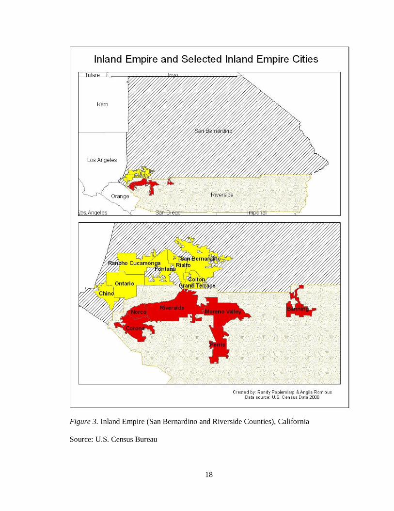
Rancho Cucamonga, Rialto, Riverside, and San Bernardino. Figure 3 displays the Inland
Empire (San Bernardino County and Riverside County).
17
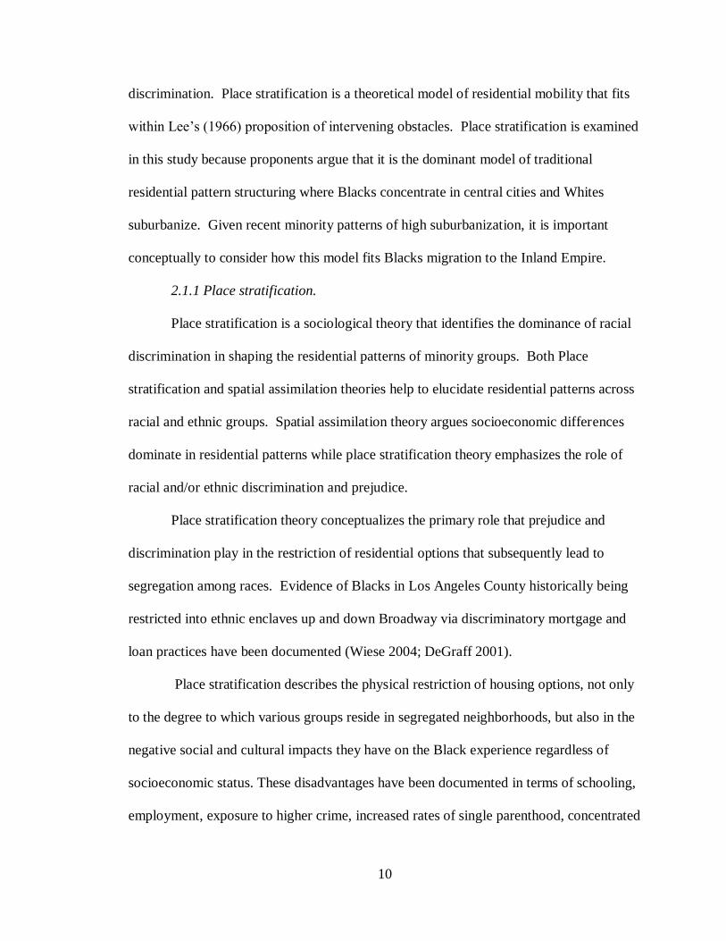
Figure 2. California Counties
Source: U.S. Census Bureau
18
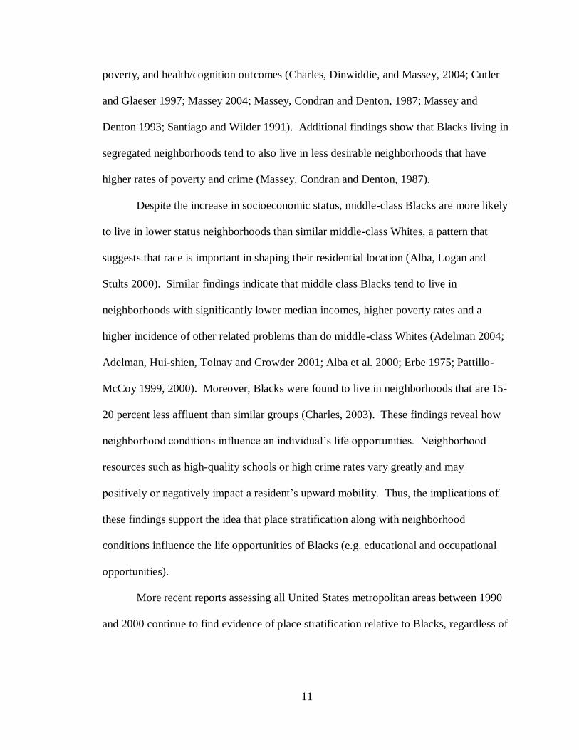
Figure 3. Inland Empire (San Bernardino and Riverside Counties), California
Source: U.S. Census Bureau
19
3.2 Data Sources
3.2.1 Demographic data.
Demographic data was extracted from the United States Census Bureau:
Decennial Census (USCBDC), Housing Patterns, and the American Community Survey.
The purpose of the USCBDC is to provide a count of the United States population at all
geographic levels. In depth population and housing data is collected every ten years. This
research has extracted state, county, PMSA, and city geographic level data.
The Housing Patterns databank was used to extract the Index of Dissimilarity for
individual cities. The Index of Dissimilarity (DI) provides segregation indexes that are
an enumeration of housing patterns. Residential housing patterns data are computed
using USCBDC data. The Census calculates DI based on the following criteria: places
with ten or more census tracts and at least 100 people for the race/ethnicity in question.
The unit of analysis at the city level is the census tract.
The American Community Survey, part of the USCBDC provides yearly interim
estimates of population, economic, social, demographic and housing. This research has
extracted the Riverside County, San Bernardino County, and the Riverside-San
Bernardino-Ontario primary metropolitan statistical area. A PMSA is defined as:
“The general concept of a metropolitan area (MA) is one of a large
population nucleus, together with adjacent communities that have a high
degree of economic and social integration with that nucleus. Some MAs
are defined around two or more nuclei…Each MA must contain either a
place with a minimum population of 50,000 or a U.S. Census Bureau-
defined urbanized area and a total MA population of at least 100,000
(75,000 in New England). An MA contains one or more central counties.
An MA also may include one or more outlying counties that have close
economic and social relationships with the central county.” (U.S. Census
2000)
.

20
A comprehensive description of USCBDC including the American Community Survey
methodology can be found on the U.S. Census Bureau website (http//www.census.gov).
Additionally, detailed description of USCBDC geographic terms as well as concepts can
be found in Appendix A of the SF3 2000 Census of Population and Housing Technical
Document.
3.2.2 Qualitative data.
Qualitative data was obtained from historical newspapers, local area newspapers,
local history and sociological theory. All newspaper articles were obtained using the
online newspaper database “NewsBank.” Newspaper sources included ProQuest
Historical Los Angeles Times (1881-1984), Los Angeles Times (1985 to present), The
New York Times, Christian Science Monitor, and The Washington Post. Local historical
literature was obtained online from City library documents and city websites.
Sociological theoretical information was obtained through various books and journal
articles noted in the reference section.
Newspaper articles and historical literature references were thoroughly searched
to identify drivers of Black residential mobility, to capture narrative history, to establish a
timeline of events, and to discover trends or patterns that parallel local events coinciding
with fluctuations in the data.
21
3.3 Operational Measures of Residential Mobility
In theory, residential mobility is primarily involved in the “interplay between a
household‟s housing needs and the physical structure it occupies” (Rossi, pg 1980).
Residential mobility is a phenomenon of the housing market and is driven by two
elements: 1) family and household changes due to growth, decline in size or dissolution;
and 2) by income and housing opportunities (Rossi, 1955).
Residential mobility will be investigated in five components: Population Patterns,
Housing Units and Tenure, Socioeconomics and Family Life Cycle, Dissimilarity Index,
and by identification of Push/Pull factors. An examination of these sources of residential
mobility allow for a comprehensive assessment of residential shift and neighborhood
characterization associated with residential mobility.
3.3.1 Population patterns.
The magnitude of residential mobility will be examined by calculating and
comparing population change and growth. Population percent change values at the city
level can be used as an indirect measure of intraurban migration by adopting the
assumption of little variation between birth and death rates within a metropolitan area
(Hwang and Murdock, 1998). Moreover, population size and the rate of growth are
indicators of increasing economic opportunities (De Graaf, 2001).
3.3.2 Changes in household: housing units, householder and tenure.
The number of housing units will be reported to assess the magnitude of change in
housing stock. Householder and tenure will also be reported to examine Black
householder shifts of owner versus renter occupied housing units.
22
3.3.3 Changes in household: family life cycle and socioeconomics.
Lee puts forth two generalizations characterizing migrants: Migration is selective,
not everyone migrates; and there is a heightened propensity to migrate at certain stages of
the life cycle is important (1966). Therefore, life cycle changes are an important
consideration to consider as part of the residential mobility investigation..
Neighborhoods represent the life cycle of residents as people tend to age in the same
place over an extended period of time, or as neighborhoods may attract people in a
particular stage in their life. Population age structures reflect the life cycle model for a
local area. These structures will be examined for Inland Empire cities with a five
percentage point gain in Black population over any decade.
Lee‟s (1966) generalization of selectivity is the essence of one of the goals of this
research to examine demographically the social status of those Blacks who migrated to
the Inland Empire. Thus, socioeconomic variables including age, education level and
income will be examined for origin cities in which Blacks predominate, defined as in
having population greater than 10 % Black. Socioeconomic variables will also be
examined for a sample of destination cities with the greatest gain in Black residents.
Socioeconomic indicators, suggestive of Spatial Assimilation, reflect high percentage
values of the following variable criteria: education levels, employment rate, income, and
diversity of races.
3.3.4 Dissimilarity Index.
The index of dissimilarity (DI) is a discrete tool used to measure residential
segregation. The index examines the extent to which racial and ethnic minority groups
23
are segregated from Whites. In this case, it compares the spatial distributions of Blacks
and Whites to determine how evenly distributed the two groups are.
The DI measures the percentage of Blacks that would have to change residence
for each neighborhood to have the same percentage of Blacks in the city overall. A
maximum index value of 100 is interpreted as complete segregation, and an index value
of 0 indicates complete integration. Intermediate vales of 1-30 indicate low segregation,
31-59 is moderate segregation, 60-79 is high segregation and 80-99 is considered
hypersegregation.
The formula used to calculate the DI for two races or ethnic groups within the same
city is as follows (Frey & Myers, 2002):
The DI values were obtained for all Inland Empire cities and the City of Los
Angeles for the Black/White race combination.
3.3.5 Push/Pull Factor.
Drivers that “pushed” Blacks out of Los Angeles County or factors that “pulled”
Blacks into the Inland Empire will be investigated from several angles. Race
distribution, income, and crime statistics data for Los Angeles County will be reported.
American Housing Survey response data for the Riverside-San Bernardino-Ontario
PMSA will be reported for Black householders. AHS includes attitudinal data about the
24
respondents‟ perception of their current home and neighborhood as well as reasons for
why they migrated from their previous home and neighborhood. Whether prominent
events preceded or contributed to the mobility will be examined.
3.3.6 Data considerations.
The definition of race includes “Whites,” “Blacks,” “Asians,” and “Others,” not
of Hispanic ethnicity. “Hispanics” are of Hispanic ethnicity and are separated from all
other races in this study (i.e. a person identifying themselves as a Black Hispanic is
considered Hispanic for the purposes of this study).
The definition of race in the USCBDC: It must be noted that Hispanics were
counted with and as Whites until the 1970 USCBDC and were not partitioned out until
the 1980 USCBDC. Thus, Hispanics will be listed in data tables for the years 1980,
1990, and 2000. “Asians and Pacific Islanders” were listed as one category in the 1990
USCBDC and was subsequently partitioned into “Asian” and “Native Hawaiian and
Other Pacific Islander” for the 2000 USCBDC. For the purposes of this study, these two
categories will remained pooled for the 2000 USCBDC for comparability across decades.
3.4 Analytical Procedures
A retrospective longitudinal case study analysis of residential mobility from Los
Angeles County to the Inland Empire from 1940 to 2000 is calculated using qualitative,
quantitative and statistical analyses. Qualitative and quantitative analyses of historical
literature, newspaper articles, sociological theory, and demographic data are used in this
study to discover trends, patterns and generalizations.
25
The analytical procedure for this study consists of five components. The first
component of the analysis describes population growth, and its decline and trends over
the 60-year time period of 1940 to 2000. The second component of the analysis describes
racial shifts in households. The third component identifies Inland Empire and Los
Angeles County cities where Blacks predominate, then compares the socioeconomic
characteristics. The fourth component of the analysis measures the level of racial
segregation in the Inland Empire. The fifth component of the analysis delineates factors
or events that have contributed to the “push” out of Los Angeles County and the “pull”
into the Inland Empire.
3.4.1 Analysis of population patterns: growth and trends.
Population data for Blacks, Whites and Others was extracted from the 1940, 1950,
1960, 1970 and 1980 USCBDC indices. Population data for all races was extracted from
the United States Census Bureau‟s American FactFinder 1990 Summary Tape Files 3 and
2000 Summary Files 3 databank.
Population data was analyzed from several perspectives. The first perspective is
that frequency and proportion values were compiled and reported at the state, county and
city geographic level. Frequency or absolute values were converted to percentage values
to compare cities of different sizes. The second perspective is that city trends are
assessed and characterized based on two neighborhood descriptors. The first descriptor is
neighborhood succession which describes the type of change that has occurred in a
decade relative to the percentage point change in Blacks. The second neighborhood
descriptor is suburban category transition which classifies a neighborhood based on the
percentage of Blacks living in that neighborhood.
26
3.4.2 Analysis of changes in housing: housing units, householder and tenure.
Housing data was extracted from the 1940, 1950, 1960, 1970 and 1980 USCBDC
indices. Housing data was also extracted from the United States Census Bureau‟s
American FactFinder 1990 Summary Tape Files 3 and 2000 Summary Files 3 databank.
The frequency and proportion of housing units are compiled and reported. The frequency
and proportion of occupied housing units are classified as either owner occupied or renter
occupied and compared by race.
3.4.3 Analysis of changes in households: family life cycle and socioeconomics.
Age and sex composition pyramids were constructed and displayed for cities that
experienced a five-percentage point increase in Black population in any given decade, for
the top five cities that exhibited the fastest rate of growth among Blacks over the study
period, and for cities that exhibited slow and steady growth for Blacks across the study
period.
Socioeconomic data at the county level was extracted from the United States
Census Bureau state and county quickfacts. City level socioeconomic data was extracted
from the United States Census Bureau, Bureau of Labor Statistics and U.S. Department
of Housing and Urban Development. 2000 percentage values of socioeconomic data for
census-designated places was extracted from the U.S. Department of Housing and Urban
Development‟s State of the Cities Data System quick link.
27
3.4.4 Analysis of dissimilarity index.
2000 population data was extracted for all races from the USCBDC‟s American
FactFinder Summary Files 3 databank for the year 2000.
Dissimilarity indices were calculated for Inland Empire destination cities with a
population greater than 10% Black, for the following race/ethnic combination:
Black/White, Black /Hispanic, Black/Asian or Others.
3.4.5 Analysis of push/pull.
Population and income data was extracted from the U.S. Census Bureau
American FactFinder databank. Data for Los Angeles County cities that are at least 10 %
Black was compiled and is reported. Crime rates were obtained from the California
Department of Justice Criminal Justice Statistics Center.
Survey response data was extracted and compiled from the American Housing
Survey American Fact-Finder data bank for years 1986, 1994 and 2004.
28
4. Results
This study investigates residential mobility patterns of Blacks out of Los Angeles
County and into selected cities in the Inland Empire from 1940 to 2000. The magnitude
of population growth will be reported, and then changes in housing and family life cycle
examined. Next, local socioeconomic measures of mobility will be compared among
origin and destination cities, and residential segregation will be determined. Finally,
push/pull variables and events will be identified.
4.1 Population Patterns: Growth and Trends
The first research question of this study is to determine patterns and trends in the
population growth. The second research question is to determine the time period with the
greatest amount of growth
4.1.1 State growth.
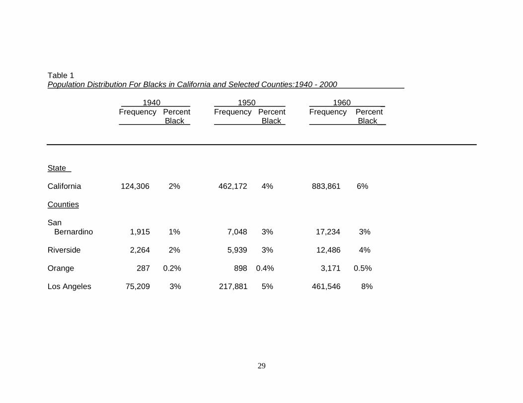
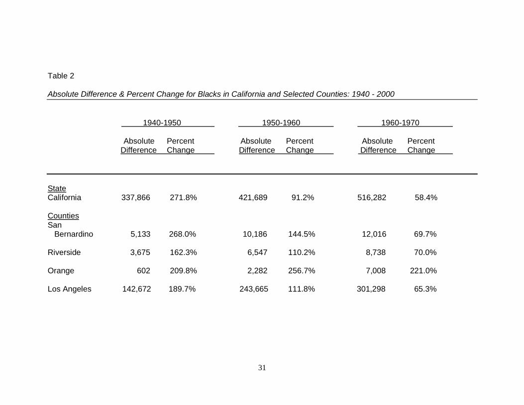
Table 1 displays the population distribution of Blacks for the state of California,
and four Southern California counties: Los Angeles, Orange, San Bernardino, and
Riverside. Table 2 displays percent change of the population by decade for the same
areas. The proportion of Blacks in California is low relative to Whites and other
Americans in the state over the study period. In 1980 Blacks achieve their highest
proportion in the state with at 7.7% or 1,819,281 persons.
Blacks have the greatest growth at the beginning of the study period and the
smallest in the last two decades of the study period. The Black population in 1940 is a
low 1.8% (124,306). During the 1940‟s this population grew to 462,172 persons –
29
Table 1 Population Distribution For Blacks in California and Selected Counties:1940 - 2000 1940 1950 1960 _ Frequency Percent Frequency Percent Frequency Percent Black Black Black__
State California 124,306 2% 462,172 4% 883,861 6% Counties San Bernardino 1,915 1% 7,048 3% 17,234 3% Riverside 2,264 2% 5,939 3% 12,486 4% Orange 287 0.2% 898 0.4% 3,171 0.5% Los Angeles 75,209 3% 217,881 5% 461,546 8%
30
Table 1 (continued) Population Distribution For Blacks in California and Selected Counties: 1940 - 2000 1970 1980 1990 2000 Frequency Percent Frequency Percent Frequency Percent Frequency Percent Black Black Black Black _
State California 1,400,143 7% 1,819,281 8% 2,110,700 7% 2,147,885 6% Counties San Bernardino 29,250 4% 47,813 5% 110,352 8% 147,488 9% Riverside 21,224 5% 30,857 5% 60,063 5% 92,186 6% Orange 10,179 1% 25,287 1% 38,825 2% 40,153 1% Los Angeles 762,844 11% 943,968 13% 946,862 11% 891,194 9%
Source: U.S. Bureau of the Census of Population, 1940 Census of Population, Tables 2, 4, 3, 5, 21, 30 and 31; 1950 Census of Population, Tables 4, 5, 7, 14, 33, 34, 38, 40, 41 and 42; 1970 Census of Population, Tables 6, 7 and 9; 1980 Census of Population, Tables 15; 1990 Census of Population and Housing, STF3 Tables P001, P008, P009, P012; and 2000 Census of Population and Housing, SF3 Tables P6, P7
31
Table 2 Absolute Difference & Percent Change for Blacks in California and Selected Counties: 1940 - 2000
1940-1950 1950-1960 1960-1970 Absolute Percent Absolute Percent Absolute Percent Difference Change Difference Change Difference Change
State California 337,866 271.8% 421,689 91.2% 516,282 58.4% Counties San Bernardino 5,133 268.0% 10,186 144.5% 12,016 69.7% Riverside 3,675 162.3% 6,547 110.2% 8,738 70.0% Orange 602 209.8% 2,282 256.7% 7,008 221.0% Los Angeles 142,672 189.7% 243,665 111.8% 301,298 65.3%
32
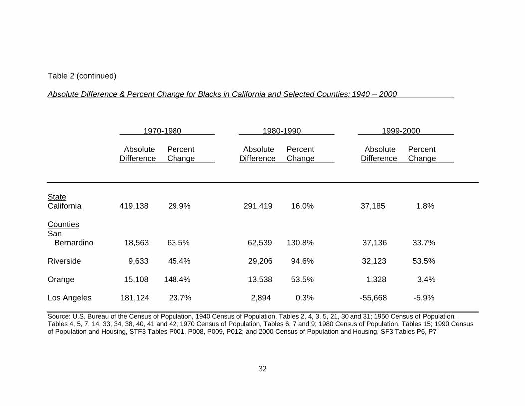
Table 2 (continued) Absolute Difference & Percent Change for Blacks in California and Selected Counties: 1940 – 2000 1970-1980 1980-1990 1999-2000 Absolute Percent Absolute Percent Absolute Percent Difference Change Difference Change Difference Change
State California 419,138 29.9% 291,419 16.0% 37,185 1.8% Counties San Bernardino 18,563 63.5% 62,539 130.8% 37,136 33.7% Riverside 9,633 45.4% 29,206 94.6% 32,123 53.5% Orange 15,108 148.4% 13,538 53.5% 1,328 3.4% Los Angeles 181,124 23.7% 2,894 0.3% -55,668 -5.9% Source: U.S. Bureau of the Census of Population, 1940 Census of Population, Tables 2, 4, 3, 5, 21, 30 and 31; 1950 Census of Population, Tables 4, 5, 7, 14, 33, 34, 38, 40, 41 and 42; 1970 Census of Population, Tables 6, 7 and 9; 1980 Census of Population, Tables 15; 1990 Census of Population and Housing, STF3 Tables P001, P008, P009, P012; and 2000 Census of Population and Housing, SF3 Tables P6, P7
33
an increase of 2.7%. Between 1950 and 1960, California‟s Black population grew 0.9%
to 883,861 persons. During the 1960‟s and 1970‟s Blacks increased by 0.6% to
1,400,143 and by 0.3% to 1,819,281, respectively. The Black population slowed in
growth during the 1980‟s and 1990‟s. Between 1980 and 1990, Blacks grew in size to
2,110,700 - reflecting an increase of 0.2%. By 2000, the Black population grew to
2,147,885 – an increase of only 0.02%.
4.1.2 County growth.
The proportion of Blacks in Los Angeles County is consistently higher than San
Bernardino, Riverside and Orange Counties over the study period. Orange County has a
consistently low proportion of Black residents. Both San Bernardino and Riverside
counties begin with a low proportion of Blacks but steadily increase across the study
period. Los Angeles County increases most dramatically, peaks in 1980, and then
decreases in 1990 and 2000.
San Bernardino County has its greatest growth in Black population from 1940 to
1950 – from 1,915 to 7,048 persons – an increase of 268%. Riverside County also has its
greatest growth in Black population from 1940 to 1950 from 2,264 to 5,939 persons – an
increase of 162%. Los Angeles County follows the same trend during the same decade as
both San Bernardino and Riverside counties. The Black population in Los Angeles
County increased of 190% - from 75,209 to 217,881 persons. However, between 1990
and 2000 the Black population decreases by 6% from 946,862 to 891,194 persons.
34
4.1.3 City growth.
Table 3 displays the population distribution of Blacks for the city of Los Angeles,
and the 15 cities comprising the Inland Empire. Table 4 displays percent change of the
population by decade for the same areas. The greatest growth for Los Angeles‟ Black
population occurs from 1940 to 1950 – from 63,774 to 171, 209 persons. However,
between 1980 and 1990 there is a 9% decrease from 505,210 to 460,893 persons. From
1990 to 2000 there is another decrease of 13% to 399,057 persons. For three Inland
Empire cities there is some dramatic growth. Between 1980 and 1990, Moreno Valley‟s
Black population grows from 35 to 15,667 persons. Between 1960 and 1970, Chino‟s
Black population grows from 4 to 897. Rialto‟s Black population grows from 4 to 794
persons between 1960 and 1970.
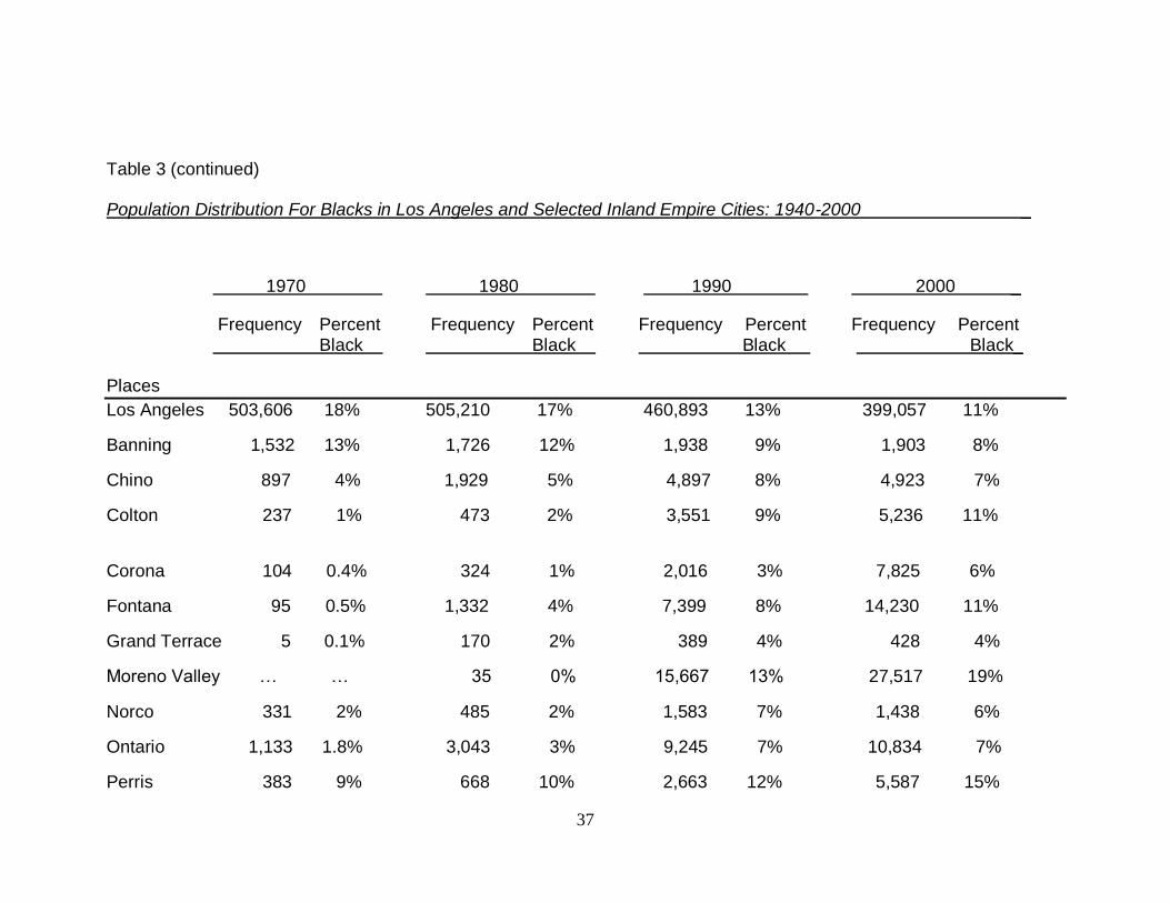
During the study period the proportion of Blacks in Los Angeles increase steadily,
peaks in 1970, and then decreases by 2000. Twelve Inland Empire cities have a rise in
the proportion of Blacks over the study period: Colton, Corona, Fontana, Grand Terrace,
Moreno Valley, Norco, Ontario, Perris, Rancho Cucamonga, Rialto, Riverside, and San
Bernardino. The proportion of Blacks in Banning and Chino increases than decreases
over the study period, peaking at 1970 and 1990, respectively.
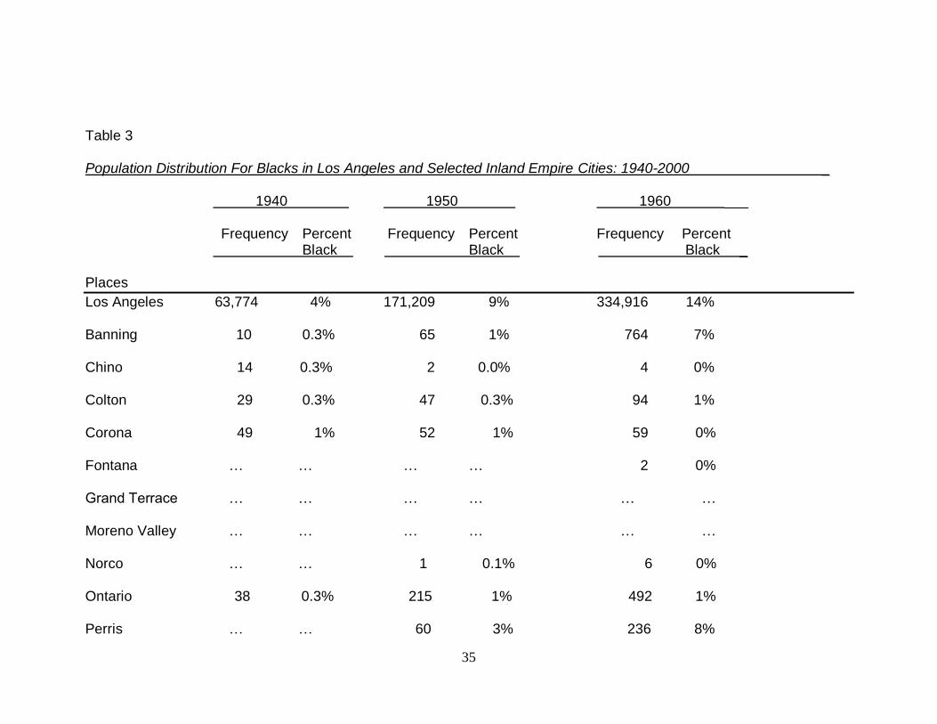
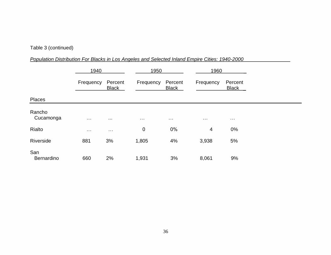
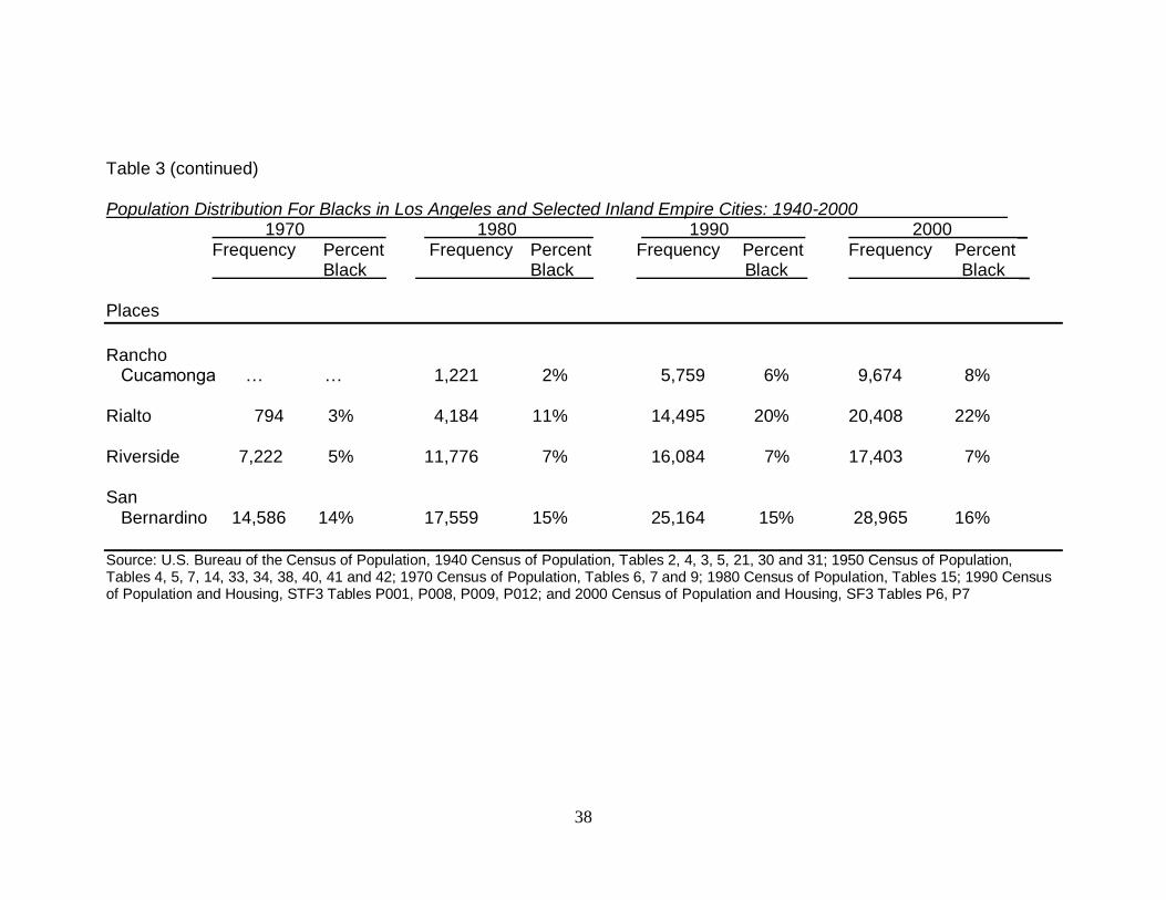
Three Inland Empire cities maintain the greatest proportion of Blacks over the
study period: Riverside, San Bernardino and Rialto. The proportion of Blacks in
Riverside was 881 persons or 2.5% in 1940, and 1,805 persons or 3.9% in 1950. The
proportion of Blacks in San Bernardino was 8,061 persons or 8.8% in 1960, 14,586
persons or 13.6% in 1970, and 17,559 persons or 14.8% in 1980. The proportion of
Blacks in Rialto was 14,495 persons or 20% in 1990, and 20,408 persons or 22.3% by
35
Table 3 Population Distribution For Blacks in Los Angeles and Selected Inland Empire Cities: 1940-2000 _ 1940 1950 1960 ___ Frequency Percent Frequency Percent Frequency Percent Black Black Black _ Places
Los Angeles 63,774 4% 171,209 9% 334,916 14% Banning 10 0.3% 65 1% 764 7% Chino 14 0.3% 2 0.0% 4 0% Colton 29 0.3% 47 0.3% 94 1% Corona 49 1% 52 1% 59 0% Fontana … … … … 2 0% Grand Terrace … … … … … … Moreno Valley … … … … … … Norco … … 1 0.1% 6 0% Ontario 38 0.3% 215 1% 492 1% Perris … … 60 3% 236 8%
36
Table 3 (continued) Population Distribution For Blacks in Los Angeles and Selected Inland Empire Cities: 1940-2000 1940 1950 1960 _ Frequency Percent Frequency Percent Frequency Percent Black Black Black _ Places
Rancho Cucamonga … ... … … … … Rialto … … 0 0% 4 0% Riverside 881 3% 1,805 4% 3,938 5% San Bernardino 660 2% 1,931 3% 8,061 9%
37
Table 3 (continued) Population Distribution For Blacks in Los Angeles and Selected Inland Empire Cities: 1940-2000 _
1970 1980 1990 2000 _
Frequency Percent Frequency Percent Frequency Percent Frequency Percent Black Black Black Black_ Places
Los Angeles 503,606 18% 505,210 17% 460,893 13% 399,057 11%
Banning 1,532 13% 1,726 12% 1,938 9% 1,903 8%
Chino 897 4% 1,929 5% 4,897 8% 4,923 7%
Colton 237 1% 473 2% 3,551 9% 5,236 11%
Corona 104 0.4% 324 1% 2,016 3% 7,825 6%
Fontana 95 0.5% 1,332 4% 7,399 8% 14,230 11%
Grand Terrace 5 0.1% 170 2% 389 4% 428 4%
Moreno Valley … … 35 0% 15,667 13% 27,517 19%
Norco 331 2% 485 2% 1,583 7% 1,438 6%
Ontario 1,133 1.8% 3,043 3% 9,245 7% 10,834 7%
Perris 383 9% 668 10% 2,663 12% 5,587 15%
38
Table 3 (continued) Population Distribution For Blacks in Los Angeles and Selected Inland Empire Cities: 1940-2000 1970 1980 1990 2000 _ Frequency Percent Frequency Percent Frequency Percent Frequency Percent Black Black Black Black _ Places
Rancho Cucamonga … … 1,221 2% 5,759 6% 9,674 8% Rialto 794 3% 4,184 11% 14,495 20% 20,408 22% Riverside 7,222 5% 11,776 7% 16,084 7% 17,403 7% San Bernardino 14,586 14% 17,559 15% 25,164 15% 28,965 16%
Source: U.S. Bureau of the Census of Population, 1940 Census of Population, Tables 2, 4, 3, 5, 21, 30 and 31; 1950 Census of Population, Tables 4, 5, 7, 14, 33, 34, 38, 40, 41 and 42; 1970 Census of Population, Tables 6, 7 and 9; 1980 Census of Population, Tables 15; 1990 Census of Population and Housing, STF3 Tables P001, P008, P009, P012; and 2000 Census of Population and Housing, SF3 Tables P6, P7
39
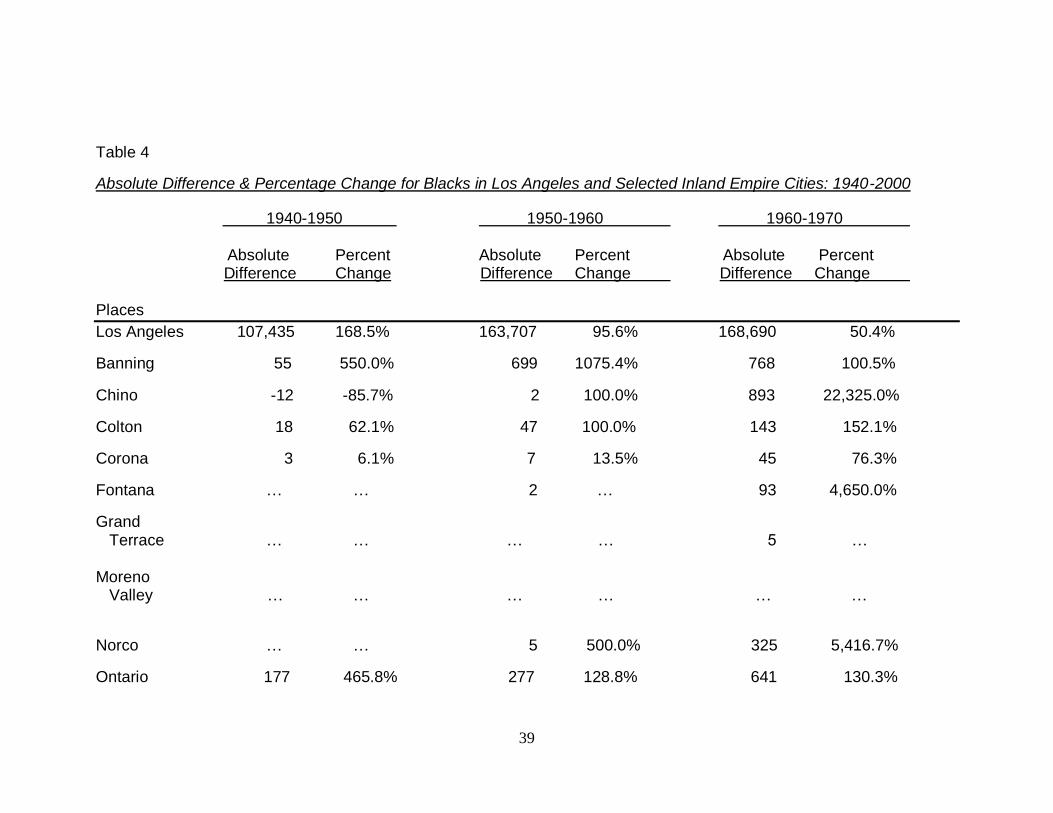
Table 4
Absolute Difference & Percentage Change for Blacks in Los Angeles and Selected Inland Empire Cities: 1940-2000
1940-1950 1950-1960 1960-1970 Absolute Percent Absolute Percent Absolute Percent
Difference Change Difference Change Difference Change Places
Los Angeles 107,435 168.5% 163,707 95.6% 168,690 50.4%
Banning 55 550.0% 699 1075.4% 768 100.5%
Chino -12 -85.7% 2 100.0% 893 22,325.0%
Colton 18 62.1% 47 100.0% 143 152.1%
Corona 3 6.1% 7 13.5% 45 76.3%
Fontana … … 2 … 93 4,650.0%
Grand Terrace … … … … 5 … Moreno Valley … … … … … …
Norco … … 5 500.0% 325 5,416.7%
Ontario 177 465.8% 277 128.8% 641 130.3%
40
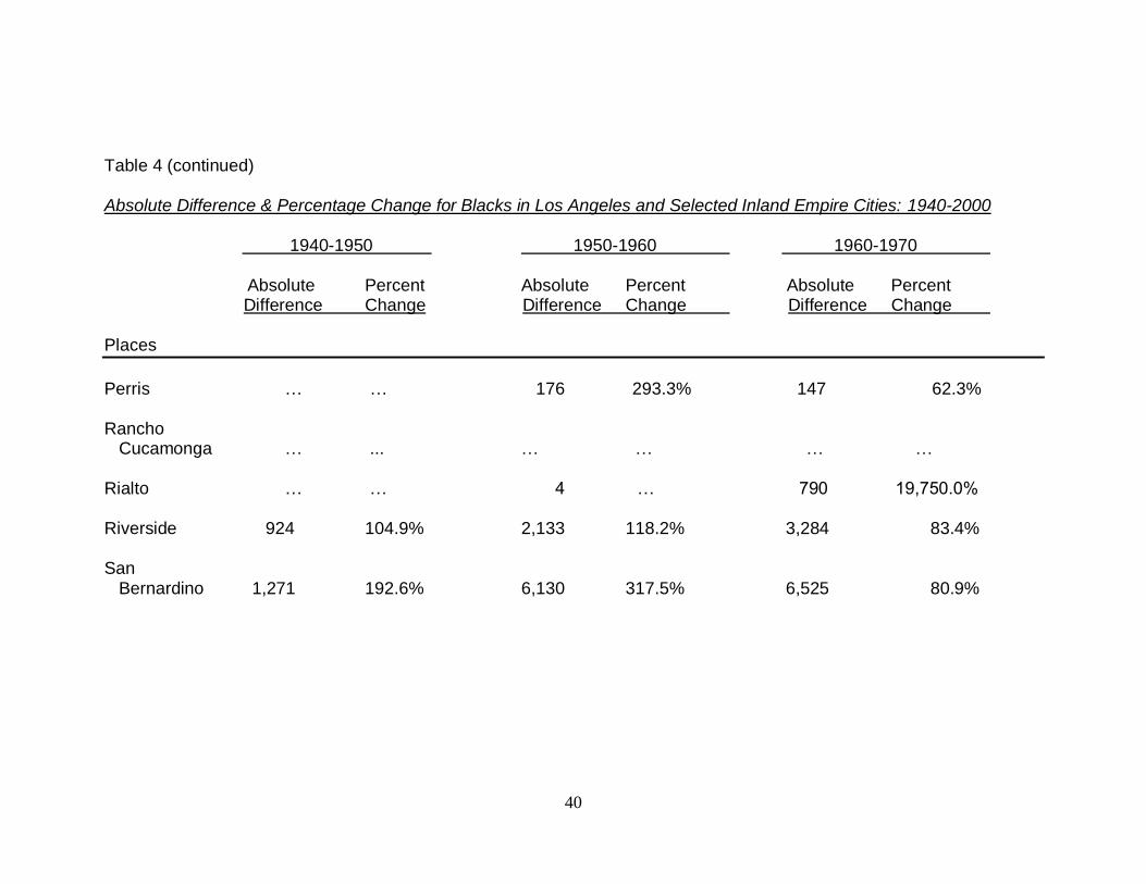
Table 4 (continued) Absolute Difference & Percentage Change for Blacks in Los Angeles and Selected Inland Empire Cities: 1940-2000 1940-1950 1950-1960 1960-1970 Absolute Percent Absolute Percent Absolute Percent
Difference Change Difference Change Difference Change Places
Perris … … 176 293.3% 147 62.3% Rancho Cucamonga … ... … … … … Rialto … … 4 … 790 19,750.0% Riverside 924 104.9% 2,133 118.2% 3,284 83.4% San Bernardino 1,271 192.6% 6,130 317.5% 6,525 80.9%
41
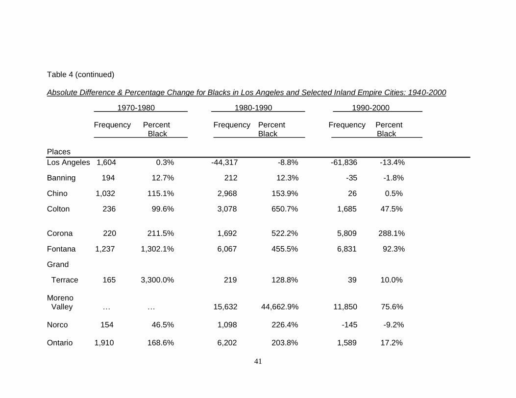
Table 4 (continued) Absolute Difference & Percentage Change for Blacks in Los Angeles and Selected Inland Empire Cities: 1940-2000
1970-1980 1980-1990 1990-2000
Frequency Percent Frequency Percent Frequency Percent Black Black Black Places
Los Angeles 1,604 0.3% -44,317 -8.8% -61,836 -13.4%
Banning 194 12.7% 212 12.3% -35 -1.8%
Chino 1,032 115.1% 2,968 153.9% 26 0.5%
Colton 236 99.6% 3,078 650.7% 1,685 47.5%
Corona 220 211.5% 1,692 522.2% 5,809 288.1%
Fontana 1,237 1,302.1% 6,067 455.5% 6,831 92.3%
Grand
Terrace 165 3,300.0% 219 128.8% 39 10.0% Moreno Valley … … 15,632 44,662.9% 11,850 75.6% Norco 154 46.5% 1,098 226.4% -145 -9.2% Ontario 1,910 168.6% 6,202 203.8% 1,589 17.2%
42
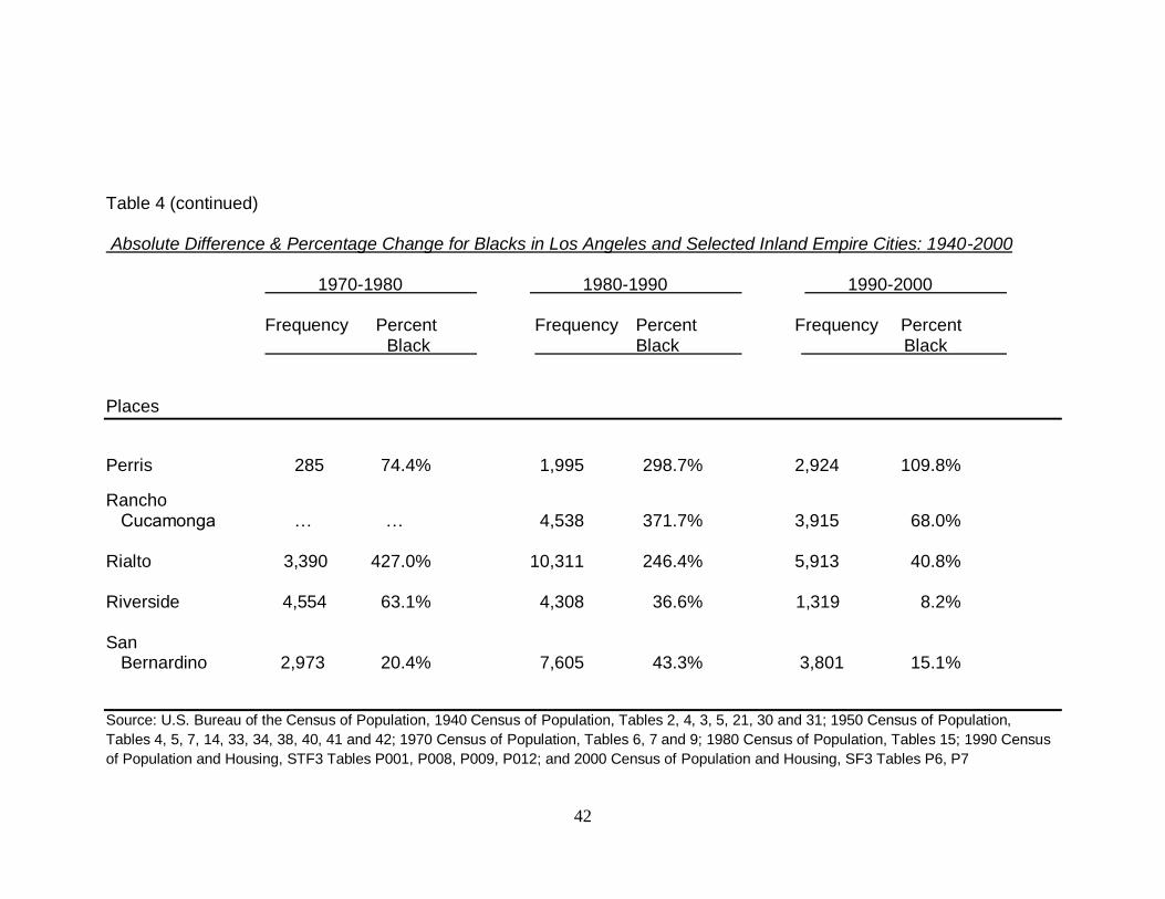
Table 4 (continued) Absolute Difference & Percentage Change for Blacks in Los Angeles and Selected Inland Empire Cities: 1940-2000 1970-1980 1980-1990 1990-2000 Frequency Percent Frequency Percent Frequency Percent Black Black Black Places
Perris 285 74.4% 1,995 298.7% 2,924 109.8%
Rancho Cucamonga … … 4,538 371.7% 3,915 68.0% Rialto 3,390 427.0% 10,311 246.4% 5,913 40.8% Riverside 4,554 63.1% 4,308 36.6% 1,319 8.2% San Bernardino 2,973 20.4% 7,605 43.3% 3,801 15.1%
Source: U.S. Bureau of the Census of Population, 1940 Census of Population, Tables 2, 4, 3, 5, 21, 30 and 31; 1950 Census of Population,
Tables 4, 5, 7, 14, 33, 34, 38, 40, 41 and 42; 1970 Census of Population, Tables 6, 7 and 9; 1980 Census of Population, Tables 15; 1990 Census
of Population and Housing, STF3 Tables P001, P008, P009, P012; and 2000 Census of Population and Housing, SF3 Tables P6, P7
43
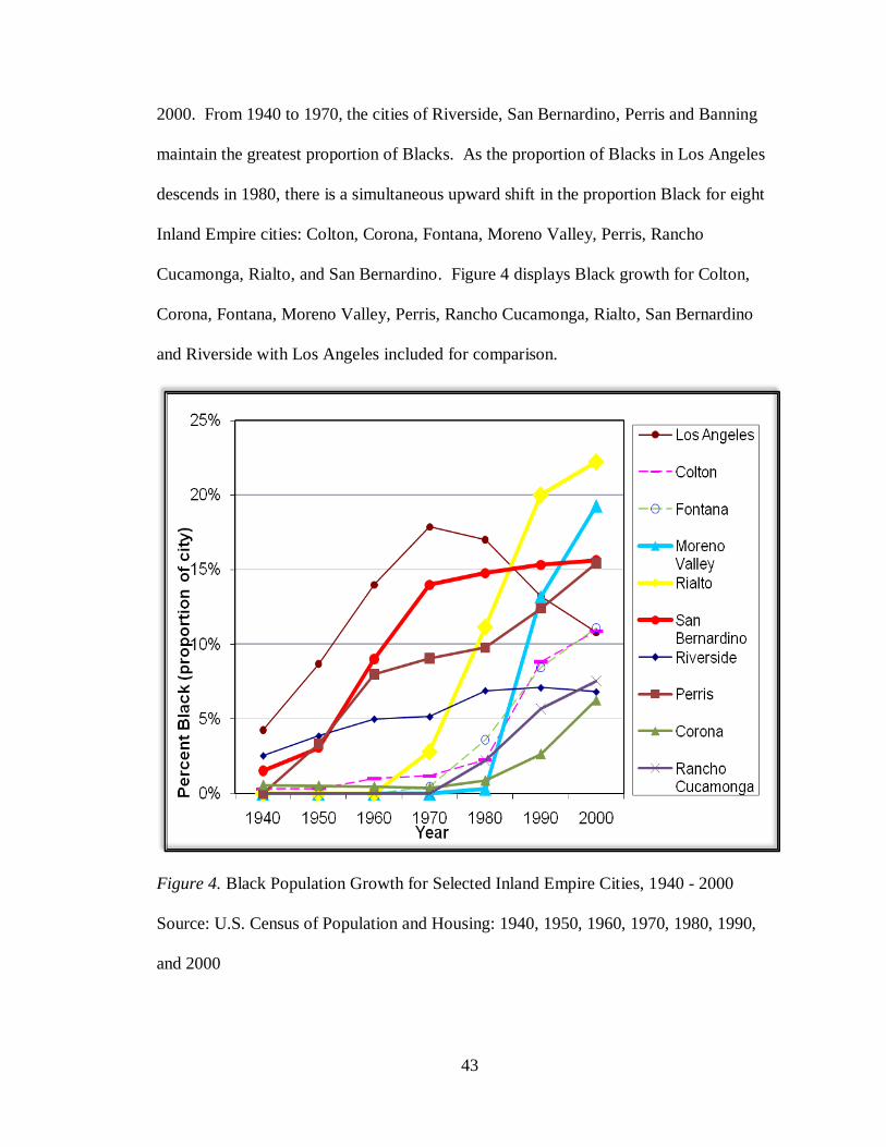
2000. From 1940 to 1970, the cities of Riverside, San Bernardino, Perris and Banning
maintain the greatest proportion of Blacks. As the proportion of Blacks in Los Angeles
descends in 1980, there is a simultaneous upward shift in the proportion Black for eight
Inland Empire cities: Colton, Corona, Fontana, Moreno Valley, Perris, Rancho
Cucamonga, Rialto, and San Bernardino. Figure 4 displays Black growth for Colton,
Corona, Fontana, Moreno Valley, Perris, Rancho Cucamonga, Rialto, San Bernardino
and Riverside with Los Angeles included for comparison.
Figure 4. Black Population Growth for Selected Inland Empire Cities, 1940 - 2000
Source: U.S. Census of Population and Housing: 1940, 1950, 1960, 1970, 1980, 1990,
and 2000
44
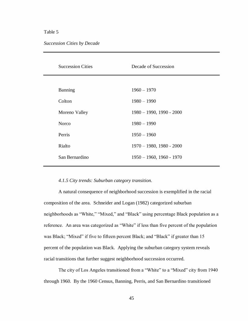
4.1.4 City trends: Succession cities.
Table 5 displays succession cities by decade. The type of change that occurs in a
ten-year period can be classified as succession, stability, and displacement relative to the
number of Blacks present at the time (Lee and Wood 1991). The terms succession,
displacement, and stability are based on the notion that a neighborhood is vulnerable to
white-to-black succession when the percent of Blacks reach the “tipping point” range of
10% to 30% (Steines, 1977; Duncan and Duncan, 1957; Wolf 1963). When the
percentage of Blacks increases by five percentage points in a given decade, it is called
succession. When the percentage of Blacks decreases by five percentage points it is
called displacement. When there is an increase or decrease in population of less than five
percentage points, it is called stability. The percentage points were obtained by
calculating the absolute difference in percent Black. The results suggest succession may
have occurred in the following seven cities: Banning, Colton, Moreno Valley, Norco,
Perris, Rialto, and San Bernardino during the following decades:
45
Table 5
Succession Cities by Decade
Succession Cities Decade of Succession
Banning 1960 – 1970
Colton 1980 – 1990
Moreno Valley 1980 – 1990, 1990 - 2000
Norco 1980 – 1990
Perris 1950 – 1960
Rialto 1970 – 1980, 1980 - 2000
San Bernardino 1950 – 1960, 1960 - 1970
4.1.5 City trends: Suburban category transition.
A natural consequence of neighborhood succession is exemplified in the racial
composition of the area. Schneider and Logan (1982) categorized suburban
neighborhoods as “White,” “Mixed,” and “Black” using percentage Black population as a
reference. An area was categorized as “White” if less than five percent of the population
was Black; “Mixed” if five to fifteen percent Black; and “Black” if greater than 15
percent of the population was Black. Applying the suburban category system reveals
racial transitions that further suggest neighborhood succession occurred.
The city of Los Angeles transitioned from a “White” to a “Mixed” city from 1940
through 1960. By the 1960 Census, Banning, Perris, and San Bernardino transitioned
46
from being “White” to being “Mixed” suburbs. Riverside shows up for the first time in
the 1960 Census as a “Mixed” suburb. By 1970, Los Angeles moved from the “Mixed”
to the “Black” category. By the 1980 Census, both Chino and Rialto transitioned from a
“White” suburban status to being “Mixed.”
The Census of 1990 reveals Rialto as the first city in the Inland Empire to
transition from being a “Mixed” suburb to a “Black” suburb; indicating that greater than
15% of the population was composed of Blacks. During this same Census year Colton,
Fontana, Moreno Valley, Norco and Ontario transitioned from being “White” suburbs to
being “Mixed” suburbs. Meanwhile, Los Angeles moved back to the “Mixed” category
and remained there throughout the 2000 Census. By this time Moreno Valley and San
Bernardino join Rialto as “Black” suburbs, while the populations in Corona and Rancho
Cucamonga make a jump from being “White” to “Mixed.” It is important to note that
Rialto made the most dramatic suburban transition over the study period, moving from
being primarily “White” (1960 - 1970) to “Mixed” (1980) to “Black” (1990 - 2000) in a
thirty year period.
4.2 Changes in Households: Housing Unit, Householder and Tenure
Table 6 displays the frequency distribution of housing units and households for
the years 1980, 1990 and 2000. There was a considerable increase in the number of
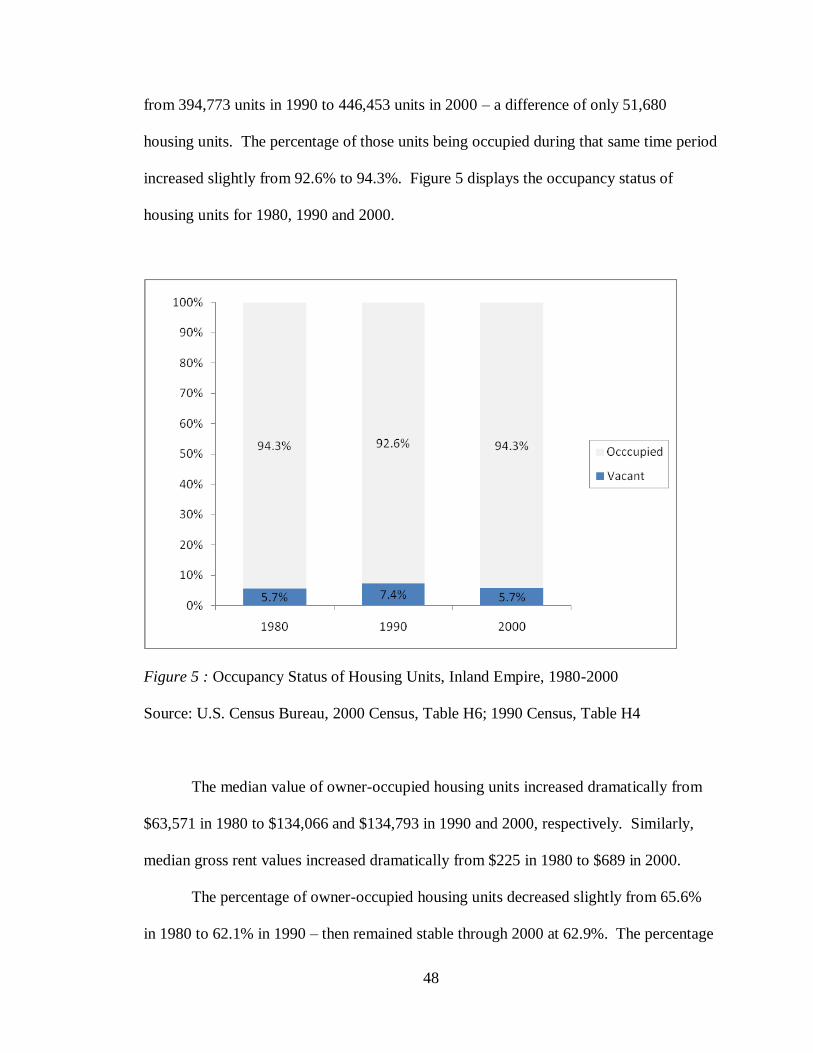
housing units in the Inland Empire – from 239,893 units in 1980 to 394,773 units in 1990
- a difference of 154,880 housing units. However, the percentage of those housing units
being occupied during that same time period declined slight from 94.3% to 92.6%. There
was a modest increase in the number of housing units compared to the previous decade –

47
Table 6 Frequency Distribution of Housing Units and Households for Inland Empire, 1980 - 2000
1980 1990 2000 Frequency Percent Frequency Percent Frequency Percent
Total Housing Units: 239,893 394,773 446,453 Vacant 13,562 5.7% 29,054 7.4% 25,567 5.7% Occupied: 226,331 94.3% 365,719 92.6% 420,886 94.3% Owner 148,465 65.6% 227,245 62.1% 264,718 62.9% Median Value $63,571 $134,066 $134,793 Renter 77,866 34.4% 138,474 37.9% 156,168 37.1% Median Rent $225 $580 $689
Source: U.S. Bureau of the Census of Population, 1980 Census of Housing, Table 1; 1990 Census of Population and Housing, STF3 Tables H43, H61; 2000 Census of Population and Housing, SF3 Tables H63, H76
48
from 394,773 units in 1990 to 446,453 units in 2000 – a difference of only 51,680
housing units. The percentage of those units being occupied during that same time period
increased slightly from 92.6% to 94.3%. Figure 5 displays the occupancy status of
housing units for 1980, 1990 and 2000.
Figure 5 : Occupancy Status of Housing Units, Inland Empire, 1980-2000
Source: U.S. Census Bureau, 2000 Census, Table H6; 1990 Census, Table H4
The median value of owner-occupied housing units increased dramatically from
$63,571 in 1980 to $134,066 and $134,793 in 1990 and 2000, respectively. Similarly,
median gross rent values increased dramatically from $225 in 1980 to $689 in 2000.
The percentage of owner-occupied housing units decreased slightly from 65.6%
in 1980 to 62.1% in 1990 – then remained stable through 2000 at 62.9%. The percentage
49
of renter-occupied housing units increased slightly from 34.4% in 1980 to 37.9% in 1990
– then remained stable through 2000 at 37.1%.
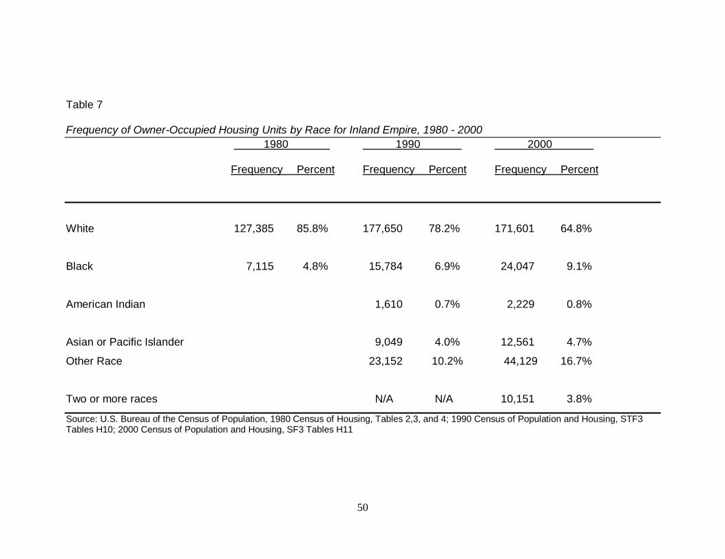
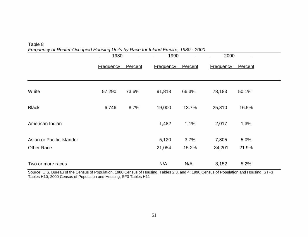
Tables 7 and 8 display the frequency distribution of renter and owner-occupied
housing units by race for the Inland Empire. In examining the breakdown, an interesting
pattern begins to emerge. The percentage of White owner-occupied housing units
dropped from 84.9% in 1980, to 78.2% in 1990, and then dropped again to 64.8% in 2000
– a difference of 45,602 housing units. In contrast to this dramatic decrease, the
percentage of Black owner-occupied housing units climbed from 4.7% in 1980 to 9.1% in
2000 – an increase of 17,063 housing units.
Equally noticeable, the percentage of White renter-occupied housing units
dropped from 73.0% in 1980 to 50.1% in 2000. In marked contrast, the percentage of
Black renter-occupied housing units increased from 8.5% in 1980, to 13.7% in 1990, and
then increased again to 16.5% in 2000 – a dramatic increase of 19,168 housing units.
It is important to note that for Whites in both renter-occupied and owner-occupied
housing units there was an increase in housing units from 1980 to 1990 and then a
sizeable decrease in both householder types from 1990 to 2000. In contrast, Blacks in
both householder types had a steady increase in housing units from 1990 to 2000.
50
Table 7
Frequency of Owner-Occupied Housing Units by Race for Inland Empire, 1980 - 2000
1980 1990 2000 Frequency Percent Frequency Percent Frequency Percent
White 127,385 85.8% 177,650 78.2% 171,601 64.8%
Black 7,115 4.8% 15,784 6.9% 24,047 9.1%
American Indian 1,610 0.7% 2,229 0.8%
Asian or Pacific Islander 9,049 4.0% 12,561 4.7%
Other Race 23,152 10.2% 44,129 16.7%
Two or more races N/A N/A 10,151 3.8%
Source: U.S. Bureau of the Census of Population, 1980 Census of Housing, Tables 2,3, and 4; 1990 Census of Population and Housing, STF3 Tables H10; 2000 Census of Population and Housing, SF3 Tables H11
51
Table 8 Frequency of Renter-Occupied Housing Units by Race for Inland Empire, 1980 - 2000
1980 1990 2000 Frequency Percent Frequency Percent Frequency Percent
White 57,290 73.6% 91,818 66.3% 78,183 50.1%
Black 6,746 8.7% 19,000 13.7% 25,810 16.5%
American Indian 1,482 1.1% 2,017 1.3%
Asian or Pacific Islander 5,120 3.7% 7,805 5.0%
Other Race 21,054 15.2% 34,201 21.9%
Two or more races N/A N/A 8,152 5.2%
Source: U.S. Bureau of the Census of Population, 1980 Census of Housing, Tables 2,3, and 4; 1990 Census of Population and Housing, STF3 Tables H10; 2000 Census of Population and Housing, SF3 Tables H11

52
4.3 Changes in Households: Family Life Cycle and Socioeconomics
4.3.1 Population age structure.
Population age structures were composed for eleven Inland Empire destination
cities. Four cities were classified as having undergone succession: Colton, Norco, Rialto,
and San Bernardino (Refer to Table 3 and Table 5). Five cities exhibit the fastest rate of
growth over the study period: Chino, Fontana, Grand Terrace, Norco, and Rialto (Refer
to Figure 4 and Table 4). Four cities exhibit slow but steady growth across the study
period: Corona, Ontario, Rancho Cucamonga, and Riverside (Refer to Table 1 and Figure
4). The various cities population age structures provide insight into the population
attracted to these cities and their particular stage in life. These temporal shifts in
population will also be compared with historical events.
Chino.
Figures 6, 7, 8, and 9 display Black population pyramids for 1970, 1980, 1990,
and 2000, respectively. Overall, the age composition of Chino‟s population is
unbalanced and is not reflective of any particular pyramid shape due to the predominance
of males throughout the decades migrating into and out of the prison there. Essentially
there is zero growth during the study period, with the exception of the male age range
that is incarcerated.
In 1970, approximately 97% of Chino‟s population were male and between the
ages of 15 and 54 years old. The female population only made up one percent of the
entire population at that time. In 1980, the male 15 to 54 year old population decreased
to about 73%. The percentage of females increased to 20% during this time, which is
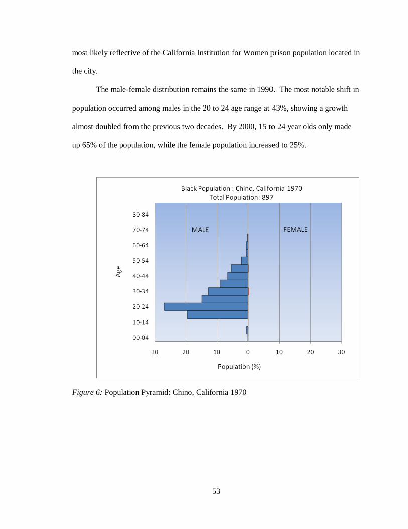
53
most likely reflective of the California Institution for Women prison population located in
the city.
The male-female distribution remains the same in 1990. The most notable shift in
population occurred among males in the 20 to 24 age range at 43%, showing a growth
almost doubled from the previous two decades. By 2000, 15 to 24 year olds only made
up 65% of the population, while the female population increased to 25%.
Figure 6: Population Pyramid: Chino, California 1970
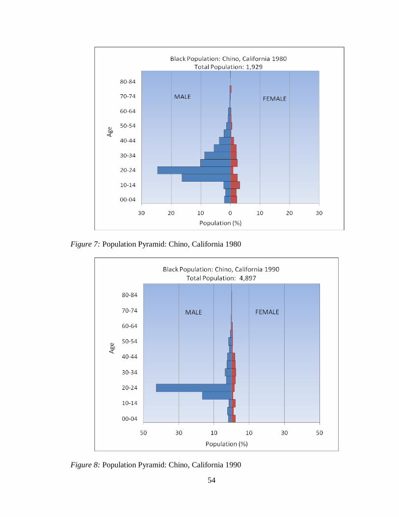
54
Figure 7: Population Pyramid: Chino, California 1980
Figure 8: Population Pyramid: Chino, California 1990

55
Figure 9: Population Pyramid: Chino, California 2000
Colton.
Figures 10, 11, 12, and 13 display Black population pyramids for 1970, 1980,
1990, and 2000, respectively. Overall, Colton‟s population structure moved from rapid to
slow growth over the 40 year time period. Between 1970 and 1980 a significant decrease
occurred for both males and females, a shift which suggests some local event that
impacted population numbers.
The 1970 population pyramid indicates rapid growth occurring in Colton where
the percentage of young people aged zero to nine years (46%) far outweighed that of
older people. About 29% of Colton was comprised of 20 to 49 year olds. The percentage
of women was greater than men in the 15 to 34 age range and the 45 to 85 plus age range.
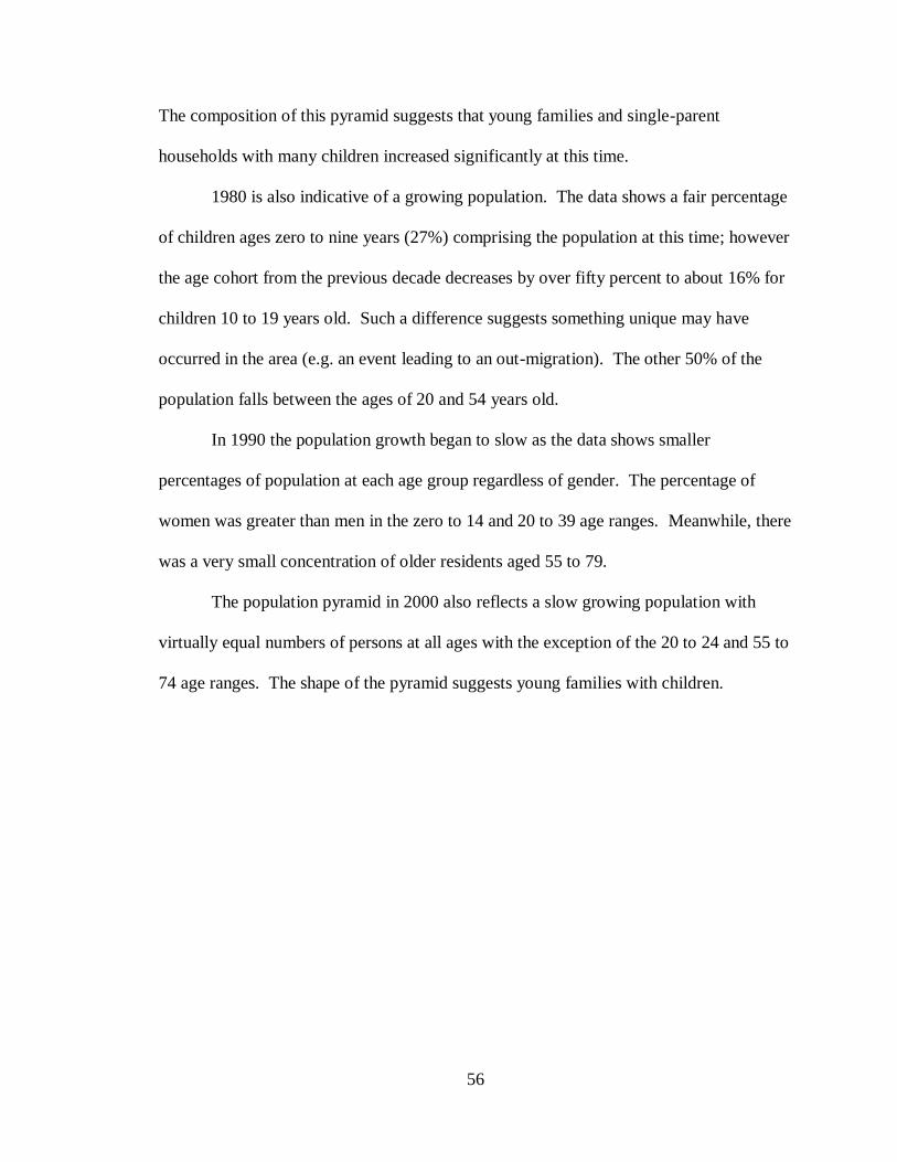
56
The composition of this pyramid suggests that young families and single-parent
households with many children increased significantly at this time.
1980 is also indicative of a growing population. The data shows a fair percentage
of children ages zero to nine years (27%) comprising the population at this time; however
the age cohort from the previous decade decreases by over fifty percent to about 16% for
children 10 to 19 years old. Such a difference suggests something unique may have
occurred in the area (e.g. an event leading to an out-migration). The other 50% of the
population falls between the ages of 20 and 54 years old.
In 1990 the population growth began to slow as the data shows smaller
percentages of population at each age group regardless of gender. The percentage of
women was greater than men in the zero to 14 and 20 to 39 age ranges. Meanwhile, there
was a very small concentration of older residents aged 55 to 79.
The population pyramid in 2000 also reflects a slow growing population with
virtually equal numbers of persons at all ages with the exception of the 20 to 24 and 55 to
74 age ranges. The shape of the pyramid suggests young families with children.
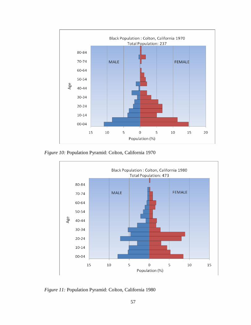
57
Figure 10: Population Pyramid: Colton, California 1970
Figure 11: Population Pyramid: Colton, California 1980
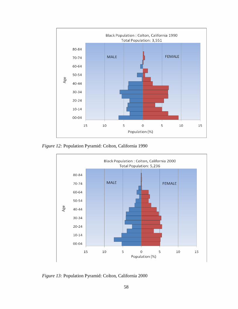
58
Figure 12: Population Pyramid: Colton, California 1990
Figure 13: Population Pyramid: Colton, California 2000
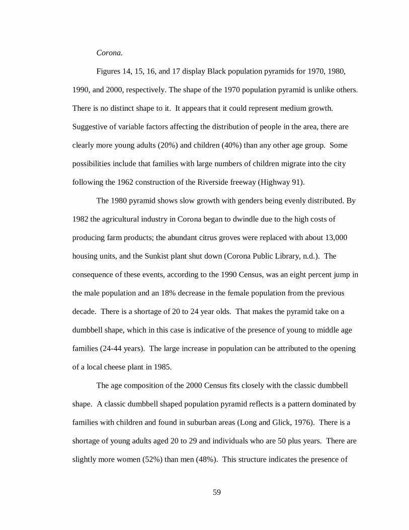
59
Corona.
Figures 14, 15, 16, and 17 display Black population pyramids for 1970, 1980,
1990, and 2000, respectively. The shape of the 1970 population pyramid is unlike others.
There is no distinct shape to it. It appears that it could represent medium growth.
Suggestive of variable factors affecting the distribution of people in the area, there are
clearly more young adults (20%) and children (40%) than any other age group. Some
possibilities include that families with large numbers of children migrate into the city
following the 1962 construction of the Riverside freeway (Highway 91).
The 1980 pyramid shows slow growth with genders being evenly distributed. By
1982 the agricultural industry in Corona began to dwindle due to the high costs of
producing farm products; the abundant citrus groves were replaced with about 13,000
housing units, and the Sunkist plant shut down (Corona Public Library, n.d.). The
consequence of these events, according to the 1990 Census, was an eight percent jump in
the male population and an 18% decrease in the female population from the previous
decade. There is a shortage of 20 to 24 year olds. That makes the pyramid take on a
dumbbell shape, which in this case is indicative of the presence of young to middle age
families (24-44 years). The large increase in population can be attributed to the opening
of a local cheese plant in 1985.
The age composition of the 2000 Census fits closely with the classic dumbbell
shape. A classic dumbbell shaped population pyramid reflects is a pattern dominated by
families with children and found in suburban areas (Long and Glick, 1976). There is a
shortage of young adults aged 20 to 29 and individuals who are 50 plus years. There are
slightly more women (52%) than men (48%). This structure indicates the presence of
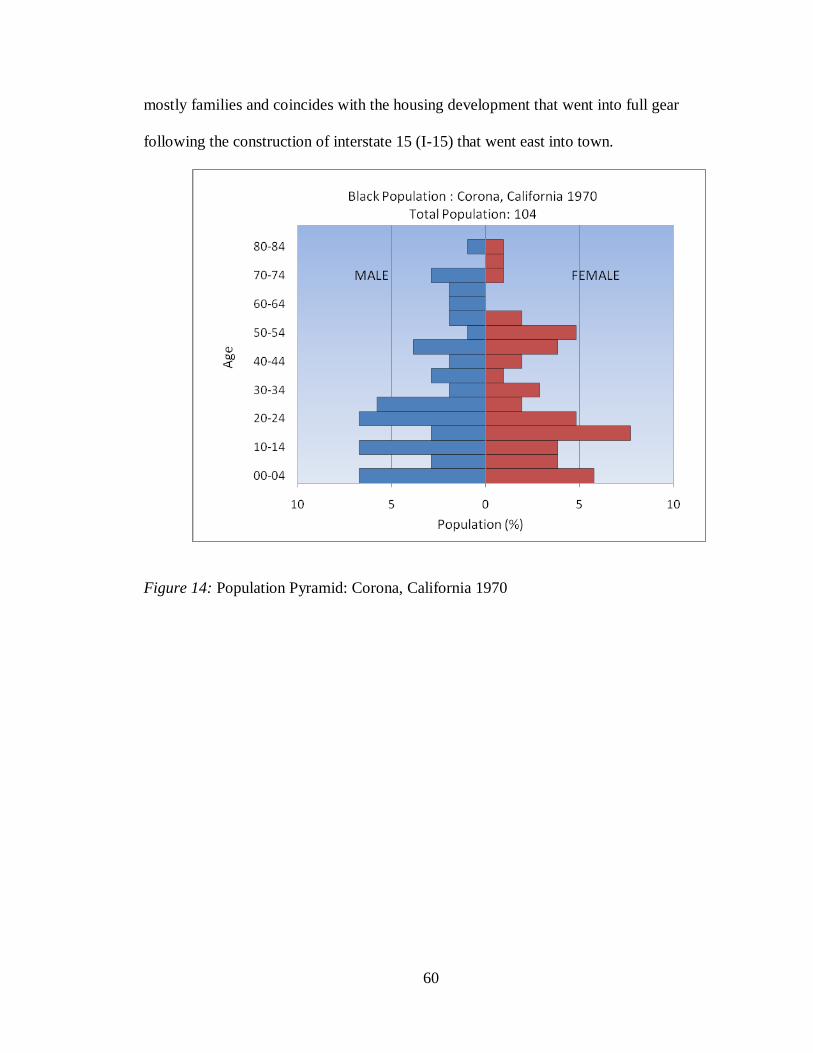
60
mostly families and coincides with the housing development that went into full gear
following the construction of interstate 15 (I-15) that went east into town.
Figure 14: Population Pyramid: Corona, California 1970
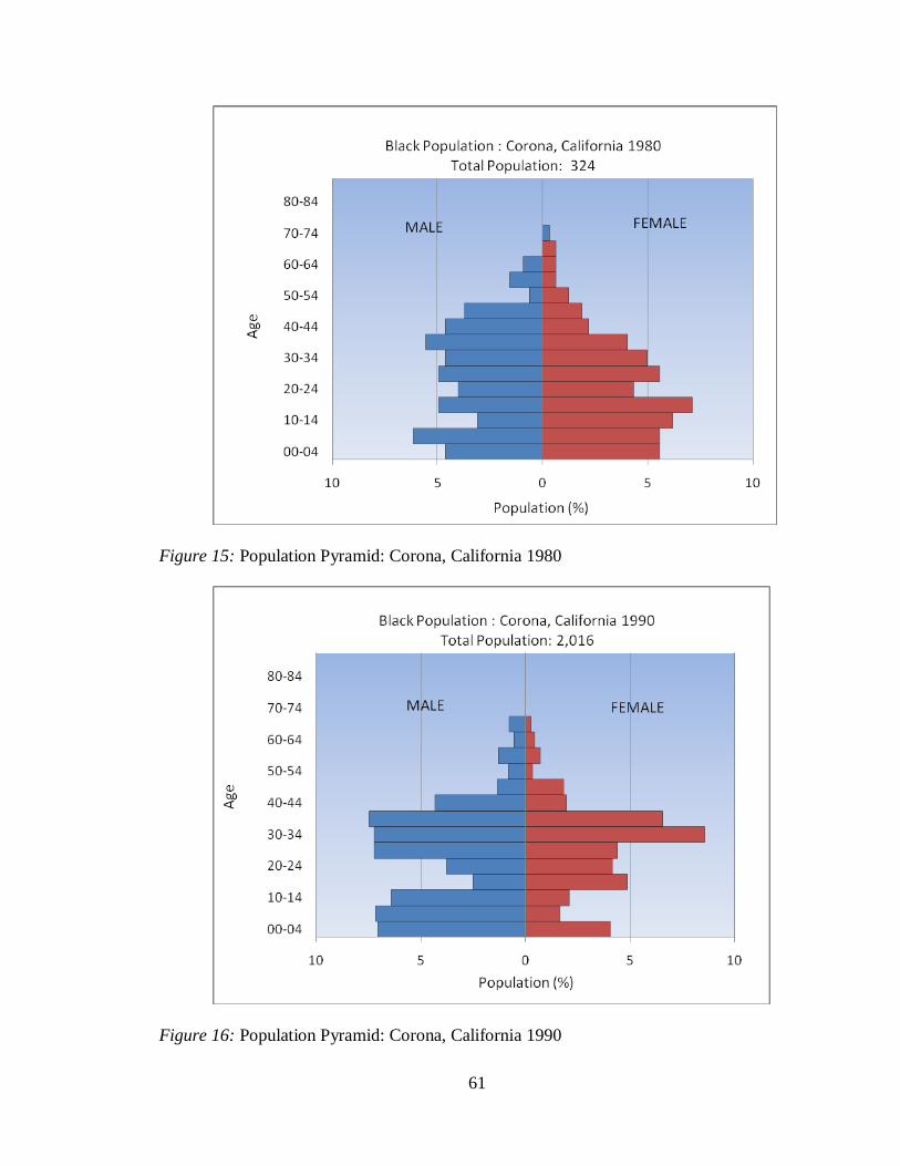
61
Figure 15: Population Pyramid: Corona, California 1980
Figure 16: Population Pyramid: Corona, California 1990
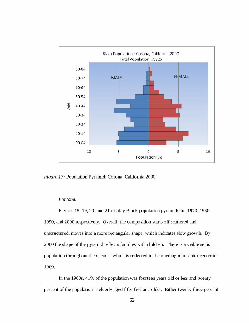
62
Figure 17: Population Pyramid: Corona, California 2000
Fontana.
Figures 18, 19, 20, and 21 display Black population pyramids for 1970, 1980,
1990, and 2000 respectively. Overall, the composition starts off scattered and
unstructured, moves into a more rectangular shape, which indicates slow growth. By
2000 the shape of the pyramid reflects families with children. There is a viable senior
population throughout the decades which is reflected in the opening of a senior center in
1969.
In the 1960s, 41% of the population was fourteen years old or less and twenty
percent of the population is elderly aged fifty-five and older. Either twenty-three percent
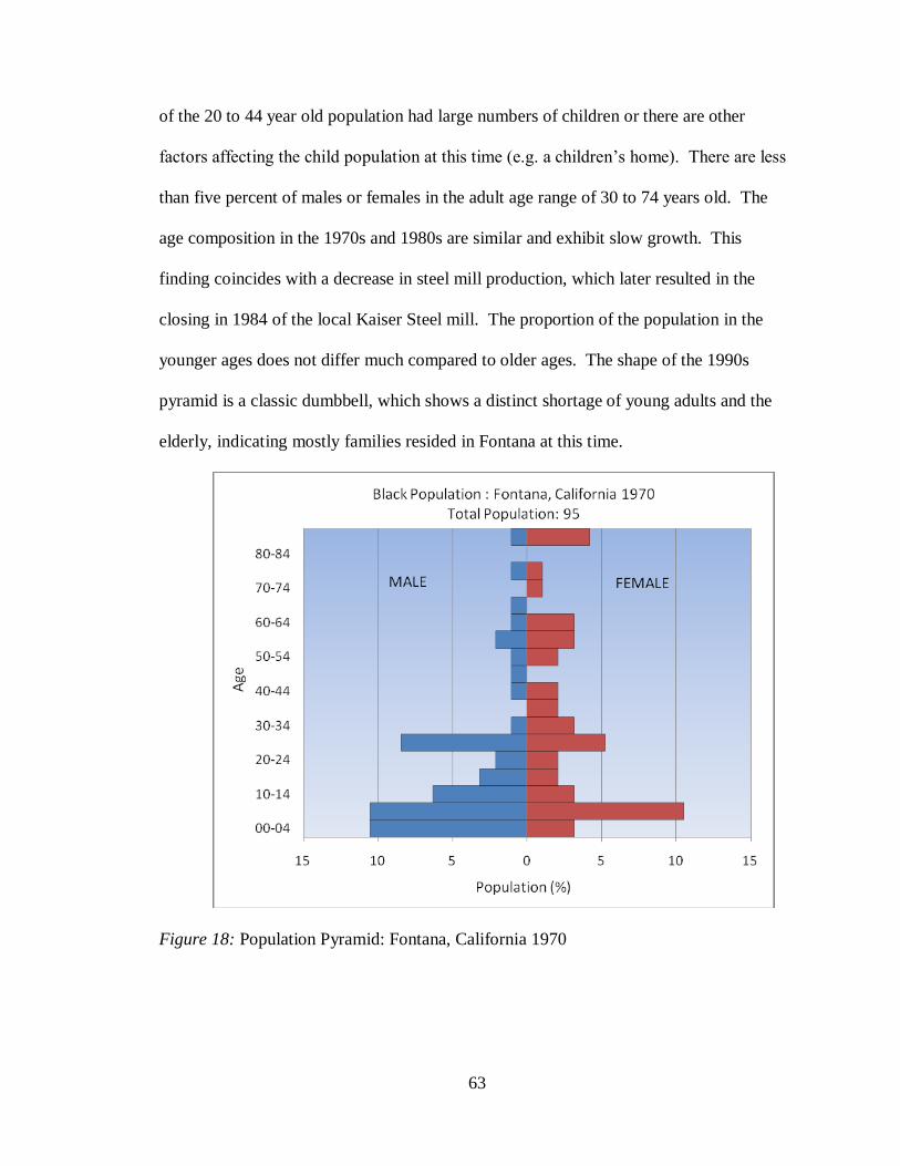
63
of the 20 to 44 year old population had large numbers of children or there are other
factors affecting the child population at this time (e.g. a children‟s home). There are less
than five percent of males or females in the adult age range of 30 to 74 years old. The
age composition in the 1970s and 1980s are similar and exhibit slow growth. This
finding coincides with a decrease in steel mill production, which later resulted in the
closing in 1984 of the local Kaiser Steel mill. The proportion of the population in the
younger ages does not differ much compared to older ages. The shape of the 1990s
pyramid is a classic dumbbell, which shows a distinct shortage of young adults and the
elderly, indicating mostly families resided in Fontana at this time.
Figure 18: Population Pyramid: Fontana, California 1970
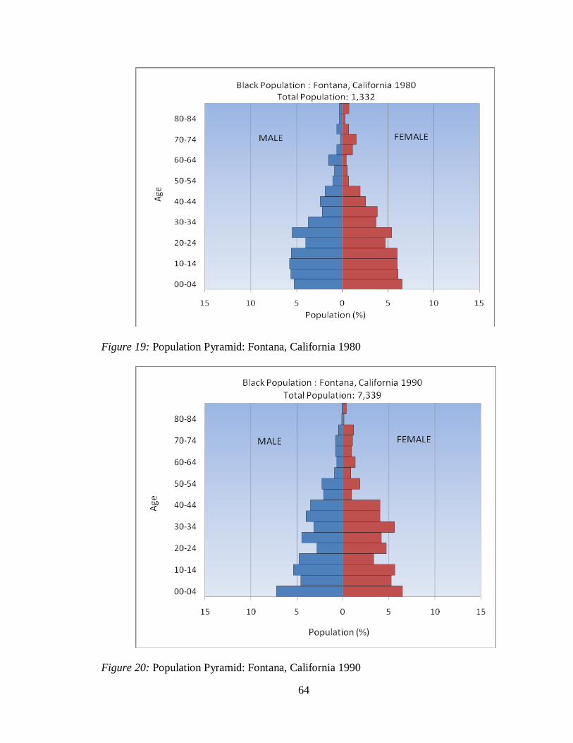
64
Figure 19: Population Pyramid: Fontana, California 1980
Figure 20: Population Pyramid: Fontana, California 1990
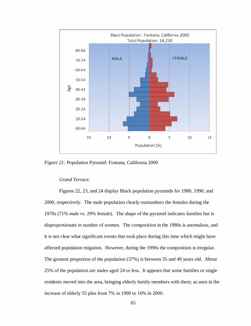
65
Figure 21: Population Pyramid: Fontana, California 2000
Grand Terrace.
Figures 22, 23, and 24 display Black population pyramids for 1980, 1990, and
2000, respectively. The male population clearly outnumbers the females during the
1970s (71% male vs. 29% female). The shape of the pyramid indicates families but is
disproportionate in number of women. The composition in the 1980s is anomalous, and
it is not clear what significant events that took place during this time which might have
affected population migation. However, during the 1990s the composition is irregular.
The greatest proportion of the population (37%) is between 35 and 49 years old. About
25% of the population are males aged 24 or less. It appears that some families or single
residents moved into the area, bringing elderly family members with them; as seen in the
increase of elderly 55 plus from 7% in 1990 to 16% in 2000.
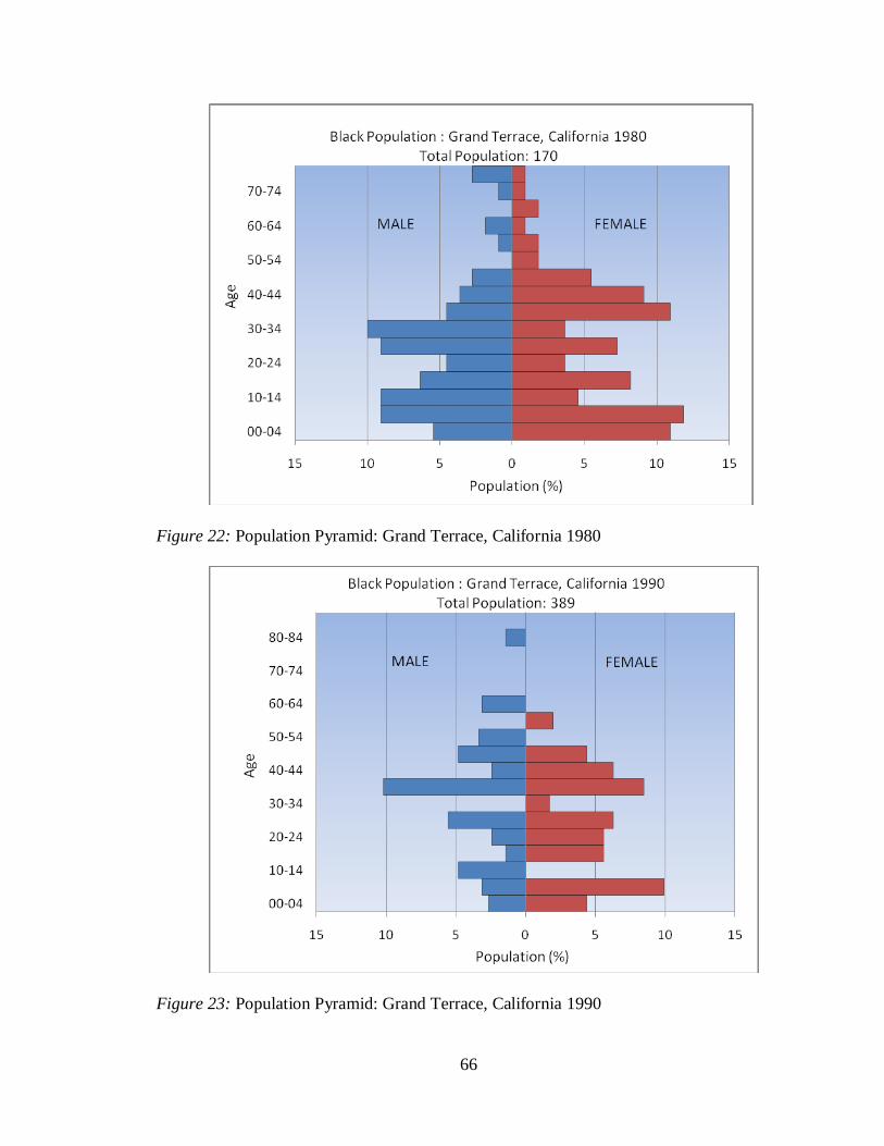
66
Figure 22: Population Pyramid: Grand Terrace, California 1980
Figure 23: Population Pyramid: Grand Terrace, California 1990
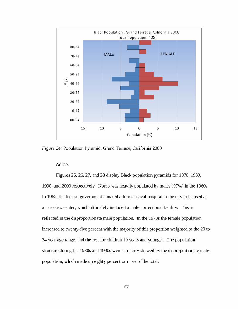
67
Figure 24: Population Pyramid: Grand Terrace, California 2000
Norco.
Figures 25, 26, 27, and 28 display Black population pyramids for 1970, 1980,
1990, and 2000 respectively. Norco was heavily populated by males (97%) in the 1960s.
In 1962, the federal government donated a former naval hospital to the city to be used as
a narcotics center, which ultimately included a male correctional facility. This is
reflected in the disproportionate male population. In the 1970s the female population
increased to twenty-five percent with the majority of this proportion weighted to the 20 to
34 year age range, and the rest for children 19 years and younger. The population
structure during the 1980s and 1990s were similarly skewed by the disproportionate male
population, which made up eighty percent or more of the total.
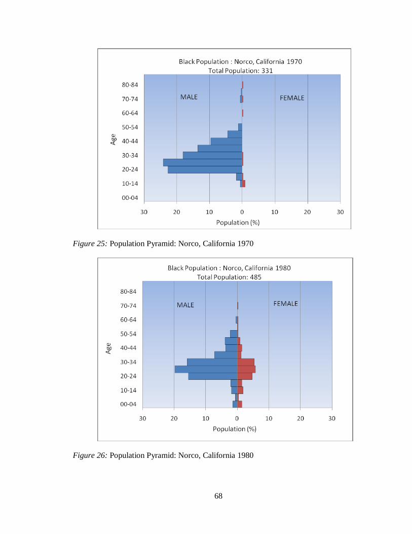
68
Figure 25: Population Pyramid: Norco, California 1970
Figure 26: Population Pyramid: Norco, California 1980
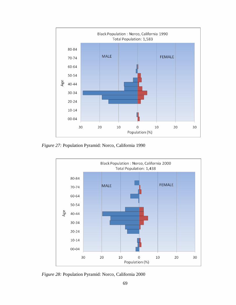
69
Figure 27: Population Pyramid: Norco, California 1990
Figure 28: Population Pyramid: Norco, California 2000
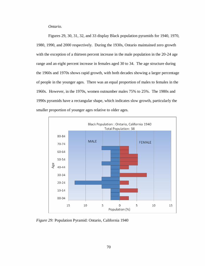
70
Ontario.
Figures 29, 30, 31, 32, and 33 display Black population pyramids for 1940, 1970,
1980, 1990, and 2000 respectively. During the 1930s, Ontario maintained zero growth
with the exception of a thirteen percent increase in the male population in the 20-24 age
range and an eight percent increase in females aged 30 to 34. The age structure during
the 1960s and 1970s shows rapid growth, with both decades showing a larger percentage
of people in the younger ages. There was an equal proportion of males to females in the
1960s. However, in the 1970s, women outnumber males 75% to 25%. The 1980s and
1990s pyramids have a rectangular shape, which indicates slow growth, particularly the
smaller proportion of younger ages relative to older ages.
Figure 29: Population Pyramid: Ontario, California 1940
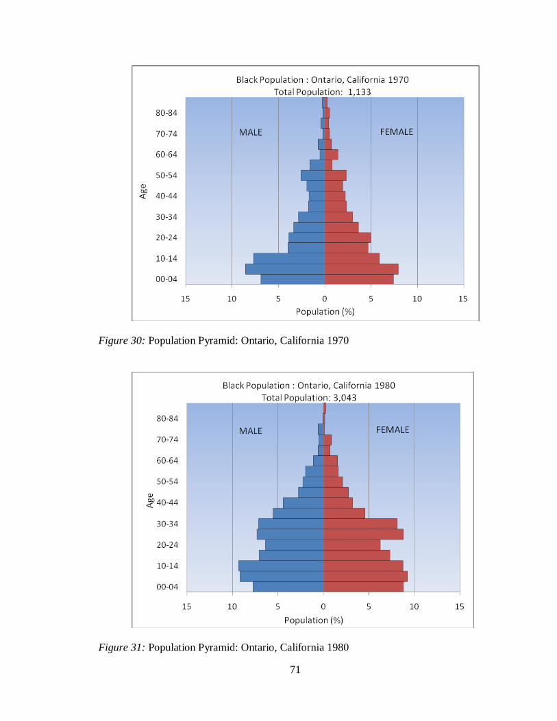
71
Figure 30: Population Pyramid: Ontario, California 1970
Figure 31: Population Pyramid: Ontario, California 1980
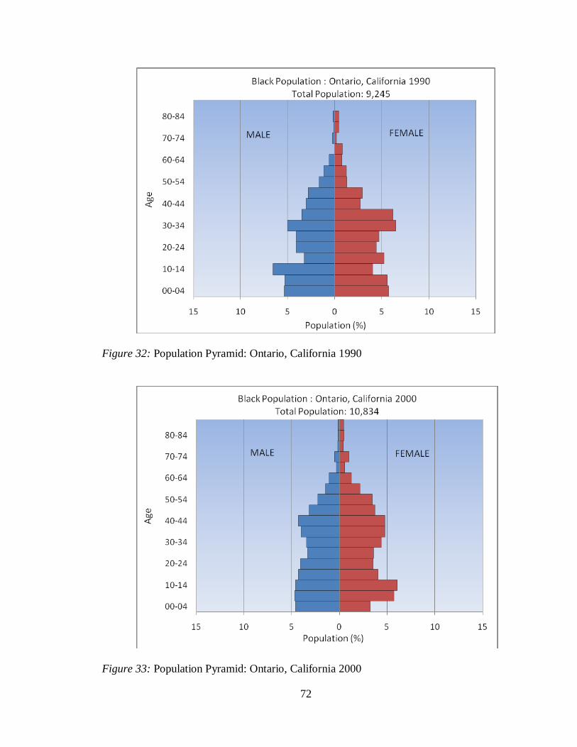
72
Figure 32: Population Pyramid: Ontario, California 1990
Figure 33: Population Pyramid: Ontario, California 2000
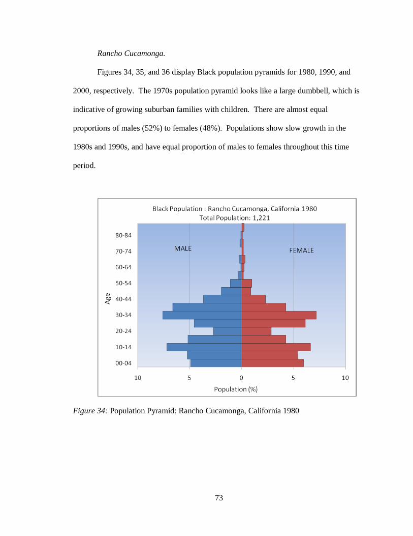
73
Rancho Cucamonga.
Figures 34, 35, and 36 display Black population pyramids for 1980, 1990, and
2000, respectively. The 1970s population pyramid looks like a large dumbbell, which is
indicative of growing suburban families with children. There are almost equal
proportions of males (52%) to females (48%). Populations show slow growth in the
1980s and 1990s, and have equal proportion of males to females throughout this time
period.
Figure 34: Population Pyramid: Rancho Cucamonga, California 1980
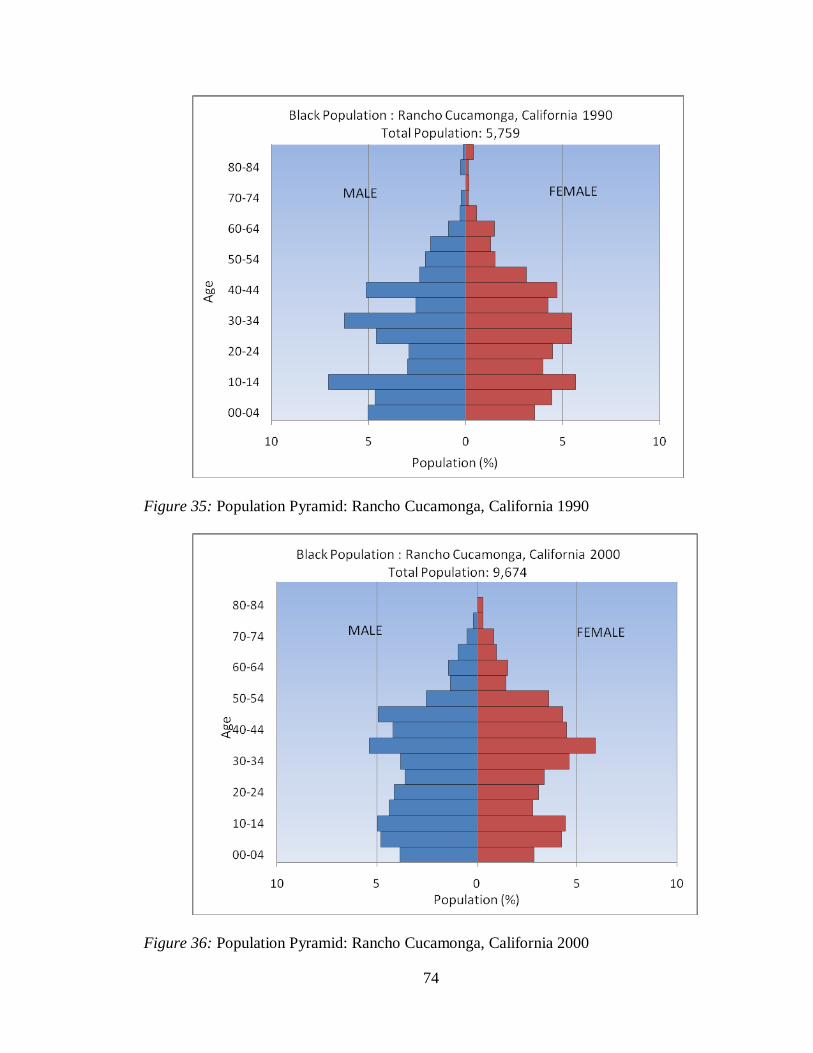
74
Figure 35: Population Pyramid: Rancho Cucamonga, California 1990
Figure 36: Population Pyramid: Rancho Cucamonga, California 2000
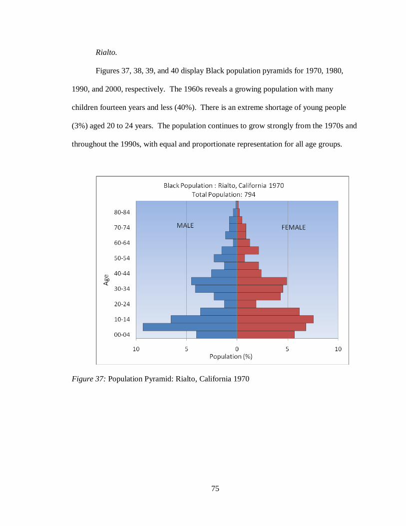
75
Rialto.
Figures 37, 38, 39, and 40 display Black population pyramids for 1970, 1980,
1990, and 2000, respectively. The 1960s reveals a growing population with many
children fourteen years and less (40%). There is an extreme shortage of young people
(3%) aged 20 to 24 years. The population continues to grow strongly from the 1970s and
throughout the 1990s, with equal and proportionate representation for all age groups.
Figure 37: Population Pyramid: Rialto, California 1970
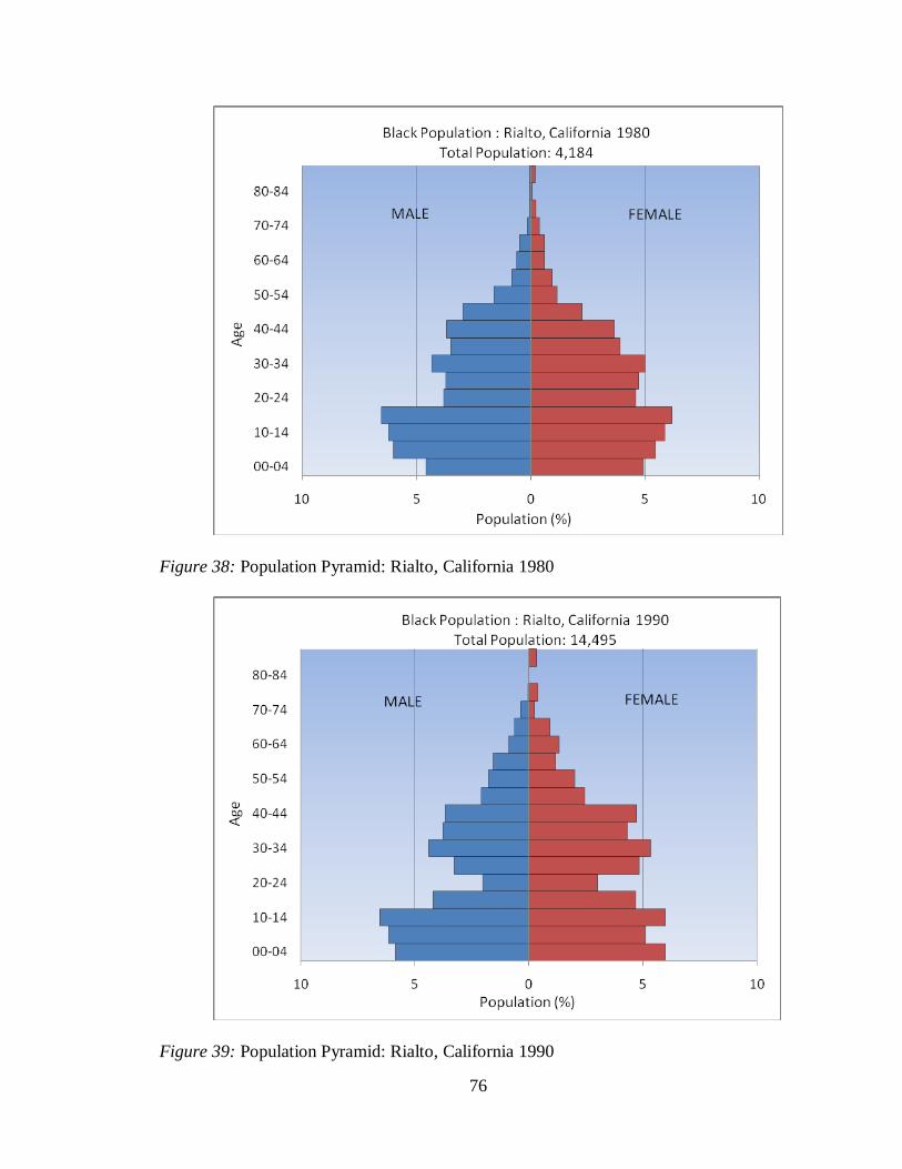
76
Figure 38: Population Pyramid: Rialto, California 1980
Figure 39: Population Pyramid: Rialto, California 1990
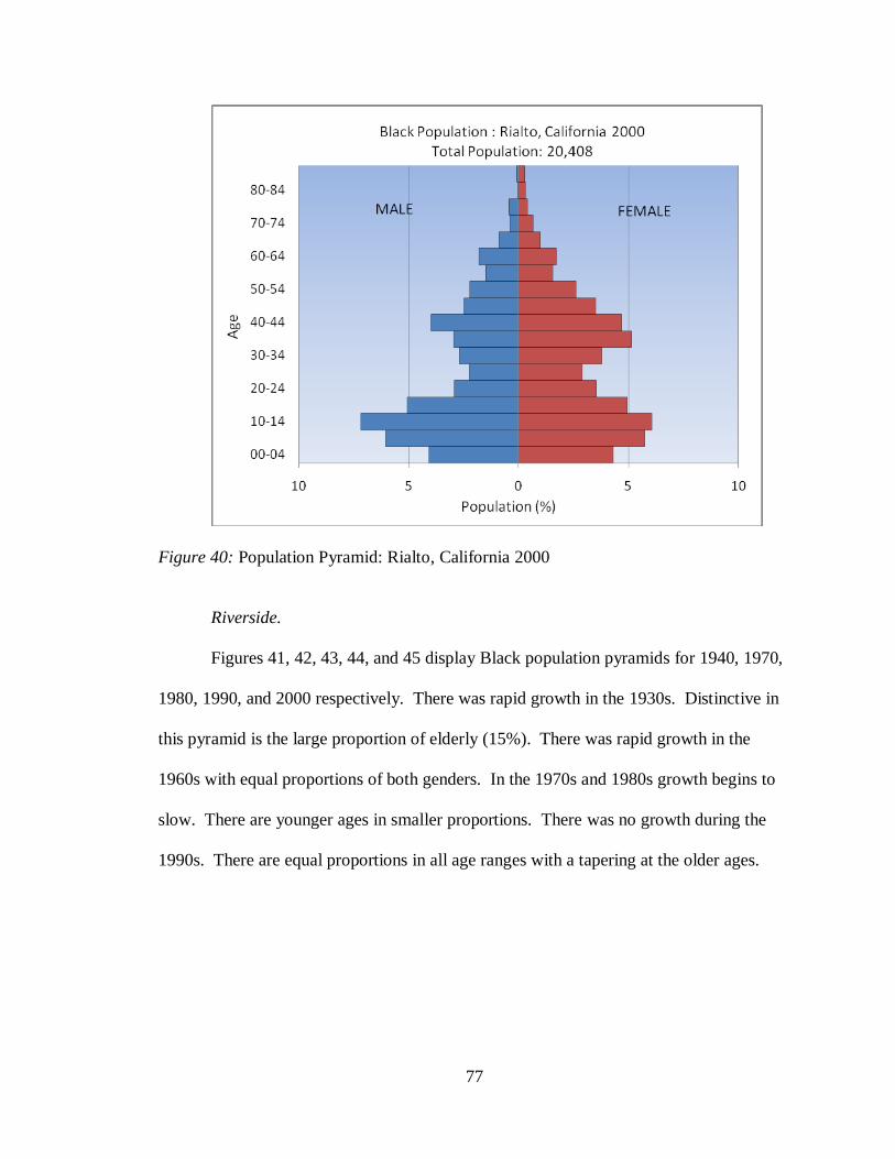
77
Figure 40: Population Pyramid: Rialto, California 2000
Riverside.
Figures 41, 42, 43, 44, and 45 display Black population pyramids for 1940, 1970,
1980, 1990, and 2000 respectively. There was rapid growth in the 1930s. Distinctive in
this pyramid is the large proportion of elderly (15%). There was rapid growth in the
1960s with equal proportions of both genders. In the 1970s and 1980s growth begins to
slow. There are younger ages in smaller proportions. There was no growth during the
1990s. There are equal proportions in all age ranges with a tapering at the older ages.
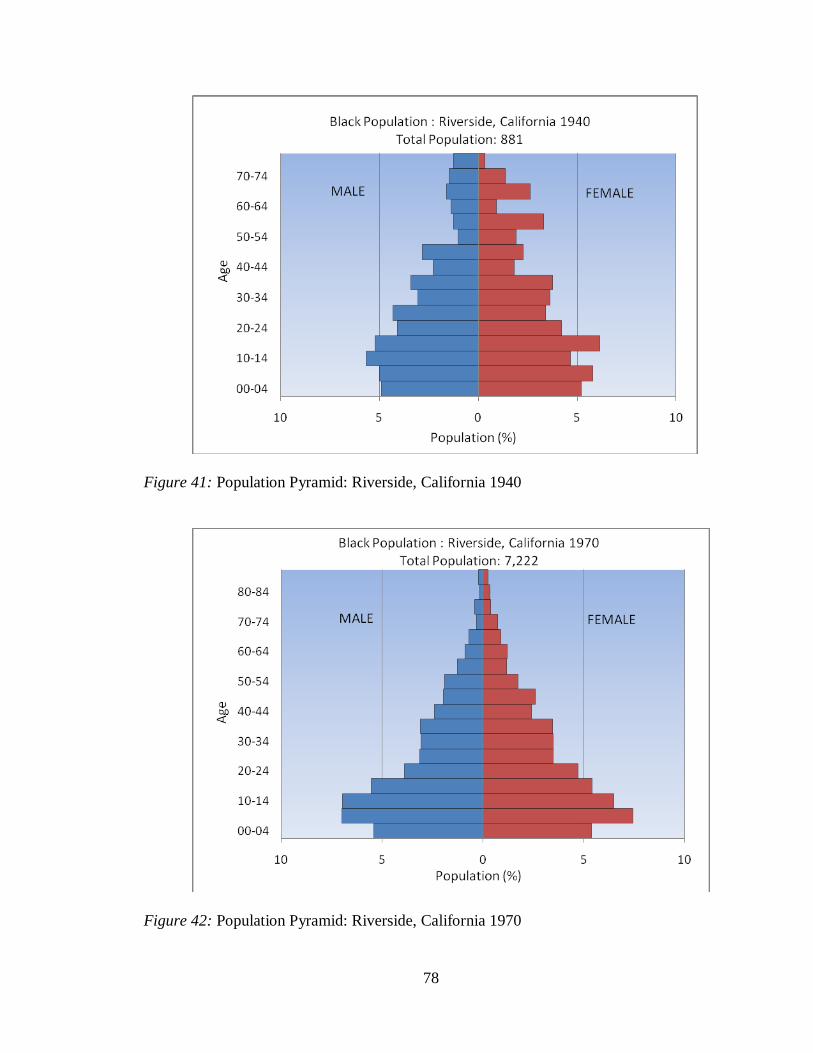
78
Figure 41: Population Pyramid: Riverside, California 1940
Figure 42: Population Pyramid: Riverside, California 1970
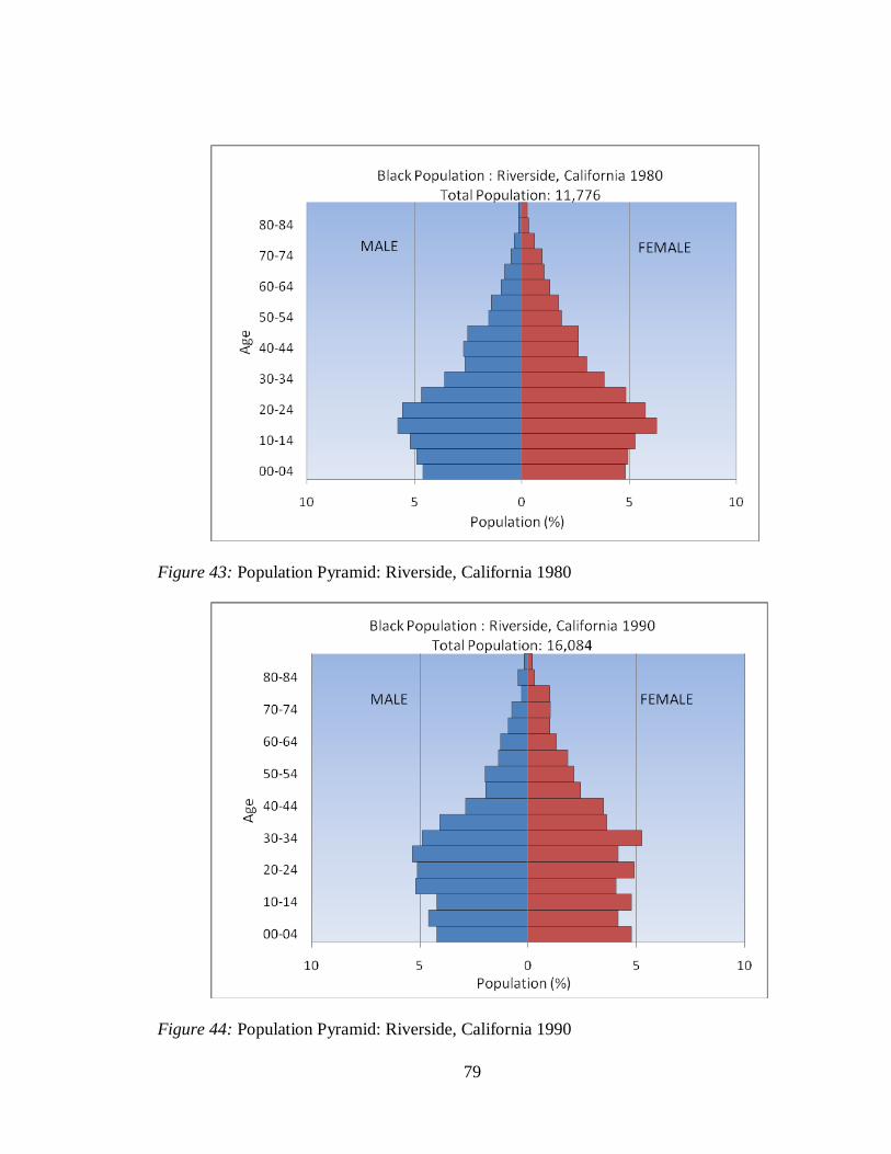
79
Figure 43: Population Pyramid: Riverside, California 1980
Figure 44: Population Pyramid: Riverside, California 1990

80
Figure 45: Population Pyramid: Riverside, California 2000
San Bernardino.
Figures 46, 47, 48, 49, and 50 display Black population pyramids for 1940, 1970,
1980, 1990, and 2000 respectively. The pyramid during the 1930s is inverted, having a
small percentage of children. It is also top heavy with a higher concentration of older
persons. The pyramid in the 1960s is a classic pyramid structure of rapid growth: large
proportions of younger people with a tapering of older adults to elderly. The growth
slows a bit in the 1970s due to smaller proportions of younger ages relative to older ones.
The pyramid shapes in the 1980s and 1990s are similar, showing rapid growth of families
with a shortage of 20 to 24 year olds.
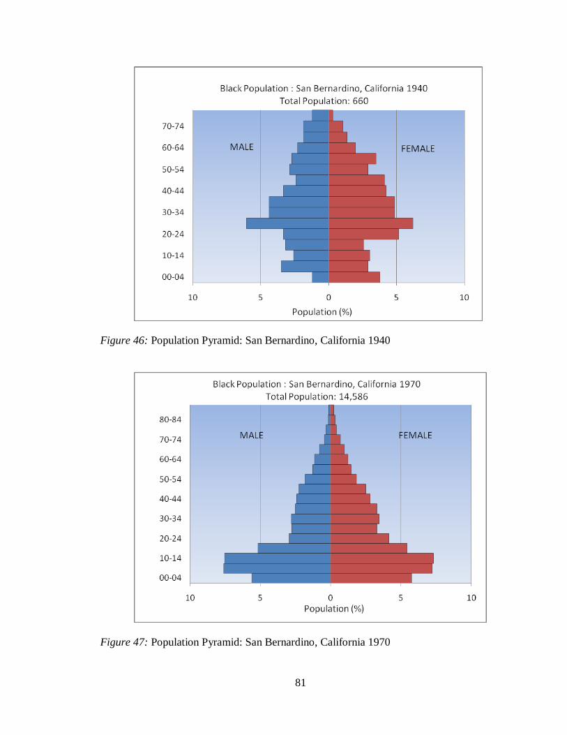
81
Figure 46: Population Pyramid: San Bernardino, California 1940
Figure 47: Population Pyramid: San Bernardino, California 1970

82
Figure 48: Population Pyramid: San Bernardino, California 1980
Figure 49: Population Pyramid: San Bernardino, California 1990
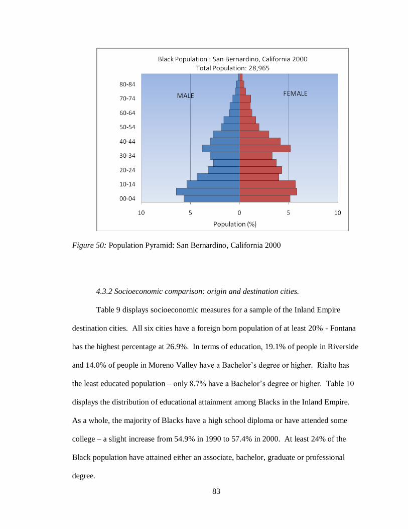
83
Figure 50: Population Pyramid: San Bernardino, California 2000
4.3.2 Socioeconomic comparison: origin and destination cities.
Table 9 displays socioeconomic measures for a sample of the Inland Empire
destination cities. All six cities have a foreign born population of at least 20% - Fontana
has the highest percentage at 26.9%. In terms of education, 19.1% of people in Riverside
and 14.0% of people in Moreno Valley have a Bachelor‟s degree or higher. Rialto has
the least educated population – only 8.7% have a Bachelor‟s degree or higher. Table 10
displays the distribution of educational attainment among Blacks in the Inland Empire.
As a whole, the majority of Blacks have a high school diploma or have attended some
college – a slight increase from 54.9% in 1990 to 57.4% in 2000. At least 24% of the
Black population have attained either an associate, bachelor, graduate or professional
degree.
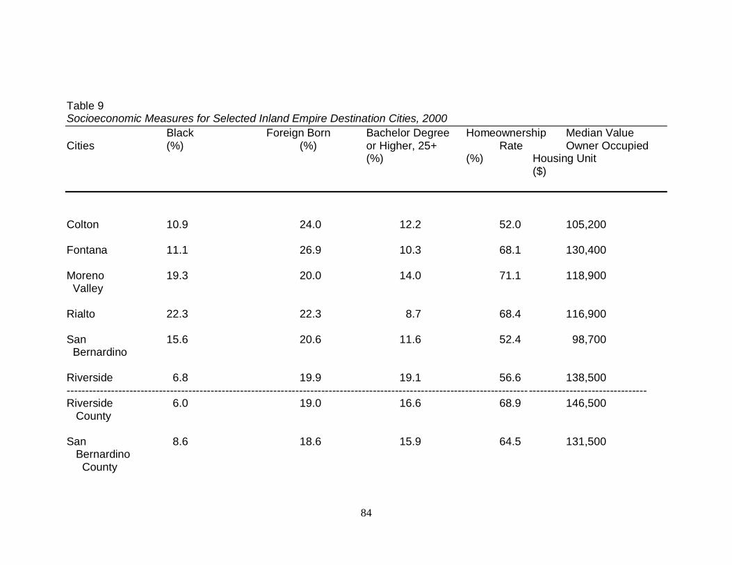
84
Table 9 Socioeconomic Measures for Selected Inland Empire Destination Cities, 2000
Black Foreign Born Bachelor Degree Homeownership Median Value Cities (%) (%) or Higher, 25+ Rate Owner Occupied (%) (%) Housing Unit ($)
Colton 10.9 24.0 12.2 52.0 105,200
Fontana 11.1 26.9 10.3 68.1 130,400
Moreno 19.3 20.0 14.0 71.1 118,900 Valley Rialto 22.3 22.3 8.7 68.4 116,900
San 15.6 20.6 11.6 52.4 98,700 Bernardino Riverside 6.8 19.9 19.1 56.6 138,500 ----------------------------------------------------------------------------------------------------------------------------- -------------------------------- Riverside 6.0 19.0 16.6 68.9 146,500 County San 8.6 18.6 15.9 64.5 131,500 Bernardino County
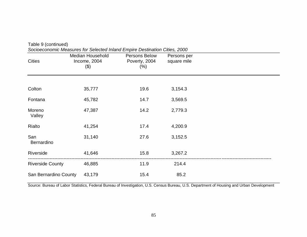
85
Table 9 (continued) Socioeconomic Measures for Selected Inland Empire Destination Cities, 2000
Median Household Persons Below Persons per Cities Income, 2004 Poverty, 2004 square mile ($) (%)
Colton 35,777 19.6 3,154.3
Fontana 45,782 14.7 3,569.5
Moreno 47,387 14.2 2,779.3 Valley Rialto 41,254 17.4 4,200.9
San 31,140 27.6 3,152.5 Bernardino Riverside 41,646 15.8 3,267.2 ----------------------------------------------------------------------------------------------------------------------------- -------------------------------- Riverside County 46,885 11.9 214.4
San Bernardino County 43,179 15.4 85.2
Source: Bureau of Labor Statistics, Federal Bureau of Investigation, U.S. Census Bureau, U.S. Department of Housing and Urban Development
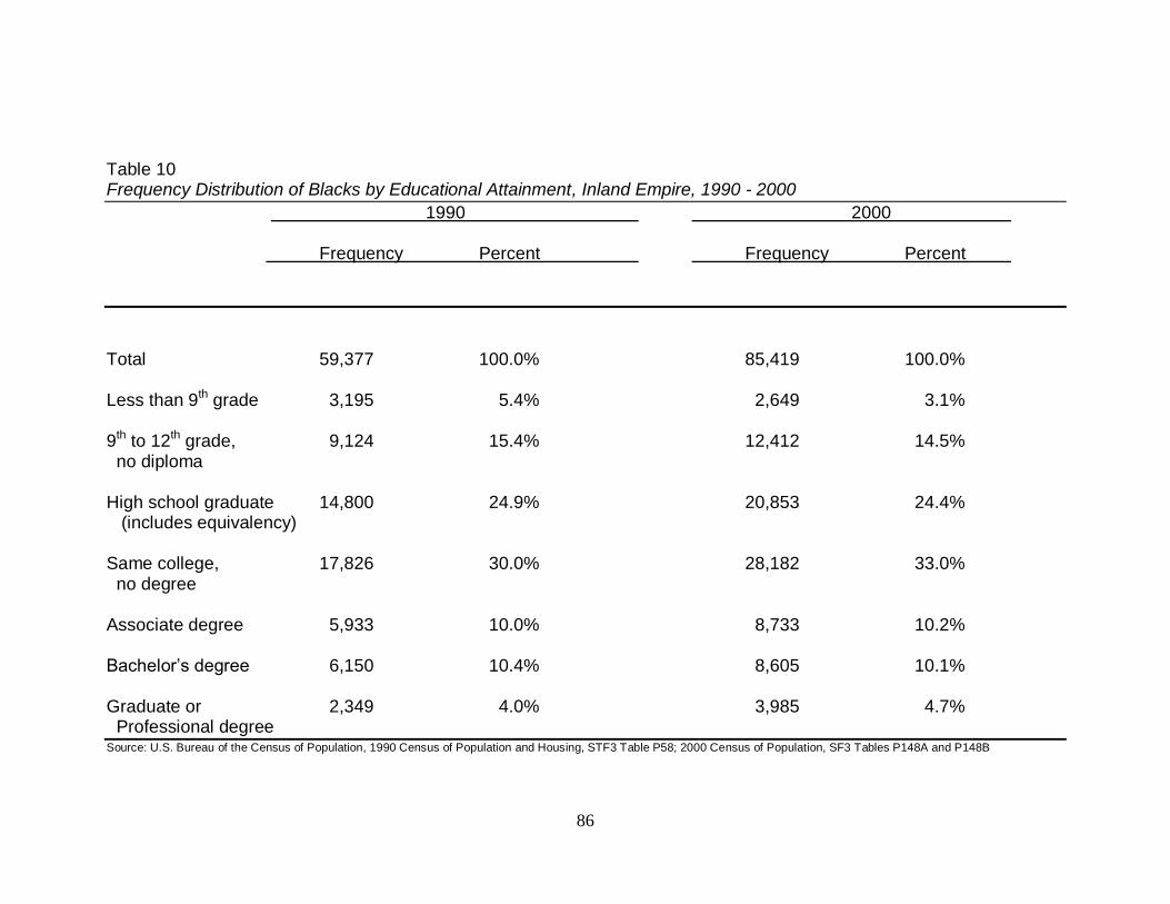
86
Table 10 Frequency Distribution of Blacks by Educational Attainment, Inland Empire, 1990 - 2000
1990 2000 Frequency Percent Frequency Percent
Total 59,377 100.0% 85,419 100.0%
Less than 9th grade 3,195 5.4% 2,649 3.1%
9th to 12th grade, 9,124 15.4% 12,412 14.5% no diploma High school graduate 14,800 24.9% 20,853 24.4% (includes equivalency) Same college, 17,826 30.0% 28,182 33.0% no degree Associate degree 5,933 10.0% 8,733 10.2%
Bachelor’s degree 6,150 10.4% 8,605 10.1%
Graduate or 2,349 4.0% 3,985 4.7% Professional degree Source: U.S. Bureau of the Census of Population, 1990 Census of Population and Housing, STF3 Table P58; 2000 Census of Population, SF3 Tables P148A and P148B
87
The wealth of a community can be measured in several ways: median household
income, median home value, or by the proportion of the population in the community that
is low income. Based on these measures, Moreno Valley and Riverside are the most
affluent communities. Moreno Valley has the most homeowners at 71.1%, while Fontana
and Rialto fall close behind with 68.1% and 6.4%, respectively. It is interesting to note
that while Rialto has the least educated population, the city has the second largest home
ownership rate relative to all other sample cities. Riverside has the most expensive home
values at $138,500 compared to the least expensive homes found in San Bernardino at
$98,700. Moreno Valley‟s community is the most affluent relative to the others, with a
median household income of $47,387 and the lowest percent of the population below the
poverty line at 14.2%. In contrast, San Bernardino‟s population is the poorest with a
median household income of $31,140; and 27.6% of the population that lives below the
poverty line.
Table 11 displays the most recent socioeconomic measures for origin cities that
have a Black population greater than ten percent. The foreign born population is 43.6%
in Lynwood, 40.9% in Los Angeles, and 40.6% in Paramount. These cities also have the
lowest proportion of Blacks – 13%, 11%,, and 12%, respectively.
In terms of education, Pasadena and Culver City make up the most educated
population by far with 41.3% and 41.2% having Bachelor degrees or higher, respectively.
The second most educated cities are Los Angeles and Long Beach with 25.5% and 23.9%
of the population having a Bachelor degree or higher, respectively.
88
Table 11 Socioeconomic Measures for Los Angeles County Cities greater than 10% Black, 2000
Black Foreign Born Bachelor Degree Homeownership Median Value Cities (%) (%) or Higher, 25+ Rate Owner Occupied (%) (%) Housing Unit ($)
Carson 25 32.9 18.1 77.9 183,200
Compton 39 31.4 5.9 56.3 136,200
Gardena 25 32.8 16.6 47.3 179,500 Hawthorne 32 33.3 12.7 25.9 183,700
Inglewood 46 29.5 13.3 36.6 175,000 Bellflower 12 28.4 12.9 40.3 179,800
Culver City 11 26.6 41.2 54.4 311,100 Lancaster 15 13.0 15.8 61.4 103,700 Lawndale 12 38.7 12.5 33.2 178,700
89
Table 11 (continued) Socioeconomic Measures for Los Angeles County Cities greater than 10% Black, 2000
Black Foreign Born Bachelor Degree Homeownership Median Value Cities (%) (%) or Higher, 25+ Rate Owner Occupied (%) (%) Housing Unit ($)
Long Beach 14 28.6 23.9 41.0 210,000
Los Angeles 11 40.9 25.5 38.6 221,600
Lynwood 13 43.6 4.5 47.1 146,700 Palmdale 14 19.8 13.3 71.0 116,400
Paramount 12 40.6 7.0 42.9 154,300 Pasadena 14 32.3 41.3 45.8 286,400 ------------------------------------------------------------------------------------------------------------------------------------------------------------- Los Angeles County 9 36.2 24.9 47.9 209,300 Orange County 1 29.9 30.8 61.4 270,000
90
Table 11 (continued) Socioeconomic Measures for Los Angeles County Cities greater than 10% Black, 2000
Median Household Persons Below Persons per Cities Income, 2004 Poverty, 2004 square mile ($) (%)
Carson 52,284 9.3 4762.7
Compton 31,819 28.0 9229.3
Gardena 38,988 15.7 9222.0 Hawthorne 31,887 20.3 13,879.9
Inglewood 34,269 22.5 12,317.3 Bellflower 39,362 15.8 12,006.3
Culver City 51,792 8.6 7,596.1 Lancaster 41,127 16.4 1,263.0 Lawndale 39,012 17.3 16,015.7
91
Table 11 (continued) Socioeconomic Measures for Los Angeles County Cities greater than 10% Black, 2000
Median Household Persons Below Persons per Cities Income, 2004 Poverty, 2004 square mile ($) (%)
Long Beach 37,270 22.8 9,149.9
Los Angeles 36,687 22.1 7,876.9
Lynwood 35,888 23.5 14,401.0 Palmdale 46,941 15.8 1,111.6
Paramount 36,749 21.9 11,684.1
Pasadena 46,012 15.9 5,798.1 ----------------------------------------------------------------------------------------------------------------------------- -------------------------------- Los Angeles County 43,518 16.7 2,344.1
Orange County 58,605 10.2 3,607.5
County Source: U.S. Census Bureau: State and County QuickFacts Data derived from Population Estimates, Census of Population and Housing, Small Area Income & Poverty Estimates, State and County Housing Unit Estimates, Nonemployer Statistics, Economic Census Consolidated Federal Funds Report City Source: Bureau of Labor Statistics, Federal Bureau of Investigation, U.S. Census Bureau, U.S. Department of Housing and Urban Development
92
The greatest numbers of homeowners are located in Carson with 77.9% and
Palmdale with 71.0%. In contrast, only 25.9% of the Hawthorne population are
homeowners. Pasadena is the most affluent of all cities and has the most expensive
homes with a median value of $286,400. The least expensive homes are located in
Lancaster ($103,700) and Palmdale ($116,400).
In terms of income and poverty, Carson and Culver City have the highest incomes
at $52,284 and $51,792, respectively. However, these cities only have 9.3% and 8.6% of
the population living below the poverty line, respectively. On the other hand, Compton
has the lowest income at $31,819 and has the most people living below the poverty line at
28%.
4.4 Dissimilarity Index
Figure 51 displays the dissimilarity index for selected cities in the Inland Empire.
The spatial distribution between Blacks and Whites in eight of the selected cities
indicates low segregation. Less than 30% of Blacks in Colton, Corona, Fontana, Moreno
Valley, Ontario, Rancho Cucamonga, Rialto and Riverside would have to move to a
different census tract in their respective city in order for the two groups to be equally
distributed.
Chino and San Bernardino reveal moderate segregation among Blacks and
Whites. In Chino 37.9% and in San Bernardino 37.1% of Blacks would have to move for
Blacks to be evenly distributed among Whites. Overall, Inland Empire selected cities
reveal Blacks are integrated well compared to Los Angeles. Los Angeles indicates a high
93
residential segregation. At least 70.6% of the Black population in Los Angeles would
have to move for the city to be evenly distributed.
Figure 51. Dissimilarity Index by Selected Cities for Blacks, 2000
Source: U.S. Census Bureau, Housing Patterns
City D
Banning N/A
Chino 0.379
Colton 0.268
Corona 0.227
Fontana 0.216
Grand Terrace N/A
Moreno Valley 0.201
Norco N/A
Ontario 0.171
Perris N/A
Rancho Cucamonga 0.240
Rialto 0.200
Riverside 0.259
San Bernardino 0.371
Los Angeles 0.706
94
4.5 Drivers of Black Mobility
4.5.1 Origin push.
The Los Angeles metropolitan area is uniquely referred to as a melting pot metro
which makes reference to the large population of Hispanics, Asians, and other race and
multiracial population (Frey, 2003). Changes in racial composition predict Hispanics to
outnumber Blacks in South Central Los Angeles and Los Angeles County, and Asians to
make up at least twelve percent of the total population in Los Angeles County
Push factors from the area of origin (i.e. Los Angeles County and its cities) that
contribute to Black Residential Mobility are evidenced in the total population, population
density, and change in racial composition. These factors are also evidenced in the
perception, experienced by Blacks, of negatives associated with employment
competition, the economy, the housing market, quality of life, schools and other issues of
concern.
The total population in Los Angeles County increased in absolute numbers over
the study period from 2,785,643 in 1940 to 9,519,338 in 2000. However, the proportion
of Los Angeles County‟s total population decreased over the study period from 40% in
1940 to 28% in 2000. Though these changes were occurring Los Angeles County
became increasingly more crowded beginning in 1940 with 684.3 people per square mile
and peaking in 2000 to 2,344.7 people per square mile (See Appendix A for a Population
Density Table).
Competition with Whites, Mexicans, and Asians in the employment market has
been a main push factor for Blacks. As early as the 1940‟s Blacks in the industrial labor
market competed primarily against Whites and Mexicans for jobs, while in the service
95
and domestic sector this competition was among Chinese and Filipinos (Sides, 2001). A
lack of advancement opportunities compounded the perception of competition and
restricted Blacks to the bottom pool of the labor market which had negative effects on the
economic status of Blacks (Coleman 1997; Sides, 2001).
The economy in Los Angeles County suffered a downturn beginning in 1965 with
the demise of defense industries which employed “tens of thousands of Blacks in
relatively high paying jobs” (Noble, 1995). This decline continued through the 1970‟s
and 1980‟s when labor intensive industries and conventional manufacturing jobs (i.e. tire
and rubber) closed down (De Graaf, 2001). Blacks who left cite the stagnant economy as
one of their reasons for moving (Noble, 1995).
Housing market restrictions (Sides, 2001) and housing discrimination (De Graaf,
2001) was prevalent during the 1940‟s and continued through the 1960s,. Despite the
enactment of state and federal fair-housing laws in the 1960‟s Black residential mobility
had been severely restricted. Other housing push factors cited by Blacks include lower
property values (Stevens, 2005), and escalating housing and living costs (Armstrong
1990; Noble, 1995).
Blacks cite a diminished quality of life as a main push factor. They attribute a
decrease in quality of life to an overall lack of neighborhood safety and being under the
constant threat of drugs (Noble, 1995), gang activity (Armstrong, 1990; Noble, 1995;
Coleman, 1997), and crime and violence (Armstrong, 1990; Noble, 1995; Stevens, 2005).
An examination of the change in crime rates for California and the four study area
counties from 1970 to 2000 reveals violent crimes in all four counties peaked in 1990
with Los Angeles County having higher crime rates than the state (See Appendix B for
96
Table of Crime Rates). Interestingly, during this same year both San Bernardino and
Riverside also exceed the state‟s crime rates. For some more educated and affluent
Blacks, the Watts uprising in the 1960‟s reinforced the danger of inner cities (De Graaf,
2001).
Another set of push factors cited by Blacks include a desire for better
neighborhoods, less congestion and cleaner air (Armstrong, 1990). Poor municipal
infrastructure including poor sanitation, insufficient lighting and irregular and unreliable
public transportation has also been cited (Sides, 2001). Additionally, Blacks cited as
push factors a deteriorating public school system, poor school districts and overcrowded
schools (Noble, 1995; De Graaf, 2001; Stevens, 2005).
Other push motivators cited by Blacks include White gentrification (Coleman,
1997), racial discrimination and profiling by city police (De Graaf, 2001), and the need to
“avoid the problems „of being a young Black man in Los Angeles‟” (Los Angeles Times,
1992).
Competition for resources (Armstrong, 1990) and a lack of opportunities that
“seem open for Hispanic and Asian residents but shut for Blacks,” (Noble, 1995) make
clear the perception of Blacks who had moved.
97
4.5.2 Destination pull.
Coastal area congestion, high land and housing prices, crime, poor schools and
other disagreeable aspects of modern urban life” drove many out of Los Angeles County
and Orange County including Black homebuyers and apartment renters who flocked to
the Inland Empire (Turpin, 1983a; Trombley, 1985a). Pull factors that contributed to
Black Residential Mobility are evidenced in the housing boom, the availability of
affordable housing, employment opportunities, educational opportunities, and more
desirable communities. These factors are also evidenced in the perception experienced
by Blacks who chose to settle in a new home and neighborhood in the Inland Empire.
Black householders were surveyed and listed the top reasons they left their
previous unit (AHS, 1986; 1994; 2002). Some householders indicated that they left a
previous residence, such as their parent‟s home or a shared residence with a roommate, to
establish their own home. Some indicated they needed a larger house or apartment or
simply wanted a better home. Other reasons Black householders moved included
problems with neighborhood crime, the racial or ethnic composition of the neighborhood,
and they also listed anything related to housing such as wanting a larger yard or a better
investment to wanting a change in climate.
An abundance of available housing became one of the most dominant draws to
the Inland Empire, and not just for Blacks. As early as 1965, the 87,000-acre Vail ranch
in Riverside County was set to be developed into “residential, commercial, industrial,
recreational, and agricultural projects of tremendous scope” (Cameron, 1965). Upon
completion there would be enough housing for 40,000 people. By 1984, the Ontario
Center opened, a 673-acre master-planned mixed-use community development suitable
98
for high-tech facilities, mid-high rise office buildings and an entertainment complex
(Green, 1984a). During this same year, the 2,150-acre master-planned community of
Victoria was announced to accommodate 25,000 people in Rancho Cucamonga (Green,
1984b). Accordingly, the Inland Empire led the state in new housing starts in 1984
(Trombley, 1985a)
Affordable housing was the prominent draw for Blacks moving to the Inland
Empire, in particular, Rialto, Fontana, and Moreno Valley (De Graaf, 2001). When
Black householders were asked why they chose their present home, financial reasons was
cited as the top reason. Black householders also indicated that the layout and design of
the rooms, the size, and exterior appearance were also reasons they chose their home
(AHS, 1986; 1994; 2002). Ultimately, the opportunity to get “more value for the dollar
continue[d] to attract price-conscious consumers to the inland areas” (Turpin, 1983b).
The abundance of affordable housing implied a great and growing pool of skilled
and semi-skilled laborers, according to an Ontario marketing manager (Green, 1984).
This was one of several factors that made the Inland Empire favorable for industry
relocation and development in California: Ontario airport expansion to an international
terminal, lower land costs and lease rates than in Los Angeles County and Orange
County, a highly developed transportation network of freeways, railroads, and
cooperative local governments responsive to industry needs (“Industrial,” 1980; Turpin,
1983a). Riverside in 1965, for example, abounded with employment opportunities
consisting of 160 industrial plants employing 12,000 people with six under construction
at the time (Cameron, 1965). By 1985, several small manufacturing operations and
several large industrial employers increased employment opportunities for the Inland
99
Empire (Trombley, 1985b). Certainly, the March Air Force Base in Riverside
contributed to the Black employment pull as well. Though these opportunities exist, one
economist described the Inland Empire as “housing-rich and job-poor,” which would
explain why migrants continued to commute (Trombley, 1985a).
The desire to fulfill a better life in their present neighborhoods became the
dominant factor for Blacks who moved to the Inland Empire. Many Black householders
chose their present neighborhood, at the time, because it was convenient to their job,
convenient to friends and relatives, they liked the look and design of the neighborhood,
they believed the schools were good, and cited their house was the most important
consideration in their decision (AHS, 1986; 1994; 2002). Educational opportunities are
available at the University of California, Riverside which also became a growing factor in
the economic and intellectual life Inland Empire development (Cameron, 1965). Overall,
Black householders believed they were in a better home and in a better neighborhood
(AHS, 1986; 1994; 2002).
Unfortunately, the population boom of the Inland Empire has not come without its
share of unintended and unforeseen consequences. A shortage of jobs coupled with
congested roads and freeways, overcrowded schools, air pollution, and problems with
inadequate sewage or flood control facilities incited concern in some (Trombley, 1985a;
1985b; 1985c). In 1983 the Kaiser Steel plant which employed some 8,000 people in
Fontana closed (Trombley, 1985b). The lack of jobs to meet the needs of the large pool
of workers maintained the need for residents to commute to both Los Angeles and
Orange counties for employment. In many cases this has led to social costs such as
„latch-key‟ children and lack of a sense of community (Trombley, 1985b).
100
De Graaf (2001) further describes the residual affect on Blacks when they move
to the suburbs as feeling social isolation, a loss of a sense of community, feelings of
disconnectedness with other Blacks, and sometimes the prevalence of problems from the
old neighborhood, such as police harassment and limitations on income and job
opportunities, despite the move.
101
5. DISCUSSION AND CONCLUSIONS
This thesis investigated Black residential mobility from Los Angeles County into
the Inland Empire (i.e. Riverside County and San Bernardino County) from 1940 to 2000.
Grounded in Spatial Assimilation and Place Stratification residential mobility theories, a
demographic analysis of population and housing data supplemented with historical data
was conducted.
5.1 Research Questions Revisited
I posed the problem of suburban growth among Blacks in Southern California in
Section 1 and found that for much of the first twenty years of the study period (1940-
1960), the Black population was concentrated in and grew larger in the City of Los
Angeles and in other areas of Los Angeles County. By 1970, the rate of Black growth in
suburban Inland Empire shifted in Colton, Fontana, Norco, and Rialto. By 1990, Moreno
Valley was included in the shift. In fact, the most prominent rates of growth occur from
1960 to 1970: Chino 22,325.0%, Grand Terrace 4,650.0%, Norco 5,416.7%, and Rialto
19,750.0%. This growth can be attributed to the availability of housing development and
housing opportunities that becoming available in the 1960‟s. Until then the Inland
Empire consisted of open rural space predominately used for agricultural purposes. The
transition from rural to suburban development began in 1970 and continued through the
1990s.
An economics professor, interviewed by a Los Angeles Times reporter, stated
“studies show former Los Angeles residents tend to move to San Bernardino County,
while emigrants (sic) from Orange County usually wind up in Riverside County”
102
(Trombley, 1985a). The results of this study support this notion given that the greatest
residential shift of Blacks occurred in a majority of cities located in San Bernardino
County.
The five Inland Empire cities (Chino, Fontana, Moreno Valley, Norco, and
Rialto) where the greatest shift occurred registered a dramatic decrease of the White
population. This decline is not only attributed to the increase of Blacks but also the
proportion of Hispanics and other non-White groups that were moving into the area.
White populations decrease by only 20 % from 1940 to 1970, however, from 1970 to
2000 there was a dramatic 40% decrease for all cities except Moreno Valley and Rancho
Cucamonga (see Appendix C for White Growth).
When analyzing Blacks and housing units from 1980 to 2000, more Blacks are in
rentals than own homes: 3.9% more in 1980, 6.8% more in 1990, and 7.4% more in 2000.
Since the 1980s Black homeowners have increased 4.3% from 4.8% to 9.1% in 2000.
However, there is a larger proportion of Blacks in rentals, increasing from 8.7% in 1980
to 16.5% in 2000. An abundance of desirable homes, ownership opportunities and
affordable housing options were made available, yet renting has been the overall choice
for Blacks in the Inland Empire cities. The reason is unclear.
One possibility as to why a greater proportion of Blacks prefer rentals to home
ownership could be that they are less affluent and fall on the lower end of the economic
scale. Black movers have been described as being middle-class and working-class, but
also as being at the lower end of the economic scale – poor and disadvantaged (Noble,
1995). Making the assumption that the majority of Black renters in the Inland Empire
fall within these lower socioeconomic categories, it can be inferred that those Blacks who
103
moved desired to achieve a different living environment regardless of whether or not they
had to rent or simply opted for a larger residential space despite it being a rental.
Blacks that have moved to the Inland Empire have also been described as
educated (Johnson and Roseman, 1970; Armstrong, 1990). The results of this study seem
to support the position. Educational measures of the Inland Empire cities suggest that the
Black population is more highly educated. Greater than 54% in both 1990 and 2000, also
described in Section 4.3.2 have some college education: an associate degree, bachelor‟s
degree, a graduate, or professional degree.
As discussed in Section 4.3.2, the socioeconomic measures indicating the wealth
of the community and education levels of Riverside, Moreno Valley, Fontana, and Rialto
suggests support for the mover described as middle-class and working-class (Noble,
1995). The less affluent communities of Colton and San Bernardino also suggest support
for the poor and disadvantaged mover described by Noble (1995). Despite these
circumstances, homeownership is within reach and may be a driving force for some of
the Blacks that relocated to the Inland Empire.
As laid out in Section 4.3.1, the age structure of families in the Inland Empire has
evolved with the transition over the decades. Some cities incurred lopsided gender or age
growth that can be attributed to facilities such as prisons in Chino and Norco, a senior
center and possibly a children‟s home in Fontana, and a large proportion of elderly in
Riverside. Other cities, like Colton, has significant decreases in both genders of the
populations that can be attributed to the closing of the Norton Air Force Base which
impacted the city and San Bernardino County. However, Colton, Corona, Rancho
Cucamonga and Rialto, reflect populations of families with children.
104
Socioeconomic differences outweigh the similarities when comparing the origin
and destination cities. The Los Angeles County origin cities reveal a greater proportion
of foreign born and Black residents, and are more crowded than Inland Empire cities.
Despite Los Angeles County cities having greater numbers living in poverty, Los
Angeles County cities have more college educated people. Median incomes are
comparable in both Los Angeles County and Inland Empire cities. Median home values
are much higher, and in some cases, double that of Inland Empire cities. The
homeownership rate is lower in Los Angeles County cities compared to Inland Empire
cities.
In terms of diversity, Blacks who relocated have indicated a “desire to move out
of areas traditionally Black and concentrated...and would buy or rent in a „nonminority‟
neighborhood if they could” (US Commission on Civil Rights 1960). This statement
supports the residential segregation results indicating how the well integrated Inland
Empire cities are compared to the more segregated City of Los Angeles.
Residential mobility drivers among Blacks that relocated from Los Angeles
County, can be attributed to changing racial composition, increasing housing market,
deterioration of schools and overall deterioration of their quality of life. Additionally,
Blacks desire to improve their personal and professional opportunities. Furthermore,
drivers attracting Blacks into the Inland Empire include available, affordable, and in
some cases better housing options, employment and educational opportunities, a less
congested environment, increased diversity, and comparable affluence to cities in Los
Angeles County. Many of those who relocated seem willing to endure the commutes to
either Los Angeles or Orange counties “to have a home of their own and what they
105
believe to be a safer, more pleasant life for themselves and their children” (Trombley,
1985a).
5.2 Effects of Black Residential Mobility
Blacks have relocated in such high numbers that the landscapes of Inland Empire
cities such as Moreno Valley, Perris, Rialto, and San Bernardino have been uniquely
changed. In fact, some cities may have experienced succession, while others experienced
such a rapid growth in the Black population that the cities evolved from “White” to
“Black” in just three decades. Furthermore, the majority of Inland Empire cities are
“Mixed” suburbs which suggests a desire, among Blacks who moved, for a different or
diverse lifestyle that is neither all Black nor all White. The types of Blacks who ended up
in suburban Inland Empire cities were either upwardly mobile Blacks desiring a better
life, or working-class and poor Blacks desiring a new start to a better life. For both types,
the perception that their future outcomes could be improved was possible. All of the
Inland Empire cities reveal moderate to low residential segregation. Given the rate of
growth over the course of the study period, it is assumed that there was little to no
integration prior to Blacks moving into the Inland Empire.
The population affects resulting from Black residential mobility to the Inland
Empire is also evident in Los Angeles County where a restructuring of historically Black
communities are now more populated by Hispanics and Asians. These changes have
future implications in the social, political, and economic landscape. For example, in Los
Angeles County a shift in the political power, and the subsequent resources determined
by the electorate, is affected due to the sheer number of Blacks that have left the area.
106
The same can be said for the Inland Empire cities that gained the most Blacks and shifted
the proportion of their numbers.
The results in Section 5 imply that the Blacks who moved out of Los Angeles
County and were attracted to the Inland Empire: were pretty well educated, wanted to
provide better future life opportunities for their children, desired a better living and home
environment, wanted to live in an integrated neighborhood, and aspired to improve their
overall quality of life. Ultimately, Blacks who moved aimed to improve their access to
economic, education and social mobility. Based on the theoretical framework set forth in
Section 2, the results in this examination refutes place stratification theory for the
Southern California scenario.
5.3 Study limitations
There is a lack of agreement about what drives residential mobility. The data
extracted and presented in this research does not provide the underpinnings for theory
development. Nevertheless, the thesis reports the best available data.
The method laid out in Section 3 is a retrospective longitudinal case study and
demographic analysis. Data extracted for this research is a representation at different
geographic levels. City level USCBDC data was obtained for the population and
housing. Primary Metropolitan Statistical Area (PMSA) level AHS data was obtained for
the reasons moved.
In the classification of succession cities (Lee and Wood, 1991) and in the
categorization of suburban transition (Schneider and Logan, 1982), both studies were
based on the census tract geographic level. This level was used as it came closest to what
107
social scientists normally mean by the concept of a neighborhood. For the purposes of
this research, it was the best available tool to use to analyze the racial dynamics
suggested to drive some Whites out of the Inland Empire cities with a higher Black
population, as well as, for racial composition labeling.
Migration flow data would allow for greater detail and accuracy regarding the
population numbers of Blacks who actually moved to the Inland Empire.
5.4 Future Research
With unlimited funding and time, this researcher would expand upon this
demographic analysis by including a trend analysis of Black owned businesses and the
sectors where Black owned businesses are most prominent. An analysis of white collar
versus blue collar occupations for Blacks in the Inland Empire would also prove
beneficial to getting to the heart of the socioeconomic answers of the Blacks that
migrated. Both of these analyses would provide additional evidence as to socioeconomic
class of Blacks that moved to the Inland Empire.
A migration analysis using the Public Use Microdata Sample (PUMS) would be
ideal. This raw data, at the census tract geographic level, would allow for a detailed
neighborhood analysis. With this data very specific summary tables on specific
subgroups could be built. It could be interesting to specify which cities or counties are
the most dominant feeder areas into the Inland Empire area. It could also be interesting
to see from which areas out-of-state Blacks that migrated directly, or indirectly, to the
Inland Empire come.
108
Migration flow data showing county-to-county movement would have been useful
and could have been incorporated into future analyses of Los Angeles County movement
to Riverside and San Bernardino Counties.
5.5 Conclusions
Suburban life for Blacks represents several aspects of upward mobility, “better
schools, higher quality housing, greater employment opportunities, and escape from the
social disorders of the ghetto” (De Graaf, 2001). Furthermore, “a linear pattern of greater
attraction to suburbs with a higher percentage of Anglos is particularly evident for
Blacks.” (Hwang and Murdock, 1998). The results of this research lends support to these
ideas as three of the four aspects of upward mobility, identified by De Graaf, were cited
by Black head of households as reasons they: left their previous home, made their choice
of present home, and made their choice of their present neighborhood. Additionally, the
dissimilarity index results support the choice for integrated neighborhoods by those
Blacks who relocated into Inland Empire cities. Thus, as a result of overcrowding,
perceptions of deteriorating schools, and environments resulting from crime and gangs,
coupled with positive opportunities (i.e. homeownership, better schools, diversity, less
crime) – it is logical to assume that suburban migration appeared to be the best
opportunity for both economic and social advancement.
In order to suburbanize, one has to separate themselves spatially (Hwang and
Murdock, 1998). Wilson (1987) interpreted Black suburbanization as a “middle-class
exodus from the inner city ghettos.” This researcher posits that though the middle-class
was among those who left Los Angeles and Los Angeles County, the working class, and
109
in some cases, the lower class also saw the possibility of becoming middle-class (or
living the middle-class lifestyle) by changing their geographic location. Distance is the
strongest non-verbal action that Black residents who relocated could initiate to ultimately
change their future and the future of their children. Per spatial assimilation theory, as set
forth in Section 2, this movement is reflective of an improvement in socioeconomic
status. Relocation is an avenue to reflect their current status, as in the case of the
homeowner, or could be an avenue to reflect their ambitions to increase their
socioeconomic status, as in the case of those in rentals. Suburban relocation becomes a
way to illustrate social distance among their Black peer albeit consciously or
subconsciously as indicated by Park (1925). Furthermore, based on the totality of the
residential mobility analysis, this researcher concludes that the lifting of place
stratification restrictions coupled with the desire for upward mobility exhibited through
spatial assimilation, is an appropriate characterization of Blacks suburbanization to the
Inland Empire (or in Southern California).
110
References
Adelman, R.M. (2004). Neighborhood opportunities, race, and class: The Black middle
class and residential segregation. City and Community, 3, 43-64.
Adelman, R.M., Hui-shien, T., Tolnay, S., &, Crowder, K.D. (2001). Neighborhood
disadvantage among racial and ethnic groups: residential location in 1970 and
1980. Sociology Quarterly, 42, 603–632.
Alba, R., Logan, J., & Stults, B. (2000). How segregated are middle-class African
Americans? Social Problems, 47, 543-558.
Allport, (1954). The nature of prejudice. New York, NY: Doubleday Anchor.
Armstrong, S. (1990, August 13). Los Angeles faces Black exodus. Christian Science
Monitor, The US, pp. 6.
Berlo, R.C. (2002). Population History of California Places. California: Livermore.
Bobo, L.D., & Zubrinsky, C.L. (1996). Attitudes toward residential integration: perceived
status differences, mere in-group preference, or racial prejudice? Social Forces,
74(3), 883-909.
Bogardus, E.S. (1959). Social Distance. Yellow Springs, Ohio: The Antioch Press.
Cameron, T. (1965, April 18). Now it‟s Riversides‟s turn to blossom out. Los Angeles
Times, p. 11. Retrieved July 24, 2008 from NewsBank database.
Charles, C.Z. (2003). The dynamics of racial residential segregation. Annual Review of
Sociology, 29(1), 167-207
111
Charles, C.Z., Dinwiddie, G.Y. & Massey, D.S. (2004). The Continuing Consequences of
Segregation: Family Stress and College Academic Performance. Social Science
Quarterly, 85(5), 1353-1373.
Clark, W.A.V. (1991). Residential preferences and neighborhood racial segregation: a
test of the Schelling segregation model. Demography, 28, 1–19.
Coleman, W. (1997, April 20). Los Angeles: five years later; the view from south central;
but Blacks have been left behind. The Washington Post, Outlook, pp. C01.
Corona Public Library (n.d.). Corona California’s Complete Source: Corona History.
Retrieved April 7, 2008, from http://www.incorona.com/history.htm
Cutler, D.M., & Glaeser, E.L. (1997). Are ghettos good or bad? Quarterly Journal of
Economics, 112(3), 455-506.
De Graaf, L.B. (2001). African American suburbanization in California, 1960 through
1990. In L. De Graaf, K. Mulroy, & Q. Taylor (Eds.), Seeking El Dorado: African
Americans in California (pp. 405-449). Autry Museum of Western Heritage:
University of Washington Press.
DeJong, G. F., & Fawcett, J. T. (1981). Motivation for migration: An assessment and a
value-expectancy research model. In G. F. De Jong & R. W. Gardner (Eds.),
Migration decision making: Multidisciplinary approaches to microlevel studies in
developed and developing countries (pp. 13–58). New York: Pergamon Press.
Erbe, B.M. (1975). Race and socioeconomic segregation. American Sociological Review,
40, 801–812.
Farley, R. (1977). Trends in Racial Inequalities: Have the Gains of the 1960s
Disappeared in the 1970s? American Sociological Review, 42, 189-218.
112
Farley, R., Fielding, E., & Krysan, M. (1997). The residential preferences of Whites and
Blacks: A four-metropolis analysis. Housing Policy Debate, 8(4), 763-800.
Farley, R. & Frey, W.H. (1994). Changes in the segregation of Whites from Blacks
during the 1980s: small steps toward a more integrated society. American
Sociological Review, 59, 23-45.
Frey, W.H. (2003). Melting pot suburbs. In B. Katz & R.E, Lang (Eds.), Redefining
Urban and suburban America: Evidence from Census 2000 Volume 1 (pp. 155-
179). Washington DC: Brookings Institution Press.
Frey, W.H. & Farley, R. (1996). Latino, Asian, and Black population segregation in U.S.
metropolitan areas: are multiethnic metros different? Demography, 33, 35-50.
Frey, W.H., & Geverdt, D. (1998). Changing Suburban Demographics Beyond the
„Black-White, City-Suburb‟ Typology. Research Report 98-422. University of
Michigan, MI: Population Studies Center.
Green, T.M. (1984a, March 25). Ontario center to spur Inland Empire‟s growth. Los
Angeles Times, p. 11. Retrieved July 24, 2008 from NewsBank database.
Green, T.M. (1984b, April 15). New community open in Rancho Cucamonga. Los
Angeles Times, p. H1. Retrieved July 24, 2008 from NewsBank database.
Hwang, S.S., & Murdock, S.H. (1998). Racial attraction or racial avoidance in American
suburbs? Social Problems,53, 248-273.
Iceland, J., & Wilkes, R. (2006). Does socioeconomic status matter? Race, class, and
residential segregation. Social Problems, 53, 248-273.
113
Industrial brokers firm opens new Ontario office. (1980, July 12). Los Angeles Times, p.
K64. Retrieved July 24, 2008 from NewsBank database.
Johnson Jr, J.H., & Roseman, C.C. (1990). Increasing Black Outmigration from Los
Angeles: The Role of Household Dynamics and Kinship Systems. Annals of the
Association of the American Geographers, 80(2), 205-222.
Lee, E. (1966). A theory of migration. Demography, 3, 47-57.
Lee, B.A., & Wood, P.B. (1991, February). Is neighborhood racial succession place-
specific? Demography, 28(1), 21-40.
Long, L.H., & Glick , P.C. (1976). Family patterns in suburban area: recent trends. In
B.Schwartz (Ed.). The changing face of the suburbs (pp.39-67). Chicago, IL:
University of Chicago Press
Massey, D.S. (1996). The Age of Extremes: Concentrated Affluence and Poverty in the
Twenty-first Century. Demography, 33(Nov), 395-412.
Massey, D.S. (2004). Segregation and stratification: a biosocial approach. Du Bois
Review, 1, 7-25.
Massey, D.S., Condran, G.A., & Denton, N.A. (1987). The effect of residential
segregation on Black social and economic well-being. Social Forces, 66, 29-57.
Massey, D.S. & Denton, N.A. (1993). American apartheid: segregation and the making
of the underclass. Cambridge, MA: Harvard University Press.
Massey, D.S. & Mullan, B. (1984). Processes of Hispanic and Black spatial assimilation,
American Journal of Sociology, 89, 836–873.
114
Noble, K.B. (1995, January 8). Blacks Say Life In Los Angeles Is Losing Allure. The
New York Times, pp. Section 1, Page 1, Column 5, National Desk.
Park, R. (1925). The City: Suggestions for the Study of Human Nature in the Urban
Environment. Chicago, IL: University of Chicago Press.
Pattillo-McCoy, M. (1999). Black picket fences: priviledge and peril among the Black
middle class. Chicago, IL: University of Chicago Press.
Pattillo-McCoy, M. (2000). The limits of out-migration for the Black middle class.
Journal of Urban Affairs, 22, 225-241.
Ravenstein, E.G. (1885, June). The laws of migration. Journal of the Statistical Society of
London, 48(2), 167-235.
Ravenstein, E.G. (1889, June). The laws of migration. Journal of the Royal Statistical
Society, 52(2), 241-305.
Rosenbaum, E., & Friedman, S. (2007). The housing divide: how generations of
immigrants fare in New York’s housing market. New York and London:
University Press
Rossi, P.H. (1955). Why Families Move: A Study in the Social Psychology of Urban
Residential Mobility. New York, NY: MacMillan.
Rossi, P.H. (1980). Why Families Move (2nd
Edition). Beverly Hills, CA: Sage
Publications, Inc.
Santiago, A., & Wilder, M. (1991). Residential Segregation and Links to Minority
Poverty: The Case of Latinos in the United States. Social Problems, 38, 492-515.
115
Schneider, M., & Logan, J. R. (1982). Suburban racial segregation and black access to
local resources. Social Science Quarterly, 63, 762-770.
Sides, J. (2001). Rethinking black migration: A perspective from the west. In S.E.
Casper & L.M. Long (Eds.), Moving stories: Migration and the American west,
1850-2000 (pp. 185-211). Reno, NV: Nevada Humanities Committee.
Sides, J. (2003). LA city limits: Black-American Los Angeles from the Great Depression
to the present. Berkeley and Los Angeles, CA: University of California Press.
Stevens, K. (2005, October 30). A Los Angeles Neighborhood Shakes Off Its Troubled
Past. The New York Times, Section 11, Column 1, Real Estate Desk, NATIONAL
PERSPECTIVES, pp. 14.
Trombley, W. (1985a, August 11). Affordable housing fuels boom. Los Angeles Times, p.
A1. Retrieved July 24, 2008 from NewsBank database.
Trombley, W. (1985b, August 12). Boom area‟s missing link – jobs. Los Angeles Times,
p. A3. Retrieved July 24, 2008 from NewsBank database.
Trombley, W. (1985c, August 12). Schools strain to cope with flood of students. Los
Angeles Times, p. A3. Retrieved July 24, 2008 from NewsBank database.
Turpin, D. (1983a, October 16). U.S. land is the best bet. Los Angeles Times, p. G1.
Retrieved July 24, 2008 from NewsBank database.
Turpin, D. (1983,b November 13). Interior frontier. Los Angeles Times, p. F1. Retrieved
July 24, 2008 from NewsBank database.
U.S. Bureau of the Census. (1940) Census of Population.
116
U.S. Bureau of the Census. (1950) Census of Population.
U.S. Bureau of the Census. (1970) Census of Population.
U.S. Bureau of the Census. (1980) Census of Population.
U.S. Bureau of the Census. (1986). American Housing Survey for the Riverside-San
Bernardino-Ontario Metropolitan area: 1986. Retrieved September 19, 2008,
from http://www.census.gov/prod2/ahsscan/h170-8637.pdf
U.S. Bureau of the Census. (1990) Decennial Census Data Set STF3, 1990 [Data file].
Available from U.S. Census Bureau American Fact Finder Web site,
http://factfinder.census.gov/servlet/DatasetMainPageServlet?_program=DEC&_ta
bId=DEC2&_submenuId=datasets_1&_lang=en&_ts=262257785828
U.S. Bureau of the Census. (1994). American Housing Survey for the Riverside-San
Bernardino-Ontario Metropolitan area: 1994. Retrieved September 19, 2008,
from http://www.census.gov/prod/1/constr/h170/h1709437.pdf
U.S. Bureau of the Census. (2000). Decennial Census Data Set STF3, 2000 [Data file].
Available from U.S. Census Bureau American Fact Finder Web site,
http://factfinder.census.gov/servlet/DatasetMainPageServlet?_program=DEC&_s
ubmenuId=datasets_1&_lang=en
U.S. Bureau of the Census. (2002). American Housing Survey for the Riverside-San
Bernardino-Ontario Metropolitan area: 2002. Retrieved September 19, 2008,
from http://www.census.gov/prod/2003pubs/h170-02-37.pdf
U.S. Bureau of the Census. (n.d.). Census of Population and Housing, Summary Social,
Economic, and Housing Characteristics, 2000, Selected Appendixes, PHC-2-A.
Retrieved May 15, 2009 from http://www.census.gov/prod/cen2000/phc-2-a.pdf
117
U.S. Bureau of the Census. (n.d.). Housing Patterns, Dissimilarity Index (2000) by Place
for Black or African Americans. Retrieved May 12, 2009 from
http://www.census.gov/hhes/www/housing/housing_patterns/gettable_place.html
U.S. Bureau of the Census. (n.d.). 2007 Population Estimates by County. Retrieved
November 18, 2008 from http://www.census.gov/popest/estimates.html
U.S. Commission. (1959). Report of the U.S. Commission on Civil Rights. Retrieved
April 10, 2009, from The University of Maryland School of Law Thurgood
Marshall Law Library via Historical Publications of the United States
Commission on Civil Rights:
http://www.law.umaryland.edu/Marshall/usccr/chrolist.html
White, M.J. (1987). American Neighborhoods and Residential Differentiation. New
York, NY: Russell Sage Foundation.
White, M.J., & Glick, J.E. (1999). The impact of immigration on residential segregation.
In F.D. Bean & S. Bell-Rose (Eds.), Immigration and opportunity: race, ethnicity,
and employment in the United States (pp. 345-372). New York, NY: Russell Sage
Foundation.
Wiese, A. (2004). Places of their own: African American suburbanization in the
twentieth century. Chicago, IL: Univ. of Chicago Press.
Wilson, J.W. (1996). When Work Disappears, The World of the New Urban Poor. New
York, New York: Vintage Books.
Zubrinsky, C.L., & Bobo, L.D. (1996). Prismatic metropolis: race and residential
segregation in the city of the angels. Social Science Research, 25, 335-374.

118
Appendix A
Population Density (population per square mile) for Southern California Counties, 1940 - 2000
County 1940 1950 1960 1970 1980 1990 2000 _
Los Angeles 684.3 1,019.8 1487.4 1730.6 1837.2 2183.0 2344.7
Orange 167.2 276.5 900.2 1817.4 2421.9 3052.5 3602.9 Riverside 14.7 23.7 42.7 63.7 91.9 162.4 214.4
San Bernardino 8.0 14.0 25.0 33.9 44.6 70.7 85.2 Source: Berlo, 2002, Table 9.
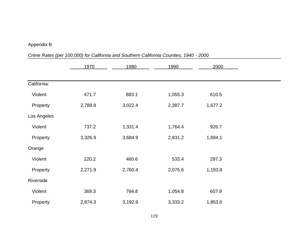
119
Appendix B Crime Rates (per 100,000) for California and Southern California Counties, 1940 - 2000
1970 1980 1990 2000 _
California:
Violent 471.7 883.1 1,055.3 610.5
Property 2,789.8 3,022.4 2,387.7 1,677.2
Los Angeles
Violent 737.2 1,331.4 1,764.4 926.7 Property 3,326.9 3,684.9 2,831.2 1,694.1 Orange Violent 220.2 460.6 533.4 297.3
Property 2,271.9 2,760.4 2,075.6 1,193.8
Riverside
Violent 369.3 764.8 1,054.8 607.9 Property 2,874.3 3,192.9 3,333.2 1,853.6
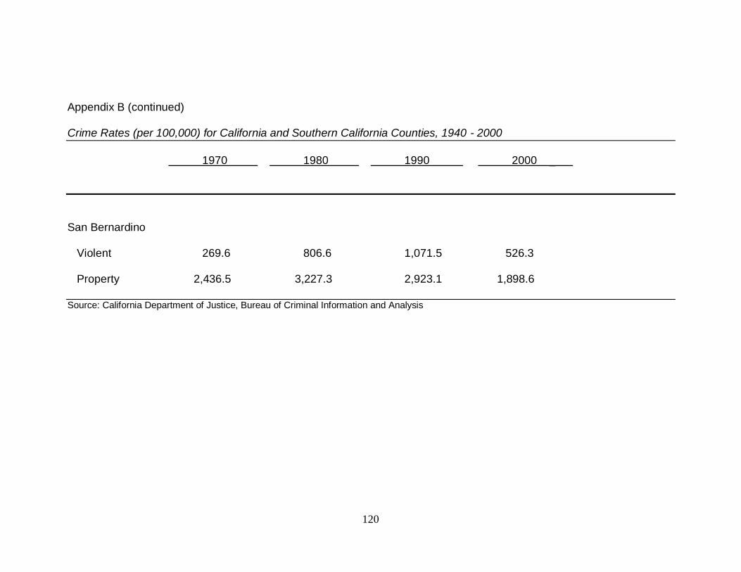
120
Appendix B (continued) Crime Rates (per 100,000) for California and Southern California Counties, 1940 - 2000
1970 1980 1990 2000 _
San Bernardino Violent 269.6 806.6 1,071.5 526.3 Property 2,436.5 3,227.3 2,923.1 1,898.6 Source: California Department of Justice, Bureau of Criminal Information and Analysis
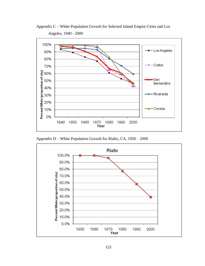
121
Appendix C – White Population Growth for Selected Inland Empire Cities and Los
Angeles, 1940 - 2000
Appendix D – White Population Growth for Rialto, CA, 1950 – 2000
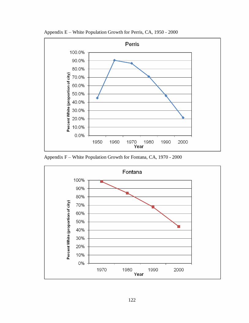
122
Appendix E – White Population Growth for Perris, CA, 1950 - 2000
Appendix F – White Population Growth for Fontana, CA, 1970 - 2000
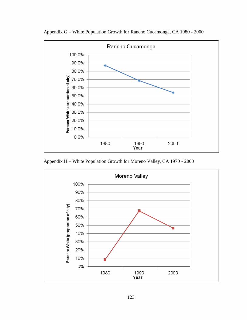
123
Appendix G – White Population Growth for Rancho Cucamonga, CA 1980 - 2000
Appendix H – White Population Growth for Moreno Valley, CA 1970 - 2000


