Embed Size (px)
Citation preview


plastic and figurative signs and in any semiotic analysis of information visualization resides in the fact that
we do not always deal with figurative images. Indeed, even though we might be working on iconic
productions such as photographs or film sequences, their analysis through image processing methods
requires to interpret resulting images that could be disrupting, abstract or non-sense for a fresh eye.
Previous investigations on information visualizations that depict relationships in form of a network
diagram, flow/pie/bar chart, treemap, stack graph, or any other visual method, prove their validity because
they tackle symbolic problems (Tufte, 1997). They also recall that images are not universal but
combination of analog and conventional modes of reading (Eco, 1997). Regarding indexicality, while
diagrams keep an indexical relationship by means of quantification and data, in visual media the indexical
signs are related to the materiality of visual images.
Cases of study In this section we present some techniques that have been employed for media visualization in order to
detect some hints and first discussions toward reading strategies of visual productions. We employ the
term ‘reading’ applied to images as an umbrella term to refer to seeing in a comprehensive way and to
understanding a code of meaning.
Pixelation and color scheme
In 1982, Adele Goldberg and Robert Flegal introduced the term ‘pixel art’ to refer to a new kind of images
produced by using Toolbox, a Smalltalk-80 drawing system designed for interactive image creation and
editing (Goldberg & Flegal, 1982). The technique consisted on applying a mask and a combination rule.
The mask could be a square (pixel) or an 8-bit dot and the combination rule would replace the original
image with the mask.
Nowadays, we can simply pixelate an image by selecting Pixelate under the Filter menu of most image
editors, from Adobe Photoshop to the online Pixlr1. The resulting image is a colored grid where squares
take its sampled color from the original image. Users are able to decide on the size of pixels. As we can
see, iconic properties of the image start to disappear and plastic signs become more evident. Of course,
this is not to say that plastic signs are not evident at first glance, we do see them but we often focus on
the identification of figures before colors, shapes and spatial composition. Figure 1 shows an example of
a pixelated image.
1 http://pixlr.com/

Figure 1. Pixelation of an image
Cultural uses of pixelation can be found in artistic styles such as pointillism. Other uses have been seen
in broadcast TV, often to hide some parts of the image. For us, this technique helps to get rid of figurative
properties and assists on developing a visual literacy grounded on plastic signs. In late 2012, we taught a
course on Digital Culture to undergraduate students of Information and Communication at University of
Paris 13. Among other activities, students were asked to pixelate images in order to make evident plastic
signs such as colors and their properties. Later we employed free and easy to use software such as
Rainbow 1.52, an add-on for Firefox Web browser. Our aim was to facilitate the understanding of different
arrangements of color. The color scheme of the image above can be seen as Figure 2.
Figure 2. Color palette of an image
A color scheme represents a color synthesis of an image. It shows the main colors, often arranged by
frequency, i.e. the most predominant will appear at the farther left. But the scheme can be observed in
more detail. Figure 3 shows a fragment of the complete color scheme, now called color palette. It is
important to note the table can be arranged according to visual properties on each column.
2 https://addons.mozilla.org/en-us/firefox/addon/rainbow-color-tools/

Figure 3. Complete color palette (fragment) of an image. Arranged by the visual feature white contrast.
From this image we also note some visual features extracted by Rainbow 1.5 that pertain to the chromatic
category: red, green, blue, saturation, lightness, white contrast, black contrast, luminosity. Recent
projects evidence the existence of 399 visual features that can be extracted and quantified using software
like MatLab and FeatureExtractor3.
Image slicing
One of the first uses of image slicing is slit-scan photography. Among other pioneers, William Larson
produced, from 1967 to 1970, a series of experiments on photography called ‘figures in motion’. The trick
was to mount a thin slit in front of the camera lens to avoid the pass of light into the film. Thus the image
is only a part of an ordinary 35mm photograph. Moreover, if the photographer sets the camera on a
movable artifact and makes a long exposure of the picture, the result could be seen indeed as a figure in
motion. Golan Levin has been compiling a list on projects and precursors on slit-scanning (Levin, 2005).
Recently, it is possible to take photos directly as slit-scan images. Consider iPhone apps such as Slit-
Scan Camera by funnerLabs4. But we can also generate a slit-scan from a live or recorded video
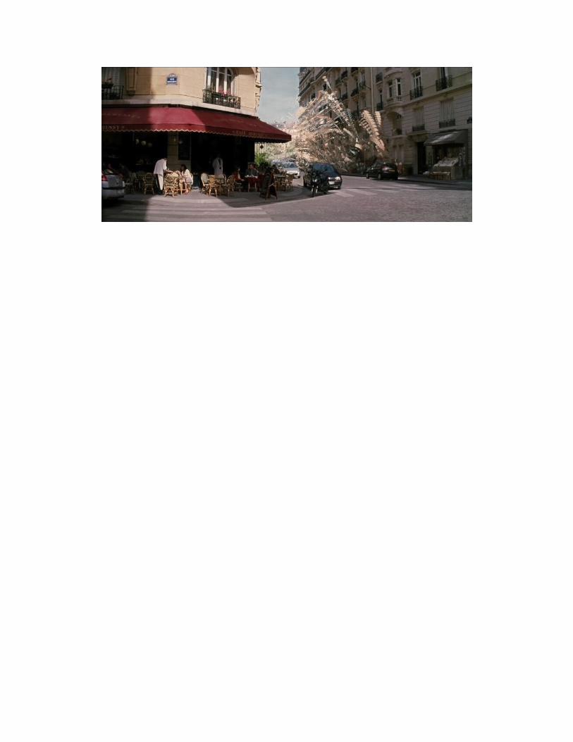
sequence by using Processing. Figure 4 shows a fragment of the film Inception (Nolan, 2010).
3 http://code.google.com/p/softwarestudies/wiki/FeatureExtractor 4 http://funnerlabs.com/apps/slitscan

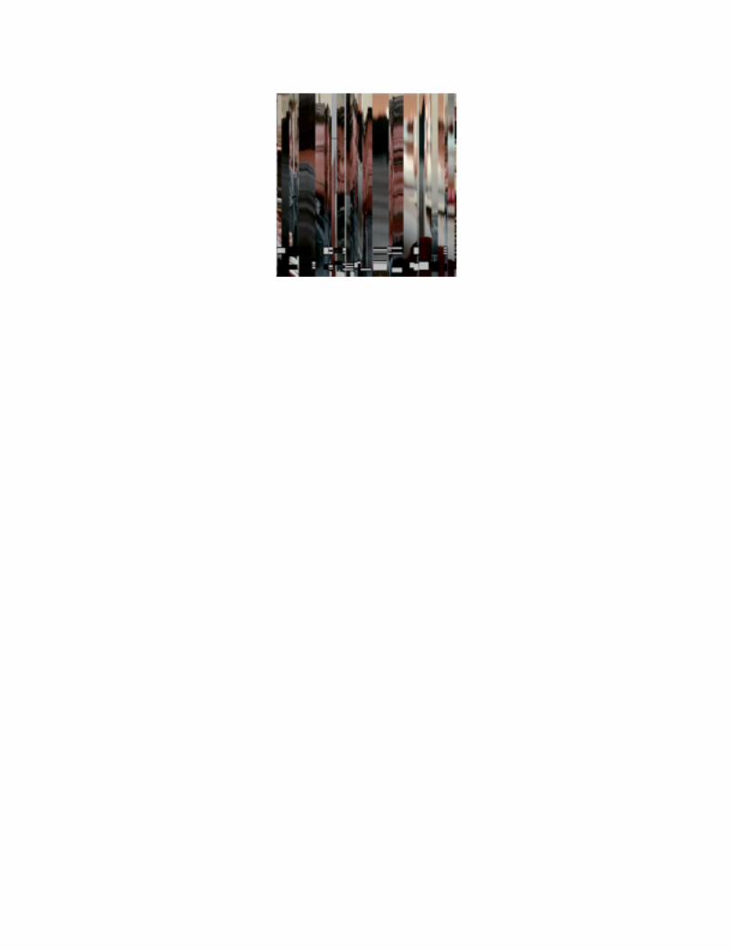
Figure 4. Slit-scan generated with Processing from a sequence from the film Inception
It might be clear to perceive the slit-scan effect. Yet for this particular case it could not be appealing
because it was done for a short duration of time. Perhaps interesting patterns may be discovered for
entire productions. Figure 5 illustrates a slit-scan, also called orthogonal cut in the software ImageJ. The
input was the video “Come as you are” by the band Nirvana (Kerslake, 1992) but converted into an image
sequence.
Figure 5. Orthogonal perspective of the music video “Come as you are”
But how would it look the visualization of an entire film according to this technique? The Tumblr site called
moviebarcode offers an index of a bunch of movies transformed to slit-scans. Among those we can see
the result for Inception.
Figure 6. Inception as slit-scan from the Tumblr site moviebarcode

Slit-scans are arranged progressively according to the time of an animated visual production. In the case
of the video-clip we note variations of colors and forms, but in the case of a film slits have been reduced
drastically and we can only see colors. An analytic reading would focus on contrasts of colors. A synthetic
reading would be related to textures created by colors. For a viewer familiar to the original production, she
could relate colors at any single position of the slit-scan to passages of the film, and that is because she
has previous experience with the object. From this image, contrasts of colors of an entire production
could then be schematized, pixelated, or we can apply other technique for visual feature extraction in
order to make comparisons on styles and rhythm.
Image montage
In 2004, Brendan Dawes presented ‘Cinema Redux’, a project aimed at showing what he calls a visual
fingerprint of an entire movie. The main idea was to decompose an entire film into frames and then to
arrange them as rows and columns, like a mosaic. In some sense, this technique is related to slit-
scanning in that is a zoom out of an entire production. This means we can observe 2 hours of images in
one single image. We replicated the same technique in Figure 7. We chose the video-clip ‘Come as you
are’ by Nirvana (Kerslake, 1992). First, we generated the image sequence at 10 frames per second
resulting in 2,257 image frames. Then, with ImageJ, we rendered an image montage.
Figure 7. Image montage of the music video “Come as you are”
While the source image is the same as in Figure 5, the result is very different. The chromatic categories
are the same but their spatial composition changes. We are indeed in front of a fingerprint, in terms of
Dawes: an indexical sign in terms of Pierce. To read this kind of image it is useful to keep in mind the
action or event or sound that relates to each position (a pragmatic perspective). Then a new relationship
to the object would rise, in other words, a new semantic of the indexical sign. A simple strategy consists
on looking for patterns in time by means of an analytic reading, which implies to visually group sequences
by colors and shapes. Do they repeat in another part? If yes, then we are in front of a pattern. In our case,
we chose deliberately the number of columns and rows to depict 6 seconds per row. Direction deploys
according to timing and should be read from left to right and top to bottom. We may observe that
saturated colors appear in the beginning, then low brightness, then again bright colors and at last a fusion
of both. Does the same pattern exist for other video clips? Is there a relationship between visual pattern
and music tempo? More investigations and comparisons are required to answer this question.
To discuss another example, Figure 8 compares two sequences that employ CGI in the film Inception
(Paris slow-motion explosions vs. Paris fold-over sequences). In this particular case, we can identify a
pattern of time: the amount of frames by shot is more or less the same. We can also appreciate that shots
include less quantity of shapes in the beginning and become more complex in the end. We may also
advance a partial conclusion. Nolan, together with visual effects supervisors Franklin, Corbuld, Bebb, and
Lockley, insert ‘rest zones’, i.e. shots without CGI effects in between shots with CGI effects.
Figure 8. Comparison of two image montages from the film Inception
Image averaging
Image averaging is related to the work of Sirovich and Kirby on ‘Eigenfaces’ in 1987 (Sirovich & Kirby,
1987). More recently, Jason Salavon has also produced series of images by averaging 100 photos of
special moments (Salavon, 2004). This method implies to flatten multiple images into one according to
the average of some chromatic value. Figure 9 shows the average of a shot in Inception that includes CGI
by taking into account the maximum brightness of 30 frames.

Figure 9. Average of max brightness of a 1-second CGI shot in Inception
With ImageJ it is easy to average other values by applying simple statistical analysis: minimum, median,
medium, or standard deviation. As we can observe, this technique is about extracting and quantifying
visual properties and then to perform statistical analysis.
It might be supposed this technique is more adequate when applied to short sequences or on those with
small changes on time. Averaging an entire contemporary Hollywood film would produce an image closer
to pure white or gray because of the quantity of frames and the movement and changes inside a frame.
However, it is possible to average only a small sample of the whole collection of frames. In Figure 11 we
show the result of averaging maximum brightness of the entire video clip ‘Smells like teen spirit’ by
Nirvana (Bayer, 1991). The image sequence was created by exporting the video at a rate of 10 frames
per second. We then imported it by incrementing by 10.
Figure 10. Average of sampled images of the music video “Smells like teen spirit”
In this case, larger forms appear in the middle of the frame. They also constitute the brightest region. A
more detailed examination, taking into account slit-scan and image montage of the same video-clip, leads
to conclude for this video an ideographic content. The figure of Kurt Cobain appears in the center, shiny

bright and high contrast inside an obscure atmosphere. However, these appearances are not numerous.
They are mainly three for the whole duration: the first around the start, the second around the middle and
the third at the end.
We present one last example. We have averaged the complete catalog of Thrasher covers, a popular
magazine among skateboarding culture. There are more than 350 images, ranging from 1981 to 2012. As
it can be appreciated the position of logo has not experienced major changes; the same can be said for
bar codes on the bottom part.
Figure 11. Average brightness of all covers of Thrasher Magazine
2D plotting
Plotting data values on two axes is a common type of representing information visually. Generally
speaking, the technique consists on locating on a Cartesian plane the crossing points according to data
values. Values can be positive or negative and they often allow seeing different positions at the same
time, so the decision maker can see variations and symbolic behavior.
Manovich introduced 2D media plotting. It consists on extracting values of visual features and storing
them in a tabulated data file. This file can also be amplified with metadata such as author, year, place and
other geographical, social or historical information. To give an example, we can extract all hue values for
a bunch of images and then mapping each of them on the X axis. The position on Y would depend on
other visual feature or on visual metadata, for instance a year. In that manner we can observe the
evolution of hue during a certain period of time.
The software ImageJ includes basic capabilities for extracting visual features. Together with
ImageMeasure and ImageShape, both scripts by the Software Studies Initiative, we can assemble an
important corpus of eidetic and chromatic visual features, about 112. As an example, consider Figure 12.
We have used ImageJ to plot 503 skateboards by Powell Peralta, produced between 1978 and 2012.
Figure 12. X axis represent hue values. Y axis stands for median brightness
What happens when you have more than 100 visual features measured? Is it possible to make an
average and to plot them? Manovich has done so by using R language. But in any case, the resulting
image depicts images themselves instead of dots and circles. We can of course zoom in and zoom out to
see details (the resolution of a media visualization is often larger than 8,000 pixels width). It is also
possible to distinguish curves and density zones. Consider figure 12 to approach a semantic reading.
Density is related to clustering and perceived through the dimension of formemes. Direction can be seen
through curves and lines traced along the graph: images go up and down. Repetition patterns can be
seen through repetitions of coloremes and texturemes.
3D structures
One of the common forms of 3D structures are 3D plot diagrams. Plotting on 3 axes has been useful for
multivariate analysis. Regarding visual information, colorimetric analysis was a pioneer in developing 3D-
based scales to visualize different color spaces. For instance, using ImageJ we can interactively visualize
an image in different color spaces. Figure 13 shows the color space RGB (red, green, blue).

Figure 13. 3D color analysis of an image in histogram mode
How to read such an image? Dimension of bubbles represent the frequency of that color, i.e. its
recurrences in the image. The position in space of the bubbles is determined by its value on red, blue,
and green channels (each of them ranging from 0.0 to 2.0). The departing point in the bottom angle is, by
default, brightness, going from 0, which is black, to 255, which is white.
Of course 3D plot is not limited to an organization inside a cube volume. Figure 14 shows two more
spaces: HSB and HDD.
Figure 14. HSB and HDD color spaces
Besides 3D plotting, we can also take advantage of 3D spaces to stack images. In this case, we simply
overlap images from a sequence. Figure 15 shows a stalk of the all shots including CGI visual effects in
the fortress explosion sequence of the film Inception.

Figure 15. Stalked sequence of images.
Now, imagine we synthetize colors for each image in a sequence and then we stack them and animate
them. Figure 16 shows two frames from a process named 3D surface plot in ImageJ.
Figure 16. 3D surface plot of a stalked image sequence
In this case, we plot the whole surface of the frame and we only see plastic signs. Remember you are
viewing the frame as if it were lying on the ground and not in front of you. It may be observed that the
highest points correspond to brighter tones, while the darker are located in the bottom. The color of the
surface is mapped from the original image. That means yellow and red stand for the explosion effect.
Gray and white are mostly snow, buildings, and the sky.
Finally, we are currently working on what we call ‘motion structures’. For us, motion structures are 3D
digital models created out of video sequences. Our workflow consists on transforming images to 8-bit

black and white, then to stalk them and to remove dark background. Figure 17 shows three views of the
same the object. It is the Paris-fold over sequence seen as motion structure.
Figure 17. Three views of a motion structure
Basically, the resulting visual production puts in evidence the shape of movements. Instead of analyzing
camera movements or character performances, we trace the transformations within the image itself. This
allows us to explore the form of indexical signs of moving pictures, to construct shapes, and to explore
them in 3D fashion. We rely on the software ImageJ to manipulate an image sequence and convert it into
a 3D model but it can be easily exported in DAE format and hence imported in other 3D navigating and
editing environment such as MeshLab, Maya, Blender, Sculptris or personal-developed applications with
Processing, OpenFrameworks, Quartz Composer and alike.

Figure 18. Motion structure imported into Sculptris
Conclusion
In this article we have proposed first steps toward a visual semiotic foundation to approach media
visualizations. The basic units for us are visual features. They are material properties of the visuality of
images. Indeed, whether contrast, mean values, standard deviation, energy, entropy, among others, they
can all be considered ‘plastic formants’. The usefulness of visual features is, essentially, to elaborate a
visual vocabulary of digital images and to foster, consequently, a more rigorous visual literacy in readers.
Moreover, we can also tackle visual features from the point of view of objects and super-objects: they can
be implied, associated, inherited between them. This facilitates a more flexible analytic/synthetic
perspective when dealing with external metadata that integrates as visual feature. As we saw, metadata
might be useful for 2D media plotting; they can be parameters to be chosen when producing an image
montage or an image average (number of frames, number of rows, visual feature to highlight).
In any case, the visual codes available are still weak. We need textual hints besides images. It is still
early to talk about visual methods besides traditional diagrams (pie/bar charts). But once we have defined
our main building blocks and general codes, we could agree on assembling larger projects that take into
account social, cultural, and political context; we could mix and remix techniques; we could create new
software and interfaces. The importance of conducting media visualizations is to navigate in the unknown;
to delegate some pre-conceptions about an object to an external agent (a software or programming
code). Perhaps this is what new images such as media visualizations are about. Perhaps, like abstract
art, they come with an ideological and connotative side: by conferring importance to materiality they are in
the same arena of the new realism (Galloway, 2012) or as alien phenomenology (Bogost, 2012).
Currently we are dedicating our efforts to construct a more comprehensible perspective to couple
semiotics, software, and media visualization. First, we believe it is fundamental to take into account

recent advances on what has been called ‘pictorial semiotics’ (Sonesson, 1989). Second, the
developments on cognitive semiotics must also be regarded, along with its methods and theories. Both
pictorial and cognitive semiotics are important because they take into account perceptual processes.
Finally, some investigations that already exist on scientific imagery (Fontanille, 2010) and on semiotics of
software (Andersen, 1997) provide valuable insights to be studied more deeply.
References
Andersen, P. (1997). A Theory of Computer Semiotics. Cambridge, MA: Cambridge University Press.
Bayer, S. (1991). “Smells like teen spirit”. DGC Records.
Bogost, I. (2012). Alien Phenomenology: or What It’s Like to Be a Thing. Minneapolis, MN: University of
Minnesota Press.
Dawes, B. “Cinema Redux”. Available online: http://brendandawes.com/projects/cinemaredux (retrieved
January 5, 2013).
Eco, U. (1997). Kant e l’ornitorinco. Milan: Bompiani.
Fontanille, J. (2010). “Réglages iconiques & esthétisation: notes sur l’interprétation de l’imagerie
scientifique“. Online:
http://www.unilim.fr/pages_perso/jacques.fontanille/articles_pdf/visuel/reglagesiconiquesimageriescientifi
que.pdf
Galloway, A. (2012). Les Nouveaux Réalistes. Paris: Léo Scheer.
Goldberg, A. & R. Flegal (1982). “Pixel Art” in Communications of the ACM. Vol. 25. No. 12. December.
New York: ACM Press.
Greimas, A.J. (1984) "Sémiotique figurative et sémiotique plastique" in Actes Sémiotiques. VI, 60. Paris:
Groupe de recherches sémio-linguistiques.
ImageJ. Available online: http://imagej.nih.gov/ij/ (retrieved January 5, 2013).
Kerslake, K. (1992). “Come as you are”. DGC Records.
Levin, G. (2005). “An Informal Catalogue of Slit-Scan Video Artworks and Research”. Available online:
http://www.flong.com/texts/lists/slit_scan/ (retrieved January 5, 2013).
Manovich, L. (2011). “Media Visualization: Visual Techniques for Exploring Large Collections of Images
and Video”. Available online: http://manovich.net/DOCS/media_visualization.2011.pdf (retrieved January
5, 2013).
Mitchell, W.J.T. (2005). What Do Pictures Want? Chicago: The University of Chicago Press.
Mondrian. Available online: http://stats.math.uni-augsburg.de/Mondrian/ (retrieved January 5, 2013).
moviebarcode. Available online: http://moviebarcode.tumblr.com/post/3508193540/inception-2010-prints
(retrieved January 5, 2013).
Nolan, Ch. (2010). Inception. Warner Bros Pictures.

O’Rourke, M. (2012). “Visualizations of Impressionist artists”. Available online:
http://lab.softwarestudies.com/2012/04/visualizations-of-impressionist-artists.html (retrieved January 5,
2013).
Rainbow 1.5. Available online: http://harthur.github.com/rainbow/ (retrieved January 5, 2013).
Salavon, J. (2004). “100 Special Moments”. Available online: http://salavon.com/work/SpecialMoments/
(retrieved January 5, 2013).
Sirovich, L. & M. Kirby (1987). "Low-dimensional procedure for the characterization of human faces" in
Journal of the Optical Society of America. Vol. 4. No. 3, pp. 519–524.
Slit-Scan Camera. Available online: http://funnerlabs.com/apps/slitscan (retrieved January 5, 2013).
Software Studies Initiative.
Sonesson, G. (1989). Pictorial concepts. Inquiries into the semiotic heritage and its relevance for the
analysis of the visual world. Lund: ARIS/Lund University Press.
Tufte, E. (1997). Visual Explanations: Images and Quantities, Evidence and Narrative. Chesire,
Connecticut: Graphics Press.


