Embed Size (px)
Citation preview
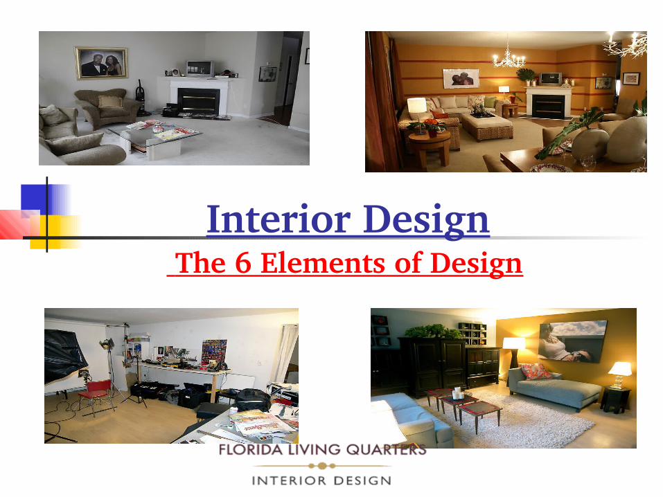
Interior Design The 6 Elements of Design

Space Space is the area in
which we work It defines limits and sets
boundaries of our design It is limited by width,
length and height To make space seem
larger use soft, light, cool colors
To make space seem smaller – use patterns or dark, warm colors

Line Line establishes
shape and form It suggests
movement and leads or moves the eye around the room
Lines are either straight or curved
Straight lines are considered to be more masculine

Vertical lines suggest formality and dignity
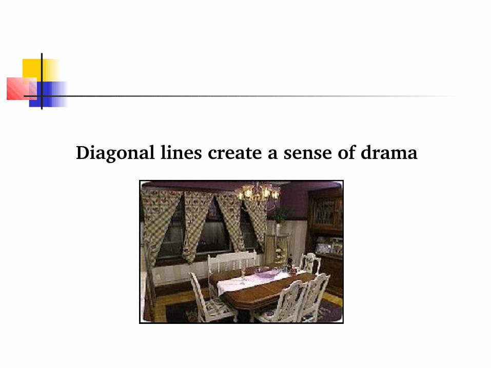
Diagonal lines create a sense of drama

Horizontal lines are relaxed, restful and casual.

Curved lines add interest and relief
Curved lines are softer, so are considered to be more feminine

Form The shape of an object is
form (square, rectangle, round, oval)
Forms in a room should be harmonious
Rectangular shapes are more pleasing to the eye than square shapes
Rectangles are most often the dominant shape in a room

Squares suggest a rational, stable form with no direction
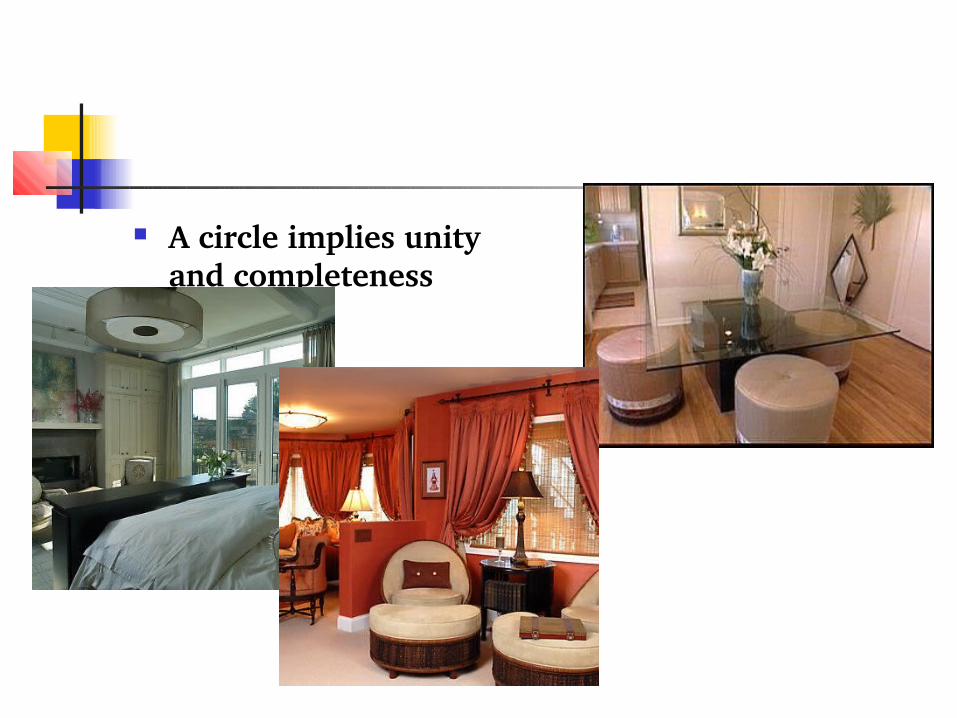
A circle implies unity and completeness
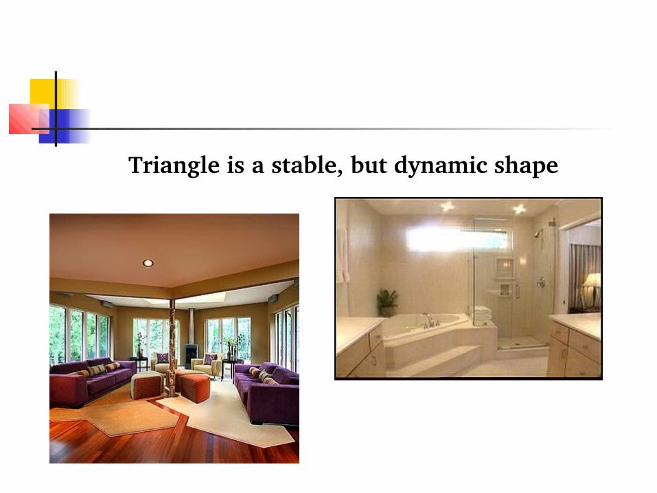
Triangle is a stable, but dynamic shape
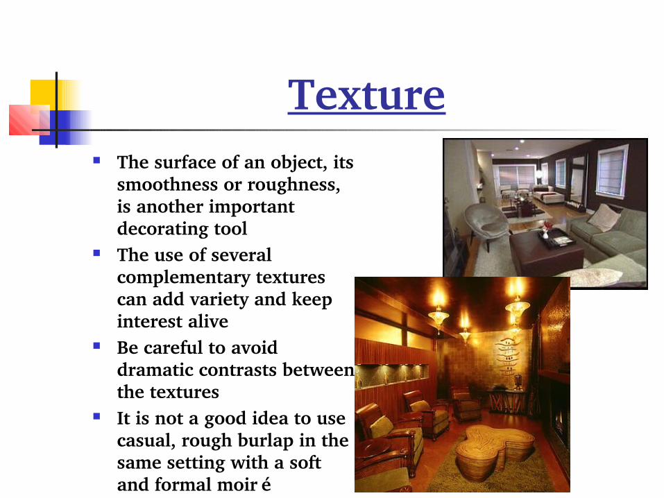
Texture The surface of an object, its
smoothness or roughness, is another important decorating tool
The use of several complementary textures can add variety and keep interest alive
Be careful to avoid dramatic contrasts between the textures
It is not a good idea to use casual, rough burlap in the same setting with a soft and formal moiré
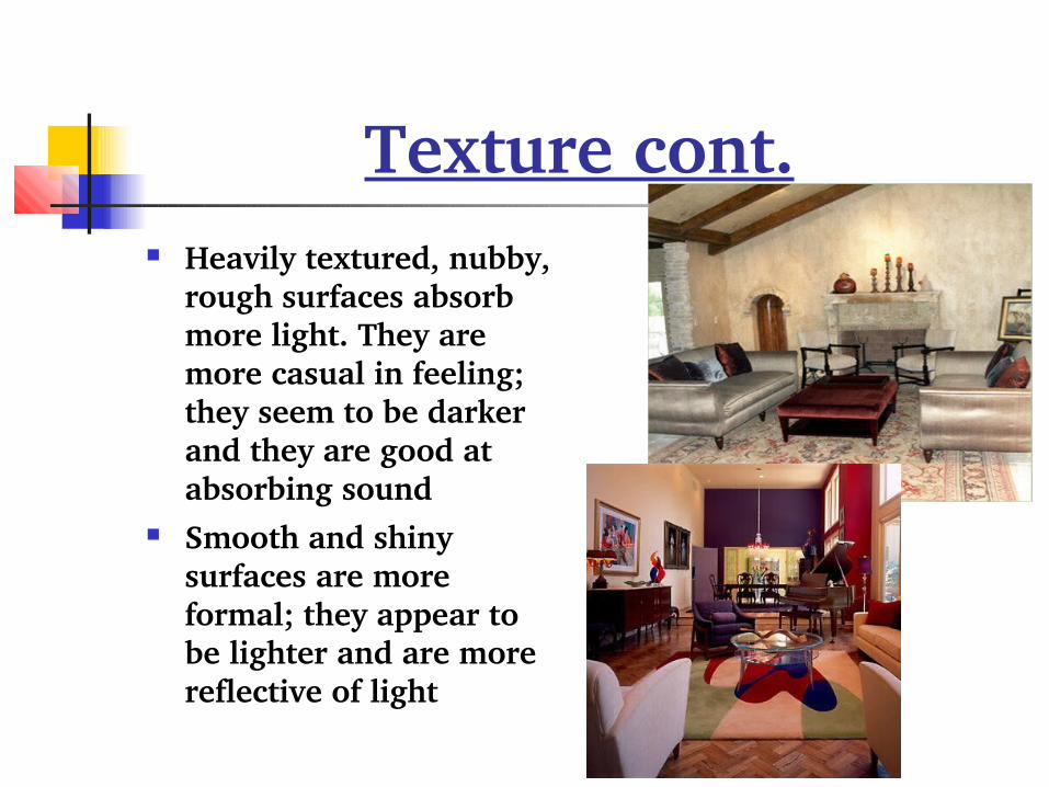
Texture cont. Heavily textured, nubby,
rough surfaces absorb more light. They are more casual in feeling; they seem to be darker and they are good at absorbing sound
Smooth and shiny surfaces are more formal; they appear to be lighter and are more reflective of light

Pattern Pattern is the repetition of a
decorative motif on a surface It is closely related to texture,
but individual elements of pattern appear as individual items and texture appears as an overall tone.
Pattern provides the spice in decorating
Scale is important in the use of pattern
If a large print is used on a small object the pattern will get lost

Pattern cont. You can safely use a
floral pattern with a geometric pattern, a stripe or check
Be careful not to create an effect that is too busy
Use patterns that are in proportion to each other
A large floral would be out of proportion with a small check

Color Color is one of the most
powerful tools used in interior design/ decorating.
Color should be studied both psychologically and emotionally to be understood and used correctly.
The amount of light also affects color
Dim lighting reduces a color's value and diminishes its hue

Color cont. High lighting levels can
either intensify the hue or make the color appear washed out
Color swatches should be tested in their actual location under the expected lighting conditions before final decisions are made
The amount of area covered affects color
Color intensifies as the area of color increases
It is also important to remember that interior colors should be chosen inside and exterior colors outside

Now that you know the six Elements of Design , you can better understand them and you can make them work for you