Embed Size (px)
Citation preview

1
Sundara

CHALLENGE Sundara is a nonprofit that funds hygiene solutions in developing countries. The founder came to us with a request for a site redesign. Through testing, we discovered that users were not getting the information they were looking for.
SCOPE Based on business goals and all stakeholder needs, we narrowed the scope of the project to updating the information architecture, identifying users, and content strategy.
MY ROLE
PROCESS Site Audit Research IA/Content Strategy Design
a nonprofit site redesign focused on identifying users, information architecture, and
content strategy
TOOLS Sketch Axure
INFORMATION ARCHITECT I primarily contributed in conducting research, creating content strategy, revising information architecture, creating wireframes, and creating materials for the client.
Sundara was a client project that I worked on in a team of 4 over the course of 2.5 weeks.
OVERVIEW SITE AUDIT RESEARCH IA/CONTENT DESIGN
Sundara

• Evidence of Credibility • Visual vs. Text-Heavy • Impact of Organization • Mission-Driven • Human Interest Stories
USER GOALS
BRAND GOALS
BUSINESS GOALS
• Education/awareness • Approachability • Bottom Up Approach
• Newsletter sign-ups • Consistent Funding • Individual Donations
We considered the goals of all stakeholders when planning our redesign.
Utilizing powerful, visually-driven storytelling
Engaging and educating the public on hygiene issues
Providing clear, compelling content for potential sponsors
This informed our objectives in how we were going to restructure the information architecture of the site. We sought a happy medium among all stakeholder goals and business needs.
OVERVIEW SITE AUDIT RESEARCH IA/CONTENT DESIGN

The mission statement is unclear to users
Too much text and not enough visuals
Purpose of the site and what user can accomplish is unclear
“I don’t understand how soap relates. Is
soap a tool or is this about soap?”
“I still don’t know who they are or
where I’m donating to.”
“I would like to know more about Sundara
without clicking so much.”
We also performed a heuristic evaluation based on these heuristics: Findable, Accessible, Clear, Communicative, Visible, Controllable, Credible, Delightful, Learnable, Useful.
KEY TAKEAWAYS
We conducted usability testing on the current site, asking users to identify the purpose of the site. Users knew it was a nonprofit, but were generally confused, unable to identify the mission statement of the organization.
usability testing | heuristic evaluation | competitive analysis
OVERVIEW SITE AUDIT RESEARCH IA/CONTENT DESIGN

charity: water clean the world pencils of promise
usability testing | heuristic evaluation | competitive analysis
We examined the sites of direct and indirect competitors for inspiration and to see what is currently succeeding in the nonprofit sector.
I additionally created site maps of competitor sites in order to audit content and understand how successful nonprofits present information to their users.
OVERVIEW SITE AUDIT RESEARCH IA/CONTENT DESIGN

We used affinity diagramming to determine what content was most important to users on a non-profit site.
80% News Feed
CONTENT RATED VERY IMPORTANT
Clear, mission-driven business plan
Evidence of credibility (legitimate partners, press)
Impact of donations & organization
Human interest stories about individuals
More photos and videos throughout
KEY TAKEAWAYS
survey | user interviews | personas
We surveyed 25 people and interviewed 13 people who were previously involved in the nonprofit sector to better understand Sundara’s target user base.
48% Interest in Issue
WHY PEOPLE VISIT NONPROFIT SITES
38% Internet Search
HOW PEOPLE FIND NONPROFIT SITES
OVERVIEW SITE AUDIT RESEARCH IA/CONTENT DESIGN

LAURIE “The Millennial Activist”
EDGAR “The Consistent Donor”
COURTNEY “The Knowledge Seeker”
ASHWINI “The Screener”
\
We synthesized all our user research into 4 personas.
survey | user interviews | personas
Our primary persona was Ashwini, whose job consists of scouring websites to find nonprofits to recommend to her boss for corporate sponsorship. This was based off the stakeholder need for consistent funding.
OVERVIEW SITE AUDIT RESEARCH IA/CONTENT DESIGN
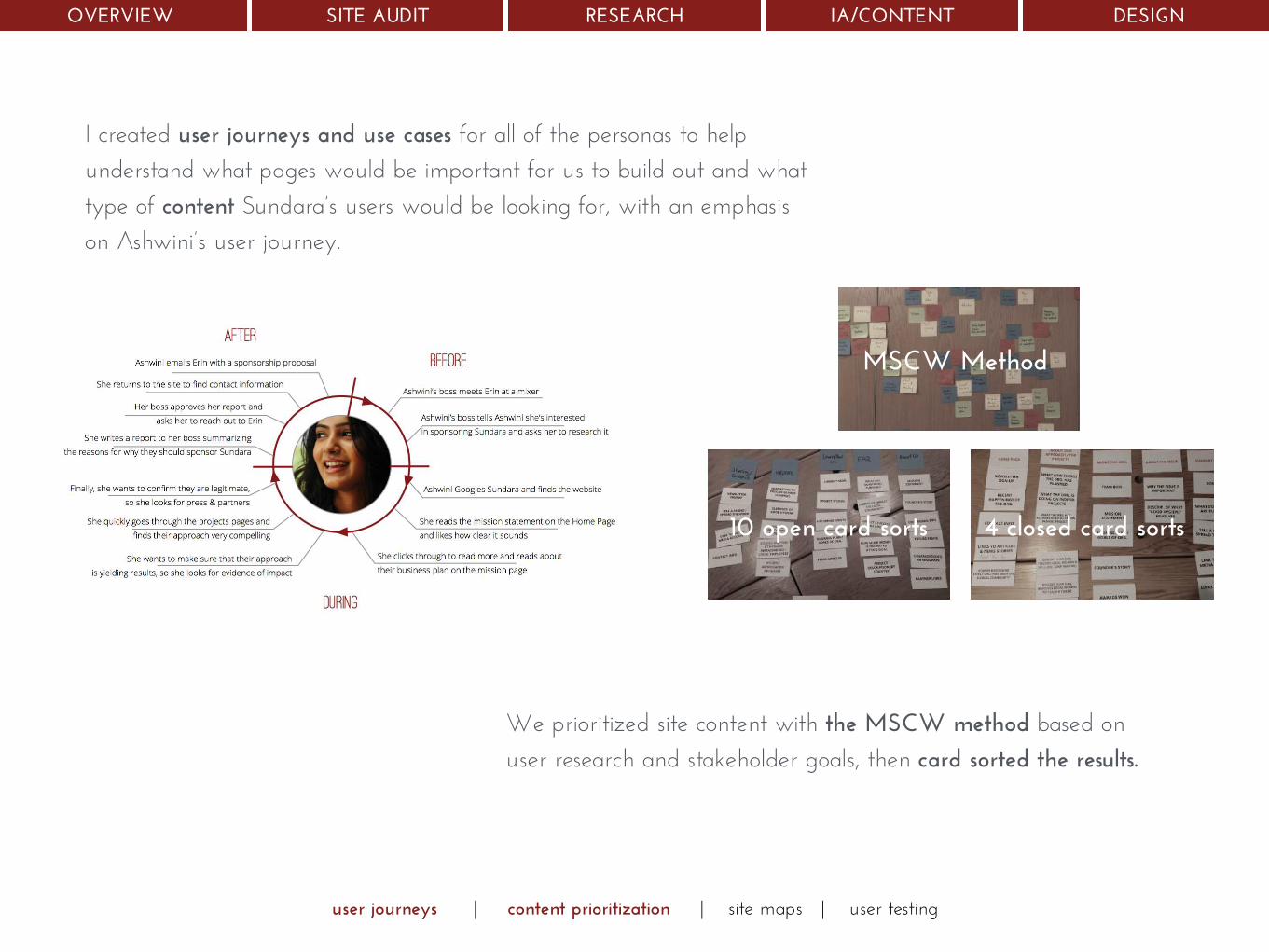
I created user journeys and use cases for all of the personas to help understand what pages would be important for us to build out and what type of content Sundara’s users would be looking for, with an emphasis on Ashwini’s user journey.
user journeys | content prioritization | site maps | user testing
10 open card sorts
MSCW Method
4 closed card sorts
We prioritized site content with the MSCW method based on user research and stakeholder goals, then card sorted the results.
OVERVIEW SITE AUDIT RESEARCH IA/CONTENT DESIGN

user journeys | content prioritization | site maps | user testing
I synthesized the results of the card sorting into an updated site map. The navigation was further validated through multivariate testing.
BEFORE AFTER
The intention with the updated site map was to maintain the simplicity of navigation, while also including necessary content that was currently missing.
OVERVIEW SITE AUDIT RESEARCH IA/CONTENT DESIGN

I collaborated with the project manager on content strategy and created lo fi wireframes for each page, which we validated through user testing.
http://dz5wna.axshare.com/home.html
lo fi wireframes | prototypes
http://bit.ly/1zwEEbZ
We additionally created high fidelity interactive prototype for two pages in order to demonstrate the responsive layout and visual design.
OVERVIEW SITE AUDIT RESEARCH IA/CONTENT DESIGN

11
thank you