Embed Size (px)
Citation preview
a user experience design case study via General Assembly’s UXDI
Matt Toman + Robert Boler
Renovate Simply
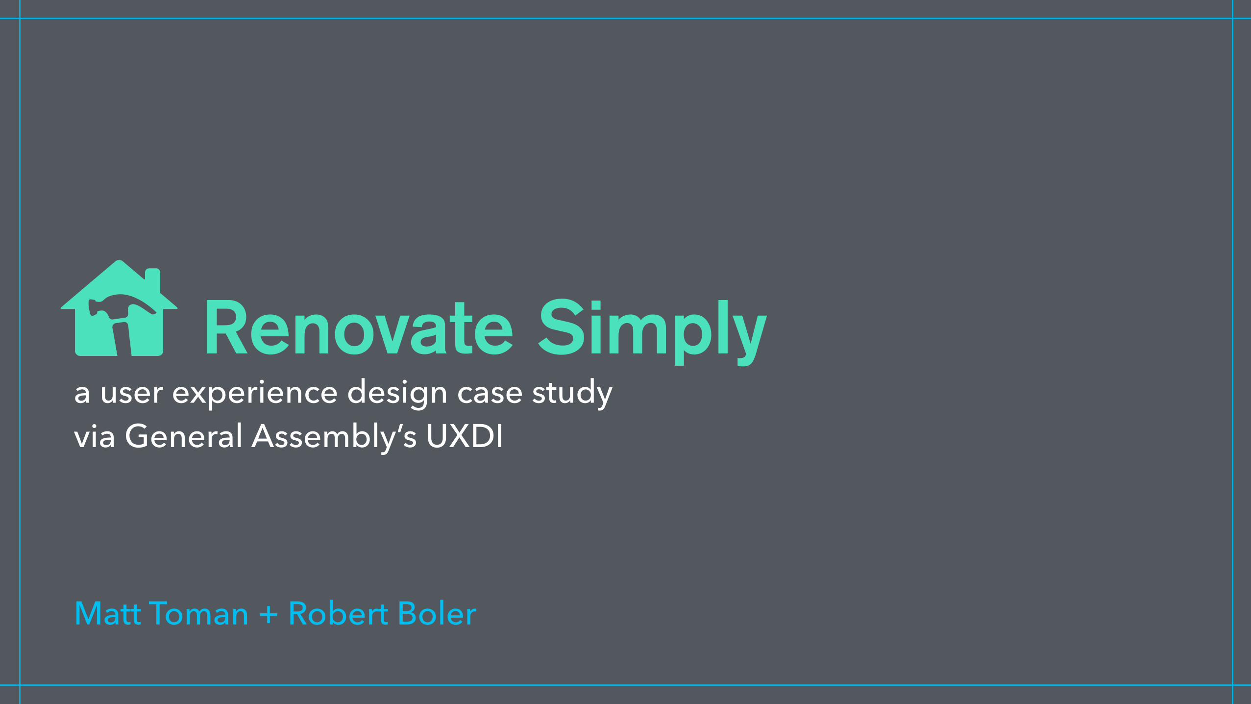
L I N E U P
1. problems 2. research 3. insights 4. top design solutions 5. prototype demo
• discussion throughout, Q&A two-on-two at the end
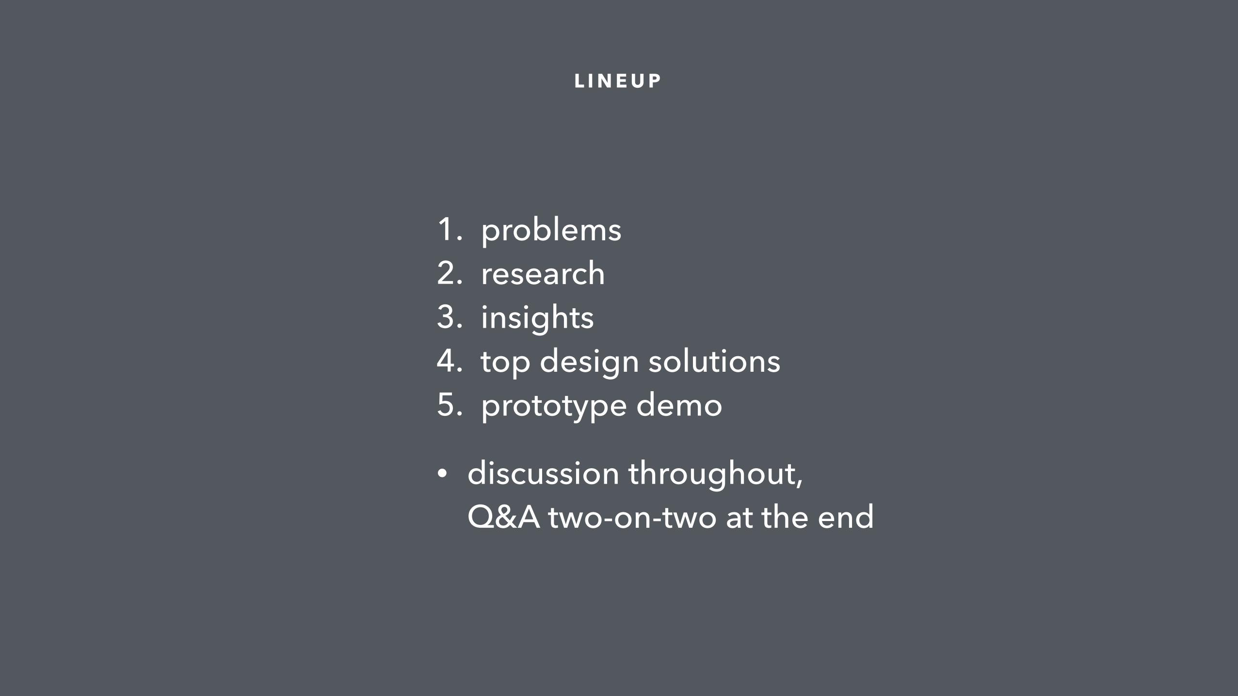
Homeowners need a simple, painless way to understand the approximate cost of their renovation projects, and find trusted contractors for them.
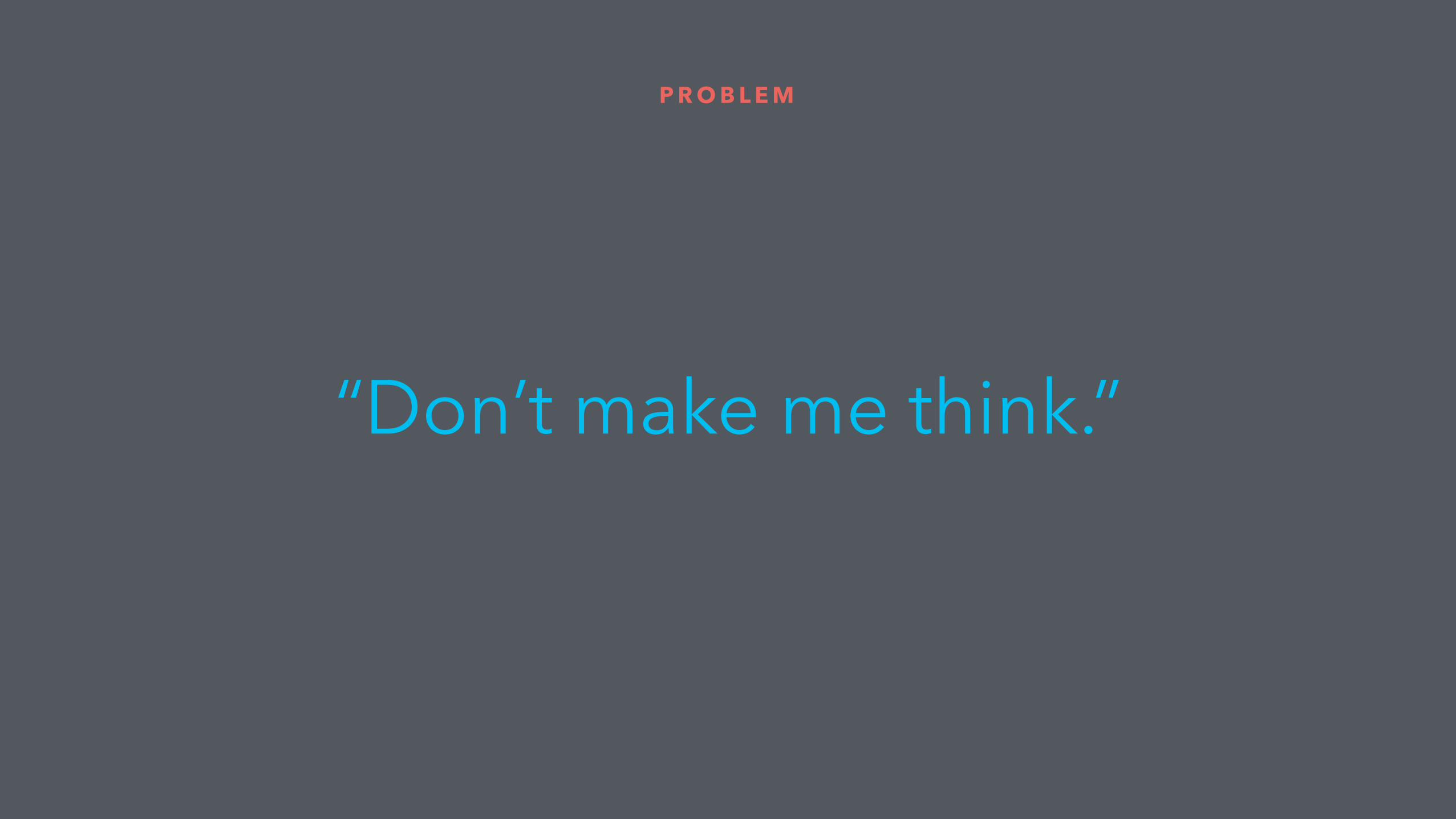
P R O B L E M
• improve current design • future features • mobile web vs. native app
P R O B L E M
“Don’t make me think.”

Research
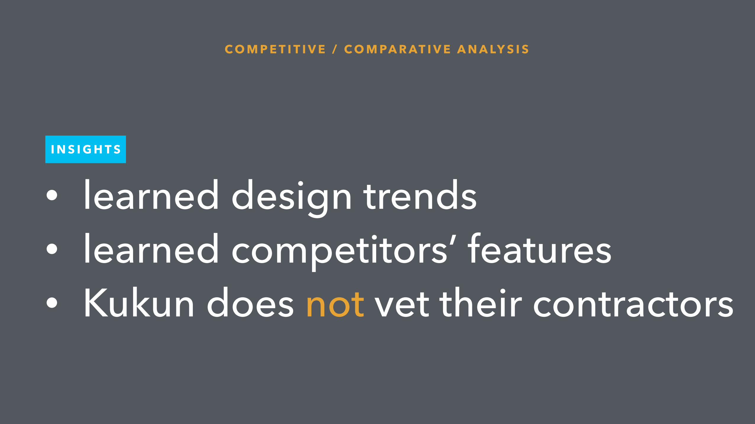
• learned design trends • learned competitors’ features • Kukun does not vet their contractors
C O M P E T I T I V E / C O M PA R AT I V E A N A LY S I S
I N S I G H T S
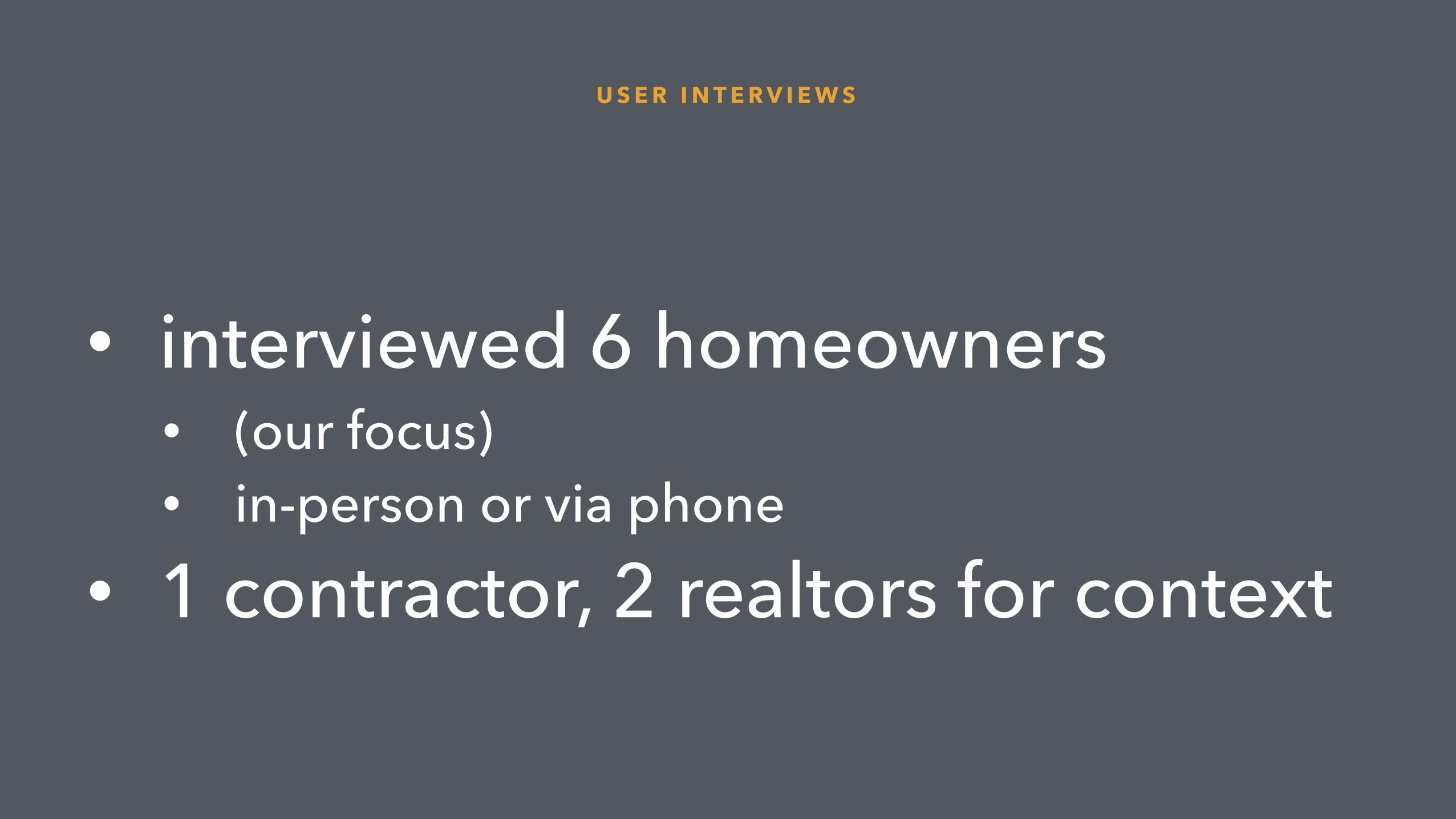
• interviewed 6 homeowners • (our focus) • in-person or via phone
• 1 contractor, 2 realtors for context
U S E R I N T E R V I E W S
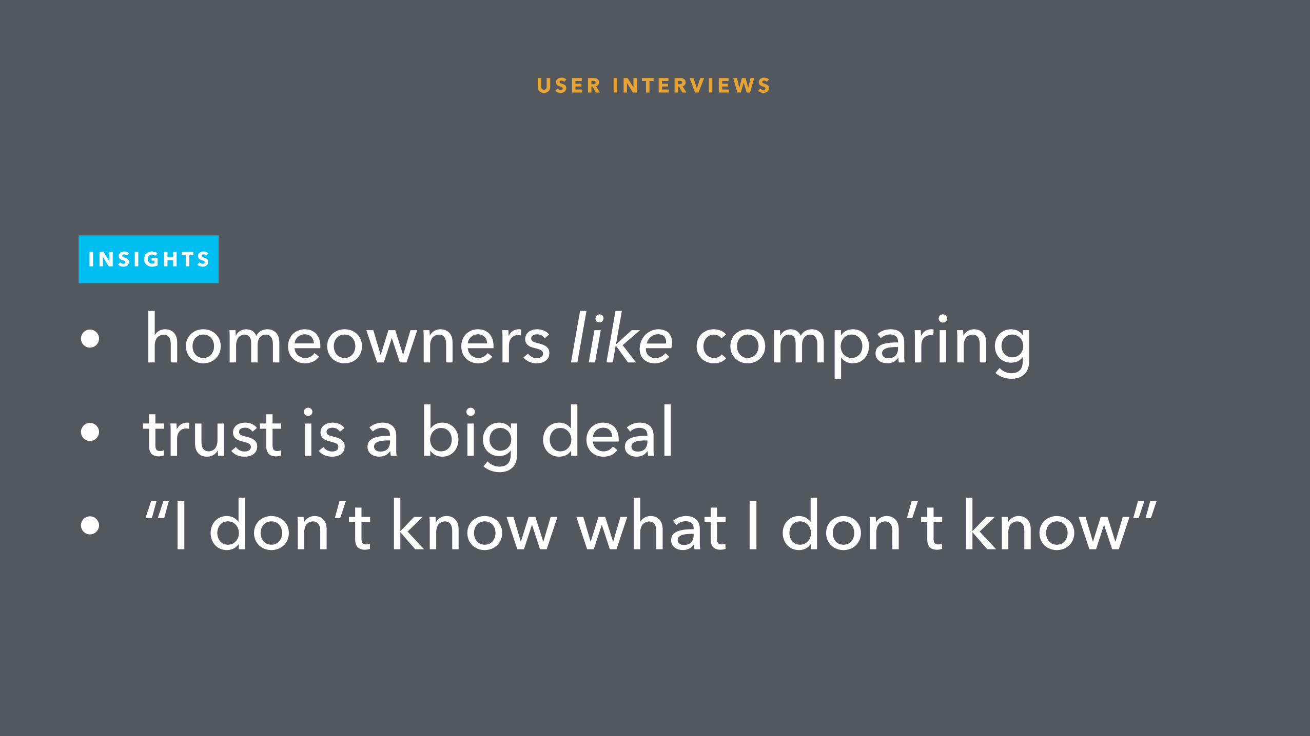
• homeowners like comparing • trust is a big deal • “I don’t know what I don’t know”
I N S I G H T S
U S E R I N T E R V I E W S
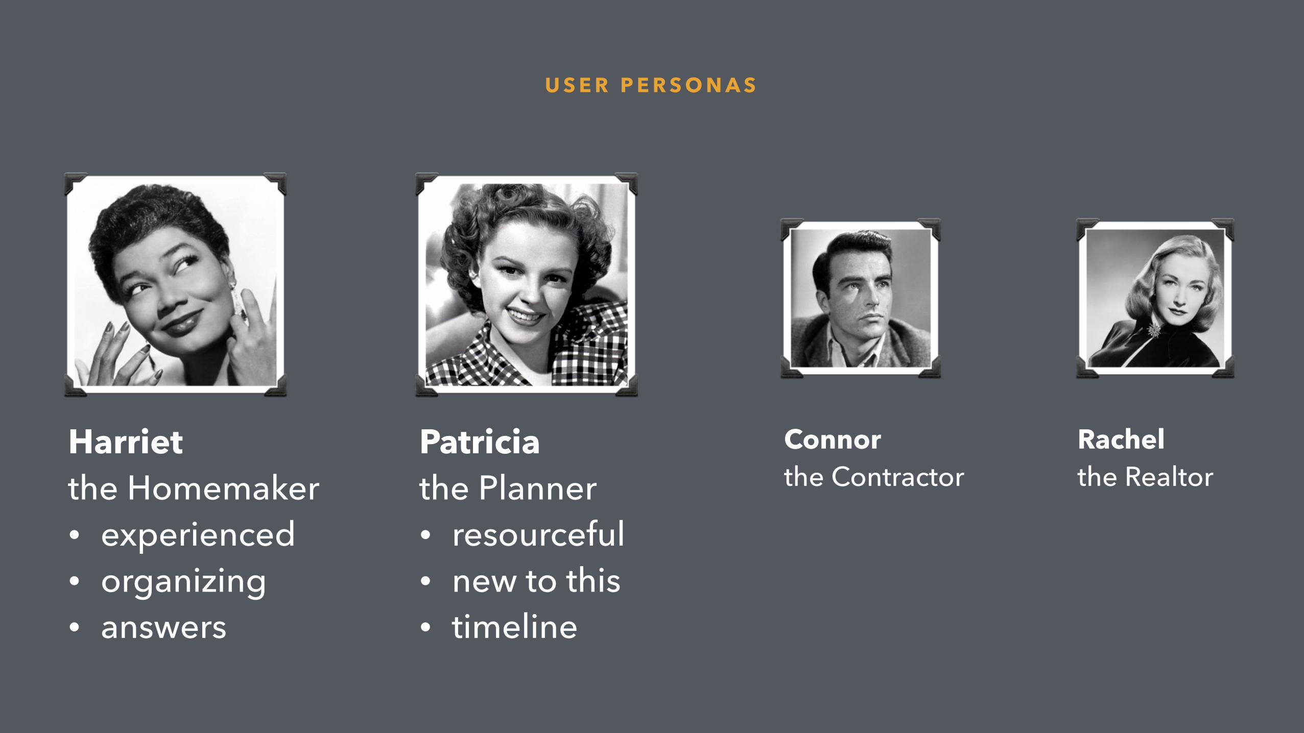
U S E R P E R S O N A S
Harriet the Homemaker • experienced • organizing • answers
Patricia the Planner • resourceful • new to this • timeline
Connor the Contractor
Rachel the Realtor
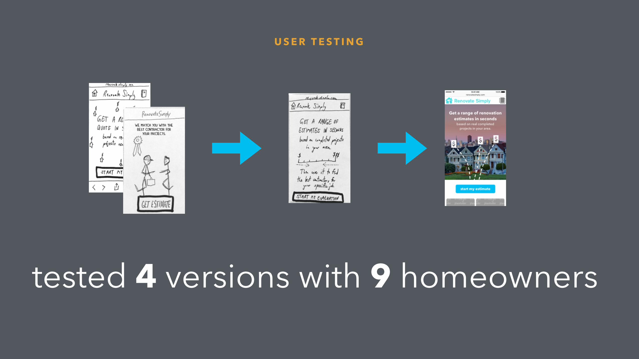
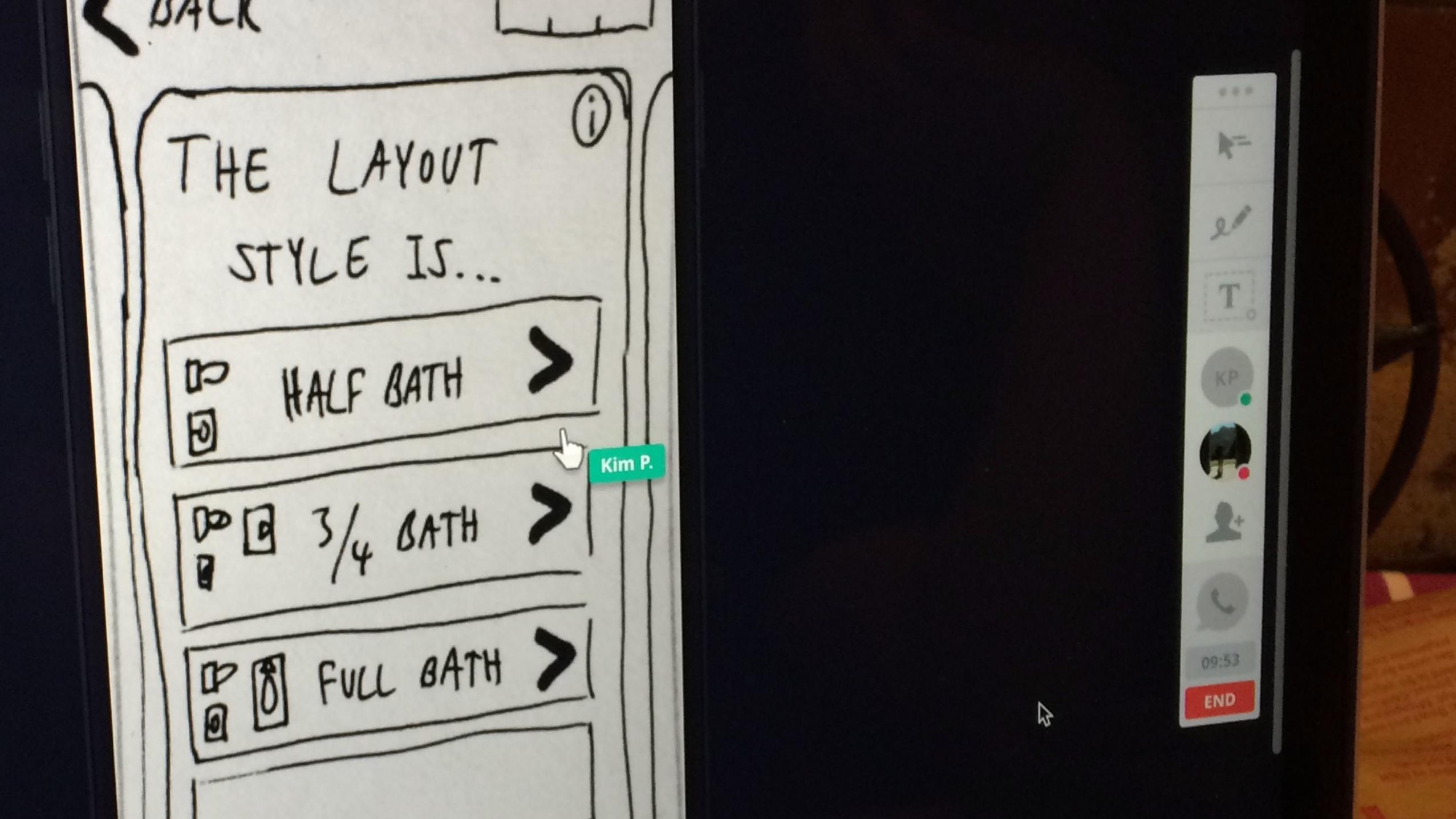
tested 4 versions with 9 homeowners
U S E R T E S T I N G
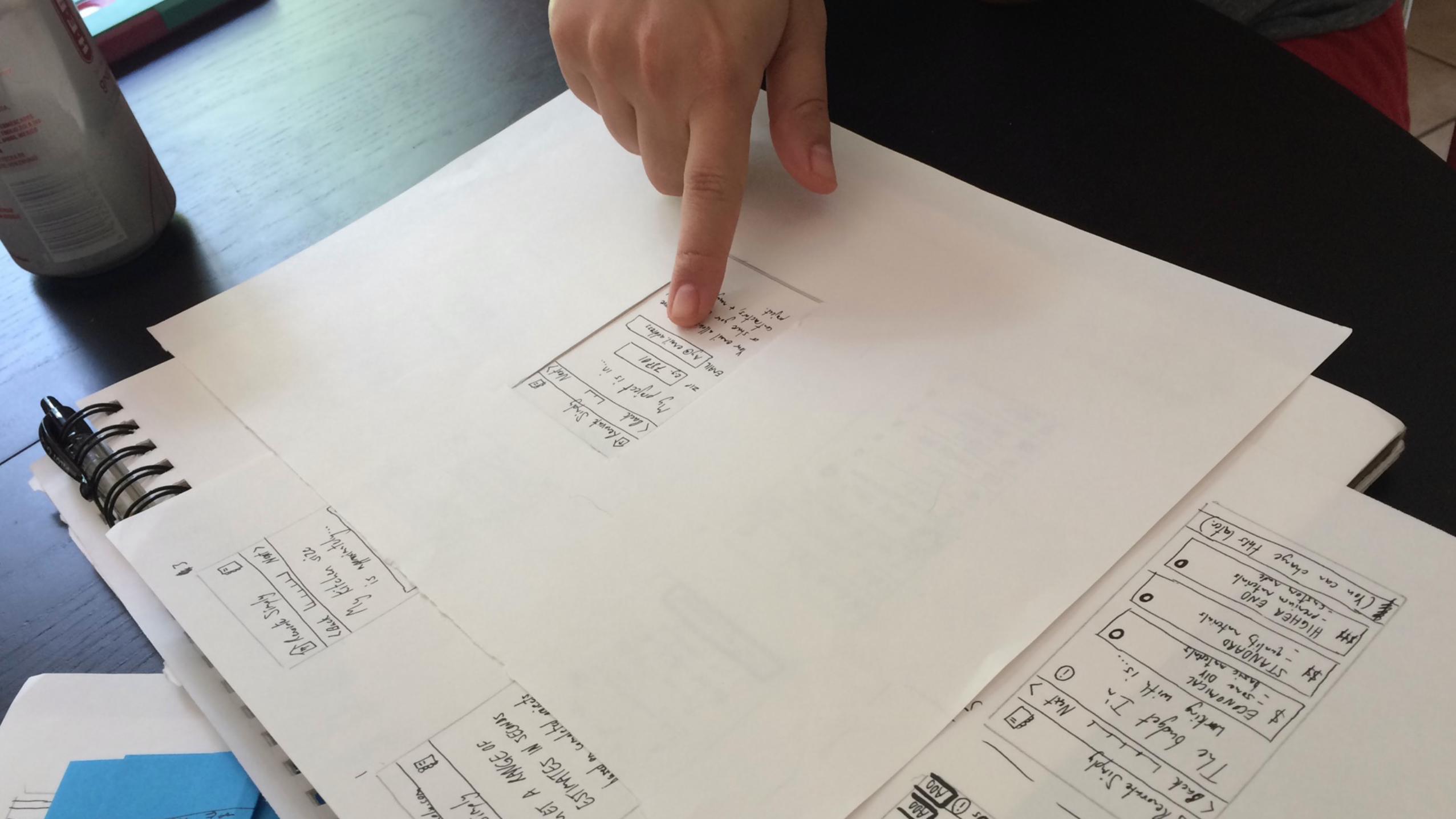
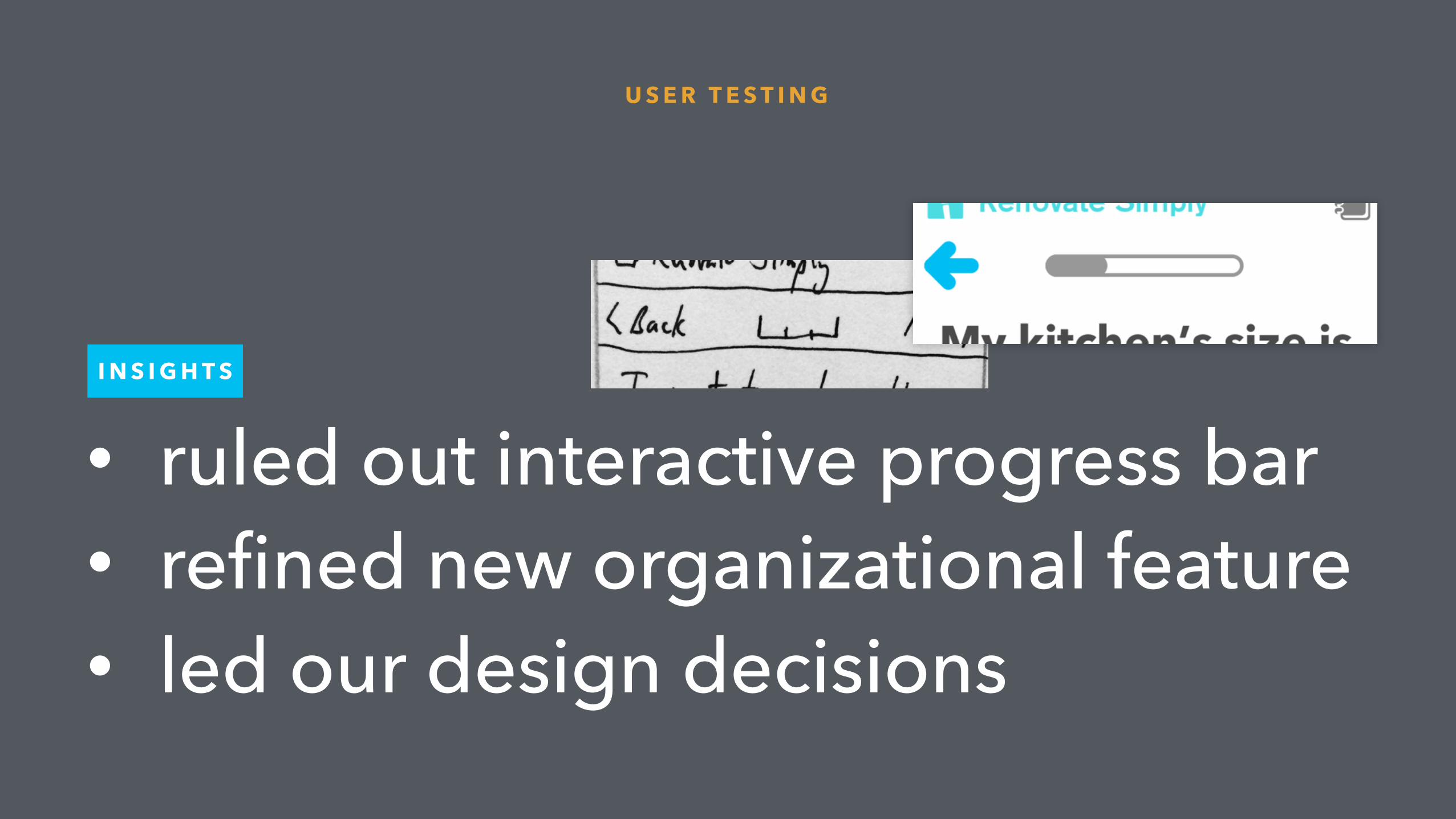
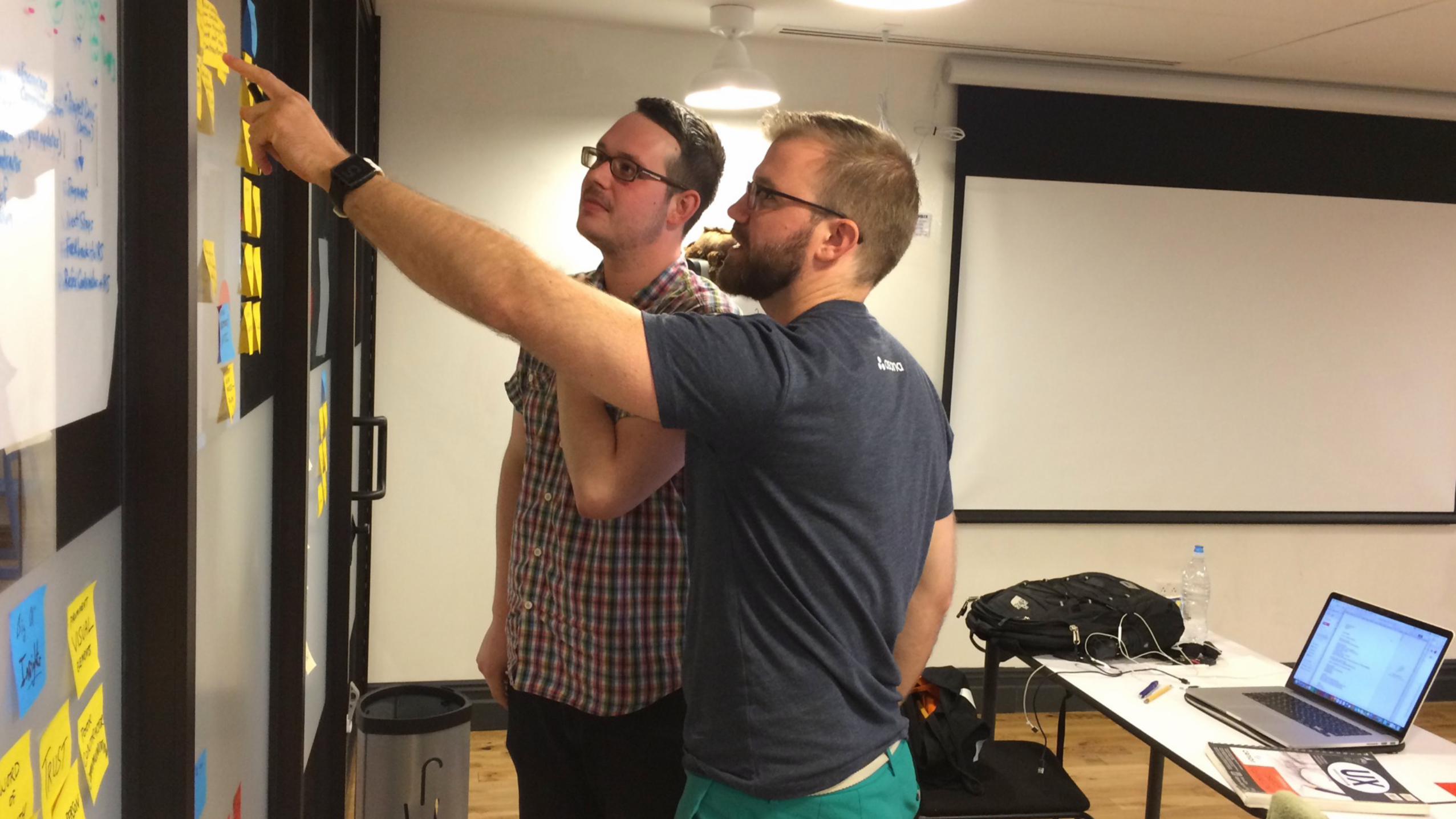
• ruled out interactive progress bar • refined new organizational feature • led our design decisions
U S E R T E S T I N G
I N S I G H T S

Top Insights the big 4
• Low likelihood to get current app • Infrequent use case • Web developer in-house
so…
1

• Focus on mobile web app first, not a native app
I N S I G H T
1
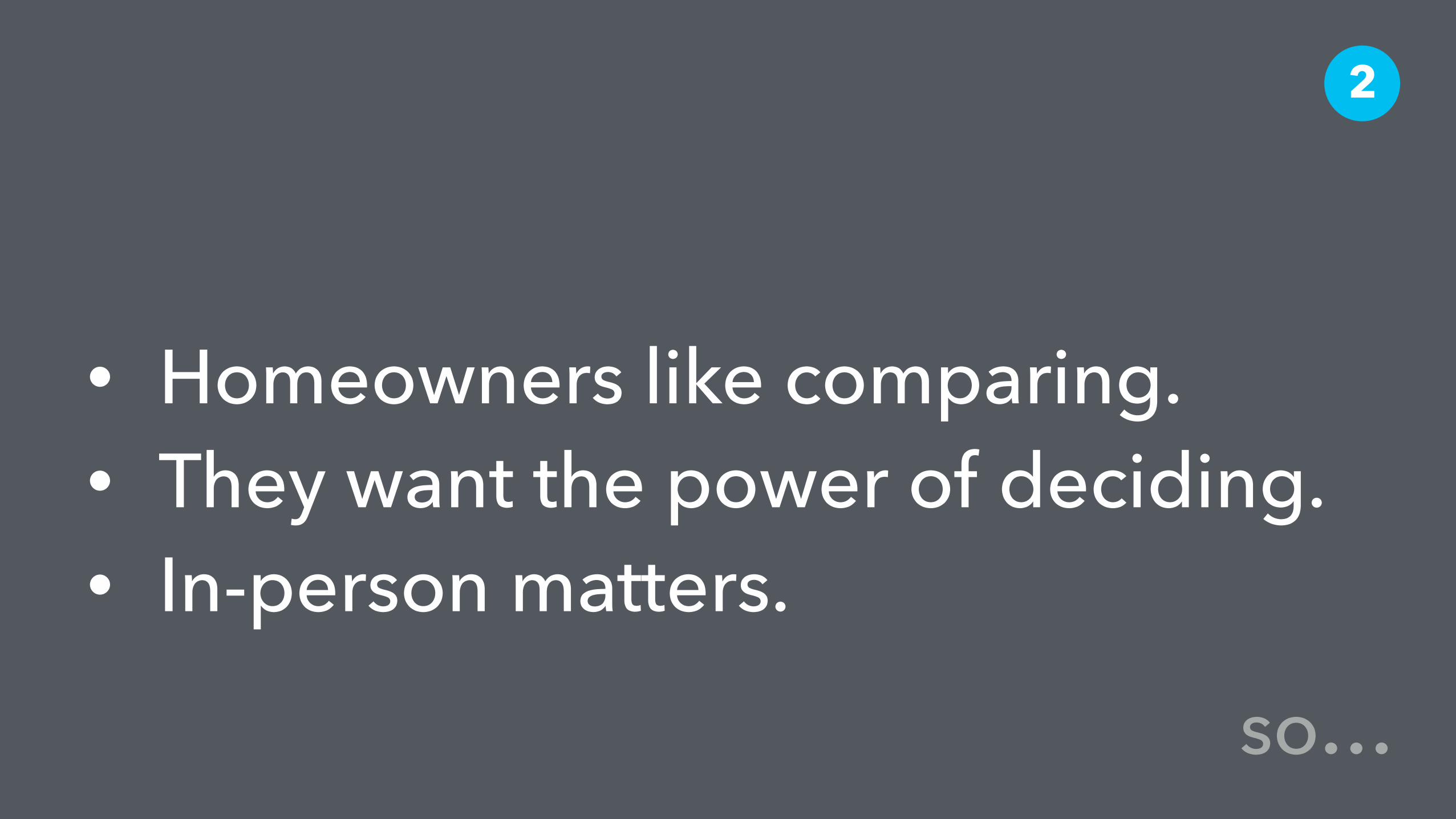
• Homeowners like comparing. • They want the power of deciding. • In-person matters.
2
so…

• Don’t fight comparison, join it. • Offer 3 contractors (sweet spot
according to user research)
I N S I G H T
2
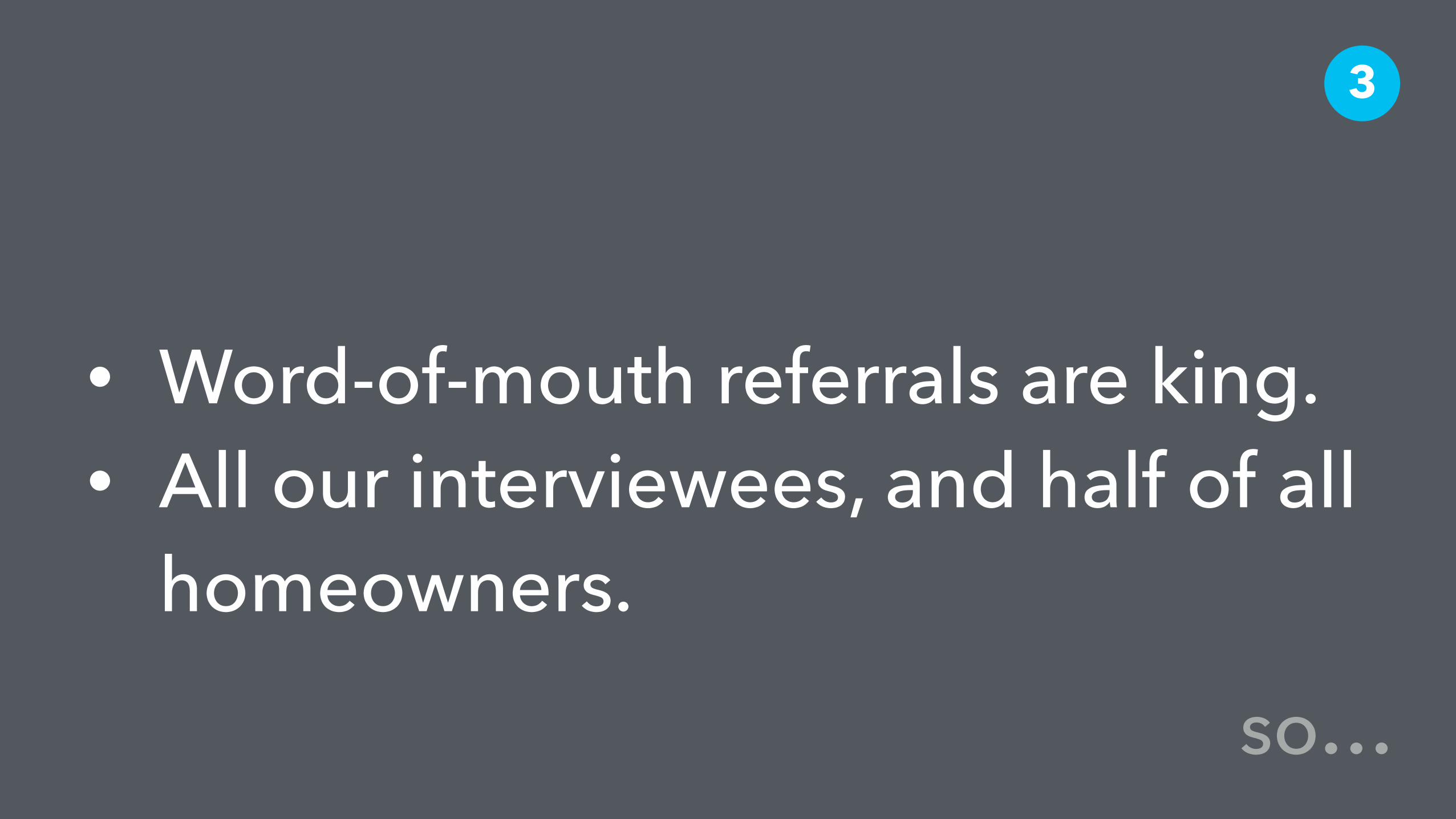
• Word-of-mouth referrals are king. • All our interviewees, and half of all
homeowners.
3
so…

• Create value for these users with a new feature…
I N S I G H T
3
(no spoilers)
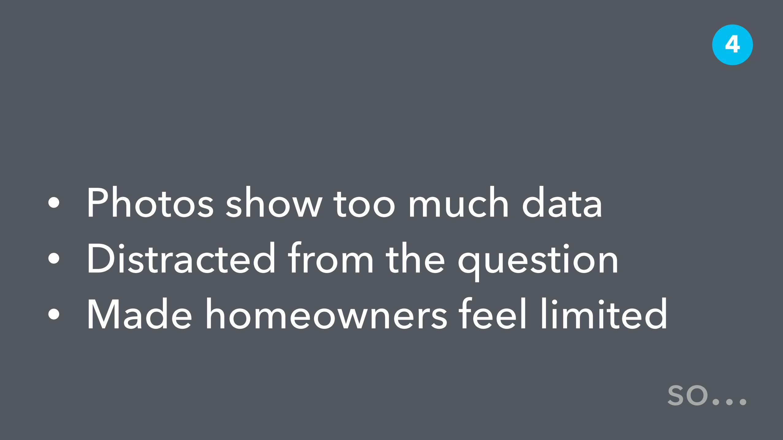
• Photos show too much data • Distracted from the question • Made homeowners feel limited
4
so…
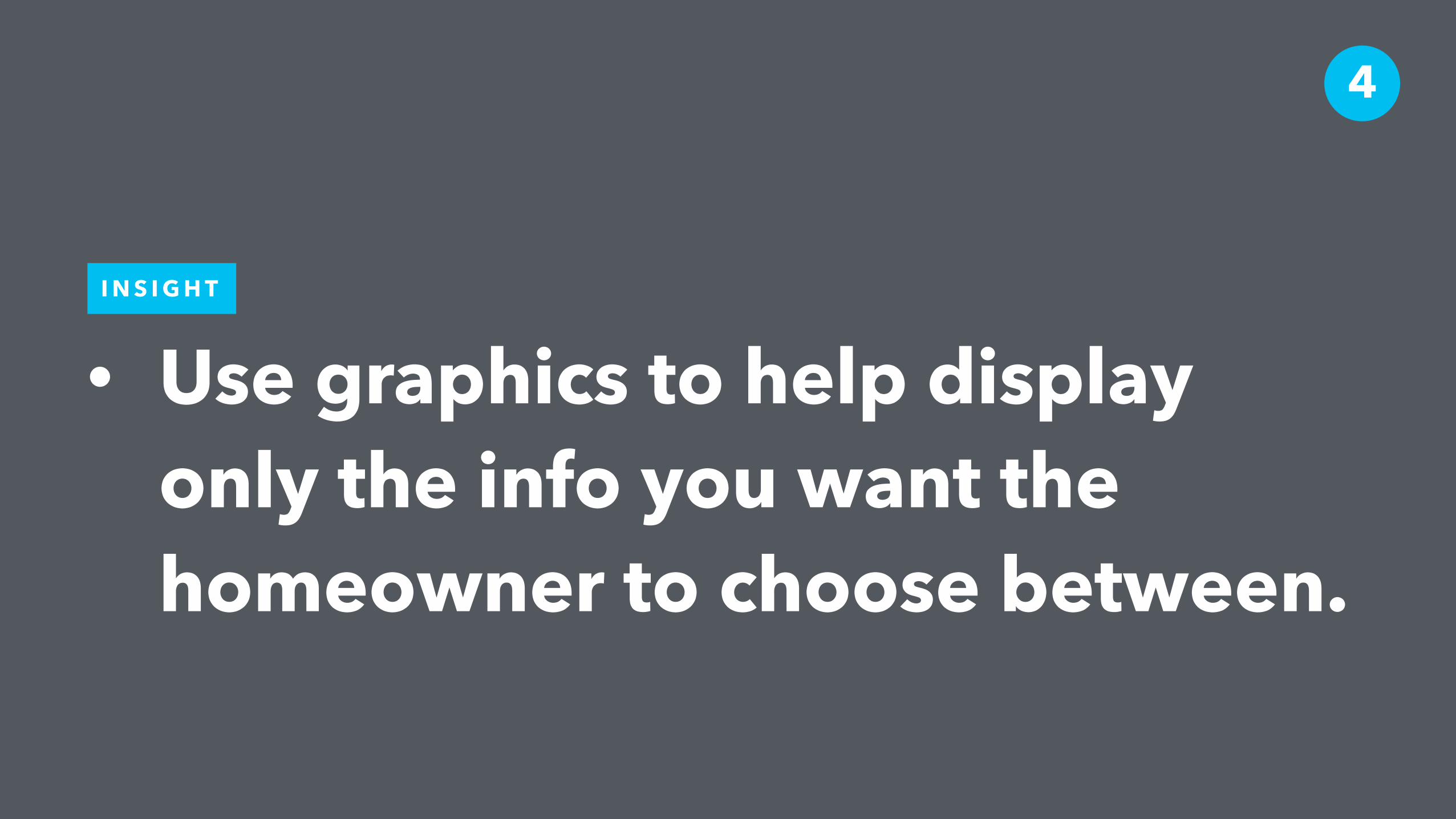
• Use graphics to help display only the info you want the homeowner to choose between.
I N S I G H T
4

Top Design Recommendations the big 5
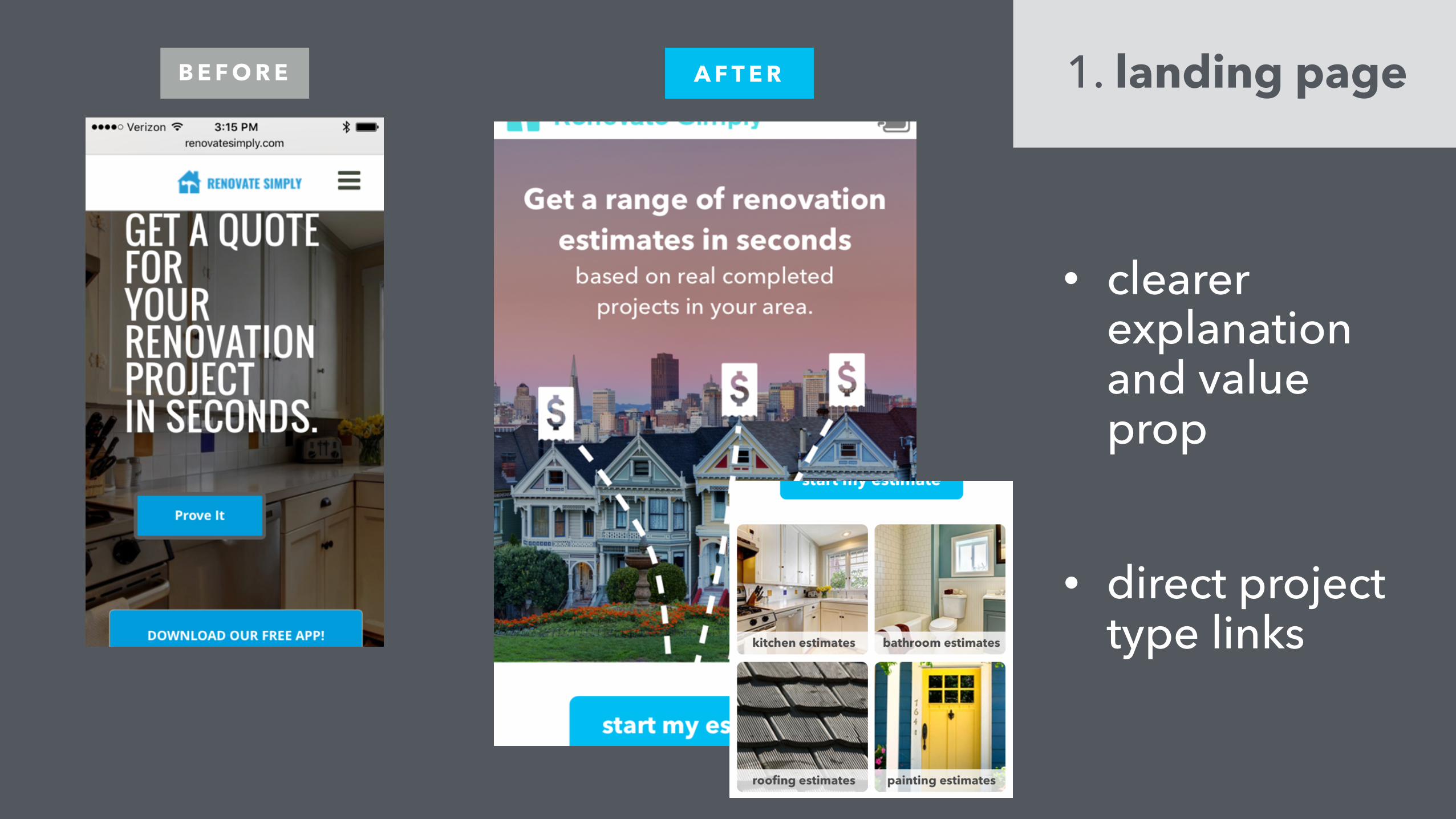
• direct project type links
B E F O R E 1. landing pageA F T E R
• clearer explanation and value prop
B E F O R E A F T E R
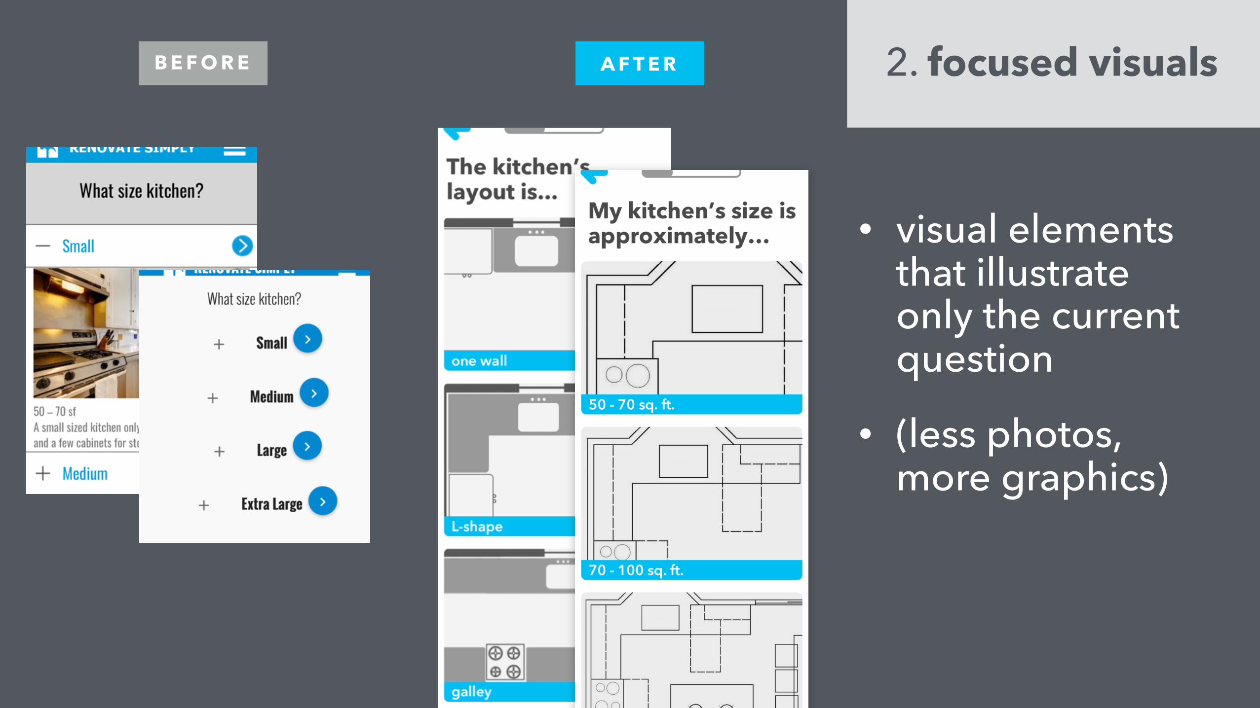
• visual elements that illustrate only the current question
• (less photos, more graphics)
2. focused visuals

B E F O R E A F T E R
• “cost level” is now “materials”
• biggest hang-up in user tests
• more specific question
• descriptive text
3. materials question
B E F O R E A F T E R
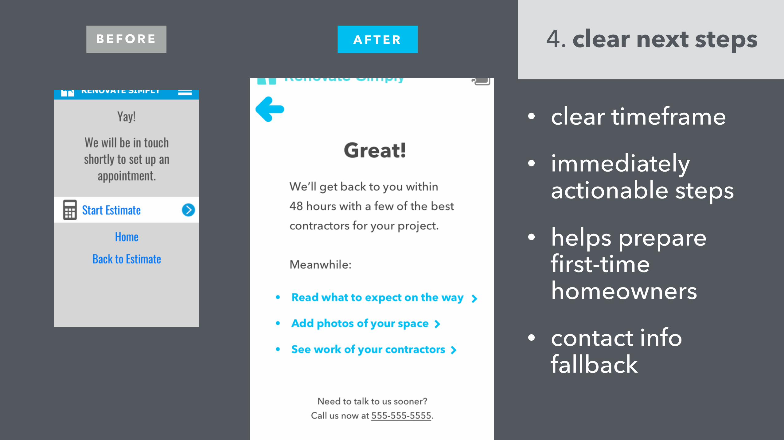
• clear timeframe
• immediately actionable steps
• helps prepare first-time homeowners
• contact info fallback
4. clear next steps

• new feature
• includes word-of-mouth referrals
• includes user photos, Pinterest links, documents, etc.
N E W 5. Project Notebook

• un-nested, contextual item labels • (no one opens the “+” button)
• removed Style page
• streamlined structure of the questions
• explanatory notes for confusing steps
• when to ask for email and account creation
M O R E

Enough talk… Let’s see it.
Demo
InVision: https://invis.io/PR7QX17FS#/168901625_V4_1_Home
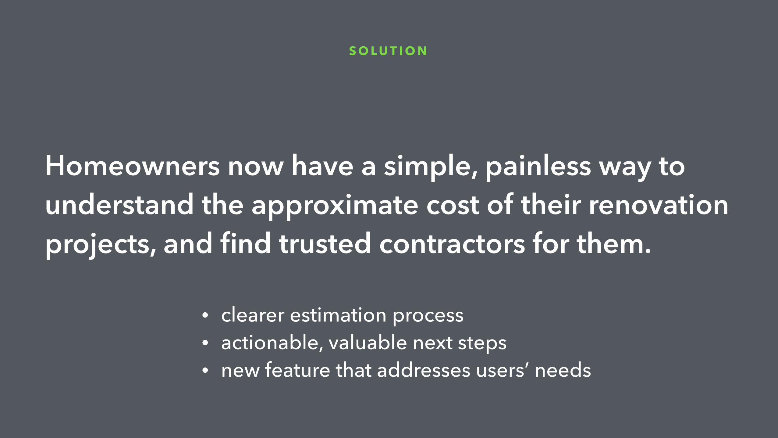
Homeowners now have a simple, painless way to understand the approximate cost of their renovation projects, and find trusted contractors for them.
S O L U T I O N
• clearer estimation process • actionable, valuable next steps • new feature that addresses users’ needs

Q&A
Thank you.
Matt Toman + Robert Boler Historic images from Pixabay