Embed Size (px)
Citation preview

break conventions.
1

1What if?But why?How can I?

1Conventions to break conventions
1. Understand the context2. Do not break for the sake of breaking3. Refer to 2
1
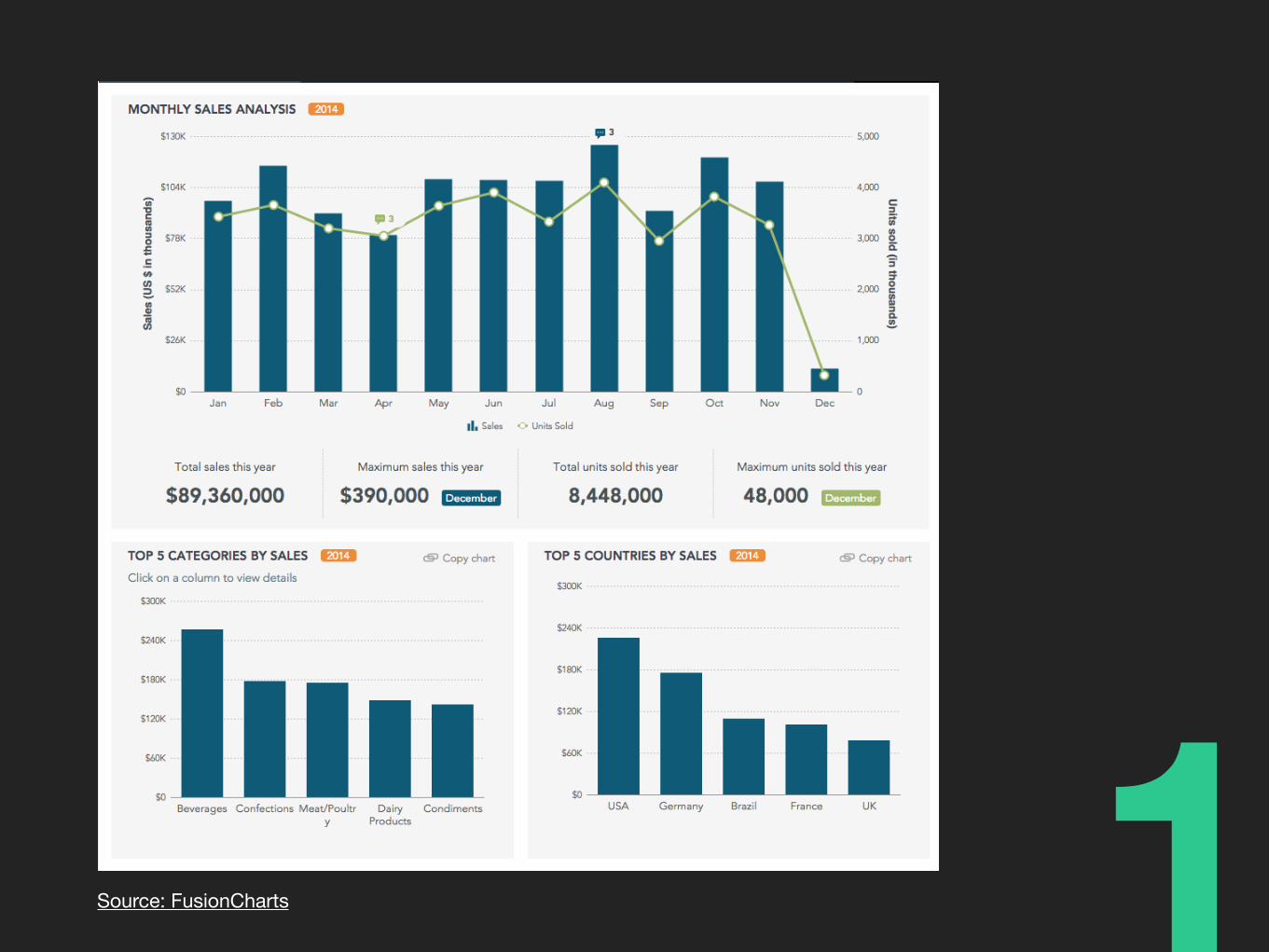
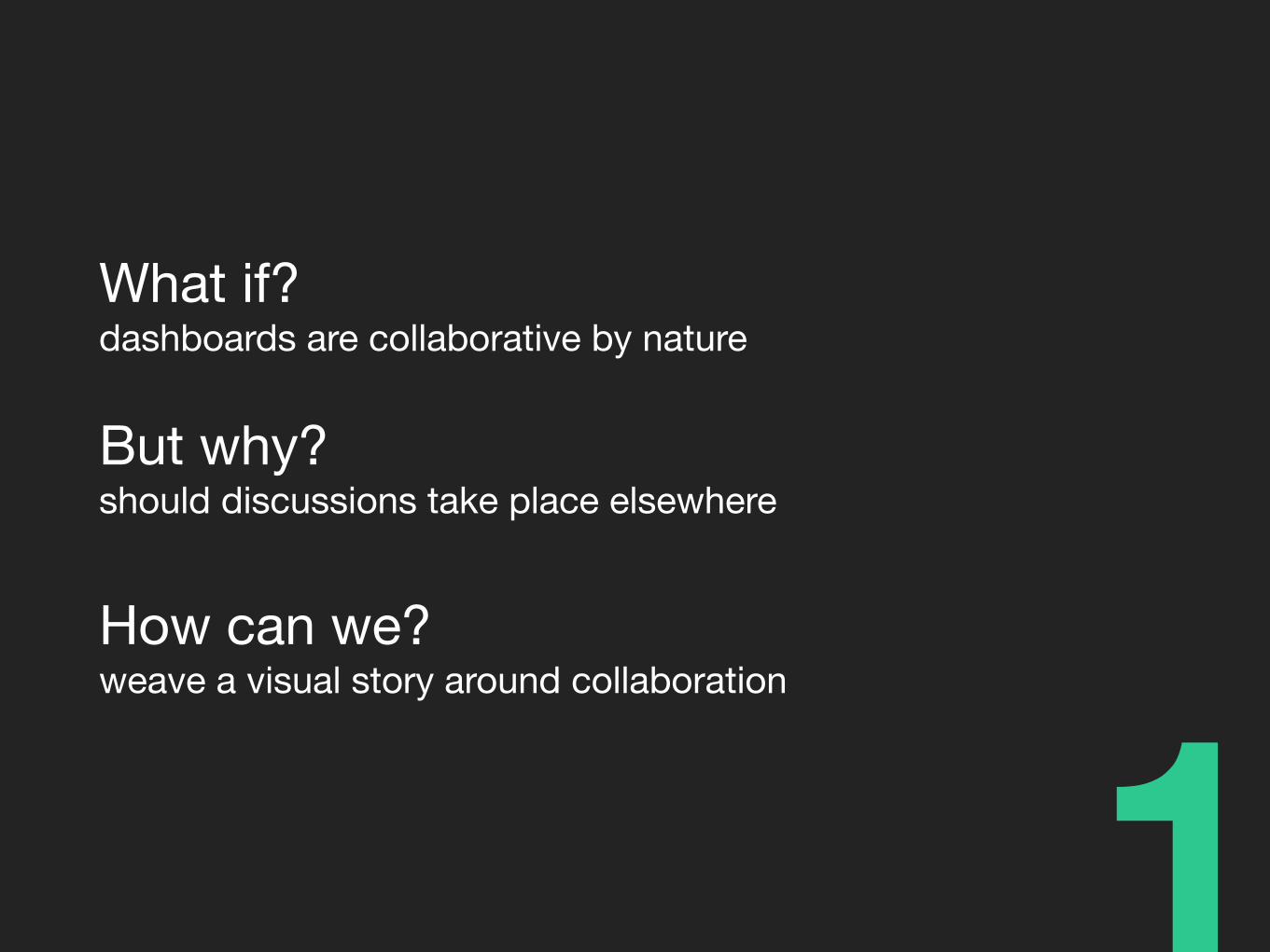
What if?dashboards are collaborative by nature!
But why?should discussions take place elsewhere!
How can we?weave a visual story around collaboration

1Don’t stick with plain ol’ conventions. Go the extra mile and show your users that you care.
#happinesstip

simplify.
2

Remove content that doesn’t support dataIt is information that viewers read without a reward
2

- You don’t have to show everything- Avoid meaningless visual content- Drill-down if necessary- Whitespace is a good thing. Really.
2

Don’t bring in unwanted varietyIncreases cognitive load and perceptual strategy for interpreting content!
It is many people’s jobDon’t make them work harder than necessary
2

Reason before you add. Every new item competes for attention, space, and action.
#happinesstip
2

love at first sight.
3info

Easy to read, understand, and monitor
3

- Provide adequate context- Maintain visual hierarchy- Express measures meaningfully- Guide the flow and attention
3

3Source: Phoenix Government

3Source: Williamsburg City Government

3Actionable, productive information VS Interesting but extraneous information

3Design information to be self-guiding, contextual, and timely.
#happinesstip

get extra makeup out of the way.
4

Avoid- Unnecessary decoration- Cute visuals with no meaning- Color abuse- Fancy typography- Automobile Gauges. Please.
4

We know 3D is cool, but …
4

Don’t try to entertain at the expense of communication
4
At every step, question if visual design aids content.
#happinesstip
4