Embed Size (px)
Citation preview
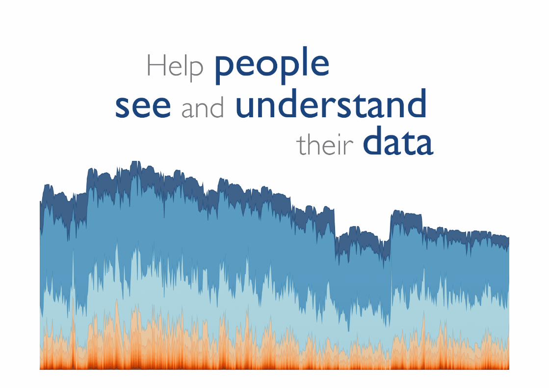
Fresh Thinking on Communicating with Data
Andy Kirk Data Visualisation Specialist & Founder of visualisingdata.com
2 quick housekeeping notes:
• This webinar will be recorded and available on-demand to view later or share with colleagues. You’ll receive an email later this week with details.
• Please type your questions into the chat box and we’ll get to them during Q&A portion at end of presentation.
Thank you for joining today’s webinar

Today’s presenters
Andy Kirk
Data Visualisation Specialist and Founder,
visualisingdata.com
Andy Cotgreave
Technical Evangelist, Tableau Software

The Tableau Revolution Fast and easy analytics for everyone

FRESH THINKING ON COMMUNICATING WITH DATA
Andy Kirk
www.visualisingdata.com @visualisingdata

Data visualisation specialist: Blogger, trainer, lecturer, researcher, author, design consultant, speaker...

Data visualisation specialist: Blogger, trainer, lecturer, researcher, author, design consultant, speaker...

Superstar technicians
Everyday practitioners

EMBRACING FRESH THINKING
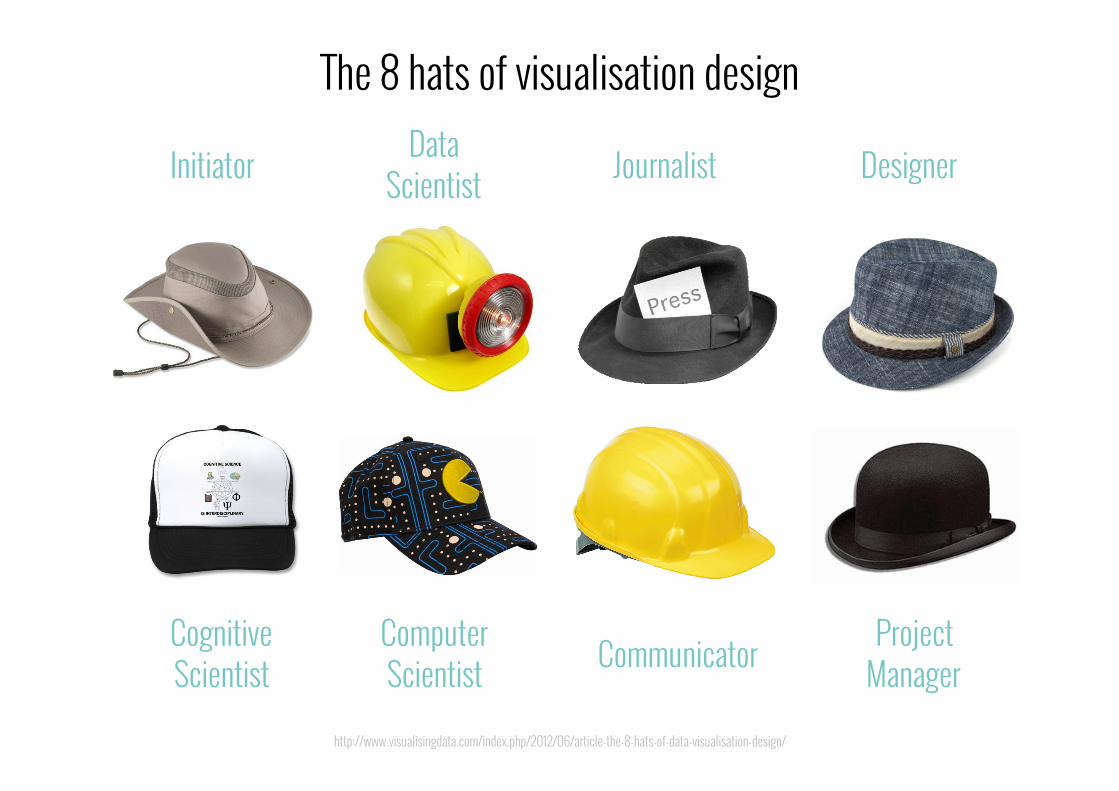
Initiator Journalist
Communicator Project Manager
Designer
Cognitive Scientist
Computer Scientist
Data Scientist
http://www.visualisingdata.com/index.php/2012/06/article-the-8-hats-of-data-visualisation-design/
The 8 hats of visualisation design

TALENT
THINKING

CONTEXTUAL IMAGINATIVE
JOURNALISTIC CRITICAL
ORGANISED CONVICTIONS
Embrace fresh thinking!

#1 CONTEXTUAL Framing our thinking


YOU ARE KAYAKING ALONG THE COAST OF GREENLAND AND YOU NEED A ‘CHART’ TO NAVIGATE...
The influence of context
(HT to Mark Daggett @heavysixer)

Cope with wet? Can’t need power? Work in dark? Can float?
http://www.visualisingdata.com/index.php/2013/03/tactile-visualisations-inuit-wood-maps/

“… in order to design a tool, we must make our best efforts to understand the larger social and physical
context within which it is intended to function.”
Bill Buxton, “Sketching User Experiences”
http://www.amazon.com/gp/product/0123740371/ref=as_li_tf_il?ie=UTF8&tag=visuadata-20&linkCode=as2&camp=217145&creative=399369&creativeASIN=0123740371

Stakeholders, influencers and interferers

Timescales?
http://comicsidontunderstand.com/wordpress/category/new-yorker/

Design rules: Layout, colour, typography, branding, language?
http://www.smashingmagazine.com/2008/02/11/award-winning-newspaper-designs/ | http://dmindless.blogspot.com/2011/04/how-to-make-presentation-that-rocks.html

Designing for an audience: Consumer setting?

Frequency, reproducibility
http://www.theguardian.com/politics/ng-interactive/2015/feb/27/guardian-poll-projection

http://www.cleverfranke.com/cf/en/project/weerkaarten-c-deg-f/project.php?id=170
Format requirements?

Designer capabilities?

What’s the best visualisation solution? It always depends. Get your contextual
thinking established first.
Takeaway #1: Contextual thinking
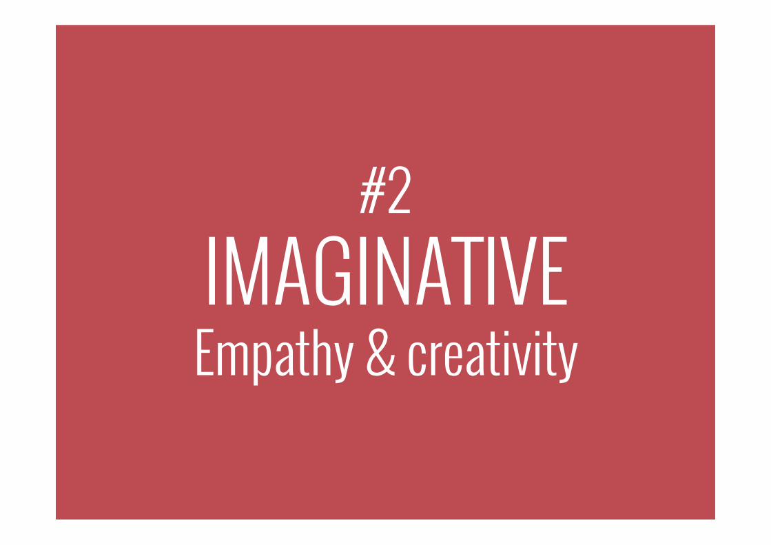
#2 IMAGINATIVE Empathy & creativity

http://www.chrisjordan.com/gallery/rtn/#prison-uniforms-set
Subject empathy

http://blogs.reuters.com/data-dive/2013/12/10/gms-new-ceo-is-another-small-crack-in-the-glass-ceiling/ http://www.chezvoila.com/blog/glass-ceiling
Subject empathy

Subject empathy: Challenging conventions

http://jaimeserra-archivos.blogspot.com.es/2015/01/cafe-diario-la-relacion-que-mantengo.html
Creativity: Rethinking concepts

https://www.facebook.com/RenzoPicassoArchive
Creativity: Be inspired by the world around you

http://www.visualisingdata.com/index.php/2012/05/the-fine-line-between-plagiarism-and-inspiration/
Creativity: Be inspired by the world around you (with attribution)

Creativity: Capture instinctive ideas and imagery

What creative ideas – instinctive keywords and imagery – form when you think about a
task: its intended recipients, the subject matter and its data?
Takeaway #2: Imaginative thinking

#3 JOURNALISTIC Harnessing curiosity

The journalist-analyst sensibility to pursue a curiosity

http://en.wikipedia.org/wiki/August_Landmesser
Pattern matching, sense-making, sniffing out the story

http://www.bloomberg.com/billionaires/latest
Pattern matching, sense-making, sniffing out the story

Visualisation often serves up the questions not the answers
Haiti
Afghanistan
S. Africa
Kuwait
Vietnam
Nauru
North Korea
Tajikistan
Ethiopia

http://www.nytimes.com/interactive/2009/03/01/business/20090301_WageGap.html
Passing on your understanding to your audience

“A photo is never an objective reflection, but always an interpretation of reality... I see data visualization as sort of
a new photojournalism – a highly editorial activity.”
Moritz Stefaner
http://well-formed-data.net/archives/1027/worlds-not-stories

https://twitter.com/toddlerlex/status/440393501810118656/photo/1
Photo-journalistic: Consider all angles

Be motivated by curiosity and a desire to effectively convey the most
relevant understanding to others.
Takeaway #3: Journalistic thinking
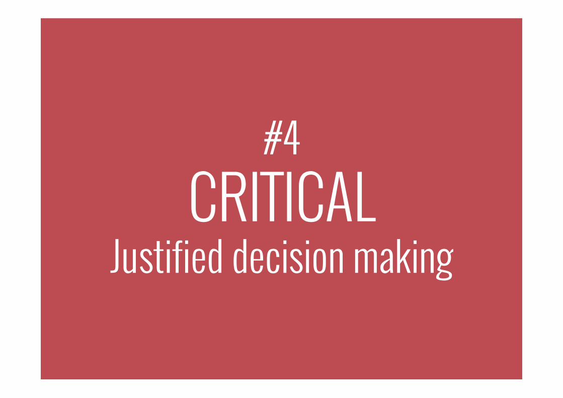
#4 CRITICAL
Justified decision making

Visualisation is a game of decisions

5 Layers: Data representation & presentation
Annotation
Interactivity
Composition
Colour
http://hint.fm/wind/
Data Representation

http://www.nytimes.com/interactive/2014/10/19/upshot/peyton-manning-breaks-touchdown-passing-record.html?abt=0002&abg=0
DATA REPRESENTATION: A visual answer to a data question How have NFL cumulative touchdown passes grown since 1930
for quarterbacks with over 30 TD passes?

http://www.nytimes.com/interactive/2014/10/19/upshot/peyton-manning-breaks-touchdown-passing-record.html?abt=0002&abg=0
DATA REPRESENTATION: A visual answer to a data question How have NFL cumulative touchdown passes grown since 1930
for quarterbacks with over 30 TD passes?
Angle: Change of quantitative value (touchdowns) over time for multiple categories (quarterbacks)
Filter: Parameters for time period (1930 to 19th October 2014)
and minimum qualifying quantitative threshold (30 TD passes)
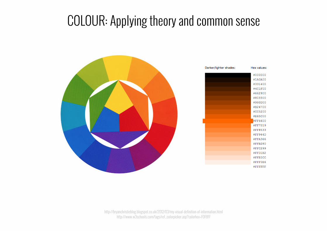
http://bryanchristieblog.blogspot.co.uk/2012/03/my-visual-definition-of-information.html http://www.w3schools.com/tags/ref_colorpicker.asp?colorhex=F0F8FF
COLOUR: Applying theory and common sense

INTERACTIVITY: Manipulate, interrogate, participate
http://www.nytimes.com/interactive/2013/12/20/sunday-review/dialect-quiz-map.html?_r=0
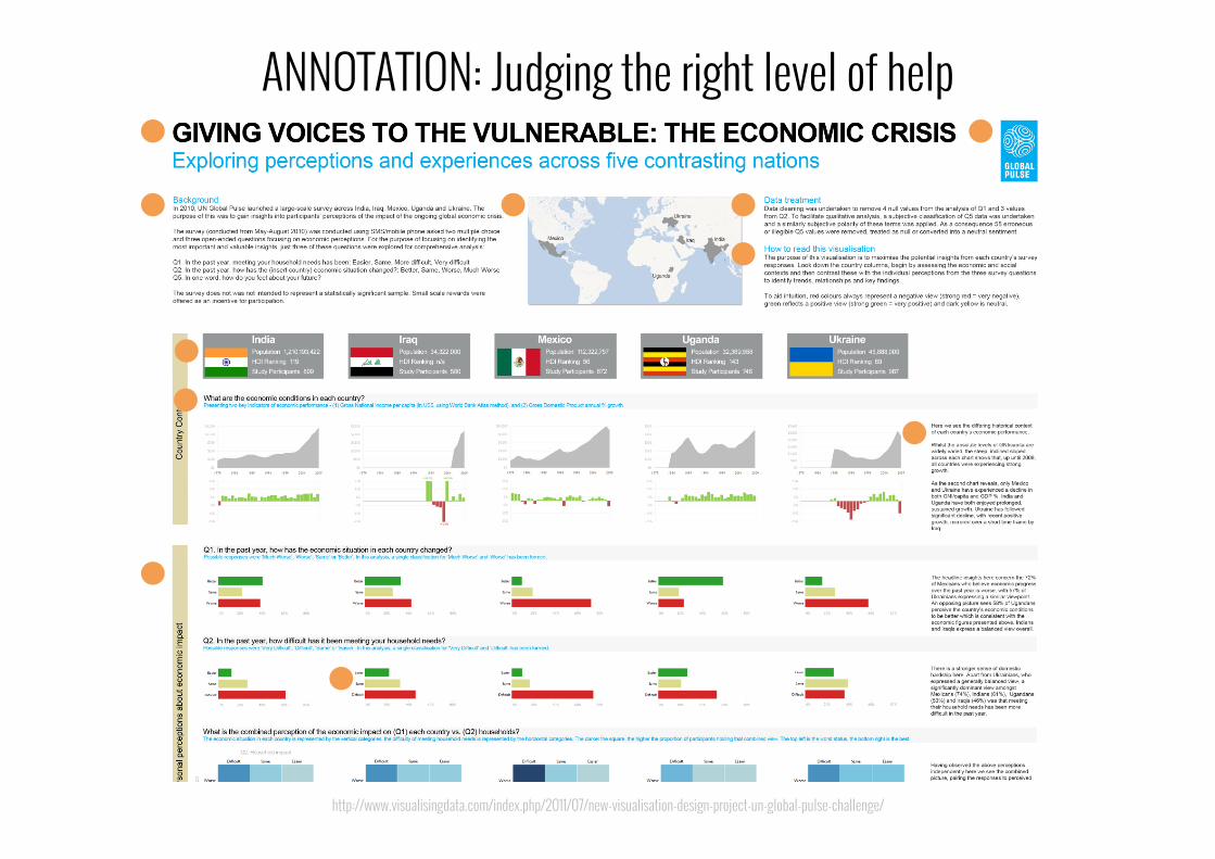
http://www.visualisingdata.com/index.php/2011/07/new-visualisation-design-project-un-global-pulse-challenge/
ANNOTATION: Judging the right level of help

https://www.flickr.com/photos/accurat/14577900823/in/set-72157632185046466?utm_content=buffer050e5&utm_medium=social&utm_source=twitter.com&utm_campaign=buffer
COMPOSITION: Size, shape, position, order

“Good design is thorough down to the last detail... Nothing must be arbitrary or left to chance.”
Dieter Rams’ ‘10 principles of good design’
https://www.vitsoe.com/gb/about/good-design

Be able to justify every design decision
http://www.oecd.org/dac/peerreviewsofdacmembers/PRFINLAND2012.pdf

The real craft behind data visualisation design is how we rationalise choices.
To make astute choices, you need to be aware of all the options.
Takeaway #4: Critical thinking

#5 ORGANISED
Sequenced thinking

Visualisation is a process, not a procedure

1. Establish the visualisation’s context and ideas
2. Acquire, familiarise with and prepare your data
3. Determine the editorial focus of your subject matter
5. Construct and evaluate your design solution
4. Conceive your design: data representation and presentation

Where to begin? What pathway to take?
http://www.mattneuman.com/maze.gif
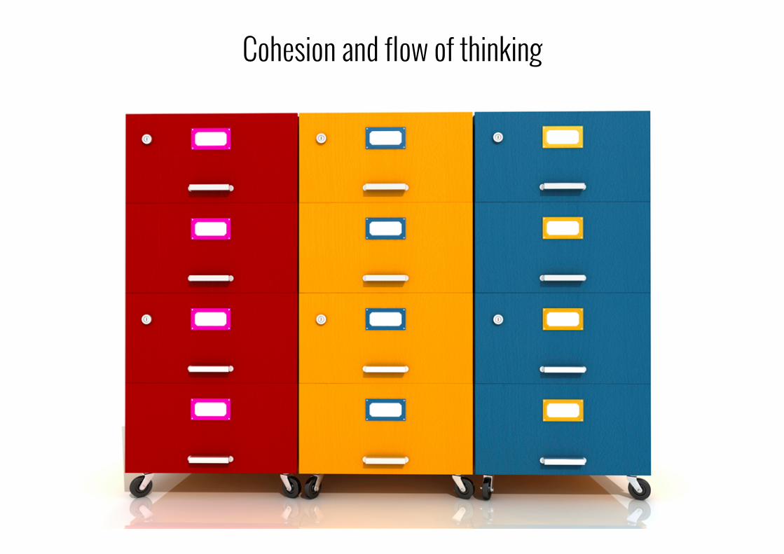
Cohesion and flow of thinking

ANAL
YTICA
L
CREA
TIVE
Splitting the mindset
http://www.docstoc.com/docs/66602562/397----THE-DOORS----RIDERSONTHESTORM-PIANO-SHEET-MUSIC

Many different proposed methodologies
https://speakerdeck.com/alignedleft/open-source-your-data-design-process

Don’t force it! Find what works for you

Pursue an effective and efficient workflow to sequence and optimise your thinking.
Takeaway #5: Organised thinking

#6 CONVICTIONS
Your own thinking

Framework for thinking rather than rules for obeying

“There's a strand of the data viz world that argues that everything could be a bar chart. That's possibly true but
also possibly a world without joy”
Amanda Cox, New York Times
http://blogs.hbr.org/hbr/hbreditors/2013/03/power_of_visualizations_aha_moment.html

Framework for thinking rather than rules for obeying

The representation and presentation of data to make understanding accessible
My definition...

http://www.visualisingdata.com/index.php/2013/06/appreciating-the-critical-role-of-subject-matter/
Good visualisation makes understanding accessible

https://twitter.com/MaxCRoser/status/580666217142329344
Bad visualisation makes understanding inaccessible
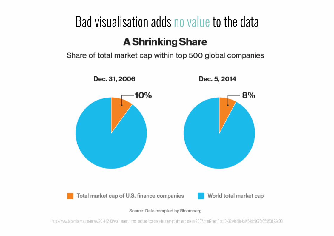
http://www.bloomberg.com/news/2014-12-19/wall-street-firms-endure-lost-decade-after-goldman-peak-in-2007.html?hootPostID=32a4ad8c4a1454db9676f05959b22c09
Bad visualisation adds no value to the data

http://porostocky.prosite.com/6517/114057/work/infographics | http://hmi.ucsd.edu/howmuchinfo.php http://viz.wtf/post/107628689945/all-your-database-are-belong-to-us | http://viz.wtf/post/107440754050/how-payday-loans-add-up
Bad visualisation tries to decorate data

http://www.nytimes.com/interactive/2015/03/19/upshot/3d-yield-curve-economic-growth.html?smid=pl-share&_r=1&abt=0002&abg=0
There are few (if any) ‘always’ and ‘nevers’ I thought all 3D was bad, why is this 3D visualisation OK?

http://www.nytimes.com/interactive/2015/03/19/upshot/3d-yield-curve-economic-growth.html?smid=pl-share&_r=1&abt=0002&abg=0
There are few (if any) ‘always’ and ‘nevers’ I thought all 3D was bad, why is this 3D visualisation OK?

http://www.visualisingdata.com/index.php/2015/02/visualisation-data-like/
Do we REALLY like it?
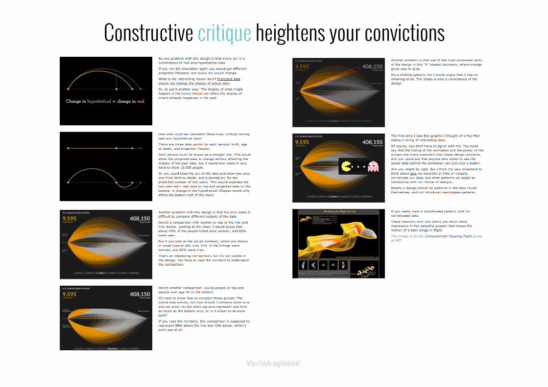
http://style.org/deleted/
Constructive critique heightens your convictions

“Chefs are able to more clearly discern what they taste because through constant exposure they have developed
improved senses as well as vocabulary to express and discuss their impressions.”
Oliver Reichenstein, “Learning to see”
Paraphrased from: http://ia.net/blog/learning-to-see/

The importance of establishing your own beliefs and convictions about what is good/
bad, effective/ineffective visualisation
Takeaway #6: Thinking for yourself...

CONTEXTUAL IMAGINATIVE
JOURNALISTIC CRITICAL
ORGANISED CONVICTIONS
Embrace fresh thinking!

Getting this little guy working will make a huge difference!

FRESH THINKING ON COMMUNICATING WITH DATA
Andy Kirk
www.visualisingdata.com @visualisingdata

Thanks for joining today. If you’d like to try Tableau for yourself you can access your free trial at: http://www.tableausoftware.com/trial