Embed Size (px)
Citation preview

CHOOSING THE RIGHT TYPEFACES
September Design-Storm Tahmid Chowhury | John Snow, Inc.
Aa

Definitions
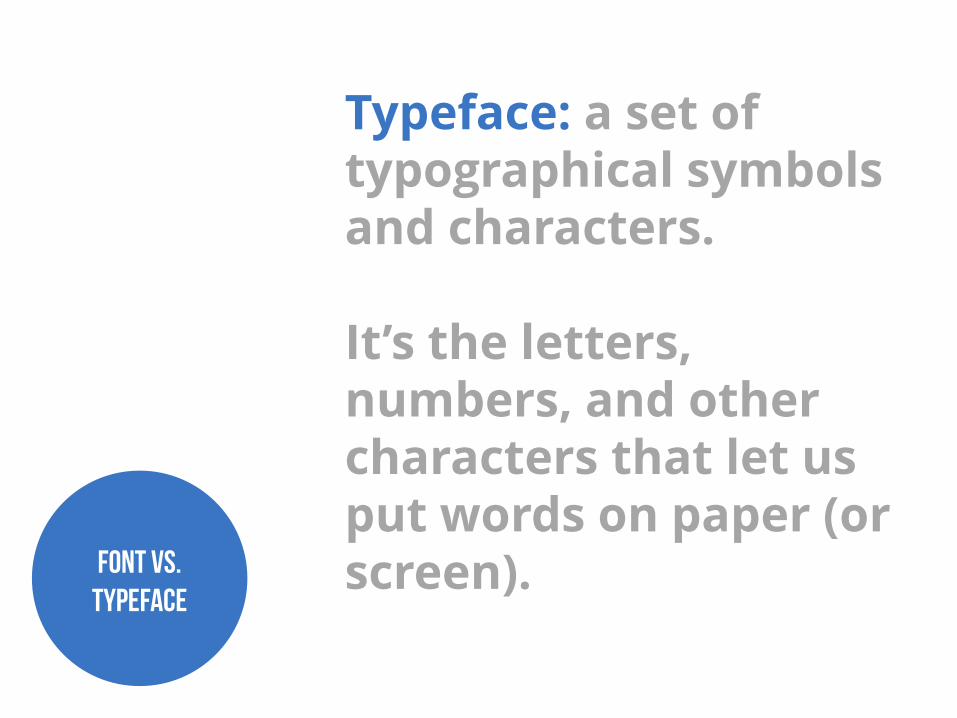
Typeface: a set of typographical symbols and characters. It’s the letters, numbers, and other characters that let us put words on paper (or screen). Font vs.
Typeface

Font: a complete character set within a typeface, often of a particular size and style. They are also specific computer files that contain all characters and glyphs within a typeface.
Font vs. Typeface

In other words, a typeface is a family of fonts (e.g., Helvetica Regular, Helvetica Italic, Helvetica Black, etc.) but a font is one weight or style within a typeface family (such as Helvetica Regular). Font vs.
Typeface

Today, typeface and font as basically used interchangeably.
Font vs. Typeface

Anatomy of a Typeface
http://www.designersinsights.com/designer-resources/anatomy-of-typography
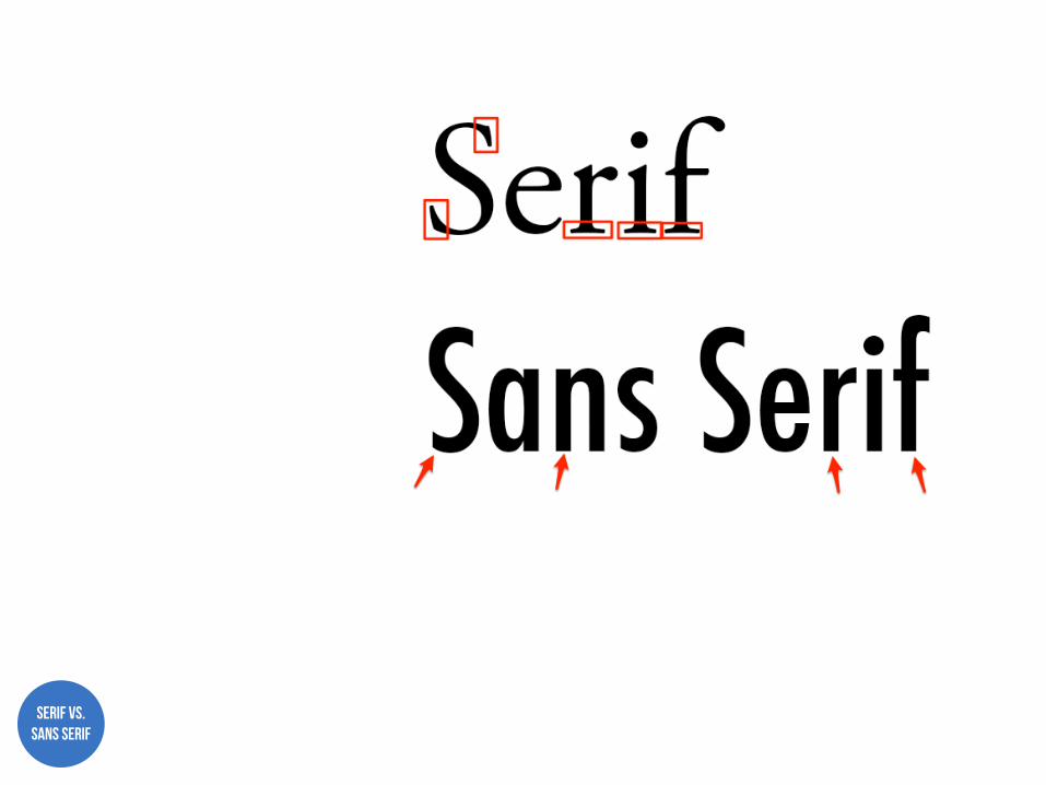
Serif vs. Sans Serif

The Psychology of Typefaces

Traditional
Serif
TIMES NEW ROMAN
Reliable BASKERVILLE
Comfortable GEORGIA ITALIC

Stable
Sans Serif
HELVETICA BOLD
Objective FRANKLIN GOTHIC
Clean CALIBRI
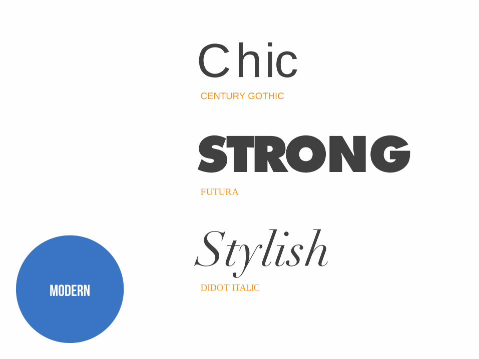
Chic
Modern
CENTURY GOTHIC
STRONG FUTURA
Stylish DIDOT ITALIC

Friendly
Display
COOPER BLACK
Unique FRANKLIN GOTHIC
Expressive VALENCIA

Pairing Typefaces

Typefaces have personalities, and like with people, typeface personalities can clash.
Typefaces Personalities
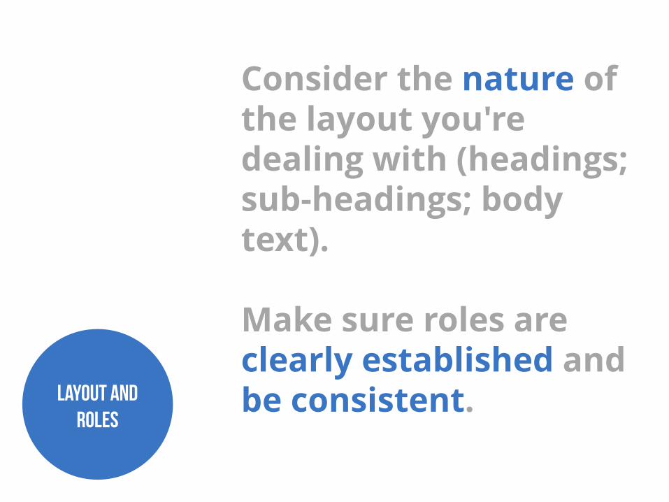
Consider the nature of the layout you're dealing with (headings; sub-headings; body text). Make sure roles are clearly established and be consistent. Layout and
Roles

Concord: presence of the same trait in both typefaces helps them to work together.
Pairing: Concord

Concord
http://webdesign.tutsplus.com/articles/a-beginners-guide-to-pairing-fonts--webdesign-5706
Droid typeface family for Google Android devices

Concord
http://webdesign.tutsplus.com/articles/a-beginners-guide-to-pairing-fonts--webdesign-5706
Cowboyslang and Supria Sans Condensed

Concord
http://webdesign.tutsplus.com/articles/a-beginners-guide-to-pairing-fonts--webdesign-5706
Anodyne and Poulaire

Concord
http://webdesign.tutsplus.com/articles/a-beginners-guide-to-pairing-fonts--webdesign-5706
Bevan and Arapey Italic

Concord
http://www.peatah.org/combinations2.html

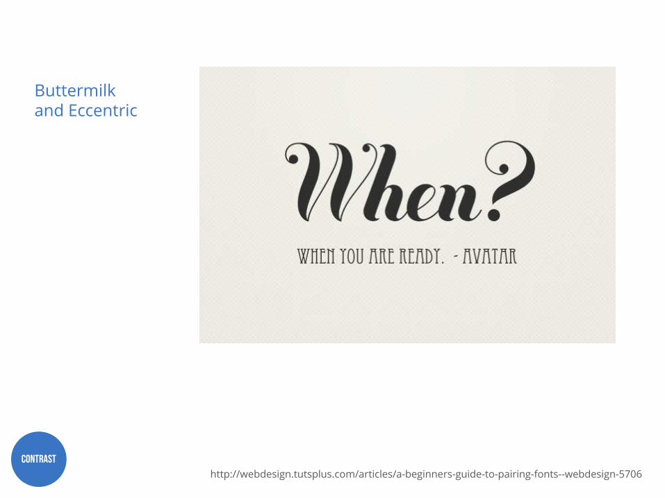
Contrast: choosing typefaces with differences in style, size, weight, form, or color can create visually appealing pairings.
Pairing: Contrast
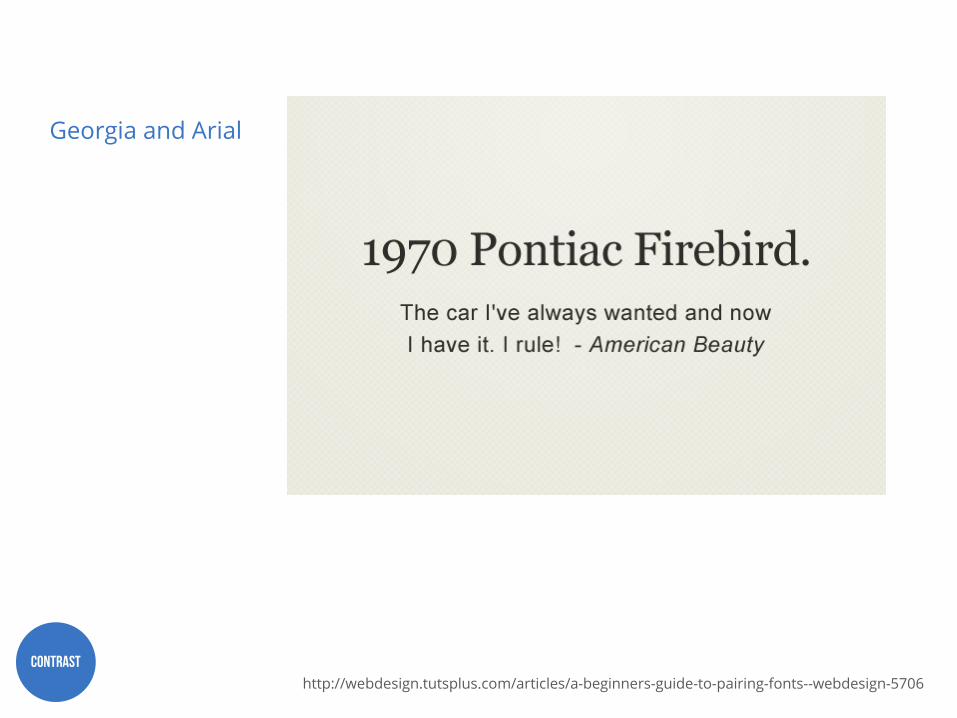
Contrast
http://webdesign.tutsplus.com/articles/a-beginners-guide-to-pairing-fonts--webdesign-5706
Georgia and Arial

Contrast
http://webdesign.tutsplus.com/articles/a-beginners-guide-to-pairing-fonts--webdesign-5706
Lora Bold and Istok Web

Contrast
http://webdesign.tutsplus.com/articles/a-beginners-guide-to-pairing-fonts--webdesign-5706
Bebas Neue and Alex Brush

Contrast
http://webdesign.tutsplus.com/articles/a-beginners-guide-to-pairing-fonts--webdesign-5706
Buttermilk and Georgia

Contrast
http://webdesign.tutsplus.com/articles/a-beginners-guide-to-pairing-fonts--webdesign-5706
Buttermilk and Aller
Contrast
http://webdesign.tutsplus.com/articles/a-beginners-guide-to-pairing-fonts--webdesign-5706
Buttermilk and Eccentric
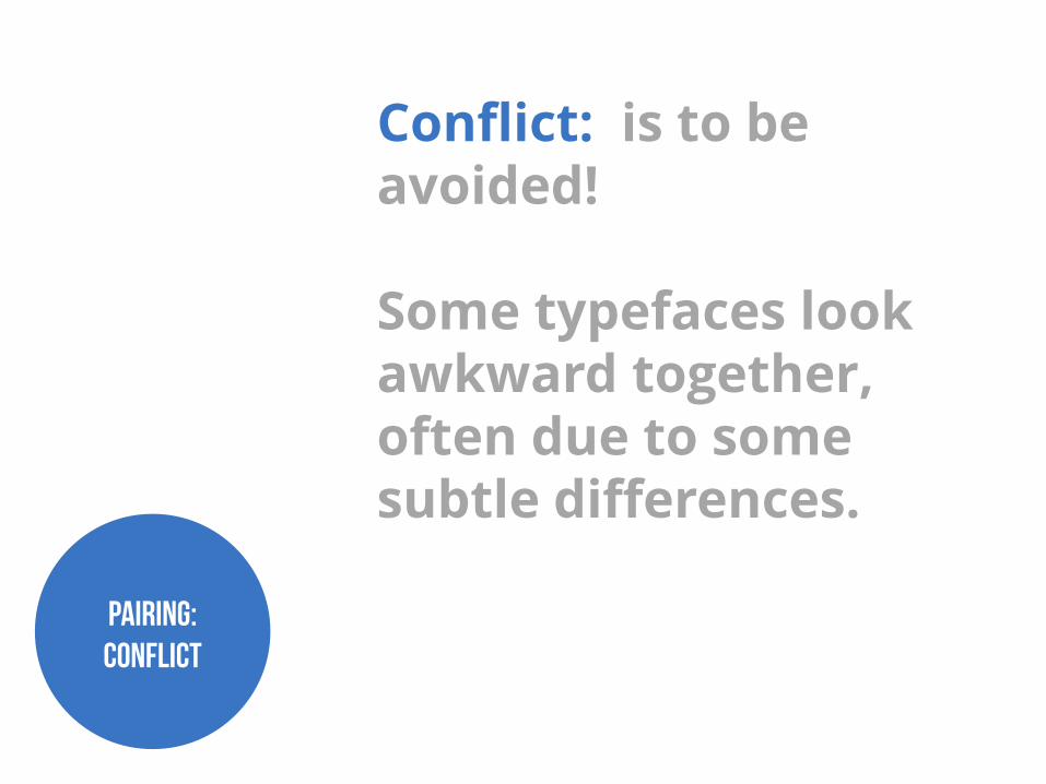
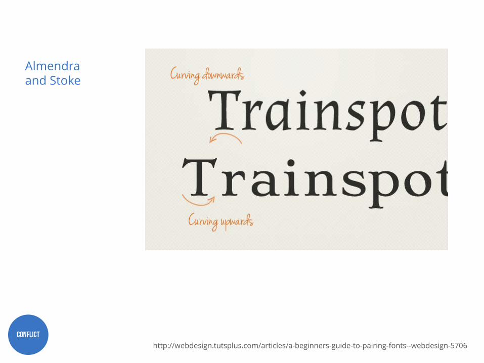
Conflict: is to be avoided! Some typefaces look awkward together, often due to some subtle differences.
Pairing: Conflict

Conflict
http://webdesign.tutsplus.com/articles/a-beginners-guide-to-pairing-fonts--webdesign-5706
Almendra and Stoke

Conflict
http://webdesign.tutsplus.com/articles/a-beginners-guide-to-pairing-fonts--webdesign-5706
Almendra and Stoke
Conflict
http://webdesign.tutsplus.com/articles/a-beginners-guide-to-pairing-fonts--webdesign-5706
Almendra and Stoke

Conflict
http://webdesign.tutsplus.com/articles/a-beginners-guide-to-pairing-fonts--webdesign-5706
Almendra and Stoke

Conflict
http://webdesign.tutsplus.com/articles/a-beginners-guide-to-pairing-fonts--webdesign-5706
Almendra and Stoke

Resources

dafont.com
fontsquirrel.com
1001freefonts.com
typetester.org
typebrewer.org
Typeface Websites

U.S. Department of HHS recommended fonts for Section 508 compliance:
Section 508 Compliance
http://www.hhs.gov/web/section-508/making-files-accessible/checklist/pdf/index.html
• Times New Roman • Verdana • Arial • Tahoma • Helvetica • Calibri

http://julianhansen.com/files/infographiclarge_v2.png

Go with your gut.
Sage Advice

For more information about JSI’s research, monitoring, evaluation & health information work, contact [email protected]
Follow @jsihealth
Thank you!