Embed Size (px)
Citation preview


(is this engineer you? that’s still a problem.)


Between Paper & Codean introduction to UX design and digital prototyping
Molly Wilson HPI School of Design Thinking
July 2015

ORIENTATION
What is UX design? Is it the same as DT?
Kinds of prototypes
Training your designer’s eye
CREATE AN APP
Information Architecture
Interface Design with Sketch
Prototype Creation with InVision

what do we mean when we say UX DESIGN?
What’s up with the users?RESEARCH
What do they need to do? What do we need them to do?PLAN
How should the product work? How should the product look?DESIGN
How are we doing?TEST
What is UX design?

What’s up with the users?RESEARCH
What do they need to do? What do we need them to do?PLAN
How should the product work? How should the product look?DESIGN
How are we doing?TEST
USER RESEARCH
What is UX design?

What’s up with the users?RESEARCH
What do they need to do? What do we need them to do?PLAN
How should the product work? How should the product look?DESIGN
How are we doing?TEST
INTERACTION DESIGN (IXD)
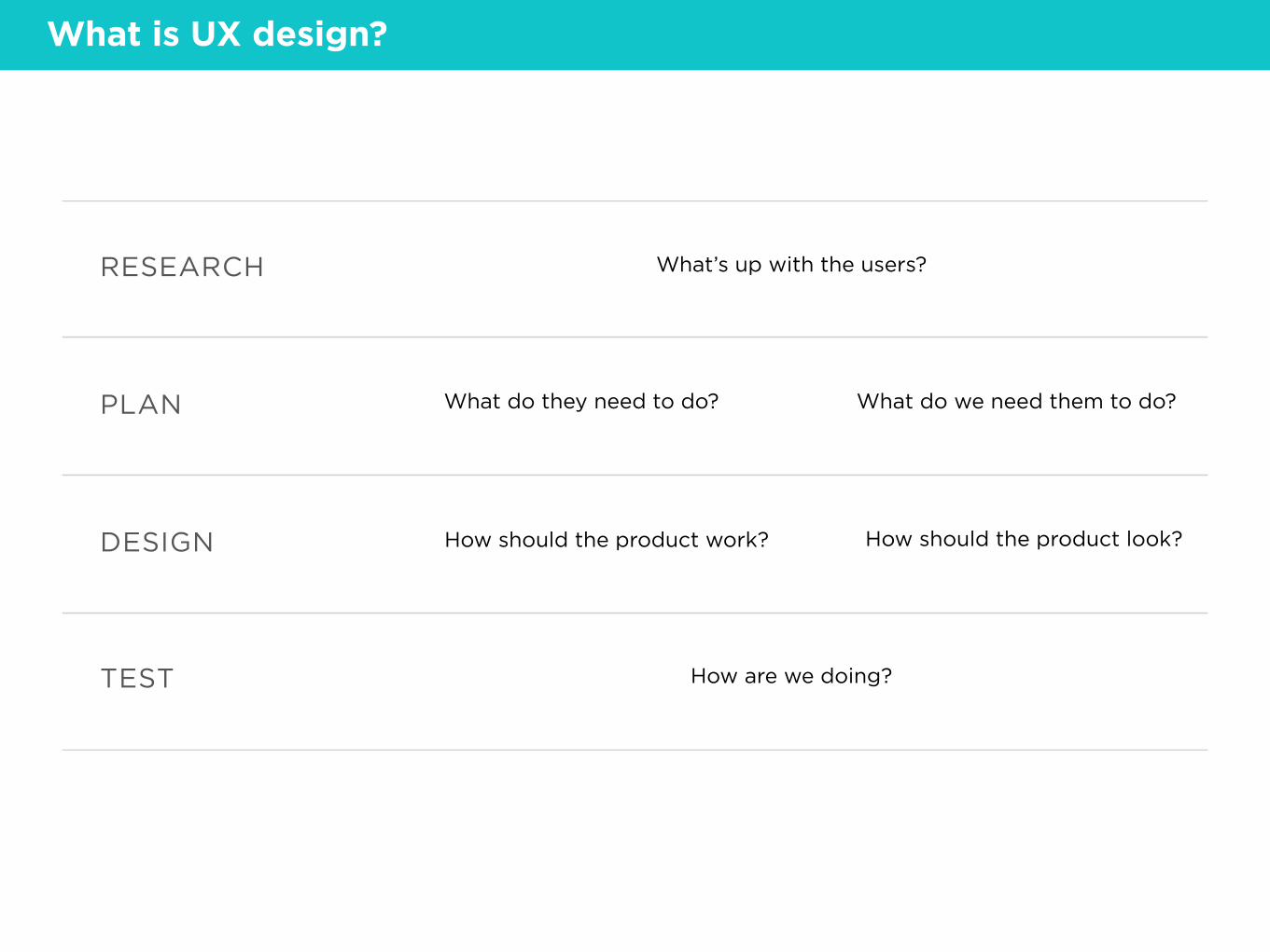
What is UX design?
What’s up with the users?RESEARCH
What do they need to do? What do we need them to do?PLAN
How should the product work? How should the product look?DESIGN
How are we doing?TEST
VISUAL (UI) DESIGN
What is UX design?

What’s up with the users?RESEARCH
What do they need to do? What do we need them to do?PLAN
How should the product work? How should the product look?DESIGN
How are we doing?TESTUSER TESTING
What is UX design?

What’s up with the users?RESEARCH
What do they need to do? What do we need them to do?PLAN
How should the product work? How should the product look?DESIGN
How are we doing?TEST
UX DESIGN
What is UX design?

how much UX DESIGN do design thinking students already know?

What do you already have?
• open-minded interviewing and testing
• getting a group of people on the same page
• constantly designing with a mind to testing
• quick iterative loops
• fast sketching
• cross-disciplinary teams
• not taking feedback personally
DT vs. UX

What else do you need?
• visual design software
• visual design sensibility (typography, composition, color, etc.)
• geeky, tech-loving attitude
• familiarity with common UI patterns (comes with experience)
• very organized
• HTML/CSS/JS certainly doesn’t hurt
DT vs. UX

Different kinds of DIGITAL PROTOTYPES

Paper prototype
Tipple app, by Kyle Donnellon
Kinds of prototypes

Paper prototype
! Pens or pencils
! Paper or post-its
! Scissors
! Tape or glue
Kinds of prototypes
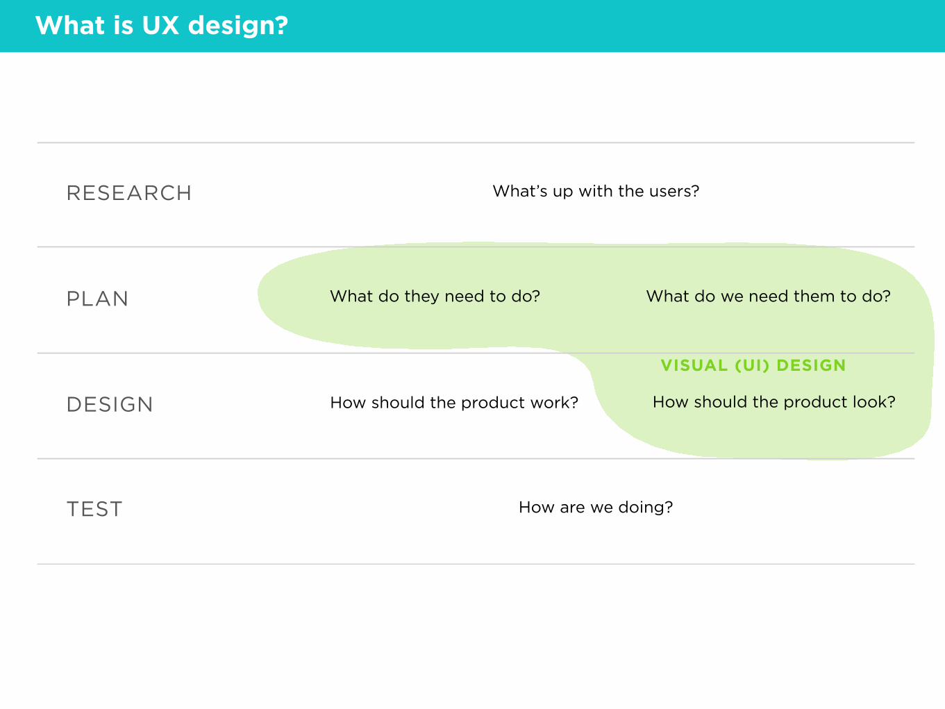
Interactive wireframe Click-through prototype Click dummy
Drug information app, by me
Kinds of prototypes

Interactive wireframe
Drug information app, by me
! A way to draw images
! A way to link images together
Sketch, Keynote, Powerpoint, InDesign, Illustrator, Balsamiq…
Invision, Marvel, Pop…
Kinds of prototypes

Code prototype
Pizza Finder app, by Leigh Shevchik
Kinds of prototypes

Code prototype
! A way to code the interface
! A way to store and/or get data
HTML/CSS/JS (optionally with a library like jQuery Mobile), XCode, Swift…
This is not my department :)
Kinds of prototypes

Kinds of prototypes
? How does it feel to use?
? How should the app be organized?
? Where should stuff go on the screen?
? What actual words/images should I use?
PAPER
INTERACTIVE WIREFRAME
CODE PROTOTYPE
? What happens when people really use this?
? What are the potential technical challenges?
? How does the data you’re pulling look?
? Is this even a good idea?
? What features should it have?

YOU’RE DONE HERE… Hard to change
Not realistic enough
Losing track of all the pieces of paper
Sick of drawing the same thing over and over
You need to share your idea with somebody outside your team
… BUT YOU’RE NOT READY FOR THIS You don’t really know what you’re making yet
Specialized skill you might not have
May get you in an engineering mindset too early
Kinds of prototypes
WE’RE DOING THIS ONE.
train your DESIGNER’S EYE

Train your designer’s eye
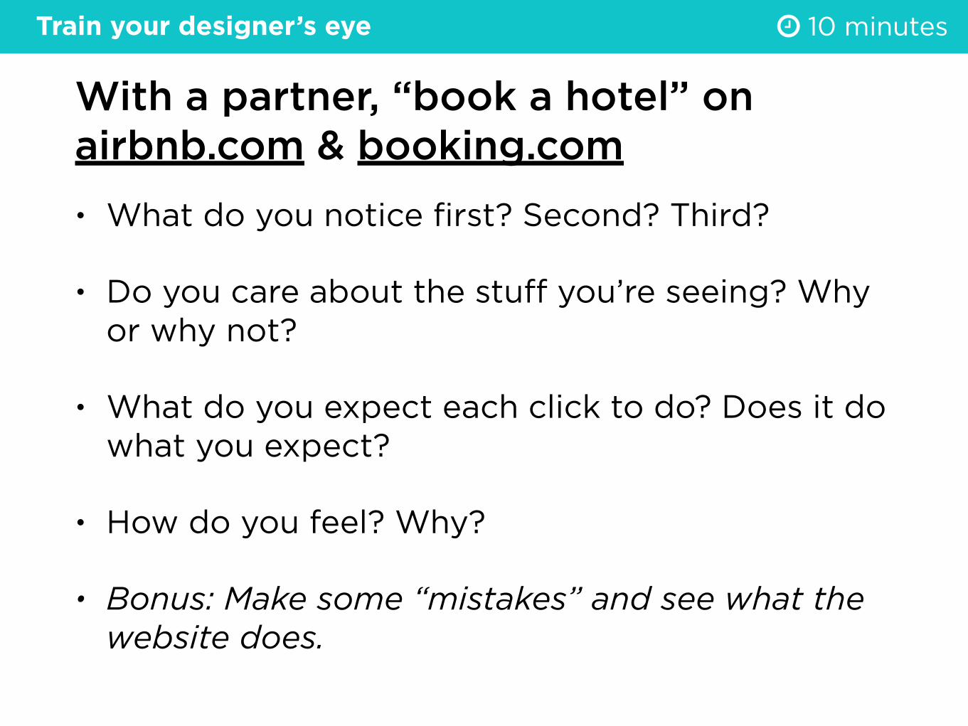
With a partner, “book a hotel” on airbnb.com & booking.com• What do you notice first? Second? Third?
• Do you care about the stuff you’re seeing? Why or why not?
• What do you expect each click to do? Does it do what you expect?
• How do you feel? Why?
• Bonus: Make some “mistakes” and see what the website does.
# 10 minutesTrain your designer’s eye

you know where you are you know where you can go you know what you can do the thing you want is right there it looks familiar it gives you feedback

YOUR CHALLENGE:
Design a mobile app that helps individuals find and support local businesses.
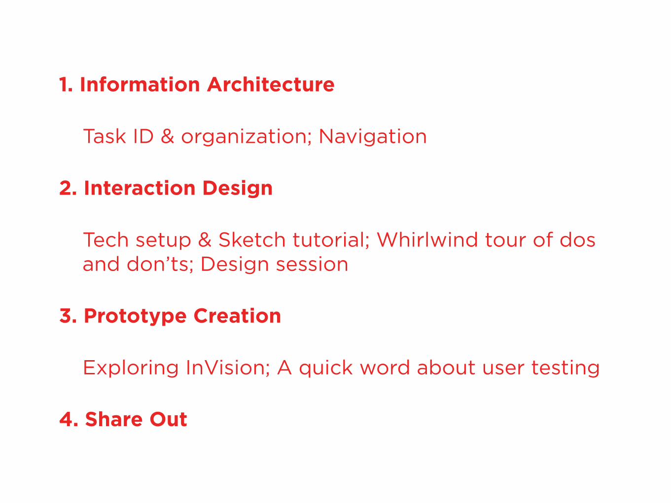
1. Information Architecture
Task ID & organization; Navigation
2. Interaction Design
Tech setup & Sketch tutorial; Whirlwind tour of dos and don’ts; Design session
3. Prototype Creation
Exploring InVision; A quick word about user testing
4. Share Out

what is INFORMATION ARCHITECTURE?

Content-based approach
vs.
Task-based approach
1. Information Architecture

TOO SPECIFIC
A DESIGN GOAL, NOT A TASK
List all the tasks a user should be able to do in your product.
Search for rooms by date/location
Choose an available room
Pay for room
Compare available rooms
Get confirmation from host
Leave a review
Read or reply to a host message
Change or cancel a reservation
Tell friends about my upcoming trip
Rent out my own room
Learn what Airbnb is
See upcoming reservations
# 7 minutes
Favorite a room
See favorite roomsDecide where to travel
1. Information Architecture > Task identification
Feel relaxed about travel
Edit spelling of name
TOO GENERAL
Plan travel

cluster similar things together
1. Information Architecture > Task organization

map out the happy path
1. Information Architecture > Task organization

Make clusters and paths.
• Cluster similar tasks near each other.
• Name each cluster.
• Are some of the clusters actually paths? If so, clarify the path. Paths can have branches in them. They can also connect to each other.
# 10 minutes1. Information Architecture > Task organization

Welcome to
The adventurous, socialway to travel.
Create an Account
Does this match our IA?

Browse Search
FavoritesMy Profile
Inbox My Trips
3
What about this?

Here’s the real design. Much better!

$ nav patterns
Top menu with overflow
Examples from Smashing Magazine
1. Information Architecture > Navigation

$ nav patterns
Bottom menu with options within buttons
Examples from Smashing Magazine
1. Information Architecture > Navigation

$ nav patterns
Vertical menus
Examples from Smashing Magazine
1. Information Architecture > Navigation

$ nav patterns
Examples from Smashing Magazine
Swipe navigation
1. Information Architecture > Navigation

1. Information Architecture > Navigation
Do a couple Post-It sketches with different nav patterns.
• Look at your IA. What’s the ideal starting point for your user?
• In your IA, how many different screens/areas does your app have? Are they all equal? Are some more important?
• Look at similar apps and see what they do. No shame in copying.
• You’ll also find pattern libraries on paperandcode.weebly.com.
# 7 minutes

kindly point your internet-machine to paperandcode.weebly.com

Time to get nerdy: Download Sketch. Download Font Awesome. Download Tethr. Links available on paperandcode.weebly.com.
Do the tutorial.
# 25 minutes

a whirlwind tour of dos and don’ts

Buttons and Links
• Make clear what’s clickable
• Colors mean something – error, warning, success
• You should never need to write directions for the user (like “click to proceed”)
Is “Change PC Settings” a button? Image via Jakob Nielsen.
this word is lighter gray. can you tell?
2. Interaction Design > Dos & Dont's

Mobile
• Minimize typing!
• Don’t have too many obscure tap/swipe/long-tap interactions – people can’t remember them all
Image: Adobe Help Center
2. Interaction Design > Dos & Dont's
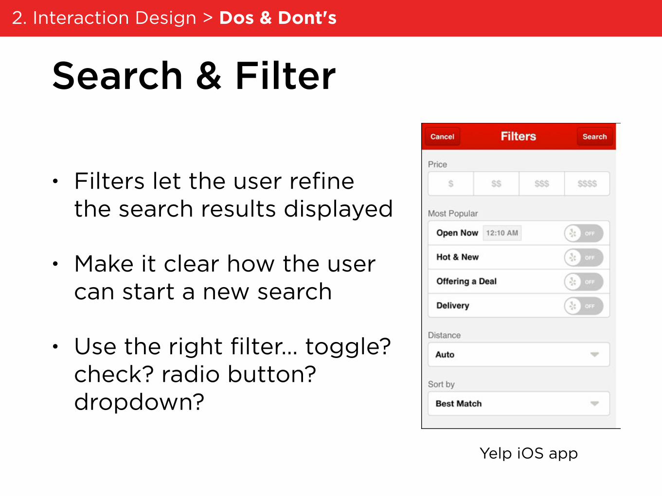
Search & Filter
• Filters let the user refine the search results displayed
• Make it clear how the user can start a new search
• Use the right filter… toggle? check? radio button? dropdown?
Yelp iOS app
2. Interaction Design > Dos & Dont's

Words
• Be consistent. Don’t say “next” on one screen and “OK” on another one
• Match the user’s feelings. Welcome them when they sign up, but be serious when they’re spending money.
mailchimp.com
2. Interaction Design > Dos & Dont's

Dashboards
• Think about what people are actually curious about. Don’t just show data for the sake of data.
• Don’t imply % complete when there’s nothing to complete (for example, energy usage).
Google Fit app
2. Interaction Design > Dos & Dont's

Use real content.
Wikimedia Commons
yours truly
2. Interaction Design > Dos & Dont's

Don’t fuss too much with visuals!
dribbble / Haziq Mir
yours truly
2. Interaction Design > Dos & Dont's

Create your screens.
• Use Tethr as a starting point, but don’t be afraid to mess with it.
• Remember: copying is totally fine.
2. Interaction Design > Design Session # 45 minutes

Link your screens together.
• Create an account and start a project at invisionapp.com.
• Export your screens as PDF, JPG, GIF, etc. Drag & drop them into Invision.
• Link them together with hotspots.
• Click “share” to view your prototype.
3. Prototype Creation > Exploring Invision # 25 minutes

Three kinds of remote testing
1. You do a videoconference with the user yourself
2. You use a service that recruits and surveys users
3. You use a service that collects data about a live website
3. Prototype Creation > User Testing

What did you make?
• How do our different design choices change the meaning of the concept?
• How do our different design choices change the behaviors people are likely to do?
4. Share Out # whatever we have left

The end… for now ♥
Continue your UX design journey at paperandcode.weebly.com.