Embed Size (px)
Citation preview

Uses and abuses of data visualizations in mass mediaESS Visualisation Workshop 2016Valencia. May 17-18, 2016. #ESSvisualisation
Pablo Rey Maz nó@numeroteca
numeroteca.org
Montera34montera34.com
Open Evidenceopen-evidence.com
Slides bit.ly/datavisabuse
All
the
New
s (a
nd A
ds) T
hat’s
Fit
to
Prin
tht
tp://
num
erot
eca.
org/
2013
/06/
23/a
ll-th
e-ne
ws-
and-
ads-
that
s-ft
-to-
prin
t/News media are not neutral

Data visualizations are cultural artifacts. They are subjective as we must distort and simplify reality.
There are white lies, misuses and... lies.
Nobody is neutral.

Dataviz in Mass media
News media want to tell a story …and show the context
Video: http://graphics.wsj.com/countdown-to-a-greek-showdown/

http://info.ils.indiana.edu/~katy/S637-S11/gershon01.pdf
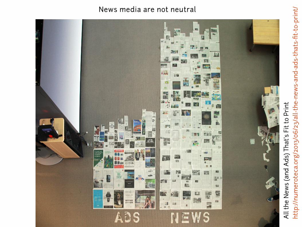
Hans Rosling: Debunking third-world myths with the best stats you've ever seen.https://youtu.be/RUwS1uAdUcI
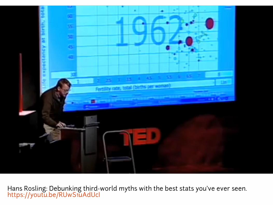
(news media)
… and let you explore the data.
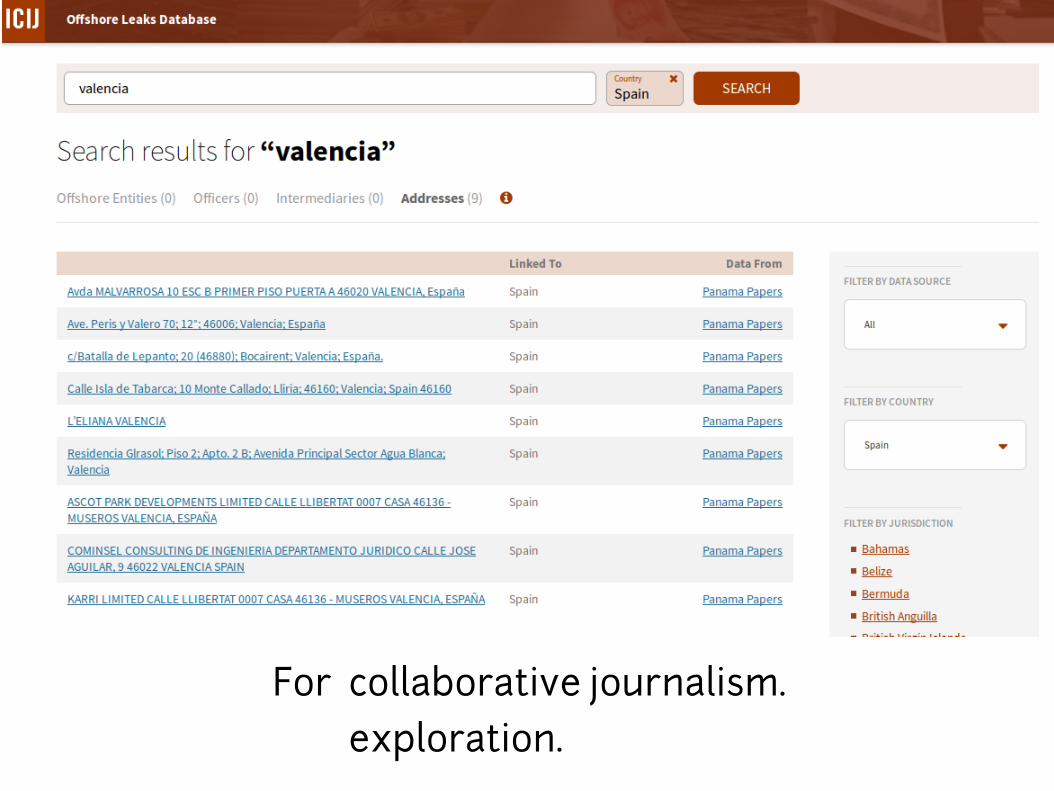
For collaborative journalism.
exploration.
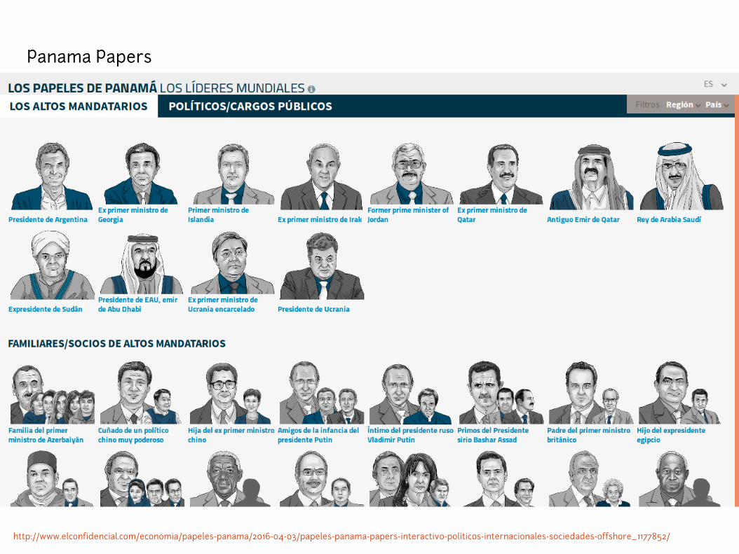
http://www.elconfidencial.com/economia/papeles-panama/2016-04-03/papeles-panama-papers-interactivo-politicos-internacionales-sociedades-offshore_1177852/
Panama Papers
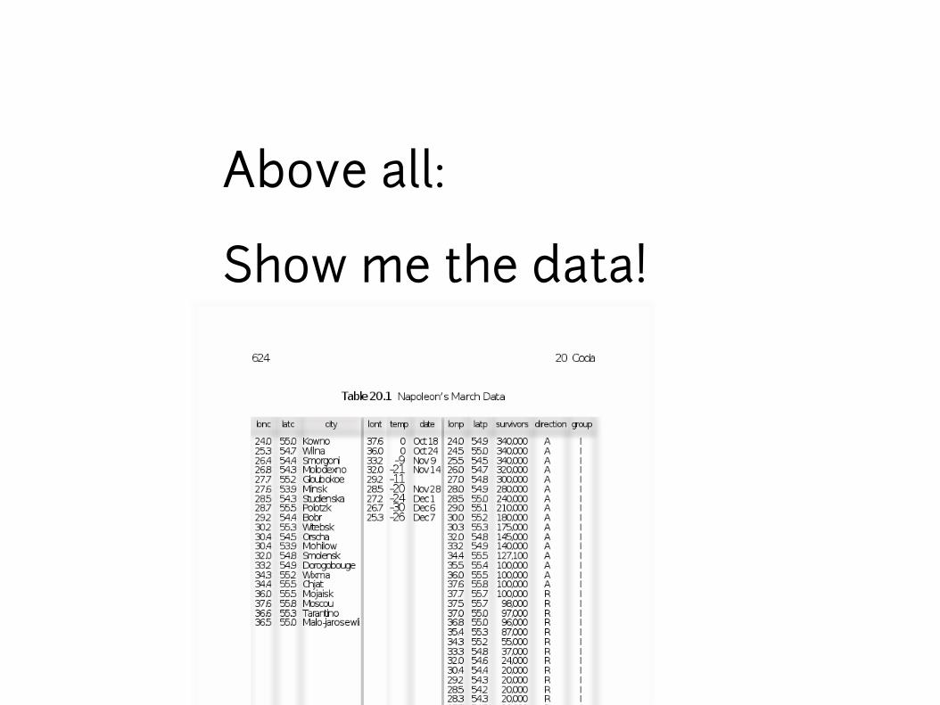
Above all:
Show me the data!
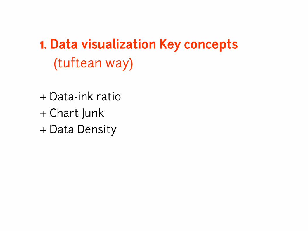
1. Data visualization Key concepts (tuftean way)
+ Data-ink ratio
+ Chart Junk
+ Data Density

http://www.perceptualedge.com/example6.php
Data-Ink ratio
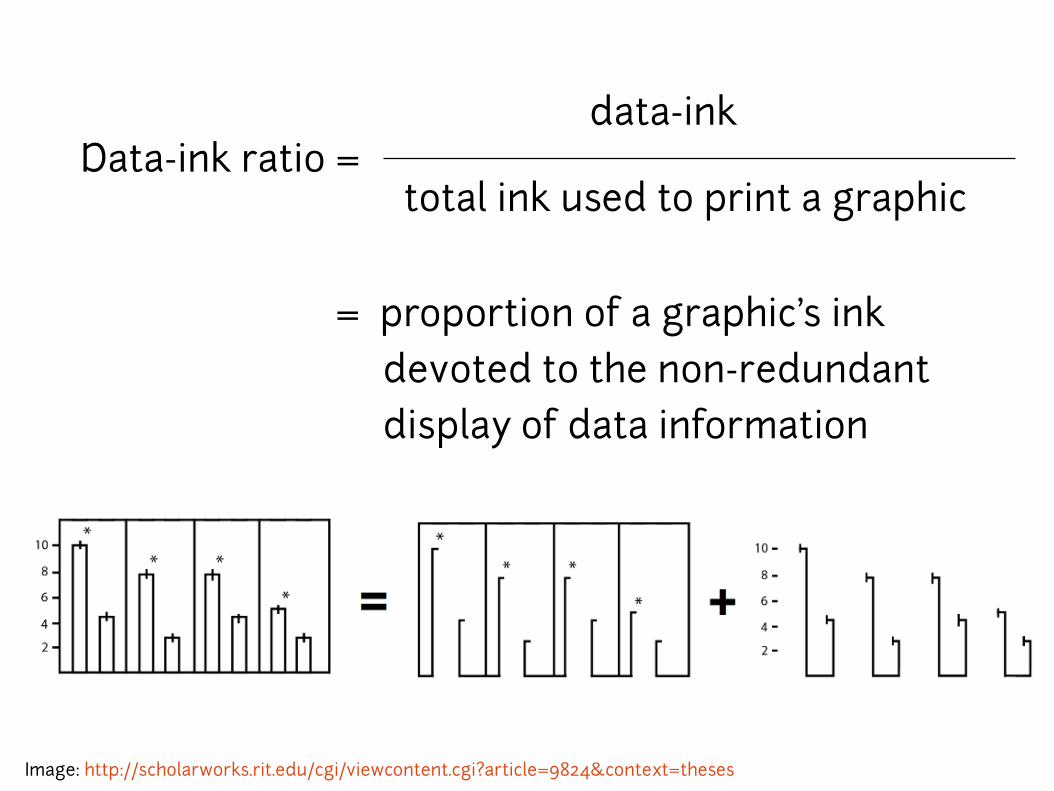
= proportion of a graphic's ink
devoted to the non-redundant
display of data information
Data-ink ratio = data-ink
total ink used to print a graphic
Image: http://scholarworks.rit.edu/cgi/viewcontent.cgi?article=9824&context=theses
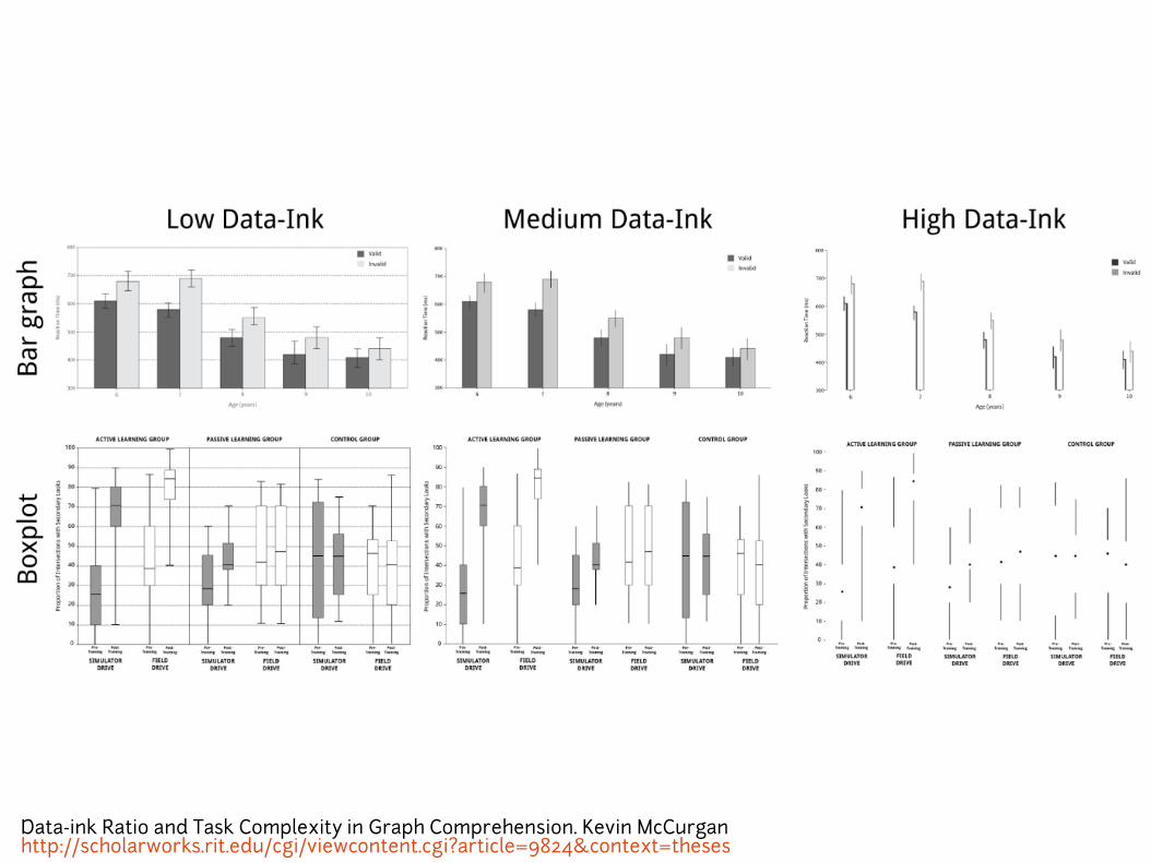
Data-ink Ratio and Task Complexity in Graph Comprehension. Kevin McCurganhttp://scholarworks.rit.edu/cgi/viewcontent.cgi?article=9824&context=theses

Chart junk
What you should erase.
http://www.elsalmoncontracorriente.es/?El-bombardeo-comercial-de-las
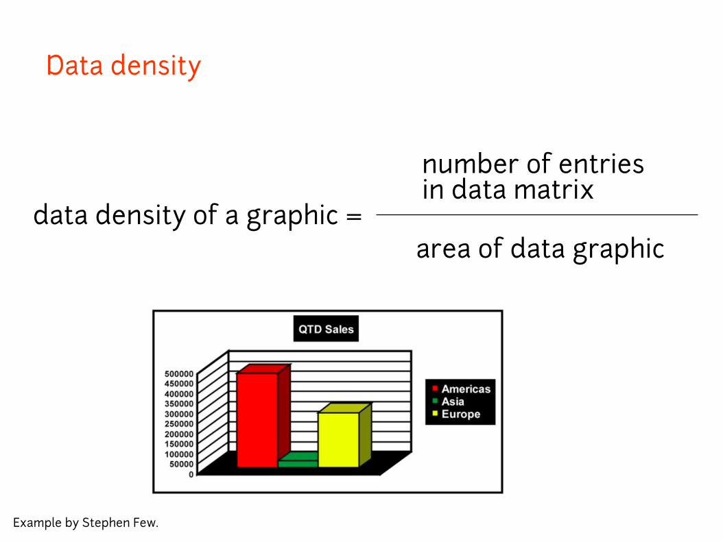
Data density
data density of a graphic =
number of entries in data matrix
area of data graphic
Example by Stephen Few.

http://www.nytimes.com/interactive/2015/07/08/us/census-race-map.html
1 dot = 60 people
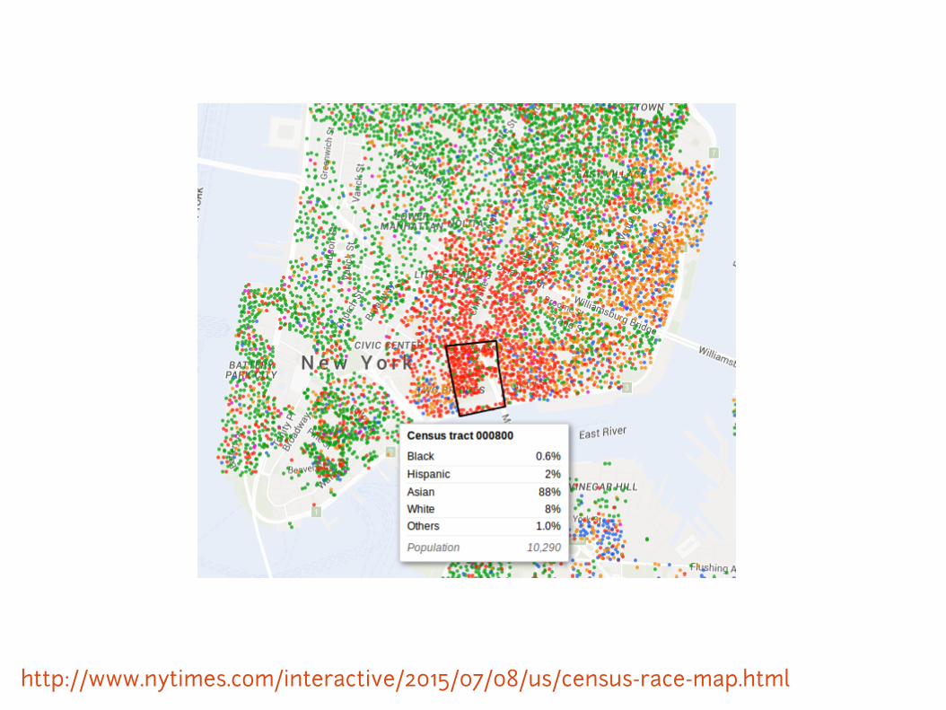
http://www.nytimes.com/interactive/2015/07/08/us/census-race-map.html
2. Review of data visualization types with examples
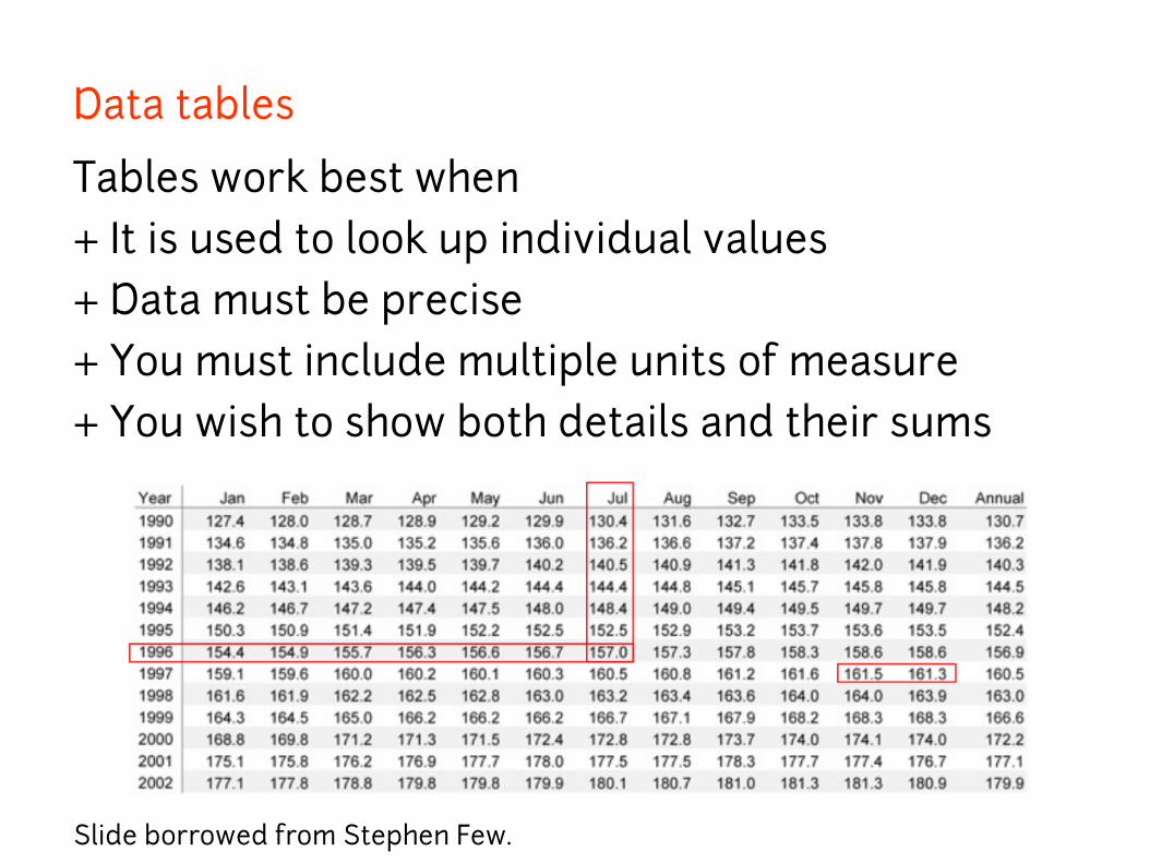
Data tables
Tables work best when
+ It is used to look up individual values
+ Data must be precise
+ You must include multiple units of measure
+ You wish to show both details and their sums
Slide borrowed from Stephen Few.
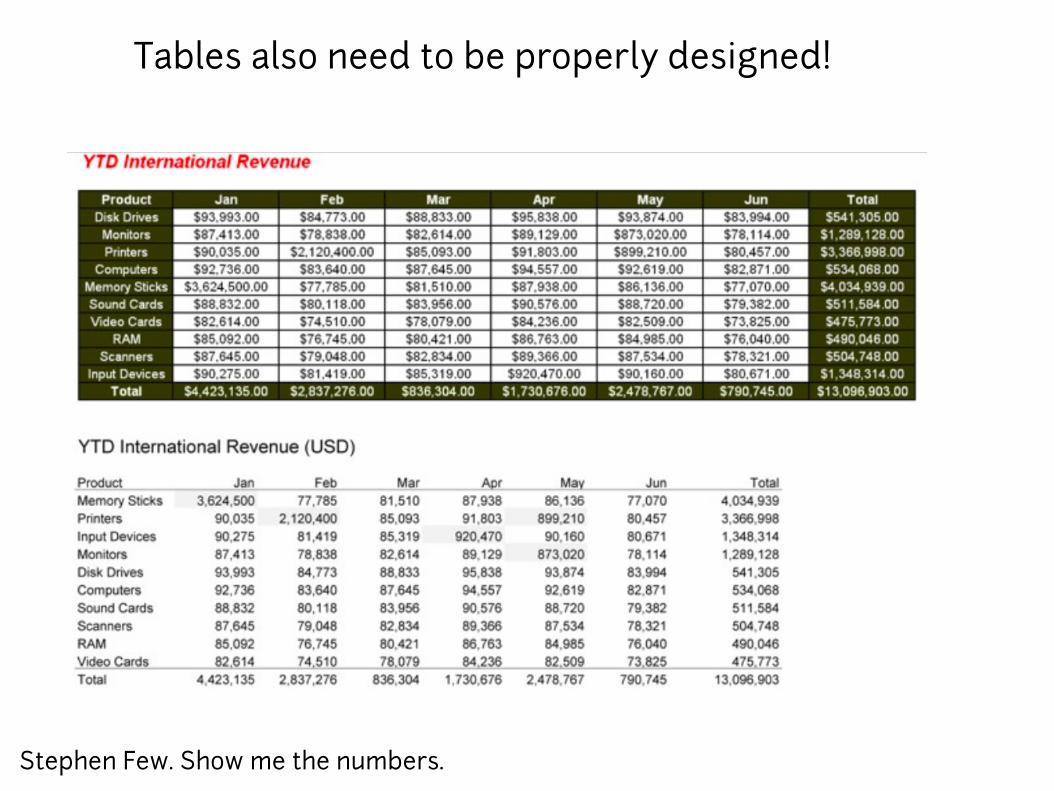
Stephen Few. Show me the numbers.
Tables also need to be properly designed!

Change order of the rows!
Datatables.Free software available at http://datatables.net/
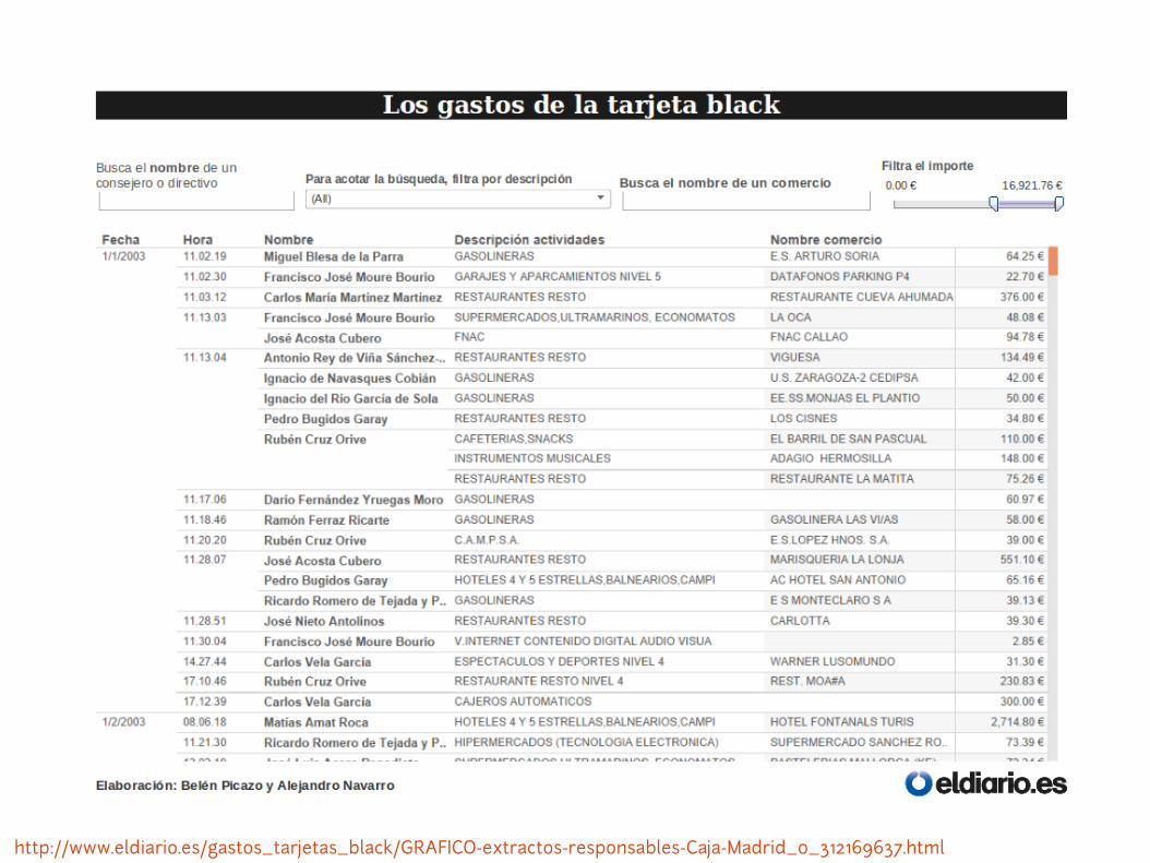
http://www.eldiario.es/gastos_tarjetas_black/GRAFICO-extractos-responsables-Caja-Madrid_0_312169637.html

Black Credit Cards analysis of type of spending
http://numeroteca.org/tarjetasblack

Black Credit Cards analysis of type of spending
http://numeroteca.org/tarjetasblack
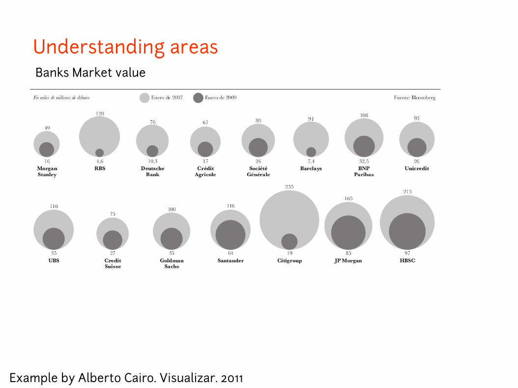
Banks Market value
Example by Alberto Cairo. Visualizar. 2011
Understanding areas
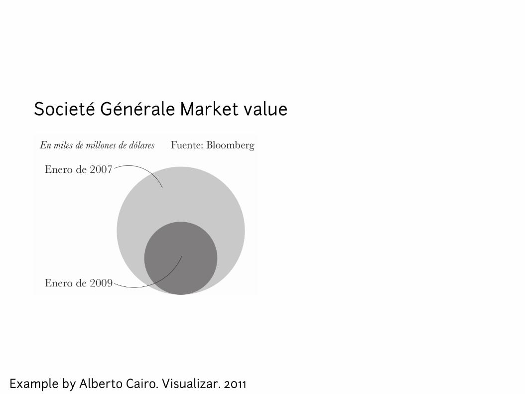
Societ G n rale Market valueé é é
Example by Alberto Cairo. Visualizar. 2011
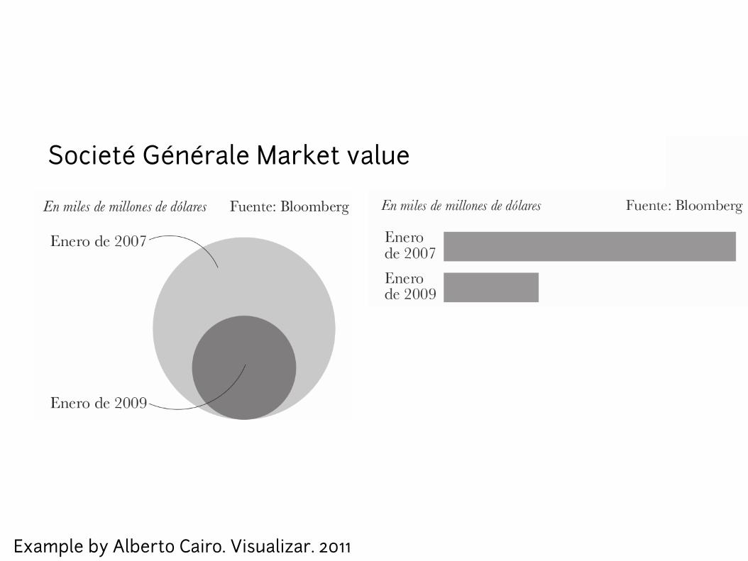
Societ G n rale Market valueé é é
Example by Alberto Cairo. Visualizar. 2011

Example by Alberto Cairo. Visualizar. 2011
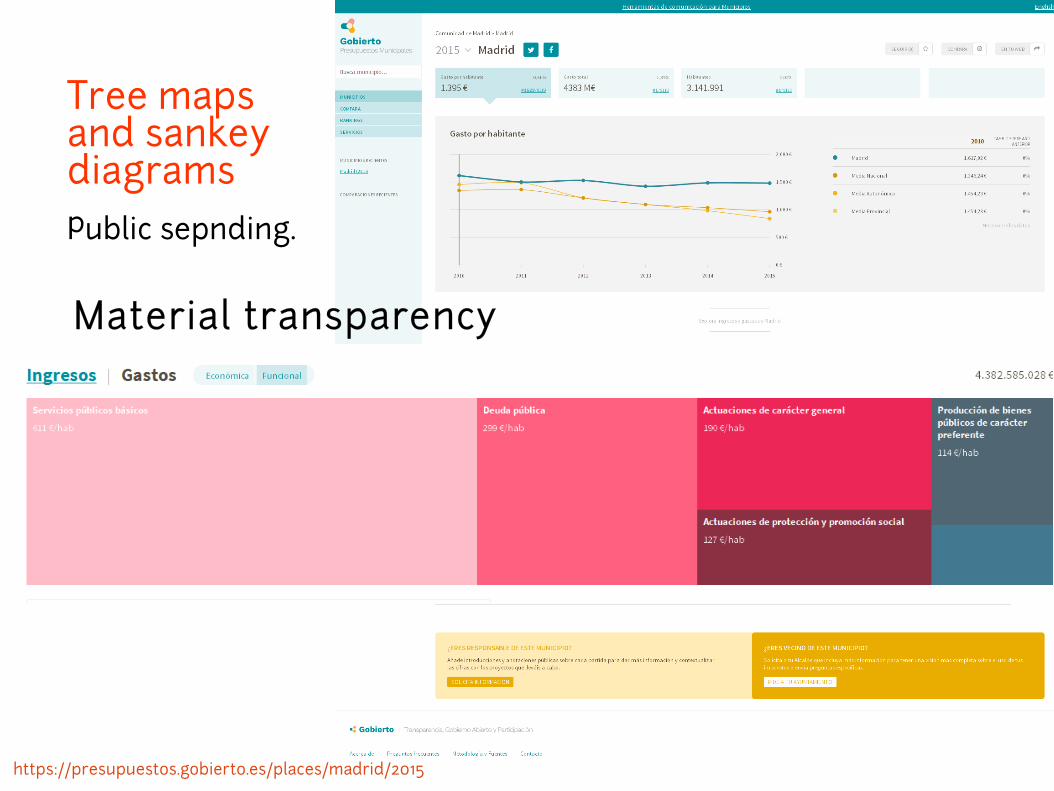
Tree mapsand sankey diagrams
Public sepnding.
Material transparency
https://presupuestos.gobierto.es/places/madrid/2015

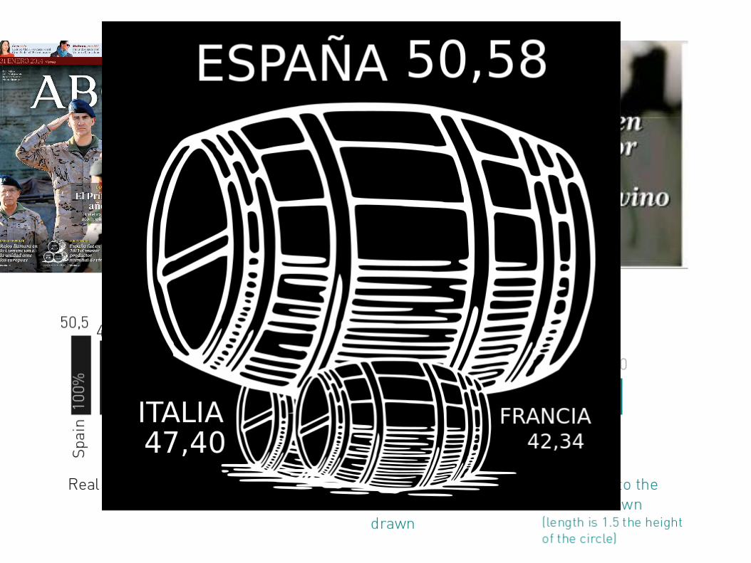
Spain is in 2013 the mayor wine producer in the world
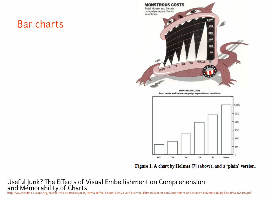
Bar charts
Useful Junk? The Effects of Visual Embellishment on Comprehension and Memorability of Chartshttp://ww.w.cedma-europe.org/newsletter%20articles/misc/The%20Effects%20of%20Visual%20Embellishment%20on%20Comprehension%20and%20Memorability%20of%20Charts.pdf
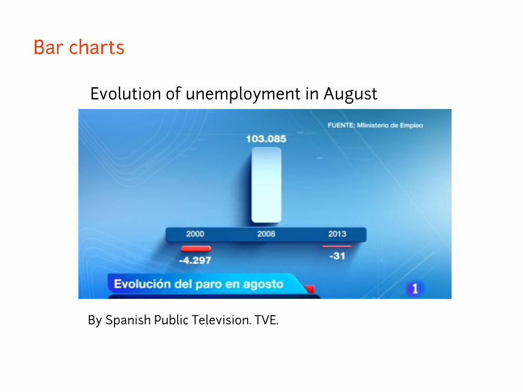
Bar charts
By Spanish Public Television. TVE.
Evolution of unemployment in August
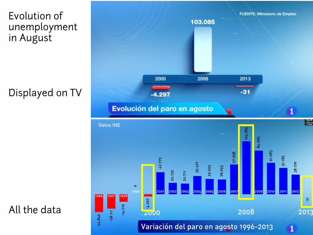
Displayed on TV
All the data
Evolution of unemployment in August
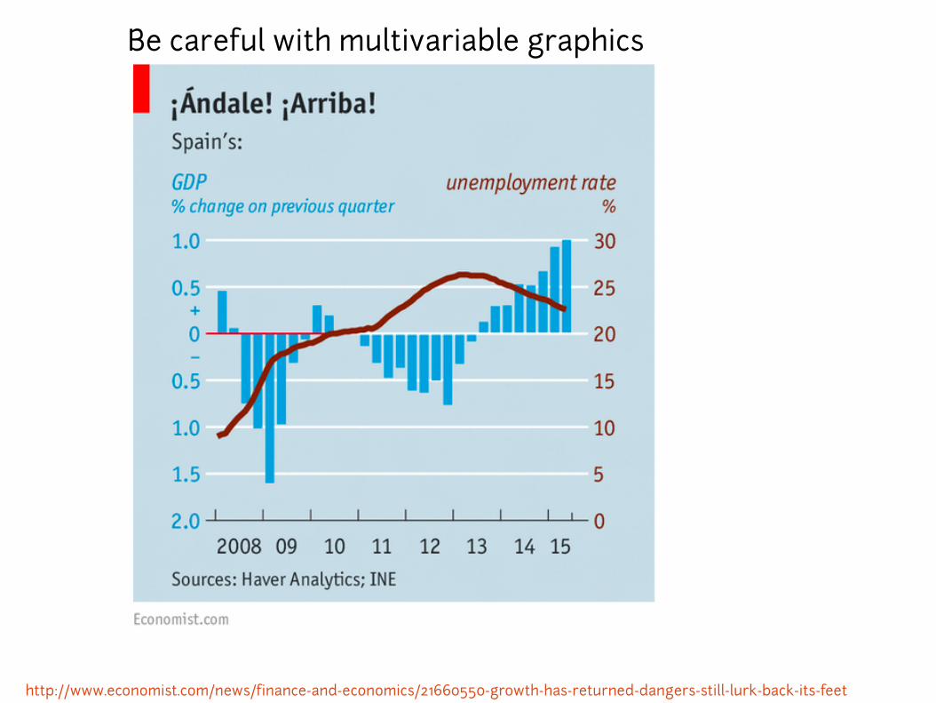
Be careful with multivariable graphics
http://www.economist.com/news/finance-and-economics/21660550-growth-has-returned-dangers-still-lurk-back-its-feet
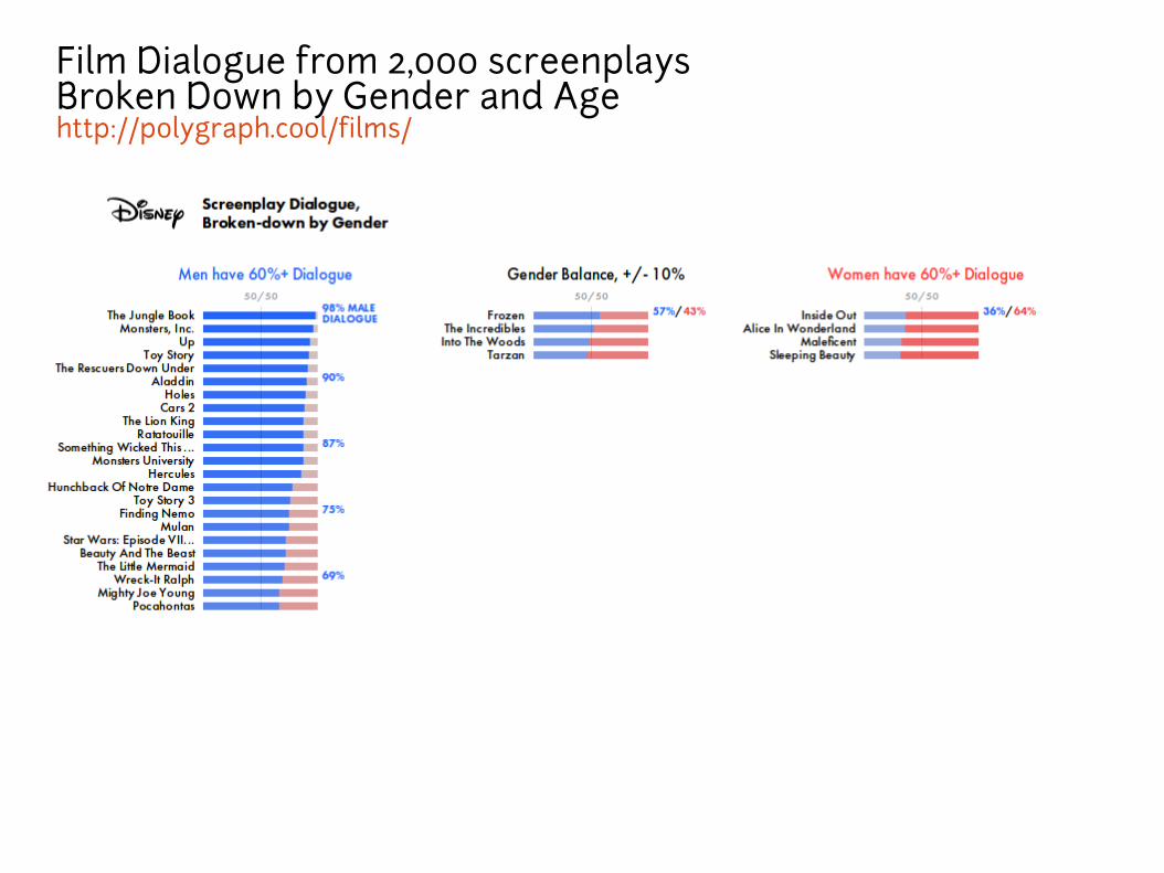
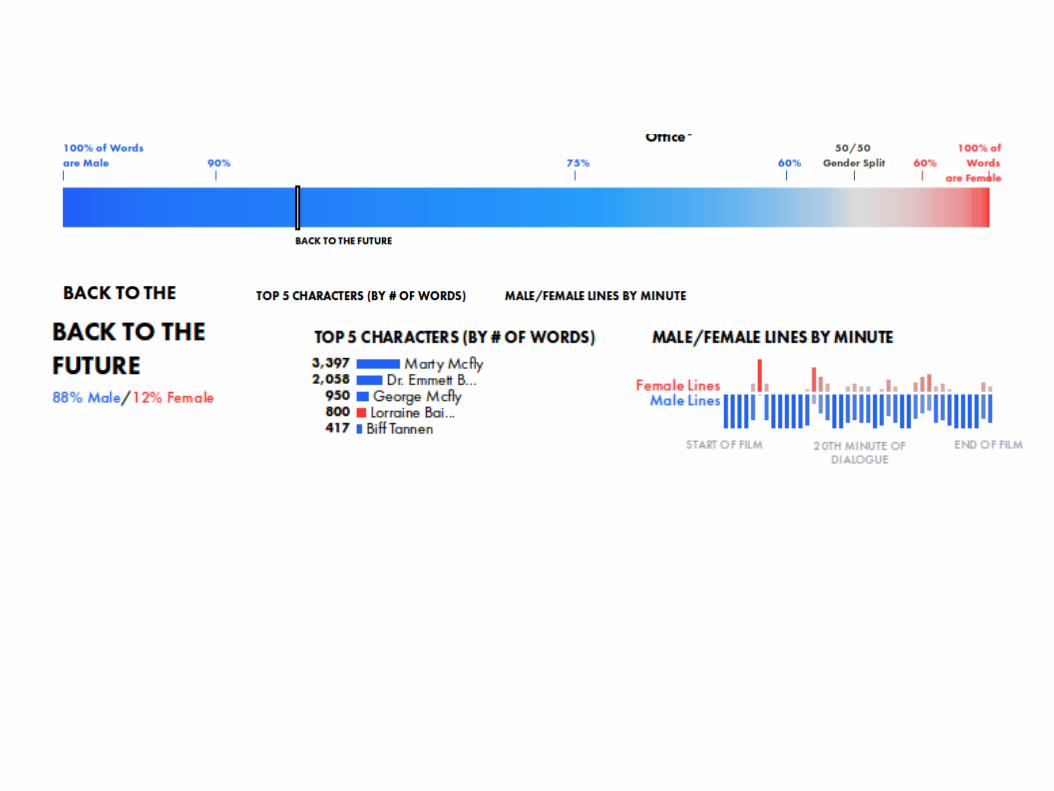
Film Dialogue from 2,000 screenplaysBroken Down by Gender and Agehttp://polygraph.cool/films/
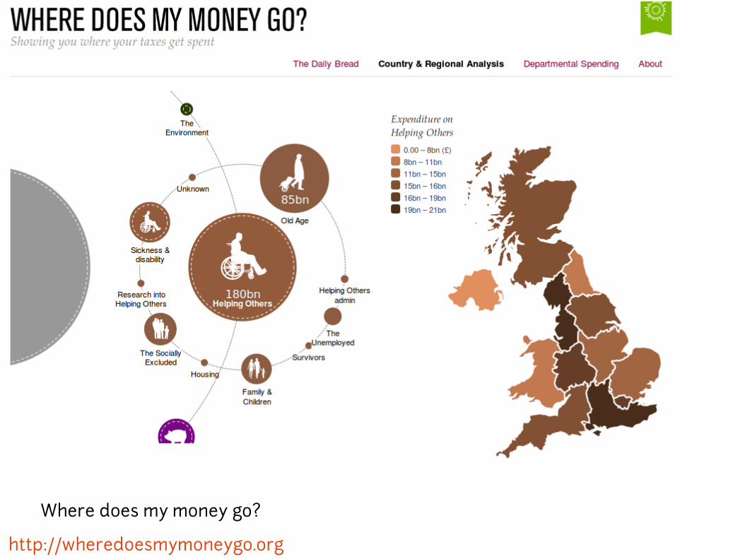
Data maps
Maps are great data visualizations to show geospatial
data, but they have to be used carefully.
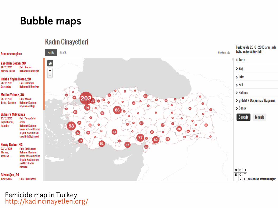
+ Chorophlet maps
+ Bubbles maps
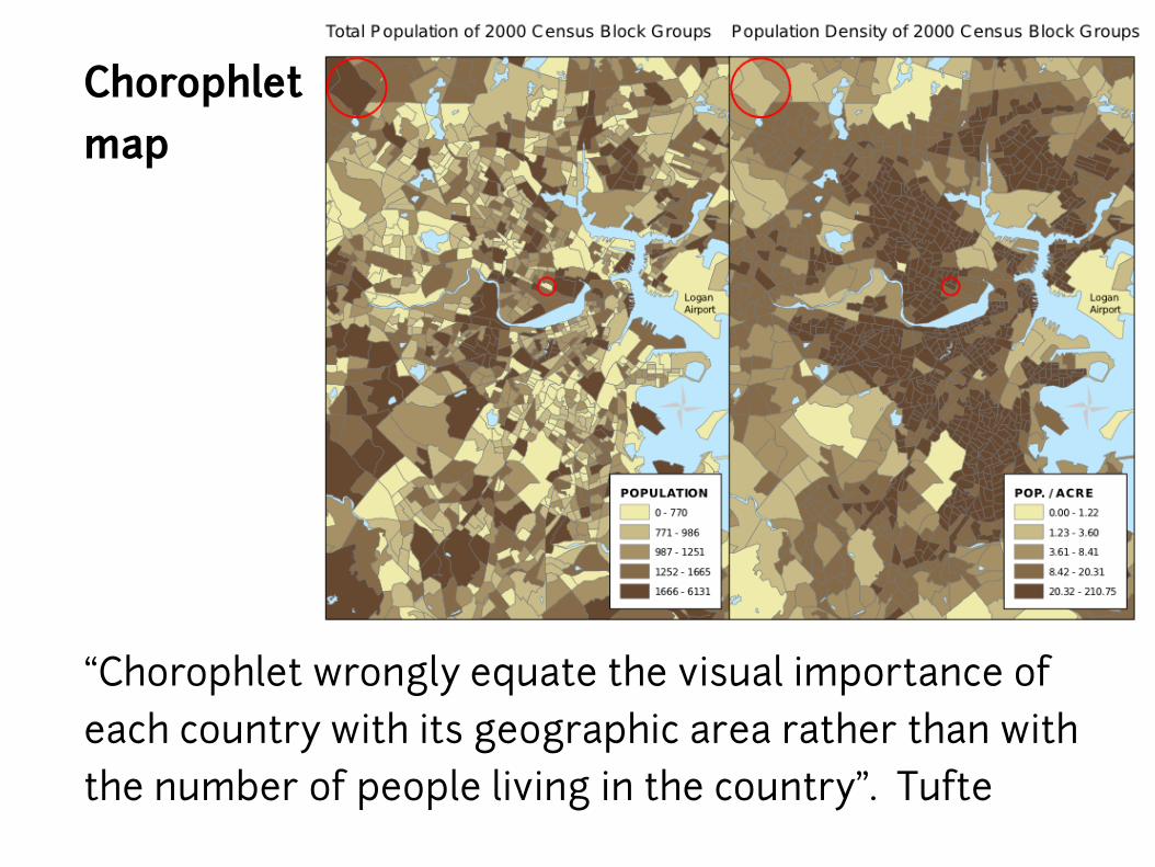
Chorophletmap
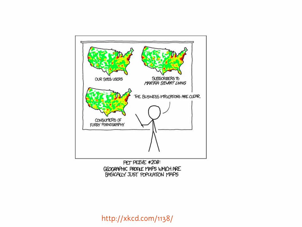
“Chorophlet wrongly equate the visual importance of
each country with its geographic area rather than with
the number of people living in the country”. Tufte

John Snow 1854.

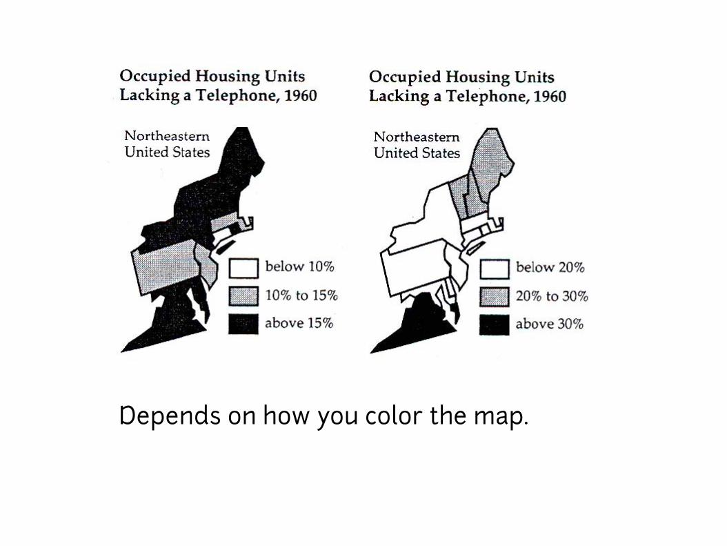
How to lie with maps. Monmonier
Depends where
the boundaries
are drawn.
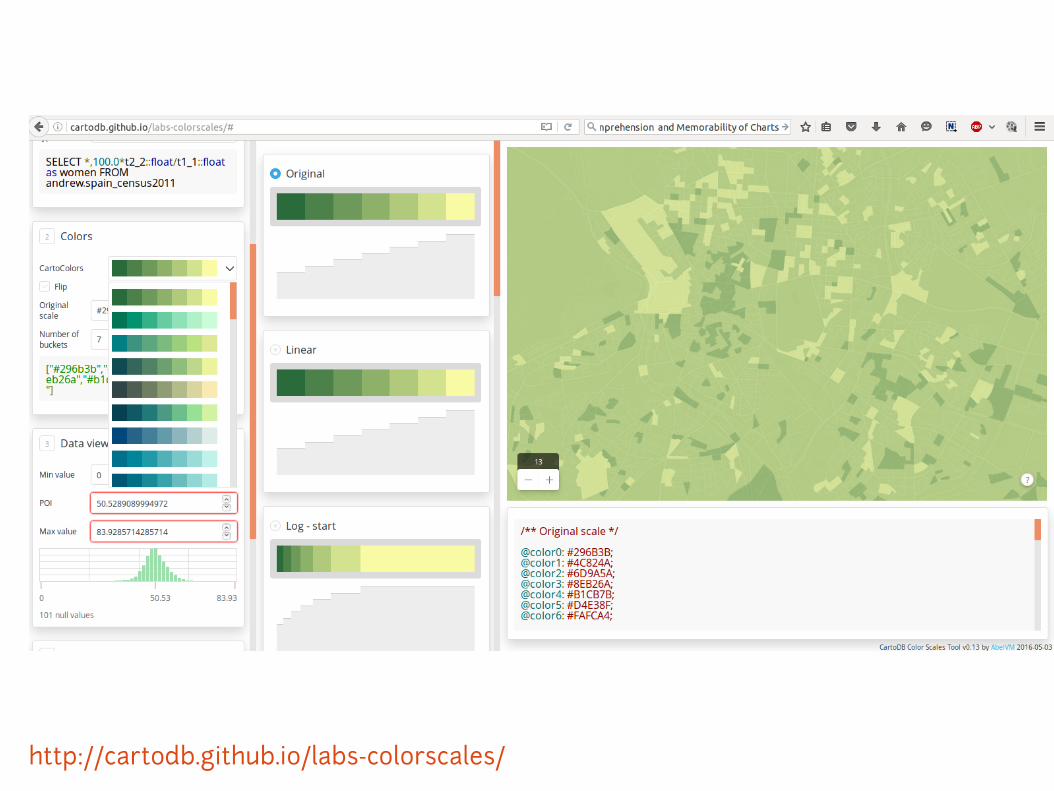
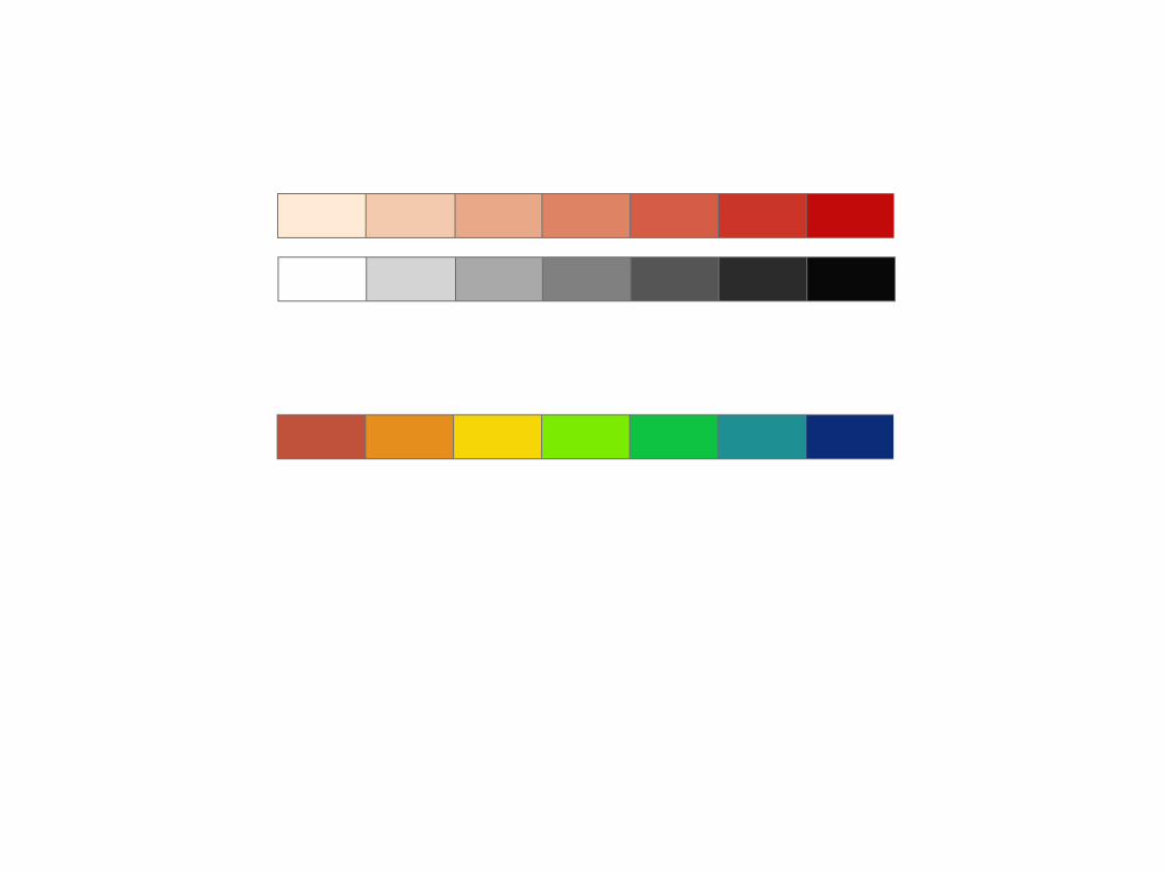
Depends on how you color the map.
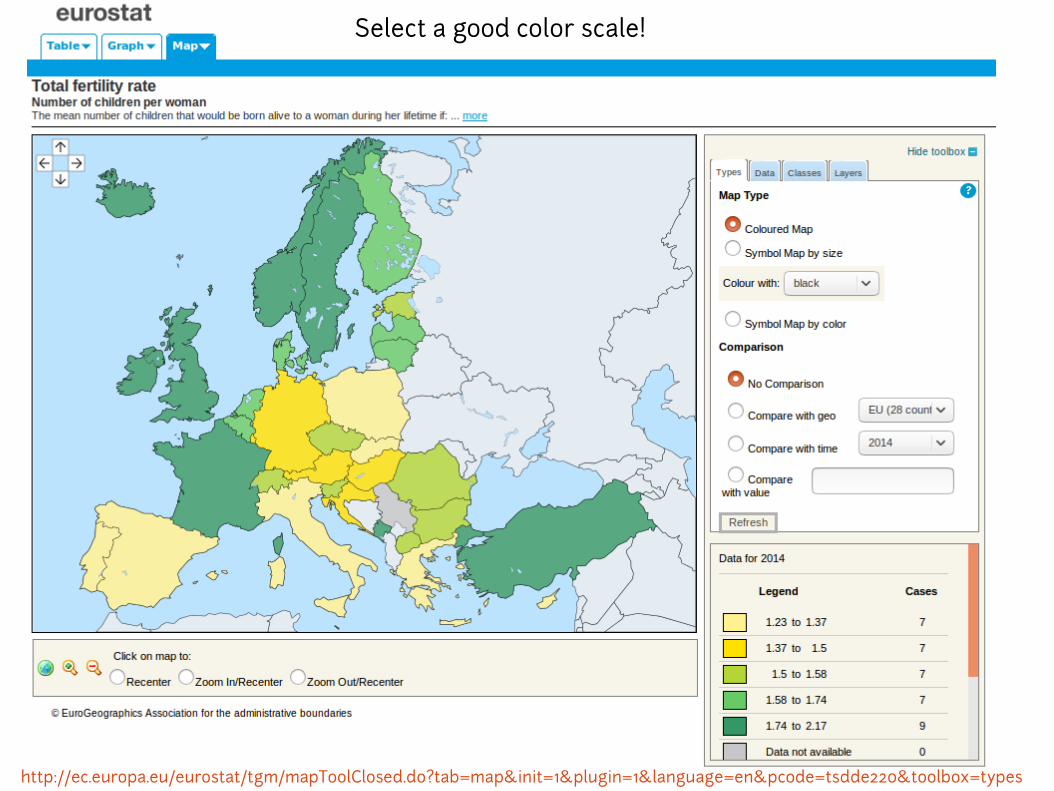
Select a good color scale!
http://ec.europa.eu/eurostat/tgm/mapToolClosed.do?tab=map&init=1&plugin=1&language=en&pcode=tsdde220&toolbox=types
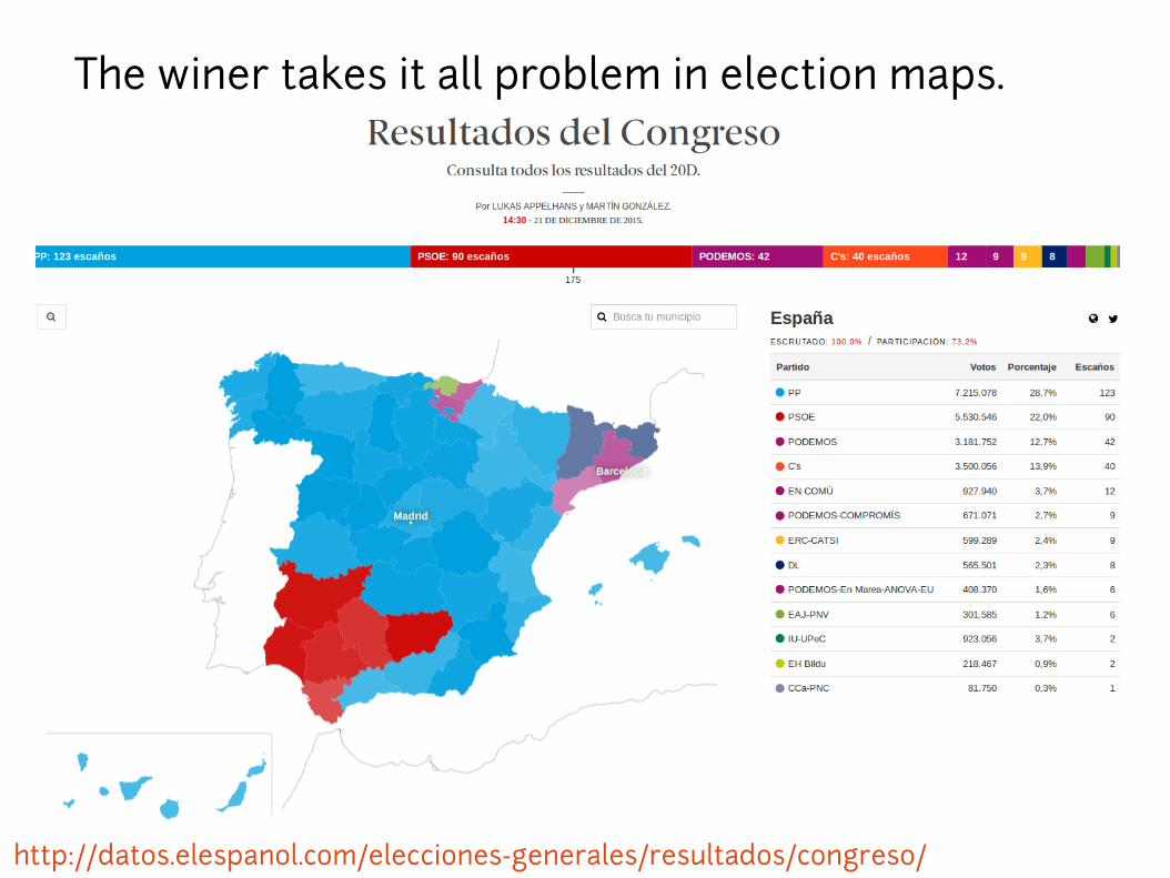
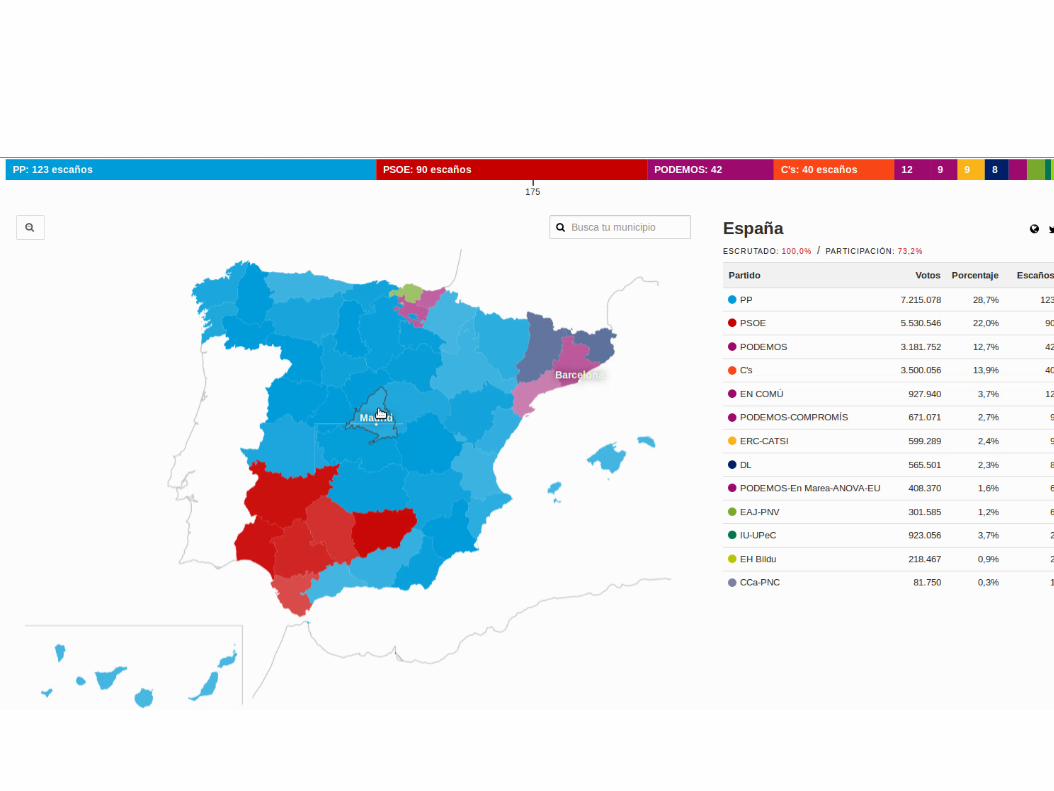
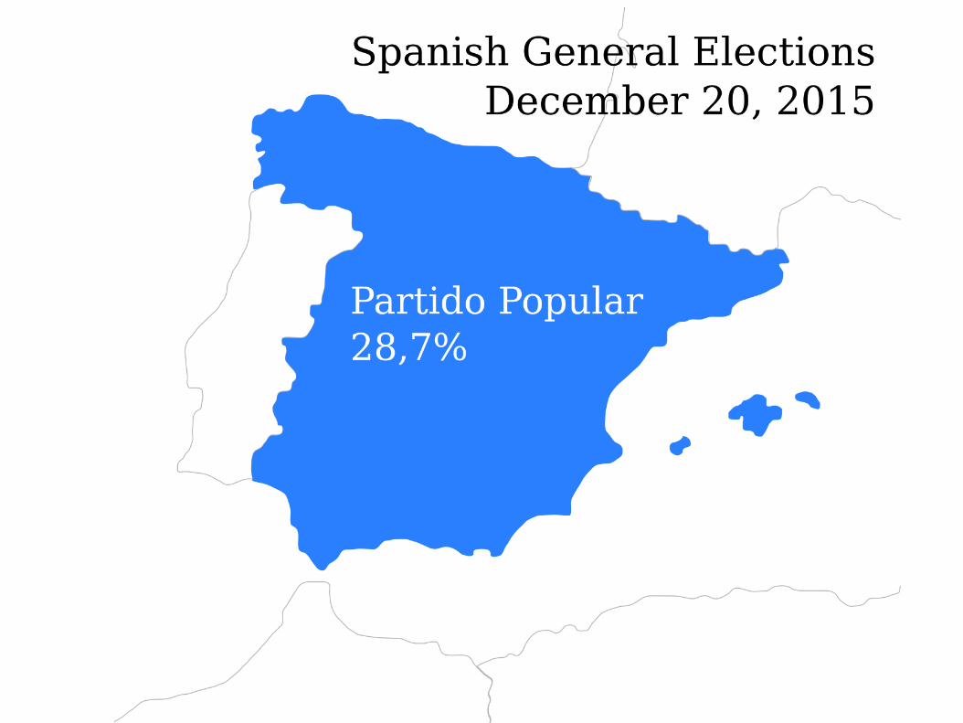
The winer takes it all problem in election maps.
http://datos.elespanol.com/elecciones-generales/resultados/congreso/

http://elpais.com/elpais/2015/12/18/media/1450461184_895079.html

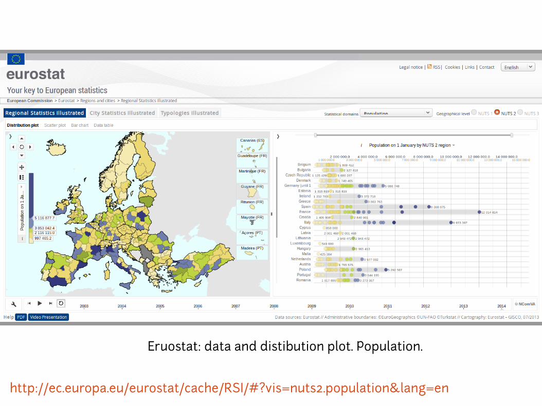
http://ec.europa.eu/eurostat/cache/RSI/#?vis=nuts2.population&lang=en
Eruostat: data and distibution plot. Population.
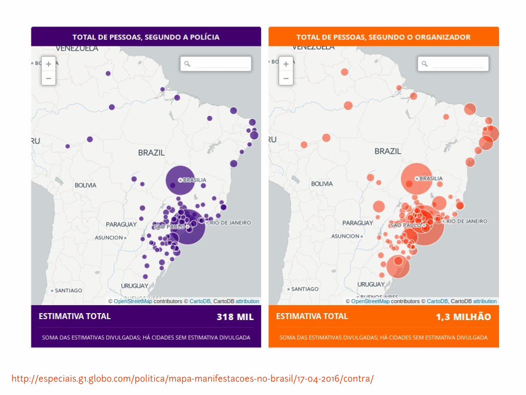
http://especiais.g1.globo.com/politica/mapa-manifestacoes-no-brasil/17-04-2016/contra/
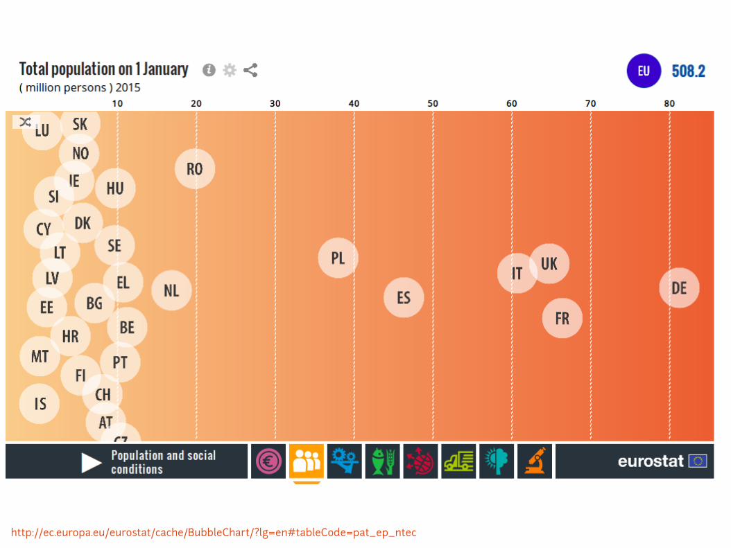
http://ec.europa.eu/eurostat/cache/BubbleChart/?lg=en#tableCode=pat_ep_ntec

http://ec.europa.eu/eurostat/cache/BubbleChart/?lg=en#tableCode=pat_ep_ntec
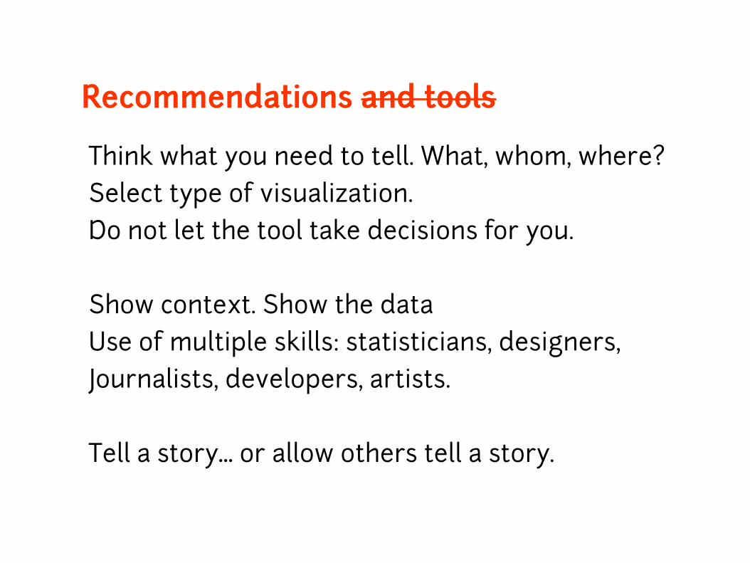
Recommendations and tools
Think what you need to tell. What, whom, where?
Select type of visualization.
Do not let the tool take decisions for you.
Show context. Show the data
Use of multiple skills: statisticians, designers,
Journalists, developers, artists.
Tell a story or allow others tell a story.…
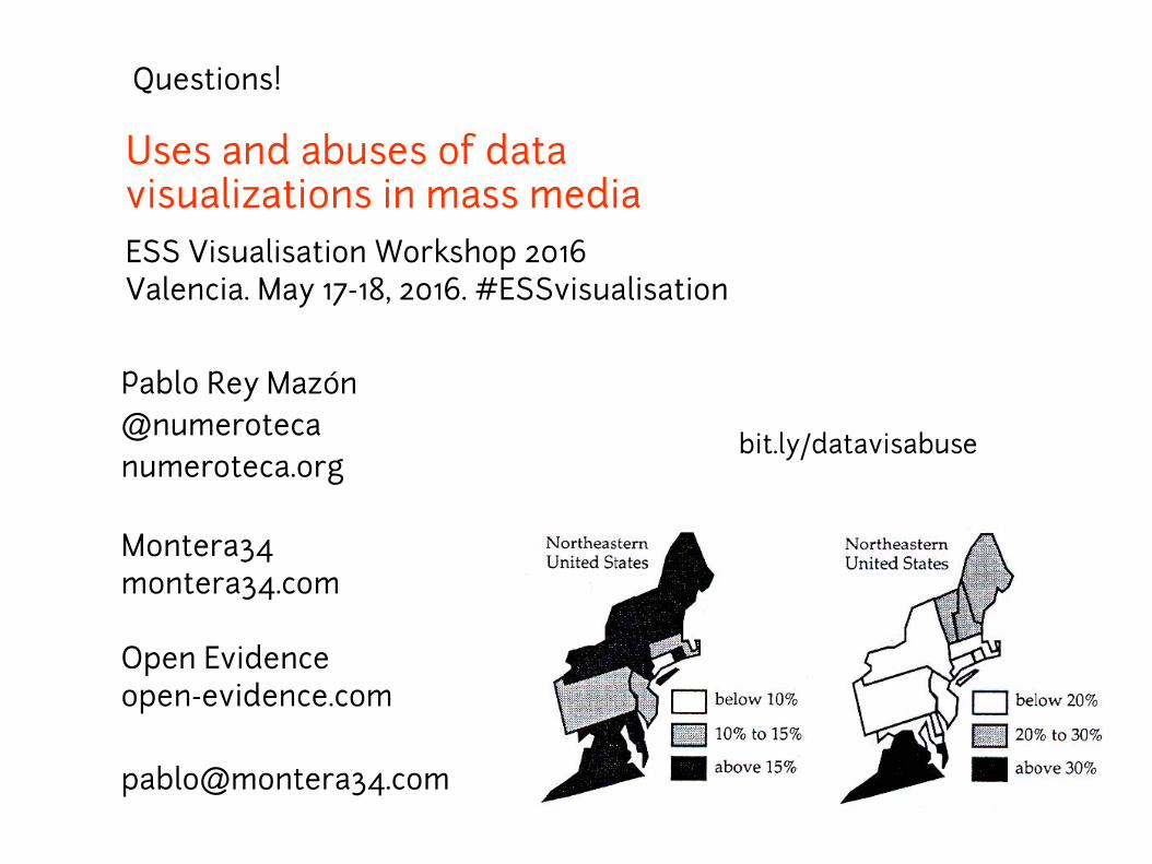
Uses and abuses of data visualizations in mass media
ESS Visualisation Workshop 2016Valencia. May 17-18, 2016. #ESSvisualisation
Pablo Rey Maz nó@numeroteca
numeroteca.org
Montera34montera34.com
Open Evidenceopen-evidence.com
Questions!
bit.ly/datavisabuse
Show me the data
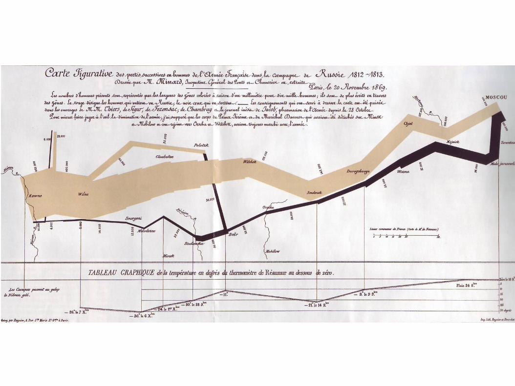
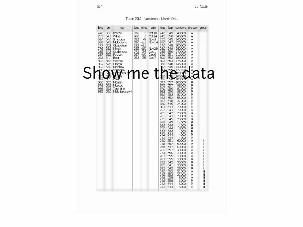
Show me the data

https://robots.thoughtbot.com/analyzing-minards-visualization-of-napoleons-1812-march

Show me the data!

Show me the data
but tell me a story!
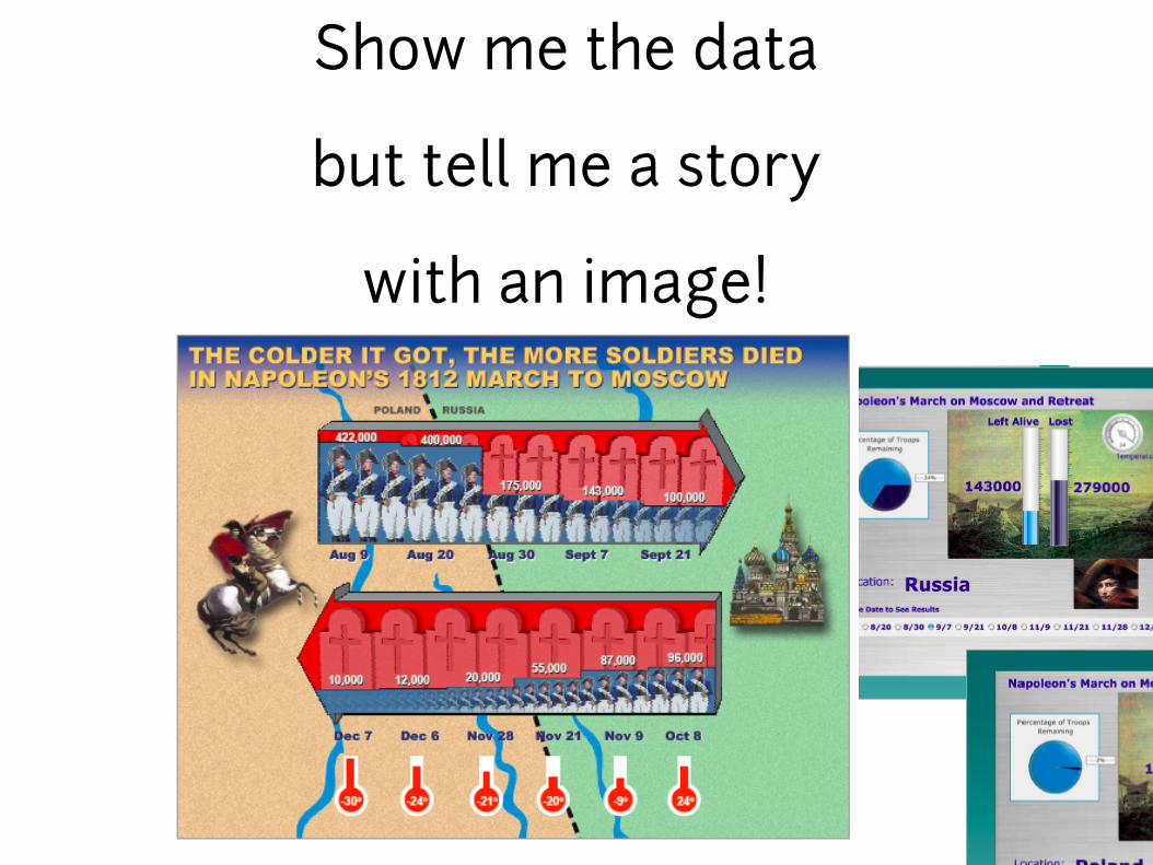
Show me the data
but tell me a story
with an image!