Embed Size (px)
Citation preview

ASSIGNMENT 2
A. Purushotam
Mauritius

Table of contents
Winners Supermarket Location 1
Macumba Deco Location 2
Power Music Shop Location 3
Shoe Connection Location 4
Pharma Link Location 5
Habit Beachwear Location 6

WINNERS
SUPERMARKET

Store Appearance Personnel
Color scheme: white, blue, orange Polite
Clean place Dressed in uniform
Large welcoming front doors Courtesy script: e.g. “good morning”
Medium size sign lettering Ratio of salesperson to customers:
1:10
Environment Products
Nice background music Arranged by type and color
Crowded store at peak hours Free samples for some items
Security persons at strategic places Products are easy to find
Average spending time at store: 30
minutes
Impulse items found near cash
registers
Customers Other observations
Customers are generally accompanied
by relatives & friendsRegular promotions are held
Products touching are discouraged No late night shopping
99% customers purchase items
INSIGHTS AND NEW OPPORTUNITIES
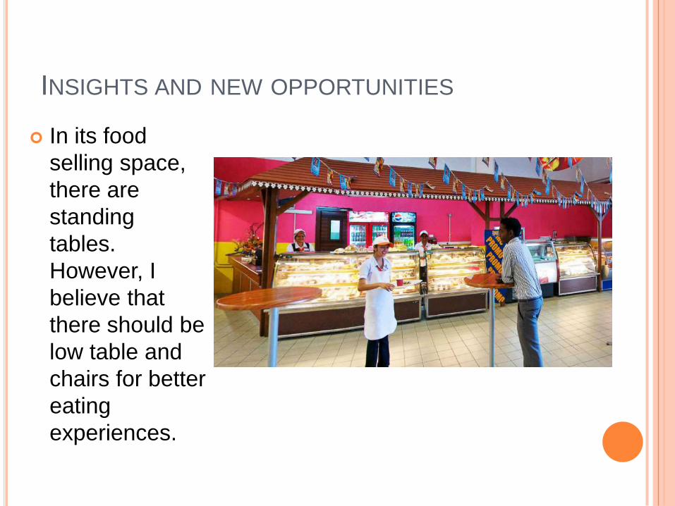
In its food
selling space,
there are
standing
tables.
However, I
believe that
there should be
low table and
chairs for better
eating
experiences.

INSIGHTS AND NEW OPPORTUNITIES
I believe, it is important
to sell jam, milk, butter
near the bread selling
space as these items
complement with each
other in the daily
household usage.

INSIGHTS AND NEW OPPORTUNITIES
As seen in the picture below, the big door is quite dull in
appearance. As it is situated near the vegetable section, it would be
wiser to paint the door green with illustrations of greenries and
vegetables in order to match with the location setting. This will
make the area more visually appealing.

MACUMBA DECO

Store Appearance Personnel
Large display windows Salesperson initiate contact after
several minutes
Small lettering of business name No uniform
Door remains open Salespeople do not match with
store images
Environment Products
Color scheme: green, orange Painting of Buddha everywhere
Peaceful environment Wooden items everywhere
No background music Lamps
Crowded with merchandise
Customers Other observations
Customers average age: 40 Too much lights due to many
lamps
Yes, touching products is allowed Wooden items smell not good
Customers walk in different path

INSIGHTS AND NEW OPPORTUNITIES
There are too
much items
stacked one on
another in the
store. It is also too
bulky with
wooden stuffs.
The items should
be well organized
with alternate
colorful variations.
INSIGHTS AND NEW OPPORTUNITIES
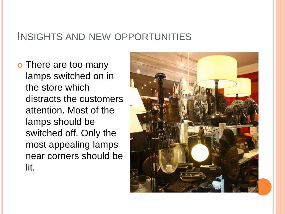
There are too many
lamps switched on in
the store which
distracts the customers
attention. Most of the
lamps should be
switched off. Only the
most appealing lamps
near corners should be
lit.

POWER MUSIC SHOP

Store Appearance Personnel
Sign lettering is big No contact from salesperson.
Feels unwelcomed with closed
door
No uniform worn
Salesperson do not match with store image
Environment Products
Color scheme: Green, yellow CDs everywhere
Floor have tiles Prices are easily found on CDs
Silent environment
Store have distinctive smell
Customers Other observations
Customers are generally alone Blank CDs for decoration on the
ceiling and door
Gender distribution equal Low security/people can easily
steal
Average age of customers: 20 No fidelity card options

INSIGHTS AND NEW OPPORTUNITIES
The CDs, DVDs and
Blurays of music and
films are scattered with
no real arrangement.
These should be
arranged by type of
movies, type of music
among others, so that
customers can easily
locate what they came
searching for.

INSIGHTS AND NEW OPPORTUNITIES
Fidelity cards should be
offered to attract and
maintain customers.
There should be more
salesperson to help
whenever a customer
enters the shop.
There should be listening
booth in case customers
want to listen to the
music before purchase.

SHOE CONNECTION

Store Appearance Personnel
Sign lettering small Immediate attention from
salesperson
Doors are left closed Employee approx. age: 20
Store does not draw us in No uniform
Environment Products
Color scheme: white, orange,
green
Shoes and bags are everywhere
No background music Some prices are not placed on the
items and have to be asked
Well lit store
Customers Other observations
Customers are generally
accompanied
Dull color of store
Yes touching of items are allowed Lack of mannequin
Average customer age: 25
INSIGHTS AND NEW OPPORTUNITIES
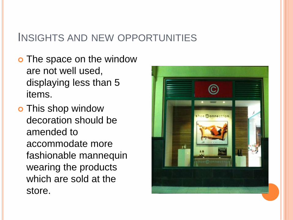
The space on the window
are not well used,
displaying less than 5
items.
This shop window
decoration should be
amended to
accommodate more
fashionable mannequin
wearing the products
which are sold at the
store.

INSIGHTS AND NEW OPPORTUNITIES
The door should be left open in order to have a welcoming feeling. Also, the shop display window can be made more creative and colorful with big posters of models/celebrities.
The color can be made more appealing through fluorescent warm colors which will attract the attention of potential customers.
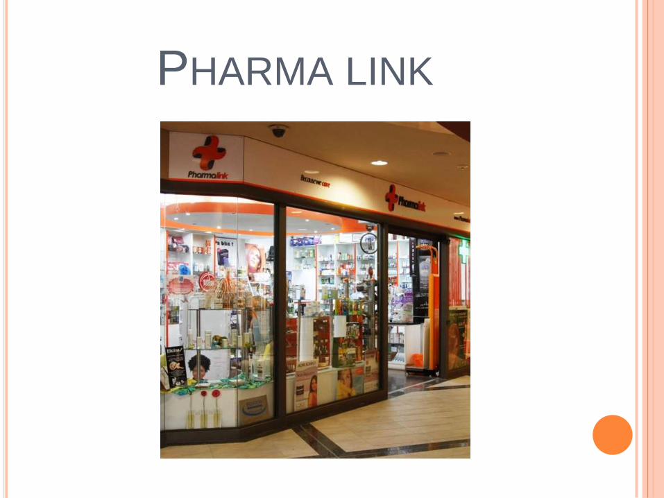
PHARMA LINK

Store Appearance Personnel
Attractive in appearance Salesperson wear uniforms
Sign lettering is big and visible Both male and female as
employees
Big door is always open and
welcoming
Polite
Environment Products
Color scheme: white, orange, red,
black
Beauty cream products are first
noticed
Well lit store Prices not easy to find-have to
inquire
Appealing music of flowing water Products arranged by type
Customers Other observations
Customers are generally
accompanied
No free sample of beauty products
Touching of products are not
allowed
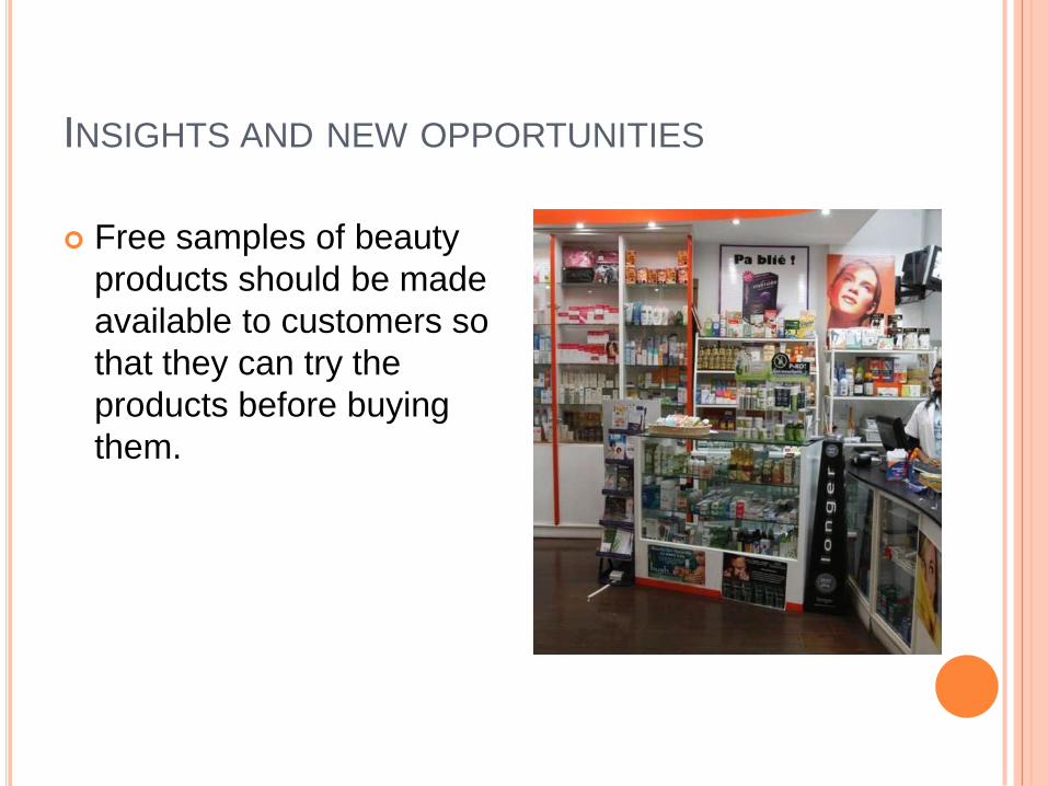
INSIGHTS AND NEW OPPORTUNITIES
Free samples of beauty
products should be made
available to customers so
that they can try the
products before buying
them.

INSIGHTS AND NEW OPPORTUNITIES
The salesperson should be well
trained in advising customers
which products best suits them
as there are various products of
various brands. Showing
reliability indicates goodwill.
Customers will therefore trust
them and will more likely
become loyal.

HABIT BEACHWEAR

Store Appearance Personnel
Yes, store draws us in. Salesperson initiate immediate
contact
Big open doors are welcoming No uniform
Sign lettering is big and visible Yes, salesperson treat different
customers differently
Environment Products
Color scheme: yellow, orange,
green, blue, white
Tshirts, jeans and beachwear are
products which are first noticed
Well lit store Products arranged by color and type
High uncovered rough looking
ceiling
Prices are easy to find
Cool background music
Customers Other observations
Most customers are accompanied Man clothing are more displayed than
woman clothing
Customers appear to be browsing
Yes products trying are accepted

INSIGHTS AND NEW OPPORTUNITIES
The pipes on the ceiling
are visible and while this
contributes to the image
projected by the store on
purpose, I believe that the
pipes are too obvious and
they should be made more
decorative and colorful to
match the store color
scheme.
INSIGHTS AND NEW OPPORTUNITIES
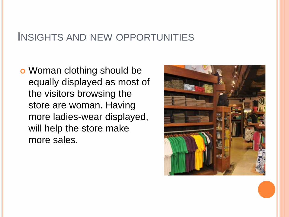
Woman clothing should be
equally displayed as most of
the visitors browsing the
store are woman. Having
more ladies-wear displayed,
will help the store make
more sales.

CONCLUSION
In this presentation, we have analysed six different
locations by store appearance, store environment,
the personnel, the products, the customers and
some further inspection. Insights and new
opportunities were developed based on the
observations made.
Paying attention is a great way to help identify
weaknesses and convert those weaknesses into
strenghts and opportunity.

THANK YOU
FOR
YOUR
ATTENTION !
This assignment is intended for personal use only.


