Embed Size (px)
Citation preview


5 Steps to Mobile Success
Raja SaggiHead of B2B Marketing, Google

Agenda● Think Mobile! ● Apps vs Sites● Design Principles● Getting Found● Content


What percentage of British mobile users have smartphones?
50% 70%
Source: “Digital Usage in the UK” Midyear 2014 eMarketer Forecast, Sept 2014
90%

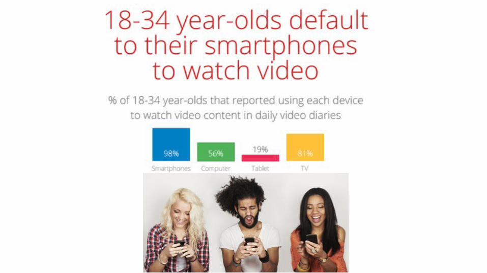
Daily time spent on smartphones
1 hrs0.5 hr
Source: eMarketer, 2014
2 hrs

UK e-commerce through mobile
of books are purchased
through mobile devices
43% ?%of clothes are bought
through mobile devices
40%of music is purchased
through mobile devices
Source: “Mobile Commerce Compendium”, Econsultancy, June 2013
42%

A)10% B) 25% C) >45%
% of teenage smartphone users who use their handset whilst in the bathroom
Source: “A nation addicted to smartphones”, OfCom, Aug 2014

To realize the true value of mobile, you need to live,
breathe and think it

Agenda● Think Mobile! ● Apps vs Sites● Design Principles● Getting Found● Content

“The mobile war is over and the app has won”
venturebeat.com 2013/04/03
Are Apps the solution?

86%
14%
Sources: Time spent stats: http://www.flurry.com/bid/109749/Apps-Solidify-Leadership-Six-Years-into-the-Mobile-Revolution#.U44l461dVX4;
On mobile, entertaining apps dominate time, but sites capture bulk of transactions
TIMESPENTON SITES
TIMESPENTON APPS
14%
40%GAMIN
G & ENT.
28%SOCIAL
20%OTHER 66
%SITES
6%APPS
28%SITES &
APPS
PRIMARY CHANNEL FOR COMMERCIAL
TASKS
USER TIME SPENTON MOBILE
DEVICES

Mobile Apps, Sites or Both?
APPS FIRSTE.g. Uber, Hotel Tonight
WHO: APP-CENTRIC MODELS
SITES FIRSTWHO: MOST COMPANIES
SITES + APPS
WHO: COMPANIES WHO HAVE NAILED THEIR SITE...
Intended for high frequency use (e.g. daily)
Delivers app-only capabilities (e.g. offline)
Entertainment, media, or gaming uses.
Fully optimized for mobile
Fully functional core capability like commerce
Built with your future customer base in mind
...and want to expand on site capabilities...
...with app-only capabilities (e.g. offline)
Focused on most loyal, engaged customers

Three options for site architecture
Responsive web design (same URL, same HTML)
Dynamic serving (same URL, different
HTML)
Separate sites (different URL, different HTML)
Pros:One URLFlexible OrientationNo redirects
Cons:Careful planning required
Pros:One URLCustom User ExperienceEasier changes
Cons:Managing content (forking!)
Pros:Custom User ExperienceEasier changes
Cons:Multiple URLsManaging content (forking!)
Sources: Think Insights: Building websites for the multiscreen consumer

Responsive design

1 2

1 2 3

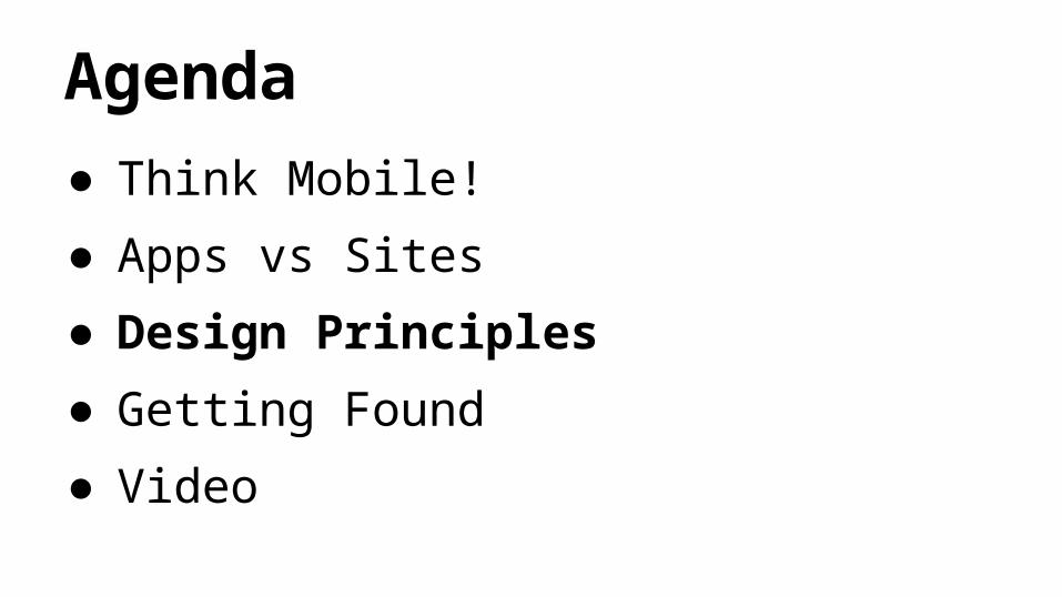
Agenda● Think Mobile! ● Apps vs Sites● Design Principles● Getting Found● Video


1. Call to Actions2. Menus short & sweet3. Clear navigation links4. Streamline form fills5. Don’t make users pinch and zoom6. User friendly site search 7. Click to Call button8. Implement analytics 9. Avoid launching new windows10.Test on a range of devices
‘Google Principles of Mobile Site Design’
‘Google Principles of Mobile Site Design’
My Top 10 Design Tips

Clear Call to Action
● Place key Call to Actions where they can be easily seen
● Primary CTAs in main body
● Secondary CTAs below fold or in menus

Menus Short and Sweet
● Mobile users lack patience
● Fewer menus better
● Refine product categories to present a shorter list
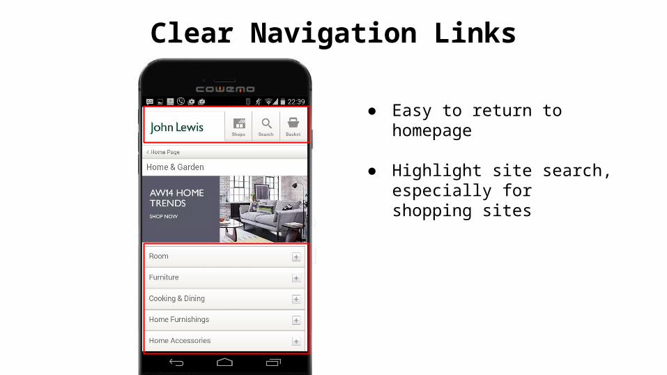
Clear Navigation Links
● Easy to return to homepage
● Highlight site search, especially for shopping sites

Streamline Form Fills
● As few fields as possible
● Avoid repeated actions
● Use Autofill where possible
● Multi-part forms should use progress bars
● Validate errors real time to avoid resubmits

Is My Site Hot or Not?

My top 10 tips:1. Call to Actions2. Menus short & sweet3. Clear navigation links4. Streamline form fills5. Don’t make users pinch and zoom6. User friendly site search 7. Click to Call button8. Implement analytics 9. Avoid launching new windows10.Test on a range of devices
‘Google Principles of Mobile Site Design’


Agenda● Think Mobile! ● Apps vs Sites● Design Principles● Getting Found● Content


1
2
3
3
4
5
4
5
1
2
On-site conversions
In-Store conversions
Phone conversions
App downloads / in app conversions
Cross device conversions
Full Value of Mobile Tool

Desktop Search Heat Map

Mobile search is different from desktop
● Focus on Left
● More scrolling
● No ‘below the fold’; view entire site
● Ads at top of the page and end are noticed


There are many ad formats for mobile search
Calls In-StoreOnlineconversions
Cart (1)
Appdownloads
Display

Call Extension In Store

Agenda● Think Mobile! ● Apps vs Sites● Design Principles● Advertising● Content

Content is still important

Content is still important

Video Content

To realize the true value of mobile, you need to live,
breathe and think it
A final request...

Appendix