Embed Size (px)
Citation preview

I included the masthead; “Dreams turned reality” – this masthead was inspired by a number of different music magazine
dps mastheads and it goes well with the information in the article on how the artist is new to the music industry.
Also, the heading “All in good welcoming” was inspired by the NME dps which I am trying to recreate. I like the heading and
believe it adds a nice touch to the text.

From these two images you can see I changed the colour of the blurb background – the
orange/red went better with the house style of my magazine and so I think it gives the magazine
a better look.

I used my own personal twitter account to tweet the q&a
questions for my dps. I planned to use this screen dump from the twitter timeline however I feel plain text looked better on the
double page spread.
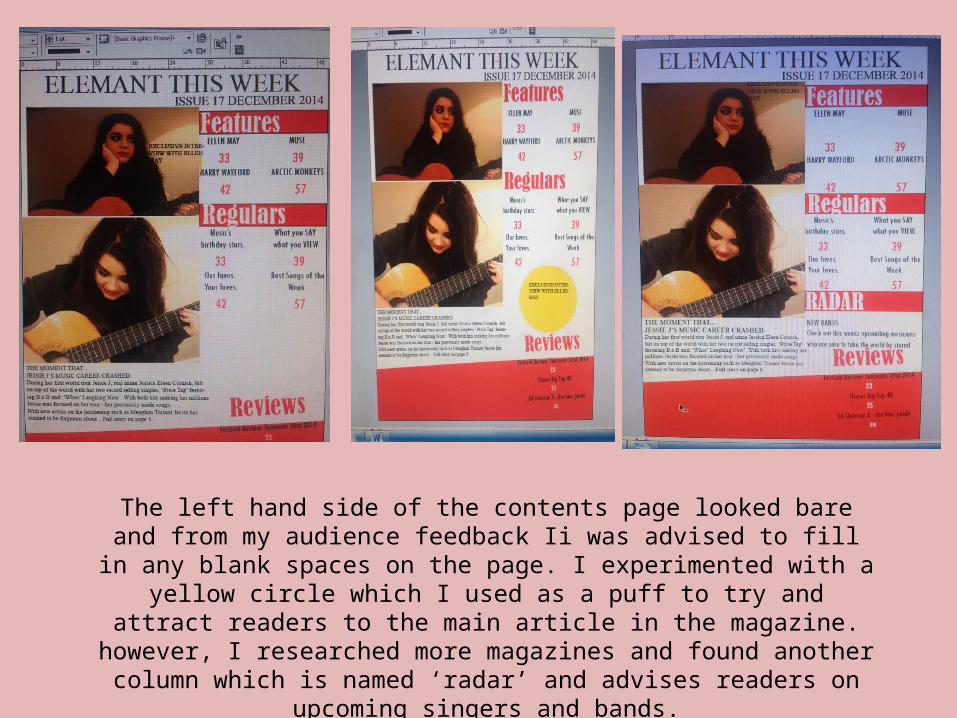
The left hand side of the contents page looked bare and from my audience feedback Ii was advised to fill in any blank spaces on the page. I experimented
with a yellow circle which I used as a puff to try and attract readers to the main article in the magazine. however, I researched more magazines and found another column which is named ‘radar’ and advises readers on upcoming
singers and bands.

From my audience feedback I learned that I could improve upon my contents page by including another artists picture – therefore I took a
new picture of a different model and changed one of the images on my contents page.
Also, I used Photoshop to edit and filter the images to ensure they looked professional and at their best quality.

I have drastically changed the whole front cover from my second and first draft – I feel I've learned a lot from my audience feedback and so I am more
aware of what the audience will find attractive.

I added the musical sign once more and also the colour scheme of the masthead and article title needed adjusting to ensure it
was readable for the reader. I like this colour scheme better and so I'm glad I made these changes.