Embed Size (px)
Citation preview
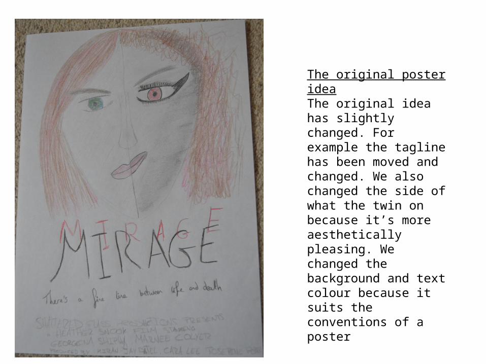
The original poster ideaThe original idea has slightly changed. For example the tagline has been moved and changed. We also changed the side of what the twin on because it’s more aesthetically pleasing. We changed the background and text colour because it suits the conventions of a poster

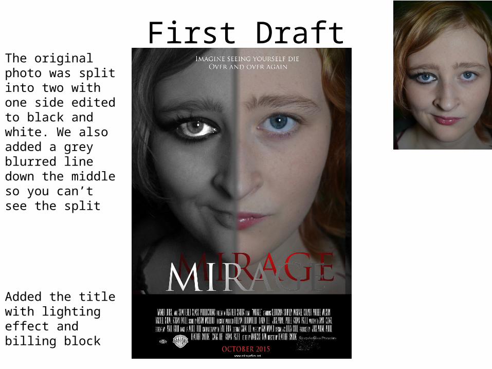
First Draft
Added the title with lighting effect and billing block
The original photo was split into two with one side edited to black and white. We also added a grey blurred line down the middle so you can’t see the split
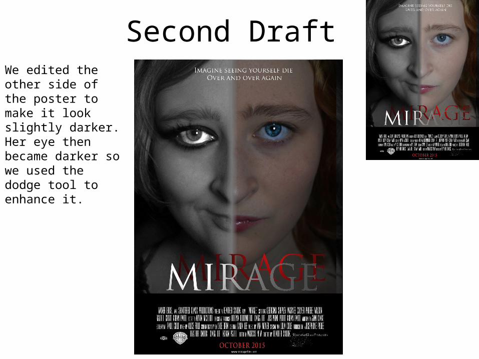
Second Draft We edited the other side of the poster to make it look slightly darker. Her eye then became darker so we used the dodge tool to enhance it.

Third Draft We used the mask tool to blur out the edges of the photo. To help conform to a poster we also added social media links. We made the poster more central and changed the colour/contrast/brightness.
Using mask tool

Fourth Draft
Used the dodge tool to brighten the eyes. Then used the burn tool to emphasise the dark lines around the iris of the eye and to darken the eye make-up.

Influences
We referenced this poster by the use of close-up and black and white
The title is a colour not used in the poster so we used red in our text
We liked this poster because of the colour scheme and the use of shadows
The facial expression helped us imagine what we should do