Embed Size (px)
Citation preview

To create the poster, first I opened a new document, and set the size to international paper. Then, I dragged the edited photo onto the document, and sized it appropriately, by right clicking it and selecting free transform. The photo on the left is the result of this. The reason why there are gaps between the photo and the borders is because the design I’m going for involved a border around the image, like the birdman poster.
To resize, I dragged the corners appropriately, making sure to hold shift so that I don’t lose the proportion.
Then to create the background, I created a new layer and named it ‘background’. I then coloured it to cream/light brown because it gives the poster a retro look which is visually appealing, and also works with colours of the poster really well. I also ordered the layer so it was sent to the back, making it the background.

Then, I wanted to create more space at the bottom of the poster for the film title, and the credit block, and the release date, and so in order to do this, instead of cutting the image, I faded it out using a layer mask. To do this, I first selected the layer with the photo, then I selected create layer mask, made the foreground and background colours black and white, then selected the gradient tool, and drew a vertical line on the section of the poster I wanted to fade out, making sure it was on the layer mask. What this does is that it hides part of the poster and blends it with the background. The result of this can be seen below.
Then, to create the film title, I used the text tool, and drew a box around the area I wanted to the text to go. Then, I selected the colour black, as this will stand out against the light in the photo, chose an appropriate font that I think suited the aesthetic of the film well and also successfully targeted the audience my poster is aimed at, who are sophisticated middle class film goers. I chose an appropriate size that made it stand out, and also made the text bold. I then highlighted the O’s of ‘Blossom’ and made them pink, then I got the paint bucket to fill the O’s in pink as well. I did this because it matches the pink of the flower and therefore presents a lasting visual appeal and will stick in the viewers head after they see it, and it also presents the film well and hints at what it could be about.
I altered the size, style and font in this bar.
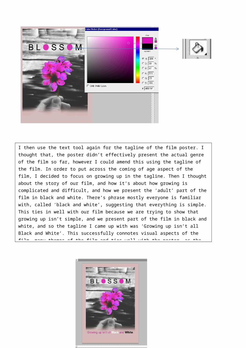
I then use the text tool again for the tagline of the film poster. I thought that, the poster didn’t effectively present the actual genre of the film so far, however I could amend this using the tagline of the film. In order to put across the coming of age aspect of the film, I decided to focus on growing up in the tagline. Then I thought about the story of our film, and how it’s about how growing is complicated and difficult, and how we present the ‘adult’ part of the film in black and white. There’s phrase mostly everyone is familiar with, called ‘black and white’, suggesting that everything is simple. This ties in well with our film because we are trying to show that growing up isn’t simple, and we present part of the film in black and white, and so the tagline I came up with was ‘Growing up isn’t all Black and White’. This successfully connotes visual aspects of the film, many themes of the film and ties well with the poster, as the poster isn’t all black and white, the flower is in colour, hinting towards the end of the film, however the audience won’t know this. I think the tagline successfully targets the right audience and it is a clever tagline once one thinks further about it, which therefore leaves audience to think about it once they stop looking. I made the writing font quite formal to suit the poster, and made the colour pink, but made the ‘black’ white and the ‘white’ black. The result of this can be seen in the print screen below.

I then added the date of release so the audience would know when the film is coming out, and made it a faded grey, so that it doesn’t stand out as much as the title or the tagline but still visible. I did this once again using the Text tool, and drawing a box.
Here you can see me making the release date text a dark grey
The final thing I had to was create a credits block at the bottom to make it look professional and to give the audience relevant information if they seek it. The reason I don’t make the directors name or actors name large and bold and visible is because it isn’t a recognisable name and would therefore be a waste of space, as this won’t turn heads. To create a credit block I used a template I found online, I added all the details such as director, actor, cinematographer, producer and pasted it at the bottom of the photo, made it the size just right enough to fit, and made it the same colour as the release date text. My final design draft and result of this can be seen below.