Embed Size (px)
Citation preview

My Street Art Designs & the Process

Mind Map
I first drew out some initial ideas of how I wanted my final piece be.Then from the ideas I came up with a design and began to create it.

Original Drawing
First I hand drew the outline of the image, then added the detail onto the hand and the phone. I drew it by using a pencil and lightly drawing the outlines then when I was confident I went over it and made the lines bolder. I then scanned the design onto the computer ready to edit it.

Scanned in Design
Once I had scanned the image into the computer I altered the brightness and contrast to make the background of the image whiter and to make the lines of the drawing darker. I also altered a few of the details in the drawing
with the pen tool in Adobe Illustrator.
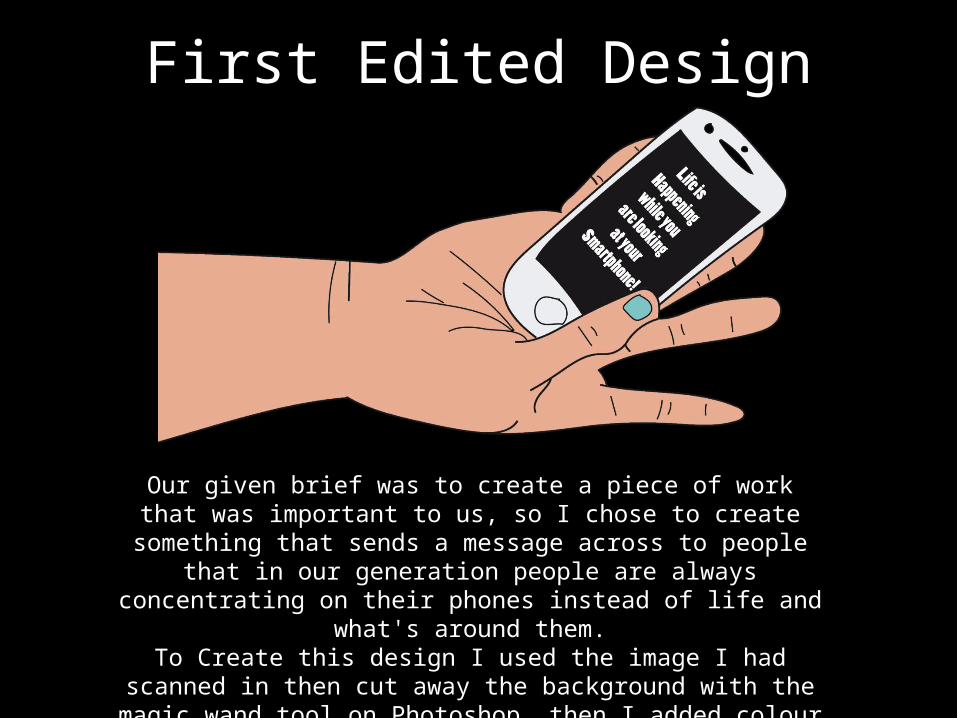
First Edited Design
Our given brief was to create a piece of work that was important to us, so I chose to create something that sends a message across to people
that in our generation people are always concentrating on their phones instead of life and what's around them.
To Create this design I used the image I had scanned in then cut away the background with the magic wand tool on Photoshop, then I added colour with the bucket tool, once I was satisfied I then printed out my
design out onto a sheet of stickers.

Second Edited Version
To create this design I took my first edited version and edited it on Photoshop my creating a new layer and adding a background colour using
the bucket tool. I wanted to make a slight change so when I printed my design out onto stickers the background wouldn’t look so plain.

Third Edited Version
I decided to add a gradient to the background to experiment and help decide what style I like best.

Fourth Edited Version
I thought I would just focus on the phone Design and make it look more like a phone and include
the text as that is the main message I want to send to people.
I decided to develop my idea and take the phone from my original idea and send the same message but just
by simply focusing on the phone. I drew out the design on illustrator
and made it look a lot neater.

Sketches/Mind MapsAfter my initial idea I decided to create a new one so I came up with another mind map to help for a new idea related to gang
violence in Manchester and how we should love instead making
war.
I then drew out some different ideas and explored different
layouts and designs.

New Design
After creating my first design I decided that I wanted to do something different so I created A new design about gang crime in Manchester. I wanted to send a message across
spreading the word that we should be spreading love and not making war with people.

InfluenceI took some influence from this Banksy Street Art. This piece of work was from when the riots took place in Manchester, so Banksy created this piece of Art and instead of throwing a brick or something he pained a bunch of flowers to send a message across that we should be dealing with the situation in a different way than being violent. We should be dealing with it in a peaceful way so the flowers symbolize peace and love.So from this design I decided to do something on gang violence in Manchester and use a gun shooting flowers out instead of bullets to symbolize love and peace.

Development
I then began to develop my design and make it different by using a darker vibrant colour that stands out and emphasizes violence.
I changed the place of the text and then added a hand shooting a gun instead of a single gun on its own, I lastly re-arranged the size and place of the text.

Development
To develop the design more I added some extra flowers to fill the empty spaces and make the design look fuller instead of being empty.

I took my original design that I had created and changed the colour to a dark red which emphasizes the violence as I have stated before, I feel as though by using
this colour it makes a big difference as the colour is bold so it catches the audiences eye also red is classed as a angry/violent colour as it relates to blood.
Development

For my last development I decided to change the colour of the text to white as I didn't think the black made the text stand out enough so I changed it to white which I think makes the text really pop. I also included my own flower images
that I have taken and edited.

Research

Edited Versions
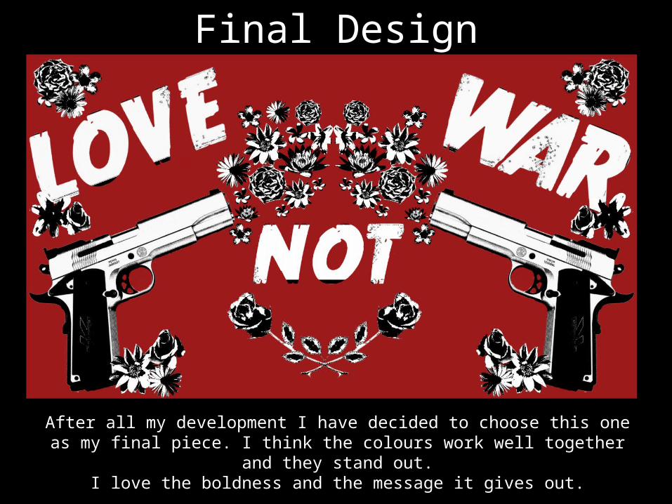
Final Design
After all my development I have decided to choose this one as my final piece. I think the colours work well together and they stand out.
I love the boldness and the message it gives out.