Embed Size (px)
Citation preview

SHARNEL MEHMI
Music Magazine Analysis

ContentsFive Front Covers
• Billboard • NME• Vibe • Rolling Stone • Q
Five Contents Pages• Billboard • NME• Vibe • Rolling Stone • Q
Five Double Page Spreads • Billboard• NME• Vibe• Rolling Stone • Q
Front Cover Analysis•Billboard
•NME
•Vibe
•Rolling Stone
•Q

Front Cover: Billboard Layout: It can be seen that there is an hidden border around the magazine to stop text from sticking right to the edge of the page, although “RIHANNA” reaches both sides of the page, this has possibly been done to stand out and draw the audience to the magazine as Rihanna is featured in there.The format of the magazine is with the masthead located at the top of the page as this is where the audience will first start reading the cover, the main image is located in the middle of the page and all of the headlines are located to the left of the page as with Westernised reading, this is where people first look for information. It can be seen that the colour scheme of the magazine is very simplistic as the only colours used (excluding the image) are red, white, yellow and black.
Main Image:As the main image is Rihanna, it is automatically easy to assume that her fans will be attracted to this magazine. It can also be assumed that this image will appeal to males as her pose is very provocative as she’s showing a lot of her back and looking over her shoulder, attracting the male gaze.As Rihanna’s top is white, this signifies innocence which however contradicts with her revealed gun tattoo, red hair and lips, informing us that she’s in fact not innocent. The red hair and lipstick can be seen as seductive and a revelation of her passion and love for music.
Date and Price: A common convention in all magazines is that the price of the magazine is presented in a small font located in a corner of the cover, this is due to the fact that companies do not want the audience to be drawn to the price as it does not appeal to them, this magazine for example costs $6.99/£4.36, aiming at a middle class audience.
Masthead:The masthead of this magazine is the Billboard logo. This same logo is seen on every edition of the magazine so that it is consistent and easily recognisable. The font of the logo is seen to be as an informal font, showing that this magazine is aimed at teenagers and the red white and yellow colours are gender neutral, indicating that the magazine is attracted to both sexes.
The picture of Rihanna featured on the cover overlaps the masthead, suggesting that the Billboard is an infamous magazine and that customers will easily recognise it despite that the name is covered.As the Billboard magazine is a chart magazine which does not focus on any particular genre of music, Rihanna is a suitable artist to be featured on the front cover as she is in R&B and Pop music.
The Feature Headline: “Rihanna” is written in a gradient above the anchorage “my fans don’t really know who I am” suggesting that the fading gradient indicates that Rihanna thinks that we don’t know. The use of the white colour against the dark purple background makes the headline stand out so that the audiences eyes are drawn straight to the word Rihanna. The use of this white headline could signify innocence and purity, the same as the white top which she is wearing. The heading is spread across the width of the cover suggesting that Rihanna is more of a star and exclusive than the magazine as her name is bigger than the masthead.
Quote Preview:The quote “Don’t know who I am” makes the audience want to read the magazine as this statement makes them intrigued and want to find out who the real Rihanna is, feeling more closer to her as they feel that what they’re reading is exclusive.This quote also gives the audience an idea of what her article will be about.

Front Cover: NMEMasthead: The masthead of this magazine is the NME logo with a slogan located underneath it. The masthead is written in a bold white formal font, indicating the contents of the magazine mean business and should be taken seriously.This white font also stands out against the red hair in the background, making the masthead stand out more to the audience. The white text also signifies innocence and purity in contrast to the bright red hair in the background.Slogan:The slogan of the magazine is just simply the NME unabbreviated so the audience are aware what NME stands for.
Date and Price: A common convention in all magazines is that the price of the magazine is presented in a small font located in a corner of the cover, this is due to the fact that companies do not want the audience to be drawn to the price as it does not appeal to them. On this magazine, the price of the magazine is located in the top left corner, as the price is £2.50, it is neither a cheap or expensive magazine and as the main target audience are teenagers who may not have a lot of money but enough to treat themselves to NME magazines.
Main Image:For this issue of the magazine a close up image of Florence’s face has been used, this has possibly been done for the audience to feel closer to the magazine and Florence as when people are this close to each other in reality it is usually because they have a very close relationship. The image fits in very well with the theme of the magazine as her facial expressions are very bold like the cover line’s and masthead featured and her bright red hair which is highly noticeable and very easily attracts the audience. However, the red hair contrasts against the white logo as red is associated with danger and aggression, similarly to the black text which says “FLORENCE” as black also represents strong emotions such as authority and power which she may have. The white top which she wears contradicts this and emphasises her red hair.
Layout:It can be seen that around the edges of the magazine there is a hidden border to avoid the text from being diminished to the edge of the page, though all of the conventions on the cover stick to this rule the barcode however reaches to the edge of the page, to possibly stay out of the way. The format of the magazine is with the masthead located in the top left corner of the cover as this is where the audience will first read and identify the magazine. The main image is seen to be located in the middle of the page and is large enough to be the background of the cover. Majority of the cover lines of the magazine are located to the right of the page, this is due to the fact that Florence’s face in her close up is facing towards the of the page and if the cover lines were to be on that side then they would be disrupting the image. It can be seen that the colour scheme of the magazine is very simplistic and minimal as the only colours used are red, black and white.
Cover line: These cover lines advertise and inform the reader of articles featured inside the magazine, encouraging them to buy this issue. These cover lines have been written in a white text so that they stand out against the red background.
Quote Preview: A quote from Florence’s article stating “I WOULD NEVER HAVE GOT THROUGH THE X FACTOR AUDITIONS” makes the audience intrigued as the word “never” is a very strong word, making the audience want to find out why she said this.Main Cover Line:The black font used for the cover line stands out against all of the other colours and indicates who the main article is about.
Cover line:This cover line informs the reader that they are reading a special edition of NME and that this is the second special edition cover from 10 different covers, as the audience are informed that this is a special edition magazine, it will draw them in to read the magazine as they would feel that what they read will be special and exclusive. Also, this cover line informs the audience that the NME has changed, making the reader want to read the magazine so that they’re aware of the fresh new changes.

Front Cover: VibeMasthead:The masthead of this cover is the magazines logo and is bold and in capitals, making the masthead appear more dramatic, attracting the audiences eye. The bold and vibrant colours of the masthead are similar to the genre of music which this magazine focuses on (rap). The image of Eminem and “the real rap” stamp overlaps the masthead, indicating that this magazine is so successful and infamous that the logo can be easily recognised even when it is partially covered. Though the masthead is bold and in capitals, the font is informal, this may be due to the fact that majority of the target audience are teenagers and are not into formal news.
Main Cover Line:On this cover, the main cover line is unusual and different to other magazines as it is not boldly presented across the magazine and is interrupted by the main image as the last letter is partially covered, this may have been done to make it clear and ensure the audience that the main image and cover line are linked together and are about Eminem.
Quote Preview: The quote “I literally almost died” is a very serious and dramatic quote, which will definitely catch the audiences eye and draw them in to read the article as they would be intrigued and wanting to find out why Eminem literally almost died.
Main Image: The main image is a medium close up of Eminem looking directly at the camera with a hard, serious looking expression, connecting with his article and the serious rap theme of the magazine. With his arms crossed, he is able to show off his tattoos, further indicating that he is a rapper as this fits the image. Although his cover line is in a red text, Eminem is in a black tank top which still fits in with the magazine as some of the sell lines around the page are black, keeping in the colour scheme.
Header: The header of the cover is a list of different major artists from the same genre of music (rap). Listing these artists may have been done in order to appeal to a larger audience group rather than just fans of Eminem.
Layout: The masthead is located at the top of the page so that the audience can easily locate and identify the name of the magazine. As the main image overlaps the masthead, this may have been done as the magazine is successful that its logo is infamous and can easily be recognised even when partially covered. The cover lines, sell lines and plugs are all littered on both the left and right side of the main image, so that no matter where the reader looks on the cover, they are presented with new information of what will be featured in the articles. The colour scheme of the magazine is very clear, simplistic and minimal as red, grey and black are the colours featured on the cover. As red is the main colour, it may have been used as it is a strong and vibrant colour and is used in certain areas of the cover to highlight and emphasise certain articles. The colour red connotes rebellion, linking to rap music and Eminem. Black has been used for the colour of text such as “50 hottest rap blogs”, as black connotes mystery it is used appropriately to emphasise this cover line. As grey connotes indecision and uncertainty, it has been used appropriately for the text listing the drugs Eminem has taken as that can be some of the many symptoms.
Background: The background of the cover is just a plain light blue background, which has been used to emphasise the image of Eminem and the text, making sure that they are easily noticeable for the audience to be drawn in and read the magazine.
Date and Price:Though the date is featured in the left hand corner of the magazine, the price and barcode are not on the cover. This may have been done as the price and barcode are displeasing and may put off readers from purchasing the magazine. Instead of this convention being located on the cover of the magazine, it may be located on the back page of the magazine.

Front Cover: Rolling StoneMasthead: The Masthead is the rolling stone logo and is located at the very top of the page so that the reader can quickly identify locate it and identify the company. The font used for the masthead matches the genre of music (rock n roll) which is featured in the magazine as the font can be seen as a vintage, cow boy looking font. The masthead also fits in with the colour scheme of the colour as it consists of red, black an white, these colours are also associated with rock music as they are very bold strong colours. As the masthead is covered by Taylor Swifts head, this may be indicating that she’s more successful than the magazine.
Layout: The main image is clearly the main focus and attraction of the magazine as Taylor Swifts head covers a large amount of the masthead, indicating that Taylor Swift may be more successful than the magazine itself. Majority of the information on the magazine is located to the left and right of the picture with Taylor Swifts name and cover line over lapping her picture, indicating that they’re connected. The bottom half of the magazine is bare as everything is located in the higher second and third part of the magazine, this may have been done to keep all of the information together to stop the reader from getting bored of looking all over the magazine for important cover lines.
Main Image: The main image is an Taylor Swift sitting on the floor, wearing a white top which mat signify her innocence, a blue jacket which may signify that she is a calm person and brown shorts, connoting that she’s boring, which her genre of music is compared to rock. In this medium long shot of Taylor Swift, her body language shows that she’s insecure which she may be as she’s featured in this rock, not pop magazine. In contrast to her body language, her facial expressions and eye makeup are showing a strong hard image, indicating that she may be adjusting herself to fit in with rock music.
Cover Lines:These cover lines consist of various stories that do and do not fit in with rock music, such as an article on Mitt Romney, attracting a wider audience range. In another article there is information on Rodd Stewarts memories from the past, attracting older readers. A fairly uncommon feature amongst these cover lines is that there are a variety of fonts used, this may have been done to distinguish the difference between each of the articles and make them stand out more.
Date and Price: The date and price are presented in a small font in the top right corner of the magazine, this is due to the fact the price may put the reader off of the magazine. As well as the date and price being located here the website is also here, this is important for advertisement as the reader can subscribe to the Rolling Stone online and find out more information.
Feature Headline:Compared to the rest of the text on the magazine, the headline is the only text which is the largest and is in white on the cover, this is to possibly represent that compared to the other articles, Taylor Swift is the biggest artist and that she is pure and innocent compared to them. Quote Preview: Unlike many other magazines, this magazine does not have a quote preview, this has possibly been done as Taylor Swift being on the cover alone is shocking enough to intrigue the audience and draw them in to read the magazine to find out why she’s featured in there. Instead of a quote preview, the cover line of Taylor Swifts article is presented instead, causing the reader to want to read the article with as least information on the cover as possible.

Front Cover: QMasthead:The masthead of this magazine is the Q logo and is the second largest feature on the page. The square red background is big and bold and the font of the white Q is formal, the masthead is very simplistic and these colours are widely associated with rock and indie music. As the masthead is positioned in the top left corner of the cover, it is the first thing that the reader will see, making it easy for them to identify the magazine. As the masthead is only just the letter Q, this gives the hint that this magazine is that successful that it is infamous and doesn’t need a hint in the name to indicate that it is a rock magazine.
Banner: The banner is black and is laid out horizontally across the top of the cover, the colours which the banner consists of are consistent with the rest of the magazine as it contains black and white however, a gold text is also included as this information is exclusive, the gold text further exaggerates that and makes it stand out even more. The ‘free music inside’ is large in comparison to the exclusive news due to the fact that the audience will be attracted to the word ‘free’, making them want to purchase the magazine and the free music.
Cover Lines: The cover lines presented vary in their style, font and colour and majority of them are located to the right of the main image. Using the rule of three, they are split into three cover lines below the main cover line. The first cover line is in a very small gold writing, which has been purposely understated as it does not contain the main information of the magazine. Different fonts are used for each line whilst the writing is centred. The second cover line is connected to the main image as its red text matches her trademark red hair. The writing is split to two lines with the smaller line in capitals. The last cover line is a Quote Preview from Florence following on from the other two, the cover line is again over two lines but due to the fact that this is a consistent quote, the font and sizing remains the same. In addition to these cover lines there are more presenting artists featured in the magazine. The location of these cover lines is possibly because they are less important compared to the other articles but are still able to attract readers. These cover lines match the mast head as they have used the same white font against a red background, making them stand out against the grey image in the background.
Main Image: The image dominates majority of the page, consisting of two parts. The image of Florence is along shot with her body positioned in the centre. Her stance is a very strong broad stance with her hip leaning slightly towards the right. Her black clothes and red hair matches the mast head and the various colour lines whilst her pale skin almost matches the white background. The fact that Florence is wearing black indicates that she has power, which she does as she towers over the buildings in the second half of the image. The buildings are positioned in height comparison to each other and are all in greyscale to not take any attention away from Florence. These buildings are littered on both sides and behind Florence with the shorter buildings covering her feet.
Date and Price: The date and price of the magazine are located to the right just above the barcode so that they are easy to find but the price is not in a big font as it may deter and put off individuals from purchasing the magazine. The website is also here as it serves as an advertising purpose so individuals can subscribe online.
Head Line:Unlike many other magazines, the head line is not linked to the main image but another feature within the magazine. It contrasts against the main image as it is about ‘the 100 greatest front men’ when Florence is a front woman. The colour of this head line matches what Florence is wearing and the banner. The fonts vary in size so that they match up into a vertical line. The font is consistent with the masthead as well as many other cover lines on the page.
Plug: The plug is the only information in the bottom left area of the page. The plug matches the colour scheme and the layout of the cover as it has a white background with the largest text in a red bold and simplistic font to attract the readers attention.
Layout: All of the cover lines are located on the right side of the magazine as in the main image of Florence, she’s leaning towards the right, indicating to the audience that all of the information is on this side. The main image is the largest feature on the magazine and partially covers the masthead, indicating that Florence may be a bigger success than the magazine. The banner is located at the top of the page so that it will attract the audience immediately as the word free is in there.

Contents Page Analysis•Billboard
•NME
•Vibe
•Rolling Stone
•Q
Contents Page: Billboard
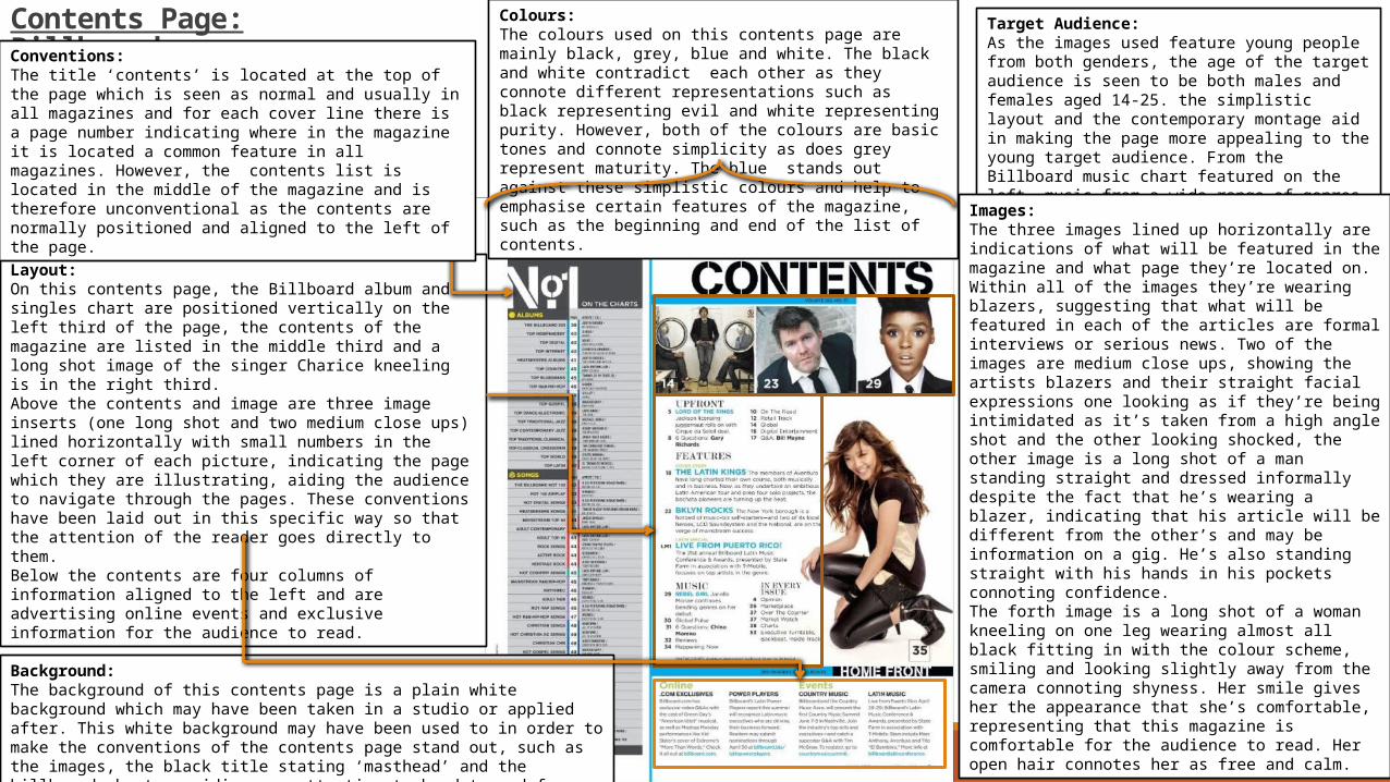
Layout: On this contents page, the Billboard album and singles chart are positioned vertically on the left third of the page, the contents of the magazine are listed in the middle third and a long shot image of the singer Charice kneeling is in the right third. Above the contents and image are three image inserts (one long shot and two medium close ups) lined horizontally with small numbers in the left corner of each picture, indicating the page which they are illustrating, aiding the audience to navigate through the pages. These conventions have been laid out in this specific way so that the attention of the reader goes directly to them. Below the contents are four columns of information aligned to the left and are advertising online events and exclusive information for the audience to read.
Background: The background of this contents page is a plain white background which may have been taken in a studio or applied after. This white background may have been used to in order to make the conventions of the contents page stand out, such as the images, the black title stating ‘masthead’ and the billboard chart, avoiding any attention to be deterred from them.
Colours: The colours used on this contents page are mainly black, grey, blue and white. The black and white contradict each other as they connote different representations such as black representing evil and white representing purity. However, both of the colours are basic tones and connote simplicity as does grey represent maturity. The blue stands out against these simplistic colours and help to emphasise certain features of the magazine, such as the beginning and end of the list of contents.
Target Audience:As the images used feature young people from both genders, the age of the target audience is seen to be both males and females aged 14-25. the simplistic layout and the contemporary montage aid in making the page more appealing to the young target audience. From the Billboard music chart featured on the left, music from a wide range of genres are featured, covering a wide audience who are fans of various artists and bands.
Conventions: The title ‘contents’ is located at the top of the page which is seen as normal and usually in all magazines and for each cover line there is a page number indicating where in the magazine it is located a common feature in all magazines. However, the contents list is located in the middle of the magazine and is therefore unconventional as the contents are normally positioned and aligned to the left of the page.
Images: The three images lined up horizontally are indications of what will be featured in the magazine and what page they’re located on. Within all of the images they’re wearing blazers, suggesting that what will be featured in each of the articles are formal interviews or serious news. Two of the images are medium close ups, showing the artists blazers and their straight facial expressions one looking as if they’re being intimidated as it’s taken from a high angle shot and the other looking shocked, the other image is a long shot of a man standing straight and dressed informally despite the fact that he’s wearing a blazer, indicating that his article will be different from the other’s and may be information on a gig. He’s also standing straight with his hands in his pockets connoting confidence. The forth image is a long shot of a woman kneeling on one leg wearing almost all black fitting in with the colour scheme, smiling and looking slightly away from the camera connoting shyness. Her smile gives her the appearance that she’s comfortable, representing that this magazine is comfortable for the audience to read. Her open hair connotes her as free and calm.
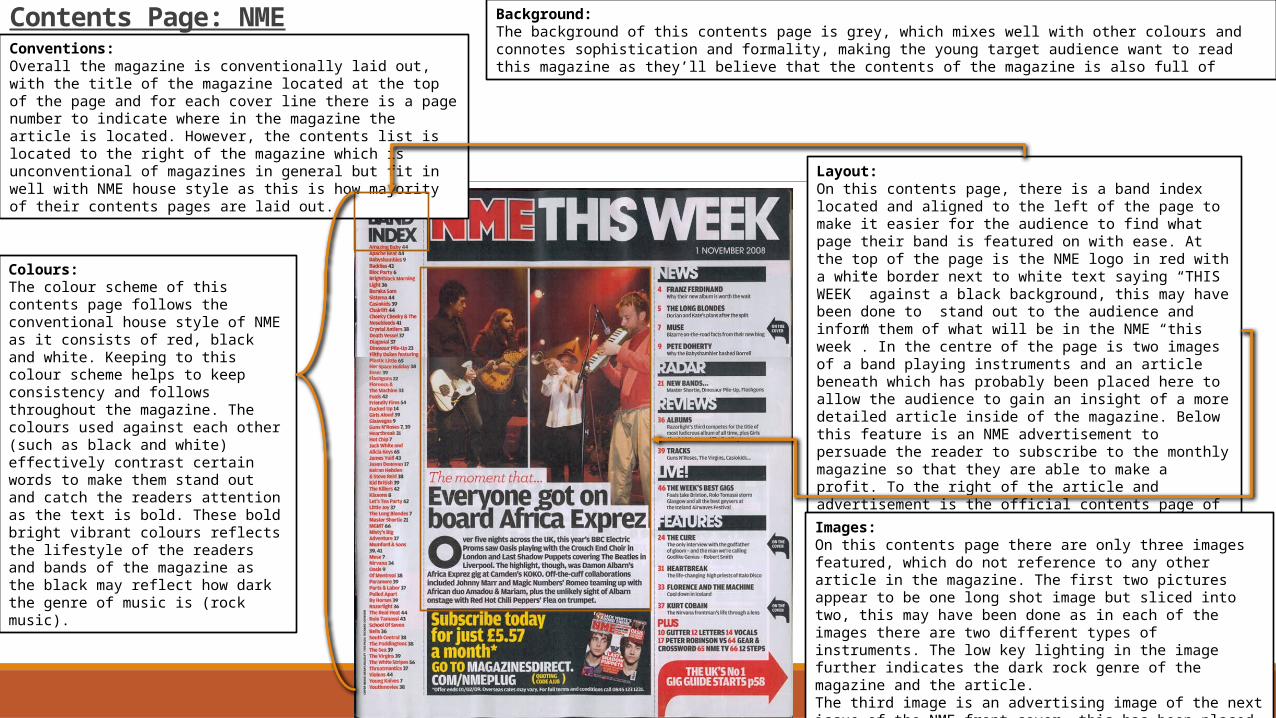
Contents Page: NMEConventions:Overall the magazine is conventionally laid out, with the title of the magazine located at the top of the page and for each cover line there is a page number to indicate where in the magazine the article is located. However, the contents list is located to the right of the magazine which is unconventional of magazines in general but fit in well with NME house style as this is how majority of their contents pages are laid out.
Layout: On this contents page, there is a band index located and aligned to the left of the page to make it easier for the audience to find what page their band is featured on with ease. At the top of the page is the NME logo in red with a white border next to white text saying “THIS WEEK” against a black background, this may have been done to stand out to the audience and inform them of what will be in the NME “this week”. In the centre of the page is two images of a band playing instruments and an article beneath which has probably been placed here to allow the audience to gain an insight of a more detailed article inside of the magazine. Below this feature is an NME advertisement to persuade the reader to subscribe to the monthly magazine so that they are able to make a profit. To the right of the article and advertisement is the official contents page of the magazine which has been in an unconventional but simple way as each article has been put in one of each of the four categories; News, Radar, Reviews, Live! and features, making it more easier for the reader to find where the news or review that they are looking for is located.
Colours: The colour scheme of this contents page follows the conventional house style of NME as it consists of red, black and white. Keeping to this colour scheme helps to keep consistency and follows throughout the magazine. The colours used against each other (such as black and white) effectively contrast certain words to make them stand out and catch the readers attention as the text is bold. These bold bright vibrant colours reflects the lifestyle of the readers and bands of the magazine as the black may reflect how dark the genre of music is (rock music).
Background:The background of this contents page is grey, which mixes well with other colours and connotes sophistication and formality, making the young target audience want to read this magazine as they’ll believe that the contents of the magazine is also full of
Images: On this contents page there are only three images featured, which do not reference to any other article in the magazine. The first two pictures appear to be one long shot image but sliced into two, this may have been done as in each of the images there are two different types of instruments. The low key lighting in the image further indicates the dark rock genre of the magazine and the article.The third image is an advertising image of the next issue of the NME front cover, this has been placed here to gain the magazine subscribers and to make a profit of them.

Contents Page: Vibe
Masthead: The masthead of this contents page is a large ‘V’ standing for the magazines name Vibe, this may have been done as the audience are already aware of what magazine they’re reading and that the magazine is that infamous the whole of the name does not have to be present. This masthead sticks with the house style of Vibe as within majority of the contents pages, the masthead is located in the top left corner.
Main Image:The main image is a grey mid shot of Kanye West with an arm coming over his shoulder with a red heart, which is the only bright coloured object on the page, drawing the readers attention to it and possibly implying that this woman’s arm is trying to win over his heart. This image dominates majority of the page and is very simplistic, attracting the target audience as Kanye is a famous rapper which relates to the genre of the magazine and they most likely are familiar with him and listen to his music. He’s looking straight at the camera with a straight face which associates well with the genre of rap music which he produces. As the image is a grey image and Kanye is dressed smart, this further connects with the magazines colour scheme and gives a feel that the magazine is elegant and classy.
Title: The word ‘contents’ is in a large bold black font and takes up the top right hand corner of the page. The word is split onto three lines and contrasts against the grey and white background making it stand out furthermore.
Sub Heading: The sub heading is written in a bold black font but is inconsistent with the title as the font is a different italic looking font. This fancy and stylish font relates to the grey scale colour scheme and Kanye’s clothing making everything on the contents page look connected.
Contents List: The contents list is located on the right hand of the page and has categories of what will be featured in the magazine and shows the reader what the main articles/stories are and the page number they are located on. The font colour of the brief headings is grey, making them stand out against the summary of the contents which is in black. The page numbers are in a bolder font than the heading indicating that the page numbers are far more important.
Details of Photograph: In the bottom right area of the page there are a few lines of text informing the reader the artists name, location and when the photo was taken and who took the picture. This allows the fans and target audience to gain extra information which they may want.
Layout:This contents page is laid out with the main image of Kanye West dominating majority of the page and overlapping the masthead, indicating that Kanye is more successful and bigger than the magazine. In the top right hand corner is the title ‘contents’ which is slightly slanted which may have been done to catch the audiences eyes and make them aware that this is the contents page. On the right hand side of the page is the contents which is different compared to other magazines as the contents are usually aligned to the left or located in the middle of the page, the contents may be located to the right due to the fact that Kanye is overtaking most of the page. In the bottom right hand corner are a few lines of text that contain details of the image for the audience.

Contents Page: Rolling Stone Masthead:The masthead of this magazine is located in the top left corner of the page and has been presented as “RS1167” as an abbreviation of ‘Rolling Stone’ and the issue number. This has not been done or presented in any other magazine making the rolling stones magazine appear more unique and original, appealing more to the readers and target audience. The masthead is written in block capitals and consists of a black for ‘RS’ and red for ‘1167’ font which stays with the Rolling Stone colour scheme and stands out against the white background.
Colour Scheme: The contents page has stuck with the Rolling Stone’s house style and colour scheme of black, red, grey and white, connoting the rock genre that will be featured in the magazine but also staying sophisticated, appealing more to the target audience and readers. By sticking to this colour scheme it has given the magazine a sophisticated and professional look as the magazine is given a sense of continuity.
Main Image: the main is a medium close up of the singer Any Heidermann. The image has been intentionally taken to make it appear that the audience are looking at her through a glass whilst her hand is positioned on her hair as she’s looking dramatically upwards, showing how much attitude she may have which matches the rock music genre. The window effect may convey to the audience that the magazine has an inside look and that if they were to read the article they are able to discover about her personal life which she may have never discussed before. Within the blurb of the main image is states “Ready for her close up”, suggesting that the magazines interview will allow the reader to get up close and personal with her, her dramatic pose suggests that something shocking may be revealed in the interview.
Slogan: Next to the masthead is a text written in quotation marks stating “All the News That Fits”. It can be assumed that this has been written and located here as it is the slogan of the magazine.
Contents: The contents list is featured as an ‘L’ shape and is divided into four categories: Features, National Affairs, Rock & Roll and Departments and a one of special for the issue titled “Women Who Rock 2012”. From reading the cover lines it is obvious that the magazine is not just solely focused on music. From making these categories, it will help the reader to find what they’re looking for in the magazine making them more attracted to the magazine as it is very simplistic. The numbers of the pages are written in grey whilst the cover lines are black, making them stand out more to the reader. The red font of each category and the banner at the bottom right of the page make them stand out more than the rest of the writing, drawing the attention of the reader to something significant.

Contents Page: Q
Masthead:The masthead of the magazine is small and located in the top left corner of the page next to the title ‘contents’. The masthead has stuck to its red and white colour scheme and is possibly small as the audience are already aware that this contents page belongs to Q.
Layout:The layout of this contents page is conventional as with majority of contents pages. At the top of the page is the title ‘contents’ in a white font against a black banner to stand out for the audience to view and confirm that this is a contents page. The contents list is located to the left of the page with a large image taking up the right hand side and the middle of the page, this image used is an indication of the main article in this issue. Below this image is what appears to be a separate section of the contents list purely for reviews as the title states “Q REVIEW the world’s biggest and best music guide” within an image of a group that may have been reviewed.
Main Image: The main image is an extremely large picture of a close up of Adele who Q’s target audience would easily recognise due to her successful singing career. Her red hair and black clothing matches the black and red colour scheme of the rest of the contents page, keeping consistency throughout the magazine and sticking to the house style. The caption of this image is “Two months in the life of Britain’s brightest new talent”, this caption along with Adele standing right at the camera makes the audience feel as if they’re going to gain an explicit and personal insight in this article and her serious facial expressions further indicate that .
Colour scheme: The colour scheme of this contents page is very minimal, it consists of red, black white and grey. With grey as the background of majority of the page, the other coloured elements stand out much more, the grey background also connotes sophistication, appealing to a wide range of audience as they will believe that the magazine and its contents is professional.
House style: The house style of this contents page has stuck to the colour scheme of Q and the front cover to ensure that there is consistency throughout the magazine, making it appear more professional and so that the colour scheme is recognisable. The page only uses colours of black, white, grey and small areas of red on important pieces of information such as titles and page numbers so that it is clear and easy to see.

Double Page Spread Analysis•Billboard
•NME
•Vibe
•Rolling Stone
•Q

Double Page Spread: BillboardTitle:The main heading of the page is located on the left page of the spread, where the text is also located. As the title contains the word “fiercely” this is also portrayed by how the text is presented as it is bold and stands out in comparison to the other word in the masthead “creative” which has been written in an artistic font. The word fierce also connects with the main image of Beyoncé as her the name of her album also had the word “fierce” in there. This white bold title stands out against the dark pink background, making the audience more interested and wanting to continue to read the double page spread.
Caption: The caption of the article is located I the top right corner of the page above Beyoncé's head stating ‘woman of the year’. Indicating to the reader that they are indeed reading an article about a woman who is extremely famous. The bold white writing this text is written in stands out against the dark grey background, making it clearer and easier for the reader to see and be informed what the main focus of the spread is.
Text: This double page spread consists of two columns of text which are both located to the left side of the page. The text may have been split into two columns in order to make it appear as if there is less text as the audience may get put off reading the article. The text may also be placed on the left page so that it is not the first thing that the audience see when they open the page as the main image takes up majority of the page.
Main Image:The main image is located on the right page and is an extremely large close up picture of Beyoncé which takes up the whole page. This is due when the reader turns the page, the first thing that they’ll see is the extremely large picture and will automatically know that this double page spread is an article based on Beyoncé. The hair, makeup and costume which is on Beyoncé are all bold and striking, relating to the title of the spread which includes the word “fierce” the mise en scene in this image clearly shows that she is fierce. The fact that she’s looking directly at the camera makes it look as if she’s looking directly at the reader, making them believe that this article is especially for them and that they’ll gain a very private insight of her life or her career through reading this article.

Double Page Spread: NMETitle:The title of this double page spread is “The Gospel According to Nicki Minaj” and is located on the left hand side of the page where many double page spread titles are commonly located. The title is large and takes up majority of the page despite the fact that it is partially covered by the main image. The title consists of two contrasting font, pink and black which may have been done to stand out to the audience. As well as consisting of two colours the masthead also consists of two fonts, one being an italic looking font and the other font a striking bold font, this may have been done to show the difference between gospel music and Nicki Minaj and to further stand out to the audience.
Colour Scheme: The main colours that are featured on this page are pink, black and white. The use of pink gives an extremely feminine vibe and makes the spread appear much more girly, relating to Nicki Minaj as she is commonly dressed in pink. The use of black text contrasts against the pink background making it easier for the audience to read, the black also gives a sophisticated look to the spread.
Main Image:This double page spread only includes one image which is the main image and takes up majority of the page. The main image is a medium shot of Nicki Minaj dressed in a zebra print outfit which contrasts against the extremely bright pink background making it stand out much more. This bold image clearly represents the ‘pop’ music genre that is being featured. This image also has direct mode of address, enticing the reader and creating a unique photo.
Text:the layout of the text is split into various different sections all over the spread, each sectioning discussing a different topic. The layout of this text is most likely to appeal to a young target audience (which is already the age range of the magazines target audience) as they are less likely willing to read to read large amounts of text. Certain quotes of the article have been pulled out and written in a bigger font and is also highlighted in a dark pink, this may have been done to attract the audience as these pieces of information are commonly the most ‘exclusive’ parts of interviews in majority of magazines.

Double Page Spread: Vibe
On the left page of this spread there’s a mini introduction, summing up what the double page consists of to gain the readers attention and introduce them to the article, drawing them in to making them want to continue reading it. The main purpose of this introduction is to ensure that skim readers who flick through pages are caught by the introduction.
Article: The article of this spread s mainly positioned on the left page and is split into columns, with the exception of one column being located on the right page. The use of columns help in order to reduce how much text there appears to be as this can put off the reader from continuing to read the rest of the spread. The text is written in grey to match the grey colour scheme and to make the reader feel that what they’re reading is sophisticated.
Colour Scheme: The colours used in this article is very minimal, the colours that have been used are white, grey, and blue with a splash of red from the main image. This minimal colour scheme gives a formal look to the magazine, making the audience more attracted and wanting to read the magazine. The use of blue on this spread has been done in order to highlight key important areas, such as Solange Knowles’ fans, drawing a wider audience to read the article.
Main Image: The main image is the only colourful aspect of the spread as Solange is wearing red which contrasts against the white background making stand out much more to the audience. This image is extremely large and takes up majority of the right side of the page. The way in which she’s standing with her feet pointing gives her the appearance of innocence. Though Solange’s dress shows a lot of her leg, it does not give a seductive message to the audience as her innocent pose contradicts this. She looks fierce and intimidating due to her facial expressions but still looks feminine and gives off a doll-like appearance at the same time.

Double Page Spread: Rolling Stone
Title: The title of this spread is not located conventionally in the top left corner but is instead located right in the middle of the left page, this may have been done so that it is the first thing that the audience see’s when they flick the page open. The title is written in a capitals and in a plain font, as well as this it is also very large in comparison to the many conventions on the page to draw in the audience to read the magazine.
Colour Scheme: The only colours in this double page spread are located in the photo to ensure that the readers full attention is drawn to it. Also colour is only used for Katy Perry’s website address which is in blue, drawing the readers attention to it, this has been done to ensure that the reader notices it, otherwise they may completely ignore it due to its small font and location.
Layout: In the top left hand corner of the page, Katy Perry’s name has been used as a header, informing the audience whom the article is focused on. This helps to attract any fans of Katy Perry to purchase the magazine. Going against a common convention of music magazines, the title of the double page spread is located in the magazine with the article above and below it. On the right page of the spread is any extremely large image of Katy Perry which takes up the whole page to catch the readers eye immediately and draw them in to read the rest of the magazine.
Main Image:The main image is a long shot of Katy Perry and takes up the whole of the right page. The image has been purposely used to appeal to the male gaze as she is only dressed in a pair of shorts and a bra, revealing majority of her body. To further emphasise her sexualised wardrobe, one of the straps has fallen down indicating that she may be getting dressed. Again, emphasising how sexualised the image is, she is wearing red lipstick and her hair is down which is commonly seen as attractive to males.

Double Page Spread:Q
Title: Unlike majority of magazines, the title of this double page spread is located in the top right corner of the page, this is possibly because when a person may open the double page spread this is the first area of the page that they’ll see, allowing them to quickly realise who’s featured in the article and drawing her fans in to purchase and read the magazine.
Main Image: Again not following the common conventions of music magazines, the main image is located on the left side of the page, this may have been done to make the reader fully open the spread so that they can see the image an be drawn in to read the magazine. The image is a black and white shot of Lady Gaga with no clothes on, covering her chest with her hands and chains. As she’s looking directly at the camera this may allow the audience to feel that what they’ll read in the magazine is very private and personal , making them feel that this information is exclusive.
Layout: The conventions of this magazine is extremely different to other magazines. The title is located in the top right hand corner rather than the left. The main image is located on the left page of the spread and the article is presented as a large amount of text which can be extremely off putting for the audience as they may not want to read so much text.

