Embed Size (px)
Citation preview

http://kyrantrickettmediablog.blogspot.co.uk/
MEDIA AS EVALUATION PART 1

SEAMUSMusic Magazine
The questions I shall be addressing are:What have you learnt about the technologies from the process of constructing this Product?Looking back at the preliminary task, what do you feel you have learnt in theprogression from it to the full product?How did I attract my audience/address my audience?

What have I learnt about technologies from the process of constructing this product?

The technologies I have learnt about in order to create the product are – Apple Macs, AdobePhotoshop and Adobe Indesign. First of all I have had no previous experience using Photoshop orthe above content before starting the preliminary of my final product.In the making of the final magazine I had to use Photoshop for everything, ever little adaptationto ever little picture. Initially I had no idea how to do this at all.I began to use my free time to learn how to use Photoshop, I spend numerous lunchtimes trying to refine a way of altering the text and seeing how everything works, Photoshop is of course an ever confusing program so it took me some time.
Before I even started work on the preliminary I had thought of ways to sculpt the name and just seeing how to use the program.I attempted to do my preliminary long before I even knew how to use the program properly but I did what I could and just created something as basic experimentation.
I just used my basic skills to try and create something. Anything really just for practice. I got pictures from the internet and pasted them together and did what I could.
It was this way of trial and error that I actually learnt how to use Photoshop.

The Magnetic Lasso Tool basically became my best friend. I usedit to separate layers and add depth to the work. I used this in my final product to create some depth and effect between the title and the instrument. I like to think this makes the image look a lot less two dimensional and draw connection between the band.
To create the faded background so the text will stand outmore, I used the square tool to make a frame around the text then l lowered the opacity to the point it wasn’t a block and was semi-transparent.
To make the word `exclusive` bold I firstly had it smaller and the same sixe as the `interview` part. The 10 beside the wordswas present but through useful outside opinion from Mister Lunn I decided to take the 10 away. I experimented with what else to use and how to make the words stand out. I added some drop shadow as well as just making the text size bigger and lowering the `interview` word size so that the key word is exclusive which actually works better as a feature advert. I also included the black line above it for dramatic effect and it all seemed to work out. Though I only found out how all this worked together bytrial and error and just finding what works.
But the single most useful thing I used was the opacity slider which changed the opacity (obviously). Basically this enabled me to put certain things over other things and make other things stand out or make them less `dense` and what basically a real magazine does. My use of different fonts on the whole cover page I found rather
difficult for a while. Trying to match them up with each other whilstkeeping them juxtaposed and in line as well as clean and interesting was hard.

To create this advertising circle I spent way to long messing around with it, whereit should go or how it should fit or how to even make it. I firstly tried it with just a white circle then just went from there. I understand that the writing on it is `wordy`but by the time I realised that it was to late to change it for something else, and also I had spaced it between my left model’s head perfectly and felt proud of that accomplishment at least. I used an Outer glow on the circle,and an Outer glow on the word `win` also to help it stand out even more.
The original image I used for the cover page had a very strong curtain as a backdrop (it’s all I could find for the photo shoot) and this seriously got in the way of bits of text that I wanted to have on top of it. The text would therefore look tacky and not be bold or highlighted at all so I used a bit of classic Photoshop magic to clear up the colour and make it white so it allowed the content on top to stand out. I used the wonderful power of the square tool again and lowered the opacity and added a cheeky gradient to make it appear a bit lighter so any text I put onto it would stand outor at least be all of the focus.
But wait, I hear you ask. How do you make the background fade and less light but keep the audacity of the models? That’s where I used the magnetic tool to separate them from the background, I created a double layer for the modelswhich allowed me to completely alter the background but keep the two of them really bold.

The only other part of using Photoshop I really struggled with was on the double pagespread. Though basically all of this was done on Indesign I did have to edit some thingsexternally on Photoshop. The main thing was the background image where I had to edit the back drop. I had to extend it and to do this I took a sample from the other side of theimage and put it the other side of Sholto. This allowed me to use the Sholto image as a background and a strong device. To achieve this, I had to use the crop tool on a certainpiece of curtain and import the picture onto the realbackground I need to use. It’s pretty simple but really fiddly.
I learnt how to make basic text appear bolder through the use of the stroke tool which put a black (or any colour) border around any given text, this makes it stand out on any background and doesn’t fade away. This is how I created the black outline (almost cell-shaded) `Exclusive text.
Furthermore the font choices I ended up using for the main title and other big adverts was simple compared to the shout outs of the artists.
The exclusive I used Arial Black which worked better than any other font choice because it was clear big and bold. However for the name of the magazine `SEAMUS` I chose the simple font Arial I wanted some variation and it needed to be simple, I didn’t want the title to be a graphic or anything I just wanted it to be as it is, a title.
I distorted the text to make it taller by using the transform tool,
this made the title fit the space better and take up a larger space
too.

Another important skill I had to learn to create the product was the photography aspects. Although I have previous use of a camera just for fun I’ve never had to do anything with set goals and for a purpose so I had to learn how to actually take a decent photo. In the creation of the magazine I used 2 cameras, a Cannon 500D for the contents page and double page but a Nikon D5000 for my frontcover. I don’t notice any difference and there’s no real purpose to the change in cameras other than I used what I had at the time. However this meant I had to be able to use both and they do have slight changes which can alter picture quality. Furthermore I had to learn what angles created what effect. In this vein I used what I already learnt in the theory side of the media, analysing film, to understand the connotations of a camera angle. For example a low angle shot would put the models in a position of power. I also learnt what makes a model eye-catching and draw people in and I found that a direct audience eye contact was a very good idea – so that’s exactly what I did.
The lighting in my shoots was very crucial and I had to learn how to get this right as so not distort the model and I had to make them the centrepiece. I learnt how to use a system of three point lighting. I placed 23 lights at 45 degree angles to the model and one light behind them to make a halo effect and ultimately make the models stand out a lot more.
How I Did my lighting shoots, for the cover I did not use a 3 point system. Unfortunately I had the photo-shoot without any lights so I had to just grab a flood light from outside and an indoor lamp to try to illuminate the 2 models. The only way I really got the background to fade out but still be there for texture was to make a new layer and lower the opacity – as explained before.
However for the shoots on the contents page and double I used a system of alternate 3 point lighting. I placed the 2 front lights at 45 degrees as normal but the 3rd light came from above to illuminate a sort of beam onto them. Although this created no halo it put 100% of the focus on them and in the right position this could be even more effective. I think for the shoot I did this was the perfect thing to do.

Looking back at the preliminary task, what do you feel you have learnt in theprogression from it to the full product?

The prelim I did to help learn what to do and how to achieve it fulfilled its purpose greatly. There is a clear masthead of the magazine and the headline story is the big thing here. Obviously it’s bad, and I’m clutching at straws to what I think I did well here but at least after I did do it I saw through it and knew what I had to do to make it better. The amount of stories is bad, what magazine has 6 stories and 10 pages and still turns a decent profit? None is the answer, also there is no brief summary about the story under it nor are there any pictures which draw interest. The colour scheme is bland and nowhere does it announce that it is a contents page. Furthermore the fonts are all the same which makes it boring and if the teachers put what they really think into a school endorsed magazine it would just be lies. I used Indesign and knew nothing about it I was blind making this and just went for whatever really.
My progression to the final product is a lot I think. I corrected all the mistakes I made here. I included an interesting colour palette as well as keeping what it is and the issue and the name of magazine bold. The colour’s chosen reflect well what the content is about (Pink Floyd is a huge prog rock giant so some text is pink in a homage)I also included a lot of pictures about interesting stories I boasted about or have featured. The 2 main Sholto and Harlequin got the best photos. The amount of stories I put in was similar to a real magazine as with the page numbers being realistic.

The front cover prelim I created was an experiment on how to use Photoshop. Although I already knew how to use it at an acceptable level I still had almost no idea how to structure a magazine cover. I used a graphical technique for the big word across `cherry` that wouldn’t work with a small time teacher and the free exam results just doesn’t make sense. Furthermore the border around it doesn’t look professional though I still like it and the features are in the complete wrong place and the font for Gillingham is horrible. The underlined grammar school is hardly legible and the science superstar slogan is not very good.Though in the creation of my final product I did learn stuff.
I didn’t ditch the cute text thing even though it was bad but it is good here because it’s a very well known artist who is recognisable. In fixed all the problems I had before, I put the features in a location where they were not clashing and the main feature `harlequin` is as low as can go. I also included a lot more stuff to make it more like a real magazine and the masthead is strong. I included a date this time and an issue number and a price and bar-code. I used the models and created them having depth through placing things behind them like the `20` and the `win` box. Also the writing in between the word `harlequin` is actually readable now with less squinting.
How did I attract my audience/address my audience?
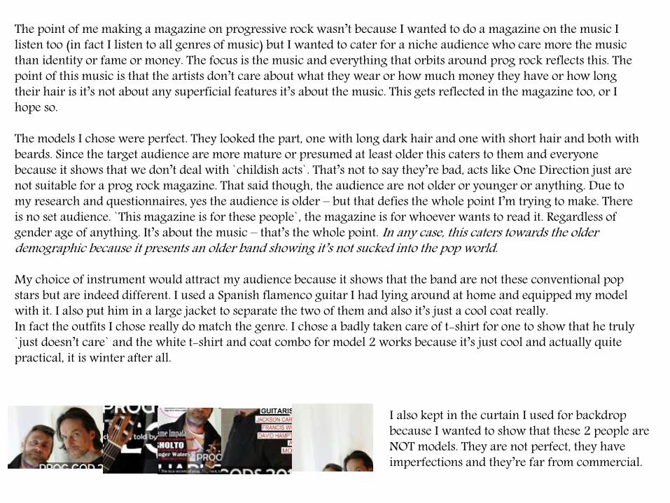
The point of me making a magazine on progressive rock wasn’t because I wanted to do a magazine on the music I listen too (in fact I listen to all genres of music) but I wanted to cater for a niche audience who care more the music than identity or fame or money. The focus is the music and everything that orbits around prog rock reflects this. The point of this music is that the artists don’t care about what they wear or how much money they have or how long their hair is it’s not about any superficial features it’s about the music. This gets reflected in the magazine too, or I hope so.
The models I chose were perfect. They looked the part, one with long dark hair and one with short hair and both with beards. Since the target audience are more mature or presumed at least older this caters to them and everyone because it shows that we don’t deal with `childish acts`. That’s not to say they’re bad, acts like One Direction just are not suitable for a prog rock magazine. That said though, the audience are not older or younger or anything. Due to my research and questionnaires, yes the audience is older – but that defies the whole point I’m trying to make. There is no set audience. `This magazine is for these people`, the magazine is for whoever wants to read it. Regardless of gender age of anything. It’s about the music – that’s the whole point. In any case, this caters towards the older demographic because it presents an older band showing it’s not sucked into the pop world.
My choice of instrument would attract my audience because it shows that the band are not these conventional pop stars but are indeed different. I used a Spanish flamenco guitar I had lying around at home and equipped my model with it. I also put him in a large jacket to separate the two of them and also it’s just a cool coat really. In fact the outfits I chose really do match the genre. I chose a badly taken care of t-shirt for one to show that he truly `just doesn’t care` and the white t-shirt and coat combo for model 2 works because it’s just cool and actually quite practical, it is winter after all.
I also kept in the curtain I used for backdrop because I wanted to show that these 2 people are NOT models. They are not perfect, they have imperfections and they’re far from commercial.

Then it comes into the subject of how I chose my name for the magazine. I didn’t choose it because it sounded good or I just liked it or someone told me or I had to at the last minute – I chose it because people who recognise Seamus from the Pink Floyd song on the album Meddle will know. It’s a kind of elitism and I like it. So I guess the stuff I said wasn’t true maybe is a bit true. But a lot of thought went into Seamus. It’s a name and it’s not obscure, it’s easy to read and it’s unique! Apart from a reference to Pink Floyd it’s unique. This attracts the audience because they’ll know what they are getting. I actually had a lot of drafts for the name –see blog- but I ended up with the pure black SEAMUS written along the top of the cover.
I think the name is one of the most important things because it needs to reflect the whole brand as a whole.
Another way I attracted my audience was the use of content. On the front cover, I had big names such as Roger Waters and Tame Impala hoping that the use of famous artists with their footing in the prog world would give my magazine some credibility. The use of a line of quote from the artists makes it look there is a big story or an engaging story.
The way I cut the main feature `Harlequin` in half serves as a graphical feature. Inspiration I took for this is from a Lana Del Rey magazine but that doesn’t matter – it looks cool, it’s eye catching and it adds depth to the cover. I also put a sentence about what it is between the lines and it’s just different, eye catching and experimental.

On an overlay for the title of SEAMUS I put a semi-transparent `FREE CD INSIDE` which attracts the audience because, it’s free and it’s big and clearly visible. This follows a lot of popular conventions of a magazine because it entices people with a physical item which can often make people more interested in buying something because there is more value for money. Exclusive attracts the audience because it lets everyone know that this magazine has special qualities unlike any other. The use of `Prog Gods 2014` makes the band appear like Gods and portrays their music to be very very good. The use of the `2014` keeps the content known to be contemporary and it could be a 2014 finale of sorts.
But enough about the front cover.
On the double page spread the way I placed the Model attracts the audience because it’s unique! It alters the text too to form this effect where it looks like Sholto is flying through the page. It’ a graphical device as well as a picture.
I even dressed Sholto in a Pink Floyd t-shirt to show just how prog-rockie he is. The pig on the shirt is obviously pink and the some the writing is also pink, I made a connection from the writing to model and I think this works really well. Furthermore I kept the black curtains from the photo-shoot in the page instead of a black background because I though it added some texture and it seemed really unprofessional to have a solid colour.

This attracts the audience by being a graphic devise – it’s just interesting and a cool feature. Addressing my audience only really seemed to be all that important when I started writing my double page spread. What do I even write for something like this? I did some research into other magazines such as prog and classic rock and I understood that I need to write formally but not bore people. After all this is not an essay. It needs to be entertaining, so I think I did write that way.
I addressed my audience in a mature way I treated them with a degree of intelligence much like how I’d treat most people. I knew I wasn’t catering for a young audience so I didn’t have to hold back my vocabulary. I kinda just wrote how I’d want to be written for.