Embed Size (px)
Citation preview

FURTHER CONSTRUCTION OF MAGAZINE ADVERT

Above is my last edit of my magazine advert. Since gaining feedback that the
two fonts don’t work particularly well together I have decided to use the font
‘Gill Sans Light’ as I think it looks cleaner & more professional. I have also used this font on my digipak for the album name, so I will carry it through for a
continuous house style.

Here I have experimented with the placement of the main title ‘FLUME’.
Since gaining feedback from my peers, I have decided to edit it so that ‘The Debut Album’ & ‘OUT NOW’ are placed nearer the bottom of the page
so that the top isn’t so text heavy. I also plan on making ‘Spotify, CD, & Vinyl’ smaller to make room for the
larger text as well as moving Siobhan upwards on the page.

This is quick flat plan edit I produced whilst editing, as I
need to move Siobhan further up the page so that there is
room for the larger text. As the image is originally a landscape image, I had to physically add on a block to the page so that it wouldn’t distort the page. So,
I took the image onto photoshop & as you can see
below I used the cloning tool to create a similar image below
where it finished.

Here I have edited the style of font that I may use, as well as the gradient. I have included
the purple gradient to allow the text to stand out well, as well as connected to the purple of the
title fonts. Here you can see I have played around with a bold font, a light font and also two texts lined up slightly differently to gain a 3D
effect. Personally I think the middle image works well, as all the fonts here are the same and
this then continues an established house style throughout all ancillary
products.
Here I have experimented with the spacing between Siobhan and the title of the Album, ‘You & Me. As I gained feedback from my tutor, we decided that closing the gap would help make
Siobhan the main focus of the magazine advert.
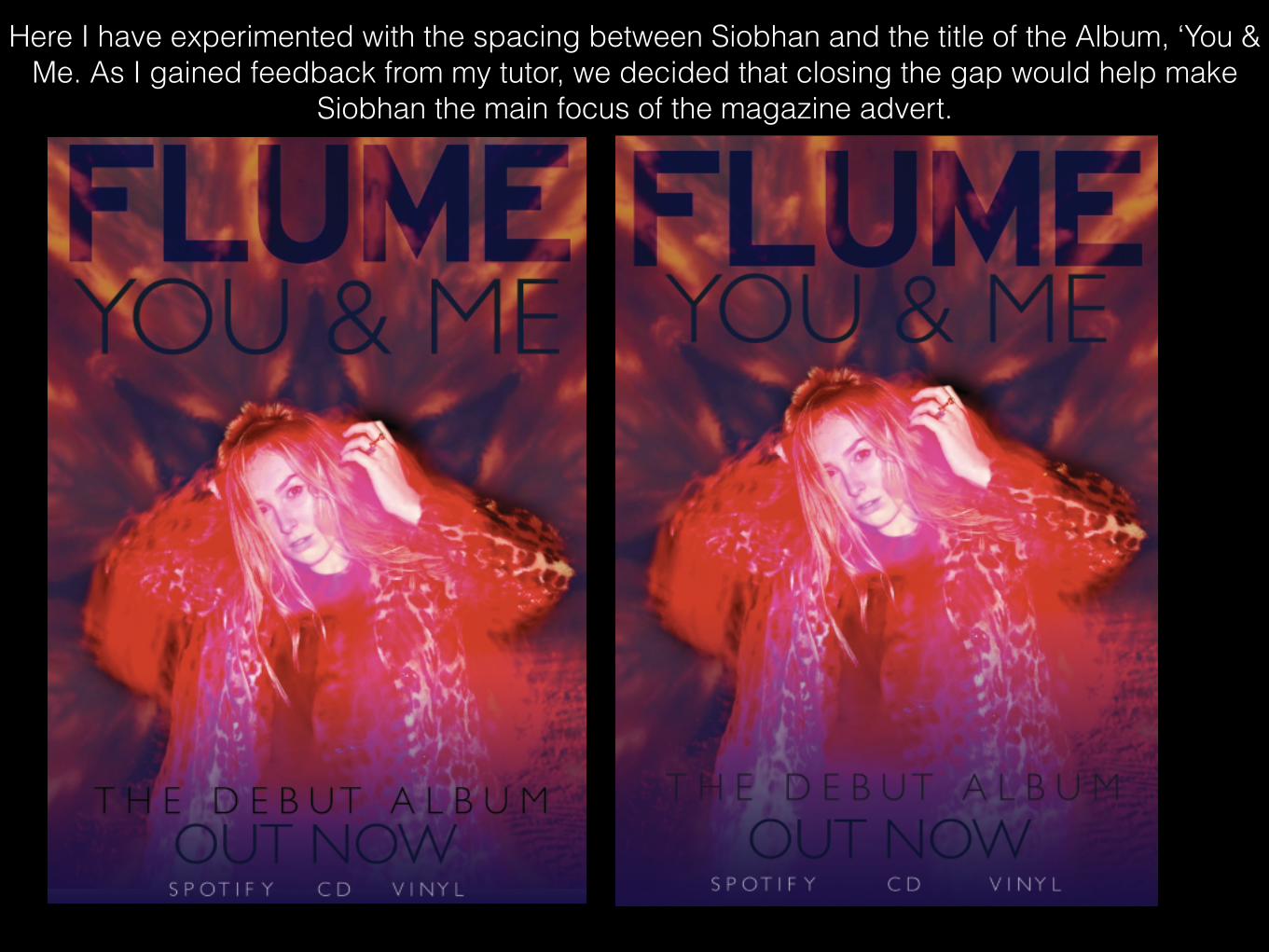
This is my final design. I have made the colours of the fonts a dark blue,
but not quite black so they don’t overpower the page and tie in with the
dark shadows in the background image. I have also placed ‘Spotify,
CD, Vinyl’ at the bottom of the page to inform the audience that this is where they can access this new album. This is a fairly conventional thing to see on
adverts, as in todays society, the online media is an easy and quick way of accessing things such as
music and images. I am happy that I have moved Siobhan upwards as it now means she is the main focus of
the page, and the image of her is well framed with the text above and below. I have made is obvious the ‘You & Me’ is the name of the album as it stands below Flume’s official logo therefore
making it stand out.