Embed Size (px)
Citation preview
Evaluation question 2How effective is the combination of your main product and ancillary texts?

Brand identity – what is it and why is it important?
‘The visible elements of a brand (such as colors, design, logotype, name, symbol) that together identify and distinguish the brand in the consumer’s mind.’
Brand identity is important as it allows the consumer to recognise a group of products as from the same brand or for example our film poster, teaser trailer and magazine cover as belonging to the same promotional package for our film, Perception. This could help with the advertising of the film.
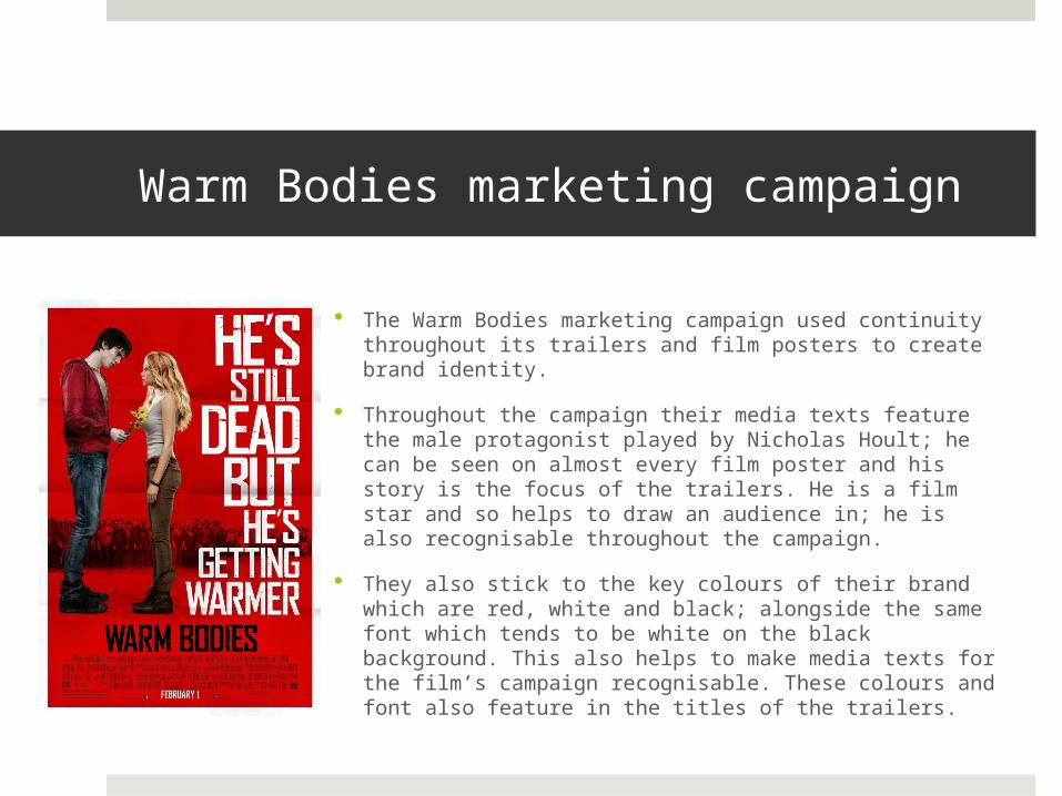
Warm Bodies marketing campaign
The Warm Bodies marketing campaign used continuity throughout its trailers and film posters to create brand identity.
Throughout the campaign their media texts feature the male protagonist played by Nicholas Hoult; he can be seen on almost every film poster and his story is the focus of the trailers. He is a film star and so helps to draw an audience in; he is also recognisable throughout the campaign.
They also stick to the key colours of their brand which are red, white and black; alongside the same font which tends to be white on the black background. This also helps to make media texts for the film’s campaign recognisable. These colours and font also feature in the titles of the trailers.

Warm Bodies marketing campaign The campaign also uses the same design style throughout
the film posters, for example a simple, plain background with the protagonists as the colourful, focus of the posters.
They also include a lot of taglines that hint at the narrative and themes of the film. These help to intrigue the audience and remind them of the film they are advertising.
They feature the title on every ancillary text and keep the costume the same as in the trailer. This also helps with creating a brand identity.
The film grossed $117 million in the box office which is why we thought it was a good idea to follow their techniques when creating brand identity. We felt that their success could help with our promotional package’s success.

Our marketing campaign We followed with the technique of using a simple
background; this allowed us to draw focus to the main image on the poster and magazine cover which was that protagonist and mask icon. This helped to make the protagonist more recognisable.
We used the icon of the mask which can be seen in our teaser trailer and ancillary texts. The mask is our unique selling point and hints at the genre and narrative of our film. By using this in all of our marketing campaign it helps the viewer to remember the film and possibly entice them into watching the film.
We also followed the technique of keeping to a colour scheme throughout. From making our teaser trailer we found we used blue tones and dark colours. We therefore used these colours in our film poster and featured the colour blue. This was also carried through as a key colour in our magazine cover.

Our marketing campaign We made sure to feature our female protagonist in
the teaser trailer, film poster and film magazine cover. This became a recognisable icon that helped to make the media texts appear as a part of a package.
We made sure to feature our tagline on the film poster and in the title sequence of our teaser trailer. The tag line helps to give the audience more information about the narrative and themes of the film. It also creates brand identity as it is a recognisable feature.
We also used the same font throughout the three products. We used the font for the title sequence, film name on the poster and magazine cover. This therefore also became a recognisable feature for our film’s campaign.

Our target audience and appeal From our research into target audience using Pearl & Dean we decided that our target
audience would be 15 – 24 year olds, both male and female however slightly more females than males.
We found that audience demographics for thriller films normally have a 50/50 split for male and female members, with the largest ages sector being 16-24 year olds.
As our actors are teenagers this helps the film to appeal to a younger audience as the audience may be able to relate to the protagonist.
Additionally as our protagonist is female our target audience is slightly more females than males as other women may relate to the character.
We found on Pearl & Dean that thriller films with a female protagonist did have more females than males in their audience demographic.
Our target audience are also any thriller film enthusiasts or people that possibly like films with the element of masks. Another key theme within the film is the element of hallucinations and confusion. This is also a theme that we have presented within our promotional package which may help to attract our target audience and those who like these sorts of films.

Conclusion
I feel we created a successful and effective brand identity within the promotional package for our thriller film. We clearly presented the films genre, and hinted at narrative and themes. We also created a recognisable marketing campaign through our consistency with icons, actors, colours, design and font. As these are key elements to a successful professional marketing campaign I feel our promotional package is also successful and has a clear brand identity.