Embed Size (px)
Citation preview
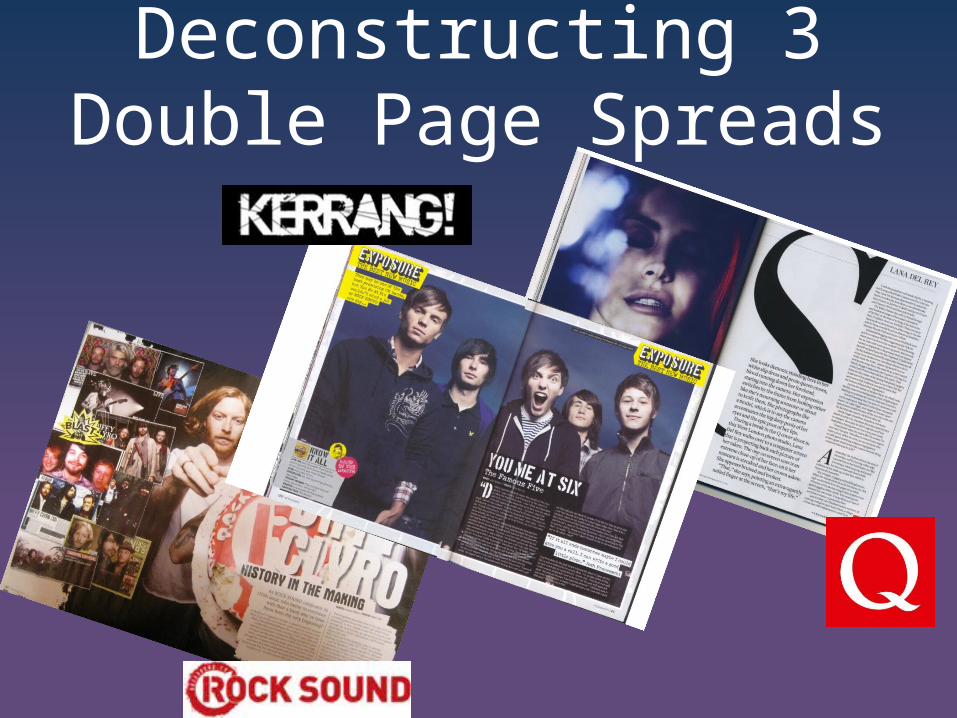
Deconstructing 3 Double Page Spreads
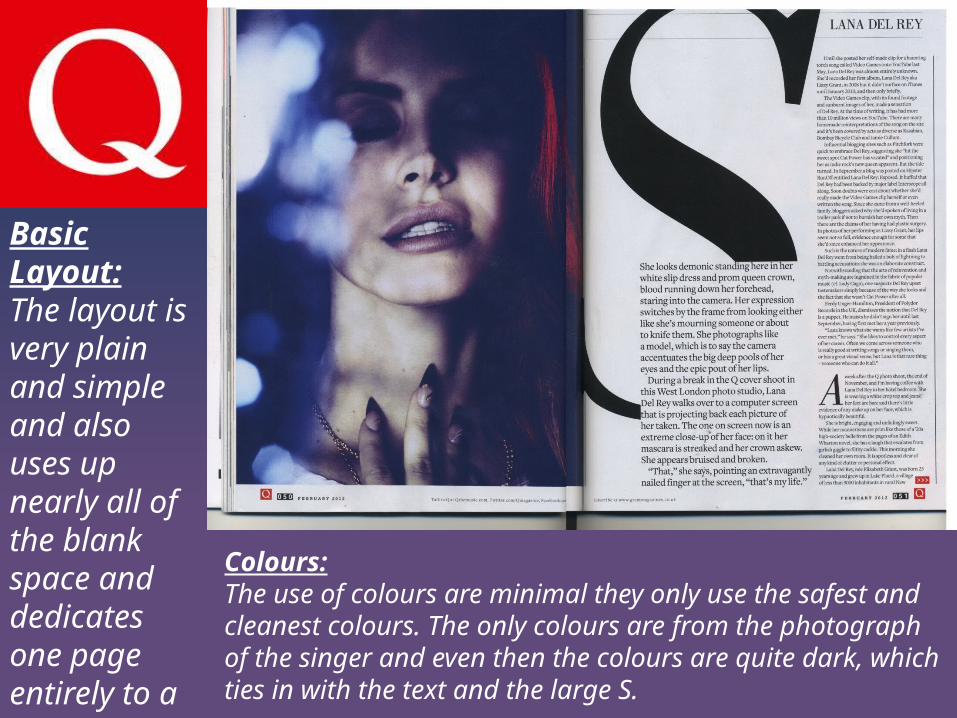
Basic Layout:The layout is very plain and simple and also uses up nearly all of the blank space and dedicates one page entirely to a large image of the singer.
Colours:The use of colours are minimal they only use the safest and cleanest colours. The only colours are from the photograph of the singer and even then the colours are quite dark, which ties in with the text and the large S.
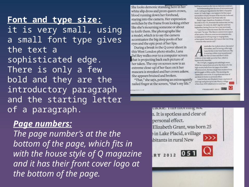
Font and type size:it is very small, using a small font type gives the text a sophisticated edge. There is only a few bold and they are the introductory paragraph and the starting letter of a paragraph.
Page numbers:The page number’s at the the bottom of the page, which fits in with the house style of Q magazine and it has their front cover logo at the bottom of the page.
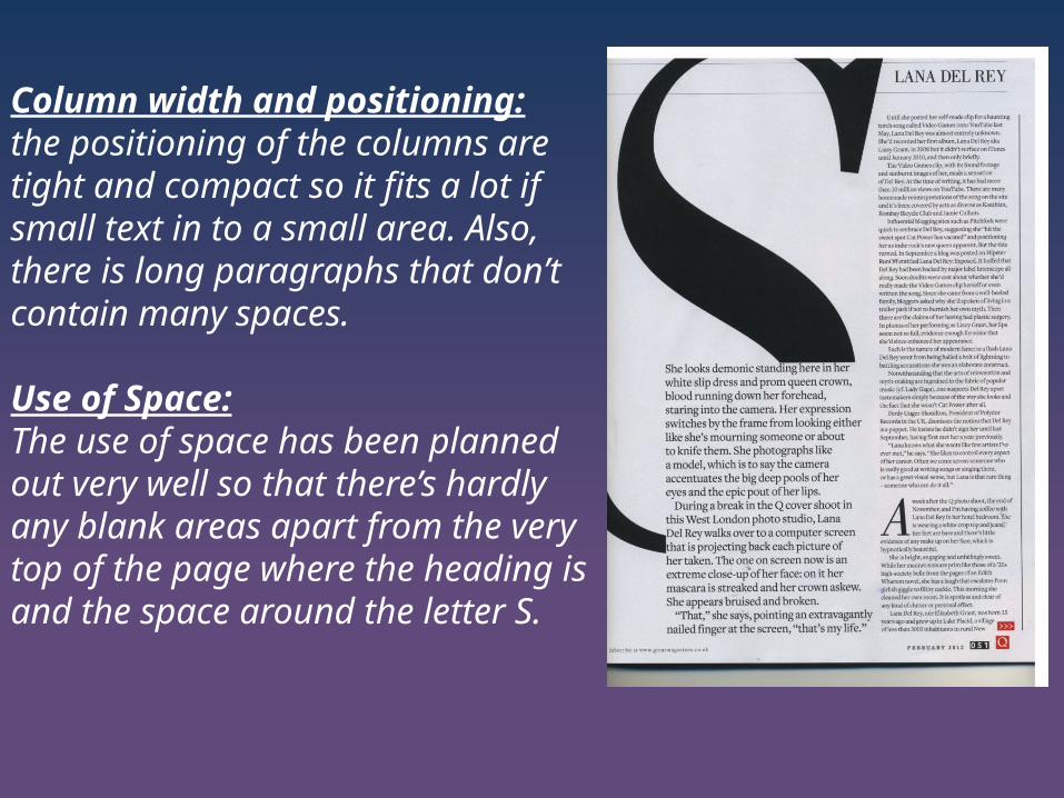
Column width and positioning:the positioning of the columns are tight and compact so it fits a lot if small text in to a small area. Also, there is long paragraphs that don’t contain many spaces.
Use of Space:The use of space has been planned out very well so that there’s hardly any blank areas apart from the very top of the page where the heading is and the space around the letter S.
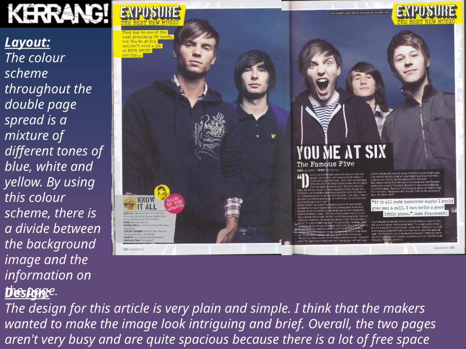
Layout:The colour scheme throughout the double page spread is a mixture of different tones of blue, white and yellow. By using this colour scheme, there is a divide between the background image and the information on the page. Design:The design for this article is very plain and simple. I think that the makers wanted to make the image look intriguing and brief. Overall, the two pages aren't very busy and are quite spacious because there is a lot of free space around the page.
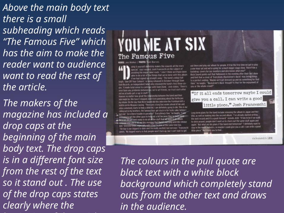
Above the main body text there is a small subheading which reads “The Famous Five” which has the aim to make the reader want to audience want to read the rest of the article.
The makers of the magazine has included a drop caps at the beginning of the main body text. The drop caps is in a different font size from the rest of the text so it stand out . The use of the drop caps states clearly where the beginning of the article is.
The colours in the pull quote are black text with a white block background which completely stand outs from the other text and draws in the audience.
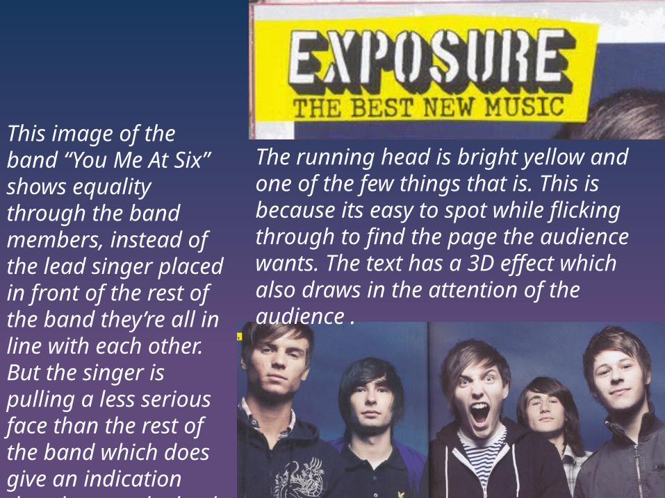
The running head is bright yellow and one of the few things that is. This is because its easy to spot while flicking through to find the page the audience wants. The text has a 3D effect which also draws in the attention of the audience .
This image of the band “You Me At Six” shows equality through the band members, instead of the lead singer placed in front of the rest of the band they’re all in line with each other. But the singer is pulling a less serious face than the rest of the band which does give an indication that they are the lead singer.
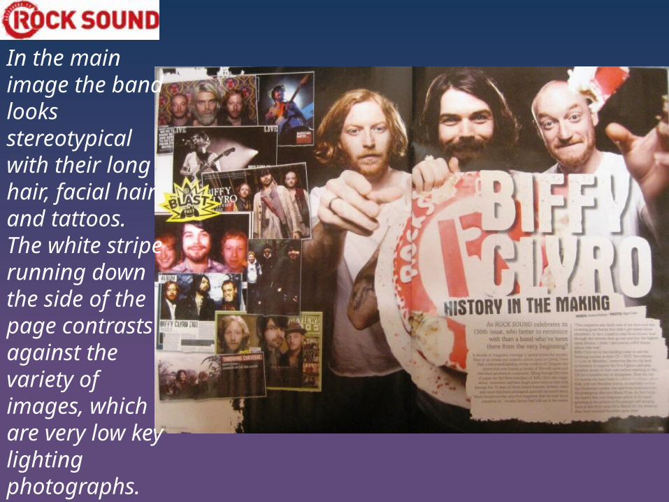
In the main image the band looks stereotypical with their long hair, facial hair and tattoos. The white stripe running down the side of the page contrasts against the variety of images, which are very low key lighting photographs.
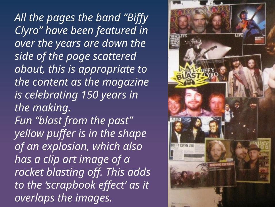
All the pages the band “Biffy Clyro” have been featured in over the years are down the side of the page scattered about, this is appropriate to the content as the magazine is celebrating 150 years in the making. Fun “blast from the past” yellow puffer is in the shape of an explosion, which also has a clip art image of a rocket blasting off. This adds to the ‘scrapbook effect’ as it overlaps the images.
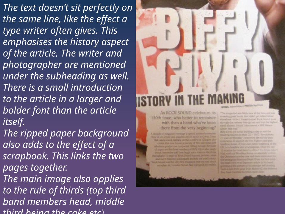
The text doesn’t sit perfectly on the same line, like the effect a type writer often gives. This emphasises the history aspect of the article. The writer and photographer are mentioned under the subheading as well.There is a small introduction to the article in a larger and bolder font than the article itself.The ripped paper background also adds to the effect of a scrapbook. This links the two pages together.The main image also applies to the rule of thirds (top third band members head, middle third being the cake etc).