Embed Size (px)
Citation preview

But what about old browsers!?!?!
Rachel Andrew, Fronteers 2015
https://www.flickr.com/photos/nossreh/5510993121/

The CSS Anthology, p.357
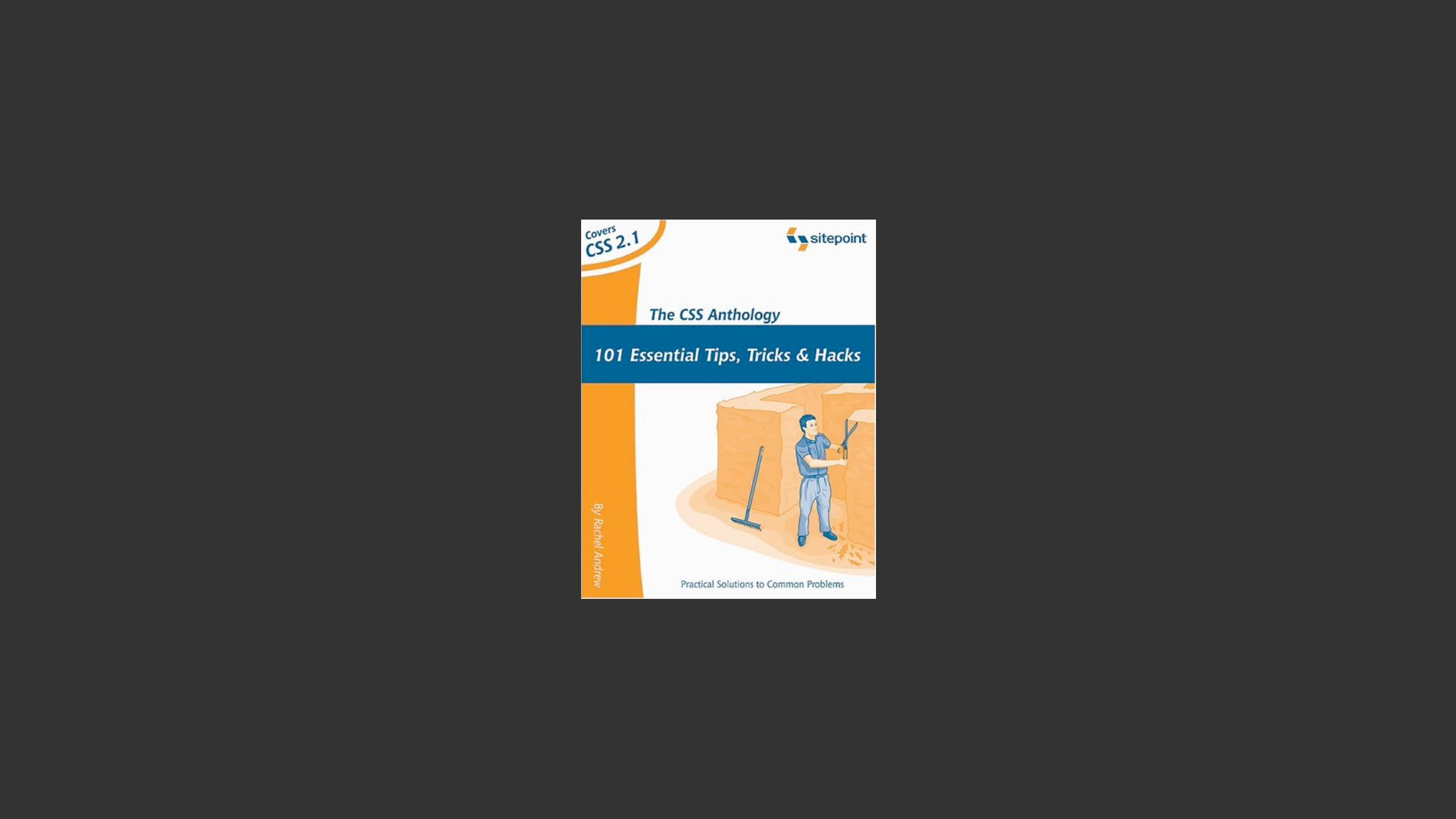
“It is possible to create the effect of rounded corners using a number of stacked, mostly 1-pixel-high <div>s.”
Ah 2004.
Simpler times.
<div id="box"> <div class="roundborder c1"></div> <div class="roundborder c2"></div> <div class="roundborder c3"></div> <div class="roundborder c4"></div> <div class="roundborder c5"></div> <div class="roundborder c6"></div> <div class="roundborder c7"></div> <div class="roundborder c8"></div> <div class="roundborder c9"></div> <div class="roundborder content">content here</div> <div class="roundborder c9"></div> <div class="roundborder c8"></div> <div class="roundborder c7"></div> <div class="roundborder c6"></div> <div class="roundborder c5"></div> <div class="roundborder c4"></div> <div class="roundborder c3"></div> <div class="roundborder c2"></div> <div class="roundborder c1"></div> </div>
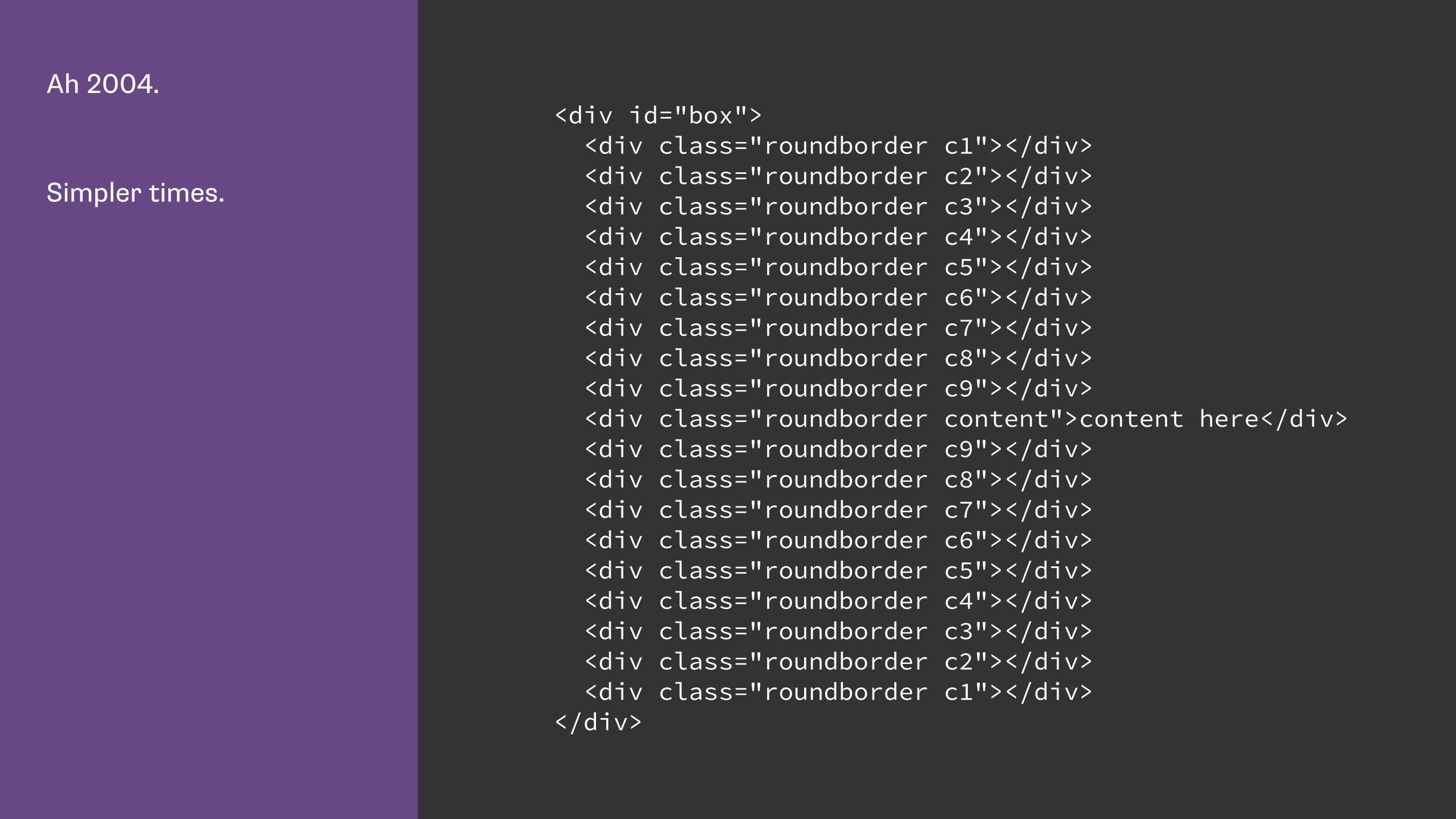
Don’t try this at home. .roundborder { height: 1px; overflow: hidden; background-color: #B0C4DE; border-right: 1px solid #33527B; border-left: 1px solid #33527B; }
.c1 { margin: 0 12px 0 12px; border: none; background-color: #33527B; }
.c2 { margin: 0 9px; border-width: 0 3px; }
.c3 { margin: 0 7px; border-width: 0 2px; }
.c4 { margin: 0 6px 0 6px; }
.c5 { margin: 0 5px 0 5px; }
.c6 { margin: 0 4px 0 4px; }
.c7 { margin: 0 3px 0 3px; }
.c8 { margin: 0 2px 0 2px; height: 2px; }
.c9 { margin: 0 1px 0 1px; height: 3px; }
.content { height: auto; padding: 0 15px; }
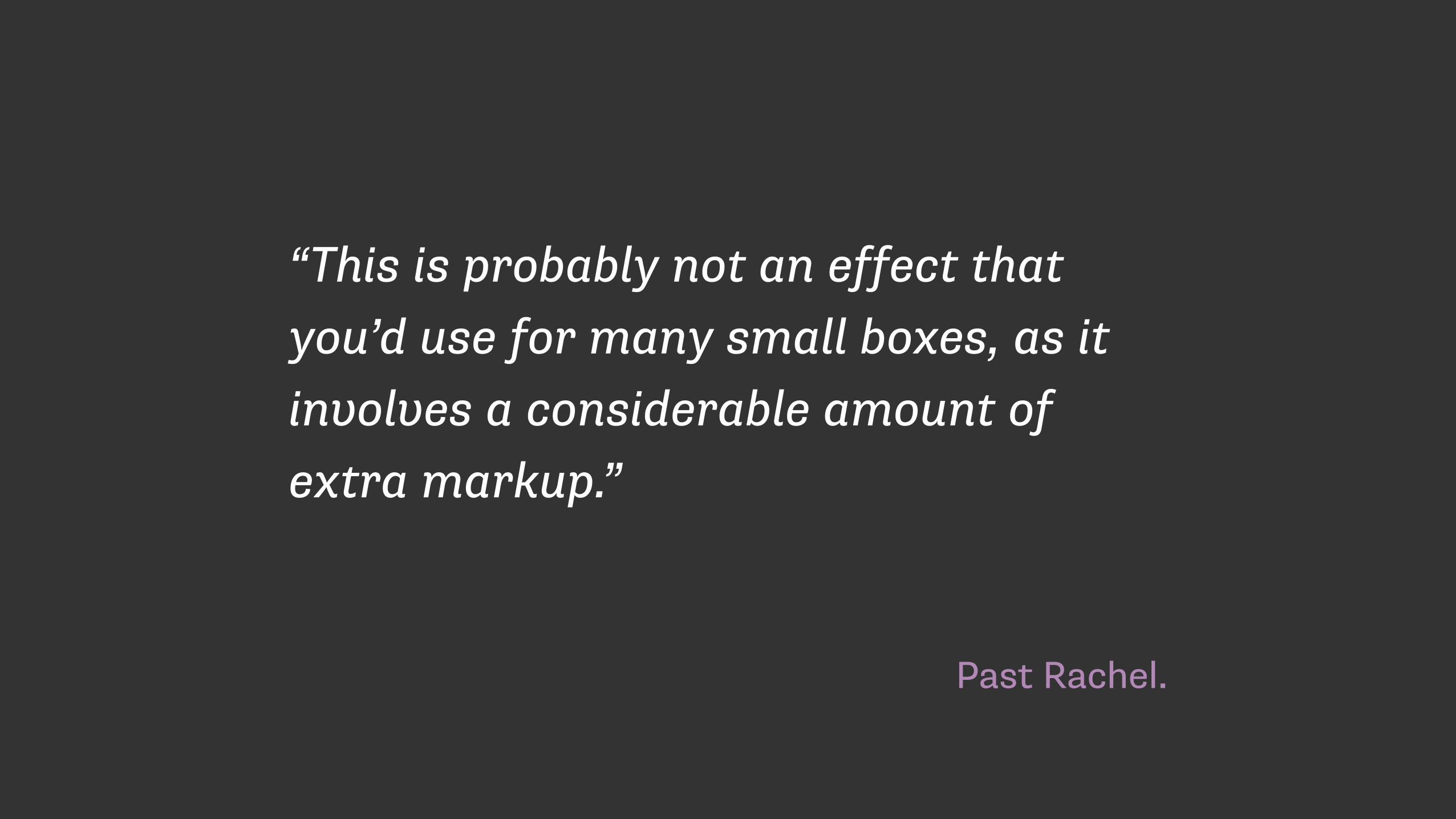
Past Rachel.
“This is probably not an effect that you’d use for many small boxes, as it involves a considerable amount of extra markup.”

The usual 2004 rounded corner technique.
<div class="rndbox"> <div class="rndtop"><img src="topleft.gif" alt="" width="30" height="30" /></div>
<p>Content here.</p>
<div class="rndbottom"><img src="bottomleft.gif" alt="" width="30" height="30" /></div> </div>
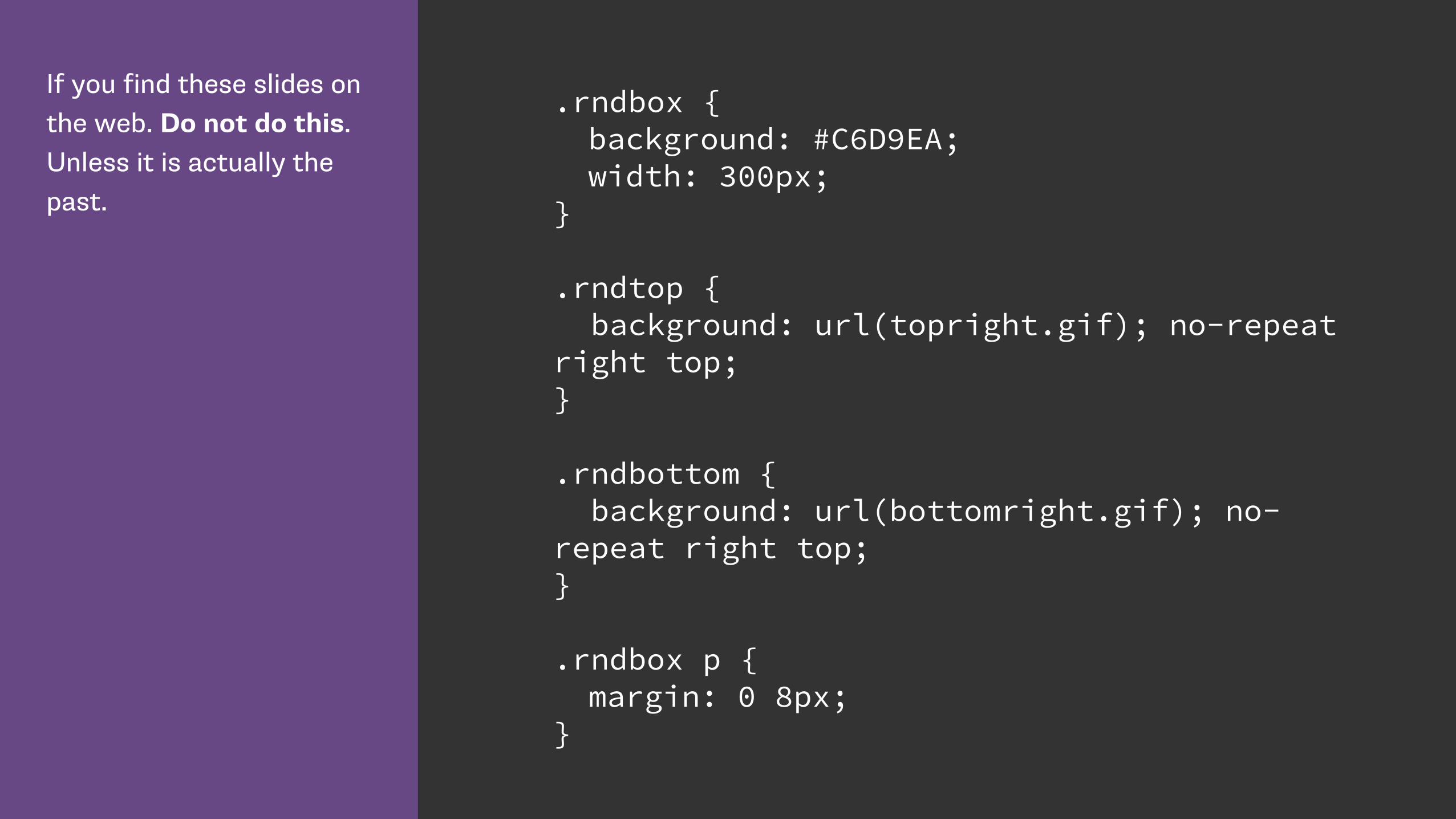
If you find these slides on the web. Do not do this. Unless it is actually the past.
.rndbox { background: #C6D9EA; width: 300px; }
.rndtop { background: url(topright.gif); no-repeat right top; }
.rndbottom { background: url(bottomright.gif); no-repeat right top; }
.rndbox p { margin: 0 8px; }
Some things change.
Some stay the same.
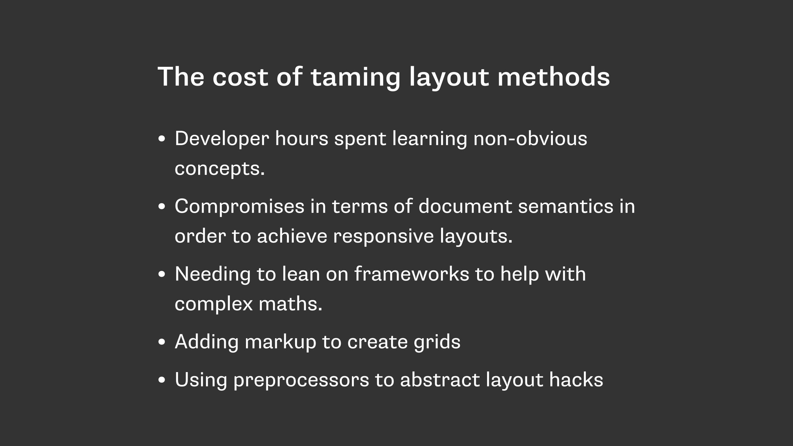
The cost of taming layout methods
• Developer hours spent learning non-obvious concepts.
• Compromises in terms of document semantics in order to achieve responsive layouts.
• Needing to lean on frameworks to help with complex maths.
• Adding markup to create grids
• Using preprocessors to abstract layout hacks

Our great hopes for layout
• Flexbox
• CSS Grid
• Box Alignment
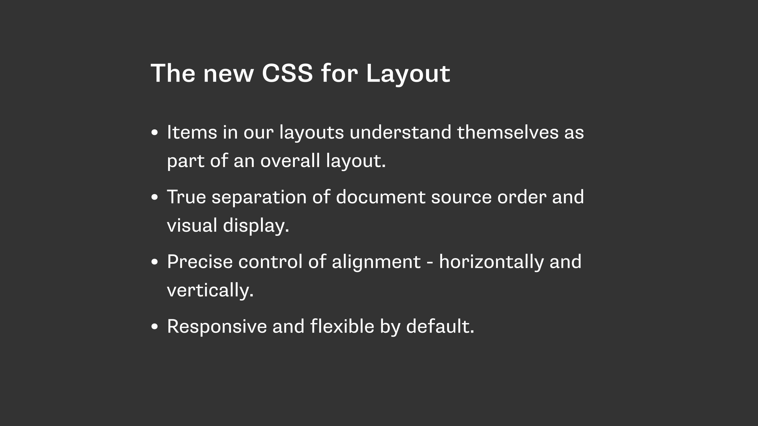
The new CSS for Layout
• Items in our layouts understand themselves as part of an overall layout.
• True separation of document source order and visual display.
• Precise control of alignment - horizontally and vertically.
• Responsive and flexible by default.

Items in our layouts understand themselves as part of a complete
layout.
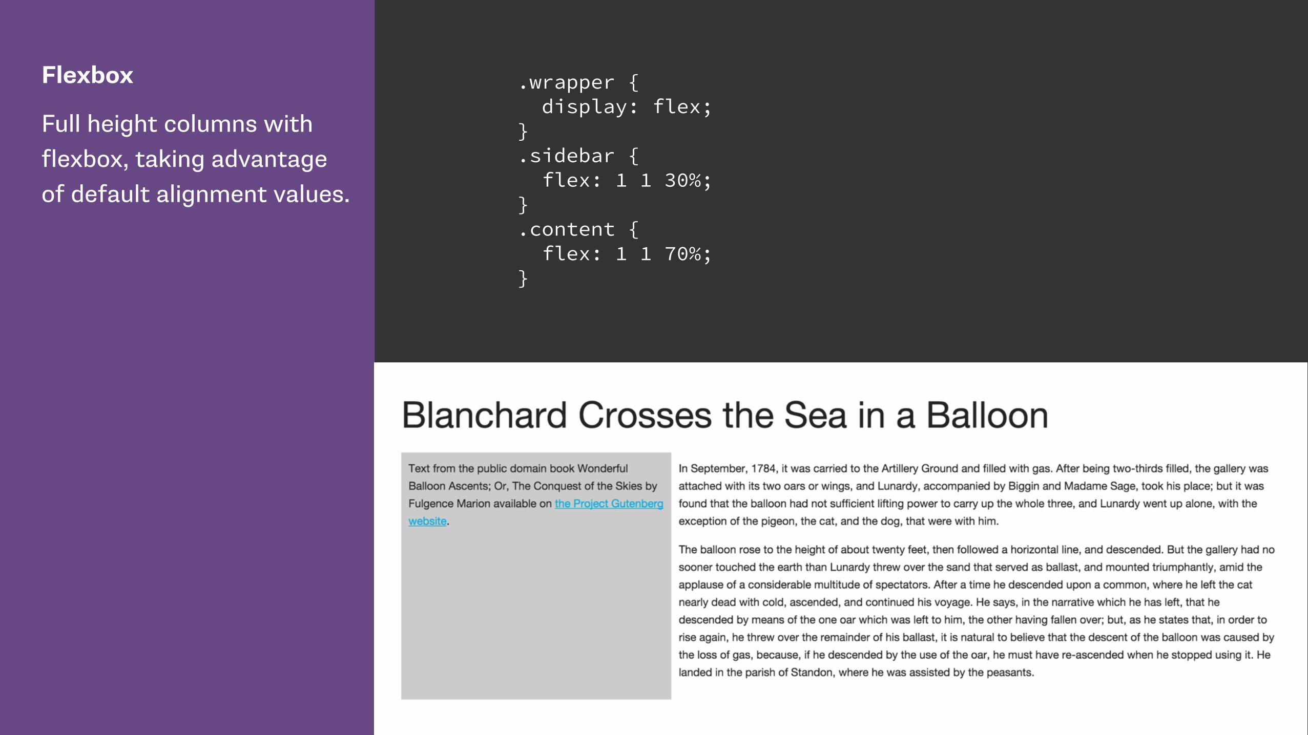
Flexbox
Full height columns with flexbox, taking advantage of default alignment values.
.wrapper { display: flex; } .sidebar { flex: 1 1 30%; } .content { flex: 1 1 70%; }
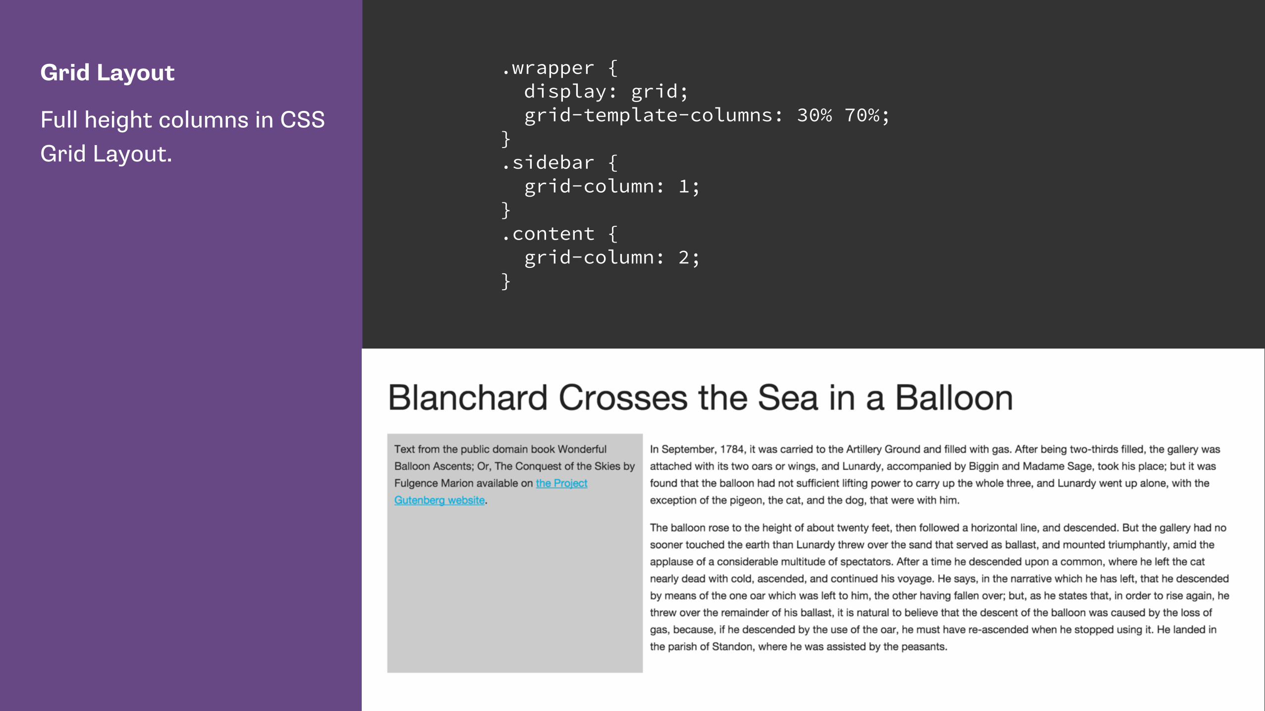
Grid Layout
Full height columns in CSS Grid Layout.
.wrapper { display: grid; grid-template-columns: 30% 70%; } .sidebar { grid-column: 1; } .content { grid-column: 2; }
Separation of source and display
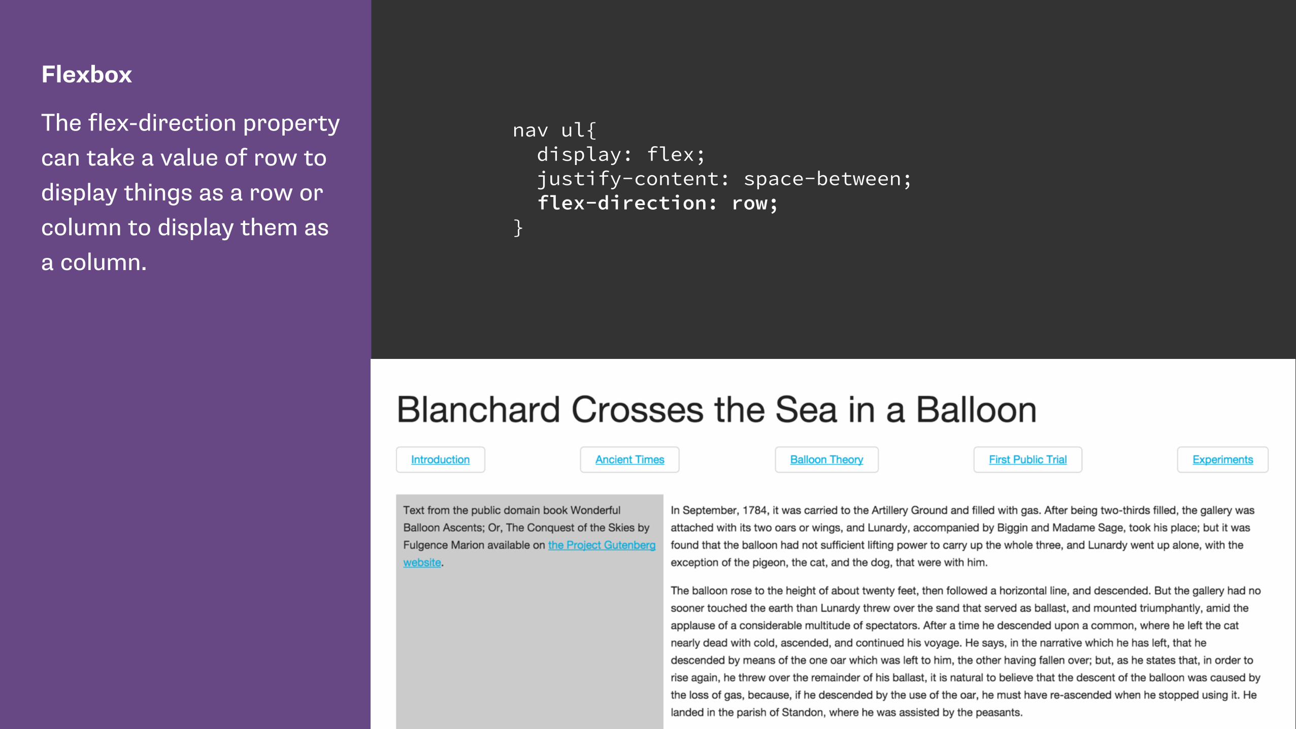
Flexbox
The flex-direction property can take a value of row to display things as a row or column to display them as a column.
nav ul{ display: flex; justify-content: space-between; flex-direction: row; }
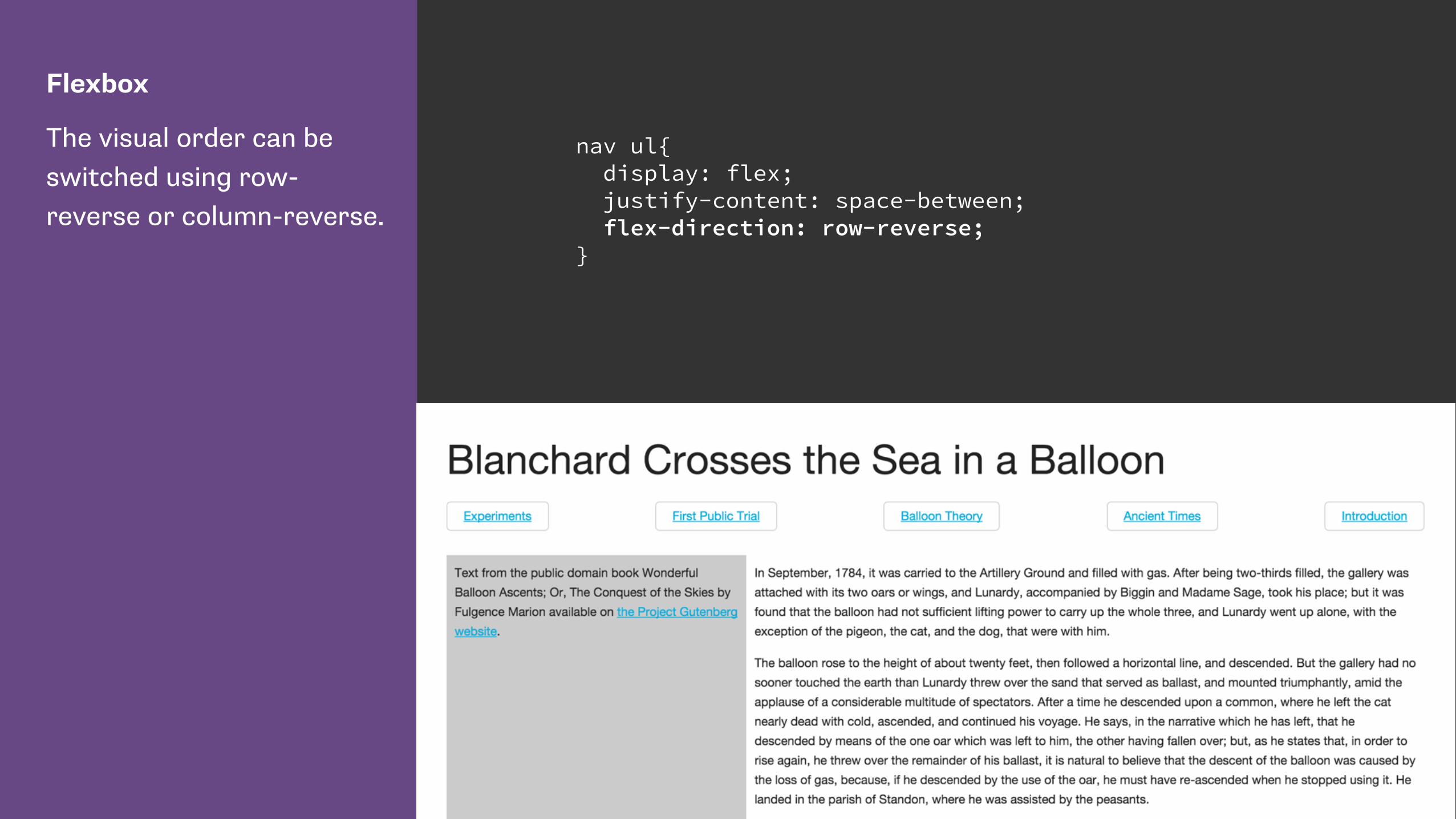
Flexbox
The visual order can be switched using row-reverse or column-reverse.
nav ul{ display: flex; justify-content: space-between; flex-direction: row-reverse; }
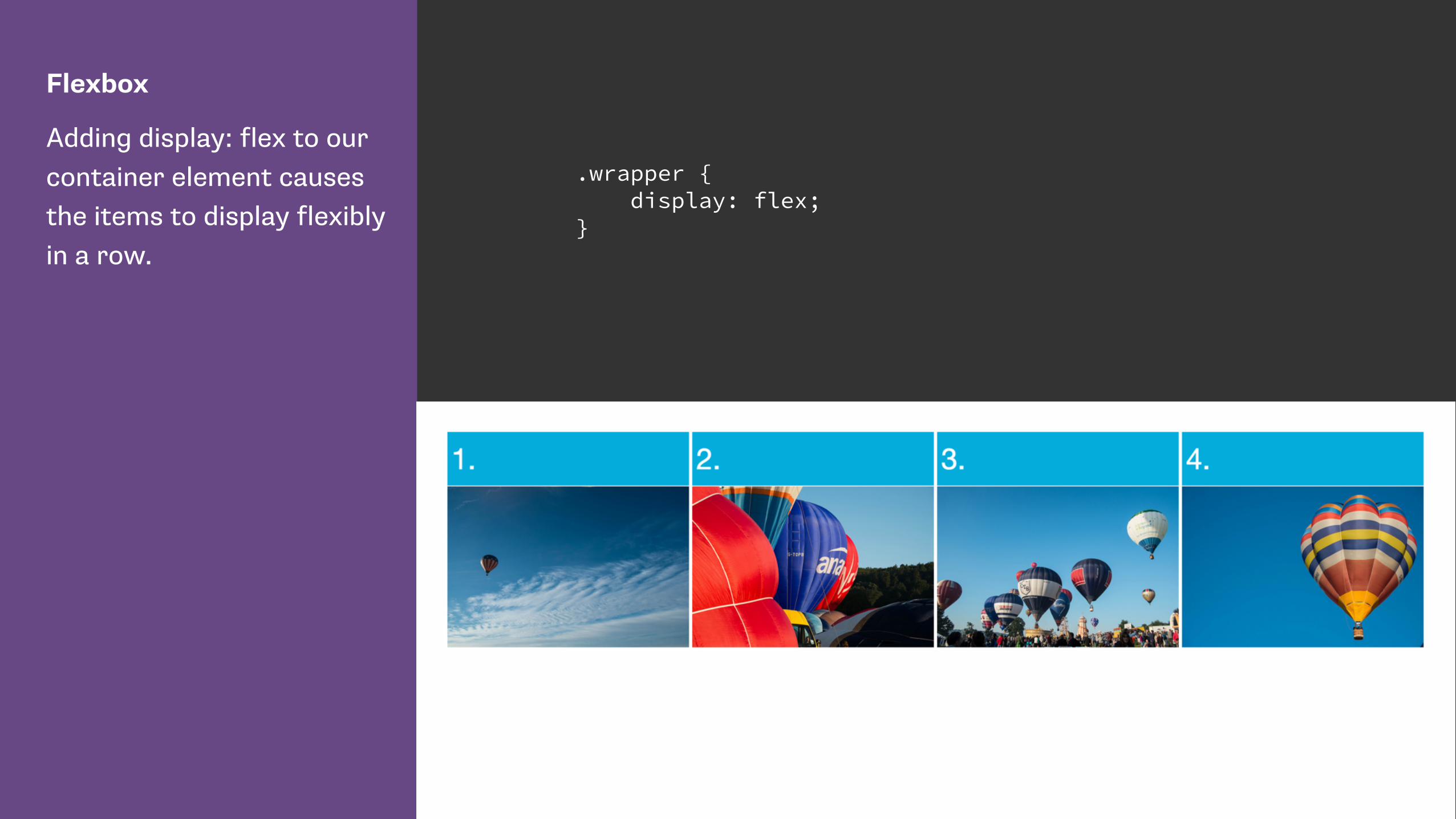
Flexbox
Adding display: flex to our container element causes the items to display flexibly in a row.
.wrapper { display: flex; }

Flexbox
The order property means we can change the order of flex items using CSS.
This does not change their source order.
li:nth-child(1) { order: 3; } li:nth-child(2) { order: 1; } li:nth-child(3) { order: 4; } li:nth-child(4) { order: 2; }

Grid Layout
I have created a grid on my wrapper element.
The grid has 3 equal width columns.
Rows will be created as required as we position items into them.
.wrapper { display: grid; grid-template-columns: 1fr 1fr 1fr; }
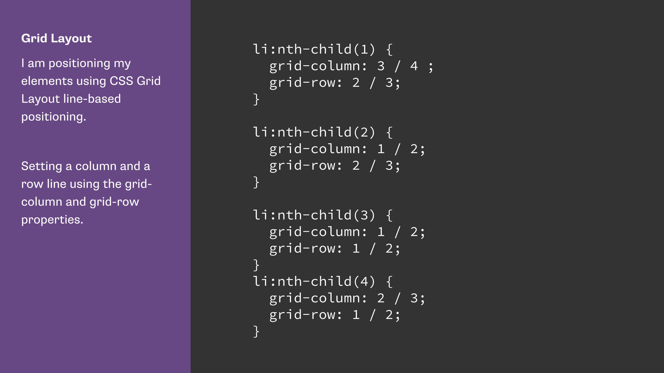
Grid Layout
I am positioning my elements using CSS Grid Layout line-based positioning.
Setting a column and a row line using the grid-column and grid-row properties.
li:nth-child(1) { grid-column: 3 / 4 ; grid-row: 2 / 3; }
li:nth-child(2) { grid-column: 1 / 2; grid-row: 2 / 3; }
li:nth-child(3) { grid-column: 1 / 2; grid-row: 1 / 2; } li:nth-child(4) { grid-column: 2 / 3; grid-row: 1 / 2; }

CSS Grid automatic placement
http://www.w3.org/TR/2015/WD-css-grid-1-20150917/#grid-auto-flow-property
https://rachelandrew.co.uk/archives/2015/04/14/grid-layout-automatic-placement-and-packing-modes/
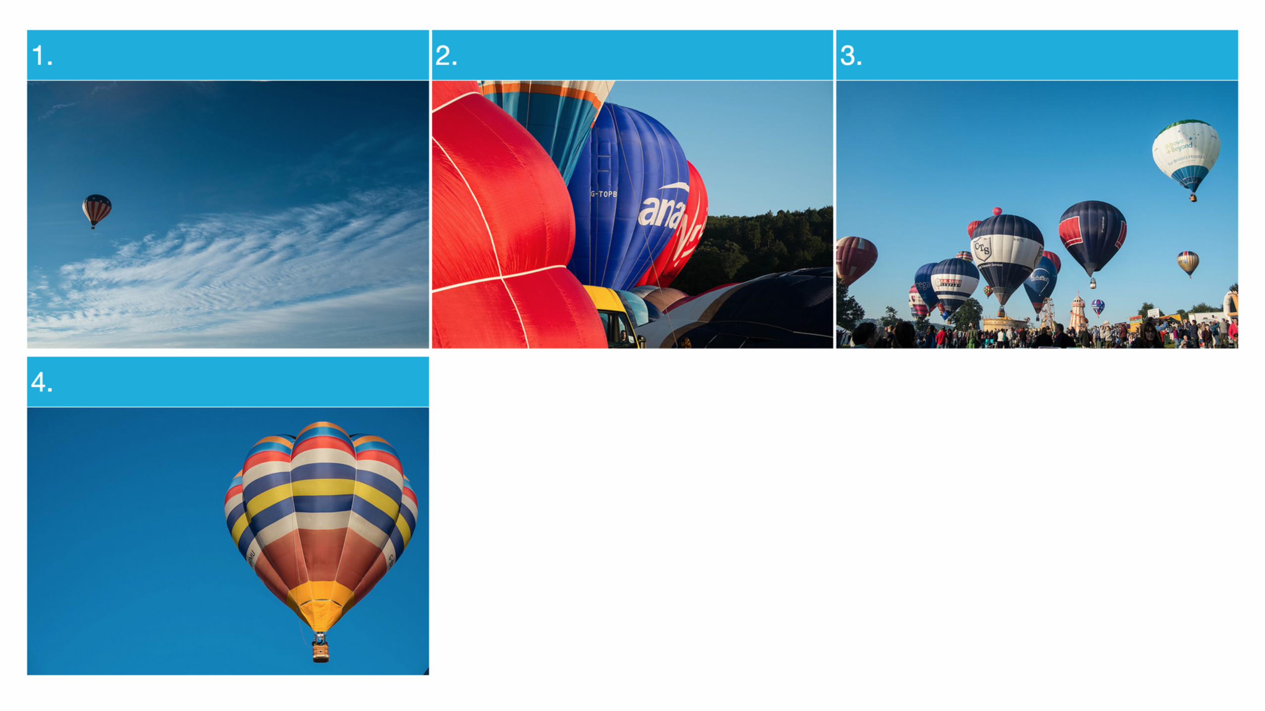
Grid Layout
When using automatic placement we can create rules for items in our document - for example displaying portrait and landscape images differently.
.wrapper { display: grid; grid-template-columns: 1fr 1fr 1fr 1fr; grid-template-rows: auto; }
.landscape { grid-column-end: span 2; }

grid-auto-flow
The default value of grid-auto-flow is sparse. Grid will move forward planning
items skipping cells if items do not fit .
Grid Layout
With a dense packing mode grid will move items out of source order to backfill spaces.
.wrapper { display: grid; grid-template-columns: 1fr 1fr 1fr 1fr; grid-template-rows: auto; grid-auto-flow: dense; }
.landscape { grid-column-end: span 2; }
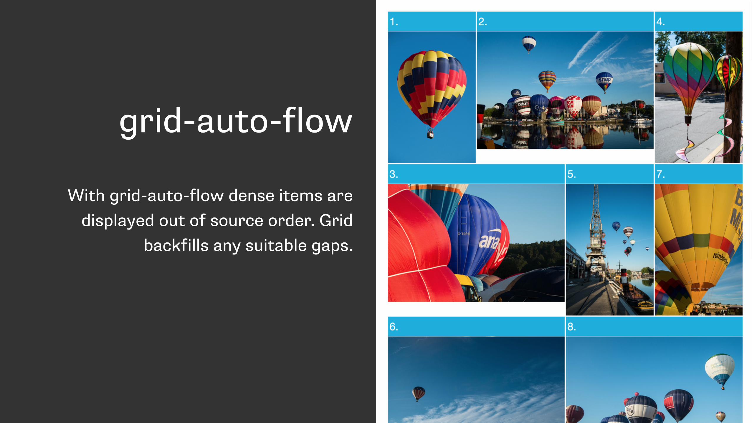
grid-auto-flow
With grid-auto-flow dense items are displayed out of source order. Grid
backfills any suitable gaps.

With great power comes responsibility.

Power and responsibility
• Good = creating the most accessible source order and using Grid or Flexbox to get the optimal display for each device.
• Bad = using Grid or Flexbox as an excuse to forget about the source.
• Terrible - stripping out semantic elements to make everything a grid or flex item.

https://drafts.csswg.org/css-flexbox/#order-accessibility
Authors must use order only for visual, not logical, reordering of content. Style sheets that use order to perform logical reordering are non-conforming.
https://rachelandrew.co.uk/archives/2015/07/28/modern-css-layout-power-and-responsibility/

Control of alignment

CSS Box Alignment Module Level 3
“This module contains the features of CSS relating to the alignment of boxes within their containers in the various CSS box layout models: block layout, table layout, flex layout, and grid layout.” - https://drafts.csswg.org/css-align/

Vertically centre ALL THE THINGS!
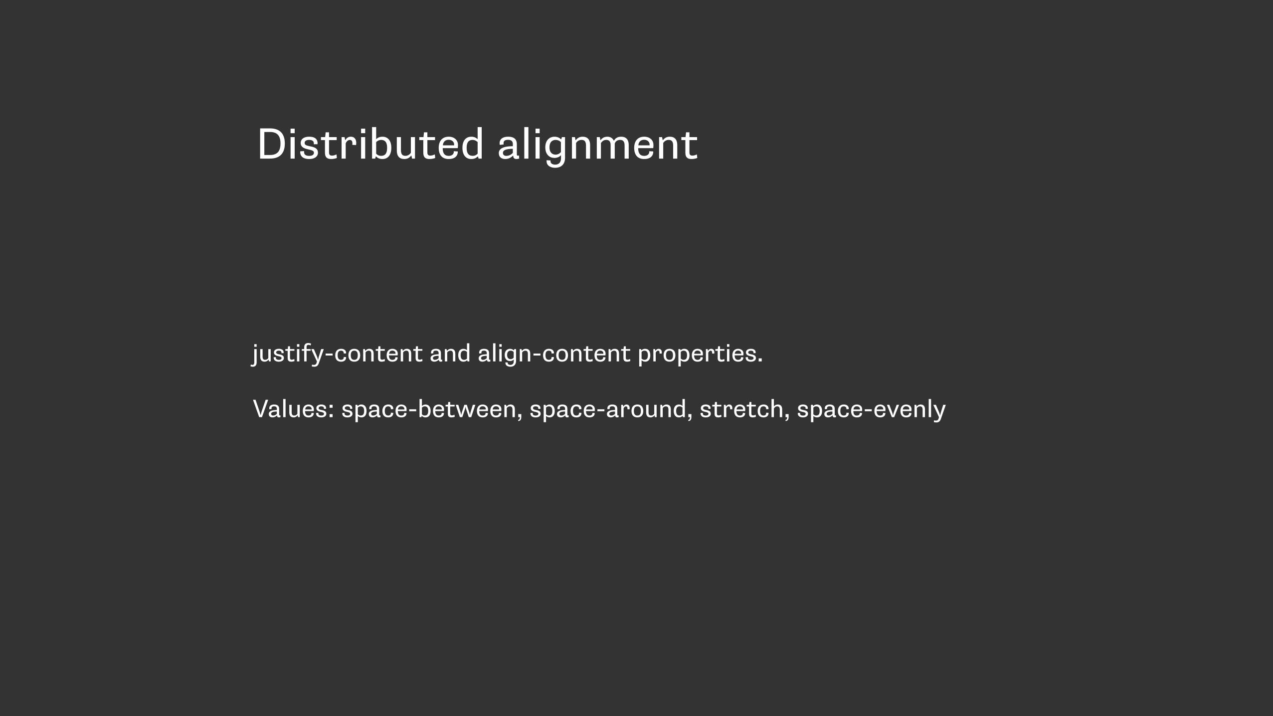
Distributed alignment
justify-content and align-content properties.
Values: space-between, space-around, stretch, space-evenly
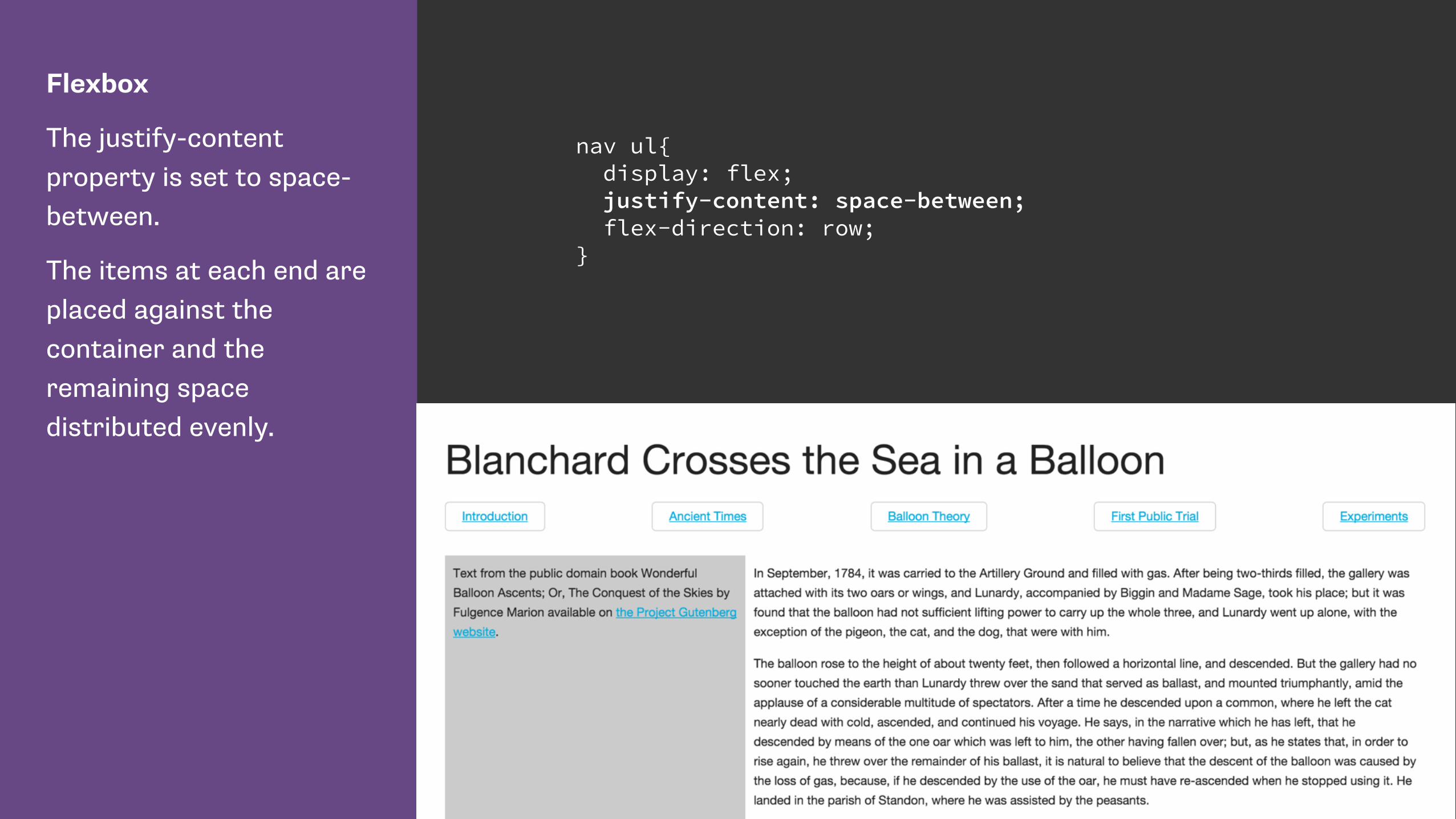
Flexbox
The justify-content property is set to space-between.
The items at each end are placed against the container and the remaining space distributed evenly.
nav ul{ display: flex; justify-content: space-between; flex-direction: row; }
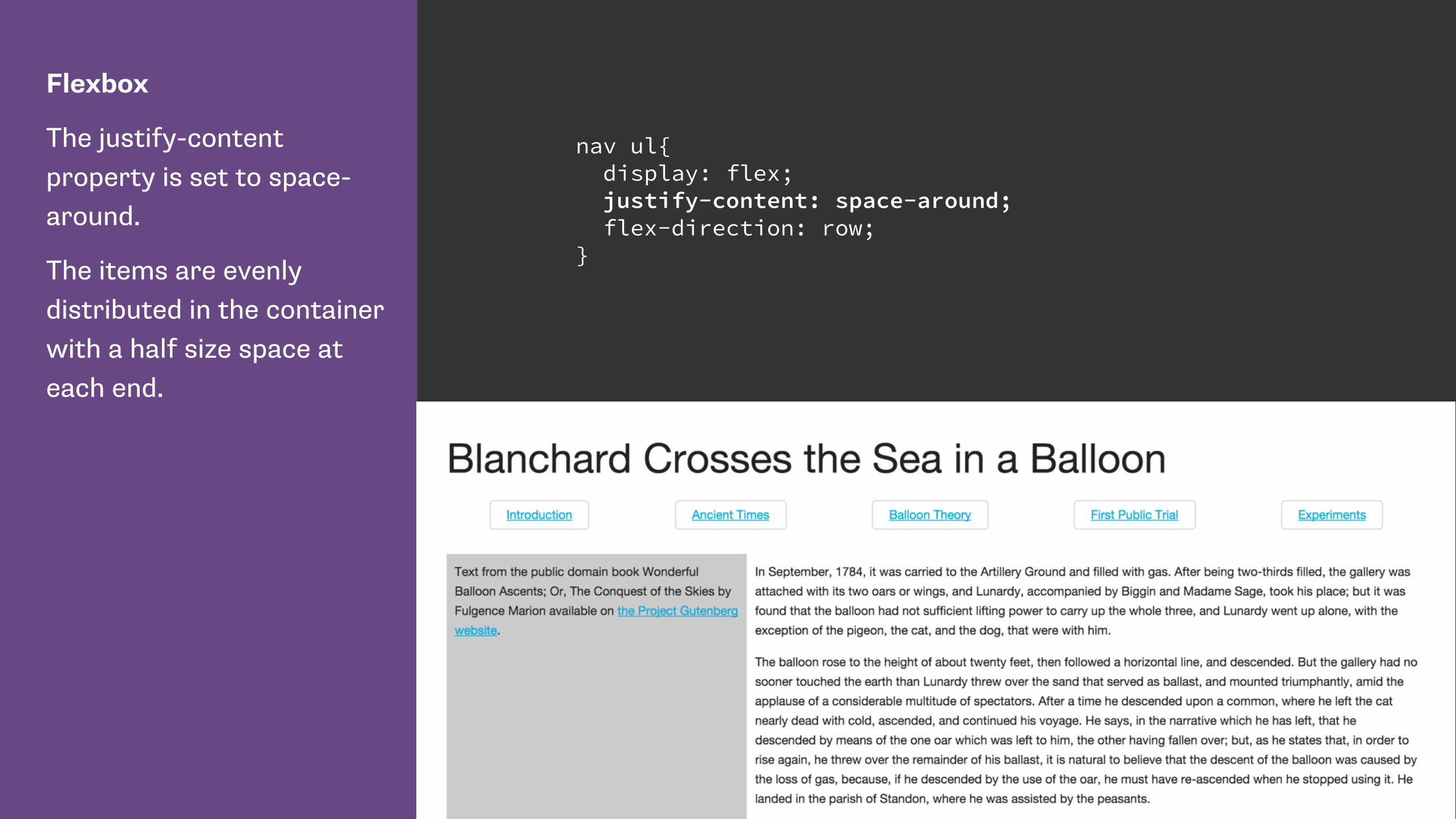
Flexbox
The justify-content property is set to space-around.
The items are evenly distributed in the container with a half size space at each end.
nav ul{ display: flex; justify-content: space-around; flex-direction: row; }

Default alignment
Used by the justify-items and align-items properties.
The align-items and justify-items properties set the default align-self and justify-self behavior of the items contained by the element.
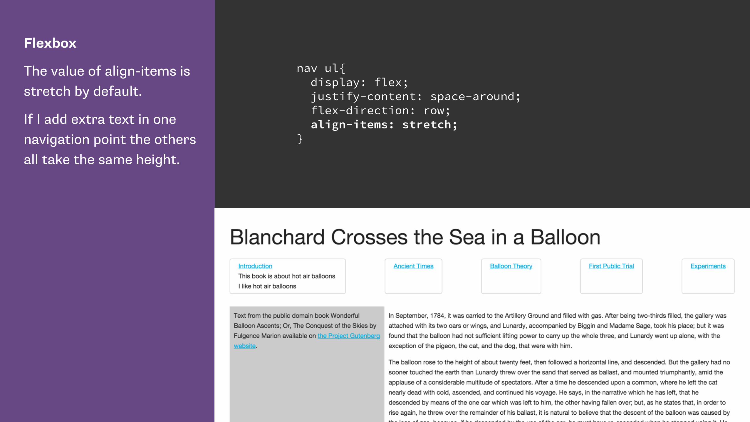
Flexbox
The value of align-items is stretch by default.
If I add extra text in one navigation point the others all take the same height.
nav ul{ display: flex; justify-content: space-around; flex-direction: row; align-items: stretch; }
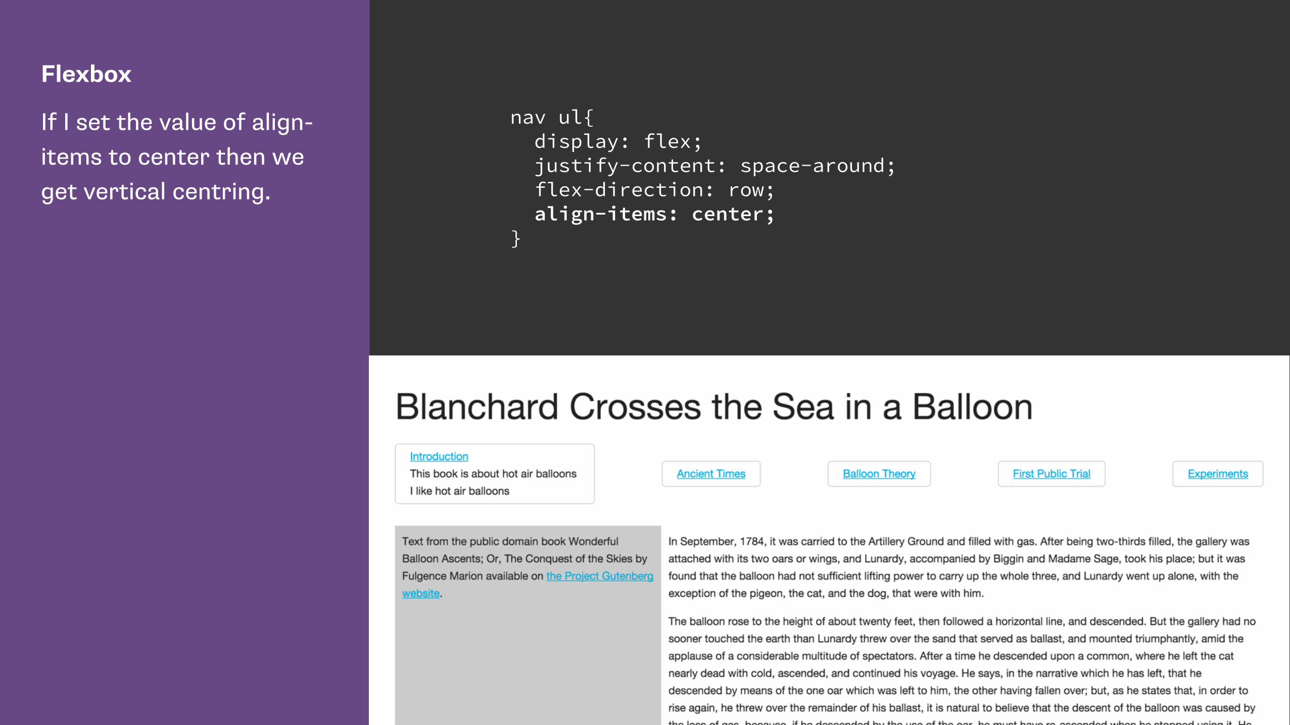
Flexbox
If I set the value of align-items to center then we get vertical centring.
nav ul{ display: flex; justify-content: space-around; flex-direction: row; align-items: center; }

Flexbox
If flex-direction is column and I set the value of align-items to center then we get horizontal centring.
nav ul{ display: flex; justify-content: space-around; flex-direction: column; align-items: center; }
Self alignment
justify-self and align-self properties.
The justify-self and align-self properties control alignment of the box within its containing block.
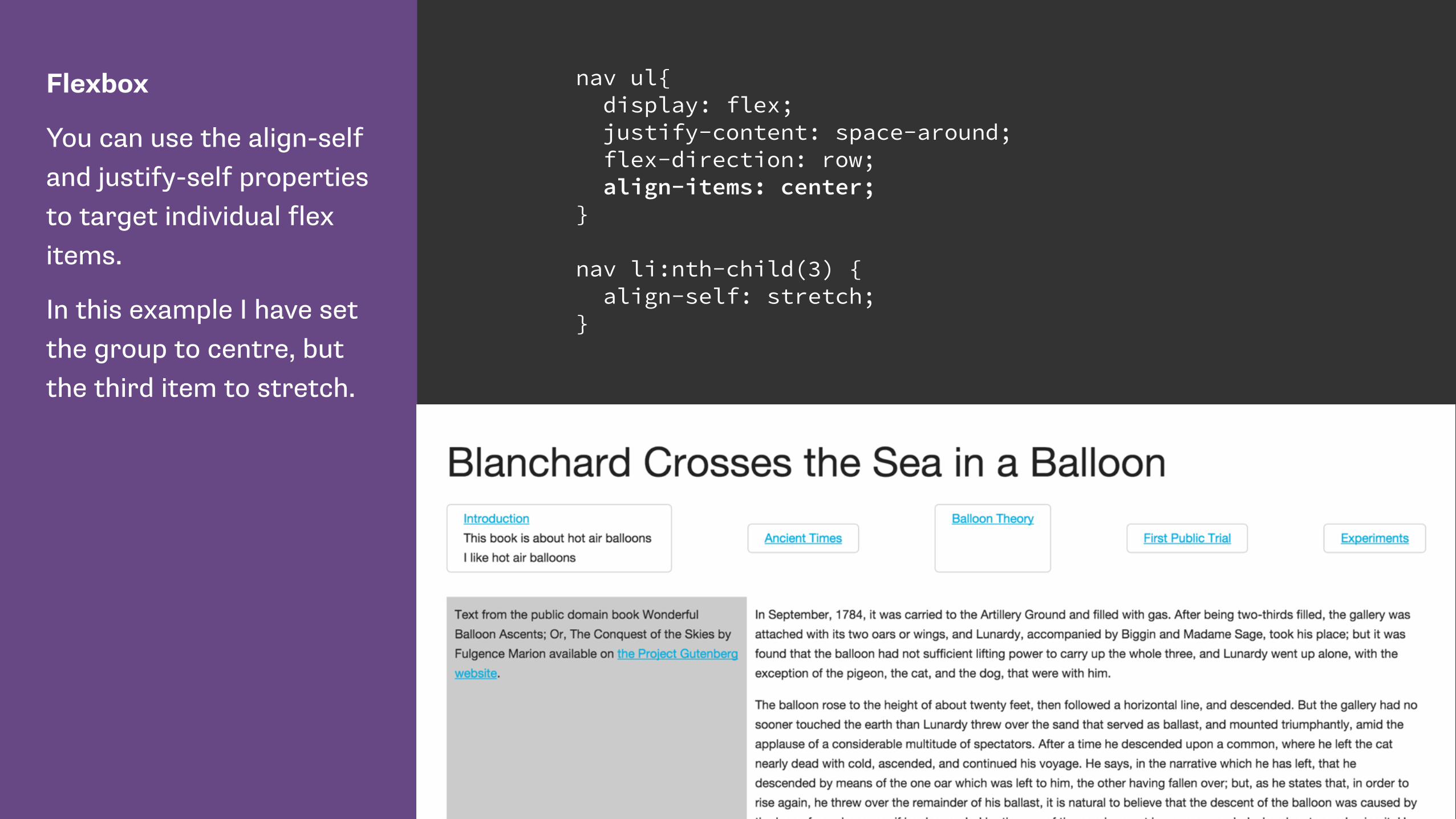
Flexbox
You can use the align-self and justify-self properties to target individual flex items.
In this example I have set the group to centre, but the third item to stretch.
nav ul{ display: flex; justify-content: space-around; flex-direction: row; align-items: center; }
nav li:nth-child(3) { align-self: stretch; }
Box alignment in CSS Grid Layout
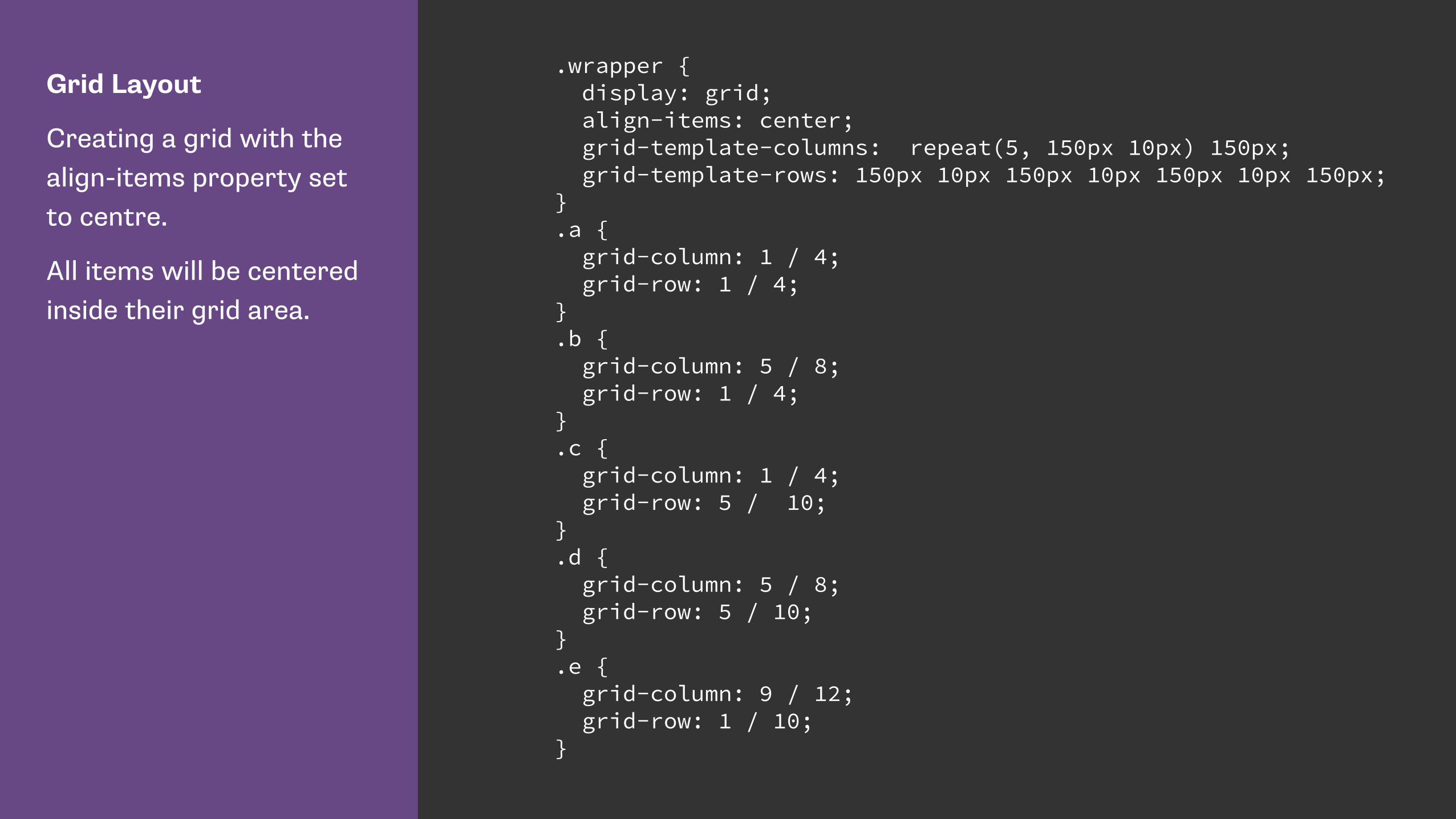
Grid Layout
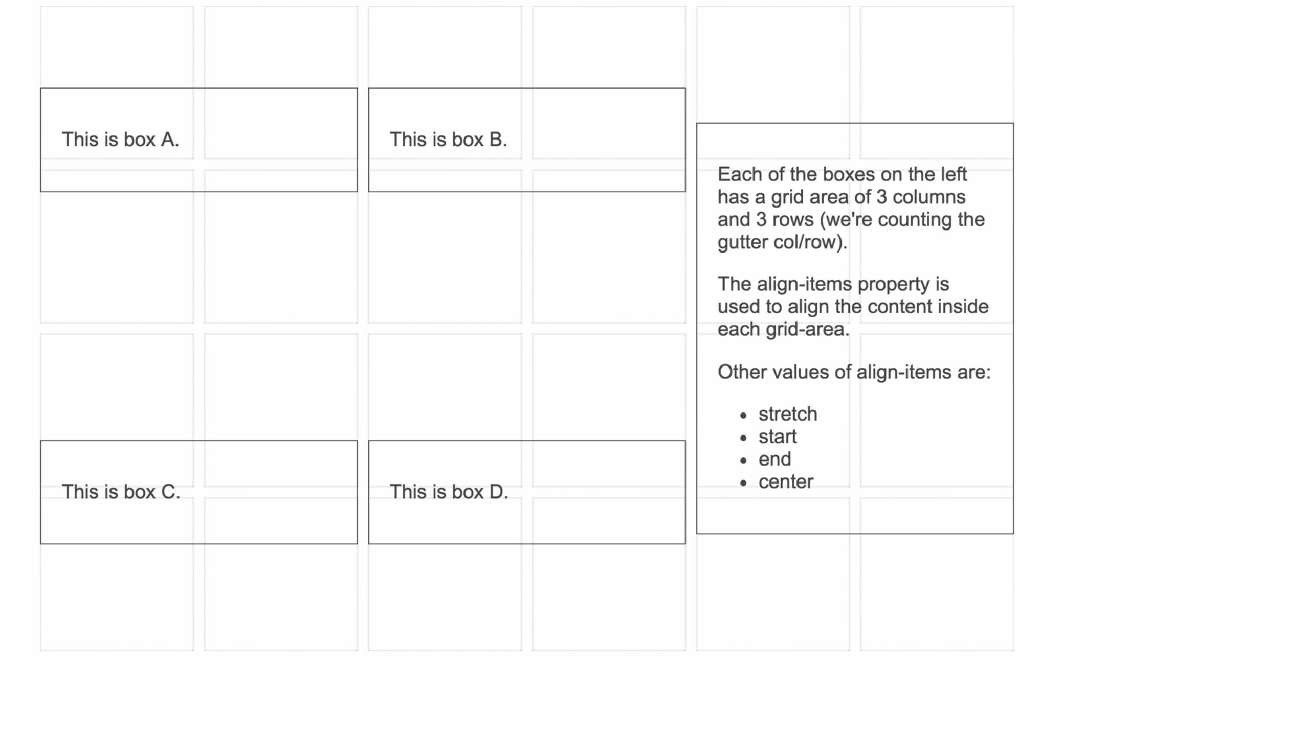
Creating a grid with the align-items property set to centre.
All items will be centered inside their grid area.
.wrapper { display: grid; align-items: center; grid-template-columns: repeat(5, 150px 10px) 150px; grid-template-rows: 150px 10px 150px 10px 150px 10px 150px; } .a { grid-column: 1 / 4; grid-row: 1 / 4; } .b { grid-column: 5 / 8; grid-row: 1 / 4; } .c { grid-column: 1 / 4; grid-row: 5 / 10; } .d { grid-column: 5 / 8; grid-row: 5 / 10; } .e { grid-column: 9 / 12; grid-row: 1 / 10; }

Grid Layout
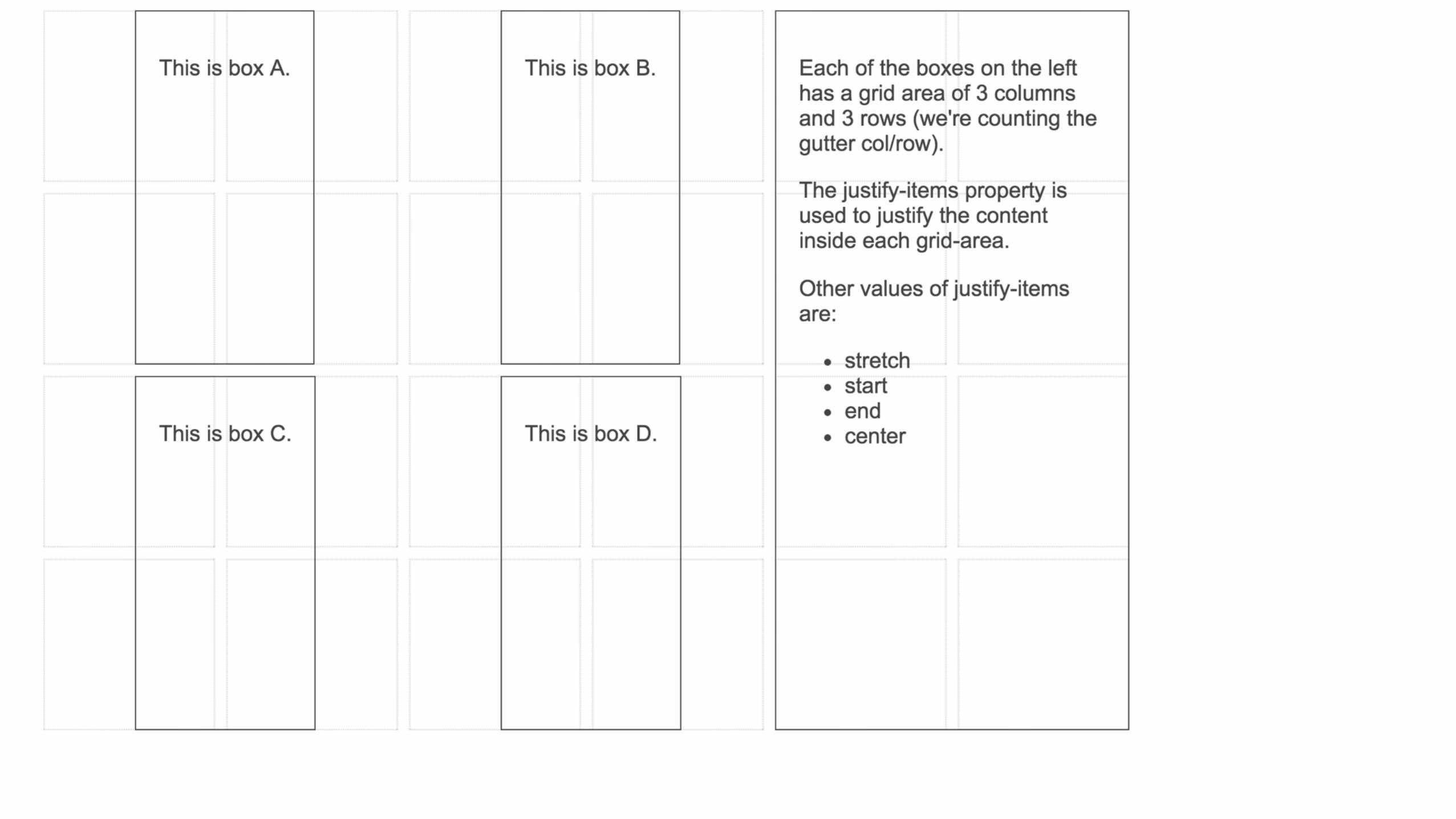
Creating a grid with the justify-items property set to centre.
All items will be centered horizontally inside their grid area.
.wrapper { display: grid; justify-items: center; grid-template-columns: repeat(5, 150px 10px) 150px; grid-template-rows: 150px 10px 150px 10px 150px 10px 150px; } .a { grid-column: 1 / 4; grid-row: 1 / 4; } .b { grid-column: 5 / 8; grid-row: 1 / 4; } .c { grid-column: 1 / 4; grid-row: 5 / 10; } .d { grid-column: 5 / 8; grid-row: 5 / 10; } .e { grid-column: 9 / 12; grid-row: 1 / 10; }

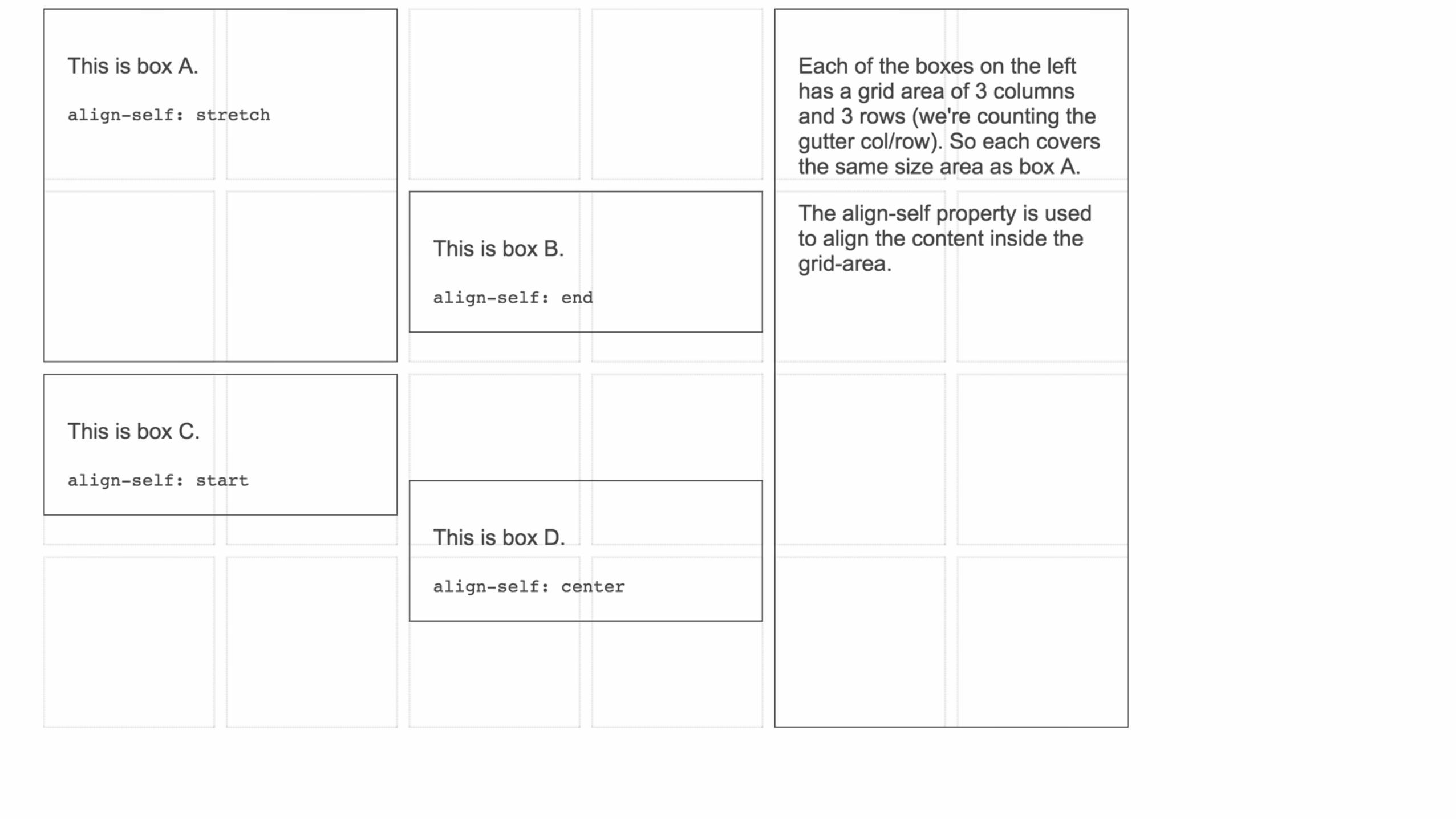
Grid Layout
As with flexbox we can use align-self and justify-self to target individual grid items.
.a { grid-column: 1 / 4; grid-row: 1 / 4; align-self: stretch; } .b { grid-column: 5 / 8; grid-row: 1 / 4; align-self: end; } .c { grid-column: 1 / 4; grid-row: 5 / 10; align-self: start; } .d { grid-column: 5 / 8; grid-row: 5 / 10; align-self: center; } .e { grid-column: 9 / 12; grid-row: 1 / 10; }

Responsive by default

Ethan Marcotte, Fluid Grids
“… every aspect of the grid—and the elements laid upon it—can be expressed as a proportion relative to its container.”

target ÷ context = result
h1 {
margin-left: 14.575%; /* 144px / 988px = 0.14575 */ width: 70.85%; /* 700px / 988px = 0.7085 */
}

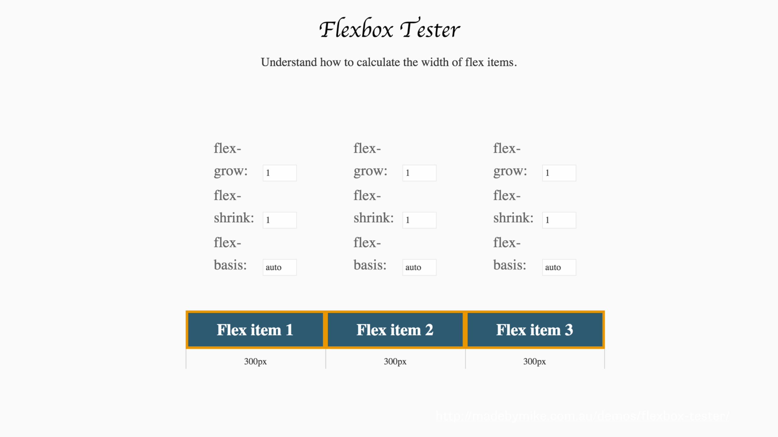
Flexbox
The most simple flexbox example demonstrates the inherent flexibility.
The items will be displayed as a row, with equal space between each item.
nav ul{ display: flex; justify-content: space-between; }
The flex property
• flex-grow - add space
• flex-shrink - remove space
• flex-basis - the initial size before any growing or shrinking
https://drafts.csswg.org/css-flexbox/#flex-components
Authors are encouraged to control flexibility using the flex shorthand rather than with its longhand properties directly, as the shorthand correctly resets any unspecified components to accommodate common uses.
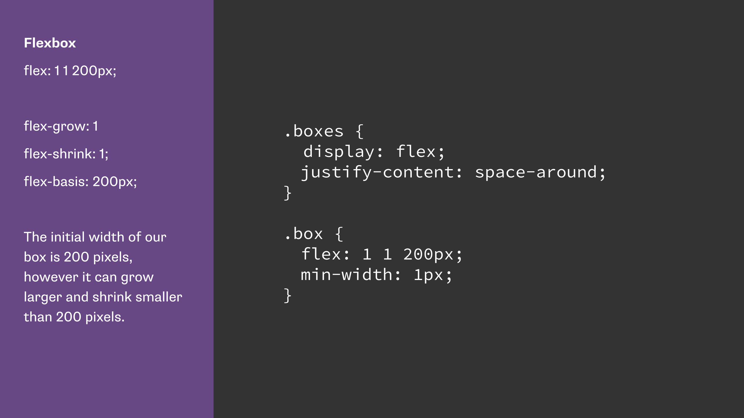
Flexbox
flex: 1 1 200px;
flex-grow: 1
flex-shrink: 1;
flex-basis: 200px;
The initial width of our box is 200 pixels, however it can grow larger and shrink smaller than 200 pixels.
.boxes { display: flex; justify-content: space-around; } .box { flex: 1 1 200px; min-width: 1px; }


Flexbox
flex: 1 1 200px;
flex-grow: 1
flex-shrink: 1;
flex-basis: 200px;
If we allow the flex items to wrap we can see how flex-basis works by dragging the window smaller.
.boxes { display: flex; flex-flow: row wrap; justify-content: space-around; } .box { flex: 1 1 200px; min-width: 1px; }

Flexbox
flex: 0 1 200px;
flex-grow: 0
flex-shrink: 1;
flex-basis: 200px;
The initial width of our box is 200 pixels, it can shrink smaller than 200 pixels but may not get larger.
.boxes { display: flex; justify-content: space-around; } .box { flex: 0 1 200px; min-width: 1px; }

Flexbox
flex: 1 1 200px;
flex-grow: 1;
flex-shrink: 1;
flex-basis: 200px;
.box3 has been set to
flex: 0 1 200px;
so cannot grow.
.boxes { display: flex; justify-content: space-around; } .box { flex: 1 1 200px; min-width: 1px; }
.box3 { flex: 0 1 200px; }


Flexbox
If we set box3 toflex-grow: 2
This box will be assigned twice of much of the available free space after we have reached the 200 pixel initial width.
.boxes { display: flex; justify-content: space-around; } .box { flex: 1 1 200px; min-width: 1px; }
.box3 { 2 1 200px; }
The CSS Grid Layout fr unit

Grid Layout
I am creating three grid column tracks, all 1fr in width.
This gives me three equally sized column tracks.
.wrapper { display: grid; grid-template-columns: 1fr 1fr 1fr; }

Grid Layout
If I create the first column as 600 pixels and then have two 1fr columns the 600 pixel track is removed from the available space and the remainder is distributed equally between the two columns.
.wrapper { display: grid; grid-template-columns: 600px 1fr 1fr; }

Grid Layout
With a 600 pixel column, a 1fr and a 3fr column. The 600 pixels is removed from the available space then the remaining space is divided by 4.
The 1fr column gets 25% and the 3fr column 75%.
.wrapper { display: grid; grid-template-columns: 600px 1fr 3fr; }
http://alistapart.com/article/holygrail
Three columns. One fixed-width sidebar for your navigation, another for, say, your Google Ads or your Flickr photos—and, as in a fancy truffle, a liquid center for the real substance.

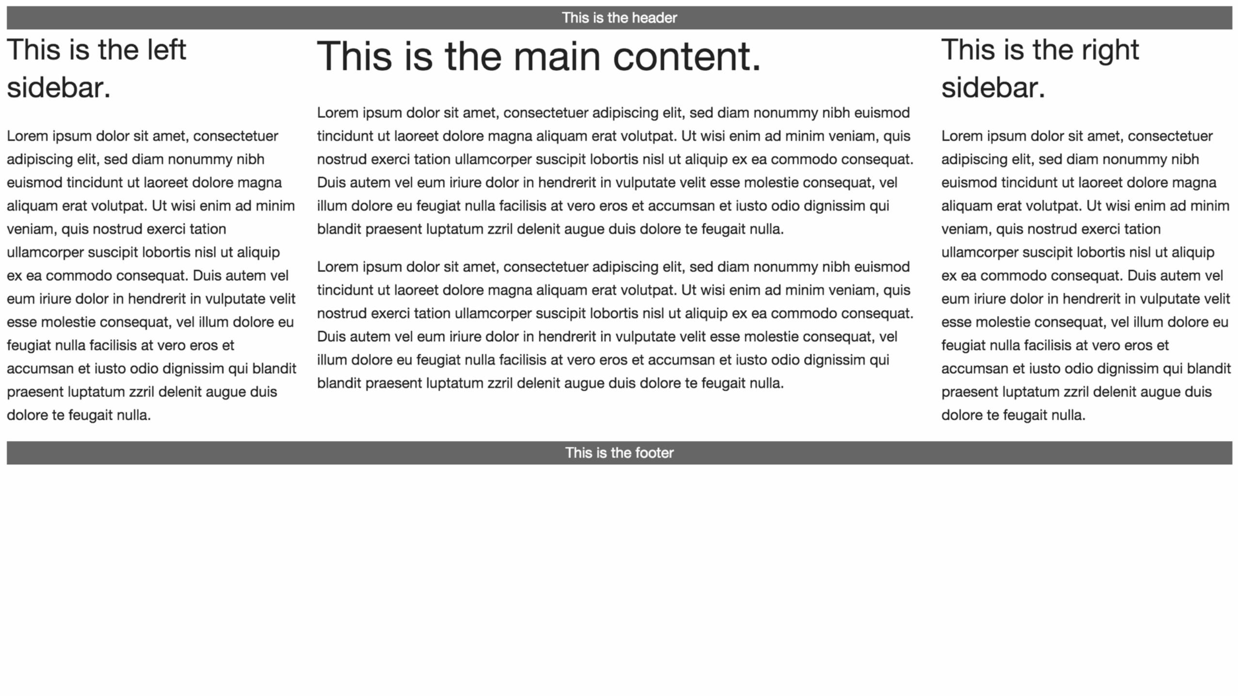
Grid Layout
CSS Grid “Holy Grail” using grid-template-areas.
//css .header { grid-area: header;} .footer { grid-area: footer;} .side1 { grid-area: nav;} .side2 { grid-area: ads;} .content { grid-area: content;}
.wrapper { display: grid; grid-template-columns: 300px 20px 1fr 20px 300px; grid-template-rows: auto; grid-template-areas: "header header header header header" "nav ...... content ...... ads" "footer footer footer footer footer" ; }
//html <div class="wrapper"> <header class="header">This is the header</header> <article class="content"></article> <div class="side1"></div> <div class="side2"></div> <footer class="footer"></div> </div>
CSS Anthology, 2004
Q. Is it a bad thing to use effects that don’t work in some browsers?
2004 Rachel
“Users [of IE] might see square corners instead of rounded ones […] but they’ll be able to use the site just as well as their Mozilla-wielding counterparts.”
It’s one thing to have no rounded corners. Quite another to have no
layout in an older browser.
We need to think about feature support differently in a world of
evergreen browsers.

Evergreen browsers mean we can enhance with newer techniques. Over time our users see the site
incrementally improve.
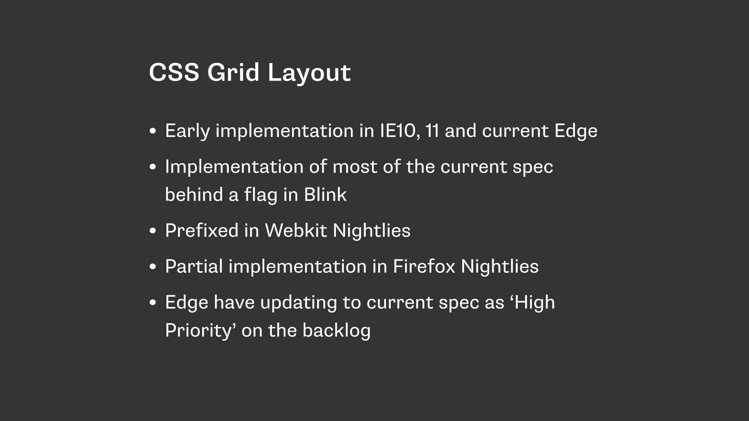
CSS Grid Layout
• Early implementation in IE10, 11 and current Edge
• Implementation of most of the current spec behind a flag in Blink
• Prefixed in Webkit Nightlies
• Partial implementation in Firefox Nightlies
• Edge have updating to current spec as ‘High Priority’ on the backlog

Start with small UI elements
• Your layout doesn’t have to be all flexbox or nothing.
• Build your layout using the methods that work for your audience profile.
• Finesse using more modern methods
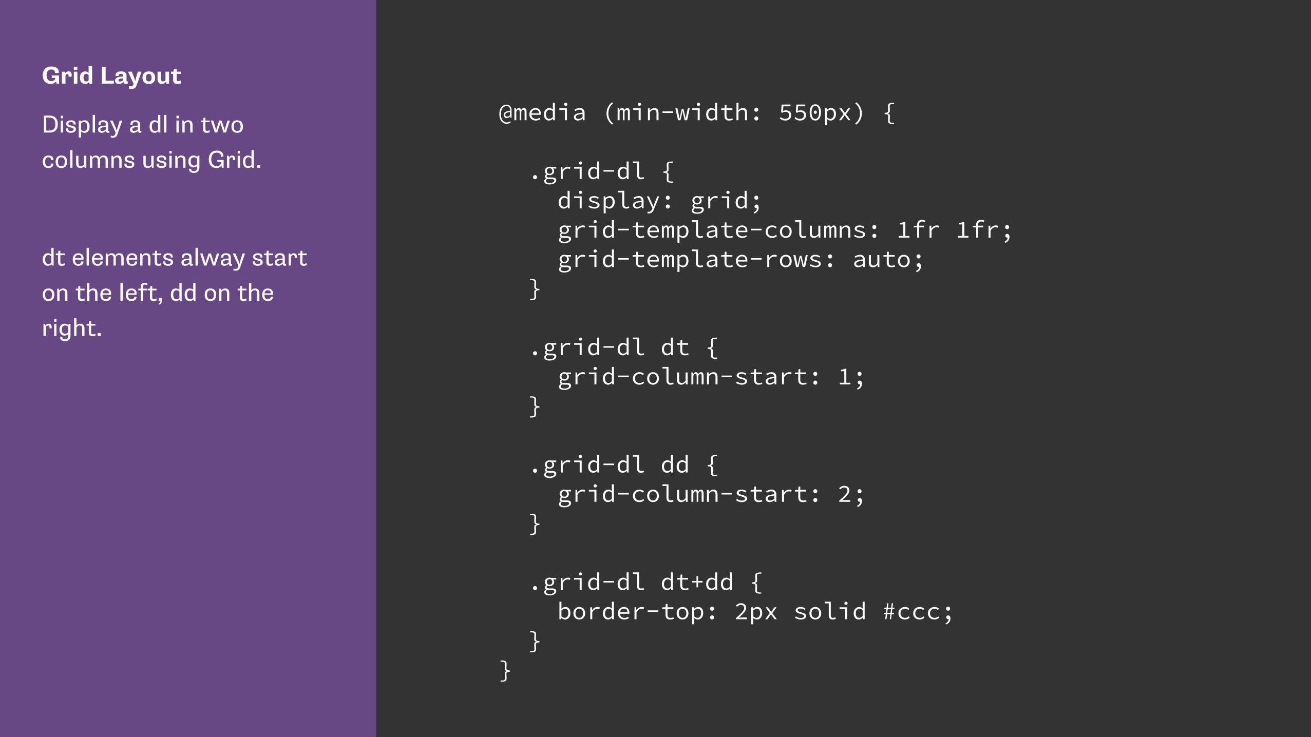
Grid Layout
Display a dl in two columns using Grid.
dt elements alway start on the left, dd on the right.
@media (min-width: 550px) {
.grid-dl { display: grid; grid-template-columns: 1fr 1fr; grid-template-rows: auto; }
.grid-dl dt { grid-column-start: 1; }
.grid-dl dd { grid-column-start: 2; }
.grid-dl dt+dd { border-top: 2px solid #ccc; } }
Flexbox in the real world
Zoe M. Gillenwater - Enhancing Responsiveness With Flexbox https://www.youtube.com/watch?v=_98SE8WUvLk
Check your stats before making assumptions about support.
Separate desktop and mobile statistics - your mobile users may
well have far more capability.
Use modern methods for prototyping and benefit from rapid
design in the browser.
Take an interest in early stage specifications in order to feed back
to the process. Have your say.

Thank youSlides & Resources: https://rachelandrew.co.uk/presentations/modern-css-layout
http://csslayout.news - sign up for my weekly CSS Layout email
—
@rachelandrew
—
https://rachelandrew.co.uk
https://grabaperch.com