Embed Size (px)
Citation preview

MOBILE SEO – HOW TO APPROACH YOUR MOBILE STRATEGY TO GET IT RIGHT
ADAM WHITTLES @AdamWhittles
SEO Account Director

@AdamWhittles@MaxusLondon

THE MOBILE LANDSCAPE

@AdamWhittles@MaxusLondon

@AdamWhittles@MaxusLondon
Mobile by Numbers
• Six in ten UK adults (62%) now use a smartphone
• One third of mobile users (33%) now say they buy things via their phone
• Roughly £1 in every £4 spent online in the UK, is through mobile
Source: Ofcom & eMarketer


@AdamWhittles@MaxusLondon
“36% of mobile web search results vary from desktop, with 23% showing pages from completely different sites”
Data provided by SearchMetrics from their 2014 US Google Ranking Factors Study

@AdamWhittles@MaxusLondon
Desktop results Mobile results
@AdamWhittles@MaxusLondon
GooglebotMobile
Crawling Errors
Changes in Mobile Rankings
201420132012
Mobile Results & Test Tool
PageSpeedInsights
Indexing Android
Apps Mobile Usability
2011 2015
Usability Warnings
Mobile Search
Queries Stats
Warnings for Flash
Sites
Faulty Redirects

@AdamWhittles@MaxusLondon

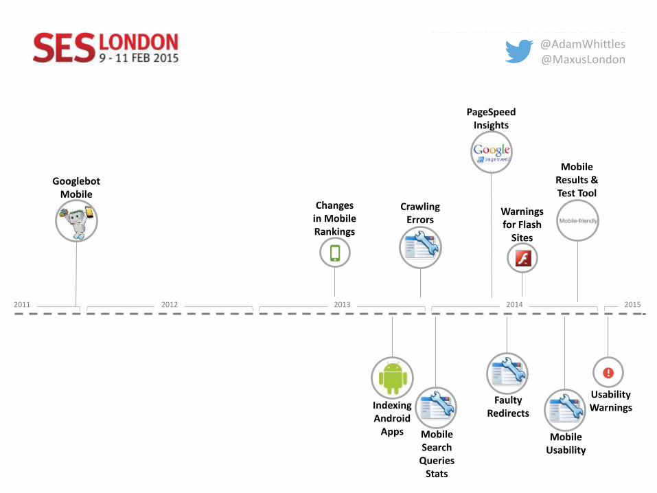
CHOOSING A MOBILE SETUP
@AdamWhittles@MaxusLondon
Responsive Separate URLs Dynamic Serving
• ALL devices• 1 URL• Same Content/HTML• Use CSS to render pages
• Separate Mobile & Desktop URLsexample.com/m/m.example.com
• Different HTML
• All devices • 1 URL• different HTML (and CSS)
depending on user agent (desktop or mobile device)
Pros
• 1 URL• Easier to maintain• Link Consolidation• No Redirects > Reduce Loading
Time• Recommended By Google (saves
resources, pages crawled once)
• Better Mobile Experience• Faster• Dedicated Mobile Content• Easier Implementation
• 1 URL• Link Consolidation• Capacity for different mobile
content
Cons
• Slower• All content is downloaded
whether it is used or not. This canbe problematic for image intensive websites
• Same Mobile/Desktop Content
• Link Equity Dilution• Higher Cost to maintain• Crawled Multiple Times with
different user agents
• Slower • Higher Cost to maintain• Old Redirect Lists• Complex technical
implementation• Crawled Multiple Times
SEO
• Check Google Webmaster Tools Crawl Errors for Redirect & 404 Errors
• Check Page Load Time for Mobile and Desktop
• Allow Search Engines to crawl all assets (CSS, Images, JS)
• Redirect Mobile Users and Bots to the mobile site
• Test Desktop Site for Redirects & 404 Errors
• Add Rel=Alternate to desktop and rel=Canonical to mobile site
• XML Mobile Sitemaps
• Use user-agent vary header to help search bots to find your mobile content
• Test for Vary: User-Agent HTTP Header
Source: John Shehata, Executive Director of Search at ABC News

@AdamWhittles@MaxusLondon
Just because Google strongly recommends using responsive
design doesn’t mean you should automatically choose responsive
design for your site

@AdamWhittles@MaxusLondon
When responsive design isn’t suitable: Disney.co.uk

@AdamWhittles@MaxusLondon
Questions to consider when deciding which mobile setup to use
1. How much budget do you have?2. How much engineering/technical resource do you have available?3. Do users interact differently between your mobile and desktop sites?4. Do you need a fast website based on your target audience search
behaviour?5. Is your content designed for sharing?6. Do you use a CDN to speed up content delivery?7. Does your content rely heavily on images or picture galleries?

AUDITING YOUR SITE

@AdamWhittles@MaxusLondon
https://www.google.com/webmasters/tools/mobile-friendly/
@AdamWhittles@MaxusLondon

@AdamWhittles@MaxusLondon

@AdamWhittles@MaxusLondon
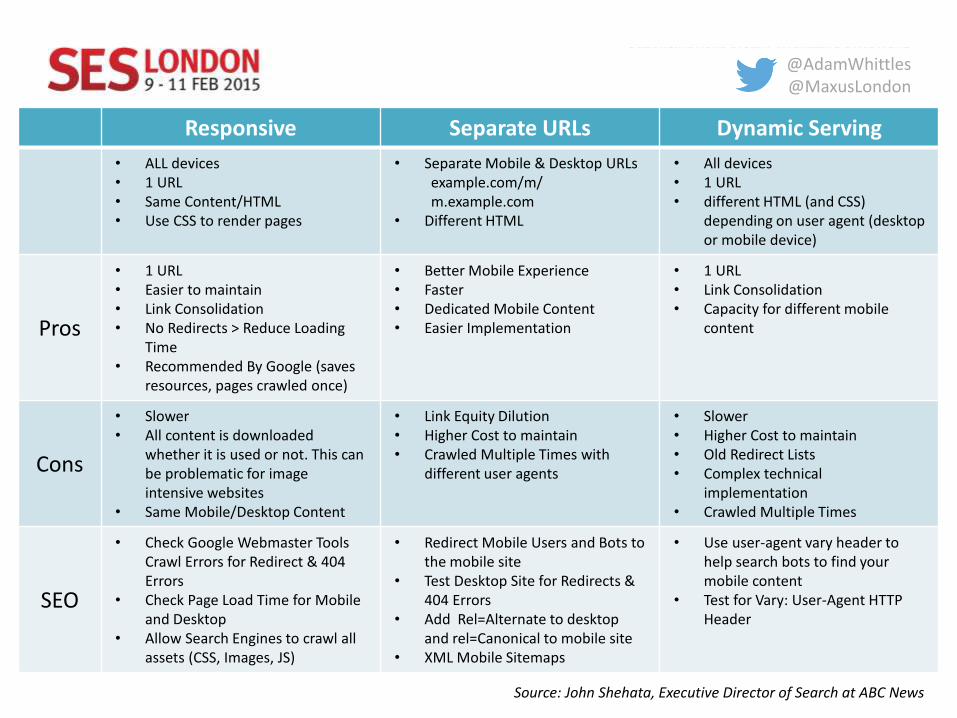
Crawl your site using GoogleBot’s mobile User Agent

@AdamWhittles@MaxusLondon
If you need more computing power, consider using a cloud-based crawler such as DeepCrawl

@AdamWhittles@MaxusLondon
Or, you could setup Screaming Frog to run on the cloud:http://www.filiwiese.com/running-screaming-frog-on-google-cloud/

@AdamWhittles@MaxusLondon
If you have a dynamic mobile configuration, check the Vary HTTP header using a free, bulk HTTP Status Checker such as http://urlitor.com (technology built by Maxus’ Kostas Voudouris)

@AdamWhittles@MaxusLondon
If you are using separate URLs for your desktop and mobile sites, make sure you have the correct rel=“alternate” annotation on the desktop site. This will ensure that the mobile version of the site appears in mobile search
Non-mobile friendly URL in mobile search. Desktop homepage is missing the rel=“alternate” tag

@AdamWhittles@MaxusLondon
According to research from BrightEdge:
Argos is not the only misconfigured mobile site. According to BrightEdge, 72% of sites with separate mobile URLs are misconfigured, with a missing rel=“alternate” tag being the most common error
Source: BrightEdge

@AdamWhittles@MaxusLondon
Future of mobile?
Source: Neilsen

@AdamWhittles@MaxusLondon
Further reading:
• http://www.bruceclay.com/blog/mobile-design-cheat-sheet/• http://searchengineland.com/mobile-site-configuration-the-varies-
header-for-enterprise-seo-163004• https://www.distilled.net/training/mobile-seo-guide/• http://moz.com/blog/so-you-have-a-mobile-friendly-website-what-now• https://developers.google.com/webmasters/mobile-sites/mobile-seo/• http://www.slideshare.net/johnshehata/advanced-mobile-seo-john-
shehata-c3-2014• http://searchengineland.com/understanding-cross-device-attribution-
210114• http://www.nytimes.com/2013/04/04/technology/as-web-search-goes-
mobile-apps-chip-at-googles-lead.html

Thank You!
@AdamWhittles
linkedin.com/in/adamwhittles