Embed Size (px)
Citation preview
Must know Colour Variations for Web Designers
Attracting a heavy traffic toward your website is not an easy task, especially if you are beginner.
A good website involves numerous aspects and from many of these one is colour combination.
Colour is one of the auspicious element that play a vital role in designing a website and make it more alluring. However, today’s market is full of numerous designing
trends and creating an interesting and eye-catching colour palettes has become very imperative in producing
successful design.
From the past many years, web-designers were obligated to work into one of two categories for developing any
website: white background or coloured background. But now, our digital market has spread very widely, so that their taste buds and we have grown to love the decisive
and calculated use of colour which can be commonly seen in print design. This means a web designer must
have a precise look to create these impeccable palettes.
Before you start your website, it is critical to understand which colour is applying in your design. Colour theory is a complex
subject and one must analyse its different shades interact with one another. There is always a one particular step you would like your website visitors to take. You are always considering that step on
most. It could be your subscribe button, follow button or buy button.
Although, call-to-action signifies that whether people will click on it or not, this depends on how you make them feel while they are on
your website. It is better to find out that specific colours which attract visitors to your website and deeply engaged them.
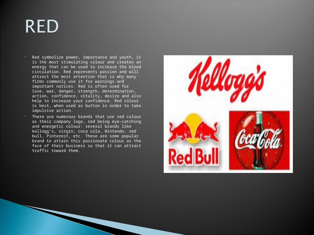
Red symbolize power, importance and youth, it is the most stimulating colour and creates an energy that can be used to increase the blood circulation. Red represents passion and will attract the most attention that is why many firms commonly use it for warnings and important notices. Red is often used for love, war, danger, strength, determination, action, confidence, vitality, desire and also help to increase your confidence. Red colour is best, when used as button in order to take impulsive action.
There are numerous brands that use red colour as their company logo, red being eye-catching and energetic colour: several brands like kellogg’s, virgin, coca cola, Nintendo, red bull, Pinterest, etc. These are some popular brand to attain this passionate colour as the face of their business so that it can attract traffic toward them.
The colour represents compassion, development and love. It relates to the unconditional love and understanding, and the giving and receiving of nurturing. It is the combination of red and white, it is the passion and power of red softened with the purity, openness and completeness of white. The deeper the pink the more energy it exhibits.
Pink also determine the feminine, romantic, affectionate, intimate, thoughtful and caring. It tones down the physical passion of red replacing it with a gentle loving energy. This is a sign of hope, its positivity inspires and provide a comfort feeling, a sense that will say everything will be okay.
Brands using pink colour for their website’s promotion is Three, Barbie, COSMOPOLITAN, VICTORIA’S SECRET. As Pink is a non-threatening color seeking appreciation, respect and admiration. It doesn’t like to be taken for granted and just loves to hear the words ‘thank you.
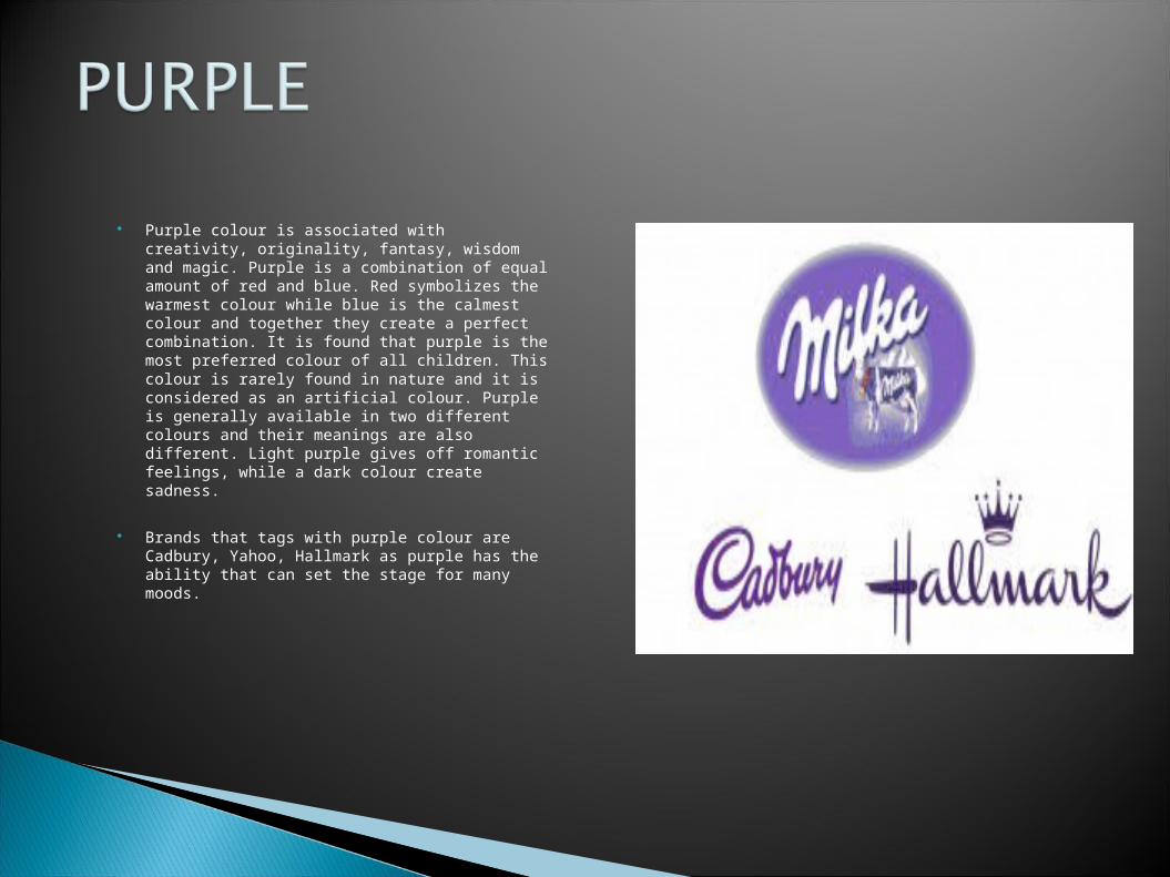
Purple colour is associated with creativity, originality, fantasy, wisdom and magic. Purple is a combination of equal amount of red and blue. Red symbolizes the warmest colour while blue is the calmest colour and together they create a perfect combination. It is found that purple is the most preferred colour of all children. This colour is rarely found in nature and it is considered as an artificial colour. Purple is generally available in two different colours and their meanings are also different. Light purple gives off romantic feelings, while a dark colour create sadness.
Brands that tags with purple colour are Cadbury, Yahoo, Hallmark as purple has the ability that can set the stage for many moods.
Green is the colour of nature and promotes growth, stability, prosperity and safety. In countries that are using their currency as in green colour, evokes thoughts and feelings of financial wealth. Green is also associated with healing, endurance, harmony, life and well being. This colour generates a very balanced and stable atmosphere.
Brands associated with Green as their website’s logo LACOSTE, Holiday Inn, Tic Tac as this is the colour which symbolize harmony and prosperity. That is why these companies promote their product with an eco-friendly colour.
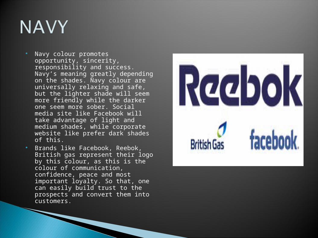
Navy colour promotes opportunity, sincerity, responsibility and success. Navy’s meaning greatly depending on the shades. Navy colour are universally relaxing and safe, but the lighter shade will seem more friendly while the darker one seem more sober. Social media site like Facebook will take advantage of light and medium shades, while corporate website like prefer dark shades of this.
Brands like Facebook, Reebok, British gas represent their logo by this colour, as this is the colour of communication, confidence, peace and most important loyalty. So that, one can easily build trust to the prospects and convert them into customers.
Orange colour promotes warmth, optimistic, extrovert and motivation. Orange is uniquely versatile, consider this as in two parts primary orange or secondary orange. As a primary colour, it can be more engaging and energizing and as a secondary colour it creates a sense of movement and energy.
Aside from it being a part of brand style, orange works well with Fanta, bitly and master card. This colour show creativity while retaining familiarity.
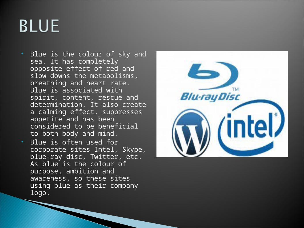
Blue is the colour of sky and sea. It has completely opposite effect of red and slow downs the metabolisms, breathing and heart rate. Blue is associated with spirit, content, rescue and determination. It also create a calming effect, suppresses appetite and has been considered to be beneficial to both body and mind.
Blue is often used for corporate sites Intel, Skype, blue-ray disc, Twitter, etc. As blue is the colour of purpose, ambition and awareness, so these sites using blue as their company logo.
Picking a colour for your website is more important then picking your favourite colour and turning it into layout. It
means picking the right colour and get the desired response from your audience. It is better to know your
potential audience first and then figure out which colour works best for them. Therefore, using the right colour for
your website is crucial for you. If you understand how colour psychology works and which colour fits for your
audience, you are a step closure to launching a successful website.

Read More at www.bestwebexperts.com