Embed Size (px)
Citation preview

D3.js 讓你的資料活起來

WTF….

OXXO 張宗彥 ( 張小彥 )
oxxostudio.twWebduino = Web x Arduino視覺設計師 + 前端工程師 + 市場行銷 + 課程規劃
中研院、遠綠資訊、鴻海精密、中冠資訊
UI、UX、F2E、CSS ( LESS )、Growth Hack

今天要講的 D3 不是 D3
今天要講的 D3 是 D3


開始之前,要先來聊一下
資料視覺化
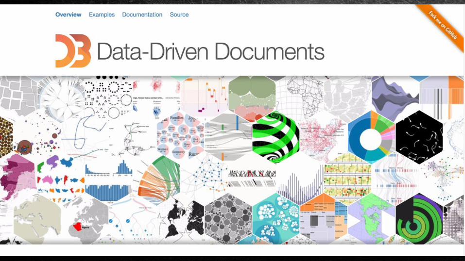
「工程師」的資料視覺化
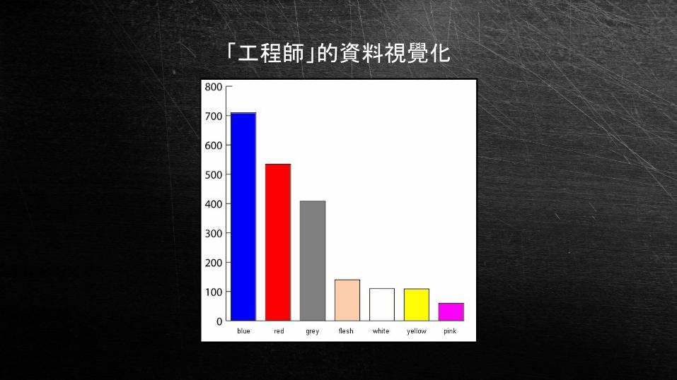
「設計師」的資料視覺化

能不能合而為一呢?

可以的!

所以 工程師去學切圖
所以 設計師去學 HTML 和 CSS


因此,在正式開始之前
先稍微要有一些資料視覺化的認知

視覺化 = 講故事
沒有故事的視覺化 = 沒有視覺化

如同一部沒有劇情的電影是不可能拿奧斯卡獎的

但是,不一定「視覺化」就好

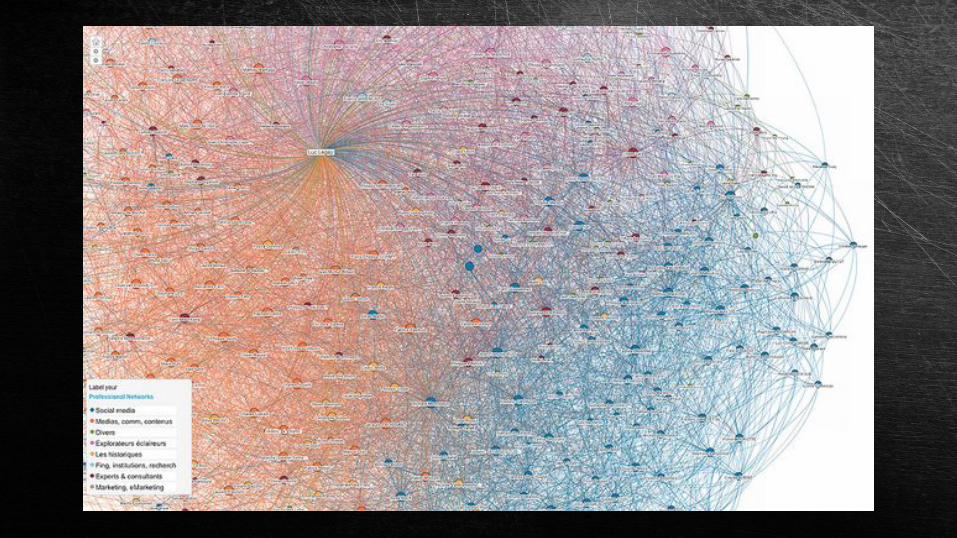
不好的資料視覺化
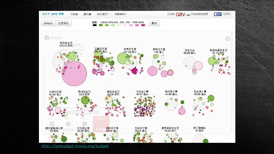
http://tpebudget.tonyq.org/budget

好的資料視覺化
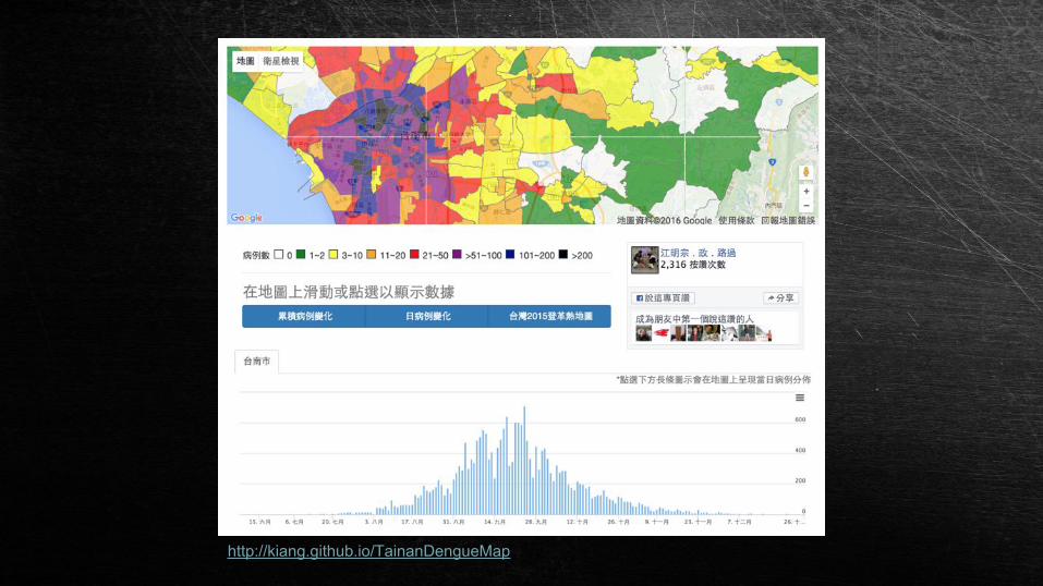
http://kiang.github.io/TainanDengueMap
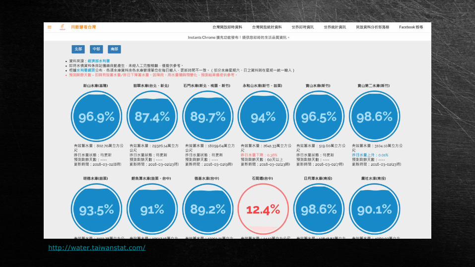
http://water.taiwanstat.com/

不正確的資料視覺化
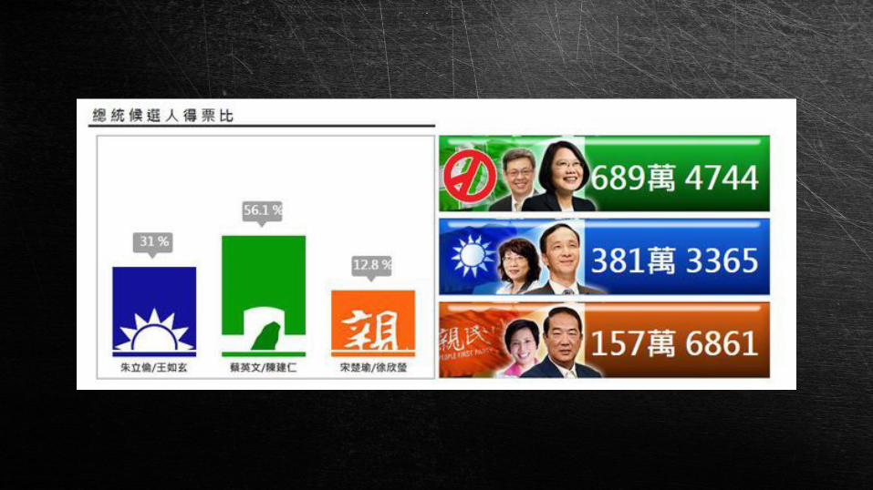
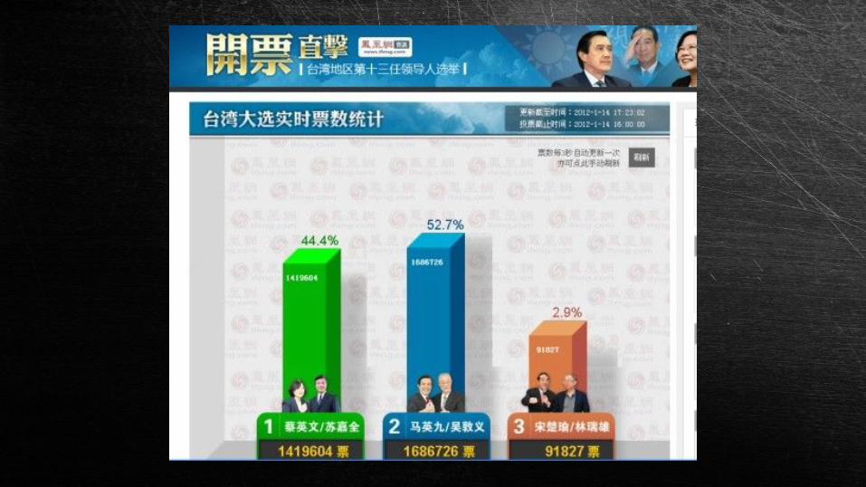

資料視覺化
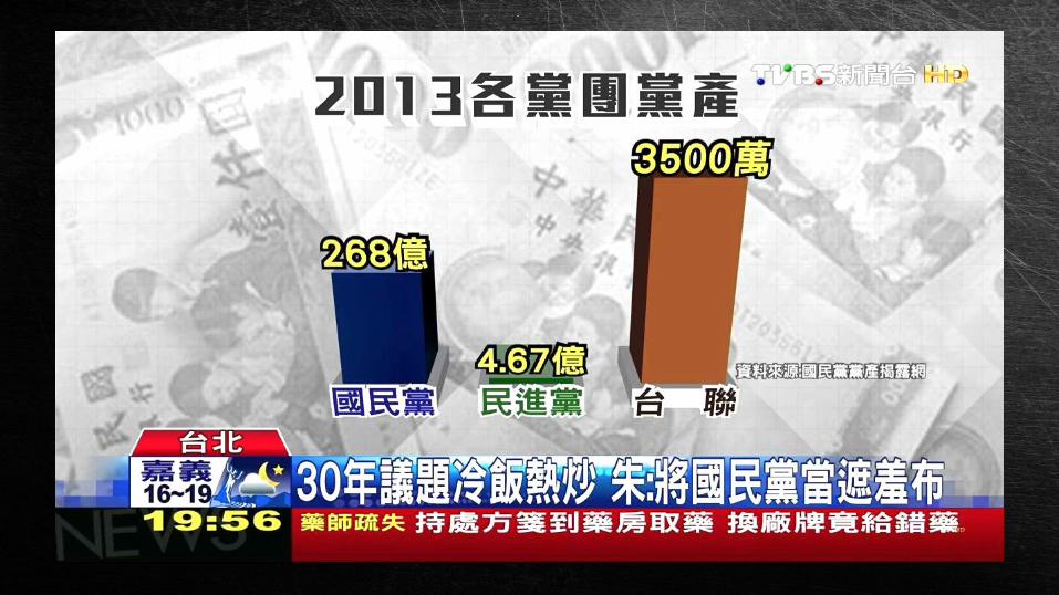
不能一目了然的資料
一目了然的資料

資料視覺化
一定要用到 D3.js 嗎?
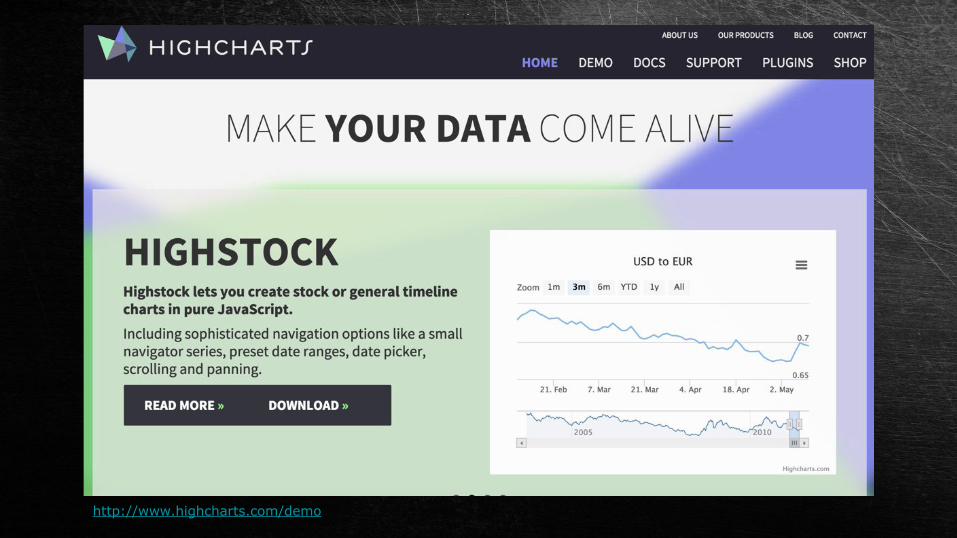
http://www.highcharts.com/demo
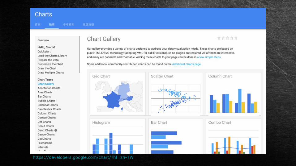
https://developers.google.com/chart/?hl=zh-TW

為什麼要用 D3.js ?

D3 = Data-Driven Documents( 資料 - 驅動的 - 文件 )

Mike Bostockhttps://bost.ocks.org/mike/

優點:
- 可以直接操作 DOM,方便操控視覺效果
- 優越的資料處理能力
- 資料視覺化的 jQuery- 社群、討論支援度高
缺點:
- 較為繁瑣
- 需要有 SVG 的基礎

但... 需要「略懂」SVG...
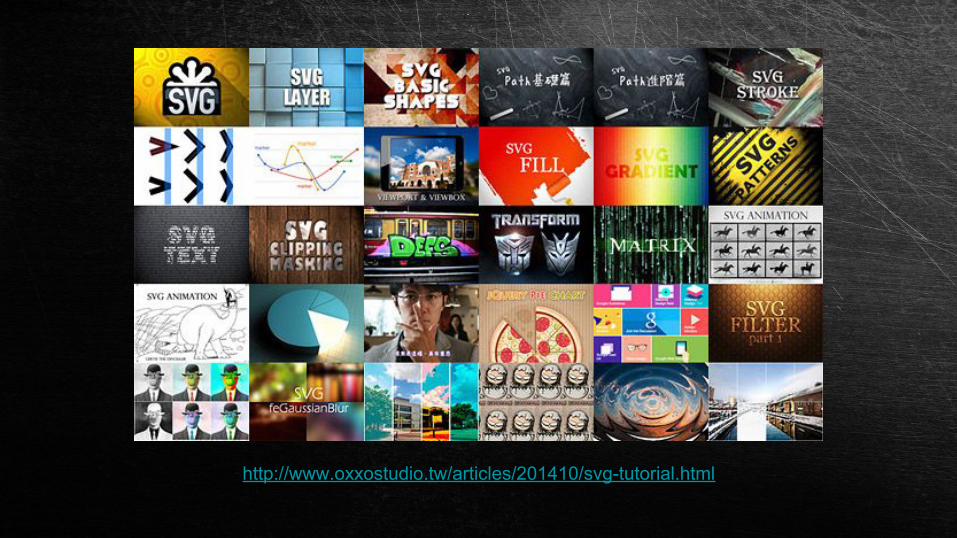
http://www.oxxostudio.tw/articles/201410/svg-tutorial.html

我的 Blog 也有不少 D3.js 的文章 ( 搜尋 d3 )http://www.oxxostudio.tw/list.html

開始使用 D3.js<script src="//d3js.org/d3.v3.min.js"></script>
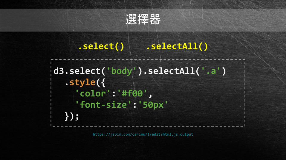
選擇器
d3.select('body').selectAll('.a') .style({ 'color':'#f00', 'font-size':'50px' });
.select() .selectAll()
https://jsbin.com/carinu/1/edit?html,js,output
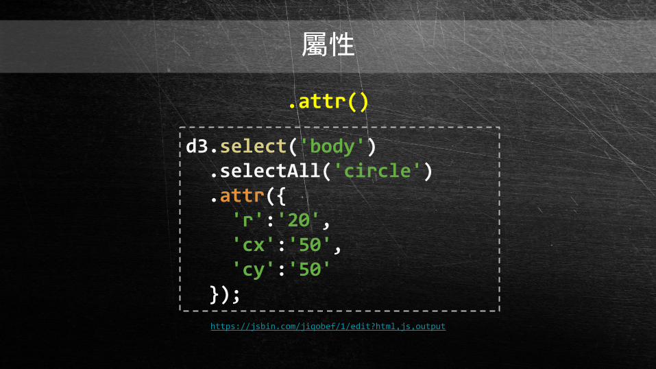
屬性
d3.select('body') .selectAll('circle') .attr({ 'r':'20', 'cx':'50', 'cy':'50' });
.attr()
https://jsbin.com/jiqobef/1/edit?html,js,output
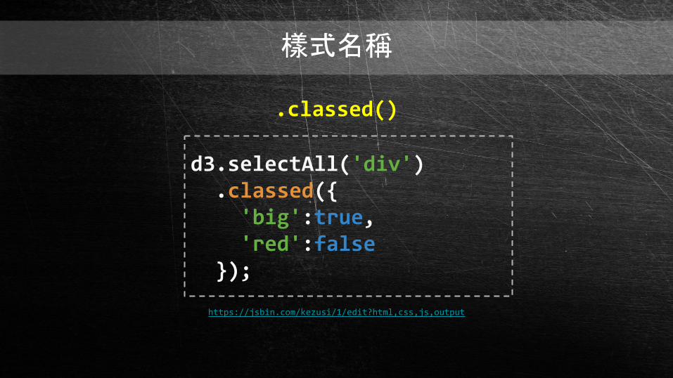
樣式名稱
d3.selectAll('div') .classed({ 'big':true, 'red':false });
.classed()
https://jsbin.com/kezusi/1/edit?html,css,js,output
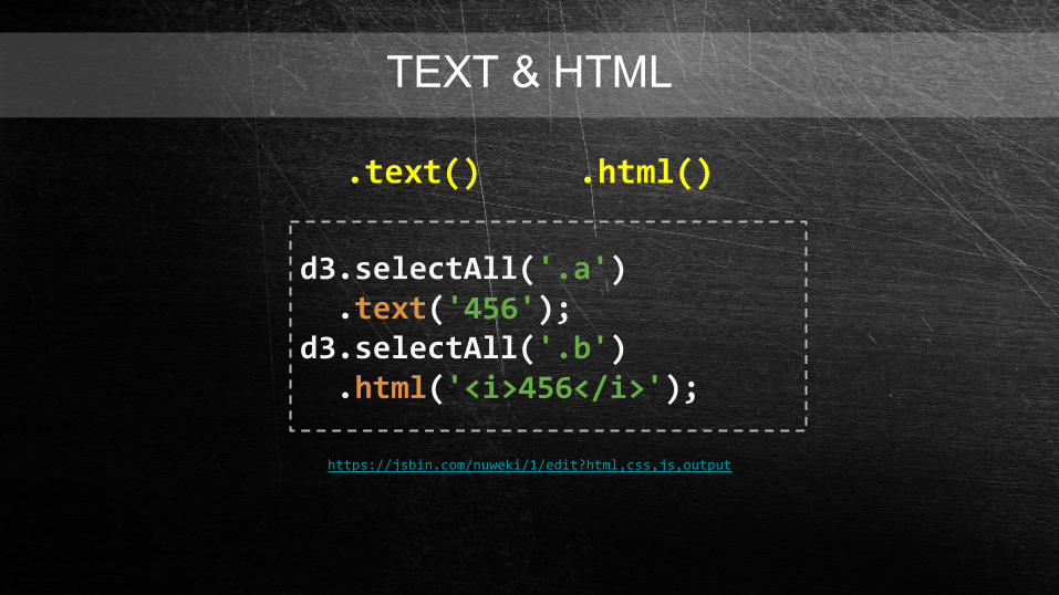
TEXT & HTML
d3.selectAll('.a') .text('456');d3.selectAll('.b') .html('<i>456</i>');
.text() .html()
https://jsbin.com/nuweki/1/edit?html,css,js,output

DATA
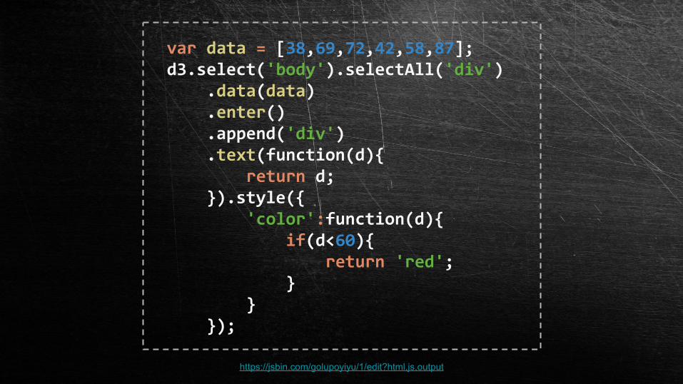
var data = [38,69,72,42,58,87];d3.select('body').selectAll('div') .data(data) .enter() .append('div') .text(function(d){ return d; }).style({ 'color':function(d){ if(d<60){ return 'red'; } } });
https://jsbin.com/golupoyiyu/1/edit?html,js,output

enter update exit
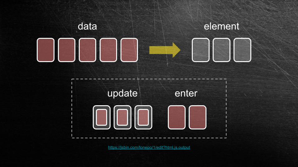
update enter
https://jsbin.com/tonepo/1/edit?html,js,output
data element
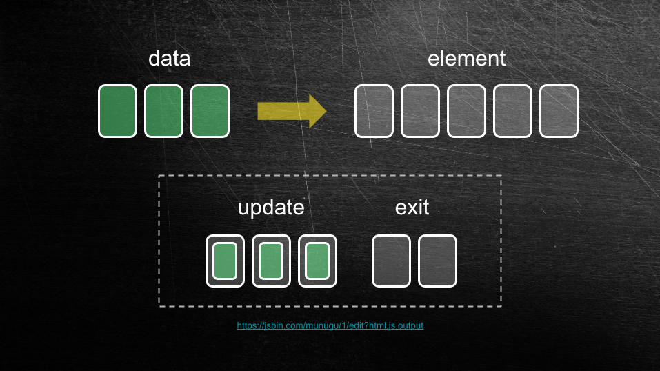
https://jsbin.com/munugu/1/edit?html,js,output
data element
update exit

DATA.nest()
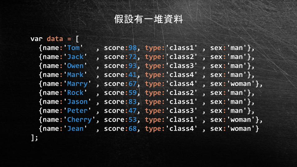
var data = [ {name:'Tom' , score:98, type:'class1' , sex:'man'}, {name:'Jack' , score:72, type:'class2' , sex:'man'}, {name:'Owen' , score:93, type:'class3' , sex:'man'}, {name:'Mark' , score:41, type:'class4' , sex:'man'}, {name:'Marry' , score:67, type:'class4' , sex:'woman'}, {name:'Rock' , score:59, type:'class2' , sex:'man'}, {name:'Jason' , score:83, type:'class1' , sex:'man'}, {name:'Peter' , score:47, type:'class3' , sex:'man'}, {name:'Cherry', score:53, type:'class1' , sex:'woman'}, {name:'Jean' , score:68, type:'class4' , sex:'woman'}];
假設有一堆資料
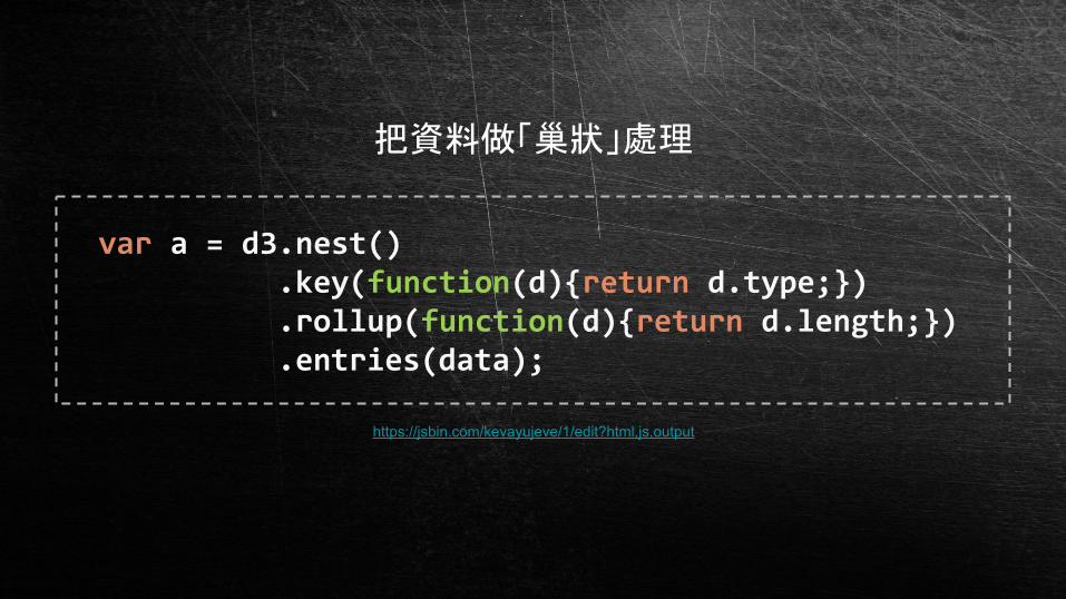
var a = d3.nest() .key(function(d){return d.type;}) .rollup(function(d){return d.length;}) .entries(data);
https://jsbin.com/kevayujeve/1/edit?html,js,output
把資料做「巢狀」處理

DATA.map()
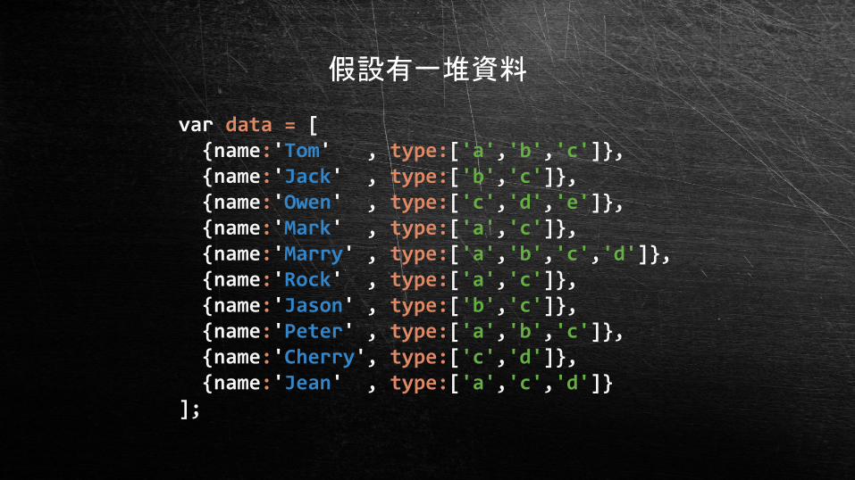
var data = [ {name:'Tom' , type:['a','b','c']}, {name:'Jack' , type:['b','c']}, {name:'Owen' , type:['c','d','e']}, {name:'Mark' , type:['a','c']}, {name:'Marry' , type:['a','b','c','d']}, {name:'Rock' , type:['a','c']}, {name:'Jason' , type:['b','c']}, {name:'Peter' , type:['a','b','c']}, {name:'Cherry', type:['c','d']}, {name:'Jean' , type:['a','c','d']}];
假設有一堆資料
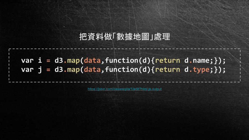
var i = d3.map(data,function(d){return d.name;});var j = d3.map(data,function(d){return d.type;});
https://jsbin.com/cesareqita/1/edit?html,js,output
把資料做「數據地圖」處理

SCALE
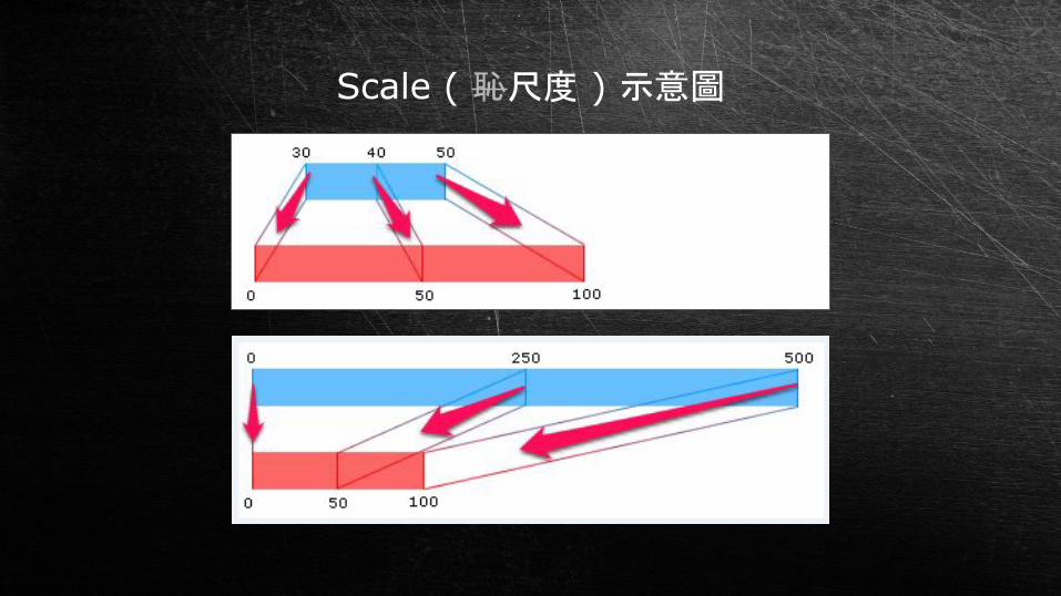
Scale ( 恥尺度 ) 示意圖

白話一點來說
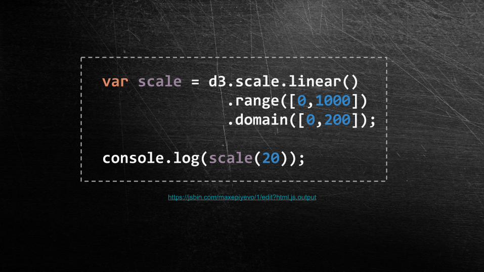
var scale = d3.scale.linear() .range([0,1000]) .domain([0,200]);
console.log(scale(20));
https://jsbin.com/maxepiyevo/1/edit?html,js,output

TRANSITION
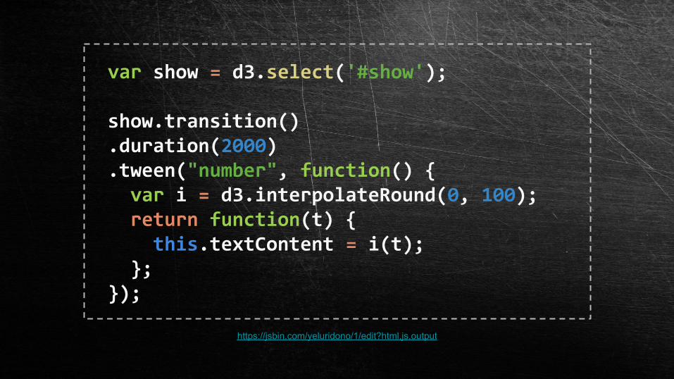
var show = d3.select('#show');
show.transition().duration(2000).tween("number", function() { var i = d3.interpolateRound(0, 100); return function(t) { this.textContent = i(t); };});
https://jsbin.com/yeluridono/1/edit?html,js,output
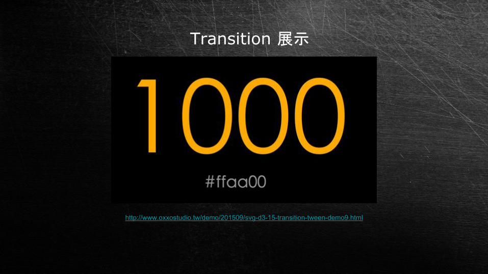
http://www.oxxostudio.tw/demo/201509/svg-d3-15-transition-tween-demo9.html
Transition 展示

其實還有很多兩個小時講不完 ><
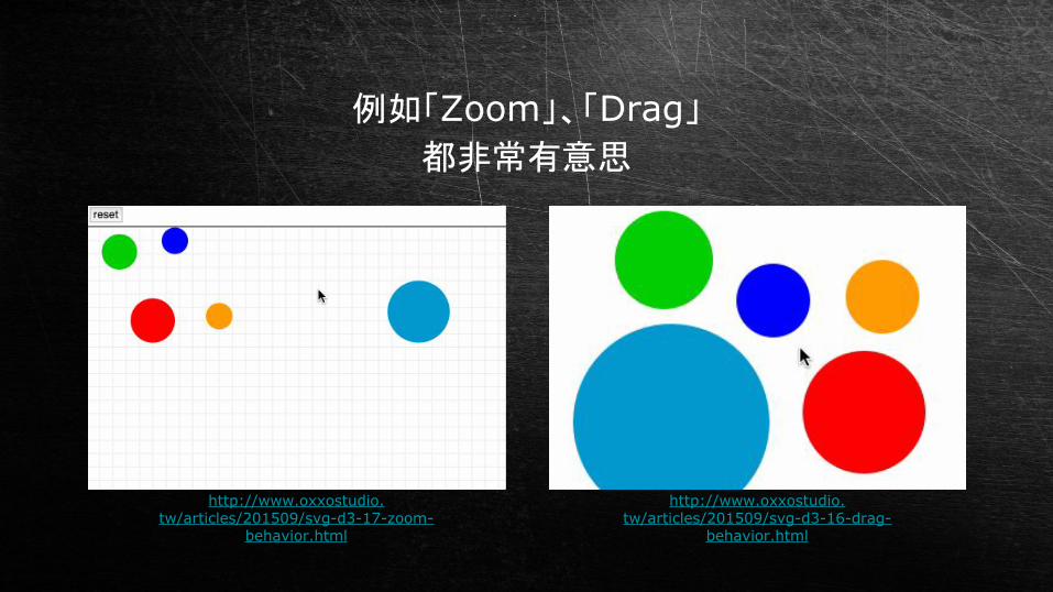
例如「Zoom」、「Drag」都非常有意思
http://www.oxxostudio.tw/articles/201509/svg-d3-17-zoom-
behavior.html
http://www.oxxostudio.tw/articles/201509/svg-d3-16-drag-
behavior.html

不管了,直接看範例 XD

範例 12016 台北市政府預算
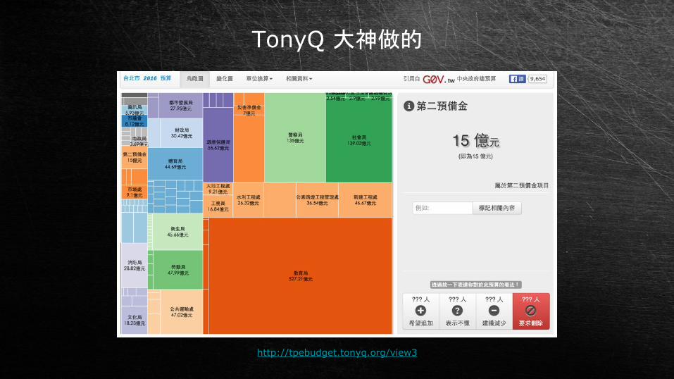
TonyQ 大神做的
http://tpebudget.tonyq.org/view3
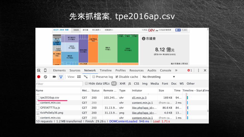
先來抓檔案,tpe2016ap.csv
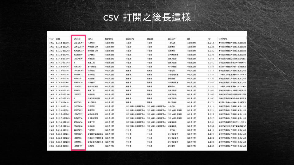
csv 打開之後長這樣
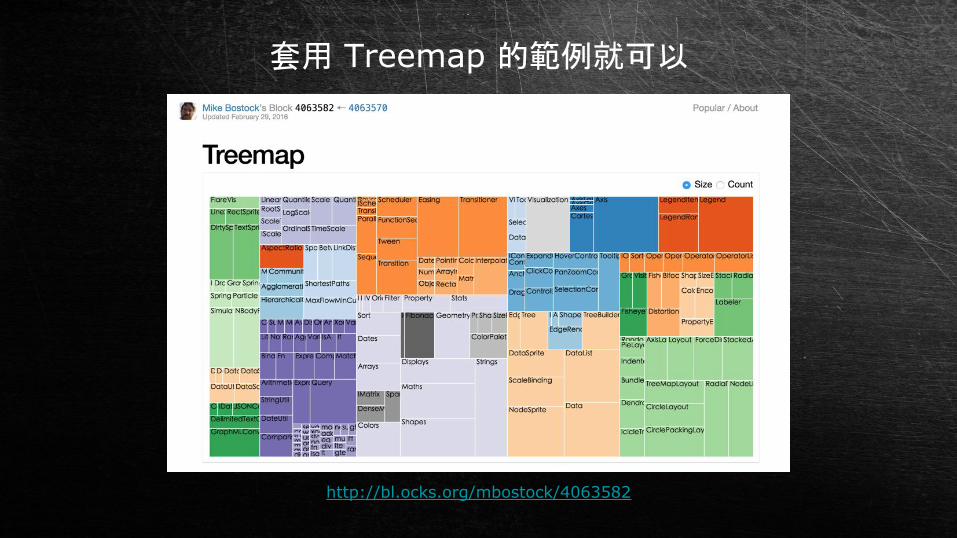
套用 Treemap 的範例就可以
http://bl.ocks.org/mbostock/4063582

真的這麼簡單?
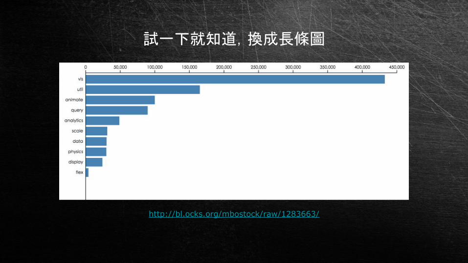
試一下就知道,換成長條圖
http://bl.ocks.org/mbostock/raw/1283663/
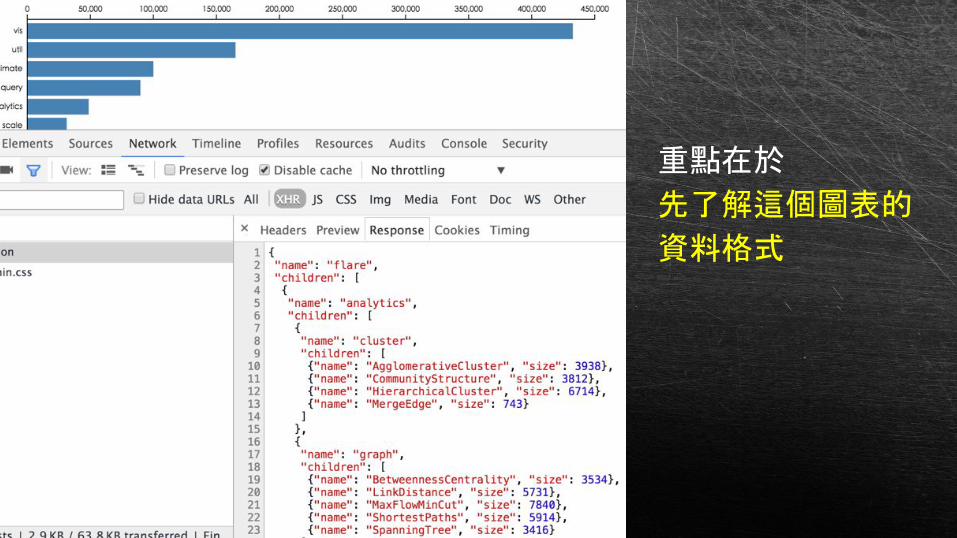
重點在於
先了解這個圖表的
資料格式

然後把 csv 轉成這個格式
( ajax 的用法 )

套用圖表程式
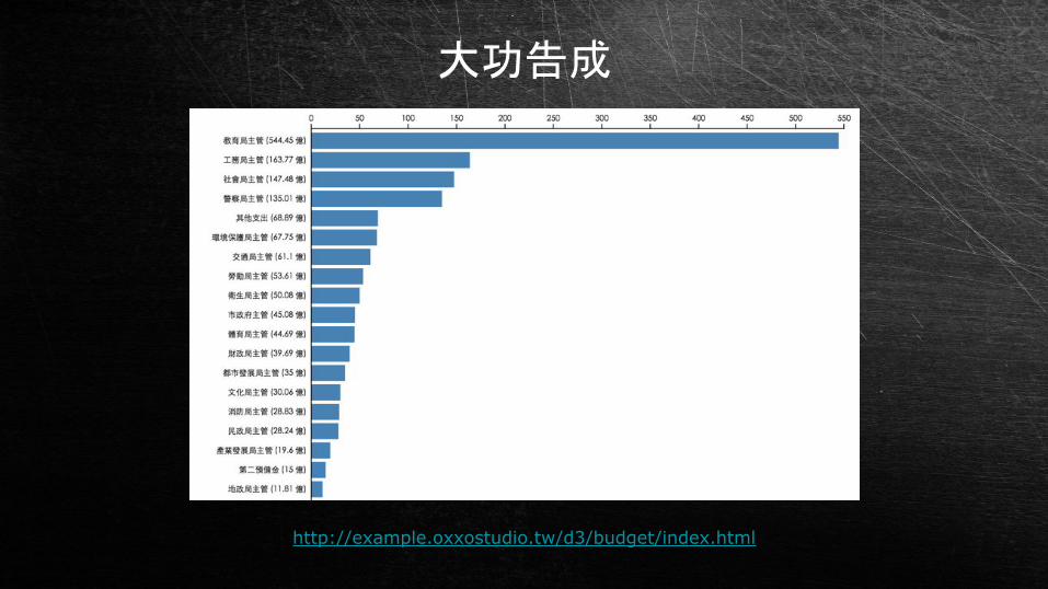
大功告成
http://example.oxxostudio.tw/d3/budget/index.html

同樣的方式也可以套別種圖表
http://example.oxxostudio.tw/d3/budget/circle.html
http://bl.ocks.org/mbostock/7607535

範例 22016 總統大選政黨票分佈

畫地圖
使用 TopoJSON
topojson 是一個改善 geojson 要去存取過多的重複資
料所做的新的一種資料格式。
這種資料格式比 geojson 可以節省許多的檔案空間 ( 省 80% ),有利讀取的速度。
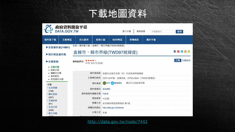
下載地圖資料
http://data.gov.tw/node/7442
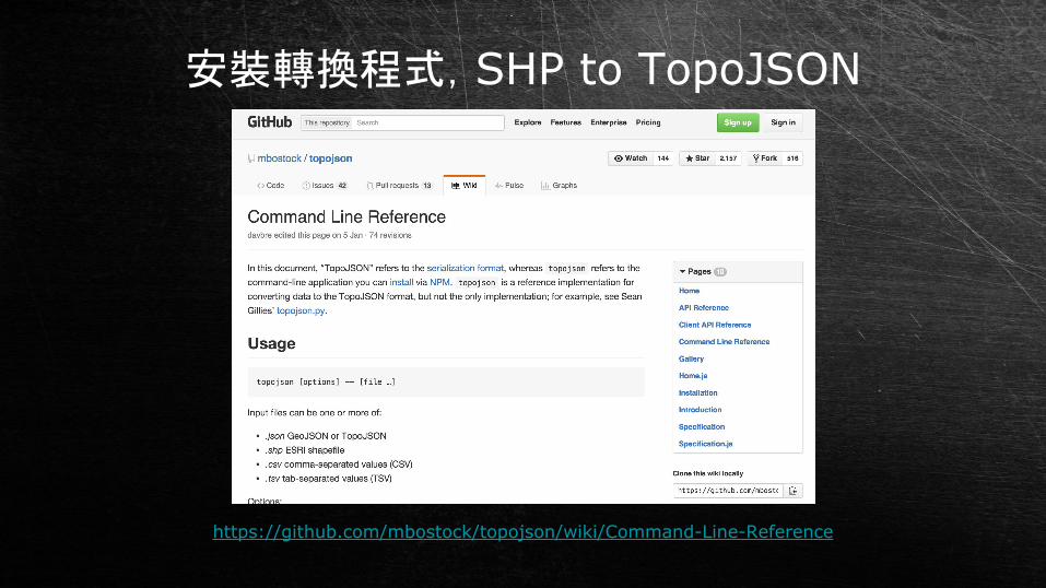
安裝轉換程式,SHP to TopoJSON
https://github.com/mbostock/topojson/wiki/Command-Line-Reference

npm install topojson -gtopojson -o map.json -p --shapefile-encoding big5 County_MOI_1041215.shp
轉換成 TopoJSON
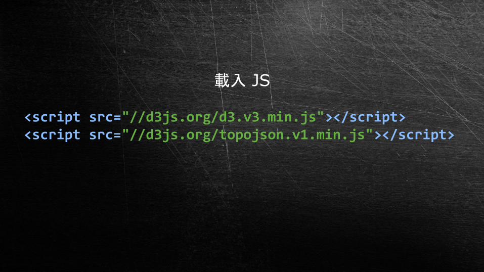
<script src="//d3js.org/d3.v3.min.js"></script><script src="//d3js.org/topojson.v1.min.js"></script>
載入 JS
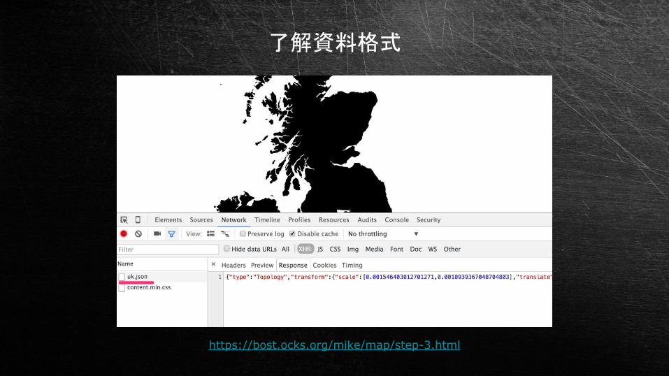
了解資料格式
https://bost.ocks.org/mike/map/step-3.html
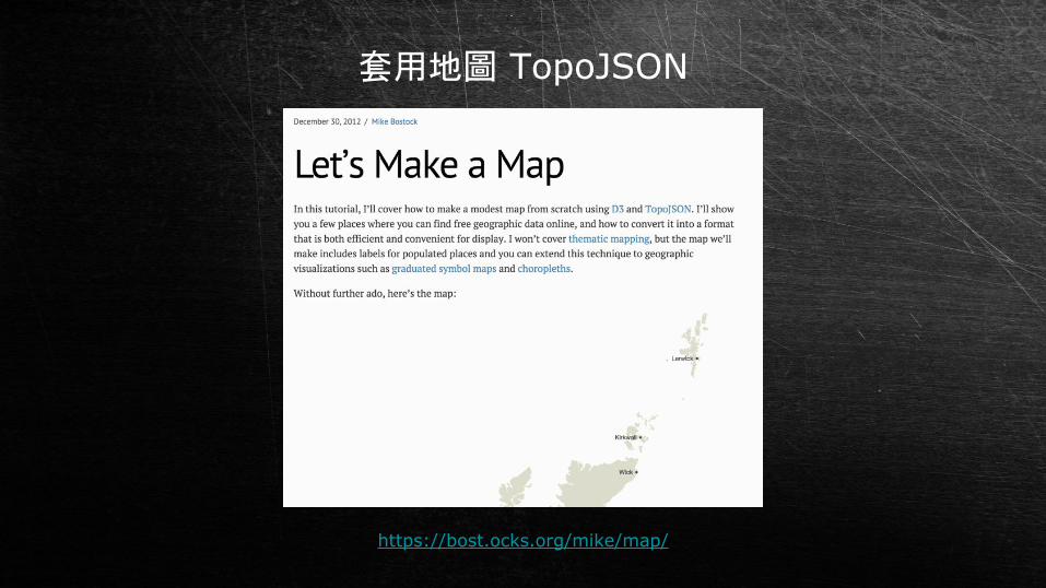
套用地圖 TopoJSON
https://bost.ocks.org/mike/map/

畫圖

畫出來了

依據政黨票比例數據,套用顏色、滑鼠事件
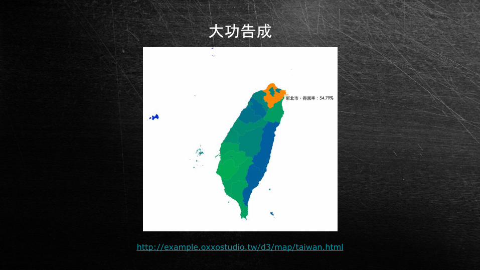
大功告成
http://example.oxxostudio.tw/d3/map/taiwan.html

工商服務

https://webduino.io/index.html
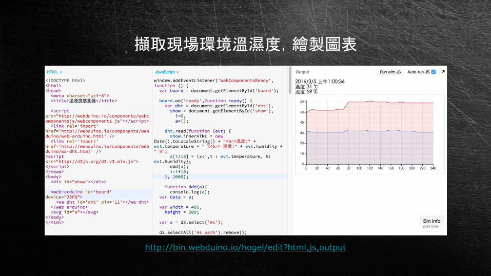
http://bin.webduino.io/hogel/edit?html,js,output
擷取現場環境溫濕度,繪製圖表

高雄市政府資料開放平台 + PM2.5 數據
http://data.kaohsiung.gov.tw/Opendata/DetailList.aspx?CaseNo1=FB&CaseNo2=1&Lang=C
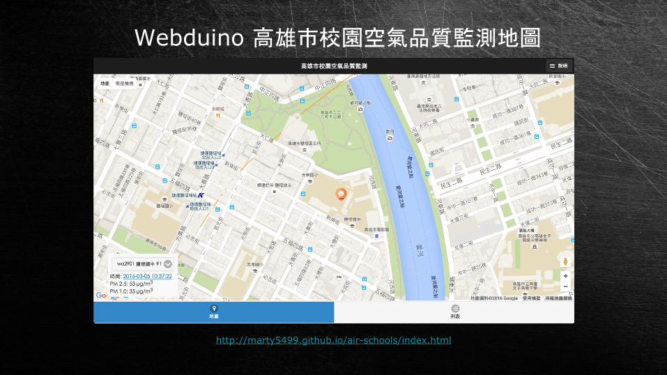
Webduino 高雄市校園空氣品質監測地圖
http://marty5499.github.io/air-schools/index.html

參考資源
http://tedxtaipei.com/articles/the-beauty-of-data-visualization/ http://buzzorange.com/techorange/2014/06/10/30-simple-tools-for-data-visualization/http://newtoypia.blogspot.tw/2015/11/d3js.htmlhttps://www.safaribooksonline.com/blog/2014/02/11/d3-js-maps/ http://blog.infographics.tw/2015/03/d3js-the-introduction/http://kuro.tw/categories/D3-jshttps://strongriley.github.io/d3/tutorial/bar-2.html http://bl.ocks.org/mbostock/1283663 http://blog.infographics.tw/2015/04/visualize-geographics-with-d3jshttp://data.gov.tw/node/7442 http://data.gov.tw/geodata_shp https://github.com/mbostock/topojson/wiki https://bost.ocks.org/mike/map/
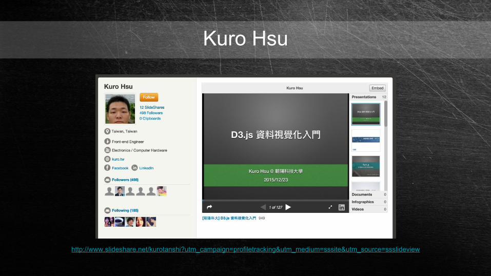
Kuro Hsu
http://www.slideshare.net/kurotanshi?utm_campaign=profiletracking&utm_medium=sssite&utm_source=ssslideview
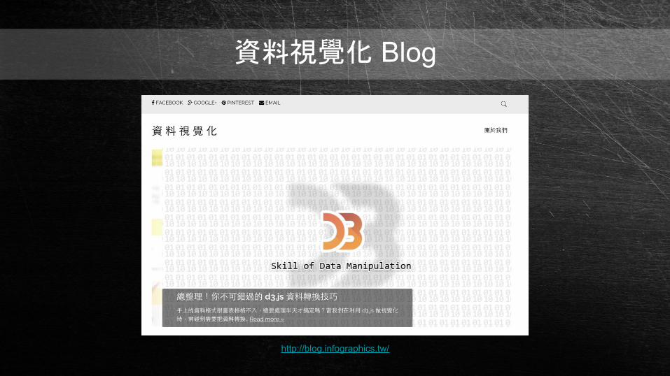
資料視覺化 Blog
http://blog.infographics.tw/

謝謝聆聽


![[Modern Web 2016] 讓你的 PHP 開發流程再次潮起來](https://img.dokumen.tips/doc/110x75/5872a83c1a28ab07208b7277/modern-web-2016-php-.jpg)