Embed Size (px)
Citation preview
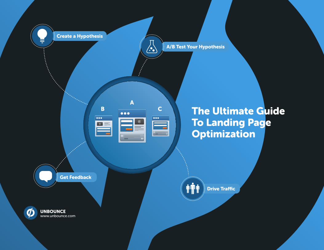
Drive Traffic
Create a Hypothesis
A/B Test Your Hypothesis
Get Feedback
AB C The Ultimate Guide
To Landing Page Optimization
UNBOUNCE www.unbounce.com
What’s in the ebook? What is Unbounce?
This guide will teach you everything you need to
know about Landing Page Optimization (LPO),
including examples, workflow and more:
• What is Landing Page Optimization?
Find out why you should be optimizing
• The Landing Page Optimation Process
7 steps to create & optimize a landing page
• Landing Page Examples
Critiqued For Conversion By Oli Gardner
• Convincing Stakeholders
Getting buy-in by showing the value of LPO
Unbounce is the DIY Landing Page platform for
Marketers. Build high converting landing pages
for your PPC, email, banner and social media
campaigns.
• Build & Publish Landing Pages In Minutes
Use our powerful editor to re-create your design
from scratch, or use one of our templates for a
head start.
• 1-Click A/B Testing For Optimization
Need to solve an argument with your boss?
Stop relying on assumptions and set up a test
experiment.
• Simple Analytics To Track Campaigns
Our stats are powerful yet simple. It’s all about
clicks, conversions and how well your campaign
is performing.
START YOUR FREE 30 DAY TRIALShare this document.
Table of Contents
Chapter 1 Chapter 3
Chapter 2
What is Landing Page Optimization?
What is a Landing Page?
Why should you use Landing Pages?
Landing Page Examples
Appendix
Convincing Stakeholders the Value of LPO The Landing Page Optimization Process
Step 1: Define Your Goals
Step 2: Build Your First Page
• Who Builds Your Page?
• Team Workflow
• Build a Post-Conversion Page
(incl. 6 action ideas)
Step 3: Drive Traffic to Your Page
Step 4: Gather Feedback for a Test
Step 5: Create a Hypothesis from Your New Data
Step 6: A/B Test Your Landing Page
In this guide I’ll walk you through the process of building, testing and optimizing your landing pages. You’ll also get to
see a critique of 10 landing pages and learn how to convince a skeptical boss or client of the value of Landing Page
Optimization (LPO).
4START YOUR FREE 30 DAY TRIAL Share This Document
What is Landing Page Optimization (LPO)?CHAPTER 1
Do any of these resonate with you?
The bounce rate on critical pages is higher than I’d like.
My PPC campaigns are ineffective.
My boss complains about industry average conversion rates being higher than what I am achieving.
This is where LPO comes in. In its simplest form, Landing Page Optimization is using informed qualitative and
quantitative information to create a hypothesis for a new version of your page to test and ultimately, come up with a
new “optimized” page.
Throughout this guide we’ll uncover techniques you’ll need to know to optimize your landing pages without seeking
outside help. This includes some great methods for gathering data about how your users interact with your pages.
This helps you gain behavioral insights, which you can use to drive your A/B test experiments.
Before we get too far down the optimization path, let’s take a quick saunter down Landing Page Lane so we understand
what we’re trying to optimize.
5START YOUR FREE 30 DAY TRIAL Share This Document
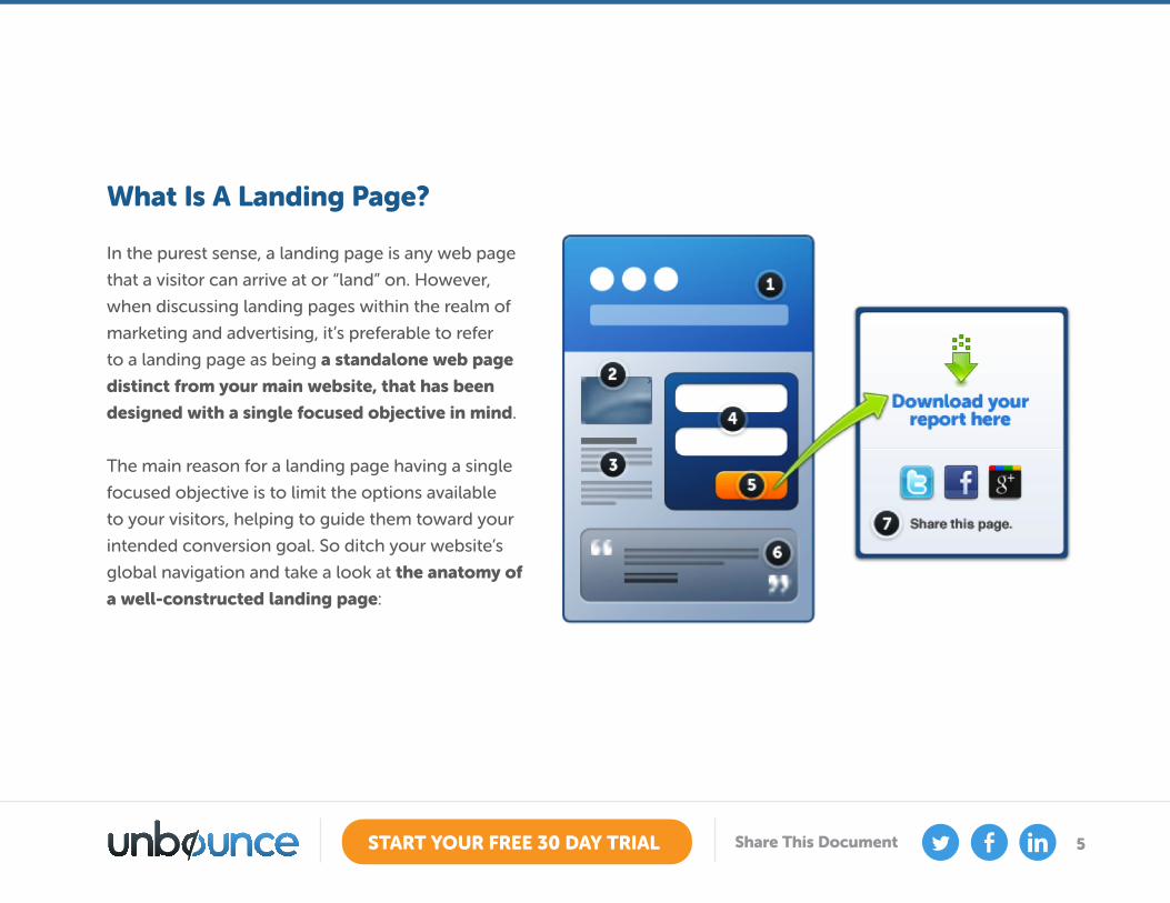
What Is A Landing Page?
In the purest sense, a landing page is any web page
that a visitor can arrive at or “land” on. However,
when discussing landing pages within the realm of
marketing and advertising, it’s preferable to refer
to a landing page as being a standalone web page
distinct from your main website, that has been
designed with a single focused objective in mind.
The main reason for a landing page having a single
focused objective is to limit the options available
to your visitors, helping to guide them toward your
intended conversion goal. So ditch your website’s
global navigation and take a look at the anatomy of
a well-constructed landing page:
6START YOUR FREE 30 DAY TRIAL Share This Document
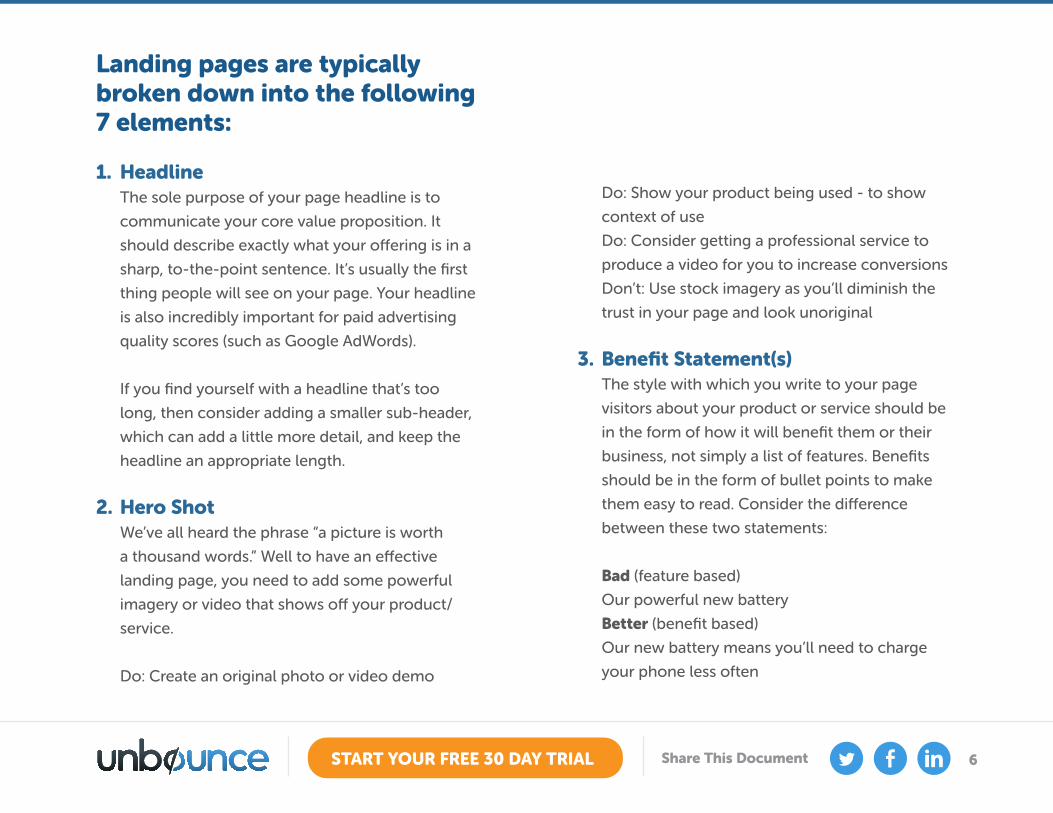
Landing pages are typically broken down into the following 7 elements:
1. Headline The sole purpose of your page headline is to
communicate your core value proposition. It
should describe exactly what your offering is in a
sharp, to-the-point sentence. It’s usually the first
thing people will see on your page. Your headline
is also incredibly important for paid advertising
quality scores (such as Google AdWords).
If you find yourself with a headline that’s too
long, then consider adding a smaller sub-header,
which can add a little more detail, and keep the
headline an appropriate length.
2. Hero Shot We’ve all heard the phrase “a picture is worth
a thousand words.” Well to have an effective
landing page, you need to add some powerful
imagery or video that shows off your product/
service.
Do: Create an original photo or video demo
Do: Show your product being used - to show
context of use
Do: Consider getting a professional service to
produce a video for you to increase conversions
Don’t: Use stock imagery as you’ll diminish the
trust in your page and look unoriginal
3. Benefit Statement(s) The style with which you write to your page
visitors about your product or service should be
in the form of how it will benefit them or their
business, not simply a list of features. Benefits
should be in the form of bullet points to make
them easy to read. Consider the difference
between these two statements:
Bad (feature based)
Our powerful new battery
Better (benefit based)
Our new battery means you’ll need to charge
your phone less often
7START YOUR FREE 30 DAY TRIAL Share This Document
The second resonates with a target user’s needs
by tackling a real pain point, in this case, phone
batteries that lose their charge too quickly.
Limit the number of benefits to between 3 and 7
for easy scanability.
4. Form
This only appears on lead capture type pages (as
we’ll discuss below). Visually you want to make
it as clear as possible. You can do this by using
encapsulation (surround it with a colored box),
and contrast to isolate it from the rest of the
page. To entice someone to complete your form
you need to match the perceived effort involved
in completing it (the length and personal nature
of the form and it’s questions), with the ‘size of
the prize’ (the item you offer in return, such as a
discount, an ebook or a webinar registration).
5. Call-To-Action (CTA) Your call-to-action is the intended conversion
goal of your page. As such, your CTA should be
the only thing to do on your landing page. Don’t
add extra links that cause leaks away from your
conversion event. When writing your CTA, finish
the sentence “I want to…”. For example if the
goal is to download an ebook, you would write,
“I want to download the ebook” – and as such,
your CTA would be “Download the ebook”.
You also want to draw attention to the button
using design principles such as contrast,
whitespace, and the oft-debated choice of color.
6. Trust Indicators People need to trust you in order to buy your
wares. A trust indicator shows that someone
else has benefited from using your product and
is vouching for its quality. Examples are client
testimonials, social widgets, press appearance
logos, customer logos or a stream of positive
tweets about you.
8START YOUR FREE 30 DAY TRIAL Share This Document
Imagine walking by a restaurant that had only
one couple eating in it, and next door there was
a line-up outside. Which would you choose?
It’s the same with landing pages. The more you
can convince people that you are worth sticking
around for, the more conversions you’ll get.
B2B Tip
If your goal is to get people to register for a
webinar, show the registration count as a form
of social proof. This will play on peoples’ herd
mentality, making them want to sign up too.
7. Post-Conversion Page
Strike while the iron is hot. You’ll want to take
advantage of your newly happy lead or customer
and get them to do something else after the
conversion. Now is a great time to ask them to
sign up for your newsletter, or buying something
else at a discount.
Use your confirmation pages (the page that
shows after your visitor downloads your eBook,
or the page after a purchase in an ecommerce
flow), to house the extra bits and bobs that you
otherwise might be tempted to include on your
landing page.
9START YOUR FREE 30 DAY TRIAL Share This Document
Why Should You Use Landing Pages?
The short answer is because they help increase your conversion rates.
Targeted promotion or product specific landing pages are focused on a single objective, and are designed to match the
intent of the ad or marketing collateral your visitors clicked to reach your page.
Consider what happens when you send traffic to your homepage
Most homepages are designed with a general purpose in mind - to speak to your overall brand, product and corporate
values, and are typically loaded with links and navigation to other areas of your site.
Every link on your page that doesn’t represent your businesses’ conversion goal is a distraction that will dilute your message and reduce your conversion rate.
10START YOUR FREE 30 DAY TRIAL Share This Document
In Fact, from now on, each link that doesn’t lead to your conversion goal should be considered a conversion leak.
Homepage vs. landing page
Observe a comparison of a Campaign Monitor homepage versus a landing page.The difference in the number of links is
41 (homepage) to 1 (landing page).
That’s WHY you should use landing pages.
Not everyone is a believer though. I’ve heard way too often that stakeholder’s, such as senior management, your boss
or clients, either don’t get the concept or think it will be too costly to incorporate into their marketing budget. If you’ve
ever experienced this, jump down to Appendix A - Convincing Stakeholders on the Value of LPO where there are 5
techniques to convince even the most skeptical people.
11START YOUR FREE 30 DAY TRIAL Share This Document
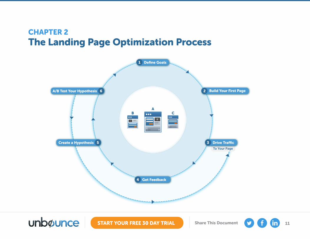
The Landing Page Optimization ProcessCHAPTER 2
AB
C
Build Your First Page2
Define Goals1
Drive Traffic3
To Your Page
Get Feedback4
Create a Hypothesis 5
A/B Test Your Hypothesis 6
12START YOUR FREE 30 DAY TRIAL Share This Document
Step 1: Define Your Goals You should never start building a page without knowing who you are building it for and what you hope to get out of it.
Are you trying to gather leads?
Are you selling a product?
Are you asking people to register for a webinar?
All of these goals require very different content. For instance, selling a product might require a video or photo gallery
showcasing the product being used, and a simple button that carries you through to a shopping cart process.
Once you know what your goals are, you can choose an appropriate type of landing page, of which there are 2 main
candidates; Click-Through, and Lead Generation (also referred to as Lead Gen or Lead Capture pages).
13START YOUR FREE 30 DAY TRIAL Share This Document
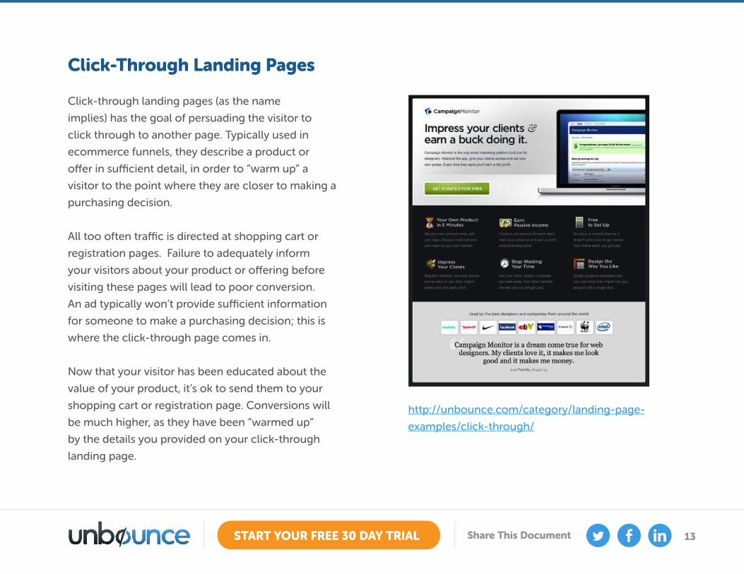
Click-Through Landing Pages
Click-through landing pages (as the name
implies) has the goal of persuading the visitor to
click through to another page. Typically used in
ecommerce funnels, they describe a product or
offer in sufficient detail, in order to “warm up” a
visitor to the point where they are closer to making a
purchasing decision.
All too often traffic is directed at shopping cart or
registration pages. Failure to adequately inform
your visitors about your product or offering before
visiting these pages will lead to poor conversion.
An ad typically won’t provide sufficient information
for someone to make a purchasing decision; this is
where the click-through page comes in.
Now that your visitor has been educated about the
value of your product, it’s ok to send them to your
shopping cart or registration page. Conversions will
be much higher, as they have been “warmed up”
by the details you provided on your click-through
landing page.
http://unbounce.com/category/landing-page-
examples/click-through/
14START YOUR FREE 30 DAY TRIAL Share This Document
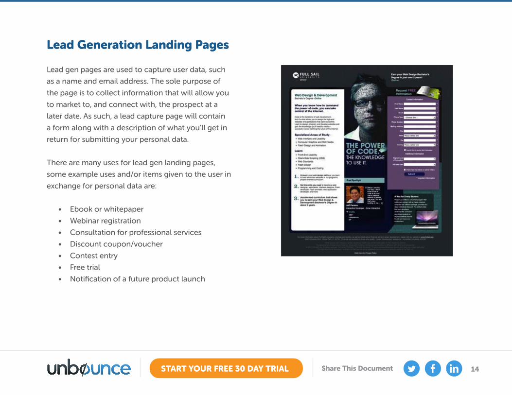
Lead Generation Landing Pages
Lead gen pages are used to capture user data, such
as a name and email address. The sole purpose of
the page is to collect information that will allow you
to market to, and connect with, the prospect at a
later date. As such, a lead capture page will contain
a form along with a description of what you’ll get in
return for submitting your personal data.
There are many uses for lead gen landing pages,
some example uses and/or items given to the user in
exchange for personal data are:
• Ebook or whitepaper
• Webinar registration
• Consultation for professional services
• Discount coupon/voucher
• Contest entry
• Free trial
• Notification of a future product launch
15START YOUR FREE 30 DAY TRIAL Share This Document
The length of your form and the level of personal
data requested can have a direct impact on
conversion. Try to ask for the absolute minimum
amount of information that will enable you to
market to your prospects effectively. For instance,
don’t ask for a phone or fax number if you only need
to contact them via email.
Digital Currency: Getting What You Want What do you want from your visitors; Is your goal to
collect leads or make your page go viral via social
media? The former requires a form to collect email
addresses, and the latter (in the case of Twitter)
would require someone to tweet to get your ebook
(or whatever you’re giving away).
A good example of this can be seen on the landing
page for The Ultimate Guide to A/B Testing, which
gives visitors the option of which currency method
they would like to use, an email or a tweet. You
may even have experienced this method of digital
currency exchange to get this guide.
Step 2: Build Your First Page
Your goals helped you decide on the type of page
you need to build. Now is when you start placing the
elements you learned about in the ‘Landing Page
Anatomy’ section above to create your first design.
Who Builds Your Page?
Often a single individual creates the page, but for
the most effective workflow, you would have several
team members working together to ensure each
page element is created by someone with the most
expertise.
The following list of roles/tasks breaks it down
nicely:
• Marketing or Creative Director: In charge of
making sure the business goals are well defined,
usually in the form of a creative brief. Also works
with the designer to maintain brand consistency.
16START YOUR FREE 30 DAY TRIAL Share This Document
• Campaign Manager: Responsible for running the
campaign from start to finish, including driving
traffic to the page via email marketing, social
media and paid advertising.
• Information Architect: Creates the blueprint of
the page containing the required elements that
meet the business goals.
• Designer: Using the blueprint as a guide, the
designer creates a professional and branded
page and uses the principles of Conversion
Centered Design to ensure that attributes like
contrast, whitespace and directional cues are
used to focus the attention of the viewer on the
conversion goal.
• Copywriter: The copywriter is responsible for
writing persuasive copy that makes the purpose
of the page very clear, and provides enough
information to convince someone to make the
choice to click your call-to-action.
• Optimizer: It’s their responsibility to take any
feedback gathered from the first run of the page
and then make it convert better with A/B testing.
17START YOUR FREE 30 DAY TRIAL Share This Document
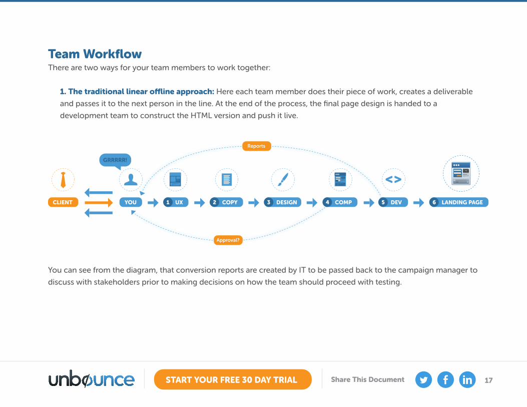
You can see from the diagram, that conversion reports are created by IT to be passed back to the campaign manager to
discuss with stakeholders prior to making decisions on how the team should proceed with testing.
Team WorkflowThere are two ways for your team members to work together:
1. The traditional linear offline approach: Here each team member does their piece of work, creates a deliverable
and passes it to the next person in the line. At the end of the process, the final page design is handed to a
development team to construct the HTML version and push it live.
UX1 COPY2 DESIGN3 COMP4 DEV5 LANDING PAGE6YOU
GRRRRR!
CLIENT
<>
Approval?
Reports
18START YOUR FREE 30 DAY TRIAL Share This Document
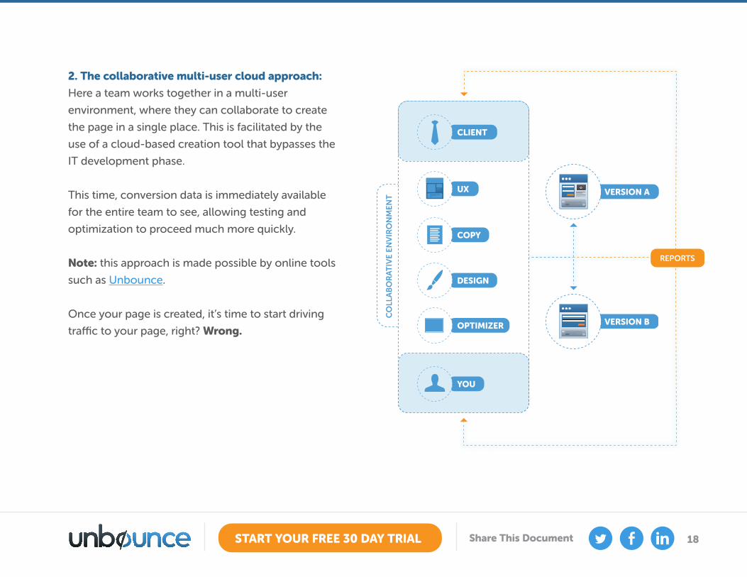
2. The collaborative multi-user cloud approach:
Here a team works together in a multi-user
environment, where they can collaborate to create
the page in a single place. This is facilitated by the
use of a cloud-based creation tool that bypasses the
IT development phase.
This time, conversion data is immediately available
for the entire team to see, allowing testing and
optimization to proceed much more quickly.
Note: this approach is made possible by online tools
such as Unbounce.
Once your page is created, it’s time to start driving
traffic to your page, right? Wrong.
VERSION A
CLIENT
YOU
VERSION B
REPORTS
CO
LLA
BO
RA
TIV
E EN
VIR
ON
MEN
T
UX
COPY
DESIGN
OPTIMIZER
19START YOUR FREE 30 DAY TRIAL Share This Document
You want to take advantage of the magic moment after they say, “Yes, I like you” by adding secondary actions on
your confirmation page.
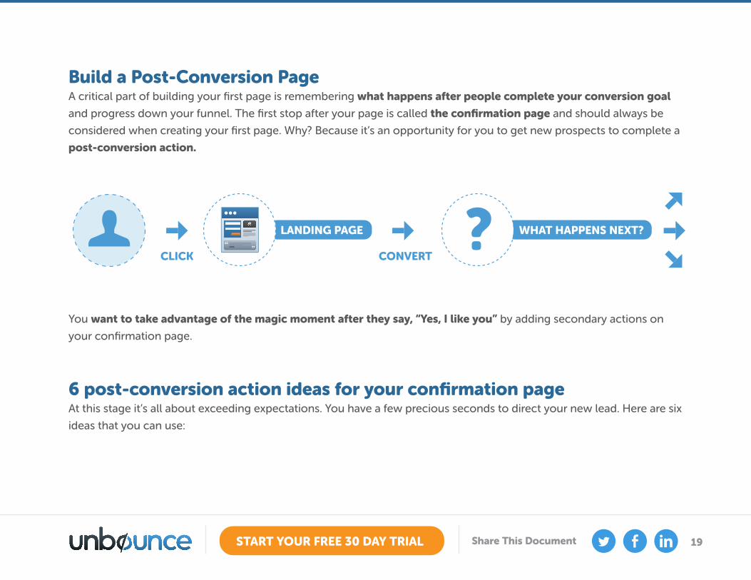
Build a Post-Conversion PageA critical part of building your first page is remembering what happens after people complete your conversion goal
and progress down your funnel. The first stop after your page is called the confirmation page and should always be
considered when creating your first page. Why? Because it’s an opportunity for you to get new prospects to complete a
post-conversion action.
6 post-conversion action ideas for your confirmation pageAt this stage it’s all about exceeding expectations. You have a few precious seconds to direct your new lead. Here are six
ideas that you can use:
LANDING PAGE
CLICK
WHAT HAPPENS NEXT??CONVERT
20START YOUR FREE 30 DAY TRIAL Share This Document
1. Ask for them for a social follow: This is a fairly
low risk action for someone to take and can
place their ears in front of your digital mouth for
a long while to come – hopefully to draw them
back when they hear about new things you are
doing.
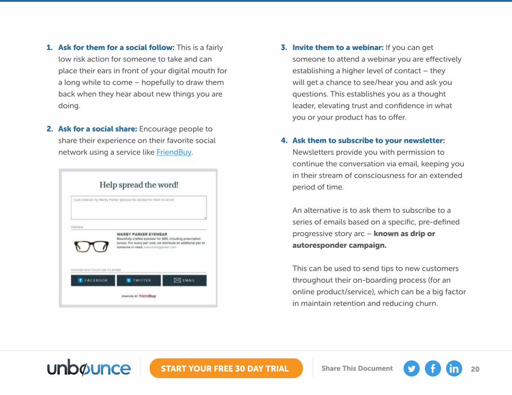
2. Ask for a social share: Encourage people to
share their experience on their favorite social
network using a service like FriendBuy.
3. Invite them to a webinar: If you can get
someone to attend a webinar you are effectively
establishing a higher level of contact – they
will get a chance to see/hear you and ask you
questions. This establishes you as a thought
leader, elevating trust and confidence in what
you or your product has to offer.
4. Ask them to subscribe to your newsletter:
Newsletters provide you with permission to
continue the conversation via email, keeping you
in their stream of consciousness for an extended
period of time.
An alternative is to ask them to subscribe to a
series of emails based on a specific, pre-defined
progressive story arc – known as drip or
autoresponder campaign.
This can be used to send tips to new customers
throughout their on-boarding process (for an
online product/service), which can be a big factor
in maintain retention and reducing churn.
21START YOUR FREE 30 DAY TRIAL Share This Document
An example drip campaign is ProBlogger’s 31
Days to a Better Blog. The expectation and
benefit is set right away – you will receive an
email every day for a month and by the end of
it your blog will be better. The purpose of this is
three-fold: to educate, to bring people back to
your website (through links in your emails), and
to establish your expertise, leading to word-of-
mouth referrals.
5. Give them a discount code: This one’s simple.
Give someone a coupon to get a discount on
another purchase and you’ll get people coming
back for more.
6. Send them to an important ‘what to do next’
page: Many people enjoy a guided experience.
Tell them what to do, and they’ll often do it. Use
a single link for this and send them to a ‘Greatest
Hits’ or ‘Top 10’ page that shows off the very best
content and information you have to offer.
To do now: Take a look at your confirmation
pages and add secondary conversion actions so
the page is doing some extra marketing legwork
on your behalf.
Step 3: Drive Traffic to Your Page This is a question that everyone asks - “How do
I drive traffic to my landing page?” The answer
depends on whether you’re just starting out or
whether you’re an established business.
• Starting out: For instant results, you’ll likely
need to start with paid advertising in the form
of Pay-Per-Click (such as Google AdWords)
and/or banner ads.
• Established businesses: If you’re at this stage,
you likely have an established list of leads
for email marketing, and a decent social
following (on your blog, Twitter, Facebook,
Google+) to couple with your paid advertising
(PPC).
22START YOUR FREE 30 DAY TRIAL Share This Document
Content MarketingProducing educational and entertaining content (in
the form of blog posts, infographics, ebooks etc.)
will naturally draw attention to you and start the
process of building your reputation as someone to
pay attention to.
Guest blogging can also be very useful. It takes
some credibility to get on the big sites, but start
small and build a portfolio of great content with
your name on it. Don’t forget to use a targeted
landing page to direct readers from your guest post.
If you write an ebook (it doesn’t need to take forever,
at Unbounce, we wrote one in 24hrs) then you can
leverage social network effects to spread the word.
The process is like this:
1. Create your ebook full of valuable content.
2. Build a landing page with an image of the
ebook on it, describe the contents of what’s
inside and provide a preview of the best part
of the book, to let people know how good it
is.
3. Use PayWithATweet to use tweets as your
social currency for people to get your ebook.
Now, when someone wants your ebook, they
have to tweet about it to download it (the
tweet contains a link back to your landing
page), exposing your landing page to the
network of everyone who downloads it. This
can produce a viral effect as momentum
builds.
So now that you know how to drive traffic to your
landing pages, it’s time to start gathering feedback
from your visitors to gain insight as to why they are
not converting.
23START YOUR FREE 30 DAY TRIAL Share This Document
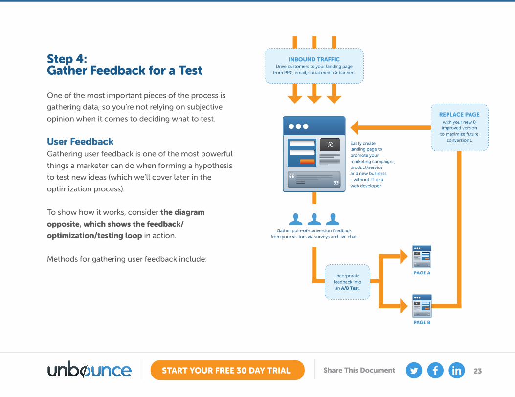
Step 4: Gather Feedback for a Test One of the most important pieces of the process is
gathering data, so you’re not relying on subjective
opinion when it comes to deciding what to test.
User FeedbackGathering user feedback is one of the most powerful
things a marketer can do when forming a hypothesis
to test new ideas (which we’ll cover later in the
optimization process).
To show how it works, consider the diagram
opposite, which shows the feedback/
optimization/testing loop in action.
Methods for gathering user feedback include:
INBOUND TRAFFIC
PAGE A
PAGE B
Drive customers to your landing pagefrom PPC, email, social media & banners
Incorporatefeedback intoan A/B Test.
Gather poin-of-conversion feedbackfrom your visitors via surveys and live chat.
REPLACE PAGEwith your new &improved version
to maximize futureconversions.
Easily createlanding page topromote yourmarketing campaigns,product/serviceand new business- without IT or aweb developer.
24START YOUR FREE 30 DAY TRIAL Share This Document
• On-page surveys
Adding a survey tool like Qualaroo (formerly
KISSinsights) to your landing page enables your
visitors to tell you what’s wrong with your page
and marketing message.
• Live chat
Talking to your users right at the point of
conversion lets you hear what is preventing them
from converting. It also gives you the opportunity
to turn a fence sitter into a customer. Live chat
provider Olark says that:
• When you talk to a new user, they are 3x
more likely to return than a user that wasn’t
engaged.
• Live chat decreases shopping cart
abandonment by 15%.
• Users you chat with spend 40% more time on
your site.
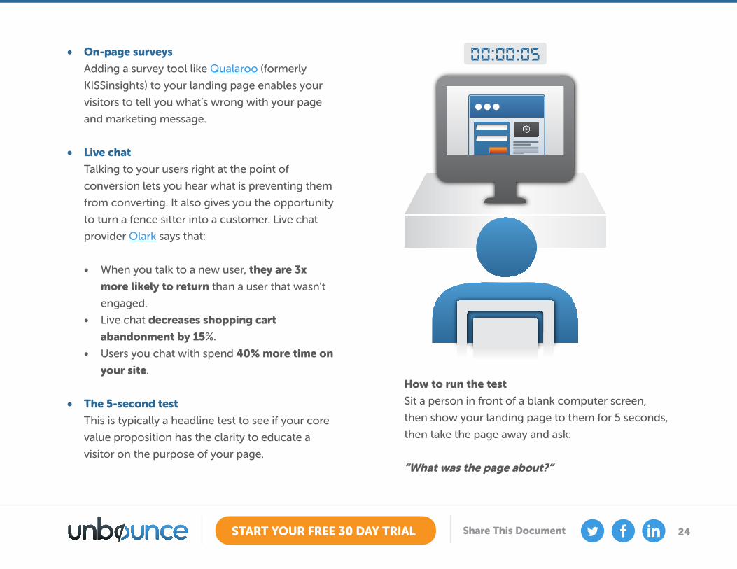
• The 5-second test
This is typically a headline test to see if your core
value proposition has the clarity to educate a
visitor on the purpose of your page.
How to run the test
Sit a person in front of a blank computer screen,
then show your landing page to them for 5 seconds,
then take the page away and ask:
“What was the page about?”
25START YOUR FREE 30 DAY TRIAL Share This Document
If your headline is clear and concise enough then
they’ll be able to explain the page’s purpose. If they
can’t tell you what the page is about, you should
revisit your headline until it’s clear enough that
people can tell you the purpose of the page right
away.
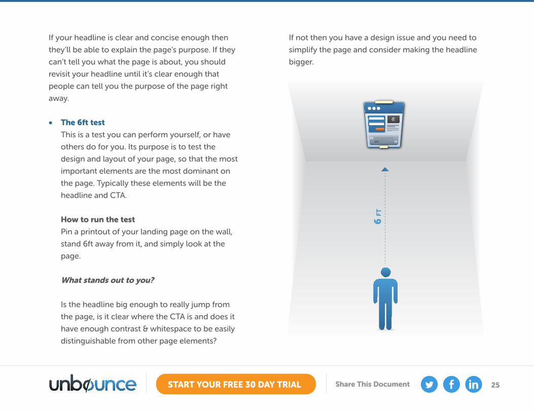
• The 6ft test
This is a test you can perform yourself, or have
others do for you. Its purpose is to test the
design and layout of your page, so that the most
important elements are the most dominant on
the page. Typically these elements will be the
headline and CTA.
How to run the test
Pin a printout of your landing page on the wall,
stand 6ft away from it, and simply look at the
page.
What stands out to you?
Is the headline big enough to really jump from
the page, is it clear where the CTA is and does it
have enough contrast & whitespace to be easily
distinguishable from other page elements?
If not then you have a design issue and you need to
simplify the page and consider making the headline
bigger.
6 F
T
26START YOUR FREE 30 DAY TRIAL Share This Document
• Usability testing
Usability testing is probably what you’ve heard
the most about, and it can often lead to the
best insights about what’s wrong with your
landing page. More commonly used for online
product or ecommerce full funnel flow to show
the interaction within a set process. We’ll take
the ecommerce angle that uses a click-through
landing page that leads to a shopping cart and
on to the checkout.
How to run the test
You only need 5-7 participants before you start to
see the same results come out of your test. Each
participant is given a set of tasks to complete,
and an observer sits and takes notes as they try
to complete the tasks - often timing them to
see how long it takes. Participants are asked to
verbalize their thoughts as they complete the
tasks to give you insight into their thinking.
At the end of the sessions you’ll have witnessed
the pain points that exist in your funnel, giving
you precious data on which areas to optimize for
a more usable experience. And don’t forget to
record the sessions on video so you can show
them to stakeholders at a later date.
Want to learn more? Here is a more detailed
explanation of usability testing.
If you work in a company, you can ask customer
support. These are the people on the front lines
and tend to hear more of the problems with your
page/site than anyone else.
27START YOUR FREE 30 DAY TRIAL Share This Document
Step 5: Create a Hypothesis from Your New Data This is where you come up with ideas for new ‘Challenger’ pages based on the feedback you just gathered. Challenger
pages are what you test against your original page, known as the ‘Champion’.
Collect data using the above exercises and you’ll have the basis for creating your hypothesis for a new A/B test. Use the
information to conceptualize a new landing page design, messaging, and CTA placement.
Once you have a solid idea of where you might be going wrong, or some great insight into which areas are confusing
visitors and need improvement, you are ready to develop your hypothesis.
Example HypothesisTo give you an idea of what a hypothesis looks like, consider an experiment performed where the digital currency to
obtain an ebook was to tweet about it.
Qualaroo was added to the landing page to gather survey insight into why some people weren’t converting (as the
conversion rate was lower than expected). The survey results showed:
• Some people don’t have a Twitter account
• Some people weren’t willing to have a business tweet go out on their personal Twitter account
• Some people weren’t willing to pay with a tweet without seeing a preview of the ebook to validate its quality
• Some people wanted to pay with an email instead of a tweet
28START YOUR FREE 30 DAY TRIAL Share This Document
By adding an alternate option for obtaining the ebook (email) and showing a preview of a portion of the ebook, we will increase conversions (downloads) of the ebook.
Given these details, the following hypothesis was formed:
After creating a challenger page to test against the champion, the results were as follows:
• The conversion rate of the initial page was 25%
• The conversion rate of the new challenger page was 33%
This produced a conversion lift of 32%
By doing the research, creating a hypothesis based on the feedback, you are able to make informed decisions about
how to optimize your page.
29START YOUR FREE 30 DAY TRIAL Share This Document
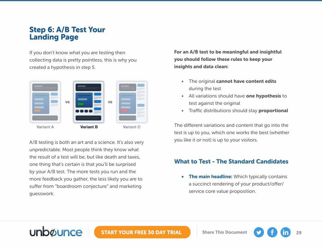
Step 6: A/B Test Your Landing Page If you don’t know what you are testing then
collecting data is pretty pointless, this is why you
created a hypothesis in step 5.
A/B testing is both an art and a science. It’s also very
unpredictable. Most people think they know what
the result of a test will be, but like death and taxes,
one thing that’s certain is that you’ll be surprised
by your A/B test. The more tests you run and the
more feedback you gather, the less likely you are to
suffer from “boardroom conjecture” and marketing
guesswork.
For an A/B test to be meaningful and insightful
you should follow these rules to keep your
insights and data clean:
• The original cannot have content edits
during the test
• All variations should have one hypothesis to
test against the original
• Traffic distributions should stay proportional
The different variations and content that go into the
test is up to you, which one works the best (whether
you like it or not) is up to your visitors.
What to Test - The Standard Candidates
• The main headline: Which typically contains
a succinct rendering of your product/offer/
service core value proposition.
30START YOUR FREE 30 DAY TRIAL Share This Document
• The call to action (CTA): typically the text
on the button that represents your page’s
conversion goal.
• Hero shot: Try a variation of your main photo
– preferably showing your product or service
being used in context.
• Button design: Use design principles to
accentuate the appearance of your CTA
(contrast, whitespace, size). Above all, try
making it stand out more.
• Button color: Green for go, blue for links,
orange or red for an emotional reaction.
• Form length: For lead capture and other
form usage, you will want to minimize the
amount of fields that visitors are required to
complete. However, if you have a particularly
strong need for data, try running an A|B|C|D|E
test with varying amounts of information
gathering. This way you can make an
informed decision about what abandonment
rate is acceptable when weighed against the
extra data produced.
• Long copy vs. short copy: Often shorter
is better, but for certain products detail is
important in the decision making process.
Test it and see.
Now what? Now it’s time to loop back to step 3 to
start driving more traffic to your newly created test
to see which page performs the best. There are a
few criteria you need to watch out for before you
can determine which page is winning:
• Run the test for at least one week, to cover
daily fluctuations in access to your page.
• On average you will want to have about 500
unique visitors see each variant in your test.
• Don’t stop the test until the statistical
significance (also referred to as “confidence”)
has surpassed the 90% mark. Statistical
significance refers to the probability that the
conversion rate of your challenger page(s)
differs from the champion page for reasons
other than chance alone.

31START YOUR FREE 30 DAY TRIAL Share This Document
Landing Page Examples Critiqued by Oli GardnerCHAPTER 3
One of the best ways to understand landing pages is to look at some examples (both good and bad) and think about
what you like about them, and what you would change or test. Below are 10 examples for you to learn from.
One final thing: never stop testing.
Want to learn more? Download the Ultimate Guide to A/B Testing
32START YOUR FREE 30 DAY TRIAL Share This Document
What’s good
• Design of eBook image shows professionalism: By
having a nicely designed cover, you show that time and
effort went into its creation (as opposed to a boring
plain white cover).
• Simple bullets break down why you would want the
eBook: The headline for the bullets “You’ll learn” really
sets the tone that it’s useful. Listing what you will get
out of reading it (as opposed to what’s in it) is a much
stronger benefits driven approach.
• Clear definition in headline of what you’ll get:
Sometimes it’s nice with an eBook to know it’s not
War and Peace. By limiting this to 10 tips, they stand a
good chance of increased conversions by providing an
easy to consume resource. While long eBooks can be
authoritative, they often go unread.
1. Monetate Ebook Lead Gen Landing Page
33START YOUR FREE 30 DAY TRIAL Share This Document
Things to change or test
• Social sharing location: People are more inclined
to share something right after they actually get it. So
we suggest placing the social sharing buttons on the
form confirmation page. This also has the benefit of
removing distractions from the main page.
• Preview: People react well to the psychology of try-
before-you-buy, so adding a preview of the eBook
(first chapter or a few choice pages) would help people
know what they are exchanging their personal data for.
1. Monetate Ebook Lead Gen Landing Page
34START YOUR FREE 30 DAY TRIAL Share This Document
What’s good
• It’s sexy: Predictable response? Yes, absolutely. That’s
the whole point.
• Validation: They jump right into showing off the
famous publications that have featured their company.
From a design perspective, the grey monotone
prevents a mishmash of color creating any visual
distraction from the call to action (CTA).
• Value propositions: The main content on the page
answers two simple questions: “What is it?” and “Why
should I care?”
• Testimonials: The second is one of the funniest I’ve
read. Socks as a Service – genius.
• Removal of doubt: The subtext below the CTA lowers
the perceived risk, which can improve the click-
through-rate (CTR).
2. Manpacks – Seduction Oriented Design
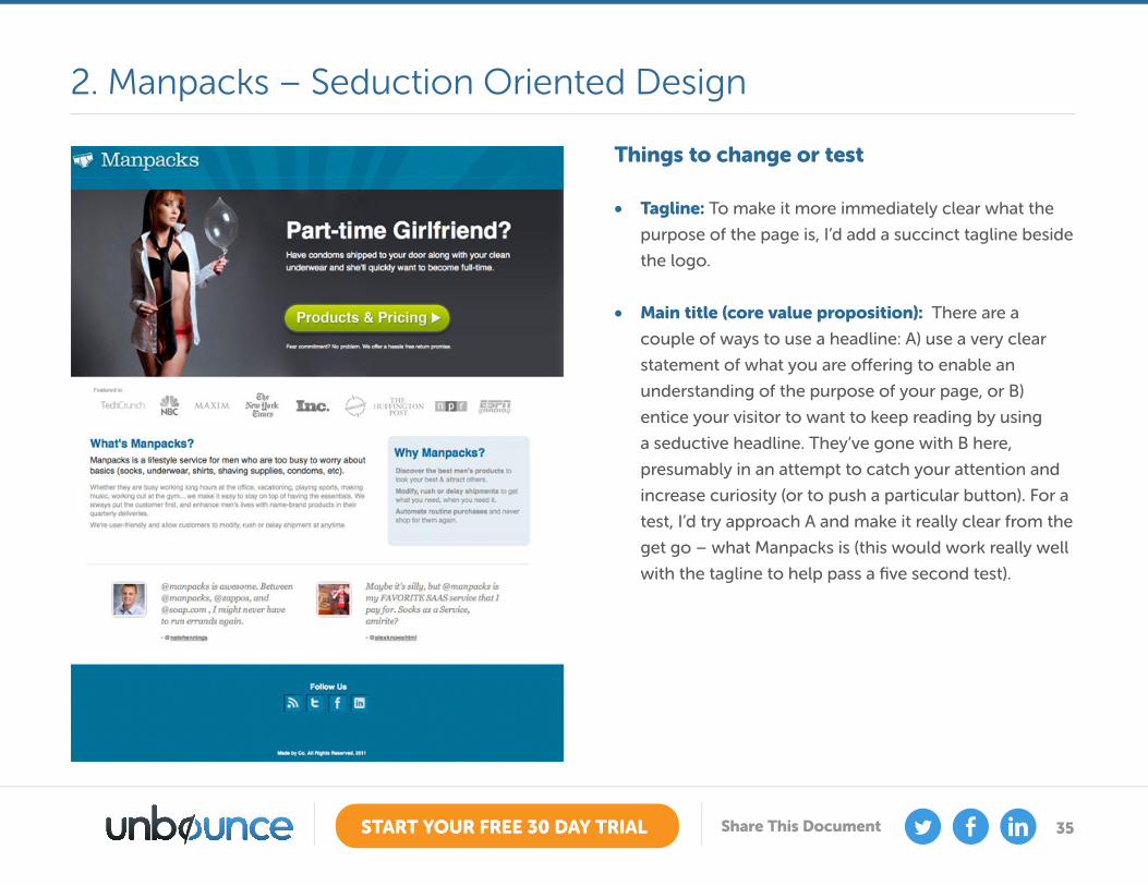
35START YOUR FREE 30 DAY TRIAL Share This Document
Things to change or test
• Tagline: To make it more immediately clear what the
purpose of the page is, I’d add a succinct tagline beside
the logo.
• Main title (core value proposition): There are a
couple of ways to use a headline: A) use a very clear
statement of what you are offering to enable an
understanding of the purpose of your page, or B)
entice your visitor to want to keep reading by using
a seductive headline. They’ve gone with B here,
presumably in an attempt to catch your attention and
increase curiosity (or to push a particular button). For a
test, I’d try approach A and make it really clear from the
get go – what Manpacks is (this would work really well
with the tagline to help pass a five second test).
2. Manpacks – Seduction Oriented Design
36START YOUR FREE 30 DAY TRIAL Share This Document
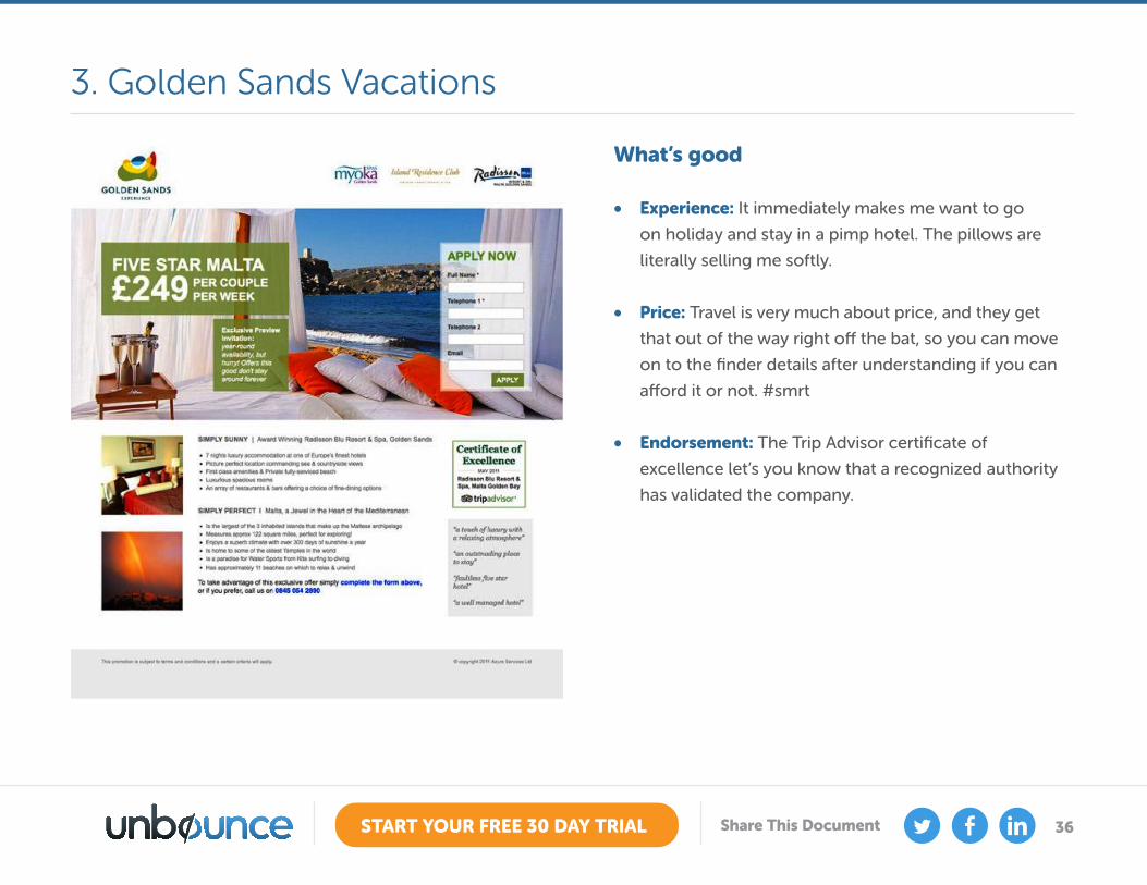
What’s good
• Experience: It immediately makes me want to go
on holiday and stay in a pimp hotel. The pillows are
literally selling me softly.
• Price: Travel is very much about price, and they get
that out of the way right off the bat, so you can move
on to the finder details after understanding if you can
afford it or not. #smrt
• Endorsement: The Trip Advisor certificate of
excellence let’s you know that a recognized authority
has validated the company.
3. Golden Sands Vacations
37START YOUR FREE 30 DAY TRIAL Share This Document
Things to change or test
• The form header: Apply now? For what? It’s unclear
what you’re applying for – I thought it was a booking
site, but apparently I have to apply for something. Make
it clear why people are filling out your form.
• Primary value proposition: There’s no clear statement
of what the page is for or what you’ll get. I’d try moving
the hotel logos from the top and adding in a strong
statement that clarifies your offer.
• Testimonials: The testimonials shown are anonymous
which reduces their impact (as they could have been
made up). Always ask permission to use a testimonial
and include the name of the person providing it for
extra trust points.
• Exclusive: There is a mention of an exclusive preview
invitation, but it doesn’t explain what you’re being
invited to. I’d also make this stand out more if it’s an
important selling point – perhaps using some visual
cues to draw the viewers eye.
3. Golden Sands Vacations
38START YOUR FREE 30 DAY TRIAL Share This Document
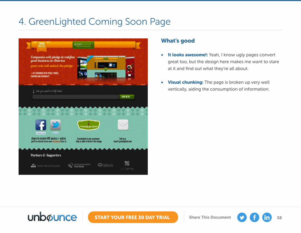
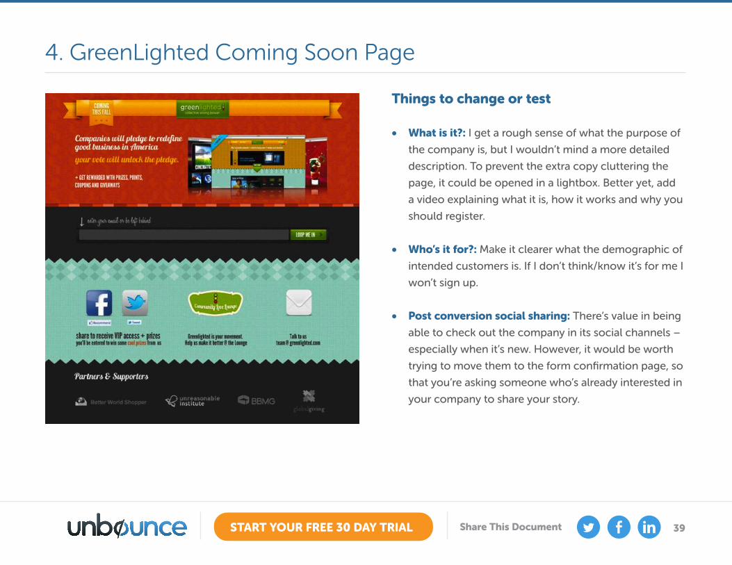
What’s good
• It looks awesome!: Yeah, I know ugly pages convert
great too, but the design here makes me want to stare
at it and find out what they’re all about.
• Visual chunking: The page is broken up very well
vertically, aiding the consumption of information.
4. GreenLighted Coming Soon Page
39START YOUR FREE 30 DAY TRIAL Share This Document
Things to change or test
• What is it?: I get a rough sense of what the purpose of
the company is, but I wouldn’t mind a more detailed
description. To prevent the extra copy cluttering the
page, it could be opened in a lightbox. Better yet, add
a video explaining what it is, how it works and why you
should register.
• Who’s it for?: Make it clearer what the demographic of
intended customers is. If I don’t think/know it’s for me I
won’t sign up.
• Post conversion social sharing: There’s value in being
able to check out the company in its social channels –
especially when it’s new. However, it would be worth
trying to move them to the form confirmation page, so
that you’re asking someone who’s already interested in
your company to share your story.
4. GreenLighted Coming Soon Page
40START YOUR FREE 30 DAY TRIAL Share This Document
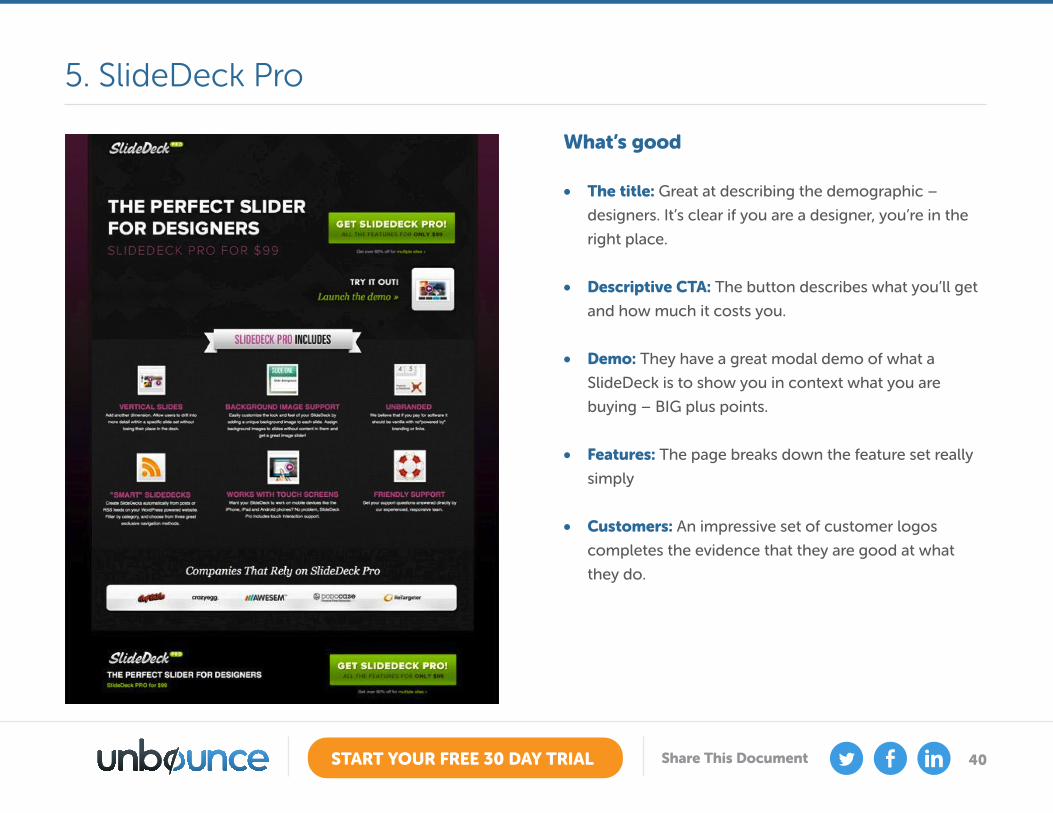
What’s good
• The title: Great at describing the demographic –
designers. It’s clear if you are a designer, you’re in the
right place.
• Descriptive CTA: The button describes what you’ll get
and how much it costs you.
• Demo: They have a great modal demo of what a
SlideDeck is to show you in context what you are
buying – BIG plus points.
• Features: The page breaks down the feature set really
simply
• Customers: An impressive set of customer logos
completes the evidence that they are good at what
they do.
5. SlideDeck Pro
41START YOUR FREE 30 DAY TRIAL Share This Document
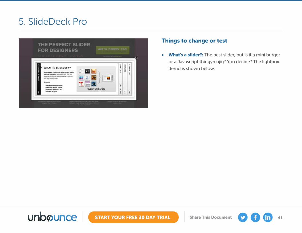
Things to change or test
• What’s a slider?: The best slider, but is it a mini burger
or a Javascript thingymajig? You decide? The lightbox
demo is shown below.
5. SlideDeck Pro
42START YOUR FREE 30 DAY TRIAL Share This Document
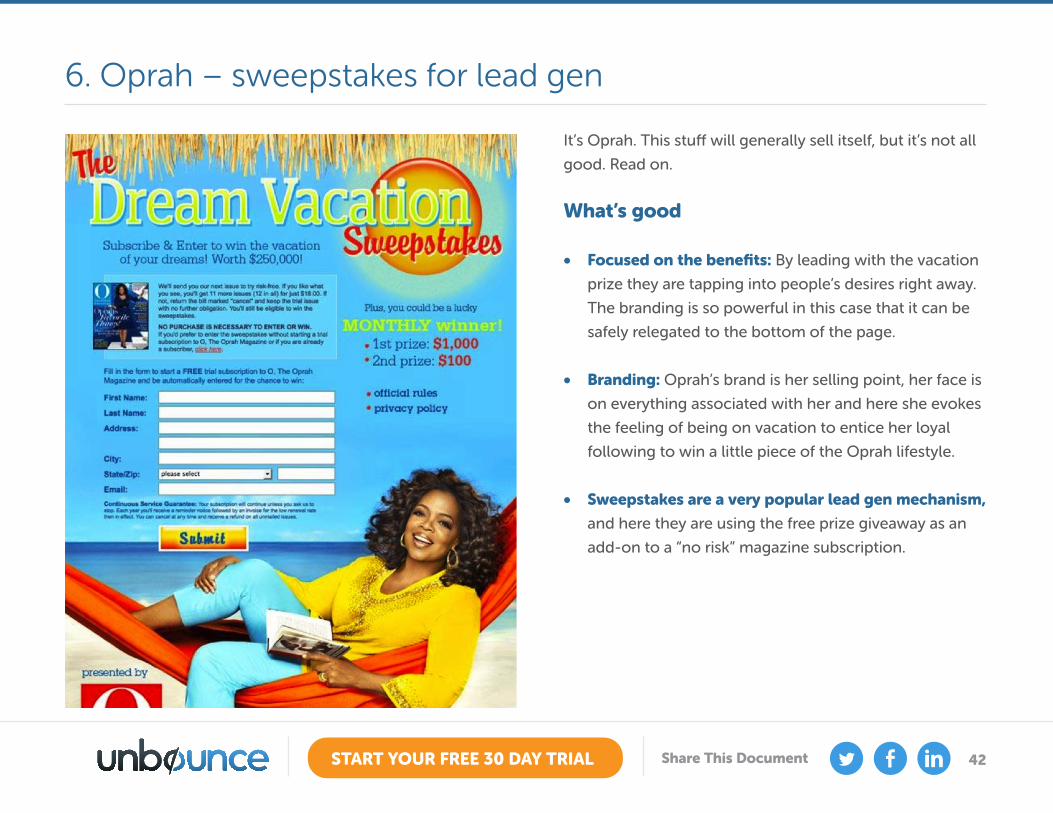
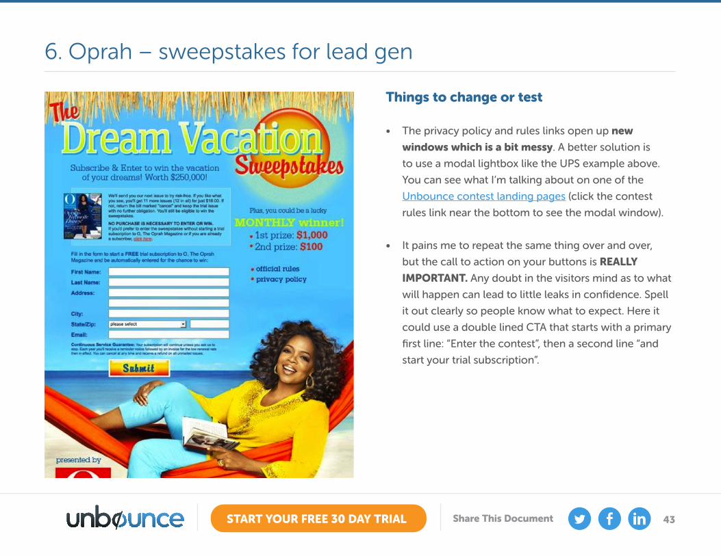
It’s Oprah. This stuff will generally sell itself, but it’s not all
good. Read on. What’s good
• Focused on the benefits: By leading with the vacation
prize they are tapping into people’s desires right away.
The branding is so powerful in this case that it can be
safely relegated to the bottom of the page.
• Branding: Oprah’s brand is her selling point, her face is
on everything associated with her and here she evokes
the feeling of being on vacation to entice her loyal
following to win a little piece of the Oprah lifestyle.
• Sweepstakes are a very popular lead gen mechanism,
and here they are using the free prize giveaway as an
add-on to a “no risk” magazine subscription.
6. Oprah – sweepstakes for lead gen
43START YOUR FREE 30 DAY TRIAL Share This Document
Things to change or test
• The privacy policy and rules links open up new
windows which is a bit messy. A better solution is
to use a modal lightbox like the UPS example above.
You can see what I’m talking about on one of the
Unbounce contest landing pages (click the contest
rules link near the bottom to see the modal window).
• It pains me to repeat the same thing over and over,
but the call to action on your buttons is REALLY
IMPORTANT. Any doubt in the visitors mind as to what
will happen can lead to little leaks in confidence. Spell
it out clearly so people know what to expect. Here it
could use a double lined CTA that starts with a primary
first line: “Enter the contest”, then a second line “and
start your trial subscription”.
6. Oprah – sweepstakes for lead gen

44START YOUR FREE 30 DAY TRIAL Share This Document
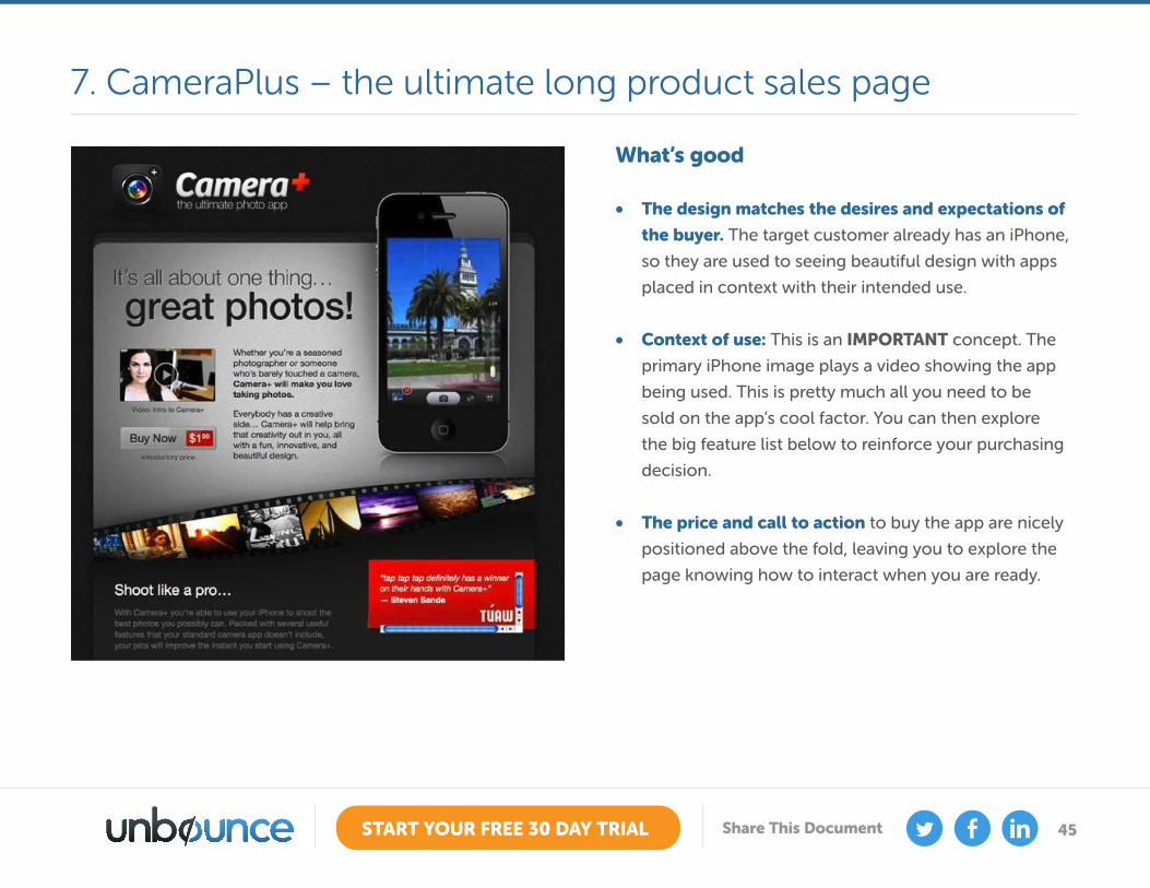
Check out the full length page.
This is the modern apple-esque equivalent of the old-
school long sales letter landing page.
You’ve probably seen the less trustworthy ones before,
where the writer uses reams of ultra persuasive copy to
convince you that, despite being an average Joe, they
have managed to build an online internet business that
prints money.
While it borrows the concept of a long page that piles
on the features until you’re ready to buy, that’s where the
comparison ends.
This is a very good landing page.
7. CameraPlus – the ultimate long product salespage
45START YOUR FREE 30 DAY TRIAL Share This Document
What’s good
• The design matches the desires and expectations of
the buyer. The target customer already has an iPhone,
so they are used to seeing beautiful design with apps
placed in context with their intended use.
• Context of use: This is an IMPORTANT concept. The
primary iPhone image plays a video showing the app
being used. This is pretty much all you need to be
sold on the app’s cool factor. You can then explore
the big feature list below to reinforce your purchasing
decision.
• The price and call to action to buy the app are nicely
positioned above the fold, leaving you to explore the
page knowing how to interact when you are ready.
7. CameraPlus – the ultimate long product sales page

46START YOUR FREE 30 DAY TRIAL Share This Document
What’s good
• Celebrity endorsement: Including celebrity
photographer Lisa Bettany – who for the record
(and gossip factor) is dating Mashable founder Pete
Cashmore – is a clever device to help convince visitors
that it’s worth buying. Professional photographers
that just want a cool app for their phone will find this
convincing.
• Proof of concept: The photo gallery at the end caps
it off nicely by showing that you can take great photos
with this app.
• The Reviews beneath the phone are highlighted in red,
making them the most important visual aspect of
the first screen. While I would normally recommend
the CTA get this level of attention, it really pushes you
towards what is often the swing vote in a purchase –
what other people say.
7. CameraPlus – the ultimate long product sales page
47START YOUR FREE 30 DAY TRIAL Share This Document
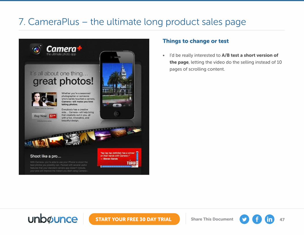
Things to change or test
• I’d be really interested to A/B test a short version of
the page, letting the video do the selling instead of 10
pages of scrolling content.
7. CameraPlus – the ultimate long product sales page
48START YOUR FREE 30 DAY TRIAL Share This Document
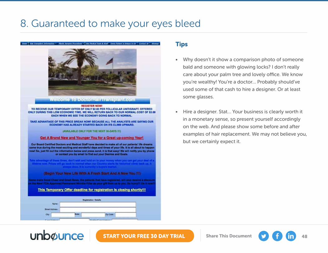
Tips
• Why doesn’t it show a comparison photo of someone
bald and someone with glowing locks? I don’t really
care about your palm tree and lovely office. We know
you’re wealthy! You’re a doctor… Probably should’ve
used some of that cash to hire a designer. Or at least
some glasses.
• Hire a designer. Stat… Your business is clearly worth it
in a monetary sense, so present yourself accordingly
on the web. And please show some before and after
examples of hair replacement. We may not believe you,
but we certainly expect it.
8. Guaranteed to make your eyes bleed
49START YOUR FREE 30 DAY TRIAL Share This Document
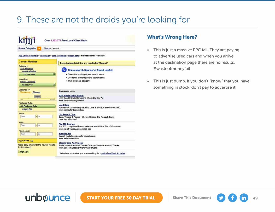
What’s Wrong Here?
• This is just a massive PPC fail! They are paying
to advertise used cars and when you arrive
at the destination page there are no results.
#wasteofmoneyfail
• This is just dumb. If you don’t “know” that you have
something in stock, don’t pay to advertise it!
9. These are not the droids you’re looking for
50START YOUR FREE 30 DAY TRIAL Share This Document
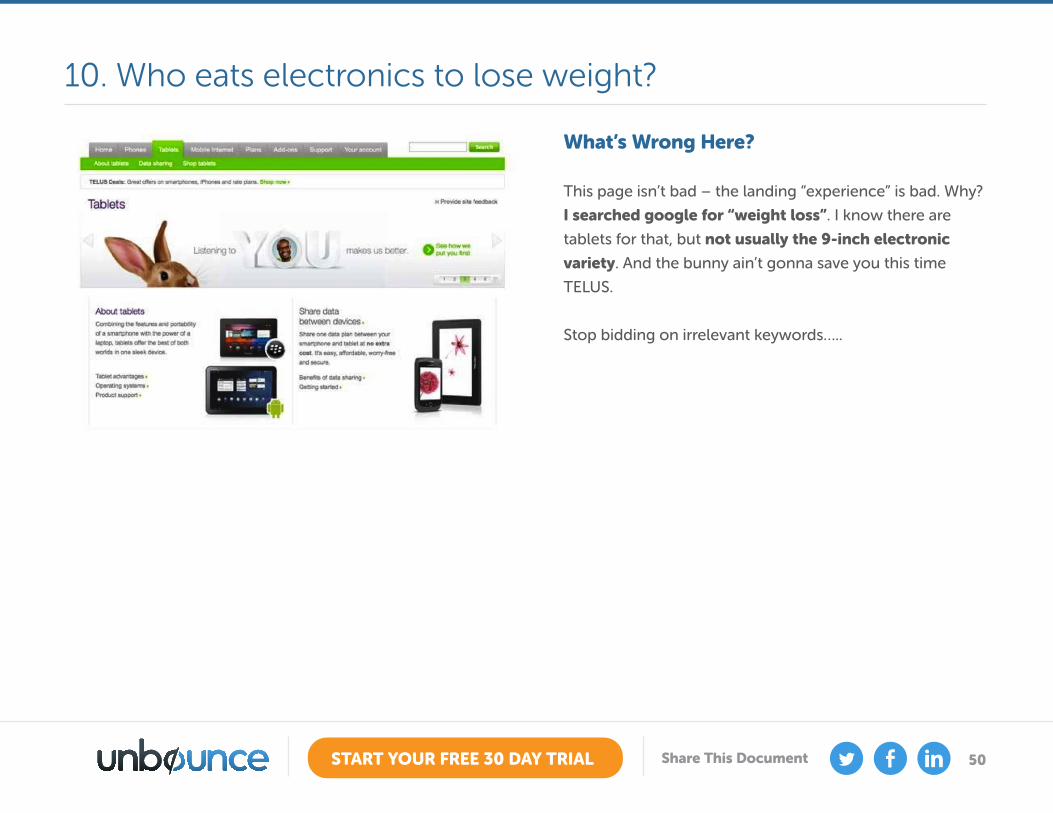
What’s Wrong Here?
This page isn’t bad – the landing “experience” is bad. Why?
I searched google for “weight loss”. I know there are
tablets for that, but not usually the 9-inch electronic
variety. And the bunny ain’t gonna save you this time
TELUS.
Stop bidding on irrelevant keywords…..
10. Who eats electronics to lose weight?
51START YOUR FREE 30 DAY TRIAL Share This Document
Convincing Stakeholders the Value of LPOAppendix A
By now you know why you should be optimizing your landing pages and you know who should be involved and the
process. But you’re getting resistance from above to make it happen.
Imagine this common scenario:
So, how do you convince someone less-than-knowledgeable that LPO is worth the time and cost investment? It’s all
about dollars and cents, so you need to show how LPO can increase your bottom line.
You say to your boss or client that you want to do some optimization work to improve your marketing campaigns.
They give you a cautious glance and ask you to create a proposal on how you’re qualified and why this will help (here we go, *sigh*).
What you don’t see are the wheels in their brain churning, thinking “What the hell is Landing Page Optimization?”

52START YOUR FREE 30 DAY TRIAL Share This Document
5 Techniques to help You Convince a Skeptical Boss or Client
Technique 1: Show some real life examplesThere are dozens of case studies showing positive changes in conversion rates through A/B testing. Here are two real-
life examples demonstrating how simple changes in language and design dramatically boosted signups and conversion
rates.
Case Study #1
GetResponse achieved a 158% increase in Free Trial signups testing CTAs
Case Study #2
WikiJob increased sales by 34% simply by incorporating testimonials on their page.
The best part about this test? It didn’t require any major design or copywriting changes.
53START YOUR FREE 30 DAY TRIAL Share This Document
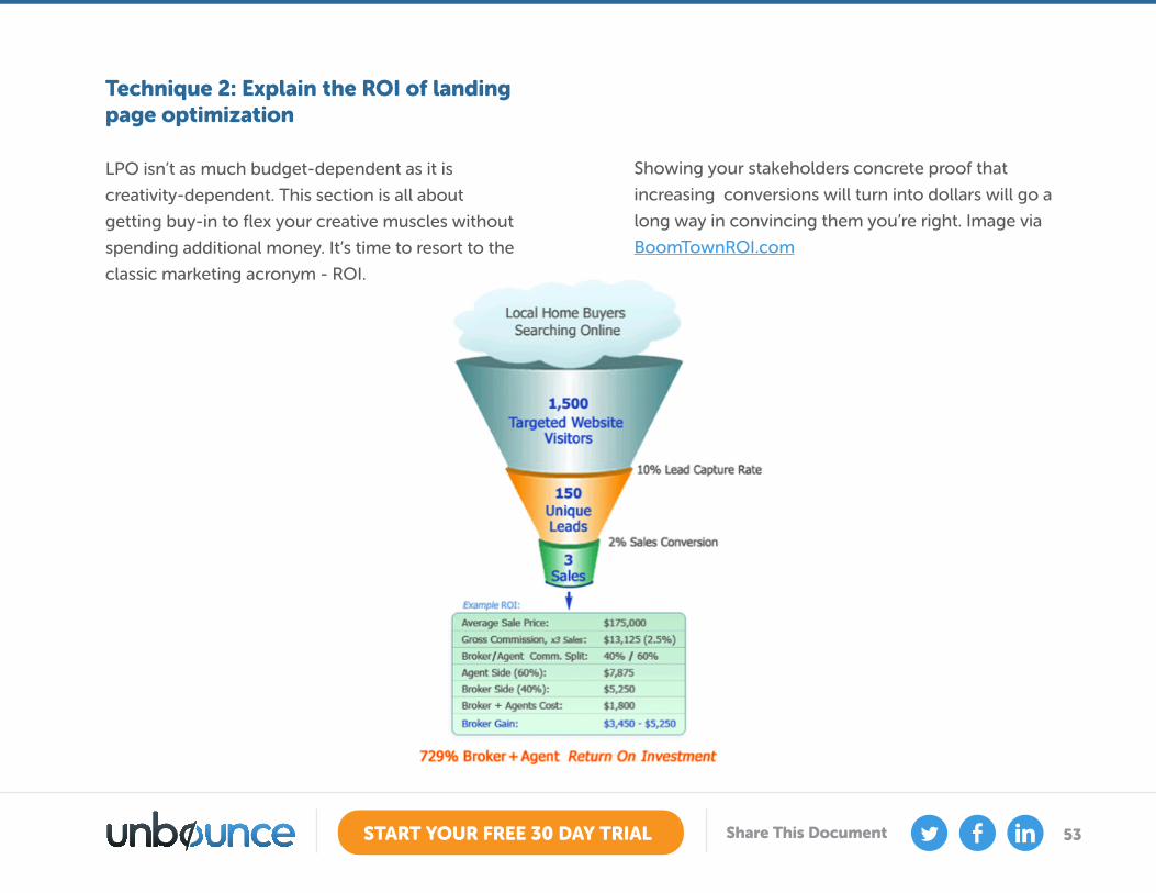
Technique 2: Explain the ROI of landing page optimization
LPO isn’t as much budget-dependent as it is
creativity-dependent. This section is all about
getting buy-in to flex your creative muscles without
spending additional money. It’s time to resort to the
classic marketing acronym - ROI.
Showing your stakeholders concrete proof that
increasing conversions will turn into dollars will go a
long way in convincing them you’re right. Image via
BoomTownROI.com
54START YOUR FREE 30 DAY TRIAL Share This Document
Technique 3: Use your analytics
“How are we going to optimize our conversion
rates?” might be what your stakeholders are thinking.
If you have access to your company’s analytics
reports, you can show exactly how much time
visitors are spending on which pages of your website
and where customers are dropping off unengaged.
It’s these specific locations where LPO needs to
take place; you need to revise your content, design
and your calls to action to entice those visitors to
convert rather than bounce.
If you can pinpoint the specific location where these
breakdowns are occurring, and show a report of the
analytics stats (preferably in the form of revenue), it
will be far easier to convince a stakeholder to let you
make some modifications.
Technique 4: Capitalize on the “fear factor” of the competition
It’s standard practice to include a competitive
analysis in any proposal, but it may be especially
important when you’re talking in terms of
optimization. If you can pitch an economical LPO
approach while simultaneously demonstrating that
your competitors are doing the very same thing
successfully, your proposal will be a no-brainer.
Sometimes, the HiPPOs aren’t convinced what
they’re missing out on. Instead, they may be more
heavily influenced if you can show how your
competition is getting business that could have
otherwise been yours.
If you can find a case study from a competitor
that clearly demonstrates changes that boosted
conversion rates, you’ll have an easier time giving
some extra attention to your landing pages.
55START YOUR FREE 30 DAY TRIAL Share This Document
This tactic will be even more convincing if you can
assign a potential lifetime customer value to every
conversion potentially lost. After all, if a competitor
boosted conversion rates by 20%, that 20% could
equate to a lot of customers that had to come
from somewhere – did they come from your
company? Hitting a business person where it hurts
– in the wallet – by showing concrete numbers and
potential lost revenue is a surefire way to make a
convincing argument for CRO.
What if none of this works…?
Technique 5: The Final Argument - Conversion Economics
Not only is spending a portion of your marketing
budget on landing pages beneficial to your bottom
line, there’s a way to predict how much you should
be spending to optimize your Cost Per Acquisition
(CPA).
Reducing Your Cost Per Acquisition (CPA)
Our goal is to analyze the effect of taking a portion
of the monthly marketing spend and investing it in
optimization.
Most people know that it’s cheaper to keep an
existing customer than it is to find a new one.
Similarly, it makes sense to get the most from your
existing flow of inbound traffic by improving the
conversion rate.
There are two options when it comes to driving
traffic to increase business:
1. You can buy more traffic
2. You can spend a portion of your budget on
improving your site
If you are in any doubt about which of these options
makes more sense, we’ll make it easy for you – it’s
the second one.
56START YOUR FREE 30 DAY TRIAL Share This Document
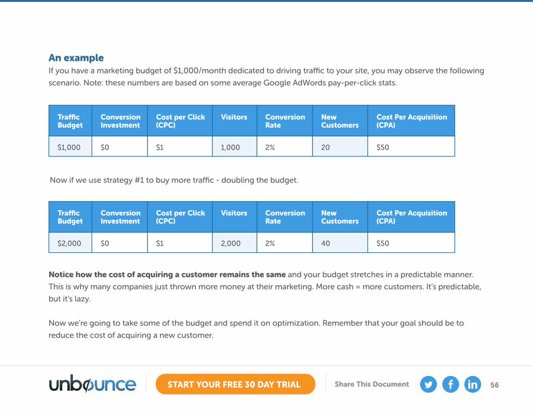
An exampleIf you have a marketing budget of $1,000/month dedicated to driving traffic to your site, you may observe the following
scenario. Note: these numbers are based on some average Google AdWords pay-per-click stats.
Notice how the cost of acquiring a customer remains the same and your budget stretches in a predictable manner.
This is why many companies just thrown more money at their marketing. More cash = more customers. It’s predictable,
but it’s lazy.
Now we’re going to take some of the budget and spend it on optimization. Remember that your goal should be to
reduce the cost of acquiring a new customer.
Now if we use strategy #1 to buy more traffic - doubling the budget.
Traffic Budget
$2,000
Conversion Investment
$0
Cost per Click (CPC)
$1
Conversion Rate
2%
New Customers
40
Cost Per Acquisition (CPA)
$50
Visitors
2,000
Traffic Budget
$1,000
Conversion Investment
$0
Cost per Click (CPC)
$1
Conversion Rate
2%
New Customers
20
Cost Per Acquisition (CPA)
$50
Visitors
1,000
57START YOUR FREE 30 DAY TRIAL Share This Document
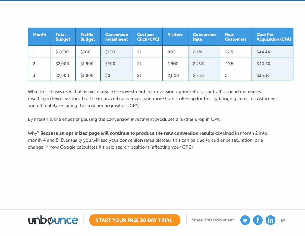
What this shows us is that as we increase the investment in conversion optimization, our traffic spend decreases
resulting in fewer visitors, but the improved conversion rate more than makes up for this by bringing in more customers
and ultimately reducing the cost per acquisition (CPA).
By month 3, the effect of pausing the conversion investment produces a further drop in CPA.
Why? Because an optimized page will continue to produce the new conversion results obtained in month 2 into
month 4 and 5. Eventually you will see your conversion rates plateau, this can be due to audience saturation, or a
change in how Google calculates it’s paid search positions (affecting your CPC).
Total Budget
Traffic Budget
$1,000 $900
$2,000 $1,800
$2,000 $1,800
Conversion Investment
$100
$200
$0
Cost per Click (CPC)
$1
$1
$1
Conversion Rate
2.5%
2.75%
2.75%
New Customers
22.5
49.5
55
Cost Per Acquisition (CPA)
$44.44
$40.40
$36.36
VisitorsMonth
9001
1,8002
2,0003
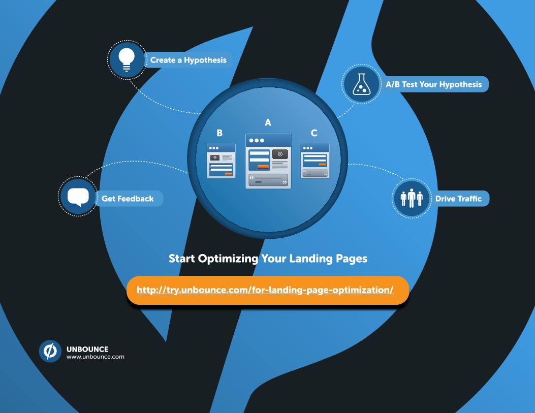
Drive Traffic
Create a Hypothesis
A/B Test Your Hypothesis
Get Feedback
AB C
UNBOUNCE www.unbounce.com
Start Optimizing Your Landing Pages
http://try.unbounce.com/for-landing-page-optimization/