Embed Size (px)
Citation preview

Birth of Bass Controls contents page.

In this screenshot you can see that I used a medium close up on my artist Wildboy to be a feature on my magazine contents page. I had used the magnetic crop tool in order to get my artist on to my magazine’s contents page as clean as possible.
• The font above is Progress Ordin, the same as the Masthead of my cover page. This is to show a clear link between both the cover and the masthead of my magazine

Below as you can see I had put in borders just to separate my sections as a guide line. And I put many numbers to show the guideline of numbers. Miss Mottram didn’t like the way that this contents page was laid out so I have to get red of the border lines.

Now the colour scheme for my magazine cover is blue, red black and white that means that this contents pages musty consist ofthe same colour scheme. I have used the ruler tool on photoshop just to place my artist correctly in the bottom left of the screen.
The red box graphics are used just to show where the web address for bass control magazine is to be present , I have done it for one main reason, in order for the website to standout it must in my idea be near the masthead or title.
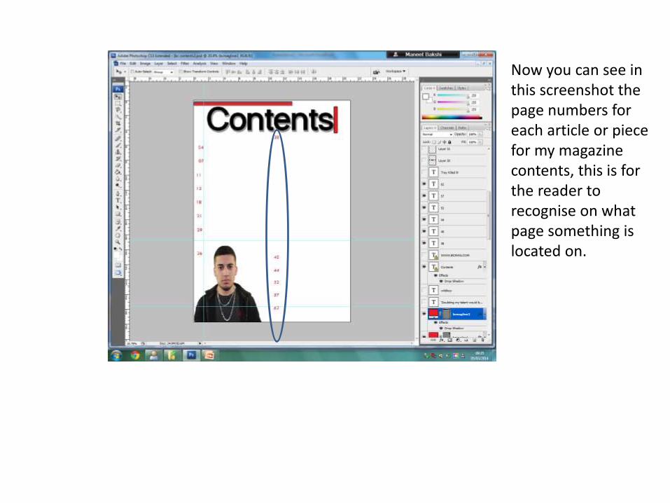
Now you can see in this screenshot the page numbers for each article or piece for my magazine contents, this is for the reader to recognise on what page something is located on.

How was this image of Trey Songz that I have taken been manipulated? I had used a tool
called levels this defined Trey Songzto be perfect in my magazine, note that what he is wearing also matches the colour scheme that my magazine consists of.
This is a preview for the levels tool on how it was manipulated.

• Now following the conventions from my cover page each artist’s name was in blue.So below my artist ‘Wildboy’ , his signature is in blue to match this convention. That signature was a real signature which I had scanned on to Photoshop, this is 100 times better because it gives the magazine that realistic feeling.
• ‘Doubting my talent would be a sin’ this quote was used by the artist Wildboy in order to intrigue readers, on what he means to say.
• This image also includes my manipulated image of Trey Songz, I had used the ruler tool in order to match the size of one section with the same size as Trey Songz.
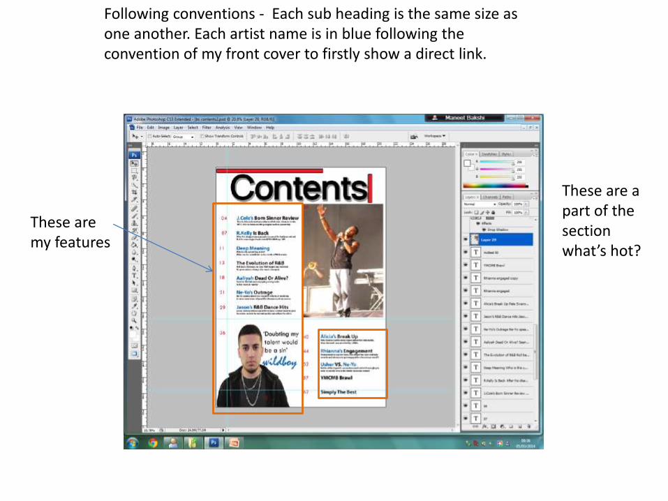
These are my features
These are a part of the section what’s hot?
Following conventions - Each sub heading is the same size as one another. Each artist name is in blue following the convention of my front cover to firstly show a direct link.
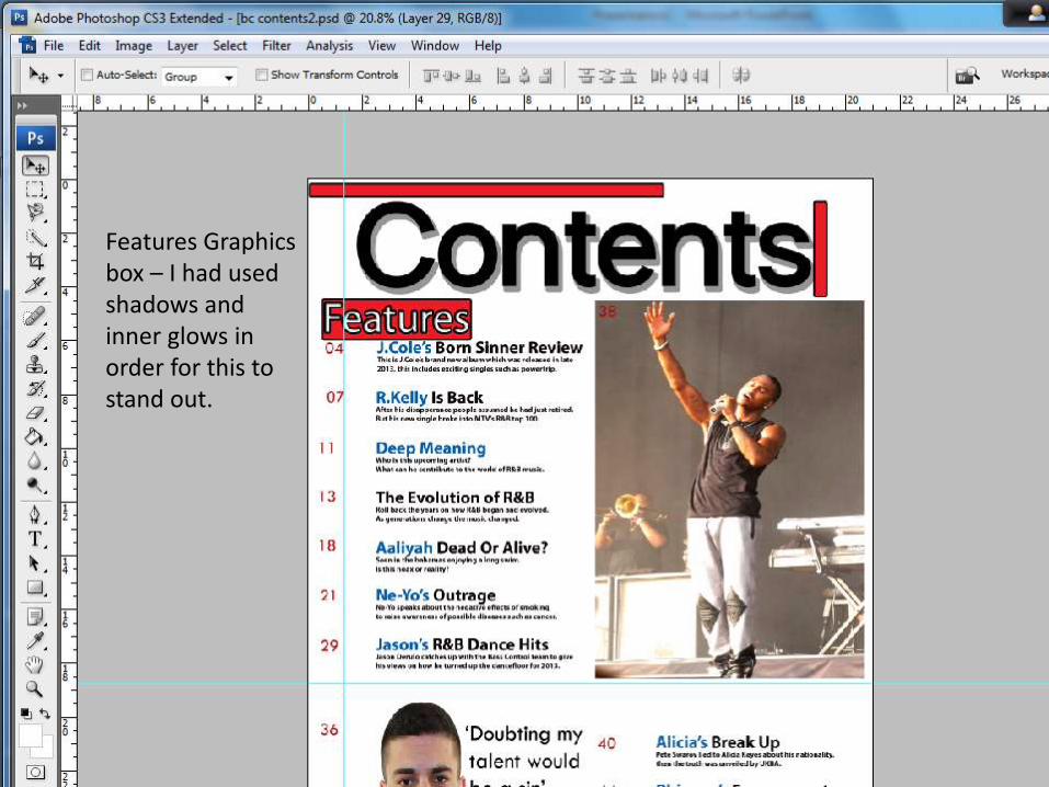
Features Graphics box – I had used shadows and inner glows in order for this to stand out.

What’s hot red graphic box, Is exactly the same size as the graphics box for features, just to look professional
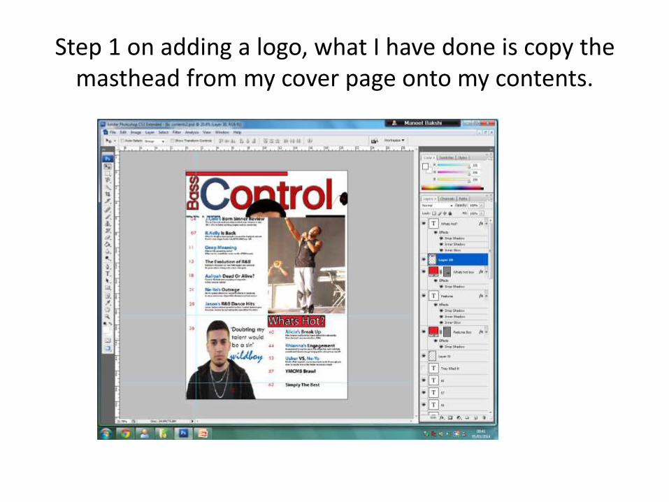
Step 1 on adding a logo, what I have done is copy the masthead from my cover page onto my contents.

Step 2: cropping just the beginning of my cover Masthead, this is to put on top of ‘Contents’ I have
done this to make that ‘Bass C’ a logo for my magazine

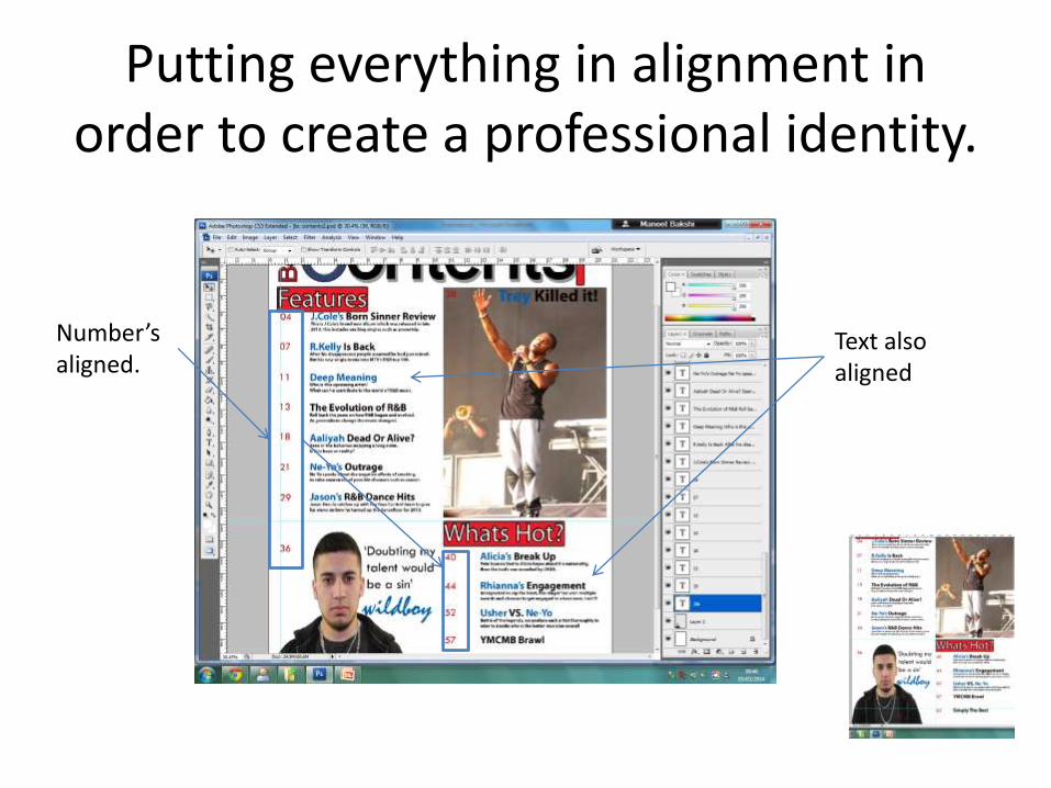
Putting everything in alignment in order to create a professional identity.
Number’s aligned.
Text also aligned

This is the finished magazine contents page.
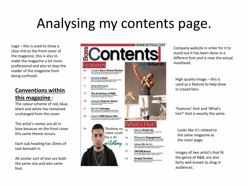
Analysing my contents page.
Company website in order for it to stand out it has been done in a different font and is near the actual masthead.
High quality image – this is used as a feature to help draw in crazed fans.
Logo – this is used to show a clear link to the front cover of the magazine, this is also to make the magazine a lot more professional and also to stop the reader of the magazine from being confused.
Conventions within this magazine :The colour scheme of red, blue, black and white has remained unchanged from the cover.
The artist’s names are all in blue because on the front cover this same theme occurs.
Each sub heading has 2lines of text beneath it.
All similar sort of text are both the same size and also same font.
‘Features’ font and ‘What’s hot?’ font is exactly the same.
Looks like it’s related to the same magazine as the cover page.
Images of two artist’s that fit the genre of R&B, are also fairly well known to drag in audiences.