Embed Size (px)
Citation preview

Music Magazine –
Front Cover, Contents Page & DPS Hand drawn
Drafts :(Initial & Final)
Name: Asuka YoungCandidate Number: 4149
Center Name: St. Andrew’s Catholic School
Center Number: 64135
OCR Media Studies – AS Level
Unit G321: Advanced Portfolio
Initial Ideas (Front Cover& Contents)
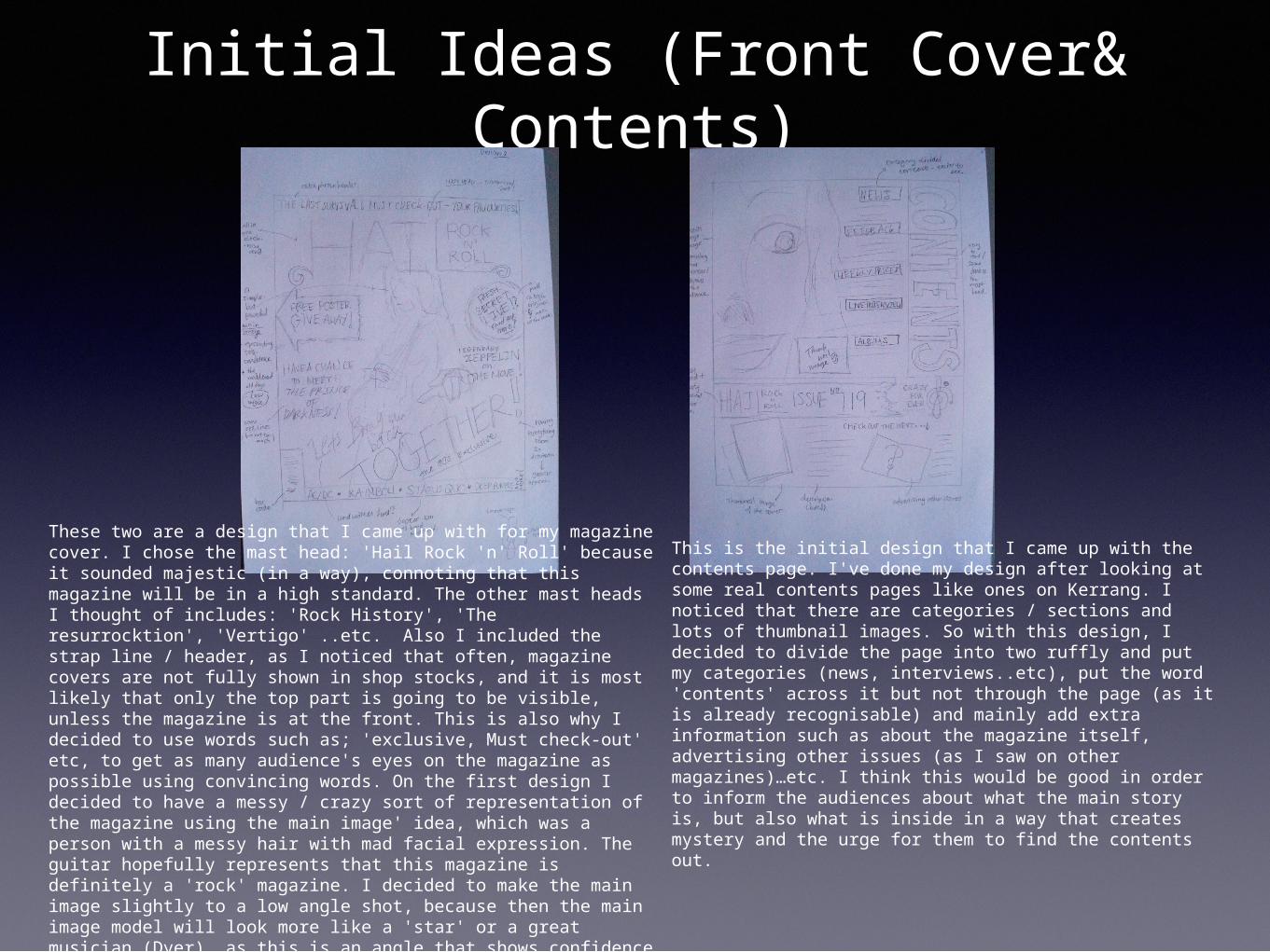
These two are a design that I came up with for my magazine cover. I chose the mast head: 'Hail Rock 'n' Roll' because it sounded majestic (in a way), connoting that this magazine will be in a high standard. The other mast heads I thought of includes: 'Rock History', 'The resurrocktion', 'Vertigo' ..etc. Also I included the strap line / header, as I noticed that often, magazine covers are not fully shown in shop stocks, and it is most likely that only the top part is going to be visible, unless the magazine is at the front. This is also why I decided to use words such as; 'exclusive, Must check-out' etc, to get as many audience's eyes on the magazine as possible using convincing words. On the first design I decided to have a messy / crazy sort of representation of the magazine using the main image' idea, which was a person with a messy hair with mad facial expression. The guitar hopefully represents that this magazine is definitely a 'rock' magazine. I decided to make the main image slightly to a low angle shot, because then the main image model will look more like a 'star' or a great musician (Dyer), as this is an angle that shows confidence and authority.
This is the initial design that I came up with the contents page. I've done my design after looking at some real contents pages like ones on Kerrang. I noticed that there are categories / sections and lots of thumbnail images. So with this design, I decided to divide the page into two ruffly and put my categories (news, interviews..etc), put the word 'contents' across it but not through the page (as it is already recognisable) and mainly add extra information such as about the magazine itself, advertising other issues (as I saw on other magazines)…etc. I think this would be good in order to inform the audiences about what the main story is, but also what is inside in a way that creates mystery and the urge for them to find the contents out.
Initial Ideas (DPS)
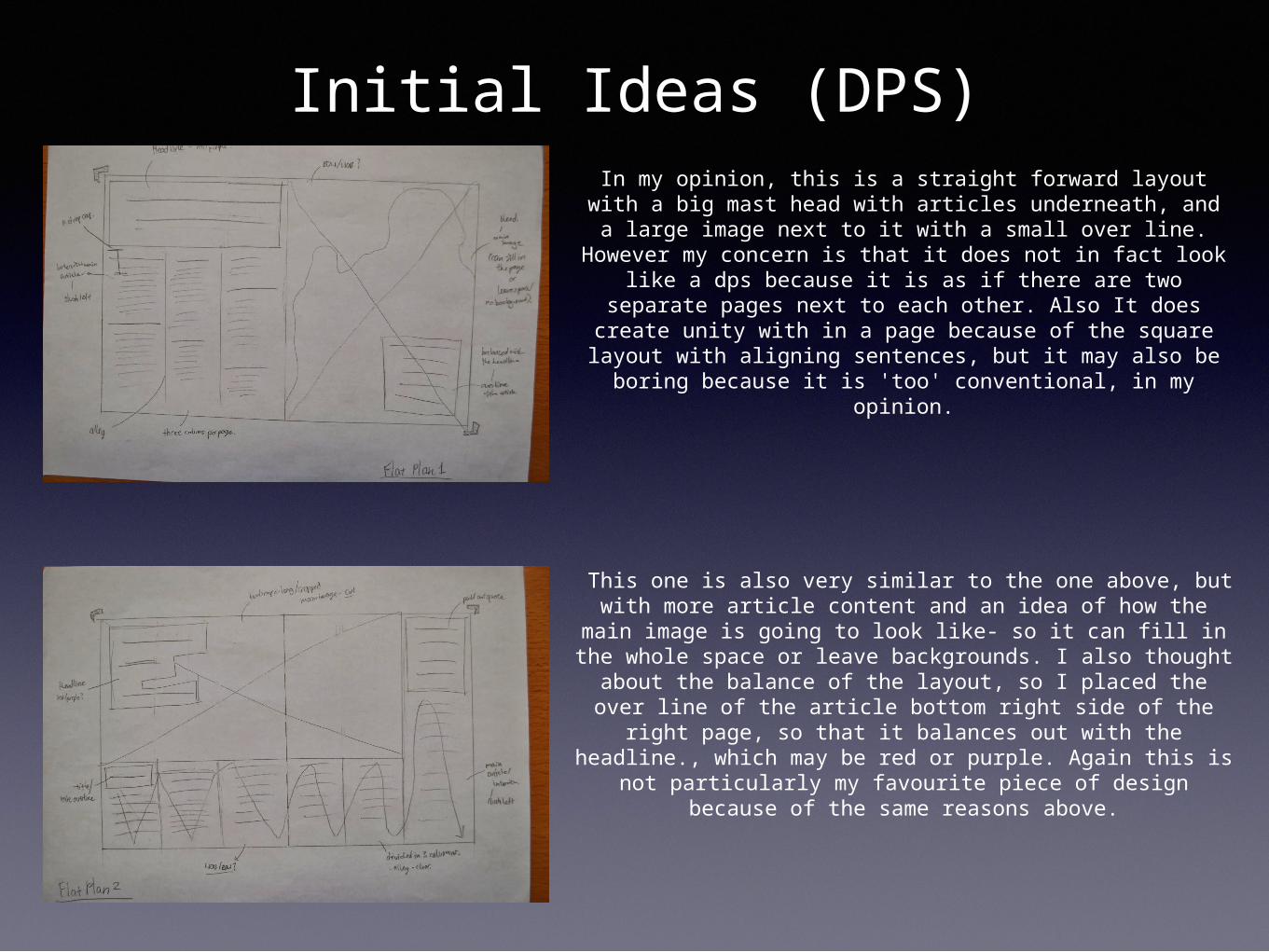
In my opinion, this is a straight forward layout with a big mast head with articles underneath, and a large image next
to it with a small over line. However my concern is that it does not in fact look like a dps because it is as if there are two separate pages next to each other. Also It does create
unity with in a page because of the square layout with aligning sentences, but it may also be boring because it is
'too' conventional, in my opinion.
This one is also very similar to the one above, but with more article content and an idea of how the main image is going to
look like- so it can fill in the whole space or leave backgrounds. I also thought about the balance of the layout, so I placed the over line of the article bottom right side of the right page, so that it balances out with the headline., which
may be red or purple. Again this is not particularly my favourite piece of design because of the same reasons above.
Initial Ideas (DPS)
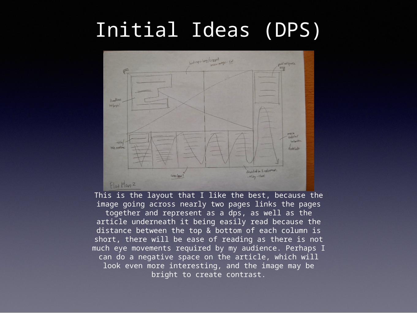
This is the layout that I like the best, because the image going across nearly two pages links the pages together and represent as a dps, as well as the article underneath it being easily read
because the distance between the top & bottom of each column is short, there will be ease of reading as there is not much eye
movements required by my audience. Perhaps I can do a negative space on the article, which will look even more
interesting, and the image may be bright to create contrast.
Final / Amended Ideas (Front Cover& Contents)
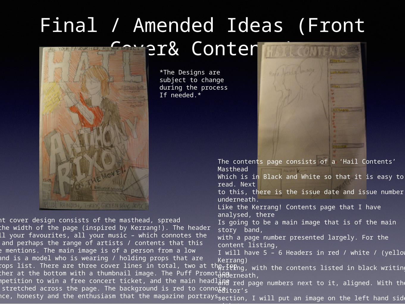
The Front cover design consists of the masthead, spread across the width of the page (inspired by Kerrang!). The headersays All your favourites, all your music – which connotes thefreedom and perhaps the range of artists / contents that thismagazine mentions. The main image is of a person from a lowangle, and is a model who is wearing / holding props that areon my props list. There are three cover lines in total, two at the top and another at the bottom with a thumbnail image. The Puff Promotionis a competition to win a free concert ticket, and the main headlineis also stretched across the page. The background is red to connoteImportance, honesty and the enthusiasm that the magazine portrays.
The contents page consists of a ‘Hail Contents’ MastheadWhich is in Black and White so that it is easy to read. Nextto this, there is the issue date and issue number underneath.Like the Kerrang! Contents page that I have analysed, there Is going to be a main image that is of the main story band, with a page number presented largely. For the content list-ing,I will have 5 – 6 Headers in red / white / (yellow-Kerrang) writing, with the contents listed in black writing underneath, and red page numbers next to it, aligned. With the editor’s section, I will put an image on the left hand side, with two column comment. A signature at the end is a convention. There will also be a promotion in the corner of the page, for the contents page to look more professional.
*The Designs aresubject to change during the process If needed.*
Final / Amended Ideas (DPS)
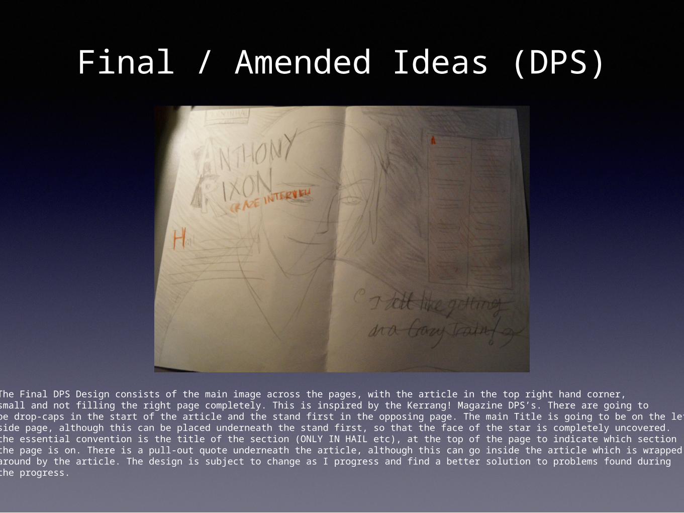
The Final DPS Design consists of the main image across the pages, with the article in the top right hand corner,small and not filling the right page completely. This is inspired by the Kerrang! Magazine DPS’s. There are going to be drop-caps in the start of the article and the stand first in the opposing page. The main Title is going to be on the left handside page, although this can be placed underneath the stand first, so that the face of the star is completely uncovered.the essential convention is the title of the section (ONLY IN HAIL etc), at the top of the page to indicate which section the page is on. There is a pull-out quote underneath the article, although this can go inside the article which is wrapped around by the article. The design is subject to change as I progress and find a better solution to problems found during the progress.