Embed Size (px)
Citation preview

NME Magazine KERRANG Magazine
The NME magazine is around £2.20, it come out weekly. Its target audience is from about 15years plus. Music genre is
rock.
FACTSType/focus of magazine – Rock Publishing Company – IPC MediaEditor’s name – Mike WilliamsDate of First publication – 7th March 1952Price - £2.40 How/Where can readers get it? – iPad, Laptop, Computer, Delivered to you (subscription), Retail shop.
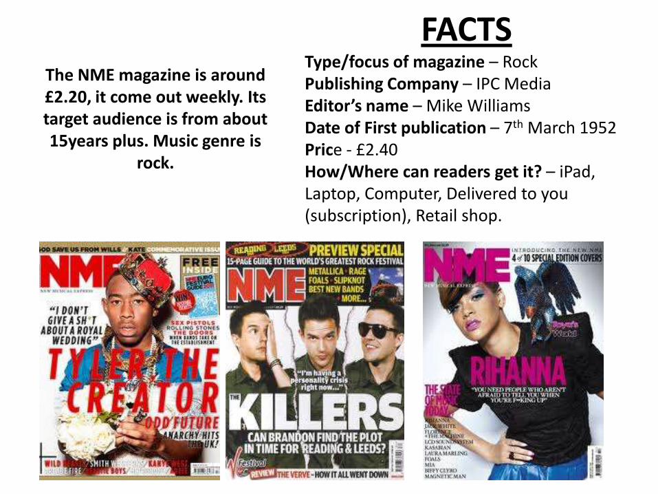
Freebie
Colour scheme, red/green/black
Barcode situated at the bottom
Date/Price
Uses quotes to attract attention
Text surrounds the face of the person on the front
Image overlaps title of magazine
The red text attracts attention
The black contrasts against the white background
Variety of font sizes
Large text ‘captivating’
Image relates to one of the topics of the magazine “I DON’T GIVE A SH*T ABOUT A ROYAL WEDDING” (the bouquet of flowers)
Other features to attract you too the magazine

The picture placed on one page automatically being the focus
Black eyes and shabby hair create the rock/punk look
Messy letters make it look scruffy and uneven makes it less formal
Quote takes up half page
Drop capital letter
Black and white contrast each other
Small paragraph, nutshellingthe writing below it
floating quote is enlarged and instantly draws readers into the article
Text wraps around the image, avoiding the image
Quote overlaps her arm but not face
Her name is highlighted in bubble writing
Text is extra small in comparison to the large image and floating quote
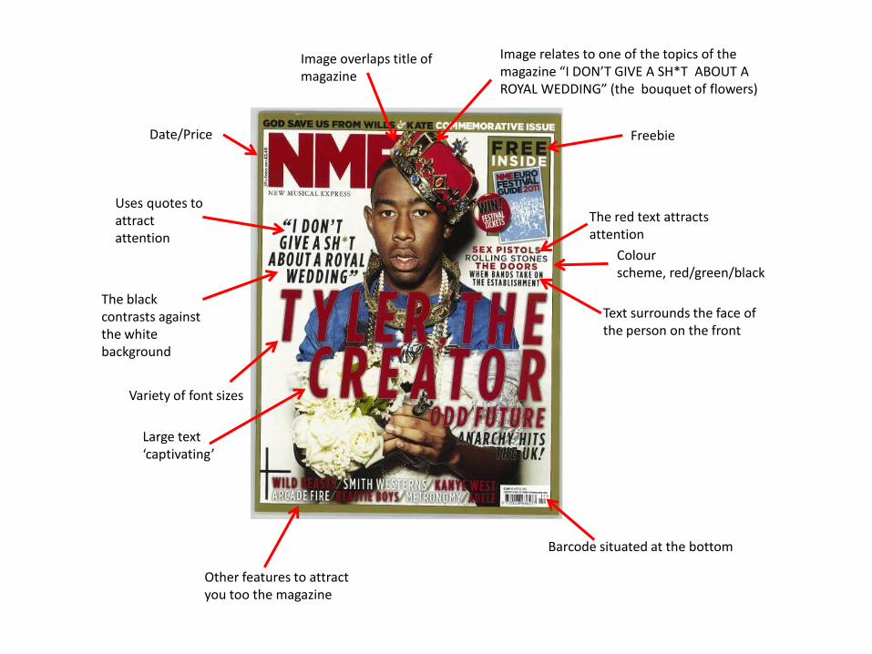
Colours contrast(numbers and text)
Uses block titles to separate the different types of articles
Advertisement
Bold contrasting titles
Main contents in one list
Page numbers easily visible in red
Picture being the main attraction
Title more towards the right
Date beneath title
Introductionary paragraph
Make the magazine look sophisticated
Drop capital
Weird subtitle

The KERRANG Magazine is out weekly, it is around £2.20 and
its music genre is rock, its target audience from around
16years plus.
FACTSType/focus of magazine – Rock Publishing Company – Bauer Media GroupEditor’s name – James McMahonDate of First publication – 6th June 1981Price - £2.20How/Where can readers get it? –iPad, Laptop, Computer, Delivered to you (subscription), Retail shop.
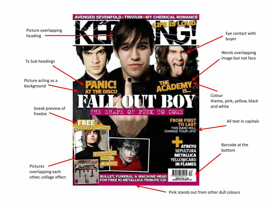
Picture overlapping heading
Sneak preview of freebie
Pink stands out from other dull colours
Colour theme, pink, yellow, black and white
Eye contact with buyer
Barcode at the bottom
Words overlapping image but not face
7x Sub headings
All text in capitals
Pictures overlapping each other, collage effect
Picture acting as a background

Issue number and date
Sub headings, are bolded with the contrasting colours
Small paragraph to introduce this magazine issue
Main picture, covering half the page
Yellow contrasts hugely against black
Page numbers highlighted in red
Advertisement
Info about who made certain stuff
Images to break up the listBold topic heading then small brief sentence
Magazine title
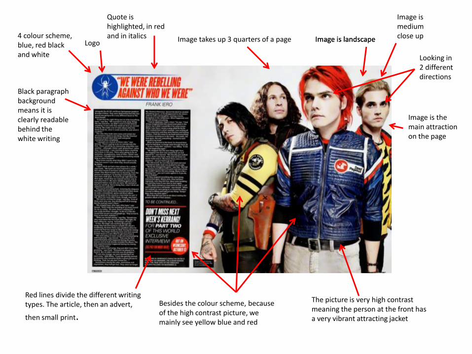
Image is landscapeImage takes up 3 quarters of a page4 colour scheme, blue, red black and white Looking in
2 different directions
Image is medium close up
The picture is very high contrast meaning the person at the front has a very vibrant attracting jacket
Besides the colour scheme, because of the high contrast picture, we mainly see yellow blue and red
Black paragraph background means it is clearly readable behind the white writing
Logo
Quote is highlighted, in red and in italics
Red lines divide the different writing types. The article, then an advert,
then small print.
Image is the main attraction on the page
Image is landscape