Embed Size (px)
Citation preview


The title of our trailer ‘The Agent’ is very stereotypical of that of a thriller. It indicates what occupation our main character has, an agent, which fits in with the forms and conventions of the thriller genre as it brings across the convention of the stereotypical thriller character being a spy, hit man etc.
Furthermore, it is short and snappy and contained the name of the occupation of our main character. We decided upon this idea from looking at similar thriller films such as ‘The American’ and ‘The Interpreter’ who use the job or role of their main character as a title.
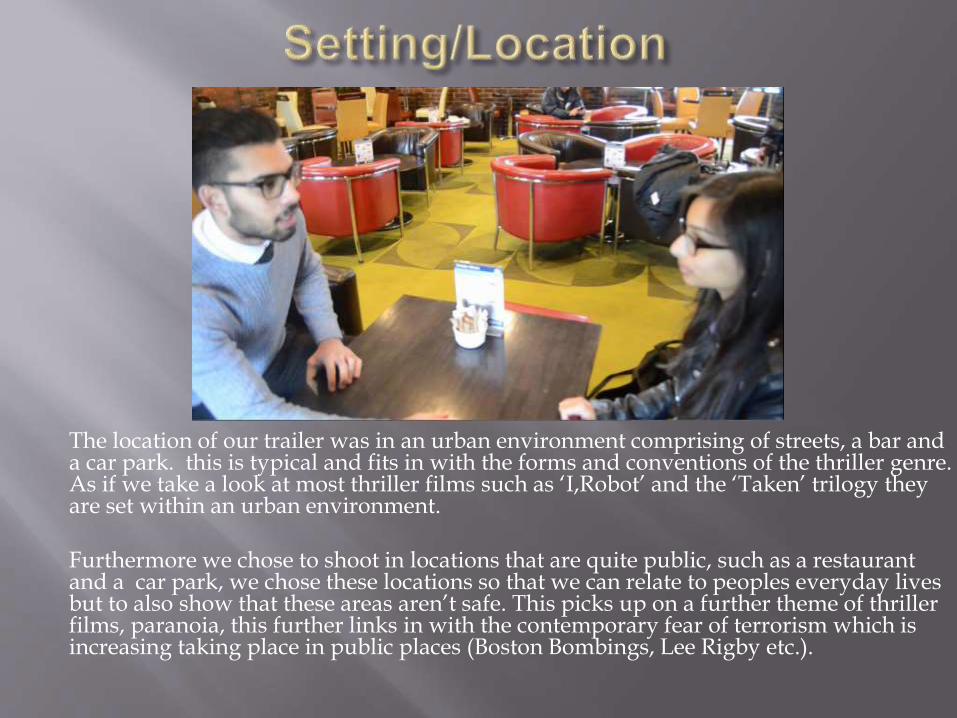
The location of our trailer was in an urban environment comprising of streets, a bar and a car park. this is typical and fits in with the forms and conventions of the thriller genre. As if we take a look at most thriller films such as ‘I,Robot’ and the ‘Taken’ trilogy they are set within an urban environment.
Furthermore we chose to shoot in locations that are quite public, such as a restaurant and a car park, we chose these locations so that we can relate to peoples everyday lives but to also show that these areas aren’t safe. This picks up on a further theme of thriller films, paranoia, this further links in with the contemporary fear of terrorism which is increasing taking place in public places (Boston Bombings, Lee Rigby etc.).

Our main props were very stereotypical of a thriller genre, as we used a gun and car. A gun is a favoured weapon across the thriller genre and can be seen as a key iconographic element in most thriller films such as Bourne and Kingsman and in the majority of thriller posters. Cars are also perceived as being typical of a thriller, if we look at the James Bond films they are known for their Aston Martin cars, and car chases are a typical thriller narrative element. This both are typical pieces of iconography, as you can see above in the new Sean Penn film ‘The Gunman which uses a gun on its poster.
The costume our main character had throughout the film is also stereotypical of a thriller character, he is dressed smartly, with a tie and trousers although not the full suit we might stereotypically expect. . Other examples would be the sort of characters Liam Neeson plays, for instance in A Walk Among The Tombstones. However, the crew neck style of jumper that our main character is wearing has links with the army, which could further insinuate that he is highly skilled and trained, another further convention of thriller characters (e.g. the Bourne or Taken central characters).

Our trailer shares typical conventions with other thriller trailers. For instance we used close up shots so that the attention of the audience is on a specific part of the framing, this is so that the audience can see the point of the shot immediately so the shot can move onto the next as soon as possible, this aids in the pace of the trailer being fast. For instance in the two shots above the attention is focused on our main character and then in the second shot the gun.
Furthermore each shot is there for a reason, I chose to explain the shot on the right as it does seem out of place, but its there to provide an enigma of why our main character would fall, and if he actually does fall. All our shots are in our trailer to help fit it in with the three part structure.

Our trailer fits in with the 3 part structure, which is a typical convention of trailers. The 3 part structure firstly introduces character traits, then comes the peak (this is a series of fast paced action shots to get the audience interested in seeing the film) and then ending on some enigmas. Our trailer follows this convention of trailer: the first 20 seconds of our trailer is introducing our two characters, and establishing their traits, Rahys as being physically fit, focused and determined, and Zahra as being shy and a stereotypical vulnerable female victim. This is then followed up by our peak which contains fast paced shots, before ending on the last part of our trailer the enigmas. This is typical in trailers and meets the forms and conventions of one.
Our continuity in our film is created partly through the chronological structure but also through using captions, which also helps to break up the structure of our trailer. This technique is also used in other trailers such as A Walk Among The Tombstones.

A typical convention of a thriller and a trailer is to have captions that link in with the rest of film’s campaign. We have followed this convention and have used the same font style used on our poster and magazine cover for our captions and title in the trailer.
Our captions, furthermore, help with the continuity of the trailer as they help to split up the sections of the three part structure. So after our characters are established there will be a caption, then the peak, followed by another caption, and then the engima of the film is in the middle of our title and ‘Coming soon’ caption.

The genre of our trailer is thriller, which is mainly perceived through the themes and narratives . For example typical narrative themes within our trailer are violence and paranoia and the narrative is mainly brought across through fight scenes, car chases, characters on the run etc. These are all typical of thriller films and they contain these narrative and themes.
For example with the thriller film ‘The Town’s’ trailer, we see these sort of themes and narratives bought across, similar to ours, we see the fight scene and furthermore a shot of them running.

Our character traits are presented within the first few shots of our trailer, in the first section of our third part structure. These are typically shown within these sections and we followed this convention. We see at the start our two main characters meeting at a bar where they introduce themselves, after this we see our main male character jogging, furthermore creating the character trait that he is physically fit. This trait is a convention of male thriller characters as they are normally fit individuals. We also get the impression that our main female character is a damsel in distress, through the shot seen above on the right, this again is typical of thriller characters, as the female is often the damsel in distress.

We haven’t used as many special effects throughout our trailer as other mainstream trailers would use. For example in the trailer for ‘I,Robot’ they use a lot of dissolves to go from shot to shot. With our trailer we use a few fades at the start and that’s about it. We went against the conventions of thriller trailers for special effects as we wanted ours to be simplistic and have focus on each shot and their meaning to create some enigmas.

Our trailer is 49 seconds long, this fits in with the conventions of teaser trailers as they are generally between 30 seconds and a minute and a half. We wanted our trailer to be as short as possible to keep with the convention of the fast paced editing of the trailer. Furthermore the length and the shots provided in the trailer are only supposed to be there to tease the audience, so each shot is only on screen for a short amount of time.

Masthead
Pug
Main Cover Line
Banner
Main Image
Cover Line

One of the main conventions of a magazine cover is its iconic rule of thirds structure. There are two orientations that the rule of thirds could fit, these are horizontal and vertical. What it does is it splits up the cover and makes sections easier to assimilate for the audience. For example our magazine cover to the left, follows the horizontal rule of thirds, the top section contains the title of the magazine and all of the magazine companies information. The second section contains our main image and our main cover line, the middle section is the part that audiences will most likely look at first so it is important that this is where the main cover line and image is placed. The last part of the third contains the other cover lines that the magazine contains alongside the pug.

When it came to making our Empire magazine cover, we thought it would be best if we looked at an existing cover so we can try and get all of the content and conventions over from an actual cover to our own one. We were influenced by the Quantum of Solace cover as firstly the film matched our trailer and furthermore it has the same strucure that we were looking for.

One typical convention that Empire magazine contains is its iconic red EMPIRE masthead, and we decided to use this in our magazine cover too.
The main use of the masthead is to make it instantly recognisable to the viewers, so to change this wouldn't be a smart move and may make our own magazine cover unrecognisable as a brand.

The main image is also very important when it comes to an Empire magazine cover, as it must fit in with a certain dramatic style, shot and framing. We used a shot similar to the one of James Bond where we show a mid to long shot of our main character and contains a gun as a prop. This fits in perfectly with both the genre of our project and an Empire magazines front cover, although what is unusual is having the central ‘star’ facing away from the camera. Empire is a mainstream film magazine and the star on the cover is a major selling point, so not seeing the star’s face would go against its own well established norm. However, I also felt that the pose itself is quite ‘iconic’ with major stars across several genres including thrillers using it- e.g. Clint Eastwood’s ‘Unforgiven’ where the star is so well known we don’t need to see his face.

Title TaglineMain Image Release Date
Reviews

Our poster went against the typical conventions of a poster as they are normally portrait (as seen with the Skyfallone below). However with the image we wanted to use wouldn’t work as a portrait poster, so we did some research and found that landscape posters for thriller films do exist for some films, such as A Walk Among The Tombstones.

Our main image also goes against a typical teaser poster convention. Where our main image is off centre, as opposed to the norm of the image being in a central position. This leaves the audience of the poster feeling paranoid as they suspect something to appear in the empty space to the side of our character. This is often used within horror films where it leaves the viewers constantly expecting something to jump out to the side furthermore leaving them constantly paranoid.