Visualization Techniques for Multivariate Discrete and Continuous
Data
March 4, 2005
Rachael Brady
Multivariate Data Types
In general, each point has many attributes and/or measurements– Type 1: measurements are continuous in nature, and
combining dimensions might make sense• Weather data - for each x, y, z location we have water density (scalar),
temperature (scalar), wind velocity (vector), air pressure (scalar)
– Type 2: data is discrete, more like attribute list, and cannot in general be combined
• Baseball statistics - for each player we have at bats, walks, hits, doubles, homeruns, RBIs.
• Populations - eye color of residents in NC, income level, voting record
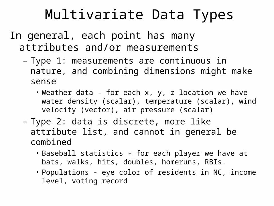
Approaches
• Dimensional Reduction– Principle Component Analysis
– Independent Component Analysis
– Kohonen Self Organizing Maphttp://davis.wpi.edu/~matt/courses/soms/Dimensional Subsetting
• Dimensional Subsetting• Dimensional Organization• Dimensional Embedding
Source: Matt Ward, Multivariate Vis talk Sept 2000
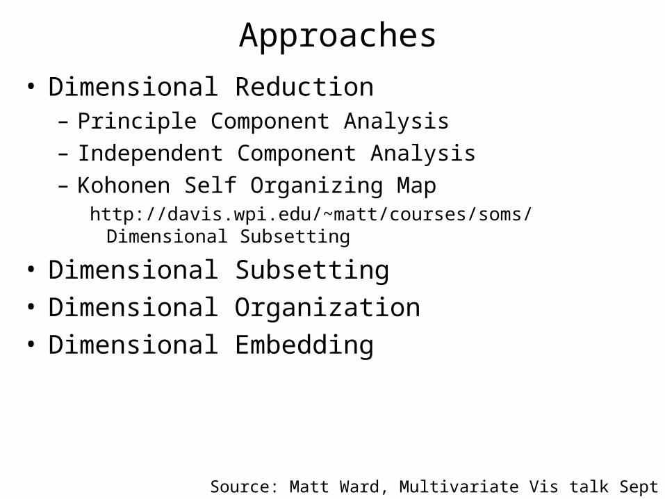
Dimensional Subsetting - Scatter Plots•Invoke the concept of small multiples
•Show all pair-wise dimensions in a matrix
•Easily see clusters, trends and correlations
•Problem: How do you see a trend that requires 2 or more dependent variables?
Source: Matt Ward, Multivariate Vis talk Sept 2000
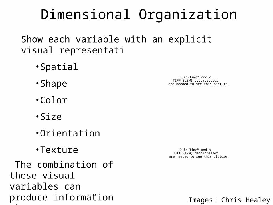
Dimensional Organization
Show each variable with an explicit visual representation
•Spatial
•Shape
•Color
•Size
•Orientation
•Texture
The combination of these visual variables can produce information that “pops out”, but it is not additive
QuickTime™ and aTIFF (LZW) decompressor
are needed to see this picture.
QuickTime™ and aTIFF (LZW) decompressor
are needed to see this picture.
Images: Chris Healey
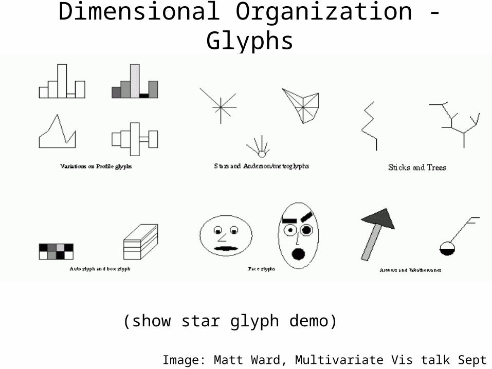
Dimensional Organization - Glyphs
(show star glyph demo)
Image: Matt Ward, Multivariate Vis talk Sept 2000
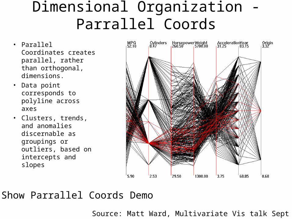
Dimensional Organization - Parrallel Coords
• Parallel Coordinates creates parallel, rather than orthogonal, dimensions.
• Data point corresponds to polyline across axes
• Clusters, trends, and anomalies discernable as groupings or outliers, based on intercepts and slopes
Source: Matt Ward, Multivariate Vis talk Sept 2000
Show Parrallel Coords Demo
Parrallel Coords - Useful?
QuickTime™ and aTIFF (LZW) decompressor
are needed to see this picture.
Source: http://www.ccs.neu.edu/home/mattsp/

Parrallel Coords - Useful?
QuickTime™ and aTIFF (LZW) decompressor
are needed to see this picture.
Parrallel Coords - Extended
QuickTime™ and aTIFF (LZW) decompressor
are needed to see this picture.
QuickTime™ and aTIFF (LZW) decompressor
are needed to see this picture.
QuickTime™ and aTIFF (LZW) decompressor
are needed to see this picture.
QuickTime™ and aTIFF (LZW) decompressor
are needed to see this picture.
QuickTime™ and aTIFF (LZW) decompressor
are needed to see this picture.
Visualizating Hierarchical clusters, Fua et al. 1999
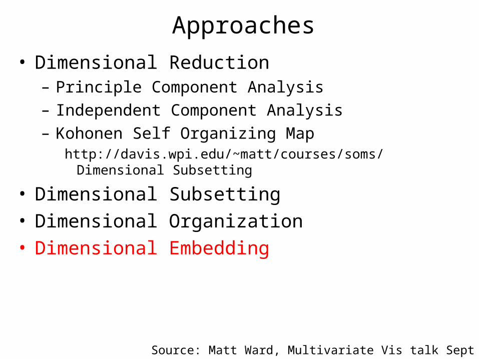
Approaches
• Dimensional Reduction– Principle Component Analysis
– Independent Component Analysis
– Kohonen Self Organizing Maphttp://davis.wpi.edu/~matt/courses/soms/Dimensional Subsetting
• Dimensional Subsetting• Dimensional Organization• Dimensional Embedding
Source: Matt Ward, Multivariate Vis talk Sept 2000
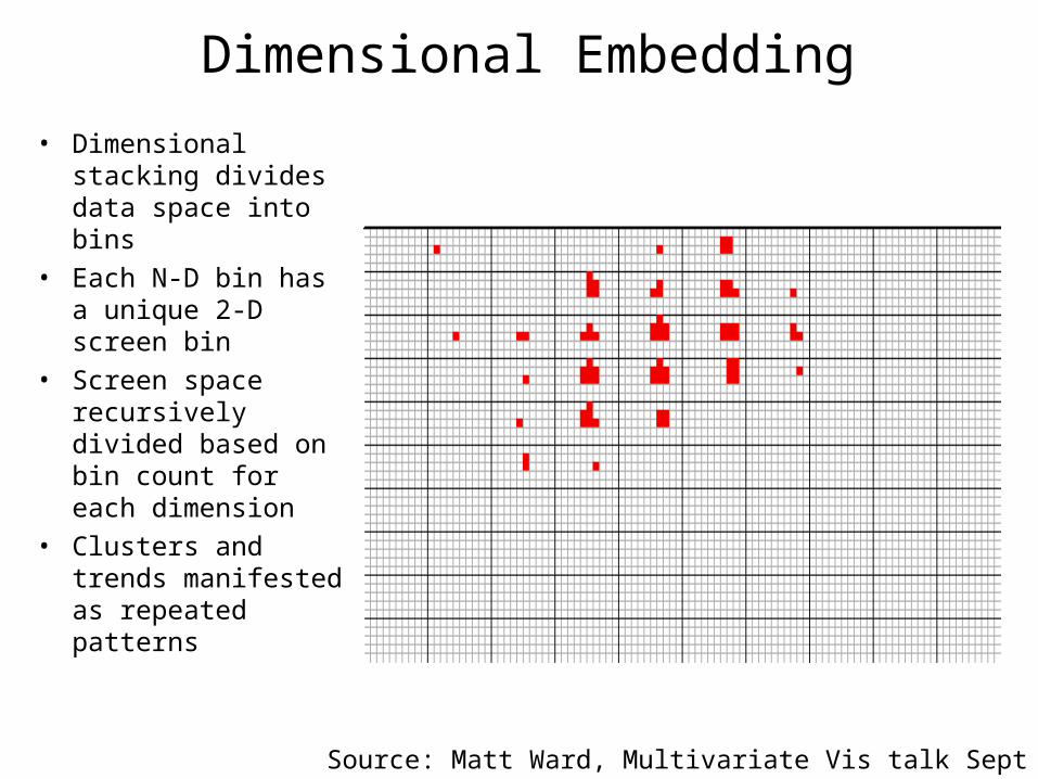
Dimensional Embedding
• Dimensional stacking divides data space into bins
• Each N-D bin has a unique 2-D screen bin
• Screen space recursively divided based on bin count for each dimension
• Clusters and trends manifested as repeated patterns
Source: Matt Ward, Multivariate Vis talk Sept 2000
Dimensional Embedding - not so easy
•What Dimensions do you choose at what hierarchy?
•How do you keep coordinates consistent?
•How do you layout tiles on page with consistency?
•Can we do this automatically?
Producing a good plot is hard
Trellis - an attempt by Rick Becker and Bill ClevelandIncorporated in to the S/S-PLUS statistical Package

A Digression into Plot design…
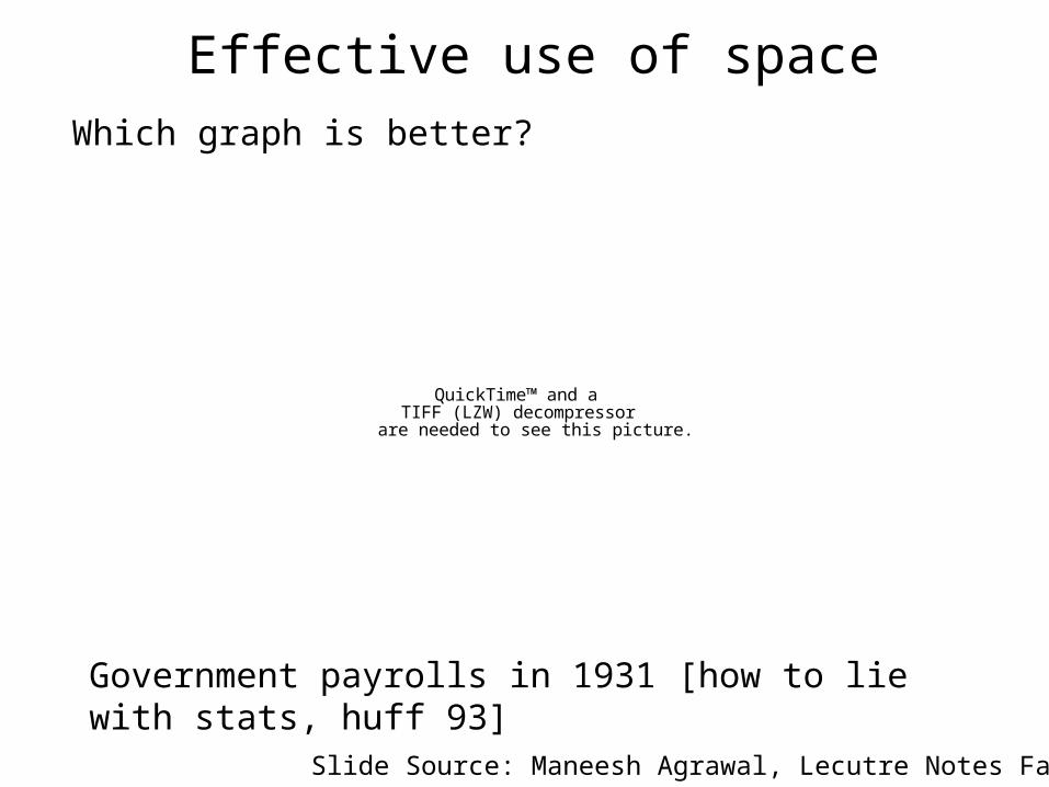
Effective use of space
QuickTime™ and aTIFF (LZW) decompressor
are needed to see this picture.
Which graph is better?
Government payrolls in 1931 [how to lie with stats, huff 93]
Slide Source: Maneesh Agrawal, Lecutre Notes Fall 2005
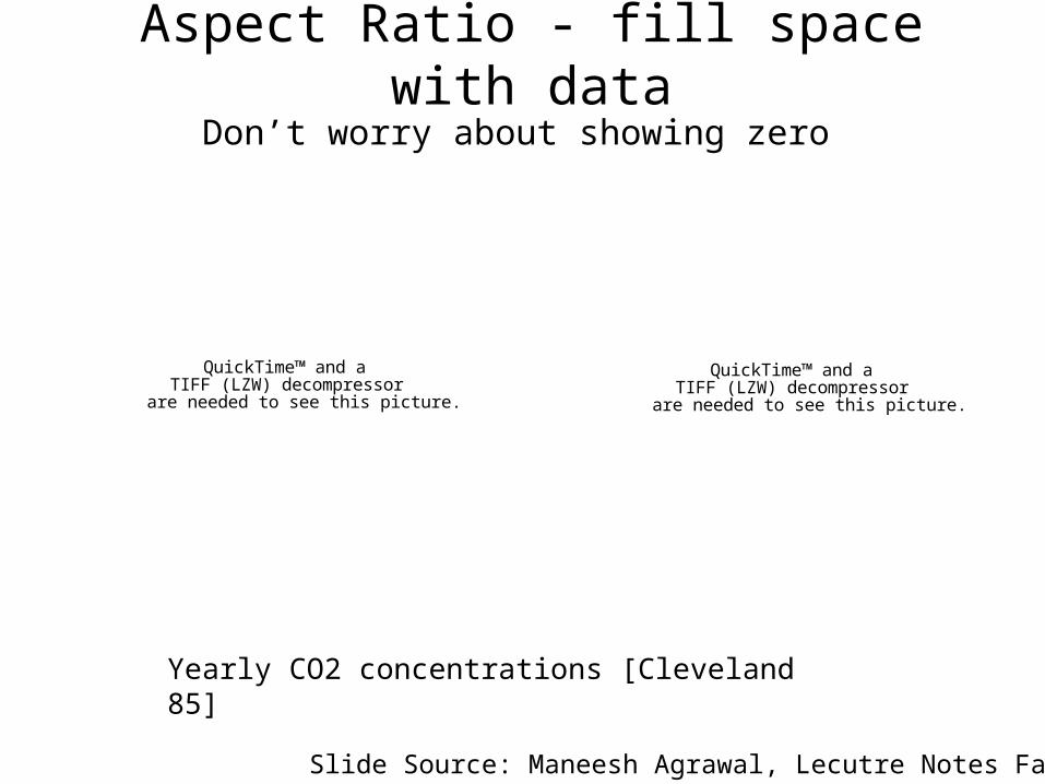
Aspect Ratio - fill space with data
QuickTime™ and aTIFF (LZW) decompressor
are needed to see this picture.
QuickTime™ and aTIFF (LZW) decompressor
are needed to see this picture.
Yearly CO2 concentrations [Cleveland 85]
Don’t worry about showing zero
Slide Source: Maneesh Agrawal, Lecutre Notes Fall 2005
QuickTime™ and aTIFF (LZW) decompressor
are needed to see this picture.
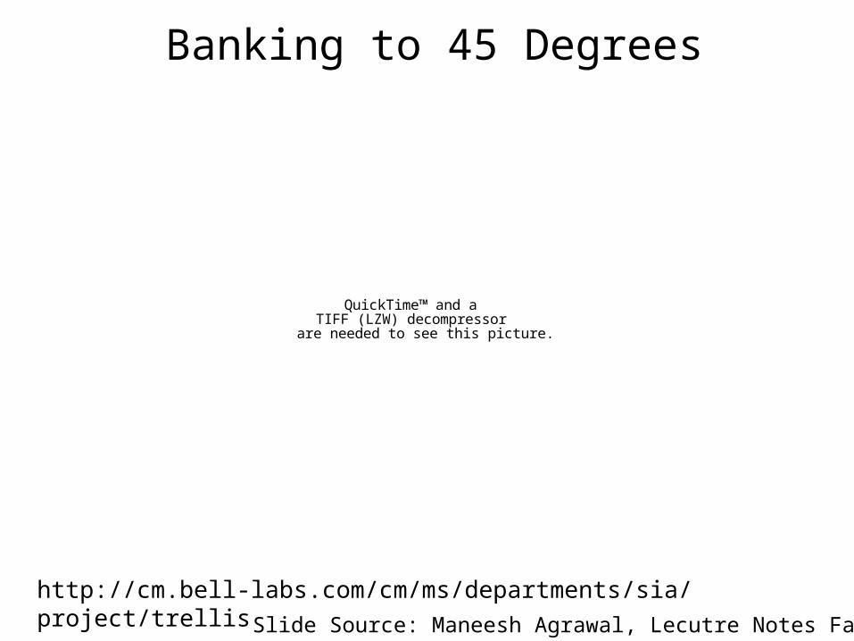
Banking to 45 Degrees
http://cm.bell-labs.com/cm/ms/departments/sia/project/trellis
Slide Source: Maneesh Agrawal, Lecutre Notes Fall 2005
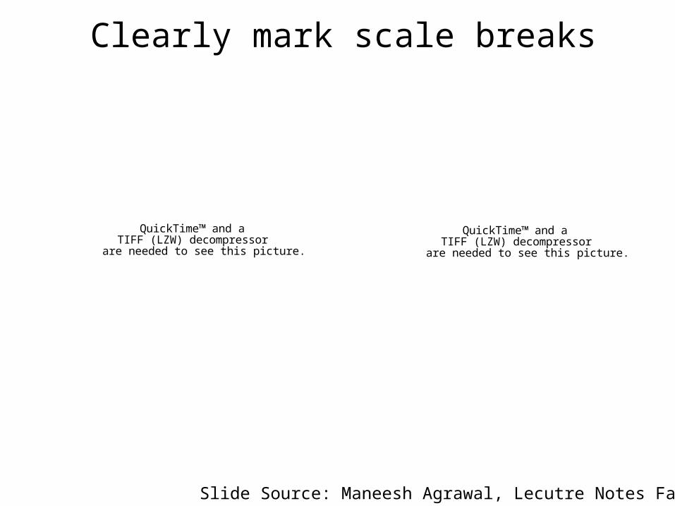
Clearly mark scale breaks
QuickTime™ and aTIFF (LZW) decompressor
are needed to see this picture.
QuickTime™ and aTIFF (LZW) decompressor
are needed to see this picture.
Slide Source: Maneesh Agrawal, Lecutre Notes Fall 2005
Scale break vs. Log scale
QuickTime™ and aTIFF (LZW) decompressor
are needed to see this picture.
QuickTime™ and aTIFF (LZW) decompressor
are needed to see this picture.
Both Increase Visual Resolution
Log scale allows easy comparisons of all data
Scale break is more difficult to compare across the break
Slide Source: Maneesh Agrawal, Lecutre Notes Fall 2005
Transforming Data for GraphingHow well does the curve fit the data?
Plot vertical distance from best fit curve
Residual graph shows accuracy of fit QuickTime™ and a
TIFF (LZW) decompressorare needed to see this picture.
Slide Source: Maneesh Agrawal, Lecutre Notes Fall 2005
A Trellis Example Lead Concentration vs. Setback Distance Given Day-of-the-Week, Week, and Height
On the next slide is a trellis display of lead concentration against setback distance given day-of-the-week (thu-wed), week (1-3), and height (3 values). There are 63 panels arranged into 31 columns and 3 rows. Each row conditions on a different value of height; as we go from bottom to top, the heights increase. The panels in each row are in time order because the panels first cycle through the days of the week and then through the weeks.
The display reveals much about the structure of the data. There is a strong interaction between height and setback distance. For the lowest height, lead decreases with setback. But for the middle value of height, lead typically first increases with setback and then decreases. For the highest height, lead occasionally has the increase-decrease pattern for about 1/3 of the days, most of them days with large concentrations, and is relatively stable for the remaining days. This behavior is consistent with air transport mechanisms. Lead is emitted at ground level from automobile tail pipes. The closest of the 9 monitors, the one with the lowest height and the closest setback, has the largest concentrations because it is close to the pollution source. From the source, the lead is carried laterally by the wind, spreading upward as it moves. This plume-like behavior can cause the concentrations to be relatively small at the higher monitors at the closest setback.
Source: http://cm.bell-labs.com/cm/ms/departments/sia/project/trellis/wwww.html
A Trellis Example
QuickTime™ and aTIFF (LZW) decompressor
are needed to see this picture.
Source: http://cm.bell-labs.com/cm/ms/departments/sia/project/trellis/wwww.html
Tensor VisualizationHigh Dimensional Scientific Data
Visualization
QuickTime™ and aTIFF (LZW) decompressor
are needed to see this picture.
QuickTime™ and aTIFF (LZW) decompressor
are needed to see this picture.
QuickTime™ and aTIFF (LZW) decompressor
are needed to see this picture.
Not Today
Some Interesting Web Sites
• The best and worst of statistical graphs– http://www.math.yorku.ca/SCS/Gallery/
• Chris Healey’s Preattentive Vision Applet– http://www.csc.ncsu.edu/faculty/healey/PP/index.html#Preattentive
• OpenDX Gallery– http://www.opendx.org/highlights.php
• IVTK: An Information Visualization Toolkit– Ivtk.sourceforge.net
• Information Visualization Repository– http://www.cs.umd.edu/hcil/InfovisRepository/index.shtml
Resources
• Great sources for theory behind multivariate display and perception are– Bertin 1983
– Cleveland 1993
– Tufte 1983, 1990
– Colin Ware, 2000
• A couple of good papers are– Shneiderman, “The Eyes Have It: A Task by Data Type
Taxonomy for Information Visualizations”
– Marc Green, “Toward a Perceptual Science of Multidimensional Data Visualization: Bertin and Beyond”
Recommended