#SMX #31B @DustinWStout
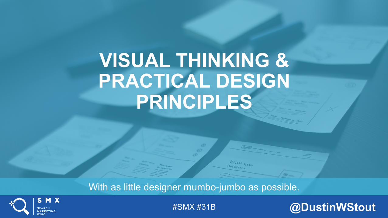
With as little designer mumbo-jumbo as possible.
VISUAL THINKING & PRACTICAL DESIGN
PRINCIPLES
Example Title Slide:
Although this is a template, these slides have been created as examples to show you what’s possible within the template. PLEASE DELETE ALL EXAMPLE SLIDES AND NOTES BEFORE CREATING OR IMPORTING YOUR OWN DECK. YOU MUST USE THE SMX FOOTER ON YOUR TITLE SLIDE! The template works best if you use it to create a presenta>on from scratch. However, this blank layout offers you flexibility to insert your own slides above the SMX footer. You must use this footer at on almost all of your slides. If a screenshot overlaps the footer on occasion, that’s fine – but do your best to crop appropriately! Before you do anything else, replace “#XXa” in the footer with your session’s specific hashtag. In PowerPoint, Select VIEW>SLIDE MASTER to edit and include it on all slides of your presenta>on. Also add your @twiQerhandle (or @companyhandle if you prefer). Ask your session coordinator for the session’s specific hashtag! This template is high-‐resolu>on 16:9. DO NOT change it to 4:3. Also note that if you import a 4:3 presenta>on into 16:9 you may encounter display issues. The template uses Century Gothic & Corbel as default fonts. Arial is a secondary font that may appear. Note that older versions of PowerPoint may not have these as an op>on; change to Arial or other standard sans-‐serif-‐font. When inser>ng text, you *MUST* use only standard fonts. We cannot guarantee event laptops will have specialty fonts installed, nor can we do so onsite. Powerpoints with anima>ons may not translate well to pdf/slideshare format – you may also submit a 2nd version / scrubbed deck more appropriate for pos>ng online by SMX produc>on staff.
#SMX #31B @DustinWStout
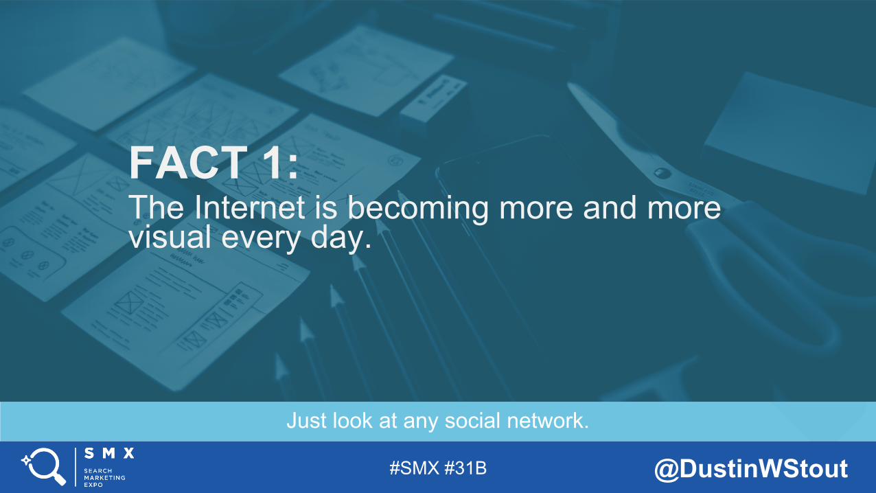
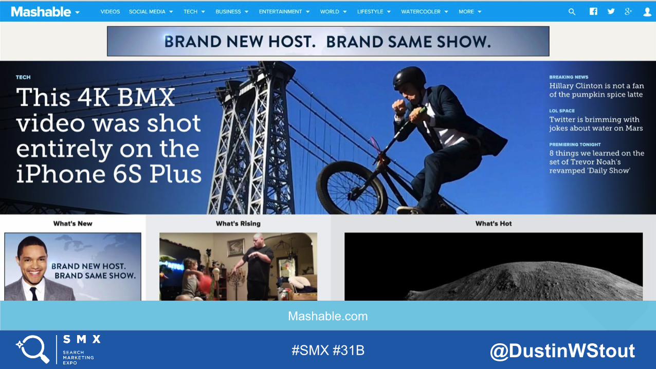
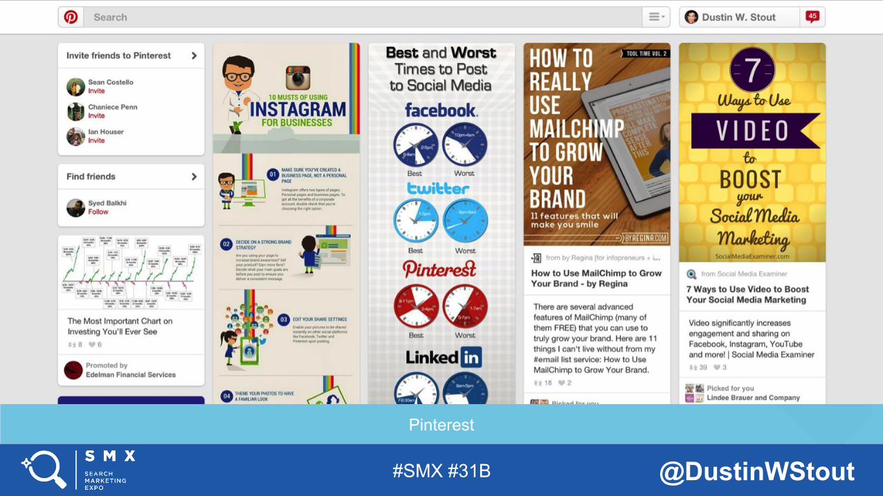
Just look at any social network.
FACT 1: The Internet is becoming more and more visual every day.
#SMX #31B @DustinWStout
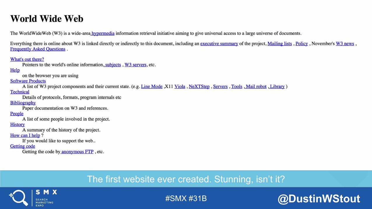
The first website ever created. Stunning, isn’t it?
#SMX #31B @DustinWStout
Mashable.com
#SMX #31B @DustinWStout
#SMX #31B @DustinWStout
Fogg, B., Soohoo, C., Danielson, D., Marable, L., Standord, J., & Tauber, E. (2003)
FACT 2: Human beings have evolved to judge their environment based on visual cues.
#SMX #31B @DustinWStout
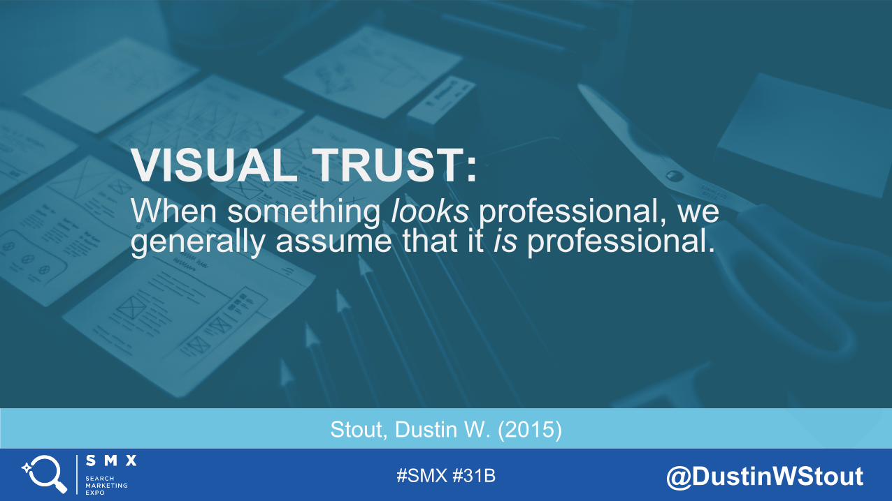
Stout, Dustin W. (2015)
VISUAL TRUST: When something looks professional, we generally assume that it is professional.
#SMX #31B @DustinWStout
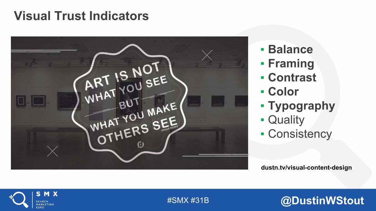
▪ Balance ▪ Framing ▪ Contrast ▪ Color ▪ Typography ▪ Quality ▪ Consistency
Visual Trust Indicators Image + Bullets Sample Slide:
Click content icons to add images, charts, video, tables, etc… DELETE THIS SLIDE IF YOU DO NOT USE.
dustn.tv/visual-content-design
#SMX #31B @DustinWStout
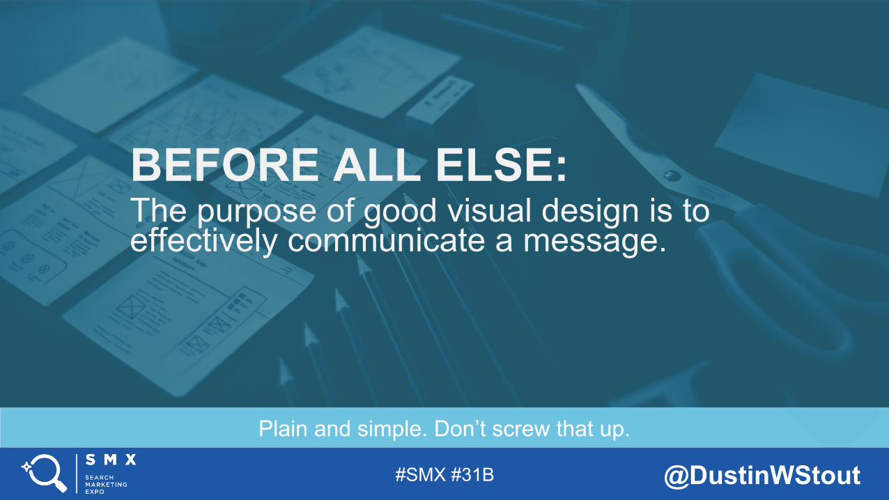
Plain and simple. Don’t screw that up.
BEFORE ALL ELSE: The purpose of good visual design is to effectively communicate a message.
#SMX #31B @DustinWStout
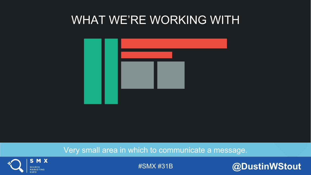
Very small area in which to communicate a message.
WHAT WE’RE WORKING WITH
#SMX #31B @DustinWStout
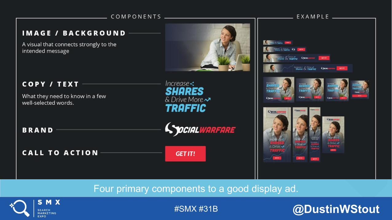
Four primary components to a good display ad.
#SMX #31B @DustinWStout
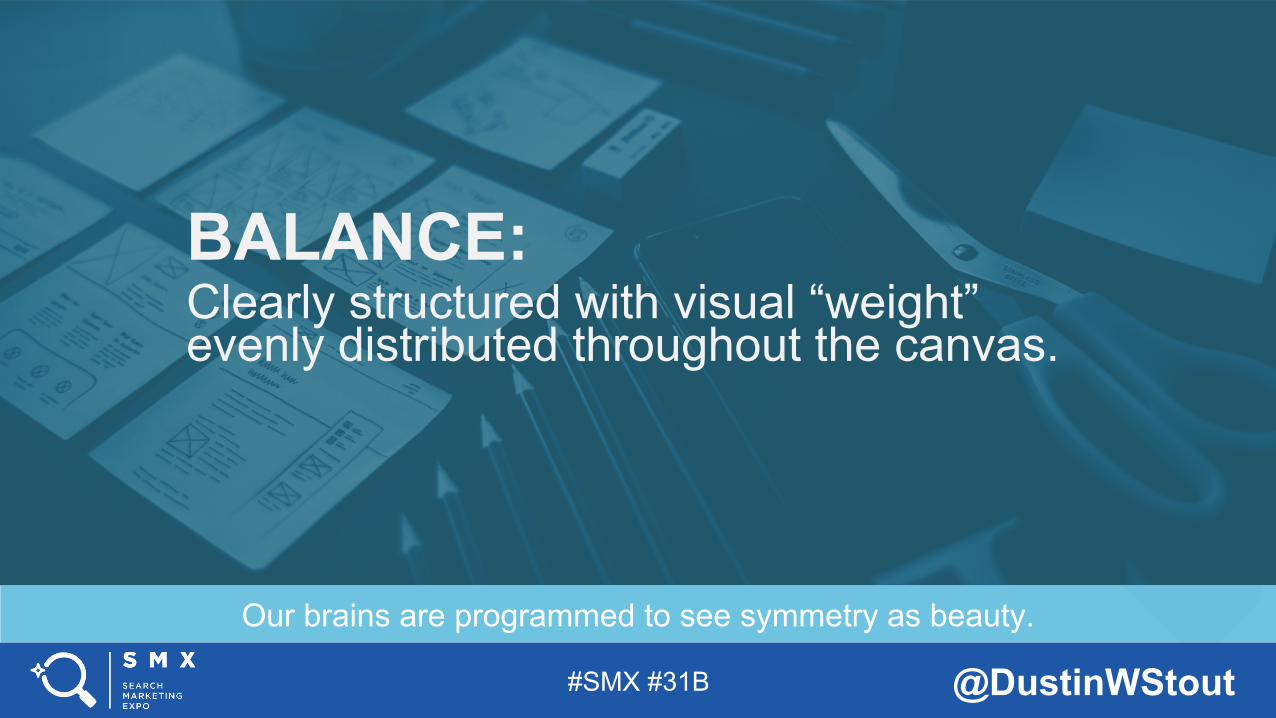
Our brains are programmed to see symmetry as beauty.
BALANCE: Clearly structured with visual “weight” evenly distributed throughout the canvas.
#SMX #31B @DustinWStout
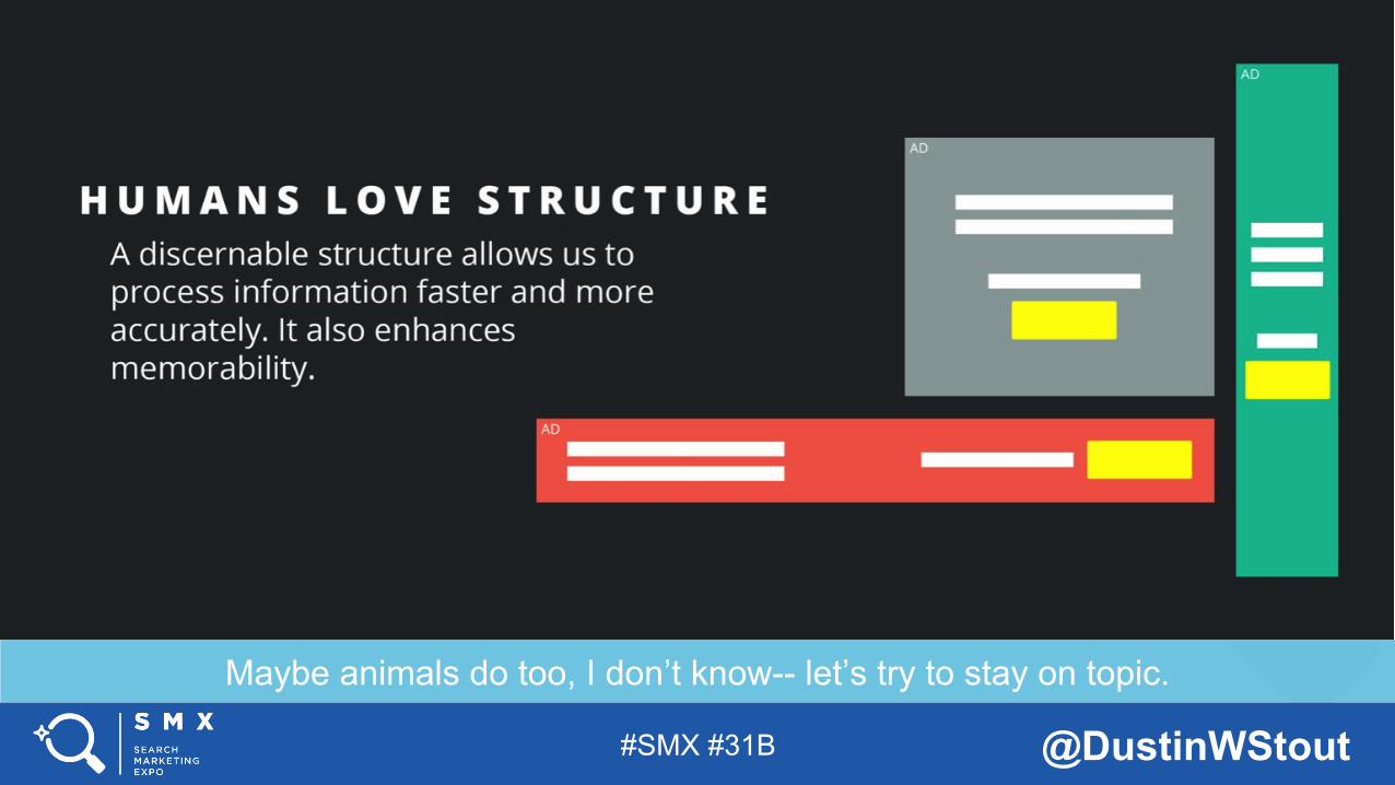
Maybe animals do too, I don’t know-- let’s try to stay on topic.
#SMX #31B @DustinWStout
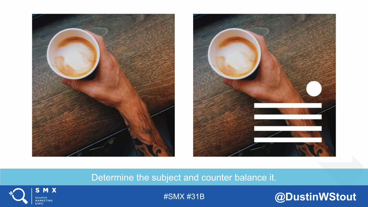
Determine the subject and counter balance it.
#SMX #31B @DustinWStout
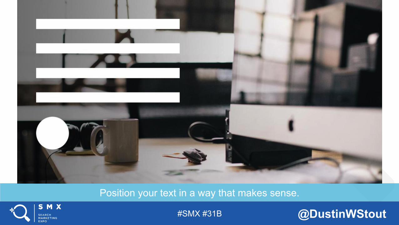
Position your text in a way that makes sense.
#SMX #31B @DustinWStout
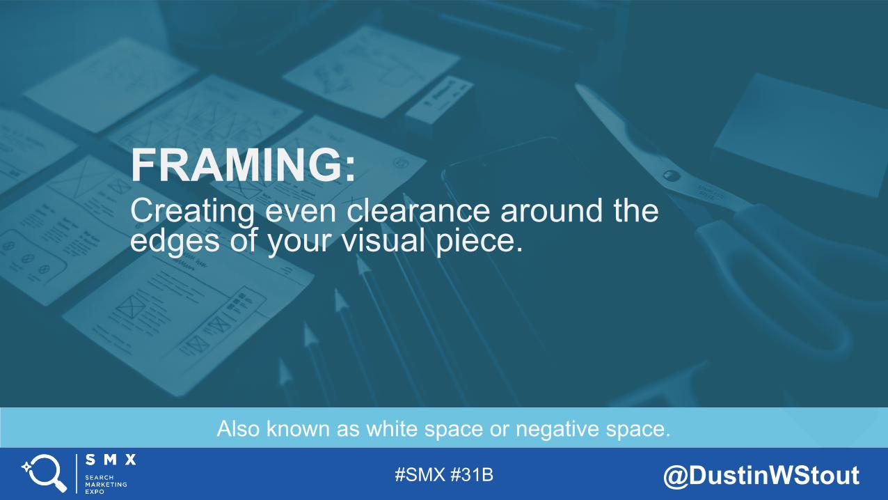
Also known as white space or negative space.
FRAMING: Creating even clearance around the edges of your visual piece.
#SMX #31B @DustinWStout
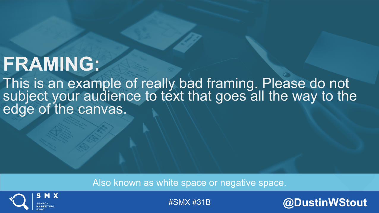
Also known as white space or negative space.
FRAMING: This is an example of really bad framing. Please do not subject your audience to text that goes all the way to the edge of the canvas.
#SMX #31B @DustinWStout
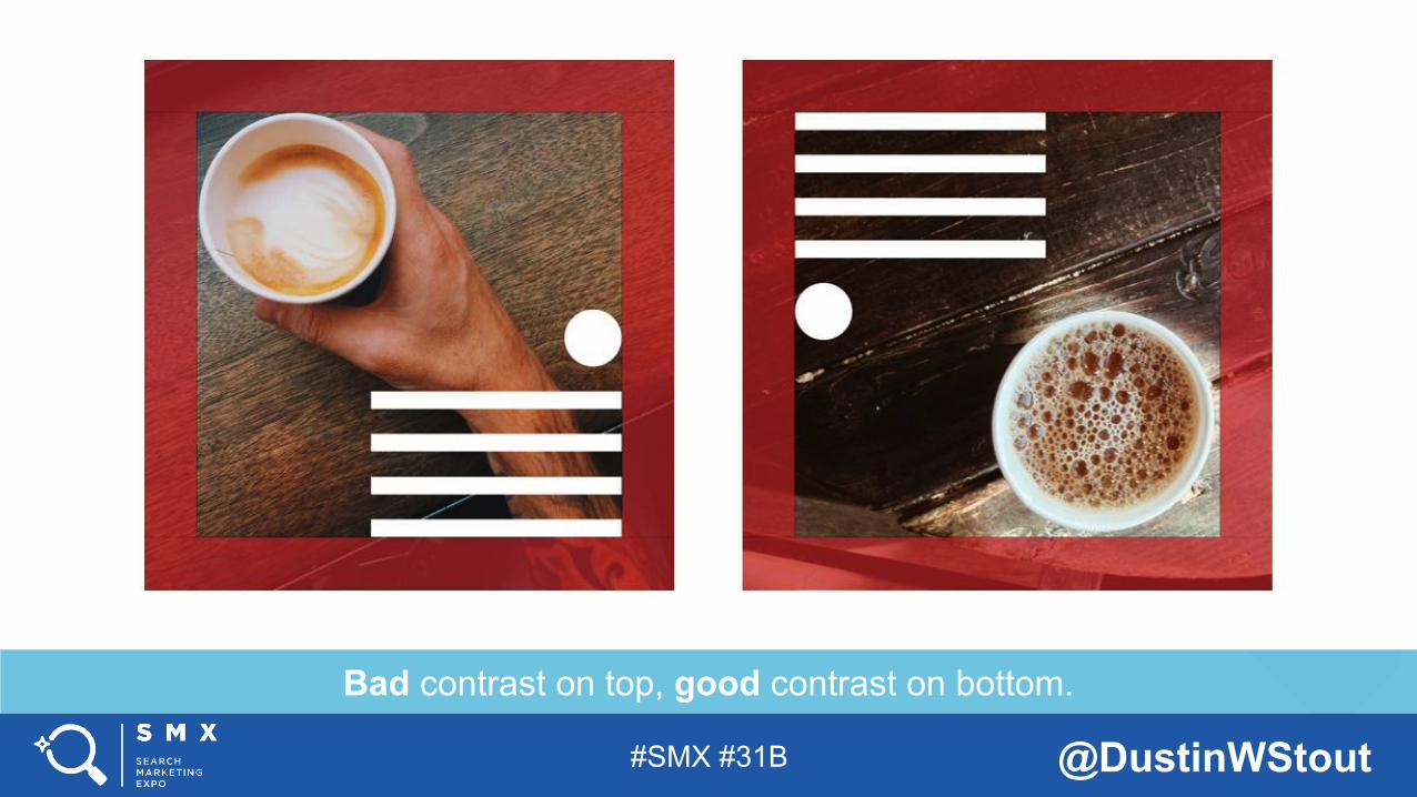
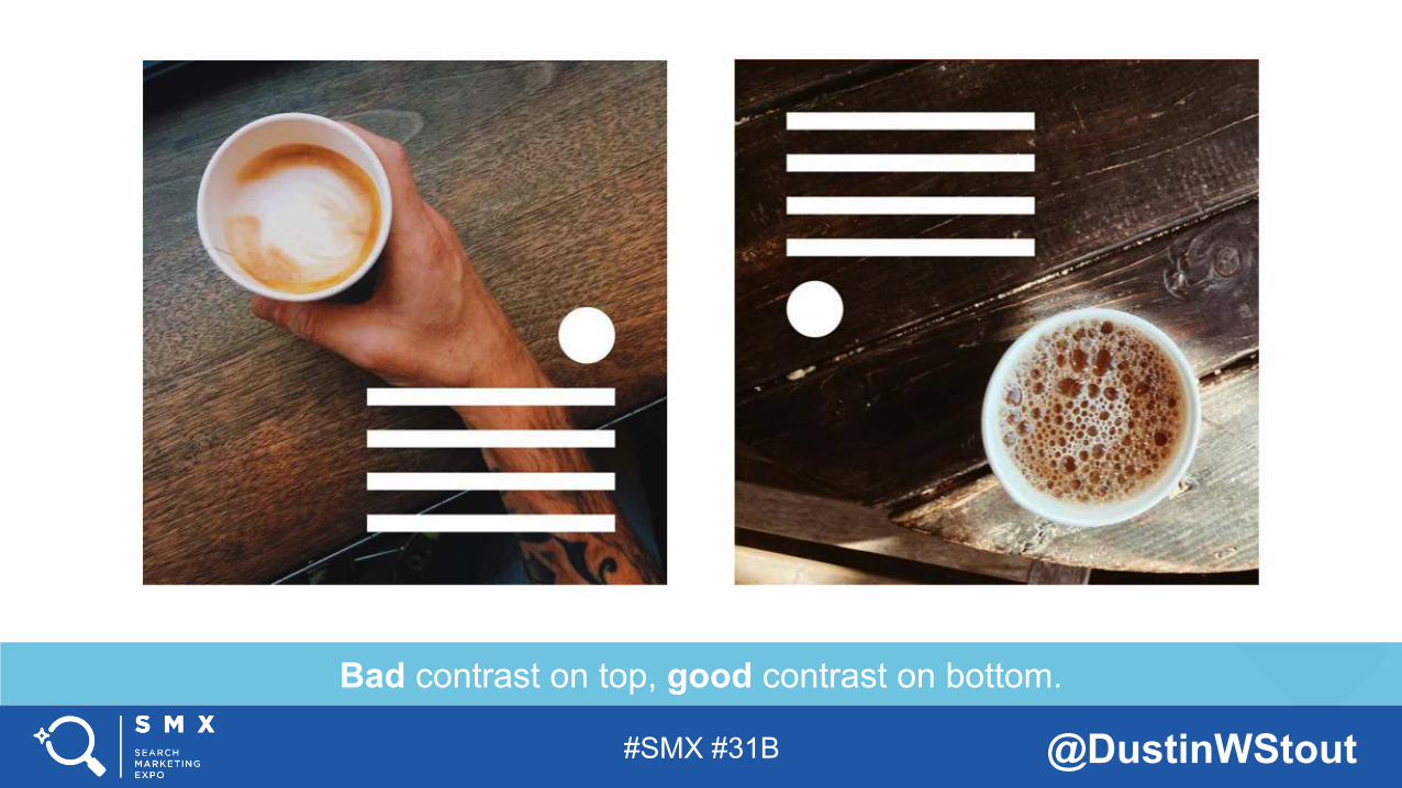
Bad contrast on top, good contrast on bottom.
#SMX #31B @DustinWStout
Bad contrast on top, good contrast on bottom.
#SMX #31B @DustinWStout
See what I did there?
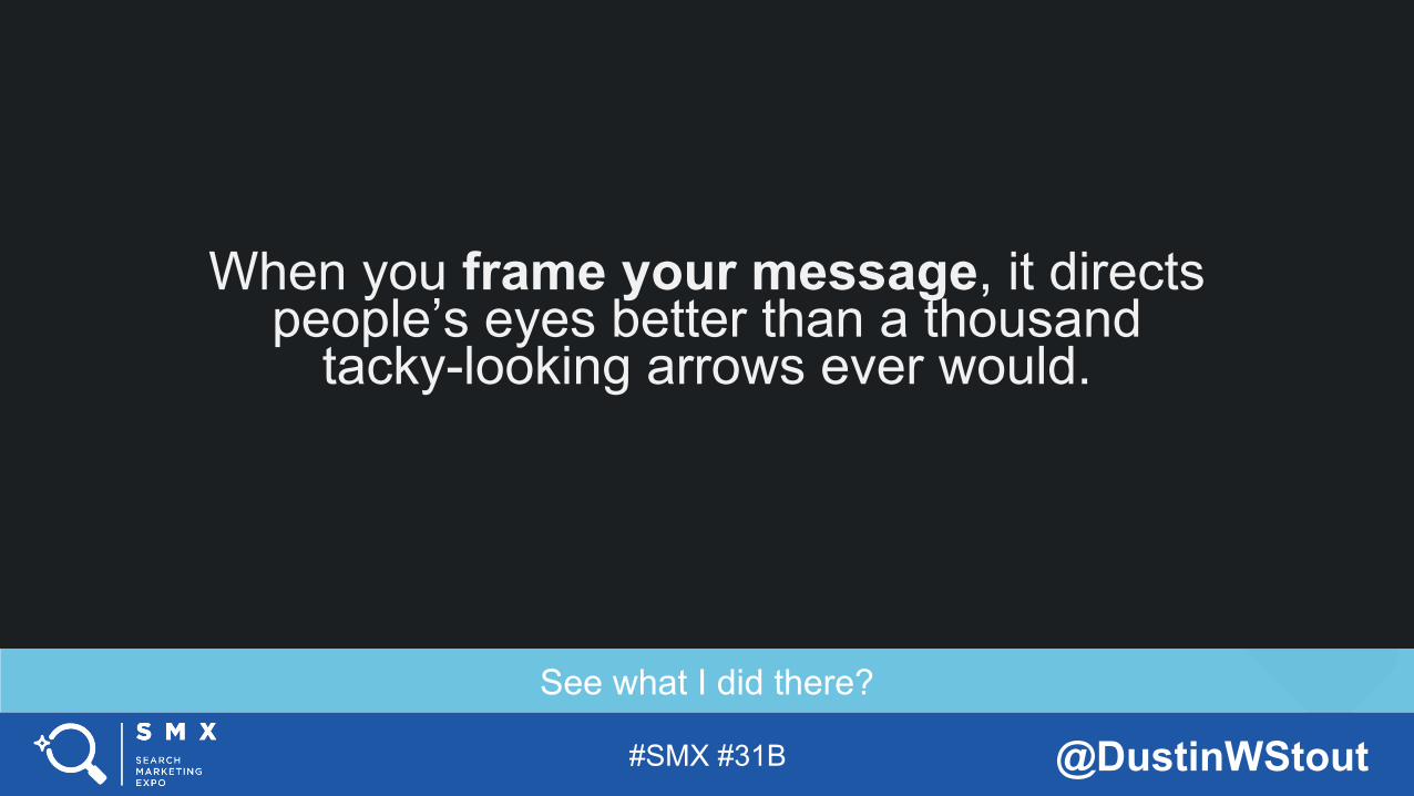
When you frame your message, it directs people’s eyes better than a thousand
tacky-looking arrows ever would.
#SMX #31B @DustinWStout
Probably the hardest thing to explain, so let me show you...
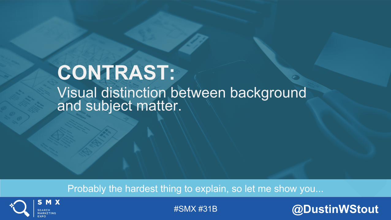
CONTRAST: Visual distinction between background and subject matter.
#SMX #31B @DustinWStout
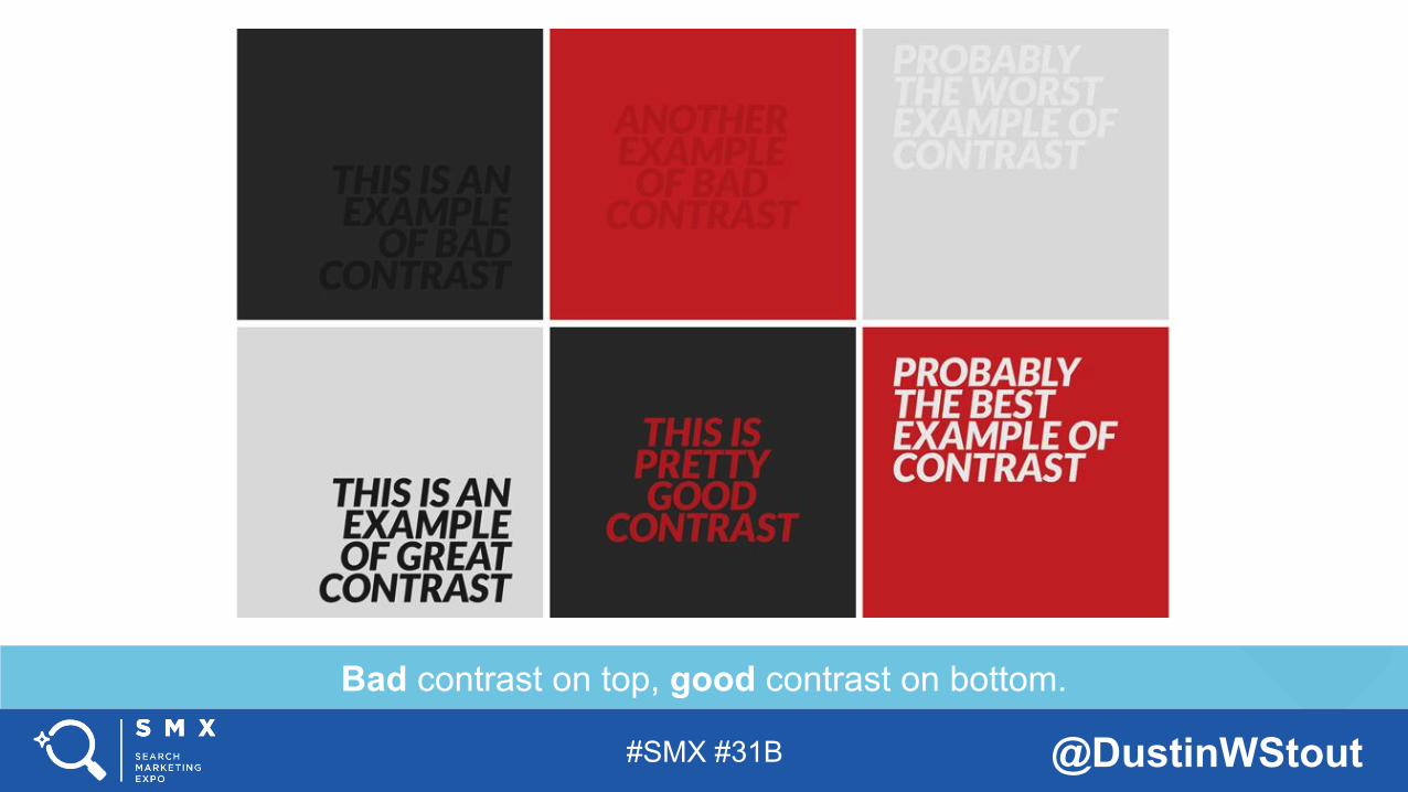
Bad contrast on top, good contrast on bottom.
#SMX #31B @DustinWStout
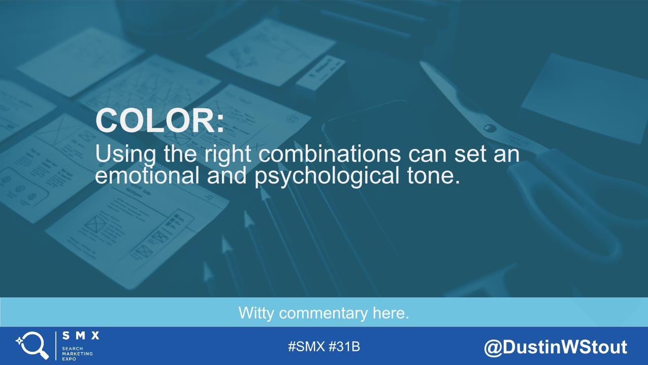
Witty commentary here.
COLOR: Using the right combinations can set an emotional and psychological tone.
#SMX #31B @DustinWStout
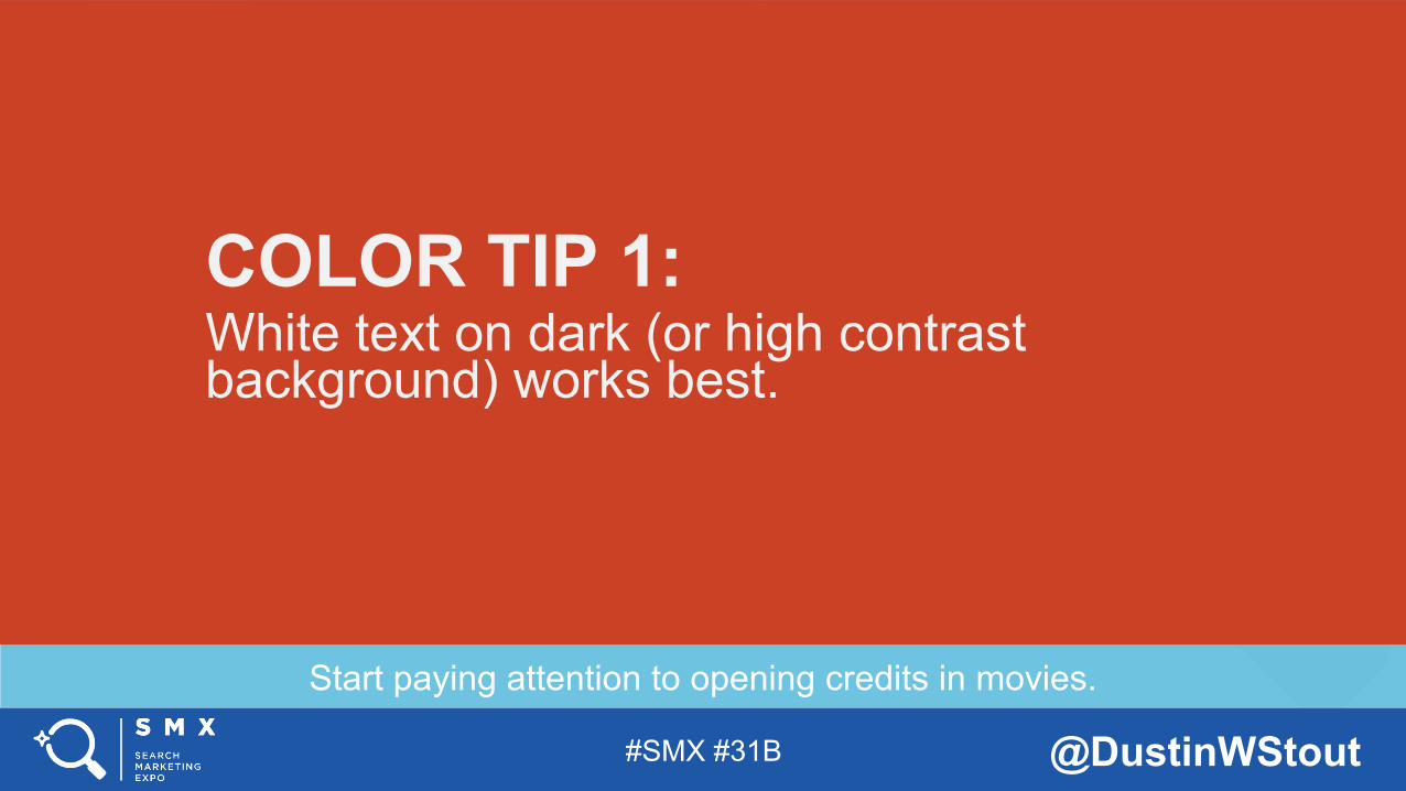
Start paying attention to opening credits in movies.
COLOR TIP 1: White text on dark (or high contrast background) works best.
#SMX #31B @DustinWStout
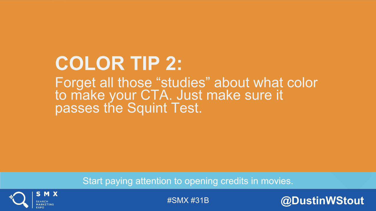
Start paying attention to opening credits in movies.
COLOR TIP 2: Forget all those “studies” about what color to make your CTA. Just make sure it passes the Squint Test.
#SMX #31B @DustinWStout
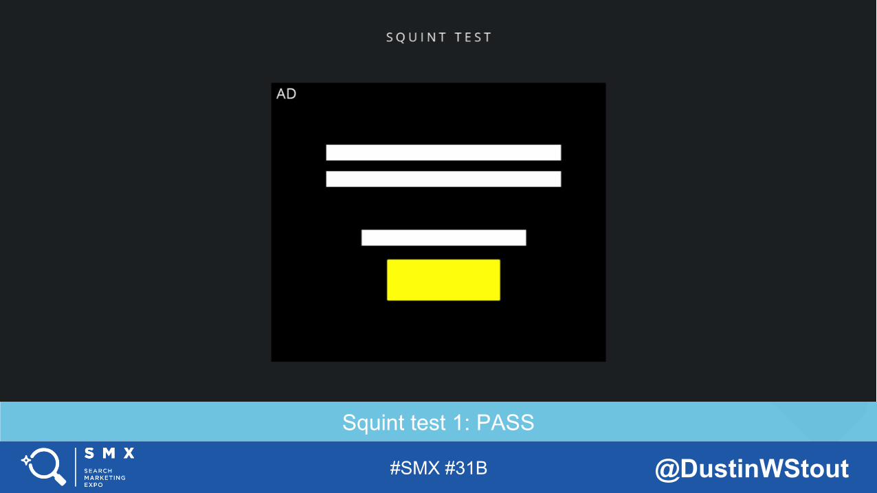
Squint test 1: PASS
#SMX #31B @DustinWStout
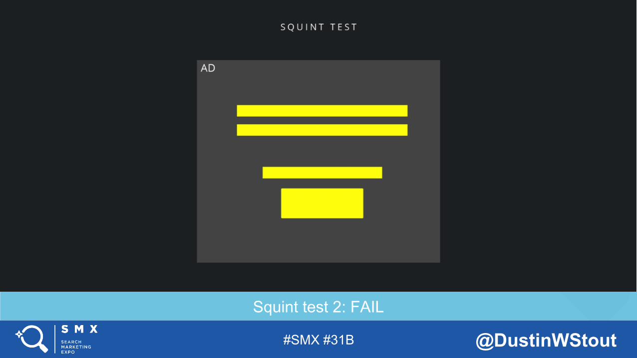
Squint test 2: FAIL
#SMX #31B @DustinWStout
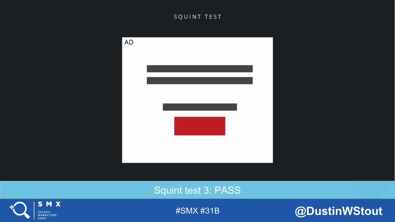
Squint test 3: PASS
#SMX #31B @DustinWStout
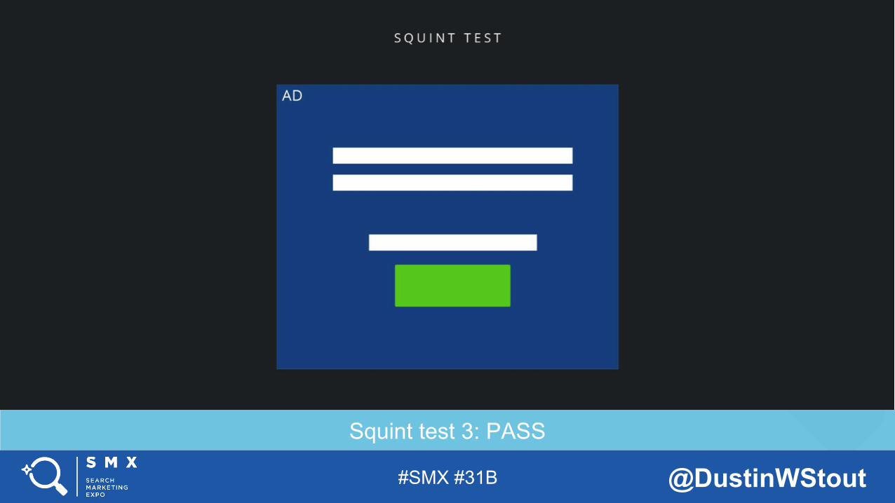
Squint test 3: PASS
#SMX #31B @DustinWStout
Start paying attention to opening credits in movies.
COLOR TIP 3: Stick to 3 colors or less, with your CTA being the brightest.
#SMX #31B @DustinWStout
Resist the urge to give a lecture on the difference between “typefaces” and “fonts”.
TYPOGRAPHY: Or in other words-- choosing the right “fonts” for the job.
#SMX #31B @DustinWStout
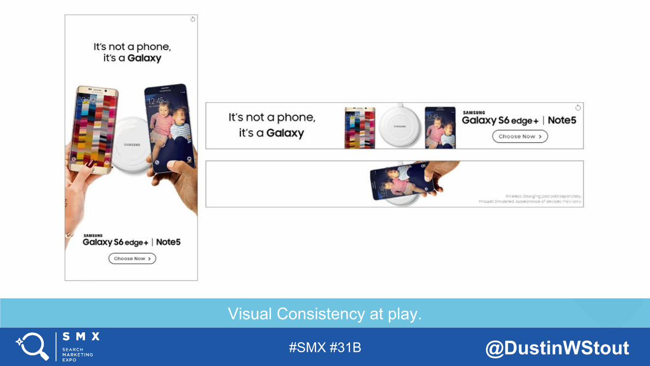
Visual Consistency at play.
#SMX #31B @DustinWStout
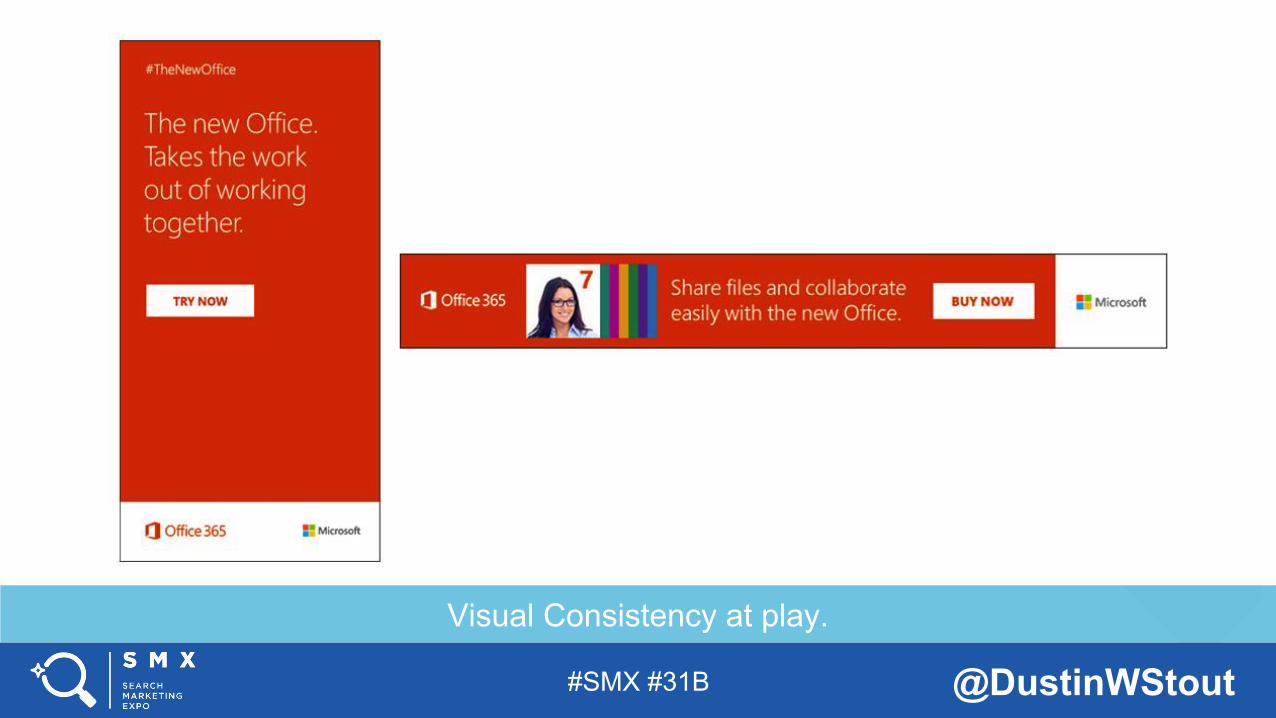
Visual Consistency at play.
#SMX #31B @DustinWStout
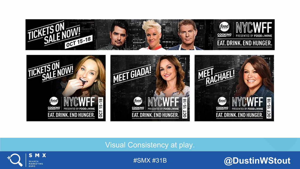
Visual Consistency at play.

#SMX #31B @DustinWStout
Plain and simple. Don’t screw that up.
BEFORE ALL ELSE: The purpose of good visual design is to effectively communicate a message.
#SMX #31B @DustinWStout
SEE YOU AT THE NEXT #SMX
THANK YOU!
Recommended