Temporal Summary Images: An Approach to NarrativeVisualization via Interactive Annotation Generation and Placement
Chris Bryan, Student Member, IEEE, Kwan-Liu Ma, Fellow, IEEE, and Jonathan Woodring, Member, IEEE
Abstract— Visualization is a powerful technique for analysis and communication of complex, multidimensional, and time-varying data.However, it can be difficult to manually synthesize a coherent narrative in a chart or graph due to the quantity of visualized attributes,a variety of salient features, and the awareness required to interpret points of interest (POIs). We present Temporal SummaryImages (TSIs) as an approach for both exploring this data and creating stories from it. As a visualization, a TSI is composed ofthree common components: (1) a temporal layout, (2) comic strip-style data snapshots, and (3) textual annotations. To augment useranalysis and exploration, we have developed a number of interactive techniques that recommend relevant data features and designchoices, including an automatic annotations workflow. As the analysis and visual design processes converge, the resultant imagebecomes appropriate for data storytelling. For validation, we use a prototype implementation for TSIs to conduct two case studieswith large-scale, scientific simulation datasets.
Index Terms—Narrative visualization, storytelling, annotations, comic strip visualization, time-varying data.
1 INTRODUCTION
Visualization may be used as both an exploratory and explanatory toolfor those who routinely need to analyze and extract essential informa-tion from their datasets and then communicate findings with others.While many visual analysis methods have been developed, there isless support for creating narrative visualizations. In particular, as databecomes large, complex, multidimensional, and sometimes heteroge-neous, manually sifting through, identifying, and highlighting the es-sential aspects of a chart or graph becomes a laborious task. It wouldbe desirable if, over the process of exploration and analysis, the vi-sualization system suggests important areas and features to select andlabel, for the purpose of deriving a data story to use in subsequent tasksor presentations.
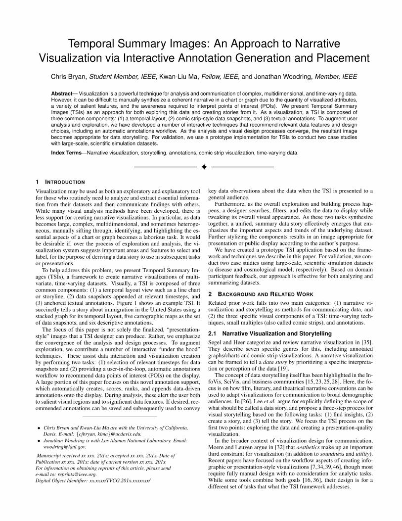
To help address this problem, we present Temporal Summary Im-ages (TSIs), a framework to create narrative visualizations of multi-variate, time-varying datasets. Visually, a TSI is composed of threecommon components: (1) a temporal layout view such as a line chartor storyline, (2) data snapshots appended at relevant timesteps, and(3) anchored textual annotations. Figure 1 shows an example TSI. Itsuccinctly tells a story about immigration in the United States using astacked graph for its temporal layout, five cartographic maps as the setof data snapshots, and six descriptive annotations.
The focus of this paper is not solely the finalized, “presentation-style” images that a TSI designer can produce. Rather, we emphasizethe convergence of the analysis and design processes. To augmentexploration, we contribute a number of interactive “under the hood”techniques. These assist data interaction and visualization creationby performing two tasks: (1) selection of relevant timesteps for datasnapshots and (2) providing a user-in-the-loop, automatic annotationsworkflow to recommend data points of interest (POIs) on the display.A large portion of this paper focuses on this novel annotation support,which automatically creates, scores, ranks, and appends data-drivenannotations onto the display. During analysis, these alert the user bothto salient visual regions and to significant data features. If desired, rec-ommended annotations can be saved and subsequently used to convey
• Chris Bryan and Kwan-Liu Ma are with the University of California,Davis. E-mail: {cjbryan, klma}@ucdavis.edu.
• Jonathan Woodring is with Los Alamos National Laboratory. Email:[email protected].
Manuscript received xx xxx. 201x; accepted xx xxx. 201x. Date ofPublication xx xxx. 201x; date of current version xx xxx. 201x.For information on obtaining reprints of this article, please sende-mail to: [email protected] Object Identifier: xx.xxxx/TVCG.201x.xxxxxxx/
key data observations about the data when the TSI is presented to ageneral audience.
Furthermore, as the overall exploration and building process hap-pens, a designer searches, filters, and edits the data to display whiletweaking its overall visual appearance. As these two tasks synthesizetogether, a unified, summary data story effectively emerges that em-phasizes the important aspects and trends of the underlying dataset.Further stylizing the components results in an image appropriate forpresentation or public display according to the author’s purpose.
We have created a prototype TSI application based on the frame-work and techniques we describe in this paper. For validation, we con-duct two case studies using large-scale, scientific simulation datasets(a disease and cosmological model, respectively). Based on domainparticipant feedback, our approach is effective for both analyzing andsummarizing datasets.
2 BACKGROUND AND RELATED WORK
Related prior work falls into two main categories: (1) narrative vi-sualization and storytelling as methods for communicating data, and(2) the three specific visual components of a TSI: time-varying tech-niques, small multiples (also called comic strips), and annotations.
2.1 Narrative Visualization and StorytellingSegel and Heer categorize and review narrative visualization in [35].They describe seven specific genres for this, including annotatedgraphs/charts and comic strip visualizations. A narrative visualizationcan be framed to tell a data story by prioritizing a specific interpreta-tion or perception of the data [19].
The concept of data storytelling itself has been highlighted in the In-foVis, SciVis, and business communities [15, 23, 25, 28]. Here, the fo-cus is on how film, literary, and theatrical narrative conventions can beused to adapt visualizations for communication to broad demographicaudiences. In [26], Lee et al. argue for explicitly defining the scope ofwhat should be called a data story, and propose a three-step process forvisual storytelling based on the following tasks: (1) find insights, (2)create a story, and (3) tell the story. We focus the TSI process on thefirst two points: exploring the data and creating a presentation-qualityvisualization.
In the broader context of visualization design for communication,Moere and Leuven argue in [32] that aesthetics make up an importantthird constraint for visualization (in addition to soundness and utility).Recent papers have focused on the workflow aspects of creating info-graphic or presentation-style visualizations [7,34,39,46], though mostrequire fully manual design with no consideration for analytic tasks.While some tools combine both goals [16, 36], their design is for adifferent set of tasks that what the TSI framework addresses.
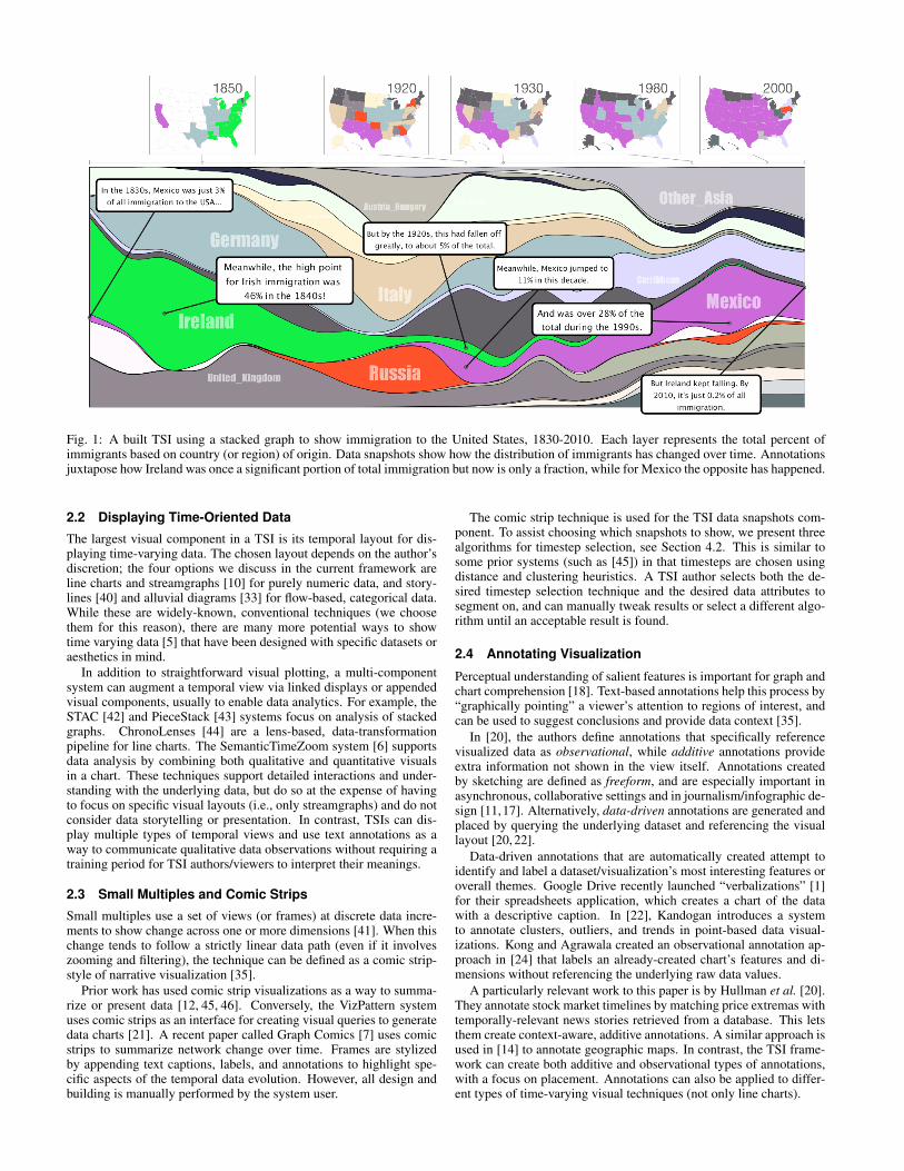
Fig. 1: A built TSI using a stacked graph to show immigration to the United States, 1830-2010. Each layer represents the total percent ofimmigrants based on country (or region) of origin. Data snapshots show how the distribution of immigrants has changed over time. Annotationsjuxtapose how Ireland was once a significant portion of total immigration but now is only a fraction, while for Mexico the opposite has happened.
2.2 Displaying Time-Oriented Data
The largest visual component in a TSI is its temporal layout for dis-playing time-varying data. The chosen layout depends on the author’sdiscretion; the four options we discuss in the current framework areline charts and streamgraphs [10] for purely numeric data, and story-lines [40] and alluvial diagrams [33] for flow-based, categorical data.While these are widely-known, conventional techniques (we choosethem for this reason), there are many more potential ways to showtime varying data [5] that have been designed with specific datasets oraesthetics in mind.
In addition to straightforward visual plotting, a multi-componentsystem can augment a temporal view via linked displays or appendedvisual components, usually to enable data analytics. For example, theSTAC [42] and PieceStack [43] systems focus on analysis of stackedgraphs. ChronoLenses [44] are a lens-based, data-transformationpipeline for line charts. The SemanticTimeZoom system [6] supportsdata analysis by combining both qualitative and quantitative visualsin a chart. These techniques support detailed interactions and under-standing with the underlying data, but do so at the expense of havingto focus on specific visual layouts (i.e., only streamgraphs) and do notconsider data storytelling or presentation. In contrast, TSIs can dis-play multiple types of temporal views and use text annotations as away to communicate qualitative data observations without requiring atraining period for TSI authors/viewers to interpret their meanings.
2.3 Small Multiples and Comic Strips
Small multiples use a set of views (or frames) at discrete data incre-ments to show change across one or more dimensions [41]. When thischange tends to follow a strictly linear data path (even if it involveszooming and filtering), the technique can be defined as a comic strip-style of narrative visualization [35].
Prior work has used comic strip visualizations as a way to summa-rize or present data [12, 45, 46]. Conversely, the VizPattern systemuses comic strips as an interface for creating visual queries to generatedata charts [21]. A recent paper called Graph Comics [7] uses comicstrips to summarize network change over time. Frames are stylizedby appending text captions, labels, and annotations to highlight spe-cific aspects of the temporal data evolution. However, all design andbuilding is manually performed by the system user.
The comic strip technique is used for the TSI data snapshots com-ponent. To assist choosing which snapshots to show, we present threealgorithms for timestep selection, see Section 4.2. This is similar tosome prior systems (such as [45]) in that timesteps are chosen usingdistance and clustering heuristics. A TSI author selects both the de-sired timestep selection technique and the desired data attributes tosegment on, and can manually tweak results or select a different algo-rithm until an acceptable result is found.
2.4 Annotating Visualization
Perceptual understanding of salient features is important for graph andchart comprehension [18]. Text-based annotations help this process by“graphically pointing” a viewer’s attention to regions of interest, andcan be used to suggest conclusions and provide data context [35].
In [20], the authors define annotations that specifically referencevisualized data as observational, while additive annotations provideextra information not shown in the view itself. Annotations createdby sketching are defined as freeform, and are especially important inasynchronous, collaborative settings and in journalism/infographic de-sign [11,17]. Alternatively, data-driven annotations are generated andplaced by querying the underlying dataset and referencing the visuallayout [20, 22].
Data-driven annotations that are automatically created attempt toidentify and label a dataset/visualization’s most interesting features oroverall themes. Google Drive recently launched “verbalizations” [1]for their spreadsheets application, which creates a chart of the datawith a descriptive caption. In [22], Kandogan introduces a systemto annotate clusters, outliers, and trends in point-based data visual-izations. Kong and Agrawala created an observational annotation ap-proach in [24] that labels an already-created chart’s features and di-mensions without referencing the underlying raw data values.
A particularly relevant work to this paper is by Hullman et al. [20].They annotate stock market timelines by matching price extremas withtemporally-relevant news stories retrieved from a database. This letsthem create context-aware, additive annotations. A similar approach isused in [14] to annotate geographic maps. In contrast, the TSI frame-work can create both additive and observational types of annotations,with a focus on placement. Annotations can also be applied to differ-ent types of time-varying visual techniques (not only line charts).
3 DESIGN REQUIREMENTS AND WORKFLOW
The motivation for TSIs came from discussion with the EpiSimS dis-ease simulation team (see Section 6.1.1 for a case study). The mem-bers of this group, though well-versed in epidemic research, were notvisualization experts and had limited experience in using complex vi-sual analytic and design tools. Based on their usual analysis needs andthe steps they take to create images for review, we defined the follow-ing specific set of tasks for the team:
T1 Results along spatiotemporal dimensions. EpiSimS simulationoutput data has two main dimensional axes. (1) Disease spreadhappens over a time period as the epidemic grows, peaks, anddecays. (2) This spread happens over a geographic region, usuallyinitially via hotspots and then to full diffusion.
T2 Data analysis by querying for features. EpiSimS scientists havea high familiarity with their domain data and this directs their ex-ploration. Their main focus is understanding how simulation inputparameters and mitigation strategies affect epidemic lifecycle be-havior for specific points of interest (POIs), such as an outbreak’speak or its distribution throughout a population’s demographics.This is done by querying the underlying dataset via SQL or table-based spreadsheet functions.
T3 Presentation with conventional tools. To present results to col-laborators or general audiences (such as at a conference or in apaper), static plots are used (line charts, maps, etc.), created withtools like R or Python’s matplotlib library. They are combined andcaptioned using image editing software.
Though these tasks as written are specific to the EpiSimS team, theycan easily be generalized. In a broad sense, researchers and chart de-signers may first wish to quickly review, analyze, and explore theirdata for relevant features or POIs. They then summarize results witha set of visual elements for presentation or storytelling. As opposedto doing these tasks manually and with no guidance, the TSI frame-work combines them into a single workflow and provides techniquesto augment the analysis and the image building processes. To formallyjustify the design components and interaction techniques discussedthroughout the rest of this paper, we first define a set of guidelinesthat the TSI framework should adhere to:
DG1 Temporal-plus data views. The dataset should be visualizedon (at least) two primary dimensional axes: the time-varying do-main plus one or more “other” dimensions. In generalizing fromthe EpiSimS-specific tasks, the spatial domain is abstracted; itnow only needs to be orthogonal to the temporal axis.
DG2 Highlight important elements. Important dataset features andPOIs should be highlighted to initially call attention to authorscreating a TSI and then to viewers observing a completed TSI.
DG3 Succinct view for presentation. A completed or “built” TSIshould be suitable for data presentation or storytelling as a sin-gle, connected, static figure. During creation, this implies anemphasis on styling and configuring the graphical componentsof a TSI to the author’s preferred liking, and then exporting theimage to a format suitable for display. In the context of visual-ization theory, this suggests that conventional or widely under-stood visual techniques be used, since they will be more easilyunderstood by a general population of viewers.
Three visual components were chosen to fulfill these requirements.For DG1, an author-selected temporal layout displays a time-varyingdata view. In consideration of DG3, we use conventional time-varyingtechniques. One or more comic-strip sets of data snapshots showthe “other,” orthogonal dimensions. The reasoning for using comicstrips (as opposed to animation or similar techniques) is due to thestatic image aspect of DG3. To ensure that components are linked to-gether (forming a single, connected overall image), snapshots are ap-pended above the temporal layout along a track at their corresponding
Fig. 2: An overview of the TSI analysis and design workflow. Theautomatic annotations workflow is illustrated in Figure 4.
timesteps. To help TSI authors choose the “best” snapshots to show,we contribute a set of automatic timestep selection techniques.
To address DG2, we use textual annotations to perform graphicalpointing of important elements on the temporal layout. Data-drivenannotations are automatically created and appended to the display in anovel workflow; they act as a form of guided exploration for a TSI de-signer by alerting him/her to important data features or salient regionsin the view. When familiar with the data, an author can quickly inter-act with a list of created annotations to search for relevant attributes,extremas, and POIs, or manually query the data to create new annota-tions. For communicating key observations to viewers in a built TSI,selected annotations can be pinned and saved. In this way the anno-tations workflow serves a dual purpose, by enriching analysis and ex-ploration for authors and by communicating findings to viewers. Sinceannotations are text-based, they have an advantage over more abstractvisual techniques (such as [6]) of requiring no training for interpre-tation, since the relevant POI or feature is explicitly described by thenote’s text.
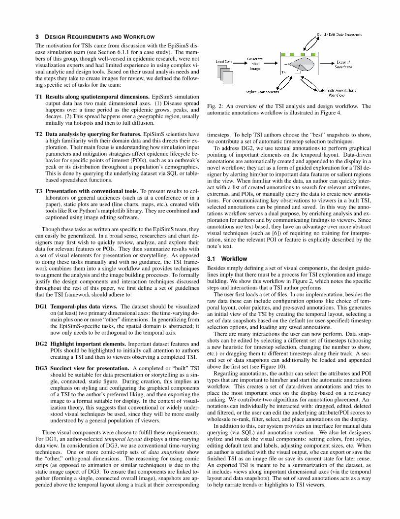
3.1 WorkflowBesides simply defining a set of visual components, the design guide-lines imply that there must be a process for TSI exploration and imagebuilding. We show this workflow in Figure 2, which notes the specificsteps and interactions that a TSI author performs.
The user first loads a set of files. In our implementation, besides theraw data these can include configuration options like choice of tem-poral layout, color palettes, and pre-saved annotations. This generatesan initial view of the TSI by creating the temporal layout, selecting aset of data snapshots based on the default (or user-specified) timestepselection options, and loading any saved annotations.
There are many interactions the user can now perform. Data snap-shots can be edited by selecting a different set of timesteps (choosinga new heuristic for timestep selection, changing the number to show,etc.) or dragging them to different timesteps along their track. A sec-ond set of data snapshots can additionally be loaded and appendedabove the first set (see Figure 10).
Regarding annotations, the author can select the attributes and POItypes that are important to him/her and start the automatic annotationsworkflow. This creates a set of data-driven annotations and tries toplace the most important ones on the display based on a relevancyranking. We contribute two algorithms for annotation placement. An-notations can individually be interacted with: dragged, edited, deletedand filtered, or the user can edit the underlying attribute/POI scores towholesale re-rank, filter, select, and place annotations on the display.
In addition to this, our system provides an interface for manual dataquerying (via SQL) and annotation creation. We also let designersstylize and tweak the visual components: setting colors, font styles,editing default text and labels, adjusting component sizes, etc. Whenan author is satisfied with the visual output, s/he can export or save thefinished TSI as an image file or save its current state for later reuse.An exported TSI is meant to be a summarization of the dataset, asit includes views along important dimensional axes (via the temporallayout and data snapshots). The set of saved annotations acts as a wayto help narrate trends or highlights to TSI viewers.
3.2 Example TSI: US Immigration 1830-2010
We illustrate a built TSI through an example use case, shown in Figure1. This TSI tells a story about immigration trends in the United Statesfrom 1830-2010 (data from [3, 4]). The temporal layout shows thepercent of immigrants for each decade based on country (or region)of origin. Each timestep sums to 100%, which is intuitively commu-nicated by the use of a stacked graph. The layers for Ireland, Russia,and Mexico have been highlighted with bright colors. Above this, datasnapshots are cartographic maps; each state is colored according to itsdominant immigrant population.
The combination of the stacked graph and map snapshots show im-migration has dramatically evolved in two ways: the countries thatpeople are coming from, and the states they are moving to. To empha-size that the trends of Ireland and Mexico have mirrored each other,selected annotations describe these two data layers with playful text.They direct the viewer’s attention: Irish immigrants once made up al-most half of all immigrants to the United States but have presentlydwindled to only a small fraction. Meanwhile, Mexican immigrationhas gone the opposite direction.
4 TEMPORAL LAYOUT AND DATA SNAPSHOTS
We now give a high-level overview of a TSI’s first two visual compo-nents: the temporal layout and data snapshots.
4.1 Temporal Layout
The temporal layout shows a time-varying view of the data; it is cen-trally placed and oriented horizontally from left-to-right. The choiceof visualization here depends on a TSI author’s discretion, and soshould be carefully considered. For independent, numeric time se-ries (such as stock prices), a line chart is a straightforward choice. Astreamgraph can be utilized if showing the temporal data magnitudes isan important consideration, such as in the immigration example (Fig-ure 1). For categorical or flow data, a technique like storylines oralluvial diagrams should be used.
Our current implementation uses these four techniques as optionsfor the temporal layout. As they are well-known conventional tech-niques, they should be effective when used for presentation to a gen-eral audience. In theory however, any time-dependent visualizationtechnique could be used for this component, though more complex orabstract views introduce potential interpretation issues.
4.2 Data Snapshots
Data snapshots are a comic strip set of visual frames, showing a viewof the dataset that is orthogonal to the temporal layout. In the immi-gration example, this is a cartographic view of the data. Snapshotsare appended to a track above the temporal layout, with placementcorresponding to their associated timesteps. They are meant to pro-vide additional insight into the temporal evolution of the dataset andhelp give a holistic summary of the data. Like the temporal layout,the choice of visualization technique used in the frames is left to theauthor. Our current TSI prototype stores data snapshots as sets of im-age files; relevant ones are retrieved and appended to the display. Inthe case studies (Section 6.1), spatial and volume renderings are used,but more abstract or projectional mappings might be appropriate de-pending on the context. These can include scatter plots, bar charts,heatmaps, video stills, and other dimensionality reduction techniques.
The set of data snapshots shown is dependent on a set of chosentimesteps. To assist a TSI author in selecting appropriate snapshots,we provide three techniques for automatic timestep selection: mod-ulo timestep indexing, entropy threshold selection, and hierarchicalsegmentation. To use one of these, a user first selects one or moretemporal attributes in the dataset. The heuristic is applied to the setof attributes and returns a set of timesteps. Figure 3 shows how thetechniques would select timesteps for an example attribute: a numeri-cal data vector in a line chart. For each chosen timestep, the relevantsnapshot image is retrieved and appended to the TSI.
Fig. 3: Automatic timestep selection for a line chart based on threetechniques. Modulo timestep indexing generates a snapshot every msteps. Entropy threshold selection generates snapshots when the datachange passes a denoted limit. Hierarchical segmentation generates auser-defined number of segments (the alternating gray-white bars) andpicks a single step to “represent” each.
Modulo Timestep Index This is the typical timestep selectionprocess employed in simulations where data is saved at periodic in-tervals; i.e., a snapshot is selected for every m number of steps. Thisreturns a linearly discretized selection of the data snapshots with con-stant step size.
Entropy Threshold The entropy is calculated between each suc-cessive timestep (or set of timesteps). When overall entropy exceedsa defined limit, that timestep is selected. This technique emphasizestimestep selection based on large-scale data changes, as opposed togenerally flat or stable data.
Hierarchical Segmentation The delta (change) at each timestepis calculated. A hierarchical clustering is applied to the deltas to gen-erate a hierarchical segmentation over all timesteps, then a cut is madefor the desired number of segments to return. A “representative”timestep is selected for each segment based on a desired statisticalmetric (such as mean delta value or standard deviation). We currentlyuse mean delta value to determine this.
We note here that these three techniques are based on a data ab-straction; that is, snapshot selection is not linked to the chosen tempo-ral layout technique or the currently displayed set of annotations. Thereasoning for this is that an author might choose snapshot timestepsbased on attributes disconnected to (independently of) these compo-nents. The used data attributes might not be shown in the temporallayout and are only included in the dataset specifically for snapshotselection.
Once loaded, appended snapshots can be interactively dragged, re-moved, or reset based on designer preferences. If a heuristic givesinsufficient results then another may be tried or timesteps may be fullymanually selected.
5 ANNOTATIONS
Annotations visually point to salient data features and/or elements.They are the third component of a TSI, overlaid and anchored ontothe temporal layout.
A major aspect of the TSI framework is its workflow for automaticannotation support, shown in Figure 4. This section describes thisworkflow. We start by explaining what data POIs are and how theyare leveraged for annotation creation. Once created, annotations arescored and ranked. Before display, they must be properly positioned.
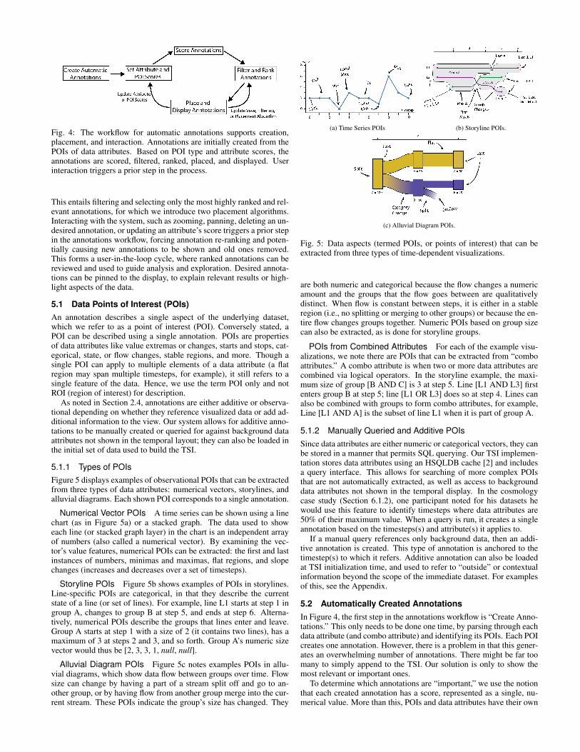
Fig. 4: The workflow for automatic annotations supports creation,placement, and interaction. Annotations are initially created from thePOIs of data attributes. Based on POI type and attribute scores, theannotations are scored, filtered, ranked, placed, and displayed. Userinteraction triggers a prior step in the process.
This entails filtering and selecting only the most highly ranked and rel-evant annotations, for which we introduce two placement algorithms.Interacting with the system, such as zooming, panning, deleting an un-desired annotation, or updating an attribute’s score triggers a prior stepin the annotations workflow, forcing annotation re-ranking and poten-tially causing new annotations to be shown and old ones removed.This forms a user-in-the-loop cycle, where ranked annotations can bereviewed and used to guide analysis and exploration. Desired annota-tions can be pinned to the display, to explain relevant results or high-light aspects of the data.
5.1 Data Points of Interest (POIs)An annotation describes a single aspect of the underlying dataset,which we refer to as a point of interest (POI). Conversely stated, aPOI can be described using a single annotation. POIs are propertiesof data attributes like value extremas or changes, starts and stops, cat-egorical, state, or flow changes, stable regions, and more. Though asingle POI can apply to multiple elements of a data attribute (a flatregion may span multiple timesteps, for example), it still refers to asingle feature of the data. Hence, we use the term POI only and notROI (region of interest) for description.
As noted in Section 2.4, annotations are either additive or observa-tional depending on whether they reference visualized data or add ad-ditional information to the view. Our system allows for additive anno-tations to be manually created or queried for against background dataattributes not shown in the temporal layout; they can also be loaded inthe initial set of data used to build the TSI.
5.1.1 Types of POIsFigure 5 displays examples of observational POIs that can be extractedfrom three types of data attributes: numerical vectors, storylines, andalluvial diagrams. Each shown POI corresponds to a single annotation.
Numerical Vector POIs A time series can be shown using a linechart (as in Figure 5a) or a stacked graph. The data used to showeach line (or stacked graph layer) in the chart is an independent arrayof numbers (also called a numerical vector). By examining the vec-tor’s value features, numerical POIs can be extracted: the first and lastinstances of numbers, minimas and maximas, flat regions, and slopechanges (increases and decreases over a set of timesteps).
Storyline POIs Figure 5b shows examples of POIs in storylines.Line-specific POIs are categorical, in that they describe the currentstate of a line (or set of lines). For example, line L1 starts at step 1 ingroup A, changes to group B at step 5, and ends at step 6. Alterna-tively, numerical POIs describe the groups that lines enter and leave.Group A starts at step 1 with a size of 2 (it contains two lines), has amaximum of 3 at steps 2 and 3, and so forth. Group A’s numeric sizevector would thus be [2, 3, 3, 1, null, null].
Alluvial Diagram POIs Figure 5c notes examples POIs in allu-vial diagrams, which show data flow between groups over time. Flowsize can change by having a part of a stream split off and go to an-other group, or by having flow from another group merge into the cur-rent stream. These POIs indicate the group’s size has changed. They
(a) Time Series POIs (b) Storyline POIs.
(c) Alluvial Diagram POIs.
Fig. 5: Data aspects (termed POIs, or points of interest) that can beextracted from three types of time-dependent visualizations.
are both numeric and categorical because the flow changes a numericamount and the groups that the flow goes between are qualitativelydistinct. When flow is constant between steps, it is either in a stableregion (i.e., no splitting or merging to other groups) or because the en-tire flow changes groups together. Numeric POIs based on group sizecan also be extracted, as is done for storyline groups.
POIs from Combined Attributes For each of the example visu-alizations, we note there are POIs that can be extracted from “comboattributes.” A combo attribute is when two or more data attributes arecombined via logical operators. In the storyline example, the maxi-mum size of group [B AND C] is 3 at step 5. Line [L1 AND L3] firstenters group B at step 5; line [L1 OR L3] does so at step 4. Lines canalso be combined with groups to form combo attributes, for example,Line [L1 AND A] is the subset of line L1 when it is part of group A.
5.1.2 Manually Queried and Additive POIsSince data attributes are either numeric or categorical vectors, they canbe stored in a manner that permits SQL querying. Our TSI implemen-tation stores data attributes using an HSQLDB cache [2] and includesa query interface. This allows for searching of more complex POIsthat are not automatically extracted, as well as access to backgrounddata attributes not shown in the temporal display. In the cosmologycase study (Section 6.1.2), one participant noted for his datasets hewould use this feature to identify timesteps where data attributes are50% of their maximum value. When a query is run, it creates a singleannotation based on the timesteps(s) and attribute(s) it applies to.
If a manual query references only background data, then an addi-tive annotation is created. This type of annotation is anchored to thetimestep(s) to which it refers. Additive annotation can also be loadedat TSI initialization time, and used to refer to “outside” or contextualinformation beyond the scope of the immediate dataset. For examplesof this, see the Appendix.
5.2 Automatically Created AnnotationsIn Figure 4, the first step in the annotations workflow is “Create Anno-tations.” This only needs to be done one time, by parsing through eachdata attribute (and combo attribute) and identifying its POIs. Each POIcreates one annotation. However, there is a problem in that this gener-ates an overwhelming number of annotations. There might be far toomany to simply append to the TSI. Our solution is only to show themost relevant or important ones.
To determine which annotations are “important,” we use the notionthat each created annotation has a score, represented as a single, nu-merical value. More than this, POIs and data attributes have their own
scores. To calculate an annotation’s overall score, the scores of itsrelevant attribute and POI are multiplied together:
scoreannotation = scoreattribute · scorePOI
In this way, every annotation has its own score. Once the full setof created annotations has been scored, they can simply be sorted intoa list. The highest ranked annotations are deemed the most impor-tant. (We give both manually-queried and loaded additive annotationsthe highest possible score/rank since they are assumed a priori to beimportant to the user, as they were manually created/loaded.)
As an example of scoring and ranking two automatic annotations,consider a data attribute A with a score of 50 (scoreA = 50), and anattribute B with a score of 25 (scoreB = 25). The POI denoting anattribute’s global maximum has a score of 10 (scoremax=10). Withthese values, the annotation denoting A’s maximum will have a scoreof 500 while for B it will be 250. Ranking is by overall score, so theannotation MaxA will be ranked above MaxB.
Before display, the list of ranked annotations is filtered. Some an-notations are discarded because they cannot currently be shown on theview. If the user has zoomed in on part of the display then annotationsoutside of the current window cannot be shown. Alternatively, an ap-plied filter can hide some POIs types from display. When annotationsare removed as candidates for display, lower-ranked annotations in thelist move up. Annotations are selected and placed on the temporallayout based on the remaining list. First however, we discuss howautomatic annotations scores are determined.
5.2.1 Scoring Data AttributesOur implemented system includes an interface where a user sets thescore for both data attributes and POI types. Combo attributes may becreated in this dialog by combining two currently selected attributes.Attribute scores can also be saved to a configuration file to be appliedat load time and then tweaked as needed. While our current systemonly supports manual attribute scoring, it is possible to automaticallyderive attribute scores and create combo attributes based on the datasetproperties. See Section 7.2 for discussion of this.
5.2.2 Determining POI ScoresLike data attributes, POI types can be manually scored by the user.In the scoring example from the start of Section 5.2, the POI type“maximum” had a score of 10 (scoremax = 10). This POI is considered“global” because each attribute only has one maximum value. (Thisis true even if the maximum happens over multiple timesteps. Thevalue is the same.) Global POIs include features like “maximum,”“minimum”, “first,” and “last.”
However, what about local maximas? For a numerical attribute,these might occur multiple times; each instance is a POI. Intuitively,smaller extremas should be given less weight than larger ones, andtheir specific POI and subsequent annotation scores should be lower.Some time series compression algorithms use this assumption toweight extremas. Local extrema weights are determined using a dis-tance function (such as the absolute distance between other extremas);very low-weighted points are then discarded from the compressed line.To weight local POIs, we use a modified version of the compressionalgorithm from [13] which has been extended to weight slopes and flatregions (where larger slopes and flat regions have higher weight).
To turn a local POI weight into a POI score, we normalize overthe overall set of local POI weights for that attribute. For example,if the POI score for local maxima is set to 5 (scorelocal max = 5) andan attribute has three local maximas with compression weights of 28,120, and 200, the corresponding POI scores are .7, 3, and 5.
Local POIs also exist in categorical data attributes. As an exampleof local POIs in storylines, first consider that a line can stay inside agroup for multiple timesteps. In Figure 5b, line L1 goes from group Ato B at step 5, a “group change” POI. The weight for this is based onhow long L1 resided in group A before leaving; a longer time meansa higher weight. Alluvial diagram POIs can be similarly weighted,except that the weight must also be scaled by the group’s overall flowat the relevant timestep(s) of the POI.
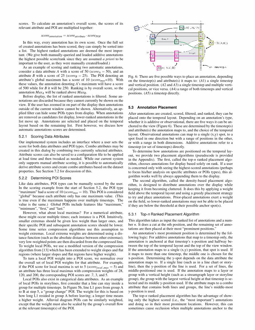
Fig. 6: There are five possible ways to place an annotation, dependingon the timestep(s) and attribute(s) it maps to: (A1) a single timestepand vertical position. (A2 and A3) a single timestep and multiple verti-cal positions, or vice versa. (A4) a range of both timesteps and verticalpositions. (A5) a timestep directly.
5.3 Annotation Placement
After annotations are created, scored, filtered, and ranked, they can beplaced onto the temporal layout. Depending on an annotation’s type,whether it is additive or observational, there are five ways it can be an-chored to the view (Figure 6). These are determined by the timestep(s)and attribute(s) the annotation maps to, and the choice of the temporallayout. Observational annotations can map to a single (x,y) spot, to aspot fixed in one direction but with a range of positions in the other,or with a range in both dimensions. Additive annotations refer to atimestep (or set of timesteps) directly.
To determine how annotations are positioned on the temporal lay-out, we provide two placement algorithms (pseudocode is providedin the Appendix). The first, called the top-n ranked placement algo-rithm, chooses annotations for display based solely on rank. If a useris concerned only with seeing the highest-scored annotations (perhapsto focus his/her analysis on specific attributes or POIs types), this al-gorithm works well by always appending them to the display.
The second algorithm, called the density-based placement algo-rithm, is designed to distribute annotations over the display whilekeeping it from becoming cluttered. It does this by applying a weightfield above the temporal layout and using a greedy placement strategyto try and place annotations. Prior-placed annotations exert a weighton the field, so lower-ranked annotations may not be able to be placedif they are below the threshold at their possible anchor spot(s).
5.3.1 Top-n Ranked Placement Algorithm
This algorithm takes as input the ranked list of annotations and a num-ber n. It does a cut at the nth position, and the remaining set of anno-tations are then placed at their most “prominent positions.”
An annotation’s most prominent position is determined by the fol-lowing logic: For additive annotations that map to a timestep only, theannotation is anchored at that timestep’s x-position and halfway be-tween the top of the temporal layout and the top of the view window.If the annotation maps to a single (x,y) position, that spot is used. Ifit maps to more than one timestep, the middle one is chosen for thex-position. Determining the y-spot depends on the data attribute theannotation maps to. If a single line (such as in a line chart or story-line), then the y-position of the line is used. For a set of lines, themiddle-positioned one is used. If the annotation maps to a layer orgroup with a vertical height (such as a streamgraph layer or storylinegroup), the group with the largest vertical height at that timestep is se-lected and its middle y-position used. If the attribute maps to a comboattribute that contains both lines and groups, the line’s middle-mosty-position is used.
The top-n ranked placement algorithm has the advantage of show-ing only the highest scored (i.e., the “most important”) annotationsand doing so in their most prominent locations. However, this cansometimes cause occlusion when multiple annotations anchor to the
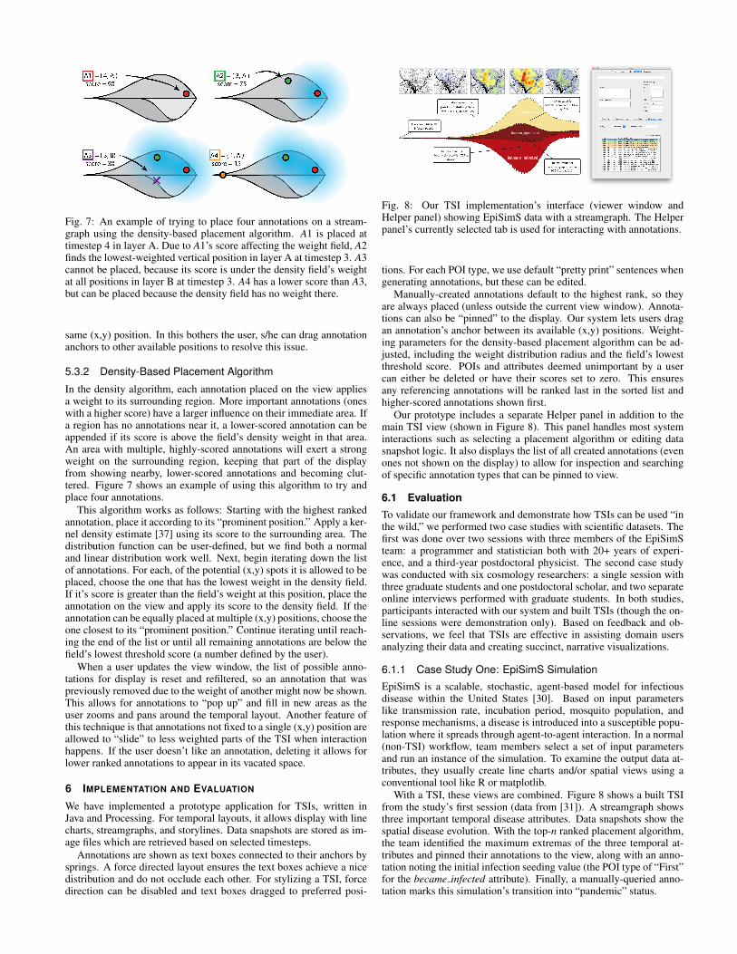
Fig. 7: An example of trying to place four annotations on a stream-graph using the density-based placement algorithm. A1 is placed attimestep 4 in layer A. Due to A1’s score affecting the weight field, A2finds the lowest-weighted vertical position in layer A at timestep 3. A3cannot be placed, because its score is under the density field’s weightat all positions in layer B at timestep 3. A4 has a lower score than A3,but can be placed because the density field has no weight there.
same (x,y) position. In this bothers the user, s/he can drag annotationanchors to other available positions to resolve this issue.
5.3.2 Density-Based Placement Algorithm
In the density algorithm, each annotation placed on the view appliesa weight to its surrounding region. More important annotations (oneswith a higher score) have a larger influence on their immediate area. Ifa region has no annotations near it, a lower-scored annotation can beappended if its score is above the field’s density weight in that area.An area with multiple, highly-scored annotations will exert a strongweight on the surrounding region, keeping that part of the displayfrom showing nearby, lower-scored annotations and becoming clut-tered. Figure 7 shows an example of using this algorithm to try andplace four annotations.
This algorithm works as follows: Starting with the highest rankedannotation, place it according to its “prominent position.” Apply a ker-nel density estimate [37] using its score to the surrounding area. Thedistribution function can be user-defined, but we find both a normaland linear distribution work well. Next, begin iterating down the listof annotations. For each, of the potential (x,y) spots it is allowed to beplaced, choose the one that has the lowest weight in the density field.If it’s score is greater than the field’s weight at this position, place theannotation on the view and apply its score to the density field. If theannotation can be equally placed at multiple (x,y) positions, choose theone closest to its “prominent position.” Continue iterating until reach-ing the end of the list or until all remaining annotations are below thefield’s lowest threshold score (a number defined by the user).
When a user updates the view window, the list of possible anno-tations for display is reset and refiltered, so an annotation that waspreviously removed due to the weight of another might now be shown.This allows for annotations to “pop up” and fill in new areas as theuser zooms and pans around the temporal layout. Another feature ofthis technique is that annotations not fixed to a single (x,y) position areallowed to “slide” to less weighted parts of the TSI when interactionhappens. If the user doesn’t like an annotation, deleting it allows forlower ranked annotations to appear in its vacated space.
6 IMPLEMENTATION AND EVALUATION
We have implemented a prototype application for TSIs, written inJava and Processing. For temporal layouts, it allows display with linecharts, streamgraphs, and storylines. Data snapshots are stored as im-age files which are retrieved based on selected timesteps.
Annotations are shown as text boxes connected to their anchors bysprings. A force directed layout ensures the text boxes achieve a nicedistribution and do not occlude each other. For stylizing a TSI, forcedirection can be disabled and text boxes dragged to preferred posi-
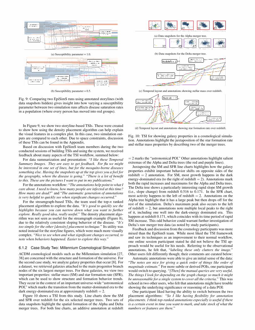
Fig. 8: Our TSI implementation’s interface (viewer window andHelper panel) showing EpiSimS data with a streamgraph. The Helperpanel’s currently selected tab is used for interacting with annotations.
tions. For each POI type, we use default “pretty print” sentences whengenerating annotations, but these can be edited.
Manually-created annotations default to the highest rank, so theyare always placed (unless outside the current view window). Annota-tions can also be “pinned” to the display. Our system lets users dragan annotation’s anchor between its available (x,y) positions. Weight-ing parameters for the density-based placement algorithm can be ad-justed, including the weight distribution radius and the field’s lowestthreshold score. POIs and attributes deemed unimportant by a usercan either be deleted or have their scores set to zero. This ensuresany referencing annotations will be ranked last in the sorted list andhigher-scored annotations shown first.
Our prototype includes a separate Helper panel in addition to themain TSI view (shown in Figure 8). This panel handles most systeminteractions such as selecting a placement algorithm or editing datasnapshot logic. It also displays the list of all created annotations (evenones not shown on the display) to allow for inspection and searchingof specific annotation types that can be pinned to view.
6.1 EvaluationTo validate our framework and demonstrate how TSIs can be used “inthe wild,” we performed two case studies with scientific datasets. Thefirst was done over two sessions with three members of the EpiSimSteam: a programmer and statistician both with 20+ years of experi-ence, and a third-year postdoctoral physicist. The second case studywas conducted with six cosmology researchers: a single session withthree graduate students and one postdoctoral scholar, and two separateonline interviews performed with graduate students. In both studies,participants interacted with our system and built TSIs (though the on-line sessions were demonstration only). Based on feedback and ob-servations, we feel that TSIs are effective in assisting domain usersanalyzing their data and creating succinct, narrative visualizations.
6.1.1 Case Study One: EpiSimS Simulation
EpiSimS is a scalable, stochastic, agent-based model for infectiousdisease within the United States [30]. Based on input parameterslike transmission rate, incubation period, mosquito population, andresponse mechanisms, a disease is introduced into a susceptible popu-lation where it spreads through agent-to-agent interaction. In a normal(non-TSI) workflow, team members select a set of input parametersand run an instance of the simulation. To examine the output data at-tributes, they usually create line charts and/or spatial views using aconventional tool like R or matplotlib.
With a TSI, these views are combined. Figure 8 shows a built TSIfrom the study’s first session (data from [31]). A streamgraph showsthree important temporal disease attributes. Data snapshots show thespatial disease evolution. With the top-n ranked placement algorithm,the team identified the maximum extremas of the three temporal at-tributes and pinned their annotations to the view, along with an anno-tation noting the initial infection seeding value (the POI type of “First”for the became infected attribute). Finally, a manually-queried anno-tation marks this simulation’s transition into “pandemic” status.
(a) Susceptibility parameter = 1.0.
(b) Susceptibility parameter = 0.5.
Fig. 9: Comparing two EpiSimS runs using annotated storylines (withdata snapshots hidden) gives insight into how varying a susceptibilityparameter between two simulation runs affects disease saturation ratesin a population (where every person has moved into red groups).
In Figure 9, we show two storyline-based TSIs. These were createdto show how using the density placement algorithm can help explainthe visual features in a complex plot. In this case, two simulation out-puts are compared to each other. Due to space constraints, discussionof these TSIs can be found in the Appendix.
Based on discussion with EpiSimS team members during the twoconducted sessions of building TSIs and using the system, we receivedfeedback about many aspects of the TSI workflow, summed below:
For data summarization and presentation: “I like these TemporalSummary Images. They are easy to get feedback. For flu we mightbe interested in one set of lines, but for the mosquito-borne diseasessomething else. Having the snapshots up at the top gives you a feel forthe geography, where the disease is going.” “There is a lot of benefitto this. These are the pictures I want to put in my publications.”
For the annotations workflow: “The annotations help point to what Icare about. I need to know, how many people are infected at this time?How many are dead?” and “The automatic generation of annotationsis very helpful to quickly see when significant changes occurred.”
For the streamgraph-based TSIs, the team used the top-n rankedplacement algorithm to explore the data. “It’s good to quickly see thehighlights because you can narrow down what you want to furtherexplore. Really good idea, really useful.” The density placement algo-rithm was not seen as useful for the streamgraph example (Figure 8),due to the relatively consistent sloping behavior of the disease. “It’stoo simple for the other [density] placement technique.” Its utility wasnoted instead for the storyline figures, which were much more visuallycomplex. “Nice to see when and what significant changes occurred, tonote when behaviors happened. Easier to explore this way.”
6.1.2 Case Study Two: Millennium Cosmological Simulation
ΛCDM cosmological models such as the Millennium simulation [27,38] are concerned with the structure and formation of the universe. Forthe second case study, we analyze galaxy properties that occur [8]. Fora dataset, we retrieved galaxies attached to the main progenitor branchnodes of the six largest merger trees. For these galaxies, we view twoimportant properties: stellar mass (SM) and star formation rate (SFR),which can be used to show structure and formation behavior trends.They occur in the context of an important universe-wide “astronomicalPOI,” which marks the transition from the matter-dominated era to thedark energy-dominated era at approximately redshift = 2.
Figure 10 shows a TSI from this study. Line charts show the SMand SFR over redshift for the six selected merger trees. Two sets ofdata snapshots highlight the spatial formation of the Alpha and Deltamerger trees. For both line charts, an additive annotation at redshift
(a) Data snapshots for the Alpha merger tree.
(b) Data snapshots for the Delta merger tree.
(c) Temporal layout and annotations showing stellar mass over redshift.
(d) Temporal layout and annotations showing star formation rate over redshift.
Fig. 10: TSI for showing galaxy properties in a cosmological simula-tion. Annotations highlight the juxtaposition of the star formation rateand stellar mass properties by describing two of the merger trees.
= 2 marks the “astronomical POI.” Other annotations highlight salientextremas of the Alpha and Delta trees (the red and purple lines).
Juxtaposing the SM and SFR line charts highlights how the galaxyproperties exhibit important behavior shifts on opposite sides of theredshift = 2 annotation. For SM, most growth happens in the darkenergy-dominated era (to the right of redshift = 2). Annotations markboth the rapid increases and maximums for the Alpha and Delta trees.The Delta tree shows a particularly interesting rapid slope SM growth(i.e., slope change) from redshift 0.516 to 0.171. In the SFR chart,most activity happens to the left of redshift = 2. Annotations on theAlpha tree highlight that it has a large peak but then drops off for therest of the simulation. Delta’s maximum peak also occurs to the leftof redshift = 2, but annotations note multiple local peaks to the rightof it, including one well into the dark-energy dominated era. Thishappens at redshift 0.171, which coincides with its time period of rapidSM increase. This odd behavior could warrant further investigation ofDelta’s raw merger tree data (as noted by study participants).
Feedback and discussion from the cosmology participants was moremixed than the EpiSimS team. While most liked the TSI frameworkand saw its techniques as an improvement to their normal workflow,one online session participant stated he did not believe the TSI ap-proach would be useful for his needs. Referring to the observationalannotations, he felt that, “labeling these only clutters the image.”Other users felt differently though; their comments are curated below:
Automatic annotations were able to give an initial sense of the data:“The notes are nice for giving a quick order of things like order ofmagnitude estimate.” For more subtle or derived POIs, one participantwould switch to querying. “[Then] the manual queries are very useful.The things I look for depending on the graph change so much it mightbe unreasonable for a single system to cover all the criteria.” This wasechoed in two other users, who felt that annotations might have troubleshowing the underlying significance or reasoning of a data POI:
One participant liked having the ability to switch between the twoplacement algorithms: “So I like having flexibility for annotationplacements. I think top-ranked annotations especially is useful if thereis a certain event in time you want to mark, and take stock of what thenumbers or features are there.”
In comparing TSIs to their domain tools (mainly R and Python):“We have trouble in the community coming up with good ways ofshowing graphs of things that evolve. This would definitely be use-ful for displaying data in papers, rather than what we normally use.”In particular, one advantage TSIs provide is their focus on storytelling:“I like the idea of being creative in adding snapshots and/or in-figureannotations. These things can help tell a story depending on whatspecifically you’re trying to show or understand.”
7 DISCUSSION
Based on the design process and feedback from case studies, there area number of points that can be discussed about the current state of theTSI framework and our prototype implementation.
7.1 Advantages of the TSI FrameworkTSIs are designed to summarize data that have at least two strong di-mensional axes, where one is always assumed to be temporal. Whilethis bounds the framework to time-dependent datasets (using the fourcurrently implemented temporal layout options), there exist a widerange of both general- and domain-specific datasets that can leverageour workflow for visualization creation and analysis.
Participants in both case studies noted they felt annotations guidedtheir analytical perception of the data, and that the “presentation” as-pect of TSIs was very visually appealing and persuasive. While Lee etal. have questioned if a single tool should combine both analysis anddesign processes [26], based on the set of design requirements for theTSI framework and feedback from case study participants, we feel it isjustified for this problem space. In this respect, a TSI is more powerfulthan simple plotting like R or Python by because it leverages an inter-active and analytic workflow that recommends snapshots and annota-tions to the user. With an end result of building visual data stories, ithas advantages over a highly complex, technical, or multi-componentapproach designed purely for data analysis.
The intentional use of conventional (and even simple) visual com-ponents in a TSI is an additional strength. By not introducing novelvisual representations, an author building a TSI for presentation knowsthat there is no inherent learning curve for the potential audience, es-pecially since annotations are text-based, and can focus instead on an-alyzing and summarizing the data.
7.2 Automatically Scoring Data AttributesAs noted in Section 5.2.1, our current system only supports manualattribute scoring. However, it is possible to automatically derive at-tribute scores based on dataset properties. This could be especiallyuseful when the number of attributes scales to an amount that makesindividual scoring difficult or time-consuming. To automatically scoretime series, a distance-based metric such as Euclidean, Minkowski, orManhattan distance can measure the similarity between each vector;there are similar techniques categorical data [9]. Each data attributecan be scored based on its overall similarity to other attributes in thedataset. A byproduct of this is that attributes found to be especiallysimilar can be combined to form combo attributes. Another approachfor automatic scoring is to use a data entropy or magnitude measureto measure the dataset’s overall change or volatility and rank attributesbased on this. Combo attributes can additionally be formed by com-bining attributes with similar scores.
7.3 Going Deeper, Wider, and into Snapshot AnnotationsWe currently are planning to expand our annotation creation processin three ways beyond the temporal, POI-based tagging currently usedby the system. We can do this by going “deeper,” “wider,” and byintegrating annotations with data snapshots. To go deeper means thatwe will include informational metrics or cues that help explain eachcreated annotation’s significance (the lack of this was noted by a par-ticipant in the cosmology case study). Going wider means includingmore types of POIs that the system recognizes such as statistical or de-rived metrics. We also plan to allow TSI authors to save manual POIqueries that can later be retrieved to generate custom annotations, likea stored procedure in SQL.
Finally, there are plans to integrate annotations more closely withdata snapshots. One way to do this is by allowing “data snapshot an-notations,” where a data snapshot frame can be directly appended tothe temporal layout. This type of annotation can act as a “zoomed-in,”data-orthogonal view for a specific data attribute on the display.
7.4 Current Design LimitationsWhile TSIs recommend annotations and data snapshot timesteps, formost other system interactions there is little user guidance. That is, thedesigner must explicitly choose options like which technique to use forthe temporal layout and data snapshots, and what the appropriate colorpalette should be.
However, an assumption here is that TSI authors have a familiaritywith the underlying dataset. As such, they can simply choose the sameviews they currently use in other plotting tools and leverage the advan-tages the TSI framework provides. While a recommendation systemlike Show Me [29] can be effective in suggesting a new visual projec-tion to a user, the authors of that paper note that once a user has “set-tled” on a set of preferred views that usage of this recommendationfeature dramatically drops. Therefore, the lack of recommendationsfor design choices like this becomes negligible if the user knows whatgeneral types of views work well for their data.
TSIs also provide no guidance for issues like choosing the optimalnumber of data snapshots to show. Obviously, choosing too many willclutter the display (our implementation shrinks snapshots based on thenumber displayed, but there is a minimum size limit). This same clut-tering can happen if too many annotations are appended to the display.We note however, that while issues like this can be addressed with dif-ferent timestep selection and placement algorithms, our system easilyallows a user to interactively modify constraints for these components.If the view is cluttered, they can change the necessary settings to clearthe display and fix this type of problem.
While aesthetically our current TSI editing options are mostly con-sidered “up to the task” via case study feedback, we are working onways to expand how a user can tweak and style the view. A recentpaper describing the GraphCoiffure system [39] presents a set of tech-niques for improving user workflow to create presentation-style im-ages of graph networks; approaches like this can be integrated into oursystem to improve flexibility and speed up the design process.
Finally, though (as summarized by one case study participant) theannotation placement algorithms, “seem to work well,” our current re-sults and feedback for these are colloquial. A lack of formal evaluationis a current limitation, and we plan to perform a full usability study todetermine optimal usage practices and strategies.
8 CONCLUSIONS
We present Temporal Summary Images, a new approach to making ex-planatory visualization through the process of interactive exploration.By leveraging “under the hood” techniques to assist user analysis anddesign, we ease the process of creating narrative visualizations forcomplex or multidimensional datasets, helping bridge the gap betweendata exploration and storytelling.
A TSI is an apt analytics and summarization technique for manydatasets, and we provide examples of its use in both general and sci-entific domains, along with domain user feedback validating our ap-proach. Future work will focus on maturing and improving our imple-mented framework and expanding it to new features and techniques.
ACKNOWLEDGMENTS
The authors wish to thank Annie Preston ([email protected]) ofVIDi Labs at the University of California, Davis, for assistance withthe cosmological case study. This research was sponsored in partby INGVA/LANL, US National Science Foundation via grants DRL-1323214, IIS-1528203, and IIS-1320229, and U.S. Department of En-ergy via grant DE-FC02-12ER26072. The Millennium Simulationdatabases used in this paper and the web application providing onlineaccess to them were constructed as part of the activities of the GermanAstrophysical Virtual Observatory (GAVO).
REFERENCES
[1] Google docs: Quickly get insights on a spreadsheet using explore.https://support.google.com/docs/answer/6280499.Accessed February 02, 2016.
[2] HSQLDB. http://hsqldb.org/. Accessed January 20, 2016.[3] Pew research center. http://www.pewresearch.org. Accessed
January 04, 2016.[4] Publications: Department of homeland security. https://www.dhs.
gov/publications/. Accessed January 04, 2016.[5] W. Aigner, S. Miksch, H. Schumann, and C. Tominski. Visualization of
Time-Oriented Dsata. Springer Science & Business Media, 2011.[6] W. Aigner, A. Rind, and S. Hoffmann. Comparative evaluation of an
interactive time-series visualization that combines quantitative data withqualitative abstractions. In Computer Graphics Forum, volume 31, pages995–1004. Wiley Online Library, 2012.
[7] B. Bach, N. Kerracher, K. Hall, S. Carpendale, J. Kennedy, and N. Riche.Telling stories about dynamic networks with graph comics. In Proceed-ings of the Conference on Human Factors in Information Systems (CHI).ACM, New York, United States, 2016.
[8] S. Bertone, G. De Lucia, and P. Thomas. The recycling of gas and metalsin galaxy formation: predictions of a dynamical feedback model. MonthlyNotices of the Royal Astronomical Society, 379(3):1143–1154, 2007.
[9] S. Boriah, V. Chandola, and V. Kumar. Similarity measures for categori-cal data: A comparative evaluation. red, 30(2):3, 2008.
[10] L. Byron and M. Wattenberg. Stacked graphs–geometry & aesthetics. Vi-sualization and Computer Graphics, IEEE Transactions on, 14(6):1245–1252, 2008.
[11] A. Cairo. The Functional Art: An introduction to information graphicsand visualization. New Riders, 2012.
[12] W.-T. Chu, C.-H. Yu, and H.-H. Wang. Optimized comics-based story-telling for temporal image sequences. Multimedia, IEEE Transactionson, 17(2):201–215, 2015.
[13] E. Fink and H. S. Gandhi. Compression of time series by extracting majorextrema. Journal of Experimental & Theoretical Artificial Intelligence,23(2):255–270, 2011.
[14] T. Gao, J. Hullman, E. Adar, B. Hecht, and N. Diakopoulos. Newsviews:An automated pipeline for creating custom geovisualizations for news. InProceedings of the 32nd Annual ACM Conference on Human Factors inComputing Systems, pages 3005–3014. ACM, 2014.
[15] N. Gershon and W. Page. What storytelling can do for information visu-alization. Communications of the ACM, 44(8):31–37, 2001.
[16] S. Gratzl, A. Lex, N. Gehlenborg, N. Cosgrove, and M. Streit. Fromvisual exploration to storytelling and back again. In Eurographics Con-ference on Visualization (EuroVis) 2016. ACM, 2016.
[17] J. Heer, F. Viegas, and M. Wattenberg. Voyagers and voyeurs: supportingasynchronous collaborative information visualization. In Proceedings ofthe SIGCHI conference on Human factors in Computing Systems, pages1029–1038. ACM, 2007.
[18] D. Hoffman and M. Singh. Salience of visual parts. Cognition, 63(1):29–78, 1997.
[19] J. Hullman and N. Diakopoulos. Visualization rhetoric: Framing effectsin narrative visualization. Visualization and Computer Graphics, IEEETransactions on, 17(12):2231–2240, 2011.
[20] J. Hullman, N. Diakopoulos, and E. Adar. Contextifier: automatic gen-eration of annotated stock visualizations. In Proceedings of the SIGCHIConference on Human Factors in Computing Systems, pages 2707–2716.ACM, 2013.
[21] J. Jin and P. Szekely. Interactive querying of temporal data using a comicstrip metaphor. In Visual Analytics Science and Technology (VAST), 2010IEEE Symposium on, pages 163–170. IEEE, 2010.
[22] E. Kandogan. Just-in-time annotation of clusters, outliers, and trends inpoint-based data visualizations. In Visual Analytics Science and Technol-ogy (VAST), 2012 IEEE Conference on, pages 73–82. IEEE, 2012.
[23] C. N. Knaflic. Storytelling with Data: A Data Visualization Guide forBusiness Professionals. John Wiley & Sons, 2015.
[24] N. Kong and M. Agrawala. Graphical overlays: Using layered elementsto aid chart reading. Visualization and Computer Graphics, IEEE Trans-actions on, 18(12):2631–2638, 2012.
[25] R. Kosara and J. Mackinlay. Storytelling: The next step for visualization.Computer, (5):44–50, 2013.
[26] B. Lee, N. Riche, P. Isenberg, and S. Carpendale. More than telling astory: Transforming data into visually shared stories. IEEE Computer
Graphics and Applications, 35(5):84–90, Sept 2015.[27] G. Lemson et al. Halo and galaxy formation histories from the mil-
lennium simulation: Public release of a vo-oriented and sql-queryabledatabase for studying the evolution of galaxies in the lambdacdm cos-mogony. arXiv preprint astro-ph/0608019, 2006.
[28] K.-L. Ma, I. Liao, J. Frazier, H. Hauser, and H.-N. Kostis. Scientificstorytelling using visualization. Computer Graphics and Applications,IEEE, 32(1):12–19, 2012.
[29] J. Mackinlay, P. Hanrahan, and C. Stolte. Show me: Automatic presen-tation for visual analysis. Visualization and Computer Graphics, IEEETransactions on, 13(6):1137–1144, 2007.
[30] S. Mniszewski, S. Del Valle, P. Stroud, J. Riese, and S. Sydoriak. Episimssimulation of a multi-component strategy for pandemic influenza. In Pro-ceedings of the 2008 Spring Simulation Multiconference, pages 556–563.Society for Computer Simulation International, 2008.
[31] S. Mniszewski, C. Manore, C. Bryan, S. Del Valle, and D. Roberts. To-wards a hybrid agent-based model for mosquito borne disease. In Pro-ceedings of the 2014 Summer Simulation Multiconference, page 10. So-ciety for Computer Simulation International, 2014.
[32] A. Moere and H. Purchase. On the role of design in information visual-ization. Information Visualization, 10(4):356–371, 2011.
[33] M. Rosvall and C. T. Bergstrom. Mapping change in large networks.PLOS ONE, 5(1):e8694, 2010.
[34] A. Satyanarayan and J. Heer. Authoring narrative visualizations withellipsis. In Computer Graphics Forum, volume 33, pages 361–370. WileyOnline Library, 2014.
[35] E. Segel and J. Heer. Narrative visualization: Telling stories with data. Vi-sualization and Computer Graphics, IEEE Transactions on, 16(6):1139–1148, 2010.
[36] Y. Shrinivasan and J. van Wijk. Supporting the analytical reasoning pro-cess in information visualization. In Proceedings of the SIGCHI confer-ence on Human Factors in Computing Systems, pages 1237–1246. ACM,2008.
[37] B. Silverman. Density estimation for statistics and data analysis. InMono. on State and Appl. Probability. Chapman & Hall, 1992.
[38] V. Springel, S. D. White, A. Jenkins, C. S. Frenk, N. Yoshida, L. Gao,J. Navarro, R. Thacker, D. Croton, J. Helly, et al. Simulations of theformation, evolution and clustering of galaxies and quasars. Nature,435(7042):629–636, 2005.
[39] A. Spritzer, J. Boy, P. Dragicevic, J.-D. Fekete, and C. Dal Sasso Freitas.Towards a smooth design process for static communicative node-link dia-grams. In Computer Graphics Forum, volume 34, pages 461–470. WileyOnline Library, 2015.
[40] Y. Tanahashi and K.-L. Ma. Design considerations for optimizing story-line visualizations. Visualization and Computer Graphics, IEEE Trans-actions on, 18(12):2679–2688, 2012.
[41] E. Tufte. The visual display of quantitative information. Number v. 914in The Visual Display of Quantitative Information. Graphics Press, 1983.
[42] Y. Wang, T. Wu, Z. Chen, Q. Luo, and H. Qu. Stac: Enhancing stackedgraphs for time series analysis. In Pacific Visualization Symposium (Paci-ficVis), 2016 IEEE, pages 234–238. IEEE, 2016.
[43] T. Wu, Y. Wu, C. Shi, H. Qu, and W. Cui. Piecestack: Toward betterunderstanding of stacked graphs. Visualization and Computer Graphics,IEEE Transactions on, 22(6):1640–1651, 2016.
[44] J. Zhao, F. Chevalier, E. Pietriga, and R. Balakrishnan. Exploratory analy-sis of time-series with chronolenses. Visualization and Computer Graph-ics, IEEE Transactions on, 17(12):2422–2431, 2011.
[45] Z. Zhao, W. Benjamin, N. Elmqvist, and K. Ramani. Sketcholution: Inter-action histories for sketching. International Journal of Human-ComputerStudies, 82:11–20, 2015.
[46] Z. Zhao, R. Marr, and N. Elmqvist. Data comics: Sequential art for data-driven storytelling. Technical report, Technical Report. Human ComputerInteraction Lab, University of Maryland, 2015.
Recommended