1
Human Computer Interaction – Lecture Notes
Cambridge Computer Science Tripos, Part II
Alan Blackwell
Overview of content:
Lecture 1: The scope and challenges of HCI and Interaction Design.
Lecture 2: Visual representation. Segmentation and variables of the display plane. Modes of correspondence
Lecture 3: Text and gesture interaction. Evolution of interaction hardware. Measurement and assessment of novel methods.
Lecture 4: Inference-based approaches. Bayesian strategies for data entry, and programming by example.
Lecture 5: Augmented reality and tangible user interfaces. Machine vision, fiducial markers, paper interfaces, mixed reality.
Lecture 6: Usability of programming languages. End-user programming, programming for children, cognitive dimensions of notations.
Lecture 7: User-centred design research. Contextual observation, prototyping, think-aloud protocols, qualitative data in the design cycle.
Lecture 8: Usability evaluation methods. Formative and summative methods. Empirical measures. Evaluation of part II projects.
2
Lecture 1: What is HCI / Interaction Design?
With the exception of some embedded software and operating system code, the success of a software product is determined by the humans who use the product. These notes present theoretical and practical approaches to making successful and usable software. A user-centred design process, as taught in earlier years of the tripos and experienced in many group design projects, provides a professional resource to creating software with functionality that users need. However, the availability of technical functionality does not guarantee that software will be practically usable. Software that is usable for its purpose is sometimes described by programmers as “intuitive” (easy to learn, easy to remember, easy to apply to new problems) or “powerful” (efficient, effective). These terms are vague and unscientific, but they point in the right direction. This course presents scientific approaches to making software that is “intuitive” and “powerful”.
HCI helps us to understand why some software products are good and other software is bad. But sadly it is not a guaranteed formula for creating a successful product. In this sense it is like architecture or product design. Architects and product designers need a thorough technical grasp of the materials they work with, but the success of their work depends on the creative application of this technical knowledge. This creativity is a craft skill that is normally learned by working with a master designer in a studio, or from case studies of successful designs. A computer science course does not provide sufficient time for this kind of training in creative design, but it can provide the essential elements: an understanding of the user’s needs, and an understanding of potential solutions.
There are many different approaches to the study and design of user interfaces. This course attempts, so far as possible within 8 lectures, to discuss the important aspects of fields including: Interaction Design, User Experience Design (UX), Interactive Systems Design, Cognitive Ergonomics, Man-Machine Interface (MMI), User Interface Design (UI), Human Factors, Cognitive Task Design, Information Architecture (IA), Software Product Design, Usability Engineering, User-Centred Design (UCD) and Computer Supported Collaborative Work (CSCW).
These investigations require a wide range of academic styles, extending across all the parts of the University. Lack of familiarity with other kinds of investigation and analysis can make it hard to absorb or collaborate with other perspectives. The advantages of different disciplines can range from those that are interpretive to those that are scientific (both are necessary), the first criticized as soft and the second as reductionist, and each relying on different kinds of knowledge, with suspicion of those seen as relativist at one extreme or positivist at the other. In professional work, the most important attributes for HCI experts are to be both creative and practical, placing design at the centre of the field.
3
Notes on recommended reading
The recommended reading for this course is as follows:
Interaction Design: Beyond human-computer interaction by Helen Sharp, Yvonne Rogers & Jenny Preece (3rd Edition 2011) describes both theoretical approaches and practical professional design methods, at forefront of current practice. There are also copies of the 1st and 2nd editions around Cambridge, which will be useful if the most recent is not available. However, note that section and chapter numbering has changed between editions. The references to specific sections in these notes are all based on the 3rd edition.
HCI Models, Theories and Frameworks: Toward a multidisciplinary science edited by John Carroll (2003) provides an in-depth introduction to the most influential theoretical approaches across the HCI field. Unfortunately the publisher has let this book go out of print, but there are still many copies around Cambridge.
Research methods for human-computer interaction edited by Paul Cairns and Anna Cox (Cambridge University Press 2008) explains the nature of HCI research, and the range of methods used, within the context of academic HCI from a UK perspective.
These notes refer to specific chapters in those books for more detail on specific topics.
4
Lecture 2: Visual representation.
How can you design computer displays that are as meaningful as possible to human viewers? Answering this question requires understanding of visual representation – the principles by which markings on a surface are made and interpreted.
Note: many illustrations referred to in this section are easily available online, though with a variety of copyright restrictions. I will show as many as possible in the lecture itself – if you want to investigate further, Google should find most of those mentioned.
Since this lecture was first written, the content has been published for use by a broader audience, via the online encyclopedia interactiondesign.org. The online version includes illustrations, commentary and critique from other leading HCI researchers, as well as an interactive demonstration that will complement the lecture. The original text is reproduced here for your convenience in note-taking and revision.
Typography and text
For many years, computer displays resembled paper documents. This does not mean that they were simplistic or unreasonably constrained. On the contrary, most aspects of modern industrial society have been successfully achieved using the representational conventions of paper, so those conventions seem to be powerful ones. Information on paper can be structured using tabulated columns, alignment, indentation and emphasis, borders and shading. All of those were incorporated into computer text displays. Interaction conventions, however, were restricted to operations of the typewriter rather than the pencil. Each character typed would appear at a specific location. Locations could be constrained, like filling boxes on a paper form. And shortcut command keys could be defined using onscreen labels or paper overlays. It is not text itself, but keyboard interaction with text that is limited and frustrating compared to what we can do with paper (Sellen & Harper 2002).
But despite the constraints on keyboard interaction, most information on computer screens is still represented as text. Conventions of typography and graphic design help us to interpret that text as if it were on a page, and human readers benefit from many centuries of refinement in text document design. Text itself, including many writing systems as well as specialised notations such as algebra, is a visual representation that has its own research and educational literature. Documents that contain a mix of bordered or coloured regions containing pictures, text and diagrammatic elements can be interpreted according to the conventions of magazine design, poster advertising, form design, textbooks and encyclopaedias. Designers of screen representations should take care to properly apply the specialist knowledge of those graphic and typographic professions. Position on the page, use of typographic grids, and genre-specific illustrative conventions should all be taken into account.
5
Summary: most screen-based information is interpreted according to textual and typographic conventions, in which graphical elements are arranged within a visual grid, occasionally divided or contained with ruled and coloured borders.
Maps and graphs
The computer has, however, also acquired a specialised visual vocabulary and conventions. Before the text-based ‘glass teletype’ became ubiquitous, cathode ray tube displays were already used to display oscilloscope waves and radar echoes. Both could be easily interpreted because of their correspondence to existing paper conventions. An oscilloscope uses a horizontal time axis to trace variation of a quantity over time, as pioneered by William Playfair in his 1786 charts of the British economy. A radar screen shows direction and distance of objects from a central reference point, just as the Hereford Mappa Mundi of 1300 organised places according to their approximate direction and distance from Jerusalem. Many visual displays on computers continue to use these ancient but powerful inventions – the map and the graph. In particular, the first truly large software project, the SAGE air defense system, set out to present data in the form of an augmented radar screen – an abstract map, on which symbols and text could be overlaid. The first graphics computer, the Lincoln Laboratory Whirlwind, was created to show maps, not text.
Summary: basic diagrammatic conventions rely on quantitative correspondence between a direction on the surface and a continuous quantity such as time or distance. These should follow established conventions of maps and graphs.
Schematic drawings
Ivan Sutherland’s groundbreaking PhD research with Whirlwind’s successor TX-2 introduced several more sophisticated alternatives (1963). The use of a light pen allowed users to draw arbitrary lines, rather than relying on control keys to select predefined options. An obvious application, in the engineering context of MIT, was to make engineering drawings such as a girder bridge. Lines on the screen are scaled versions of the actual girders, and text information can be overlaid to give details of force calculations. Plans of this kind, as a visual representation, are closely related to maps. However, where the plane of a map corresponds to a continuous surface, engineering drawings need not be continuous. Each set of connected components must share the same scale, but white space indicates an interpretive break, so that independent representations can potentially share the same divided surface – a convention introduced in Diderot’s encyclopedia of 1772, which showed pictures of multiple objects on a page, but cut them loose from any shared pictorial context.
Summary: engineering drawing conventions allow schematic views of connected components to be shown in relative scale, and with text annotations labelling the parts.
6
White space in the representation plane can be used to help the reader distinguish elements from each other rather than directly representing physical space.
Pictures
Sutherland also suggested the potential value that computer screens might offer as artistic tools. His Sketchpad system was used to create a simple animated cartoon of a winking girl. This is the first computer visual representation that might suffer from the ‘resemblance fallacy’, i.e. that drawings are able to depict real object or scenes because the visual perception of the flat image simulates the visual perception of the real scene. Sutherland’s cartoon could only be called an approximate simulation, but many flat images (photographs, photorealistic ray-traced renderings, ‘old master’ oil paintings) have been described as though perceiving the representation is equivalent to perceiving a real object.
In reality, new perspective rendering conventions are invented and esteemed for their accuracy by critical consensus, and only more slowly adopted by untrained readers. The consensus on preferred perspective shifts across cultures and historical periods, as is obvious from comparison of prehistoric, classical, medieval and renaissance artworks. It would be naïve to assume that the conventions of today are the final and perfect product of technical evolution. As with text, we become so accustomed to interpreting these representations that we are blind to the artifice. When even psychological object-recognition experiments employ line drawings as though they were objects, it can be hard to insist on the true nature of the representation. But professional artists are fully aware of the conventions they use – the way that a photograph is framed changes its meaning, and a skilled pencil drawing is completely unlike visual edge-detection thresholds. A good pictorial representation need not simulate visual experience any more than a good painting of a unicorn need resemble an actual unicorn.
Summary: pictorial representations, including line drawings, paintings, perspective renderings and photographs rely on shared interpretive conventions for their meaning. It is naïve to treat screen representations as though they were simulations of experience in the physical world.
Node-and-link diagrams
The first impulse of a computer scientist, when given a pencil, seems to be to draw boxes and connect them with lines. These node and link diagrams can be analysed in terms of the graph structures that are fundamental to the study of algorithms (but unrelated to the visual representations known as graphs or charts). A predecessor of these connectivity diagrams can be found in electrical circuit schematics, where the exact location of components, and the lengths of the wires, can be arranged anywhere, because they are irrelevant to the circuit function. Another early program created for the TX-2, this time by Ivan Sutherland’s
7
brother Bert, allowed users to create circuit diagrams of this kind. The distinctive feature of a node-and-link connectivity diagram is that, since the position of each node is irrelevant to the operation of the circuit, it can be used to carry other information. Marian Petre’s research into the work of electronics engineers (1995) catalogued the ways in which they positioned components in ways that were meaningful to human readers, but not to the computer – like the blank space between Diderot’s objects a form of ‘secondary notation’ – use of the plane to assist the reader in ways not related to the technical content.
Circuit connectivity diagrams have been most widely popularised through the London Underground diagram, an invention of electrical engineer Henry Beck. The diagram has been clarified by exploiting the fact that most underground travellers are only interested in order and connectivity, not location, of the stations on the line. However, popular resistance to reading ‘diagrams’ means that this one is more often described as the London Undergound ‘map’, despite Beck’s complaints.
Summary: node and link diagrams are still widely perceived as being too technical for broad acceptance. Nevertheless, they can present information about ordering and relationships clearly, especially if consideration is given to the value of allowing human users to specify positions.
Icons and symbols
Maps frequently use symbols to indicate specific kinds of landmark. Sometimes these are recognisably pictorial (the standard symbols for tree and church), but others are fairly arbitrary conventions (the symbol for a railway station). As the resolution of computer displays increased in the 1970s, a greater variety of symbols could be differentiated, by making them more detailed, as in the MIT SDMS system that mapped a naval battle scenario with symbols for different kinds of ship. However, the dividing line between pictures and symbols is ambiguous. Children’s drawings of houses often use conventional symbols (door, four windows, triangle roof and chimney) whether or not their own house has two storeys, or a fireplace. Letters of the Latin alphabet are shapes with completely arbitrary relationship to their phonetic meaning, but the Korean phonetic alphabet is easier to learn because the forms mimic the shape of the mouth when pronouncing those sounds. The field of semiotics offers sophisticated ways of analysing the basis on which marks correspond to meanings. In most cases, the best approach for an interaction designer is simply to adopt familiar conventions. When these do not exist, the design task is more challenging.
It is unclear which of the designers working on the Xerox Star coined the term ‘icon’ for the small pictures symbolising different kinds of system object. David Canfield Smith winningly described them as being like religious icons, which he said were pictures standing for (abstract) spiritual concepts. But ‘icon’ is also used as a technical term in semiotics. Unfortunately, few of the Xerox team had a sophisticated understanding of
8
semiotics. It was fine art PhD Susan Kare’s design work on the Apple Macintosh that established a visual vocabulary which has informed the genre ever since. Some general advice principles are offered by authors such as Horton (1994), but the successful design of icons is still sporadic. Many software publishers simply opt for a memorable brand logo, while others seriously misjudge the kinds of correspondence that are appropriate (my favourite blooper was a software engineering tool in which a pile of coins was used to access the ‘change’ command).
It has been suggested that icons, being pictorial, are easier to understand than text, and that pre-literate children, or speakers of different languages, might thereby be able to use computers without being able to read. In practice, most icons simply add decoration to text labels, and those that are intended to be self-explanatory must be supported with textual tooltips. The early Macintosh icons, despite their elegance, were surprisingly open to misinterpretation. One PhD graduate of my acquaintance believed that the Macintosh folder symbol was a briefcase (the folder tag looked like a handle), which allowed her to carry her files from place to place when placed inside it. Although mistaken, this belief never caused her any trouble – any correspondence can work, so long as it is applied consistently.
Summary: the design of simple and memorable visual symbols is a sophisticated graphic design skill. Following established conventions is the easiest option, but new symbols must be designed with an awareness of what sort of correspondence is intended - pictorial, symbolic, metonymic (e.g. a key to represent locking), bizarrely mnemonic, but probably not monolingual puns.
Visual metaphor
The ambitious graphic designs of the Xerox Star/Alto and Apple Lisa/Macintosh were the first mass-market visual interfaces. They were marketed to office professionals, making the ‘cover story’ that they resembled an office desktop a convenient explanatory device. Of course, as was frequently noted at the time, these interfaces behaved nothing like a real desktop. The mnemonic symbol for file deletion (a wastebasket) was ridiculous if interpreted as an object placed on a desk. And nobody could explain why the desk had windows in it (the name was derived from the ‘clipping window’ of the graphics architecture used to implement them – it was at some later point that they began to be explained as resembling sheets of paper on a desk). There were immediate complaints from luminaries such as Alan Kay and Ted Nelson that strict analogical correspondence to physical objects would become obstructive rather than instructive. Nevertheless, for many years the marketing story behind the desktop metaphor was taken seriously, despite the fact that all attempts to improve the Macintosh design with more elaborate visual analogies, as in General Magic and Microsoft Bob, subsequently failed.
The ‘desktop’ can be far more profitably analysed (and extended) by understanding the representational conventions that it uses. The size and position of icons and windows on the
9
desktop has no meaning, they are not connected, and there is no visual perspective, so it is neither a map, graph nor picture. The real value is the extent to which it allows secondary notation, with the user creating her own meaning by arranging items as she wishes. Window borders separate areas of the screen into different pictorial, text or symbolic contexts as in the typographic page design of a textbook or magazine. Icons use a large variety of conventions to indicate symbolic correspondence to software operations and/or company brands, but they are only occasionally or incidentally organised into more complex semiotic structures.
Summary: theories of visual representation, rather than theories of visual metaphor, are the best approach to explaining the conventional Macintosh/Windows ‘desktop’. There is huge room for improvement.
Unified theories of visual representation
The analysis in this lecture has addressed the most important principles of visual representation for screen design, introduced with examples from the early history of graphical user interfaces. In most cases, these principles have been developed and elaborated within whole fields of study and professional skill – typography, cartography, engineering and architectural draughting, art criticism and semiotics. Improving on the current conventions requires serious skill and understanding. Nevertheless, interaction designers should be able, when necessary, to invent new visual representations.
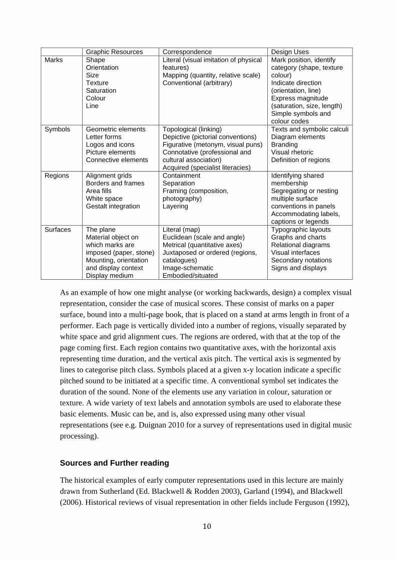
One approach is to take a holistic perspective on visual language, information design, notations, or diagrams. Specialist research communities in these fields address many relevant factors from low-level visual perception to critique of visual culture. Across all of them, it can be necessary to ignore (or not be distracted by) technical and marketing claims, and to remember that all visual representations simply comprise marks on a surface that are intended to correspond to things understood by the reader. The two dimensions of the surface can be made to correspond to physical space (in a map), to dimensions of an object, to a pictorial perspective, or to continuous abstract scales (time or quantity). The surface can also be partitioned into regions that should be interpreted differently. Within any region, elements can be aligned, grouped, connected or contained in order to express their relationships. In each case, the correspondence between that arrangement, and the intended interpretation, must be understood by convention or explained. Finally, any individual element might be assigned meaning according to many different semiotic principles of correspondence.
The following table summarises holistic views, as introduced above, drawing principally on the work of Bertin, Richards, MacEachren, Blackwell & Engelhardt and Engelhardt.
10
Graphic Resources Correspondence Design Uses Marks Shape
Orientation Size Texture Saturation Colour Line
Literal (visual imitation of physical features) Mapping (quantity, relative scale) Conventional (arbitrary)
Mark position, identify category (shape, texture colour) Indicate direction (orientation, line) Express magnitude (saturation, size, length) Simple symbols and colour codes
Symbols Geometric elements Letter forms Logos and icons Picture elements Connective elements
Topological (linking) Depictive (pictorial conventions) Figurative (metonym, visual puns) Connotative (professional and cultural association) Acquired (specialist literacies)
Texts and symbolic calculi Diagram elements Branding Visual rhetoric Definition of regions
Regions Alignment grids Borders and frames Area fills White space Gestalt integration
Containment Separation Framing (composition, photography) Layering
Identifying shared membership Segregating or nesting multiple surface conventions in panels Accommodating labels, captions or legends
Surfaces The plane Material object on which marks are imposed (paper, stone) Mounting, orientation and display context Display medium
Literal (map) Euclidean (scale and angle) Metrical (quantitative axes) Juxtaposed or ordered (regions, catalogues) Image-schematic Embodied/situated
Typographic layouts Graphs and charts Relational diagrams Visual interfaces Secondary notations Signs and displays
As an example of how one might analyse (or working backwards, design) a complex visual representation, consider the case of musical scores. These consist of marks on a paper surface, bound into a multi-page book, that is placed on a stand at arms length in front of a performer. Each page is vertically divided into a number of regions, visually separated by white space and grid alignment cues. The regions are ordered, with that at the top of the page coming first. Each region contains two quantitative axes, with the horizontal axis representing time duration, and the vertical axis pitch. The vertical axis is segmented by lines to categorise pitch class. Symbols placed at a given x-y location indicate a specific pitched sound to be initiated at a specific time. A conventional symbol set indicates the duration of the sound. None of the elements use any variation in colour, saturation or texture. A wide variety of text labels and annotation symbols are used to elaborate these basic elements. Music can be, and is, also expressed using many other visual representations (see e.g. Duignan 2010 for a survey of representations used in digital music processing).
Sources and Further reading
The historical examples of early computer representations used in this lecture are mainly drawn from Sutherland (Ed. Blackwell & Rodden 2003), Garland (1994), and Blackwell (2006). Historical reviews of visual representation in other fields include Ferguson (1992),
11
Pérez-Gómez & Pelletier (1997), McCloud (1993), Tufte (1983). Reviews of human perceptual principles can be found in Gregory (1970), Ittelson (1996), Ware (2004), Blackwell (2002). Advice on principles of interaction with visual representation is distributed throughout the HCI literature, but classics include Norman (1988), Horton (1994), Shneiderman (Shneiderman & Plaisant 2010, Card et al 1999, Bederson & Shneiderman 2003) and Spence (2001). Green’s Cognitive Dimensions of Notations framework has for many years provided a systematic classification of the design parameters in interactive visual representations. A brief introduction is provided in Blackwell & Green (2003).
References related to visual representation Bederson, B.B. and Shneiderman, B. (2003). The Craft of Information Visualization: Readings and Reflections,
Morgan Kaufmann
Bertin, J. (1967). Semiologie graphique. Paris: Editions Gauthier-Villars. English translation by WJ. Berg (1983) as Semiology of graphics, Madison, WI: University of Wisconsin Press
Blackwell, A.F. and Engelhardt, Y. (2002). A meta-taxonomy for diagram research. In M. Anderson & B. Meyer & P. Olivier (Eds.), Diagrammatic Representation and Reasoning, London: Springer-Verlag, pp. 47-64.
Blackwell, A.F. (2002). Psychological perspectives on diagrams and their users. In M. Anderson & B. Meyer & P. Olivier (Eds.), Diagrammatic Representation and Reasoning. London: Springer-Verlag, pp. 109-123.
Blackwell, A.F. and Green, T.R.G. (2003). Notational systems - the Cognitive Dimensions of Notations framework. In J.M. Carroll (Ed.) HCI Models, Theories and Frameworks: Toward a multidisciplinary science. San Francisco: Morgan Kaufmann, 103-134.
Blackwell, A.F. (2006). The reification of metaphor as a design tool. ACM Transactions on Computer-Human Interaction (TOCHI), 13(4), 490-530.
Duignan, M., Noble, J. & Biddle, R. (2010). Abstraction and activity in computer mediated music production, Computer Music Journal, vol. 34
Engelhardt, Y. (2002). The Language of Graphics. A framework for the analysis of syntax and meaning in maps, charts and diagrams. PhD Thesis, University of Amsterdam.
Ferguson, E.S. (1992). Engineering and the mind's eye. MIT Press.
Garland, K. (1994). Mr. Beck's Underground Map. Capital Transport Publishing.
Goodman, N. (1976). Languages of art. Indianapolis: Hackett.
Pérez-Gómez, A. and Pelletier, L. (1997). Architectural Representation and the Perspective Hinge. MIT Press
Gregory, R. (1970). The Intelligent Eye. Weidenfeld and Nicolson.
Horton, W.K. (1994). The icon book: Visual symbols for computer systems and documentation. Wiley
Ittelson, W.H. (1996). Visual perception of markings. Psychonomic Bulletin & Review, 3(2), 171-187.
MacEachren, A.M. (1995). How maps work: Representation, visualization, and design. Guilford.
McCloud, S. (1993). Understanding comics: The invisible art. Northhampton, MA:: Kitchen Sink Press.
Norman, D.A. (1988/2002). The Design of Everyday Things (originally published under the title ‘The Psychology of Everyday Things’). Newprint.
Petre, M. (1995) Why looking isn’t always seeing: readership skills and graphical programming. Communications of the ACM, 38 (6), 33 - 44.
12
Richards, C.J. (1984). Diagrammatics: an investigation aimed at providing a theoretical framework for studying diagrams and for establishing a taxonomy of their fundamental modes of graphic organization. Unpublished Phd Thesis. London: Royal College of Art.
Sellen, A. J. & Harper, R. H. R. (2002). The Myth of the Paperless Office. MIT Press.
Shneiderman, B. & Plaisant, C. (2010). Designing the User Interface: Strategies for Effective Human-Computer Interaction, 5th edition. Addison-Wesley.
Card, S.K., Mackinlay, J.D. & Shneiderman, B. (1999). Readings in Information Visualization: Using Vision to Think. Morgan Kaufmann
Spence, R. (2001). Information visualization. Addison-Wesley.
Sutherland, I.E. (1963/2003). Sketchpad, A Man-Machine Graphical Communication System. PhD Thesis at Massachusetts Institute of Technology, online version and editors' introduction by A.F. Blackwell & K. Rodden. Technical Report 574. Cambridge University Computer Laboratory
Tufte, E.R. (1983). The visual display of quantitative information. Cheshire, CT: Graphics Press
Ware, C. (2004). Information Visualization - Perception for Design. Morgan Kaufmann.
13
Visual representation design exercise

14
Lecture 3: Text and gesture interaction
When technical people are commenting on, or even creating, user interfaces, they often get distracted or hung up on the hardware used for input and output. This is a sign that they haven’t thought very hard about what is going on underneath, and also that they will never keep up with new technical advances. There have always been good and bad examples of interface designs using control panels, punch cards, teletypes, text terminals, bitmap displays, light pens, tablets, mice, touch screens, and so on. With every generation, you can hear people debating whether, for example, ‘the mouse is better than a touch screen’ or ‘voice input is better than a keyboard’. Debates like this demonstrate only that those involved haven’t been able to see past the surface appearance (and the marketing spiel of the device manufacturers). And opinions or expertise on these matters quickly gets out of date. Within the past few weeks, I’ve heard a leading researcher tell his sponsors that ‘we have added a GUI to our prototype’, as if that was an important thing. 20 years ago, it was something of an achievement to get some output on a bitmap display rather than a command line text application. Nowadays, it is more challenging to work with projection surfaces or augmented reality (more of that in a later lecture). But sensing and display technologies change fast, and it’s more important to understand the principles of interaction than the details of a specific interaction device.
The lecture on visual representation was based on display principles that are independent of any particular display hardware. If we consider the interaction principles that are independent of any particular hardware, these are:
How does the user get content (both data and structure) into digital form?
How does the user navigate around the content?
How does the user manipulate the content (restructuring, revising, replacing)?
These are often inter-dependent. The Dasher system for text entry presents an interface in which the user ‘navigates’ through a space of possible texts as predicted by a probabilistic language model, so it can be considered both as content creation and navigation. It is relatively hard to structure and revise text using Dasher, because the language model only uses a 5-character context, and many text documents have structure on a larger-scale than that. However, Dasher provides an excellent example of an interaction ‘paradigm’ that is independent of any particular hardware – it can be controlled using mouse, keys, voice, breath, eyetracking, and many other devices.
General principles: direct manipulation, and interface modes
At the point where the GUI was about to become popular, HCI researcher Ben Shneiderman summarized the important opportunities it provided, under the name Direct Manipulation. In fact some of these things were already possible with text interfaces (for example after the advent of full-screen text editors), and they remain relevant in more
15
recent generations of hardware. It is also possible to use GUI libraries to create bad user interfaces that do not support these principles – just being graphical doesn’t make it good! The principles of Direct Manipulation as described by Shneiderman are:
An object that is of interest to the user should be continuously visible in the form of a graphical representation on the screen
Operations on objects should involve physical actions (using a pointing device to manipulate the graphical representation) instead of commands with complex syntax
The actions that the user makes should be rapid, should offer incremental changes over the previous situation, and should be reversible
The effect of actions should immediately be visible, so that the user knows what has happened
There should be a modest set of commands doing everything that a novice might need, but it should be possible to expand these, gaining access to more functions as the user develops expertise.
We should also note an additional principle, defined around the same time by Larry Tesler at Apple, that the same action should always have the same effect. It’s hard to believe that this wouldn’t be done, but he was campaigning against editors like vi, which many people found unusable because hitting a key on the keyboard could have different consequences at different times. Tesler campaigned against ‘modes’ in the user interface, based on his studies of non-technical users (search for ‘nomodes’ to learn more). The largest achievement of the ‘windows’ style interface is that the frames around each application give the user a clue about different modes – but as Tesler said, removing modes altogether is a great ambition.
Content creation
Text content: guest lecturer will discuss this, including how we can assess and measure the efficiency of alternative text entry mechanisms.
Non-text content: This course won’t say very much about non-text content creation. ‘Content’ can refer to music, visual arts, film, games, novels and many other genres. To understand any of them well, you would have to take a degree in the relevant discipline (some available in Cambridge). All of those fields develop their own professional tools, and there is a constant stream of ‘amateur’ tools modeled on the professional ones. Cultural tastes don’t change that fast (the rate of change is generational, not annual), so digital content creation tools are usually derived from and imitate the artistic tools of previous generations (cameras, microphones, mixing desks, typewriters etc). Innovative content creation tools appear first in the ‘avant garde’ contemporary arts, and take a generation to reach popular audiences, get taken up by mainstream professional artists, and become subject to consumer demand for amateur tools – for example, sampling and mashups were first explored in the mid-20th century by ‘musique concrete’ composers using tape
16
recorders. The Computer Lab Rainbow Group has always had an active programme of research engagement with contemporary artists, developing new digital media tools. That research continues actively at present, but is outside the scope of an introduction to HCI.
Content manipulation and navigation via deixis
In order to manipulate content, the user has to be able to refer to specific parts of the product (whether text, diagram, video, audio etc) that he or she is working on. In early text interfaces, references were made by numbering the lines of a text file (e.g. substitute ‘fred’
for ‘frrd’ on line 27 – ‘27;s/frrd/fred/’). As in programming languages, line number
could be replaced by labels, but it is irritating to give everything names. Imagine a shop where everything for sale was given its own unique name, or had to be referred to by index position of aisle, shelf, and item. It’s much easier just to point and say ‘I want that one’. In language, this is called deixis – sentences in which the object is identified by pointing at it, rather than by naming it. For the same reason, deixis has become universal in computer languages, and this is why devices for pointing are so important in user interfaces.
In early GUIs, the combination of mouse and pointer to achieve deixis was a significant invention (hence the WIMP interface – Windows, Icons, Mouse, Pointer). Other inventions around the same time were the placement of a text cursor between characters, rather than identifying a single character (Larry Tesler had a hand in this invention too). But new hardware suggests new approaches to deixis – touch screens, augmented reality etc will all require new inventions. It’s reasonable to assume that deixis in different media can be achieved in different ways too – audio interfaces, cameras, and other devices don’t necessarily need to have a cursor. In many cases, what is required is a deictic method that relates user ‘gestures’ (detected via any kind of sensing device) with a media ‘location’. Navigation is then a matter of supporting user strategies to vary that location, including techniques to show local detail within a larger context (via scroll bars, zooming, thumbnails, fisheye views, overview maps, structure navigation and so on)
Simple content manipulations include simply adding more content (perhaps inserted within a particular context), or removing content that isn’t required. Anything more complex involves modifying the structure of the content. This is an area in which user interface design can build on insights from the usability of programming languages (in a later lecture).
Evaluation of pointing devices and WIMP interfaces
As with text entry, modern user interfaces involve so much pointing, that it is worth optimizing the efficiency of the interaction. Early HCI models based their optimization on Fitts' law – an experimental observation that the time it takes to point at a given location is
17
related to the size of the target and also the distance from the current hand position to the target.
Fitts original experiment involved two targets of variable size, and separated by a variable distance. Experimental subjects were required to touch first one target, then the other, as quickly as they could. The time that it takes to do this increased with the Amplitude of the movement (i.e. the distance between the targets) and decreased with the Width of the target that they were pointing to:
T = K log2(A / W + 1) where A = amplitude, W = width
When evaluating new pointing devices, it can be useful experimentally to measure performance over a range of target sizes and motion distances, in order to establish the value of the constant in this equation (sometimes called ID: the Index of Difficulty).
In user interfaces that require a user to make many sequences of repetitive actions (for example, people working in telephone call centres or in data entry), it can be useful to compare alternative designs by counting the individual actions needed to carry out a particular task, including the number and extent of mouse motions, as well as all the keys pressed on the keyboard. This Keystroke Level Model can be used to provide a quantitative estimate of user performance, and to optimize the design and layout of the interaction sequence. It is more difficult to make numerical comparisons of user interfaces in cases where the user actions are less predictable – the GOMS model (Goals Operators Methods Selection) combines keystroke-level estimates of user actions with an AI planning model derived from the 1969 work of Ernst and Newell on a Generalised Problem Solver. The GPS operated in a search space characterised by possible intermediate states between some initial state and a goal state. Problem solving consisted of finding a series of operations that would eventually reach the goal state. This involved recursive application of two heuristics: A) select an intermediate goal that will reduce the difference between the current state and the desired state, and B) if there is no operation to achieve that goal directly, decompose it into sub-goals until the leaves of the sub-goal hierarchy can be achieved by individual keystrokes or mouse movements.
For further reading on KLM and GOMS, see chapter 4 in Carroll, by Bonnie John.
Once we can measure interaction efficiency, whether text entry or time to point at a target, it is possible to compare alternative designs through controlled experiments with human participants. These are described in a later lecture.

18
Lecture 4: Inference
Mental models – what the user infers about the system
Don Norman, one of the first generation of cognitive scientists investigating HCI, also wrote the first popular book on the topic – The Design of Everyday Things1. What most people remember about this book is the example of door handles that are so badly designed they need labels telling you to pull them. But his key message was to draw attention to the gulf of evaluation and the gulf of execution– how does the user know what the system is doing, and how do they know what they need to do, in order to achieve their goals?
For a review of Norman’s model, see section 3.3.2 in Sharp, Rogers & Preece.
Computer systems are so complex, that nobody really knows what is happening inside (except, possibly, the designer). In the face of incomplete information, the gulf of evaluation is unavoidable. The user has to make inferences (or guess) what is happening inside. The user’s conclusions form a mental model of the system. One way of thinking about the design problem is that the designer must give sufficient clues to the user to support that inference process, and help the user form an accurate (or at least adequate) mental model. The idea of a visual metaphor is that the screen display simulates some more familiar real world object, and that the user’s mental model will then be understood by analogy to the real world.
The metaphor/analogy approach can potentially help with the gulf of execution too. If the system behaved exactly like the real world objects depicted, then users would know exactly what to do with them. In practice, computer systems never behave exactly like real world objects, and the differences can make the system even more confusing. (Why do you have windows in your desktop? Why do I have to put my USB drive in the rubbish before unplugging it?) Furthermore, designers inadvertently create metaphors that correspond very well to their own understanding of the internal behaviour of the system, but users should not be expected to know as much as designers. User studies can help to identify what users actually know, what they need to know, and how they interpret prototype displays.
Mental models research
Mental models research attempts to describe the structure of the mental representations that people use for everyday reasoning and problem solving. Common mental models of everyday situations are often quite different from scientific descriptions of the same phenomena. They may be adequate for basic problem solving, but break down in unusual situations. For example, many people imagine electricity as being like a fluid flowing
1 originally called the Psychology of Everyday Things – he wrote much of it while on sabbatical leave at the Applied Psychology Unit in Cambridge, and among other examples, described the idiosyncratic voicemail system at the APU
19
through the circuit. When electrical wiring was first installed in houses, it appeared very similar to gas or water reticulation, including valves to turn the flow on and off, and hoses to direct the flow into an appliance. Many people extended this analogy and believed that the electricity would leak out of the light sockets if they were left without a lightbulb. This mental model did not cause any serious problems - people simply made sure that there were lightbulbs in the sockets, and they had no trouble operating electrical devices on the basis of their model.
The psychological nature of unofficial but useful mental models was described in the 1970s, and these ideas have been widely applied to computer systems. Young's study of calculator users in 1981 found that users generally had some cover story which explained to their satisfaction what happened inside the device. Payne carried out a more recent study of ATM users, demonstrating that even though they have never been given explicit instruction about the operation of the ATM network, they do have a definite mental model of data flow through the network, as well as clear beliefs about information such as the location of their account details.
The basic claim of mental models theory is that if you know the users' beliefs about the system they are using, you can predict their behaviour. The users' mental models allow them to make inferences about the results of their actions by a process of mental simulation. The user imagines the effect of his or her actions before committing to a physical action on the device. This mental simulation process is used to predict the effect of an action in accordance with a mental model, and it supports planning of future actions through inference on the mental model. Where the model is incomplete, and the user encounters a situation that cannot be explained by the mental model, this inference will usually rely on analogy to other devices that the user already knows.
Think aloud studies
A great deal of cognitive psychology research, including some basic research on mental models, has been based on think-aloud studies, in which subjects are asked to carry out some task while talking as continuously as possible. The data are collected in the form of a verbal protocol, normally transcribed from a tape recording so that subtle points are not missed. Use of this technique requires some care. It can be difficult to get subjects to think aloud, and some methods of doing so can bias the experimental data. A detailed discussion of this kind of study is provided by Ericsson & Simon (1985).
For a description of think-aloud techniques, see section 7.6.2 in Sharp, Rogers & Preece.
Performance models of users
Early HCI research was largely concerned with the performance of the user, measured in engineering terms as a system component (‘cognitive psychology’ is closely associated with ‘artificial intelligence’, investigating human performance by simulating it with
20
machines). One of the most famous findings in cognitive psychology research, and the one most often known to user interface developers, is an observation by George Miller in 1956. Miller generalised from a number of studies finding that people can recall somewhere between 5 and 9 things at one time - usually referred to as “seven plus or minus two”. Surprisingly, this number always seems to be about the same, regardless of what the “things” are. It applies to individual digits and letters, meaning that it would be very difficult to remember 25 letters. However if the letters are arranged into five 5-letter words (apple, grape …), we have no trouble remembering them. We can even remember 5 simple sentences reasonably easily. Miller called these units of short-term memory chunks. It is rather more difficult to define a chunk than to make the observation - but it clearly has something to do with how we can interpret the information. This is often relevant in user interfaces - a user may be able to remember a sequence of seven meaningful operations, but will be unable to remember them if they seem to be arbitrary combinations of smaller elements.
Short term memory is also very different from long term memory - everything we know. Learning is the process of encoding information from short term memory into long term memory, where it appears to be stored by association with the other things we already know. Current models of long-term memory are largely based on connectionist theories - we recall things as a result of activation from related nodes in a network. According to this model, we can improve learning and retrieval by providing rich associations - many related connections. This is exploited in user interfaces that mimic either real world situations or other familiar applications.
A further subtlety of human memory is that the information stored is not always verbal. Short term memory experiments involving recall of lists failed to investigate the way that we remember visual scenes. Visual working memory is in fact independent of verbal short term memory, and this can be exploited in mnemonic techniques which associate images with items to be remembered – display icons combined with associated labels provide this kind of dual coding.
Intelligent interfaces – what the system infers about the user
A further inference problem is that, in addition to the user not knowing what is happening inside the system, the system doesn’t ‘know’ what is happening inside the user. Advanced systems can be designed to record and observe user interactions, and on the basis of that data, make inferences about what the user intends to do next, and present short-cuts, usability cues or other aids. These kinds of ‘intelligent user interface’ are becoming more common, but they can also introduce severe usability problems. A notorious early example was the Microsoft Word ‘Clippy’, which analysed features of the document, and offered to help with automatic formatting (“You appear to be writing a letter …”). Although some users found it useful, a far larger number found the tone patronizing and the automated

21
actions inaccurate. Google ‘Death to Clippy’ to see the extent to which smart user interface technology can get it wrong.
Many intelligent user interfaces emerge from the machine learning community, and especially Bayesian inference techniques. Bayesian techniques are more appropriate to user interfaces than other techniques for a range of reasons:
They don’t rely on large training sets (as is the case with neural net approaches), so they can adapt more quickly to individual users
Bayesian consideration of prior probabilities corresponds better to commonsense human reasoning under uncertainty.
Bayes formula provides a consistent way to combine data from user interactions with historical data and heuristic rules.
An inference framework provides a valuable analytic perspective on many current trends in user interaction. For example, the behaviour of Google, or of recommender systems such as Amazon or Facebook friend finder, use inference techniques to apply statistical data and guess what the user really wants. It remains the case that when the system makes inaccurate inferences, the results will be annoying, confusing, or even damaging. This means that some advanced research areas, such as Programming by Example (where automated scripts or macros are created by inference, after observing repeated actions) provide a major challenge for HCI. These are active areas of research in Cambridge at present, and a few advanced prototypes are available for experimental use, such as the CoScripter project at IBM's Almaden Research Center (Allen Cypher, one of the CoScripter team, has worked in this area for many years – his ‘Eager’ prototype at Apple Research was an early success).
22
Lecture 5: Advanced user interface techniques
This lecture summarises recent and current HCI research into advanced interaction technologies, using a variety of projects (especially current research in Cambridge) to review the principles introduced elsewhere in the course.
Virtual reality (VR)
The term virtual reality originally applied only to full immersion VR, in which simulated world is projected onto all walls of a room (CAVE – a recursive acronym for CAVE Automatic Virtual Environment), or via a head-mounted display (HMD) which uses motion-tracking to change the view as you turn your head. Interaction was always a challenge – data gloves could supposedly be used to pick up and interact with objects in the virtual scene. However, actual systems tended to use the glove only for gesture recognition, with all the problems of training, inference and accuracy that this implies. ‘Natural’ navigation in the real world is achieved by walking, but CAVEs were never large enough to walk far, and HMDs with motion tracking were normally tethered by cables. In practice, the illusion was always fairly limited, unlike the Matrix-style science fiction ideal that motivated it. Marketing creep has meant that any interactive 3D environment (including FPS games, Second Life etc) might get called VR, even if presented on a standard monitor, and controlled by a mouse. As games players know very well, control of view and camera angle, unless constrained by a script, can make arbitrary action in 3D scenes complex.
Augmented reality
Augmented reality (AR) systems overlay digital information onto the real world, either using partially-transparent head mounted displays as with Google project Glass, or by taking a video feed of an actual scene, and compositing it with computer generated elements, as with Wikitude, or Layar. A key technical problem is registration – relatively recently, this had to be done by integrating GPS, compass orientation, accelerometer for gravity orientation, and often gyroscopes, into the HMD. Now that all these peripherals are available on high end mobile phones, Mobile AR is becoming a major marketing buzzword, possibly with the same loss of actual functionality that occurred when VR shifted from research ambition to marketing buzzword.
Tangible user interfaces
Tangible user interfaces (TUIs) use physical objects to control the computer, most often a collection of objects arranged on a tabletop to act as ‘physical icons’. An immediate problem is that physical objects don’t change their visible state very easily. You can include motors and displays in each object (expensive), or project overlaid AR information onto them, or just use them as multiple specialized mice/pucks that control elements of the
23
display on a separate screen. In this case, it is necessary to track their positions, perhaps by using a large tablet device. If they are just being used as tokens to select a particular function or piece of data, an embedded RFID chip can be used to sense when they are placed within a certain distance of a reader.
Machine vision
Machine vision is a key technology for both AR and TUIs, as a way of recognizing real world objects such as buildings (in the case of outdoor AR) or objects on a desk (used for TUIs). Many current AR prototypes recognize distinctive objects from a large number of low-level visual features, as in the SIFT algorithm. Key problems are to maintain a sufficiently large database of object features, track them fast enough to give user feedback that responds to camera, gesture or object motion in realtime, and do both of these in varying lighting conditions. An alternative is fiducial markers – simple visual markers such as barcodes, that can be used to more reliably identify and track objects from camera input. They are more robust to changes in camera angle and lighting than object recognition algorithms.
Paper interfaces
Inspired by the research conducted by Abigail Sellen and Richard Harper (originally at Xerox EuroPARC in Cambridge, now at Microsoft Research Cambridge), whose book ‘The Myth of the Paperless Office’ analyses the ways in which the properties of paper are preferable to computers for many kinds of activity. The book remains a useful resource for designers of mobile devices substituting for paper (phones and tablets), but has also inspired research in which paper is integrated with digital systems, for example with fiducial markers on the page that can be traced by cameras (the Anoto digital pen can perhaps be considered an extreme example of gesture recognition implemented with fiducial markers).
Mixed reality
Mixed reality combines physical objects with information displays, for example by projecting digital data onto objects on a table, or onto paper. Fiducial markers can be used to determine the identity and location of individual sheets of paper, and project additional information onto them. The ISMAR conference series presents new results in Mixed and Augmented Reality, often based on machine vision techniques.
Eye tracking and gaze control
Originally developed for psychological research into visual attention processes, eye-trackers are now used fairly routinely in HCI research to study what position on the screen
24
users are looking at. A high resolution close-up camera is used to capture video of one of the user’s eyes, and the precise position where they are looking is deduced from the position of the pupil, often combined with reflections from a pair of small infrared (LED) spotlights. One company sells a device with the camera and spotlights integrated into the surround of a monitor, to be unobtrusive. However, almost all systems like this require the user to sit fairly still, and to undergo a calibration procedure in which they look at points on the screen in sequence. Performance can be poor when there is strong ambient lighting, when the user wears spectacles, has watery eyes or shiny skin. Often practice is required to get good results.
Chapter 3 of the Cairns and Cox book (by Natalie Webb and Tony Renshaw) is devoted to eyetracking in HCI
Eye trackers are occasionally used to make gaze-controlled interfaces. At first sight, it seems that these might be especially natural and intuitive to use. In practice, natural eye movement of fixations and saccades can confuse the eye-tracker inference algorithms, it is hard work to keep your eyes fixated on control locations for substantial periods of time, and the natural temptation to glance elsewhere (check work in progress, look at the time, look down at your hands etc) or to blink excessively must be constantly fought.
Surface and tabletop interaction
Surface/tabletop interaction uses large display areas, usually projected, on a flat surface such as a wall or table. User interaction takes place by touching, gesturing, or pointing at the display. Many of these systems use camera input, with more accurate recognition of the users hands possible by using infrared, rather than visible light. A low-powered infrared spotlight is often used to illuminate the scene, rather than relying on body heat (which can be confused by other hot objects in the environment – such as computers!). A popular technique at present is frustrated total internal reflection (FTIR), where infrared light is shone inside a flat transparent medium such as a glass panel, and anything touching the surface causes infrared to be scattered. This technique can be used to recognize fingertip touches, or gestures involving more skin contact, such as multiple fingers or even a flat palm. A motivating scenario for many of these systems has been the gesture-controlled projection interface in the movie Minority Report.
Embodied interaction
A user sitting at a desk, in front of a screen, with a keyboard and mouse on the surface, was the default assumption in most classical user interface designs. Most of the new technologies described above are used in other positions, making it necessary to take account of how users stand or move around. Machine vision, tracking of infrared markers, use of accelerometer data, ‘smart’ fabrics and clothing, and many other techniques can be

25
used to analyse and track body positions. The theoretical perspectives necessary to account for embodied interaction rather than the ‘disembodied’ view of the mind preferred in AI and cognitive science (along with some fairly heavy philosophy) are explained in Where The Action Is: The Foundations of Embodied Interaction by Paul Dourish (MIT Press 2001).
26
Lecture 6: Usability of programming languages
For many years, it seemed that conventional text programming would eventually be replaced by visual programming languages, where program behaviour is defined by drawing diagrams (many proposals resembled software engineering diagrams, such as those in UML – flow charts, object interaction, state charts etc). At a time when software development methods involved creating a complete specification in diagram form, then employing programmers to convert those into code, it seemed as though programming could be completely automated. However the fallacy of this reasoning was the same error made when FORTRAN (Formula Translation) was considered to be ‘automatic programming’ – any representation that defines the program behaviour in sufficiently precise detail to be compiled will be more like programming than like design. Drawing highly detailed diagrams is often more laborious than writing highly detailed text, so it isn’t the case that diagrams will always have superior usability relative to text.
Many elements of the modern WIMP interface originated in programming language research – the ancestor of the Windows and Macintosh GUIs was originally created at Xerox PARC as a user interface to the Smalltalk language, and Shneiderman’s principles of direct manipulation were originally described as an alternative to programming languages. It is likely that research into advanced programming techniques will continue to influence future user interfaces. There are also some good examples of programming languages that have been designed for use by special groups – end user programmers who are not professionally trained in programming, or educational programming languages that illustrate programming language principles using graphical display elements. Examples include the LabView language for programming laboratory instrumentation and control, Max/MSP used for music performance and digital art installations, and Scratch, used as a first programming language for children around the ages of 8-10.
For many years, programmers often argued that their favourite language was the best in the world, almost like children arguing whether a tractor is better than a Ferrari. It should be clear that different languages are good for different purposes, and for use by different people. These often include a broad mix of visual and textual (or even physical and tangible) elements, selected to meet specific needs.
Cognitive Dimensions of Notations
The usability principles by which we describe what kind of activities a language in being used for, and what kinds of visual representation can be useful or not useful for those activities, have been collected into guidance for language designers, under the name Cognitive Dimensions of Notations (CDs), a programme of work initiated at the MRC Applied Psychology Unit in Cambridge under the leadership of Thomas Green. Just as many innovations in programming language user interfaces have led to radically different
27
approaches to user interfaces, CDs are one of the most appropriate theoretical frameworks for analysis of completely new content manipulation styles.
The CDs are presented as a vocabulary for design discussion. Many of the dimensions reflect common usability factors that experienced designers might have noticed, but did not have a name for. Giving them a name allows designers to discuss these factors easily. Furthermore, CDs are based on the observation that there is no perfect user interface any more than a perfect programming language. Any user interface design reflects a set of design trade-offs that the designers have had to make. Giving designers a discussion vocabulary means that they can discuss the trade-offs that result from their design decisions. The nature of the trade-offs is reflected in the structure of the dimensions. It is not possible to create a design that has perfect characteristics in every dimensions - making improvements along one dimension often results in degradation along another.
An example dimension is called viscosity, meaning resistance to change. In some notations, small conceptual changes can be very expensive to make. Imagine changing a variable from int to long in a large Java program. The programmer has to find every function to which that variable is passed, check the parameter declarations, check any temporary local variables where it is stored, check any calculations using the value, and so on. The idea of what the programmer needs to do is simple, but achieving it is hard. This is viscosity. There are programming languages that do not suffer from this problem, but they have other problems instead – trade-offs. This means that language designers must be able to recognise and discuss such problems when planning a new language. The word “viscosity” helps that discussion to happen.
CDs are relevant to a wide range of content manipulation systems – audio and video editors, social networking tools, calendar and project management systems, and many others. These systems all provide a notation of some kind, and an environment for viewing and manipulating the notation. Usability is a function of both the notation and the environment.
Representative cognitive dimensions
The following list gives brief definitions of the main dimensions, and examples of the questions that can be considered in order to determine the effects that these dimensions will have on different user activities.
Premature commitment: constraints on the order of doing things. When you are working with the notation, can you go about the job in any order you like, or does the system force you to think ahead and make certain decisions first? If so, what decisions do you need to make in advance? What sort of problems can this cause in your work?
28
Hidden dependencies: important links between entities are not visible. If the structure of the product means some parts are closely related to other parts, and changes to one may affect the other, are those dependencies visible? What kind of dependencies are hidden? In what ways can it get worse when you are creating a particularly large description? Do these dependencies stay the same, or are there some actions that cause them to get frozen? If so, what are they?
Secondary notation: extra information in means other than formal syntax. Is it possible to make notes to yourself, or express information that is not really recognised as part of the notation? If it was printed on a piece of paper that you could annotate or scribble on, what would you write or draw? Do you ever add extra marks (or colours or format choices) to clarify, emphasise or repeat what is there already? If so, this may constitute a helper device with its own notation.
Viscosity: resistance to change. When you need to make changes to previous work, how easy is it to make the change? Why? Are there particular changes that are especially difficult to make? Which ones?
Visibility: ability to view components easily. How easy is it to see or find the various parts of the notation while it is being created or changed? Why? What kind of things are difficult to see or find? If you need to compare or combine different parts, can you see them at the same time? If not, why not?
Closeness of mapping: closeness of representation to domain. How closely related is the notation to the result that you are describing? Why? (Note that if this is a sub-device, the result may be part of another notation, not the end product). Which parts seem to be a particularly strange way of doing or describing something?
Consistency: similar semantics are expressed in similar syntactic forms. Where there are different parts of the notation that mean similar things, is the similarity clear from the way they appear? Are there places where some things ought to be similar, but the notation makes them different? What are they?
Diffuseness: verbosity of language. Does the notation a) let you say what you want reasonably briefly, or b) is it long-winded? Why? What sorts of things take more space to describe?
Error-proneness: the notation invites mistakes. Do some kinds of mistake seem particularly common or easy to make? Which ones? Do you often find yourself making small slips that irritate you or make you feel stupid? What are some examples?
Hard mental operations: high demand on cognitive resources. What kind of things require the most mental effort with this notation? Do some things seem especially complex or difficult to work out in your head (e.g. when combining several things)? What are they?
Progressive evaluation: work-to-date can be checked at any time. How easy is it to stop in the middle of creating some notation, and check your work so far? Can you do this any time you like? If not, why not? Can you find out how much progress you have made, or check what stage in your work you are up to? If not, why not? Can you try out partially-completed versions of the product? If not, why not?
29
Provisionality: degree of commitment to actions or marks. Is it possible to sketch things out when you are playing around with ideas, or when you aren't sure which way to proceed? What features of the notation help you to do this? What sort of things can you do when you don't want to be too precise about the exact result you are trying to get?
Role-expressiveness: the purpose of a component is readily inferred. When reading the notation, is it easy to tell what each part is for? Why? Are there some parts that are particularly difficult to interpret? Which ones? Are there parts that you really don't know what they mean, but you put them in just because it's always been that way? What are they?
Abstraction: types and availability of abstraction mechanisms. Does the system give you any way of defining new facilities or terms within the notation, so that you can extend it to describe new things or to express your ideas more clearly or succinctly? What are they? Does the system insist that you start by defining new terms before you can do anything else? What sort of things? These facilities are provided by an abstraction manager - a redefinition device. It will have its own notation and set of dimensions.
Notational activities
When users interact with content, there are a limited number of activities that they can engage in, when considered with respect to the way the structure of the content might change. A CDs evaluation must consider which classes of activity will be the primary type of interaction for all representative system users. If the needs of different users have different relative priorities, those activities can be emphasised when design trade-offs are selected. The basic list of activities includes:
Search Finding information by navigating through the content structure, using the facilities provided by the environment (e.g. finding a specific value in a spreadsheet). The notation is not changing at all, though the parts of it that the users sees will vary. Visibility and hidden dependencies can be important factors in search.
Incrementation
Adding further content without altering the structure in any way (e.g. adding a new formula to a spreadsheet). If the structure will not change, then viscosity is not going to be very important.
Modification
Changing an existing structure, possibly without adding new content (e.g. changing a spreadsheet for use with a different problem).
Transcription
Copying content from one structure or notation to another notation (e.g. reading an equation out of a textbook, and converting it into a spreadsheet formula).
Exploratorydesign
Combining incrementation and modification, with the further characteristic that the desired end state is not known in advance (e.g. programming a spreadsheet on the fly or “hacking”). Viscosity can make this kind of activity far more difficult. This is why good languages for

30
hacking may not be strictly typed, or make greater use of type inference, as maintaining type declarations causes greater viscosity. Loosely typed languages are more likely to suffer from hidden dependencies (a trade-off with viscosity), but this is not such a problem for exploratory design, where the programmer can often hold this information in his head during the relatively short development timescale.
Chapter 5 of the Carroll book gives a more extended description of Cognitive Dimensions, with examples and theoretical background.

31
Lecture 7: User-centred design research
Observation and task analysis
The Part 1a Software Design course mentioned a packaged approach to requirements, based on the book Contextual Design: Defining Customer-Centered Systems by Hugh Beyer and Karen Holtzblatt (1997). That book provides comparatively step-by-step guidance through a process with similar motivation to that described here, but does not emphasis theoretical concerns or user studies in a more academic HCI research context. This course gives more attention to individual research techniques that are often used within HCI, and the social science context from which they are derived.
A guest speaker with wide experience of social scientific field work in commercial contexts has been invited to give this lecture. He may mention some of the following techniques:
Structured interviews
Most software projects start with a series of meetings in which the system requirements are established. The agenda of these meetings is often concerned with many other matters than the user interface, however. In fact the people who will use the completed system may not even be present. Their requirements are defined by a representative (a system analyst for an internal project or a market researcher for a product) who may not have much experience of design for usability.
For this reason, user interface designers often conduct studies specifically to discover the requirements of the system users. One of the cheapest and most straightforward techniques is to conduct interviews with the users. Interviews must be carefully planned to be effective, however. They are generally more or less structured, encompassing a selected range of users, and taking care to encourage cooperation from users who may feel threatened or anxious.
A structured interview is based around a set of questions that will be asked of every interviewee. This need not necessarily be a long list, but it helps to collect data into a common framework, and to ensure that important aspects of the system are not neglected.
Section 7.4 of Preece, Rogers and Sharp gives far more detail about interview techniques.
Observational studies
Observational studies are a less intrusive way of capturing data about users' tasks, and can also be more objective. They involve more intensive work, however. An observational study of tasks that take place in a fixed location can be conducted by making video recordings which are transcribed into a video protocol. This protocol can then be used for
32
detailed analysis of the task - relative amounts of time spent in different sub-tasks, common transitions between different sub-tasks, interruptions of tasks and so on.
Audio recordings can also be used for this purpose in certain domains, but these are less likely to be useful for task analysis than they are in think-aloud studies.
If a task ranges over a number of locations, the investigator has no choice but to follow the subject, taking notes or recordings as best as possible. This is sufficiently difficult that ethnographic techniques are more likely than passive observation. An alternative is the user of diary studies, in which subjects take their own notes, but prompted to pay attention to specific times, events or categories.
Ethnographic field studies
Ethnographic study methods recognise that the investigator will have to interact directly with the subject, but while taking sufficient care to gain reasonably complete and objective information. An ethnographic study will attempt to observe subjects in a range of contexts, over a substantial period of time, and making a full record using any possible means (photography, video and sound recording as well as note-taking) of both activities and the artefacts that the subject interacts with.
Ethnographic methods are becoming increasingly important in HCI, to an extent that many technology companies will now employ an anthropologist as their first social science expert, rather than a psychologist. In practice, both sets of skills are useful. Cognitive descriptions of human performance (often called human factors by engineers) tend to be most valuable in detailed assessment and critique of a proposed design. Descriptions of mental models can be helpful in elaborating a design concept. But ethnographic observation can help to understand technology and products in completely new ways, perhaps leading to innovative new concepts. In this respect, ethnography can be considered as a contribution to engineering requirements capture in a traditional technology company. Younger and trendier companies like to describe the whole process of product concept identification, development and refinement as user experience (UX) design. There are specialised books and conferences that report methods and research from all of these perspectives (e.g. EPIC: the Ethnographic Praxis in Industry Conference; DUX: Designing the User Experience; CHI: Human Factors in Computing, etc.).
HCI researchers tend to have skills in all these techniques, but product designers generally want a simpler recipe that doesn’t require them to spend a year or more doing fieldwork. Often the biggest problem they have is how to gain a perspective of what it is like to be a user, escaping the mindset of their own technical understanding and expectations of the product. A useful intermediate technique is to write fictionalised descriptions of the kind of person who will use the product, to help the engineer understand what sort of person they are based on his or her personal experience. These user personas might be derived from
33
ethnographic fieldwork, or from conventional market research data. They are a particularly popular technique in Microsoft, where persona descriptions include photographs (presumably of actors), fictional biographies, and descriptions of why this person uses computers. Product design then proceeds on the basis that the designer tries to accommodate (or ideally charm, assist and delight) this range of fictional people. Two Microsoft staff members, Pruitt and Grudin, have written a brief paper explaining their use of the technique.
Sectin 7.6 of Preece, Rogers and Sharp gives far more detail about ethnographic and observational techniques.
Prototyping
Prototyping is becoming increasingly important as a software design method, particularly addressing the problems of developing user interfaces within a strict waterfall development model. Companies that use waterfall models have placed increasing emphasis on accurate portrayal of the user interface at the specification phase, after finding that the majority of specification changes arise from client not understanding the requirements for user functionality. In terms of mental models theory, this could be expected - clients who have no image of the interface that they will operate are unlikely to have a useful mental model of system behaviour.
If the system can respond in complex ways, it is difficult to appreciate this from static figures in a specification, so the specification phase of projects often uses rapid prototyping tools to construct a functional user interface. This prototype can be demonstrated to clients and used as a basis for discussion. If a spiral development model is adopted rather than a waterfall, the prototype can be refined iteratively until the full system functionality is achieved. Incremental prototyping requires that the rapid prototyping tool also meets the engineering requirements of the final system. If such a tool is not available, an alternative is deep prototyping, in which one aspect of the system functionality is fully implemented before developing the rest of the interface.
These common approaches to prototyping are quite different to the prototyping techniques that have been found to be successful in developing novel user interfaces. Many product designers believe that creativity in the product design process is directly related to the number of prototypes produced. HCI research similarly emphasises techniques for developing a large number of prototypes, exploring different possible solutions, and evaluating the usability of alternatives. This is in contrast to incremental prototyping techniques, which encourage cost-saving by using the first solution regardless of its usability properties.
Further discussion of the philosophy of prototyping in HCI can be found in Bill Buxton’s popular book Sketching User Experiences (2007)

34
Investigation of multiple prototypes requires low cost techniques for producing prototypes. Rather than implementing realistic system functionality, these often use generic graphic design tools with some scripting functions: early HCI research often used Apple Hypercard, and more recent work uses tools like Flash. Simulations of user interfaces are often presented as a click-through prototype – a sequence of simulated screens typically loaded into Powerpoint, where a demonstrator moves the mouse pointer to a position on the screen and clicks there, pretending that the system is responding to that action (in fact, it always advances to the next slide – the demonstrator has to remember where to click to make it appear realistic). An even more radical proposal is low-fidelity prototyping, in which the prototype user interface is made using controls built from glue and paper. During evaluation, the functionality can be implemented using the Wizard of Oz technique - a person simulates the machine by responding to user actions with the display of new (paper) screens.
The objective of building multiple prototypes is to investigate design alternatives through evaluation with actual users. This might involve simple discussion in a participatory design workshop, a more structured interview, or use of think-aloud to study the mental model that the user develops when interpreting the prototype.
Theories of computers and social actors
When we are designing computer systems that will be closely integrated into a social context, we need to consider a number of important properties of social contexts. As expressed in the field of Computer-Supported Collaborative Work (CSCW), these are broadly derived from specialist perspectives in social science known as ethnomethodology and conversation analysis. This approach was popularized by Lucy Suchman, an anthropologist at Xerox PARC, in her book Plan and Situated Actions. This book not only set an agenda for understanding user interaction that was independent of cognitive psychology, but also offered a strong critique of the artificial intelligence techniques on which cognitive science was based. The theoretical concerns of her approach are, broadly speaking, as follows:
1. The things that people say relate to the current situation (indexicality). In natural human conversation, it is not usually possible to interpret an utterance without knowing the context in which it appeared. Social situations are constructed from words, but the same word can be used to make very different situations (compare ‘hard labour’ to ‘labour of love’).
2. Most social actions are made in response to the other people around you and the things they do (contingency). It is seldom practical to make a detailed plan in advance, and then carry out an exact sequence of actions without change. But plans are necessary and useful; so a plan must be flexible. Alternatively, a plan might be an orientation rather than a specification of 'what to do'. Indeed, most plans are in fact of this latter kind.
35
3. In social situations, the things that people say and do are organized in a way that makes sense to other people (accountability). If someone does something that does not make sense within this framework, this makes him appear irrational, disruptive or mad (whether or not his actions seemed logical in his own mind).
4. If you want to understand why someone said or did something, it is the context they are in that gives their actions meaning; their point if you will. Abstract theories or explanations about social actions are often too abstract to help explain the details of social actions (and so may not help in design). Nevertheless, and perplexingly, abstract theories are often used by people themselves to help give meaning and sense to what they do in any situation.
All four of these aspects of human behaviour are different to the behaviour of computer systems. The semantics of computer languages determines that a particular language element should always have the same effect (they are not indexical). Computer plans can be derived exactly from a statement of requirements, but it is seldom possible for a computer to improvise, other than replanning from scratch (they are not contingent). Computers do not behave in the same way as people, participating in social situations, with the result that they often do things that seem arbitrary, rather than accountable contributions to a conversation. Finally, computers always act according to rules (programs) constructed to follow computational theories – the computer itself is not uniquely adequate to explain its behaviour.
If we are designing computer systems that will be used within social situations, we need a set of research methods that can provide a ‘remedial’ perspective that makes the computer slightly less incompetent as a social actor. We can do this by observing real social actions in context (ethnography), writing about what we see at a level that not only what happened but why things were done, in a way recognizable to the participants themselves (thick description), and making detailed analysis of recordings in order to understand the patterns and rules of the situation (work analysis).
Chapter 13 of the Carroll book (by Graham Button) gives a more detailed introduction to ethnomethodological studies of work.
Methods for analyzing qualitative data
Despite the name ‘ethnomethodology’, Suchman’s work offers a theoretical critique, rather than a methodology for design (the word refers to the study of ethno-methods, that is, contingent and accountable patterns of human interaction, and has nothing to do with any technical concern).
There are some rigorous approaches to analysis of video data, oriented toward these concerns, and used by Suchman and others at Xerox. However, these require specialist training and are probably too time consuming for routine design work. In cases where it is

36
necessary to take an open-minded approach to qualitative data such as interview transcripts or think-aloud protocols, many HCI researchers use a technique known as grounded theory, in which individual statements are coded and categorized in response to the data itself, rather than framed by a prior hypothesis or assumptions about how users ought to interact.
Chapter 7 of the Cairns and Cox book gives a good introduction to grounded theory.

37
Lecture 8: Usability evaluation methods
Summative Evaluation techniques
Summative evaluation, often performed under the umbrella of usability testing is carried out at the end of a project after the system has been built, to assess whether it meets its specification, or whether a project was successful. This is in contrast to formative evaluation, where the main objective is to contribute to the design of the product, by assessing specifications or prototypes before the system has been built. Formative evaluation is often analytic (it proceeds by reasoning about the design), while summative evaluation is often empirical (it proceeds by making observations or measurements).
The evaluation carried out in most Part II projects is summative in nature. Summative evaluation is also used frequently in research situations, where the performance of a new interaction technique is assessed for scientific publication.
However, summative evaluation is not so popular in commercial settings as in academic settings. After a system has been built, the creators tend not to be interested in further advice – many small companies consider that releasing a product is so cheap that they might as well release it as test it. Any usability problems can be resolved in version 2, in response to user feedback. An alternative is to use discount usability techniques that are less rigorous than academic studies, but still give more information than crossing your fingers and hoping that users will like it (although that is a surprisingly common approach in small companies).
Larger, more established, companies spend more on summative evaluation of new products, because of the danger to their reputation if they were to release a product that was very much inferior. For this reason, companies like Microsoft carry out summative evaluation studies of all products, before they undergo even early (beta) market release. Usability problems can then be tracked and resolved in the same way as other software defects, using the same process as for functional bugs found during system testing.
Controlled experiments
The most common empirical method used in HCI research, derived from its origins in human factors and experimental psychology, is the controlled experiment. An experiment is based on a number of observations (measurements made while someone is using an experimental interface). A typical measurement might be “How long did Fred take to finish task A?” or “How many errors did he make”? A wide range of alternative measurements are possible, including heart rate or other exotic biological data. However we most often assume, as in the discussion of KLM and GOMS, that it is a good thing if interfaces allow us to do something quickly.
38
A single observation of speed is not very interesting, however. If Fred did the task again, he would take a different amount of time, and if someone else did it, it would take an even more different amount of time. We therefore collect sets of measurements, and compare averages. The sets might be multiple observations of one person performing a task over many trials, or of a range of people (experimental participants) performing the same task under controlled conditions. As with most human performance, the measured results will usually be found to have a normal distribution.
A typical HCI experiment involves one or more experimental treatments that modify the user interface. A very simple example might test the question: “How long does Fred take to finish task A when using a good UI, compared to a bad UI?” The result will often be that the good UI is usually faster to use than the bad, but not in every trial. If we plot the measurements, we find two overlapping normal distributions, and we must therefore compare the effect of treatments relative to the spread in the population distribution. We need to know whether the difference between the averages is the result of ordinary random variation, or the effect of the changes we made to the user interface.
This involves a statistical significance test such as the t-test. The t-test and other similar tests answer the question “What is the probability that the observed difference in means could have occurred simply by random variation?”. The idea that the experimental difference might just have been a random variation is called a null hypothesis, and it is important to remember that this is always a possibility in any experiment. We generally hope that the probability was very low – i.e. that the observed difference is because we designed a really good interface, rather than luck. In HCI research, we usually insist that the probability of the result being due to random variation (p) is less than 0.05, or 5%. Good quality research results are normally based on experiments with significance values p < 0.01, which can be expressed as ‘we reject the null hypothesis, with 99% confidence’.
If large amounts of data are available (for example, if you are Google, and have millions of people interacting with your product), then a simple binary measurement may be sufficient to provide useful evaluation. This is commonly used in A/B testing, where two versions of a design are created, and then compared using a measure such as “click-through” – is a user more likely to click on a button in design A or design B? Significance testing with binary data can be carried out using a binomial test to see whether the variation between the two is greater than would be expected by chance.
Variation in controlled experiments
Some computer scientists find it surprising that one can draw scientific conclusions from measurements that are different every time we make them, and even offer the opinion that the basis of HCI in probability and statistics instead of mathematical proof is a fundamental flaw in HCI research. This is rather fatalistic. Everyone knows that people are different. If there were no way to measure the value of a user interface for a wide range of different
39
people, there would be no chance of progress in user interface development. It is important, however, that we are aware of the sources of variation in the measurements.
Theseinclude:
Variationsinthetaskparticipant(changingwithdayoftheweekandtimeofday);
Theeffectofthetreatment(i.e.theuserinterfaceimprovementsthatwemade);
Individualdifferencesbetweenexperimentalsubjects(e.g.IQ);
Differentstimuliforeachtask;
Distractionsduringthetrial(sneezing,droppingthings);
Motivationofthesubject;
Accidentalhintsorinterventionbytheexperimenter;
Orotherrandomfactors.
The statistical techniques used in sophisticated experiments isolate these kinds of factors, and try to account for them separately in order to gain a good understanding of the effects of the experimental treatments. Fortunately over a large number of trials all of these factors tend to combine into a pattern of random variation within the normal distribution, as predicted by the central limit theorem. The central limit theorem and further null-hypothesis testing techniques are beyond the scope of this course. A useful introductory text on experiment design is Robson's Experiment, Design and Statistics in Psychology.
A briefer summary of the most important principles is given in section 14.3 of Preece, Rogers and Sharp.
A more serious concern in this kind of research is the validity of the result. Is the effect being measured really produced in response to the treatment (internal validity). Would the observed effect generalise to other situations besides the precise context of the experiment? What exactly was the mechanism by which the effect occurred? Is there some established HCI work or psychological theory that can explain it? Could it be replicated if you repeated the experiment with slight variations (older users, for example, or a different model of computer)? In order to avoid these potential criticisms, HCI researchers often try to use experimental tasks and context that have good external or environmental validity - they are as close as possible to the situation in which the interface will really be used.
Chapter 6 of the Cairns and Cox book gives very useful advice on statistical argument in HCI, while chapter 9 (by Alan Dix) has an excellent discussion on validity and theory.
Think aloud studies
Although not really experiments (they are often conducted without a hypothesis, and the data is qualitative rather than quantitative), controlled studies in HCI often use the think-aloud technique (described in an earlier lecture) to gain insight into the way the user has interpreted a prototype.
40
When used as a rigorous scientific technique, a great deal of care is taken to ensure that the users vocalizes every thought they are aware of, and the recording is transcribed and analysed in detail for evidence of particular mental processes.
However in a commercial context, the think-aloud protocol can seem much more like real-time evaluation feedback, in which users are simply asked to make as many comments as possible on the user interface. This may not provide very much scientific insight, but at least it avoids the problem of users who spend an hour using a new system, then say almost nothing in the way of feedback.
There is some discussion of think-aloud in section 7.6.2 of Preece, Rogers and Sharp
Other empirical techniques
Hypothesis testing is a very useful technique for making quantifiable statements about improvements in a user interface. It also hides a lot of useful information, however. Experimental subjects usually have a lot of useful feedback about the interface that they are trying, but there is no easy way to incorporate this into statistical analyses. Instead, we use a range of other techniques to capture and aggregate interpretative reports from system users.
Surveys
Surveys include a range of techniques for collecting report data from a population. The most familiar types of survey are public opinion polls and market research surveys, but there are a much greater range of survey applications. Surveys are usually composed of a combination of closed and open questions. Closed questions require a yes/no answer, or a choice on a Likert scale - this is the familiar 1 to 5 scale asking respondents to rank the degree to which they agree with a statement. Closed questions are useful for statistical comparisons of different groups of respondents. In open questions the respondent is asked to compose a free response to the question. The latter requires a methodical coding technique to structure the content of the responses across the population, and is particularly useful for discovering information that the investigator was not expecting.
Questionnaires
Questionnaires are a particular type of survey. (Interview studies of a sample population are also a form of survey). Questionnaires are generally used to gather responses from a larger sample, and can be administered by email as well as on paper. A discussion of the issues that can be encountered in questionnaire studies is available on-line at: http://kmi.open.ac.uk/people/paulm/summer98/question.html.
Chapter 7 of Preece, Rogers and Sharp gives detailed advice on data collection using questionnaires and interviews.
41
Field tests
Some very successful software companies have carried out field testing of their products in addition to field studies at the specification phase. A well-documented example is the “follow-me-home” programme carried out by Intuit Inc. after the release of their Quicken product. Company researchers selected customers at random, when they were buying a shrink-wrapped copy of Quicken in a store. The researcher then went home with the customer in order to observe them as they read the manuals, installed the product, and used it for their home financial management. Intuit directly attribute the impressive success of the product to this type of exercise, and to the observational studies they carried out during initial product planning. (Quicken survived an assault from a Microsoft product priced at a predatory $15, and Microsoft later made a bid of $1.5 billion to buy Intuit). Intuit continues to thrive as an independent company, and all members of staff, from directors to programmers, are expected to spend at least 10% of their time visiting customers to understand user needs.
Chapter 14 of Preece, Rogers and Sharp discusses field studies.
Bad evaluation techniques
Some user interface developers use evaluation techniques that are practically useless. Unfortunately these techniques can even be found in some published research in computer science. This section is included as a warning to interpret such results with great care.
Simple subjective reports seldom give useful information about interface usability. When users are shown a shiny new interface next to a tatty old one, they will often say that they like the new one better, regardless of its usability. There are many circumstances in which a person's introspective feelings about their mental performance is not a good predictor of actual performance, so this type of report is unreliable as well as open to bias.
Some research proposes a usability hypothesis, then does not test it at all. “It was proposed that more colours should be used in order to increase usability”. This type of statement is speculation rather than science; designing novel user interfaces without any kind of experimental testing is rather pointless.
There is a great deal of variation between different people in their ability to use different interfaces. This may result from different mental models, different cognitive skills, different social contexts and many other factors. Any conclusions drawn from an observation of only one person must therefore be very suspect. Unfortunately, many user interfaces are developed based on observations of a single person - the programmer. The introspection of the user interface developer about his or her performance is seldom relevant to users.
The word “intuitive” is often used in discussion of user interfaces to summarise theories based on all the above, so should be considered a danger sign, if it is used to describe the
42
advantages of a particular user interface design, without any further specific detail or empirical evidence.
Formative evaluation techniques
In system testing (as described in Part 1a Software Design), development costs can be minimized by finding bugs as early as possible in the software development cycle. The same applies to usability ‘bugs’ – it is far more useful to identify potential problems before the system is built than after it. Formative evaluation describes studies that are carried out as part of the design process.
To some extent, formative evaluation can be carried out simply by inviting usability experts, or representative users, to review product plans and specifications, and offer their opinion. A more formalized approach to soliciting user opinions is participatory design methods, where representative users take part in design activities, perhaps structured in a way that means they do not have to learn too much technical jargon, but can concentrate on the way they are likely to interact with the user interface. A more formalized approach to engaging with usability experts is via techniques such as heuristic evaluation, where a panel of experts review a proposed user interface one screen at a time, assessing whether it meets some predefined set of ‘heuristic’ criteria for good usability.
Formative evaluation using Cognitive Dimensions of Notations
There are also more theoretically motivated techniques for formative evaluation. The Cognitive Dimensions of Notations can be applied in ‘checklist’ style, as with Heuristic Evaluation. However, it is more useful to apply the dimensions more broadly, to consider both user needs and potential general approaches to the design. At this level, all design work can be considered ‘evaluative’, in the sense that designers are always having to evaluate which are the best options or trade-offs in the final product.
Formative evaluation using Cognitive Walkthrough
The Cognitive Walkthrough method is a structured analytic approach to assessing usability early in the project. The authors, Lewis and Polson, apply their own theory of exploratory learning, called “CE+”. Further details of the CE+ theory are not important - the CW method itself expresses quite clearly what are the assumptions and applicability of the theory.
Behaviour model
Themodelofausercarryingoutataskthroughexploratorylearninginvolvesfourbasicphases:

43
1) The model describes how a notional user sets a goal to be accomplished with the system. A typical goal will be expressed in terms of the expected capabilities of the system, such as “check spelling of this document”.
2) The model describes how the notional user searches the interface for currently available actions. The availability of actions may be observable as the presence of menu items, of buttons, of available command-line inputs, etc.
3) The model describes how the notional user selects the action that seems likely to make progress toward the goal.
4) The model describes how the notional user performs the selected action and evaluates the system's feedback for evidence that progress is being made toward the current goal.
Evaluation procedure
The evaluation procedure is based on a manual simulation of a notional user iteratively carrying out the stages of the behavioural model. Note that users themselves are not involved – CW is a methodical approach to guessing the needs of real users, but without the difficulty and expense of recruiting actual sample users for observation. Before evaluation can start, the evaluators need to have access to the following information:
1) A general description of the type of users who would be expected to use the system, and the relevant knowledge that these users would be expected to have.
2) A description of one or more representative tasks to be used in the evaluation.
3) For each of the tasks, a list of the correct actions that should be performed in order to complete the task.
The evaluation is conducted by the interface designer, and by a group of peers. This group includes a nominated scribe who records the results of the evaluation and a facilitator who is responsible for the smooth running of the evaluation process. The scribe and the facilitator are also active members of the evaluation group.
The group of evaluators move through each of the tasks, considering the user interface at each step. At each step, they examine the interface and tell a story about why the notional user would choose that action. These stories are then evaluated according to an information-processing model derived from the exploratory learning behavioural model:
1) consider what the notional user's current goal would be;
2) evaluate the accessibility of the correct control;
3) evaluate the quality of the match between the control's label and the goal; and
4) evaluate the feedback that would be provided to the notional user after the action.
Section 15.2.2 of Preece Rogers and Sharp summarises the Cognitive Walkthrough process.
More information on cognitive walkthrough is available in a brief description presented at the ACM conference on Human Factors in Computing Systems in 1995:
http://doi.acm.org/10.1145/223355.223735
44
An alternative printed source is this chapter in a book on usability inspection (available in the CL library):
Wharton, C., Rieman, J., Lewis, C., and Polson, P. The cognitive walkthrough method: A practitioner's guide. In J. Nielsen and R. Mack (Eds.), Usability inspection methods. John Wiley & Sons, Inc., New York, NY, 1994.
Evaluation of Part II projects
A substantial proportion of the marks for a Part II project are awarded for proper evaluation. In most projects, this tends to be summative – formative evaluation work could be reported in the ‘preparation’ or even ‘implementation’ sections of the dissertation.
Non-HCI projects
In all projects, whether or not they include a user interface component, empirical measures are considered to offer stronger evidence for the quality of your work, and a higher degree of scientific rigour. Empirical evaluation involves taking measurements (perhaps of compile times, or network traffic estimates). Most empirical measurements are not exact, so it will be necessary to make a number of measurements, and report the degree of variance as well as the mean. Empirical results are particularly convincing if they offer a comparison – either comparing performance of your system to an existing one, or comparing earlier and later versions of your work. Where a comparison is being made, and there is some variance in measurements, it is necessary to give some statistical evidence to support the claim that the observed difference was not the result of random variation.
Projects with user interfaces
All of the above applies to projects that do not include user interfaces. If the project does includes a user interface, or is an interactive system, then some kind of user study will be appropriate.
It is not expected that user studies at undergraduate level should be large or time consuming, to the extent of those carried out in professional HCI research projects. This means that number of participants is likely to be small, and there may be substantial variation between them. A statistical significance test of an experimental comparison, for an undergraduate project addressing a problem of realistic complexity, is unlikely to reach the 95% significance level expected of professional research. You (and your supervisors and directors of studies) should not be worried about this – most undergraduate machine learning projects do not achieve 95% statistical accuracy either, and even undergraduate compiler implementations seldom succeed in 19 out of 20 independent trials (because most of them never compile 20 different programs!)
45
In cases where it is not feasible to gather sufficient quantitative data for a statistically significant comparison at the 95% level, it is perfectly appropriate to report the mean of two samples, along with a confidence interval. This can be expressed graphically as ‘error bars’ on the estimated mean. Your main concern should be to estimate the effect size, rather than be too concerned with variability in your sample – you want to know what impact does your system have on user performance?
Evaluation of user interfaces need not be quantitative, of course. In cases where speed and accuracy measurements are not meaningful ways to assess your project, any of the qualitative methods described above could provide useful evaluations: think-aloud studies, interviews, questionnaires, observational studies, or even field trials. Where there is a lot of variation between users, it can be a good idea to interview them and ask why.
Ethical issues with human participants!
There are a number of simple precautions that you should take, when conducting research involving human participants. Fortunately, these are fairly straightforward for routine technology evaluation studies. Nevertheless, you should review the guidance provided for those in the Cambridge schools of technology and physical sciences who are working with human participants: http://bit.ly/hptps-guide
Last resort evaluation
As a last resort (for example, if your project is incomplete), you could carry out a formative evaluation and report this in the evaluation section of your dissertation. Either Cognitive Walkthrough, or Cognitive Dimensions of Notations, could be used for this purpose. However, note that industry practice is for such evaluations to be carried out by independent evaluators, not by the same person who did the technical design. If you carry out a formative evaluation yourself, try hard to be honest, and even hard on yourself. Otherwise, your results are likely to be obviously biased and subjective, and will not impress examiners. It is also worth remembering that choosing an analytic technique rather than an empirical one (i.e. not basing your conclusions on measurements or observations of the system in use), will always plant suspicion in the minds of the examiners that you have chosen to do this because the system doesn’t work, meaning that proper summative evaluation wasn’t an option.
Recommended