Factual Writing
Emily Shaw
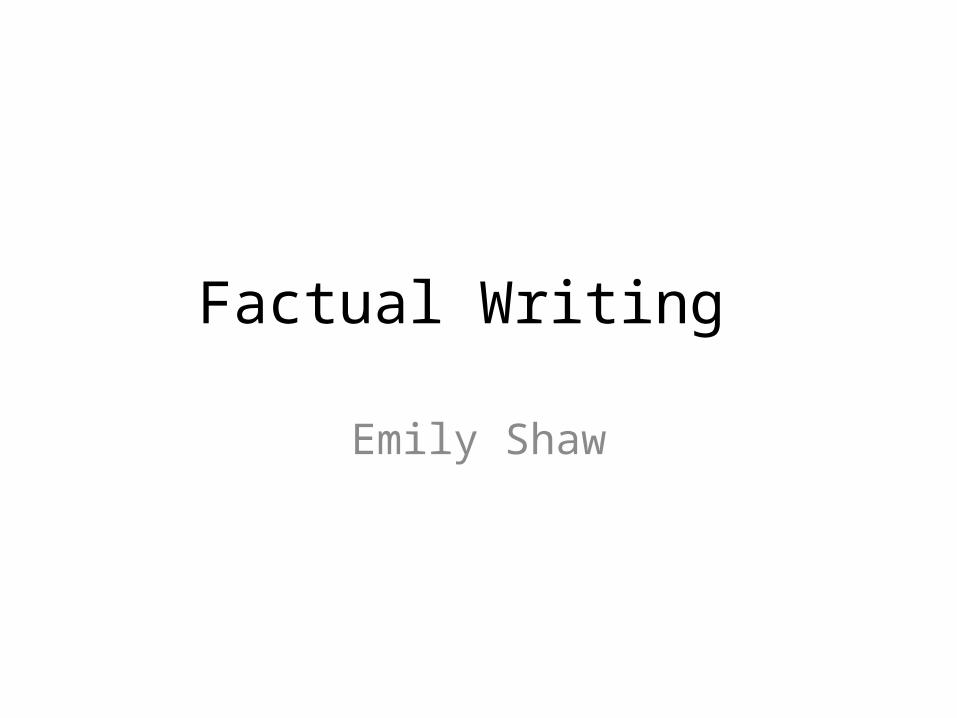
Leaflets Clear and simple text with no large blocks of text keeping it concise and making it easier for people to read and keeping it to the point.
Certain words are put in bold throughout to highlight them and make a statement. Both the number to phone to donate, the email address and the key words ‘survive’ and ‘step one’ these have been put in bold to draw an audiences attention to it and highlight the importance.
This leaflet uses very gender neutral colours as it isn't aimed towards a specific gender it is more generalized towards anyone as it uses simple block colours of navy blue, white and a pop of red which features in their logo.
There are no more than three fonts used to help keep it looking clean and professional. There is one smaller font font used which is very basic and easy to read, then there is the simplistic larger fonts that are used across all three pages to highlight important facts and one more font is used on the word ‘survive’ and has a slight crumpled effect on it which helps it stand out from the other words on that page and show that it is hard to survive for the children that save the children help.
The language used is quite formal as there aren't any abbreviations used however there isn't a lot of text, and the text that has been used is in very short and simple sentences.
Leaflets are useful for advertisement, promotions and sometimes for public information as they can be as simplistic or as in depth as a company wants. However generally leaflets contain a lot more information than a poster as there is a lot more space to include the facts and information you need to. There is a wide variety of the types of companies that use leaflets and these range from charities to businesses and services including the NHS.
Images are also used in this leaflet to help support the text and add a more personal look to the leaflet and shows that its happening to real people not just a made up story, this also helps people to relate to it more for example parents may feel more drawn towards this advertisement due to the fact of there being a large image of a child on the cover which could be their child.
They have also avoided ambiguity in this leaflet by simply stating facts and their point of view and there isn't much room for interpretation.
This leaflet is very effective as the use of the large images draw in peoples attention especially by having the simple step one on top of this image it helps to make people think that there are simple, easy yet effective ways at helping these children in poverty. Also by having the ‘Step One’ written in bold it helps make that line more eye catching much like the word survive in bold helps highlight the point they are making. Another thing that I think is very effective on this leaflet is having the ‘No Child Born To Die’ slogan clearly written at the top in the center of the leaflet with the clear statements and facts beneath it is a very clear page especially with the repetition of the word ‘We’ helps symbolize that they are more of a team and work together to end child poverty and you can help them too and join their team. Another thing that is very useful in this leaflet is having the number to call printed on two of the pages which means where ever you pick up the booklet and whatever page you see first the number o call is always visible. The use of the dark colours also helps to reflect how dark and miserable life is for these children and you can help change it and help them have a brighter future.
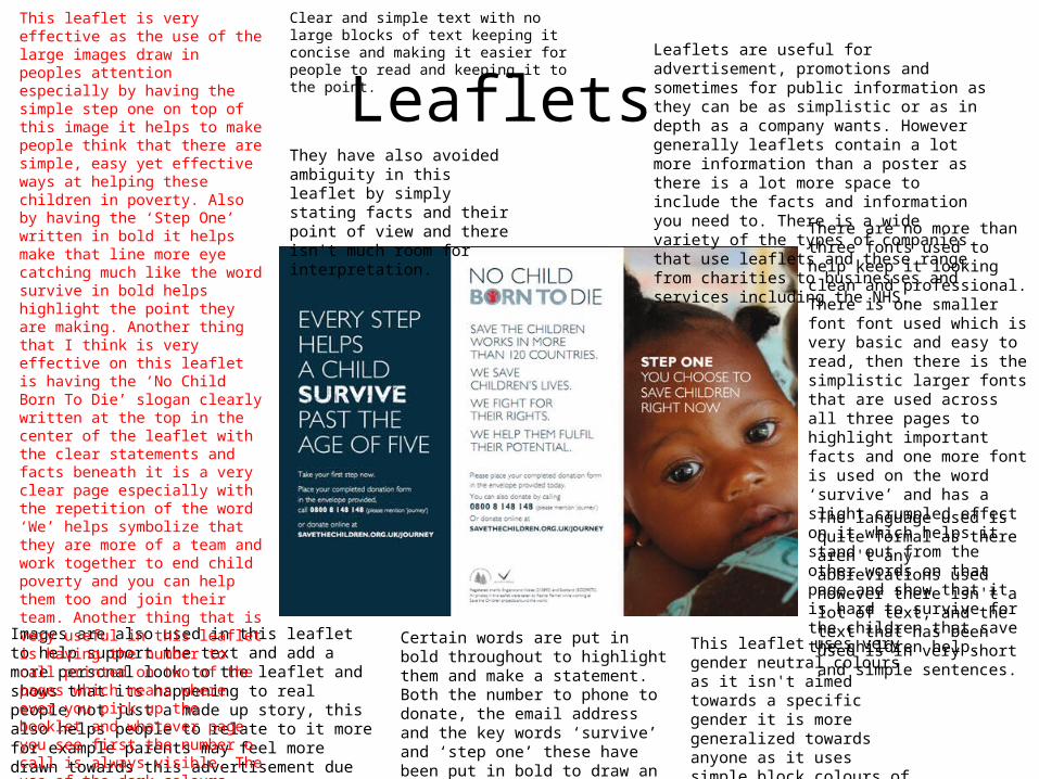
Instruction Manual Instruction manuals should be simple and factual, as well as this instruction manuals usually contain images to help make and step by steps and instructions easier to carry out. There are instruction manuals for a wide variety of things for example there are instruction manuals for anything from building furniture to how to use a phone. There will usually be a simple step by step layout with clear instructions.
This instruction manual is very clear and concise as there's a clear layout to follow the 3 steps to guide you through the process, as well as this there are very simple sentences to follow as there is no more than two sentences per step. There is also clear demonstrations of how the product should look which is helpful for people trying to make their own.
As this is an instruction manual there is no room for the manual to contain any bias, and should be accurate and checked as the product shouldn’t have an incorrect instructions.
This instructional guide is made even more clear by having magnified segments and labeled sections to show a more close up shot of what to do and how pieces fit together. As well as this being very clear by using a simple line drawing for the illustrations doesn’t make it complicated or overpowering to look at.
The font used for the product title is very simplistic and bold to show clearly what its called and the small step by step numbers are also in bold to help highlight where they are so they don’t get lost in the illustration and make it easier to follow. As all of the text is in capital letters it makes it very clear and easy to follow combined with the simple instructions.
There is also clearly no ambiguity and room for interpretation in this instruction manual either as it is a simple step by step guide rather than an opinionated piece of text with open questions, with this there are very few words and just images to follow meaning there is nothing that could be misinterpreted.
By having this instruction manual very basic and mainly image based makes it a lot easier to follow as the drawings demonstrate what needs to be done to put it altogether. As well as this very simple clear instructive language has been used to help easily instruct anyone, also by having very simplistic language it means it can be picked up and followed by anyone. Another thing that works quite nicely on this instruction manual is the use of having the logo and name clearly labeled in the top and center of the page which makes it easy for someone to simply pick, read and understand what its about and what its for.
How to Guides How to guides are more likely to contain advice and tips rather than factual instructions. As well as this show to guide generally will contain steps to go through to a achieve a certain goal. How to guides can be helpful to receive other peoples advice as its more opinionated than in an instruction manual where that is more to the point on how to put something together as apposed to how to use it.
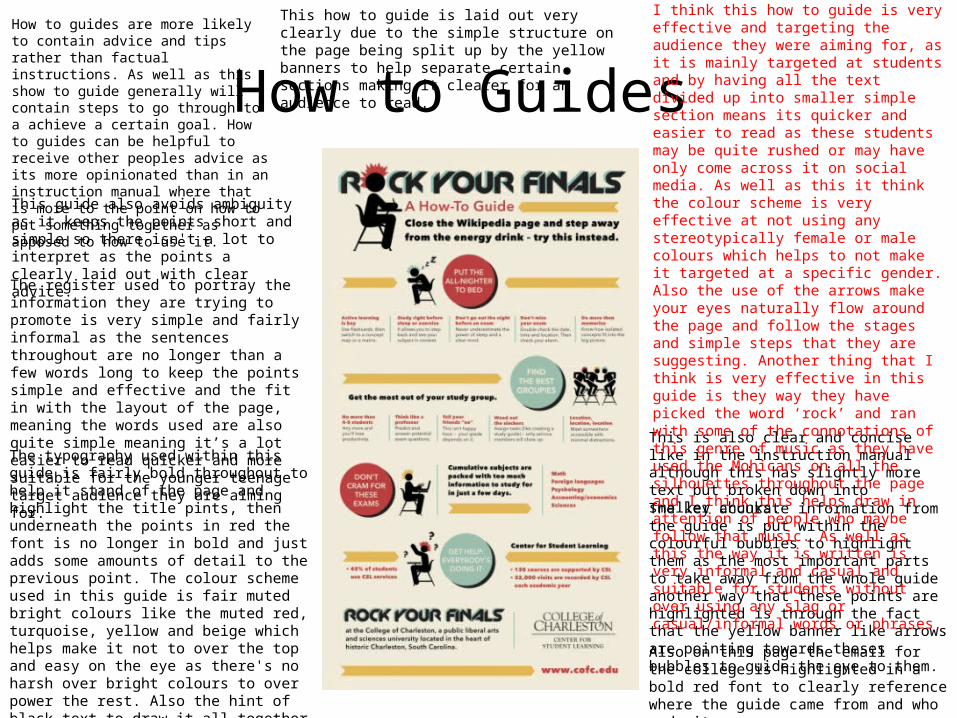
This how to guide is laid out very clearly due to the simple structure on the page being split up by the yellow banners to help separate certain sections making it clearer for an audience to read.
This is also clear and concise like in the instruction manual although this has slightly more text but broken down into smaller chunks.
The key accurate information from the guide is put within the colourful bubbles to highlight them as the most important parts to take away from the whole guide another way that these points are highlighted is through the fact that the yellow banner like arrows are pointing towards theses bubbles to guide the eye to them.
This guide also avoids ambiguity as it keeps the points short and simple so there isn't a lot to interpret as the points a clearly laid out with clear advice.
The register used to portray the information they are trying to promote is very simple and fairly informal as the sentences throughout are no longer than a few words long to keep the points simple and effective and the fit in with the layout of the page, meaning the words used are also quite simple meaning it’s a lot easier to read quicker and more suitable for the younger teenage target audience they are aiming for.
The typography used within this guide is fairly bold throughout to help it stand of the page and highlight the title pints, then underneath the points in red the font is no longer in bold and just adds some amounts of detail to the previous point. The colour scheme used in this guide is fair muted bright colours like the muted red, turquoise, yellow and beige which helps make it not to over the top and easy on the eye as there's no harsh over bright colours to over power the rest. Also the hint of black text to draw it all together helps to show important points as well instead of just having all the sub headings in red. As well as this the small illustrations are in black and help add interest rather than just having blocks of text.
Also on this page the email for the college is highlighted in a bold red font to clearly reference where the guide came from and who made it.
I think this how to guide is very effective and targeting the audience they were aiming for, as it is mainly targeted at students and by having all the text divided up into smaller simple section means its quicker and easier to read as these students may be quite rushed or may have only come across it on social media. As well as this it think the colour scheme is very effective at not using any stereotypically female or male colours which helps to not make it targeted at a specific gender. Also the use of the arrows make your eyes naturally flow around the page and follow the stages and simple steps that they are suggesting. Another thing that I think is very effective in this guide is they way they have picked the word ‘rock’ and ran with some of the connotations of this genre of music as they have used the Mohicans on all the silhouettes throughout the page and I think this helps draw in attention of people who maybe follow that music. As well as this the way it is written is very informal and casual and suitable for students without over using any slag or casual/informal words or phrases.
Factual JournalismFactual journalism informs audiences on events that have happened or are happening, this form of factual writing can appear in many places for example magazines, newspapers and websites. Factual journalism should aim not to be biased but majority of the time come across that way.
This form of factual writing isn't as concise as the other forms as there is a lot more text and more to be written about whereas the other simply contained clear and easy sentences with less text to a page.
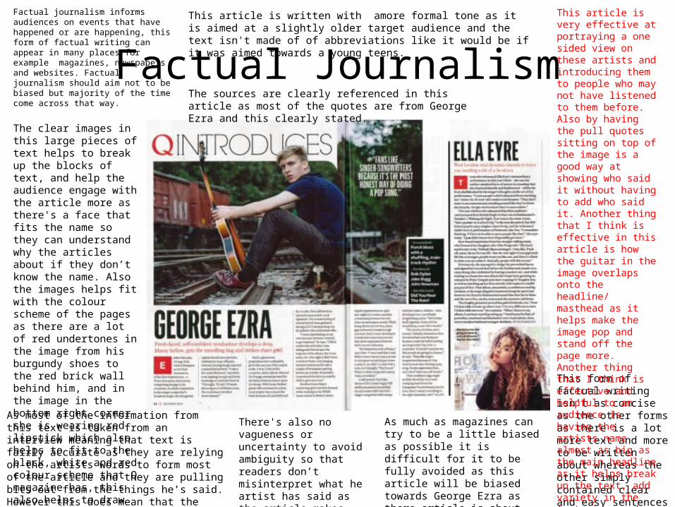
The clear images in this large pieces of text helps to break up the blocks of text, and help the audience engage with the article more as there's a face that fits the name so they can understand why the articles about if they don’t know the name. Also the images helps fit with the colour scheme of the pages as there are a lot of red undertones in the image from his burgundy shoes to the red brick wall behind him, and in the image in the bottom right corner she is wearing red lipstick which also helps to fit to the black, white and red colour scheme that Q magazine has, this also helps to draw both the text and images together.
As most of the information from this text is taken from an interview meaning that text is fairly accurate as they are relying on the artists words to form most of the article and they are pulling bits out from the things he’s said. However this does mean that the article will be fairly biased as its only that artists opinion and there's no opposition in this article.
There's also no vagueness or uncertainty to avoid ambiguity so that readers don’t misinterpret what he artist has said as the article makes summary's from it.
As much as magazines can try to be a little biased as possible it is difficult for it to be fully avoided as this article will be biased towards George Ezra as there article is about him so there wont be a contrasting point of view.
This article is written with amore formal tone as it is aimed at a slightly older target audience and the text isn't made of of abbreviations like it would be if it was aimed towards a young teens.
The sources are clearly referenced in this article as most of the quotes are from George Ezra and this clearly stated.
This article is very effective at portraying a one sided view on these artists and introducing them to people who may not have listened to them before. Also by having the pull quotes sitting on top of the image is a good way at showing who said it without having to add who said it. Another thing that I think is effective in this article is how the guitar in the image overlaps onto the headline/ masthead as it helps make the image pop and stand off the page more. Another thing that I think is effective and helpful to an audience is having the artists name almost as big as the main headline as it helps break up the text, add variety in the font size, and show clearly who the article and image is about.
Recommended