Charles Petzoldwww.charlespetzold.com
XAML

Agenda
• Layout and positioning• Shapes, brushes, and brush resources• Text, fonts, and font resources• Images and writeable bitmaps• UI element properties• Creating XAML objects programmatically• Transforms and projections• Animations and animation easing• GPU caching
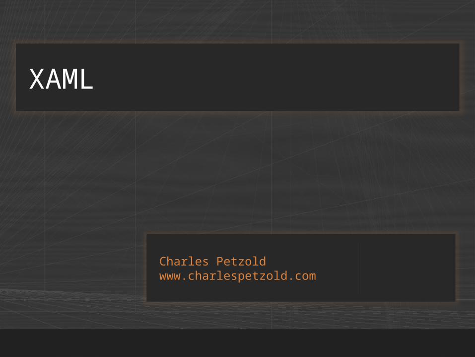
• Controls for positioning UI elements• More in the Silverlight for Windows Phone
Toolkit
Layout Controls
Control Description
Canvas Positions elements using pixel coordinates
Grid Arranges objects in rows and columns
StackPanel Arranges objects in a row or a column

• Allows absolute positioning of elements
Canvas
<Canvas> <Rectangle Canvas.Left="50" Canvas.Top="50" Width="100" Height="100" Fill="Red" /> <Canvas Canvas.Left="200" Canvas.Top="100" Width="200" Height="200" Background="Yellow"> <Rectangle Canvas.Left="50" Canvas.Top="50" Width="100" Height="100" Fill="Blue" /> </Canvas></Canvas>
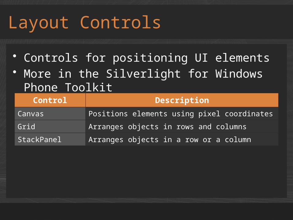
• Stacks elements horizontally or vertically
StackPanel
<StackPanel Orientation="Horizontal"> <Rectangle Width="100" Height="100" Fill="Red" /> <Rectangle Width="100" Height="100" Fill="Green" /> <Rectangle Width="100" Height="100" Fill="Blue" /></StackPanel>
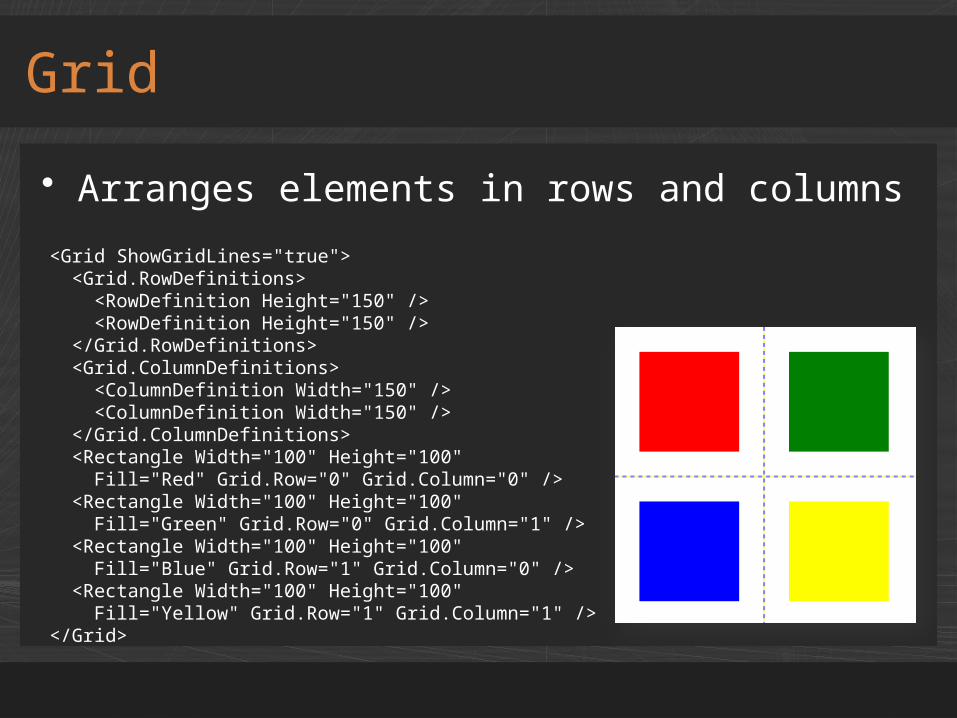
• Arranges elements in rows and columns
Grid
<Grid ShowGridLines="true"> <Grid.RowDefinitions> <RowDefinition Height="150" /> <RowDefinition Height="150" /> </Grid.RowDefinitions> <Grid.ColumnDefinitions> <ColumnDefinition Width="150" /> <ColumnDefinition Width="150" /> </Grid.ColumnDefinitions> <Rectangle Width="100" Height="100" Fill="Red" Grid.Row="0" Grid.Column="0" /> <Rectangle Width="100" Height="100" Fill="Green" Grid.Row="0" Grid.Column="1" /> <Rectangle Width="100" Height="100" Fill="Blue" Grid.Row="1" Grid.Column="0" /> <Rectangle Width="100" Height="100" Fill="Yellow" Grid.Row="1" Grid.Column="1" /></Grid>
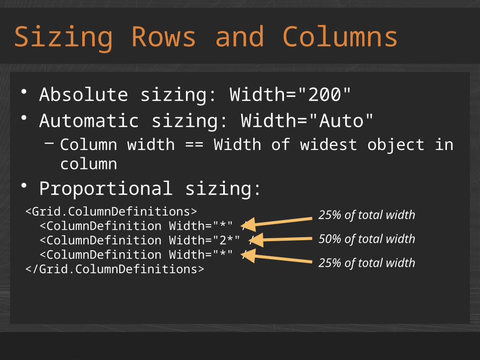
• Absolute sizing: Width="200"• Automatic sizing: Width="Auto"
– Column width == Width of widest object in column
• Proportional sizing:
Sizing Rows and Columns
<Grid.ColumnDefinitions> <ColumnDefinition Width="*" /> <ColumnDefinition Width="2*" /> <ColumnDefinition Width="*" /></Grid.ColumnDefinitions>
25% of total width50% of total width25% of total width
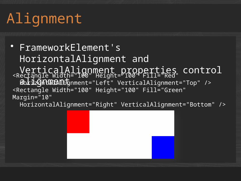
• FrameworkElement's HorizontalAlignment and VerticalAlignment properties control alignment
Alignment
<Rectangle Width="100" Height="100" Fill="Red" HorizontalAlignment="Left" VerticalAlignment="Top" /><Rectangle Width="100" Height="100" Fill="Green" Margin="10" HorizontalAlignment="Right" VerticalAlignment="Bottom" />
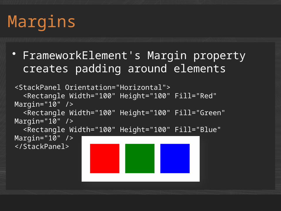
• FrameworkElement's Margin property creates padding around elements
Margins
<StackPanel Orientation="Horizontal"> <Rectangle Width="100" Height="100" Fill="Red" Margin="10" /> <Rectangle Width="100" Height="100" Fill="Green" Margin="10" /> <Rectangle Width="100" Height="100" Fill="Blue" Margin="10" /></StackPanel>

demoLayout

• Silverlight supports six shape types
Shapes
Rectangle Ellipse Polygon
Line PolyLine Path
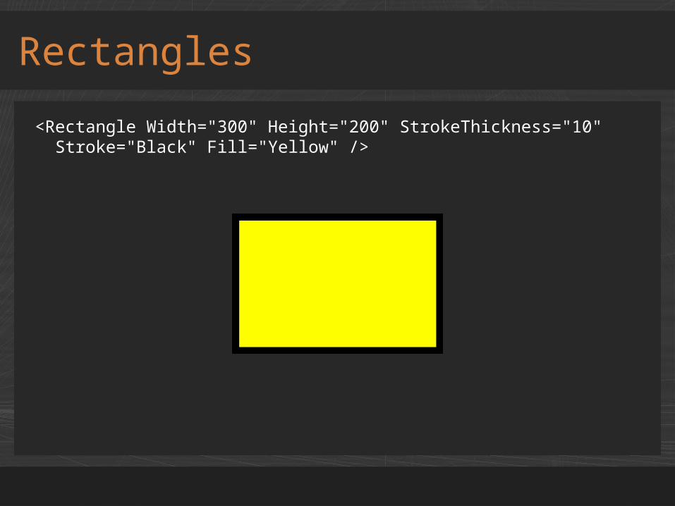
Rectangles
<Rectangle Width="300" Height="200" StrokeThickness="10" Stroke="Black" Fill="Yellow" />

Paths
<Path Fill="Yellow" Stroke="Black" StrokeThickness="4" StrokeEndLineCap="Round" StrokeLineJoin="Round" Data="M 200,200 C 200,300 330,250 580,140 C 330,300 130,450 200,200" />
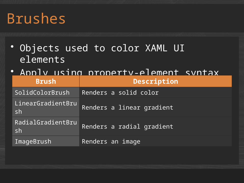
• Objects used to color XAML UI elements• Apply using property-element syntax
Brushes
Brush Description
SolidColorBrush Renders a solid color
LinearGradientBrush Renders a linear gradient
RadialGradientBrush Renders a radial gradient
ImageBrush Renders an image
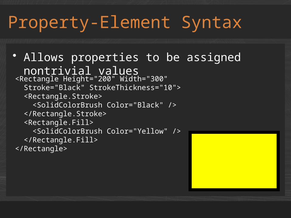
• Allows properties to be assigned nontrivial values
Property-Element Syntax
<Rectangle Height="200" Width="300" Stroke="Black" StrokeThickness="10"> <Rectangle.Stroke> <SolidColorBrush Color="Black" /> </Rectangle.Stroke> <Rectangle.Fill> <SolidColorBrush Color="Yellow" /> </Rectangle.Fill></Rectangle>
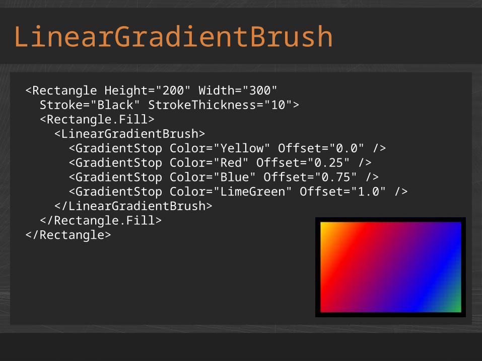
LinearGradientBrush
<Rectangle Height="200" Width="300" Stroke="Black" StrokeThickness="10"> <Rectangle.Fill> <LinearGradientBrush> <GradientStop Color="Yellow" Offset="0.0" /> <GradientStop Color="Red" Offset="0.25" /> <GradientStop Color="Blue" Offset="0.75" /> <GradientStop Color="LimeGreen" Offset="1.0" /> </LinearGradientBrush> </Rectangle.Fill></Rectangle>
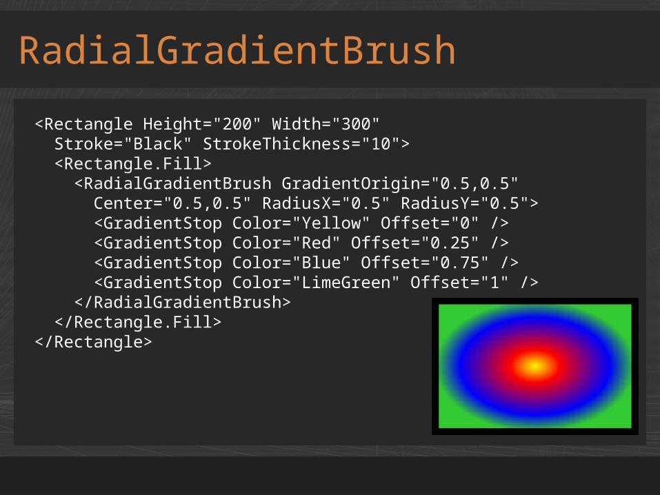
RadialGradientBrush
<Rectangle Height="200" Width="300" Stroke="Black" StrokeThickness="10"> <Rectangle.Fill> <RadialGradientBrush GradientOrigin="0.5,0.5" Center="0.5,0.5" RadiusX="0.5" RadiusY="0.5"> <GradientStop Color="Yellow" Offset="0" /> <GradientStop Color="Red" Offset="0.25" /> <GradientStop Color="Blue" Offset="0.75" /> <GradientStop Color="LimeGreen" Offset="1" /> </RadialGradientBrush> </Rectangle.Fill></Rectangle>

• Approximately 25 built-in brush resources– PhoneAccentBrush and PhoneSubtleBrush– PhoneBackgroundBrush and
PhoneForegroundBrush– PhoneChromeBrush and PhoneDisabledBrush– PhoneBorderBrush and many others
• Colors change with theme and accent colors• Complete list at
http://msdn.microsoft.com/en-us/library/ff769552(v=vs.92).aspx
• Also in ThemeResources.xaml
Stock Brush Resources
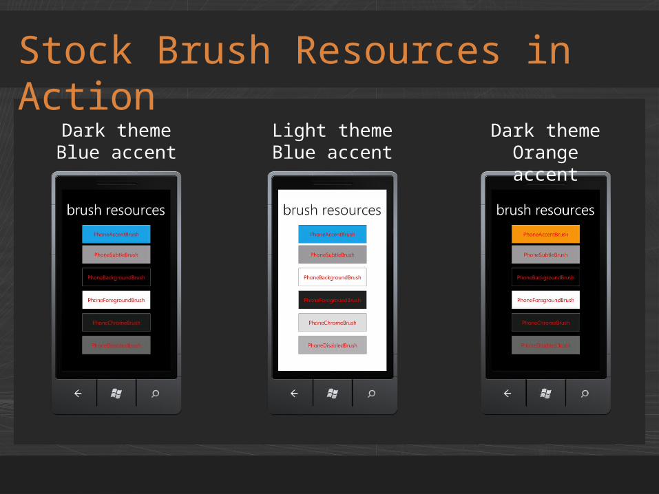
Stock Brush Resources in Action
Dark themeBlue accent
Light themeBlue accent
Dark themeOrange accent
Using Stock Brush Resources
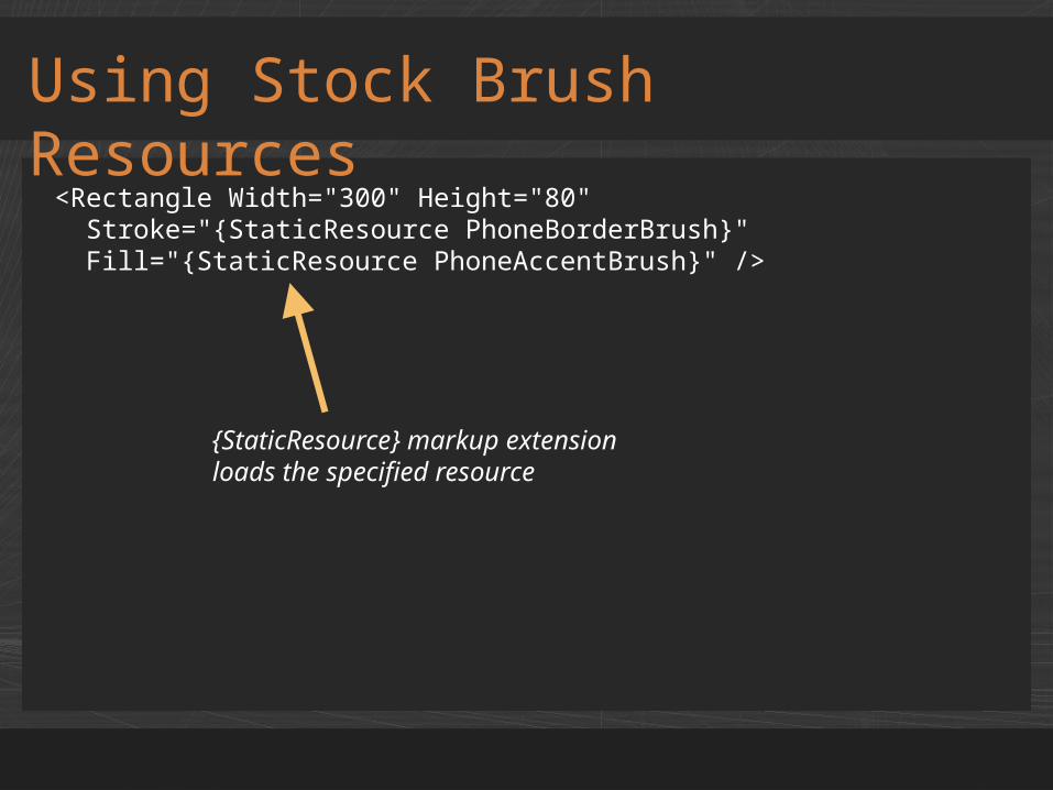
<Rectangle Width="300" Height="80" Stroke="{StaticResource PhoneBorderBrush}" Fill="{StaticResource PhoneAccentBrush}" />
{StaticResource} markup extension loads the specified resource

demoStock Brushes
TextBlock
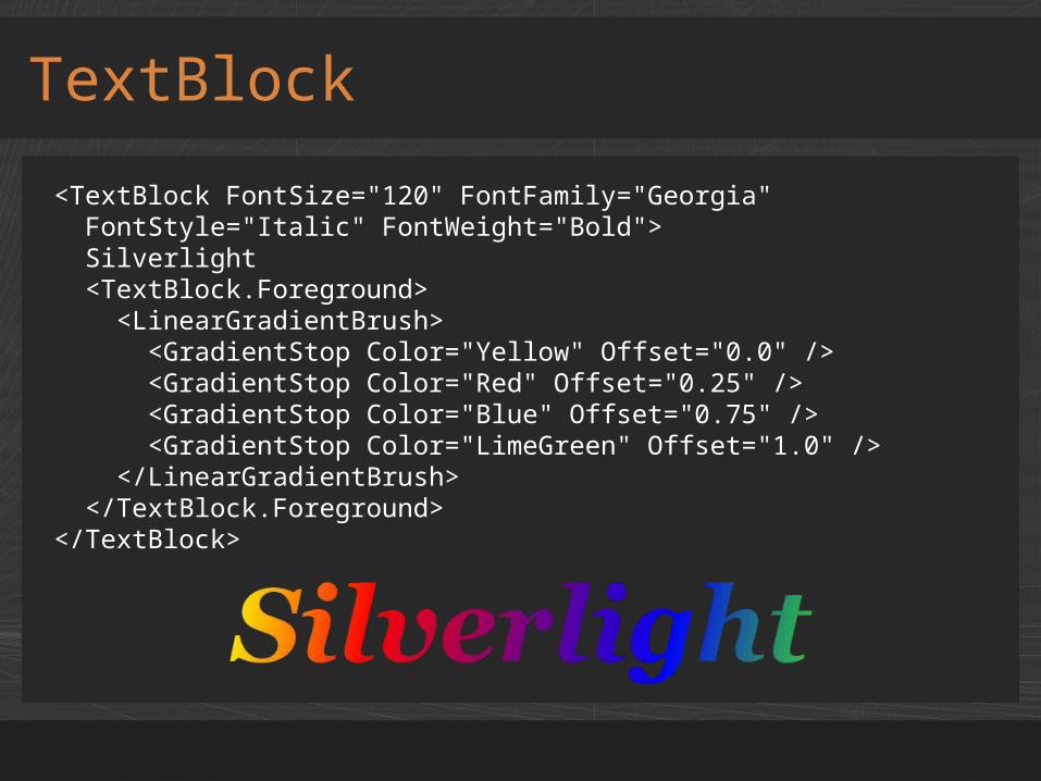
<TextBlock FontSize="120" FontFamily="Georgia" FontStyle="Italic" FontWeight="Bold"> Silverlight <TextBlock.Foreground> <LinearGradientBrush> <GradientStop Color="Yellow" Offset="0.0" /> <GradientStop Color="Red" Offset="0.25" /> <GradientStop Color="Blue" Offset="0.75" /> <GradientStop Color="LimeGreen" Offset="1.0" /> </LinearGradientBrush> </TextBlock.Foreground></TextBlock>
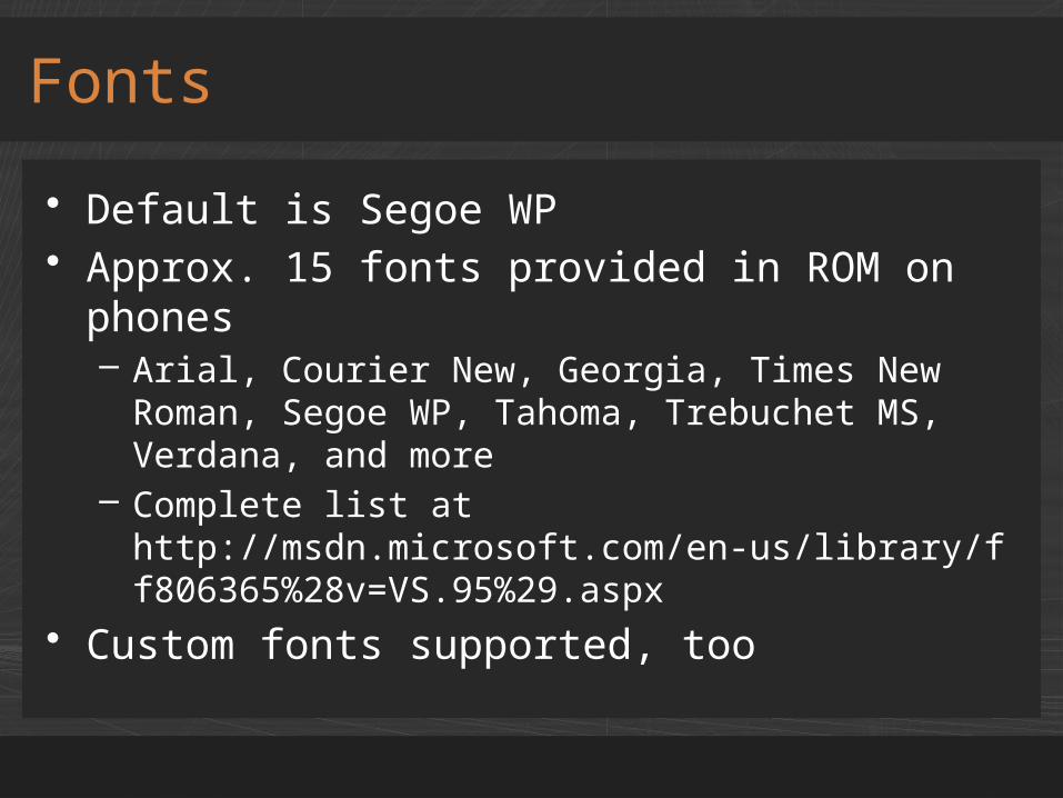
• Default is Segoe WP• Approx. 15 fonts provided in ROM on
phones– Arial, Courier New, Georgia, Times New Roman,
Segoe WP, Tahoma, Trebuchet MS, Verdana, and more
– Complete list at http://msdn.microsoft.com/en-us/library/ff806365%28v=VS.95%29.aspx
• Custom fonts supported, too
Fonts
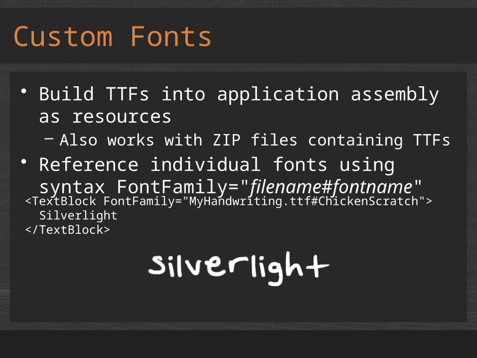
• Build TTFs into application assembly as resources– Also works with ZIP files containing TTFs
• Reference individual fonts using syntax FontFamily="filename#fontname"
Custom Fonts
<TextBlock FontFamily="MyHandwriting.ttf#ChickenScratch"> Silverlight</TextBlock>
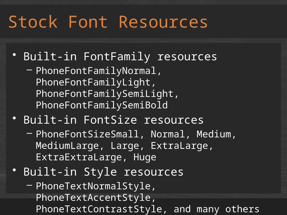
• Built-in FontFamily resources– PhoneFontFamilyNormal, PhoneFontFamilyLight,
PhoneFontFamilySemiLight, PhoneFontFamilySemiBold
• Built-in FontSize resources– PhoneFontSizeSmall, Normal, Medium,
MediumLarge, Large, ExtraLarge, ExtraExtraLarge, Huge
• Built-in Style resources– PhoneTextNormalStyle, PhoneTextAccentStyle,
PhoneTextContrastStyle, and many others– Combine FontFamily, FontSize, and Foreground
Stock Font Resources
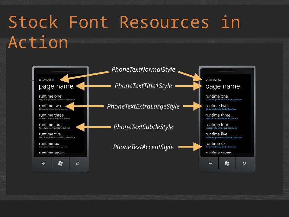
Stock Font Resources in Action
PhoneTextNormalStyle
PhoneTextTitle1Style
PhoneTextExtraLargeStyle
PhoneTextSubtleStyle
PhoneTextAccentStyle
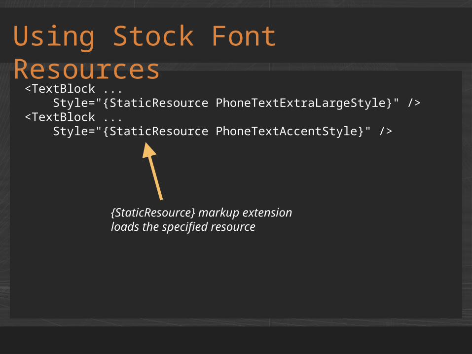
Using Stock Font Resources
<TextBlock ... Style="{StaticResource PhoneTextExtraLargeStyle}" /><TextBlock ... Style="{StaticResource PhoneTextAccentStyle}" />
{StaticResource} markup extension loads the specified resource
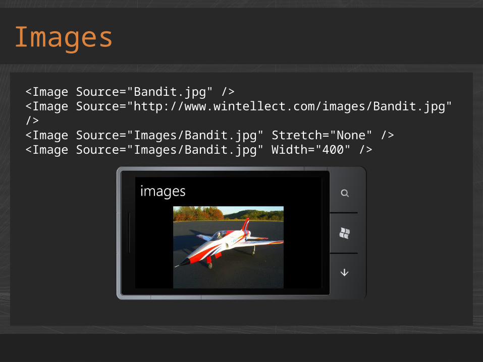
Images
<Image Source="Bandit.jpg" /><Image Source="http://www.wintellect.com/images/Bandit.jpg" /><Image Source="Images/Bandit.jpg" Stretch="None" /><Image Source="Images/Bandit.jpg" Width="400" />
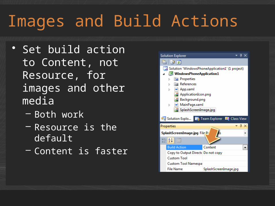
• Set build action to Content, not Resource, for images and other media– Both work– Resource is the
default– Content is faster
Images and Build Actions
• Silverlight's pixel-addressable bitmap API– Pixels exposed through Pixels property– One-dimensional array (row-first order)
• Create bitmaps from scratch• Create bitmaps from Image objects• Render all or part of the XAML tree to a
bitmap
WriteableBitmap

Generating an Image
WriteableBitmap bitmap = new WriteableBitmap(width, height);
for (int x = 0; x < width; x++){ for (int y = 0; y < height; y++) { bitmap.Pixels[(y * width) + x] = unchecked((int)0xFF000000); // ARGB (black) }}
bitmap.Invalidate();
// Copy WriteableBitmap bits to a XAML ImageMyImage.Source = bitmap;
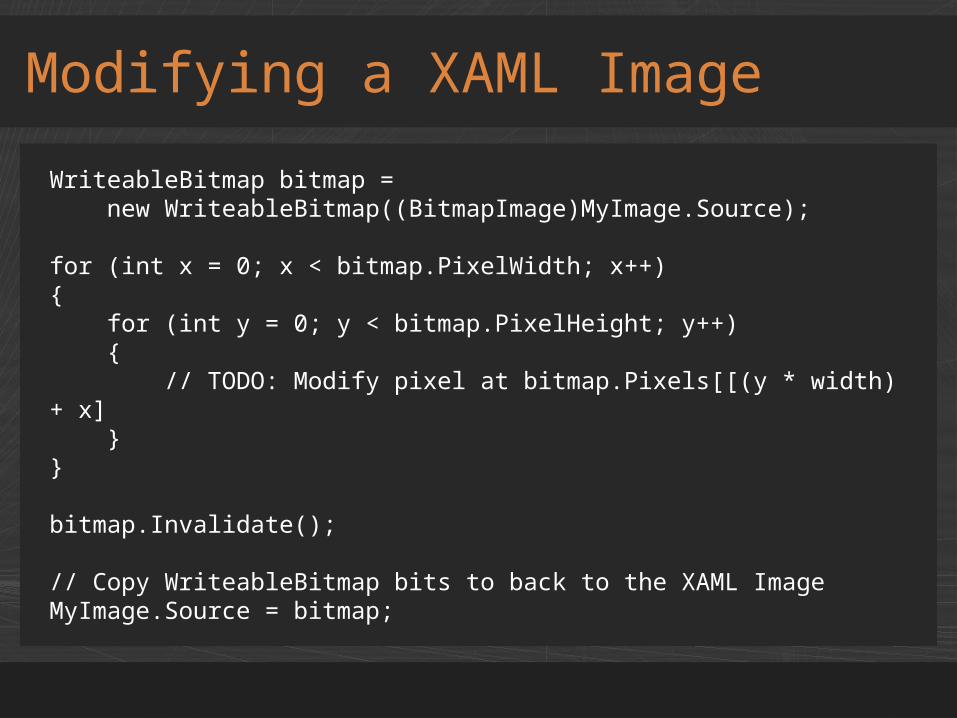
Modifying a XAML Image
WriteableBitmap bitmap = new WriteableBitmap((BitmapImage)MyImage.Source);
for (int x = 0; x < bitmap.PixelWidth; x++){ for (int y = 0; y < bitmap.PixelHeight; y++) { // TODO: Modify pixel at bitmap.Pixels[[(y * width) + x] }}
bitmap.Invalidate();
// Copy WriteableBitmap bits to back to the XAML ImageMyImage.Source = bitmap;
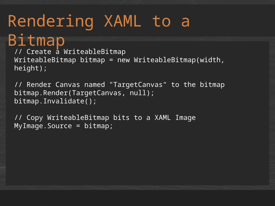
Rendering XAML to a Bitmap
// Create a WriteableBitmapWriteableBitmap bitmap = new WriteableBitmap(width, height);
// Render Canvas named "TargetCanvas" to the bitmapbitmap.Render(TargetCanvas, null);bitmap.Invalidate();
// Copy WriteableBitmap bits to a XAML ImageMyImage.Source = bitmap;
demoWriteableBitmap

Properties of UI Elements
Property Description
Clip Clips an element using a specified geometry
Cursor Specifies the appearance of the mouse cursor over an element
IsHitTestVisible Determines whether an element fires touch events
Opacity Specifies an element's opacity (0.0 – 1.0)
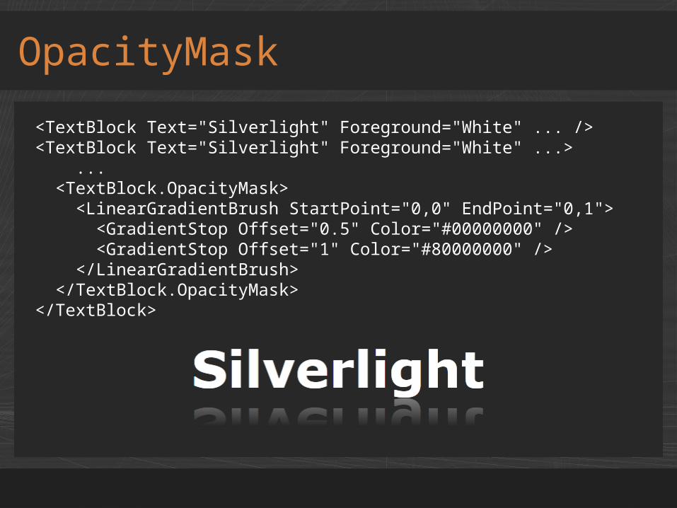
OpacityMask Varies opacity using a gradient brush
Style Applies a style to an element
Visibility Controls an element's visibility
Canvas.ZIndex Specifies an element's Z-index
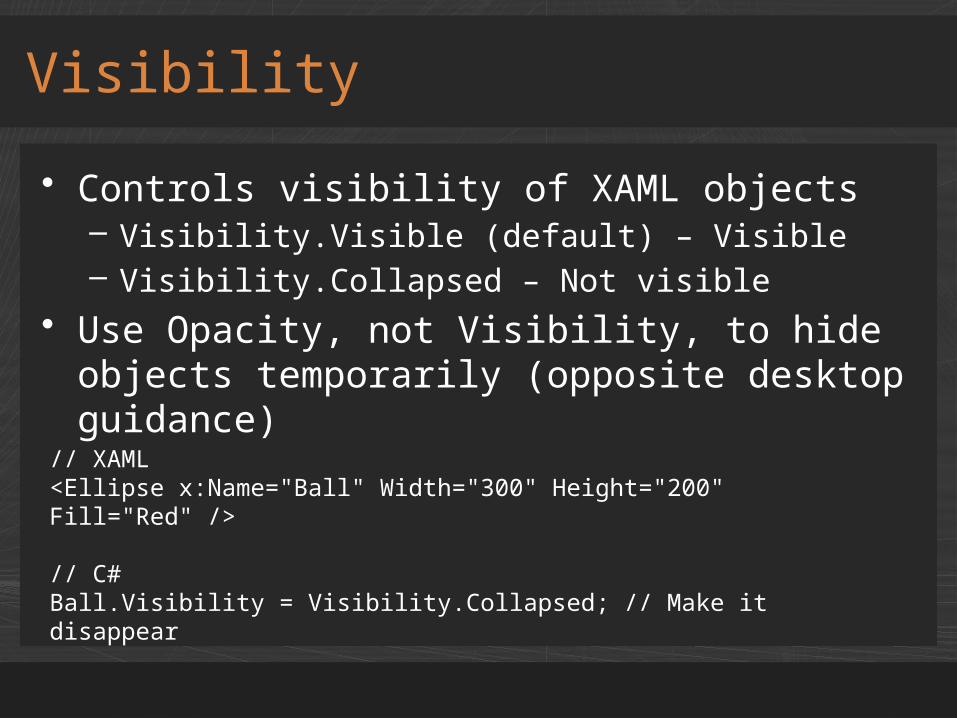
• Controls visibility of XAML objects– Visibility.Visible (default) – Visible– Visibility.Collapsed – Not visible
• Use Opacity, not Visibility, to hide objects temporarily (opposite desktop guidance)
Visibility
// XAML<Ellipse x:Name="Ball" Width="300" Height="200" Fill="Red" />
// C#Ball.Visibility = Visibility.Collapsed; // Make it disappear
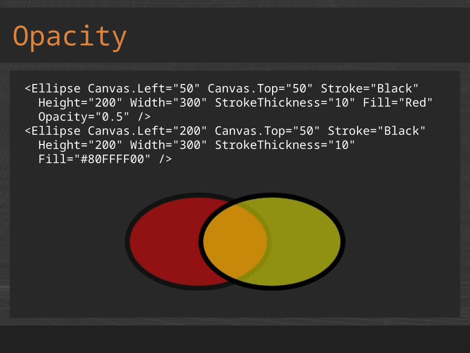
Opacity
<Ellipse Canvas.Left="50" Canvas.Top="50" Stroke="Black" Height="200" Width="300" StrokeThickness="10" Fill="Red" Opacity="0.5" /><Ellipse Canvas.Left="200" Canvas.Top="50" Stroke="Black" Height="200" Width="300" StrokeThickness="10" Fill="#80FFFF00" />
OpacityMask
<TextBlock Text="Silverlight" Foreground="White" ... /><TextBlock Text="Silverlight" Foreground="White" ...> ... <TextBlock.OpacityMask> <LinearGradientBrush StartPoint="0,0" EndPoint="0,1"> <GradientStop Offset="0.5" Color="#00000000" /> <GradientStop Offset="1" Color="#80000000" /> </LinearGradientBrush> </TextBlock.OpacityMask></TextBlock>

Canvas.ZIndex
<Ellipse Canvas.Left="50" Canvas.Top="50" Stroke="Black" Height="200" Width="300" StrokeThickness="10" Fill="Red" Canvas.ZIndex="1" /><Ellipse Canvas.Left="200" Canvas.Top="50" Stroke="Black" Height="200" Width="300" StrokeThickness="10" Fill="Yellow" Canvas.ZIndex="0" />
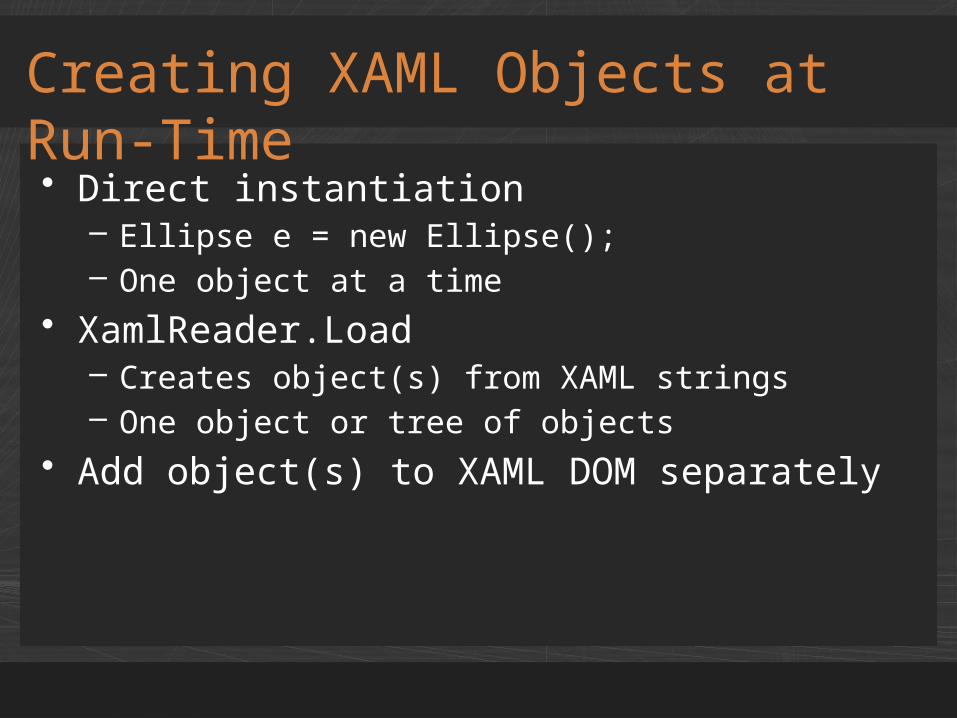
• Direct instantiation– Ellipse e = new Ellipse();– One object at a time
• XamlReader.Load– Creates object(s) from XAML strings– One object or tree of objects
• Add object(s) to XAML DOM separately
Creating XAML Objects at Run-Time
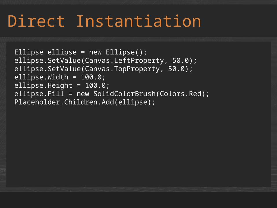
Direct Instantiation
Ellipse ellipse = new Ellipse();ellipse.SetValue(Canvas.LeftProperty, 50.0);ellipse.SetValue(Canvas.TopProperty, 50.0);ellipse.Width = 100.0;ellipse.Height = 100.0;ellipse.Fill = new SolidColorBrush(Colors.Red); Placeholder.Children.Add(ellipse);
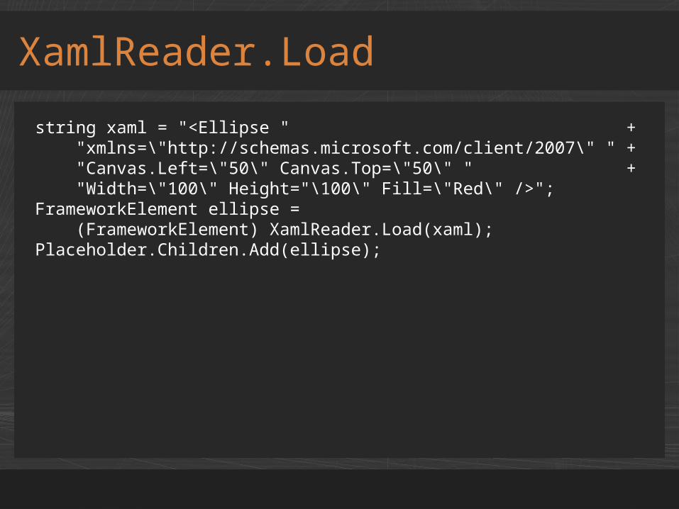
XamlReader.Load
string xaml = "<Ellipse " + "xmlns=\"http://schemas.microsoft.com/client/2007\" " + "Canvas.Left=\"50\" Canvas.Top=\"50\" " + "Width=\"100\" Height="\100\" Fill=\"Red\" />";FrameworkElement ellipse = (FrameworkElement) XamlReader.Load(xaml);Placeholder.Children.Add(ellipse);

demoCreating XAML Objects at Run-Time
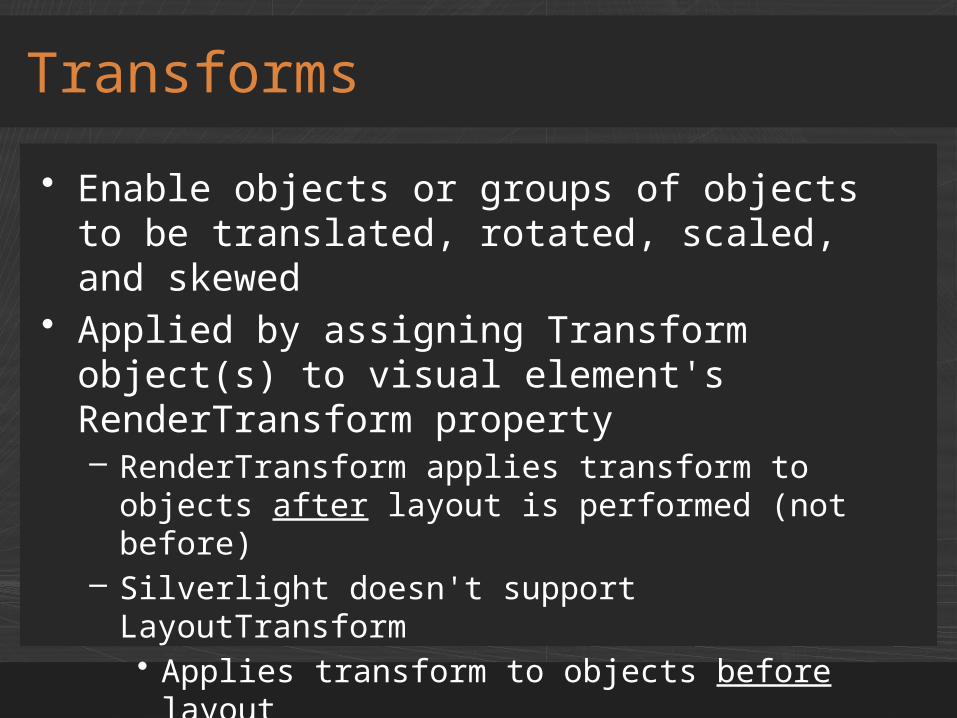
• Enable objects or groups of objects to be translated, rotated, scaled, and skewed
• Applied by assigning Transform object(s) to visual element's RenderTransform property– RenderTransform applies transform to objects
after layout is performed (not before)– Silverlight doesn't support LayoutTransform
• Applies transform to objects before layout• The basis for many advanced visual effects
Transforms
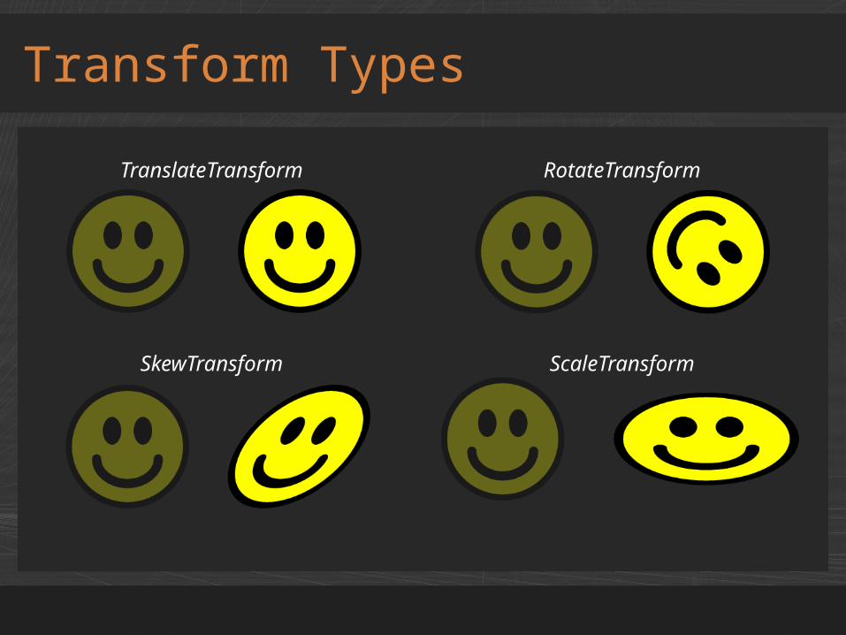
Transform Types
TranslateTransform RotateTransform
SkewTransform ScaleTransform
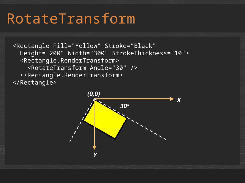
RotateTransform
<Rectangle Fill="Yellow" Stroke="Black" Height="200" Width="300" StrokeThickness="10"> <Rectangle.RenderTransform> <RotateTransform Angle="30" /> </Rectangle.RenderTransform></Rectangle>
X
Y
(0,0)
30o
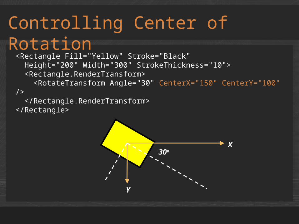
<Rectangle Fill="Yellow" Stroke="Black" Height="200" Width="300" StrokeThickness="10"> <Rectangle.RenderTransform> <RotateTransform Angle="30" CenterX="150" CenterY="100" /> </Rectangle.RenderTransform></Rectangle>
Controlling Center of Rotation
X
Y
30o
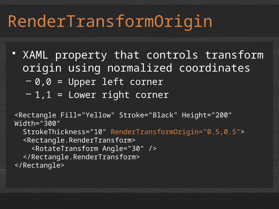
<Rectangle Fill="Yellow" Stroke="Black" Height="200" Width="300" StrokeThickness="10" RenderTransformOrigin="0.5,0.5"> <Rectangle.RenderTransform> <RotateTransform Angle="30" /> </Rectangle.RenderTransform></Rectangle>
• XAML property that controls transform origin using normalized coordinates– 0,0 = Upper left corner– 1,1 = Lower right corner
RenderTransformOrigin
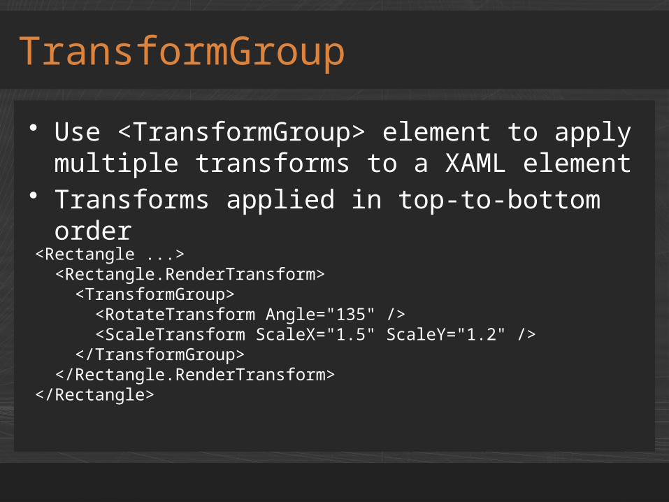
• Use <TransformGroup> element to apply multiple transforms to a XAML element
• Transforms applied in top-to-bottom order
TransformGroup
<Rectangle ...> <Rectangle.RenderTransform> <TransformGroup> <RotateTransform Angle="135" /> <ScaleTransform ScaleX="1.5" ScaleY="1.2" /> </TransformGroup> </Rectangle.RenderTransform></Rectangle>
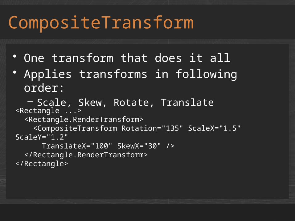
• One transform that does it all• Applies transforms in following order:
– Scale, Skew, Rotate, Translate
CompositeTransform
<Rectangle ...> <Rectangle.RenderTransform> <CompositeTransform Rotation="135" ScaleX="1.5" ScaleY="1.2" TranslateX="100" SkewX="30" /> </Rectangle.RenderTransform></Rectangle>
demoTransforms
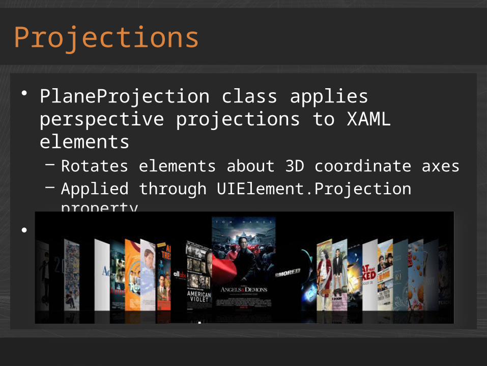
• PlaneProjection class applies perspective projections to XAML elements– Rotates elements about 3D coordinate axes– Applied through UIElement.Projection property
• Properties provide control over projection
Projections
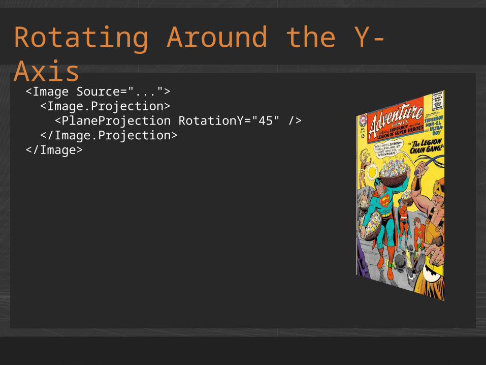
Rotating Around the Y-Axis
<Image Source="..."> <Image.Projection> <PlaneProjection RotationY="45" /> </Image.Projection></Image>
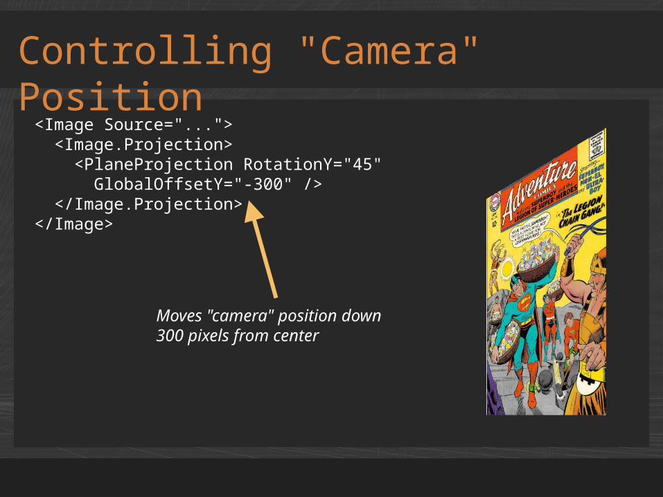
Controlling "Camera" Position
<Image Source="..."> <Image.Projection> <PlaneProjection RotationY="45" GlobalOffsetY="-300" /> </Image.Projection></Image>
Moves "camera" position down300 pixels from center
demoProjections
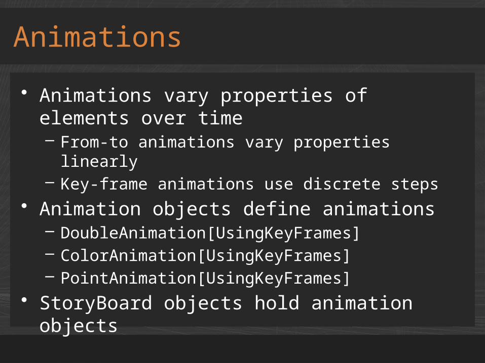
• Animations vary properties of elements over time– From-to animations vary properties linearly– Key-frame animations use discrete steps
• Animation objects define animations– DoubleAnimation[UsingKeyFrames]– ColorAnimation[UsingKeyFrames]– PointAnimation[UsingKeyFrames]
• StoryBoard objects hold animation objects
Animations
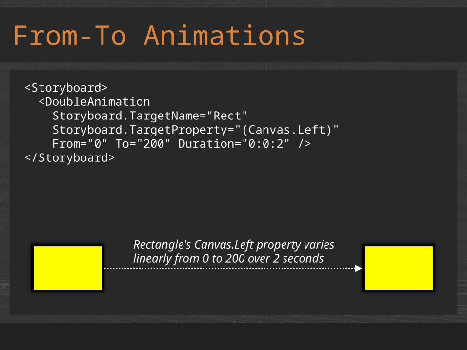
From-To Animations
<Storyboard> <DoubleAnimation Storyboard.TargetName="Rect" Storyboard.TargetProperty="(Canvas.Left)" From="0" To="200" Duration="0:0:2" /></Storyboard>
Rectangle's Canvas.Left property varies linearly from 0 to 200 over 2 seconds
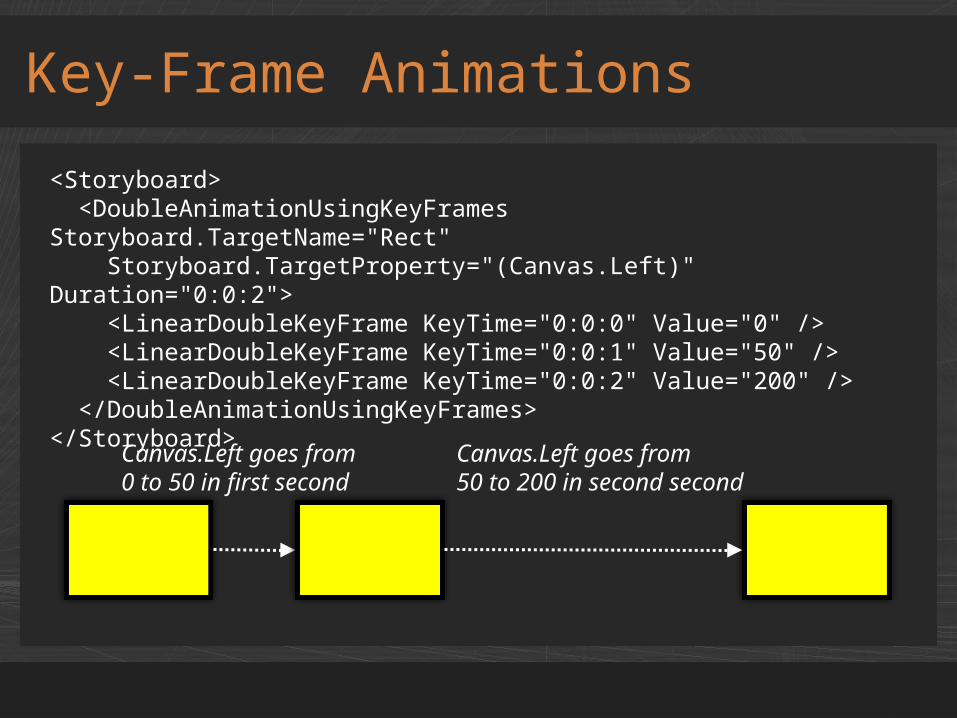
Key-Frame Animations
<Storyboard> <DoubleAnimationUsingKeyFrames Storyboard.TargetName="Rect" Storyboard.TargetProperty="(Canvas.Left)" Duration="0:0:2"> <LinearDoubleKeyFrame KeyTime="0:0:0" Value="0" /> <LinearDoubleKeyFrame KeyTime="0:0:1" Value="50" /> <LinearDoubleKeyFrame KeyTime="0:0:2" Value="200" /> </DoubleAnimationUsingKeyFrames></Storyboard>
Canvas.Left goes from0 to 50 in first second
Canvas.Left goes from50 to 200 in second second
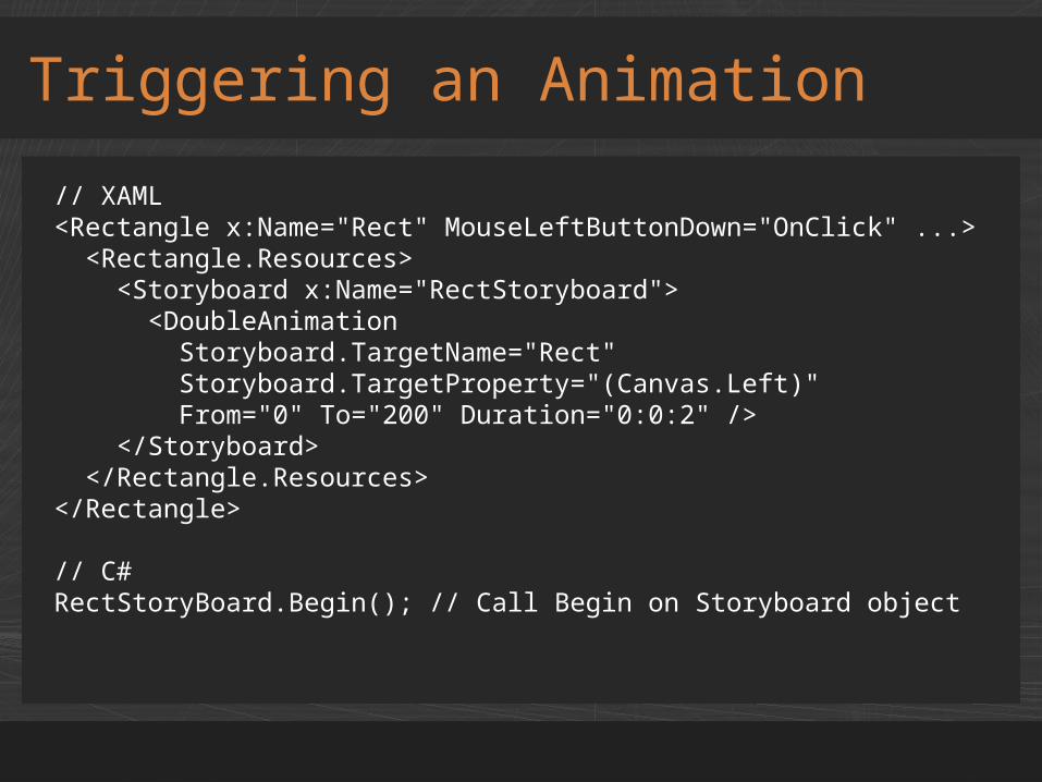
Triggering an Animation
// XAML<Rectangle x:Name="Rect" MouseLeftButtonDown="OnClick" ...> <Rectangle.Resources> <Storyboard x:Name="RectStoryboard"> <DoubleAnimation Storyboard.TargetName="Rect" Storyboard.TargetProperty="(Canvas.Left)" From="0" To="200" Duration="0:0:2" /> </Storyboard> </Rectangle.Resources></Rectangle>
// C#RectStoryBoard.Begin(); // Call Begin on Storyboard object
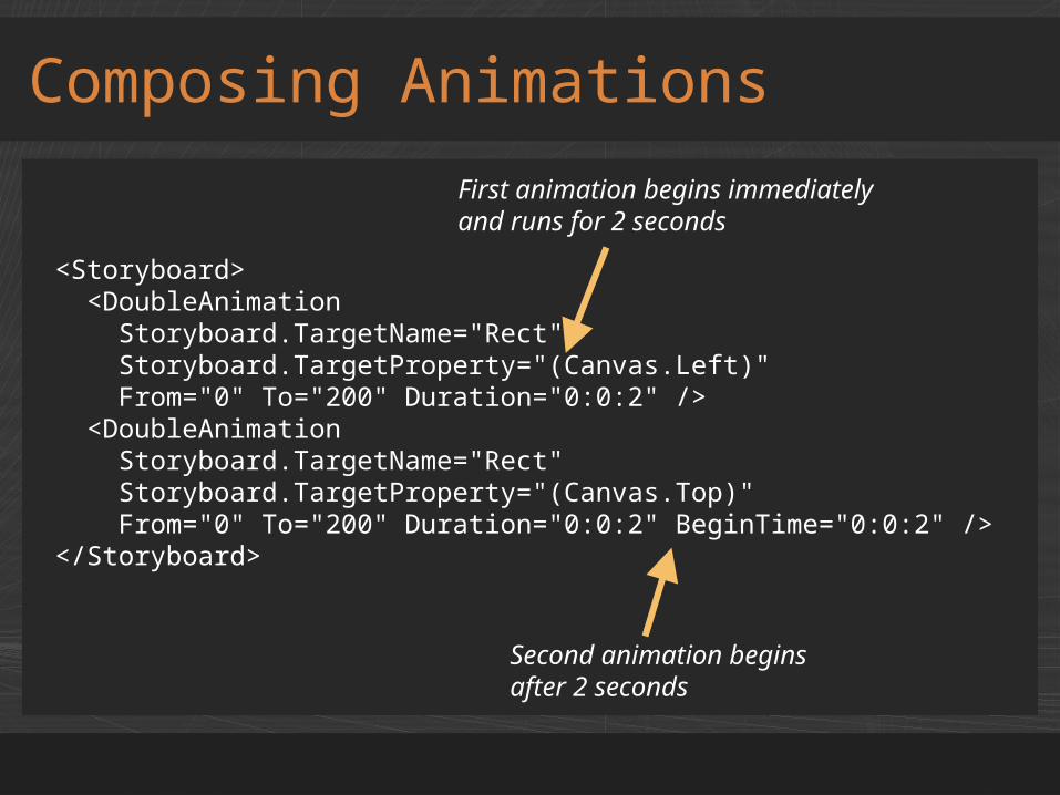
Composing Animations
<Storyboard> <DoubleAnimation Storyboard.TargetName="Rect" Storyboard.TargetProperty="(Canvas.Left)" From="0" To="200" Duration="0:0:2" /> <DoubleAnimation Storyboard.TargetName="Rect" Storyboard.TargetProperty="(Canvas.Top)" From="0" To="200" Duration="0:0:2" BeginTime="0:0:2" /></Storyboard>
Second animation beginsafter 2 seconds
First animation begins immediatelyand runs for 2 seconds
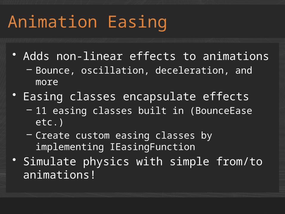
• Adds non-linear effects to animations– Bounce, oscillation, deceleration, and more
• Easing classes encapsulate effects– 11 easing classes built in (BounceEase etc.)– Create custom easing classes by implementing
IEasingFunction• Simulate physics with simple from/to
animations!
Animation Easing

Easing Classes
Class Description
BackEase Retracts the motion of an animation slightly before it begins
BounceEase Adds "bounce" to an animation
CircleEase Accelerates and/or decelerates using a circular function
CubicEase Accelerates and/or decelerates using the formula f(t) = t3
ElasticEase Adds oscillation to an animation
ExponentialEase
Accelerates and/or decelerates using an exponential formula
PowerEase Accelerates and/or decelerates using the formula f(t) = tp
QuadraticEase Accelerates and/or decelerates using the formula f(t) = t2
QuarticEase Accelerates and/or decelerates using the formula f(t) = t4
QuinticEase Accelerates and/or decelerates using the formula f(t) = t5
SineEase Accelerates and/or decelerates using a sine formula
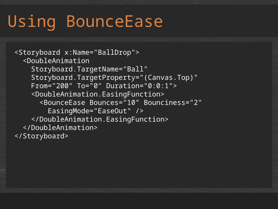
Using BounceEase
<Storyboard x:Name="BallDrop"> <DoubleAnimation Storyboard.TargetName="Ball" Storyboard.TargetProperty="(Canvas.Top)" From="200" To="0" Duration="0:0:1"> <DoubleAnimation.EasingFunction> <BounceEase Bounces="10" Bounciness="2" EasingMode="EaseOut" /> </DoubleAnimation.EasingFunction> </DoubleAnimation></Storyboard>
demoAnimation Easing
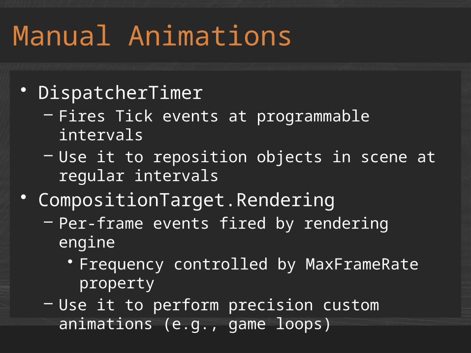
• DispatcherTimer– Fires Tick events at programmable intervals– Use it to reposition objects in scene at regular
intervals• CompositionTarget.Rendering
– Per-frame events fired by rendering engine• Frequency controlled by MaxFrameRate
property– Use it to perform precision custom animations
(e.g., game loops)
Manual Animations
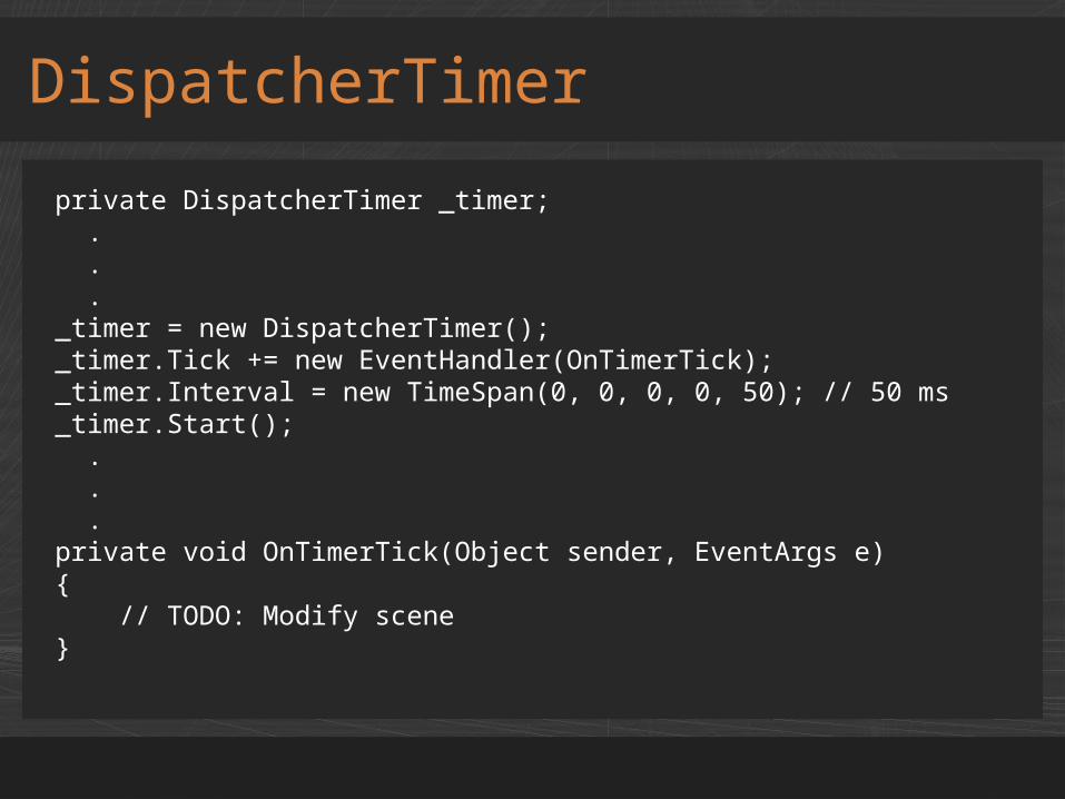
DispatcherTimer
private DispatcherTimer _timer; . . ._timer = new DispatcherTimer();_timer.Tick += new EventHandler(OnTimerTick);_timer.Interval = new TimeSpan(0, 0, 0, 0, 50); // 50 ms_timer.Start(); . . .private void OnTimerTick(Object sender, EventArgs e){ // TODO: Modify scene}
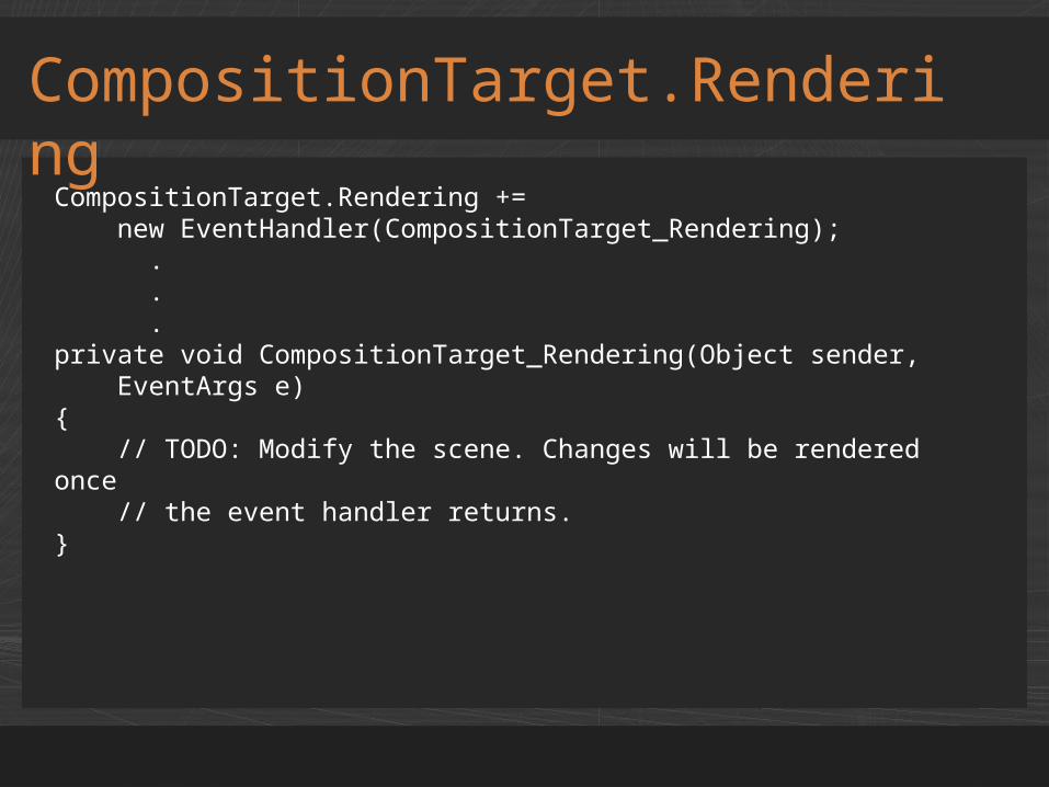
CompositionTarget.Rendering
CompositionTarget.Rendering += new EventHandler(CompositionTarget_Rendering); . . .private void CompositionTarget_Rendering(Object sender, EventArgs e){ // TODO: Modify the scene. Changes will be rendered once // the event handler returns.}
demoManual Animations
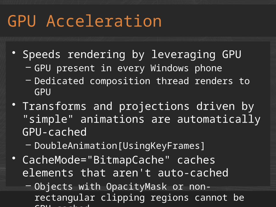
• Speeds rendering by leveraging GPU– GPU present in every Windows phone– Dedicated composition thread renders to GPU
• Transforms and projections driven by "simple" animations are automatically GPU-cached– DoubleAnimation[UsingKeyFrames]
• CacheMode="BitmapCache" caches elements that aren't auto-cached– Objects with OpacityMask or non-rectangular
clipping regions cannot be GPU-cached
GPU Acceleration
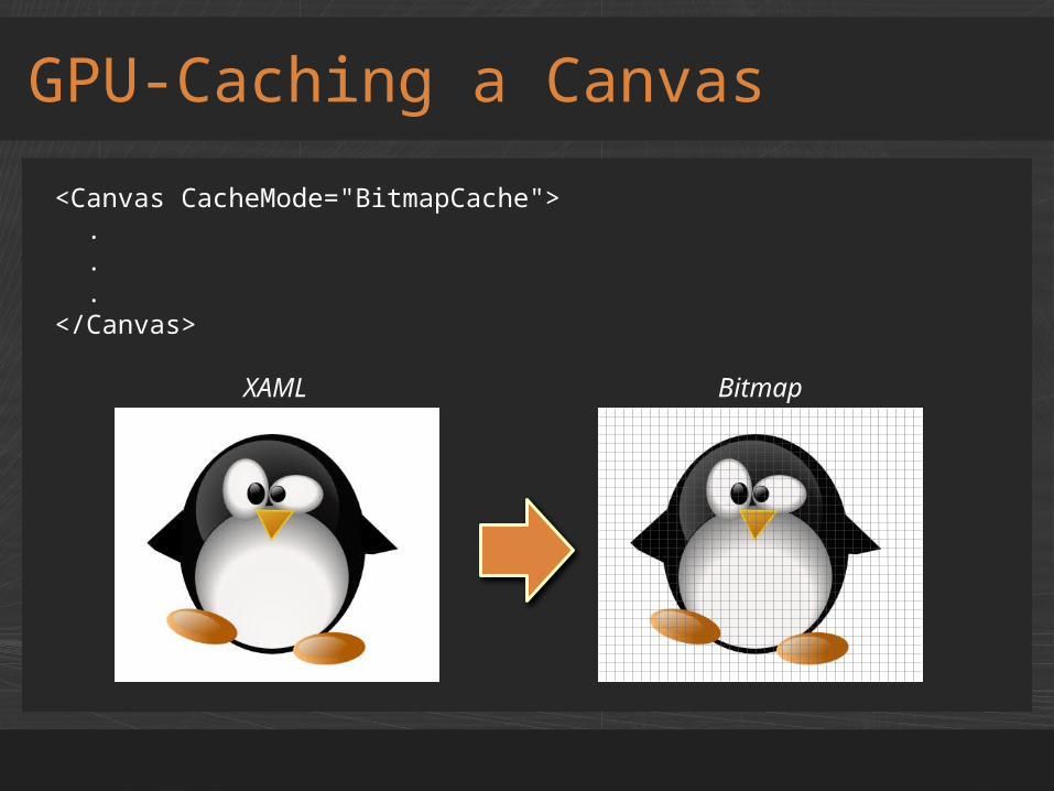
GPU-Caching a Canvas
<Canvas CacheMode="BitmapCache"> . . .</Canvas>
XAML Bitmap
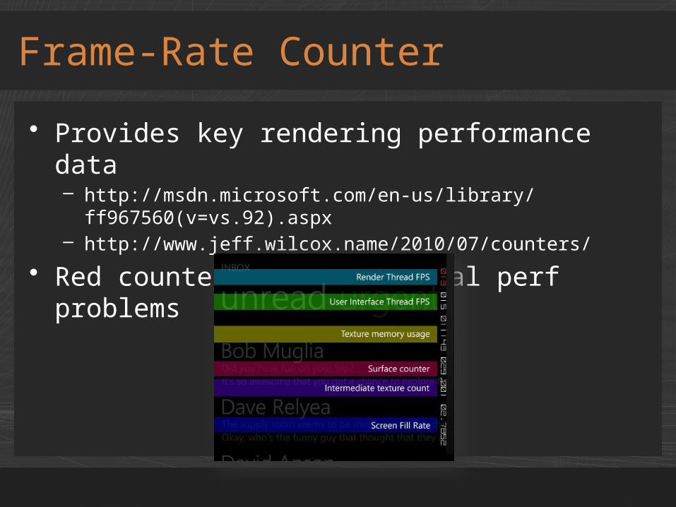
• Provides key rendering performance data– http://msdn.microsoft.com/en-us/library/
ff967560(v=vs.92).aspx– http://www.jeff.wilcox.name/2010/07/counters/
• Red counters flag potential perf problems
Frame-Rate Counter
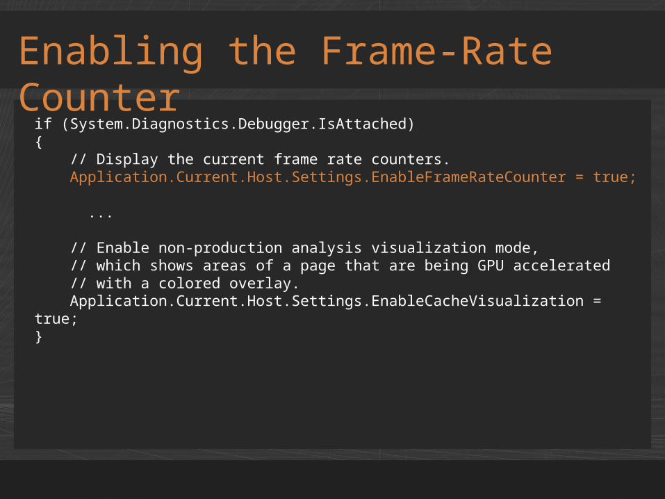
if (System.Diagnostics.Debugger.IsAttached){ // Display the current frame rate counters. Application.Current.Host.Settings.EnableFrameRateCounter = true;
...
// Enable non-production analysis visualization mode, // which shows areas of a page that are being GPU accelerated // with a colored overlay. Application.Current.Host.Settings.EnableCacheVisualization = true;}
Enabling the Frame-Rate Counter

• Visually depicts which objects are GPU-cached
Cache Visualization
Non-GPU-Cached GPU-CachedVisualization Off
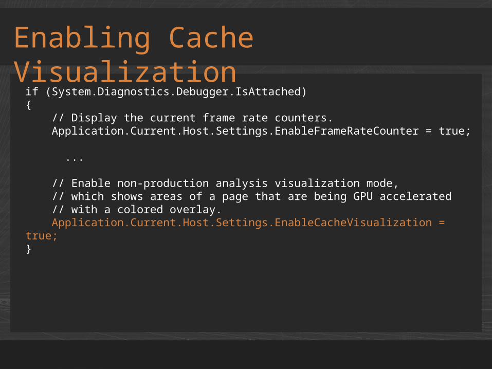
if (System.Diagnostics.Debugger.IsAttached){ // Display the current frame rate counters. Application.Current.Host.Settings.EnableFrameRateCounter = true;
...
// Enable non-production analysis visualization mode, // which shows areas of a page that are being GPU accelerated // with a colored overlay. Application.Current.Host.Settings.EnableCacheVisualization = true;}
Enabling Cache Visualization

demoGPU Acceleration

Charles Petzoldwww.charlespetzold.com
Questions?
Recommended