Embed Size (px)
Citation preview
What You See Is What You Touch: Visualizing Touch Screen Interaction in the Head-Up Display
Felix Lauber
University of Munich (LMU)
Munich, Germany
Anna Follmann
University of Munich (LMU)
Munich, Germany
Andreas Butz
University of Munich (LMU)
Munich, Germany
[email protected] ABSTRACT
Touch screens are increasingly used for secondary in-
vehicle controls. While they are more flexible than
traditional knobs and dials, interacting with them requires
more visual attention. In this paper, we propose several
variations of a concept we call “What You See Is What You
Touch” (WYSIWYT), which allows touch screen
interaction without removing one’s eyes from the road. This
becomes possible by showing both, the current content of
the touch screen as well as the position of the user’s hand in
relation to it, within the car’s head-up display (HUD). In an
initial study we compared six different variations of this
concept in a driving simulation mockup. After excluding
some concept variations, we conducted a second study
comparing the remaining ones with traditional touch
interaction. The best performing variation obtains better
subjective ratings without any significant disadvantages in
driving performance.
Author Keywords
Interaction in cars; indirect interaction; head-up-display;
touch displays; automotive user interfaces;
ACM Classification Keywords
H.5.2. Information interfaces and presentation (e.g., HCI):
User Interfaces.
INTRODUCTION
During the last few years, touch screens have started to
appear in car cockpits as the main interaction unit. The
main reason for this could be the great success of consumer
electronics devices with touch screens, which certainly have
changed customer expectations and habits. In addition,
there are objective advantages of touch screens in cars, in
particular the comfort of direct input as well as their
flexibility and customizability for handling a multitude of
functions. One of the most consequent examples is the
cockpit of the 2013 Tesla S model, in which not only
infotainment functions, but almost all center stack functions
(including air condition and the sunroof) are controlled
from a 17” touch screen. However, there is also one main
drawback of touch screens, especially in cars. Haptic knobs,
used to control in-vehicle functions such as the radio,
require almost no visual attention. Once we know where to
find them, proprioception and motor memory, as well as
their haptic discoverability allow us to use them without
averting our eyes from the street. Modern multi-purpose
controllers, which are used to navigate in-vehicle
information systems (IVIS), allow long, but interruptible
interaction phases with brief glances at the corresponding
display. In contrast, touchscreens originally provide no
haptic feedback at all and require very precise hand-eye
coordination [24]. In order to ensure road safety, the
American government [26] recommends limiting IVIS
interaction. According to their guidelines, one glance away
from the street may be no longer than 2 seconds and the
cumulated time to complete a whole task may be no longer
than 12 seconds.
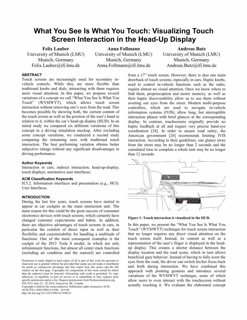
Figure 1: Touch interaction is visualized in the HUD.
In this paper, we present the “What You See Is What You
Touch” (WYSIWYT) technique for touch screen interaction
that no longer requires any direct visual attention on the
touch screen itself. Instead, its content as well as a
representation of the user’s finger is displayed in the head-
up display. This creates a shorter distance between the
display location and the road scene, which in turn allows
beneficial gaze behavior. Instead of having to fully avert the
eyes from the road, the driver can switch his/her focus back
and forth during interaction. We have combined this
approach with pointing gestures and introduce several
variations of the WYSIWYT technique, some of which
allow users to even interact with the touchscreen without
actually touching it. We evaluate the elaborated concept
Permission to make digital or hard copies of all or part of this work for personal or
classroom use is granted without fee provided that copies are not made or distributed
for profit or commercial advantage and that copies bear this notice and the full
citation on the first page. Copyrights for components of this work owned by others
than the author(s) must be honored. Abstracting with credit is permitted. To copy
otherwise, or republish, to post on servers or to redistribute to lists, requires prior
specific permission and/or a fee. Request permissions from [email protected].
DIS 2014, June 21 - 25 2014, Vancouver, BC, Canada
Copyright is held by the owner/author(s). Publication rights licensed to ACM.
ACM 978-1-4503-2902-6/14/06…$15.00.
http://dx.doi.org/10.1145/2598510.2598521

variations and finally compare them to standard touch
interaction, using alphanumeric text input as use case in
both user studies.
RELATED WORK
Our work builds upon prior work on touchscreen and
gesture interaction in cars, which was equally motivated by
reducing distraction during driving. Additionally, as prior
examinations have indicated, HUD visualizations can
contribute to a reduction of eye fixation times and increased
driving performance. Finally, we also looked at work on
indirect touch interaction within other areas of application.
Touch screens in cars
Both, touch screens and indirect input devices, have their
own advantages and drawbacks. Rogers et al. compared
touch screen interaction with rotary controllers for different
tasks and user groups [19]. According to their results, touch
screens are more suitable for ballistic tasks (e.g., scroll
bars), for pointing tasks (e.g., selecting an item from a drop-
down menu) or discrete tasks such as non-repetitive button
pressing. The rotary controller, in contrast, performed better
in repetitive tasks. Harvey et al. investigated the differences
between touch screen interaction and rotary controllers with
20 different tasks, while subjects were driving a car [8]. In
their study, touch screens outperformed the rotary controller
in all aspects (vehicle control, gaze behavior, secondary
task time, secondary task errors and subjective usability).
The advantages of touch screens become even more
evident, when the visual attention needed for hand-eye
coordination while pointing at items can be reduced. Ecker
et al. [6] therefore proposed a variation of pie menus for
blind interaction. Other concepts try to improve gaze
behavior and reduce distraction by haptic feedback from
vibrating driver seats [17], structured touch surfaces [20],
actuated touch screens [18] or an indirect touch controller
with an integrated haptic adjustable surface [23].
Gesture interaction in cars
Since it has been proven that gestures can improve gaze
behavior while interacting with secondary controls [15],
there is plenty of work examining gesture interaction while
driving. Pickering et al. differentiate 5 categories of in-
vehicle gesture interaction: pre-emptive, function
associated, context sensitive, global shortcut and natural
dialogue gestures [15]. Depending on the use case and
sensor technology, they are performed at different locations
within the cockpit, such as the area around the steering
wheel [e.g., 4, 13] or right in front of the center stack [e.g.,
1, 11]. Carnie et al. chose an interesting approach: they
provided an additional display on top of the dashboard
behind the steering wheel [4]. Secondary functions then are
controlled by pointing at the associated icon on the screen
and selecting it with a button on the steering wheel. Laquai
et al. used pointing gestures on the center stack screen [11].
Instead of visualizing a cursor on the screen, they proposed
different concepts, such as scaling the content approached
by the finger for improving target acquisition and
performance.
Head-up Displays in cars
A larger body of work exists on automotive HUDs. Shorter
display-road transition and eye accommodation times in
comparison to head-down displays (HDDs, such as the
instrument cluster or center stack display) have been
identified [e.g., 10, 22]. In contrast to that, there are also
problems with HUDs (as summarized in [16]), mainly
known as cognitive capture, attention capture or perceptual
tunneling. Because these phenomena are not very well
investigated within the automotive context, advantages and
drawbacks of each HUD use case must be individually
analyzed. For example, HUDs produced fewer errors than
HDDs when displaying navigational cues [2]. Driving
speed was more constant and response times to urgent
events were lower [12]. Similar advantages could also be
observed in bad weather conditions [5] and with elderly
drivers [9]. When using HUDs as an output technology for
menu interaction, simple tasks could be performed
significantly faster when using the HUD in comparison to
an HDD [14]. The same study found no decrease in driving
performance or peripheral perception.
Indirect touch interaction
By decoupling the location of visualization and interaction,
our work also relates to indirect interaction on touch
screens. Prior work has shown that this does not necessarily
lead to decreased task performance. Forlines et al. compare
direct touch and (indirect) mouse interaction on tabletop
displays [7]. Their results indicate that direct touch
interaction may be the better choice for tasks requiring
bimanual input, whereas mouse interaction may be the
better choice for tasks, which can be performed with one
hand. Schmidt et al. compare direct and indirect multi touch
interaction on tabletops [21]. In the indirect condition, they
use a horizontally aligned display for interaction and a
vertically aligned display for visualization. In order to
support users in finding their on-screen target, their fingers
are already tracked before touching the surface and their
location relative to the screen is visualized. Several
problems were identified, possibly related to the lack of a
three dimensional visualization of the finger position and a
four times slower positioning of the second finger. They
also encourage an exclusively contact-based interaction for
better guidance.
THE WYSIWYT CONCEPT
Basic Idea
The basic idea of all WYSIWYT concept variations is to
allow drivers to interact with a touchscreen in the center
stack without directly looking at it. Instead, both the content
of the touch screen and the performed interaction are
displayed in the head-up display. This is accomplished by
mirroring the touch screen’s content, and simultaneously
indicating the location on the touch screen, to which the
driver is pointing, by a cursor visualization. Thus, drivers
can quickly access functions in the board computer without
turning their head away from the street. While focusing on
the head-up display does not necessarily mean that drivers
are not distracted at all, their peripheral perception will
remain on the road and hopefully lead to an improvement of
driving performance during phases of intensive interaction.
Preliminary considerations
For the WYSIWYT concept, we can define three dedicated
states. While drivers are not interacting with the system, the
head-up display should be in a default state, presenting the
standard content such as driving speed and navigational
cues. In a second state, drivers should see the touch screen
content and the cursor, indicating what they are pointing at
(active state). In a third state, while the user is pointing at a
desired item, it can be selected (selection state).
For the second state, in which the visualization is active, we
have considered two alternative possibilities:
Hover-based: In this case, the user’s finger is tracked on the
touch screen itself, as well as shortly (approx. 0.2m) before
contact. This allows us to determine its position in reference
to the touch screen’s content and we can mark the location
to which the finger is pointing, respectively where it would
touch if moved along the direction of the pointing vector.
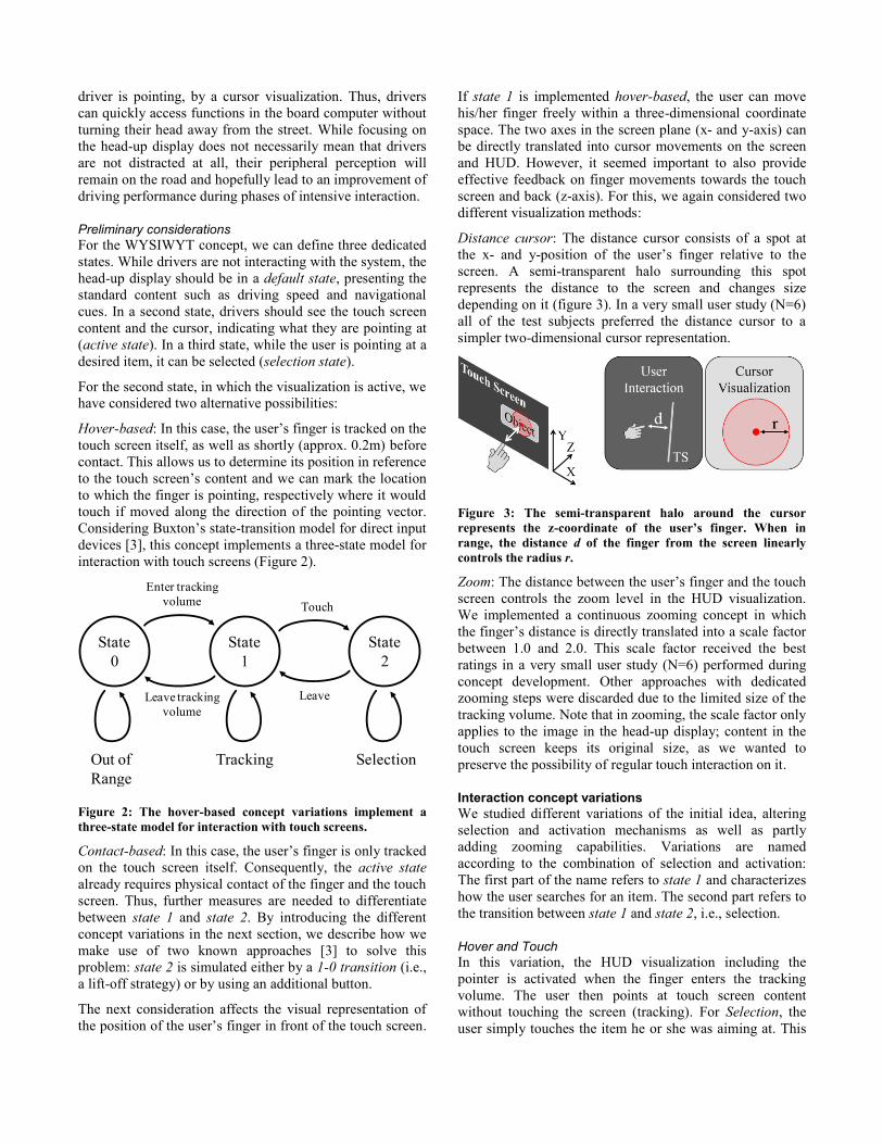
Considering Buxton’s state-transition model for direct input
devices [3], this concept implements a three-state model for
interaction with touch screens (Figure 2).
State
0
State
1
State
2
Out of
Range
Tracking Selection
Enter tracking
volume
Leave tracking
volume
Touch
Leave
Figure 2: The hover-based concept variations implement a
three-state model for interaction with touch screens.
Contact-based: In this case, the user’s finger is only tracked
on the touch screen itself. Consequently, the active state
already requires physical contact of the finger and the touch
screen. Thus, further measures are needed to differentiate
between state 1 and state 2. By introducing the different
concept variations in the next section, we describe how we
make use of two known approaches [3] to solve this
problem: state 2 is simulated either by a 1-0 transition (i.e.,
a lift-off strategy) or by using an additional button.
The next consideration affects the visual representation of
the position of the user’s finger in front of the touch screen.
If state 1 is implemented hover-based, the user can move
his/her finger freely within a three-dimensional coordinate
space. The two axes in the screen plane (x- and y-axis) can
be directly translated into cursor movements on the screen
and HUD. However, it seemed important to also provide
effective feedback on finger movements towards the touch
screen and back (z-axis). For this, we again considered two
different visualization methods:
Distance cursor: The distance cursor consists of a spot at
the x- and y-position of the user’s finger relative to the
screen. A semi-transparent halo surrounding this spot
represents the distance to the screen and changes size
depending on it (figure 3). In a very small user study (N=6)
all of the test subjects preferred the distance cursor to a
simpler two-dimensional cursor representation.
Figure 3: The semi-transparent halo around the cursor
represents the z-coordinate of the user’s finger. When in
range, the distance d of the finger from the screen linearly
controls the radius r.
Zoom: The distance between the user’s finger and the touch
screen controls the zoom level in the HUD visualization.
We implemented a continuous zooming concept in which
the finger’s distance is directly translated into a scale factor
between 1.0 and 2.0. This scale factor received the best
ratings in a very small user study (N=6) performed during
concept development. Other approaches with dedicated
zooming steps were discarded due to the limited size of the
tracking volume. Note that in zooming, the scale factor only
applies to the image in the head-up display; content in the
touch screen keeps its original size, as we wanted to
preserve the possibility of regular touch interaction on it.
Interaction concept variations
We studied different variations of the initial idea, altering
selection and activation mechanisms as well as partly
adding zooming capabilities. Variations are named
according to the combination of selection and activation:
The first part of the name refers to state 1 and characterizes
how the user searches for an item. The second part refers to
the transition between state 1 and state 2, i.e., selection.
Hover and Touch
In this variation, the HUD visualization including the
pointer is activated when the finger enters the tracking
volume. The user then points at touch screen content
without touching the screen (tracking). For Selection, the
user simply touches the item he or she was aiming at. This
was implemented with both of the z-axis representations,
either using zoom or the distance cursor. Figure 4 depicts
the entire interaction process.
Figure 4: Interaction process of Hover and Touch.
Hover and Click
Hover and Click is similar to Hover and Touch except for
selection. Instead of touching the screen, the user presses a
button located on the steering wheel with the other hand.
This has the theoretical advantage that the user does not
have to move the finger to the screen to select an item,
which could improve task completion time and provide
better ergonomics. A drawback may be that adding a differ-
rent input modality could increase workload and add further
distraction. This concept variation was also implemented in
two ways, using either zoom or the distance cursor.
Slide and Lift
This variation is completely contact-based. We wanted to
maintain the three-state model in order to use state 1 for the
activation of the HUD visualization and the target search
without looking at the center stack display. Thus, similar to
touch screens on smartphones or tablet computers, we
implemented the selection of an item by lifting the finger
off the screen. Figure 5 depicts one complete interaction
phase.
Figure 5: Interaction process of Slide and Lift.
One possible advantage could be that the user’s hand does
not move in free space. Instead, it receives haptic guidance
during the search phase. We assumed that selecting items
by lifting off the finger should be well known from smart
phones or tablets. One possible drawback may be the
involuntary activation of an item upon interruption, in case
the hand is needed back on the steering wheel.
Slide and Click
This works just as slide and lift except for selecting an item.
Instead of lifting the finger off the screen, the user presses a
button on the steering wheel. Just as with Hover and Click,
at the cost of adding a different input modality, this may
increase interaction speed and improve ergonomics.
USE CASES AND IMPLEMENTATION
All variations are generally suitable for scenarios, in which
one out of several items has to be selected by the user. This
includes hierarchical menus, but also flat object selection,
such as app-style home screens, keypads or keyboards.
Use case for comparing variations in the study
For the following user studies we chose an on-screen
keyboard for entering destinations in a navigation system.
Although this is a relatively complex use case for HUD
interaction, it also is a very relevant one for real car
infotainment systems and no prior domain knowledge is
needed. It also natively implements a two-dimensional
arrangement of items, and with 28 buttons (26 characters
plus back and enter), its spatial complexity might bring out
the advantages of the zooming technique.
Implemented Prototype
The prototype runs on a 12.1” touch tablet (Lenovo X201).
The user interface was implemented using Microsoft’s
.NET framework and its standard GUI widgets and touch
screen support. For tracking the pointing gestures, we used
a Microsoft Kinect sensor with the OpenNI and NiTE
frameworks. For additional image processing, we used
openCV. In all studies, the Kinect was mounted above the
touch screen, which means that the depth sensor was used
to detect the y-axis movement of the finger. The system
was calibrated by displaying and touching 9 fixed points on
the touch screen. Using bilinear interpolation the system
then calculated an approximated representation in tracking
coordinates for each pixel on the touch screen, which
ensured a sufficiently accurate finger tracking within the
defined volume.
FIRST STUDY
In an initial study we compared all concepts previously
described. Both hover-concepts had been implemented with
and without zoom, leading to a total of 6 different concept
variations. There were three main aspects we intended to
examine: First, we wanted to know whether the hover-
based or the contact-based implementation of the activation
and search phase would perform better. Second, we wanted
to find out whether the button on the steering wheel would
support the user or just add unnecessary workload. Finally
we wanted to find out whether zooming would support the
users or rather be too distracting.
Apparatus
The study was conducted using a driving simulation with a
mid-fidelity car mockup (Figure 6). Subjects would sit in a
real car seat in front of an office desk and use a Logitech
MOMO steering wheel with pedals to control the virtual
vehicle. In order to provide flexible ergonomics, the
distance between the car seat and the steering wheel,
respectively the pedals, was adjustable. The HUD was
simulated by placing an LCD screen horizontally on the
desk pointing upward at a combiner mirror (70%
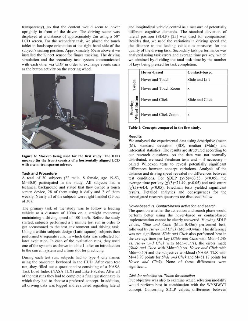
transparency), so that the content would seem to hover
uprightly in front of the driver. The driving scene was
displayed at a distance of approximately 2m using a 50”
LCD screen. For the secondary task, we placed the touch
tablet in landscape orientation at the right hand side of the
subject’s seating position. Approximately 65cm above it we
installed the Kinect sensor for finger tracking. The driving
simulation and the secondary task system communicated
with each other via UDP in order to exchange events such
as the button activity on the steering wheel.
Figure 6: Mockup being used for the first study. The HUD
mockup (in the front) consists of a horizontally aligned LCD
with a semi-transparent mirror.
Task and Procedure
A total of 30 subjects (22 male, 8 female, age 19-53,
M=30.0) participated in the study. All subjects had a
technical background and stated that they owned a touch
screen device, 28 of them using it daily and 2 of them
weekly. Nearly all of the subjects were right-handed (29 out
of 30).
The primary task of the study was to follow a leading
vehicle at a distance of 100m on a straight motorway
maintaining a driving speed of 100 km/h. Before the study
started, subjects performed a 5 minute test run in order to
get accustomed to the test environment and driving task.
Using a within-subjects design (Latin square), subjects then
performed 6 separate runs, in which data was collected for
later evaluation. In each of the evaluation runs, they used
one of the systems as shown in table 1, after an introduction
to the current system and a time slot for practicing.
During each test run, subjects had to type 4 city names
using the on-screen keyboard in the HUD. After each test
run, they filled out a questionnaire consisting of a NASA
Task Load Index (NASA TLX) and Likert-Scales. After all
of the test runs they had to complete a final questionnaire in
which they had to choose a preferred concept. In addition,
all driving data was logged and evaluated regarding lateral
and longitudinal vehicle control as a measure of potentially
different cognitive demands. The standard deviation of
lateral position (SDLP) [25] was used for comparisons.
Besides that, we used the variations in driving speed and
the distance to the leading vehicle as measures for the
quality of the driving task. Secondary task performance was
analyzed using task errors and average time per key, which
we obtained by dividing the total task time by the number
of keys being pressed for task completion.
Hover-based Contact-based
To
uch
Hover and Touch Slide and Lift
Hover and Touch Zoom x
Ste
erin
g
Wh
eel
Bu
tton
Hover and Click Slide and Click
Hover and Click Zoom x
Table 1: Concepts compared in the first study.
Results
We analyzed the experimental data using descriptive (mean
(M), standard deviation (SD), median (Mdn)) and
inferential statistics. The results are structured according to
our research questions. As the data was not normally
distributed, we used Friedman tests and – if necessary –
paired Wilcoxon tests to reveal potentially significant
differences between concept variations. Analysis of the
distance and driving speed revealed no differences between
test conditions. For SDLP (χ2(5)=60.53, p<0.05), the
average time per key (χ2(5)=71.49, p<0.05) and task errors
(χ2(5)=64.4, p<0.05), Friedman tests yielded significant
results. Detailed analytics and consequences for the
investigated research questions are discussed below.
Hover-based vs. Contact-based activation and search
The question whether the activation and search phase would
perform better using the hover-based or contact-based
implementation cannot be clearly answered. Viewing SDLP
values, Slide and Click (Mdn=0.43m) performed best,
followed by Hover and Click (Mdn=0.44m). The difference
was not significant. Slide and Click also performed best in
the average time per key (Slide and Click with Mdn=1.58s
vs. Hover and Click with Mdn=1.77s), the errors made
(Slide and Click with Mdn=0.0 vs. Hover and Click with
Mdn=0.50) and the subjective workload (NASA TLX with
M=48.93 points for Slide and Click and M=51.17 points for
Hover and Click). None of these differences were
significant.
Click for selection vs. Touch for selection
Our objective was also to examine which selection modality
would perform best in combination with the WYSIWYT
concept. Concerning SDLP values, differences between
Hover and Click (Mdn=0.44m) and Hover and Touch
(Mdn=0.45 m) were not significant. In contrast, a Wilcoxon
test revealed significant differences (z=2.64, p<.05, r=.14)
between Hover and Touch Zoom (Mdn=0.58m) and Hover
and Click Zoom (Mdn=0.49m).
This first hint of Click being superior to Touch, could be
consolidated by looking at the secondary task. The average
time per key significantly differed between Hover and
Touch (Mdn=2.47s) and Hover and Click (Mdn=1.77s,
z=3.62, p<.05, r=.19) as well as between Hover and Touch
Zoom (Mdn=2.98s) and Hover and Click Zoom
(Mdn=2.17s, z=2.66, p<.05, r=.14). The comparison of the
secondary task errors revealed the same results: Hover and
Touch (Mdn=4.00) performed significantly worse (z=3.32,
p<.05, r=.17) than Hover and Click (Mdn=0.5). The
comparison between the zoom variations (Hover and Click
Zoom with Mdn=0.50 and Hover and Touch Zoom with
Mdn=3.50) again confirmed this tendency (z=3.18, p<.05,
r=.17). These objective findings are also reflected in the
subjects’ workload assessments. Hover and Touch Zoom
(M=78.27) scored lower in the NASA TLX than Hover and
Click Zoom (M=66.53) and Hover and Click (M=51.17)
scored lower than Hover and Touch (M=64.53).
Zoom vs. no Zoom
The third important question in our initial study was
whether zoom would support the user in task fulfillment or
whether it would be too distracting and require unnecessary
visual attention. In this case, nearly all results pointed in
one direction: concepts with zoom seem to perform worse
than those concept variations without zooming capabilities.
First of all, this statement applies to SDLP values. Hover
and Touch Zoom (Mdn=0.58 m) and Hover and Click Zoom
(0.49m) yielded the worst results, while paired comparisons
with Hover and Touch (0.45m) respectively Hover and
Click (0.44m) revealed significant differences (z=3.62,
p<.05, r=.19 respectively z=1.92, p<.05, r=.10).
This tendency can also be found when analyzing the
secondary task completion performance. Differences
concerning average key time between Hover and Touch
(Mdn=2.47s) and Hover and Touch Zoom (Mdn=2.98s)
were significant (z=2.64, p<.05, r=.13) as well as between
Hover and Click (Mdn=1.77 s) and Hover and Click Zoom
(Mdn=2.17s, z=2.92, p<.05, r=.15). Surprisingly, for the
task errors, there were no significant differences between
zoom and non-zoom variations. The NASA TLX, in
contrast, revealed a higher subjective workload for the
concept variations with zoom (Hover and Touch Zoom
M=78.27, Hover and Click Zoom M=66.53) than for those
without zoom (Hover and Touch M=64.53, Hover and
Click M=51.17).
Discussion
After this first study with six different concept variations,
we could already partially answer some of our research
questions. In addition, the study served as a basis for
designing the second study. In general, the HUD as a
display location for touch interaction was accepted and
subjects ceased to glance at the center stack (CS) display
(even though it was displaying the exact same information).
In contrast, the question whether zooming would support
users in their task fulfillment, can already be denied at this
point. Concept variations without zoom led to better driving
performance, fewer errors in the secondary task and
decreased task completion time. They also got higher
ratings and led to a lower subjective workload. Subjects
stated that by zooming, unnecessary complexity was added
to the task. In their opinion, this led to an increased visual
demand and distraction.
Another goal of the first study was to examine whether the
contact-based or the hover-based implementation of the
searching phase would be preferable. In a final ranking,
most subjects preferred the concepts Hover and Click and
Slide and Click. This conflict between the two basic
approaches hover-based and contact-based could not be
resolved by analyzing the data. On the one hand, subjects
preferred the hover concepts because sliding on the touch
screen felt uncomfortable, the physical demands were
perceived to be lower and it simply felt ‘cooler’. On the
other hand, they liked the additional physical guidance of
the touch surface and therefore felt safer while interacting
with the screen. The concept Slide and Lift on the contrary,
was perceived to be very complex and unfamiliar. Even if
most of the subjects possessed a touch screen device and
used it regularly, they found the lift-off metaphor for item
selection very confusing.
The question, which selection modality would perform
better, can be answered with a surprising outcome. Even if
pressing a button on the steering wheel involved a different
modality as well as a second hand for selecting an item, the
click concepts outperformed the touch concepts in nearly all
of the analyzed data. Using click for selection led to
improved driving performance as well as a better secondary
task completion and better subjective assessments. One
possible reason for this may be that free hand movements
without haptic feedback, in combination with a vertically
aligned touch display, could lead to inaccurate selection.
When the user approaches the display with his/her finger, it
tends to vertically shift due to the weight of the hand. One
subject clearly stated that ‘[one] has to get accustomed to
aiming a little bit higher than expected’ [S18].
SECOND STUDY
We designed a second study based on the results of the first
study. The main goal of this second study was to compare
the best performing concepts of the first study to a baseline
concept. As a baseline concept we used standard touch
interaction on the center stack display without any prior
hover effects or HUD visualizations. As described in the
previous section, a clear ‘winner concept’ could not be
identified. Neither subjective nor objective data could
identify any significant differences between Slide and Click
and Hover and Click, which also could not be expected for
the second study. Thus we excluded the zoom and the slide
concept variations and included Touch (baseline) combined
with the two hover approaches, which leads to the study
design depicted in table 2.
Touch Screen (TS) HUD
To
uch
Hover And Touch TS
Hover And Touch HUD
Touch (Baseline)
Ste
erin
g
Wh
eel
Bu
tto
n
Hover And Click TS Hover And Click HUD
Table 2: Design of the second study.
In addition to the baseline comparison, this study layout
allowed us to examine further research questions. We were
now able to analyze the isolated effects of the selection
modality and the display location as well as possible
combined effects on driving performance and secondary
task completion. In addition, we examined which of the
remaining interaction concepts worked best when
visualized on the HUD and which one would outperform
the others, when visualized solely on the center stack
display. Furthermore, we could study the effects of the
distance cursor in a direct touch condition, without any
active HUD visualization.
Apparatus
The study was conducted in a driving simulation using a
high-fidelity car mockup. Similarly to the first study, the
HUD was simulated by using a 70% transparency combiner
mirror reflecting the image of a horizontally aligned
projection screen. A realistic driving scene was displayed at
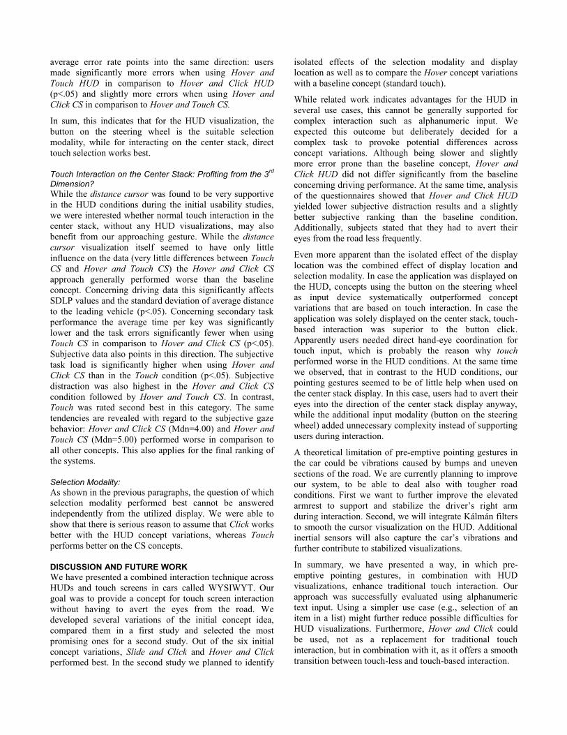
a distance of 2.5m using three 50” plasma screens (Fig. 7).
Figure 7: User perspective in the second study.
For the secondary task, we placed the 12.1” touchscreen
tablet computer at the right hand side of the subject’s
seating position in the car mockup’s center stack. A
Microsoft Kinect was positioned at a distance of
approximately 45cm above the center stack. To provide
comfortable ergonomics, the position of the driving seat
and the steering wheel were adjustable. Taking note of the
results of the first study, the touch screen was slightly tilted
towards the driver and an elevated armrest was provided at
the right hand side of the driver. Thus, in situations in
which the user needed to hover in front of the touch screen,
his/her arm could rest in a comfortable position.
Task and Procedure
A total of 40 subjects (38 male, 2 female, age 21-55,
M=35.5) participated in the second study. Most of the
subjects (34) stated that they regularly used a HUD and 36
indicated that they owned a smartphone or tablet computer
with a touch screen. In contrast to that, very few of the
subjects were used to touch screen interaction in cars. Out
of the 40 test persons, 27 stated that they had never used
touch screen interaction in cars, 11 subjects used it weekly
or monthly and 2 test persons daily. Nearly all subjects (37)
were right-handed.
Similarly to the first study, we tested all systems presented
in table 2 in a within-subjects design (Latin square).
Subjects were asked to follow a leading vehicle at a
distance of 50m in a motorway scenario. For the secondary
task, a total of 4 city names had to be entered into the
system using a Latin square design. In order to receive
reproducible data, we defined fixed landmarks as starting
points (approximately every 2km). Surrounding traffic was
identical across all conditions.
Subjects were instructed to focus on the primary task while
still trying to complete the secondary task as quickly and
accurately as possible. Once a task had been started, it
could be interrupted and continued at any time. In case a
task could not be completed during the time between two
landmarks, it was discarded and subjects were instructed to
continue with a new task. As in the first study, all driving
and secondary task data was logged and analyzed with
regard to the previously introduced factors.
Results
To reveal potentially significant effects, we applied a two-
way ANOVA and paired t-tests (with Bonferroni
correction), when necessary.
Display Location: HUD vs. Center Stack
The first interesting aspect in the second study was to
examine, what effect the display location would have on the
data. Concerning the driving parameters, a significant
influence of the display location was only observed with
respect to the longitudinal control of the vehicle, while
SDLP values did not differ significantly across concept
variations. For the longitudinal control of the vehicle,
significant main effects were observed regarding both, the
standard deviation of the mean distance to the leading
vehicle (F(1,39)=6.42, p<.05, ηp2=0.14) and the standard
deviation of the mean velocity (F(1,39)=5.25, p<.05,
ηp2=0.12).
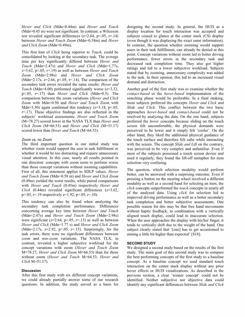
Figure 8: Longitudinal vehicle control
Despite the fact that HUD visualizations generally tended to
result in a higher standard deviation of the average distance
and the average driving speed (fig. 4), pairwise
comparisons could not reveal any significant differences
between corresponding HUD and CS concepts.
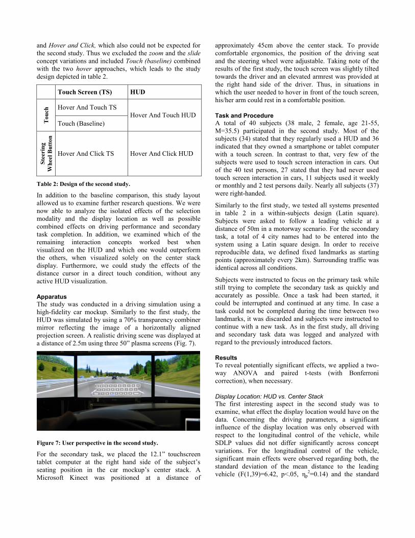
A main effect of the display location could also be observed
concerning the secondary task performance. This affects the
mean time per key (F(1,39)=176.6, p<.05, ηp2=0.82) and the
error rate (F(1,39)=24.18, p<.05, ηp2=0.38). Although
pairwise comparisons confirmed that subjects could
complete the secondary task significantly faster when
displayed on the center stack (p<.05), only Hover and
Touch HUD caused significantly more errors than the
baseline concept (p<.05).
Figure 9: Secondary task performance
Analysis of the questionnaires could also partially reveal a
significant influence of the display location, this time,
however, in favor of a HUD concept. Using Hover and
Click HUD, the subjective workload (NASA TLX) was
significantly lower than with Hover and Click CS (p<.05).
Concerning how often subjects had to avert their gaze from
the driving scene, on a 6 point Likert scale Hover and Click
HUD (Mdn=3.00) also was perceived to perform best. This
was confirmed by the subjective ranking of the systems:
Hover and Click HUD was rated higher than Touch,
followed by Hover and Touch CS.
In summary, the display location seems to have an
influence on both, driving and secondary task performance.
However, pairwise comparisons could not reveal
systematical advantages of one display location across all
concept variations. Remaining inconsistencies can be
clarified with the significant interaction effect of display
location and interaction modality, which will be analyzed in
the next paragraph.
Combined Effects of Selection Modality and Display Location
Concerning the driving performance, ANOVA tests could
reveal significant interaction effects of display location and
interaction modality with respect to SDLP values
(F(1,39)=16.7, p<.05, ηp2=0.30) and the standard deviation
of the average distance to the leading vehicle
(F(1,39)=6.42, p<.05, ηp2=0.14). In the following we will
show, how Touch consequently outperforms Click on the
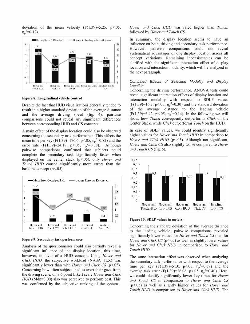
Center Stack, while Click outperforms Touch on the HUD.
In case of SDLP values, we could identify significantly
higher values for Hover and Touch HUD in comparison to
Hover and Click HUD (p<.05). Although not significant,
Hover and Click CS also slightly worse compared to Hover
and Touch CS (fig. 5).
Figure 10: SDLP values in meters.
Concerning the standard deviation of the average distance
to the leading vehicle, pairwise comparisons revealed
significantly lower values for Hover and Touch CS than for
Hover and Click CS (p<.05) as well as slightly lower values
for Hover and Click HUD in comparison to Hover and
Touch HUD.
The same interaction effect was observed when analyzing
the secondary task performance with respect to the average
time per key (F(1,39)=51.0, p<.05, ηp2=0.57) and the
average task error (F(1,39)=26.06, p<.05, ηp2=0.40). Here,
we could identify significantly lower key times for Hover
and Touch CS in comparison to Hover and Click CS
(p<.05) as well as slightly higher values for Hover and
Touch HUD in comparison to Hover and Click HUD. The
average error rate points into the same direction: users
made significantly more errors when using Hover and
Touch HUD in comparison to Hover and Click HUD
(p<.05) and slightly more errors when using Hover and
Click CS in comparison to Hover and Touch CS.
In sum, this indicates that for the HUD visualization, the
button on the steering wheel is the suitable selection
modality, while for interacting on the center stack, direct
touch selection works best.
Touch Interaction on the Center Stack: Profiting from the 3rd
Dimension?
While the distance cursor was found to be very supportive
in the HUD conditions during the initial usability studies,
we were interested whether normal touch interaction in the
center stack, without any HUD visualizations, may also
benefit from our approaching gesture. While the distance
cursor visualization itself seemed to have only little
influence on the data (very little differences between Touch
CS and Hover and Touch CS) the Hover and Click CS
approach generally performed worse than the baseline
concept. Concerning driving data this significantly affects
SDLP values and the standard deviation of average distance
to the leading vehicle (p<.05). Concerning secondary task
performance the average time per key was significantly
lower and the task errors significantly fewer when using
Touch CS in comparison to Hover and Click CS (p<.05).
Subjective data also points in this direction. The subjective
task load is significantly higher when using Hover and
Click CS than in the Touch condition (p<.05). Subjective
distraction was also highest in the Hover and Click CS
condition followed by Hover and Touch CS. In contrast,
Touch was rated second best in this category. The same
tendencies are revealed with regard to the subjective gaze
behavior: Hover and Click CS (Mdn=4.00) and Hover and
Touch CS (Mdn=5.00) performed worse in comparison to
all other concepts. This also applies for the final ranking of
the systems.
Selection Modality:
As shown in the previous paragraphs, the question of which
selection modality performed best cannot be answered
independently from the utilized display. We were able to
show that there is serious reason to assume that Click works
better with the HUD concept variations, whereas Touch
performs better on the CS concepts.
DISCUSSION AND FUTURE WORK
We have presented a combined interaction technique across
HUDs and touch screens in cars called WYSIWYT. Our
goal was to provide a concept for touch screen interaction
without having to avert the eyes from the road. We
developed several variations of the initial concept idea,
compared them in a first study and selected the most
promising ones for a second study. Out of the six initial
concept variations, Slide and Click and Hover and Click
performed best. In the second study we planned to identify
isolated effects of the selection modality and display
location as well as to compare the Hover concept variations
with a baseline concept (standard touch).
While related work indicates advantages for the HUD in
several use cases, this cannot be generally supported for
complex interaction such as alphanumeric input. We
expected this outcome but deliberately decided for a
complex task to provoke potential differences across
concept variations. Although being slower and slightly
more error prone than the baseline concept, Hover and
Click HUD did not differ significantly from the baseline
concerning driving performance. At the same time, analysis
of the questionnaires showed that Hover and Click HUD
yielded lower subjective distraction results and a slightly
better subjective ranking than the baseline condition.
Additionally, subjects stated that they had to avert their
eyes from the road less frequently.
Even more apparent than the isolated effect of the display
location was the combined effect of display location and
selection modality. In case the application was displayed on
the HUD, concepts using the button on the steering wheel
as input device systematically outperformed concept
variations that are based on touch interaction. In case the
application was solely displayed on the center stack, touch-
based interaction was superior to the button click.
Apparently users needed direct hand-eye coordination for
touch input, which is probably the reason why touch
performed worse in the HUD conditions. At the same time
we observed, that in contrast to the HUD conditions, our
pointing gestures seemed to be of little help when used on
the center stack display. In this case, users had to avert their
eyes into the direction of the center stack display anyway,
while the additional input modality (button on the steering
wheel) added unnecessary complexity instead of supporting
users during interaction.
A theoretical limitation of pre-emptive pointing gestures in
the car could be vibrations caused by bumps and uneven
sections of the road. We are currently planning to improve
our system, to be able to deal also with tougher road
conditions. First we want to further improve the elevated
armrest to support and stabilize the driver’s right arm
during interaction. Second, we will integrate Kálmán filters
to smooth the cursor visualization on the HUD. Additional
inertial sensors will also capture the car’s vibrations and
further contribute to stabilized visualizations.
In summary, we have presented a way, in which pre-
emptive pointing gestures, in combination with HUD
visualizations, enhance traditional touch interaction. Our
approach was successfully evaluated using alphanumeric
text input. Using a simpler use case (e.g., selection of an
item in a list) might further reduce possible difficulties for
HUD visualizations. Furthermore, Hover and Click could
be used, not as a replacement for traditional touch
interaction, but in combination with it, as it offers a smooth
transition between touch-less and touch-based interaction.
ACKNOWLEDGEMENTS
We thank all study participants for their time and their
valuable feedback.
REFERENCES
1. Akyol, S., Canzler, U., Bengler, K. and Hahn, W.
Gesture control for use in automobiles. IAPR Work-
shop on Machine Vision Applications 2000, 349–352.
2. Burnett, G. E. A road-based evaluation of a head-up
display for presenting navigation information. Proc. of
the HCI international conference 2003.
3. Buxton, W. A three-state model of graphical input.
Proc. INTERACT 1990, 449-456.
4. Cairnie, N., Ricketts, I.W., McKenna, S.J., McAllister,
G. Using finger-pointing to operate secondary controls
in automobiles. Proc. of Intelligent Vehicles
Symposium 2000. IEEE, 2000.
5. Charissis, V., Papanastasiou S. and Vlachos, G.
Interface Development for Early Notification Warning
System: Full Windshield Head-Up Display Case Study.
Human-Computer Interaction. Interacting in Various
Application Domains 2009, Springer, 2009. 683–692.
6. Ecker, R., Broy, V., Butz, A. and De Luca, A.
pieTouch: a direct touch gesture interface for
interacting with in-vehicle information systems. Proc.
on Human-Computer interaction with Mobile Devices
and Services 2009. ACM 2009.
7. Forlines, C., Wigdor, D., Shen, C. and Balakrishnan, R.
Direct-touch vs. mouse input for tabletop displays.
Proc. of CHI 2007. ACM (2007), New York
8. Harvey, C., Stanton, N. A., Pickering, C. A.,
McDonald, M. and Zheng, P. To twist or poke? A
method for identifying usability issues with the rotary
controller and touch screen for control of in-vehicle
information systems. Ergonomics, 2011.
9. Kiefer, R. Older Drivers' Pedestrian Detection Times
Surrounding Head-Up Versus Head-Down
Speedometer Glances. A.G. Gale et al. (Eds.), Vision in
Vehicles -VII, Elsevier, 2000, 111-118.
10. Kiefer, R. Defining the “HUD benefit time window“.
Vision in Vehicles-VI, 1998.
11. Laquai, F., Ablassmeier M., Poitschke, T. and Rigoll,
G. Using 3D Touch Interaction for a Multimodal
Zoomable User Interface. Proc. on Human Interface
2009.
12. Liu, Y.-C. and Wen, M.-H. Comparison of head-up
display (HUD) vs. head-down display (HDD): driving
performance of commercial vehicle operators in
Taiwan. International Journal of Human-Computer
Studies, 2004.
13. Mahr, A., Endres, C., Müller, C. and Schneeberger, T.
Determining human-centered parameters of ergonomic
micro-gesture interaction for drivers using the theater
approach. Proc. AutomotiveUI 2011. ACM (2011).
14. Miličić, N. and Lindberg, T. Menu interaction in Head-
Up Displays. Human Factors and Ergonomic Society,
2008.
15. Pickering, C. A., Burnham, K. J. and Richardson, M. J.
A research study of hand gesture recognition
technologies and applications for human vehicle
interaction. Automotive Electronics, 2007. IET.
16. Prinzel, L., and Risser, M. Head-up displays and
attention capture. NASA Technical Memorandum,
213000, 2004.
17. Richter, H. and Wiethoff, A. Augmenting Future In-
Vehicle Interactions With Remote Tactile Feedback.
Adj. Proc. of AutomotiveUI, 2011, 162-163.
18. Richter H., Ecker R., Deisler C. and Butz A. HapTouch
and the 2+1 state model: potentials of haptic feedback
on touch based in-vehicle information systems. Proc.
of AutomotiveUI 2010. ACM (2010), 72-79.
19. Rogers, W. A., Fisk, A. D., McLaughlin, A. C. and
Pak, R. Touch a screen or turn a knob: Choosing the
best device for the job. Human Factors: The Journal of
the Human Factors and Ergonomics Society, 2005,
47(2), 271-288.
20. Rümelin, S., Brudy, F. and Butz, A. Up And Down
And Along: How We Interact With Curvature. Adj.
Proc of CHI, 2013.
21. Schmidt, D., Block, F. and Gellersen, H. A comparison
of direct and indirect multi-touch input for large
surfaces. Proc. INTERACT 2009. Springer 2009.
22. Sojourner, R. J. and Antin, J. F. The Effects of a
Simulated Head-Up Display Speedometer on
Perceptual Task Performance. Human Factors: The
Journal of the Human Factors and Ergonomics
Society, 32(3), 329–339, 1990.
23. Spies, R., Ablaßmeier, M., Bubb, H. and Hamberger,
W. Augmented interaction and visualization in the
automotive domain. Human-Computer Interaction.
Ambient, Ubiquitous and Intelligent Interaction.
Springer, 2009.
24. Stevens A., Quimby A., Board A., Kersloot T. and
Burns, P. Design guidelines for safety of in-vehicle
information systems. TRL Limited, 2002.
25. Verster, J. C. and Roth, T. Standard operation
procedures for conducting the on-the-road driving test,
and measurement of the standard deviation of lateral
position (SDLP). International journal of general
medicine, 4, 359. 2011.
26. Visual –Manual NHTSA Driver Distraction Guidelines
for In-Vehicle Electronic Devices. National Highway
Traffic Safety Administration. NHTSA-2010-0053, 201