Embed Size (px)
Citation preview

www.elsevier.com/locate/intcom
Interacting with Computers 19 (2007) 630–643
Visualizing set concordance with permutation matricesand fan diagrams
Bohyoung Kim a, Bongshin Lee b, Jinwook Seo c,*
a Seoul National University Bundang Hospital, 300 Gumi-dong, Bundand-gu, Seongnam-si, Gyeonggi-do 463-802, Republic of Koreab Microsoft Research, One Microsoft Way, Redmond, WA 98052, USA
c Research Center for Genetic Medicine, Children’s Research Institute, 111 Michigan Ave NW, Washington, DC 20010, USA
Received 18 September 2006; received in revised form 11 February 2007; accepted 22 May 2007Available online 8 June 2007
Abstract
Scientific problem solving often involves concordance (or discordance) analysis among the result sets from different approaches. Forexample, different scientific analysis methods with the same samples often lead to different or even conflicting conclusions. To reach amore judicious conclusion, it is crucial to consider different perspectives by checking concordance among those result sets by differentmethods. In this paper, we present an interactive visualization tool called ConSet, where users can effectively examine relationshipsamong multiple sets at once. ConSet provides an overview using an improved permutation matrix to enable users to easily identify rela-tionships among sets with a large number of elements. Not only do we use a standard Venn diagram, we also introduce a new diagramcalled Fan diagram that allows users to compare two or three sets without any inconsistencies that may exist in Venn diagrams. A qual-itative user study was conducted to evaluate how our tool works in comparison with a traditional set visualization tool based on a Venndiagram. We observed that ConSet enabled users to complete more tasks with fewer errors than the traditional interface did and mostusers preferred ConSet.� 2007 Elsevier B.V. All rights reserved.
Keywords: Set concordance; Permutation matrix; Fan diagram; Venn diagram; Cluster comparison
1. Introduction
Visualization of the concordance or discordance of dif-ferent empirical analysis methods can help integrate impor-tant knowledge from different perspectives. Researcherscan have a more judicious view on their research problemsby comparing different analysis results on the samedataset. This paper presents an interactive visualizationtool called ConSet that enables researchers to visually ana-lyze concordance of different empirical analyses that pro-duce sets.
When scientists run an experiment, there may be severalsemi-standard methods (or algorithms) to acquire numeri-cal values from a measurement device. Since the choice of a
0953-5438/$ - see front matter � 2007 Elsevier B.V. All rights reserved.
doi:10.1016/j.intcom.2007.05.004
* Corresponding author. Tel.: +1 202 884 4942; fax: +1 202 884 6014.E-mail addresses: [email protected] (B. Kim), bongshin@
microsoft.com (B. Lee), [email protected] (J. Seo).
data acquisition method can profoundly change the resultvalues, it is crucial to check the concordance of the resultsfrom different acquisition methods to avoid high false posi-tive rates. For example, for an Affymetrix microarrayexperiment, biologists can use several algorithms (e.g.,probe set signal algorithms) to acquire numerical valuesfrom microarrays, which represent gene activities (Seoet al., 2006). Subsequent analyses such as identification ofimportant genes and power analysis depend on thesenumerical values. Using set operations and various concor-dance measures to compare result sets from different signalalgorithms, biologists can identify concordant/discordantgenes across different signal algorithms. While this can helpsignificantly lower false positive rates, there is no interac-tive visualization tool for this purpose yet.
Similar problems occur after the data acquisition step.Biologists may use clustering algorithms to identify impor-tant patterns in the acquired dataset. Different algorithms
B. Kim et al. / Interacting with Computers 19 (2007) 630–643 631
might come up with very different patterns depending onhow they detect clusters. Therefore, using only one cluster-ing algorithm could bias the result. Comparison betweentwo clustering algorithms can be formulated as a set con-cordance problem since most clustering algorithms gener-ate disjoint sets (or clusters). For example, if we look atall sets together from the two clustering algorithms, theconcordance can be checked by how many sets from oneclustering result are similar to those from the other result.A detailed example will be presented in Section 5 to showhow set concordance analysis helps compare clusteringresults.
Another example is when one data element can be clas-sified into multiple categories. For example, a gene or aprotein can be related to many gene ontology categories.Similarly, a web resource can be mapped to multiple cate-gories in the Open Directory (www.dmoz.org). Treatingeach category as a set containing many elements, concor-dance analysis to see how individual data elements are dis-tributed in the categories helps users identify importantcategories as well as unveil the features of unknownelements.
In existing information visualization tools, brushing andlinking techniques (Becker and Cleveland, 1987) were usedto show concordance. Coordinated highlighting of differentrepresentations for the same (or similar) dataset helps usersreveal intersection and difference of those representations.For example, HCE (Hierarchical Clustering Explorer)compared hierarchical clustering results using paireddendrograms (Seo and Shneiderman, 2002) and TreeJuxta-
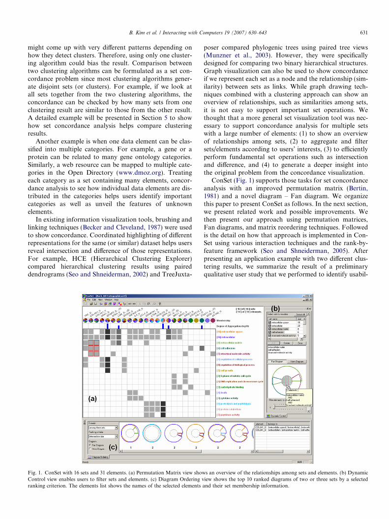
Fig. 1. ConSet with 16 sets and 31 elements. (a) Permutation Matrix view showControl view enables users to filter sets and elements. (c) Diagram Ordering vranking criterion. The elements list shows the names of the selected elements
poser compared phylogenic trees using paired tree views(Munzner et al., 2003). However, they were specificallydesigned for comparing two binary hierarchical structures.Graph visualization can also be used to show concordanceif we represent each set as a node and the relationship (sim-ilarity) between sets as links. While graph drawing tech-niques combined with a clustering approach can show anoverview of relationships, such as similarities among sets,it is not easy to support important set operations. Wethought that a more general set visualization tool was nec-essary to support concordance analysis for multiple setswith a large number of elements: (1) to show an overviewof relationships among sets, (2) to aggregate and filtersets/elements according to users’ interests, (3) to efficientlyperform fundamental set operations such as intersectionand difference, and (4) to generate a deeper insight intothe original problem from the concordance visualization.
ConSet (Fig. 1) supports those tasks for set concordanceanalysis with an improved permutation matrix (Bertin,1981) and a novel diagram – Fan diagram. We organizethis paper to present ConSet as follows. In the next section,we present related work and possible improvements. Wethen present our approach using permutation matrices,Fan diagrams, and matrix reordering techniques. Followedis the detail on how that approach is implemented in Con-Set using various interaction techniques and the rank-by-feature framework (Seo and Shneiderman, 2005). Afterpresenting an application example with two different clus-tering results, we summarize the result of a preliminaryqualitative user study that we performed to identify usabil-
s an overview of the relationships among sets and elements. (b) Dynamiciew shows the top 10 ranked diagrams of two or three sets by a selected
and their set membership information.

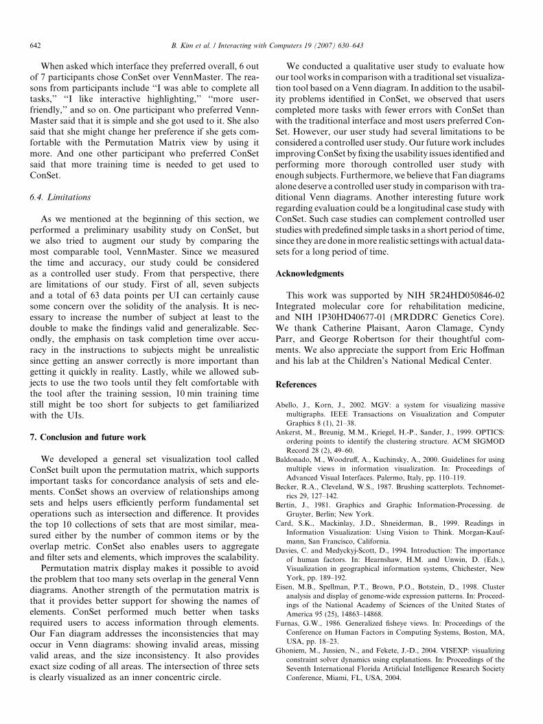
Fig. 2. VennMaster with the same dataset as in Fig. 1. We manuallyplaced labels of some sets using VennMaster.
632 B. Kim et al. / Interacting with Computers 19 (2007) 630–643
ity problems of ConSet. We conclude this paper with dis-cussion and future work.
2. Related work
Many classical information visualization techniqueshave been used to reveal concordances between datasets.For example, coordinated multiple views provide userswith ways to understand relationships between datasetsbehind the views (Baldonado et al., 2000). HCE showstwo hierarchical clustering results (or dendrograms) atonce. When users click on a branch of a dendrogram,HCE highlights the corresponding terminal nodes in thetwo dendrograms and shows the mapping between match-ing nodes with connecting lines (Seo and Shneiderman,2002). TreeJuxtaposer (Munzner et al., 2003) appliesbrushing and linking techniques as well as Focus+Contexttechniques (Furnas, 1986) to compare two large phylogenictrees with guaranteed visibility. Users can easily see the dis-cordance of the two hierarchical structures by examiningthe highlights and/or connections. Sometimes, the mainpurpose of selecting an internal node on a tree visualizationis to select a set of terminal nodes reachable from the inter-nal node. This problem can be generalized as a set visuali-zation problem and the main task can be checkingconcordance between sets.
Visualization tools to show results from multiple searchengines have been developed. MetaCrystal (Spoerri, 2004)based on the InfoCrystal layout (Spoerri, 1993) helps usersfuse together search results from different search engines. Itutilizes various visual features such as shape, size, color,proximity, and orientation to show the degree of overlapamong different search results. Overlapping search resultsare expected to provide a more comprehensive, relevant,and effective view on the subjects delivered by the searchterms. While these tools tackle the problems that can beinterpreted as set concordance problems, they are notdesigned for general set visualizations.
The Venn diagram is the de facto standard in set visual-ization. A Venn diagram is a special case of an Euler dia-gram. Venn diagrams, by definition, should have areas torepresent all possible combinations of sets regardless ofwhether that area is actually empty or not. This restrictionis loosened in Euler diagrams, where empty areas do nothave to appear. These diagrams are applied to variousproblems in bioinformatics, information retrieval, andinformation visualization. Some applications may requireadditional restrictions on how to draw Euler diagrams.For example, the shape of the contour should be a circleand more information such as cardinality is coded as size(area). It is important to mention that the terms Venn dia-gram and Euler diagram are often used in a confusing way.Euler diagrams, where each contour is a circle, are oftencalled Venn diagrams. Even though this is theoreticallynot correct, in this paper, we follow this general perceptionof Venn diagram and use the term Venn diagram for theEuler diagram, in which each contour is a circle.
Venn diagrams usually have three sets, but there havebeen many approaches to represent many more sets inVenn diagrams. Recently, Verroust and Viaud showed thatthere was a way to draw extended Euler diagrams for up to8 sets (Verroust and Viaud, 2004). VennMaster (Fig. 2) isto our knowledge the only visualization tool that showsan arbitrary number of sets in Venn diagrams, where eachset is represented as a polygon with a user-defined numberof edges (Kestler et al., 2005). When there are enoughedges, each set looks like a circle. The size of each polygonis proportional to the cardinality of the corresponding set.All properly size-coded polygons are placed in a way thatthe size of each intersection area is also proportional tothe number of elements in the intersection. Since the opti-mal size coding and layout determination are too expensiveto be solved in a pure analytical way, they resort to geneticalgorithm techniques.
VennMaster was developed to improve users’ interpreta-tion and visualization of the output of the bioinformaticstool GoMiner (Zeeberg et al., 2003). GoMiner enablesresearchers to query the gene ontology database(www.geneontology.org; comprehensive annotation ofgenes or gene products) for associated categories in a cellu-lar context. Given the fact that one gene can be associatedwith multiple gene ontology categories, the associationsbetween the vast amount of genes and categories couldbe very complex and their interpretation is a challengingtask. VennMaster translated this problem into a set-rela-tionship visualization problem by treating a gene ontologycategory as a set and a gene product as an element. Sincethis approach turned out to be very useful, VennMasterwas integrated into GoMiner. However, it has significantdrawbacks from an information visualization perspective:
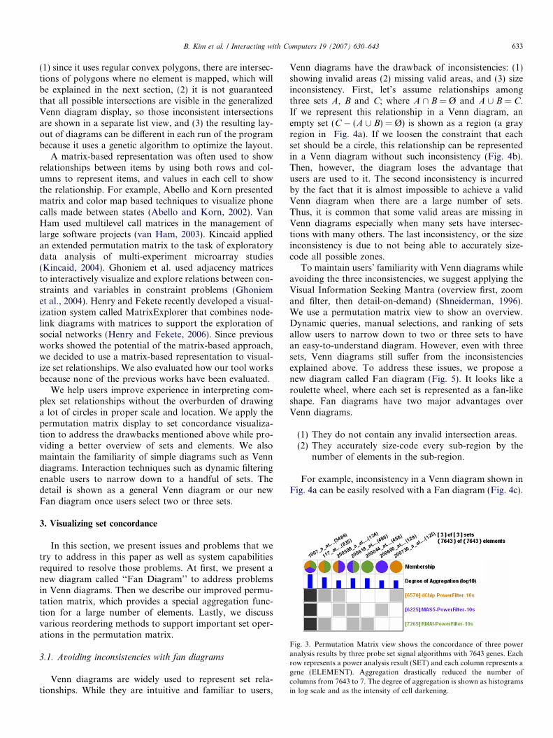
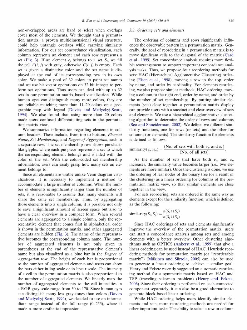
Fig. 3. Permutation Matrix view shows the concordance of three poweranalysis results by three probe set signal algorithms with 7643 genes. Eachrow represents a power analysis result (SET) and each column represents agene (ELEMENT). Aggregation drastically reduced the number ofcolumns from 7643 to 7. The degree of aggregation is shown as histogramsin log scale and as the intensity of cell darkening.
B. Kim et al. / Interacting with Computers 19 (2007) 630–643 633
(1) since it uses regular convex polygons, there are intersec-tions of polygons where no element is mapped, which willbe explained in the next section, (2) it is not guaranteedthat all possible intersections are visible in the generalizedVenn diagram display, so those inconsistent intersectionsare shown in a separate list view, and (3) the resulting lay-out of diagrams can be different in each run of the programbecause it uses a genetic algorithm to optimize the layout.
A matrix-based representation was often used to showrelationships between items by using both rows and col-umns to represent items, and values in each cell to showthe relationship. For example, Abello and Korn presentedmatrix and color map based techniques to visualize phonecalls made between states (Abello and Korn, 2002). VanHam used multilevel call matrices in the management oflarge software projects (van Ham, 2003). Kincaid appliedan extended permutation matrix to the task of exploratorydata analysis of multi-experiment microarray studies(Kincaid, 2004). Ghoniem et al. used adjacency matricesto interactively visualize and explore relations between con-straints and variables in constraint problems (Ghoniemet al., 2004). Henry and Fekete recently developed a visual-ization system called MatrixExplorer that combines node-link diagrams with matrices to support the exploration ofsocial networks (Henry and Fekete, 2006). Since previousworks showed the potential of the matrix-based approach,we decided to use a matrix-based representation to visual-ize set relationships. We also evaluated how our tool worksbecause none of the previous works have been evaluated.
We help users improve experience in interpreting com-plex set relationships without the overburden of drawinga lot of circles in proper scale and location. We apply thepermutation matrix display to set concordance visualiza-tion to address the drawbacks mentioned above while pro-viding a better overview of sets and elements. We alsomaintain the familiarity of simple diagrams such as Venndiagrams. Interaction techniques such as dynamic filteringenable users to narrow down to a handful of sets. Thedetail is shown as a general Venn diagram or our newFan diagram once users select two or three sets.
3. Visualizing set concordance
In this section, we present issues and problems that wetry to address in this paper as well as system capabilitiesrequired to resolve those problems. At first, we present anew diagram called ‘‘Fan Diagram’’ to address problemsin Venn diagrams. Then we describe our improved permu-tation matrix, which provides a special aggregation func-tion for a large number of elements. Lastly, we discussvarious reordering methods to support important set oper-ations in the permutation matrix.
3.1. Avoiding inconsistencies with fan diagrams
Venn diagrams are widely used to represent set rela-tionships. While they are intuitive and familiar to users,
Venn diagrams have the drawback of inconsistencies: (1)showing invalid areas (2) missing valid areas, and (3) sizeinconsistency. First, let’s assume relationships amongthree sets A, B and C; where A \ B = Ø and A [ B = C.If we represent this relationship in a Venn diagram, anempty set (C � (A [ B) = Ø) is shown as a region (a grayregion in Fig. 4a). If we loosen the constraint that eachset should be a circle, this relationship can be representedin a Venn diagram without such inconsistency (Fig. 4b).Then, however, the diagram loses the advantage thatusers are used to it. The second inconsistency is incurredby the fact that it is almost impossible to achieve a validVenn diagram when there are a large number of sets.Thus, it is common that some valid areas are missing inVenn diagrams especially when many sets have intersec-tions with many others. The last inconsistency, or the sizeinconsistency is due to not being able to accurately size-code all possible zones.
To maintain users’ familiarity with Venn diagrams whileavoiding the three inconsistencies, we suggest applying theVisual Information Seeking Mantra (overview first, zoomand filter, then detail-on-demand) (Shneiderman, 1996).We use a permutation matrix view to show an overview.Dynamic queries, manual selections, and ranking of setsallow users to narrow down to two or three sets to havean easy-to-understand diagram. However, even with threesets, Venn diagrams still suffer from the inconsistenciesexplained above. To address these issues, we propose anew diagram called Fan diagram (Fig. 5). It looks like aroulette wheel, where each set is represented as a fan-likeshape. Fan diagrams have two major advantages overVenn diagrams.
(1) They do not contain any invalid intersection areas.(2) They accurately size-code every sub-region by the
number of elements in the sub-region.
For example, inconsistency in a Venn diagram shown inFig. 4a can be easily resolved with a Fan diagram (Fig. 4c).

(a) Venn Diagram with inconsistency (b) Euler Diagram without inconsistency
(c) Fan Diagram without inconsistency
A B
C
A B
C
C
Fig. 4. Inconsistency of Venn Diagrams. (a) and (b) show the same setrelationships (A \ B = Ø & A [ B = C). There is no element in the grayarea at (a), but there is no way to avoid this inconsistency in VennDiagrams. By loosening the constraint that each set should be a circle, it ispossible to avoid the inconsistency in Euler Diagrams (b) and in FanDiagrams (c).
Fig. 5. Fan Diagrams for two sets (a) and for three sets (b). Each set isexactly size-coded by the number of elements in the set. In (b), the size ofthe inner circle clearly visualizes the amount of intersection of three sets.
634 B. Kim et al. / Interacting with Computers 19 (2007) 630–643
We achieve the accurate size coding as follows. For twosets A and B, a circle represents the union (A [ B). The cen-ter angle of the fan for A is calculated as follows:
hA ¼ 2p� nðAÞnðA [ BÞ ;
where n(A) is the cardinality of set A. The center angle ofthe fan for B is calculated in the same way. If the intersec-tion (A \ B) is not empty, the two fans for A and B overlap.The center angle for the overlapping fan is calculated asfollows:
hðA\BÞ ¼ 2p� nðA \ BÞnðA [ BÞ :
Therefore, all regions split by the fans of the sets A andB are accurately size-coded.
For three sets A, B and C, a circle represents the union(A [ B [ C). The intersection (A \ B \ C) is represented asa smaller concentric circle. If the outer circle has the radiusof R, the radius of the inner circle (r) is calculated asfollows:
nðA \ B \ CÞnðA [ B [ CÞ ¼
pr2
pR2) r ¼
ffiffiffiffiffiffiffiffiffiffiffiffiffiffiffiffiffiffiffiffiffiffiffiffiffiffinðA \ B \ CÞnðA [ B [ CÞ
s� R:
Thus, the area of the center circle for the set (A \ B \ C)is exactly proportional to the cardinality of (A \ B \ C). Adoughnut-shaped region between the inner and outer cir-cles represents the set ((A [ B [ C) � (A \ B \ C)). In thedoughnut-shaped region, there are three doughnut seg-ments for the three sets (A � (A \ B \ C)),(B � (A \ B \ C)), and (C � (A \ B \ C)). Each doughnutsegment has a center angle in proportion to the cardinalityof the corresponding set. The center angle of the doughnutsegment for the set (A � (A \ B \ C)) is calculated asfollows:
hðA�ðA\B\CÞÞ ¼ 2p� nðAÞ � nðA \ B \ CÞnðA [ B [ CÞ � nðA \ B \ CÞ :
Thus, we can accurately size-code all regions split by theinner and outer circles and three doughnut segments.
While Fan diagrams have advantages such as no incon-sistencies and accurate size-coding as shown above, thereare some problems with this approach. For example, circlesand doughnut-shape regions are, in theory, drawn within acircle and a part of some outer arcs can overlap each other.Thus, sometimes it is difficult to know the exact bounds ofa region. This problem can be attenuated by drawingregion boundaries with a tiny displacement as shown inFig. 5.
3.2. Untangling overlaps with permutation matrices
While significant overlaps of many sets in the generalVenn diagram visualization tool clearly show high similar-ity among sets, those overlaps make it difficult to see thedetails on set memberships of the elements. Moreover,
B. Kim et al. / Interacting with Computers 19 (2007) 630–643 635
non-overlapped areas are hard to select when overlapscover most of the elements. We thought that a permuta-tion matrix, a proven multidimensional visual structure,could help untangle overlaps while carrying similarityinformation. For our set concordance visualization, eachcolumn represents an element and each row represents aset (Fig. 3). If an element ej belongs to a set Si, we fillthe cell C(i, j) with gray, otherwise C(i, j) is empty. Eachset is given a distinctive color and the set name is dis-played at the end of its corresponding row in its owncolor. We make a pool of 32 colors to paint set namesand we use bit vector operations on 32 bit integer to per-form set operations. Thus users can deal with up to 32sets in our permutation matrix based visualization. Whilehuman eyes can distinguish many more colors, they arenot reliable matching more than 11–20 colors on a geo-graphic map with legend (Davies and Medyckyj-Scott,1994). We also found that using more than 20 colorsmade users confused differentiating sets in the permuta-tion matrix view.
We summarize information regarding elements in col-umn headers. These include, from top to bottom, ElementName, Set Membership, and Degree of Aggregation, each ina separate row. The set membership row shows pie-chart-like glyphs, where each pie piece represents a set to whichthe corresponding element belongs and is filled with thecolor of the set. With the color-coded set membershipinformation, users can easily grasp how many sets an ele-ment belongs to.
Since all elements are visible unlike Venn diagram visu-alizations, it is necessary to implement a method toaccommodate a large number of columns. When the num-ber of elements is significantly larger than the number ofsets, it is reasonable to assume that many elements willshare the same set membership. Thus, by aggregatingthose elements into a single column, it is possible not onlyto save a significant amount of screen space but also tohave a clear overview in a compact form. When severalelements are aggregated to a single column, only the rep-resentative element that comes first in alphabetical orderis shown in the permutation matrix, and other aggregatedelements are hidden (Fig. 3). The name of the representa-tive becomes the corresponding column name. The num-ber of aggregated elements is not only given inparentheses at the end of the representative element’sname but also visualized as a blue bar in the Degree ofAggregation row. The height of each bar is proportionalto the number of aggregated elements and users can showthe bars either in log scale or in linear scale. The intensityof a cell in the permutation matrix is also proportional tothe number of aggregated elements. We linearly map thenumber of aggregated elements to the cell intensities ina RGB gray scale range from 50 to 170. Since human eyescan distinguish many less gray tones than colors (Daviesand Medyckyj-Scott, 1994), we decided to use an interme-diate range instead of the full range (0–255), where itmade a more aesthetic impression.
3.3. Ordering sets and elements
The ordering of columns and rows significantly influ-ences the observable pattern in a permutation matrix. Gen-erally, the goal of reordering in a permutation matrix is tomove significant cells to the diagonal of the matrix (Cardet al., 1999). Set concordance analysis requires more flexi-ble rearrangement to support important concordance anal-ysis tasks. Thus, we propose four reordering methods forsets: HAC (Hierarchical Agglomerative Clustering) order-ing (Eisen et al., 1998), moving a row to the top, orderby name, and order by cardinality. For elements reorder-ing, we also propose similar methods: HAC ordering, mov-ing a column to the right end, order by name, and order bythe number of set memberships. By putting similar ele-ments (sets) close together, a permutation matrix displaycan provide users with a succinct and clear overview of setsand elements. We use a hierarchical agglomerative cluster-ing algorithm to determine the order of rows and columns(Seo and Shneiderman, 2002). We define two different sim-ilarity functions, one for rows (or sets) and the other forcolumns (or elements). The similarity function for elementsis defined as follows:
similarityðem; enÞ ¼ðNo: of sets with both em and enÞ
ðNo: of all setsÞ :
As the number of sets that have both em and en
increases, the similarity value becomes larger (i.e., two ele-ments are more similar). Once the clustering is done, we usethe ordering of leaf nodes of the binary tree (or a result ofthe clustering) as a linear ordering for columns of the per-mutation matrix view, so that similar elements are closetogether in the view.
For sets reordering, sets are ordered in the same way aselements except for the similarity function, which is definedas the following:
similarityðSi; SjÞ ¼nðSi \ SjÞnðSi [ SjÞ
:
Since HAC orderings of sets and elements significantlyimprove the overview of the permutation matrix, userscan start a concordance analysis among sets and amongelements with a better overview. Other clustering algo-rithms such as OPTICS (Ankerst et al., 1999) that give alinear ordering can be used instead of HAC. Heuristic reor-dering methods for permutation matrix (or ‘‘reorderablematrix’’) (Makinen and Siirtola, 2005) can also be usedto generate a linear ordering to achieve a similar goal.Henry and Fekete recently suggested an automatic reorder-ing method for a symmetric matrix based on HAC andTSP (traveling salesman problem) (Henry and Fekete,2006). Since their ordering is performed on each connectedcomponent separately, it can also be a good alternative togenerate block-based linear ordering.
While HAC ordering helps users identify similar ele-ments and sets, more reordering methods are needed forother important tasks. The ability to select a row or column

636 B. Kim et al. / Interacting with Computers 19 (2007) 630–643
and move the row to the top or the column to the right endcan help users efficiently figure out where the elementbelongs or what elements the set has, respectively. Orderingby names facilitate users’ search on a set (or element) with aspecific name. Ordering by cardinality (or the number ofset memberships) speeds up frequent queries based on thequantity.
4. ConSet interface
ConSet enables users to examine the concordance of setsvisually and interactively. ConSet consists of three views:Permutation Matrix view, Dynamic Control view, andDiagram Ordering view (Fig. 1). The Permutation Matrixview shows an overview of all the visible sets. The DynamicControl view on the right contains the sets list, the diagramarea, and the filter controls. The Diagram Ordering view atthe bottom shows the top 10 ranked diagrams. The ele-ments list in the Diagram Ordering view shows the nameof the selected elements and their set membershipinformation.
4.1. Interaction, brushing and linking for sets and elements
ConSet, by default, rearranges the sets by HAC order-ing. Since this places sets with more common elements clo-ser to each other, users can easily find similar sets. Inaddition, the sets can also be ordered by their name andcardinality either by clicking on column-headers of the setslist in the Dynamic Control view or by using a pop-upmenu on the Permutation Matrix view.
ConSet also provides four element reordering methods.When users right-click on a column header, a pop-up menufor element reordering shows up. Selecting the first menu
Fig. 6. When users mouse over on a column header for an element, names of thnames.
item (‘‘move to the right end’’), users can move the corre-sponding element to the right end of the column. Thisenables users to easily compare several elements of interestby putting them side by side and right next to the setnames. Elements can also be sorted by three criteria; alpha-betically, by the number of set memberships, and by HACordering.
When users move the mouse over a column header of anelement, ConSet highlights the corresponding column witha greenish-gray rectangle. In addition, the names of setsthat do not contain that element are grayed out (Fig. 6).This helps users identify all the sets that an element belongsto. The name of the element is also shown in the elementslist in the Diagram Ordering view along with their set mem-bership information. If the column is aggregated, thenames of all the aggregated elements are shown.
Similarly, if users move the mouse over a set name, thecorresponding row is highlighted with a rectangle in theset’s own color. The names of elements that do not belongto the highlighted set are grayed out (Fig. 7). The names ofall the elements of the highlighted set come in the elementslist. If users move the mouse over a gray-filled cell C(i, j) inthe Permutation Matrix view, the cell is highlighted by ared rectangle with the j-th element’s name highlighted inred and the i-th set’s name underlined in red. The nameof the j-th element and the names of its aggregated, ifany, elements are shown in the elements list.
4.2. Dynamic filtering of sets and elements
ConSet, by default, shows the names of all the sets in thesets list in the Dynamic Control view (Fig. 1b). It allowsusers to change the visibility of sets in the PermutationMatrix view. For example, if users check (or uncheck) a
e sets (rows) containing the element are highlighted by diluting all other set

Fig. 7. When users mouse over on a set name, names of all elements in the set are highlighted by diluting all other element names.
B. Kim et al. / Interacting with Computers 19 (2007) 630–643 637
check box right before a set name in the sets list, ConSetshows (or hides) the set in the Permutation Matrix view.This enables users to manually filter out uninteresting setsto reduce the number of sets to examine. For example, thenumber of sets was reduced from 21 (Fig. 8a) to 10(Fig. 8b) when we hid the sets whose cardinality is less than30. This task can be easily done after sorting the list by the‘‘size’’ column. The aggregation of elements is based ontheir memberships to the visible sets, not to all the sets.So, whenever the visibility of sets changes, ConSet re-com-putes the aggregation of elements. In addition, ConSetreassigns the set colors. It was because we do not expectusers to remember the color for each set. We use colorsto help users differentiate sets.
ConSet also enables users to dynamically filter elementsto be shown in the Permutation Matrix view. For example,the ‘‘Filter elements to show’’ slider control with a value t
filters to show only elements that belong to at least t sets.Filtered elements or sets can either be removed from orbe grayed out in the Permutation Matrix view. The numberof elements was further reduced from 133 (Fig. 8b) to 24(Fig. 8c) when we filtered out the elements that do notbelong to at least 5 sets.
4.3. Showing relationships between sets
ConSet visualizes the relationship of two or three sets inthe diagram area in the Dynamic Control view. Users canadd up to three sets into the diagram area from the sets list.When users select a set in the sets list, the corresponding setis highlighted in the Permutation Matrix view while thenames of all the elements of the selected set are shown inthe elements list (Fig. 1c). When they click the ‘‘Add’’ but-ton at the bottom of the sets list, selected sets are added tothe diagram area. The names of added sets are displayed in
the upper window of the diagram area and a diagram oftheir relationship is drawn in the lower window of the dia-gram area. Users can remove sets from the diagram area byclicking the ‘‘Delete’’ button after selecting them from theupper window. They can also clear the diagram area byclicking the ‘‘Clear’’ button.
When users move the mouse over a set in a Venn dia-gram or a Fan diagram, a tooltip appears to show its nameand cardinality. At the same time, the set is highlighted inthe Permutation Matrix view and the elements informationin the set is shown in the elements list. When users movethe mouse over a region for an intersection, the elementsin the intersection are highlighted in the PermutationMatrix view and their information appears in the elementslist. If users click on a region in a diagram, the correspond-ing region is selected and the selection is toggled on anotherclick. This enables users to examine all elements in the ele-ments list when scrolling is required.
4.4. Diagram ordering using the rank-by-feature framework
We applied the rank-by-feature framework (Seo andShneiderman, 2005) to ConSet. The Diagram Orderingview shows the top 10 diagrams ranked by some criterion(Fig. 1c). From the ‘‘Domain’’ combo-box at the top leftcorner of the view, users can select the ordering of dia-grams between two or among three sets. Two ranking cri-teria are provided in the ‘‘Ranking criteria’’ combo-box.The criterion ‘‘intersection size’’ ranks diagrams by the sizeof the intersection, and the criterion ‘‘overlap metric’’orders diagrams by the ratio of the intersection set size tothe union set size. This helps users easily capture a collec-tion of important sets that meets the ranking criteria. Userscan see each of the top 10 ranked diagrams in two ways: asa Venn diagram and a Fan diagram.

(a) Original data
(b) Filtering out sets whose cardinality is less than 30 from (a)
(c) Filtering out elements that belong to fewer than 5 sets from (b)
Fig. 8. Filtering of sets and elements with human muscular dystrophy dataset of 21 sets and 163 elements.
638 B. Kim et al. / Interacting with Computers 19 (2007) 630–643
5. Application example: Clusters as sets
We extended ConSet to help users compare clusteringresults by adding a special functionality. An output of aclustering algorithm is in most cases a group of disjointclusters, each of which is treated as a set in ConSet. ConSetarranges sets to form several groups where a set from oneclustering result is put together with one or more similarsets from the other clustering result.
In the beginning, among all clusters of two differentclustering results, say CR1 and CR2, a cluster (sayc_anchor) with the most elements is selected as an anchorfor a new group. For example, let’s assume that the firstanchor cluster c_anchor is from the clustering result CR1.
Then the clusters from CR2, all of whose elements belongto c_anchor are added to the group. A cluster from CR2
which is not a subset of c_anchor but has more intersec-tions with c_anchor than with any other clusters in CR1
is also added to the group. After completing a group withthe current anchor cluster c_anchor, a new group formationbegins by finding a new anchor cluster from remainingclusters with the most elements.
ConSet arranges these groups row by row and groupsare separated by bold horizontal lines. ConSet adds a spe-cial row called Cluster Concordance to the column header(Fig. 9). Each matching element within a group is projectedonto the Cluster Concordance row. If an element is notmatched within its group, the corresponding cell is left

Fig. 9. Clustering results comparison when two methods produceidentical clusters. The Cluster Concordance row consists of all dark redcells since each element (or aggregated elements) is matched in twoclustering results with the same cardinality. Gray-shaded cells are perfectlyaligned along the diagonal line.
Fig. 10. Clustering results comparison (HCLUSTER: Hierarchical Clus-tering, KCLUSTER: K-means Clustering) with 77 breakfast cereals data.Two clustering results are quite consistent with each other because (1) theCluster Concordance row is almost filled with dark red cells except for theempty cell for ‘‘Multi_Grain_Cheerios’’ and four other thin red cells, and(2) gray-filled cells are well aligned, though not perfectly, along thediagonal line.
B. Kim et al. / Interacting with Computers 19 (2007) 630–643 639
unfilled. If it is matched, the cell is filled in red and it iscolor-coded by the ratio of the cardinalities of the two sets,one from each clustering result, that have the matching ele-ment. This color-coding is intended to give an appropriatepenalty to the cases where one big cluster from one cluster-ing result overlaps with several small clusters from theother clustering result, which is a less concordance.
ConSet allows users to visually examine concordancebetween two clustering results by skimming though theCluster Concordance row. As shown in Fig. 9, if the twoclustering results are identical (or completely concordant),all the cells on the Cluster Concordance row should bedark red. In addition, all gray-filled cells in the permutationmatrix should be aligned along the diagonal line. Cellsdeviating from the diagonal line indicate discordant ele-ments. Through these two display measures ConSetenables users to examine the concordance between twoclustering results.
Figs. 10 and 11 show the concordance between the hier-archical clustering result and K-means clustering resultwith Euclidean distance measure with 77 breakfast cerealsdata and with Census data of 224 US eastern counties nearMD, respectively. Many dark red cells at the Cluster Con-
cordance row in Fig. 10 indicate that those two results arevery concordant with each other despite an outlier, ‘‘Mul-
tigrain_Cheerios,’’ which does not belong to any matchingclusters pair. On the other hand, Fig. 11 shows that, over-all, the two clustering results for the census dataset are notso concordant even though there are several strong match-ing counties groups with dark red cells on the Cluster Con-cordance row. Gray cells below the diagonal line are theones that break down the concordance between two clus-tering results.
The same approach can also help users identify statisti-cal associations between categorical variables or between aclustering result and a categorical variable. Users can par-tition a dataset into disjoint sets according to a categoricalvariable. For example, the census data for all US countiescan be partitioned into disjoint sets according to categori-cal variables, such as ‘‘poverty level’’ and ‘‘educationlevel.’’ Since an integer- or real-type variable can be con-verted to a categorical variable by a simple binning, ConSetcan be used to visualize statistical associations between acategorical variable and an integer- or real-type variable.
In summary, clustering results comparison in ConSetprovides an overview where users can see elements as wellas sets, together with a compact one-dimensional overview(the Cluster Concordance row) for the comparison. Wenote here that there could be a simple alternative to ourapproach. As presented in various information visualiza-

Fig. 11. Clustering results comparison (HCLUSTER: Hierarchical Clustering, KCLUSTER: K-means Clustering) with Census data of 224 US easterncounties in or near Maryland. These two clustering results are not very consistent with each other. Gray cells deviating from the diagonal line withcorresponding empty cells in the Cluster Concordance row are the ones that differentiate the two clustering results.
640 B. Kim et al. / Interacting with Computers 19 (2007) 630–643
tion systems (Guo, 2003; Seo and Shneiderman, 2005), wecan implement a set–set matrix to show the correlationbetween sets where clusters from one algorithm arearranged in row and clusters from the other algorithmare arranged in column. We can color-code each cell bythe number of common elements. Then users can checkthe overview of the concordance of the two clusteringresults on the matrix.
6. ConSet evaluation
We conducted a qualitative usability study to under-stand how well ConSet works and to identify any usabilityissues. During individual test sessions, the experimentertook notes on usability issues that participants experiencedduring the walk through of the system. We compared Con-Set to VennMaster (Fig. 2) to augment our usability studysince VennMaster is the only comparable tool to ConSet.We measured the time to complete each task using a stop-watch and counted the number of wrong answers, time-outs, and give-ups. We have to note that the number ofsubjects is too small to perform a statistical analysis on
those measurements, thus we only report on raw numberswithout referring to statistical significance.
6.1. Data and participants
We used two similar datasets exported from GoMinerfor this user study. Each GoMiner dataset consists oftwo text files, the category summary file and the gene sum-mary file. ConSet combines the two text files to generatesets of genes (gene ontology categories), as VennMasterdoes. One dataset had 16 sets and 31 elements and theother had 23 sets and 28 elements.
We recruited 8 biologists (5 males and 3 females) includ-ing 1 male pilot subject. They had used neither VennMasternor ConSet before this study. The pilot data is not includedin the reporting of the experimental task data because theinterfaces and tasks were improved after the pilot.
6.2. Procedure and tasks
Each participant used both interfaces; interface orderwas counterbalanced. Participants first received training

Average Completion Times
0
20
40
60
80
100
120
140
160
1 2 3 4 5 6 7 8 9
Task
Tim
e (s
eco
nd
s)
ConSet VennMaster
Fig. 12. Average task completion times. Seven subjects performed ninetasks with ConSet and VennMaster. No one could complete tasks 3, 4, and5 within the 3 min time limit with VennMaster while 7, 6, and 5participants answered correctly with ConSet, respectively. The error barrepresents the standard deviation.
B. Kim et al. / Interacting with Computers 19 (2007) 630–643 641
on the first interface and were allowed to play with the pro-gram to learn the basic features. They were allowed to askquestions during the training. For each interface, partici-pants spent about 10 min on average. Next, they wereasked to conduct 9 tasks as quickly as they could. Eachtask had a 3-min time limit and participants were allowedto give up a task at any time. After a short break, the sameprocedure was repeated with the second interface. Prefer-ences, comments, and suggestions were collected duringdebriefing. Each session lasted 38 min on average.
To evaluate our tool with realistic tasks, we chose thetasks through a semester-long task analysis with biologists,who were often required to do concordance analyses fortheir research projects in a large biology laboratory. Afterperforming a genome wide expression profiling project or aproteomics project, biologists usually want to know whatcellular components or biological processes in the geneontology database are involved in their data. In additionto identifying which genes or proteins are associated witha specific gene ontology term, they need to figure out asso-ciations with more than two gene ontology terms. Thisrequires biologists to go through long manual tasks usingGoMiner, one of the most commonly used tools.
The list of tasks follows
1. What are the top three biggest sets?2. What is the size of the biggest set?3. What are the top three elements that belong to the most
sets?4. Name the sets that have a given element.5. Name the sets that have two given elements.6. What are three sets that share the most elements?7. Name the elements in the intersection of two sets.8. Name the elements in the intersection of three sets.9. Name the elements that are in A but not in B.
6.3. Results
6.3.1. Usability issues
We observed several usability issues in ConSet thatneeded to be addressed. There was clear user frustrationaround the selection of sets in the Dynamic Control viewon the right. Three participants had difficulty choosing setsto show in the diagram view. Even though the check box infront of the set name is to filter sets to show in the mainPermutation Matrix view, some of the participants thoughtthat the checked sets would be added into the diagramarea.
Another issue is that there is no way to select the differ-ence area (A � B). This is because single click behaves dif-ferently depending on where users select; click on theintersection area selects the intersection but click on the dif-ference area selects the entire set. To address this issue, wecan introduce a more consistent interaction style to selectareas in the Venn and Fan diagrams. First, a single clickshould select the smallest containing area. So, if users click
on the difference or intersection area, the difference orintersection will be selected. Second, users should be ableto combine two areas by clicking an area with the controlkey. Lastly, a double click on an area should select allthe sets that contain the area. So, users can select an entireset by double clicking on the difference area.
There is no efficient way to find elements/sets with theirnames. Even though ConSet enables users to sort elements/sets by their name, four participants did not use the sortfeature and sequentially scanned element names for task4. This would be a bigger problem when the number of ele-ments is large. We can address this issue by providing asimple search on the element and set name.
The familiarity with the traditional Venn diagram makesit hard for users to utilize the new Fan diagram. In addi-tion, the tasks used in the study were easy enough to becompleted with the Venn diagrams. However, we believethat instantaneous highlighting of the area on mouse-overalong with informative tooltip text helped users understandhow to interpret the diagram. It was encouraging toobserve that some users utilized the Fan diagram after ashort tutorial.
6.3.2. Error, task times, and preferences
Participants with ConSet completed more tasks withfewer errors. Out of 63 questions across participants, whilethere were only 6 time-outs and 5 incorrect answers withConSet, there were 30 time-outs and 10 incorrect answerswith VennMaster. With VennMaster no one could com-plete task 3, 4, and 5 within the 3 min time limit. However,7, 6, and 5 participants answered correctly with ConSet fortask 3, 4, and 5, respectively. We believe this is becauseConSet provides good support for showing the names ofelements. For task 6, two participants forgot how to usediagram ordering in ConSet. Two participants were notable to complete for task 9 and one for task 1 and 5 withConSet. Fig. 12 shows average task completion times(time-outs were not included in the task time analysis).
642 B. Kim et al. / Interacting with Computers 19 (2007) 630–643
When asked which interface they preferred overall, 6 outof 7 participants chose ConSet over VennMaster. The rea-sons from participants include ‘‘I was able to complete alltasks,’’ ‘‘I like interactive highlighting,’’ ‘‘more user-friendly,’’ and so on. One participant who preferred Venn-Master said that it is simple and she got used to it. She alsosaid that she might change her preference if she gets com-fortable with the Permutation Matrix view by using itmore. And one other participant who preferred ConSetsaid that more training time is needed to get used toConSet.
6.4. Limitations
As we mentioned at the beginning of this section, weperformed a preliminary usability study on ConSet, butwe also tried to augment our study by comparing themost comparable tool, VennMaster. Since we measuredthe time and accuracy, our study could be consideredas a controlled user study. From that perspective, thereare limitations of our study. First of all, seven subjectsand a total of 63 data points per UI can certainly causesome concern over the solidity of the analysis. It is nec-essary to increase the number of subject at least to thedouble to make the findings valid and generalizable. Sec-ondly, the emphasis on task completion time over accu-racy in the instructions to subjects might be unrealisticsince getting an answer correctly is more important thangetting it quickly in reality. Lastly, while we allowed sub-jects to use the two tools until they felt comfortable withthe tool after the training session, 10 min training timestill might be too short for subjects to get familiarizedwith the UIs.
7. Conclusion and future work
We developed a general set visualization tool calledConSet built upon the permutation matrix, which supportsimportant tasks for concordance analysis of sets and ele-ments. ConSet shows an overview of relationships amongsets and helps users efficiently perform fundamental setoperations such as intersection and difference. It providesthe top 10 collections of sets that are most similar, mea-sured either by the number of common items or by theoverlap metric. ConSet also enables users to aggregateand filter sets and elements, which improves the scalability.
Permutation matrix display makes it possible to avoidthe problem that too many sets overlap in the general Venndiagrams. Another strength of the permutation matrix isthat it provides better support for showing the names ofelements. ConSet performed much better when tasksrequired users to access information through elements.Our Fan diagram addresses the inconsistencies that mayoccur in Venn diagrams: showing invalid areas, missingvalid areas, and the size inconsistency. It also providesexact size coding of all areas. The intersection of three setsis clearly visualized as an inner concentric circle.
We conducted a qualitative user study to evaluate howour tool works in comparison with a traditional set visualiza-tion tool based on a Venn diagram. In addition to the usabil-ity problems identified in ConSet, we observed that userscompleted more tasks with fewer errors with ConSet thanwith the traditional interface and most users preferred Con-Set. However, our user study had several limitations to beconsidered a controlled user study. Our future work includesimproving ConSet by fixing the usability issues identified andperforming more thorough controlled user study withenough subjects. Furthermore, we believe that Fan diagramsalone deserve a controlled user study in comparison with tra-ditional Venn diagrams. Another interesting future workregarding evaluation could be a longitudinal case study withConSet. Such case studies can complement controlled userstudies with predefined simple tasks in a short period of time,since they are done in more realistic settings with actual data-sets for a long period of time.
Acknowledgments
This work was supported by NIH 5R24HD050846-02Integrated molecular core for rehabilitation medicine,and NIH 1P30HD40677-01 (MRDDRC Genetics Core).We thank Catherine Plaisant, Aaron Clamage, CyndyParr, and George Robertson for their thoughtful com-ments. We also appreciate the support from Eric Hoffmanand his lab at the Children’s National Medical Center.
References
Abello, J., Korn, J., 2002. MGV: a system for visualizing massivemultigraphs. IEEE Transactions on Visualization and ComputerGraphics 8 (1), 21–38.
Ankerst, M., Breunig, M.M., Kriegel, H.-P., Sander, J., 1999. OPTICS:ordering points to identify the clustering structure. ACM SIGMODRecord 28 (2), 49–60.
Baldonado, M., Woodruff, A., Kuchinsky, A., 2000. Guidelines for usingmultiple views in information visualization. In: Proceedings ofAdvanced Visual Interfaces. Palermo, Italy, pp. 110–119.
Becker, R.A., Cleveland, W.S., 1987. Brushing scatterplots. Technomet-rics 29, 127–142.
Bertin, J., 1981. Graphics and Graphic Information-Processing. deGruyter, Berlin; New York.
Card, S.K., Mackinlay, J.D., Shneiderman, B., 1999. Readings inInformation Visualization: Using Vision to Think. Morgan-Kauf-mann, San Francisco, California.
Davies, C. and Medyckyj-Scott, D., 1994. Introduction: The importanceof human factors. In: Hearnshaw, H.M. and Unwin, D. (Eds.),Visualization in geographical information systems, Chichester, NewYork, pp. 189–192.
Eisen, M.B., Spellman, P.T., Brown, P.O., Botstein, D., 1998. Clusteranalysis and display of genome-wide expression patterns. In: Proceed-ings of the National Academy of Sciences of the United States ofAmerica 95 (25), 14863–14868.
Furnas, G.W., 1986. Generalized fisheye views. In: Proceedings of theConference on Human Factors in Computing Systems, Boston, MA,USA, pp. 18–23.
Ghoniem, M., Jussien, N., and Fekete, J.-D., 2004. VISEXP: visualizingconstraint solver dynamics using explanations. In: Proceedings of theSeventh International Florida Artificial Intelligence Research SocietyConference, Miami, FL, USA, 2004.
B. Kim et al. / Interacting with Computers 19 (2007) 630–643 643
Guo, D., 2003. Coordinating computational and visual approaches forinteractive feature selection and multivariate clustering. InformationVisualization 2, 232–246.
Henry, N., Fekete, J.-D., 2006. MatrixExplorer: a dual-representationsystem to explore social networks. IEEE Transactions on Visualizationand Computer Graphics 12 (5), 677–684.
Kestler, H.A., Muller, A., Gress, T.M., Buchholz, M., 2005. GeneralizedVenn Diagrams: a new method of visualizing complex genetic setrelations. Bioinformatics 21 (8), 1592–1595.
Kincaid, R., 2004. VistaClara: an interactive visualization for exploratoryanalysis of DNA microarrays. In: Proceedings of the ACM Sympo-sium on Applied Computing, Nicosia, Cyprus, 2004, pp. 167–174.
Makinen, E., Siirtola, H., 2005. The barycenter heuristic and thereorderable matrix. Informatica 29 (3), 357–363.
Munzner, T., Guimbretiere, F., Tasiran, S., Zhang, L., Zhou, Y., 2003.TreeJuxtaposer: scalable tree comparison using Focus+Context withguaranteed visibility. ACM Transactions on Graphics 22 (3), 453–462.
Seo, J., Gordish-Dressman, H., Hoffman, E.P., 2006. An interactive poweranalysis tool for microarray hypothesis testing and generation.Bioinformatics 22 (7), 808–814.
Seo, J., Shneiderman, B., 2002. Interactively exploring hierarchicalclustering results. Computer 35 (7), 80–86.
Seo, J., Shneiderman, B., 2005. A rank-by-feature framework forinteractive exploration of multidimensional data. Information Visual-ization 4 (2), 99–113.
Shneiderman, B., 1996. The eyes have it: a task by data type taxonomy forinformation visualizations. In: Proceedings of IEEE Symposium onVisual Languages, Boulder, CO, USA, 1996, pp. 336–343.
Spoerri, A., 1993. InfoCrystal: a visual tool for information retrieval. In:Proceedings of the IEEE Visualization Conference, San Jose, CA,USA, pp. 150–157.
Spoerri, A., 2004. MetaCrystal: Visualizing the degree of overlap betweensearch engines. In: Proceedings of the ACM International World WideWeb Conference, New York, NY, USA, pp. 378–379.
van Ham, F., 2003. Using multilevel call matrices in large softwareprojects. In: Proceedings of IEEE Symposium on Information Visu-alization, Seattle, WA, USA, pp. 227–232.
Verroust, A., Viaud, M.-L., 2004. Ensuring the drawability of extendedeuler diagrams for up to 8 sets. Lecture Notes in Computer Science2980, 128–141.
Zeeberg, B., Feng, W., Wang, G., Wang, M., Fojo, A., Sunshine, M.,Narasimhan, S., Kane, D., Reinhold, W., Lababidi, S., Bussey, K.,Riss, J., Barrett, J., Weinstein, J., 2003. GoMiner: a resource forbiological interpretation of genomic and proteomic data. GenomeBiology 4 (4), R28.