1
Visual vocabulary Designing with data There are so many ways to visualise data - how do we know which one to pick? Use the categories across the top to decide which data relationship is most important in your story, then look at the different types of chart within the category to form some initial ideas about what might work best. This list is not meant to be exhaustive, nor a wizard, but is a useful starting point for making informative and meaningful data visualisations. FT graphic: Alan Smith; Chris Campbell; Ian Bott; Liz Faunce; Graham Parrish; Billy Ehrenberg; Paul McCallum; Martin Stabe Inspired by the Graphic Continuum by Jon Schwabish and Severino Ribecca Flow Show the reader volumes or intensity of movement between two or more states or conditions. These might be logical sequences or geographical locations. Example FT uses Movement of funds, trade, migrants, lawsuits, information; relationship graphs. Waterfall Sankey Chord Network Waterfall Sankey Chord Network Spatial Aside from locator maps only used when precise locations or geographical patterns in data are more important to the reader than anything else. Example FT uses Population density, natural resource locations, natural disaster risk/impact, catchment areas, variation in election results Basic choropleth (rate/ratio) Scaled cartogram (value) Flow map Contour map Equalised cartogram Proportional symbol (count/magnitde) Change over Time Give emphasis to changing trends. These can be short (intra-day) movements or extended series traversing decades or centuries: Choosing the correct time period is important to provide suitable context for the reader. Example FT uses Share price movements, economic time series Column Fan chart (projections) Area chart Line + column Stock price Slope Calendar heatmap Line Priestley timeline Circle timeline Connected scatterplot Vertical timeline Magnitude Show size comparisons. These can be relative (just being able to see larger/bigger) or absolute (need to see fine differences). Usually these show a ‘counted’ number (for example, barrels, dollars or people) rather than a calculated rate or per cent. Example FT uses Commodity production, market capitalisation Paired column Paired bar Bar Column Deviation Emphasise variations (+/-) from a fixed reference point. Typically the reference point is zero but it can also be a target or a long-term average. Can also be used to show sentiment (positive/neutral/negative). Example FT uses Trade surplus/deficit, climate change Diverging bar Diverging stacked bar Surplus/deficit filled line Spine chart The standard approach for putting data on a map – should always be rates rather than totals and use a sensible base geography. The standard way to compare the size of things. Must always start at 0 on the axis. Columns work well for showing change over time - but usually best with only one series of data at a time. A good way of showing the relationship over time between an amount (columns) and a rate (line). Usually focused on day-to-day activity, these charts show opening/closing and high/low points of each day. Good for showing changing data as long as the data can be simplified into 2 or 3 points without missing a key part of story. Use with care – these are good at showing changes to total, but seeing change in components can be very difficult. Use to show the uncertainty in future projections - usually this grows the further forward to projection. A good way of showing changing data for two variables whenever there is a relatively clear pattern of progression. A great way of showing temporal patterns (daily, weekly, monthly) – at the expense of showing precision in quantity. Great when date and duration are key elements of the story in the data. Good for showing discrete values of varying size across multiple categories (eg earthquakes by contintent). The standard way to show a changing time series. If data are irregular, consider markers to represent data points. Presents time on the Y axis. Good for displaying detailed time series that work especially well when scrolling on mobile. See above. Good when the data are not time series and labels have long category names. As per standard column but allows for multiple series. Can become tricky to read with more than 2 series. See above. Isotype (pictogram) Lollipop chart Proportional symbol Radar chart Parallel coordinates Use when there are big variations between values and/or seeing fine differences between data is not so important. Excellent solution in some instances – use only with whole numbers (do not slice off an arm to represent a decimal). Lollipop charts draw more attention to the data value than standard bar/column – does not have to start at zero (but preferable). A space-efficient way of showing value of multiple variables– but make sure they are organised in a way that makes sense to reader. An alternative to radar charts – again, the arrangement of the variables is important. Usually benefits from highlighting values. Proportional stacked bar A good way of showing the size and proportion of data at the same time – as long as the data are not too complicated. Use for totals rather than rates – be wary that small differences in data will be hard to see. For showing unambiguous movement across a map. For showing areas of equal value on a map. Can use deviation colour schemes for showing +/- values Converting each unit on a map to a regular and equally-sized shape – good for representing voting regions with equal value. Stretching and shrinking a map so that each area is sized according to a particular value. Designed to show the sequencing of data through a flow process, typically budgets. Can include +/- components. A complex but powerful diagram which can illustrate 2-way flows (and net winner) in a matrix. Used for showing the strength and inter-connectedness of relationships of varying types. The standard way to show a statistical distribution - keep the gaps between columns small to highlight the ‘shape’ of the data. Standard bar charts display the ranks of values much more easily when sorted into order. The standard way to show the relationship between two continuous variables, each of which has its own axis. A simple standard bar chart that can handle both negative and positive magnitude values. Shows changes in flows from one condition to at least one other; good for tracing the eventual outcome of a complex process. Summarise multiple distributions by showing the median (centre) and range of the data Similar to a box plot but more effective with complex distributions (data that cannot be summarised with simple average). A standard way for showing the age and sex breakdown of a population distribution; effectively, back to back histograms. Good for showing individual values in a distribution, can be a problem when too many dots have the same value. A simple way of showing the change or range (min/max) of data across multiple categories. Like dot strip plots, good for displaying all the data in a table, they work best when highlighting individual values. A good way of showing how unequal a distribution is: y axis is always cumulative frequency, x axis is always a measure. See above. Use when there are big variations between values and/or seeing fine differences between data is not so important. Dots placed in order on a strip are a space-efficient method of laying out ranks across multiple categories. Perfect for showing how ranks have changed over time or vary between categories. Lollipops draw more attention to the data value than standard bar/column and can also show rank and value effectively. A good way of showing the relationship between an amount (columns) and a rate (line). Usually used to show how the relationship between 2 variables has changed over time. Like a scatterplot, but adds additional detail by sizing the circles according to a third variable. A good way of showing the patterns between 2 categories of data, less good at showing fine differences in amounts. Perfect for presenting survey results which involve sentiment (eg disagree/neutral/ agree). Splits a single value into two contrasting components (eg male/female). The shaded area of these charts allows a balance to be shown – either against a baseline or between two series. Ranking Use where an item’s position in an ordered list is more important than its absolute or relative value. Don’t be afraid to highlight the points of interest. Example FT uses Wealth, deprivation, league tables, constituency election results Ordered column Ordered proportional symbol Lollipop chart Slope Dot strip plot Ordered bar Correlation Show the relationship between two or more variables. Be mindful that, unless you tell them otherwise, many readers will assume the relationships you show them to be causal (i.e. one causes the other). Example FT uses Inflation & unemployment, income & life expectancy Line + Column Connected scatterplot Bubble XY heatmap Scatterplot Distribution Show values in a dataset and how often they occur. The shape (or ‘skew’) of a distribution can be a memorable way of highlighting the lack of uniformity or equality in the data. Example FT uses Income distribution, population (age/sex) distribution Histogram Boxplot Violin plot Dot plot Population pyramid Dot strip plot Barcode plot Cumulative curve Dot density Used to show the location of individual events/locations – make sure to annotate any patterns the reader should see. Heat map Grid-based data values mapped with an intensity colour scale. As choropleth map – but not snapped to an admin/political unit. ft.com/vocabulary Seismogram Another alternative to the circle timeline for showing series where there are big variations in the data. Bullet chart Grouped symbol Good for showing a measurement against the context of a target or performance range. Part-to-whole Show how a single entity can be broken down into its component elements. If the reader’s interest is solely in the size of the components, consider a magnitude-type chart instead. Example FT uses Fiscal budgets, company structures, national election results Stacked column A simple way of showing part-to-whole relationships but can be difficult to read with more than a few components. Pie Donut Treemap Voronoi A common way of showing part-to-whole data – but be aware that it’s difficult to accurately compare the size of the segments. Similar to a pie chart – but the centre can be a good way of making space to include more information about the data (eg total). Use for hierarchical part-to-whole relationships; can be difficult to read when there are many small segments. A way of turning points into areas – any point within each area is closer to the central point than any other centroid. Proportional stacked bar A good way of showing the size and proportion of data at the same time – as long as the data are not too complicated. Arc Gridplot Waterfall Venn A hemicycle, often used for visualising political results in parliaments. Good for showing % information, they work best when used on whole numbers and work well in multiple layout form. Generally only used for schematic representation. Can be useful for showing part-to-whole relationships where some of the components are negative. An alternative to bar/column charts when being able to count data or highlight individual elements is useful.

Visual vocabulary FOR WALL commentary - UTS Library · Visual vocabulary Designing with data There are so many ways to visualise data - how do we ... Scaled cartogram (value) Flow

Embed Size (px)

Citation preview

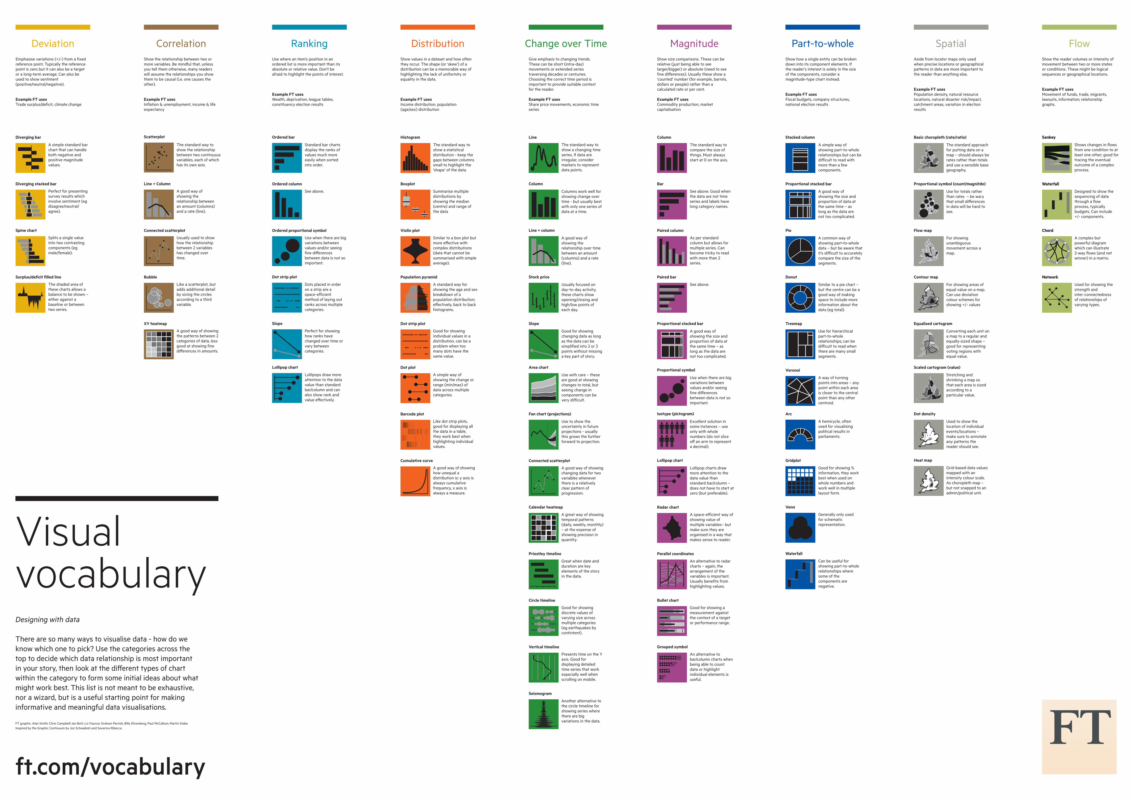
VisualvocabularyDesigning with data

There are so many ways to visualise data - how do we know which one to pick? Use the categories across the top to decide which data relationship is most important in your story, then look at the di�erent types of chart within the category to form some initial ideas about what might work best. This list is not meant to be exhaustive, nor a wizard, but is a useful starting point for making informative and meaningful data visualisations.

FT graphic: Alan Smith; Chris Campbell; Ian Bott; Liz Faunce; Graham Parrish; Billy Ehrenberg; Paul McCallum; Martin StabeInspired by the Graphic Continuum by Jon Schwabish and Severino Ribecca

FlowShow the reader volumes or intensity of movement between two or more states or conditions. These might be logical sequences or geographical locations.

Example FT usesMovement of funds, trade, migrants, lawsuits, information; relationship graphs.

Waterfall

Sankey

Chord

Network

Waterfall

Sankey

Chord

Network

SpatialAside from locator maps only used when precise locations or geographical patterns in data are more important to the reader than anything else.

Example FT usesPopulation density, natural resource locations, natural disaster risk/impact, catchment areas, variation in election results

Basic choropleth (rate/ratio)

Scaled cartogram (value)

Flow map

Contour map

Equalised cartogram

Proportional symbol (count/magnitde)

Change over TimeGive emphasis to changing trends. These can be short (intra-day) movements or extended series traversing decades or centuries: Choosing the correct time period is important to provide suitable context for the reader.

Example FT usesShare price movements, economic time series

Column

Fan chart (projections)

Area chart

Line + column

Stock price

Slope

Calendar heatmap

Line

Priestley timeline

Circle timeline

Connected scatterplot

Vertical timeline

MagnitudeShow size comparisons. These can be relative (just being able to see larger/bigger) or absolute (need to see fine di�erences). Usually these show a ‘counted’ number (for example, barrels, dollars or people) rather than a calculated rate or per cent.

Example FT usesCommodity production, market capitalisation

Paired column

Paired bar

Bar

Column

DeviationEmphasise variations (+/-) from a fixed reference point. Typically the reference point is zero but it can also be a target or a long-term average. Can also be used to show sentiment (positive/neutral/negative).

Example FT usesTrade surplus/deficit, climate change

Diverging bar

Diverging stacked bar

Surplus/deficit filled line

Spine chart

The standard approach for putting data on a map – should always be rates rather than totals and use a sensible base geography.

The standard way to compare the size of things. Must always start at 0 on the axis.

Columns work well for showing change over time - but usually best with only one series of data at a time.

A good way of showing the relationship over time between an amount (columns) and a rate (line).

Usually focused on day-to-day activity, these charts show opening/closing and high/low points of each day.

Good for showing changing data as long as the data can be simplified into 2 or 3 points without missing a key part of story.

Use with care – these are good at showing changes to total, but seeing change in components can be very difficult.

Use to show the uncertainty in future projections - usually this grows the further forward to projection.

A good way of showing changing data for two variables whenever there is a relatively clear pattern of progression.

A great way of showing temporal patterns (daily, weekly, monthly) – at the expense of showing precision in quantity.

Great when date and duration are key elements of the story in the data.

Good for showing discrete values of varying size across multiple categories (eg earthquakes by contintent).

The standard way to show a changing time series. If data are irregular, consider markers to represent data points.

Presents time on the Y axis. Good for displaying detailed time series that work especially well when scrolling on mobile.

See above. Good when the data are not time series and labels have long category names.

As per standard column but allows for multiple series. Can become tricky to read with more than 2 series.

See above.

Isotype (pictogram)

Lollipop chart

Proportional symbol

Radar chart

Parallel coordinates

Use when there are big variations between values and/or seeing fine di�erences between data is not so important.

Excellent solution in some instances – use only with whole numbers (do not slice o� an arm to represent a decimal).

Lollipop charts draw more attention to the data value than standard bar/column – does not have to start at zero (but preferable).

A space-efficient way of showing value of multiple variables– but make sure they are organised in a way that makes sense to reader.

An alternative to radar charts – again, the arrangement of the variables is important. Usually benefits from highlighting values.

Proportional stacked bar

A good way of showing the size and proportion of data at the same time – as long as the data are not too complicated.

Use for totals rather than rates – be wary that small di�erences in data will be hard to see.

For showing unambiguous movement across a map.

For showing areas of equal value on a map. Can use deviation colour schemes for showing +/- values

Converting each unit on a map to a regular and equally-sized shape – good for representing voting regions with equal value.

Stretching and shrinking a map so that each area is sized according to a particular value.

Designed to show the sequencing of data through a flow process, typically budgets. Can include +/- components.

A complex but powerful diagram which can illustrate 2-way flows (and net winner) in a matrix.

Used for showing the strength and inter-connectedness of relationships of varying types.

The standard way to show a statistical distribution - keep the gaps between columns small to highlight the ‘shape’ of the data.

Standard bar charts display the ranks of values much more easily when sorted into order.

The standard way to show the relationship between two continuous variables, each of which has its own axis.

A simple standard bar chart that can handle both negative and positive magnitude values.

Shows changes in flows from one condition to at least one other; good for tracing the eventual outcome of a complex process.

Summarise multiple distributions by showing the median (centre) and range of the data

Similar to a box plot but more e�ective with complex distributions (data that cannot be summarised with simple average).

A standard way for showing the age and sex breakdown of a population distribution; e�ectively, back to back histograms.

Good for showing individual values in a distribution, can be a problem when too many dots have the same value.

A simple way of showing the change or range (min/max) of data across multiple categories.

Like dot strip plots, good for displaying all the data in a table, they work best when highlighting individual values.

A good way of showing how unequal a distribution is: y axis is always cumulative frequency, x axis is always a measure.

See above.

Use when there are big variations between values and/or seeing fine di�erences between data is not so important.

Dots placed in order on a strip are a space-efficient method of laying out ranks across multiple categories.

Perfect for showing how ranks have changed over time or vary between categories.

Lollipops draw more attention to the data value than standard bar/column and can also show rank and value e�ectively.

A good way of showing the relationship between an amount (columns) and a rate (line).

Usually used to show how the relationship between 2 variables has changed over time.

Like a scatterplot, but adds additional detail by sizing the circles according to a third variable.

A good way of showing the patterns between 2 categories of data, less good at showing fine di�erences in amounts.

Perfect for presenting survey results which involve sentiment (eg disagree/neutral/agree).

Splits a single value into two contrasting components (egmale/female).

The shaded area of these charts allows a balance to be shown – either against a baseline or between two series.

RankingUse where an item’s position in an ordered list is more important than its absolute or relative value. Don’t be afraid to highlight the points of interest.

Example FT usesWealth, deprivation, league tables, constituency election results

Ordered column

Ordered proportional symbol

Lollipop chart

Slope

Dot strip plot

Ordered bar

CorrelationShow the relationship between two or more variables. Be mindful that, unless you tell them otherwise, many readers will assume the relationships you show them to be causal (i.e. one causes the other).

Example FT usesInflation & unemployment, income & life expectancy

Line + Column

Connected scatterplot

Bubble

XY heatmap

Scatterplot

DistributionShow values in a dataset and how often they occur. The shape (or ‘skew’) of a distribution can be a memorable way of highlighting the lack of uniformity or equality in the data.

Example FT usesIncome distribution, population (age/sex) distribution

Histogram

Boxplot

Violin plot

Dot plot

Population pyramid

Dot strip plot

Barcode plot

Cumulative curve

Dot density

Used to show the location of individual events/locations – make sure to annotate any patterns the reader should see.

Heat map

Grid-based data values mapped with an intensity colour scale. As choropleth map – but not snapped to an admin/political unit.

ft.com/vocabulary

Seismogram

Another alternative to the circle timeline for showing series where there are big variations in the data.

Bullet chart

Grouped symbol

Good for showing a measurement against the context of a target or performance range.

Part-to-wholeShow how a single entity can be broken down into its component elements. If the reader’s interest is solely in the size of the components, consider a magnitude-type chart instead.

Example FT usesFiscal budgets, company structures, national election results

Stacked column

A simple way of showing part-to-whole relationships but can be difficult to read with more than a few components.

Pie

Donut

Treemap

Voronoi

A common way of showing part-to-whole data – but be aware that it’s difficult to accurately compare the size of the segments.

Similar to a pie chart – but the centre can be a good way of making space to include more information about the data (eg total).

Use for hierarchical part-to-whole relationships; can be difficult to read when there are many small segments.

A way of turning points into areas – any point within each area is closer to the central point than any other centroid.

Proportional stacked bar

A good way of showing the size and proportion of data at the same time – as long as the data are not too complicated.

Arc

Gridplot

Waterfall

Venn

A hemicycle, often used for visualising political results in parliaments.

Good for showing % information, they work best when used on whole numbers and work well in multiple layout form.

Generally only used for schematic representation.

Can be useful for showing part-to-whole relationships where some of the components are negative.

An alternative to bar/column charts when being able to count data or highlight individual elements is useful.