Embed Size (px)
Citation preview
PIIM IS A RESEARCH AND DEVELOPMENT FACILITY AT THE NEW SCHOOL
© 2012 PARSONS JOURNAL FOR INFORMATION MAPPING AND PARSONS INSTITUTE FOR INFORMATION MAPPING
68 Fifth Avenue New York, NY 10011
THE PARSONS INSTITUTE FOR INFORMATION MAPPING
212 229 6825piim.newschool.edu
KEYWORDS Berlin olympics, identification design, London olympics, olympic pictograms, olympic pictographs, olympic symbols, sports symbols
ABSTRACT
Sixteen unified symbols were designed for the 1936 Berlin Olympics. From that initial series of pictographs, until the latest 2012 London Olympics, approximately 500 pictographs and pictograms have been designed to represent the various summer and winter sports included in the Olympic Contests. These pictographs and pictograms vary in design from figuratively realistic in form to highly interpretative. In a somewhat parallel way they range in design from ostensibly “detailed,” or complex to pointedly reductionist. These two vectors: Realistic vs. Interpretative; and, Complex vs. Reductionist allowed the Olympic symbols to be comparatively plotted. For the two demon-strations included in this paper, only one series, those used for hockey, both hockey and ice hockey, are investigated. I used the hockey symbol because it is the most prevalent through modern Olympic history and it is the only sport that is present in both summer and winter Olympics, from 1936 to present. (Only one series of symbols need be used for the plotting because any particular year’s set of symbols maintains a consistent look respecting realistic/interpretive and complex/reductionist factors. Therefore, a similar relationship would exist for any one plot to every plot of symbol types: hockey, cycling, swimming, etc.) The goal was to ascertain trends on the design of Olympic picto-graphs and pictograms. To understand and reveal this, a score for each symbol needed to be developed and this score needed to then be plotted over time. The score was to be determined by the initial scatterplot that would set the “range of design.” For the first diagram, the scores for the two factor-comparatives are plotted, revealing the range of design approach relative to each pictogram. For the second diagram, the scores from the first are combined. The symbols are then presented in a chrono-logical diagram. This diagram serves to reveal design trends, or lack thereof, across the full range of Olympic pictographs and pictograms. In order to provide the full context to this work a nearly total collection of every symbol, from 1936 to present, is provided.
Trends in Olympic PictographDesign: A comparative study usingOlympic Games’ Sports SymbolsSOjung Kim
inTRODuCTiOn
A Pictogram, here also denoted as a Pictograph, refers to a picture or contained symbol that stands for person, place, or thing, or ideographically points through pictorial resemblance to a physical object or condition. Loosely, pictograph may be more defined as a simplified picture of the item it refers to, while pictogram may be somewhat more obtuse in its direct representation. In a yet more inclusive manner we can refer to these elements as symbols. These contrived devices might have long histories with their origins disappearing into the obscured past, in such a case their meanings may be rich and broad, even varying significantly in meaning from culture to culture. Conversely, they may have been created recently as identification, communication, and navigation tools toward a more specific purpose. From a professionally-designed perspective, symbols play the role of a concise graphic communicator and as a tool for expressing a corporate identity. A symbol may identify a subset within the whole of a far greater entity, such as small company, or it could be assigned to a much larger role: standing in, for example, to represent an entire country’s culture (as does the solid red circle represent Japan as the “Land of the Rising Sun.”
When considering the challenge of determining if any contemporary graphic styles or trends can be derived from observing recently created pictographs the issue of comparing apples to apples arises. Control sets are problematic to find. In many instances corporate logos
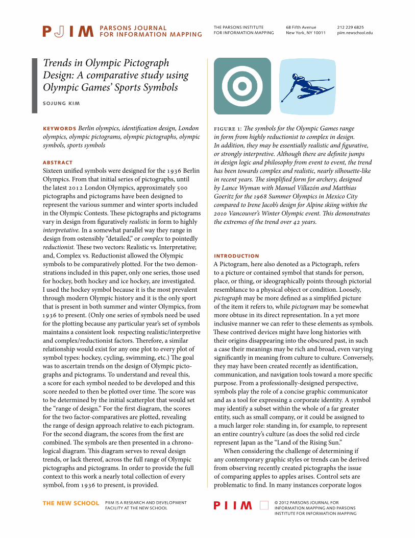
Figure 1: The symbols for the Olympic Games range in form from highly reductionist to complex in design. In addition, they may be essentially realistic and figurative, or strongly interpretive. Although there are definite jumps in design logic and philosophy from event to event, the trend has been towards complex and realistic, nearly silhouette-like in recent years. The simplified form for archery, designed by Lance Wyman with Manuel Villazón and MatthiasGoeritz for the 1968 Summer Olympics in Mexico City compared to Irene Jacob’s design for Alpine skiing within the 2010 Vancouver’s Winter Olympic event. This demonstrates the extremes of the trend over 42 years.
trends in olympic pictograph design:a comparative studysojung kim
PARSONS JOURNAL FOR INFORMATION MAPPINGvOLUME Iv ISSUE 4, FALL 2012[PAGE 2]
© 2012 PARSONS JOURNAL FOR INFORMATION MAPPING AND PARSONS INSTITUTE FOR INFORMATION MAPPING
slowly evolved over time, but these tend to fall under the domain of logotype (Coca-Cola, IBM), those that are more purely pictographic (Starbucks, Apple) are more rare. Starbucks and Apple command huge market recognition and can function apart from their logotype and corporate name (Starbucks quite recently divesting itself of the corporate name within the symbol.) One set of symbols that has both breadth (of time) and depth (or variations within a set) are Olympic pictographic sets representing the individual (or collective) sports within the greater even. Going back to the origins of the modern Olympics of 1936 there are over 500 pictographs (simplified images) or pictograms (representative pictures, such as a ball meaning soccer, etc.) to consider. This supplied a very large control group. Additionally, each set of symbols was designed over controlled time frames of two or four years; also, each year for which there is either
Berlin1936
london1948
tokyo1964
mexico city1968
munich1972
montreal1976
moscow1980
los angeles1984
seoul1988
barcelona1992
atlanta1996
sydney2000
athens2004
beijing2008
london2012
Archery ArtisticGymnastic
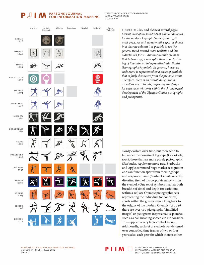
Athletics Badminton Baseball Basketball BeachVolleyball Figure 2: This, and the next several pages,
present most of the hundreds of symbols designed for the modern Olympic Games from 1936 until 2012. As each representative sport is shown in a discrete column it is possible to see the general trend toward more realistic and less reductionist forms. Another notable factor is that between 1972 and 1988 there is a cluster-ing of like-minded interpretative/reductionist (iconographic) symbols. In general, however, each event is represented by a series of symbols that is fairly distinctive from the previous event. Therefore, there is an overall design trend, as well as micro trends, respecting the design for each series of sports within the chronologicaldevelopment of the Olympic Games pictographs and pictogram’s.
TRENDS IN OLyMPIc PIcTOGRAPh DESIGN:A cOMPARATIvE STUDySOJUNG kIM
© 2012 PARSONS JOURNAL FOR INFORMATION MAPPING AND PARSONS INSTITUTE FOR INFORMATION MAPPING
Berlin1936
london1948
tokyo1964
mexico city1968
munich1972
montreal1976
moscow1980
los angeles1984
seoul1988
barcelona1992
atlanta1996
sydney2000
athens2004
beijing2008
london2012
Boxing CanoeCanoeKayakSlalom
Cyclisme Diving EquestrianSports
Fencing
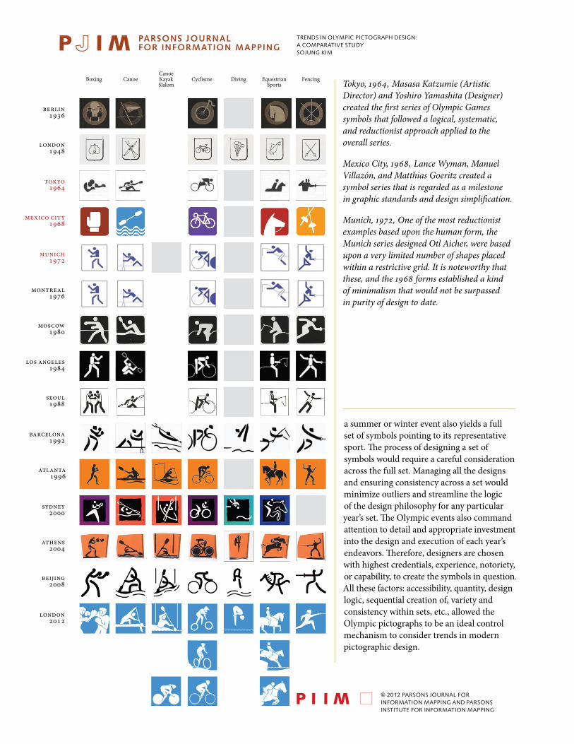
a summer or winter event also yields a full set of symbols pointing to its representative sport. The process of designing a set of symbols would require a careful consideration across the full set. Managing all the designs and ensuring consistency across a set would minimize outliers and streamline the logic of the design philosophy for any particular year’s set. The Olympic events also command attention to detail and appropriate investment into the design and execution of each year’s endeavors. Therefore, designers are chosen with highest credentials, experience, notoriety, or capability, to create the symbols in question. All these factors: accessibility, quantity, design logic, sequential creation of, variety and consistency within sets, etc., allowed the Olympic pictographs to be an ideal control mechanism to consider trends in modern pictographic design.
Tokyo, 1964, Masasa Katzumie (Artistic Director) and Yoshiro Yamashita (Designer) created the first series of Olympic Games symbols that followed a logical, systematic, and reductionist approach applied to the overall series.
Mexico City, 1968, Lance Wyman, Manuel Villazón, and Matthias Goeritz created a symbol series that is regarded as a milestone in graphic standards and design simplification.
Munich, 1972, One of the most reductionist examples based upon the human form, the Munich series designed Otl Aicher, were based upon a very limited number of shapes placed within a restrictive grid. It is noteworthy that these, and the 1968 forms established a kind of minimalism that would not be surpassed in purity of design to date.
trends in olympic pictograph design:a comparative studysojung kim
PARSONS JOURNAL FOR INFORMATION MAPPINGvOLUME Iv ISSUE 4, FALL 2012[PAGE 4]
© 2012 PARSONS JOURNAL FOR INFORMATION MAPPING AND PARSONS INSTITUTE FOR INFORMATION MAPPING
Berlin1936
london1948
tokyo1964
mexico city1968
munich1972
montreal1976
moscow1980
los angeles1984
seoul1988
barcelona1992
atlanta1996
sydney2000
athens2004
beijing2008
london2012
Football Handball Hockey Judo Pentathlonmodern
RythmicGymnastics
Rowing
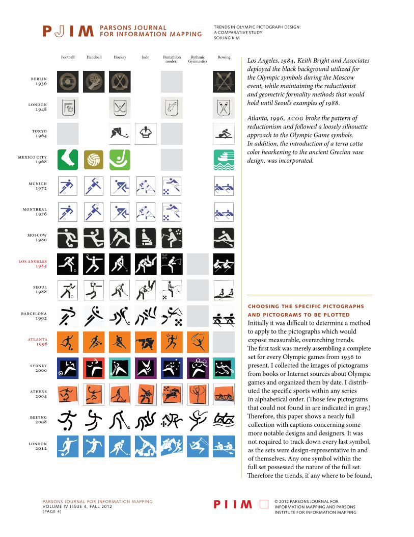
ChOOSing ThE SpECifiC piCTOgRAphS
AnD piCTOgRAmS TO BE plOTTED
Initially it was difficult to determine a method to apply to the pictographs which would expose measurable, overarching trends. The first task was merely assembling a complete set for every Olympic games from 1936 to present. I collected the images of pictograms from books or Internet sources about Olympic games and organized them by date. I distrib-uted the specific sports within any series in alphabetical order. (Those few pictograms that could not found in are indicated in gray.) Therefore, this paper shows a nearly full collection with captions concerning some more notable designs and designers. It was not required to track down every last symbol, as the sets were design-representative in and of themselves. Any one symbol within the full set possessed the nature of the full set. Therefore the trends, if any where to be found,
Los Angeles, 1984, Keith Bright and Associates deployed the black background utilized for the Olympic symbols during the Moscow event, while maintaining the reductionist and geometric formality methods that would hold until Seoul’s examples of 1988.
Atlanta, 1996, ACOG broke the pattern of reductionism and followed a loosely silhouette approach to the Olympic Game symbols. In addition, the introduction of a terra cotta color hearkening to the ancient Grecian vase design, was incorporated.
trends in olympic pictograph design:a comparative studysojung kim
PARSONS JOURNAL FOR INFORMATION MAPPINGvOLUME Iv ISSUE 4, FALL 2012[PAGE 5]
© 2012 PARSONS JOURNAL FOR INFORMATION MAPPING AND PARSONS INSTITUTE FOR INFORMATION MAPPING
Berlin1936
london1948
tokyo1964
mexico city1968
munich1972
montreal1976
moscow1980
los angeles1984
seoul1988
barcelona1992
atlanta1996
sydney2000
athens2004
beijing2008
london2012
Sailing Shooting Softball Swimming SwimmingSyncron
Tabletennis Taekwondo
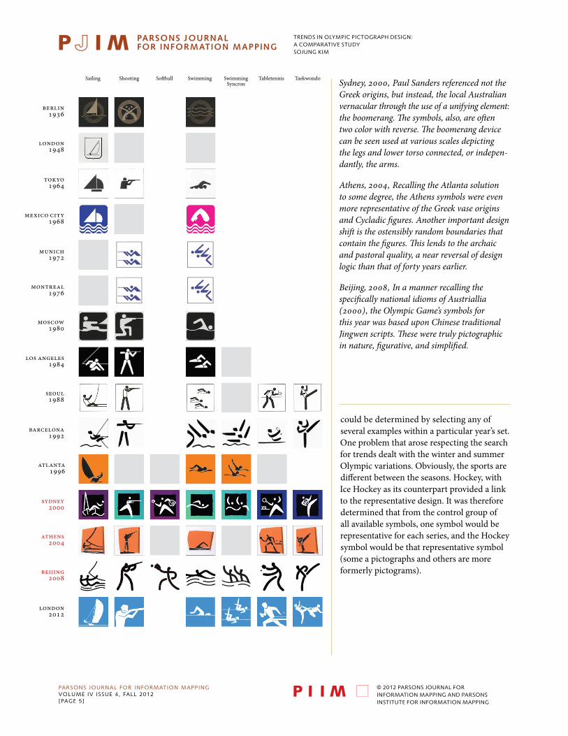
could be determined by selecting any of several examples within a particular year’s set. One problem that arose respecting the search for trends dealt with the winter and summer Olympic variations. Obviously, the sports are different between the seasons. Hockey, with Ice Hockey as its counterpart provided a link to the representative design. It was therefore determined that from the control group of all available symbols, one symbol would be representative for each series, and the Hockey symbol would be that representative symbol (some a pictographs and others are more formerly pictograms).
Sydney, 2000, Paul Sanders referenced not the Greek origins, but instead, the local Australian vernacular through the use of a unifying element: the boomerang. The symbols, also, are often two color with reverse. The boomerang device can be seen used at various scales depicting the legs and lower torso connected, or indepen-dantly, the arms.
Athens, 2004, Recalling the Atlanta solution to some degree, the Athens symbols were even more representative of the Greek vase originsand Cycladic figures. Another important design shift is the ostensibly random boundaries that contain the figures. This lends to the archaicand pastoral quality, a near reversal of design logic than that of forty years earlier.
Beijing, 2008, In a manner recalling the specifically national idioms of Austriallia (2000), the Olympic Game’s symbols for this year was based upon Chinese traditional Jingwen scripts. These were truly pictographic in nature, figurative, and simplified.
trends in olympic pictograph design:a comparative studysojung kim
PARSONS JOURNAL FOR INFORMATION MAPPINGvOLUME Iv ISSUE 4, FALL 2012[PAGE 6]
© 2012 PARSONS JOURNAL FOR INFORMATION MAPPING AND PARSONS INSTITUTE FOR INFORMATION MAPPING
Berlin1936
london1948
tokyo1964
mexico city1968
munich1972
montreal1976
moscow1980
los angeles1984
seoul1988
barcelona1992
atlanta1996
sydney2000
athens2004
beijing2008
london2012
Tennis Trampoline Triathlon Volleyball Waterpolo Weightlifting Wresling
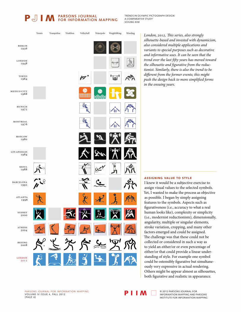
ASSigning vAluE TO STYlE
I knew it would be a subjective exercise to assign visual values to the selected symbols. Yet, I wanted to make the process as objective as possible. I began by simply assigning features to the symbols. Aspects such as figurativeness (i.e., accuracy to what a real human looks like), complexity or simplicity (i.e., modernist reductionism), dimensionally, angularity, multiple or singular elements, stroke variation, cropping, and many other factors emerged and could be assigned. The challenge was that these could not be collected or considered in such a way as to yield an either/or or even percentage of either/or that could provide a linear under-standing of style. For example one symbol could be ostensibly figurative but simultane-ously very expressive in actual rendering. Others might be appear almost as silhouettes, both figurative and realistic in appearance.
London, 2012, This series, also strongly silhouette-based and invested with dynamicism, also considered multiple applications and variants to special purposes such as decorative and informative uses. It can be seen that the trend over the last fifty years has moved toward the silhouette and figurative from the reduc-tionist. Similarly, there is also the trend to be different from the former events; this might push the design back to more simplified forms in the ensuing years.
trends in olympic pictograph design:a comparative studysojung kim
PARSONS JOURNAL FOR INFORMATION MAPPINGvOLUME Iv ISSUE 4, FALL 2012[PAGE 7]
© 2012 PARSONS JOURNAL FOR INFORMATION MAPPING AND PARSONS INSTITUTE FOR INFORMATION MAPPING
Alpine Skiing
Biathlon BobsledCross-
countryskiing
Curling Figureskating
FreestyleSkiing
grenoble1968
sapporo1972
innusbruck1976
lake placid1980
sarajevo1984
calgary1988
albertville1992
lillehammer1994
nagano1998
salt lake city2002
torino2006
vancouver2010
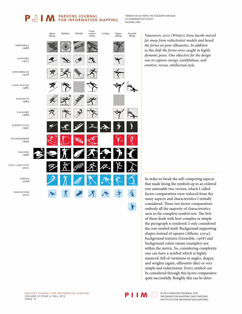
Vancouver, 2010 (Winter), Irene Jacobs moved far away from reductionist models and based the forms on pure silhouettes. In addition to this shift the forms were caught in highly dynamic poses. One objective for the design was to capture energy, youthfulness, andemotive, versus, intellectual style.
In order to break the self-competing aspects that made lining the symbols up in an ordered row untenable two vectors, which I called factor-comparatives were reduced from the many aspects and characteristics I initially considered. These two factor-comparatives embody all the majority of characteristics seen in the complete symbol sets. The first of these deals with how complex or simple the pictograph is rendered. I only considered the core symbol itself. Background supporting shapes instead of squares (Athens, 2004); background textures (Grenoble, 1968) and background colors (many examples) not within the metric. So, considering complexity one can have a symbol which is highly nuanced, full of variations in angles, shapes, and weights (again, silhouette-like) or very simple and reductionist. Every symbol can be considered through this factor-comparative quite successfully. Roughly this can be deter-
trends in olympic pictograph design:a comparative studysojung kim
PARSONS JOURNAL FOR INFORMATION MAPPINGvOLUME Iv ISSUE 4, FALL 2012[PAGE 8]
© 2012 PARSONS JOURNAL FOR INFORMATION MAPPING AND PARSONS INSTITUTE FOR INFORMATION MAPPING
grenoble1968
sapporo1972
innusbruck1976
lake placid1980
sarajevo1984
calgary1988
albertville1992
lillehammer1994
nagano1998
salt lake city2002
torino2006
vancouver2010
LugeIce Hockey Nordiccombined
Short Track Skeleton Ski Jumping Snowboard Speedskating
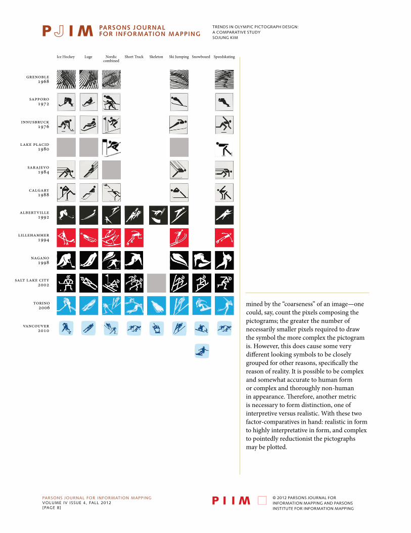
mined by the “coarseness” of an image—one could, say, count the pixels composing the pictograms; the greater the number of necessarily smaller pixels required to draw the symbol the more complex the pictogram is. However, this does cause some very different looking symbols to be closely grouped for other reasons, specifically the reason of reality. It is possible to be complex and somewhat accurate to human form or complex and thoroughly non-human in appearance. Therefore, another metric is necessary to form distinction, one of interpretive versus realistic. With these two factor-comparatives in hand: realistic in form to highly interpretative in form, and complex to pointedly reductionist the pictographs may be plotted.
trends in olympic pictograph design:a comparative studysojung kim
PARSONS JOURNAL FOR INFORMATION MAPPINGvOLUME Iv ISSUE 4, FALL 2012[PAGE 9]
© 2012 PARSONS JOURNAL FOR INFORMATION MAPPING AND PARSONS INSTITUTE FOR INFORMATION MAPPING
Real
isti
ccomplex
Inte
rpre
tati
ve
reductionist
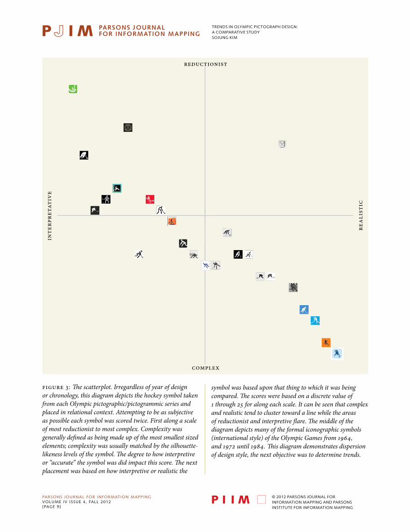
Figure 3: The scatterplot. Irregardless of year of design or chronology, this diagram depicts the hockey symbol taken from each Olympic pictographic/pictogrammic series and placed in relational context. Attempting to be as subjective as possible each symbol was scored twice. First along a scale of most reductionist to most complex. Complexity was generally defined as being made up of the most smallest sized elements; complexity was usually matched by the silhouette-likeness levels of the symbol. The degree to how interpretive or “accurate” the symbol was did impact this score. The next placement was based on how interpretive or realistic the
symbol was based upon that thing to which it was being compared. The scores were based on a discrete value of 1 through 25 for along each scale. It can be seen that complex and realistic tend to cluster toward a line while the areas of reductionist and interpretive flare. The middle of the diagram depicts many of the formal iconographic symbols (international style) of the Olympic Games from 1964, and 1972 until 1984. This diagram demonstrates dispersion of design style, the next objective was to determine trends.
trends in olympic pictograph design:a comparative studysojung kim
PARSONS JOURNAL FOR INFORMATION MAPPINGvOLUME Iv ISSUE 4, FALL 2012[PAGE 10]
© 2012 PARSONS JOURNAL FOR INFORMATION MAPPING AND PARSONS INSTITUTE FOR INFORMATION MAPPING
inte
rpre
tati
ve/r
educ
tion
ist
real
isti
c/co
mpl
ex
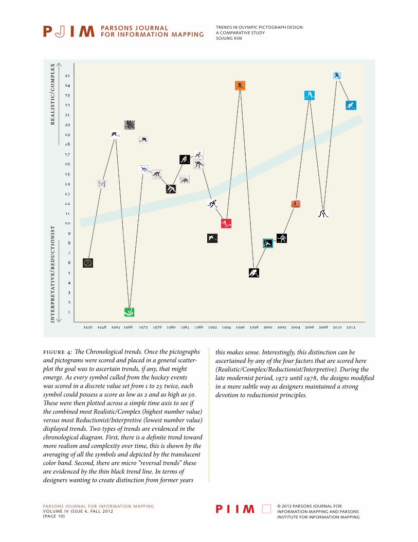
Figure 4: The Chronological trends. Once the pictographs and pictograms were scored and placed in a general scatter-plot the goal was to ascertain trends, if any, that might emerge. As every symbol culled from the hockey events was scored in a discrete value set from 1 to 25 twice, each symbol could possess a score as low as 2 and as high as 50. These were then plotted across a simple time axis to see if the combined most Realistic/Complex (highest number value) versus most Reductionist/Interpretive (lowest number value) displayed trends. Two types of trends are evidenced in the chronological diagram. First, there is a definite trend toward more realism and complexity over time, this is shown by the averaging of all the symbols and depicted by the translucent color band. Second, there are micro “reversal trends” these are evidenced by the thin black trend line. In terms of designers wanting to create distinction from former years
this makes sense. Interestingly, this distinction can be ascertained by any of the four factors that are scored here(Realistic/Complex/Reductionist/Interpretive). During the late modernist period, 1972 until 1978, the designs modified in a more subtle way as designers maintained a strong devotion to reductionist principles.
trends in olympic pictograph design:a comparative studysojung kim
PARSONS JOURNAL FOR INFORMATION MAPPINGvOLUME Iv ISSUE 4, FALL 2012[PAGE 11]
© 2012 PARSONS JOURNAL FOR INFORMATION MAPPING AND PARSONS INSTITUTE FOR INFORMATION MAPPING
ThE SCATTERplOT gRAph
A scatterplot graph of twenty-five by twenty-five cells was created to contain the pictographs along the two factor-comparatives. In order to more clearly score the pictographs each was viewed through a discrete logic of most to least. So, first I considered the pictograph according to a scale, one-to-the-other, from most reduc-tionist to most complex. These were placed in the y-axis of the scatterplot discretely: in general only one symbol could occupy one row. Next, the pictograph was considered from the factor-comparative of most interpretive to most realistic. Once again the symbols were discretely placed in columns, that is, across the x-axis. I tried to define the exact meanings for interpretive to realistic, and reductionist to complex, in order to disambiguate. This was best accomplished by studying each symbol and making the determination through actual analysis of both the apparent results and the probable designers intent. In future, I would very much like to repeat this process of differenti-ating these two factors and placing the symbols in the scatterplot through targeted reviewers. I believe this might move some of the symbols within the scatterplot, however, I believe this would provide refinement—not major reorder. Although there are times when two symbols seem to have very subtle differences respecting the scoring here presented, in most instances the less/more or either or factor was quite self-evident. One aspect of how the symbols distribute was toward a kind of clustering of complex/realistic together and interpretive/reductionist more apart. This makes sense and during the analysis phase it was visually suggested that this might occur, which it did. This triangulation of symbols—as they became more realistic they also became more complex—also makes sense from the logic of a greater number of smallest elements. Determining hierarchical placement via the greater number of smallest elements, though not foolproof, is a fairly objective approach. However, it does not allow the self-imposed requirement of a discrete linear hierarchy to emerge: the symbols would overlap in placement. Regardless, once the symbols are placed in their discrete cells and rows one can see the diagonal scattering across the matrix of the interpretive to the realistic and the reductionist to the complex. It can be seen that the diagonal is somewhat flared at the upper right and concentrated to the lower left. This permitted me to “score” the picto-graphs by their position and move them into another graph where I might be able to determine trends.
ThE TimElinE gRAph
Once I had organized the complete pictograph/pictogram hockey symbol elements within the scatterplot matrix it was time to assign the score to them in order to make a linear comparison. The linear comparison would be plotted across a time line in order to reveal design shifts. My objective was to see if there was a general trend through the entire series as well as to determine if there might be a Olympic to Olympic shift of any significance. In order to assign the score the two factor-comparatives were assigned numerical values of one through twenty-five. For the first factor-comparative, the most reductionist symbol was given a score of one; the most complex symbol given a score of twenty-five. For the interpretative/real-istic factor-comparative, the most interpretative symbol was given a score of one; the most realistic symbol was given a score of twenty-five. When these two ranges are added together, a symbol can score as low as two, and as high as fifty. The triangulation of the scatterplot tends to mean that the symbols within the lower right have nearly duplicated the scores that are added together. Conversely, reductionist and interpretative symbols have a more varied ranges within their combined scores. This doubling of scores serve to smooth out my analysis and bring a more leveled sequencing of the scores. My next step was to simply take my scored symbols, and place them along an x-axis of time (when created for their respective Olympic year) against the y-axis of collective score. This process concluded my four-fold effort of collecting, analyzing, scoring and trend-comparing Olympic Games pictographs over nearly eighty years. The timeline shows how there is a both general trend over the decades as well as a specific trend being style Olympic event to Olympic event. COnCluSiOn: mAjOR TREnDS AnD mOnOR TREnDS
I believe that this simple research backs up a two-fold occurrence that one sees in the design process. The first is a major, general trend in graphic design and the figurative representation within pictograph, pictogram, and general symbol design. This über-trend would show a purity and reductionist design approach when modernism was a powerful influence in the design and communication arts. Indeed, in the second demonstration this can be seen by the lower scores from the 1960s through the 1970s and into the early 1980s. The generally higher scoring symbols of the 1990s and 2000s show the embracing of more realistic and complex forms. Simultaneously, there is a minor, specificity-based trend that runs along the entire timeline. This is revealed by the jagged, non-smooth, Olympics-to-Olympics symbol design schema. This bears
trends in olympic pictograph design:a comparative studysojung kim
PARSONS JOURNAL FOR INFORMATION MAPPINGvOLUME Iv ISSUE 4, FALL 2012[PAGE 12]
© 2012 PARSONS JOURNAL FOR INFORMATION MAPPING AND PARSONS INSTITUTE FOR INFORMATION MAPPING
out another aspect of the design profession, viz.: that each successive design must be in some way (or multiple ways) different than the former presentation. Although serious designers may collectively consider the wider implications of design in context to society, hence the major general trends, they must also consider their specific contributions. This means that distinctiveness is part of the equation and their designs (as this demonstration indicates) must vary from previous schemas in order to justify their contribution, employ fresh solutions for the public, and establish notable milage markers along the design collective which is the Olympic pictographic forms.
ABOuT ThiS pApER
The text for this document was derived from a series of interviews with the author and upon the four core areas of the submission: collecting the Olympic Game’s symbols, the analysis of the symbol sets, the plotting of the symbols into a scatterplot of design style, and considering trends, macro and micro, in the design of the Olympic Games’ pictographic design. These four transcripts were then assembled by the editor.
BiOgRAphY
SoJung Kim is currently a Communication Design student within Parsons The New School for Design, this project is part of her research and working thesis toward the creation of representative Olympic pictographs for the full complement of both summer and winter sports.