Embed Size (px)
Citation preview
Tools for visualizing properties of spatial and temporalperiodicity in geographic data
Robert M. Edsall*, Mark Harrower, Jeremy L. Mennis
Department of Geography, The Pennsylvania State University, 302 Walker Building, University Park, PA 16802, USA
Received 15 February 1998; received in revised form 30 September 1998; accepted 30 September 1998
Abstract
Exploration of complex spatio-temporal environmental data demands creative methods of analysis. We present asuite of interactive visualization techniques to explore a three-dimensional Fourier transformation of a geographic
time series. Such a transformation decomposes geographic time series data into coherent spatial and temporalperiodicities that may be otherwise di�cult to observe. The tools reported herein facilitate the exploration of three-dimensional representations of both physical and spectral space. These visualization techniques are demonstrated
using both idealized and real-world environmental space±time data. Using the tools described, a user may exploreexisting hypotheses as well as generate new insights into environmental process. Because the spatial and temporalparameters of the phenomena under investigation are not necessarily predetermined, exploration of the data itself
using the techniques described in this paper can drive the phenomena de®nition. Ultimately, this technique may leadto insight concerning the behavior of a given environmental phenomenon over a variety of scales, or indicateappropriate spatial and temporal scales for further analysis. # 2000 Elsevier Science Ltd. All rights reserved.
Keywords: Visualization; Exploratory data analysis; Spectral analysis; Space±time feature analysis; Scale
1. Introduction
Geographic visualization is a powerful data explora-tion technique, exploiting the ability of current com-
puting technology to analyze and display dynamicallylarge amounts of information. Visualization refers notonly to a set of graphical images but also to the itera-tive process of visual thinking and interaction with the
images (DiBiase et al., 1992a, b). An interactive visual-ization environment, in which the user may choose todisplay the data in many di�erent ways, encourages
data exploration. One goal of data exploration is the
recognition of pattern and the abstraction of structure
and meaning from data. Visualization can play a vital
role in bringing to light subtle patterns captured within
complex spatio-temporal data that may not be immedi-
ately apparent in strictly quantitative data analysis
methods.
A suite of interactive tools was developed within
IBM's Data Explorer (DX) for multi-dimensional spec-
tral decomposition and visualization. These tools facili-
tate the recognition and interpretation of geographic
phenomena within spatial (three-dimensional) or spa-
tio-temporal (two-dimensional plus time) data. Such
data typically consists of a series of registered raster
layers spaced at regular spatial or temporal intervals
that describe a geographic theme. These tools allow
the quick and concise recognition of the presence and
Computers & Geosciences 26 (2000) 109±118
0098-3004/00/$ - see front matter # 2000 Elsevier Science Ltd. All rights reserved.
PII: S0098-3004(99 )00037-0
* Corresponding author. Fax: +1-814-865-7943.
E-mail address: [email protected] (R.M. Edsall).

relative strength of regularities (periodicity) in spaceand time embedded within the data. Knowledge of
these regularities contributes to the recognition of geo-graphic phenomena captured within data sets as wellas the behavior of such phenomena across spatial and
temporal scales.The remainder of this paper is divided into three
main sections. The ®rst discusses the nature of period-
icity in geographic data and the utility of extractingperiodicity in geographic analysis. The seconddescribes our approach to the visualization of period-
icity and the third section describes the visualizationtools in detail and demonstrates their use on syntheticand climatological data sets.
2. Interpreting periodicity in spatio-temporal data
Spatial and temporal properties are often used to de-
®ne and distinguish geographic phenomena. One of themost intuitive of such properties is extent. Spatial andtemporal extent can be generally interpreted as a phe-
nomenon's volume and duration, respectively,although some phenomena do have spatial and tem-poral boundaries that are non-discrete. However,
understanding geographic process requires more thanknowing an object's size and life span. The property ofperiodicity can provide additional insight into geo-
graphic process by indicating aspects of the spatio-tem-poral behavior of geographic phenomena.
3. Periodicities of geographic objects and ®elds
For geographic phenomena that are conceived of asdistinct objects, temporal periodicity refers to the
recurrence interval of the occurrence (or instantiation)of a type of phenomenon at a given location. Forexample, the temporal periodicity of summer thunder-
storms in State College, PA, re¯ects how often a thun-derstorm occurs in State College during the summer.Clearly, this periodicity does not refer to the behavior
of one single thunderstorm that consistently passesthrough State College like a racecar around a trackbut to the set of temporal occurrences associated witha group of individual precipitation events. It is the cat-
egorization of these individual, yet similar, precipi-tation events into a class of phenomena(thunderstorm) that allows for the interpretation of
temporal periodicity. Likewise, a value of spatialperiodicity implies the simultaneous existence of a setof similar geographic objects arranged in some spatial
pattern, for which the measure and strength of regu-larity can be calculated.Interpretation of periodicity becomes further compli-
cated if the geographic phenomenon is conceived of asa continuous ®eld that exists throughout a space and
that has no intrinsic spatial or temporal boundaries(see Burrough and Frank, 1995; Couclelis, 1993; andPeuquet, 1988 for a discussion of ®eld versus object
conceptualizations of geographic phenomena). If the®eld changes very little with time, for example topo-graphic elevation, its temporal periodicity is insigni®-
cant, but its spatial periodicity gives insight into thespatial texture of the ®eld. Conversely, if a ®eld varieslittle over space at any given moment but changes
cyclically over time, such as the surface elevation of areservoir, the temporal periodicity describes the analo-gous temporal texture of the ®eld.Spatio-temporal data sets, however, are often variant
in both space and time. The global temperature ®eld,for example, is characterized by variation from equatorto pole and from winter to summer. The combination
of these textures represent `movement' within the ®eld,changes in temperature as warmer and cooler regionscyclically migrate over the surface of the earth along
semi-predictable paths. The spatial and temporalperiodicities of such a ®eld indicate the dominantspatial arrangements and recurrence intervals of this
pattern of movement.Identifying periodicity (and extent) properties of
`®eld-like' geographic phenomena may contribute tothe extraction of geographic entities, such as moun-
tains and valleys from elevation and warm and coldair masses from temperature. However, this classi®-cation of geographic objects must be spatially and tem-
porally exhaustive if it is to commit to the initialconceptualization of the domain as continuous. In thedomain of earth surface temperature, for instance, a
moving air mass object must be displaced by anotherair mass object; there cannot be a spatial or temporalabsence of air masses just as there cannot be anabsence of temperature. In the case of a non-exhaus-
tive partitioning of space±time, periodicity is just asapt to describe the textures of the absence of objects asit is the textures of their presence.
4. The paradox of scale
Properties of spatial and temporal extent and
periodicity play a prominent role in the de®nition ofgeographic phenomena because they are also the par-ameters of scale, a primary factor in geographic cogni-
tion (Couclelis and Gale, 1986; Downs and Stea, 1973;Mark and Frank, 1996). Unlike `table-top' objects, asingle substance (the matter of which a phenomena is
composed) may be recognized as di�erent, often hier-archically nested, geographic phenomena when viewedat di�erent scales (Smith and Mark, 1998). For
R.M. Edsall et al. / Computers & Geosciences 26 (2000) 109±118110

example, the substance water is called a puddle, pond,or lake depending on its size.
Because spatio-temporal data are usually composedof a set of measurements collected at only one spatialand temporal scale and resolution, only one scale-
based view of a substance is captured. Other phenom-ena that are taking place within a simultaneous spaceand time, but whose feature manifestations are of
di�erent extents and periodicities, are ignored. Thiscon¯ict has been explored in the ®eld of landscapeecology, among others. Turner et al. (1989) note that
the scale of data used for a given study must be appro-priate to the scale of the phenomenon under investi-gation to foster analyses of known integrity. Similarly,Meentenmeyer (1989) states that in building predictive
environmental models, the choice of variables and thecausal mechanisms they are designed to represent arecontingent upon the scale of study.
Because of the inter-scale relationships among geo-graphic phenomena, however, determination of someoptimal scale of analysis is an oversimpli®cation.
Many phenomena require multi-scale sampling fortheir recognition and interpretation (Schneider, 1994).To ensure capture of a particular phenomenon within
a data set for analysis, one needs to know how a phe-nomenon's extent and periodicity properties behaveacross a variety of spatial and temporal scales. Para-doxically, this knowledge is often the goal of the inves-
tigation.In this paper we propose an inductive approach as a
potential solution to this paradox. Instead of concep-
tualizing geographic phenomena and their propertiesof scale prior to analysis of a data set, exploration ofthe data itself drives the phenomena de®nition. The
premise of this approach is that a spatio-temporal dataset is composed of multiple real world instances (orevents) of geographic phenomena. It is assumed that aseries of these events exhibits consistent spatial and
temporal extents and periodicities. Visualizing consist-ent periodicities reveals the dominant spatial and tem-poral textures and recurrence intervals captured within
a data set. These properties of periodicity indicate thedominant scales at which a geographic phenomenonbehaves and encourage the multi-scale abstraction of
geographic objects from ®elds of spatio-temporal data.
5. Project design
At a conceptual level, our goal is to create a visualdata exploration system that is inductive and ¯exible, asystem that encourages hypotheses generation about
the data and that provides the user with a variety ofexploratory approaches. At an operational level, theseconceptual goals are realized by a visualization en-
vironment that is dynamic (able to represent change inreal-world time), interactive (supports user manipu-
lation) and linked to a database. At an implementa-tional level, dynamic and interactive system featuresinclude animation, real-time change, three-dimensional
image rendering, basic user navigation (panning,zooming, rotating) and color manipulation.
6. Research context
The suite of tools described in this paper are a com-ponent of the Apoala project, a research initiative
focused on geographic data representation, visualiza-tion and analysis. One goal of the project is the con-struction of a Geographic Information System (GIS)
capable of robust representation of complex anddynamic geographic phenomena. Tools for the extrac-tion and visualization of periodicity will eventually be
incorporated as a module within this GIS, and willcontribute to the development of temporal analysistechniques in GIS in general.The Apoala project incorporates research from
diverse ®elds such as cartography, database design,cognitive science and exploratory data analysis (EDA).The tools described here encourage inductive examin-
ation of multivariate data through dynamic graphicsand may be considered an addition to standard EDAtechniques (Becker et al., 1988). The visualization of
spectral analysis is readily integrated with the existingEDA toolbox, which contains more familiar graphicdevices like histograms, scatterplots and scatterplot
matrices, often with the ability to be manipulateddynamically. EDA techniques have been shown to beparticularly e�ective tools for the examination of geo-referenced data (Monmonier, 1989; MacDougall, 1992;
Cook et al., 1996), and recent research extends graphi-cal techniques such as scatterplots into multidimen-sional visualization of large spatial databases
(Gahegan, 1998).As a visualization tool for examining data in space
and time simultaneously, this application is an example
of the use of dynamic computing environments to rep-resent change through time and space. Comprehendingthe representation of multi-dimensional process, whatMacEachren (1995) terms space±time feature analysis
(STFA), is one of the most complex cognitive tasks fora user of a visualization system. Since the recognitionof space±time periodicity facilitates not only feature
identi®cation but also feature comparison, the abilityto provide a concise visual and mathematical presen-tation of periodicity is a powerful exploratory data
analysis tool.Animation has proven to be an e�ective technique
for inductive analysis of large geographical databases
R.M. Edsall et al. / Computers & Geosciences 26 (2000) 109±118 111

(Dorling and Openshaw, 1992; DiBiase et al., 1992a, b;
Kraak and Klomp, 1995; Acevedo and Masuokai,
1997). Yet Dorling (1992a, b) correctly cautions thathuman visual memory is actually rather poor and an
animated set of complex data representations loses sig-
ni®cant utility if a user does not have time to interpret
the information. Interactivity is a necessary comp-
lement to animation; enabling users to control thepace, direction and selection of frames of an animated
display is vital for the most complete understanding of
the data. Interactivity is thus a basic need for ¯exible
user-centered visualization (Robertson, 1994;MacEachren and Kraak, 1997).
Because space±time data sets and their correspond-ing spectral transformations are inherently three-
dimensional, creative methods of display, in addition
to animation, are necessary for e�ective visualization
and understanding. When a two-dimensional map of
physical (or spectral) space is extruded to three dimen-sions, the result is a data `cloud' (Becker et al., 1988)
which, to be most e�ectively interpreted, needs to be
sliced, colored, shaded and otherwise interactively
manipulated. The spectral visualization systemdescribed here employs many interactive tools for a
variety of manipulations including animation controlto facilitate understanding of complex geographical in-
formation.
7. The development environment
We chose to build our visualization tools using DX,which is intended for high-performance, parallel com-
puting environments, and was well-suited to our needs:
. DX programs are built using a relatively easy-to-understand visual programming language (Fig. 1);
. DX possesses a robust set of pre-built visualizationtools (or `modules') which can be easily adapted andincorporated into larger programs;
. DX is capable of Fourier transformations;
. DX is designed to be primarily a visualization tool,and as such, allows for sophisticated three-dimen-sional image rendering.
Although other programming languages exist whicho�er more extensive statistical tools (e.g. S-PLUS,Mathematica), it would have been less convenient to
Fig. 1. Visual program editor (VPE) of IBM's Data Explorer. Modularized visual programming language provides intuitive alterna-
tive to command-line language.
R.M. Edsall et al. / Computers & Geosciences 26 (2000) 109±118112

build such interactive visualization tools using thesecommand line languages.
One limitation of our visualization system as cur-rently implemented is computing speed: even with amoderately sized data set (1 MB), calculations take as
much as ®fteen minutes on a dual-processor Ultra-Sparc 2 workstation. We will be implementing thesetools in a massively parallel environment (75-processor
supercomputer), which may allow for genuine real-timeanalysis and display.
8. Visualizing spectral analysis
Spectral transformations have traditionally been
analyzed using visual methods. Researchers are primar-ily interested in the relative magnitudes of the spectralsignal among wavenumbers (as opposed to the magni-tudes of individual wavenumbers), and such qualitative
judgments can be made easily with visualization. Yetthe extension of spectral transformations to multipledimensions presents visualization challenges which are
best overcome using methods that, with the advent ofadvanced computing, have only recently come into fre-quent use.
9. The Fourier decomposition
DX is supplied with a module that performs a dis-crete Fourier transformation (DFT), an approximationof an exact Fourier transformation (which would
require a continuous spatial or temporal signal). TheFourier transformation reconstructs the shape of aseries of spatial or temporal observations using a sumof well-de®ned trigonometric functions. This represen-
tation gives meaningful information about the relativeimportance of each term in the sum, and correspond-ingly, about the periodicity of the original signal. For
a detailed summary and review of the use of spectralanalysis methods, including Fourier and wavelet trans-formations, the reader is referred to Jenkins and Watts
(1968); Yiou et al. (1996).Given an ideally periodic signal in one, two or even
three dimensions, the utility of a spectral transform-ation provides little added knowledge over a visual
inspection of the signal. Analyzing a two-dimensionalsurface resembling corrugated cardboard, for example,would not require a spectral transformation (other
than to con®rm what is already apparent). The cyclicnature of the surface would be re¯ected in a single pro-nounced peak in the spectral representation corre-
sponding to the direction and wavenumber of theperiodicity. However, no phenomenon in earth scienceis ideally periodic and the use of spectral transform-
ations to visualize periodicities in space and time seriesprovides a useful way to distinguish meaningful pat-
tern from noise.
10. The visualization tools
The representation of three-dimensional (x, y, t )physical data is accomplished in the system with a
data cloud, a `volume' of data with two spatial axesand a third temporal axis. By applying a DFT to suchdata, three-dimensional geographic space is remappedinto three-dimensional spectral space, with spectral
wavenumber (ki, i=x, y, z ) along each axis. The suiteof tools described in this paper allows for explorationof both types of three-dimensional representations, the
space±time `cube' in physical space and the Fourier`cube' in spectral space. Both use a logical colorscheme to indicate relative strength of an attribute
(e.g. temperature or spectral power) and an analyst isfree to rotate, pan and zoom the display. However,much of the information remains hidden within the in-terior of the cube and to adequately explore the entire
cloud, slicing and isosurfacing tools were implemented.Slicing, as the name implies, involves extracting a
two-dimensional sample from the three-dimensional
data volume. This data can be remapped onto a 2.5-dimensional surface, which accentuates relative attri-bute values with peaks and valleys. Furthermore, the
vertical scale of this surface may be adjusted, as in ter-rain modeling in general, to facilitate visual decodingof the statistical surface. Color may be used to dupli-
cate the attribute information represented by theheight of the surface or may be used to represent anentirely di�erent attribute in order to search visuallyfor possible associations among attribute ®elds.
An isosurface is conceptually similar to a contourline, but in three dimensions. Using the isosurface tool,a researcher can interactively establish a threshold
value of the mapped attribute, and values above thatthreshold are encased within the isosurface. The isosur-facing visually strips away data from the cube exposing
high or low values within the data volume. In theFourier cube, the greatest spectral power may be as-sociated with the smallest wavenumbers, which areembedded in the interior of the volume.
Slicing may be considered to be a variety of theEDA technique `brushing', in which a subset ofdata is interactively highlighted, exposing the context
or relationship of that subset to the whole. Isosurfa-cing, on the other hand, is analogous to `focusing',in which users are allowed to isolate and identify
outliers and signi®cant trends using a manipulablethreshold value (Howard and MacEachren, 1995;MacEachren et al., 1997). Whereas focusing reduces
R.M. Edsall et al. / Computers & Geosciences 26 (2000) 109±118 113
the amount of data displayed, brushing visually
enhances portions of the entire data set.
Since isosurfacing retains the three dimensionality
of the display, slicing can be used in concert with
isosurfacing to pinpoint features or locations of
each isosurfaced region in physical or spectral
space. In addition, the cross-sectional slicing can be
animated giving the user the advantages a�orded by
animation for geographic representation (Kraak and
MacEachren, 1994).
The use of the speci®c visualization tools described
above is illustrated now using three examples: an ide-
ally periodic two-dimensional ®eld, an ideally periodic
three-dimensional ®eld, and ®nally, a space±time data
set of daily temperature maxima over several months
from a region in Pennsylvania.
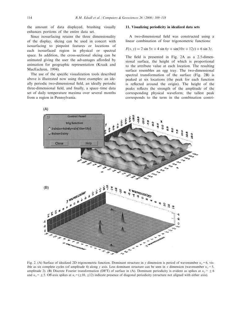
11. Visualizing periodicity in idealized data sets
A two-dimensional ®eld was constructed using a
linear combination of four trigonometric functions:
F�x, y� � 2 sin 5x� 4 sin 6y� sin�10x� 12y� � 6 sin 3z:
The ®eld is presented in Fig. 2A as a 2.5-dimen-sional surface, the height of which is proportionalto the attribute value at each location. The resulting
surface resembles an egg tray. The two-dimensionalspectral transformation of the surface (Fig. 2B) ispeaked at six locations (the peak for each function
is re¯ected around the origin). The height of thepeaks re¯ects the strength of the amplitude of thecorresponding physical waveform; the tallest peak
corresponds to the term in the combination contri-
Fig. 2. (A) Surface of idealized 2D trigonometric function. Dominant structure in y dimension is period of wavenumber ky=6, vis-
ible as six complete cycles (of amplitude 4) along y axis. Less dominant structure can be seen in x dimension (wavenumber kx=5,
amplitude 2). (B) Discrete Fourier transformation (DFT) of surface in (A). Dominant periodicity is evident as spikes at ky=26
and kx=25. O�-axis spikes at ki=(210,212) indicate presence of diagonal periodicity (structure not aligned with either axis).
R.M. Edsall et al. / Computers & Geosciences 26 (2000) 109±118114

buting most to the variance of the `observations'.
In this case, the tallest peak, at ky=26, is associ-
ated with the large wave that completes six cycles in
the y dimension over the observation ®eld.
The previous two-dimensional idealized surface may
be a set of observations from a single time or layer
extracted from a long series of such sets. This third
dimension may also exhibit periodicity (Fig. 3), and
can be spectrally decomposed simultaneously with the
other dimensions, yielding a three-dimensional spectral
representation (Fig. 4). Such a representation contains
embedded data points corresponding to the idealized
periods of the physical data. An isosurface threshold
of 0.5 � (maximum spectral power) exposes those
wavenumbers with the greatest spectral power (Fig.4A); relaxing this threshold to 0.2 � (maximum spec-
tral power) allows for the `discovery' of waveforms oflower amplitude (Fig. 4B). The wavenumbers associ-ated with these data points can be isolated using the
slicing tool (Fig. 4A and B); a slice may be interac-tively passed along the length of any of the axes, andwhen the slice intersects one of the isosurfaced fea-tures, the feature is highlighted with a colored halo.
12. Exploring periodicities in a climate data set
Not every possible periodic spatial and spatio-tem-
Fig. 3. 3D physical data volume of idealized trigonometric function, showing periodicity in three dimensions. Surface in Fig. 2A is
extracted from two di�erent slices in data volume; slices might represent temporal snapshots of physical phenomenon.
Fig. 4. 3D DFT of data volume in Fig. 3. Exploring interior of this `Fourier volume' is demonstrated here using both isosurfacing
and slicing. In (A), all points in Fourier volume with spectral power 0.5�max are encased with gray surface. Location of points of
interest may be identi®ed with translucent planes (slices) which transect volume in each dimension. When slice transects isosurface,
isosurface is outlined with halo of color representing dimension that particular slice (e.g. blue=kt dimension). In (b), isosurface
value is relaxed to 0.2�max, increasing number of highlighted points in Fourier volume. Slices have been moved by user to ident-
ify location of large data point at ki=(0, 0, 5).
R.M. Edsall et al. / Computers & Geosciences 26 (2000) 109±118 115

poral phenomenon is represented in the examples
above; much more complex idealized phenomena could
be envisioned and illustrated. We now turn our atten-
tion to a situation for which this tool is designed: the
analysis and exploration of a real-world environmental
data set.
Our suite of visualization tools was applied to a spa-
tio-temporal data set of maximum daily temperature
and total daily precipitation for a portion of central
Pennsylvania. The spatial extent of the gridded climate
data is approximately 300 � 300 km, and the temporal
extent is 180 days. This data has a four-kilometer res-
olution, interpolated from approximately 150 weather
stations across the region.
In addition to the ®gures provided herein, more
detailed examples of the exploration of this and other
data sets are provided at the web site note listed at the
end of the article.
Within the 180-day temperature data set, represented
in physical (x, y, t ) space by the space±time volume in
Fig. 5, coherent, clearly de®ned periodicities emerged
after a Fourier transformation was applied. Isosurfa-
cing reveals an elongated series of high spectral power
oriented along the kt axis, indicating that the dominant
periodicity in this data set is temporal (Fig. 6). In
other words, temperatures ¯uctuate in unison over the
entire region. Fine-tuning the isosurface threshold
value further reveals interesting periodicity in the tem-
perature data set. For example, there is a relatively
strong signal at wavenumber kt=8, corresponding to a
22-day cycle (180 days/8) in temperature maxima over
the entire region. In addition, a relative maximum of
spectral at kt=0, and o�-axis kx,y=(5, 7) (highlighted
with slicing tools in Fig. 6) indicates regular and per-
sistent temperature variation aligned approximately
southeast to northwest, perhaps a result of the ridge-
and-valley topography of central Pennsylvania. The
overall structure of the isosurfaced regions is especially
informative because, at a glance, it summarizes the
periodic behavior of the data set over a range of scales
(bounded by the resolution and extent of the data).
The isosurfacing techniques lead to more informed
use of the slicing tool by highlighting `hot spots' in the
Fourier representation (Fig. 6). The volume can be
sliced in any of the three dimensions; slicing along the
kt axis (i.e. holding temporal wavenumber constant),
for example, captures the spatial periodicity associated
with a given temporal frequency. In other words, this
allows a climatologist to posit the question `what
spatial structure is associated with a 22-day cycle?' The
highest peaks on the 2.5-dimensional representation of
this kt slice (analogous to Fig. 2b) portray the most
clearly de®ned spatial periodicities at that given tem-
poral scale. Random patterns or noise in the physical
Fig. 6. 3D DFT of data volume in Fig. 5. Isosurfacing and
slicing are both demonstrated here to highlight o�-axis rela-
tive data maximum at ki=(5, 7, 0). Center of Fourier volume
is shown in detail at right. This relative maximum is indicative
of minor spatial periodicity aligned approximately southeast
to northwest, perhaps result of temperature variations aligned
normal to ridge-and-valley topography of central Pennsylva-
nia.
Fig. 5. 3D physical data volume of real climatological data.
Maximum temperature is mapped for region in Pennsylvania
for 180 days; three slices are made opaque to show tempera-
ture distribution in winter, spring and early summer. Slices
may be manipulated by user through stepper tool in upper
left.
R.M. Edsall et al. / Computers & Geosciences 26 (2000) 109±118116

data produce relatively smooth surfaces with no dis-cernible peaks.
Because the data are collected at point sampleswithin the study area, precipitation values for many ofthe cells within the data are estimated. Although a
review of interpolation methods is beyond the scope ofthis paper, our analysis provided an unexpected insightinto the quality of the interpolation method itself. A
subtle, yet persistent, `ripple' was discovered that ranacross the surface of many of the time slices. Althoughpossibly a genuine climatological phenomenon, the
geometric regularity of this structure led us to hypoth-esize that it was a bias introduced into the data as aresult of the interpolation process. It should be noted,however, that this `ripple' was an order of magnitude
smaller than the signals produced by real climatephenomena, and therefore does not severely compro-mise the quality of either the climate data or our
analysis.
13. Conclusion
By combining two established analytical techniques,spectral analysis and interactive geographic visualiza-tion, our approach facilitates the inductive identi®-
cation of geographic phenomena, their behavior andtheir dominant scales. It is hoped that our approachwill spur questions about the nature of geographic
phenomena and processes: what they are, how werecognize them and how they should be analyzed.Note that the patterns and structures revealed in the
data sets are de®ned by two processes that are verysusceptible to error and misinterpretation: quantitativeanalysis and human cognition. Data collection, interp-olation, and statistical techniques themselves may all
produce numerical patterns that simply do not exist inreality. A case in point was the ripple found on thestatistical surface generated from the Fourier trans-
formation of the precipitation data, most likely an arti-fact of the interpolation process. In addition, the veryability of humans to visually abstract pattern from
noise with such skill can lead us to see pattern wherethere is none, such as pictures in clouds and the manin the moon (MacEachren and Ganter, 1990). Cautionis therefore advised in interpreting the results of any
visualization; nevertheless, our examples demonstratethat the most prominent periodicities are clearly repre-sentative of some real-world pattern.
What, then, can be learned from understandingperiodicity in geographic data using these tools? Someof these periodicities that may be found indicate the
existence of geographic phenomena for which wealready have names, such as summer thunderstorm.However, some spatial and temporal structures
revealed by this technique may be surprising, and evencounter-intuitive, suggesting some as yet unaccounted-
for systematic geographic pattern. Hence, it is a meth-odology designed not simply to arrive at a speci®c `sol-ution', but to stimulate hypotheses and generate new
insight about the nature of spatial and temporal beha-vior of environmental phenomena.
Acknowledgements
This research was funded by the United States En-vironmental Protection Agency (No. R825195-01-0).The authors also thank Dr. Ray Masters and the PennState Computer Center for their assistance and Dr.
Alan MacEachren, Dr. Donna Peuquet, Dr. BrentYarnal, Dr. Mark Gahegan and the anonymousreviewers for their suggestions and editorial comments
on previous drafts of this paper. In addition, thanksare extended to Doug Sheldon and the research groupat the Center for Integrated Regional Assessment
(U.S. EPA No. 824807-010) for providing the climatedata used in this paper. World Wide Web. Colorgraphics, animated GIFs, and more detailed examplesof the tools can be accessed at the following web
address: http://www.GeoVISTA.psu.edu/apoala/teamJRM/index.html
References
Acevedo, W., Masuokai, P., 1997. Time-series animation tech-
niques for visualizing urban growth. Computers &
Geosciences 23 (4), 423±435.
Becker, R.A., Cleveland, W.S., Wilks, A.R., 1988. Dynamic
graphics for data analysis. In: Cleveland, W.S., McGill,
M.E. (Eds.), Dynamic Graphics for Statistics. Wadsworth
& Brooks, Belmont, California, pp. 1±49.
Burrough, P.A., Frank, A.U., 1995. Concepts and paradigms
in spatial information: are current geographical infor-
mation systems truly generic? International Journal of
Geographic Information Systems 9 (2), 101±116.
Cook, D., Majure, J.J., Symanzik, J., Cressie, N., 1996.
Dynamic graphics in a GIS: exploring and analyzing mul-
tivariate spatial data using linked software. Computational
Statistics 11, 467±480.
Couclelis, H., 1993. People manipulate objects (but cultivate
®elds): beyond the raster-vector debate in GIS. In: Frank,
A.U., Campari, I., Formentini, U. (Eds.), From Space to
Territory: Theories and Methods of Spatio-Temporal
Reasoning. Springer-Verlag, Berlin, pp. 65±77.
Couclelis, H., Gale, N., 1986. Space and spaces. Geogra®ska
Annaler B 68, 1±12.
DiBiase, D., MacEachren, A.M., Krygier, J.B., Reeves, C.,
1992a. Animation and the role of map design in scienti®c
visualization. Cartography and Geographic Information
Systems 19 (4), 201±214.
R.M. Edsall et al. / Computers & Geosciences 26 (2000) 109±118 117
DiBiase, D., MacEachren, A.M., Krygier, J.B., Reeves, C.,
1992b. Animation and the role of map design in scienti®c
visualization. Cartography and Geographic Information
Systems 19 (4), 265±266.
Dorling, D., 1992a. Stretching space and splicing time: from
cartographic animation to interactive visualization.
Cartography and Geographic Information Systems 19 (4),
215±227.
Dorling, D., 1992b. Stretching space and splicing time: from
cartographic animation to interactive visualization.
Cartography and Geographic Information Systems 19 (4),
267±270.
Dorling, D., Openshaw, S., 1992. Using computer animation
to visualize space±time patterns. Environment and
Planning B: Planning and Design 19, 639±650.
Downs, R., Stea, D., 1973. Image and Environment. Aldine,
Chicago, Illinois, 439 pp.
Gahegan, M.N., 1998. Scatterplots and scenegraphs: visualiza-
tion techniques for exploratory spatial analysis.
Computers, Environment and Urban Systems 22 (1).
Howard, D., MacEachren, A.M., 1995. Constructing and
evaluating an interactive interface for visualizing re-
liability. In: Proceedings of the 17th International
Cartographic Conference, September 3±9, 1995, Barcelona,
Spain, pp. 320±329.
Jenkins, G., Watts, D., 1968. Spectral Analysis and its
Applications. Holden-Day, Oakland, California, 525 pp.
Kraak, M.J., Klomp, A., 1995. A classi®cation of carto-
graphic animations: towards a tool for the design of
dynamic maps in a GIS environment. In: Proceedings of
the Seminar on Teaching Animated Cartography, August
30±September 1, 1995, Madrid, Spain, pp. 29±35.
Kraak, M.J., MacEachren, A.M., 1994. Visualization of
spatial data's temporal component. In: Proceedings of the
Sixth International Symposium on Spatial Data Handling:
Advances in GIS Research, September 5±9, 1994,
Edinburgh, Scotland, pp. 391±409.
MacDougall, E.B., 1992. Exploratory analysis, dynamic stat-
istical visualization and geographic information systems.
Cartography and Geographic Information Systems 19 (4),
237±246.
MacEachren, A.M., 1995. How Maps Work: Representation,
Visualization, and Design. Guilford Press, New York,
513 pp.
MacEachren, A.M., Ganter, J.H., 1990. A pattern identi®-
cation approach to cartographic visualization.
Cartographica 27 (2), 64±81.
MacEachren, A.M., Kraak, M.-J., 1997. Exploratory carto-
graphic visualization: advancing the agenda. Computers &
Geosciences 23 (4), 335±343.
MacEachren, A.M., Polsky, C., Haug, D., Brown, D.,
Boscoe, F., Beedasy, J., Pickle, L., Marrara, M., 1997.
Visualizing spatial relationships among health, environ-
ment, and demographic statistics: interface design issues.
In: Proceedings of the 18th International Cartographic
Conference, June 21±27, 1997, Stockholm, Sweden,
pp. 880±887.
Mark, D.M., Frank, A.U., 1996. Experiential and formal
models of geographic space. Environment and Planning B:
Planning and Design 23, 3±24.
Meentenmeyer, V., 1989. Geographical perspectives of
space, time, and scale. Landscape Ecology 3 (3/4),
163±173.
Monmonier, M., 1989. Geographic brushing: enhancing ex-
ploratory analysis of the scatterplot matrix. Geographical
Analysis 21, 81±84.
Peuquet, D., 1988. Representations of geographic space:
toward a conceptual synthesis. Annals of the Association
of American Geographers 78 (3), 375±394.
Robertson, P.K., 1994. Interactive visualization: its role in
enabling specialists' expertise. In: Resource Technology
'94, September 26±30, 1994, University of Melbourne,
Melbourne, Victoria, pp. 17±24.
Schneider, D.C., 1994. Quantitative Ecology: Spatial and
Temporal Scaling. Academic Press, New York.
Smith, B., Mark, D., 1998. Ontology and geographic kinds.
In: Proceedings of the Eighth International Symposium on
Spatial Data Handling, July 11±15, 1998, Vancouver,
Canada, pp. 308±318.
Turner, M.G., Dale, V.H., Gardner, R.H., 1989. Predicting
across scales: theory development and testing. Landscape
Ecology 3 (3/4), 245±252.
Yiou, P., Baert, E., Loutre, M.-F., 1996. Spectral analysis of
climate data. Surveys in Geophysics 17, 619±663.
R.M. Edsall et al. / Computers & Geosciences 26 (2000) 109±118118