Embed Size (px)
Citation preview
TMS SOFTWARE
TMS FNC UI Pack DEVELOPERS GUIDE
1
TMS FNC Ribbon
DEVELOPERS GUIDE
August 2017 Copyright © 2017 by tmssoftware.com bvba
Web: http://www.tmssoftware.com Email: [email protected]

TMS SOFTWARE
TMS FNC UI Pack DEVELOPERS GUIDE
2
Index
Getting Started ........................................................................................................................................ 3
Availability ............................................................................................................................................... 4
Hierarchy ................................................................................................................................................. 5
Adding Controls ....................................................................................................................................... 5
QAT .......................................................................................................................................................... 7
Caption .................................................................................................................................................... 7
System menu ........................................................................................................................................... 8
Pages ....................................................................................................................................................... 8
Toolbar .................................................................................................................................................... 9
Groups ................................................................................................................................................... 16
Shortcut hints ........................................................................................................................................ 18
Theming ................................................................................................................................................. 20

TMS SOFTWARE
TMS FNC UI Pack DEVELOPERS GUIDE
3
Getting Started
To quickly get up and running with the ribbon, a wizard is available that automatically prepares a TTMSFNCRibbonForm with an instance of TTMSFNCRibbon. When dropping an instance of TTMSFNCRibbon on a form in a newly created project without the wizard, you need to manually inherit the form from TTMSFNCRibbonForm to benefit from all the features of the ribbon. Below is screenshot of the wizard when starting a new project and one after choosing one of the available options for creating an FNC Ribbon application.
TMS SOFTWARE
TMS FNC UI Pack DEVELOPERS GUIDE
4
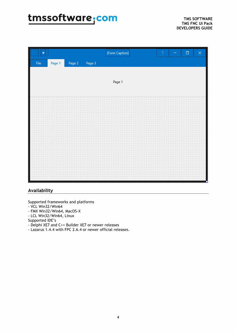
Availability
Supported frameworks and platforms - VCL Win32/Win64 - FMX Win32/Win64, MacOS-X - LCL Win32/Win64, Linux Supported IDE’s - Delphi XE7 and C++ Builder XE7 or newer releases - Lazarus 1.4.4 with FPC 2.6.4 or newer official releases.

TMS SOFTWARE
TMS FNC UI Pack DEVELOPERS GUIDE
5
Hierarchy
1) Application icon button: When clicking the application icon button, the system menu drops down with options to minimize, maximize and close the form. When double-clicking the icon, the form closes.
2) QAT (quick access toolbar): The quick access toolbar is capable of holding any type of control, automatically aligns, auto-sizes the controls, and offers a drop-down menu to show or hide controls and a way to place the quick access toolbar under the ribbon page control.
3) Form Caption: The form caption is a TTMSFNCHTMLText capable of displaying HTML.
4) System Menu: The system menu holds buttons to minimize, maximize or close the application. The System Menu can additionally hold other controls if necessary.
5) File Button: The file button can be used to display another form, frame or panel for more options. To use the button, assign an event handler to the OnClick event.
6) Pagecontrol: A page control component that can display multiple pages, each with its own container. The page control inherits from TTMSFNCPageControl which is available separately.
7) Toolbar: A toolbar control capable of holding controls, displaying a caption with HTML formatted text as well as auto-alignment, auto-sizing and many more.
Adding Controls
After dropping an instance on the form, or using the wizard, you can select the ribbon and start adding controls, pages, toolbars and many more. Each control of the ribbon is based an existing control available in the TMS FNC UI Pack. Each control has its own design-time helper context menu. To add controls, right-click on a control of choice and see what options there are available for adding controls. TTMSFNCRibbonPageControl: Options for adding new, delete existing or navigate through pages. TTMSFNCRibbonQAT, TTMSFNCRibbonToolBar, TTMSFNCRibbonSystemMenu: Options for adding new toolbar controls such as the default button, font-name and font-size pickers as well as bitmap and color-pickers. TTMSFNCRibbonPageControlContainer: Options to add new toolbars.
TMS SOFTWARE
TMS FNC UI Pack DEVELOPERS GUIDE
6
The options at designtime to add controls are also available at runtime. TTMSFNCRibbonPageControl: TMSFNCRibbonPageControl1.AddPage(‘Page 1’); TTMSFNCRibbonQAT, TTMSFNCRibbonToolBar, TTMSFNCRibbonSystemMenu: The following code snippets are not limited to the ones demonstrated here. There are more add functions available. TMSFNCRibbonQAT1.AddButton TMSFNCRibbonQAT1.AddFontNamePicker TMSFNCRibbonToolBar1.AddButton; TMSFNCRibbonSystemMenu1.AddSeparator; TTMSFNCRibbonPageControlContainer: TMSFNCRibbonPageControlContainer1.AddToolBar;
TMS SOFTWARE
TMS FNC UI Pack DEVELOPERS GUIDE
7
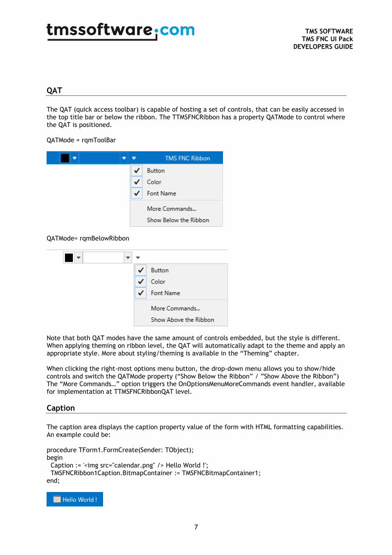
QAT
The QAT (quick access toolbar) is capable of hosting a set of controls, that can be easily accessed in the top title bar or below the ribbon. The TTMSFNCRibbon has a property QATMode to control where the QAT is positioned. QATMode = rqmToolBar
QATMode= rqmBelowRibbon
Note that both QAT modes have the same amount of controls embedded, but the style is different. When applying theming on ribbon level, the QAT will automatically adapt to the theme and apply an appropriate style. More about styling/theming is available in the “Theming” chapter. When clicking the right-most options menu button, the drop-down menu allows you to show/hide controls and switch the QATMode property (“Show Below the Ribbon” / ”Show Above the Ribbon”) The “More Commands…” option triggers the OnOptionsMenuMoreCommands event handler, available for implementation at TTMSFNCRibbonQAT level.
Caption
The caption area displays the caption property value of the form with HTML formatting capabilities. An example could be: procedure TForm1.FormCreate(Sender: TObject); begin Caption := '<img src="calendar.png" /> Hello World !'; TMSFNCRibbon1Caption.BitmapContainer := TMSFNCBitmapContainer1; end;
TMS SOFTWARE
TMS FNC UI Pack DEVELOPERS GUIDE
8
The caption automatically adapts to the available width of the form, taking the QAT / SystemMenu and groups into consideration.
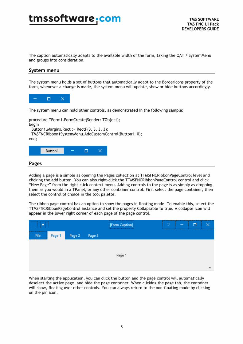
System menu
The system menu holds a set of buttons that automatically adapt to the BorderIcons property of the form, whenever a change is made, the system menu will update, show or hide buttons accordingly.
The system menu can hold other controls, as demonstrated in the following sample: procedure TForm1.FormCreate(Sender: TObject); begin Button1.Margins.Rect := RectF(3, 3, 3, 3); TMSFNCRibbon1SystemMenu.AddCustomControl(Button1, 0); end;
Pages
Adding a page is a simple as opening the Pages collection at TTMSFNCRibbonPageControl level and clicking the add button. You can also right-click the TTMSFNCRibbonPageControl control and click “New Page” from the right-click context menu. Adding controls to the page is as simply as dropping them as you would in a TPanel, or any other container control. First select the page container, then select the control of choice in the tool palette. The ribbon page control has an option to show the pages in floating mode. To enable this, select the TTMSFNCRibbonPageControl instance and set the property Collapsable to true. A collapse icon will appear in the lower right corner of each page of the page control.
When starting the application, you can click the button and the page control will automatically deselect the active page, and hide the page container. When clicking the page tab, the container will show, floating over other controls. You can always return to the non-floating mode by clicking on the pin icon.
TMS SOFTWARE
TMS FNC UI Pack DEVELOPERS GUIDE
9
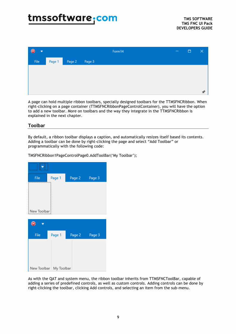
A page can hold multiple ribbon toolbars, specially designed toolbars for the TTMSFNCRibbon. When right-clicking on a page container (TTMSFNCRibbonPageControlContainer), you will have the option to add a new toolbar. More on toolbars and the way they integrate in the TTMSFNCRibbon is explained in the next chapter.
Toolbar
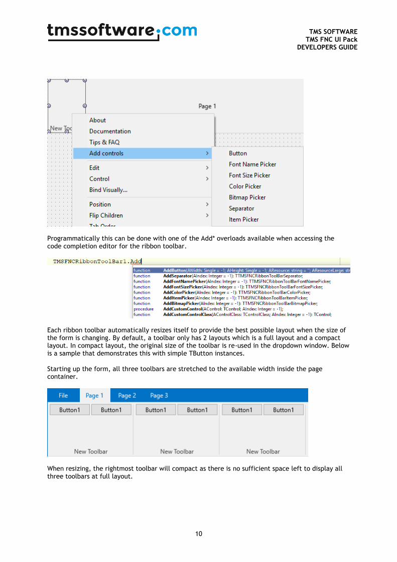
By default, a ribbon toolbar displays a caption, and automatically resizes itself based its contents. Adding a toolbar can be done by right-clicking the page and select “Add Toolbar” or programmatically with the following code: TMSFNCRibbon1PageControlPage0.AddToolBar(‘My Toolbar’);
As with the QAT and system menu, the ribbon toolbar inherits from TTMSFNCToolBar, capable of adding a series of predefined controls, as well as custom controls. Adding controls can be done by right-clicking the toolbar, clicking Add controls, and selecting an item from the sub-menu.
TMS SOFTWARE
TMS FNC UI Pack DEVELOPERS GUIDE
10
Programmatically this can be done with one of the Add* overloads available when accessing the code completion editor for the ribbon toolbar.
Each ribbon toolbar automatically resizes itself to provide the best possible layout when the size of the form is changing. By default, a toolbar only has 2 layouts which is a full layout and a compact layout. In compact layout, the original size of the toolbar is re-used in the dropdown window. Below is a sample that demonstrates this with simple TButton instances. Starting up the form, all three toolbars are stretched to the available width inside the page container.
When resizing, the rightmost toolbar will compact as there is no sufficient space left to display all three toolbars at full layout.
TMS SOFTWARE
TMS FNC UI Pack DEVELOPERS GUIDE
11
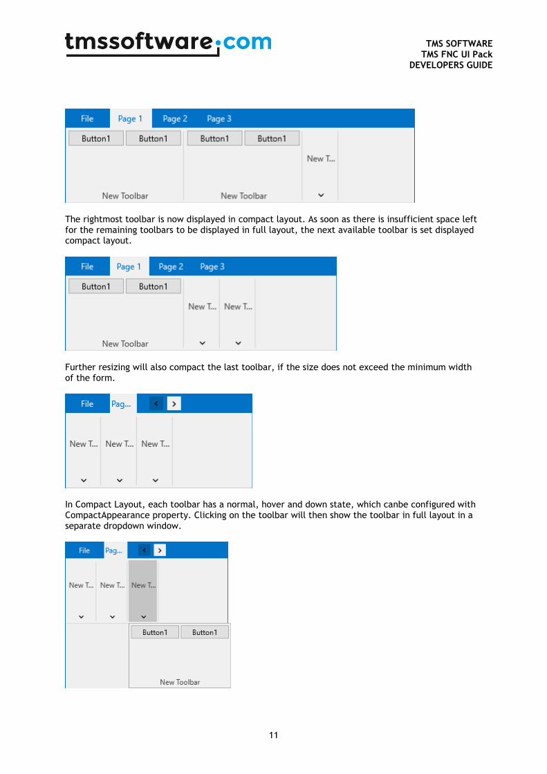
The rightmost toolbar is now displayed in compact layout. As soon as there is insufficient space left for the remaining toolbars to be displayed in full layout, the next available toolbar is set displayed compact layout.
Further resizing will also compact the last toolbar, if the size does not exceed the minimum width of the form.
In Compact Layout, each toolbar has a normal, hover and down state, which canbe configured with CompactAppearance property. Clicking on the toolbar will then show the toolbar in full layout in a separate dropdown window.
TMS SOFTWARE
TMS FNC UI Pack DEVELOPERS GUIDE
12
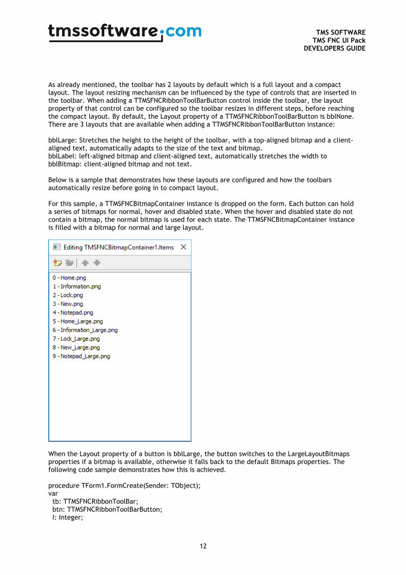
As already mentioned, the toolbar has 2 layouts by default which is a full layout and a compact layout. The layout resizing mechanism can be influenced by the type of controls that are inserted in the toolbar. When adding a TTMSFNCRibbonToolBarButton control inside the toolbar, the layout property of that control can be configured so the toolbar resizes in different steps, before reaching the compact layout. By default, the Layout property of a TTMSFNCRibbonToolBarButton is bblNone. There are 3 layouts that are available when adding a TTMSFNCRibbonToolBarButton instance: bblLarge: Stretches the height to the height of the toolbar, with a top-aligned bitmap and a client-aligned text, automatically adapts to the size of the text and bitmap. bblLabel: left-aligned bitmap and client-aligned text, automatically stretches the width to bblBitmap: client-aligned bitmap and not text. Below is a sample that demonstrates how these layouts are configured and how the toolbars automatically resize before going in to compact layout. For this sample, a TTMSFNCBitmapContainer instance is dropped on the form. Each button can hold a series of bitmaps for normal, hover and disabled state. When the hover and disabled state do not contain a bitmap, the normal bitmap is used for each state. The TTMSFNCBitmapContainer instance is filled with a bitmap for normal and large layout.
When the Layout property of a button is bblLarge, the button switches to the LargeLayoutBitmaps properties if a bitmap is available, otherwise it falls back to the default Bitmaps properties. The following code sample demonstrates how this is achieved. procedure TForm1.FormCreate(Sender: TObject); var tb: TTMSFNCRibbonToolBar; btn: TTMSFNCRibbonToolBarButton; I: Integer;
TMS SOFTWARE
TMS FNC UI Pack DEVELOPERS GUIDE
13
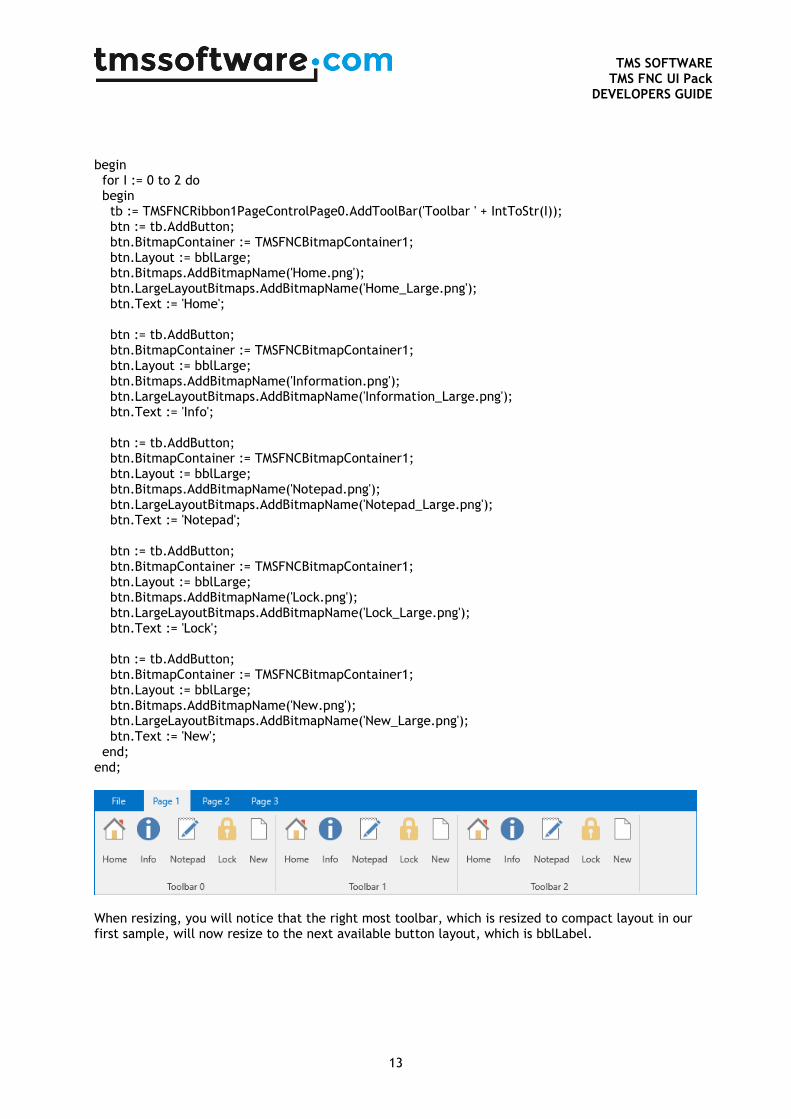
begin for I := 0 to 2 do begin tb := TMSFNCRibbon1PageControlPage0.AddToolBar('Toolbar ' + IntToStr(I)); btn := tb.AddButton; btn.BitmapContainer := TMSFNCBitmapContainer1; btn.Layout := bblLarge; btn.Bitmaps.AddBitmapName('Home.png'); btn.LargeLayoutBitmaps.AddBitmapName('Home_Large.png'); btn.Text := 'Home'; btn := tb.AddButton; btn.BitmapContainer := TMSFNCBitmapContainer1; btn.Layout := bblLarge; btn.Bitmaps.AddBitmapName('Information.png'); btn.LargeLayoutBitmaps.AddBitmapName('Information_Large.png'); btn.Text := 'Info'; btn := tb.AddButton; btn.BitmapContainer := TMSFNCBitmapContainer1; btn.Layout := bblLarge; btn.Bitmaps.AddBitmapName('Notepad.png'); btn.LargeLayoutBitmaps.AddBitmapName('Notepad_Large.png'); btn.Text := 'Notepad'; btn := tb.AddButton; btn.BitmapContainer := TMSFNCBitmapContainer1; btn.Layout := bblLarge; btn.Bitmaps.AddBitmapName('Lock.png'); btn.LargeLayoutBitmaps.AddBitmapName('Lock_Large.png'); btn.Text := 'Lock'; btn := tb.AddButton; btn.BitmapContainer := TMSFNCBitmapContainer1; btn.Layout := bblLarge; btn.Bitmaps.AddBitmapName('New.png'); btn.LargeLayoutBitmaps.AddBitmapName('New_Large.png'); btn.Text := 'New'; end; end;
When resizing, you will notice that the right most toolbar, which is resized to compact layout in our first sample, will now resize to the next available button layout, which is bblLabel.
TMS SOFTWARE
TMS FNC UI Pack DEVELOPERS GUIDE
14
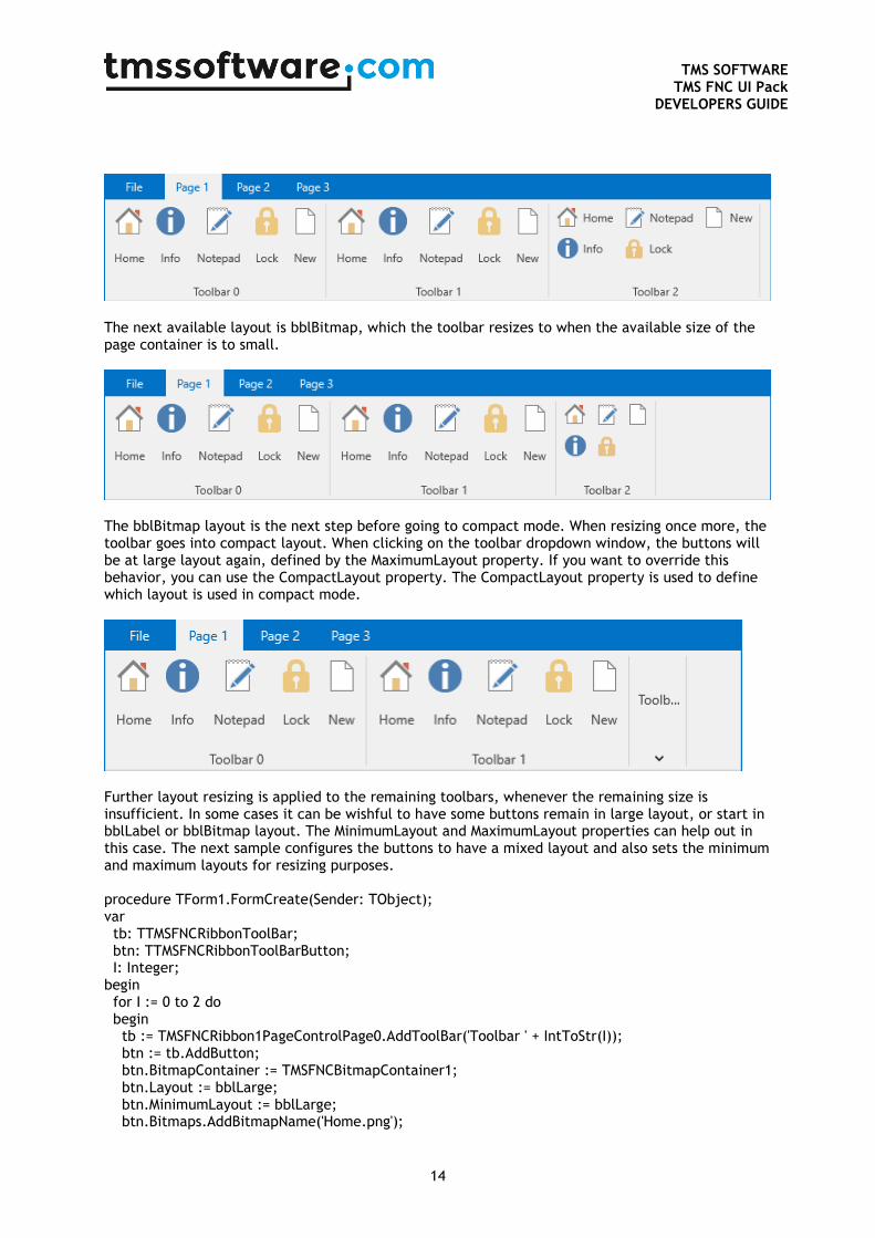
The next available layout is bblBitmap, which the toolbar resizes to when the available size of the page container is to small.
The bblBitmap layout is the next step before going to compact mode. When resizing once more, the toolbar goes into compact layout. When clicking on the toolbar dropdown window, the buttons will be at large layout again, defined by the MaximumLayout property. If you want to override this behavior, you can use the CompactLayout property. The CompactLayout property is used to define which layout is used in compact mode.
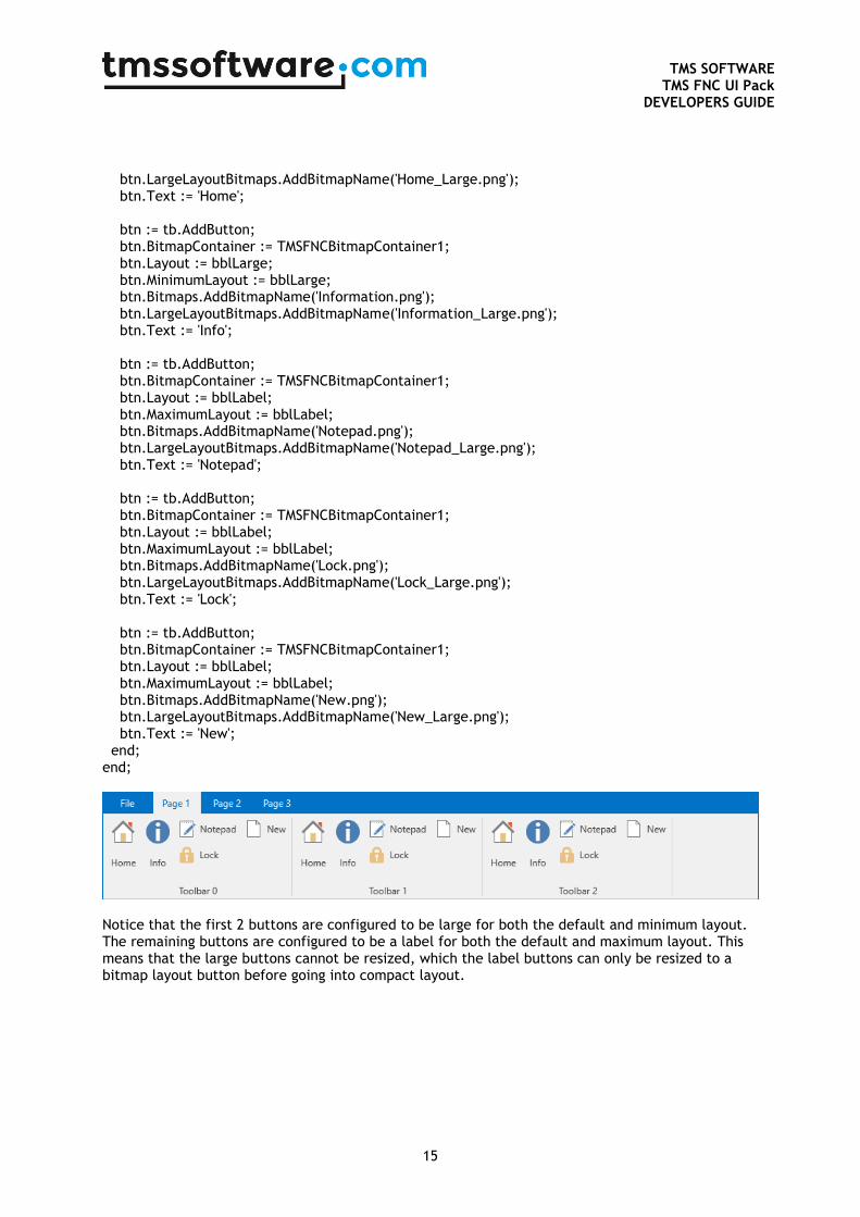
Further layout resizing is applied to the remaining toolbars, whenever the remaining size is insufficient. In some cases it can be wishful to have some buttons remain in large layout, or start in bblLabel or bblBitmap layout. The MinimumLayout and MaximumLayout properties can help out in this case. The next sample configures the buttons to have a mixed layout and also sets the minimum and maximum layouts for resizing purposes. procedure TForm1.FormCreate(Sender: TObject); var tb: TTMSFNCRibbonToolBar; btn: TTMSFNCRibbonToolBarButton; I: Integer; begin for I := 0 to 2 do begin tb := TMSFNCRibbon1PageControlPage0.AddToolBar('Toolbar ' + IntToStr(I)); btn := tb.AddButton; btn.BitmapContainer := TMSFNCBitmapContainer1; btn.Layout := bblLarge; btn.MinimumLayout := bblLarge; btn.Bitmaps.AddBitmapName('Home.png');
TMS SOFTWARE
TMS FNC UI Pack DEVELOPERS GUIDE
15
btn.LargeLayoutBitmaps.AddBitmapName('Home_Large.png'); btn.Text := 'Home'; btn := tb.AddButton; btn.BitmapContainer := TMSFNCBitmapContainer1; btn.Layout := bblLarge; btn.MinimumLayout := bblLarge; btn.Bitmaps.AddBitmapName('Information.png'); btn.LargeLayoutBitmaps.AddBitmapName('Information_Large.png'); btn.Text := 'Info'; btn := tb.AddButton; btn.BitmapContainer := TMSFNCBitmapContainer1; btn.Layout := bblLabel; btn.MaximumLayout := bblLabel; btn.Bitmaps.AddBitmapName('Notepad.png'); btn.LargeLayoutBitmaps.AddBitmapName('Notepad_Large.png'); btn.Text := 'Notepad'; btn := tb.AddButton; btn.BitmapContainer := TMSFNCBitmapContainer1; btn.Layout := bblLabel; btn.MaximumLayout := bblLabel; btn.Bitmaps.AddBitmapName('Lock.png'); btn.LargeLayoutBitmaps.AddBitmapName('Lock_Large.png'); btn.Text := 'Lock'; btn := tb.AddButton; btn.BitmapContainer := TMSFNCBitmapContainer1; btn.Layout := bblLabel; btn.MaximumLayout := bblLabel; btn.Bitmaps.AddBitmapName('New.png'); btn.LargeLayoutBitmaps.AddBitmapName('New_Large.png'); btn.Text := 'New'; end; end;
Notice that the first 2 buttons are configured to be large for both the default and minimum layout. The remaining buttons are configured to be a label for both the default and maximum layout. This means that the large buttons cannot be resized, which the label buttons can only be resized to a bitmap layout button before going into compact layout.
TMS SOFTWARE
TMS FNC UI Pack DEVELOPERS GUIDE
16
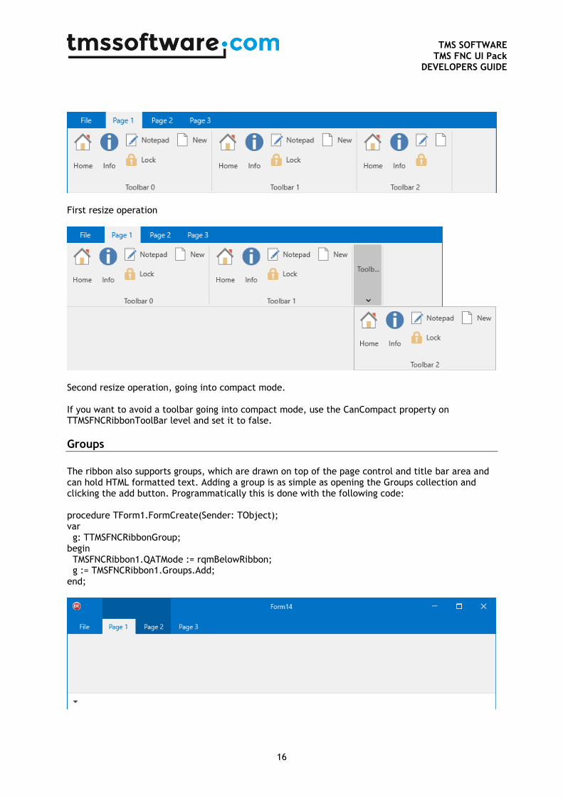
First resize operation
Second resize operation, going into compact mode. If you want to avoid a toolbar going into compact mode, use the CanCompact property on TTMSFNCRibbonToolBar level and set it to false.
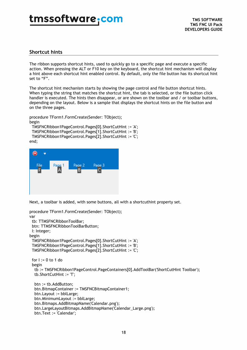
Groups
The ribbon also supports groups, which are drawn on top of the page control and title bar area and can hold HTML formatted text. Adding a group is as simple as opening the Groups collection and clicking the add button. Programmatically this is done with the following code: procedure TForm1.FormCreate(Sender: TObject); var g: TTMSFNCRibbonGroup; begin TMSFNCRibbon1.QATMode := rqmBelowRibbon; g := TMSFNCRibbon1.Groups.Add; end;

TMS SOFTWARE
TMS FNC UI Pack DEVELOPERS GUIDE
17
The qat has also been placed under the ribbon, to have a better visualization of the group. In case the QAT is placed on top, the group will automatically resize of even disappear if no space is left above the page tabs. By default the group is stretched over 2 pages. You can easily change this with the StartPageIndex and EndPageIndex property. procedure TForm1.FormCreate(Sender: TObject); var g: TTMSFNCRibbonGroup; begin TMSFNCRibbon1.QATMode := rqmBelowRibbon; g := TMSFNCRibbon1.Groups.Add; g.StartPageIndex := 1; g.EndPageIndex := 1; end;
A group can also display HTML formatted text with bitmaps, when assigning a BitmapContainer to the ribbon. The following sample displays HTML formatted text on 2 groups that are stretched over multiple pages. This sample also demonstrates how to add pages. procedure TForm1.FormCreate(Sender: TObject); var g: TTMSFNCRibbonGroup; I: Integer; begin TMSFNCRibbon1.PageControl.Pages.Clear; for I := 0 to 6 do TMSFNCRibbon1.PageControl.AddPage('Page ' + IntToStr(I + 1)); g := TMSFNCRibbon1.Groups.Add; g.StartPageIndex := 2; g.EndPageIndex := 2; g.Text := 'Group 1'; g := TMSFNCRibbon1.Groups.Add; g.StartPageIndex := 4; g.EndPageIndex := 5; g.Text := '<img src="Home.png"/><i>Group 2</i>'; TMSFNCRibbon1.BitmapContainer := TMSFNCBitmapContainer1; end;
TMS SOFTWARE
TMS FNC UI Pack DEVELOPERS GUIDE
18
Shortcut hints
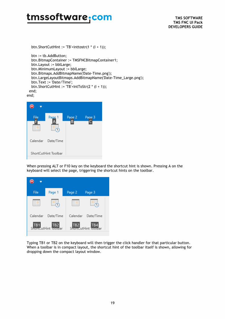
The ribbon supports shortcut hints, used to quickly go to a specific page and execute a specific action. When pressing the ALT or F10 key on the keyboard, the shortcut hint mechanism will display a hint above each shortcut hint enabled control. By default, only the file button has its shortcut hint set to “F”. The shortcut hint mechanism starts by showing the page control and file button shortcut hints. When typing the string that matches the shortcut hint, the tab is selected, or the file button click handler is executed. The hints then disappear, or are shown on the toolbar and / or toolbar buttons, depending on the layout. Below is a sample that displays the shortcut hints on the file button and on the three pages. procedure TForm1.FormCreate(Sender: TObject); begin TMSFNCRibbon1PageControl.Pages[0].ShortCutHint := 'A'; TMSFNCRibbon1PageControl.Pages[1].ShortCutHint := 'B'; TMSFNCRibbon1PageControl.Pages[2].ShortCutHint := 'C'; end;
Next, a toolbar is added, with some buttons, all with a shortcuthint property set. procedure TForm1.FormCreate(Sender: TObject); var tb: TTMSFNCRibbonToolBar; btn: TTMSFNCRibbonToolBarButton; I: Integer; begin TMSFNCRibbon1PageControl.Pages[0].ShortCutHint := 'A'; TMSFNCRibbon1PageControl.Pages[1].ShortCutHint := 'B'; TMSFNCRibbon1PageControl.Pages[2].ShortCutHint := 'C'; for I := 0 to 1 do begin tb := TMSFNCRibbon1PageControl.PageContainers[0].AddToolBar('ShortCutHint Toolbar'); tb.ShortCutHint := 'T'; btn := tb.AddButton; btn.BitmapContainer := TMSFNCBitmapContainer1; btn.Layout := bblLarge; btn.MinimumLayout := bblLarge; btn.Bitmaps.AddBitmapName('Calendar.png'); btn.LargeLayoutBitmaps.AddBitmapName('Calendar_Large.png'); btn.Text := 'Calendar';
TMS SOFTWARE
TMS FNC UI Pack DEVELOPERS GUIDE
19
btn.ShortCutHint := 'TB'+inttostr(1 * (I + 1)); btn := tb.AddButton; btn.BitmapContainer := TMSFNCBitmapContainer1; btn.Layout := bblLarge; btn.MinimumLayout := bblLarge; btn.Bitmaps.AddBitmapName('Date-Time.png'); btn.LargeLayoutBitmaps.AddBitmapName('Date-Time_Large.png'); btn.Text := 'Date/Time'; btn.ShortCutHint := 'TB'+IntToStr(2 * (I + 1)); end; end;
When pressing ALT or F10 key on the keyboard the shortcut hint is shown. Pressing A on the keyboard will select the page, triggering the shortcut hints on the toolbar.
Typing TB1 or TB2 on the keyboard will then trigger the click handler for that particular button. When a toolbar is in compact layout, the shortcut hint of the toolbar itself is shown, allowing for dropping down the compact layout window.
TMS SOFTWARE
TMS FNC UI Pack DEVELOPERS GUIDE
20
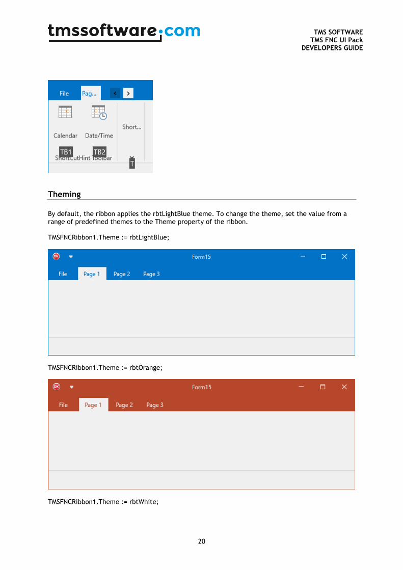
Theming
By default, the ribbon applies the rbtLightBlue theme. To change the theme, set the value from a range of predefined themes to the Theme property of the ribbon. TMSFNCRibbon1.Theme := rbtLightBlue;
TMSFNCRibbon1.Theme := rbtOrange;
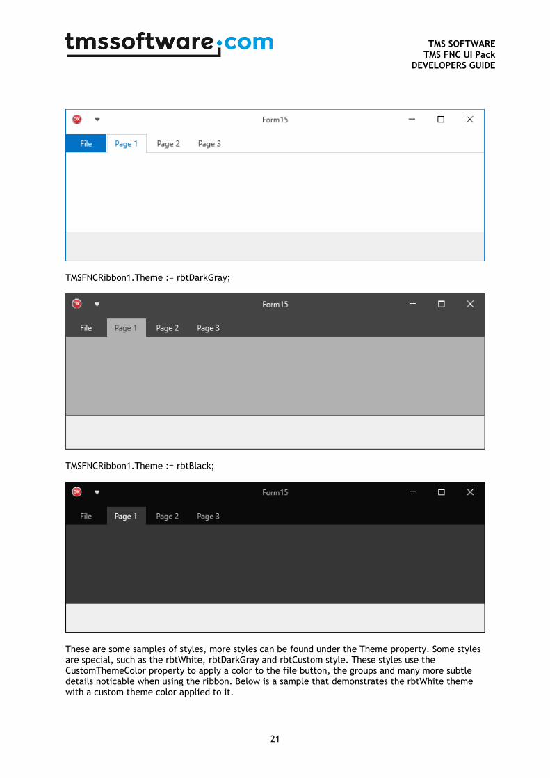
TMSFNCRibbon1.Theme := rbtWhite;
TMS SOFTWARE
TMS FNC UI Pack DEVELOPERS GUIDE
21
TMSFNCRibbon1.Theme := rbtDarkGray;
TMSFNCRibbon1.Theme := rbtBlack;
These are some samples of styles, more styles can be found under the Theme property. Some styles are special, such as the rbtWhite, rbtDarkGray and rbtCustom style. These styles use the CustomThemeColor property to apply a color to the file button, the groups and many more subtle details noticable when using the ribbon. Below is a sample that demonstrates the rbtWhite theme with a custom theme color applied to it.
TMS SOFTWARE
TMS FNC UI Pack DEVELOPERS GUIDE
22
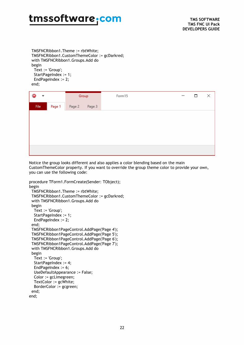
TMSFNCRibbon1.Theme := rbtWhite; TMSFNCRibbon1.CustomThemeColor := gcDarkred; with TMSFNCRibbon1.Groups.Add do begin Text := 'Group'; StartPageIndex := 1; EndPageIndex := 2; end;
Notice the group looks different and also applies a color blending based on the main CustomThemeColor property. If you want to override the group theme color to provide your own, you can use the following code: procedure TForm1.FormCreate(Sender: TObject); begin TMSFNCRibbon1.Theme := rbtWhite; TMSFNCRibbon1.CustomThemeColor := gcDarkred; with TMSFNCRibbon1.Groups.Add do begin Text := 'Group'; StartPageIndex := 1; EndPageIndex := 2; end; TMSFNCRibbon1PageControl.AddPage('Page 4'); TMSFNCRibbon1PageControl.AddPage('Page 5'); TMSFNCRibbon1PageControl.AddPage('Page 6'); TMSFNCRibbon1PageControl.AddPage('Page 7'); with TMSFNCRibbon1.Groups.Add do begin Text := 'Group'; StartPageIndex := 4; EndPageIndex := 6; UseDefaultAppearance := False; Color := gcLimegreen; TextColor := gcWhite; BorderColor := gcgreen; end; end;

TMS SOFTWARE
TMS FNC UI Pack DEVELOPERS GUIDE
23
Each control calls the OnBeforeApplyTheme and the OnAppliedTheme events. These events can be used to further customize controls after theming is applied, or to prevent the ribbon from applying theming to a specific control. If you have any custom control that needs to be included in the ribbon and you want it to automatically adapt to the theme that is applied, you need to implement the ITMSFNCRibbonTheme interface. Below is a sample that demonstrates this based on a TRectangle descendant type TTMSFNCRibbonRectangle = class(TRectangle, ITMSFNCRibbonTheme) public procedure SetTheme(ATheme: TTMSFNCRibbonTheme; ACustomThemeColor: TTMSFNCGraphicsColor); end; … procedure TForm1.FormCreate(Sender: TObject); var r: TTMSFNCRibbonRectangle; p: TTMSFNCPageControlContainer; begin p := TMSFNCRibbon1.PageControl.PageContainers[0]; r := TTMSFNCRibbonRectangle.Create(p); r.Parent := p; r.Align := TAlignLayout.Left; r.Margins.Rect := RectF(10, 10, 10, 10); TMSFNCRibbon1.Theme := rbtWhite; TMSFNCRibbon1.CustomThemeColor := gcDarkred; end; { TTMSFNCRibbonRectangle } procedure TTMSFNCRibbonRectangle.SetTheme(ATheme: TTMSFNCRibbonTheme; ACustomThemeColor: TTMSFNCGraphicsColor); begin Fill.Color := GetThemeTabHoverColor(ATheme, ACustomThemeColor); Stroke.Color := Fill.Color; end;

TMS SOFTWARE
TMS FNC UI Pack DEVELOPERS GUIDE
24
Inside the ribbon source there are a set of GetTheme* functions that return the theme color for a specific element / state. The above rectangle applies the GetThemeTabHoverColor to both the fill and stroke.