Embed Size (px)
Citation preview
Chalmers University of Technology
University of Gothenburg
Department of Computer Science and Engineering
Göteborg, Sweden, February 2012
The Interactive Shopping Window The Future of Window Shopping Nordh Alexander
Nordh Joakim
2
The Author grants to Chalmers University of Technology and University of Gothenburg the
non-exclusive right to publish the Work electronically and in a non-commercial purpose make
it accessible on the Internet.
The Author warrants that he/she is the author to the Work, and warrants that the Work does
not contain text, pictures or other material that violates copyright law.
The Author shall, when transferring the rights of the Work to a third party (for example a
publisher or a company), acknowledge the third party about this agreement. If the Author has
signed a copyright agreement with a third party regarding the Work, the Author warrants
hereby that he/she has obtained any necessary permission from this third party to let
Chalmers University of Technology and University of Gothenburg store the Work electronically
and make it accessible on the Internet.
The Interactive Shopping Window
The future of window shopping
Alexander Nordh
Joakim Nordh
© Alexander Nordh, February 2012.
© Joakim Nordh, February 2012.
Examiner: Fang Chen
Chalmers University of Technology
University of Gothenburg
Department of Computer Science and Engineering
SE-412 96 Göteborg
Sweden
Telephone + 46 (0)31-772 1000
Cover: A picture of the server screen in the final version of the program, see page 35.
Department of Computer Science and Engineering
Göteborg, Sweden February 2012
3
Abstract The purpose of a shopping window is to attract attention and interest to the store, hoping to
get as many passersby as possible to become new customers or tempt old ones to new
purchases. Today, the shopping windows most often have a display consisting of merchandise
or services that the store sells. In some cases they take it a step further, adding a digital screen
to allow a better display of a larger range of merchandise, with the help of a slideshow of
pictures. There is however a limitation to this solution. You can’t control what pictures are
shown when a specific individual is passing by the store, thus having the risk of losing a
potential customer.
We have together with a company named VisioSign explored different solutions on how to add
interactivity to the shopping windows, allowing customers to view more specific merchandise
or services that the store offers. We aimed to create an interaction that would allow the users
to gain as much information as possible in a simple and entertaining manner. Different types
of technology for interaction through a glass window were investigated and evaluated with
respect to each other. Webcams, Kinect, mobile device connection through Bluetooth or Wi-Fi,
voice control, and touch screens were considered to be viable solutions. After researching
them, we decided on a Wi-Fi connection between the shopping window screen and a mobile
device running the Android OS.
The main part of the project then revolved around the creation of an interaction between the
shopping window screen and the user, using an Android device as the interaction medium. We
put much time into designing the interaction, as well as implementing the applications. For
communication between the Android device and the shopping window screen, we needed two
applications, one server application for the screen, and one client application for the user’s
device. Through iterations ending with company tests and feedback, as well as some user
tests, we developed and improved the interactions. The final result was two applications
allowing the user to browse through categories, save viewable information, and browse
webpages on the shopping window screen by the use of his Android device.
4
Table of Contents Abstract ......................................................................................................................................... 3
1 Introduction................................................................................................................................ 8
1.1 Delimitation ........................................................................................................................ 8
1.2 Background ......................................................................................................................... 8
1.3 Goal ..................................................................................................................................... 8
2 Methodology .............................................................................................................................. 9
2.1 Time plan .......................................................................................................................... 10
3 Research ................................................................................................................................... 10
3.1 Bluetooth and Wi-Fi .......................................................................................................... 11
3.1.1 Hardware ................................................................................................................... 11
3.1.2 Solutions .................................................................................................................... 11
3.1.3 Advantages ................................................................................................................ 12
3.1.4 Disadvantages ............................................................................................................ 12
3.2 Webcam ............................................................................................................................ 12
3.2.1 Hardware ................................................................................................................... 12
3.2.2 Solutions .................................................................................................................... 12
3.2.3 Advantages ................................................................................................................ 13
3.2.4 Disadvantages ............................................................................................................ 13
3.3 Kinect ................................................................................................................................ 13
3.3.1 Hardware ................................................................................................................... 13
3.3.2 Solutions .................................................................................................................... 14
3.3.3 Advantages ................................................................................................................ 14
3.3.4 Disadvantages ............................................................................................................ 14
3.4 Touch/Multi-touch ............................................................................................................ 14
3.4.1 Hardware ................................................................................................................... 14
3.4.2 Solutions .................................................................................................................... 15
3.4.3 Advantages ................................................................................................................ 15
3.4.4 Disadvantages ............................................................................................................ 15
3.5 Voice Control .................................................................................................................... 16
3.5.1 Hardware ................................................................................................................... 16
3.5.2 Solutions .................................................................................................................... 16
3.5.3 Advantages ................................................................................................................ 16
3.5.4 Disadvantages ............................................................................................................ 16
3.6 Related Work .................................................................................................................... 17
5
4 Meeting Visiosign and a Customer ........................................................................................... 17
4.1 Conclusion ......................................................................................................................... 19
5 How Should the Phone Control the Screen? ............................................................................ 19
5.1 Initial Ideas from Brainstorming ....................................................................................... 19
5.2 Criteria .............................................................................................................................. 19
5.3 The Five Best Ideas ............................................................................................................ 20
5.3.1 Removed Ideas .......................................................................................................... 20
5.3.2 Kept Ideas .................................................................................................................. 20
6 The First Iteration ..................................................................................................................... 21
6.1 Prototype Goals ................................................................................................................ 21
6.2 Prototype Result ............................................................................................................... 22
6.3 Prototype Feedback .......................................................................................................... 23
6.3.1 Company Feedback ................................................................................................... 23
7 The Second Iteration ................................................................................................................ 24
7.1 Prototype Goals ................................................................................................................ 24
7.2 Prototype Results .............................................................................................................. 25
7.3 Prototype Feedback .......................................................................................................... 27
8 The Third Iteration ................................................................................................................... 27
8.1 Prototype Goals ................................................................................................................ 27
8.2 Prototype Result ............................................................................................................... 27
8.2.1 Client .......................................................................................................................... 27
8.2.2 Server ......................................................................................................................... 28
8.3 Prototype Feedback .......................................................................................................... 31
8.3.1 Company Feedback ................................................................................................... 31
8.3.2 User Feedback ........................................................................................................... 32
8.3.3 User Test .................................................................................................................... 32
9 The Final Iteration .................................................................................................................... 35
9.1 Goals ................................................................................................................................. 36
9.2 Result ................................................................................................................................ 37
9.2.1 Server ......................................................................................................................... 37
9.2.2 Client .......................................................................................................................... 40
9.2.3 Final Feedback ........................................................................................................... 41
10 Final Touches .......................................................................................................................... 42
11 Application Distribution ......................................................................................................... 43
12 Problems ................................................................................................................................ 43
6
12.1 Supporting Other Devices ............................................................................................... 43
12.2 Supporting Android Devices ........................................................................................... 44
12.3 Player Could Not Be Server ............................................................................................. 44
12.4 Accelerometer, Compass and Gyroscope ....................................................................... 44
12.5 Hardware ........................................................................................................................ 44
12.6 Connecting to the Intended Screen ................................................................................ 45
12.7 Portrait or Landscape Problem ....................................................................................... 45
12.8 Finding a Customer ......................................................................................................... 45
12.9 Permissions ..................................................................................................................... 46
12.10 Delay ............................................................................................................................. 46
12.11 Availability ..................................................................................................................... 46
12.12 Connection Lost After Orientation Change................................................................... 46
12.13 Kiosk Mode Safe? .......................................................................................................... 47
13 Future Work ........................................................................................................................... 47
13.1 Click Sensitivity................................................................................................................ 47
13.2 Adapting to New Customers ........................................................................................... 47
13.3 Android Market ............................................................................................................... 47
13.4 Statistics .......................................................................................................................... 47
13.5 Sweep .............................................................................................................................. 48
13.6 Softkeyboard ................................................................................................................... 48
13.7 Queue .............................................................................................................................. 48
13.8 Idle demonstration ......................................................................................................... 48
14 Conclusion .............................................................................................................................. 48
14.1 Reflection ........................................................................................................................ 48
14.2 Discussion ....................................................................................................................... 49
15 References .............................................................................................................................. 52
15.1 Bluetooth and Wi-Fi ........................................................................................................ 52
15.2 Webcam .......................................................................................................................... 52
15.3 Kinect and Gestures ........................................................................................................ 52
15.4 Touch and Multi-touch ................................................................................................... 53
15.5 Android ........................................................................................................................... 53
15.6 Voice Control .................................................................................................................. 54
15.7 Gyroscope, Accelerometer and Compass ....................................................................... 54
15.8 Programming Languages ................................................................................................. 54
15.9 QR-Reading ..................................................................................................................... 54
7
15.10 Methods ........................................................................................................................ 54
15.11 Algorithms ..................................................................................................................... 55
16 Appendix ................................................................................................................................ 56
16.1 Sketches .......................................................................................................................... 56
8
1 Introduction The display in shopping windows today is quite simple. Most of them consist of merchandise
from the store, and in some cases digital screens displaying their merchandise and services.
These kinds of solutions allow no interaction, and there is a limit to how much you can show in
the window at any given time. With an interactive solution, a user could choose what
merchandise and services he would want to view, even at night when the store is closed. Our
goal was to create and design such a solution for the company VisioSign. Our solution would
then be integrated in VisioSign’s screen solution, meaning that our solution would in some way
be designed around a screen.
1.1 Delimitation From the beginning, we researched many technical ways of communicating, but we chose to
only develop for the technology we find most suitable. The interaction should only be used to
view and save information; other services such as purchases will not be considered. We will
also limit ourselves to a single environment, such as the shopping window of a real estate
agency.
1.2 Background This master thesis was done in cooperation with a Danish company named VisioSign,
specializing in internal communication and digital signage. They had an idea about making
shopping windows interactive, and suggested this as a project to us. The idea first came to
light when one of their employees past a shopping window after closing hours. He realized
that the shopping window didn’t use its full potential; it could only show a limited number of
predetermined items. If there was a way to interact with the shopping window, he could have
browsed it for interesting information, instead of revisiting the store the next day, just to
realize that the item he sought was not available. We were given the opportunity to develop a
solution for this.
1.3 Goal The goal of the project is to research and evaluate different ways of interacting with a screen
through a shop window. One or more input solutions will then be implemented and tested in
form of a working prototype for a specific shop window, for example a real estate agent. Our
goals were the following:
How can one make a screen interactive without giving the user any physical device?
How can one make the best use of a shop window at all times, both day and night?
How can one allow the user to keep interesting information, and where should it be
stored?
What should the screen offer?
Should the screen allow multiple users at one time, and if so, how?
What should be done to make people realize that they can interact with the screen?
9
2 Methodology During the thesis, several design methods were used to plan, progress, and direct the work.
The initial plan was to first of all do research in order to find the best suited interaction
medium by which user and screen could communicate. Related work was studied in order to
gather as many mediums used between a shopping window and a user as possible. Viewing
and analyzing these allowed us to see how finished solutions of related problems worked,
what was good about them, and their drawbacks. This was very helpful when choosing what
solution to proceed with. When a set of the most reasonable interaction mediums had been
decided, they were more closely researched, and a single one was chosen for further
development during the rest of the thesis.
The plan was then to continue developing using an iterative model. The first two of these
iterations were aimed on deciding the input method used by the medium. For a phone, there
are for example many ways to solve this, such as communicating with button presses or by the
use of a touch pad. Different input solutions were designed, implemented, tested, and
evaluated. After two iterations a single input solution was decided upon. Iterations after the
first two were aimed at creating and improving the actual product. Each iteration still
consisting of a design and objective phase, a development phase, and an evaluation phase
with user and company feedback to be considered for the next iteration. Our method of work
adapted a concept called “The process of prototype development” which we read about in a
book (Sommerville, I., 2007).
During early design phases brainstorming was used. As many features and design choices as
possible was written down. When no more ideas could be thought of, an elimination process
took place, removing all ideas that were either unrealistic or less good. The ideas kept were
then implemented during the next implementation phase to be tested. Later iterations
focused on the feedback from the previous iteration rather than brainstorming.
While writing the code for the applications, we used “Pair programming” (Sommerville, I.,
2007), since most errors are caught up by the second person if the first person misses it.
User tests were performed at the end of each iteration in order to evaluate what was good,
what should be removed, and what should be changed. Since the tests required access to
Internet and a router, as well as permission to modify it, the tests were conducted in a home
environment. A short interview was held after each test to gather feedback and reflections.
The test group consisted of about 15 users; a few being fellow design students. We had
preferred to have a test group containing only people which were familiar with the interaction
device used, but we could only find a few. During the early iterations, most user testing was
done on fellow designers and a few persons from Visiosign. Towards the later iterations, the
user group widened. After getting feedback from the test phase, the results were evaluated
and used in the next iteration’s design phase.
10
2.1 Time plan
We have planned to spend our time in this order, but we might have to work a bit
differently if something is taking shorter or longer time than expected. The report writing
could cause the time plan to shift a bit since it could sometimes be more intense, and
sometimes less.
Week 1-3: Determine input method though asking users, paper prototyping and research on existing technology.
Week 3-10: Implement determined input method and test it for precision if the technology requires it (possibly take a step back and chose another input method if the chosen one fails).
Week 10-15: Create main application. Week 15-18: Final user testing for minor changes, done in iterations. Week 1-20: Report writing and company feedback.
3 Research From a paper (Brignull, H. and Rogers, Y., 2002), we understood that it was important to make
people feel like they can benefit from the interaction, and make them choose to start
participating. The paper states that users will find it easier to participate, if others have
interacted with the screen before, and the interaction is simple to start using, without forcing
the user into any commitment, being able to quit whenever he or she wants to. We thought
that if we keep this in mind when designing, it won’t be too much of a problem that people
don’t dare to interact with the screen. Having seen someone else interact before you try could
probably make you more willing to try it out as well, if the seen interaction looked simple
enough.
When we researched different input methods, we analyzed them, looking specifically on what
hardware they required and how the technology would fit in a shopping window. To decide
what technology should be used, we took both the advantages and disadvantages into
consideration. We took special consideration to a couple of different attributes to make the
input methods easier to compare to each other. Depending on how well the technology
supported an attribute, that attribute will either be mentioned as an advantage or
disadvantage for that technology. The attributes considered were the following.
Precision
Interaction simplicity
Fun/Annoyance
Input implementation difficulty
Aesthetics
We thought that precision was the most important factor, since we believed it to coincide with
other factors, such as how fun or annoying the interaction would be. For example, if the
precision is low when you interact through voice control, we believe that you will most likely
be annoyed when you get misinterpreted and unexpected things happen, instead of possibly
having fun and enjoy the interaction.
11
If the user is not too interested in using the screen, we think that he will likely not be willing to
put much effort into learning how it works. That is we wanted to have an interaction that is as
easy to learn and understand as possible.
We wanted to avoid input solutions that will likely take far more time to implement than
others, since we wanted to put more work into creating a good interaction than working on
making a connection between application and input device work properly. We believed it to be
better if we could do that well with as little time as possible, and still get an input method that
works in a sufficient way.
We also thought that it was worth to consider that the hardware should not scare people
away, but rather draw their attention to the shop window. For example, we think that having
something new like a Kinect in the shop window will draw more interest than having a regular
webcam.
3.1 Bluetooth and Wi-Fi
3.1.1 Hardware
Bluetooth is an open technology that allows for wireless communication between devices. We
would like to make Bluetooth connections between the screen and the by-passing users’
“Bluetooth enabled devices”. Another alternative is to connect to their devices using Wi-Fi
(Brain, M. and Wilson, T., 2012). The users should then be able to interact with the screen
through their device in a similar manner. The most common range for a Bluetooth enabled
device is about 10 meters (The Travel Insider, 2012), which will be enough for us since people
will be standing just outside the shop window. There are three radio classes, all with different
ranges (The Travel Insider, 2012). The first class only has about 1 meter range, which would
probably be a bit too little, but all other classes would be fine, since they have a range
exceeding 10 meters, going up to as much as 100 meters for the longest ranges.
3.1.2 Solutions
Our proposed solution was to let mobile phones connect via Bluetooth or Wi-Fi to a screen on
the other side of a shop window. Nowadays, almost everyone carries a phone containing
either Wi-Fi or Bluetooth, and hence we can utilize the fact that none of the shop’s hardware
needs to be on the outside of the window. After connecting your phone to the screen you
would be able to navigate it with the phone’s keypad and browse whatever information the
screen holds. We hoped that this could be done without the need of an application on the
phone. If this couldn’t be done we would need to put an application on the screen so that
connected phones can download quickly while standing outside the store.
12
3.1.3 Advantages
This solution would make it possible for us to have an interaction without the store having to
give the customer anything to interact with, nor putting anything on the outside of their store
which could be destroyed or stolen. Another advantage is that the application would be able
to separate users easily during multiple user communication, since it would be able to
distinguish between different devices. Compared to other solutions, this solution does not
have any problems with precision, since the input would consist of the users pressing buttons
on their phones, and that information would be sent to the screen. A solution such as a touch
screen or webcam would require that the program is precise so that it isn’t hard or annoying to
interact with. It is also more subtle compared to the other solutions, such as speaking to,
touching or waving in front of the shop window.
3.1.4 Disadvantages
This solution would require that the users walking by carry a device with Bluetooth or Wi-Fi.
Without that, they can’t interact with the screen. We believed it to be common enough for
people to have Bluetooth or Wi-Fi today so that we could expect most people to have it. We
came to this conclusion after looking through the specifications of 54 different, arbitrary, new
mobile phones, and all of them at least had Bluetooth. We believe that older phones have a
risk of not having any of them, but nowadays it should be unlikely enough. A likely bigger
problem is that Bluetooth drains the battery of the phone faster and is usually turned off by
default, making it necessary for users to manually activate it before interaction with the
screen. People might also not want their Bluetooth to be active all the time, since they might
have heard about the possible security vulnerabilities (Cheung, H., 2005). The interaction
would probably be a bit harder to start up than for other solutions, but after that it will likely
be more useful since the phone allows for file transfer and storage. Something less good is that
the interaction will likely be less aesthetically appealing than something such as a Kinect
solution or a voice control solution.
3.2 Webcam
3.2.1 Hardware
A webcam is a small camera which can be used to send images in real time to a computer. It
could be connected to the computer through USB, but Wi-Fi or Bluetooth are also possibilities.
A webcam can be relatively small, and would not have to take up much space.
3.2.2 Solutions
There were many different software solutions we found that we could try to implement for
using a webcam as an input method. A few such solutions will be mentioned in this text. One
solution to use the webcam to control the screen was by tilting your head in front of the
camera (Canonical Design, 2010). This was achieved by the use of face recognition. This
solution can also recognize if the user moves his head towards or away from the camera.
There are also other solutions, such as combining the camera with an external object such as a
glove with a different color for each finger (Fredriksson, J., Ryen, S. and Fjeld, M. 2008).
13
In this solution 3D objects could be rotated by the software which recognizes the different
colors on the users hand and wrist. That kind of solution would require that the user has a
colored glove, which we want to avoid. The store should preferable not be forced to give the
users any material prerequisites to start an interaction with the screen. If we would decide to
use webcam as input method, we would probably implement it using OpenCV (OpenCV, 2012),
which is a framework for computer vision.
3.2.3 Advantages
One of the greatest advantages of the gesture interaction which the webcam would allow us
to have, was that it would most likely be easy and possibly fun to use. You don’t need to use
any buttons or press anything, just make gestures and see how the screen reacts. This could
also mean that you don’t need anything physical on the outside to interact, since the camera
would likely be on the inside of the shop window. This would also allow the interaction to start
off directly, since the user doesn’t need to install any software in advance.
3.2.4 Disadvantages
A problem with webcam solutions would be that they would require the user to do some kind
of odd gesture, which we don’t know if people would like to do on the street. We were unsure
about how much precision this technology could give us. Controlling something with
movements could be tricky as mistakes easily are made and people are more or less agile for
such tasks. Even if we would get it to work pretty well, it would most likely be hard to isolate
different persons unless we could make a face recognition which can tell people and their
input apart.
3.3 Kinect
3.3.1 Hardware
The Kinect is a device meant to be used together with an Xbox 360, which is a gaming console.
Kinect was developed by Microsoft, who also developed the Xbox 360, to be used as an input
device for games and other Xbox 360 applications. The Kinect sends out IR-lights in different
directions covering everything in front of it (brmadsenad, 2010). It can give us information
about all three dimensions, which a webcam solution could not easily do. It also contains
software for recognizing persons and thus can easily interpret movements and gestures. We
have seen that there are a vast potential in this hardware, and it seems to have been used in
very many ways (vsauce, 2010). Microsoft is likely to be working on a PC version of this
technology, but we have no idea when, or if this will be released (Boland, R., 2011). We believe
this to be quite hard to implement, since the hardware is not meant for PC use.
14
3.3.2 Solutions
Not long after the Kinect was released it was also modified so that it could be used together
with a normal computer. This opened our eyes for a solution for a shop window. By having a
Kinect connected to a screen on the inside of the window it could register all the movements
outside and interpret gestures as commands for the screen. A simple gesture with your hand
could let the screen swap to a new page. Another solution could have been that the screen
displays your hands as well, and you can simply click on images or links by moving your
pointing finger forward towards the window.
3.3.3 Advantages
The Kinect’s great advantage was that it provided us with 3D information about what is seen
outside the shop window. It could for example start an advertisement with sound when it sees
that someone is passing by. We also found it to be a possibly enjoyable interaction, since it just
requires the user to move their body. We also thought that it could be easily understood, since
one could show how the navigation is done with sensory symbols, as described in a book
(Ware, C., 2004), showing for example a body part performing a certain movement. Another
big advantage was that it didn’t require anything from the user; he could start the interaction
directly without any programs or previous knowledge.
3.3.4 Disadvantages
The main reasons for us to not use this technology is that it is currently being developed for
computers, and that it would be very hard to adapt the Kinect for computer use ourselves. The
Kinect solution would also have the problem that some users would probably not want to
make odd gestures on the streets, but following the hints from a paper (Brignull, H. and
Rogers, Y., 2002), it will likely be less of a problem. At first we didn’t know how well a Kinect
solution would work behind glass, since it is said that it should not be put behind glass (Minor,
N., 2010), but we believed that it might still work good enough. Luckily, we have found a
solution present in Moscow (KinectHacks.net, 2011), which has done this, and it seems to work
well (see Related work).
3.4 Touch/Multi-touch
3.4.1 Hardware
We only considered touch technology that rely on webcam or IR because it’s the most
reasonable in our situation. A screen that feels touch would require to be placed outside the
shopping window or replace the window, this would either be too expensive or cause a risk of
vandalism or wear and tear. However, some touch technology is based on sending IR light from
the backside of a glass surface, reflecting on anything that touches it. It then returns with
information telling where the surface was touched. One framework we considered to use with
this kind of solution was grafiti, which would have made the gesture recognition much easier
(graffiti, 2009).
15
3.4.2 Solutions
We found two promising solution which we could use to achieve multi-touch without having
anything on the outside of the shop window. One of these was to make our own multi-touch
surface, using the open source code from MTMINI (Seth Sandler, 2011) and their simple
solution for making a multi-touch surface with a webcam. The only thing you need is a
webcam, a cardboard box, some tape and a paper. If we chose such a solution we would like to
do essentially the same thing, just with more appropriate materials, given that it will be placed
in a shop window. The problem with this solution is that it is just a multi-touch surface, and not
a multi-touch screen. Thus you can’t see anything on the surface you touch and will have to
view it on a different screen. Since we wanted to have it inside the shop window, we were
unsure whether if it would work through the window or not, since you are supposed to touch
the paper (representing the touch surface), creating a shadow which can be read by a camera.
If the shop window is too thick, a shadow might not be created.
We preferred the second solution that we had found, which was to make a multi-touch screen
using an IR camera and a projector. The projector would display a screen on the shop window
and an IR camera calibrated to the same points as the projector would feel wherever you press
on the shop window. This means that both the touch surface and the screen would be
projected onto the shop window.
3.4.3 Advantages
An advantage with a touch screen solution was that it is usually easy to learn and navigate.
With a good, quickly responding application, it should be possible to make a natural, and
hopefully enjoyable, interaction. Given the open source software and guide on how to make
the touch screen (Seth Sandler, 2011), it seemed that the implementation of this input solution
would be quite easy. Multi-touch would also give us the same advantage as webcam and
Kinect; it doesn’t require the users to acquire any program or tool before starting the
interaction and thus makes it quick and simple to start.
3.4.4 Disadvantages
For both the solutions that we found, we couldn’t see any way of separating different users’
fingers from each other. In the projection solution, it would be hard to separate different
users, since we wouldn’t be able to tell their fingers apart. In the webcam solution, it would be
possible to separate different users by simply having more than one touch surface.
The greatest worry about this input method was that it would not work, or, that it would not
work well, having low precision. We don’t know much about the properties of a common shop
window glass, and we were worried that it might be too thick for the webcam to see the
shadows properly. This might not have been a problem at all, but we would need to test it to
be sure, which could cost us a lot of extra work if it doesn’t work decently.
16
A problem for the projector solution was that it could be unusable by some stores, if they do
not have about two meters of open space between the window and the projector, which they
can sacrifice, since the projector needs some distance to work at a high resolution.
3.5 Voice Control
3.5.1 Hardware
The process of voice control starts with the user saying a phrase to the computer; the phrase is
then cleaned from unwanted noise and translated into digital format. The data is then
compared with a dictionary to decide what words was most likely said. These words can
thereafter be either dictated in any program or they could activate different commands like
open or close a program. A problem with this technology is that we all have different dialects
and thus make it easier for the computer to misinterpret different words. One way to solve
this is to let the program learn the speech patterns of the user and adapt to him
(Grabianowski, E., 2006), but this is something that is only useful if the software is used by few
and regular users. For a scenario where lots of user will interact with it another solution is
better, namely to limit the possible words and make sure to use words that does not sound
too similar. The voice control will be more limited but less likely to misinterpret its users.
3.5.2 Solutions Communicating with computers or robots by voice exclusively is something that is regularly occurring in science fiction, but the technology exists and could easily be used in our scenario. By simply saying out loud what the user wants to browse in the shopping window, it could be shown. To try this out we installed and did some testing with E-Speaking; a free voice recognition software for windows (e-Speaking, 2012).
3.5.3 Advantages
If the computer would be able to easily understand what the user says, it could give a quite
simple and enjoyable interaction, where the user would not need to do anything more than
talk to start the interaction.
3.5.4 Disadvantages
First of all, we believed that this could be hard to achieve in a good way. The microphone
would have to be on the outside of the glass, and there would likely be other noises which
might confuse the program, since it would be on a street where people pass by, talking to each
other. After installing and testing software (e-Speaking, 2012) for voice control we found
several problems with this solution. These were mainly related to the precision. It was very
common that we had to repeat the same word over and over again before the software
recognized what we were saying. This repetition made it quite annoying and sometimes it
even took a different action that sounded close to what we tried to say. We believed that this
would only get worse and become more annoying in an outdoor situation with more
background noise and the fact that you would have to stand and repeat yourself in front of a
shopping window in public.
17
3.6 Related Work We have found a very interesting Kinect solution for an interactive shopping window, which
looks a lot like the solution we were thinking of doing. It has been implemented and is
currently in use in Moskow, made by “VIVID Interactive” (KinectHacks.net, 2011). We found it
very useful to see what the use of a Kinect behind a shop window would be like, since we were
worried about whether it would work well or even at all. In the video (KinectHacks.net, 2011),
you can see how a user turns pages waving his hand like if he was turning a newspaper. He can
enter or select an item on the screen by holding his hand still, pointing at the screen, or doing
a gesture which looks like if he is pulling aside curtains. From this we see that it is possible to
do a quite natural interaction, which look good and will likely draw attention to itself. The
drawbacks that we can see are that it occasionally doesn’t respond, but not often, and that
you are not really connected to it through a device of your own, meaning that you can’t ask it
to give you information to take with you, stored on your device. This would have been possible
with a Bluetooth or Wi-Fi solution. We also believe that the interaction can be a bit slow, and
that it would be very hard to type anything if necessary, since you don’t have a keyboard of
any sort because of the lack of buttons or areas to press. Solutions such as voice recognition,
Bluetooth/Wi-Fi, and Multi-touch screens could have handled situation in which you would
need to type, or preferred to type, better.
We also found a solution made by “The Alternative” (The Alternative, 2010), which is a gesture
based interactive shopping window. It is projected onto the window, and a user can interact
with it to watch music videos or read the news (itn, 2007). The interviewed people seem to like
it, but we believe that it will have the same drawbacks as the solution by “VIVID Interactive”.
4 Meeting Visiosign and a Customer After researching the positive and negative factors of the different possible input methods, we
wanted to talk to VisioSign and a customer of theirs about what we had found out through our
research. We thought it was important that we didn’t start to work on a solution that wouldn’t
be wanted. VisioSign had a customer which they contacted for us, and since we believed them
to have much information and experience which we didn’t, we prepared a couple of questions
to ask. Our customer was a company called Tylöprint, which helps real estate agencies with
different kinds of advertisement.
We quickly found out that the real estate agencies had already tried different technological
solutions. The most common was a standard screen with a loop showing a picture of a house
and its related information such as location and price. After a few minutes the screen would
simply display a new house and so on. This technology however had flaws, as customers would
not stand and wait outside the window for a suitable house to appear, and if such a house
would actually appear they would only have a short amount of time to write down the
information given about the house before it was gone again. We were told that many agencies
nowadays were getting rid of their digital solutions and returned to having standard papers in
their windows with different houses on. They did this mainly for two different reasons, the
screens cost them more than they actually earned from them and they found it technically
hard to update the information on the screens.
18
When we presented the different technologies that we thought was the best solutions (Kinect,
Multi-touch, and mobile phone Wi-Fi / Bluetooth), he didn’t think that people would like to
use such solutions out on the street to acquire information, and that the shopping window was
more meant to create a first interest, improving the store’s reputation. He also thought that
people wouldn’t want to do gestures outside a shopping window. He did however like the idea
of using multi-touch as a tool, which the real estate agents could use inside their stores for
presenting houses in a professional and effective way. This way they could show their
customers what houses they had for sale, and where they were situated, on a dynamic 3D
model. This is the example which he showed us that he wanted to see adapted (hakandincher
2011).
Since some real estate agents had even removed their screens because of the electricity cost
and the fact that they didn’t do much more good for them than illuminated papers, we
thought that we had two possible conclusions to draw. Either this is an opportunity to enter a
market that has yet to see a digital improvement, or this is a bad market, because previous
digital solutions have not proven themselves to be useful. The fact that they had just been
removed in some stores makes us believe it to be unlikely that the store owners would want to
risk the same thing happening twice.
The target group for real estate agencies was about what we expected, but it was good to hear
it from an experienced person in the field. He mentioned that students were more likely to
browse the internet to find a place to live, but middle aged persons and above could enjoy
getting inspired by the shopping window of a real estate store. He said that the window
doesn’t only inspire the customers into buying houses, if it looks professional enough, it could
make the customers interested in selling their houses through that particular real estate
agency.
Other interesting points which were mentioned were:
Anything presented in the shopping window needs the correct lightning to be clearly
visible. The solution must be easily updated by the real estate agents. The shopping window should focus on creating an impulse for the bypassing people. You could use a combined solution, having both illuminated papers and a digital
screen. Real estate agencies usually have the same opening time as most other stores. According to him, Sweden is on the cutting edge in the real estate area. Pictures creates impulses and feelings, they should be used www.hemnet.se contains all houses for sale in Sweden. It could be useful for our
solution. The most common exposure used in shopping windows is currently illuminated papers
in plastic pockets.
19
4.1 Conclusion We talked with VisioSign again, after having the meeting. We talked about their solution (the
Infoboard) and decided that the best way to proceed would be to make a prototype with a
mobile phone, which could connect to (and control) their screen in some way. We chose this
because we found it to be the most subtle among the solutions, not as hard to implement as
Kinect, and it would allow users to save information from the screen to their own device. The
Kinect and multi-touch solutions are also much more expensive.
5 How Should the Phone Control the Screen? As we had now decided on how the input should be done, we had to ask ourselves the next
question: How should the phone control the screen? We realized that there were many ways
in which this could be done, and we decided to begin with brainstorming ideas.
5.1 Initial Ideas from Brainstorming These were the ideas that came up during our brainstorming session:
Control the mouse directly with the directional pad and make choices with it.
Each alternative is marked with a digit, clicking that digit will chose that alternative.
Chose an alternative through a selection that the directional pad can move.
Press 1 or 2 to navigate through a decision tree until you reach your goal.
Write code words through the T9-system to reach your goal.
Use the gyroscope to control either a mouse pointer or a selection in order to reach
and select you alternative.
Make decisions through speaking words to your phone.
Move a selection through changing the orientation of your phone by using the
compass; push a button to choose an alternative.
5.2 Criteria These are the most important criteria that we thought of when judging our solutions:
Quickness - For someone to take interest from the beginning, the communication can’t
be too slow. If the interaction seems too slow, the user might quickly lose interest.
Comfort - Some ways of interacting with the screen using your phone might be more
or less discomforting. For example, interacting through buttons might be less
discomforting than talking through your phone within a public area.
Precision - With a low precision, the user will have less control of the interaction and
risk making mistakes, which would be frustrating. Examples on solutions that require
such precision could be voice control or control through gyroscope.
Easily mastered - The sessions in which the users interact with the screen are short,
and because of this, it shouldn’t take long time to master the input method, since the
user might never do so if it is a bit tricky.
Enjoyable - The interaction shouldn’t be boring. It should preferable be something that
attracts attention and makes people want to try it out, given that it is presented in a
shop window.
20
5.3 The Five Best Ideas We then evaluated the ideas against the criteria, deciding which should be kept for testing,
and which should be discarded.
5.3.1 Removed Ideas
We removed three of our solutions which did not fulfill the criteria very well:
Voice control is an excellent solution for the quick criterion, and it could be enjoyable.
It does however fail at all other criteria.
Writing code words would be hard to master, quite slow, and we don’t think that it
would be enjoyable.
The decision tree fulfills all criteria quite well, except quickness. In this regard, it does
however fail too much and we don’t see a reason to choose this over the digit solution.
5.3.2 Kept Ideas
These ideas were kept to be tested by both us and VisioSign in the first version of the
application:
The solution in which you control the screen with a mouse was kept, since it didn’t fail
critically at any of the criteria. The reason that we didn’t really like this solution is that
it does not really fulfill any of the criteria very well, but just decently, except for
comfort.
Controlling the screen by pressing the digits on your phone corresponding to different
alternatives on the screen was one of our favorite solutions. It fulfilled all the criteria
and seemed like a nice way of interacting.
Using the directional pad and a button for selecting was an idea we liked quite well. It
fulfilled most criteria, but was just a bit lacking in the quickness and enjoyable criteria.
The gyroscope’s strongest points are that it would likely fulfill both the quickness and
enjoyable criteria very well. We didn’t know how hard it would be to master it, and we
believed that it might barely pass the comfort and precision criteria. However, we had
to test some of these things to know for sure, such as precision.
Most smart phones have an inbuilt compass, so we thought that we could make use of
it. We reached this conclusion by seeing the compatibility definitions for the different
Android phones, together with what phones are being used today (Google Inc, 2010a)
(Google Inc, 2010b) (Google Inc, 2010c) (Google Inc, 2011) (Android Developers,
2012b). Navigating the screen by simply aiming your phone would be a fun solution
but we still believed it would lack some in precision and perhaps even be hard to
control if you don’t have a steady hand.
21
6 The First Iteration First of all, we needed to decide what phones we should aim at to begin with. It was seen likely
that if we made an application for one phone, it would not work for more than just that type of
phones, since there are so many different brands and operating systems. The iPhone for
example uses an operating system referred to as iOS, while some phones use Android
(Mohelska, H., 2010).
We chose to make a prototype for an Android phone, since it is a smartphone that is getting
more and more popular while competing with the iPhone in the top. By developing to a
smartphone we would get a lot of advantages such as the touch screen, Wi-Fi, and the inbuilt
compass and accelerometer. The smartphones are getting more and more popular and we
believed, and still do, that in a couple of years the old phones will wear out, and smartphones
will become the standard.
The reason we chose Android over iOS is that currently, more Android phones are being sold
than iPhones (Market Force, 2011). We are also more used to the Java programming language,
which is greatly supported by the Android (LINUX FOR YOU, 2008), than we are to the iOS
language. We did however aim to keep on developing this project and adapting it to both
Androids and iPhones in the future.
6.1 Prototype Goals The goals of the first prototype aimed to create an as simple as possible communication
between the computer and the phone, demonstrating possible input methods. This meant that
we would have to create a client for the phone and a server for the computer and screen. The
prototype would have to be able to handle digit input, selection with soft direction buttons,
remote mouse controlling with the soft direction buttons and control of the server screen by
simply moving, aiming or tilting the phone, utilizing the accelerometer and compass. We found
out that few phones actually have gyroscope, and we decided to try achieving the same effect
through combining the accelerometer and the compass that are standards in the smartphones
(Varga, S. and Kostic, M., 2010). The server should contain a program that allows you to test
the input methods in navigation.
We decided that when the prototype would be finished it should be tested to make sure that
the connection worked through a standard shop window and that the delay when sending
information to the server was low enough to not annoy the users. It should also be tested by
Visiosign so that they could get a first feeling of the interaction and thus making them able to
gain ideas of how this solution could be implemented for their customers. They would also be
able to give us feedback about how they experienced it, and what input method they
preferred.
22
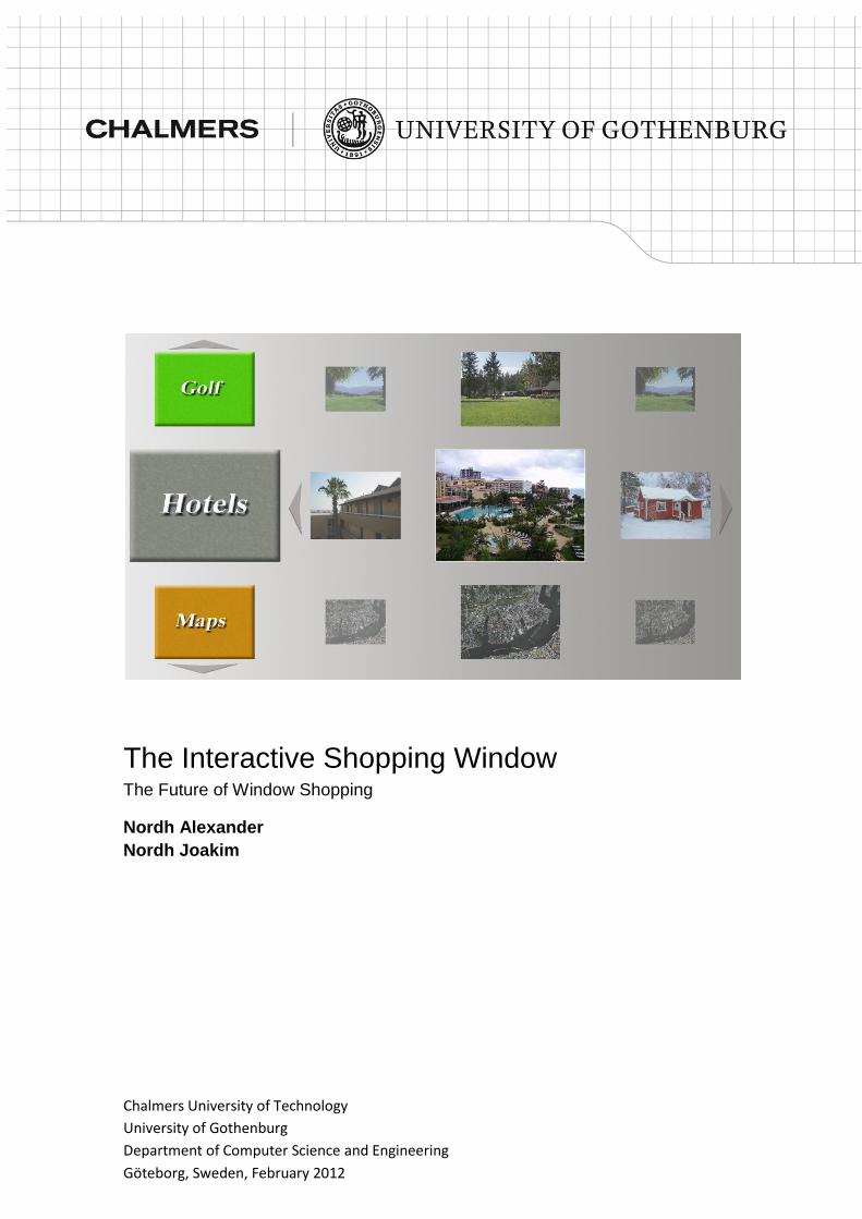
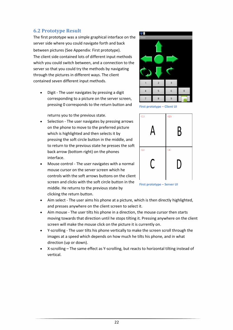
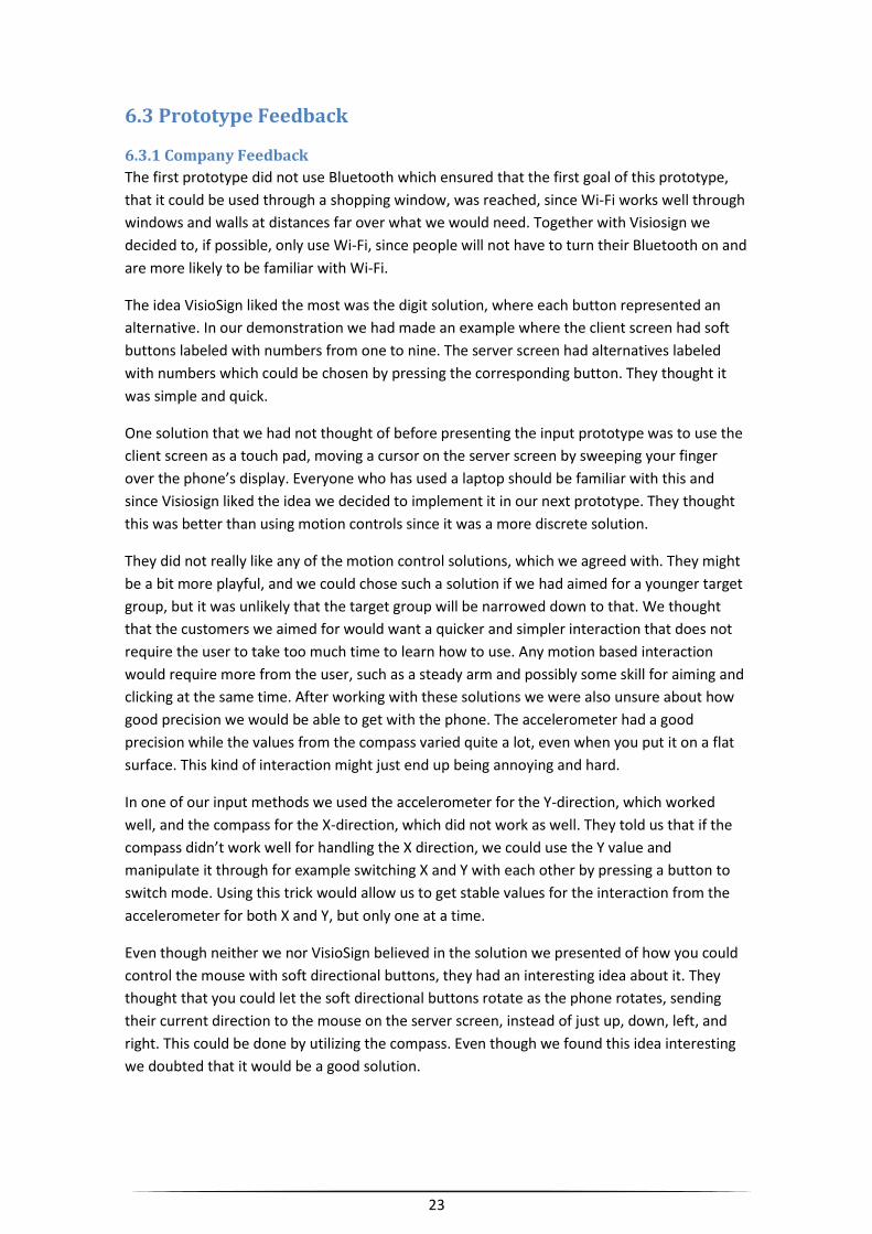
6.2 Prototype Result The first prototype was a simple graphical interface on the
server side where you could navigate forth and back
between pictures (See Appendix: First prototype). The client side contained lots of different input methods
which you could switch between, and a connection to the
server so that you could try the methods by navigating
through the pictures in different ways. The client
contained seven different input methods.
Digit - The user navigates by pressing a digit
corresponding to a picture on the server screen,
pressing 0 corresponds to the return button and
returns you to the previous state.
Selection - The user navigates by pressing arrows
on the phone to move to the preferred picture
which is highlighted and then selects it by
pressing the soft circle button in the middle, and
to return to the previous state he presses the soft
back arrow (bottom right) on the phones
interface.
Mouse control - The user navigates with a normal
mouse cursor on the server screen which he
controls with the soft arrows buttons on the client
screen and clicks with the soft circle button in the
middle. He returns to the previous state by
clicking the return button.
Aim select - The user aims his phone at a picture, which is then directly highlighted,
and presses anywhere on the client screen to select it.
Aim mouse - The user tilts his phone in a direction, the mouse cursor then starts
moving towards that direction until he stops tilting it. Pressing anywhere on the client
screen will make the mouse click on the picture it is currently on.
Y-scrolling - The user tilts his phone vertically to make the screen scroll through the
images at a speed which depends on how much he tilts his phone, and in what
direction (up or down).
X-scrolling – The same effect as Y-scrolling, but reacts to horizontal tilting instead of
vertical.
First prototype – Client UI
First prototype – Server UI
23
6.3 Prototype Feedback
6.3.1 Company Feedback
The first prototype did not use Bluetooth which ensured that the first goal of this prototype,
that it could be used through a shopping window, was reached, since Wi-Fi works well through
windows and walls at distances far over what we would need. Together with Visiosign we
decided to, if possible, only use Wi-Fi, since people will not have to turn their Bluetooth on and
are more likely to be familiar with Wi-Fi.
The idea VisioSign liked the most was the digit solution, where each button represented an
alternative. In our demonstration we had made an example where the client screen had soft
buttons labeled with numbers from one to nine. The server screen had alternatives labeled
with numbers which could be chosen by pressing the corresponding button. They thought it
was simple and quick.
One solution that we had not thought of before presenting the input prototype was to use the
client screen as a touch pad, moving a cursor on the server screen by sweeping your finger
over the phone’s display. Everyone who has used a laptop should be familiar with this and
since Visiosign liked the idea we decided to implement it in our next prototype. They thought
this was better than using motion controls since it was a more discrete solution.
They did not really like any of the motion control solutions, which we agreed with. They might
be a bit more playful, and we could chose such a solution if we had aimed for a younger target
group, but it was unlikely that the target group will be narrowed down to that. We thought
that the customers we aimed for would want a quicker and simpler interaction that does not
require the user to take too much time to learn how to use. Any motion based interaction
would require more from the user, such as a steady arm and possibly some skill for aiming and
clicking at the same time. After working with these solutions we were also unsure about how
good precision we would be able to get with the phone. The accelerometer had a good
precision while the values from the compass varied quite a lot, even when you put it on a flat
surface. This kind of interaction might just end up being annoying and hard.
In one of our input methods we used the accelerometer for the Y-direction, which worked
well, and the compass for the X-direction, which did not work as well. They told us that if the
compass didn’t work well for handling the X direction, we could use the Y value and
manipulate it through for example switching X and Y with each other by pressing a button to
switch mode. Using this trick would allow us to get stable values for the interaction from the
accelerometer for both X and Y, but only one at a time.
Even though neither we nor VisioSign believed in the solution we presented of how you could
control the mouse with soft directional buttons, they had an interesting idea about it. They
thought that you could let the soft directional buttons rotate as the phone rotates, sending
their current direction to the mouse on the server screen, instead of just up, down, left, and
right. This could be done by utilizing the compass. Even though we found this idea interesting
we doubted that it would be a good solution.
24
While we discussed the prototype, they really liked the idea of letting the user save
information to their phone. They especially thought that this would be useful for tourists if the
server screen would give information about events. A simple save button on the client screen
were decided to be added in the next prototype.
7 The Second Iteration We were not yet sure about what language the server would be using. If the Player would have
Java, we would probably use that. If it did not have Java, but did have the .Net framework, we
would probably use C# instead. The Player was a small computer which VisioSign sold, using
VisioSign's software together with a screen of the customer's choice.
7.1 Prototype Goals One of the most important goals of this prototype was to get the server working in its correct
environment, which would mean integrating it into the Player computer, instead of using it in
our regular computers. We wanted to find out if it would require that we install any additional
software, such as Java, or if it was already installed at a version which is high enough to handle
our software. Since our goal was to integrate our program into their system, it would be better
if we used the software that the Player already contained, than to add new software.
We wanted to implement both the digit and touch pad input methods in two separate
prototypes, since the last prototype handled all the different inputs in a single application. This
made it look a bit cluttered and reduced the feeling of every individual method. By having two
separate applications in this prototype we aimed to give the users a better feel of how those
input methods would work alone in the end product.
We had also thought about if we wanted to use something else than numbers for representing
the alternatives in the digit solution. Since the user did not push a physical button (The buttons
on the smartphone is fully digital), there was no need for us to use a specific symbol in the
application representing that button anymore. We could have any kind of symbols on the
server screen and the same on the client screen as buttons. Some examples could be different
colored squares, arrows in 8 different directions with something in the middle or simply
miniatures of pictures corresponding to what you would see on the server screen.
Another new feature of this prototype would be a saving function. The user should be able to
simply save whatever is on the server screen right now to his connected phone. So far we were
not sure if this should be saved as a single picture on the phone, as an editable text file, or pdf
file.
We will also implement the technical possibility for multiple phones to connect to the same
screen in this prototype, but not design for it, meaning that the screen will not care who sent
what, just handle it as if it all came from the same person.
25
Digit prototype - Server UI – Category selection
Digit prototype – Server UI – Item selection
7.2 Prototype Results First of all, the second prototype was designed for another
customer than the last one. The real estate agency we first
designed for lacked in interest so it was decided that this
solution should be designed for another market, rest areas
in southern Sweden. Since VisioSign had contacts in this
area, and since the area had a potential need for
information, VisioSign told us that we should change our
focus to this area. We and VisioSign thought that a rest
place could benefit from information about things such as
hotels, nature, golf, fishing, restaurants, and so on.
We should by now have it running on the companies
hardware, unfortunately that was not the case. First of all
we realized that the Player did not contain the required
software for our server to run. Installing all the required
software worked without any problems,
however, their build of the Windows XP
embedded operative system didn’t allow
outside connections and thus couldn’t carry
out the role of a server. It was decided that
we should be granted their software for
installation directly on our own computers
until it could be fixed.
The first part was the polished digit solution
from the first prototype (See Appendix:
Second prototype). In addition to the earlier
version, it now contained a save button that
could save any kind of file directly to the
phone. It also contained two new buttons,
named left and right, that was used when a
category had more than nine pictures so
that all could be browsed but not more
than nine at a time. The server had a simple
way of loading files into the system, so that
it was easy to add or remove new
categories and images.
Digit pototype – Client UI
Digit prototype – Server UI – Item viewing
26
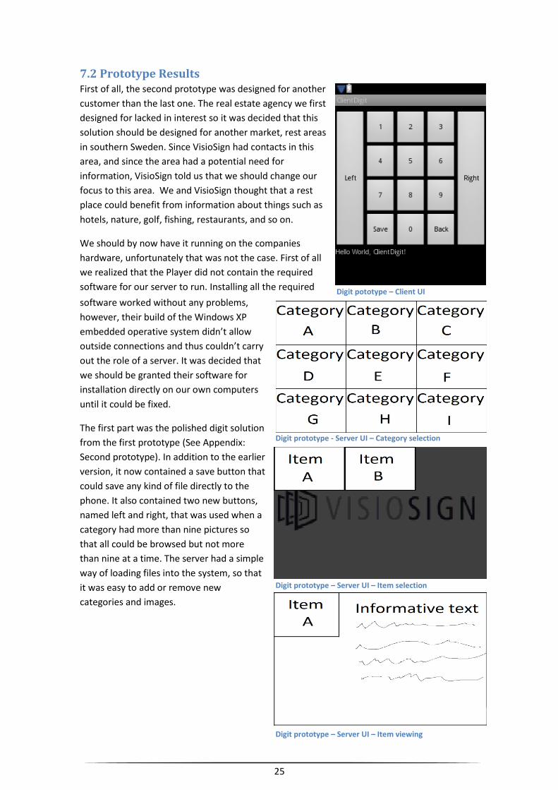
The second part was a touch pad version where you dragged
your finger on the client screen to navigate through the server
screen. The server screen displayed all pictures in a horizontal
line that you could drag left or right until you got your preferred
item in the middle of the server screen. To select the current
item you simply tapped anywhere on your client screen and
that item was selected. This solution also contained two
buttons; a back button and a save button. An alternative to the
back button was also implemented; you could simply shake the
phone to back one step.
Touch prototype – Server UI – Category selection Touch prototype – Server UI – Item selection
Touch prototype – Server UI – Item viewing
Touch prototype – Client UI
27
7.3 Prototype Feedback VisioSign liked both solutions, but decided that we should go with the touch pad version since
it was less cluttered, more fun to use, and because people are used to this kind of interaction if
they have a smartphone, since it is used to navigate the standard graphical user interface.
They liked that it now was possible to save files to the phone in a better way than through
SMS, which they had previously used and had many ideas of how this new feature could be
used. Stores could use this to allow their customers to save some kind of digital coupon to the
phone that could later be used for a discount when purchasing something from the store.
They also showed us how they imagined that our application could be integrated with their
Player. (See Appendix: Second prototype: Early sketches)
8 The Third Iteration Together with VisioSign we decided to continue with the touch input method. Since all Android
phones must have a touch screen (Google Inc, 2010), we did not have to implement an
alternate input method. If we would extend the application to work with other popular phones
such as the iPhone, we would have to look into what input method best suits them, and how
our graphical screen solution would have to adapt to still give an as simple and good
interaction as possible for the different ways of controlling the server screen.
8.1 Prototype Goals The main goal of this prototype was to create the actual application which we would want to
polish into our final result. We wanted to put much more effort into the graphical design, since
the previous prototypes were almost only aimed at allowing tests for different ways of making
input and finding technical solutions for us to use later on, such as saving files on your phone
from the server.
8.2 Prototype Result
8.2.1 Client
8.2.1.1 Graphical Design and Functionality
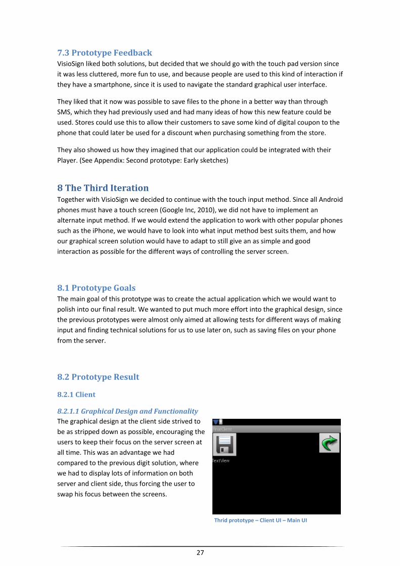
The graphical design at the client side strived to
be as stripped down as possible, encouraging the
users to keep their focus on the server screen at
all time. This was an advantage we had
compared to the previous digit solution, where
we had to display lots of information on both
server and client side, thus forcing the user to
swap his focus between the screens.
Thrid prototype – Client UI – Main UI
28
Third prototype – Server UI – Item selection
The client screen was locked in a horizontal mode to allow easier scrolling for the user, since
scrolling will be more commonly used horizontal than vertical for navigating the application.
Having it locked avoided the problem when the phone was accidentally tilted and the client
screen swapped to vertical mode causing you to suddenly start scrolling in another direction
without knowing why. This would get even worse since you would not watch your phone while
browsing the server screen. The client screen was almost entirely black with the two buttons in
the top corners being the only exceptions. The first one was a picture of a floppy disc,
representing the save function. The second one was a picture of a curved arrow, representing
the back function.
8.2.1.2 Program Architecture
For the client, only one class was used, since we basically only needed to use it as a remote
control, letting the server handle most of the work. We had to use three different kinds of
listeners to receive the required input from the phone’s sensors. First of all we required an
OnTouchEvent, so that we could immediately find out where (in screen coordinates) on the
screen the user had pressed, or if he had clicked. We also required an OnTouchListener to
handle the button presses for the save and back button. Since we wanted to be able to go back
by simply shaking the phone, we also needed to take input from the phone’s accelerometer.
For this we used a SensorEventListener. By comparing new accelerometer values with old, we
could measure how hard the phone had been shaken or moved. Basing our logic on these
values, we could determine when we considered the phone to have been shaken. We hope
that the user tests will help us adjust our constants so that it will only trigger when it is meant
to.
8.2.2 Server
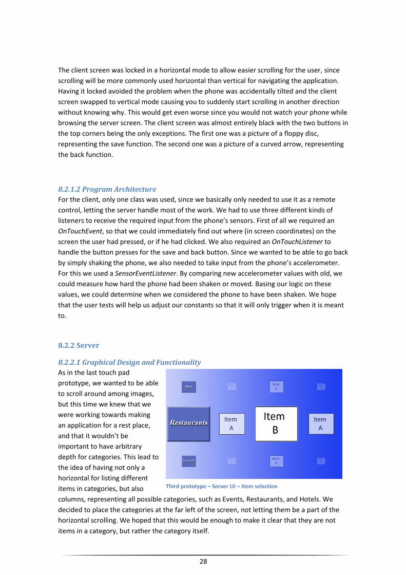
8.2.2.1 Graphical Design and Functionality
As in the last touch pad
prototype, we wanted to be able
to scroll around among images,
but this time we knew that we
were working towards making
an application for a rest place,
and that it wouldn’t be
important to have arbitrary
depth for categories. This lead to
the idea of having not only a
horizontal for listing different
items in categories, but also
columns, representing all possible categories, such as Events, Restaurants, and Hotels. We
decided to place the categories at the far left of the screen, not letting them be a part of the
horizontal scrolling. We hoped that this would be enough to make it clear that they are not
items in a category, but rather the category itself.
29
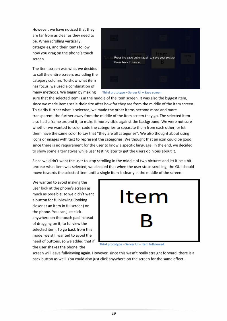
However, we have noticed that they
are far from as clear as they need to
be. When scrolling vertically,
categories, and their items follow
how you drag on the phone’s touch
screen.
The item screen was what we decided
to call the entire screen, excluding the
category column. To show what item
has focus, we used a combination of
many methods. We began by making
sure that the selected item is in the middle of the item screen. It was also the biggest item,
since we made items scale their size after how far they are from the middle of the item screen.
To clarify further what is selected, we made the other items become more and more
transparent, the further away from the middle of the item screen they go. The selected item
also had a frame around it, to make it more visible against the background. We were not sure
whether we wanted to color code the categories to separate them from each other, or let
them have the same color to say that “they are all categories”. We also thought about using
icons or images with text to represent the categories. We thought that an icon could be good,
since there is no requirement for the user to know a specific language. In the end, we decided
to show some alternatives while user testing later to get the users opinions about it.
Since we didn’t want the user to stop scrolling in the middle of two pictures and let it be a bit
unclear what item was selected, we decided that when the user stops scrolling, the GUI should
move towards the selected item until a single item is clearly in the middle of the screen.
We wanted to avoid making the
user look at the phone’s screen as
much as possible, so we didn’t want
a button for fullviewing (looking
closer at an item in fullscreen) on
the phone. You can just click
anywhere on the touch pad instead
of dragging on it, to fullview the
selected item. To go back from this
mode, we still wanted to avoid the
need of buttons, so we added that if
the user shakes the phone, the
screen will leave fullviewing again. However, since this wasn’t really straight forward, there is a
back button as well. You could also just click anywhere on the screen for the same effect.
Third prototype – Server UI – Save screen
Third prototype – Server UI – Item fullviewed
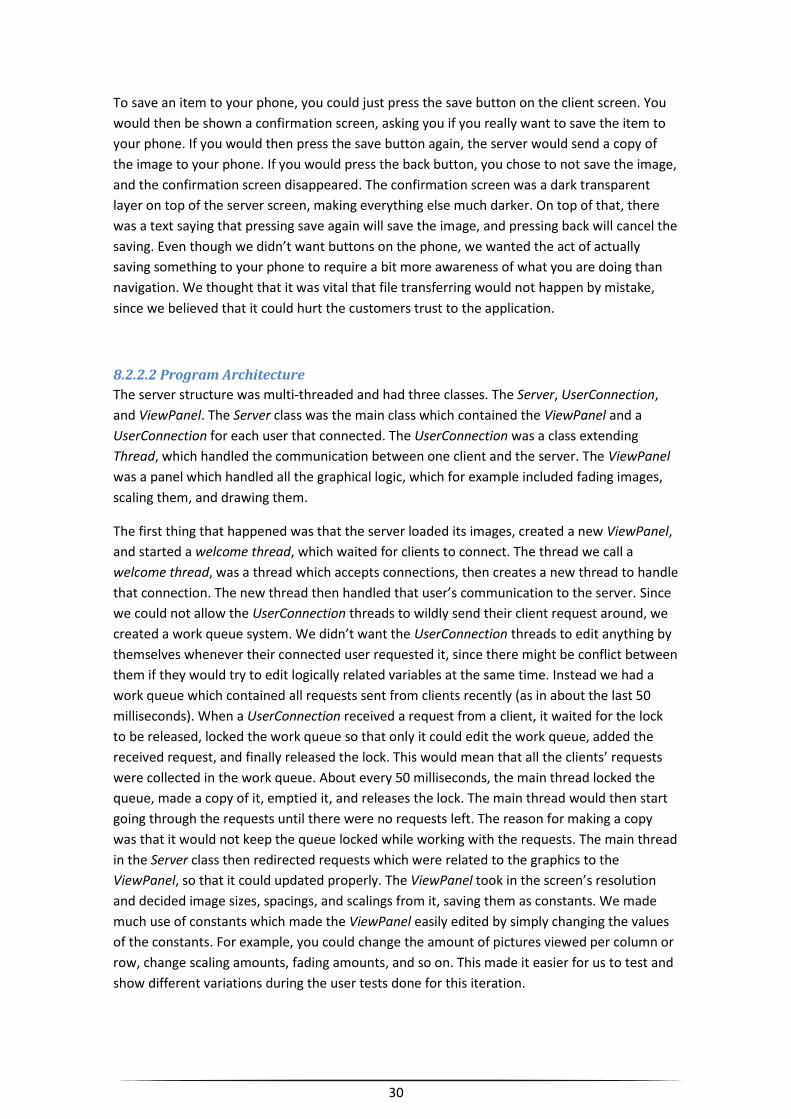
30
To save an item to your phone, you could just press the save button on the client screen. You
would then be shown a confirmation screen, asking you if you really want to save the item to
your phone. If you would then press the save button again, the server would send a copy of
the image to your phone. If you would press the back button, you chose to not save the image,
and the confirmation screen disappeared. The confirmation screen was a dark transparent
layer on top of the server screen, making everything else much darker. On top of that, there
was a text saying that pressing save again will save the image, and pressing back will cancel the
saving. Even though we didn’t want buttons on the phone, we wanted the act of actually
saving something to your phone to require a bit more awareness of what you are doing than
navigation. We thought that it was vital that file transferring would not happen by mistake,
since we believed that it could hurt the customers trust to the application.
8.2.2.2 Program Architecture
The server structure was multi-threaded and had three classes. The Server, UserConnection,
and ViewPanel. The Server class was the main class which contained the ViewPanel and a
UserConnection for each user that connected. The UserConnection was a class extending
Thread, which handled the communication between one client and the server. The ViewPanel
was a panel which handled all the graphical logic, which for example included fading images,
scaling them, and drawing them.
The first thing that happened was that the server loaded its images, created a new ViewPanel,
and started a welcome thread, which waited for clients to connect. The thread we call a
welcome thread, was a thread which accepts connections, then creates a new thread to handle
that connection. The new thread then handled that user’s communication to the server. Since
we could not allow the UserConnection threads to wildly send their client request around, we
created a work queue system. We didn’t want the UserConnection threads to edit anything by
themselves whenever their connected user requested it, since there might be conflict between
them if they would try to edit logically related variables at the same time. Instead we had a
work queue which contained all requests sent from clients recently (as in about the last 50
milliseconds). When a UserConnection received a request from a client, it waited for the lock
to be released, locked the work queue so that only it could edit the work queue, added the
received request, and finally released the lock. This would mean that all the clients’ requests
were collected in the work queue. About every 50 milliseconds, the main thread locked the
queue, made a copy of it, emptied it, and releases the lock. The main thread would then start
going through the requests until there were no requests left. The reason for making a copy
was that it would not keep the queue locked while working with the requests. The main thread
in the Server class then redirected requests which were related to the graphics to the
ViewPanel, so that it could updated properly. The ViewPanel took in the screen’s resolution
and decided image sizes, spacings, and scalings from it, saving them as constants. We made
much use of constants which made the ViewPanel easily edited by simply changing the values
of the constants. For example, you could change the amount of pictures viewed per column or
row, change scaling amounts, fading amounts, and so on. This made it easier for us to test and
show different variations during the user tests done for this iteration.
31
8.3 Prototype Feedback
8.3.1 Company Feedback
VisioSign was overall very satisfied with the results so far. Since we were now on the final
version and had put more effort into design than the testing of different concepts, it had also
started to look good, and viewable results tend to be more appreciated.
We discussed about the advertisement perspectives of the application. If the screen contained
an item representing another company, some spots would be more and less valuable to have.
They thought it was interesting to know how many times each item had been pressed, since it
would make places around that item more valuable for other companies, since such a spot
would allow their item to be seen more often. They also said that maybe users could be
attracted to the screen by offering sales and possibly saying that there is a small chance to win
something while using the screen (only allowed once per day and phone).
We mentioned that we aimed to distribute the application through QR, a simple tag on the
server screen, that when scanned by the phone would send you to the place where the
application was downloaded. We also proposed that by scanning another tag you would
receive the IP to the server and be able to connect automatically to any screen, however, they
asked if it was possible to combine both these solutions into a single QR which we could not
yet answer.
For the next version they wanted us to try and implement a way of browsing a webpage
through our application and with the use of the client screen navigate a mouse on the server
screen. They also wanted an easy way for the client to write texts.
They came up with a solution they wanted to test to make it easier to distinguish what
category was selected. Having different colors for each category and changing the background
color to the corresponding color, whenever a category was selected, would allow the users to
see what category was currently selected in an easy manner.
They liked the effect when a picture animated into fullscreen, but not that it worked less good
if a picture wasn’t scalable with the server screens dimension. They proposed that when we
enlarge pictures to fullscreen, only enlarge until either width or height has reached the end of
the screen, then fill out the other with black or dim it. This will retain the ratio of the picture
and make sure it doesn’t look weird.
It was also discussed whether or not a new back function should be implemented, allowing the
user to traverse backwards through the previously selected pictures he had viewed, similar to
the back function of a web browser.
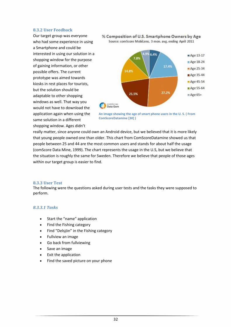
32
8.3.2 User Feedback
Our target group was everyone
who had some experience in using
a Smartphone and could be
interested in using our solution in a
shopping window for the purpose
of gaining information, or other
possible offers. The current
prototype was aimed towards
kiosks in rest places for tourists,
but the solution should be
adaptable to other shopping
windows as well. That way you
would not have to download the
application again when using the
same solution in a different
shopping window. Ages didn’t
really matter, since anyone could own an Android device, but we believed that it is more likely
that young people owned one than older. This chart from ComScoreDatamine showed us that
people between 25 and 44 are the most common users and stands for about half the usage
(comScore Data Mine, 1999). The chart represents the usage in the U.S, but we believe that
the situation is roughly the same for Sweden. Therefore we believe that people of those ages
within our target group is easier to find.
8.3.3 User Test The following were the questions asked during user tests and the tasks they were supposed to perform.
8.3.3.1 Tasks
Start the “name” application
Find the Fishing category
Find “Delsjön” in the Fishing category
Fullview an image
Go back from fullviewing
Save an image
Exit the application
Find the saved picture on your phone
An image showing the age of smart phone users in the U. S. ( From ComScoreDatamine [30] )
33
8.3.3.2 Questions
1. Did you feel in control over the screen?
2. Did you find it easy to complete the tasks given to you?
3. Do you remember how to navigate to, and view an image of a certain category?
4. Did you understand what was happening on the screen, did it feel natural?
5. Did you make any mistakes while using the program?
6. What kind of category images did you prefer? Text with the same color, text with
different colors, only a picture or picture with text?
7. Did you prefer to have 3 images in height and width, or was it better with 5? Was it
hard to see the selected image in 5x5?
8. What do you think about non-selected pictures fading out?
9. What do you think about the frame around the selected picture?
10. What do you think about pictures shrinking the further away they go?
11. Was there something that felt unnecessary
12. Was there something that you felt were missing
8.3.3.3 Answers
This is a summary of the answers that we got: 1. Most people said “yes”, but we also got people saying that they first felt in control after
understanding that the interaction was done by only one finger. Some thought the scrolling
was a bit weird since it often jumped back to the previous element when they tried to move to
the next one.
2. Everyone thought it was easy to complete the tasks given to them, after they had
understood how the category system and the input worked. We noticed that the category
items definitely needed to be clearer since many didn’t understand what they were at first.
3. With only one exception the users still remembered how to perform this task when asked
after the testing session. They also said that the tasks were easier than they had expected
them to be.
4. Mostly “yes”, but we also noticed that some did not understand what was supposed to
happen until after they understood that the phone was used as a touch pad, since we for
example had a case where the user were looking for the mouse pointer on the server screen.
Many did not understand how to use the “shake the phone to go back” function, and some
didn’t even notice it. If we are to keep that function, we would probably have to tell the user
about it, since it is hard to figure out by yourself. Many also triggered it by mistake since they
didn’t know about it and were just confused. Many thought the scrolling was a bit weird, but
the users couldn’t really pinpoint what it was that made the scrolling feel unnatural.
5. Among the mistakes that were done, the “shake the phone to go back” were quite usual,
but we also got some people who did a mistake which we had also made a few times, but not
really thought about. They put their finger on the Android’s top menu bar (which is not
removed from our application), and then when moving their finger downwards, they dragged
down the top bar instead of scrolling vertically, making it cover the application.
34
Some also thought that the category item was the selected item, since they had the same size.
Some other mistakes performed were people trying to use well know gestures, such as the
quick iPad sweeping motion to flip page, which our application does not support, and pinching
motions to shrink and grow the selected picture.
6. People didn’t have much opinions in common here, it was a quite wide spread among all
alternatives. For example, some liked icons because they did not require the user to know the
language, while some disliked it because it could be hard to understand.
7. Most people thought that 5x5 was too small, and that it was too hard to know which image
was the selected one. Most people preferred the 3x3 version.
8. Almost everyone liked the fading, and the ones who had something against it were only a bit
doubtful. There was no one who said with certainty that they disliked it.
9. Many liked the idea of having a frame, but we often heard that it wasn’t visible enough and
some didn’t notice it at all.
10. The result here was pretty much the same as for fading. The majority liked it, since it made
it clearer that the size was related to the relevance.
11. People generally thought that the GUI was very clean, and that there was nothing
unnecessary.
12. People had many suggestions which we write about in the next section, but when we asked
for something that they thought were missing, there were very few ideas. One that came up
was “Information”. In our prototype, the images that the user fullviewed didn’t contain any
information, which we had completely forgotten about. This made some people confused
about the purpose of the application. When the application is complete, it is supposed to
provide information together with an image.
8.3.3.4 User Ideas and Suggestions
During the testing, many users had suggestions on how to improve things, either by adding
features or changing the current ones, which was outside what our questions covered.
One suggestion was that there should be some indication that the client screen is a touch
screen, and that it is what you use to perform the interaction.
Some also wanted to change the scrolling in different ways. One thing was that they wanted it
to be able to handle a sweeping gesture, so that they can sweep it to quickly go to the next
image. Another was that they wanted it to focus the selected image slower so that it wouldn’t
bounce back as fast, and that they wanted the scrolling to go faster.
Since we didn’t have any information about it, many thought that it would be good with some
indication that you can go back by shaking the phone. Some people also found the icon of the
“back button” a bit vague, and instead proposed a clearer image or text.
35
For the image saving, there were quite many proposals. People generally suggested that there
should be some confirmation on the server screen which told the user when the image was
successfully saved, rather than just a confirmation asking you if you were sure you wanted to
save. When you had confirmed that you want to save, there should be some text saying
whether or not the image was actually successfully saved, instead of the current situation,
where we had no such feedback at all. We currently save images straight into the SD-card, and
we had a suggestion that they should be saved to the phone’s gallery instead. They also found
a bug, which was that you could still scroll around among items while they were faded out by
the save confirmation screen.
Some also suggested that the phone should not be able to enter sleep mode while the
application is running, since the phone fell asleep sometimes during testing. This is something
we had in the previous version but forgot to add to the new one. We fixed this during the
testing as soon as it was noticed, since it was something that we had already solved earlier.
Currently there is nothing separating the categories from the items they contain, and this
made most users a little confused in the beginning, but they realized it quite fast. Some
suggestions to fix this was either to make them more distinguishable from each other by have
the same style on all categories and a different one for all items they contained. Someone also
proposed a thin line separating the categories from their items. Adding a dimmed up and
down arrow at the top and bottom of the categories and a left and right arrow in the sides of
the category items was also proposed.
A few had problems with the top menu of the phone because the interface on the client
screen is currently locked in a horizontal mode, this limits the height of the application and if
you go too far up you would pull down a dropdown menu of the phone that is not part of the
actual application. It was suggested that we changed the orientation of the application so that
it would be locked in a vertical view and thus hindering users from accidentally pulling down
the phone menu.
A few also commented on the actual testing and thought it could have been made better with
the use of personas. If they before testing was handed a role to play, so that they had a reason
to use the screen, the interaction would have been more logical.
Something that we had noticed as well but not put too much thought into was the sensitivity
of the clicking. Some thought that it was too easy to click by mistake when trying to scroll.
36
9 The Final Iteration
9.1 Goals We learnt many things that we want to change from the user testing, but also a lot from
VisioSign’s feedback. We definitely wanted to look closer at the scrolling constants to make
sure that it would work smoothly. We also wanted to make our application work more like the
usual touch devices and their corresponding GUI’s, so that the users doesn’t try to use
gestures that we don’t account for. For example, we really wanted the sweeping gesture to
work with our program since it is pretty commonly used. That way, users will not try to sweep
the screen quickly to go to the next item, and then instantly be pulled back.
Since simply clicking the phone’s screen already returns you from fullviewing, we didn’t think
that we should keep the phone shake function for backing. There had been too many users
making mistakes, as they did not know about its existence, and clicking again seemed to feel
natural for most users.
There were enough users that disliked the back button, so we decided to take their advice and
make a new one. Possibly with text, or just a better image. We still needed the button for
canceling the image transfer confirmation, and we thought that it would be inconsistent to not
let it work for backing from fullscreen as well, since it felt so natural.
When it came to saving, we definitely wanted to give the user feedback on the screen when
the file saving had been completed (or have failed for some reason). Since the file transfer was
so fast (less than a second), we doubt that it would be necessary to report the progress, but if
we in the future need to send bigger files, we might have to reconsider. We decided to remove
the bug that allows the user to scroll around and save different images while the confirmation
screen is still covering the screen, and we liked the idea of putting the images in the gallery
instead of directly in the SD-card. However, we were not yet sure how we should put them
there, and if it was really a good idea to possibly mix our images with the ones already there.
The problem with accidentally pulling down the phone menu was something we wanted to fix.
Either by removing it, or by changing the orientation of the screen, so that it would be less of a
problem.
We realized that the category images were too easy to mix up with their items, and we
decided to find ways to make it clearer that they are categories. We were not sure what advice
to follow or if we should just find a different solution.
The problem with the too high clicking sensitivity was something that we have noticed as well,
and we decided to try to find a way to make it harder to trigger by mistake.
VisioSign also had many good ideas, and we were planning on implementing the ones that
follow. Statistics was to be added to this version to allow companies to see how often their
information on the screen was looked at and for how long, compared to the other items.
Whenever an item was selected a timer would start. The application would then register for
how long the item had been browsed and how many times it had been clicked into fullview.
This information would be saved in a document which should be easily read by anyone.
37
All the categories was now to have a unique color and when selected the background would
change into that color as well.
Since they were interested in the possibility of making the items direct you to a web browser
containing a specific webpage, which the user could then control through his phone, we
planned to implement that. Since some webpages might require it, we would also implement a
softkeyboard, or use an existing one if Android’s API had it. To not confuse the user, the web
page is opened on the server screen instead of the phone screen. This was because we wanted
the interaction to be consistent with always keeping the visual focus on the server screen.
We liked their idea of changing the background color with the category color, and we decided
to try it out to see if it would make things clearer.
We decided to not support multiple users for the time being, since we had not found any good
way of letting two persons use the application at the same time without sacrificing more
valued attributes, such as understandability and visibility. However, we decided that a queue
should be implemented in the future, to handle the problem of more users connecting to the
screen at once.
9.2 Result
9.2.1 Server
9.2.1.1 Graphical Design and Functionality We realized that it was important to make it easier for new users to understand that the far left images were categories, and that they were not part of the category items. The most important users in our system were the new users. This was because if a user would try the application and not like it, they would likely not try it again. If the user fails to understand the system, he might quit, and never try it again, since he will have no obligation to do so. For a shopping window application, we cannot expect the user to have much patience nor will to understand the system. To distinguish categories from category items, we added four arrows; one for each direction. The up and down arrow are above and below the column of categories, to indicate that they can be scrolled through vertically, whereas the left and right arrow follows the far left and right end of the currently selected category items block, to indicate that these images can be scrolled through horizontally.
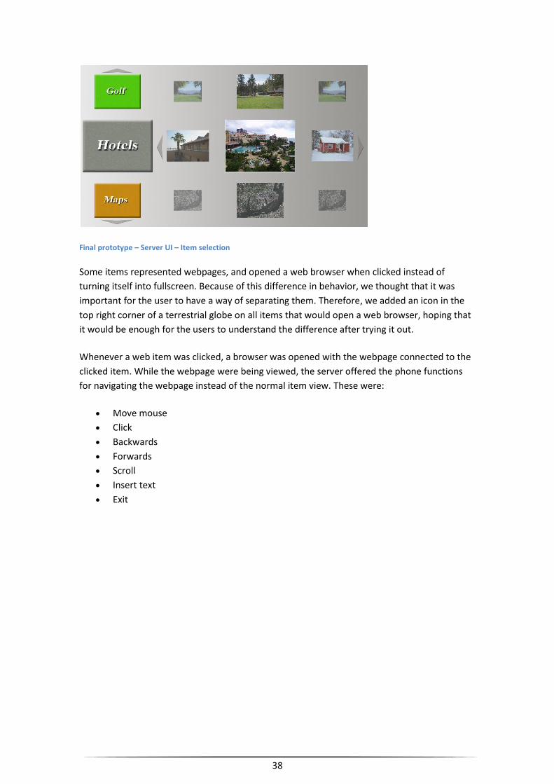
38
Final prototype – Server UI – Item selection
Some items represented webpages, and opened a web browser when clicked instead of
turning itself into fullscreen. Because of this difference in behavior, we thought that it was
important for the user to have a way of separating them. Therefore, we added an icon in the
top right corner of a terrestrial globe on all items that would open a web browser, hoping that
it would be enough for the users to understand the difference after trying it out.
Whenever a web item was clicked, a browser was opened with the webpage connected to the
clicked item. While the webpage were being viewed, the server offered the phone functions
for navigating the webpage instead of the normal item view. These were:
Move mouse
Click
Backwards
Forwards
Scroll
Insert text
Exit
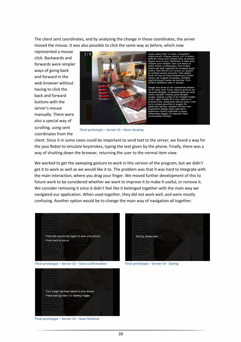
39
The client sent coordinates, and by analyzing the change in these coordinates, the server
moved the mouse. It was also possible to click the same way as before, which now
represented a mouse
click. Backwards and
forwards were simpler
ways of going back
and forward in the
web browser without
having to click the
back and forward
buttons with the
server’s mouse
manually. There were
also a special way of
scrolling, using sent
coordinates from the
client. Since it in some cases could be important to send text to the server, we found a way for
the java Robot to simulate keystrokes, typing the text given by the phone. Finally, there was a
way of shutting down the browser, returning the user to the normal item view.
We worked to get the sweeping gesture to work in this version of the program, but we didn’t
get it to work as well as we would like it to. The problem was that it was hard to integrate with
the main interaction, where you drag your finger. We moved further development of this to
future work to be considered whether we want to improve it to make it useful, or remove it.
We consider removing it since it didn’t feel like it belonged together with the main way we
navigated our application. When used together, they did not work well, and were mostly
confusing. Another option would be to change the main way of navigation all together.
Final prototype – Server UI – Item viewing
Final prototype – Server UI – Save finished
Final prototype – Server UI – Save confirmation Final prototype – Server UI - Saving
40
9.2.1.2 Program Architecture
The architecture was still the same as from the last prototype, but a few new classes had been
added. A Time, which represented a duration used for statistics, a TextRobot (which extends
Robot) used for simulating letter typing, and a CategoryItem, which grouped together
information often usable related to a specific category, such as the image and the category
background. There was also a CategoryStatistics which contained all statistics for a specific
category item, such as the time it had been viewed and the amount of times it had been
clicked.
9.2.2 Client
9.2.2.1 Graphical Design and Functionality
The normal layout’s two buttons now had new images. Instead of a diskette and an arrow for
save and back, there was now texts saying “Save” and “Back”, since we had some users who
had trouble understanding them. The main change in this version for the client was the new
layout made for the web mode. When you clicked an image on the server screen, which linked
to a webpage, the server screen would open a web browser, and your client’s layout switched
to give you more useful navigational tools. The client’s screen now contained an “X” button
which closed the web browser and returned you to the normal mode, a back and forward
button which worked as the browsers back and forward buttons, a scroll for making the page
scrolling simpler, and a text box for inserting text. The rest of the open area was still
considered a touch screen which you now used to move the mouse. Clicking the touch screen
would result in a mouse click.
We only implemented ways for the phone to access the functions which we thought was most
important, since when the phone got more graphically represented functions, the touch screen
got less space. Since it was the function you used most of the time, it should not be easy to
make mistakes with it. If there are too many graphical components, one could easily be
triggered while dragging around on the touch screen. That was also why we wanted as many
screen edges to be cleared of functional, graphical components as possible, so that you could
safely drag to the end of the screen without triggering anything. All functions were put at the
top, except for the scroll which stretched from the top right corner to the bottom right corner.
We let it be that big because we thought it was important for it to have great precision, but we
also thought it was important that it was easy to scroll longer distances on long webpages.
Additionally, the punishment for accidentally triggering it was not grave. For example, during
testing, we had the “X” button above the scroll. If that were pressed by mistake, the browser
would close, which was very bad. However, if the scroll was pressed accidentally, the page
would at worst scroll a bit, which might not even matter to the user. The mistake of scrolling
into a button above the scroll was also the reason for why there was no such button. The only
likely mistake we knew of was dragging too far up on the touch screen, colliding with the
buttons.
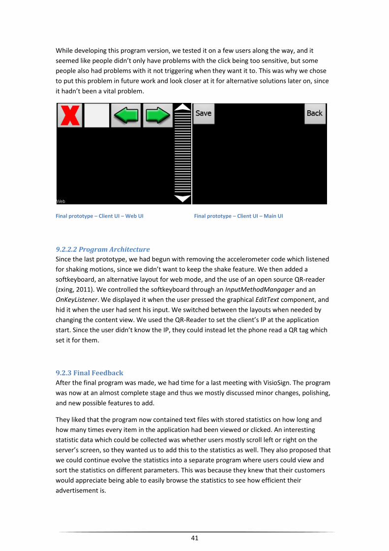
41
While developing this program version, we tested it on a few users along the way, and it
seemed like people didn’t only have problems with the click being too sensitive, but some
people also had problems with it not triggering when they want it to. This was why we chose
to put this problem in future work and look closer at it for alternative solutions later on, since
it hadn’t been a vital problem.
Final prototype – Client UI – Web UI Final prototype – Client UI – Main UI
9.2.2.2 Program Architecture
Since the last prototype, we had begun with removing the accelerometer code which listened
for shaking motions, since we didn’t want to keep the shake feature. We then added a
softkeyboard, an alternative layout for web mode, and the use of an open source QR-reader
(zxing, 2011). We controlled the softkeyboard through an InputMethodMangager and an
OnKeyListener. We displayed it when the user pressed the graphical EditText component, and
hid it when the user had sent his input. We switched between the layouts when needed by
changing the content view. We used the QR-Reader to set the client’s IP at the application
start. Since the user didn’t know the IP, they could instead let the phone read a QR tag which
set it for them.
9.2.3 Final Feedback After the final program was made, we had time for a last meeting with VisioSign. The program
was now at an almost complete stage and thus we mostly discussed minor changes, polishing,
and new possible features to add.
They liked that the program now contained text files with stored statistics on how long and
how many times every item in the application had been viewed or clicked. An interesting
statistic data which could be collected was whether users mostly scroll left or right on the
server’s screen, so they wanted us to add this to the statistics as well. They also proposed that
we could continue evolve the statistics into a separate program where users could view and
sort the statistics on different parameters. This was because they knew that their customers
would appreciate being able to easily browse the statistics to see how efficient their
advertisement is.
42
VisioSign also wanted us to remove some icons, replacing them with text, since they were too
unclear. We agreed on this, since there had been some trouble with those buttons during user
testing. Those buttons were the phone’s “Save” and “Back”, and the web icon in the server.
Every item in the server’s application represented a company, place or event. The items could
be viewed in full screen mode and then be saved to the users’ phones. Having a limitation of
one picture per item, however, was something we wanted to change. We were asked to
remove this limitation and add a slideshow of pictures when you fullviewed an item. With this
change we could use the item as a single logo for a company's name, and when clicked, a
slideshow containing more pictures and informative texts could be browsed through. We
thought that it must also be possible to save all browsable pictures within the slideshow. To
make the fact that there were more pictures within one item, we discussed making it look like
there was several pictures below an item, making it look like a pile for example.
VisioSign also had a suggestion for when the screen was idle. To make it draw attention, the
screen could show a slideshow of images if it hasn’t been interacted with for a few minutes.
We were aware of the problem that users might navigate to a new webpage, leaving the
webpage represented by a clicked item. This would mean that a user can visit any webpage,
which could be harmful or inappropriate. VisioSign suggested a solution which they had used
earlier. They suggested that we put our browser in Kiosk mode, meaning that the address bar
was removed, together with other unwanted components, such as the “X” button, which
would close down the browser without the server application knowing about it. It wouldn’t
entirely solve the problem, but it would limit it. They also wanted to increase the mouse speed
in web mode, and make it move smoother.
Instead of just having a color in the background, VisioSign suggested that we could have a large
picture related to the category in the background instead. For example, there could be a coast
for fishing or a green for the golf category.
10 Final Touches After the final version of the program was shown to VisioSign, we made a few changes which
we felt was either important to have in our final thesis product, or just easily improved. Some
of these changes were from their feedback and ideas. As VisioSign suggested, we added more
pictures to each item, so that you could open an item in fullview and scroll through several
pictures related to that item. There was now also a text indicating how many pictures that
existed in the fullviewed item, saying “1 / 4” if you were at the first picture out of four.
We also felt that we needed to turn on the web browser’s Kiosk mode, meaning that it does
not have an address bar, hindering the user from going to unwanted webpages. It was still
possible to leave the website through advertisement, which was something we still needed to
solve. Early user tests and company feedback suggested that the icon of the back button
wasn’t clear enough, so we decided to change it. The phone’s save and back buttons were now
text instead of icons, saying “Save” and “Back”. We also removed the terrestrial globe
indication for if an item is connected to a webpage or not, replacing it with the text “Web”.
43
After we were able to remove the top menu bar through setting our application as fullscreen,
we decided to change the orientation into landscape again, since the main problem with that
choice was fixed.
Solving the delay was something that was important. Luckily, we found an easy way of doing
that, by simply turning off the TCP’s delay option.
11 Application Distribution We have found two ways of delivering the application to the user. The first solution is using
Bluetooth to send the application from the server screen, to the user’s phone. This solution
has at least two problems which made us prefer our next solution better. The first problem is
that the user must have Bluetooth activated on his phone. Otherwise the server screen can’t
contact his phone. The second is that even if we transfer the application, he would need to
turn off a security option on his phone called “Unknown sources (Allow install of non-market
application)”, which many might not be comfortable with.
The second solution is not perfect either, since it also requires the user to do something before
he can start interacting. Being able to start interacting as fast as possible is one of our highest
priorities since we want the user to be able to try it out without having to invest much effort.
The second solution is to upload the application to the Android Market, which is where users
would normally download applications for their phones. The user would either have to scan a
QR at the server screen to get linked to the application on the market, or he would have to
manually search for the applications name on the market to find it. When found they can
simply click download and it will automatically install. If we decide to distribute it through the
market, we will tell the user about how they download the application either on the server
screen or in some other way.
12 Problems During this project, we encountered several problems which we either solved or found a way
around. We also encountered some problems which we did not solve, forcing us to take a
different approach. The most interesting problems we had were the ones that follow in this
chapter.
12.1 Supporting Other Devices We wanted to reach as many different kinds of devices as possible with our application, but as
we did research on the subject, we understood that it was not possible to make a global client
solution which is easily accessible for everyone. On the bright side, we realized that we would
not have to make new versions of the server, which would have been much worse. There was
simply not enough time to make more than one client solution during the project. That was
why we chose to start with the one we believed to be the most common, Android.
44
12.2 Supporting Android Devices When we first tried to compile code on the phone, it didn’t work. This was because we were
using a too high API level. An Android device has a specific API level, but supports all levels
below theirs as well (Android Developers, 2012a) We are currently using API level 4, but we
think it will be easy to raise or lower at the time of release to a level that fits the current
market. We will need to set it at a level which a vast majority of the existing devices can
handle. According to data collected by the Android Market 2011-08-3, only 2.5% of the users
accessing it uses API level of 4 or lower (Android Developers, 2012b). By using an API level as
low as 4, we can make sure that at least 97.5% of the users will be able to use the application,
if not more at the time of release.
12.3 Player Could Not Be Server
What we think was our biggest setback was the problems with VisioSign’s hardware, the
Players. They were running an operative system called Windows XP embedded, which is quite
limited by VisioSign to ensure a high safety. This safety came at a high price for us, since the
Players usual purpose is to act as a client for an online server and display whatever the server
tells them to. When we tried to use the Player as a server and the phone as a client, we
realized that their operative system was configured to not allow the Player to host anything.
VisioSign promised to fix a solution by reconfiguring the operative system to allow it, but they
couldn’t do so before the end of this project and thus it was put as a future development for
us.
12.4 Accelerometer, Compass and Gyroscope Another problem we had early on was when we were trying to use the accelerometer and
compass on the phone to directly point on the server’s screen to control it, similar to a
Nintendo Wii remote. We were hoping to recreate the precision you could get with a
gyroscope and accelerometer together. Unfortunately, not all smart phones are equipped with
a gyroscope. The accelerometer had a really good vertical precision but not horizontally so it
was combined with the compass, unfortunately the compass was quite wonky and couldn’t
give us a smooth enough precision horizontally. Even when the phone was lying completely
still on a flat surface the degrees it returned varied by a big margin. If it wasn’t for that we
might have considered this as our main solution over the touch pad solution.
12.5 Hardware Since our project started by doing research on what hardware we should use for our particular
solution, we had to wait a long time to get all the hardware that we needed after we had
decided on something. When we had decided to use Android phones, we asked the school for
these, which took time to order, and then we had to wait for VisioSign sending their Player
from Denmark.
45
12.6 Connecting to the Intended Screen A problem we had since we decided to use Wi-Fi was how the phone should receive and
connect to the correct IP address for a specific screen. Different screens had different IP
addresses and to write it manually on the phone’s softkeyboard would be tedious for the
users. We considered having a static IP on all server screens and all phones would then always
try to connect to that one, but we quickly realized that it had many flaws, such as not allowing
several servers on the same network since they can’t share the same IP. In the end, we found a
solution that worked with minimal strain on the users, QR. A small QR code placed on the
server’s screen can contain the IP needed for every server screen and all the user needs to do
is to aim his phone at it to connect. To not put too much effort into it at the prototype level we
decided to use an open source QR reader instead of coding one ourselves.
12.7 Portrait or Landscape Problem From the start, the application on the phone wasn’t locked into a specific orientation. This
meant that if you kept the phone horizontally, the view on the phone switched to a horizontal
view (landscape), and if you turned back to holding it vertically, it switched to a vertical view
(portrait). This led to confusion during the user tests. If a user held the phone horizontally
while scrolling with the touch pad solution on the phone, he could easily manage to tilt the
phone into a vertical orientation and thus what previously made him scroll horizontally now
made him scroll vertically. We solved this by locking the phone to a specific orientation.
We started by locking it in as a landscape orientation, giving it a wider width which
corresponds more correctly to the screen. It was later changed to a portrait orientation since
the testers of the first user tests discovered that the landscape orientation made it easier to
access the top menu bar of the phone by mistake. In the final prototype it was changed back
again to landscape to allow easier scrolling and by utilizing a full screen mode on the phone’s
display we could remove the risk of users accessing the top menu bar by mistake, since it
wasn’t included in full screen mode.
12.8 Finding a Customer
Our first prototype was meant for the shopping windows at real estate agencies. The solution
should have displayed the houses currently on sale in more detail, and allow the customers to
have a good way of searching for specific houses. This however, didn’t work out as well as we
had hoped for. The real estate agencies seemed interested in it, but since their previous screen
solutions had cost them more than they could earn from the extra advertisement, they
decided to not take part in this. A decision was made to continue developing this for a more
general purpose, as a general information board for tourists at resting places. We have also
kept the application as general as possible and made it very adaptable, so that we can easily
use it in different environments.
46
12.9 Permissions There was a problem which took us quite some time to figure out. When we tried to compile
our code, it would just not work and no helpful error messages were given. After a long while
of searching, we did however find that if your application used something out of the ordinary,
you had to state that as a permission in an XML file, such as accessing the Internet or saving
files to the phone. When downloading applications from the Android Market, you can see
what permissions an application requires. If it for example does not state that it needs to use
Bluetooth, it cannot use Bluetooth.
12.10 Delay We have always had a slight delay when interacting with the screen. It has not been severe
enough for us to give up on this solution, but it has been harming the interaction, making it
more tedious. Depending on router, it would either be a slight delay or just freeze, but on
some it worked almost fine. We figured that this problem could be solved later through finding
a good router and configuring it, since VisioSign would sell the screen together with a router.
This was not a solution we liked, but we lived with it until we found a way to switch a default
setting for our TCP connection. By simply writing Socket.setNoTcpDelay(true), we could
remove all freezes and delay, removing that problem entirely. The delay was caused by an
algorithm which makes the sending of many small messages more efficient by waiting before
sending them, so that it can pack them together. This was quite disastrous for our solution
since we continuously send coordinates with very small intervals for high precision (Chen, L.,
2010).
12.11 Availability It had been a bit problematic to do user tests, because of networks not allowing
communication between our server and application. The random delay we have
suffered, which is more or less severe depending on the router, had not made the tests easier
either. Luckily that was solved towards the end of the project, through simply turning off the
TCP’s default delay (setTcpNoDelay(true);). However, we would still need to have access to the
router which the screen solution uses, so that we can allow our application through.
12.12 Connection Lost After Orientation Change For a long time, we would occasionally lose connection, but we didn’t know why, and it
seemed random. The effect was that the phone lost connection, then instantly reconnected. It
didn’t hurt the client, but the server was confused, thinking that it had two users connected
instead of one. First during the testing of the shake function we noticed that it seemed like
shaking was the cause of the disconnects. After testing it a bit, we realized that the problem
was the orientation change. When the phone changed orientation the application paused,
setting our socket to null without actually disconnecting it. Then it called OnCreate, creating a
new socket, continuing as usual again. We were able to fix this by adding disconnection code in
the onPause and onStop method, but luckily we could also stop it all together through just
locking the orientation which we did later on.
47
12.13 Kiosk Mode Safe? When a web browser was opened, we want to guarantee that the user couldn’t leave the
address given by the item they clicked, but is still allowed to navigate that webpage. Kiosk
mode removed some problems, like the address bar, but the user could still leave the page
through advertisements and links. We didn’t find a definite solution for this problem, but we
plan to solve this in some way. In worst case scenario, we think it is a possibility to define
which webpages are allowed to be entered. We believe that this would make it much harder
to edit for the product owner which we would like to avoid.
13 Future Work
13.1 Click Sensitivity Since we are aware of this function’s sometime odd behavior, we want to improve it, but we
are not sure how. We think we can make it better by changing constants for sensitivity for
example. It does however cause trouble by triggering when not intended, and not triggering
when intended, which makes it tricky to solve.
13.2 Adapting to New Customers We have made our solution quite general, so that it can easily be adapted to a large variety of
customers without too much trouble. When VisioSign finds a new customer, we will have to
make a separate version for them which suit their needs. This will also most likely be done in
iterations with regular meetings and feedback from that customer.
13.3 Android Market When we feel that the product is ready for release, we will add it to the Android Market. When
we have done so, we will also want to make it easy to find. We will do this through adding a
QR tag which sends the user to the download page for our application and by simply having an
explaining text telling them how to download it manually. Hopefully this will make both the
ones who use QR codes, and the ones who don’t, understand how to get the application.
13.4 Statistics The statistics part of the program has a lot of potential for further development. As it is now, it
only saves a few interesting events and saves them into a text file. This could be extended by
adding a program for viewing that data in a much better way. For example, it could contain
graphs which would make the data much more lucid. You could include more interesting data,
such as when certain information has been viewed during the day, and on which days of the
year most people view your information on the screen. The program could also be extended to
compare statistics between different items.
48
13.5 Sweep In the future, we will look into ways of solving the problem with the sweep function. We could
remove it, try to merge it with the current way of controlling the screen, or replace the current
way with the sweep. We believe that the best idea would be to somehow merge it with our
main way of controlling the screen, but also the hardest.
13.6 Softkeyboard The softkeyboard is currently our only way of making text input from the phone. It works well
but the user will have to manually press a button to make it appear and when he is done
writing a text with it, the text will be transferred to wherever the focus on the server is at that
moment. We would like to find an easier way to do this, preferably have a method that notice
when a text field in the web browser is selected and then automatically display the
softkeyboard.
13.7 Queue Currently, if two users connect, they can both control the screen. We want to make a queue so
that people can’t interrupt each other, and so that they can use the solution in the order they
arrived.
13.8 Idle demonstration We really wanted the screen to go into a demonstration mode whenever it had been idle for
too long, showing a movie clip that would clearly point out how you could connect to it, and
what the screen had to offer. This was not prioritized during the work, but it is a very
important feature to have before VisioSign could actually put the solution on the market.
14 Conclusion
14.1 Reflection The project was from the start aimed at a specific kind of customers (Real estate agents), but
over the course of the project, we learnt through meeting people in the area that this market
had tried, but lost interest in digital solutions. Because of this, we continued to develop for
resting places instead, since Visiosign thought that this solution had good potential in that
area. We did however realize that the solution could be used by many different kinds of
customers without much extra work, so we made the applications very easy to adapt to new
customers. From this we learnt that it can be good to keep code general until it needs to be
specific, since the market may change.
49
We have also learnt a lot about mobile development, and how it is important to save resources
such as the battery, which is not a problem for stationary computers. We learnt that it is
always important to keep the intended use of what you are developing in mind, and for whom
you develop it. For example, when developing for the Android we had to decide on what API
level to use. Because of this, we had to research and compare the pros and cons of choosing a
higher or lower API level. A higher API level would give us better performance and UI
components, but it would also make the application unusable by some older Android phones.
We made our choice based on statistics made recently this year about which API level phones
currently use.
The use of an iterative model had a lot of benefits. User tests at the end of each iteration gave
us a lot of input. It helped us create new features, remove the things that were bad or
unnecessary, and improve the functionality. It made it easier to plan and separate parts of the
implementations, as well as setting up goals. People who had not seen the application before
could provide good insight which we could not see, such as what their first impression was and
how they thought it worked before trying it. Some things we took for granted was surprisingly
hard for some users, and we increased our understanding of how hard things can be for new
users even though you as a developer find them easy. For example, we had no idea that the
categories were hard to tell apart from the items, but as we saw, we really didn’t have much
indicating that they were during early development of the third prototype.
When testing, we learnt that finding people as close to the target group as possible is
important. Testing with people who don’t know much about smart phones gives results that
are harder to interpret. An accustomed user of a smart phone yields more accurate results,
since they are closer to the target group. Larger groups of testers would also give us more
reliable results.
Since this solution utilizes one distant screen and one screen on a handheld device, there were
many choices on how to give feedback. The device itself has many ways of giving feedback,
such as vibration, sound, and visual feedback from the screen, while the distant screen can
only give visual feedback. We considered giving feedback through sound in the phone, but
realized that it could be unwanted in a public area. After a few user tests, we realized that it
was important to not force the user to change his focus between the two screens, since it can
get very confusing. Because of this, we tried to design for an as nonvisual interaction between
the device and user as possible. By doing this, we let the user have his focus on the distant
screen most of the time, controlling it without having to look down on his device. Haptic
feedback was also considered for the handheld device, but wasn’t implemented, since
vibrations might attract unwanted attention to the user. From this we learnt that when
designing, you have to know how to prioritize the important things in an interaction after the
intended use, user group and social context.
50
14.2 Discussion Our first goal was to make the screen interactive without giving the user any physical device.
We think we accomplished this in a good way, even though the user still has a physical device.
The thought behind this goal was to save the shop owner from extra costs due to vandalism or
wear and tear, in the case that such an external device would be damaged. By utilizing the
customers own phones to interact with a screen in the shopping window, no physical devices
was required to be handed to the user.
The second goal was to make the best use of a shopping window, no matter what time it is.
Our solution allowed users to interact with the shopping window through the use of his own
phone. A connection was established and he could browse a screen containing all the
necessary information about what the store had to offer. Previous solutions did not allow the
user any kind of interaction and because of that restriction; it could only show a limited
amount of information, or display the information over a long time interval, hoping the
customer passed by in the right moment to see information interesting to him. This
interaction was started by the customer and required no work for the store and thus it could
be used at all times, including after closing hours.
Our third goal was to find a way for the user to take interesting information with him, which he
has found through the use of our interactive solution. We had thoughts about mailing such
information to the user, if he would input his e-mail address, but we thought our current
solution was much better. Our solution to the problem was to simply transfer informative
images to the phone. Since the user is connected through his own personal phone, he can take
information from the screen and bring it with him, such as a detailed and informative map
over the area the screen is found in. For example, if it would be in the shopping window of a
fairly large store, it could allow the user to acquire a small map which would show where what
product could be found inside the store.
Our fourth goal was to figure out what functionality and information the screen was supposed
to offer. This was found out over time, though communication with VisioSign and their
customers. During many meetings, functionality came up, and was often later implemented.
The information on the screen was individually customized depending on what the customer
wanted to display. The functionality of the screen was focused on supplying the user with
relevant information. This was done though a few functions such as displaying a collection of
informative pictures throughout many different categories, saving them to your phone and
allowing the users to browse through a set of specifically determined web pages.
The fifth goal was to decide if multiple users should be supported and if so, how? This goal was
given quite a low priority during the course of the thesis. It was discussed if the screen should
be split up into several areas, allowing each connected user his own personal space to interact
with, but this was never implemented, mostly because the overall visibility and quality of the
interaction would be reduced for all participants. In the end it was decided to not allow
multiple users and adding a queue for the connected phones was planned as future work.
51
The final goal was to find a way of making people realize that the screen was interactive. We
wanted to make a demonstration mode that would start whenever the screen had been idle
for a short period of time. This demonstration would make it clear how the user could connect
and interact with the screen, as well as show what the screen had to offer. VisioSign also
wanted to add some kind of special offer to first time users to make it more desirable to try
the screen out and thus learning that it is interactive.
52
15 References
15.1 Bluetooth and Wi-Fi The Travel Insider, 2012. Bluetooth Wireless Networking Explained [online] Available at:
<http://thetravelinsider.info/roadwarriorcontent/bluetooth.htm> [Accessed 12 February
2012]
Cheung, H., 2005. How To: Building a BlueSniper Rifle - Part 1 [online] Available at:
<http://www.tomsguide.com/us/how-to-bluesniper-pt1,review-408-10.html> [Accessed 12
February 2012]
Brain, M. and Wilson, T., 2012. How WiFi Works [online] Available at:
<http://computer.howstuffworks.com/wireless-network1.htm> [Accessed 12 February 2012]
15.2 Webcam Canonical Design, 2010. Getting physical [online] Available at:
<http://design.canonical.com/2010/09/getting-physical/> [Accessed 12 February 2012]
Fredriksson, J., Ryen, S. and Fjeld, M. 2008. Real-Time 3D Hand-Computer Interaction:
Optimization and Complexity Reduction [pdf] Available at:
<http://www.t2i.se/pub/papers/nchi08_p133_fp.pdf> [Accessed 12 February 2012]
OpenCV, 2012. OpenCV [online] Available at: <http://opencv.willowgarage.com/wiki/>
[Accessed 12 February 2012]
15.3 Kinect and Gestures brmadsenad, 2010. Kinect Dots - Night Vision with Kinect Nightvision Infrared IR [video online]
Available at: <http://www.youtube.com/watch?v=-gbzXjdHfJA&feature=related> [Accessed 12
February 2012]
Boland, R., 2011. Microsoft Announces Official Support For Kinect And Windows 7 [online]
Available at: <http://www.windows7news.com/2011/01/21/microsoft-announces-official-
support-kinect-windows-7/> [Accessed 12 February 2012]
Minor, N., 2010. Fixing Kinect Problems for the Xbox 360 - A Troubleshooting Guide [online]
Available at:
<http://www.associatedcontent.com/article/6071600/fixing_kinect_problems_for_the_xbox.h
tml> [Accessed 12 February 2012]
vsauce, 2010. 12 BEST Kinect HACKS [video online] Available at:
<http://www.youtube.com/watch?v=ho8KVOe_y08> [Accessed 12 February 2012]
KinectHacks.net, 2011. Interactive Shopping in Moscow [online] Available at:
<http://www.kinecthacks.net/interactive-shopping-in-moscow/> [Accessed 12 February 2012]
53
The Alternative, 2010. Orange Interactive Window [online] Available at:
<http://www.thealternative.co.uk/2010/10/orange-interactive-window/> [Accessed 12
February 2012]
itn, 2007. Amazing new shopping experience! [video online] Available at:
<http://www.youtube.com/watch?v=7uixUmxH-Z0> [Accessed 12 February 2012]
Brignull, H. and Rogers, Y., 2002. Enticing People to Interact with Large Public Displays in Public
Spaces [pdf] Available at:
<http://citeseerx.ist.psu.edu/viewdoc/download?doi=10.1.1.129.603&rep=rep1&type=pdf>
[Accessed 12 February 2012]
Ware, C., 2004. Information visualization: Perception for design. 2nd edition. San Francisco.
Elsevier Inc.
15.4 Touch and Multi-touch
Seth Sandler, 2011. MULTITOUCH MINI (MTMINI) – HOW TO [online] Available at:
<http://sethsandler.com/multitouch/mtmini/> [Accessed 12 February 2012]
graffiti, 2009. Gesture Recognition mAnagement Framework for Interactive Tabletop Interfaces
[online] Available at: <http://code.google.com/p/grafiti/> [Accessed 12 February 2012]
hakandincher 2011. Mitsubishi 50PE Multitouch Video Wall (2x2) [video online] Available at:
<http://www.youtube.com/watch?v=VWTzlGGi_8Y&feature=related> [Accessed 12 February
2012]
Mohelska, H., 2010. Mobile Technologies and Their Use in a Company [pdf] Available at:
<http://www.wseas.us/e-library/conferences/2010/Tunisia/AEBD/AEBD-23.pdf> [Accessed 12
February 2012]
Market Force, 2011. Consumers Now More Likely to Buy Androids Than iPhones [online]
Available at: <http://www.marketforce.com/2011/02/consumers-now-more-likely-to-buy-
androids-than-iphones/> [Accessed 12 February 2012]
Google Inc, 2010. Android 2.3 Compatibility Definitio [pdf] Available at:
<http://static.googleusercontent.com/external_content/untrusted_dlcp/source.android.com/
en//compatibility/2.3/android-2.3.3-cdd.pdf> [Accessed 12 February 2012]
15.5 Android Android Developers, 2012a. Android API Levels [online] Available at:
<http://developer.android.com/guide/appendix/api-levels.html> [Accessed 12 February 2012]
Android Developers, 2012b. Platform Versions [online] Available at:
<http://developer.android.com/resources/dashboard/platform-versions.html> [Accessed 12
February 2012]
54
Google Inc, 2010a. Android 2.1 Compatibility Definition [online] Available at:
<http://static.googleusercontent.com/external_content/untrusted_dlcp/source.android.com/s
v//compatibility/android-2.1-cdd.pdf> [Accessed 12 February 2012]
Google Inc, 2010b. Android 2.2 Compatibility Definition [online] Available at:
<http://static.googleusercontent.com/external_content/untrusted_dlcp/source.android.com/s
v//compatibility/android-2.2-cdd.pdf> [Accessed 12 February 2012]
Google Inc, 2010c. Android 2.3 Compatibility Definition [online] Available at:
<http://static.googleusercontent.com/external_content/untrusted_dlcp/source.android.com/s
v//compatibility/android-2.3-cdd.pdf> [Accessed 12 February 2012]
Google Inc, 2011. Android 4.0 Compatibility Definition [online] Available at:
<http://static.googleusercontent.com/external_content/untrusted_dlcp/source.android.com/s
v//compatibility/4.0/android-4.0-cdd.pdf> [Accessed 12 February 2012]
15.6 Voice Control Grabianowski, E., 2006. How Speech Recognition Works [online] Available at:
<http://electronics.howstuffworks.com/gadgets/high-tech-gadgets/speech-recognition.htm>
[Accessed 12 February 2012]
e-Speaking, 2012. E-Speaking [online] Available at: <http://www.e-speaking.com/index.htm>
[Accessed 12 February 2012]
15.7 Gyroscope, Accelerometer and Compass Varga, S. and Kostic, M., 2010. Android Sensors [pdf] Available at:
<http://www.touchqode.com/misc/20101025_jsug/20101025_touchqode_sensors.pdf>
[Accessed 12 February 2012]
15.8 Programming Languages LINUX FOR YOU, 2008. A Developer’s First Look At Android [pdf] Available at:
<http://gcodebank.com/attachment/495f58525fcf7D0.pdf> [Accessed 12 February 2012]
comScore Data Mine, 1999. comScore Data Mine. [online] (2012) Available at:
<http://www.comscoredatamine.com/> [Accessed 12 February 2012]
15.9 QR-Reading zxing, 2011. Multi-format 1D/2D barcode image processing library with clients for Android,
Java. [online] (2012) Available at: <http://code.google.com/p/zxing/> [Accessed 12 February
2012]
55
15.10 Methods Sommerville, I., 2007. Software Engineering. 8th edition. Harlow. ADDISION-WESLEY.
15.11 Algorithms Chen, L., 2010. The Case of Delayed ACKs and Nagle's Algorithm [online] Available at:
<http://blog.liranchen.com/2010/08/case-of-delayed-acks-and-nagles.html> [Accessed 12
February 2012]
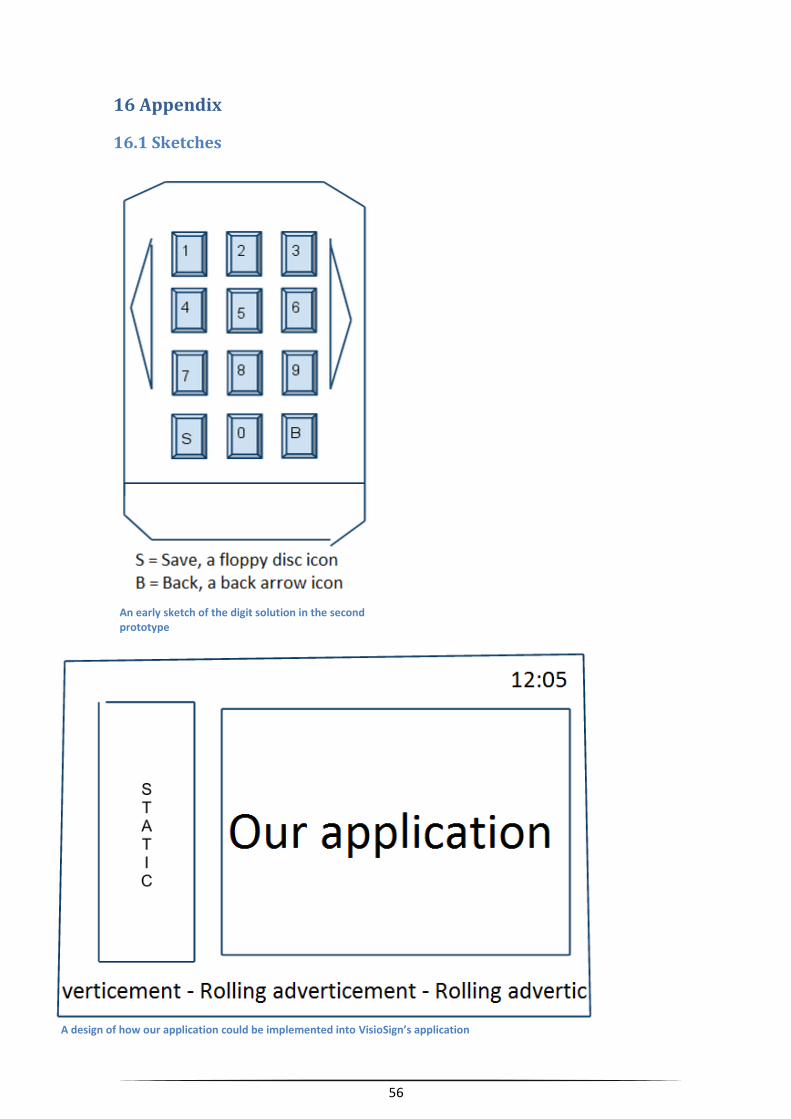
56
16 Appendix
16.1 Sketches
A design of how our application could be implemented into VisioSign’s application
An early sketch of the digit solution in the second prototype