Embed Size (px)
Citation preview
THE HAMILTON SPECTATOR DESIGN-A-DRESS PROGRAM
PowerPoint Presentation 3
Elements of Design:Colour
Colour Definitions• Hue: another term for the name of a colour
• Value: refers to the lightness or darkness of a colour
• Tint: white is added to a colour
• Shade: black is added to a colour
• Intensity: refers to the brightness or dullness of the colour (i.e., the bright yellow of a daffodil is considered a highly intense colour whereas the dull yellow of mustard is considered a colour of low intensity)
• Neutrals: used to change the value of a hue and create a tint or shade - black, white, beige or gray -in fashion, a neutral can be worn with any other colour
• Warm colours: described as being ‘warm like the sun’- red, orange, yellow - makes objects advance- in fashion they make the body look larger
• Cool colours: described as being cool like the water or sky- blue, green, violet - makes objects recede or back away from the viewer- in fashion makes the body look smaller, used for plus sizes
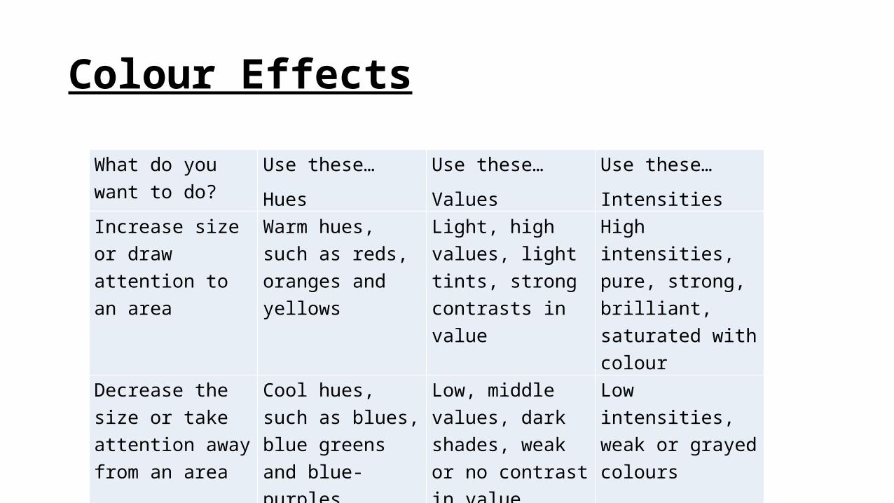
Colour Effects
What do you want to do?
Use these…Hues
Use these…Values
Use these…Intensities
Increase size or draw attention to an area
Warm hues, such as reds, oranges and yellows
Light, high values, light tints, strong contrasts in value
High intensities, pure, strong, brilliant, saturated with colour
Decrease the size or take attention away from an area
Cool hues, such as blues, blue greens and blue-purples
Low, middle values, dark shades, weak or no contrast in value
Low intensities, weak or grayed colours
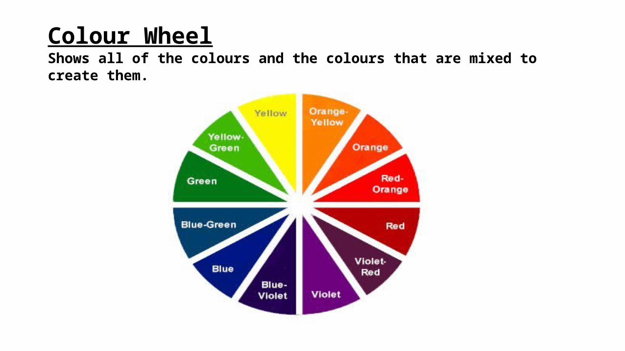
Colour WheelShows all of the colours and the colours that are mixed to create them.
Colour Classifications (Primary, Secondary)• Primary colours: colours that are mixed together to create all of the
other colours. - red, yellow, blue
• Secondary colours are a mixture of equal amounts of two primary colours
- red and yellow = orange- red and blue = violet- blue and yellow = green
Colour Classification (Tertiary or Intermediate)• Tertiary (Intermediate) Colours: the combination of a primary colour
plus a neighbouring secondary colour. They are named using the primary colour name first. For example:
yellow-orange yellow –green red – orange red – violet blue – green blue – violet
Colour Harmonies or Colour SchemesWhen certain colours are used together in a pleasing manner, they create a colour harmony, or colour scheme. There are not definite right or wrong ways to harmonize, but there are guidelines:
a. Monochromatic-a single hue/colour is used-variation added by changing values and intensity
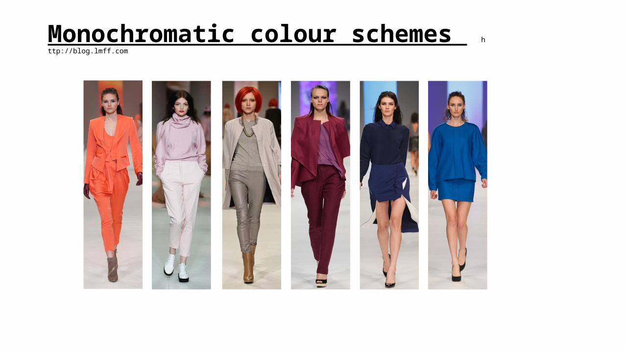
Monochromatic colour schemes h
ttp://blog.lmff.com
b. Complementary Colour Scheme• made by combining complementary colours - those positioned
directly across from each other on the colour wheel (e.g., red and green)
• Using complementary colours makes each colour look brighter and more intense (e.g., blue next to orange makes the blue look more blue, and the orange more orange)
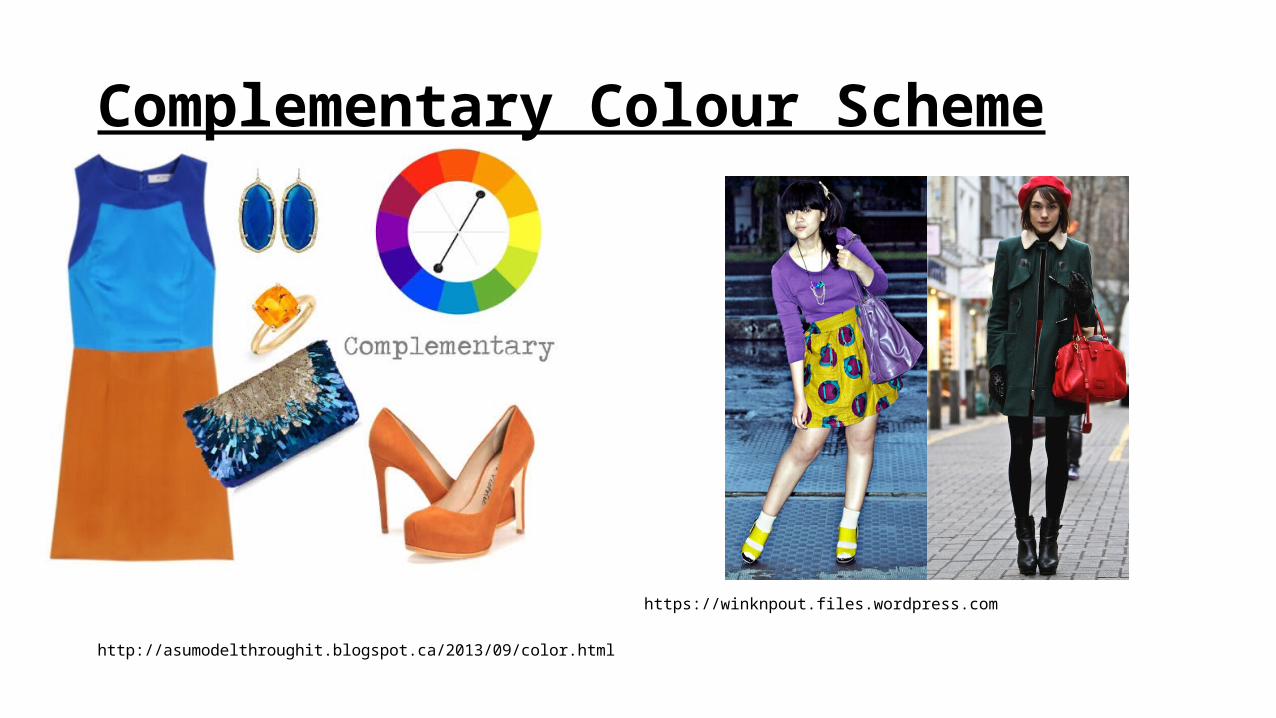
Complementary Colour Scheme
https://winknpout.files.wordpress.com
http://asumodelthroughit.blogspot.ca/2013/09/color.html
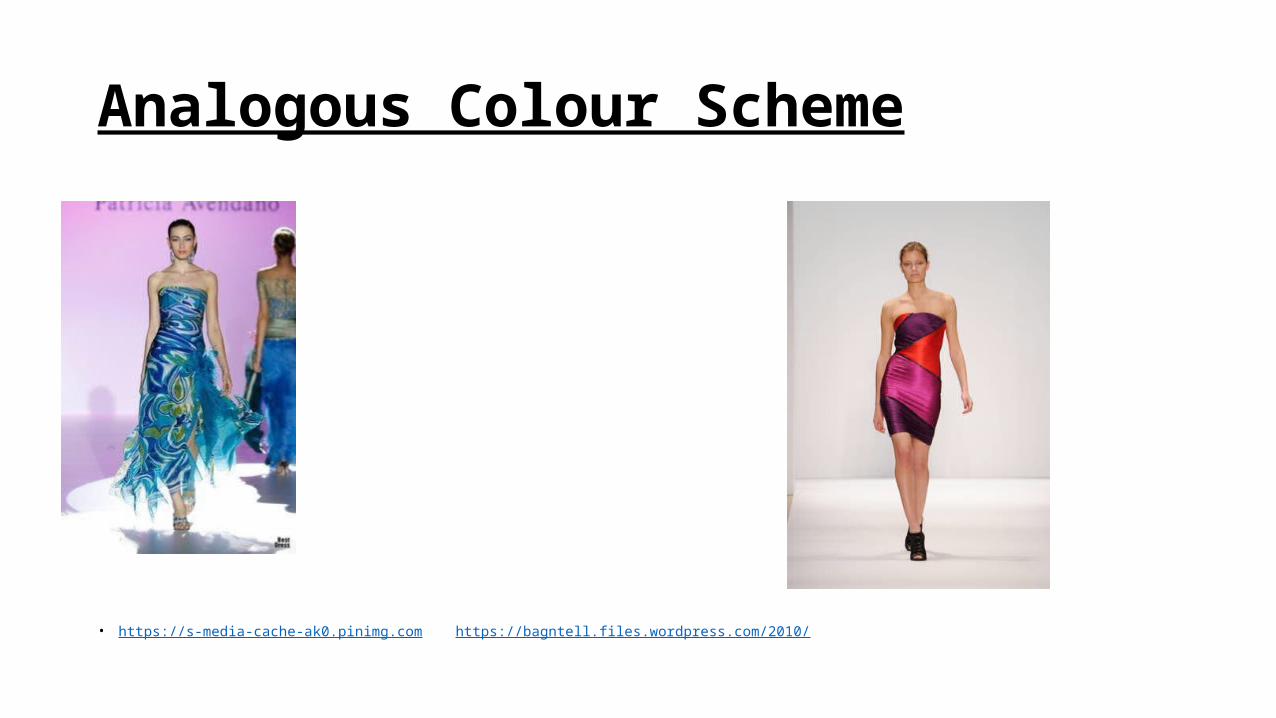
c. Analogous Colour Scheme
• made by combining related hues (those that appear next to each other on the colour wheel)
• usually between 3 and 5 hues are used
• having the same primary colour makes these colour schemes successful and attractive
• because they are related, they blend easily (e.g., yellow, yellow-green and green and the Fall colours in Canada – red, red-orange, and orange)
Analogous Colour Scheme
• https://s-media-cache-ak0.pinimg.com https://bagntell.files.wordpress.com/2010/
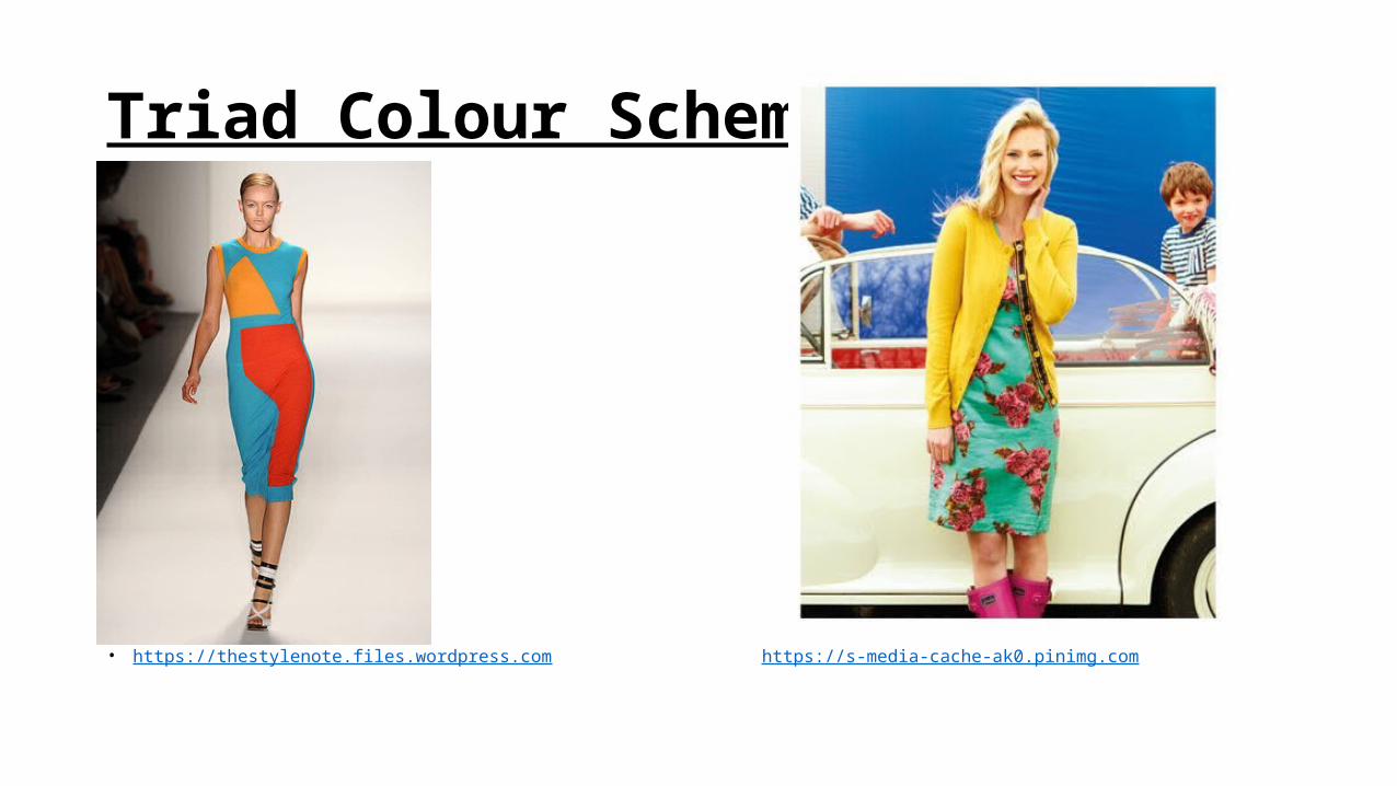
d. Triad Colour Scheme
• uses 3 colours that are spaced evenly around the colour wheel (e.g., the 3 primary colours form a triad)
• results in a vibrant and bold colour combination
• to be successful, a variety in value and intensity is important
Triad Colour Scheme
• https://thestylenote.files.wordpress.com https://s-media-cache-ak0.pinimg.com