Embed Size (px)
Citation preview

25
TEACHERS’ USE OF TRANSNUMERATION IN SOLVING STATISTICAL TASKS WITH
DYNAMIC STATISTICAL SOFTWARE5
HOLLYLYNNE S. LEE NC State University
GLADIS KERSAINT University of South Florida
SUZANNE R. HARPER Miami University
SHANNON O. DRISKELL University of Dayton
DUSTY L. JONES Sam Houston State University
KEITH R. LEATHAM Brigham Young University [email protected]
ROBIN L. ANGOTTI
University of Washington Bothell [email protected]
KWAKU ADU-GYAMFI East Carolina University
ABSTRACT
This study examined a random stratified sample (n=62) of teachers’ work across eight institutions on three tasks that utilized dynamic statistical software. We considered how teachers may utilize and develop their statistical knowledge and technological statistical knowledge when investigating a statistical task. We examined how teachers engaged in transnumerative activities with the aid of technology through representing data, using dynamic linking capabilities, and creating statistical measures and augmentations to graphs. Results indicate that while dynamic linking was not always evident in their work, many teachers took advantage of software tools to create enhanced representations through many transnumerative actions. The creation and use of such enhanced representations of data have implications for teacher education, software design, and focus for future studies. Keywords: Statistics education research; Technology; Statistical inquiry; Teacher education;
Graphs Statistics Education Research Journal, 13(1), 25-52, http://iase-web.org/Publications.php?p=SERJ International Association for Statistical Education (IASE/ISI), May, 2014

26
1. INTRODUCTION
In the past decade, a focus on statistics, representations, and use of dynamic statistical software has become more common in schools. Suggestions from researchers and some teacher preparation efforts also include a stronger focus on learning and teaching statistics and preparing teachers to use tools such as dynamic statistical software tools (e.g., Lee & Hollebrands, 2008, 2011; Pfannkuch & Ben-Zvi, 2011; Pratt, Davies & Connor, 2011). Teachers’ effective use of these dynamic tools is influenced by their own understanding of representations of data and how to use the tools to explore statistical ideas. In this paper, we examine how prospective teachers use representations of data when solving statistical tasks using dynamic statistical software tools of Fathom (Finzer, 2002) or TinkerPlots (Konold & Miller, 2005).
Herein the term representation is used to refer to external objects (e.g., tables, graphs, symbols, etc.) whose relationship with the statistical or mathematical idea they signify is established through shared conventions (Cobb, Yackel & Wood, 1992). The key function of these objects is not only to designate or depict statistical relations or ideas, but also to work with these ideas (Duval, 2006). For example, a graph can be used to depict the relationship between two or more attributes in a data set. Since a graph demonstrates its own set of characteristics and has its own unique structural conventions and rules for working in it, particular operations can be used to transform its structure without affecting the statistical relation or idea it designates. For example, a graphical depiction of a given data set can be altered by overlaying a symbol representing a measure of center or a line of fit without changing the original statistical relations depicted; however, the representation now signifies additional statistical relations among data and measures which can be further explored.
Given that specific information can be conveyed in a specific representation, two or more representations (multiple representations) can be used to emphasize and de-emphasize different aspects of a statistical idea, and also to present a complementary or holistic view of an idea. For example, when examining two attributes in a data set, three graphical representations may be constructed and viewed simultaneously to depict the distribution of each single attribute as a dot plot, and a third graphical representation combining the two attributes to depict any relationship between them, as in a scatterplot. Moreover, if multiple graphical representations are created within dynamic statistical software there is a need to understand better how users take advantage of other features in the software to make connections across representations, and to represent and analyze data in other ways.
2. GROUNDING IN AND BUILDING FROM LITERATURE 2.1. REPRESENTING DATA IN DYNAMIC STATISTICAL SOFTWARE
Finzer (2000) describes two aspects that make a statistical software environment dynamic: “direct
manipulation of mathematical objects and synchronous update of all dependent objects during dragging operations” (p. 1). In a statistics environment, manipulable objects include data values, lines representing values or equations, axes, and parameters. Various other objects may be dependent on these, such as a statistical measure computed from data values, a scatterplot representation of data values, a table of data values, an equation of a line, or a residual plot showing differences between actual and predicted values. All of these dependent objects would update synchronously upon a change (often induced by clicking or dragging) in another object to which it is linked.
Within TinkerPlots and Fathom, representations are linked as they are created. To create a graphical representation or a summary table, one has to drag an attribute (variable) name from the data card or data table and drop it onto an axis in a plot window or a row or column in a summary table. This action of dragging an attribute name from the data card or table onto a plot window or summary table is a primary building tool that creates the representation and establishes the internal link (dependency) between the graph or summary table to the data that is stored numerically in the data card or table. In both programs, there are built-in connections among all representations created

27
from a data set. Thus, highlighting (selecting) a case in one representation creates a highlighted display of that case within all other representations. Both environments also provide capabilities to compute and display a variety of statistical measures, including the ability to overlay a graph with statistical measures such as mean, median, or a least squares line. Both programs also afford various other ways to augment a graphical display by adding additional information to support data analysis.
By using tools such as TinkerPlots or Fathom, teachers and students can quickly become enculturated into the statistical inquiry process (Biehler, Ben-Zvi, Bakker & Makar, 2013; McClain & Cobb, 2001; Pfannkuch, 2008; Pfannkuch & Ben-Zvi, 2011). Overall, the major affordances of dynamic statistical software include the ability to: a) create and simultaneously view different representations, statistical measures, and graphical augmentations; and b) interact with these dynamically linked representations. Taking advantage of these affordances can allow users to engage in goal-directed activities that may lead to further investigations or additional insights in their data interrogations. 2.2. UNDERSTANDING TEACHERS’ USE OF DYNAMIC STATISTICAL TOOLS
Many have described the importance of teachers learning to engage in statistical investigations using dynamic statistical software (e.g., Lee & Hollebrands, 2008, 2011; Pratt et al., 2011). Several researchers have examined and reported teachers’ use of dynamic statistical tools within a professional development experience or course at a university (e.g., Doerr & Jacob, 2011; Hammerman & Rubin, 2004; Makar & Confrey, 2008; Meletiou-Mavrotheris, Paparistodemou & Stylianou, 2009). These studies suggest that using dynamic tools provide opportunities for teachers to improve their approaches to statistical problem solving, particularly moving beyond traditional computation-based techniques and utilizing more graphics-based analysis.
Makar and Confrey (2008) noted that some prospective teachers seemed to use representations in Fathom to investigate a data set in ways that allowed them to develop hypotheses and use data to explore and make a claim, and to systematically explore variables in a data set leading them to an interesting claim. Doerr and Jacob (2011) reported that choices in representational capabilities in Fathom allowed teachers to illustrate their understanding of sampling distributions. In addition, they found significant improvements in teachers’ overall statistical reasoning and understanding of graphical representations.
In studies involving TinkerPlots and Fathom, teachers often used graphical and statistical measures together by either adding a measure to a graph or using a graph to help make sense of a statistical measure already computed. Such analysis by teachers often affords opportunities to consider an aggregate view of a distribution that incorporates reasoning about centers and spreads (Konold & Higgins, 2003). For example, Meletiou-Mavrotheris et al. (2009) noted that practicing teachers used graphical representations in TinkerPlots to notice the impact of a particularly high or low value in a distribution and to examine the impact on a measure of center if an apparent outlier was removed. Although a focus on an interesting point may indicate a focus on data as individual points, the teachers also demonstrated use of graphs to describe patterns in a distribution and group propensities. A focus on group propensities was also found by Hammerman and Rubin (2004) as they analyzed how teachers tended to use binning of data in TinkerPlots (segmenting a distribution range into several parts to visually group data within a range).
Although prior research has discussed how teachers represent and analyze data where a link among representations may often be inferred, this research often has not focused explicitly on how, why, and to what extent teachers created and utilized representations. Once the links, which are internal to the technology environment, are established, we are interested in how teachers may use and take advantage of representations that are linked together. In addition, dynamic statistical software such as TinkerPlots or Fathom both offer various tools that can be used to create and display statistical measures and to augment graphical displays. We wonder if teachers take advantage of the various affordances in these dynamic software tools to examine and analyze their data.

28
2.3. CONCEPTUAL FRAMEWORK
The ways teachers may use dynamic statistical software to solve statistical tasks can provide insight into their understandings about statistics and how they utilize the power of technology in doing statistics. Lee and Hollebrands (2011) proposed a framework that characterizes the important aspects of knowledge needed to teach statistics with technology (see Figure 1). In this framework, three components consisting of Statistical Knowledge (SK), Technological Statistical Knowledge (TSK), and Technological Pedagogical Statistical Knowledge (TPSK) are envisioned as nested circles with the innermost circle representing TPSK, a subset of SK and TSK. Thus, Lee and Hollebrands (2011) propose that teachers’ TPSK is founded on and developed with teachers’ technological statistical knowledge (TSK) and statistical knowledge (SK). The research reported in this paper examines only a few components of teachers’ SK and TSK.
Within SK, we are interested in teachers’ ability to engage in statistical investigations as a key component of statistical thinking. More specifically, we focus on transnumeration (Wild & Pfannkuch, 1999) as a process of transforming data into a representation, and perhaps altering that representation or coordinating across representations, with an intention of sense making (Pfannkuch & Wild, 2004). Thus, teachers would be using (or developing) SK as they pose questions, collect or access data, represent them meaningfully with graphs and statistical measures, and translate their interpretations of these representations back to the context to make claims, answer a question, or pose a new question. Often times, transnumeration occurs when data is represented in some way that highlights a certain aspect related to the context that can afford new insights into the data. Some specific techniques used in transnumeration are sorting data, forming groups, creating a graph, calculating a measure which could be displayed within a graph, and selecting and examining a subset of the data (Chick, 2004).
Figure 1. Components of Technological Pedagogical Statistical Knowledge. (diagram adapted from Lee & Hollebrands, 2011)
Within TSK, our focus is on how teachers engage in transnumeration by taking advantage of
technology’s capabilities to: 1) automate calculations of measures and generate graphical displays, and 2) use these graphs and measures to further explore data and visualize abstract ideas (Chance, Ben-Zvi, Garfield & Medina, 2007). Thus, TSK encompasses how one uses technology to engage in many transnumerative activities to: 1) create a graphical representation of data, 2) examine and visualize measures (e.g., mean), 3) create and use graphical augmentations (e.g., shade a region of data, showing squares on a least squares line), 4) examine subsets of data (e.g., remove outliers or filter cases with certain characteristics), and 5) link multiple representations. Exploratory data

29
analysis (EDA) within a statistical investigation can be facilitated by all of these technology-enabled transnumerative actions.
In the context of our study, we are only examining teachers’ work while using dynamic statistical software. Thus, we suggest that a teacher’s engagement in transnumerative activities with dynamic statistical software is simultaneously drawing upon and building that teacher’s SK and TSK. Transnumerative actions alone cannot make for a strong statistical investigation. There also needs to be evidence that the actions are appropriate and lead to evidence-based claims in answering a question. Thus, we are interested in identifying the purposes for which different transnumerative actions are done, and what the actions may lead teachers to notice or do following those actions. Thus, our research questions are:
What transnumerative activities are evident in teachers’ written presentations of their statistical problem solving activities with a dynamic statistical environment?
What seems to be the purpose for these actions, and what may be the impact of these actions on their statistical investigation?
3. METHODS
3.1. CONTEXT AND TASKS
Many of the studies conducted to understand teachers’ statistical work have been from a single site, often with a relatively small sample of teachers. In contrast, our research group examined teachers’ use of dynamic statistical tools with 204 teachers enrolled in courses from eight different U.S. institutions in which faculty were using the same curriculum materials (Lee, Hollebrands, & Wilson, 2010). In those materials, teachers are engaged as learners and doers of statistics through exploratory data analysis (EDA), using contexts that are likely of interest to teachers (e.g., national school data, vehicle fuel economy, birth data) that can promote the practice of asking questions from data. TinkerPlots and Fathom are used to engage teachers in tasks that simultaneously develop their understanding of statistical ideas and technology skills (SK and TSK, see Figure 1). Throughout the materials, findings from research on students’ understandings of statistical ideas are used to make points, raise issues, and pose questions for teachers to consider pedagogical implications of various uses of technology on students’ understanding of statistical ideas. Chapters 1-4 of the curriculum focus on EDA using descriptive statistics and making informal inferences with a sample of data. Chapters 5 and 6 focus on randomness, sampling, and distributions of sample statistics. (See Lee & Hollebrands, 2008, for details on design of materials.)
What is reported here is based on analysis of teachers’ work on three tasks, chosen from Chapters 1, 3, and 4 in Lee et al. (2010), that use similar statistical concepts and tools in either TinkerPlots or Fathom (see Table 1). The faculty implementing the materials attended a week-long summer institute to become familiar with the technologies, specific tasks and data sets, and pedagogical issues. Across institutions, materials were implemented in a variety of courses. The vast majority of teachers enrolled in these courses were prospective teachers in a mathematics teacher preparation program. However, some were currently practicing teachers, and a few were graduate students who were former classroom teachers. Most of the courses focused on using technology to teach middle or secondary mathematics, and a few focused on statistics for elementary or middle school teachers. We refer to all participants in the study as teachers. We recognize, and embrace, the fact that the mathematical and statistical background of these teachers varied widely, as did their intended grade level focus within K-12. We were not trying to control for or attend to these attributes of teachers. Rather, we wanted to accept this variability and examine teachers’ work with an eye toward what patterns may surface, without regard to their background and grade level.

30
Table 1. Research tasks
Task as Posed in Materials
Task 1 TinkerPlots
[Note: There were two similar data sets containing state level school data for two regions of the U.S. used in Task 1. The numerical attributes for each state were as follows: average expenditure per student, average teacher salary, number of teachers, number of high school graduates, average revenue per student, and average number of students per teacher.] Use TinkerPlots to explore the attributes in this data set and compare the distributions for the South and West [Northeast and Midwest]. Based on the data you have examined, in which region would you prefer to teach and why? Provide a detailed description of your comparisons. Include copies of plots and calculations as necessary.
Note: Tasks 2 and 3 required the use of the 2006 Vehicle data set that included five qualitative attributes (manufacturer, model, class, transmission type, engine type) and four numerical attributes (average city mpg, average highway mpg, annual fuel cost, weight).
Task 2 Fathom
Explore several of the attributes in the 2006 Vehicle data set. a) Generate a question that involves a comparison of distributions that you would like your future students to investigate. b) Use Fathom to investigate your question. Provide a detailed description of your comparisons and your response to the question posed. Include copies of plots and calculations as necessary.
Task 3 Fathom
Explore several of the attributes in the 2006 Vehicle data set. a) Generate a question that involves examining relationships among attributes that you would like your future students to investigate. b) Use Fathom to investigate your question. Provide a detailed description of your work and your response to the question posed. Include copies of plots and calculations as necessary.
3.2. SOFTWARE USED
TinkerPlots utilizes Data Cards (Figure 2), similar to a stack of index cards, with each card representing a case (e.g., the state of Alabama) and containing the values for that case for each attribute (e.g., average salary, census region) in the data set. When the TinkerPlots file for Task 1 was initially opened, the Data Cards for the collection of cases was the only representation visible.
Figure 2. Data Cards representation in TinkerPlots.

31
Teachers needed to actively construct a representation using the TinkerPlots primitive actions of
separating, stacking, and ordering. Figure 3 shows three plots of the same attribute. Figure 3a resulted from dragging a quantitative attribute name onto the horizontal axis; cases were sorted into two categories and bins (8-15.9 students per teacher and 16-24 students per teacher). These cases were fully separated in Figure 3b (as an unstacked plot in which the vertical location of the data points is not relevant), where the horizontal axis appears as a number line and each case is located above its value for Students_per_Teacher. To create the dot plot in Figure 3c, the fully separated cases were stacked vertically. The toolbar along the top of Figure 3 shows commonly available tools that can be used to augment a graph when working in a plot window (e.g., reference lines, dividers, or averages).
Figure 3. Graphical representations of separating and stacking in TinkerPlots.
While collections of data can also be viewed in data card format in Fathom, the Fathom file containing data used for Tasks 2 and 3 opened with the data shown in a data table (Figure 4). Each row is a different case, and attributes are listed as column headings.
Figure 4. The data table representation in Fathom.
Unlike TinkerPlots, Fathom provided options for standard types of graphical displays. When a user added a new plot for a single quantitative attribute, it initially appeared as a dot plot. Plots for single qualitative attributes were initially shown as bar graphs. A menu listed the possible graph options given the characteristics of the particular attributes (Figure 5).

32
Figure 5. Graph illustrating default graph type (dot plot) and options in Fathom.
Once a graph has been created, the user can add elements (e.g., an icon locating the mean, least
squares line, color representing the scale of an attribute), augment a graph with other tools (e.g., superimpose a movable line showing squares), or add plots that are linked to the original plot (e.g., residual plot). When one displays the least squares line, the equation and coefficient of determination are automatically added to the representation.
Fathom also offers a summary table for computing and displaying statistical measures, including those which are commonly used (e.g., mean, median, standard deviation, correlation) as well as those which a user can create (e.g., max-min, mean+stdDev). Thus, the summary table is a representation in which users can organize and display many statistical measures for a variety of attributes (Figure 6).
Figure 6. Summary table including common and user-defined statistical measures.
In both TinkerPlots and Fathom, after two or more representations have been created for a given data set, highlighting a case in one representation creates a highlighted display of that case within all other representations. Also, transforming the data set in one representation creates an analogous transformation within all other representations. For example, changing a data value for an attribute of a single case in the data table will change the case’s location in any visible graphical display and update any statistical measures dependent on that value.
3.3. DATA COLLECTED
At each institution, each teacher worked individually to complete the task, typically as a homework assignment. Teachers were asked to create a document that described the details of his or her work, not just a final response or claim, and to include illustrative screenshots of ways they used

33
technology in solving the task. A total of 247 documents, including Word documents, TinkerPlots files, and Fathom files, were collected across institutions and blinded to protect teacher, faculty, and institutional identity. Data on Task 1 (n=102) was collected from five institutions and six instructors. Seven instructors had teachers working in the textbook materials containing Tasks 2 and 3. However, due to time constraints, most instructors assigned only Task 3. Thus, data on Task 2 (n=41) was collected from two instructors at different institutions. A total of 104 documents of teachers’ work were collected for Task 3 from six different instructors across four institutions.
3.4. ANALYSIS PROCEDURES
To begin analysis, four documents were randomly selected from the collection of data for each task (total of 12). Through iterative discussions by the research team, including examining documents and making sense of teachers’ work, grounded theory (Strauss & Corbin, 1990) and top-down methods of Miles and Huberman (1994) were used to iteratively develop, apply, and refine a coding instrument. The coding instrument that emerged was based on theory from research on statistical problem solving, particularly cycles of EDA and use of static and dynamic representations in statistics and other domains of mathematics, and on categories and codes that emerged from analyzing the initial random sample of teachers’ work.
Often in qualitative research, the quantity of data can be overwhelming. This was the case in our collection of 247 documents. A decision was made to reduce our data by using a stratified random sampling approach. Patton (2002) discusses several ways that researchers can use stratified and random sampling techniques within qualitative methods. From the initial review of the 12 randomly sampled documents, it was obvious that some responses were more detailed than others, contained more statistical investigation cycles, and used more representations. Thus, each of the 247 documents was read and classified as either a short or long response. Short responses were typically one page in length and included one or two screenshots of a representation with minimal explanation; others were classified as long responses. In the second phase of analysis, a stratified random sample was chosen to have proportional representation of short and long responses from each collection of task responses, and to select about 25% of our documents overall (see Table 2).
Table 2. Design of stratified random sample
Task 1 Task 2 Task 3
Short Long Total Short Long Total Short Long Total
Total Documents Collected 52 50 102 12 29 41 38 66 104
Stratified Random Sample 13 12 25 4 8 12 9 16 25
It was possible for a teacher to have two or three of her/his task responses included in the
stratified random sample. In fact, only four teachers had multiple (two or three) documents selected for analysis. Thus, a total of 56 teachers produced the 62 randomly selected documents in our analysis. The purpose of this approach is not to be able to generalize our findings to all teachers using dynamic statistical tools. Rather, we intend “to capture major variations rather than to identify a common core, although the latter may also emerge in the analysis” (Patton, 2002, p. 240) and to increase the credibility of our results.
All documents in the stratified random sample from Task 1 were submitted in Microsoft Word containing text interspersed with illustrative screenshots. Seven of the 12 randomly selected documents for Task 2 and six of the 25 examined for Task 3, were submitted as a Fathom file, while the remaining were submitted as a Word document. Within a Fathom file, teachers left their representations viewable and wrote their responses in text boxes.
In the coding instrument and procedures, each of the 62 documents of teachers’ work was initially analyzed in order to identify cycles of EDA. Each cycle included four phases: Choose Focus, Represent Data, Analyze/Interpret, and Make Decision (see Wild & Pfannkuch, 1999). By initially

34
identifying each phase of a statistical investigation, and indicating how many times a teacher may cycle through these phases, we were identifying important aspects of their SK. We also made note of what seemed to prompt a teacher to continue to explore data in subsequent cycles. The critical shift from one cycle to the next was identified when a teacher made a claim, expressed a need to “dig deeper”, or abandoned his or her current focus and chose a new one (often choosing a new attribute of interest or tweaking the focus of a question to allow for a finer-grained examination). Within each phase, several categories were then used to characterize the teachers’ work (e.g., type of question asked, number of attributes used, type of representations and whether these were appropriate, type of graphical augmentations, what was noticed, interpretations they offered, and any claims they made). With respect to the type of question teachers were investigating, we characterized types of questions into two categories, influenced by a classification scheme developed by Arnold (2009). Broad questions included elements that would require a more open problem solving process, and perhaps more EDA. In contrast, a precise question focused on a specific goal or hypothesis, which could involve simple or complex analysis.
Example of a Broad Question: “What do manual and automatic transmission cars have the most in common?” (Posed by a teacher responding to Task 2) Example of a Precise Question: “Is there a relationship between the weight of a vehicle and its annual fuel cost? If so, please explain that relationship and describe its strength. If not, then give an explanation as to why that may be the case.” (Posed by teacher responding to Task 3)
An example of a coded document is published in the appendix of Lee, Kersaint, Harper, Driskell, and Leatham (2012). At the beginning of the Results section, we provide definitions of major coding categories that emerged related to transnumerative actions, and representative examples to illustrate how they appeared in the data.
Seven coding dyads were formed with each randomly assigned 8-12 documents to code. Six researchers were each in two dyads and the other two researchers were each in one dyad. All documents were initially coded individually, and then a pair met to discuss, compare, record inter-rater reliability, and come to consensus for each document. When coding pairs met, they recorded inter-rater reliability (IRR) on many categories. The overall IRR for several coding categories used in this paper, across all documents, was 0.746 for number of cycles, 0.923 for types of representations used, and 0.940 for measures added to representations. There was low initial agreement about coding an augmentation to a graph (0.523), which led to discussions to establish a better definition of a graphical augmentation, and reclassification of all documents based on this definition (described in Section 4.1). Discussions as part of this process resulted in the refinement of code descriptions. After the IRR was recorded, pairs of coders discussed disagreements until a final consensus was reached. In a few instances, the opinion of a third coder was used to help reach consensus.
After the qualitative coding was complete, each of the 62 documents was given a summary code for several new categories. For example, we created a new category to describe how many unique types of representations a teacher used, as well as a total number of representations used in their report. These summary codes became a condensed data set in which we were able to create descriptive statistics for several categories, as well as conduct informal comparisons across several categories and use inference techniques to examine differences among some categories with an alpha set at 0.05. Both qualitative and statistical analysis of the condensed summary codes for the 62 cases informed our results.
4. RESULTS
Major affordances of dynamic statistical software include the ability to: (1) create and view data
representations and statistical measures, (2) dynamically link representations, and (3) enhance graphical displays with augmentations. Although TinkerPlots and Fathom share certain similar design elements and affordances, there are important differences. In addition, the tasks with which teachers were working had similar and different features. Each task involved a multivariate data set. However,
35
Task 1 (using TinkerPlots) and Task 2 (using Fathom) were focused on comparing distributions, while Task 3 (using Fathom) focused on analyzing relationships among attributes. Thus, the results section is organized to highlight similarities and differences across both technologies and tasks. We begin with definitions of major codes for transnumerative activities that emerged and were used when analyzing teachers’ work.
4.1. CODING FOR TECHNOLOGY-ENABLED TRANSNUMERATIONS
In the “represent and analyze” phase of each cycle in a teacher’s work, we recorded the details of two basic forms of transnumerating data – transforming data into graphical representations and statistical measures. We coded for the types of graphical representations and statistical measures visible in the document, how many were constructed, and whether they were appropriate for the data and question being pursued. It was important for us to note how statistical measures were computed. In TinkerPlots, the easiest way to compute a measure is to add it to a graph. However, as noted earlier, in Fathom, measures can be computed within a graph window or through the use of a summary table.
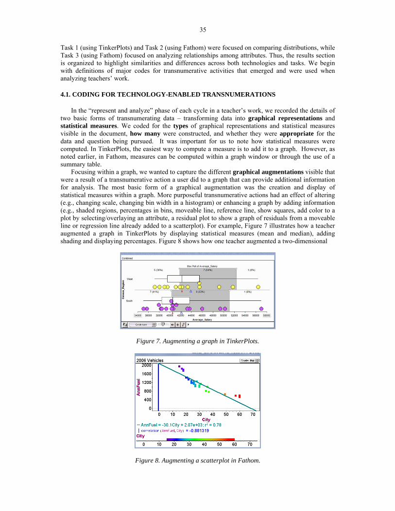
Focusing within a graph, we wanted to capture the different graphical augmentations visible that were a result of a transnumerative action a user did to a graph that can provide additional information for analysis. The most basic form of a graphical augmentation was the creation and display of statistical measures within a graph. More purposeful transnumerative actions had an effect of altering (e.g., changing scale, changing bin width in a histogram) or enhancing a graph by adding information (e.g., shaded regions, percentages in bins, moveable line, reference line, show squares, add color to a plot by selecting/overlaying an attribute, a residual plot to show a graph of residuals from a moveable line or regression line already added to a scatterplot). For example, Figure 7 illustrates how a teacher augmented a graph in TinkerPlots by displaying statistical measures (mean and median), adding shading and displaying percentages. Figure 8 shows how one teacher augmented a two-dimensional
Figure 7. Augmenting a graph in TinkerPlots.
Figure 8. Augmenting a scatterplot in Fathom.

36
scatterplot with a color scale for one of the attributes, added a least squares regression line, equation, and computed correlation. In earlier papers reporting on this research, we had a different definition of augmentation that showed slightly different results (see Lee, Driskell, Harper, Leatham, Kersaint, & Angotti, 2011; Lee, Kersaint, Harper, Driskell, & Leatham, 2012).
We also coded whether there was evidence that a teacher made links between representations. We differentiated between Dynamic Linking and Static Linking, both of which we consider to be transnumerative activities. Dynamic Linking occurs when a purposeful action was done to one representation that causes a reactive and coordinated action in another representation. These actions result in a visible “highlighting” of individual cases across representations (e.g., selecting one case in a graph and seeing that case highlighted in a data table or “flipped” to in the Data Cards, selecting a range of cases in one graph and seeing those same cases highlighted in a separate graph window) or a change in one representation (e.g., dragging) alters information in another representation (see Figure 9). Sometimes the use of dynamic linking was explicit in teachers’ reports because they had a screenshot with two or more representations highlighted or they reported clicking one case in a representation and seeing it highlighted in another. At other times, however, the use of dynamic linking was implicit. Knowing the software capabilities, and based on what was reported in teachers’ documents, coders sometimes had to infer that dynamic linking had been used. For example, while describing a distribution with a graph displayed, if a teacher stated something specific about two cases which was not shown in a graph (e.g., “the south has two outliers, Florida and Texas”, see Figure 10), then we inferred they used dynamic linking to click on a data point in the graph and see details of that case in the data card.
Figure 9. Dynamical linking of two graphical representations in Fathom.
Figure 10. Using dynamic linking in TinkerPlots to identify state names of data points considered outliers with link between case icon in graph and Data Card.

37
Static Linking occurred when there was evidence of a teacher coordinating complementary information in two or more static representations (Ainsworth, 1999) that did not require any direct technological interaction with a representation (e.g., viewing a dot plot of an attribute and a separate box plot of the same attribute, one may coordinate the information in each plot and notice that while the lower whisker has a large range, almost all the data is stacked near the lower end with a significant gap in the distribution, as seen in the dot plot). Figure 11 illustrates a teacher’s reasoning about two distributions and how information was coordinated across two representations to make a claim.
“The next attribute I looked at was the Revenue per student. The median for the West is $8,565 and for the South it is about $8,210. These medians are roughly very close. This means that the West gets more money per student. The funny thing is that the West spends more on its students so in return they should get more money per student than the south does. Also, the West spends about $7,580 on a student and receives about a $1,000 more per student, which is very helpful to the school. The South spends about $7,160 on a student and receives about $8,210, which is also a big profit for them.” [italics added to emphasize coordination across graphs and measures]
Figure 11. Static linking in TinkerPlots to coordinate representations.
A special type of transnumeration activity, Examining Subsets, emerged in our coding. This
occurred when a user performed an action that resulted in creating a subset of the data. Examples of such actions were removing a specific case, or subset of cases, or filtering the dataset based on the value of an attribute. For example, consider the teacher’s work in Figure 12. Using something they noticed in the two-by-two plot of categorical attributes (transmission and engine type), the teacher decided to remove the cases of hybrid cars, and examine just the standard and diesel cars for how the city and highway miles per gallon ratings compared for automatic or manual transmissions.
Figure 12. A teacher’s work to examine a subset of data.

38
4.2. TEACHERS’ USE OF TINKERPLOTS TO COMPARE DISTRIBUTIONS (TASK 1)
For Task 1 (see Table 1), teachers had access to six numerical attributes for each state in two U.S. census regions. They were then asked to decide the region in which they would rather teach, based on evidence gathered when comparing distributions of one or more of these numerical attributes. Since this task is considered a broad question (open-ended, multiple solution paths), and all teachers were asked to explore the same question, all 25 teachers’ work on this task was classified as answering a broad question.
Two different data sets were available for this task. The first contained data from the South and West regions, comprised of 17 and 13 states, respectively. The second set contained data from the Northeast (9 states) and Midwest (12 states) regions. To make the task more contextual and relevant to teachers, instructors often chose the data set based on the location of their institution.
Creation and use of graphs and statistical measures. When coding the Task 1 documents (n=25),
data tables and plots were both considered representations, as teachers needed to drag down a data table to view a different numerical representation, or use a plot to construct a visual representation. We did not list the Data Cards as a representation created by teachers, as it was automatically available in the TinkerPlots file for this task. However, if the teachers’ work indicated the use of linking between the Data Cards and a data table or plot, Data Cards were considered a representation of the data being linked.
The most common plots created in response to this task were dot plots and box plots. Three teachers used a binned plot to show categories of values. Most (n=18) of the 25 teachers only used one unique type of representation throughout their problem solving. At most, teachers used two unique types of representations, typically a dot plot and a box plot. Both of these plots are appropriate to use to examine and compare distributions. About half of the teachers (n=12) created only one representation per investigation cycle. That is, if they had five cycles in their problem solving, they also created five representations, one in each cycle.
In general, teachers used appropriate measures related to the question they were pursuing. The most commonly used measures were mean and median, augmented on a graph. TinkerPlots easily allows for the incorporation of summary statistics, such as measures of center, on graphical representations with the click of an icon from the plot tool bar. As such, it is not surprising that 18 teachers superimposed statistical measures to graphs. While most teachers simply added the iconic symbols for the mean or median (e.g., Figure 7), a few added the numeric value of the measure or displayed a vertical line at the location of a measure (e.g., Figure 10). A few teachers also seemed to use various techniques to either estimate or compute other measures. For example, some would use the reference line augmentation and drag it to the location of the first or third quartile in a box plot and report those values or use those values to estimate the interquartile range. Some would also click on the lowest and highest icons in a distribution to read the values in the Data Cards and then use those values to compute a range or simply report minimum and maximum values. Thus, even though it is not straightforward to have TinkerPlots compute common descriptive or summary statistics such as interquartile range (IQR), several teachers were able to use various tools and techniques to obtain these values for use in their analysis. There was also direct evidence that one teacher entered data values for all cases into a graphing calculator and computed summary statistics.
Linking representations. Several teachers (n=9) clearly indicated the use of dynamic linking,
while a few (n=3) teachers demonstrated the use of static linking (two teachers used both types of linking). We found it significant that many teachers’ reports (n=15) did not indicate that they engaged in linking representations at all (dynamic nor static). This does not mean such linking did not occur as they worked on their task, but is an indicator that they did not discuss their problem solving in their report in such a way as to reveal any linking that may have occurred.
The most common purposes for dynamic linking was to identify a particular value for a specific case of interest by clicking on a particular case icon in the graph and using the data card to determine the value of an attribute. Teachers were often focused on special cases such as those that appeared to be outliers and often situated these cases in comparison to the aggregate. It was also inferred that a

39
few teachers dynamically linked a data card and graph to report specific values (e.g., data point at first quartile) or compute measures such as the range, which is not easily computed and displayed in TinkerPlots.
Evidence of static linking of representations occurred in documents submitted by three teachers; they coordinated a characteristic of a distribution of one attribute with something noticed earlier in their work when examining a distribution of a different attribute. For example, while comparing the distribution of Revenue_per_Student in the West and South, the teacher made reference to an earlier representation depicting the distribution of Expenditure_per_Student (see teacher’s work in Figure 11). Such a relationship might be noticed if one was viewing a scatterplot of these two quantitative attributes. However, there was no evidence in this teacher’s work that such a representation was made.
Working with graphical representations: augmenting and examining subsets of data Teachers
were overall highly engaged in using various TinkerPlots tools to work with their graphical representations. Most teachers (n=21) used some form of graphical augmentation in their representations. As stated in the prior section, many teachers (n=18) added one or more types of statistical measures to their graphs, which is the first basic type of graphical augmentation we coded. More than half (n=15) of the teachers took advantage of other ways they could augment a graph, such as adding a reference line (see Figures 10 and 11), inserting dividers to shade a region, and ordering the data. Several teachers used augmentations to enhance a representation by adding counts or percentages for a specific region of data and adding color to the graph by selecting a different attribute. This last type of augmentation, adding color by overlaying a second or third attribute in the plot, often increased the complexity of analysis as teachers considered relationships among attributes.
Several teachers (n=8) took advantage of the capabilities in TinkerPlots to examine a subset of data. Teachers would identify a particular case that was an outlier (using the feature to indicate in a graph if a data value is a statistical outlier), or that they thought appeared to be different enough from the other cases in a distribution. They would then use the tool to remove a case(s) which would update the graph and all measures accordingly without considering the removed case. For seven of these teachers, the removal of a case or two was appropriate and seemed to enhance their ability to make judgments about the distribution. There was one document in which a teacher repeatedly removed a case(s) from a distribution then moved on to analyze a different attribute without reshowing the previously removed case(s). For example, the teacher examined a distribution for an attribute and removed a case that was apparently an outlier. Then, the teacher dragged a new attribute onto the horizontal axis which displayed a distribution for that new attribute with one less case. In examining that new distribution, the teacher chose to remove another case that appeared to be an outlier and now had n-2 cases shown. This process repeated for several cycles where each time a different case was removed. Thus, it seemed that the ability to remove a case became a process this teacher thought should always be applied, and there was no indication of awareness that the subsets of data were excluding cases from subsequent cycles of analyses. Thus, we consider this teacher’s work to show that performing a transnumerative action may not always be an indication of strong statistical thinking.
4.3. TEACHERS’ USE OF FATHOM TO COMPARE DISTRIBUTIONS (TASK 2)
Tasks 2 and 3 (see Table 1) utilized Fathom and both involved EDA of a set of data pertaining to
41 vehicles manufactured in 2006. In contrast to Task 1, teachers were asked to generate their own question, one that they might ask their own future students, and report on their EDA. In Task 2, they were asked to generate a question that involved a comparison of distributions.
The Fathom file containing the data used for Tasks 2 and 3 opened with the data already shown in a data table. Thus, the data table was not specifically listed as a representation created by teachers. However, if a teacher used the data table when linking to another representation such as a graph or summary table, it was considered a linked representation.
Six of the 12 randomly selected documents that were examined for Task 2 were submitted as Fathom files rather than Word documents. Submitting responses as a Fathom file allowed teachers to leave many of their representations viewable and write in a text box placed in close proximity to the

40
graph being described. Teachers who submitted responses using a Word document interspersed text responses with screenshots of their work from Fathom.
Creation and use of graphs and statistical measures. The 12 teachers who worked on Task 2
posed both broad (n=5) and precise questions (n=7) that would require a comparison of distributions. To explore these questions, they created and used a variety of representations in their investigation (e.g., Figure 13). The teachers created multiple graph types: nine used box plots, nine used dot plots, and a few created histograms and scatterplots. Almost all (11 out of 12) used at least two representations in a cycle during their investigation. Summary tables were used extensively (n=9), with several teachers having used more than one summary table. One possible explanation for the increase in the number of multiple representations identified in submitted reports may be that more than half of the documents were submitted as Fathom files. However, teachers who provided responses in a Word document also interspersed their responses with a variety of representations. Considered collectively, this suggests that without regard to reporting environments, teachers who completed Task 2 took advantage of multiple representations in Fathom to help them explore the questions they generated.
Figure 13. Sample document illustrating multiple representations used by a teacher. Ten of the 12 teachers seemed to be making purposeful use of Fathom’s capability to compute
multiple measures to assist them in their work. Teachers typically used statistical measures of mean and median when comparing distributions in Task 2. Most also computed a measure of spread such as standard deviation or IQR, with a few computing the standard five number summary. The statistical measures were added to either a graphical display (n=7) or to a summary table (n=9), or to both. Two teachers created their own measures (e.g., mean + stdDev, (max-min)/stDev, mean - stdDev) alongside other standard measures generated in the summary table (see Figure 6). These measures were appropriately used to substantiate their claims about the central tendency or typicality that they noticed in the distribution, with some reference to variability as well.
Linking representations. Although submitted responses to Task 2 tended to be long, these
documents revealed the smallest percentage of teachers across all tasks that showed evidence of linked representations. Only four teachers provided evidence of linked representations, with only two teachers explicitly indicating the use of dynamic links. Teachers who created different representations but failed to establish links among them (n=8) seemed to utilize different representations to emphasize different aspects of data. For example, one teacher used: (1) a dot plot to view variation in the data—more variation in fuel economy of automatic than for manual transmission vehicles; (2) box plots to identify the existence of outliers—hybrid cars are outliers; and (3) bar charts to identify similarities

41
and differences in groups of cases—hybrid cars are disproportionately automatic while diesel and standard engines have a similar proportion of manual/auto. Yet, there was no evidence to infer that these teachers made links across representations in their written responses or displayed representations.
The two teachers who linked representations dynamically noted that they clicked on data points in a graph to locate specific cases in the data table. The other two teachers used static linking to coordinate information across multiple representations in order to substantiate a claim or answer questions. For example, one teacher noted that, “using these three representations (dot plot, box plot, summary table), I noticed that cars that had automatic transmissions had the largest range of city mpg with 45, compared to the manual transmission’s range of 36.” This teacher may have also linked representations dynamically, but the provided response did not include enough information to infer that such linking occurred.
Working with graphical representations: graphical augmentations and examining subsets.
Teachers’ work on Task 2 demonstrated a strong tendency to engage in some form of augmenting graphs (nine augmented in some way). In some cases where teachers (n=7) created and added measures to graphical displays it seemed at first glance that teachers were mainly using the graph window as a place to compute a statistical measure, such as IQR and standard deviation (see Figure 14); however, we had no way of verifying whether this was the case because their statements did not provide enough information to support such analysis. In one case, a teacher seemed to be using mean, mean+stdev, and mean-stdev to overlay vertical reference lines to perhaps assist in comparing the distribution of weight to characteristics of a normal distribution (Figure 14, second graph). Five teachers also augmented their graph to add color or icons to represent an additional attribute. As in the analysis of Task 1 documents, this augmentation allowed them to notice more aspects of the data and often led to further analysis.
Figure 14. Teachers’ work displaying common and user-defined measures on graph. Three of the 12 teachers who worked on Task 2 examined a subset of data in their work. Two
teachers used the capability to filter within a graph to remove a particular category within an attribute. One used filters to closely examine trends for manual and auto transmissions, while another removed hybrids from a graphical display. Another teacher filtered out hybrid cars after examining the box plots of the data. The teacher did this by creating a new case table with hybrid cars removed and then creating a new box plot of the new data set. For each of these teachers, actions done to purposely examine a subset of data were guided by previous transnumerative actions and observations in their analysis and seemed to greatly tighten their focus and allow them to make claims more specific to certain types of vehicles.

42
4.4. TEACHERS’ USE OF FATHOM TO ANALYZE RELATIONSHIPS (TASK 3) Task 3 (see Table 1) also utilized Fathom. As mentioned in the previous section, Tasks 2 and 3
involved EDA of the same set of data. In Task 3, teachers were asked to generate their own question that involved examining relationships among attributes, one that they might ask their own future students, and report on their EDA. Six of the 25 Task 3 responses were submitted as Fathom documents, and the remaining 19 were Word documents.
Creation and use of graphs and statistical measures. Task 3 required teachers to pose a question
to investigate. Seven of the 25 teachers posed broad questions and the remainder posed questions that were precise. The teachers who worked on this task created graphical representations that one would expect to use to examine relationships among variables. Most often (n=17) teachers used scatterplots of two quantitative attributes, with several (n=7) overlaying a third attribute to examine relationships among three attributes. A few teachers used dot plots (n=9) or box plots (n=7) to examine distributions of several attributes, sometimes within a single graph window by separating a quantitative attribute by a qualitative attribute, and other times graphing two quantitative attributes in separate graph windows. A few teachers (n=4) created histograms to examine the distributions.
Of the 25 teachers, 16 added statistical measures to either graphs or summary tables. Nine teachers created a summary table representation to display statistical measures. Due to the nature of Task 3, which asks about relationships among attributes, it is not surprising that the most common statistical measures teachers used were least squares lines and their equations. Nine teachers added a least squares line and its equation to a graph, and four teachers computed the correlation of two attributes. Five teachers plotted the mean of one of the attributes on a graph.
Linking representations. A little less than half (n=11) of the 25 teachers provided evidence of
linking representations statically or dynamically. Overall, the most common purpose for linking was to compare the position of groups of cases across graphical representations and to make statements about their relationships (as shown in Figure 9).
Of the six teachers who included evidence of statically linked representations, four revealed linking between two or more graphs. This linking typically occurred as a teacher noted the shape of a graph and commented on whether or not a second graph, developed using a different attribute, was similarly shaped. Furthermore, two teachers linked numerical measures in summary tables with graphical representations. For example, one teacher linked the standard deviation to a histogram in an attempt to make sense of the magnitude of the standard deviation by noting “the automatics [vehicles] also have a much higher standard deviation, which is reflected in the wide range of the histogram”.
Five teachers provided evidence of either implicitly or explicitly linking their representations dynamically. Three of these teachers linked two graphs, one linked a graph with the data table, and another linked the numerical values of sliders (controlling values of coefficients in a model) to characteristics of a graph of the model. Two teachers who linked dynamically and statically did so by linking several univariate graphs (see Figure 9), and one teacher linked a box plot to a scatterplot. The linking of representations appeared to facilitate observations during their analysis that led to interpretations linked back to the question they were pursuing.
Working with graphical representations: graphical augmentations and examining subsets.
Teachers who worked on Task 3 within Fathom were engaged in using various tools to interact with their graphical representations. Most documents (n=20) indicated that teachers augmented their graphs in some way with measures or other enhancements. Slightly more than half (n=14) of the teachers added one or more types of statistical measures directly to their graphs. Thirteen teachers provided evidence of the use of some other form of augmentation in their graphical representations. Augmentations relating to the least squares line were the most commonly used. These augmentations include adding a moveable line (n=4), showing squares (n=2), and adding a residual plot (n=4) to enhance a scatterplot. Augmentations that enhance a representation by adding a third attribute to the graph that resulted in a change of color or icons was also used (n=5) to enhance a graphical representation. One teacher attempted to find the curve of best fit by plotting four different quadratic

43
equations on the graph. Not only were these augmentations visible in the teachers’ work, but usually referred to in their responses that indicated what they were noticing and interpreting about the data with these enhanced graphs.
There was only one case in which a teacher filtered the data to examine a subset. This teacher filtered two separate, but similar graphs. The teacher was investigating the relationship between miles per gallon (mpg) on city (or highway) and annual fuel costs and had a scatterplot with these two attributes and engine type overlayed as the third variable. In both graphs, she restricted the cases to those vehicles that had greater than 30 miles per gallon in the city, or in the highway. Thus, she was focusing on whether the relationship changed if she just used vehicles she considered to be more efficient. 4.5. TEACHERS’ USE OF TRANSNUMERATIVE ACTIONS
In considering ways teachers may have been using and/or developing their statistical knowledge
[SK] and technological statistical knowledge [TSK], we further examined the teachers’ work for relationships among the questions they generated and their transnumerative actions of the representations they used, measures they created or used, the ways they did or did not link representations, augmenting graphs by adding statistical measures to graphs or altering or adding information, and examining subsets of data.
Evidence of SK and TSK in Task 1. Ten teachers dynamically or statically linked representations;
of these, six also augmented their graphs by altering or adding information and eight added a statistical measure to their graphs. Of the 15 teachers who interacted more with a graph through augmenting, only six had linked their representations. Of the 18 teachers who added statistical measures to a graph, 11 of their reports did not indicate any linking of representations. Overall, there did not appear to be any strong trends between teachers’ use of graphical augmentations and linking representations.
There were eight teachers who examined a subset of data in Task 1. Six of them dynamically linked representations, seven added statistical measures to graphs, and five added other types of augmentations to their graphs. There was only one teacher who examined subsets of data but did not engage in any type of augmentation. However, this teacher did dynamically link a graph with the data card. Thus, it seemed that teachers who chose to examine subsets of data engaged in at least three cycles of investigation and tended to interact with the graphs through augmenting and linking.
Teachers displayed evidence of knowing how to appropriately create and use double dot plots and box plots, and add graphical augmentations to these, most commonly median and mean, reference lines, shading and percentages. However, in their work, most teachers used only one type of representation and did not seem to take advantage of the capability to examine data in multiple ways. In fact many teachers created a specific representation in their first cycle and because most of the representations used in subsequent cycles looked similar, it appeared that the only action used to create their next representation was to drag and drop a new attribute on the horizontal axis. There was evidence that some teachers used different graphical augmentations in subsequent cycles, but in many cases, the representations used across cycles were almost identical. This, along with the trend that 12 teachers used one representation per cycle, suggests that many teachers may have routinized their work so that they could use the same lens or focus for comparing the states in two different regions of the country with each new attribute they chose to examine. Such a routinized view of how to use the features in TinkerPlots to engage in a statistical investigation may indicate that the development of their SK and TSK is not moving much beyond viewing the tool as a way to automate the creation of graphs and computations and engage in basic types of transnumeration activities. Overall, only five teachers in our sample showed evidence in their written report that they used TinkerPlots in ways that combined dynamic linking, augmenting and examining subsets of data.
Evidence of SK and TSK in Task 2. For the most part, representations used by teachers on Task 2
were generally aligned with their generated questions. Teachers took advantage of the ability to generate multiple graph types in Fathom to help them in their exploration. Nine out of the ten teachers

44
who showed no evidence of linking in their written work still took advantage of different concretizations or views of data possible in Fathom to highlight different aspects of a distribution. These teachers used more than one type of representation, augmented their graphs with statistical measures or color, and four teachers used a large number of representations in their work (8 or more).
Indeed, teachers’ work on Task 2 reflected a variety of interesting and different approaches for exploring data. One teacher created new attributes to examine by defining these new attributes based on existing ones. For example, she was interested in considering the difference between highway and city miles per gallon (HWY-CITY) and fuel costs per pound of vehicle (annualFuel/Weight). Teachers also took advantage of Fathom's capability to automate calculation of measures. In 11 of the 12 documents analyzed, teachers utilized standard measures (like mean and median) generated via the summary tables in Fathom to help them explore the data given. In two of the documents analyzed, teachers created their own non-standard measures using the formula tool available in Fathom. All in all, these observations speak to teachers’ facility in taking advantage of the software capabilities to generate graphical displays and a myriad of statistical measures, both standard and user-defined, and to use these representations appropriately to explore data. Thus, most teachers’ work on a comparing distribution task in Fathom indicated use of many different transnumerative actions on the data. Such actions, we claim, show evidence of the development of rich SK and TSK.
Evidence of SK and TSK in Task 3. The teachers work illustrated their ability to use a wide
variety of appropriate representations and statistical measures to examine relationships among variables. Not only did they use scatterplots, often enhanced with augmentations, but also used several univariate displays and engaged in linking across these graphs to examine relationships. In fact, almost all teachers (n=22) engaged in augmenting their graph or linking among representations. Eight out of 11 teachers who dynamically or statically linked representations also augmented their graph in some way. Six of those eight augmented and added measures to scatterplots; the other two generated graphs that examined only one variable. Figure 15 shows an example of a teacher who added four graphical augmentations to a standard scatterplot: two added measures (mean(Weight), least squares line) and two enhancements that add additional information to the graph (showing squares, residual plot).
Figure 15. Scatterplot in Fathom with augmentations displayed.
Thus, the teachers who worked on Task 3 tended to create more than one type of representation and engage in many transnumerative actions on the data, often creating rich graphical displays and using multiple representations to support their claims.
5. DISCUSSION OF TRENDS ACROSS TEACHERS’ WORK
There are two ways to compare the types of tasks posed: a task where teachers were asked to compare distributions (Tasks 1 and 2) versus a task where they were asked to examine relationships among attributes (Task 3); or a task where teachers answered a question that was given (Task 1) versus a task where teachers posed their own question of interest (Tasks 2 and 3). The latter type of

45
comparison also separates the data by technology, use of TinkerPlots (Task 1) versus use of Fathom (Tasks 2 and 3). We will first report some overall trends in the results and then use these comparisons as a lens to discuss differences noticed across the collection of teachers’ work (n=62). Comparisons between groups were done using Student’s t-test with unpooled variances to examine the difference in means. 5.1. OVERALL TRENDS
There was high variability in the number of representations created by teachers across all tasks, with most reports (90%) using between one and eight representations, as evidenced by the number of screenshots included in their report or the number of representations visible in their Fathom file. However, there were several reports (18%) that used 11, 12, or 13 representations, and one teacher who used 18 representations, a clear outlier.
By far, the most common graphical representation used by teachers was a box plot. Collectively across the 62 reports, the teachers created 81 double or multiple box plots (more than one box plot stacked in a single graph window) and 12 single box plots. The next most commonly used graph was a dot plot, either double or multiple (n=31) or single (n=26). Not surprisingly, the majority of teachers’ use of dot and box plots was found in Task 1 and 2 documents, and was appropriately used to compare distributions. These representations were emphasized in the Lee et al. (2010) materials and are graphs commonly used for comparing distributions. Scatterplots were created almost exclusively in response to Task 3, though a few teachers (n=3) used them in Task 2 to answer relationship questions (even though the task prompt asked them to compare distributions). Binned plots, a two-dimensional plot of two attributes that group data in cells in TinkerPlots, were used by three teachers for Task 1. Overall teachers mostly used appropriate representations for the questions they were pursuing. Thus, they had achieved the ability to use technology to generate graphs that were useful for their investigation.
In most reports (73%), teachers used only one or two distinct types of representations. This means that even if they were exploring different attributes in a data set, they limited their way of examining the distributions to one type of representation, most commonly a box plot, or two representations, most commonly a box plot and dot plot. This pattern indicates that perhaps teachers do not have the skills for, or do not see the need for, using multiple ways of representing data, even if the technology could easily generate such graphs. This pattern may also be related to classroom activities in implementing the materials (Lee et al., 2010) in which other representations were introduced (e.g., bar graphs, histograms, binned plots) but the emphasis was on dot plots and box plots. The pattern was slightly different across tasks and technologies, as will be discussed later.
In only 40% of the reports did teachers provide evidence of linking, dynamically or statically, across their representations of data, typically between two representations, with only 29% of those using dynamic linking capabilities. The most common use of dynamic linking was to coordinate a single graph with either a data card or data table to find out details about a specific case of interest. Some teachers used dynamic linking to look at an interval of data shown in two graphical representations and make statements about relationships. In all tasks, several teachers’ reports indicated the use of static linking to compare trends in graphs of different attributes across cycles. This was often towards the end of their problem solving process as teachers reflected on their work and made a final decision.
After linking a graph with a numerical measure (e.g., in a summary table) or linking two graphs (e.g., clicking on one region in a histogram and seeing the same case(s) highlighted in another histogram), teachers must engage in another level of analysis. Specifically, teachers must view the linked data, make sense of it, and draw conclusions about its meaning. In contrast, if they link a single case in a graph to a table or data card (eight in TinkerPlots and two in Fathom from Task 2) to find out “which” was the special case, there are often instances of contextual sense making as they try to explain what may be special about the case, but there is little to no additional statistical meaning making after the linking action (e.g., see a teacher's work in Figure 10). When considering the instances of teachers linking two or more graphs or a graph with a summary table, either dynamic or static, their analysis involved much more statistical sense making.

46
Overall, teachers used some form of graphical augmentations in 77% of the reports. Slightly more than half of the teachers’ work indicated they had added statistical measures to their graphs (63%) or added other types of augmentations to their graphs (53%). The teachers used augmentations to enhance the ways they analyzed the data (transnumeration) and to consider various aspects of the distributions to support their claims. There were 12 documents in our sample (19%) where transnumerative actions were used to examine a subset of the data. In six of these documents, the teacher first used dynamic linking to find out about a special case, and then removed that case from the graph. In these instances, the linking action for a special case did prompt additional sense making as they considered what the distributions and statistical measures might be impacting by removing those cases.
Teachers who dynamically linked representations (29% of the reports) tended to also augment a graph in some way (83% of those that dynamically linked across all three tasks). Specifically, in 61% of the documents, teachers that used dynamic linking added statistical measures to graphs, and 61% of them used other types of graphical augmentations. However, in most reports (77%), teachers who either did not link representations or only statically linked representations also used some type of augmentation for a graph.
Thus, overall, teachers tended to use appropriate representations for the question they were investigating and use statistical measures and graphical augmentations to support their work. They only occasionally used dynamic linking that we could infer from their written reports. A small number of our teachers also used more advanced techniques to examine a subset of data and to create user-defined statistics and custom attributes they wished to examine. 5.2. COMPARING DISTRIBUTIONS VERSUS EXAMINING RELATIONSHIPS
The importance of engaging teachers in different task types is not a new recommendation.
Pfannkuch and Ben-Zvi (2011) emphasize that for teachers, “learning to be a data detective by wondering whether some factors might explain differences between two groups or whether there is a relationship between two variables is part of learning the game of statistics” (p. 328). In our work, we wondered if there were differences in the ways teachers used representations in the dynamic statistical software as part of their “data detective” work. Teachers who worked on Tasks 1 and 2 were classified as teachers who worked on a task that required them to compare distributions (n=37). The teachers who worked on Task 3 (n=25) were classified as those who worked on a task that required them to analyze relationships. We found a few significant differences as we compared those teachers who worked on the comparing distribution (CD) task to those who worked on the analyzing relationships (AR) task. Teachers who worked on a CD task tended to use more graphical augmentations (adding statistical measures as well as other enhancements) than those doing the AR task (p=0.014). However, when we considered the use of statistical measures or other types of graphical augmentations (e.g., reference lines, adding color, residual plots) separately, CD teachers always used more of each type of augmentation, but not significantly more (p=0.078, p=0.49, respectively). There was no difference between these groups on the tendency to use dynamic linking, with about 30% of teachers exploring each type of task reporting the use of dynamic linking. However, of the 12 teachers who examined a subset of the data, 11 of these were working on a CD task. Thus, it seems that comparing distribution tasks may lend themselves more to the use of transnumerative actions to augment graphs and to examine subsets.
Among the teachers who produced the 37 reports analyzed for Tasks 1 and 2, there were no notable differences in the total number of representations used in their work. However, the teachers who worked on AR tasks tended to use more unique types of representations in their work, though not significantly more (p=0.056). The teachers who worked on a CD task used many dot plots and box plots. Those who worked on the AR task used a much wider variety of representations in their work. This will be discussed in more detail when we consider further the technologies used, as this difference is also heavily influenced by the many teachers in Task 1 who only used one type of representation in their work on the CD task.
In the AR task, teachers who linked representations tended to examine group propensities. It might be that the task of looking for relationships facilitated the use of linking and encouraged the

47
examination of group propensities. Although the linking done in the CD tasks did not appear to assist teachers in the analysis of group propensities, it was a vehicle to help teachers move between an aggregate view of the data to an individual view, and often led them to engage in further analysis by examining subsets. However, in the CD tasks, the teachers’ use of graphical augmentations appeared to support their claims about group propensities. Researchers have claimed that tasks involving the comparison of distributions can facilitate teachers and students in viewing data as an aggregate and enhancing their ability to discuss group propensities (e.g., Konold & Higgins, 2003; Konold & Pollatsek, 2002; McClain, 2008). Our findings suggest when teachers engage in comparing distribution tasks, that their use of augmentation tools, more so than the use of linking capabilities within the software environments, may support this move towards examining group propensities. 5.3. ANSWERING GIVEN QUESTION WITH TINKERPLOTS VERSUS POSING OWN
QUESTION WITH FATHOM
Many researchers focused on how important it is for teachers and students to pose their own questions about data (e.g., Arnold, 2009; Makar & Confrey, 2008; Pfannkuch & Ben-Zvi, 2011). Thus, we wondered if there were differences in teachers’ work when exploring their own questions versus one that had been posed for them. Teachers’ reports on Task 1 with TinkerPlots (exploring a pre-posed question) mostly included only one unique type of representation (18 of 25), with the remaining cases using two distinct types of representations (7 of 25). It was much more common for teachers to use between three and five distinct types of representations in Fathom, 67% and 32% for Tasks 2 and 3 respectively. There was one outlier from Task 3 who used seven different types of representations. In fact, teachers working in Fathom on their own question used significantly more unique types of representations in their work (p<0.001). To investigate a question of interest in Fathom, many teachers used a summary table (75% in Task 2 and 36% in Task 3), a representation available in Fathom but not in TinkerPlots, that can be used for generating specific statistical measures. Merely having the additional option of a summary table in Fathom may partially account for the differences between teachers’ use of unique representations.
Although many teachers who completed Task 1 used one graph per investigation cycle working in TinkerPlots, teachers who investigated their own question in Tasks 2 and 3 in Fathom typically used more than one representation per cycle. In particular, a much wider variety of graphical representations (simple box plots and dot plots, double box plots and dot plots, histograms, scatterplots) were used in Task 3 to respond to questions about relationships among attributes, and almost always, teachers who worked on Task 3 used more than one representation per cycle.
Of the teachers who worked on their own question in Fathom, seven used a high number of representations (from 8 to 18). Four of these teachers submitted their work in a Fathom file; the one clear outlier in the group who used 18 representations did so in a Word document. Thus, although it seems likely that using Fathom as an analysis and reporting environment may give better insight into all representations created and used by teachers, the data we analyzed does not point directly to such a trend. We suspect, however, that when reporting work in a separate document with screenshots, teachers may not report all representations used or all ways they interacted with those representations (such as linking).
Teachers who used TinkerPlots added significantly more graphical augmentations of all types to their graphs than those working in Fathom (p=0.015). When we considered the use of unique types of augmentations, teachers who used TinkerPlots tended to add slightly more types of statistical measures and slightly more types of other augmentations (e.g., reference line, shading, color/icon change, etc.) to their graphs; however, the differences were not significant when compared to those who worked with their own question using Fathom (p=0.23 and p=0.062, respectively). It is interesting to note that these results are similar if we consider more carefully the type of question the teacher was answering.
In Task 1, the question posed was very broad (“In which region do you want to teach?”). When teachers posed their own questions in Task 2 and 3, some were still “broad” while others were considered more “precise.” All teachers worked on a broad question in Task 1 (n=25) and most for Task 2 and 3 were precise (25 out of 37). There was no significant difference between teacher’s use of

48
various representations and the type of question being explored (broad or precise). For example, for each type of question, teachers engaged in dynamic linking in about 30% of the reports. However, teachers who worked on broad questions added significantly more augmentations of all types to their graphs (p<0.001). When we considered the unique types of statistical measures or other types of augmentations used, we found no significant difference between the groups. Interestingly, 11 out of the 12 teachers who examined a subset of data were pursuing a broad question.
Thus, overall, teachers who used Fathom used more representations in their work, with almost all being appropriate for the data and question posed. However, teachers who used TinkerPlots used many more graphical augmentations, again almost all augmentations being deemed as appropriate. Both of these trends can be partially explained by affordances available in each software. Fathom has more types of representations that are relatively easy to generate; TinkerPlots has a toolbar readily accessible that facilitates the addition of graphical augmentations, including statistical measures. Teachers who pursued broad questions used many more types of graphical augmentations and were more likely to examine a subset of the data. Thus, posing broad questions may lead to more opportunities for teachers to use technology to engage in more types of transnumeration activities. Because these actions were almost always done appropriately, a teacher was likely using (or developing) their statistical knowledge through investigating these broad questions. 5.4. LIMITATIONS
Given the dynamic nature of Fathom and TinkerPlots and emphasis in the curriculum materials (Lee et al., 2010) on using dynamically linked representations and augmentations, it was somewhat surprising that so few of the teachers' responses provided evidence of either dynamic or static linking among representations. We recognize, however, that lack of evidence of linking does not mean that teachers did not engage in this activity. Instead, it means that they did not provide evidence in the report of their work that could be used to infer that linking had occurred. For example, when we coded an instance of static linking, it is quite possible that although the written report did not indicate any technological interaction with the representations, the teacher may have indeed engaged in dynamic linking activities but reported in ways that could only be coded as a static link. Thus, a limitation in our study is that we needed to infer teachers’ use of linking based on written reports of their problem solving within the dynamic statistical environment.
Another limitation is that the sample of documents analyzed may not be representative of all that were collected. There certainly may have been very interesting uses of technology that we have not captured in our analysis. However, we feel that doing the stratified random sampling according to task and whether the work appeared to be short or lengthy helped our confidence that we were likely capturing a wide range of teachers’ approaches and use of technology from our collected data.
We made a decision early in blinding the data to not attend to characteristics of the teacher such as prospective or practicing, grade level focus (elementary, middle, high), or whether they were in a class that completed many more chapters in the Lee et al. (2010) materials (e.g., a teacher who completed Task and also had studied material from prior chapters and had opportunities to complete Task 1 or 2). Thus, careful coding of documents to reflect these various characteristics would allow for deeper analysis according to the characteristics. For example, there may or may not be a difference in the ways that prospective elementary teachers used the various features of the dynamic statistical software than did those preparing to be middle or high school teachers.
On the one hand, collecting and analyzing written documents made things much more manageable across multiple institutions. However, we recognize that this does not give us a complete picture of teachers’ entire statistical problem solving process. Using screen capturing software would allow a much more accurate and complete understanding of how teachers interact with the software.
6. IMPLICATIONS We want to underscore that the sample of teachers in this study included a variety of teachers,
mostly prospective teachers with some practicing teachers, from a variety of institutions. Yet all teachers were learning to use dynamic statistical software for the first time to engage in understanding

49
statistical concepts. Thus, this cross-institutional study may support stronger trends in teachers’ work than can be claimed by any singular context. This cross-institutional approach may help move the mathematics and statistics education research field forward with regard to issues of importance.
Such cross-institutional research requires different management of data collection and analysis than a singular context. Intense time was devoted to: (1) engaging the instructors in using the materials, (2) managing the data collection process (multiple Institutional Review Board applications, uploading documents to secure servers, blinding all documents), and (3) iteratively creating a coding instrument, coding, developing IRR measures, and collectively discussing to reach agreements on codes.
Given the wide variety of teachers in our sample, interesting patterns in the documents still emerged. Teachers who posed their own question, compared to those who were given a question, tended to use more sophisticated EDA as these teachers included more appropriate representations and more than one representation per cycle of investigation. Responding to broad questions, however, did not seem to enhance teachers’ use of new representations, but it did seem to support their use of more graphical augmentations, including overlaying statistics in graphs, and analysis of a subset of data. These transnumerative activities encouraged teachers to dive deeper in their data analysis (i.e., engage in more cycles of investigation) and resulted in most teachers making important connections to the data context and appropriately supported claims. Thus, our finding supports the recommendation by Pfannkuch and Ben-Zvi (2011) that “the emphasis should be on teachers posing their own questions about the data, interrogating the data and learning new information about the real world from the data” (p. 328) and that tools such TinkerPlots and Fathom can support such data interrogation.
If teacher preparation programs want to engage teachers in experiences that might potentially develop their TSK and SK, then these experiences should allow teachers to explore broad questions with multivariate datasets and pose their own questions that invite EDA. Further, teachers should be encouraged to take advantage of the affordances in dynamic statistical software with a particular attention on transnumerative actions, followed with explicit discussions about how specific types of transnumerations can support data interrogation and claims. This does not mean that teachers should explore only broad questions, as precise questions can lead to using technology in appropriate and specific ways that can highlight aspects of data for a question with a precise goal. We further suggest that teachers would benefit from examining examples of students’ work on both types of questions and using various transnumerative actions that could allow for explicit discussions about how to develop students’ SK and TSK. Such examples are included in reports on students’ work with dynamic statistical tools (e.g., Biehler et al., 2013; Hammerman & Rubin, 2004) and could be used within teacher education contexts.
Our guiding framework focused on teachers’ SK and TSK, with specific attention to their transnumeration activities. Even through transnumeration is an element of SK in the original framework (Figure 1), when teachers work in a technology-enabled environment, their use of the computational power to generate graphs and measures and the ability to explore data through various visualization techniques (e.g., dynamic linking, graphical augmentations) can simultaneously draw upon and develop their TSK and SK. We found that there were many ways that teachers used technology to support appropriate transnumeration of data that extend the by-hand activities described by Chick (2004). Specifically, we have identified seven transnumerative actions that were used in our teachers’ work that seemed to be using TSK in ways that could afford using or developing specific aspects of SK (Table 3).
Our final suggestion from this research is that designers of the next generation of dynamic statistical software tools need to increase the ease of which statistical measures and other augmentations can be used within graphical representations. In addition, the actions needed to perform some of the transnumerative activities in our list above need to be made more readily accessible within the user interface. Some of these actions (e.g., adding a filter) are only accessible through menus when a graph is selected. Since examining a subset of data seems to be a very useful action in a statistical investigation, the means to do so should be more readily accessible.

50
Table 3. Affordances of transnumerative actions with dynamic statistical software
Transnumerative action Affordance of action for using or developing statistical knowledge
overlaying statistical measures on a graph of a distribution
assist in examining the relationship between the measure and a distribution, particularly coordination of center and spread
changing case icons to a different color or shape
assist in examining relationships among two or three attributes within a single graph, which enhances exploratory data analysis
creating and using user-defined statistical measures (e.g., mean+stdev)
assist in interrogating data with an intentional focus or purpose during exploratory data analysis
linking cases across representations
assist in examining subsets of cases and their location in multiple representations (with either the same attributes or different attributes), which facilitates examining variation, relationships and trends in exploratory data analysis
computing proportions and counts for sub-regions of a distribution
assist in making claims about variation in the aggregate and within subsets of data,
removing individual case(s) or filtering data based on some criteria
assist in quickly examining a subset of data with an intentional focus or purpose during exploratory data analysis
creating new attributes from existing ones
assist in the ability to pose questions during exploratory data analysis by re-purposing attributes to examine something new (e.g., creating a new attribute of the difference between two attributes, such as the miles per gallon efficiency in the city and highway)
Teachers just learning to use dynamic statistical software showed promising ways of interacting
with representations to interrogate data. Many showed evidence of developing and applying their statistical and technological statistical knowledge that we and others (e.g., Pratt et al., 2011) hypothesize can have a positive influence on their technological pedagogical statistical knowledge and teaching practices; testing that hypothesis is a study for another day.
ACKNOWLEDGMENTS
The research reported here is partially supported by the National Science Foundation (DUE 0442319, 0817253, and 1123001). The opinions expressed herein are those of the authors and not the foundation. Thank you to the following individuals for their valuable work as part of the research team: Karen Hollebrands, Tina Starling, Marggie Gonzalez, and Tyler Pulis.
REFERENCES
Ainsworth, S. E. (1999). A functional taxonomy of multiple representations. Computers & Education, 33(2/3), 131–152.

51
Arnold, P. (2009). Context and its role in posing investigative questions. Paper presented at the Sixth Conference of the International Collaboration for Research on Statistical Reasoning Thinking and Literacy, Brisbane, Australia.
Biehler, R., Ben-Zvi, D., Bakkar, A., & Makar, K. (2013). Technology for enhancing statistical reasoning at the school level. In M. A. (Ken) Clements, A. J. Bishop, C. Keitel, J. Kilpatrick, F. K. S. Leung (Eds.), Third international handbook of mathematics education (pp. 643–689). New York: Springer.
Chance, B., Ben-Zvi, D., Garfield, J., & Medina, E. (2007). The role of technology in improving student learning of statistics. Technology Innovations in Statistics Education, 1(1), 1–26. [ Online: http://repositories.cdlib.org/uclastat/cts/tise/vol1/iss1/art2/ ]
Chick, H. L. (2004). Tools for transnumeration: Early stages in the art of data representation. In I. Putt, R. Faragher, & M. McLean (Eds.), Mathematics Education for the Third Millennium: Towards 2010. Proceedings of the Twenty-seventh Annual Conference of the Mathematics Education Research Group of Australasia (pp. 167–174). Sydney: MERGA. [ Online: http://www.merga.net.au/documents/RP182004.pdf ]
Cobb, P., Yackel E., & Wood, T. (1992). A constructivist alternative to the representational view of the mind in mathematics education. Journal for Research in Mathematics Education, 23(1), 2–33.
Doerr, H., & Jacob, B. (2011). Investigating secondary teachers’ statistical understandings. In Proceedings of the Seventh Congress of the European Society for Research in Mathematics Education, Rzeszów, Poland. [ Online: www.cerme7.univ.rzeszow.pl/ ]
Duval, R. (2006). A cognitive analysis of problems of comprehension in the learning of mathematics. Educational Studies in Mathematics, 61(1/2), 103–131.
Finzer, W. (2000). Design of Fathom, a dynamic statistics environment, for the teaching of mathematics. Paper presented at the International Conference on Mathematics Education. Copenhagen, Denmark. [ Online: www.keypress.com/documents/fathom/Presentations/ICME00.pdf ]
Finzer, W. (2002). Fathom Dynamic DataTM Software (Version 2.1). [Computer software]. Emeryville, CA: Key Curriculum Press.
Hammerman, J. K., & Rubin, A. (2004). Strategies for managing statistical complexity with new software tools. Statistics Education Research Journal, 3(2), 17–39.
[ Online: http://iase-web.org/documents/SERJ/SERJ3(2)_Hammerman_Rubin.pdf ] Konold, C., & Pollatsek, A. (2002). Data analysis as the search for signals in noisy processes. Journal
for Research in Mathematics Education, 33(4), 259–289. Konold, C., & Higgins, T. (2003). Reasoning about data. In J. Kilpatrick, W. G. Martin, & D. Schifter
(Eds.), A research companion to principles and standards for school mathematics (pp. 196–215). Reston, VA: National Council of Teachers of Mathematics.
Konold, C., & Miller, C. D. (2005). TinkerPlots® Dynamic data exploration [Computer software]. Emeryville, CA: Key Curriculum Press.
Lee, H. S., & Hollebrands, K. (2008). Preparing to teach mathematics with technology: An integrated approach to developing technological pedagogical content knowledge. Contemporary Issues in Technology and Teacher Education, 8(4).
[ Online: http://www.citejournal.org/vol8/iss4/mathematics/article1.cfm ] Lee, H. S., Hollebrands, K. F., & Wilson, P. H. (2010). Preparing to teach mathematics with
technology: An integrated approach to data analysis and probability. Dubuque, IA: Kendall Hunt Publishers.
Lee, H. S., Driskell, S. O., Harper, S. R., Leatham, K. R., Kersaint, G., & Angotti, R. L. (2011). Prospective teachers’ use of representations in solving statistical tasks with dynamic statistical software. In L. R. Wiest & T. Lamberg (Eds.), Proceedings of the Thirty-third annual meeting of the North American Chapter of the International Group for the Psychology in Mathematics Education (pp. 268–275). Reno, NV: University of Nevada.
Lee, H. S., & Hollebrands, K. F. (2011). Characterizing and developing teachers’ knowledge for teaching statistics. In C. Batanero, G. Burrill, & C. Reading (Eds.), Teaching statistics in school

52
mathematics - Challenges for teaching and teacher education: A joint ICME/IASE study (pp. 359–369). New York: Springer.
Lee, H. S., Kersaint, G., Harper, S., Driskell, S. O., & Leatham, K. (2012). Teachers' statistical problem solving with dynamic technology: Research results across multiple institutions. Contemporary Issues in Technology and Teacher Education 12(3). [ Online: http://www.citejournal.org/vol12/iss3/mathematics/article1.cfm ]
Makar, K., & Confrey, J. (2008). Dynamic statistical software: How are learners using it to conduct data-based investigations? Proceedings of the Joint Study of the ICMI/IASE (Monterrey, Mexico). [ Online: www.ugr.es/~icmi/iase_study/Makar_ICMI17.pdf ]
McClain, K., & Cobb, P. (2001). Supporting students’ ability to reason about data. Educational Studies in Mathematics, 45(1-3), 103–129.
McClain, K. (2008). The evolution of teachers’ understanding of distribution. In C. Batanero, G. Burrill, C. Reading, & A. Rossman (Eds.), Joint ICMI/IASE Study: Teaching statistics in school mathematics: Challenges for teaching and teacher education. Proceedings of the ICMI Study 18 and 2008 Roundtable Conference, Monterrey, Mexico: International Commission on Mathematical Instruction and International Association for Statistics Education. [ Online: http://iase-web.org/documents/papers/rt2008/T2P8_McClain.pdf ]
Meletiou-Mavrotheris, M., Paparistodemou, E., & Stylianou, D. (2009). Enhancing statistics instruction in elementary schools: Integrating technology in professional development. The Montana Mathematics Enthusiast, 6(1 & 2), 57–78.
Miles, M. B., & Huberman, A. M. (1994). Qualitative data analysis: An expanded sourcebook (2nd ed.). Thousand Oaks, CA: SAGE Publications.
Patton, M. Q. (2002). Qualitative research and evaluation methods (3rd ed.). Thousand Oaks, CA: Sage Publications, Inc.
Pfannkuch, M. (2008). Training teachers to develop statistical thinking. In C. Batanero, G. Burrill, C. Reading, & A. Rossman (Eds.), Joint ICMI/IASE Study: Teaching Statistics in School Mathematics. Challenges for Teaching and Teacher Education. Proceedings of the ICMI Study 18 and 2008 IASE Round Table Conference. Monterrey, Mexico: International Commission on Mathematical Instruction and International Association for Statistics Education. [ Online: http://iase-web.org/documents/papers/rt2008/T4P2_Pfannkuch.pdf ]
Pfannkuch, M., & Ben-Zvi, D. (2011). Developing teachers’ statistical thinking. In C. Batanero, G. Burrill, & C. Reading (Eds.), Teaching statistics in school mathematics-Challenges for teaching and teacher education: A joint ICMI/IASE study (pp. 323–333). New York: Springer.
Pfannkuch, M., & Wild, C. (2004). Towards an understanding of statistical thinking. In D. Ben-Zvi & J. Garfield (Eds.), The challenge of developing statistical literacy, reasoning, and thinking (pp. 79–95). Dordrecht, The Netherlands: Kluwer Academic Publishers.
Pratt, D., Davies, N., & Connor, D. (2011). The role of technology in teaching and learning statistics. In C. Batanero, G. Burrill, & C. Reading (Eds.), Teaching statistics in school mathematics-Challenges for teaching and teacher education: A joint ICMI/IASE study (pp. 97–107). New York: Springer.
Strauss, A., & Corbin, J. (1990). Basic of qualitative research: Grounded theory procedures and techniques. Thousand Oaks, CA: SAGE Publications.
Wild, C., & Pfannkuch, M. (1999). Statistical thinking in empirical enquiry (with discussion). International Statistical Review, 67(3), 223–265.
HOLLYLYNNE S. LEE
North Carolina State University 502 Poe Hall
Campus Box 780 Raleigh, NC 27695