Embed Size (px)
DESCRIPTION
Student Learning Environment. Sylvan LCF. All graphics should be considered placeholders for demo purposes only. Icons and button designs not finalized. Various button states not illustrated. Header Components Selected Student Character button (opens My Learning) - PowerPoint PPT Presentation
Citation preview

Student Learning Environment
Sylvan LCF
All graphics should be considered placeholders for demo purposes only.
Icons and button designs not finalized.
Various button states not illustrated.

Header Components
• Selected Student Character button (opens My Learning)
•Character Border (color indicates if student has entered My Interests info.
•Student Name
•Current Program Name
•Current Lesson Description
•Teacher Controls button
•Teacher Name
•Rotate Screen button

Toolbar
•Draw Tool Options Menu
•Erase Tool Options Menu
•Color Options Menu
•Width Options Menu
•Stamp Tool Options Menu
•Resource Options Menu (some options program specific)
•Dashboard Options Menu
•I’m Done button

Clicking Student Character graphic (button) opens My Learning

My Learning > My Skill (default)
Animated graphic for Mastered skill (flashing star)

My Learning > My Learning Logs
Text entry field. Entries auto-saved on Close.

My Learning > My Interests
Note: Once an entry is made in x # of fields, the border around the character in the header is one color (green), otherwise it is another color (blue). Questions are
placeholders only.
Entries auto-saved on Close.

My Learning > My Character
The selected character shows in the header. The Admin can make other custom selections (e.g., a student photo or avatar) available.

Draw Tools
Hovering over toolbar icon displays dropdown menu.
Current selected option indicated.
Selected option also shows on toolbar.
Icons reflect color selected.

Erase Tools
Hovering over toolbar icon displays dropdown menu.
Current selected option indicated.
Selected option also shows on toolbar.

Color Options
Hovering over toolbar icon displays dropdown menu.
Current selected option indicated.
Selected option also shows on toolbar.

Width Options
Hovering over toolbar icon displays dropdown menu.
Current selected option indicated.
Selected option also shows on toolbar.
Icons reflect color selected.
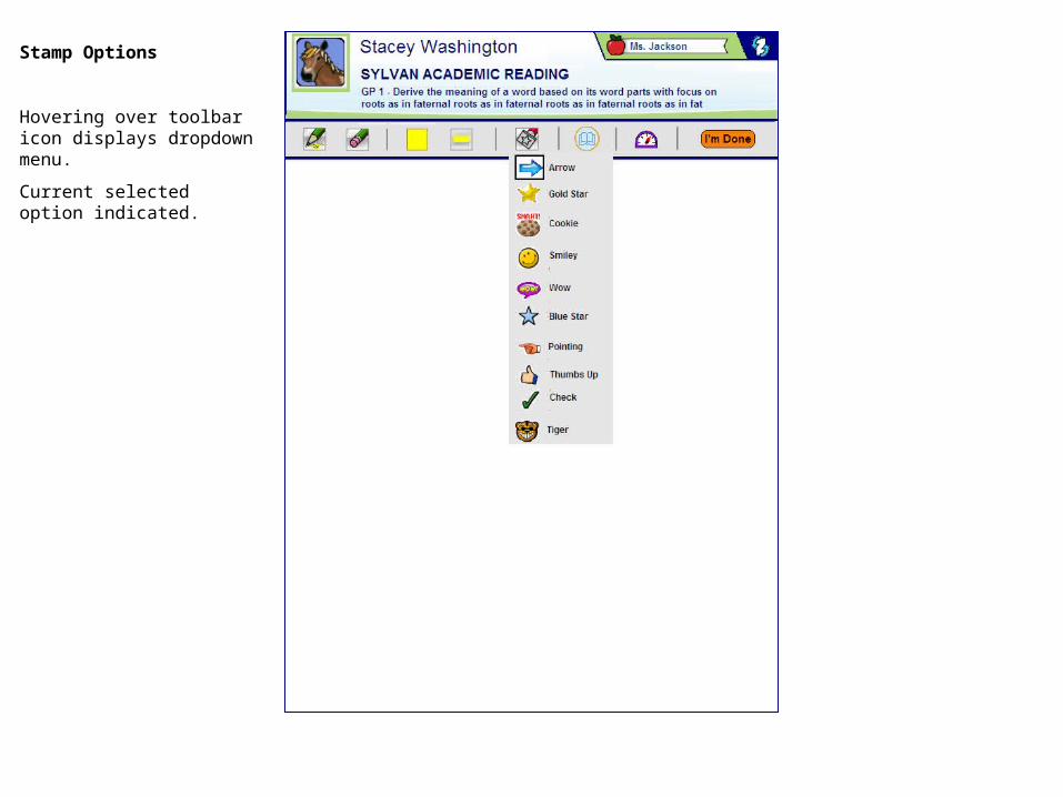
Stamp Options
Hovering over toolbar icon displays dropdown menu.
Current selected option indicated.

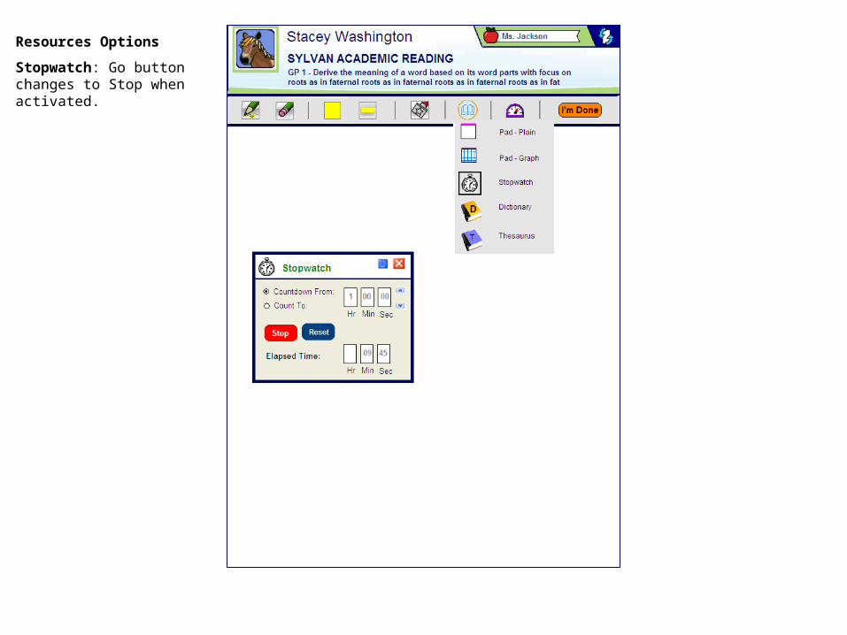
Resources Options
Hovering over toolbar icon displays dropdown menu.
Pads and Stopwatch are always menu options.
Other Resources options are dependent on current program.

Resources Options
Selecting an option opens a separate window.
Selected option indicated on menu.
Windows can be moved.
Resources Options
Stopwatch: Go button changes to Stop when activated.

Resources Options
Stopwatch: This window can be minimized, if desired.

Resources Options
Multiple Resources option windows can be open at one time.

Resources Options
Selecting Dictionary or Thesaurus changes onscreen cursor to a select word “tool.” If an onscreen word is selected, the selection and the definition show in window.
Or, the user can enter a word.

Dashboard Options
Hovering over toolbar icon displays dropdown menu.
Options include Show and Hide Dashboard.

Dashboard Options
Current session feedback displayed below toolbar:
•Completed Lessons
•Elapsed Time
•Average Score
For ease of use, show more detailed info in an tooltip style popup when stylus hovers over progress bar.

Clicking I’m Done button displays Activities and Games window.
Students can click on links (URLS) to outside resources.
Or click Return to Lesson button to close window.