Embed Size (px)
Citation preview
STRATOS: Using Visualization to Support Decisions in Strategic Software Release Planning
Bon Adriel Aseniero, Tiffany Wun, David Ledo, Guenther Ruhe,
Anthony Tang, Sheelagh Carpendale
Department of Computer Science
University of Calgary
{baasenie, twwun, dledomai, ruhe, tonyt, sheelagh}@ucalgary.ca
ABSTRACT
Software is typically developed incrementally and released
in stages. Planning these releases involves deciding which
features of the system should be implemented for each
release. This is a complex planning process involving
numerous trade-offs—constraints and factors that often
make decisions difficult. Since the success of a product
depends on this plan, it is important to understand the trade-
offs between different release plans in order to make an
informed choice. We present STRATOS, a tool that simulta-
neously visualizes several software release plans. The
visualization shows several attributes about each plan that
are important to planners. Multiple plans are shown in a sin-
gle layout to help planners find and understand the trade-offs
between alternative plans. We evaluated our tool via a
qualitative study and found that STRATOS enables a range of
decision-making processes, helping participants decide on
which plan is most optimal.
Author Keywords
Information Visualization; Release Planning; Software
Engineering.
ACM Classification Keywords
H.5. Information Interfaces & Presentation; H.4.2. Infor-
mation Systems Applications: Decision Support.
INTRODUCTION
Different models of software development have been used in
industry, including iterative and incremental practices, as
well as newer, agile methodologies. Companies trying to de-
liver a product work under several constraints (e.g. time,
budget, personpower), and often have to contend with fluc-
tuating and growing sets of customer requirements. Thus, it
is important for large projects to make effective and efficient
decisions concerning the use of resources—that is, deciding
on a development plan such that it articulates what order fea-
tures should be developed, which features should be post-
poned, how resources should be divided, etc. The process of
structuring and managing project plans to balance between
factors such as stakeholder satisfaction, resource allocation,
feature dependencies, etc. is known as release planning [1].
The goal of release planning is to find an optimal release plan
which balances these factors desirably—a decision-making
process which typically requires the involvement of a human
planner (e.g. project managers).
To support planners in this decision-making process, we cre-
ated a tool called STRATOS (STRATegic release planning
Oversight Support). STRATOS uses a hybrid visualization
showing several potential release plans, revealing strengths
and trade-offs within a single layout. It is designed to help
planners choose an optimal plan by visualizing the interre-
lated factors and constraints. Our intention is to enhance the
decision-making process of planners by allowing them to use
different problem solving strategies while facilitating an
easier way to account for multiple factors and trade-offs
among alternative plans.
We make two contributions in this work:
1. First, we present the design and implementation of
STRATOS, an interactive hybrid visualization which
supports decision-making in software release planning;
2. Second, we outline and discuss the results of a qualitative
study of this tool, in which we identified the scope of
what a visualization tool like STRATOS could enable and
support in software release planning.
The next section gives a brief explanation of the practice of
release planning to help explain the motivation of our re-
search, followed by a survey of related literature on visuali-
zation tools for software engineering and release planning.
We then explain the design and implementation of STRATOS,
outline its qualitative study, and discuss its results and impli-
cations. Finally, we explore some avenues for future work.
Practice of Release Planning
One method of release planning, EVOLVE II [9], makes use
of standard planning procedures to arrive at a release plan
containing the prioritization of features, timing of releases,
Permission to make digital or hard copies of all or part of this work for
personal or classroom use is granted without fee provided that copies are
not made or distributed for profit or commercial advantage and that copies
bear this notice and the full citation on the first page. Copyrights for com-
ponents of this work owned by others than ACM must be honored. Abstract-
ing with credit is permitted. To copy otherwise, or republish, to post on
servers or to redistribute to lists, requires prior specific permission and/or a
fee. Request permissions from [email protected].
CHI 2015, April 18 - 23 2015, Seoul, Republic of Korea
Copyright 2015 ACM 978-1-4503-3145-6/15/04…$15.00
http://dx.doi.org/10.1145/2702123.2702426
and allocation of resources. This method is realized in
ReleasePlannerTM1 which is an industry-grade online
decision support tool for release planning [3]. Planners,
stakeholders, and development team members work together
in planning their project using ReleasePlanner; the iterative
standard planning procedures include:
1. Studying and classifying the characteristics of the project.
This involves defining the project features – different
components and capabilities of the software, and available
resources – supplies needed for the implementation of
features (e.g. budget, hours of labour, risk, etc. [15]).
2. Identifying the stakeholders and their influence.
Stakeholders are people who have a vested interest in the
project and have a say on the importance of features and the
use of resources. In ReleasePlanner, stakeholders are given a
weight signifying their influence level and they vote on the
priority of each feature using a nine-point scale. These votes
are used to predict how satisfied they will be regarding a
plan. Stakeholder satisfaction ranges from very excited to
very disappointed, and includes very surprised and
surprised—excitement (positive) occurs when high priority
features are released early within a plan, disappointment
(negative) occurs when features with high priority gets
postponed, and surprise (neither positive nor negative)
occurs when a feature with low priority gets released earlier
than expected. This stakeholder satisfaction is further
summarized in conjunction with feature prioritization into
the Stakeholder Feature Points (SHFP) which summarizes
the degree of optimality for the plan.
3. Examining multiple plan scenarios with varying values of
constraints and factors and choosing the best one. This
involves creating possible groupings of features to be imple-
mented within a development cycle or release. Depending
on the grouping of features, releases will have different
resource requirements and the planner has to assess whether
resources are going to be used appropriately. Typically, some
features are postponed because of resource limitations.
Instead of having planners create multiple plan scenarios,
ReleasePlanner uses an automated genetic algorithm to pro-
vide a small solution set of optimized release plans for anal-
ysis. In this method, planners still decide which plan in the
solution set is best for their project. Our research focused on
supporting these first three procedures since understanding
the benefits and trade-offs of each plan by thoroughly exam-
ining resource constraints, stakeholder satisfaction, and fea-
ture implementation can quickly grow in complexity [12,15].
The next three steps—4. Executing the chosen plan, 5. Ana-
lysing the outcome of the executed plan after each
release and adjusting the plan accordingly, and 6. Recording
the analysis from Procedure 5 for reference—occur after
planning and are thus not in the current focus.
1 http://releaseplanner.com
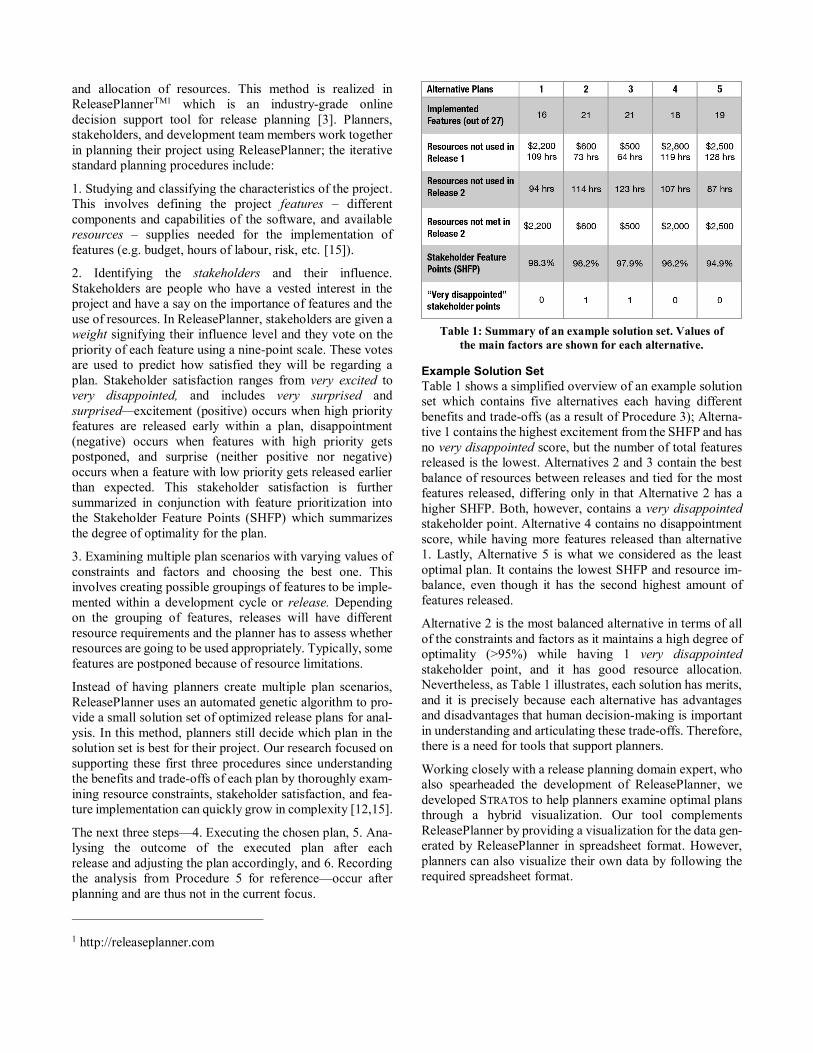
Example Solution Set
Table 1 shows a simplified overview of an example solution
set which contains five alternatives each having different
benefits and trade-offs (as a result of Procedure 3); Alterna-
tive 1 contains the highest excitement from the SHFP and has
no very disappointed score, but the number of total features
released is the lowest. Alternatives 2 and 3 contain the best
balance of resources between releases and tied for the most
features released, differing only in that Alternative 2 has a
higher SHFP. Both, however, contains a very disappointed
stakeholder point. Alternative 4 contains no disappointment
score, while having more features released than alternative
1. Lastly, Alternative 5 is what we considered as the least
optimal plan. It contains the lowest SHFP and resource im-
balance, even though it has the second highest amount of
features released.
Alternative 2 is the most balanced alternative in terms of all
of the constraints and factors as it maintains a high degree of
optimality (>95%) while having 1 very disappointed
stakeholder point, and it has good resource allocation.
Nevertheless, as Table 1 illustrates, each solution has merits,
and it is precisely because each alternative has advantages
and disadvantages that human decision-making is important
in understanding and articulating these trade-offs. Therefore,
there is a need for tools that support planners.
Working closely with a release planning domain expert, who
also spearheaded the development of ReleasePlanner, we
developed STRATOS to help planners examine optimal plans
through a hybrid visualization. Our tool complements
ReleasePlanner by providing a visualization for the data gen-
erated by ReleasePlanner in spreadsheet format. However,
planners can also visualize their own data by following the
required spreadsheet format.
Table 1: Summary of an example solution set. Values of
the main factors are shown for each alternative.
RELATED WORK
To set the stage, we first outline related work in visualization
used in software engineering and development. We then
discuss visualizations that have been previously created
specifically for release planning. We also discuss visualiza-
tions that we have drawn from in designing STRATOS.
Visualizations for General Software Development
Visualizations have been previously used in software engi-
neering. For example, UML (Unified Modelling Language)
[16] is commonly used to capture and portray requirements
during the software development process. Although UML
provides developers with constructs to build object-oriented
models close to real-world models [8], UML focuses primar-
ily on software architecture rather than management (e.g.
budget, development schedule).
In contrast, Gantt charts visualize the development schedule,
allowing planners to chart and hierarchically see dependen-
cies between related feature components [5]. This makes
these charts effective at executing plans with minimal confu-
sion [5]. Similarly, Wnuk et al. explored how one can repre-
sent feature life cycles in a two dimensional graph [23].
Kanban visualizes workflow of a development team [2]. It
depicts just-in-time development process, where features are
only implemented when there is an explicit customer request;
as a consequence, development is represented as a large
number of small deliverables. These deliverables are de-
picted with cards that can be moved along a board signifying
where it is in the development cycle. While Gantt charts and
Kanban are effective at visualizing development progress,
they both rely on a flexible plan that is already decided on
earlier. Putting these in perspective, we envision our tool to
coexist with these pre-existing kinds of visualizations. This
is because our tool supports the decision-making process to
come up with a plan before development begins, and
possibly when a change in plan is needed or when a new
development cycle begins.
Visualizations for Release Planning
The goal of introducing visualization in release planning is
often the same: to increase the transparency of solutions,
showing why certain plans are suggested, and what the trade-
offs look like between alternatives [1]. While some release
planning tools like ReleasePlanner provide basic visualiza-
tions (e.g. bar graphs, line graphs, etc.)[3,23], these are
typically focused on simple bivariate relationships, unable to
depict the complex, multivariate relationships inherent in
release planning. Several researchers have explored using
different visual representations to support release planning.
For example, Feather et al. provided several representations
that showed the requirements and risks for the planning of a
release [6]. Their tool provided different basic visualization
views for comparing risks and exploring the solution space
as a trade-off between cost and benefit. While each view is
useful, switching between them to in order to accomplish
tasks can be cumbersome as it relies on mentally integrating
information across several views to answer questions.
STRATOS begins with the premise that several variables need
to be visually accessible simultaneously to show their
interrelatedness and reduce this burden.
Carlshamre et al. illustrated ways to represent feature
dependencies, including coupling, precedence, multiplica-
tive cost and multiplicative value through a graph that resem-
bled a directed node-link graph [4]. Herrmann’s Rational-
Based Analysis Tool allows for the representation of use
cases, multiple releases, and the features related to them by
showing the subclass–superclass relationship through
knowledge nuggets—objects which contain information per-
taining to plans. It also allows for modification of releases or
plans [10]. These provided a good basis for STRATOS in rep-
resenting hierarchical relationships. However, while these
are useful for showing functional dependencies (for
development planning), they do not account for the broader
factors that impact release planning (e.g. resource allocation
and stakeholder preferences) which are important in deter-
mining how to arrange releases such that they would arrive
to market in the most effective way possible.
Visualizations that Influenced the Design of STRATOS
We were inspired by several existing visualizations that we
leverage in our work. The Sankey diagram [17] is based on
Minard’s drawing of Napoleon’s Russian Campaign of
1812―to which he claimed to promptly convey “the relation
not given quickly by numbers” [22]. Sankey diagrams have
been used for depicting energy and material balances of
complex production systems (e.g. Steam-Engine production)
[16,17]. Reihmann et al. furthered this development by mak-
ing Sankey diagrams interactive and useful for planning
alternative flow scenarios [14].
While the Sankey diagram is effective for depicting resource
consumption, our data has other properties that have led us
to examine other visualizations as well. One aspect of our
data is that it is highly comparative, containing information
about several plans, releases, and features. Features, in
particular, remain constant among all of the plans in a solu-
tion set, with the difference being their priority. This makes
it akin to multivariate data, hence we turned to using Parallel
Coordinates [11] for its depiction. We took inspiration from
these works to create a hybrid visualization tool that supports
the decision-making process of release planning.
Parallel Sets [13] bears a striking resemblance to our
visualization. Parallel sets is a visualization which combines
parallel coordinates and frequency displays. It was designed
specifically for showing categorical information as inde-
pendent dimensions, while STRATOS depicts alternatives.
STRATOS was designed with a more practical goal in mind—
the comparison of alternative release plans to support
planners in choosing the best plan. Nevertheless, parallel sets
have been shown to help identify relationships in the data
which reinforces our use of a similar visualization to depict
relationships among release planning factors and constraints.
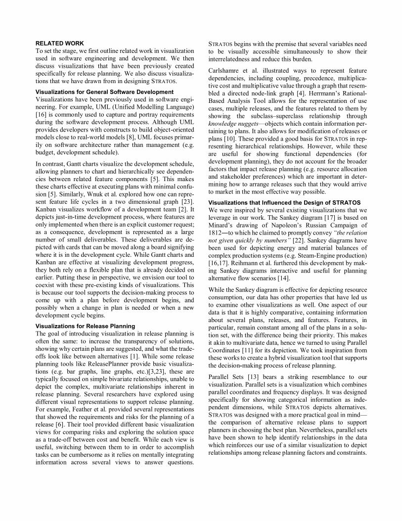
STRATOS
Our goal in designing STRATOS (Figure 1) is to support
planners in their release planning decision-making process
through visualization. Our solution combines the flow
visualization of Sankey diagrams with the multivariate
illustration of Parallel Coordinates. Our data set is inherently
hierarchical, with plans containing releases and releases
containing features, thus we opted to use a forest or multiple
tree layout [7]. STRATOS visualizes the important factors of
release planning in a unified, single layout. This ensures that
all of the factors are readily available to the planner. We also
implemented interactive brushing, allowing components to
interactively reveal relationships in the data. Our design
process relied on gaining knowledge and feedback from a
release planning domain expert.
Design Process and Guidelines
We used a method akin to Sedlmair’s et al. design study
methodology [18]. We worked closely with a release plan-
ning domain expert who emphasized that a visualization
could help planners in release planning. He helped identify
important patterns and relationships, providing guidance for
the development of STRATOS. We iterated on several visual-
ization designs specifically to highlight these relationships
which were not readily apparent with basic visualizations.
The underlying design guidelines for STRATOS are:
1. Consider as many as possible factors. Knowing the con-
ditions of multiple factors and constraints of release plan-
ning is important for planners to be able to make good and
well-informed decisions. The visualization design must
take into account visualizing as many factors as possible.
2. Provide a holistic view. The visualization must also be
able to show how the factors and constraints relate to each
other. A holistic view allows planners to consider most of
the factors with considerable ease rather than trying to do
so while switching between views. Hybrid visualization
brings together different aspects of existing visualization
techniques to create something novel. We bring the ad-
vantages of several techniques together to make data com-
parisons more transparent.
3. Support comparison between plans. While plans will be
shown as distinct, consistency across representations must
be used to support comparison between plans.
4. Support different strategies for decision-making. Different
planners often have different ways of deciding what is the
best plan regarding their project. An interactive visualiza-
tion should allow planners to explore the data however
they prefer (e.g. allowing a planner to start their explora-
tion of the data anywhere in the visualization).
5. Support both individual and collaborative exploration of
data. Release planning can be performed either as an indi-
vidual or as a team. This extends Guideline 4 in case of
collaborative planning.
6. Support details-on-demand [19]. While visually convey-
ing information allows planners to do simple comparisons
at-a-glance, they must be able to access detailed infor-
mation for fine-grained analysis.
7. Minimize required interactions. Minimizing interaction
overhead by avoiding deeply nested menus and other com-
plicated actions while still providing full visualization and
data access could help simplify the planner’s task.
a
d
c
e
b
Figure 1: STRATOS’ view of a release planning solution set summarized in Table 1. (a) Legend for the colour representations of
resources and excitement levels. (b) The boxes representing the alternative plans in the solution set. (c) The flow diagram visu-
alizing the flow of resources into the (d) alternative’s releases, and eventually to the (e) features.
Visual Representation
As previously mentioned, STRATOS is a hybrid visualization
that integrates Sankey diagrams and parallel coordinates in a
multiple tree layout. Figure 1 shows an overview of
STRATOS. At the top right hand side (Figure 1.a) are two leg-
ends: (1) resources and (2) stakeholder satisfaction levels.
Each plan can be thought of as a hierarchy that contains re-
sources, releases and features. The overall view is a small
forest, with one tree representing an alternative plan. The
hierarchy shows alternative headers at the top (Figure 1.b),
releases in the middle (Figure 1.d), and the features at the
bottom (Figure 1.e). Since all alternatives contain the same
set of features—though they have been given different im-
plementation order—the trees representing the plans also
share the same set of features. This visually depicts that the
plans are alternatives for the same software. The flow or
graph edges represent resource allocation. Their thickness is
mapped to the crucial factor of available (or required)
amount of the resource each represents. The flow of re-
sources shown from the plan to the releases and from the re-
leases to the features (Figure 1.c) function similar to parallel
coordinates where plans, releases, and features are the axes.
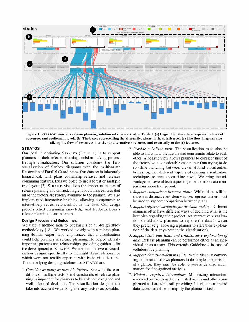
Figure 2.a shows the bar chart representation of the stake-
holder satisfaction. Figure 2.b (white bar) shows the degree
of optimality for a plan (SHFP). Figure 2.c shows the top of
the resource flow visual element. The amount of available
resources are shown here (dark blue: budget, light blue: de-
sign effort, pink: development effort, red: testing effort).
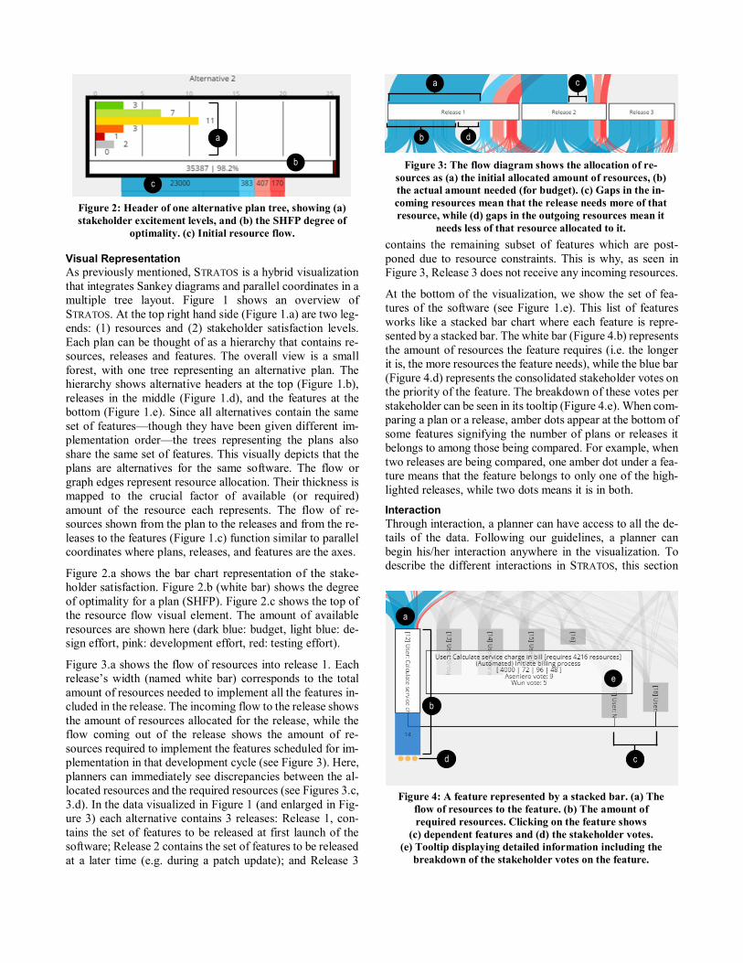
Figure 3.a shows the flow of resources into release 1. Each
release’s width (named white bar) corresponds to the total
amount of resources needed to implement all the features in-
cluded in the release. The incoming flow to the release shows
the amount of resources allocated for the release, while the
flow coming out of the release shows the amount of re-
sources required to implement the features scheduled for im-
plementation in that development cycle (see Figure 3). Here,
planners can immediately see discrepancies between the al-
located resources and the required resources (see Figures 3.c,
3.d). In the data visualized in Figure 1 (and enlarged in Fig-
ure 3) each alternative contains 3 releases: Release 1, con-
tains the set of features to be released at first launch of the
software; Release 2 contains the set of features to be released
at a later time (e.g. during a patch update); and Release 3
contains the remaining subset of features which are post-
poned due to resource constraints. This is why, as seen in
Figure 3, Release 3 does not receive any incoming resources.
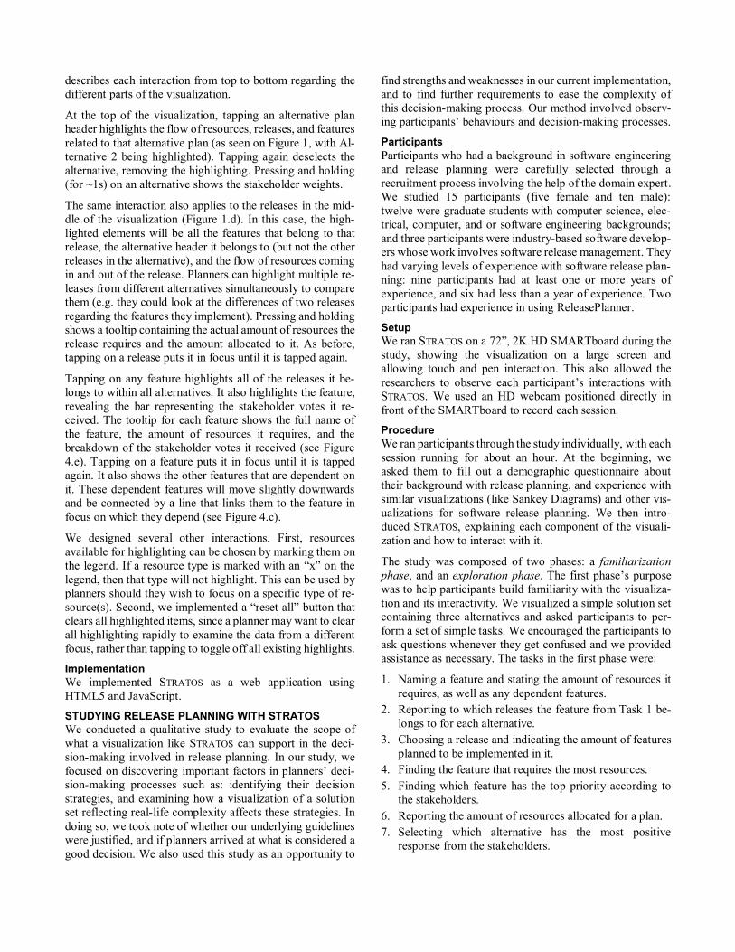
At the bottom of the visualization, we show the set of fea-
tures of the software (see Figure 1.e). This list of features
works like a stacked bar chart where each feature is repre-
sented by a stacked bar. The white bar (Figure 4.b) represents
the amount of resources the feature requires (i.e. the longer
it is, the more resources the feature needs), while the blue bar
(Figure 4.d) represents the consolidated stakeholder votes on
the priority of the feature. The breakdown of these votes per
stakeholder can be seen in its tooltip (Figure 4.e). When com-
paring a plan or a release, amber dots appear at the bottom of
some features signifying the number of plans or releases it
belongs to among those being compared. For example, when
two releases are being compared, one amber dot under a fea-
ture means that the feature belongs to only one of the high-
lighted releases, while two dots means it is in both.
Interaction
Through interaction, a planner can have access to all the de-
tails of the data. Following our guidelines, a planner can
begin his/her interaction anywhere in the visualization. To
describe the different interactions in STRATOS, this section
b
a
Figure 2: Header of one alternative plan tree, showing (a)
stakeholder excitement levels, and (b) the SHFP degree of
optimality. (c) Initial resource flow.
c
a c
b d
Figure 3: The flow diagram shows the allocation of re-
sources as (a) the initial allocated amount of resources, (b)
the actual amount needed (for budget). (c) Gaps in the in-
coming resources mean that the release needs more of that
resource, while (d) gaps in the outgoing resources mean it
needs less of that resource allocated to it.
a
d
e
b
c
Figure 4: A feature represented by a stacked bar. (a) The
flow of resources to the feature. (b) The amount of
required resources. Clicking on the feature shows
(c) dependent features and (d) the stakeholder votes.
(e) Tooltip displaying detailed information including the
breakdown of the stakeholder votes on the feature.
describes each interaction from top to bottom regarding the
different parts of the visualization.
At the top of the visualization, tapping an alternative plan
header highlights the flow of resources, releases, and features
related to that alternative plan (as seen on Figure 1, with Al-
ternative 2 being highlighted). Tapping again deselects the
alternative, removing the highlighting. Pressing and holding
(for ~1s) on an alternative shows the stakeholder weights.
The same interaction also applies to the releases in the mid-
dle of the visualization (Figure 1.d). In this case, the high-
lighted elements will be all the features that belong to that
release, the alternative header it belongs to (but not the other
releases in the alternative), and the flow of resources coming
in and out of the release. Planners can highlight multiple re-
leases from different alternatives simultaneously to compare
them (e.g. they could look at the differences of two releases
regarding the features they implement). Pressing and holding
shows a tooltip containing the actual amount of resources the
release requires and the amount allocated to it. As before,
tapping on a release puts it in focus until it is tapped again.
Tapping on any feature highlights all of the releases it be-
longs to within all alternatives. It also highlights the feature,
revealing the bar representing the stakeholder votes it re-
ceived. The tooltip for each feature shows the full name of
the feature, the amount of resources it requires, and the
breakdown of the stakeholder votes it received (see Figure
4.e). Tapping on a feature puts it in focus until it is tapped
again. It also shows the other features that are dependent on
it. These dependent features will move slightly downwards
and be connected by a line that links them to the feature in
focus on which they depend (see Figure 4.c).
We designed several other interactions. First, resources
available for highlighting can be chosen by marking them on
the legend. If a resource type is marked with an “x” on the
legend, then that type will not highlight. This can be used by
planners should they wish to focus on a specific type of re-
source(s). Second, we implemented a “reset all” button that
clears all highlighted items, since a planner may want to clear
all highlighting rapidly to examine the data from a different
focus, rather than tapping to toggle off all existing highlights.
Implementation
We implemented STRATOS as a web application using
HTML5 and JavaScript.
STUDYING RELEASE PLANNING WITH STRATOS
We conducted a qualitative study to evaluate the scope of
what a visualization like STRATOS can support in the deci-
sion-making involved in release planning. In our study, we
focused on discovering important factors in planners’ deci-
sion-making processes such as: identifying their decision
strategies, and examining how a visualization of a solution
set reflecting real-life complexity affects these strategies. In
doing so, we took note of whether our underlying guidelines
were justified, and if planners arrived at what is considered a
good decision. We also used this study as an opportunity to
find strengths and weaknesses in our current implementation,
and to find further requirements to ease the complexity of
this decision-making process. Our method involved observ-
ing participants’ behaviours and decision-making processes.
Participants
Participants who had a background in software engineering
and release planning were carefully selected through a
recruitment process involving the help of the domain expert.
We studied 15 participants (five female and ten male):
twelve were graduate students with computer science, elec-
trical, computer, and or software engineering backgrounds;
and three participants were industry-based software develop-
ers whose work involves software release management. They
had varying levels of experience with software release plan-
ning: nine participants had at least one or more years of
experience, and six had less than a year of experience. Two
participants had experience in using ReleasePlanner.
Setup
We ran STRATOS on a 72”, 2K HD SMARTboard during the
study, showing the visualization on a large screen and
allowing touch and pen interaction. This also allowed the
researchers to observe each participant’s interactions with
STRATOS. We used an HD webcam positioned directly in
front of the SMARTboard to record each session.
Procedure
We ran participants through the study individually, with each
session running for about an hour. At the beginning, we
asked them to fill out a demographic questionnaire about
their background with release planning, and experience with
similar visualizations (like Sankey Diagrams) and other vis-
ualizations for software release planning. We then intro-
duced STRATOS, explaining each component of the visuali-
zation and how to interact with it.
The study was composed of two phases: a familiarization
phase, and an exploration phase. The first phase’s purpose
was to help participants build familiarity with the visualiza-
tion and its interactivity. We visualized a simple solution set
containing three alternatives and asked participants to per-
form a set of simple tasks. We encouraged the participants to
ask questions whenever they get confused and we provided
assistance as necessary. The tasks in the first phase were:
1. Naming a feature and stating the amount of resources it
requires, as well as any dependent features.
2. Reporting to which releases the feature from Task 1 be-
longs to for each alternative.
3. Choosing a release and indicating the amount of features
planned to be implemented in it.
4. Finding the feature that requires the most resources.
5. Finding which feature has the top priority according to
the stakeholders.
6. Reporting the amount of resources allocated for a plan.
7. Selecting which alternative has the most positive
response from the stakeholders.
In the second phase, we asked our participants to take on the
role of a project manager (a planner) in a scenario in which
they were to explore a new dataset and choose an optimal
plan. For this phase, the software being planned for was a
standard language learning software, with all of its features
labelled and described. We used the previously described so-
lution set (the example in this paper’s introduction) with five
plans pre-generated from ReleasePlanner (see Figure 1). In
this phase, the participants interacted with STRATOS on their
own, but encouraged to think aloud as they worked. Once
they had chosen an alternative, we asked them to explain why
they believed their chosen alternative was the best plan.
At the end of the study, we asked participants to fill out a
post-study questionnaire about their overall thoughts on
STRATOS. We asked them to rate STRATOS on how easy it
was to use and read, and their confidence on their chosen al-
ternative. We also asked them about which parts of the visu-
alization helped them most, their criticisms, and suggestions.
RESULTS
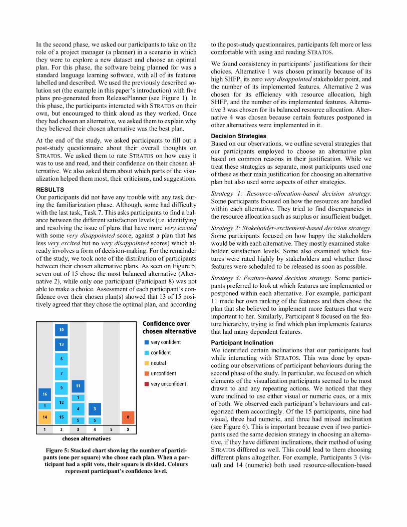
Our participants did not have any trouble with any task dur-
ing the familiarization phase. Although, some had difficulty
with the last task, Task 7. This asks participants to find a bal-
ance between the different satisfaction levels (i.e. identifying
and resolving the issue of plans that have more very excited
with some very disappointed score, against a plan that has
less very excited but no very disappointed scores) which al-
ready involves a form of decision-making. For the remainder
of the study, we took note of the distribution of participants
between their chosen alternative plans. As seen on Figure 5,
seven out of 15 chose the most balanced alternative (Alter-
native 2), while only one participant (Participant 8) was not
able to make a choice. Assessment of each participant’s con-
fidence over their chosen plan(s) showed that 13 of 15 posi-
tively agreed that they chose the optimal plan, and according
to the post-study questionnaires, participants felt more or less
comfortable with using and reading STRATOS.
We found consistency in participants’ justifications for their
choices. Alternative 1 was chosen primarily because of its
high SHFP, its zero very disappointed stakeholder point, and
the number of its implemented features. Alternative 2 was
chosen for its efficiency with resource allocation, high
SHFP, and the number of its implemented features. Alterna-
tive 3 was chosen for its balanced resource allocation. Alter-
native 4 was chosen because certain features postponed in
other alternatives were implemented in it.
Decision Strategies
Based on our observations, we outline several strategies that
our participants employed to choose an alternative plan
based on common reasons in their justification. While we
treat these strategies as separate, most participants used one
of these as their main justification for choosing an alternative
plan but also used some aspects of other strategies.
Strategy 1: Resource-allocation-based decision strategy.
Some participants focused on how the resources are handled
within each alternative. They tried to find discrepancies in
the resource allocation such as surplus or insufficient budget.
Strategy 2: Stakeholder-excitement-based decision strategy.
Some participants focused on how happy the stakeholders
would be with each alternative. They mostly examined stake-
holder satisfaction levels. Some also examined which fea-
tures were rated highly by stakeholders and whether those
features were scheduled to be released as soon as possible.
Strategy 3: Feature-based decision strategy. Some partici-
pants preferred to look at which features are implemented or
postponed within each alternative. For example, participant
11 made her own ranking of the features and then chose the
plan that she believed to implement more features that were
important to her. Similarly, Participant 8 focused on the fea-
ture hierarchy, trying to find which plan implements features
that had many dependent features.
Participant Inclination
We identified certain inclinations that our participants had
while interacting with STRATOS. This was done by open-
coding our observations of participant behaviours during the
second phase of the study. In particular, we focused on which
elements of the visualization participants seemed to be most
drawn to and any repeating actions. We noticed that they
were inclined to use either visual or numeric cues, or a mix
of both. We observed each participant’s behaviours and cat-
egorized them accordingly. Of the 15 participants, nine had
visual, three had numeric, and three had mixed inclination
(see Figure 6). This is important because even if two partici-
pants used the same decision strategy in choosing an alterna-
tive, if they have different inclinations, their method of using
STRATOS differed as well. This could lead to them choosing
different plans altogether. For example, Participants 3 (vis-
ual) and 14 (numeric) both used resource-allocation-based
Figure 5: Stacked chart showing the number of partici-
pants (one per square) who chose each plan. When a par-
ticipant had a split vote, their square is divided. Colours
represent participant’s confidence level.
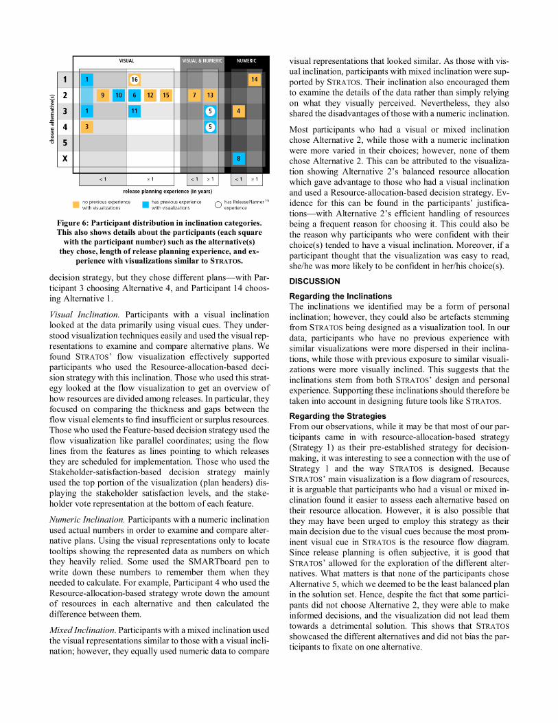
decision strategy, but they chose different plans—with Par-
ticipant 3 choosing Alternative 4, and Participant 14 choos-
ing Alternative 1.
Visual Inclination. Participants with a visual inclination
looked at the data primarily using visual cues. They under-
stood visualization techniques easily and used the visual rep-
resentations to examine and compare alternative plans. We
found STRATOS’ flow visualization effectively supported
participants who used the Resource-allocation-based deci-
sion strategy with this inclination. Those who used this strat-
egy looked at the flow visualization to get an overview of
how resources are divided among releases. In particular, they
focused on comparing the thickness and gaps between the
flow visual elements to find insufficient or surplus resources.
Those who used the Feature-based decision strategy used the
flow visualization like parallel coordinates; using the flow
lines from the features as lines pointing to which releases
they are scheduled for implementation. Those who used the
Stakeholder-satisfaction-based decision strategy mainly
used the top portion of the visualization (plan headers) dis-
playing the stakeholder satisfaction levels, and the stake-
holder vote representation at the bottom of each feature.
Numeric Inclination. Participants with a numeric inclination
used actual numbers in order to examine and compare alter-
native plans. Using the visual representations only to locate
tooltips showing the represented data as numbers on which
they heavily relied. Some used the SMARTboard pen to
write down these numbers to remember them when they
needed to calculate. For example, Participant 4 who used the
Resource-allocation-based strategy wrote down the amount
of resources in each alternative and then calculated the
difference between them.
Mixed Inclination. Participants with a mixed inclination used
the visual representations similar to those with a visual incli-
nation; however, they equally used numeric data to compare
visual representations that looked similar. As those with vis-
ual inclination, participants with mixed inclination were sup-
ported by STRATOS. Their inclination also encouraged them
to examine the details of the data rather than simply relying
on what they visually perceived. Nevertheless, they also
shared the disadvantages of those with a numeric inclination.
Most participants who had a visual or mixed inclination
chose Alternative 2, while those with a numeric inclination
were more varied in their choices; however, none of them
chose Alternative 2. This can be attributed to the visualiza-
tion showing Alternative 2’s balanced resource allocation
which gave advantage to those who had a visual inclination
and used a Resource-allocation-based decision strategy. Ev-
idence for this can be found in the participants’ justifica-
tions—with Alternative 2’s efficient handling of resources
being a frequent reason for choosing it. This could also be
the reason why participants who were confident with their
choice(s) tended to have a visual inclination. Moreover, if a
participant thought that the visualization was easy to read,
she/he was more likely to be confident in her/his choice(s).
DISCUSSION
Regarding the Inclinations
The inclinations we identified may be a form of personal
inclination; however, they could also be artefacts stemming
from STRATOS being designed as a visualization tool. In our
data, participants who have no previous experience with
similar visualizations were more dispersed in their inclina-
tions, while those with previous exposure to similar visuali-
zations were more visually inclined. This suggests that the
inclinations stem from both STRATOS’ design and personal
experience. Supporting these inclinations should therefore be
taken into account in designing future tools like STRATOS.
Regarding the Strategies
From our observations, while it may be that most of our par-
ticipants came in with resource-allocation-based strategy
(Strategy 1) as their pre-established strategy for decision-
making, it was interesting to see a connection with the use of
Strategy 1 and the way STRATOS is designed. Because
STRATOS’ main visualization is a flow diagram of resources,
it is arguable that participants who had a visual or mixed in-
clination found it easier to assess each alternative based on
their resource allocation. However, it is also possible that
they may have been urged to employ this strategy as their
main decision due to the visual cues because the most prom-
inent visual cue in STRATOS is the resource flow diagram.
Since release planning is often subjective, it is good that
STRATOS’ allowed for the exploration of the different alter-
natives. What matters is that none of the participants chose
Alternative 5, which we deemed to be the least balanced plan
in the solution set. Hence, despite the fact that some partici-
pants did not choose Alternative 2, they were able to make
informed decisions, and the visualization did not lead them
towards a detrimental solution. This shows that STRATOS
showcased the different alternatives and did not bias the par-
ticipants to fixate on one alternative.
Figure 6: Participant distribution in inclination categories.
This also shows details about the participants (each square
with the participant number) such as the alternative(s)
they chose, length of release planning experience, and ex-
perience with visualizations similar to STRATOS.
Regarding the Design Guidelines
The unified layout of STRATOS showed all of the factors and
how they relate with each other, providing a holistic view
(Guideline 2) and allowing participants to compare alterna-
tives (Guideline 3). The hybrid visualization of STRATOS has
also been shown to support multiple decision-making
strategies (Guideline 4). We found that all strategies of the
participants involved some form of examining most factors
of release planning. This suggests that STRATOS’ visual
elements allowed the planners to consider as many release
planning factors as they could (Guideline 1). However, the
study showed that while a single layout could help in easing
the mental load coming from view switching, this gives its
own type of mental load and that training time (approxi-
mately 20 minutes) was necessary for the participants to be
able to use STRATOS comfortably and effectively. This issue
raises a question on whether compartmentalizing the single
view into several visualization widgets (one visualization per
factor) and updating all whenever one is interacted with by
the planner, could lower the mental load. Arriving at a good
balance would require additional future work. Nevertheless,
the choice of combining Sankey diagrams and parallel coor-
dinates in a tree view hybrid visualization proved useful in
supporting participants who had visual or mixed inclinations.
To some extent, STRATOS also supported those with a nu-
meric inclination via details-on-demand (Guideline 6).
STRATOS provides the ability to drill down to actual data
through tooltips—and numerically inclined participants did
use the structure of STRATOS to find the right tooltips—there
are some aspects of this numerical approach that the design
of STRATOS did not effectively support. For example, partic-
ipants who used the Stakeholder-satisfaction-based decision
strategy with a numeric inclination were not able to draw out
numeric data composing the stakeholder satisfaction levels.
On the other hand, Participant 8, who used a Feature-based
decision strategy—focusing mostly on stakeholder votes for
each features, dependent features, and when they are imple-
mented—had to go through each of the features to see their
details in the tooltips. This put a heavy mental load on the
participant which hindered him finding the best plan.
It is hard to say whether these difficulties are due to the par-
ticipants not understanding the visualization enough or be-
cause some type of support was lacking, since our post-study
questionnaire data showed that most numerically inclined
participants still agreed that the visualization was easy to
read. Nevertheless, rather than having the participants dig for
numerical information through tooltips, it is advisable to spe-
cifically design ways of how to integrate numerical data
within the same view of the visualization. Minimizing the
required interactions for all the inclinations is imperative to
ensure they are all well-supported (Guideline 7). Simplifying
required interactions can be extended to the feature visual el-
ements as well. For instance, rather than showing a single bar
for the stakeholder votes with its breakdown shown in the
tooltip, the domain expert suggested that it would be more
meaningful to see the vote breakdown as separate parts of the
stacked bar. This is because some stakeholders have a higher
weight than others, and seeing the vote of a targeted stake-
holder at-a-glance can add more utility to the visualization.
Finding features dependencies can also be simplified by
arranging the features in space based on their dependencies.
Limitations
One limitation of our qualitative study is our participant sam-
ple. While our participants had at least graduate level expe-
rience with release planning, the majority were still students
with only a handful of planners from industry. While this
participant sample is seldom perfect, this study’s partici-
pants’ skill set was both representative and sufficient for the
study’s purpose. The goal of our study was to understand the
scope of what a visualization like STRATOS potentially sup-
ports, and not to evaluate STRATOS (in its current prototype
form) as a tool used in industry. Nevertheless, a study involv-
ing industry planners could shed light into how visualizations
like STRATOS might perform in the wild. It could also lead to
the identification of other decision strategies and inclina-
tions, and inform how this type of visualization can be inte-
grated with existing management practices. Furthermore, the
study was performed individually between participants, and
as such, it did not investigate what roles STRATOS could take
on as part of a development team dynamics (Guideline 5).
Investigating this could inform us about group decision-
making strategies, how they relate to individual decision
strategies and inclinations, and how to support them.
FUTURE WORK
We derived several ways in which STRATOS can be improved
by reflecting over the lessons from our study together with
the release planning expert. One way is to improve support
for planners with a numeric inclination. The domain expert
suggested this type of inclination can be better supported by
implementing a type of dashboard that integrates the visual
elements of STRATOS with the spreadsheet containing the
numerical data. Dashboards have been shown to provide
better awareness of both high-level and low-level aspects of
data [21], suggesting its incorporation with the visualization
of STRATOS would be beneficial. Moreover, to reduce the
mental load stemming from the single layout of STRATOS, he
suggested implementing a feature which guides the planner
along a series of steps to analyse the data. This would enable
the planner to focus on a certain portion of the visualization,
while the rest of the visualization is rendered out-of-focus to
reduce visual clutter but maintain overall awareness. It
would need to be possible for the planner to override this fea-
ture at any time to retain the freedom of choice afforded by
STRATOS’ design guideline 4.
There are also other things that could be implemented to turn
STRATOS from a simple visualization tool into a full visual
analytics tool. Direct manipulation, or being able to modify
the data on the spot [20] (e.g. changing values for budget,
adding and removing features, etc. and seeing the visuals
update accordingly) could further increase decision support.
Furthermore, embedded analysis of the data could highlight
areas of the data that could be missed due to human error.
CONCLUSION
In this paper we presented STRATOS, a visualization tool that
supports the decision-making process involved in software
release planning. We outlined how we used a hybrid visual-
ization combining Sankey diagrams and parallel coordinates
in a tree view for its design and implementation, and the
qualitative study we conducted to study its scope. In brief we
contribute: (1) STRATOS: a decision support visualization
tool; and (2) the study where we identified three decision
strategies (resource-allocation-based, stakeholder-satisfac-
tion-based and feature-based) and three inclinations (visual,
numeric, and mixed). We observed that while most partici-
pants had a main strategy for their decision, they also made
use of other strategies, indicating that supporting multiple
strategies is useful for decision-making support.
We argued that STRATOS is able to support multiple pro-
cesses and suggested that similar visualizations could help
planners in decision-making. Our future work suggestions
could open up more support for decision-making. In broader
terms, we would like to extend the lessons learned from
STRATOS to the design of other visualizations supporting de-
cision-making beyond the area of software release planning.
Acknowledgements
We would like to thank the following organizations for
providing funding and equipment for this research: Alberta
Innovates Technology Futures (AITF), Natural Sciences and
Engineering Research Council of Canada (NSERC),
Graphics Animation and New Media (GRAND), SurfNet,
and SMART technologies.
REFERENCES
1. Amandeep, Ruhe, G., and Stanford, M. Intelligent Sup-
port for Software Release Planning. In F. Bomarius and
H. Iida, eds., Product Focused Software Process Im-
provement. Springer Berlin Heidelberg, 2004, 248–262.
2. Anderson, D.J. Kanban. Blue Hole Press, 2010.
3. Bhawnani, P. and Ruhe, G. ReleasePlanner-Planning new
Releases for Software Maintenance and Evolution. ICSM
(Industrial and Tool Volume), (2005), 73–76.
4. Carlshamre, P., Sandahl, K., Lindvall, M., Regnell, B.,
and Natt och Dag, J. An Industrial Survey of Require-
ments Interdependencies in Software Product Release
Planning. In Proc. Fifth IEEE International Symposium
on Requirements Engineering, (2001), 84 –91.
5. Clark, W. and Gantt, H.L. The Gantt Chart, a Working
Tool of Management. New York, Ronald Press, 1923.
6. Feather, M.S., Cornford, S.L., Kiper, J.D., and Menzies,
T. Experiences using Visualization Techniques to Present
Requirements, Risks to Them, and Options for Risk Mit-
igation. First International Workshop on Requirements
Engineering Visualization, REV ’06, (2006), 10.
7. Feiner, S. Seeing the Forest for the Trees: Hierarchical
Displays of Hypertext Structures. In Proc. ACM SIGOIS
and IEEECS TC-OA 1988 Conference on Office Infor-
mation Systems, ACM (1988), 205–212.
8. France, R., Evans, A., Lano, K., and Rumpe, B. The UML
as a Formal Modeling Notation. Computer Standards &
Interfaces 19, 7 (1998), 325–334.
9. Greer, D. and Ruhe, G. Software Release Planning: An
Evolutionary and Iterative Approach. Information and
Software Technology 46, 4 (2004), 243–253.
10. Herrmann, K. Visualization of Release Planning. First In-
ternational Workshop on Requirements Engineering Vis-
ualization, 2006. REV ’06, (2006), 8–8.
11. Inselberg, A. and Dimsdale, B. Parallel Coordinates: A
Tool for Visualizing Multi-dimensional Geometry. In
Proc. 1st Conference on Visualization ’90, IEEE (1990),
361–378.
12. Jantunen, S., Lehtola, L., Gause, D.C., Dumdum, U.R.,
and Barnes, R.J. The Challenge of Release Planning.
Fifth International Workshop on Software Product Man-
agement (IWSPM), (2011), 36–45.
13. Kosara, R., Bendix, F., and Hauser, H. Parallel Sets: In-
teractive Exploration and Visual Analysis of Categorical
Data. IEEE Transactions on Visualization and Computer
Graphics 12, 4 (2006), 558–568.
14. Riehmann, P., Hanfler, M., and Froehlich, B. Interactive
Sankey Diagrams. IEEE INFOVIS, (2005), 233–240.
15. Ruhe, G. Product Release Planning: Methods, Tools and
Applications. CRC Press, 2011.
16. Rumbaugh, J., Jacobson, I., and Booch, G. The Unified
Modeling Language Reference Manual (2nd Edition).
Pearson Higher Education, 2004.
17. Sankey, H.R. The Thermal Efficiency of Steam-Engines.
Minutes of the Proceedings 125, 1896 (1896), 182–212.
18. Sedlmair, M., Meyer, M., and Munzner, T. Design Study
Methodology: Reflections from the Trenches and the
Stacks. IEEE Transactions on Visualization and Com-
puter Graphics 18, 12 (2012), 2431–2440.
19. Shneiderman, B. The Eyes Have It: A Task By Data Type
Taxonomy for Information Visualizations. In Proc. Vis-
ual Languages, IEEE (1996), 336–343.
20. Shneiderman, B. and Maes, P. Direct Manipulation vs.
Interface Agents. Interactions 4, 6 (1997), 42–61.
21. Treude, C. and Storey, M. Awareness 2.0: Staying Aware
of Projects, Developers and Tasks Using Dashboards and
Feeds. ACM/IEEE 32nd International Conference on
Software Engineering, (2010), 365–374.
22. Tufte, E.R. The Visual Display of Quantitative Infor-
mation. Graphics Press, Cheshire, CT, 1983.
23. Wnuk, K., Regnell, B., and Karlsson, L. Visualization of
Feature Survival in Platform-Based Embedded Systems
Development for Improved Understanding of Scope Dy-
namics. Requirements Engineering Visualization, REV
’08, (2008), 41–50.